
Search results for "People decide" in Home Design Ideas
 Drury Design
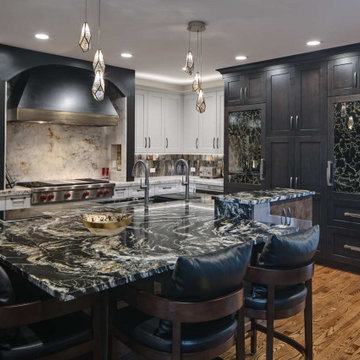
The existing kitchen wasn’t cutting it anymore. The homeowners designed and built this home about 20 years ago, but since then, their taste and needs changed. The outdated finishes felt outdated. There weren’t enough work areas. Some counterspace stations were just awkward due to the layout. Adjoining spaces around the kitchen were also in need of an update, but it was decided that the kitchen would undergo a transformation first.
Design Objectives
-Rework the overall layout (kitchen, laundry and butler’s pantry) to have a better flow and utilize the space better
-Incorporate materials with wow and pizzazz to reflect the homeowner’s style
-Design large work areas for cooking with two or more people at a time
-Provide seating at an island in addition to table seating
-Update surrounding spaces since the kitchen is open to the rest of the home
Design Challenges:
-Include a vast array of cooking appliances while having enough of cabinet storage
-Adjacent rooms need to feel updated and flow with new Kitchen
-Having multiple focal points with different materials but not have the space feel like a hodge podge
-Provide different task, accent and overall lighting to brighten up space
Design Solutions:
-The homeowner loves to cook and wanted to maximize her abilities. We incorporated a 48” rangetop with a griddle, a single oven, steam oven, microwave drawer and 15” induction cooktop next to a 48” Galley Ideal Workstation with two faucets. In order to have room for all of these appliances, the floor plan needed to accommodate more cabinetry. Both dining room entrances were closed off and the laundry room entrance were moved to the opposite end of the wall to allow two long walls for additional cabinets.
-The existing round columns throughout the first floor were outdated. To keep the architectural element of the columns, we wrapped the new columns to have a square shape with a flat panel on all four sides. Then, we painted them black (to tie in with the kitchen tops and curved hood surround) and added simple crown molding. For the flow of the space, closing up the odd corner that connected the laundry and dining room and relocating both room entrances allowed the space to actually feel larger and more continuous. --Adding the same square columns to the main dining room entrance, by the front door, also tied in the front of the house with the kitchen.
-The homeowner loves unique and bold materials. The main focal point of the kitchen is definitely the custom metal hood that incorporates two finishes and is set on a Lumix quartzite full-high back and side splashes. To make this area even more pronounced, a hearth-like drywall arch encloses the space. Once your eye moves off the hood, you start to notice the mirrored refrigerator panels, high gloss island cabinets, mirrored metal backsplash tile, delicate pendant island lights and the stunning island countertop material! There is a good mix of materials that make every space shine. The blacks, golds and pewter finishes help tie everything together.
-Lighting in a large kitchen is important. This space, besides getting a lot of natural light, needed lots of additional lighting due to the dark finishes. For overall lighting we have plenty of can lights in addition to lighting at the tops of the wall cabinets (that shine on the ceiling), undercabinet task lighting to make the tops sparkle and provide abundant lighting while prepping, pendant accent lighting over the island and a fandolier to add a little sparkle over the pub table. Voila!
 Drury Design
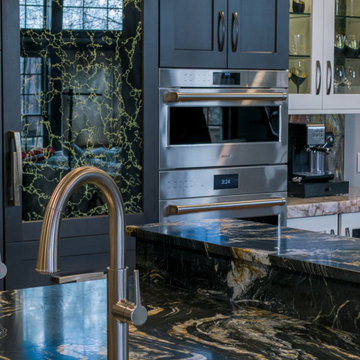
The existing kitchen wasn’t cutting it anymore. The homeowners designed and built this home about 20 years ago, but since then, their taste and needs changed. The outdated finishes felt outdated. There weren’t enough work areas. Some counterspace stations were just awkward due to the layout. Adjoining spaces around the kitchen were also in need of an update, but it was decided that the kitchen would undergo a transformation first.
Design Objectives
-Rework the overall layout (kitchen, laundry and butler’s pantry) to have a better flow and utilize the space better
-Incorporate materials with wow and pizzazz to reflect the homeowner’s style
-Design large work areas for cooking with two or more people at a time
-Provide seating at an island in addition to table seating
-Update surrounding spaces since the kitchen is open to the rest of the home
Design Challenges:
-Include a vast array of cooking appliances while having enough of cabinet storage
-Adjacent rooms need to feel updated and flow with new Kitchen
-Having multiple focal points with different materials but not have the space feel like a hodge podge
-Provide different task, accent and overall lighting to brighten up space
Design Solutions:
-The homeowner loves to cook and wanted to maximize her abilities. We incorporated a 48” rangetop with a griddle, a single oven, steam oven, microwave drawer and 15” induction cooktop next to a 48” Galley Ideal Workstation with two faucets. In order to have room for all of these appliances, the floor plan needed to accommodate more cabinetry. Both dining room entrances were closed off and the laundry room entrance were moved to the opposite end of the wall to allow two long walls for additional cabinets.
-The existing round columns throughout the first floor were outdated. To keep the architectural element of the columns, we wrapped the new columns to have a square shape with a flat panel on all four sides. Then, we painted them black (to tie in with the kitchen tops and curved hood surround) and added simple crown molding. For the flow of the space, closing up the odd corner that connected the laundry and dining room and relocating both room entrances allowed the space to actually feel larger and more continuous. --Adding the same square columns to the main dining room entrance, by the front door, also tied in the front of the house with the kitchen.
-The homeowner loves unique and bold materials. The main focal point of the kitchen is definitely the custom metal hood that incorporates two finishes and is set on a Lumix quartzite full-high back and side splashes. To make this area even more pronounced, a hearth-like drywall arch encloses the space. Once your eye moves off the hood, you start to notice the mirrored refrigerator panels, high gloss island cabinets, mirrored metal backsplash tile, delicate pendant island lights and the stunning island countertop material! There is a good mix of materials that make every space shine. The blacks, golds and pewter finishes help tie everything together.
-Lighting in a large kitchen is important. This space, besides getting a lot of natural light, needed lots of additional lighting due to the dark finishes. For overall lighting we have plenty of can lights in addition to lighting at the tops of the wall cabinets (that shine on the ceiling), undercabinet task lighting to make the tops sparkle and provide abundant lighting while prepping, pendant accent lighting over the island and a fandolier to add a little sparkle over the pub table. Voila!

 Legendary Escapes Pools
This project began as a wilderness retreat for the homeowners at their rural estate. They already had a large outdoor area complete with a pond, and detached garage in the perfect location to tie into an outdoor entertaining area/kitchen for the swimming pool. The homeowners were hoping that the design team at Legendary Escapes could create something magical for their small grandchildren, and for the grownups to enjoy for summertime relaxation.
When the discussion turned to themes, the cartoon SpongeBob came up, and our team found a direction to go, either to the homeowners delight, possibly mixed with a bit of apprehension at the thought of a cartoony theme as a result. We promised subtle surprise and delight - and the homeowner decided to let the team go with their vision. The pool is a very abundant sized swimming pool, much larger than the average residential swimming pool. The sunledge was also made larger after the pool layout, providing even more space for chairs and play area for small children.
The waterfall/slide combination also features a large grotto - themed and decorated with elements that remind visitors to the space of the lessons and themes of the cartoon. The castle is solid, carved concrete - mixed and sculpted on site and hand placed. As the waterfall began to take shape, the outside was created as a sand castle, providing the perfect whimsical backdrop for the slide, and accents including a pair of flipper outfitted legs of what we can only think is mermaid man.
One of the biggest surprises on this project came when Al found an old wooden boat at an auction, which he bought, took back to the job and cut it in half - creating the tail end of a boating incident, much like SpongeBob would have had when he missed the direction of the curve sign while out boating. (The joke in the show is that he can't ever get his drivers license because he doesn't know how to steer.) The other end of the boat became a vertical storage space for firewood or other pool side needs. The two parts of the boat became anchor pieces for what became the "wharf wall" which is the perfect area to lead people into the swimming pool retreat.
The pool has three different entertaining patio levels, including the lower wharf level, swim up bar and raised concrete counter at the deep end of the pool. The middle section of patio is perfect for relaxing and watching kids play in the pool with the deck jets and sun ledge, and the upper area is adjacent to the outdoor kitchen area, also designed and created out of concrete (carved timbers) as the cabinetry and under bar areas.
The pool was completed with ecoFinish on the sun ledge, interior of the spa, grotto and the slide. The main swimming area of the pool was vinyl liner, constructed in the special hybrid way of the team.
With the project complete, the homeowners and family thoroughly enjoyed their backyard retreat. Any hesitation at the initial theme ideas were fully appreciated as they developed along the way, with the final project a subtle blend of function and whimsy, meeting everything that they could have asked for in a backyard entertaining retreat. Their advice is to just trust Al and the team through the process, because the results will be more than you would ever hope for. If our team can help you create a backyard or custom retreat, which includes a pool and plenty of outdoor entertaining options to surprise and delight you and your family, please reach out to start your design discussions.
Find the right local pro for your project
 Drury Design
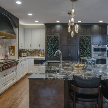
The existing kitchen wasn’t cutting it anymore. The homeowners designed and built this home about 20 years ago, but since then, their taste and needs changed. The outdated finishes felt outdated. There weren’t enough work areas. Some counterspace stations were just awkward due to the layout. Adjoining spaces around the kitchen were also in need of an update, but it was decided that the kitchen would undergo a transformation first.
Design Objectives
-Rework the overall layout (kitchen, laundry and butler’s pantry) to have a better flow and utilize the space better
-Incorporate materials with wow and pizzazz to reflect the homeowner’s style
-Design large work areas for cooking with two or more people at a time
-Provide seating at an island in addition to table seating
-Update surrounding spaces since the kitchen is open to the rest of the home
Design Challenges:
-Include a vast array of cooking appliances while having enough of cabinet storage
-Adjacent rooms need to feel updated and flow with new Kitchen
-Having multiple focal points with different materials but not have the space feel like a hodge podge
-Provide different task, accent and overall lighting to brighten up space
Design Solutions:
-The homeowner loves to cook and wanted to maximize her abilities. We incorporated a 48” rangetop with a griddle, a single oven, steam oven, microwave drawer and 15” induction cooktop next to a 48” Galley Ideal Workstation with two faucets. In order to have room for all of these appliances, the floor plan needed to accommodate more cabinetry. Both dining room entrances were closed off and the laundry room entrance were moved to the opposite end of the wall to allow two long walls for additional cabinets.
-The existing round columns throughout the first floor were outdated. To keep the architectural element of the columns, we wrapped the new columns to have a square shape with a flat panel on all four sides. Then, we painted them black (to tie in with the kitchen tops and curved hood surround) and added simple crown molding. For the flow of the space, closing up the odd corner that connected the laundry and dining room and relocating both room entrances allowed the space to actually feel larger and more continuous. --Adding the same square columns to the main dining room entrance, by the front door, also tied in the front of the house with the kitchen.
-The homeowner loves unique and bold materials. The main focal point of the kitchen is definitely the custom metal hood that incorporates two finishes and is set on a Lumix quartzite full-high back and side splashes. To make this area even more pronounced, a hearth-like drywall arch encloses the space. Once your eye moves off the hood, you start to notice the mirrored refrigerator panels, high gloss island cabinets, mirrored metal backsplash tile, delicate pendant island lights and the stunning island countertop material! There is a good mix of materials that make every space shine. The blacks, golds and pewter finishes help tie everything together.
-Lighting in a large kitchen is important. This space, besides getting a lot of natural light, needed lots of additional lighting due to the dark finishes. For overall lighting we have plenty of can lights in addition to lighting at the tops of the wall cabinets (that shine on the ceiling), undercabinet task lighting to make the tops sparkle and provide abundant lighting while prepping, pendant accent lighting over the island and a fandolier to add a little sparkle over the pub table. Voila!
 Drury Design
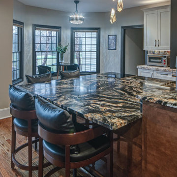
The existing kitchen wasn’t cutting it anymore. The homeowners designed and built this home about 20 years ago, but since then, their taste and needs changed. The outdated finishes felt outdated. There weren’t enough work areas. Some counterspace stations were just awkward due to the layout. Adjoining spaces around the kitchen were also in need of an update, but it was decided that the kitchen would undergo a transformation first.
Design Objectives
-Rework the overall layout (kitchen, laundry and butler’s pantry) to have a better flow and utilize the space better
-Incorporate materials with wow and pizzazz to reflect the homeowner’s style
-Design large work areas for cooking with two or more people at a time
-Provide seating at an island in addition to table seating
-Update surrounding spaces since the kitchen is open to the rest of the home
Design Challenges:
-Include a vast array of cooking appliances while having enough of cabinet storage
-Adjacent rooms need to feel updated and flow with new Kitchen
-Having multiple focal points with different materials but not have the space feel like a hodge podge
-Provide different task, accent and overall lighting to brighten up space
Design Solutions:
-The homeowner loves to cook and wanted to maximize her abilities. We incorporated a 48” rangetop with a griddle, a single oven, steam oven, microwave drawer and 15” induction cooktop next to a 48” Galley Ideal Workstation with two faucets. In order to have room for all of these appliances, the floor plan needed to accommodate more cabinetry. Both dining room entrances were closed off and the laundry room entrance were moved to the opposite end of the wall to allow two long walls for additional cabinets.
-The existing round columns throughout the first floor were outdated. To keep the architectural element of the columns, we wrapped the new columns to have a square shape with a flat panel on all four sides. Then, we painted them black (to tie in with the kitchen tops and curved hood surround) and added simple crown molding. For the flow of the space, closing up the odd corner that connected the laundry and dining room and relocating both room entrances allowed the space to actually feel larger and more continuous. --Adding the same square columns to the main dining room entrance, by the front door, also tied in the front of the house with the kitchen.
-The homeowner loves unique and bold materials. The main focal point of the kitchen is definitely the custom metal hood that incorporates two finishes and is set on a Lumix quartzite full-high back and side splashes. To make this area even more pronounced, a hearth-like drywall arch encloses the space. Once your eye moves off the hood, you start to notice the mirrored refrigerator panels, high gloss island cabinets, mirrored metal backsplash tile, delicate pendant island lights and the stunning island countertop material! There is a good mix of materials that make every space shine. The blacks, golds and pewter finishes help tie everything together.
-Lighting in a large kitchen is important. This space, besides getting a lot of natural light, needed lots of additional lighting due to the dark finishes. For overall lighting we have plenty of can lights in addition to lighting at the tops of the wall cabinets (that shine on the ceiling), undercabinet task lighting to make the tops sparkle and provide abundant lighting while prepping, pendant accent lighting over the island and a fandolier to add a little sparkle over the pub table. Voila!
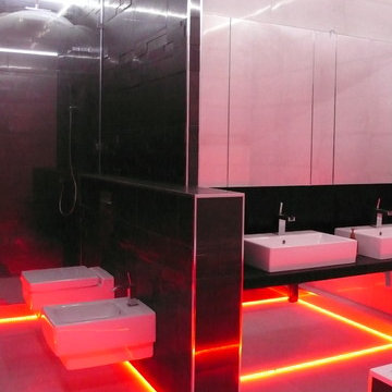


 CairnsCraft Design & Remodel
Great spacious bathroom with lot of amenities.
Photographer: Jon Upson
Large elegant master beige tile and porcelain tile drop-in bathtub photo in San Diego with an undermount sink, raised-panel cabinets, medium tone wood cabinets, granite countertops, beige walls and a two-piece toilet
Large elegant master beige tile and porcelain tile drop-in bathtub photo in San Diego with an undermount sink, raised-panel cabinets, medium tone wood cabinets, granite countertops, beige walls and a two-piece toilet
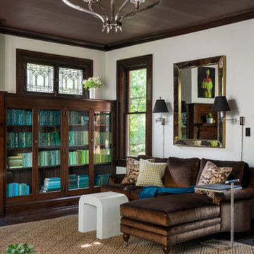
Sponsored
Columbus, OH

Wannemacher Interiors
Customized Award-Winning Interior Design Solutions in Franklin Cnty OH
 Drury Design
The existing kitchen wasn’t cutting it anymore. The homeowners designed and built this home about 20 years ago, but since then, their taste and needs changed. The outdated finishes felt outdated. There weren’t enough work areas. Some counterspace stations were just awkward due to the layout. Adjoining spaces around the kitchen were also in need of an update, but it was decided that the kitchen would undergo a transformation first.
Design Objectives
-Rework the overall layout (kitchen, laundry and butler’s pantry) to have a better flow and utilize the space better
-Incorporate materials with wow and pizzazz to reflect the homeowner’s style
-Design large work areas for cooking with two or more people at a time
-Provide seating at an island in addition to table seating
-Update surrounding spaces since the kitchen is open to the rest of the home
Design Challenges:
-Include a vast array of cooking appliances while having enough of cabinet storage
-Adjacent rooms need to feel updated and flow with new Kitchen
-Having multiple focal points with different materials but not have the space feel like a hodge podge
-Provide different task, accent and overall lighting to brighten up space
Design Solutions:
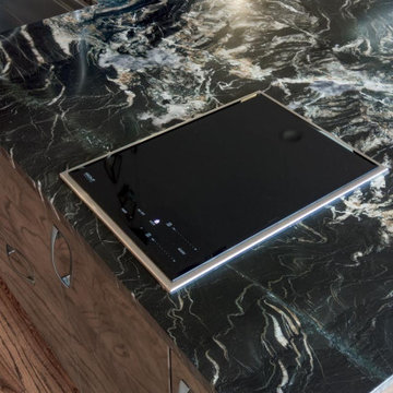
-The homeowner loves to cook and wanted to maximize her abilities. We incorporated a 48” rangetop with a griddle, a single oven, steam oven, microwave drawer and 15” induction cooktop next to a 48” Galley Ideal Workstation with two faucets. In order to have room for all of these appliances, the floor plan needed to accommodate more cabinetry. Both dining room entrances were closed off and the laundry room entrance were moved to the opposite end of the wall to allow two long walls for additional cabinets.
-The existing round columns throughout the first floor were outdated. To keep the architectural element of the columns, we wrapped the new columns to have a square shape with a flat panel on all four sides. Then, we painted them black (to tie in with the kitchen tops and curved hood surround) and added simple crown molding. For the flow of the space, closing up the odd corner that connected the laundry and dining room and relocating both room entrances allowed the space to actually feel larger and more continuous. --Adding the same square columns to the main dining room entrance, by the front door, also tied in the front of the house with the kitchen.
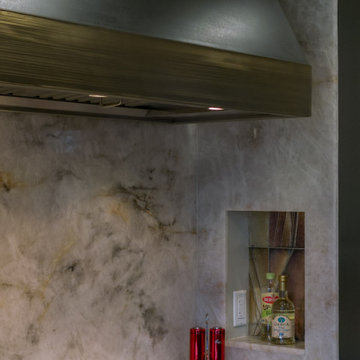
-The homeowner loves unique and bold materials. The main focal point of the kitchen is definitely the custom metal hood that incorporates two finishes and is set on a Lumix quartzite full-high back and side splashes. To make this area even more pronounced, a hearth-like drywall arch encloses the space. Once your eye moves off the hood, you start to notice the mirrored refrigerator panels, high gloss island cabinets, mirrored metal backsplash tile, delicate pendant island lights and the stunning island countertop material! There is a good mix of materials that make every space shine. The blacks, golds and pewter finishes help tie everything together.
-Lighting in a large kitchen is important. This space, besides getting a lot of natural light, needed lots of additional lighting due to the dark finishes. For overall lighting we have plenty of can lights in addition to lighting at the tops of the wall cabinets (that shine on the ceiling), undercabinet task lighting to make the tops sparkle and provide abundant lighting while prepping, pendant accent lighting over the island and a fandolier to add a little sparkle over the pub table. Voila!
 Drury Design
The existing kitchen wasn’t cutting it anymore. The homeowners designed and built this home about 20 years ago, but since then, their taste and needs changed. The outdated finishes felt outdated. There weren’t enough work areas. Some counterspace stations were just awkward due to the layout. Adjoining spaces around the kitchen were also in need of an update, but it was decided that the kitchen would undergo a transformation first.
Design Objectives
-Rework the overall layout (kitchen, laundry and butler’s pantry) to have a better flow and utilize the space better
-Incorporate materials with wow and pizzazz to reflect the homeowner’s style
-Design large work areas for cooking with two or more people at a time
-Provide seating at an island in addition to table seating
-Update surrounding spaces since the kitchen is open to the rest of the home
Design Challenges:
-Include a vast array of cooking appliances while having enough of cabinet storage
-Adjacent rooms need to feel updated and flow with new Kitchen
-Having multiple focal points with different materials but not have the space feel like a hodge podge
-Provide different task, accent and overall lighting to brighten up space
Design Solutions:
-The homeowner loves to cook and wanted to maximize her abilities. We incorporated a 48” rangetop with a griddle, a single oven, steam oven, microwave drawer and 15” induction cooktop next to a 48” Galley Ideal Workstation with two faucets. In order to have room for all of these appliances, the floor plan needed to accommodate more cabinetry. Both dining room entrances were closed off and the laundry room entrance were moved to the opposite end of the wall to allow two long walls for additional cabinets.
-The existing round columns throughout the first floor were outdated. To keep the architectural element of the columns, we wrapped the new columns to have a square shape with a flat panel on all four sides. Then, we painted them black (to tie in with the kitchen tops and curved hood surround) and added simple crown molding. For the flow of the space, closing up the odd corner that connected the laundry and dining room and relocating both room entrances allowed the space to actually feel larger and more continuous. --Adding the same square columns to the main dining room entrance, by the front door, also tied in the front of the house with the kitchen.
-The homeowner loves unique and bold materials. The main focal point of the kitchen is definitely the custom metal hood that incorporates two finishes and is set on a Lumix quartzite full-high back and side splashes. To make this area even more pronounced, a hearth-like drywall arch encloses the space. Once your eye moves off the hood, you start to notice the mirrored refrigerator panels, high gloss island cabinets, mirrored metal backsplash tile, delicate pendant island lights and the stunning island countertop material! There is a good mix of materials that make every space shine. The blacks, golds and pewter finishes help tie everything together.
-Lighting in a large kitchen is important. This space, besides getting a lot of natural light, needed lots of additional lighting due to the dark finishes. For overall lighting we have plenty of can lights in addition to lighting at the tops of the wall cabinets (that shine on the ceiling), undercabinet task lighting to make the tops sparkle and provide abundant lighting while prepping, pendant accent lighting over the island and a fandolier to add a little sparkle over the pub table. Voila!
 Maria Blogs
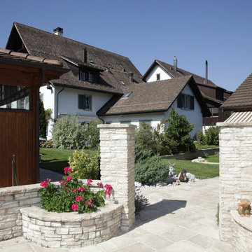
It’s always an excellent idea to renovate some corners in your house if you are looking to sell. It is crucial for you to remember to ‘sell it right,’ which means doing the upgrades and renovations accurately for your homebuyer. Some of the best home renovations — for instance, an upgraded kitchen, remodeled bathroom, or a new deck — can get expensive. This is why it is important to know what kind of return you might expect before you think of taking on a remodeling project.
Top Home Renovations in 2021
If you have smartly budgeted for major remodeling projects, here are some of the upgrades that will immediately add more value to your homes:
Kitchen Remodel
People can go wild in kitchen renovations, but it’s not always required. A kitchen remodeling, if done the right way, is certain to add more value to your home. You will love an even higher return if you remodel a kitchen with traditional designs and builds. This will include replacing your cabinets, refrigerator, stove, flooring, and even sinks and faucets.
Nowadays, a kitchen’s functionality and convenience are becoming more and more important. For instance, lowered light switches, cabinets, and racks can make it simpler for an elderly person or someone with a disability to explore the kitchen if they use a wheelchair. Cabinets with a hydraulic system can make it possible for a homeowner to move their position, ensuring it’s available within your reach no matter your mobility level.
Improving Your Outdoor Appeal
The outdoor appeal is basically the first impression of your home. That old front door, cracked driveway won’t help potential buyers feel an eternal connection with your home. The outdoor appeal can be improved with the application of new paint, gardening, or attractive landscaping. Hence, it is necessary for you to consider beforehand what improvements you are going to make, what you can do yourself, and what you need to outsource.
Begin where your property meets the main street. Are the walls well maintained and colored? Do driveways need to be redone or just a quick water blast to clean them? Do you need to paint your door or close the cracks on them or add a couple of planter pots to give more warmth to the entrance?
More expensive things include painting your house, adding a deck, or fencing your property. Before taking these costly projects, do seek professional advice about whether this will increase your property’s value.
Including Square Footage to Your Home
As mentioned above, expensive additions in remodeling include house extensions and reconfigurations of old rooms. This may lead to a larger ROI, so they’re worth assessing. You may want to add a bedroom, build a home office corner, make the living area by making it more spacious or add another bathroom. These extensions all add value to your home, but you’ll want to guarantee that you can get your money back once you sell the property.
Big projects are more expensive. Homeowners may want to think of applying for a home improvement loan to help them finance the project or ensure they have financial assistance in case the cost goes over the board.
The Bottom Line
Renovating your home not only adds to your excitement but can also increase your home’s value over time, as well.
If you live in an urban area, your listing might be competing with other upgraded homes to grab the buyers’ attention. When you refinance your house, for example, remodeling will be considered when a property appraiser studies your home’s current market value. Higher home value means you’ll get more equity and a lower loan-to-value ratio. Moreover, you might even be able to cancel personal mortgage insurance payments earlier than expected.
When you decide to sell your home, buyers will expect to see a clean, attractive home with modern updates that’s ready to move in.
 Drury Design
The existing kitchen wasn’t cutting it anymore. The homeowners designed and built this home about 20 years ago, but since then, their taste and needs changed. The outdated finishes felt outdated. There weren’t enough work areas. Some counterspace stations were just awkward due to the layout. Adjoining spaces around the kitchen were also in need of an update, but it was decided that the kitchen would undergo a transformation first.
Design Objectives
-Rework the overall layout (kitchen, laundry and butler’s pantry) to have a better flow and utilize the space better
-Incorporate materials with wow and pizzazz to reflect the homeowner’s style
-Design large work areas for cooking with two or more people at a time
-Provide seating at an island in addition to table seating
-Update surrounding spaces since the kitchen is open to the rest of the home
Design Challenges:
-Include a vast array of cooking appliances while having enough of cabinet storage
-Adjacent rooms need to feel updated and flow with new Kitchen
-Having multiple focal points with different materials but not have the space feel like a hodge podge
-Provide different task, accent and overall lighting to brighten up space
Design Solutions:
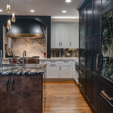
-The homeowner loves to cook and wanted to maximize her abilities. We incorporated a 48” rangetop with a griddle, a single oven, steam oven, microwave drawer and 15” induction cooktop next to a 48” Galley Ideal Workstation with two faucets. In order to have room for all of these appliances, the floor plan needed to accommodate more cabinetry. Both dining room entrances were closed off and the laundry room entrance were moved to the opposite end of the wall to allow two long walls for additional cabinets.
-The existing round columns throughout the first floor were outdated. To keep the architectural element of the columns, we wrapped the new columns to have a square shape with a flat panel on all four sides. Then, we painted them black (to tie in with the kitchen tops and curved hood surround) and added simple crown molding. For the flow of the space, closing up the odd corner that connected the laundry and dining room and relocating both room entrances allowed the space to actually feel larger and more continuous. --Adding the same square columns to the main dining room entrance, by the front door, also tied in the front of the house with the kitchen.
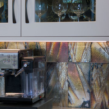
-The homeowner loves unique and bold materials. The main focal point of the kitchen is definitely the custom metal hood that incorporates two finishes and is set on a Lumix quartzite full-high back and side splashes. To make this area even more pronounced, a hearth-like drywall arch encloses the space. Once your eye moves off the hood, you start to notice the mirrored refrigerator panels, high gloss island cabinets, mirrored metal backsplash tile, delicate pendant island lights and the stunning island countertop material! There is a good mix of materials that make every space shine. The blacks, golds and pewter finishes help tie everything together.
-Lighting in a large kitchen is important. This space, besides getting a lot of natural light, needed lots of additional lighting due to the dark finishes. For overall lighting we have plenty of can lights in addition to lighting at the tops of the wall cabinets (that shine on the ceiling), undercabinet task lighting to make the tops sparkle and provide abundant lighting while prepping, pendant accent lighting over the island and a fandolier to add a little sparkle over the pub table. Voila!
 Drury Design
The existing kitchen wasn’t cutting it anymore. The homeowners designed and built this home about 20 years ago, but since then, their taste and needs changed. The outdated finishes felt outdated. There weren’t enough work areas. Some counterspace stations were just awkward due to the layout. Adjoining spaces around the kitchen were also in need of an update, but it was decided that the kitchen would undergo a transformation first.
Design Objectives
-Rework the overall layout (kitchen, laundry and butler’s pantry) to have a better flow and utilize the space better
-Incorporate materials with wow and pizzazz to reflect the homeowner’s style
-Design large work areas for cooking with two or more people at a time
-Provide seating at an island in addition to table seating
-Update surrounding spaces since the kitchen is open to the rest of the home
Design Challenges:
-Include a vast array of cooking appliances while having enough of cabinet storage
-Adjacent rooms need to feel updated and flow with new Kitchen
-Having multiple focal points with different materials but not have the space feel like a hodge podge
-Provide different task, accent and overall lighting to brighten up space
Design Solutions:
-The homeowner loves to cook and wanted to maximize her abilities. We incorporated a 48” rangetop with a griddle, a single oven, steam oven, microwave drawer and 15” induction cooktop next to a 48” Galley Ideal Workstation with two faucets. In order to have room for all of these appliances, the floor plan needed to accommodate more cabinetry. Both dining room entrances were closed off and the laundry room entrance were moved to the opposite end of the wall to allow two long walls for additional cabinets.
-The existing round columns throughout the first floor were outdated. To keep the architectural element of the columns, we wrapped the new columns to have a square shape with a flat panel on all four sides. Then, we painted them black (to tie in with the kitchen tops and curved hood surround) and added simple crown molding. For the flow of the space, closing up the odd corner that connected the laundry and dining room and relocating both room entrances allowed the space to actually feel larger and more continuous. --Adding the same square columns to the main dining room entrance, by the front door, also tied in the front of the house with the kitchen.
-The homeowner loves unique and bold materials. The main focal point of the kitchen is definitely the custom metal hood that incorporates two finishes and is set on a Lumix quartzite full-high back and side splashes. To make this area even more pronounced, a hearth-like drywall arch encloses the space. Once your eye moves off the hood, you start to notice the mirrored refrigerator panels, high gloss island cabinets, mirrored metal backsplash tile, delicate pendant island lights and the stunning island countertop material! There is a good mix of materials that make every space shine. The blacks, golds and pewter finishes help tie everything together.
-Lighting in a large kitchen is important. This space, besides getting a lot of natural light, needed lots of additional lighting due to the dark finishes. For overall lighting we have plenty of can lights in addition to lighting at the tops of the wall cabinets (that shine on the ceiling), undercabinet task lighting to make the tops sparkle and provide abundant lighting while prepping, pendant accent lighting over the island and a fandolier to add a little sparkle over the pub table. Voila!
 highland
Renovating a home can completely transform the way a space looks, feels, and functions, but successful improvements require thoughtful planning rather than rushing into expensive changes. These renovation tips and tricks house ideas can help homeowners organize projects, control costs, select practical materials, and create rooms that remain useful for years. Start by identifying what genuinely needs improvement, such as outdated finishes, poor lighting, inefficient storage, damaged surfaces, or an inconvenient layout. Create a realistic budget that includes materials, labor, permits where applicable, and a contingency amount for unexpected issues. Taking measurements, collecting inspiration, and deciding priorities before work begins can prevent unnecessary purchases and make the renovation process much easier to manage.
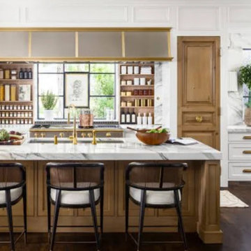
One of the most useful renovation tips and tricks house projects can benefit from is improving the layout before focusing on decoration. A beautiful room will still feel inconvenient if furniture blocks walkways or storage is insufficient. Consider how people actually use each space and whether doors, windows, lighting, electrical outlets, and storage are positioned effectively. In kitchens, for example, practical work zones and accessible storage can make everyday tasks easier. In bedrooms and living rooms, built-in shelving, multifunctional furniture, and organized storage can reduce clutter without making the space feel crowded. Whenever possible, repair or improve the existing structure before replacing everything, because thoughtful upgrades can deliver significant results without creating unnecessary renovation costs.
Choosing materials carefully is another important part of renovation tips and tricks house planning. Look beyond appearance and consider durability, maintenance, safety, and suitability for the room. High-moisture areas require materials that can handle regular exposure to water, while frequently used floors and work surfaces should be selected for durability. Neutral foundations can also provide flexibility because wall colors, textiles, artwork, and accessories can be changed later without another major renovation. Lighting deserves equal attention: combine general illumination with task and accent lighting to make rooms more functional and visually comfortable. Energy-efficient lighting, improved insulation, weather sealing, and efficient fixtures may also contribute to better long-term household performance.
Before beginning major work, divide the project into manageable stages. A useful approach is to complete structural or repair work first, followed by electrical or plumbing updates when necessary, then walls, flooring, cabinetry, fixtures, and finally decorative details. This order can reduce the chance of damaging newly finished surfaces. Keep a record of measurements, product specifications, receipts, and important project decisions so replacements or future repairs are easier. For specialized work involving structural changes, electrical systems, plumbing, gas, or other regulated areas, consult appropriately qualified professionals and follow local requirements. Among the most practical renovation tips and tricks house owners can follow is to avoid changing too many things simultaneously; completing priority areas systematically makes budgets, timelines, and quality easier to control.
Finally, focus on improvements that combine appearance with everyday usefulness. Fresh paint, updated hardware, better organization, improved lighting, refreshed flooring, and carefully selected fixtures can make a noticeable difference without requiring a complete transformation. Outdoor areas can also benefit from simple maintenance, improved lighting, seating, planting, or repaired surfaces that extend the usable living space. Before declaring the project finished, inspect each room for functionality, storage, lighting, ventilation, safety, and finishing quality. The best renovation tips and tricks house approach is not necessarily about spending more it is about making informed choices that solve real problems and create a home that feels comfortable, practical, and personal.
One of the most useful renovation tips and tricks house projects can benefit from is improving the layout before focusing on decoration. A beautiful room will still feel inconvenient if furniture blocks walkways or storage is insufficient. Consider how people actually use each space and whether doors, windows, lighting, electrical outlets, and storage are positioned effectively. In kitchens, for example, practical work zones and accessible storage can make everyday tasks easier. In bedrooms and living rooms, built-in shelving, multifunctional furniture, and organized storage can reduce clutter without making the space feel crowded. Whenever possible, repair or improve the existing structure before replacing everything, because thoughtful upgrades can deliver significant results without creating unnecessary renovation costs.
Choosing materials carefully is another important part of renovation tips and tricks house planning. Look beyond appearance and consider durability, maintenance, safety, and suitability for the room. High-moisture areas require materials that can handle regular exposure to water, while frequently used floors and work surfaces should be selected for durability. Neutral foundations can also provide flexibility because wall colors, textiles, artwork, and accessories can be changed later without another major renovation. Lighting deserves equal attention: combine general illumination with task and accent lighting to make rooms more functional and visually comfortable. Energy-efficient lighting, improved insulation, weather sealing, and efficient fixtures may also contribute to better long-term household performance.
Before beginning major work, divide the project into manageable stages. A useful approach is to complete structural or repair work first, followed by electrical or plumbing updates when necessary, then walls, flooring, cabinetry, fixtures, and finally decorative details. This order can reduce the chance of damaging newly finished surfaces. Keep a record of measurements, product specifications, receipts, and important project decisions so replacements or future repairs are easier. For specialized work involving structural changes, electrical systems, plumbing, gas, or other regulated areas, consult appropriately qualified professionals and follow local requirements. Among the most practical renovation tips and tricks house owners can follow is to avoid changing too many things simultaneously; completing priority areas systematically makes budgets, timelines, and quality easier to control.
Finally, focus on improvements that combine appearance with everyday usefulness. Fresh paint, updated hardware, better organization, improved lighting, refreshed flooring, and carefully selected fixtures can make a noticeable difference without requiring a complete transformation. Outdoor areas can also benefit from simple maintenance, improved lighting, seating, planting, or repaired surfaces that extend the usable living space. Before declaring the project finished, inspect each room for functionality, storage, lighting, ventilation, safety, and finishing quality. The best renovation tips and tricks house approach is not necessarily about spending more it is about making informed choices that solve real problems and create a home that feels comfortable, practical, and personal.
Sponsored
Columbus, OH

Hope Restoration & General Contracting
Columbus Design-Build, Kitchen & Bath Remodeling, Historic Renovations
 Drury Design
The existing kitchen wasn’t cutting it anymore. The homeowners designed and built this home about 20 years ago, but since then, their taste and needs changed. The outdated finishes felt outdated. There weren’t enough work areas. Some counterspace stations were just awkward due to the layout. Adjoining spaces around the kitchen were also in need of an update, but it was decided that the kitchen would undergo a transformation first.
Design Objectives
-Rework the overall layout (kitchen, laundry and butler’s pantry) to have a better flow and utilize the space better
-Incorporate materials with wow and pizzazz to reflect the homeowner’s style
-Design large work areas for cooking with two or more people at a time
-Provide seating at an island in addition to table seating
-Update surrounding spaces since the kitchen is open to the rest of the home
Design Challenges:
-Include a vast array of cooking appliances while having enough of cabinet storage
-Adjacent rooms need to feel updated and flow with new Kitchen
-Having multiple focal points with different materials but not have the space feel like a hodge podge
-Provide different task, accent and overall lighting to brighten up space
Design Solutions:
-The homeowner loves to cook and wanted to maximize her abilities. We incorporated a 48” rangetop with a griddle, a single oven, steam oven, microwave drawer and 15” induction cooktop next to a 48” Galley Ideal Workstation with two faucets. In order to have room for all of these appliances, the floor plan needed to accommodate more cabinetry. Both dining room entrances were closed off and the laundry room entrance were moved to the opposite end of the wall to allow two long walls for additional cabinets.
-The existing round columns throughout the first floor were outdated. To keep the architectural element of the columns, we wrapped the new columns to have a square shape with a flat panel on all four sides. Then, we painted them black (to tie in with the kitchen tops and curved hood surround) and added simple crown molding. For the flow of the space, closing up the odd corner that connected the laundry and dining room and relocating both room entrances allowed the space to actually feel larger and more continuous. --Adding the same square columns to the main dining room entrance, by the front door, also tied in the front of the house with the kitchen.
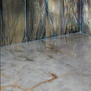
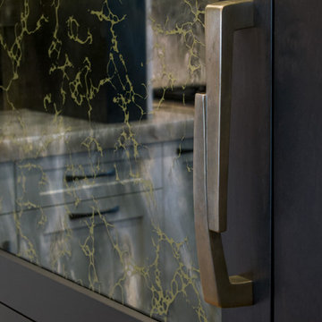
-The homeowner loves unique and bold materials. The main focal point of the kitchen is definitely the custom metal hood that incorporates two finishes and is set on a Lumix quartzite full-high back and side splashes. To make this area even more pronounced, a hearth-like drywall arch encloses the space. Once your eye moves off the hood, you start to notice the mirrored refrigerator panels, high gloss island cabinets, mirrored metal backsplash tile, delicate pendant island lights and the stunning island countertop material! There is a good mix of materials that make every space shine. The blacks, golds and pewter finishes help tie everything together.
-Lighting in a large kitchen is important. This space, besides getting a lot of natural light, needed lots of additional lighting due to the dark finishes. For overall lighting we have plenty of can lights in addition to lighting at the tops of the wall cabinets (that shine on the ceiling), undercabinet task lighting to make the tops sparkle and provide abundant lighting while prepping, pendant accent lighting over the island and a fandolier to add a little sparkle over the pub table. Voila!
 Drury Design
The existing kitchen wasn’t cutting it anymore. The homeowners designed and built this home about 20 years ago, but since then, their taste and needs changed. The outdated finishes felt outdated. There weren’t enough work areas. Some counterspace stations were just awkward due to the layout. Adjoining spaces around the kitchen were also in need of an update, but it was decided that the kitchen would undergo a transformation first.
Design Objectives
-Rework the overall layout (kitchen, laundry and butler’s pantry) to have a better flow and utilize the space better
-Incorporate materials with wow and pizzazz to reflect the homeowner’s style
-Design large work areas for cooking with two or more people at a time
-Provide seating at an island in addition to table seating
-Update surrounding spaces since the kitchen is open to the rest of the home
Design Challenges:
-Include a vast array of cooking appliances while having enough of cabinet storage
-Adjacent rooms need to feel updated and flow with new Kitchen
-Having multiple focal points with different materials but not have the space feel like a hodge podge
-Provide different task, accent and overall lighting to brighten up space
Design Solutions:
-The homeowner loves to cook and wanted to maximize her abilities. We incorporated a 48” rangetop with a griddle, a single oven, steam oven, microwave drawer and 15” induction cooktop next to a 48” Galley Ideal Workstation with two faucets. In order to have room for all of these appliances, the floor plan needed to accommodate more cabinetry. Both dining room entrances were closed off and the laundry room entrance were moved to the opposite end of the wall to allow two long walls for additional cabinets.
-The existing round columns throughout the first floor were outdated. To keep the architectural element of the columns, we wrapped the new columns to have a square shape with a flat panel on all four sides. Then, we painted them black (to tie in with the kitchen tops and curved hood surround) and added simple crown molding. For the flow of the space, closing up the odd corner that connected the laundry and dining room and relocating both room entrances allowed the space to actually feel larger and more continuous. --Adding the same square columns to the main dining room entrance, by the front door, also tied in the front of the house with the kitchen.
-The homeowner loves unique and bold materials. The main focal point of the kitchen is definitely the custom metal hood that incorporates two finishes and is set on a Lumix quartzite full-high back and side splashes. To make this area even more pronounced, a hearth-like drywall arch encloses the space. Once your eye moves off the hood, you start to notice the mirrored refrigerator panels, high gloss island cabinets, mirrored metal backsplash tile, delicate pendant island lights and the stunning island countertop material! There is a good mix of materials that make every space shine. The blacks, golds and pewter finishes help tie everything together.
-Lighting in a large kitchen is important. This space, besides getting a lot of natural light, needed lots of additional lighting due to the dark finishes. For overall lighting we have plenty of can lights in addition to lighting at the tops of the wall cabinets (that shine on the ceiling), undercabinet task lighting to make the tops sparkle and provide abundant lighting while prepping, pendant accent lighting over the island and a fandolier to add a little sparkle over the pub table. Voila!

 Lindsey Markel
Photo By: Lindsey Neumann
Cabinetry; Dura Supreme, Camden door style, Maple, Natural, Counters; Zodiaq Quartz, Nutmeg, Sink; Blanco Precision, Faucet; Hansgrohe Focus 2-spray, Tile; Gendai Natural, Color Sanna Natural, Hardware; Top Knobs, Hood; Broan Elite
 Azenco Outdoor
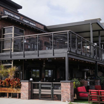
The warmer season, upcoming Super Bowl Sunday, and a raging pandemic. These were the problems plaguing the World of Beer Bar in Tampa Bay, FL, when they got in touch with us for an outdoor bar pergola solution.
Outdoor Project
They wanted to entertain massive crowds of people and watch parties, but the guests could be limited to an outdoor seating space due to the area’s pandemic restrictions. The solution for the restaurant patio cover was the louvered roof system.
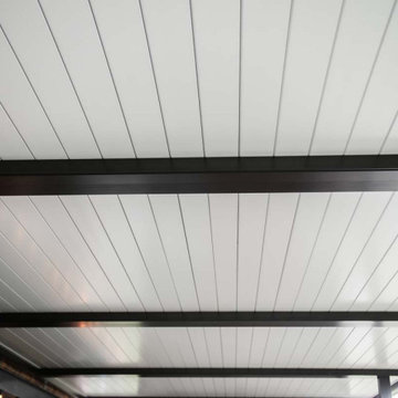
The World of Beer Bar decided on a modern pergola with an automated louvered roof to create an outside terrace where their customers can enjoy Super Bowl while maintaining the government’s SOPs due to the pandemic. They loved our R-Blade pergola as it offered a covered outdoor space where they could receive and entertain their guests.
They wanted the industrial patio cover installed on their outdoor terrace to offer rain protection to their customers. But they also wanted a part of the terrace to be uncovered so that their customers can enjoy the beautiful day outdoors.
R-Blade pergola design with the louvered system was the perfect solution for this beer bar’s outdoor space.
Product Choice
Outdoor Terrace - World Of Beer Bar and Kitchen - covered with a louvered roof
Product 4 Pergolas
Model R-BLADE louvered roof
Type Attached to the wall
Size 52’ x 22’ projection – 15’ high
Options Screens
Color Grey Bronze / White louvers
Benefits Stunning 2-story patio
The challenges of this outdoor bar pergola project
Working on this outdoor bar pergola while keeping the pandemic restriction.
4 louvered roofs opening altogether as well as independently
outdoor bar pergola louvered roof with better sealing and less chance of leaks
4 louvered roof that open and close independently - outdoor bar pergola
This industrial patio cover for the outdoor terrace consists of 4 louvered roofs mounted to the bar’s wall. Additionally, the client wanted these roofs to open and close independently so that their customers can enjoy a nice beer and enjoy the Super Bowl watch parties outside when the weather’s good.
Automated screens for wind and rain protection
The R-Blade bioclimatic louvered roof installed at the outdoor terrace comes with outdoor screens, a rain sensor that prompts the pergola to close automatically when it detects rain. Moreover, the outdoor bar pergola has a wind sensor for automatic opening whenever it detects a strong wind force.
While offering the perfect ambiance to this convivial sports bar, it shelters the customers from winds during watch parties and gatherings.
Moreover, our modern louvered roof system is complemented by Azenco’s well-engineered invisible gutter system to drain the rainwater immediately, ensuring that the space under the pergola remains dry.
Grey bronze structure to match the bar’s overall look
We installed grey bronze structures that go very well with the sports bar’s overall look and ambiance. They also asked for white louvers to perfectly contrast with the grey bronze structures giving the outdoor bar pergola a more sophisticated yet friendly vibe.
The pergolas were designed to perfectly blend with the bar’s exterior, offering the perfect place for beer and sports enthusiasts to connect over their favorite teams in the Super Bowl.
Outdoor bar pergola features and Azenco’s solutions
As a result, we created an amazing restaurant patio design for the World of Beer Bar to entertain their guests outside even during the pandemic restrictions.
The louvered system was designed to blend with the sports bar’s look, so the structures were attached to the outdoor wall and crafted in grey bronze while the louvers were white.
Before the renovation, it was just an uncovered terrace on the second story of the patio. But now it’s the perfect outdoor sitting area for customers who come to enjoy the outdoors and watch Super Bowl. The elegant-looking louvers protect the customers from rain or the sun, while the uncovered part gives guests the perfect outdoor experience.
Not to mention that Azenco successfully installed the louvered roof before the Super Bowl 2021 started as the client needed to arrange an outdoor terrace to receive the guests.
Turnaround time
Manufacturing: Custom manufactured adjustable white louvered roof with grey bronze structure. Delivery in 4 weeks.
Mounting On Site: 4 days deal with specific timing and scheduling to ensure that the mounting doesn’t interfere with opening hours.
Sponsored
Columbus, OH
Wannemacher Interiors
Customized Award-Winning Interior Design Solutions in Franklin Cnty OH
 Azenco Outdoor
The warmer season, upcoming Super Bowl Sunday, and a raging pandemic. These were the problems plaguing the World of Beer Bar in Tampa Bay, FL, when they got in touch with us for an outdoor bar pergola solution.
Outdoor Project
They wanted to entertain massive crowds of people and watch parties, but the guests could be limited to an outdoor seating space due to the area’s pandemic restrictions. The solution for the restaurant patio cover was the louvered roof system.
The World of Beer Bar decided on a modern pergola with an automated louvered roof to create an outside terrace where their customers can enjoy Super Bowl while maintaining the government’s SOPs due to the pandemic. They loved our R-Blade pergola as it offered a covered outdoor space where they could receive and entertain their guests.
They wanted the industrial patio cover installed on their outdoor terrace to offer rain protection to their customers. But they also wanted a part of the terrace to be uncovered so that their customers can enjoy the beautiful day outdoors.
R-Blade pergola design with the louvered system was the perfect solution for this beer bar’s outdoor space.
Product Choice
Outdoor Terrace - World Of Beer Bar and Kitchen - covered with a louvered roof
Product 4 Pergolas
Model R-BLADE louvered roof
Type Attached to the wall
Size 52’ x 22’ projection – 15’ high
Options Screens
Color Grey Bronze / White louvers
Benefits Stunning 2-story patio
The challenges of this outdoor bar pergola project
Working on this outdoor bar pergola while keeping the pandemic restriction.
4 louvered roofs opening altogether as well as independently
outdoor bar pergola louvered roof with better sealing and less chance of leaks
4 louvered roof that open and close independently - outdoor bar pergola
This industrial patio cover for the outdoor terrace consists of 4 louvered roofs mounted to the bar’s wall. Additionally, the client wanted these roofs to open and close independently so that their customers can enjoy a nice beer and enjoy the Super Bowl watch parties outside when the weather’s good.
Automated screens for wind and rain protection
The R-Blade bioclimatic louvered roof installed at the outdoor terrace comes with outdoor screens, a rain sensor that prompts the pergola to close automatically when it detects rain. Moreover, the outdoor bar pergola has a wind sensor for automatic opening whenever it detects a strong wind force.
While offering the perfect ambiance to this convivial sports bar, it shelters the customers from winds during watch parties and gatherings.
Moreover, our modern louvered roof system is complemented by Azenco’s well-engineered invisible gutter system to drain the rainwater immediately, ensuring that the space under the pergola remains dry.
Grey bronze structure to match the bar’s overall look
We installed grey bronze structures that go very well with the sports bar’s overall look and ambiance. They also asked for white louvers to perfectly contrast with the grey bronze structures giving the outdoor bar pergola a more sophisticated yet friendly vibe.
The pergolas were designed to perfectly blend with the bar’s exterior, offering the perfect place for beer and sports enthusiasts to connect over their favorite teams in the Super Bowl.
Outdoor bar pergola features and Azenco’s solutions
As a result, we created an amazing restaurant patio design for the World of Beer Bar to entertain their guests outside even during the pandemic restrictions.
The louvered system was designed to blend with the sports bar’s look, so the structures were attached to the outdoor wall and crafted in grey bronze while the louvers were white.
Before the renovation, it was just an uncovered terrace on the second story of the patio. But now it’s the perfect outdoor sitting area for customers who come to enjoy the outdoors and watch Super Bowl. The elegant-looking louvers protect the customers from rain or the sun, while the uncovered part gives guests the perfect outdoor experience.
Not to mention that Azenco successfully installed the louvered roof before the Super Bowl 2021 started as the client needed to arrange an outdoor terrace to receive the guests.
Turnaround time
Manufacturing: Custom manufactured adjustable white louvered roof with grey bronze structure. Delivery in 4 weeks.
Mounting On Site: 4 days deal with specific timing and scheduling to ensure that the mounting doesn’t interfere with opening hours.
 julianhardacre
Top Tips for Selling a Home in 2016
Want to sell your house in 2016? It’s a great year to sell your home and if you go about it the right way you’ll get what it’s worth and maybe more.
Now I could write this post and do the usual “do this, “do that” type stuff but I wouldn’t be doing you any favors. Because unless you know your numbers and the value of your home, you could wind up leaving money on the table or even losing it.
So here you go.
If you want tips for selling your house in 2016, listen to me - a guy who has bought and sold hundreds of properties as a full-time professional Real Estate Investor. Before you repair anything or call a real estate agent…
...you have to know your numbers.
Tip #1: Know the After Repair Value (ARV) of Your Home
If you’re going to get the right amount of money for your house, you have to know the After Repair Value (ARV). Essentially this means that you should know what your home can sell for after it’s is 100% rehabbed.
If you have a house that you can sell for $120,000, you need to know that. If it will sell for $350,000, you need to know what you need to do to your house to get it there. At the same time, you don’t want to overdo it.
If you have a house that’s currently worth $100,000 as is and it can sell for $115,000 when it’s all fixed up, you may or may not want to put the money into a rehab job. If you put $10,000 in just to make an extra $5,000, it might not be worth the hassle.
So whatever you do, know what it’s worth now (as -is) and know what it’ll sell for afterward. If you want to find out how much your house is worth, there are plenty of agents out there who will give you comps (Comps is a term that is short for “Comparisons” that lets you determine an appraisal value for your home by comparing it to recently sold homes in your area that are similar to yours) or advice for free, so ask them.
So don’t over do it, but don’t be hesitant to put money into your house if it’ll yield a big payoff when you sell it.
TIP #2: Make Your Agent Work For You
After you determine your ARV and enlist a good agent to help you sell your home, It might be worthwhile to hop in their Escalade to drive around town and look at some high end houses in your area to see what kind of upgrades they have. And when you see a common theme, you’ll have a good idea as to what kind of upgrades you might want to do to be able to sell your house.
Granite? Concrete? Tile? Carpet? Wood floors?
It depends.
I don’t know your area or market so you have to do the research, ask your agent questions, and exercise wisdom. Every market is different and you don’t want to put money into an upgrade or rehab if it’s not the type of thing people in your area are looking for.
So talk to a competent agent, and even offer to pay them a bit more in commissions if they can sell your home for a higher price.
This is not a waste of money.
A good agent with a proven track record is worth every penny because they know exactly what needs to be done to sell your home for the most money.
Tip #3: Interior Improvements
So once you have an idea about what your home is worth, have a good agent, and have toured homes in your area to see what kind of upgrades homes in your area typically have, it's time to look at your interior to decide what you should and shouldn’t do to sell your house in 2016.
No matter what you do, you need to be wise about it. Maybe you live in non-traditional or funky house. That’s fine. Just go through 2 or 3 times with a notepad, write down the frustrations you have with it, and do what you need to do to make it functional, warm, beautiful, and inviting.
Interior must-haves:
1. Make sure your kitchen is functional.
2. Always have (or add) a 2nd bathroom: If you don’t have a second bathroom, build one. Sure it could cost you $5-$6k, but it could net you an additional $20k when you sell. No matter what you do, make sure there is a second bathroom. It’s a must.
1. Open floor plans are huge in 2016: If you don’t have one, first- make sure it’s right for your area, and if it is, create one. This might mean building or breaking down a wall, but it’ll pay off in the end.
2. Stage your house: Just do it. Staging your home means that you hire a home stager and/or an interior design consultant (like the lady on Love It or List It) to set up your home in the most inviting way possible and tell you everything you need to do to make it sell. You’ll pay some cash up front but staged homes are shown to sell for 6% to 10% higher according to realtor.org.
Tip #4: Exterior Improvements
Just like the interior, you have to make sure the exterior of your house looks appealing if you want to get the most value of your house in 2016.
Exterior must haves:
1. Add curb appeal: When people pull up to your house, most won’t even want to go inside or look at it unless it looks good from the curb. So make sure it looks gorgeous. Rake the leaves, plant some flowers, mow the lawn - make it inviting.
2. Make sure the picture on the MLS listing matches what your house currently looks like: People don’t want to look at a picture and pull up to your house, only to be disappointed.
3. Hire a professional photographer: This is crucial. It could mean the difference between someone viewing your house, or someone skipping it because the pictures look like a child took them. Hire a pro - it’s worth it. Ask me how I know.
4. Don’t paint your house diarrhea green or brown: This is just common sense. If you’re going to paint, use a neutral color. You don’t want to make your house unsellable because you chose an odd color or made a bad decision elsewhere.
Tip #5: Common Sense, Common Sense, Common Sense
No matter what you do or do not do, don’t make any hasty decisions. Ask your agent questions, look around, be observant, and don't do anything extreme. If you need to fix up your house to see a big profit, do it. If you have a modest budget and improvements won’t raise the value or your house (the ARV) anyways, don’t go crazy.
2016 is a great year to sell your house.
Do it right and do it wisely.
Cheers,
Nate
---
Nate Pyles is a long term Real Estate Investor who made it through the crash in 2008 and spends his week buying and selling houses for profit in the Boise, ID area. He runs House Flip Mentor, has 4 kids, a gorgeous wife, loves to fly, and even built his own Irish pub on his property.
 Lindsey Markel
Photo By: Lindsey Neumann
Cabinetry; Dura Supreme, Camden door style, Maple, Natural, Counters; Zodiaq Quartz, Nutmeg, Sink; Blanco Precision, Faucet; Hansgrohe Focus 2-spray, Tile; Gendai Natural, Color Sanna Natural, Hardware; Top Knobs, Hood; Broan Elite
41