
Search results for "People decide" in Home Design Ideas

 Story Homes
This is the story about a kitchen that was showing it’s age with white countertops and dark oak cabinets on a dark oak floor. It all worked once, but now the kitchen felt dark, cramped and dysfunctional. The owners were looking for a total kitchen transformation.
After a disastrous beginning with a contractor taking their money and vanishing into thin air, the owners were left with a completely gutted kitchen that consisted of only the walls. They hired Rick Jacobson to rescue them and restart the project.
The new kitchen design began with the idea of using Cobalt Blue as a primary color. The blue seen on many glassware pieces is Cobalt Blue, and it was decided to use it in the tile for the kitchen, as well as the pendant lights. Another goal was to make the kitchen brighter with an easier traffic flow, as well as completely updated cabinetry. And there were traffic patterns to improve, a refrigerator to move, and exhaust vents to reroute.
Rick Jacobson listened to the owners and worked to create the kitchen that the owners imagined. He began by thinking through the traffic flow patterns. He noted that the doorway from the dining room needed to be widened. He added rounded doorway headers to match the home’s existing décor.
He carefully thought through where the kitchen island should be, including how opening the oven doors would be in relation to people sitting at the kitchen island at a family gathering. Kitchen cabinet touches include off edge flat panel doors, soft close wooden drawers, and a spice cabinet with two slide-out racks. The new longer center island features a drawer microwave that opens and closes automatically with the push of a button. The center island also features two recycling bins and seating for four. Rick even thought of adding decorative elements to the existing half wall to make it look in line with the kitchen island. The kitchen’s black granite countertops offer an unusually appealing view: There are lots of interesting reflections throughout the kitchen.
Another of Rick’s touches is that all of the lights, including recessed ceiling lights, three cobalt blue pendant lights and below cabinet lights are on dimmers which work to balance daytime and nighttime lighting.
The under mounted stainless steel single sink is complemented with a gooseneck faucet. The stainless steel gas range is thin enough to allow for a wide drawer below for utensils, and the stainless steel vent hood is vented through the ceiling to outdoors, allowing additional storage space in the top cabinets. Double ovens with white doors are the perfect match to the cabinets, with a location that makes baking and roasting easier with the two large vertical storage for baking sheets and supplies nearby.
The result: A functional, open, bright and Cobalt blue kitchen.
 Tile Doctor Ltd
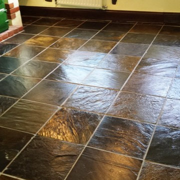
I recently made a trip down to South Molton, a small town which sits on the River Mole. The river, actually a tributary of the River Taw, gets its name from the two small towns it runs by, North Molton and South Molton. Anyway I digress, my client asked me to take a look at a Chinese Slate floor in her house, as it was in dire need of a good clean due to the original sealer having worn off over time allowing the dirt to become ingrained in the tile.
As this particular type of floor is naturally quite rough, I advised my client to have the Slate milled flat. This would not only make the floor easier to clean on a regular basis, but also it would reduce the hazard of people tripping over the exposed edges. However, the milling procedure is expensive due to the need to use a special grinding disc formed of diamond segments, which is then attached to a rotary machine and used on the stone. My client decided against this, instead opting for a thorough clean and seal. This would be the first time the floor had ever received a proper clean – it had not even been cleaned when the tilers first fitted it!
My choice of product for the cleaning was Tile Doctor Pro-Clean, a high alkaline cleaner which, along with Slate, is suitable for use on other natural stone floors such as Limestone, Granite and Travertine. The product, diluted with clean water, was applied evenly to the floor using a Polybrush, as well as a rotary machine fitted with a buffing pad. This also helped to remove any remaining old sealer although, as aforementioned, the vast majority of the old sealer had already worn away.
Following this, I cleaned the grout using Tile Doctor Grout Clean-Up and a long-handled stiff grout brush. Grout Clean-Up penetrates below the surface of the grout to lift out grout haze and general dirt. After completing the cleaning I rinsed the floor several times with clean water to remove any trace of cleaning product. The floor was then left to dry completely before sealing, as any moisture left over on the floor could have impacted on the sealer.
When I returned to seal the floor I opted to use Tile Doctor High Shine Sealer, which is suitable for use on textured natural stone floors, as well as textured ceramic, textured porcelain, and a range of others. Five coats of High Shine Sealer were applied, providing the floor with durable surface protection and a nice high-sheen finish. This dramatically improved the appearance of the floor to the point that it is hard to believe this is the first time it has been treated to a proper clean and seal!
Both myself and my client were very pleased with the results. Chinese Slate is one of the most beautiful and characterful types of stone for tiled floors, so it was very rewarding to be able to make such a difference here.

 Advance Design Studio, Ltd.
When Tom and Michelle Stien decided to remodel their kitchen, they chose Advance Design Studio to make it happen. They were looking for an innovative design that would open up an awkward wall, and we're hoping to remove some half walls that closed off their family room. "Of all the people we had come and give us quotes for our project, ADS/Scott, was the only one who came in with an idea right off the bat for what we could do. His knowledge of design and code was evident from the start," said the Stiens.
The new design increased the seating area with a large peninsula, and the cooking area was expanded to accommodate Tom's cooking skills. A warming drawer was incorporated beneath a nearly hidden microwave drawer, along with a clever pull out for increased pantry storage. A built in message board area was custom designed for kids art and family communication. Roll out trays grace every base cabinet for easy pull out storage and a single floating shelf ties the contemporary kitchen design together. Starlight quartz countertops create ease of clean up, and the look is finished off with sharp gray and white mosaic backsplash tiles.
The Stiens really liked a clean modern look, so the new crisp transitional kitchen design incorporated bright white shaker cabinetry from Medallion with gray and metal accents along with a modern feel. "Scott's presentation of what we could expect with ADS was clear and concise. He gave us a great deal of confidence in how the project would be handled".
Homeowners are frequently concerned about project budgets that get quickly get out of control. "Scott's quote was well thought out, organized and offered options based on our budget," said Michelle. "I was worried about the project budget changing as we went through the process, but they did a good job managing the situation and minimized change orders as much as possible."
When asked about their overall experience with their kitchen renovation he Stien's said; "Scott, Justin, Matt and Jason were great! They were all very friendly, personable, responsible and trustworthy. Advance Design definitely met and exceeded our expectations. Remodeling is a very challenging process to endure, but ADS minimized discomfort and inconvenience as much as possible and kept on schedule. The end result was well worth the investment in time and money."
Designer: Scott Christensen
Photographer: Joe Nowak
Find the right local pro for your project

 Samantha Smith
Buying term papers from academic writing services and freelance writers is becoming a popular deal. Therefore, former and current professors are entering this industry to write papers for money more and more often. Such services as CourseworkService.com are becoming popular among students all over the world. An interesting fact is that they hire not only former graduates but also out-of-work academics.
When professors find a compromise about cheating
Jennifer Sunseri, a former assistant professor, lost her job in 2009. She has been looking for a job for almost three years. At long last, she had abandoned all hope of finding a new job and started working as an academic writing service creating papers for college students.
Jenifer says, “I realize that it is legal, but highly unethical especially regarding the fact that I am a former professor. For me this is an equivalent of prostitution. But I have been living in a tight situation for years without an opportunity to visit a doctor or pay my bills. I am 53, and I have no kids to help me when I am out-of-work.”
She has been a tutor in Texas Tech since 1998, where she established a Slavic folklore course. Jenifer didn’t have any publications during her working years at Texas Tech, so when the time has come to apply for a venture, she realized that she has no chances and left. She moved to her sister and her mom and now she is living in her studio apartment with her two cats.
Sunseri was worried when she lost her job even though she has master’s degrees in Slavic linguistics and technical communications.
“I thought that my educator’s and writer’s skills will be useful,” she said. “However, I was shocked at the quantity of applications for an instructor at the local college, as well as for the office manager, or an adjunct at the local institution. Even an effort to apply for a substitute teacher failed. I cannot believe that those who have academic background, experience and a degree are in less demand than those have not.”
When Ph.D. and master’s degrees lose their magical power, people with academic background have no choice but to start their term paper writing career. Once professors become unemployed, one may say that they feel themselves like high school graduates looking for a part-time job. However, you will be surprised, but according to statistics sometimes those with high school or college diplomas are more welcome than people with higher education. The reason is that a lot of new job places in America were created at times of economic recovery and, therefore, they are low-paying and require specialists with lower skills. It turns to be that it is much easier to learn a less-educated worker and train him/her in a particular way suitable for a certain company or service than to teach a higher-educated worker all over again. In addition, higher educated job candidates are more selective about their choice.
How to become a ghostwriter if you have been punishing others for paper cheating
Jenifer was not fastidious. She was looking for a job that would correspond her skills and finally decided to try herself as an online editor. While searching for an editing job, she ran against term paper writing service. This company asked her to send examples of her works and complete a test task. She has been accepted as a ghostwriter.
In fact, term paper writing services gladly accept people with higher education and offer them to write papers of all kinds for money. Jenifer says that her first assignments for sale included a 5-page paper on public debt, 10-page paper on linguistics, and an editing work of someone else’s 20-page paper. All these assignments brought her about $150. Jenifer reports that it is possible to turn a useful penny by writing academic papers.
Jenifer realized that ghostwriting is a good source of income after she read an article about an anonymous academic writer who earned almost $70,000 a year writing papers for high school and college students.
“Currently this business becomes more and more popular. During finals and midterms, we have a lot of work to do since there are a lot of students ready to pay for a custom paper and submit it as their own,” he says. “It is no wonder that students use writing services. I have seen a lot of their writings, and I realize why they are so desperate about writing their assignments. Some of them are unable to compose a grocery list without additional help. They really need it. We help them pass a course, that’s all.”
Jenifer says that this work helped her be on form and develop her core skills like writing and researching all the time. She was unemployed for a long time and was afraid that her skills might become lower due to a lack of practice. However, at a writing company she never stops practicing. She claims that this is a hard work mostly because you have to be meet urgent deadlines.
The other challenge was a paper that she couldn’t complete once. The problem was not in a lack of competency, but in ethics. She discovered that it was an order for a student from her former place of work, Tech University. She says that she felt weird about completing this work and refused to write it.
“I became angry when I realized that I am going to serve a kid who is partying in Florida, while being a former faculty member of the university he is attending.”
Currently, Jenifer is working as a Russian translator. However, she is not abandoning academic writing industry even though she feels a little awkward about helping students to cheat. It is not that bad that unemployable professors have an opportunity to earn for living being ghostwriters even though it is not very ethical.
Ironically, a place of work like academic writing company that makes out-of-job educators feel that they are performing a crime assisting students in cheating seems to be the only place in the job market that values their experience in the sphere of education.
 Advance Design Studio, Ltd.
When Tom and Michelle Stien decided to remodel their kitchen, they chose Advance Design Studio to make it happen. They were looking for an innovative design that would open up an awkward wall, and we're hoping to remove some half walls that closed off their family room. "Of all the people we had come and give us quotes for our project, ADS/Scott, was the only one who came in with an idea right off the bat for what we could do. His knowledge of design and code was evident from the start," said the Stiens.
The new design increased the seating area with a large peninsula, and the cooking area was expanded to accommodate Tom's cooking skills. A warming drawer was incorporated beneath a nearly hidden microwave drawer, along with a clever pull out for increased pantry storage. A built in message board area was custom designed for kids art and family communication. Roll out trays grace every base cabinet for easy pull out storage and a single floating shelf ties the contemporary kitchen design together. Starlight quartz countertops create ease of clean up, and the look is finished off with sharp gray and white mosaic backsplash tiles.
The Stiens really liked a clean modern look, so the new crisp transitional kitchen design incorporated bright white shaker cabinetry from Medallion with gray and metal accents along with a modern feel. "Scott's presentation of what we could expect with ADS was clear and concise. He gave us a great deal of confidence in how the project would be handled".
Homeowners are frequently concerned about project budgets that get quickly get out of control. "Scott's quote was well thought out, organized and offered options based on our budget," said Michelle. "I was worried about the project budget changing as we went through the process, but they did a good job managing the situation and minimized change orders as much as possible."
When asked about their overall experience with their kitchen renovation he Stien's said; "Scott, Justin, Matt and Jason were great! They were all very friendly, personable, responsible and trustworthy. Advance Design definitely met and exceeded our expectations. Remodeling is a very challenging process to endure, but ADS minimized discomfort and inconvenience as much as possible and kept on schedule. The end result was well worth the investment in time and money."
Designer: Scott Christensen
Photographer: Joe Nowak

 River Valley Landscapes
The property is one of the original farm houses located on the main street of a small town. It has been in the family for many years and our client just inherited the property. They were trying to have balance of preserving the old while realizing modern day living has its benefits too. The house had a large addition added using mostly old style materials, but designed with function and modern day luxuries. Our goal was to carry that theme to the outside.
Our first problem we had to address was how to transition between the first floor elevation changes. The lower room was the husband’s office. He stated in the future he may have clients over and it would be nice to have an area to sit outside. The wife’s main concern was to renew the four corner garden. She also felt it was very important to be able to see it from the kitchen area. Finally there was an old wishing well stuck right outside the kitchen. They both felt it would be neat to be able to incorporate this in some how. They wanted a patio area with a built in grill to accommodate there family and friends. They also wanted to keep a large play area for the kids.
We were able to pull this off successfully. We addressed the first issue by having a small lower level flagstone area. This area is large enough for 1 to 2 people to sit comfortably. It also provides a transition from his office to the larger patio area. We installed a simple small gravel sitting area opposite of the main patio. This provides our client a secluded place to relax or do business. Mrs.... told me she is amazed how much her and her husband enjoys this area. It is so peaceful looking at the small creek over a glass of wine.
We built a natural limestone retaining wall to create the patio terrace. The stone was chosen to extend the houses architectural elements into the landscape. Irregular broken flagstone was used to give it a more casual feel. We installed three Serviceberries into the patio terrace to replace some trees that were taken down during the remodeling. She was very concern that they would block the view of the four corner garden. We new they were crucial to nestle in the terrace, so we placed them for a couple days for her to decide. Fortunately she agreed they not only kept the view open, but helped frame the garden.
The four corner garden was designed to be viewed from afar and experienced up close. We wanted the space to have some formal structure while keeping with the casual farm house feel. Another natural limestone retaining wall was created. This leveled the garden terrace and helped associate it with the rest of the property. The four corner garden is nestled into the existing woods edge. This provides three distinct experiences to entering the garden; a more formal from the driveway, an open feel from the lower lawn, and a more natural / casual experience from the wooded area. The Plymouth brown gravel was used for the center of the garden. This helped highlight the stone post that was found during construction. The gravel also brings the sense of sound into the garden space. Lamb’s ear was chosen as a fun way to get kids interest in horticulture.
The balance of using the new to create the old feel is what makes this project a success. The property has already hosted a local historical society event and won an award for its preservation efforts. When Mrs.... can’t find her husband, she knows he is either reading the newspaper by the grill or resting in the hammock along the wood’s path.
 TKS Design Group
Download our free ebook, Creating the Ideal Kitchen. DOWNLOAD NOW
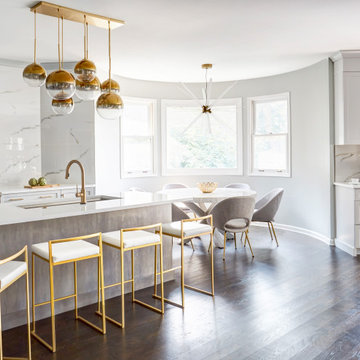
This client was referred to us from a past client. They are a busy 2-career household with young children and enjoy entertaining friends and family in their home. They have a beautiful open concept home but unfortunately the kitchen was not fitting for the rest of the home. They were not quite sure what to do with the space. We talked about trying to refresh it or do more of a minor remodel, but in the end they decided a full gut would get them to where they wanted to be.
One problem was there was no place for guests to hang out other than the large and awkward banquette area. The brick wall and tiled hood area were feeling a bit dated and tired. The space was just not functional for their lifestyle. There was no prep space near the cooktop and no landing area for items coming out of the ovens or refrigerator, plus a big dead zone in the center of the room.
Banquettes, like the one they previously had in the space, are great for small spaces, but when they get really large like this one, it makes getting in and out of the seating area awkward and uncomfortable. Plus, there was room for a large table, so we eliminated the awkward built in.
We started by removing the faux brick wall between the kitchen and back entry. We relocated the entry to the garage over a couple feet in order to get every last inch out of the new kitchen. We also made the decision to close up the primary window that faced the pretty ho hum brick wall of the neighbor’s house. There was plenty of light coming in from the seating area, so we just didn’t feel the window was adding much to the room.
Construction went smoothy. There was a bit of rework with electrical, flooring and HVAC, but in the end, we think it was well worth it.
The clients really wanted a sleek contemporary look, and we originally had planned for a full height slab backsplash, but due to it’s size, it was a budget buster. Instead, we got creative and settled on large format porcelain tiles that have a similar feel but were a fraction of the cost. We made sure the wall was plumb and level so that the fit and finish would mimic that of slab material.
The final space was quite a change. A large prep sink sits directly across from the new pro-style range with plenty additional prep space on the large island. The refrigerator and ovens now have miles of landing space, and a nice tight work triangle makes cooking a breeze.
Since we wanted a more contemporary feel, not many wall cabinets were included. Instead, we outfitted some of the drawers for dish storage with a peg system. Two large pantries flanking the refrigerator hold baking supplies and small appliances. Large drawers by the cooktop hold pots and pans, and an appliance garage tucked away to the left of the range hides away miscellaneous items. The large island also houses a microwave drawer and tons of storage, most of which is drawers offering maximum convenience.
The island now seats 5-6 people comfortably along with the new table in the seating area which can seat up to 8. Entertaining will be a breeze in this space. With such a clean backdrop, we knew we would need some drama with the lighting, so we chose two sets of staggered pendants, which we adjusted for the right visual balance above the island.
We also included a small coffee station to the right of the main kitchen, which helps keep the coffee clutter out of the kitchen proper. Two tones of complimentary gray are featured in this kitchen. The perimeter is a light gray that reads almost white. The island is a gray stain that adds some depth and interest with the visible wood texture. The countertops are clean white quartz, and the hardware, barstools and light fixtures add warm brass tones. I see lots of cooking and entertaining with family and friends in the near future in this bright and airy new space.
Designed by: Susan Klimala, CKD, CBD
Photography by: Michael Kaskel
For more information on kitchen and bath design ideas go to: www.kitchenstudio-ge.com
Sponsored
Columbus, OH

Hope Restoration & General Contracting
Columbus Design-Build, Kitchen & Bath Remodeling, Historic Renovations
 Drury Design
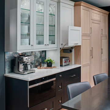
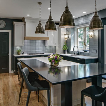
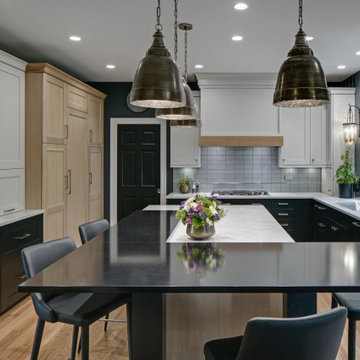
The original intent of this project was to replace the island, hood, countertops, and a few appliances. A primary bath remodel was the main priority. But once the couple realized certain features would enhance the functionality of the kitchen – not to mention completely change the aesthetic – they put the master bath on hold and decided to remodel the entire kitchen first.
Design objectives:
-Omit separate table, plan for a larger island that would seat 7 people
-Simple, clean lines – no rounded corners or weird angles
-Nothing trendy – use modern classic details
-Uncluttered countertops
-Better pantry storage for food & small appliances
-Integrated major appliances
-Coffee bar
-Avoid “1 color on perimeter with second color on island”
-Integrate a harmonious variety of finishes
-Integrate black & handmade metals
Design challenges:
-Island shape to fit within confines of existing half wall between kitchen & family room & bay window/door to backyard
-Narrow kitchen with major walkway
-Planning for 7 seats at the island
-Keep guest social area away from the cook’s zone
-Place appliances according to use
-Point-of-use storage for an avid cook within a relatively small space
-Integrate colors without looking too busy
THE NEW KITCHEN
-While the island is mostly rectangular, the seating area utilizes the bay extension without interfering with the exterior door
-All seating is placed on the outside perimeter of the island, giving the cook dedicated prep space
-The L-shaped seating area & adjacent coffee bar encourage guests to gather on the outside edge of the kitchen where they can still interact with the cook
-Island prep space includes 5 feet of versatile drawer storage, double waste basket and an open paper towel dispenser
-One pantry designated for food; the other for small appliances & bulk storage; creates visual armoire look
-Microwave drawer in island faces refrigerator for easy access & less interference with cook’s zone
-Appliance garages avoid clutter on the countertops
-Off-white upper cabinets make the kitchen look larger while the black bases offer contrast without closing in the space
Once the client committed to remodeling her entire kitchen, she had a good idea of the direction she wanted the space to take. Even so, there were many details that remained open to explore & contemplate. The end result is modern, clean and ultimately transitional – a creative vision anchored in functionality and artistry!
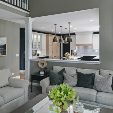
A powder room remodel was added to the project that beautifully compliments the kitchen aesthetic. The entire staircase, all trim & doors were painted in the same tones as the kitchen, transforming the entire first floor into a cohesive & welcoming space. It was a great collaborative partnership!
 River Valley Landscapes
The property is one of the original farm houses located on the main street of a small town. It has been in the family for many years and our client just inherited the property. They were trying to have balance of preserving the old while realizing modern day living has its benefits too. The house had a large addition added using mostly old style materials, but designed with function and modern day luxuries. Our goal was to carry that theme to the outside.
Our first problem we had to address was how to transition between the first floor elevation changes. The lower room was the husband’s office. He stated in the future he may have clients over and it would be nice to have an area to sit outside. The wife’s main concern was to renew the four corner garden. She also felt it was very important to be able to see it from the kitchen area. Finally there was an old wishing well stuck right outside the kitchen. They both felt it would be neat to be able to incorporate this in some how. They wanted a patio area with a built in grill to accommodate there family and friends. They also wanted to keep a large play area for the kids.
We were able to pull this off successfully. We addressed the first issue by having a small lower level flagstone area. This area is large enough for 1 to 2 people to sit comfortably. It also provides a transition from his office to the larger patio area. We installed a simple small gravel sitting area opposite of the main patio. This provides our client a secluded place to relax or do business. Mrs.... told me she is amazed how much her and her husband enjoys this area. It is so peaceful looking at the small creek over a glass of wine.
We built a natural limestone retaining wall to create the patio terrace. The stone was chosen to extend the houses architectural elements into the landscape. Irregular broken flagstone was used to give it a more casual feel. We installed three Serviceberries into the patio terrace to replace some trees that were taken down during the remodeling. She was very concern that they would block the view of the four corner garden. We new they were crucial to nestle in the terrace, so we placed them for a couple days for her to decide. Fortunately she agreed they not only kept the view open, but helped frame the garden.
The four corner garden was designed to be viewed from afar and experienced up close. We wanted the space to have some formal structure while keeping with the casual farm house feel. Another natural limestone retaining wall was created. This leveled the garden terrace and helped associate it with the rest of the property. The four corner garden is nestled into the existing woods edge. This provides three distinct experiences to entering the garden; a more formal from the driveway, an open feel from the lower lawn, and a more natural / casual experience from the wooded area. The Plymouth brown gravel was used for the center of the garden. This helped highlight the stone post that was found during construction. The gravel also brings the sense of sound into the garden space. Lamb’s ear was chosen as a fun way to get kids interest in horticulture.
The balance of using the new to create the old feel is what makes this project a success. The property has already hosted a local historical society event and won an award for its preservation efforts. When Mrs.... can’t find her husband, she knows he is either reading the newspaper by the grill or resting in the hammock along the wood’s path.
 Advance Design Studio, Ltd.
When Tom and Michelle Stien decided to remodel their kitchen, they chose Advance Design Studio to make it happen. They were looking for an innovative design that would open up an awkward wall, and we're hoping to remove some half walls that closed off their family room. "Of all the people we had come and give us quotes for our project, ADS/Scott, was the only one who came in with an idea right off the bat for what we could do. His knowledge of design and code was evident from the start," said the Stiens.
The new design increased the seating area with a large peninsula, and the cooking area was expanded to accommodate Tom's cooking skills. A warming drawer was incorporated beneath a nearly hidden microwave drawer, along with a clever pull out for increased pantry storage. A built in message board area was custom designed for kids art and family communication. Roll out trays grace every base cabinet for easy pull out storage and a single floating shelf ties the contemporary kitchen design together. Starlight quartz countertops create ease of clean up, and the look is finished off with sharp gray and white mosaic backsplash tiles.
The Stiens really liked a clean modern look, so the new crisp transitional kitchen design incorporated bright white shaker cabinetry from Medallion with gray and metal accents along with a modern feel. "Scott's presentation of what we could expect with ADS was clear and concise. He gave us a great deal of confidence in how the project would be handled".
Homeowners are frequently concerned about project budgets that get quickly get out of control. "Scott's quote was well thought out, organized and offered options based on our budget," said Michelle. "I was worried about the project budget changing as we went through the process, but they did a good job managing the situation and minimized change orders as much as possible."
When asked about their overall experience with their kitchen renovation he Stien's said; "Scott, Justin, Matt and Jason were great! They were all very friendly, personable, responsible and trustworthy. Advance Design definitely met and exceeded our expectations. Remodeling is a very challenging process to endure, but ADS minimized discomfort and inconvenience as much as possible and kept on schedule. The end result was well worth the investment in time and money."
Designer: Scott Christensen
Photographer: Joe Nowak

 Lindsey Markel
Photo By: Lindsey Neumann
Cabinetry; Dura Supreme, Camden door style, Maple, Natural, Counters; Zodiaq Quartz, Nutmeg, Sink; Blanco Precision, Faucet; Hansgrohe Focus 2-spray, Tile; Gendai Natural, Color Sanna Natural, Hardware; Top Knobs, Hood; Broan Elite
 MIDWEST CONSTRUCTION & SUPPLY INC
Paul Despenas: 25 S Louisiana Ave
Mason City, IA 50401
USA
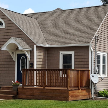
South Louisiana Avenue in Mason City: Installed American Classic Insulated siding, Tando Shake and EcoSmart Vinyl Replacement Windows. This home will save energy and completely reduce any maintenance cost for years to come.
Chad Arndt, a 15 years sales veteran with Midwest Construction office, located at 1601-South Taft, Mason City with an Office/Showroom and warehouses worked with this homeowner to fix the problem, add energy efficiency and eliminate maintenance so they can enjoy their family time and not be a slave to the house on the weekends.
The homeowners started by replacing their windows a few at a time until that project was finished. The advantage of doing them a few at a time: Midwest Construction’s Price Lock Guarantee (as long as the homeowner purchases windows within 1 year of the installation date we will guarantee the prices will stay the same). Another big advantage was the homeowners got to live with their new EcoSmart replacement windows for all four season to make sure the windows performed like the sales representative said they would, and the installer did the job they were to do. That gives homeowners some peace of mind and comfort knowing they chose the right window and the right company.
The next project was the big one siding for the house and the 3 stall custom sized garage.
American Classic Double – 4 Insulated Premium Vinyl siding with Tando Rough Sawn Cedar Shingle Shakes to Accent the front of the house and garage.
All of the windows had been previously capped with aluminum PVC coil stock with brick mold pattern to add some contoured lines to the window casings.
All of the soffits and fascias(Eves & Overhangs) were covered with American Classic center ridge vinyl soffit and custom bent PVC aluminum coil stock to give this home true maintenance freedom.
Midwest Construction is proud to have been working with the homeowners of Mason City since 1958, delivering comprehensive service and support that rivals that of our competitors and puts smiles on peoples' faces – guaranteed.
We've been providing comprehensive exterior remodeling solutions since 1958, offering "Quality Products & Quality Installation" just like our motto implies...
Whether you're in the market for:
Windows
Doors
Siding
Sun rooms
Gutters
...the pros at Midwest can deliver on-time and on-budget service.
Call us today for your free consultation and no-obligation quote!
Mason City Siding, Window, Sunroom and Door Company
To ensure we're providing safe service that is up-to-code, we have all of our production managers get VSI-certified – not to mention that all of our team members are factory trained!
For a more in-depth at our offering, visit our showroom right here in Mason City. It features full-size sun rooms and fully functional window displays.
If you decide on us, we'll be sure to walk you through the entire process – from beginning to end – and our team members will be there throughout to ensure a smooth and streamlined process.
Call us today for your free consultation and no-obligation quote!
 Paver House
This Tampa Bay homeowner was looking into complete change his backyard. Most pools in Tampa are built with a connected spa. To increase his pool size, he ended up deciding for not to build spa, however, he still wanted an appealing focal point to his pool. To contrast with the beautiful green landscape around the backyard, our customer wanted to add color and movement to his outdoor area.
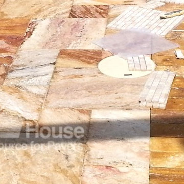
For the main pool deck area, our customer felt in love with the french pattern autumn blend tumbled travertine pavers. French Pattern Tumbled Autumn Blend Travertine Pavers contain a mixture of mostly red and gold, with some white, dark and light brown tones. Autumn Blend added the perfect amount of color and movement our customer wanted.
Travertine pavers offer a few unique color mixtures that make any outdoor space pops up from others.
A great accent color solution for the coping was the Desert Gold color on the 4×9 tumbled travertine copings. The beautifully blended Desert Gold may be bright and striking but does not lack for warmth and richness as well. To not compete with the strong colors of the pool deck, we advised our customer to add a lighter and more neutral pool tile: 2×2 autumn blend tumbled travertine tiles brought the perfect combination of contrast and harmony we were looking to achieve.
CREATIVITY ON YOUR POOL REMODEL WITH TRAVERTINE PAVER.
Pool remodel with travertine paver does not need to represent neutral colors only. Different than what most people believe, travertine pavers offer a few unique color mixtures that make any outdoor space pop up from others. Don’t be afraid of mixing different patterns, colors and textures to add more character to your outdoor space. Remember that, travertine pavers will display better their color when sealed, like the pictures from this pool remodel. If you are not sure if you would like your paver with the enhanced color, spray the sample with water first.
PREMIUM TRAVERTINE FRENCH PATTERN PAVERS
Pool remodel with travertine paver
POOL REMODEL WITH TRAVERTINE PAVERS
This Tampa Bay homeowner was looking into complete change his backyard. Most pools in Tampa are built with a connected spa. To increase his pool size, he ended up deciding for not to build spa, however, he still wanted an appealing focal point to his pool. To contrast with the beautiful green landscape around the backyard, our customer wanted to add color and movement to his outdoor area.
For the main pool deck area, our customer felt in love with the french pattern autumn blend tumbled travertine pavers. French Pattern Tumbled Autumn Blend Travertine Pavers contain a mixture of mostly red and gold, with some white, dark and light brown tones. Autumn Blend added the perfect amount of color and movement our customer wanted.
pool remodel with travertine paverpool remodel with travertine paverpool remodel with travertine paverpool remodel with travertine paverpool remodel with travertine paver
Previous
Next
Travertine pavers offer a few unique color mixtures that make any outdoor space pops up from others.
A great accent color solution for the coping was the Desert Gold color on the 4×9 tumbled travertine copings. The beautifully blended Desert Gold may be bright and striking but does not lack for warmth and richness as well. To not compete with the strong colors of the pool deck, we advised our customer to add a lighter and more neutral pool tile: 2×2 autumn blend tumbled travertine tiles brought the perfect combination of contrast and harmony we were looking to achieve.
CREATIVITY ON YOUR POOL REMODEL WITH TRAVERTINE PAVER.
Pool remodel with travertine paver does not need to represent neutral colors only. Different than what most people believe, travertine pavers offer a few unique color mixtures that make any outdoor space pop up from others. Don’t be afraid of mixing different patterns, colors and textures to add more character to your outdoor space. Remember that, travertine pavers will display better their color when sealed, like the pictures from this pool remodel. If you are not sure if you would like your paver with the enhanced color, spray the sample with water first.
PREMIUM TRAVERTINE FRENCH PATTERN PAVERS
On this pool remodel project, our customer preferred to use the French Pattern design, which is a good way to break up the monotony of the typical geometric or square appearance of large areas. Just like this outstanding pool deck remodel, patios and walkways will appear more fluid and mosaic by eliminating grout lines and the usual linear effect as well as the need for constant maintenance of the typical square or rectangular paver.
A French Pattern or a Versailles pattern is a paver pattern made up of four different sized tiles. Most French patterns are laid in stone, and nearly all are sold in “bundles” of tile that will cover 16 square feet.
Travertine pavers on your pool deck will reflect heat on hot days, remaining cool to the touch, unlike concrete surface options. Travertine does not discolor or become chalky after installation. The texture of travertine ensures that the stone remains slip resistant for wet feet, while its cool feel prevents burns. Another great advantage of travertine pavers is that there will be no visible grout lines; grout can be a source of both installation problems and added cost for future removal / replacement or up-keep.
Sponsored
Columbus, OH

Wannemacher Interiors
Customized Award-Winning Interior Design Solutions in Franklin Cnty OH

 Miller-Roodell Architects Ltd
Set in Montana's tranquil Shields River Valley, the Shilo Ranch Compound is a collection of structures that were specifically built on a relatively smaller scale, to maximize efficiency. The main house has two bedrooms, a living area, dining and kitchen, bath and adjacent greenhouse, while two guest homes within the compound can sleep a total of 12 friends and family. There's also a common gathering hall, for dinners, games, and time together. The overall feel here is of sophisticated simplicity, with plaster walls, concrete and wood floors, and weathered boards for exteriors. The placement of each building was considered closely when envisioning how people would move through the property, based on anticipated needs and interests. Sustainability and consumption was also taken into consideration, as evidenced by the photovoltaic panels on roof of the garage, and the capability to shut down any of the compound's buildings when not in use.
 Drury Design
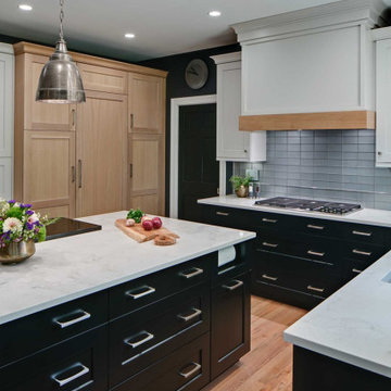
The original intent of this project was to replace the island, hood, countertops, and a few appliances. A primary bath remodel was the main priority. But once the couple realized certain features would enhance the functionality of the kitchen – not to mention completely change the aesthetic – they put the master bath on hold and decided to remodel the entire kitchen first.
Design objectives:
-Omit separate table, plan for a larger island that would seat 7 people
-Simple, clean lines – no rounded corners or weird angles
-Nothing trendy – use modern classic details
-Uncluttered countertops
-Better pantry storage for food & small appliances
-Integrated major appliances
-Coffee bar
-Avoid “1 color on perimeter with second color on island”
-Integrate a harmonious variety of finishes
-Integrate black & handmade metals
Design challenges:
-Island shape to fit within confines of existing half wall between kitchen & family room & bay window/door to backyard
-Narrow kitchen with major walkway
-Planning for 7 seats at the island
-Keep guest social area away from the cook’s zone
-Place appliances according to use
-Point-of-use storage for an avid cook within a relatively small space
-Integrate colors without looking too busy
THE NEW KITCHEN
-While the island is mostly rectangular, the seating area utilizes the bay extension without interfering with the exterior door
-All seating is placed on the outside perimeter of the island, giving the cook dedicated prep space
-The L-shaped seating area & adjacent coffee bar encourage guests to gather on the outside edge of the kitchen where they can still interact with the cook
-Island prep space includes 5 feet of versatile drawer storage, double waste basket and an open paper towel dispenser
-One pantry designated for food; the other for small appliances & bulk storage; creates visual armoire look
-Microwave drawer in island faces refrigerator for easy access & less interference with cook’s zone
-Appliance garages avoid clutter on the countertops
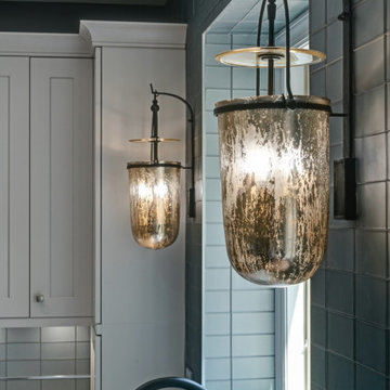
-Off-white upper cabinets make the kitchen look larger while the black bases offer contrast without closing in the space
Once the client committed to remodeling her entire kitchen, she had a good idea of the direction she wanted the space to take. Even so, there were many details that remained open to explore & contemplate. The end result is modern, clean and ultimately transitional – a creative vision anchored in functionality and artistry!
A powder room remodel was added to the project that beautifully compliments the kitchen aesthetic. The entire staircase, all trim & doors were painted in the same tones as the kitchen, transforming the entire first floor into a cohesive & welcoming space. It was a great collaborative partnership!
 Drury Design
The original intent of this project was to replace the island, hood, countertops, and a few appliances. A primary bath remodel was the main priority. But once the couple realized certain features would enhance the functionality of the kitchen – not to mention completely change the aesthetic – they put the master bath on hold and decided to remodel the entire kitchen first.
Design objectives:
-Omit separate table, plan for a larger island that would seat 7 people
-Simple, clean lines – no rounded corners or weird angles
-Nothing trendy – use modern classic details
-Uncluttered countertops
-Better pantry storage for food & small appliances
-Integrated major appliances
-Coffee bar
-Avoid “1 color on perimeter with second color on island”
-Integrate a harmonious variety of finishes
-Integrate black & handmade metals
Design challenges:
-Island shape to fit within confines of existing half wall between kitchen & family room & bay window/door to backyard
-Narrow kitchen with major walkway
-Planning for 7 seats at the island
-Keep guest social area away from the cook’s zone
-Place appliances according to use
-Point-of-use storage for an avid cook within a relatively small space
-Integrate colors without looking too busy
THE NEW KITCHEN
-While the island is mostly rectangular, the seating area utilizes the bay extension without interfering with the exterior door
-All seating is placed on the outside perimeter of the island, giving the cook dedicated prep space
-The L-shaped seating area & adjacent coffee bar encourage guests to gather on the outside edge of the kitchen where they can still interact with the cook
-Island prep space includes 5 feet of versatile drawer storage, double waste basket and an open paper towel dispenser
-One pantry designated for food; the other for small appliances & bulk storage; creates visual armoire look
-Microwave drawer in island faces refrigerator for easy access & less interference with cook’s zone
-Appliance garages avoid clutter on the countertops
-Off-white upper cabinets make the kitchen look larger while the black bases offer contrast without closing in the space
Once the client committed to remodeling her entire kitchen, she had a good idea of the direction she wanted the space to take. Even so, there were many details that remained open to explore & contemplate. The end result is modern, clean and ultimately transitional – a creative vision anchored in functionality and artistry!
A powder room remodel was added to the project that beautifully compliments the kitchen aesthetic. The entire staircase, all trim & doors were painted in the same tones as the kitchen, transforming the entire first floor into a cohesive & welcoming space. It was a great collaborative partnership!
 Drury Design
The original intent of this project was to replace the island, hood, countertops, and a few appliances. A primary bath remodel was the main priority. But once the couple realized certain features would enhance the functionality of the kitchen – not to mention completely change the aesthetic – they put the master bath on hold and decided to remodel the entire kitchen first.
Design objectives:
-Omit separate table, plan for a larger island that would seat 7 people
-Simple, clean lines – no rounded corners or weird angles
-Nothing trendy – use modern classic details
-Uncluttered countertops
-Better pantry storage for food & small appliances
-Integrated major appliances
-Coffee bar
-Avoid “1 color on perimeter with second color on island”
-Integrate a harmonious variety of finishes
-Integrate black & handmade metals
Design challenges:
-Island shape to fit within confines of existing half wall between kitchen & family room & bay window/door to backyard
-Narrow kitchen with major walkway
-Planning for 7 seats at the island
-Keep guest social area away from the cook’s zone
-Place appliances according to use
-Point-of-use storage for an avid cook within a relatively small space
-Integrate colors without looking too busy
THE NEW KITCHEN
-While the island is mostly rectangular, the seating area utilizes the bay extension without interfering with the exterior door
-All seating is placed on the outside perimeter of the island, giving the cook dedicated prep space
-The L-shaped seating area & adjacent coffee bar encourage guests to gather on the outside edge of the kitchen where they can still interact with the cook
-Island prep space includes 5 feet of versatile drawer storage, double waste basket and an open paper towel dispenser
-One pantry designated for food; the other for small appliances & bulk storage; creates visual armoire look
-Microwave drawer in island faces refrigerator for easy access & less interference with cook’s zone
-Appliance garages avoid clutter on the countertops
-Off-white upper cabinets make the kitchen look larger while the black bases offer contrast without closing in the space
Once the client committed to remodeling her entire kitchen, she had a good idea of the direction she wanted the space to take. Even so, there were many details that remained open to explore & contemplate. The end result is modern, clean and ultimately transitional – a creative vision anchored in functionality and artistry!
A powder room remodel was added to the project that beautifully compliments the kitchen aesthetic. The entire staircase, all trim & doors were painted in the same tones as the kitchen, transforming the entire first floor into a cohesive & welcoming space. It was a great collaborative partnership!
Sponsored
Columbus, OH
Wannemacher Interiors
Customized Award-Winning Interior Design Solutions in Franklin Cnty OH
 Drury Design
The original intent of this project was to replace the island, hood, countertops, and a few appliances. A primary bath remodel was the main priority. But once the couple realized certain features would enhance the functionality of the kitchen – not to mention completely change the aesthetic – they put the master bath on hold and decided to remodel the entire kitchen first.
Design objectives:
-Omit separate table, plan for a larger island that would seat 7 people
-Simple, clean lines – no rounded corners or weird angles
-Nothing trendy – use modern classic details
-Uncluttered countertops
-Better pantry storage for food & small appliances
-Integrated major appliances
-Coffee bar
-Avoid “1 color on perimeter with second color on island”
-Integrate a harmonious variety of finishes
-Integrate black & handmade metals
Design challenges:
-Island shape to fit within confines of existing half wall between kitchen & family room & bay window/door to backyard
-Narrow kitchen with major walkway
-Planning for 7 seats at the island
-Keep guest social area away from the cook’s zone
-Place appliances according to use
-Point-of-use storage for an avid cook within a relatively small space
-Integrate colors without looking too busy
THE NEW KITCHEN
-While the island is mostly rectangular, the seating area utilizes the bay extension without interfering with the exterior door
-All seating is placed on the outside perimeter of the island, giving the cook dedicated prep space
-The L-shaped seating area & adjacent coffee bar encourage guests to gather on the outside edge of the kitchen where they can still interact with the cook
-Island prep space includes 5 feet of versatile drawer storage, double waste basket and an open paper towel dispenser
-One pantry designated for food; the other for small appliances & bulk storage; creates visual armoire look
-Microwave drawer in island faces refrigerator for easy access & less interference with cook’s zone
-Appliance garages avoid clutter on the countertops
-Off-white upper cabinets make the kitchen look larger while the black bases offer contrast without closing in the space
Once the client committed to remodeling her entire kitchen, she had a good idea of the direction she wanted the space to take. Even so, there were many details that remained open to explore & contemplate. The end result is modern, clean and ultimately transitional – a creative vision anchored in functionality and artistry!
A powder room remodel was added to the project that beautifully compliments the kitchen aesthetic. The entire staircase, all trim & doors were painted in the same tones as the kitchen, transforming the entire first floor into a cohesive & welcoming space. It was a great collaborative partnership!
 Drury Design
The original intent of this project was to replace the island, hood, countertops, and a few appliances. A primary bath remodel was the main priority. But once the couple realized certain features would enhance the functionality of the kitchen – not to mention completely change the aesthetic – they put the master bath on hold and decided to remodel the entire kitchen first.
Design objectives:
-Omit separate table, plan for a larger island that would seat 7 people
-Simple, clean lines – no rounded corners or weird angles
-Nothing trendy – use modern classic details
-Uncluttered countertops
-Better pantry storage for food & small appliances
-Integrated major appliances
-Coffee bar
-Avoid “1 color on perimeter with second color on island”
-Integrate a harmonious variety of finishes
-Integrate black & handmade metals
Design challenges:
-Island shape to fit within confines of existing half wall between kitchen & family room & bay window/door to backyard
-Narrow kitchen with major walkway
-Planning for 7 seats at the island
-Keep guest social area away from the cook’s zone
-Place appliances according to use
-Point-of-use storage for an avid cook within a relatively small space
-Integrate colors without looking too busy
THE NEW KITCHEN
-While the island is mostly rectangular, the seating area utilizes the bay extension without interfering with the exterior door
-All seating is placed on the outside perimeter of the island, giving the cook dedicated prep space
-The L-shaped seating area & adjacent coffee bar encourage guests to gather on the outside edge of the kitchen where they can still interact with the cook
-Island prep space includes 5 feet of versatile drawer storage, double waste basket and an open paper towel dispenser
-One pantry designated for food; the other for small appliances & bulk storage; creates visual armoire look
-Microwave drawer in island faces refrigerator for easy access & less interference with cook’s zone
-Appliance garages avoid clutter on the countertops
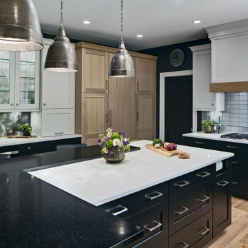
-Off-white upper cabinets make the kitchen look larger while the black bases offer contrast without closing in the space
Once the client committed to remodeling her entire kitchen, she had a good idea of the direction she wanted the space to take. Even so, there were many details that remained open to explore & contemplate. The end result is modern, clean and ultimately transitional – a creative vision anchored in functionality and artistry!
A powder room remodel was added to the project that beautifully compliments the kitchen aesthetic. The entire staircase, all trim & doors were painted in the same tones as the kitchen, transforming the entire first floor into a cohesive & welcoming space. It was a great collaborative partnership!
 Drury Design
The original intent of this project was to replace the island, hood, countertops, and a few appliances. A primary bath remodel was the main priority. But once the couple realized certain features would enhance the functionality of the kitchen – not to mention completely change the aesthetic – they put the master bath on hold and decided to remodel the entire kitchen first.
Design objectives:
-Omit separate table, plan for a larger island that would seat 7 people
-Simple, clean lines – no rounded corners or weird angles
-Nothing trendy – use modern classic details
-Uncluttered countertops
-Better pantry storage for food & small appliances
-Integrated major appliances
-Coffee bar
-Avoid “1 color on perimeter with second color on island”
-Integrate a harmonious variety of finishes
-Integrate black & handmade metals
Design challenges:
-Island shape to fit within confines of existing half wall between kitchen & family room & bay window/door to backyard
-Narrow kitchen with major walkway
-Planning for 7 seats at the island
-Keep guest social area away from the cook’s zone
-Place appliances according to use
-Point-of-use storage for an avid cook within a relatively small space
-Integrate colors without looking too busy
THE NEW KITCHEN
-While the island is mostly rectangular, the seating area utilizes the bay extension without interfering with the exterior door
-All seating is placed on the outside perimeter of the island, giving the cook dedicated prep space
-The L-shaped seating area & adjacent coffee bar encourage guests to gather on the outside edge of the kitchen where they can still interact with the cook
-Island prep space includes 5 feet of versatile drawer storage, double waste basket and an open paper towel dispenser
-One pantry designated for food; the other for small appliances & bulk storage; creates visual armoire look
-Microwave drawer in island faces refrigerator for easy access & less interference with cook’s zone
-Appliance garages avoid clutter on the countertops
-Off-white upper cabinets make the kitchen look larger while the black bases offer contrast without closing in the space
Once the client committed to remodeling her entire kitchen, she had a good idea of the direction she wanted the space to take. Even so, there were many details that remained open to explore & contemplate. The end result is modern, clean and ultimately transitional – a creative vision anchored in functionality and artistry!
A powder room remodel was added to the project that beautifully compliments the kitchen aesthetic. The entire staircase, all trim & doors were painted in the same tones as the kitchen, transforming the entire first floor into a cohesive & welcoming space. It was a great collaborative partnership!
39