
Search results for "People highlighted" in Home Design Ideas
 Michael Nash Design, Build & Homes
2011 CAPITAL COTY HONORABLE MENTION AWARD
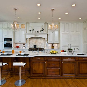
Located in the new Trump International Golf Course Community, this contemporary home has a great location overlooking the golf course. The current layout, however, prevented the owners from taking advantage of its breathtaking view.
Goals of the remodel were to open up the first floor layout by taking down the partition walls between the kitchen and dining room. The homeowner also wanted to update the home’s galley kitchen, replacing its dark cabinets and counters.
Once the walls were removed, major obstacles because they were load bearing, the new design could evolve. The ten foot ceilings provided the opportunity to stack up decorative glass cabinetry and highly crafted crown moldings on top, while maintaining a considerable amount of cabinetry right below it. The custom made brush stroke finished cabinetry with bells and whistles such as corbels and chimney style wood hood surrounded with leaded glass cabinetry. Pillars were all part of detailed craftsmanship of this project.
A large 5’ x 14’ island is the focal point of the design. The island consists of main sink with a pedal style control disposal, dishwasher, microwave, second bar sink, beverage center refrigerator and still has room to sit five to six people. Its darker cabinetry provides a beautiful contrast to the opaque white cabinets on the surrounding walls.
White marble counters and backsplash brighten up the kitchen and two crystal chandeliers create a timeless yet elegant feel. High-end Thermador appliances covered in custom inset panels are part of this featured project to implement the classic look the homeowner wanted for this kitchen. Finally, a featured cabinet arch with leaded glass separates the kitchen from the dining room and displays the homeowner’s fine china.
Finally, large windows and French doors offer beautiful golf course views from multiple vantage points.
 Gallery KBNY
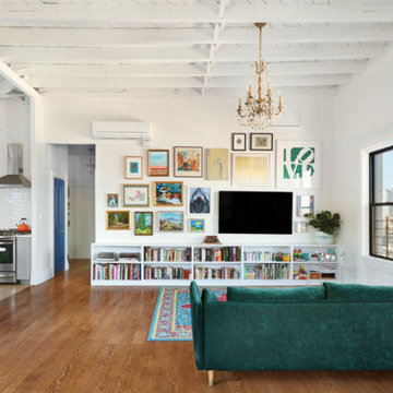
For this Brooklyn condo renovation, Gallery Kitchen and Bath updated the entire kitchen and both bathrooms, as well as painted and laid out new flooring throughout the entire apartment. The owners wanted to unite the seeming medley of the existing space into a cohesive design more representative of their own style. With its ultra-high ceilings and exposed joints and beams, the space already lent itself to the farmhouse look. The end result is a modernized, eclectic farmhouse style that we keenly carried throughout the home.
MORE DETAILS
Compelling textures and color combos reign supreme. The kitchen features semi-custom Shaker-style stone gray cabinets, a white subway tile backsplash running all the way up the wall, and white quartz countertops. We built the island in part to create a pleasing yet efficient flow from the kitchen into the living and dining areas as the space was opened up. We also painted the plumbing stack white to not make it stand out.
We also redesigned the bathrooms, giving each a unique treatment. In the master bath, we took a Victorian-goes-modern approach with coral walls, champagne fixtures, and a clawfoot tub. In the guest bathroom, we stuck to a transitional style that approaches modern without becoming contemporary, pairing herringbone marble floor tiles with a mix of subway and penny tiles on the walls and in the shower. Both maintain elements, such as tiles, fixtures, and colors, that coordinate with the overall eclectic farmhouse look.
HOW WE COLLABORATE
Collaboration with our clients to their desired degree is one of our core pillars. In this condo renovation, the clients wanted central air and were initially considering a true central air system. We advised against it, as not only would it take away from the unique beauty of unusually tall ceilings by adding unsightly ductwork, but it would also significantly detract from the farmhouse look. Instead, we suggested a mini-split system. Our recommended units were both cost-effective and much more complementary to the comprehensive theme. Of course, we ultimately always honor the clients’ choices but it’s just as important to us that we make sure to provide all the necessary information so our clients can make educated decisions that are best for their needs.
SPACE PLANNING
Another key element of the renovation process is space planning. From this perspective, we consider the placement and positioning of objects with regard to the overall flow of space. The building where this renovation took place is U-shaped at one end, which happens to be where this particular apartment is located. Uniquely-shaped spaces naturally require more concentration than those built in the standard rectangular shape. Questions we consider include: Where will people really spend time in this space? What will the flow of foot traffic be? Is there easy access to the kitchen island? Does it flow well into the hallways? Does the island protrude into anything? Working in New York, with its variety of homes and architectural styles, has greatly developed our experience with standard spaces and unconventional ones alike.
SOME HIGHLIGHTS
- Ultra-tall ceilings, allowing for stacked cabinets in the kitchen, as well as long pendant light fixtures and more chandeliers than usual throughout the home
- Completely refurbished cast iron clawfoot tub in one bathroom, with a 270-degree shower curtain around the tub
- Vibrant color choices, including an all-blue bedroom in various shades
- Treated exposed brick walls
Fun Fact: A client once showed us inspiration photos that they sourced online of this exact project, having no idea it was one of ours.
Thinking about renovating your condo? Contact us today to find out how you can benefit from our expertise in remodeling New York City condos. We are a design-and-build firm with a full-scale approach that handles every single aspect of your condo renovation from start to finish.
 Blackdog Design Build Remodel
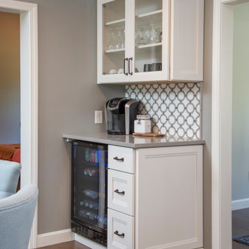
The reason for the project was purely due to the age of the existing space. There were different types of flooring (including carpet that was showing a lot of wear) throughout the first floor, the doors and windows were showing their age, and the kitchen was outdated, dark, and not functioning well for the family. The laundry room didn’t have any storage at all, and was open to the kitchen, which was unsightly to guests. Additionally, the heights of the family members range between 6’ and 6’5” so they were looking to customize the height of all of the cabinetry to make tasks easier and more comfortable. To remedy these challenges, the flooring and baseboards throughout the first floor of the home were updated with a high-quality, refinishable engineered walnut, providing the home with an instant update and creating a more cohesive flow. A wall was added with a sliding barn door between the kitchen and laundry/powder room area, giving that space some separation and privacy from the social space. Beautifulpainted tile was used in the laundry powder room and pantry, which added an artistic pop, and to highlight this we replaced the pantry door with a framed glass door.In the kitchen, an obstructive peninsula was removed, and the cabinetry was extended to make space for a large island that seats up to six people. The range was swapped for a cooktop and double oven, and an exterior-venting fan was added. The microwave was moved into the island, the window above the sink was replaced with a large, single-pane casement, and a gorgeous four-inch mitered edge marble countertop made the island a stunning focal point. A coffee bar and beverage station was added to free up working counter space, and added a functioning feature to an unused corner of the room.
Find the right local pro for your project
 Klopf Architecture
Malibu Glass Box House by Klopf Architecture
Following the devastating Woolsey Fire of 2018, the site in Malibu offered a unique opportunity to rebuild not just a home, but a new architectural composition that highlighted the property’s potential while navigating strict fire-rebuild codes in the area. Designed by Klopf Architecture, this project embraced a set of limitations and translated them into an architectural asset.
The city’s fire-rebuild process required the new structure to remain close to the original footprint, size and bulk, a constraint that ultimately clarified the architectural direction. Perched near the front of a long, narrow lot, the new home frames and overlooks a private, park-like rear expanse, an uncommon luxury especially in this part of Malibu .
Without a fixed program, the design process allowed for a different kind of creative focus allowing Klopf Architecture the opportunity to explore how a modernist home could best respond to this site. The team approached the project not with a list of requirements, but with a question: How might a modernist live here? What spatial qualities would inspire calm, connection, and a sense of wonder in this setting? The process became less about problem-solving and more about architectural storytelling—letting the site, the light, and the principles of modern design guide the form and flow of the home.
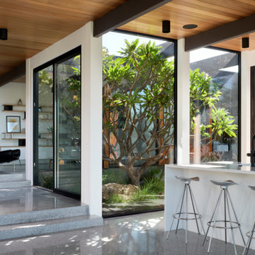
The response emerged in the form of a glass-box pavilion, an open, Mid-Century Modern inspired living, dining, and kitchen space that floats at the edge of the property’s natural descent. Connected to the more enclosed, private areas of the home by a glass-walled hallway, the living pavilion becomes a distinct centerpiece of the design. It opens on all four sides to the landscape with decks and patios on the flanks, an internal garden and water feature to the north, and a dramatic unguarded view of the expansive backyard and ocean horizon to the south.
Because of the mandated footprint, careful planning was required to ensure every space could still engage with light, landscape, or both. Strategic voids in the form of atriums and courtyards allow daylight to filter deep into the home’s core, while offering moments of surprise and retreat. These design gestures allow natural light to filter deep into the interior, creating a sense of brightness and openness throughout the day. At the same time, they expand the perceptual boundaries between inside and out, making the home feel more expansive while anchoring its connection to the surrounding landscape.
The siting of the house is what gives it its unique character. Rather than receding into the backyard like the neighboring homes, the house holds a slight prominence. From the central living pavilion, stepping down into the landscape feels more like entering a secluded park where a separate existing accessory structure, trail, and recreational areas await. The home’s modest street presence gives way to this unfolding drama of space, view, and nature.
Fire-resilient materials and assemblies are integrated seamlessly throughout including triple-pane glazing, under-slab and roof insulation, and locally sourced fire-rated cladding ensure the house not only meets Calfornia’s rigorous wildland-urban interface (WUI) standards, but feels effortlessly aligned with them. While technical decisions like fire-hardening and mechanical systems presented some construction challenges, particularly around the cantilevered glass box, the team found a functional compromise that preserved the integrity of the design.
Inside, a restrained palette and exposed post and beam design celebrate the ethos of mid-century modernism. A central circulation spine extends from the entry to the rear glass wall, offering a continuous visual link from street to ocean. Spaces such as the library and office, though more intimate in scale, are never cut off from nature as each opens to its own unique courtyard or garden view.
Though born out of a strict regulatory framework and developed without a specific client, the rebuild design unfolded with remarkable clarity. Grounded in site logic, refined by limitations and an emphasis on timeless spatial relationships – light, proportion, and a strong connection to nature, the resulting design feels both effortless and uplifting. The home lives lightly on the land, opens generously to its surroundings, and strikes a careful balance between privacy, openness, and calm. For Klopf Architecture, it stands as a compelling case study in how site, code, and circumstantial constraints can inspire enduring, modernist architecture. With years of experience reimagining mid-century modern design for how people live today, the firm took the project’s limitations as an opportunity. The result is a home shaped by open, flowing spaces, strong indoor-outdoor connections, and a calm, clear sense of structure. It’s a good reminder that even with strict constraints, there’s still room for architecture to breathe—and for modernism to keep moving forward.
Klopf Architecture project team: Geoff Campen, John Klopf, AIA, and Sherry Tan
Structural Engineer: ZFA
Contractor: Maison D’Artiste
Photography: ©2025 Mariko Reed
Year Completed: 2023
 Michael Nash Design, Build & Homes
2011 CAPITAL COTY HONORABLE MENTION AWARD
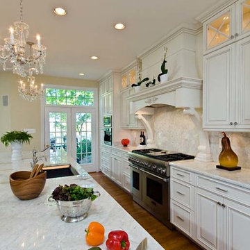
Located in the new Trump International Golf Course Community, this contemporary home has a great location overlooking the golf course. The current layout, however, prevented the owners from taking advantage of its breathtaking view.
Goals of the remodel were to open up the first floor layout by taking down the partition walls between the kitchen and dining room. The homeowner also wanted to update the home’s galley kitchen, replacing its dark cabinets and counters.
Once the walls were removed, major obstacles because they were load bearing, the new design could evolve. The ten foot ceilings provided the opportunity to stack up decorative glass cabinetry and highly crafted crown moldings on top, while maintaining a considerable amount of cabinetry right below it. The custom made brush stroke finished cabinetry with bells and whistles such as corbels and chimney style wood hood surrounded with leaded glass cabinetry. Pillars were all part of detailed craftsmanship of this project.
A large 5’ x 14’ island is the focal point of the design. The island consists of main sink with a pedal style control disposal, dishwasher, microwave, second bar sink, beverage center refrigerator and still has room to sit five to six people. Its darker cabinetry provides a beautiful contrast to the opaque white cabinets on the surrounding walls.
White marble counters and backsplash brighten up the kitchen and two crystal chandeliers create a timeless yet elegant feel. High-end Thermador appliances covered in custom inset panels are part of this featured project to implement the classic look the homeowner wanted for this kitchen. Finally, a featured cabinet arch with leaded glass separates the kitchen from the dining room and displays the homeowner’s fine china.
Finally, large windows and French doors offer beautiful golf course views from multiple vantage points.
 Michael Nash Design, Build & Homes
Built in the early 1950s, this small urban townhouse is located in North Old Town Alexandria in an area currently undergoing major redevelopment. The neighborhood is popular with, and affordable for, young people and families, and very convenient to Washington, DC.
In its heyday, the townhouse touted a stately brick exterior, plaster walls, tongue and groove wood flooring and beautiful wooden staircase. Sixty years later, however, the homeowners were faced with crumbling masonry, sagging floors, a double layer of wallpaper over the plaster walls, a crumbling staircase, a dysfunctional kitchen and small, dark second floor rooms. Additionally, the basement had a low ceiling, moldy and cinder block walls, no plumbing and a large boiler taking up most of the space.
The homeowners’ goal was to restore the exterior’s historic look while creating an interior up-to-date for the 21st Century. To turn their vision into reality, they turned to Michael Nash Design, Build & Homes.
Design Solutions
To maintain the townhome’s historic exterior, the Michael Nash team carefully removed, salvaged, restored and reused existing brick masonry. Matching fascia boards and windows were combined with existing windows to complete the exterior renovation.
All interior walls were gutted and reframed. New electrical work, new insulation and new drywall were installed. Much of the home’s original trim was salvaged and reused, as was a piece of art glass, all to keep a bit of the past in the renovation.
The sagging subfloors were fixed, new hard wood floors were installed and a new staircase and railing were designed in a style similar to the original.
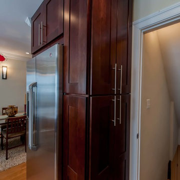
The solid wall between the kitchen and the dining room was removed, plumbing was relocated for a new sink location and the kitchen got expanded with an island into the dining room. Closet and plumbing stacks were relocated to allow a new space for fridge. Stainless steel appliances, granite countertops and custom cabinetry highlight the new modern kitchen.
The plan called for redesigning the three bedrooms on the second floor to allow a larger bathroom, walk-in closet and wider hallways. In addition to new roofing, a large skylight was installed to allow natural light into the bathroom and the upper hallway.
The basement was totally revamped. New plumbing was put in place for a full bathroom, laundry room and a den. New e-grass window was installed in the basement to bring this basement up to current building codes.
This homeowners love the neighborhood and now their home gives them the opportunity to stay in the same location.
 BearCrafted
“You ever notice how supervillains have really good taste in furniture?”
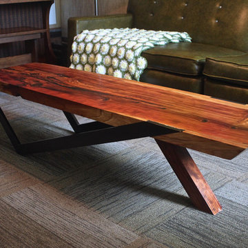
I’m proud to bring you another original design! I like to believe that part of myself goes into my work, and I hope the intelligence and creative spirit that went into this piece radiates throughout your home. Enjoy! – Cedrick
This ‘Stance’ coffee table started as a slab of redwood for the top, beech and reclaimed cedar for the legs. It measures 64″L x 16.5″W x 15.5″ H, and makes a good companion to a wide, low modern or midcentury sitting area. Black epoxy fill highlights knots and along with a 3 stage finishing process brings a stark, strong look to the table; people tend to stare at the spiraling grain patterns when they first see it. Glass smooth lacquer invites touching and brings that a very deep sheen to the top. The angled legs are suprisingly sturdy and work well for this application while adding an intelligent visual twist.
Credit to our lumber suppliers also, Millers Milling and Hughes Hardwood for their superb service.


 Klopf Architecture
Malibu Glass Box House by Klopf Architecture
Following the devastating Woolsey Fire of 2018, the site in Malibu offered a unique opportunity to rebuild not just a home, but a new architectural composition that highlighted the property’s potential while navigating strict fire-rebuild codes in the area. Designed by Klopf Architecture, this project embraced a set of limitations and translated them into an architectural asset.
The city’s fire-rebuild process required the new structure to remain close to the original footprint, size and bulk, a constraint that ultimately clarified the architectural direction. Perched near the front of a long, narrow lot, the new home frames and overlooks a private, park-like rear expanse, an uncommon luxury especially in this part of Malibu .
Without a fixed program, the design process allowed for a different kind of creative focus allowing Klopf Architecture the opportunity to explore how a modernist home could best respond to this site. The team approached the project not with a list of requirements, but with a question: How might a modernist live here? What spatial qualities would inspire calm, connection, and a sense of wonder in this setting? The process became less about problem-solving and more about architectural storytelling—letting the site, the light, and the principles of modern design guide the form and flow of the home.
The response emerged in the form of a glass-box pavilion, an open, Mid-Century Modern inspired living, dining, and kitchen space that floats at the edge of the property’s natural descent. Connected to the more enclosed, private areas of the home by a glass-walled hallway, the living pavilion becomes a distinct centerpiece of the design. It opens on all four sides to the landscape with decks and patios on the flanks, an internal garden and water feature to the north, and a dramatic unguarded view of the expansive backyard and ocean horizon to the south.
Because of the mandated footprint, careful planning was required to ensure every space could still engage with light, landscape, or both. Strategic voids in the form of atriums and courtyards allow daylight to filter deep into the home’s core, while offering moments of surprise and retreat. These design gestures allow natural light to filter deep into the interior, creating a sense of brightness and openness throughout the day. At the same time, they expand the perceptual boundaries between inside and out, making the home feel more expansive while anchoring its connection to the surrounding landscape.
The siting of the house is what gives it its unique character. Rather than receding into the backyard like the neighboring homes, the house holds a slight prominence. From the central living pavilion, stepping down into the landscape feels more like entering a secluded park where a separate existing accessory structure, trail, and recreational areas await. The home’s modest street presence gives way to this unfolding drama of space, view, and nature.
Fire-resilient materials and assemblies are integrated seamlessly throughout including triple-pane glazing, under-slab and roof insulation, and locally sourced fire-rated cladding ensure the house not only meets Calfornia’s rigorous wildland-urban interface (WUI) standards, but feels effortlessly aligned with them. While technical decisions like fire-hardening and mechanical systems presented some construction challenges, particularly around the cantilevered glass box, the team found a functional compromise that preserved the integrity of the design.
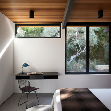
Inside, a restrained palette and exposed post and beam design celebrate the ethos of mid-century modernism. A central circulation spine extends from the entry to the rear glass wall, offering a continuous visual link from street to ocean. Spaces such as the library and office, though more intimate in scale, are never cut off from nature as each opens to its own unique courtyard or garden view.
Though born out of a strict regulatory framework and developed without a specific client, the rebuild design unfolded with remarkable clarity. Grounded in site logic, refined by limitations and an emphasis on timeless spatial relationships – light, proportion, and a strong connection to nature, the resulting design feels both effortless and uplifting. The home lives lightly on the land, opens generously to its surroundings, and strikes a careful balance between privacy, openness, and calm. For Klopf Architecture, it stands as a compelling case study in how site, code, and circumstantial constraints can inspire enduring, modernist architecture. With years of experience reimagining mid-century modern design for how people live today, the firm took the project’s limitations as an opportunity. The result is a home shaped by open, flowing spaces, strong indoor-outdoor connections, and a calm, clear sense of structure. It’s a good reminder that even with strict constraints, there’s still room for architecture to breathe—and for modernism to keep moving forward.
Klopf Architecture project team: Geoff Campen, John Klopf, AIA, and Sherry Tan
Structural Engineer: ZFA
Contractor: Maison D’Artiste
Photography: ©2025 Mariko Reed
Year Completed: 2023
 Lighting EVER
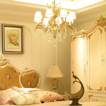
There is no gainsaying in the fact that good lighting compliments and brings out the overall aesthetics of a home; no interior designer can contest this truth. The living space of the home deserves a carefully selected residential interior lighting. Regardless of interior design, furniture and fittings, decors, colors, and fitted accessories, poor residential interior lighting would deny the room of that elegant and alluring look it deserves, you would feel that something is not just right.
Installing the right interior lighting goes beyond fixing some ceiling cans and a couple of lamps; it calls for careful thought and apposite selections. Your understanding and careful choice of residential interior lighting would enable you create a magnificent environment. Design professionals do not just get hired, they are paid for their experience and ability to study your residential interior and come up with lighting choice that would transform it while saving on the energy use.
It should be borne in mind that lighting has three categories. Before you decide what lighting accessories to buy, it is needful that you consider the following factors to determine the right residential interior lighting that suits each of your rooms.
1. Lighting for Task Purpose: It aims at achieving certain functions and it is underscored by the need for good vision. Tasks such as reading, working on the computer etc. require good vision; therefore, lighting for this purpose should be installed in the areas of the room where these tasks are to be performed.
2. Ambient or General Lighting: This type of lighting is meant to lit up the space for easy movement and to see objects and people. It is usually not as bright as the lighting for task purpose.
3. Accent Lighting: The underlying purpose of this lighting is to focus or accentuate the visibility of certain areas or objects. The use of picture lights is to highlight the architectural feature in certain areas of the room. It is used primarily to create a striking interest and make the space very active and interesting.
It is, however, an excellent practice to make use of these three essential lighting types to create a good residential interior lighting system. You should carefully evaluate your space in order to avoid double duty and redundancy of any installed light. Ensure that the lighting choices are necessary and not redundant; this will guarantee functional and aesthetic purposes of your residential interior lighting.
Visit www.lightingever.com for a vast variety of interior and outdoor lighting for your use.
 Klopf Architecture
Malibu Glass Box House by Klopf Architecture
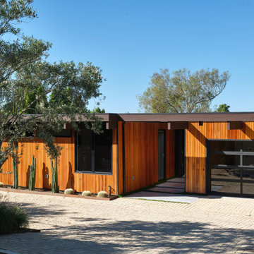
Following the devastating Woolsey Fire of 2018, the site in Malibu offered a unique opportunity to rebuild not just a home, but a new architectural composition that highlighted the property’s potential while navigating strict fire-rebuild codes in the area. Designed by Klopf Architecture, this project embraced a set of limitations and translated them into an architectural asset.
The city’s fire-rebuild process required the new structure to remain close to the original footprint, size and bulk, a constraint that ultimately clarified the architectural direction. Perched near the front of a long, narrow lot, the new home frames and overlooks a private, park-like rear expanse, an uncommon luxury especially in this part of Malibu .
Without a fixed program, the design process allowed for a different kind of creative focus allowing Klopf Architecture the opportunity to explore how a modernist home could best respond to this site. The team approached the project not with a list of requirements, but with a question: How might a modernist live here? What spatial qualities would inspire calm, connection, and a sense of wonder in this setting? The process became less about problem-solving and more about architectural storytelling—letting the site, the light, and the principles of modern design guide the form and flow of the home.
The response emerged in the form of a glass-box pavilion, an open, Mid-Century Modern inspired living, dining, and kitchen space that floats at the edge of the property’s natural descent. Connected to the more enclosed, private areas of the home by a glass-walled hallway, the living pavilion becomes a distinct centerpiece of the design. It opens on all four sides to the landscape with decks and patios on the flanks, an internal garden and water feature to the north, and a dramatic unguarded view of the expansive backyard and ocean horizon to the south.
Because of the mandated footprint, careful planning was required to ensure every space could still engage with light, landscape, or both. Strategic voids in the form of atriums and courtyards allow daylight to filter deep into the home’s core, while offering moments of surprise and retreat. These design gestures allow natural light to filter deep into the interior, creating a sense of brightness and openness throughout the day. At the same time, they expand the perceptual boundaries between inside and out, making the home feel more expansive while anchoring its connection to the surrounding landscape.
The siting of the house is what gives it its unique character. Rather than receding into the backyard like the neighboring homes, the house holds a slight prominence. From the central living pavilion, stepping down into the landscape feels more like entering a secluded park where a separate existing accessory structure, trail, and recreational areas await. The home’s modest street presence gives way to this unfolding drama of space, view, and nature.
Fire-resilient materials and assemblies are integrated seamlessly throughout including triple-pane glazing, under-slab and roof insulation, and locally sourced fire-rated cladding ensure the house not only meets Calfornia’s rigorous wildland-urban interface (WUI) standards, but feels effortlessly aligned with them. While technical decisions like fire-hardening and mechanical systems presented some construction challenges, particularly around the cantilevered glass box, the team found a functional compromise that preserved the integrity of the design.
Inside, a restrained palette and exposed post and beam design celebrate the ethos of mid-century modernism. A central circulation spine extends from the entry to the rear glass wall, offering a continuous visual link from street to ocean. Spaces such as the library and office, though more intimate in scale, are never cut off from nature as each opens to its own unique courtyard or garden view.
Though born out of a strict regulatory framework and developed without a specific client, the rebuild design unfolded with remarkable clarity. Grounded in site logic, refined by limitations and an emphasis on timeless spatial relationships – light, proportion, and a strong connection to nature, the resulting design feels both effortless and uplifting. The home lives lightly on the land, opens generously to its surroundings, and strikes a careful balance between privacy, openness, and calm. For Klopf Architecture, it stands as a compelling case study in how site, code, and circumstantial constraints can inspire enduring, modernist architecture. With years of experience reimagining mid-century modern design for how people live today, the firm took the project’s limitations as an opportunity. The result is a home shaped by open, flowing spaces, strong indoor-outdoor connections, and a calm, clear sense of structure. It’s a good reminder that even with strict constraints, there’s still room for architecture to breathe—and for modernism to keep moving forward.
Klopf Architecture project team: Geoff Campen, John Klopf, AIA, and Sherry Tan
Structural Engineer: ZFA
Contractor: Maison D’Artiste
Photography: ©2025 Mariko Reed
Year Completed: 2023
 Michael Nash Design, Build & Homes
Built in the early 1950s, this small urban townhouse is located in North Old Town Alexandria in an area currently undergoing major redevelopment. The neighborhood is popular with, and affordable for, young people and families, and very convenient to Washington, DC.
In its heyday, the townhouse touted a stately brick exterior, plaster walls, tongue and groove wood flooring and beautiful wooden staircase. Sixty years later, however, the homeowners were faced with crumbling masonry, sagging floors, a double layer of wallpaper over the plaster walls, a crumbling staircase, a dysfunctional kitchen and small, dark second floor rooms. Additionally, the basement had a low ceiling, moldy and cinder block walls, no plumbing and a large boiler taking up most of the space.
The homeowners’ goal was to restore the exterior’s historic look while creating an interior up-to-date for the 21st Century. To turn their vision into reality, they turned to Michael Nash Design, Build & Homes.
Design Solutions
To maintain the townhome’s historic exterior, the Michael Nash team carefully removed, salvaged, restored and reused existing brick masonry. Matching fascia boards and windows were combined with existing windows to complete the exterior renovation.
All interior walls were gutted and reframed. New electrical work, new insulation and new drywall were installed. Much of the home’s original trim was salvaged and reused, as was a piece of art glass, all to keep a bit of the past in the renovation.
The sagging subfloors were fixed, new hard wood floors were installed and a new staircase and railing were designed in a style similar to the original.
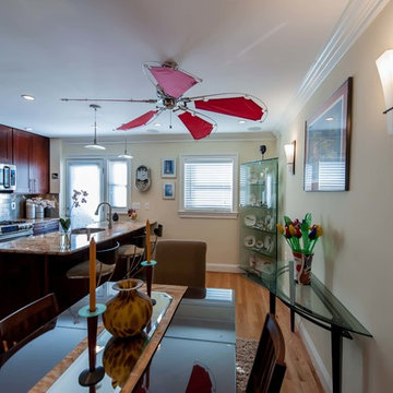
The solid wall between the kitchen and the dining room was removed, plumbing was relocated for a new sink location and the kitchen got expanded with an island into the dining room. Closet and plumbing stacks were relocated to allow a new space for fridge. Stainless steel appliances, granite countertops and custom cabinetry highlight the new modern kitchen.
The plan called for redesigning the three bedrooms on the second floor to allow a larger bathroom, walk-in closet and wider hallways. In addition to new roofing, a large skylight was installed to allow natural light into the bathroom and the upper hallway.
The basement was totally revamped. New plumbing was put in place for a full bathroom, laundry room and a den. New e-grass window was installed in the basement to bring this basement up to current building codes.
This homeowners love the neighborhood and now their home gives them the opportunity to stay in the same location.
 McCabe By Design LLC
This bathroom was designed for two professionals who dedicate themselves to the health and wellness of others. The objective of the project was to be able to practice for themselves, what they preach to their patients.
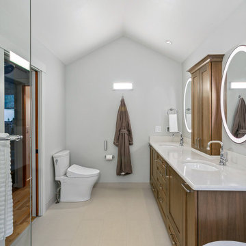
The original 90” x 162” primary bathroom had so many pain points (would you to look at a toilet when taking a relaxing bath?), that it should have been an easy task to meet their needs and desires, but it was anything but due to structural issues with the home. Several design layouts were considered before it was concluded that the only approach to check the ‘needs’ boxes was to flip the primary fixtures in the room from one end of this long, narrow bathroom to the other and incorporating a wet room.
The needs list included a soaking tub, a spacious shower that accommodated dual showering on business workday morning, more counter space, a bidet toilet, more storage, better lighting, better heat and humidity control, a soothing color pallet and privacy from the neighbors.
An air jet soaking tub (motor concealed in the nearby vented base cabinet) under a new window with privacy glass on the bottom and a clear glass awning window on top checked two boxes. The center drain for the bathing features provides space for two people to shower simultaneously while highlighting the soothing color pallet from every view point in the room. The integrated bidet toilet is an affordable luxury that delivers health and wellness multiples times in a day. The expanded vanity optimized storage while providing more, clutter free countertop space. Utilizing a variety of lighting types, with dimmers, provides the right illumination for every bathroom activity. Lastly, the in-floor heat, toe-kick heater and relocated bathroom exhaust fan over the shower help maintain a consistently comfortable temperature and humidity level in this bathroom transformation.
 Homeowner Services of Michigan LLC
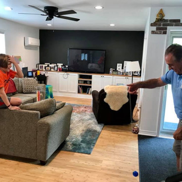
Homeowner Services of Michigan (HSM) is excited to share the details of a new 16' x 22' family room expansion in Ann Arbor, Michigan. This project reflects our dedication to meeting our clients' specific needs.
Our clients approached us needing more space for their growing family and wanted a seamless integration with their existing home. After thorough consultations, we developed a plan to bring their vision to life.
The project began with careful architectural planning. We worked with a local architect to create detailed plans and secured all necessary permits to ensure compliance with local building codes.
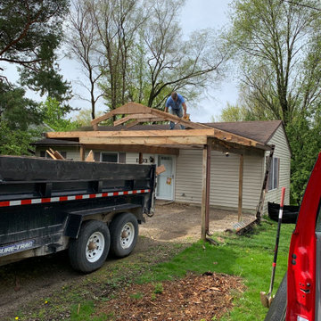
Site preparation involved demolishing an existing carport, grading, and excavation to prepare the building pad for the new foundation. This step was essential to ensure a stable base for the construction.
Our team then focused on structural framing, tying the new addition to the existing home. We ensured that the new structure matched the current architectural style for a seamless blend. The addition was then roofed and sheathed to provide a sturdy and weatherproof exterior.
Next, we addressed the electrical work, installing new circuits for lighting, HVAC, and receptacles, and adding smoke and carbon monoxide detectors to meet safety standards. A licensed journeyman electrician performed the electrical service to ensure high-quality and compliant installations.
Insulation and drywall installation followed. We installed batt insulation to meet or exceed Michigan Energy Code requirements. The interior surfaces were finished with drywall, taping, mudding, sanding, and priming to prepare for painting. Baseboard molding and trim around doors and windows added the finishing touches.
Exterior features were also important. We framed and installed new windows and a front entry door and added a front eyebrow vent feature to match the existing structure. Vinyl siding was installed to complete the exterior, ensuring a cohesive look and enhanced curb appeal.
Throughout the project, we maintained a clean and professional worksite, disposing of debris responsibly and minimizing disruption to the client's daily lives. Our focus was always on delivering quality and ensuring client satisfaction.
This home addition project highlights our commitment to understanding and fulfilling our clients' needs. We are proud to have added valuable space and enhanced the overall functionality and aesthetic of the home.
These folks had a vision, a budget, and a whole lot of patience. We got through this family room remodel during a global pandemic. What great people to work with!

Sponsored
Columbus, OH

Wannemacher Interiors
Customized Award-Winning Interior Design Solutions in Franklin Cnty OH
 Homeowner Services of Michigan LLC
Homeowner Services of Michigan (HSM) is excited to share the details of a new 16' x 22' family room expansion in Ann Arbor, Michigan. This project reflects our dedication to meeting our clients' specific needs.
Our clients approached us needing more space for their growing family and wanted a seamless integration with their existing home. After thorough consultations, we developed a plan to bring their vision to life.
The project began with careful architectural planning. We worked with a local architect to create detailed plans and secured all necessary permits to ensure compliance with local building codes.
Site preparation involved demolishing an existing carport, grading, and excavation to prepare the building pad for the new foundation. This step was essential to ensure a stable base for the construction.
Our team then focused on structural framing, tying the new addition to the existing home. We ensured that the new structure matched the current architectural style for a seamless blend. The addition was then roofed and sheathed to provide a sturdy and weatherproof exterior.
Next, we addressed the electrical work, installing new circuits for lighting, HVAC, and receptacles, and adding smoke and carbon monoxide detectors to meet safety standards. A licensed journeyman electrician performed the electrical service to ensure high-quality and compliant installations.
Insulation and drywall installation followed. We installed batt insulation to meet or exceed Michigan Energy Code requirements. The interior surfaces were finished with drywall, taping, mudding, sanding, and priming to prepare for painting. Baseboard molding and trim around doors and windows added the finishing touches.
Exterior features were also important. We framed and installed new windows and a front entry door and added a front eyebrow vent feature to match the existing structure. Vinyl siding was installed to complete the exterior, ensuring a cohesive look and enhanced curb appeal.
Throughout the project, we maintained a clean and professional worksite, disposing of debris responsibly and minimizing disruption to the client's daily lives. Our focus was always on delivering quality and ensuring client satisfaction.
This home addition project highlights our commitment to understanding and fulfilling our clients' needs. We are proud to have added valuable space and enhanced the overall functionality and aesthetic of the home.
These folks had a vision, a budget, and a whole lot of patience. We got through this family room remodel during a global pandemic. What great people to work with!
 D&G Construction
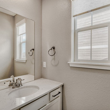
This remodel reimagines the main living space into a bright, open-concept environment that blends comfort, functionality, and modern design.
Wide-plank flooring flows throughout, creating continuity and warmth, while expansive windows bring in natural light and enhance the sense of openness. A sleek fireplace feature wall anchors the living area, paired with custom built-ins and floating shelves that add both storage and visual balance.
The kitchen was designed as the centerpiece of the home, featuring clean-lined cabinetry, a large island for gathering, and high-end finishes that elevate everyday use. Thoughtful lighting—from recessed fixtures to statement pendants—adds depth and highlights key areas throughout the space.
The lower level continues the same design language with a spacious layout ideal for entertaining or relaxing. A custom wet bar with open shelving and a tile backsplash creates a dedicated hosting zone, while soft carpeting keeps the space comfortable and inviting.
Finishing touches like updated bathrooms with modern fixtures and clean tilework complete the transformation, tying every space together with a cohesive, refined feel.
The result is a home that feels open, elevated, and built for the way people actually live.
 Michael Nash Design, Build & Homes
Built in the early 1950s, this small urban townhouse is located in North Old Town Alexandria in an area currently undergoing major redevelopment. The neighborhood is popular with, and affordable for, young people and families, and very convenient to Washington, DC.
In its heyday, the townhouse touted a stately brick exterior, plaster walls, tongue and groove wood flooring and beautiful wooden staircase. Sixty years later, however, the homeowners were faced with crumbling masonry, sagging floors, a double layer of wallpaper over the plaster walls, a crumbling staircase, a dysfunctional kitchen and small, dark second floor rooms. Additionally, the basement had a low ceiling, moldy and cinder block walls, no plumbing and a large boiler taking up most of the space.
The homeowners’ goal was to restore the exterior’s historic look while creating an interior up-to-date for the 21st Century. To turn their vision into reality, they turned to Michael Nash Design, Build & Homes.
Design Solutions
To maintain the townhome’s historic exterior, the Michael Nash team carefully removed, salvaged, restored and reused existing brick masonry. Matching fascia boards and windows were combined with existing windows to complete the exterior renovation.
All interior walls were gutted and reframed. New electrical work, new insulation and new drywall were installed. Much of the home’s original trim was salvaged and reused, as was a piece of art glass, all to keep a bit of the past in the renovation.
The sagging subfloors were fixed, new hard wood floors were installed and a new staircase and railing were designed in a style similar to the original.
The solid wall between the kitchen and the dining room was removed, plumbing was relocated for a new sink location and the kitchen got expanded with an island into the dining room. Closet and plumbing stacks were relocated to allow a new space for fridge. Stainless steel appliances, granite countertops and custom cabinetry highlight the new modern kitchen.
The plan called for redesigning the three bedrooms on the second floor to allow a larger bathroom, walk-in closet and wider hallways. In addition to new roofing, a large skylight was installed to allow natural light into the bathroom and the upper hallway.
The basement was totally revamped. New plumbing was put in place for a full bathroom, laundry room and a den. New e-grass window was installed in the basement to bring this basement up to current building codes.
This homeowners love the neighborhood and now their home gives them the opportunity to stay in the same location.
 Marlo Creative Interiors
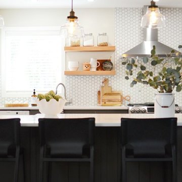
A tired and dated, poorly layed out kitchen gets a bright and fresh new look in in the NW community of Arbour Lake in Calgary.
The corner pantry made way for plenty of storage and counter space and the former dining nook now houses a coffee bar. There’s no need for a separate table because the island has ample space to seat four people comfortably as well as houses extra storage for those infrequently used items. The floating wood shelves don’t just look amazing, they are great for easy access to your most used items. The hexagon tile back splash is installed to highlight the shelves and stainless hood and make a very graphic statement.

Sponsored
Columbus, OH
Wannemacher Interiors
Customized Award-Winning Interior Design Solutions in Franklin Cnty OH
 Camden Lane Interiors
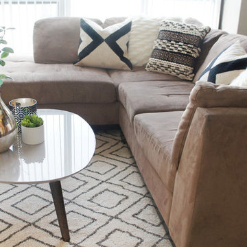
A charming Airbnb rental in the Toronto area. We wanted the design to be glamorous and welcoming - a place where guests feel they are most relaxed! Working within this client’s budget, we were able to design a beautiful and cohesive new look for the bedroom and living area. In the bedroom, we added new bedding with a play on pattern, stripes, and accents of gold. The art piece is a wonderful statement piece that was the inspiration to highlight some of the rich blues and subtle gold onto the bedding. The living room decor is warm & inviting with a play on contrast, texture, and pattern. Less is more here, with warm cream tones in the cushions and area rug which lightens up the space and creates harmony. The living room now meets the needs of these clients, with a sectional to seat multiple people and an arching floor lamp that adds great lighting.
Project completed by Toronto interior design firm Camden Lane Interiors, which serves Toronto.
For more about Camden Lane Interiors, click here: https://www.camdenlaneinteriors.com/
To learn more about this project, click here: https://www.camdenlaneinteriors.com/portfolio-item/torontocondo/
 H Interiors
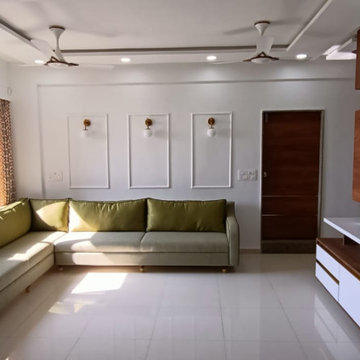
Living room with a comfortable L shaped sofa with white coloured walls. There are molding frames on the walls within which you can hang pictures which will be highlighted by wall lights. The L shapes sofa can easily seat eight people.
 Innovative Modern Design
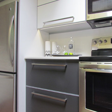
Gourmet kitchen for people who love to cook!! Usually with more than one chef using the space at the same time, the wide distance between walls and ideal layout make moving around simple.Upper cabinets are easy to open using the Aventos soft lift system giving full access to the interior when open. The lower cabinets feature 2 drawers plus 1 hidden inner drawer for a sleek look while maintaining all storage needs. U-shaped drawers under the sink allow for full use of the cabinet and organised trash and recycling. Under cabinet LED lighting and magic corner pull-out are some other highlights. Can't ask for more in a high traffic, well-used space.
22