
Search results for "Performance goals" in Home Design Ideas
 Reyes Creative Concepts LLC.
Living Room:
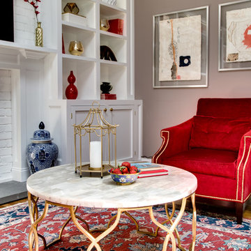
Our customer wanted to update the family room and the kitchen of this 1970's splanch. By painting the brick wall white and adding custom built-ins we brightened up the space. The decor reflects our client's love for color and a bit of asian style elements. We also made sure that the sitting was not only beautiful, but very comfortable and durable. The sofa and the accent chairs sit very comfortably and we used the performance fabrics to make sure they last through the years. We also wanted to highlight the art collection which the owner curated through the years.
Kithen:
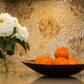
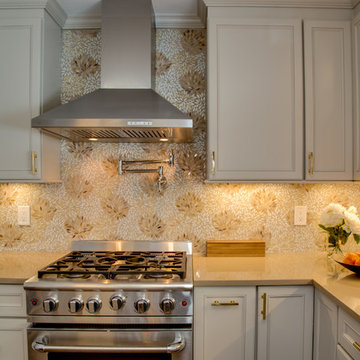
We enlarged the kitchen by removing a partition wall that divided it from the dining room and relocated the entrance. Our goal was to create a warm and inviting kitchen, therefore we selected a mellow, neutral palette. The cabinets are soft Irish Cream as opposed to a bright white. The mosaic backsplash makes a statement, but remains subtle through its beige tones. We selected polished brass for the hardware, as well as brass and warm metals for the light fixtures which emit a warm and cozy glow.
For beauty and practicality, we used quartz for the working surface countertops and for the island we chose a sophisticated leather finish marble with strong movement and gold inflections. Because of our client’s love for Asian influences, we selected upholstery fabric with an image of a dragon, chrysanthemums to mimic Japanese textiles, and red accents scattered throughout.
Functionality, aesthetics, and expressing our clients vision was our main goal.
Photography: Jeanne Calarco, Context Media Development
 Reyes Creative Concepts LLC.
Living Room:
Our customer wanted to update the family room and the kitchen of this 1970's splanch. By painting the brick wall white and adding custom built-ins we brightened up the space. The decor reflects our client's love for color and a bit of asian style elements. We also made sure that the sitting was not only beautiful, but very comfortable and durable. The sofa and the accent chairs sit very comfortably and we used the performance fabrics to make sure they last through the years. We also wanted to highlight the art collection which the owner curated through the years.
Kithen:
We enlarged the kitchen by removing a partition wall that divided it from the dining room and relocated the entrance. Our goal was to create a warm and inviting kitchen, therefore we selected a mellow, neutral palette. The cabinets are soft Irish Cream as opposed to a bright white. The mosaic backsplash makes a statement, but remains subtle through its beige tones. We selected polished brass for the hardware, as well as brass and warm metals for the light fixtures which emit a warm and cozy glow.
For beauty and practicality, we used quartz for the working surface countertops and for the island we chose a sophisticated leather finish marble with strong movement and gold inflections. Because of our client’s love for Asian influences, we selected upholstery fabric with an image of a dragon, chrysanthemums to mimic Japanese textiles, and red accents scattered throughout.
Functionality, aesthetics, and expressing our clients vision was our main goal.
Photography: Jeanne Calarco, Context Media Development
 Reyes Creative Concepts LLC.
Living Room:
Our customer wanted to update the family room and the kitchen of this 1970's splanch. By painting the brick wall white and adding custom built-ins we brightened up the space. The decor reflects our client's love for color and a bit of asian style elements. We also made sure that the sitting was not only beautiful, but very comfortable and durable. The sofa and the accent chairs sit very comfortably and we used the performance fabrics to make sure they last through the years. We also wanted to highlight the art collection which the owner curated through the years.
Kithen:
We enlarged the kitchen by removing a partition wall that divided it from the dining room and relocated the entrance. Our goal was to create a warm and inviting kitchen, therefore we selected a mellow, neutral palette. The cabinets are soft Irish Cream as opposed to a bright white. The mosaic backsplash makes a statement, but remains subtle through its beige tones. We selected polished brass for the hardware, as well as brass and warm metals for the light fixtures which emit a warm and cozy glow.
For beauty and practicality, we used quartz for the working surface countertops and for the island we chose a sophisticated leather finish marble with strong movement and gold inflections. Because of our client’s love for Asian influences, we selected upholstery fabric with an image of a dragon, chrysanthemums to mimic Japanese textiles, and red accents scattered throughout.
Functionality, aesthetics, and expressing our clients vision was our main goal.
Photography: Jeanne Calarco, Context Media Development
Find the right local pro for your project
 MATHISON | MATHISON ARCHITECTS
With a desire to stay close to friends and family, the owners of this 1984 home spent several years searching for property near their neighborhood to build a new, more modern, energy-conscious home tailored to their empty-nest lifestyle. They eventually concluded that their current site was the perfect location for them, but the home needed to be updated and reorganized to create fresh, open, unified spaces to comfortably welcome gatherings of family, friends, and guests.
Before renovation, the floor plan included small rooms, dedicated hallways, a step-down living room, a heavy and dark corner fireplace, and limited opportunities for natural light and visual connections from space to space. Exterior deck areas were narrow, long, and used infrequently.
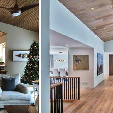
Primary goals of this project included accessibility of space, more natural light, better connectivity between spaces, and a focus on sustainable performance. The updated main floor plan included the selective removal of walls to reallocate dedicated hall space to usable, open living area. The step-down living room was leveled for full accessibility, safety, furniture flexibility and overall space use. The removal of a half-height wall between the living area and the kitchen created continuity between the spaces. Reorganizing the primary entry and stair and eliminating walls between the entry and dining room created new visual connections between the kitchen and the entry. The new central concrete hearth and fireplace provides a strong, modern focal point for the living area. Large sliding glass doors on each side of the fireplace allow the TV area beyond to be separated from the living area as needed.
In several strategic locations, the footprint of the house was expanded to enhance function and flow at the kitchen, dining room, and mudroom. The new outdoor deck area is now large and singular and includes a grille area, dining space and open seating overlooking the newly landscaped pool below.
The exterior envelope of the house includes new insulation, siding, and energy-efficient windows, as well as two large roof-mounted solar arrays, to increase thermal performance and to offset energy costs. Inside, the new HVAC system maximizes energy efficiency while using a fraction of its former footprint. As a result, a portion of the former mechanical space was added back to the lower level family room area and expands into a cozy library nook.
MMA partnered with the owner’s interior designer and kitchen designer to achieve a softer, contemporary palette of finishes that complement this newly configured, light-filled home.
 The Flooring Warehouse
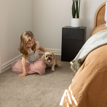
Hilton carpet offers a stately blend of sophistication, luxury and outstanding performance. The dense pile, offers superior comfort, but is also hard wearing for those heavy traffic areas. Made from Premium Solution Dyed Nylon, this carpet is stain proof, fade proof, anti-allergenic with outstanding performance.
 NanaWall
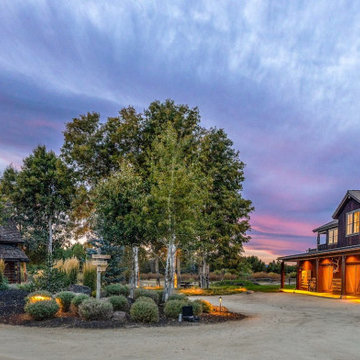
Originally built in 1892, this quaint log cabin has undergone a transformative renovation while preserving its charming character. Located near the Little Deschutes River in Central Oregon, within the historic Vandert Homestead, the home now boasts bright, open spaces for everyday living, complete with flexible aluminum clad folding doors.
Working alongside contractor Bales Inc., architect Jeff Klein from Klein Architecture led the renovation with the goal of opening the once dark interior to natural light and the surrounding landscape. Central to the design was transforming a deteriorating garage into a new functional sunroom, creating a light-filled space that reorients the cabin design toward the patio and natural environment.
Restoring a Historic Cabin with Aluminum Clad Folding Doors
outdoor living with aluminum clad folding door
A Revamped Cabin Design for Indoor-Outdoor Living
The former garage is now a transitional space between the cabin and a natural stone patio. Positioned along the south elevation, the sunroom captures daylight throughout the day while acting as a buffer between the interior and exterior environments. A revised roof assembly was developed to resolve previous drainage failures. Working with framers, the design team incorporated a sloping roof system with a waterproof membrane to direct water away from the structure.
This approach not only protected the log walls but also created access to a rooftop deck from the upper level, adding functional outdoor space without expanding the building footprint.
“It was also critical to transform the existing dark, segmented interior spaces by physically opening them up to the new sunroom,” says Klein. “NanaWall systems offered the ideal solution for what we were after.”
historical homestead interior
Improving Spatial Flow, From the Kitchen to the Sunroom
The kitchen remained largely intact during the renovation, retaining many of the elements that had defined the cabin’s character for decades. Features such as the farmhouse sink, concrete countertops, butcher-block island, and built-in seating were retained, creating a perfect blend of old and new.
What changed was how the kitchen connects to the surrounding rooms. The layout now flows naturally into an adjacent dining area before extending into the newly added sunroom, delivering a seamless transition from the interiors to the outdoors through aluminum clad folding doors.
Historic log cabin with clad folding doors and windows
A Light-Filled Sunroom Designed for Gatherings with Aluminum Clad Windows and Doors
The newly added sunroom became the centerpiece of the cabin design. Designed as a bright, welcoming space, it connects the historic cabin to the natural stone patio beyond. Interior designer Sue Olson helped create the room's atmosphere by choosing finishes and furnishings that complement the cabin's rustic materials while keeping the space open and inviting.
The sunroom captures sunlight throughout the day and serves as a flexible space for dining, relaxing, and entertaining. The addition was designed to sit comfortably alongside the existing log structure while introducing expansive glazing and aluminum clad folding doors that draw daylight deep into the home.
NanaWall aluminum clad folding doors and windows
Aluminum Clad Folding Doors Open the Sunroom to the Patio
A NanaWall aluminum clad folding glass door opens the south wall of the sunroom, creating a direct connection to the natural stone patio. Spanning more than thirteen feet wide and nearly eight feet tall, the system allows the entire façade to open when the panels are folded back. Specified with pine wood frames and simulated divided lites, the door complements the cabin’s traditional materials while introducing the flexibility of modern indoor-outdoor living.
When closed, the door frames the view while bringing daylight into the sunroom. When open, the space seamlessly flows into the patio. Plus, customized with double glazed panels, these aluminum clad systems offer an insulated barrier that keeps cold weather out and keeps comfortable interiors year-round.
“The NanaWall system was the ideal solution for the proposed design,” says Klein. “The result is a seamless connection between the sheltered interior area and the openness of the outdoor environment.”
aluminum clad folding windows
A Folding Window Creates an Indoor-Outdoor Bar
Complementing the folding door and indoor-outdoor cabin design, a NanaWall aluminum clad folding window was installed at bar height along the sunroom wall facing the patio. Stretching more than thirteen feet across and just over four feet in height, the opening transforms the wall into a casual indoor-outdoor serving counter.
Specified with matching pine wood frames and simulated divided lites, the system folds away easily, creating an indoor-outdoor bar that encourages interaction between the sunroom and patio. When open, the counter becomes a flexible gathering point for meals, drinks, and conversation, allowing those inside and outside to share the space comfortably.
“The NanaWall door and window systems played a pivotal role in achieving our design objectives,” says Klein. “The connection between the indoor and outdoor environment has become seamless.”
inoor-outdoor living with clad folding windows and doors
The Flexible Design Solution for Every Home Style
Beyond creating large openings, the NanaWall aluminum clad folding doors were chosen for how well they integrate with the cabin’s traditional architecture while delivering modern functionality. The wood clad panels, specified with simulated divided lites, reflect the style and charm of classic window detailing, while panels that fold outward maximize usable space inside the cabin.
Minimal frames maximize glass area, drawing natural light deeper into the sunroom and adjacent spaces. Paired with higher weather performance sills, the systems are built to withstand the region’s climate while allowing the sunroom to shift easily between a sheltered interior space and an open-air extension of the patio.
Additionally, NanaWall aluminum clad systems feature clip-on cladding technology that allows the wood to breathe in environments where temperatures are extremely hot, humid, or cold. This, in turn, aligns with the renovation’s goal of resolving prior drainage and moisture issues.
outdoor living with NanaWall aluminum clad systems
Final Thoughts: Historic Cabin Design Reimagined for Modern Living
Today, the Vandevert Homestead perfectly blends old-time charm with modern living. The renovation maintains the historic character of the original log structure while introducing brighter, more connected spaces that better engage with the surrounding landscape.
With the transformation of the garage into a light-filled sunroom and flexible NanaWall aluminum clad folding doors, everyday living now flows naturally between the kitchen, dining area, sunroom, and patio. The result is a cabin that feels both timeless and renewed, where historic craftsmanship remains intact while the home experience is lighter, more open, and closely tied to the natural beauty of Central Oregon.
 A. Michael Architecture
At A. Michael Architecture, we are a leading residential architecture firm in Dallas, TX, specializing in unforgettable Healthy, High-Performance home design. We craft exclusive living spaces as sophisticated and elegant as our clients' imaginations....#AMArchitecture #DesignCraftThrive #HighPerformanceHome #HealthyHomeDesign #ModernTexasArchitecture #LuxuryResidentialDesign #CustomHomeArchitect #BoutiqueArchitectureFirm #PassiveHouseInspired #ArchitectsOfPinterest #ElevatedLiving #HomeAsSanctuary #WellnessByDesign #SustainableLuxury #LiveInspired #DallasArchitecture #TexasModernHome #PinterestHomeInspo #DreamHomeGoals #ArchitecturalInspiration
 User
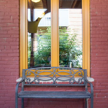
UserA unique historic renovation. Our windows maintain the historic look with modern performance. Equipped with tilt and turn, wood aluminum triple-pane, Glo European Windows.
The Glo wood aluminum triple pane windows were chosen for this historic renovation to maintain comfortable temperatures and provide clear views. Our client wanted to match the historic aesthetic and continue their goal of energy efficient updates. High performance values with multiple air seals were required to keep the building comfortable through Missoula's changing weather. Warm wood interior frames were selected and the original paint color chosen to match the original design aesthetic, while durable aluminum frames provide protection from the elements.
 Crystal Kitchen + Bath
The goal for this 1939 Tudor-style story-and-a-half home was to create a kitchen that offered the conveniences, storage, and performance of a modern workspace while preserving the warmth, craftsmanship, and vintage charm that made the home special. The client, an avid home cook, wanted the room to feel as though it had always belonged to the house, with thoughtful upgrades that respected the original architecture rather than competing with it. Just as important, she needed a more efficient layout with enough storage for small appliances, so everyday cooking would no longer require carrying items up from the lower level.
Several existing conditions shaped the design approach. The kitchen retained original, amber-stained birch woodwork that the client wished to keep, and the compact footprint was interrupted by six doorways and two windows, none of which were to be moved, altered, or replaced. A previous flooring update had left the door casings undercut too short, creating visible gaps where the casing met the floor. The existing vintage 40-inch range also lacked proper ventilation, yet the client wished to accommodate a refrigerator, dishwasher, cooktop, double ovens, built-in microwave, and effective venting above the cooktop into the new kitchen layout.
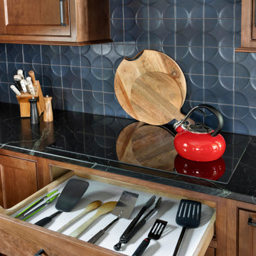
To honor the original millwork, beaded inset-style cherry cabinetry was selected in a soft, hand-rubbed finish that will deepen over time and develop a natural patina. Charcoal-gray soapstone countertops complement the cabinetry while reinforcing the historic character of the home with an organic, timeworn texture. The former breakfast nook was transformed into a butler’s pantry, adding valuable base cabinet storage and expanded work surfaces for frequently used small appliances. Also in the butler’s pantry, a single upper cabinet was paired with open shelves to give an open, airy feeling while adding character and practical storage. A classic single-bowl apron-front workstation sink contributes both period-appropriate character and practical prep and cleanup function.
Because the home’s openings were such a defining feature, the design worked within the existing architecture instead of altering it. Custom plinth blocks were created for each doorway to extend the original casing gracefully down to the new natural red oak flooring, resolving the earlier construction issue while adding a detail that feels authentic to the age of the house. Despite the number of door and window openings, the new layout provides a significantly more functional, built-in kitchen with an improved work triangle for serious cooking.
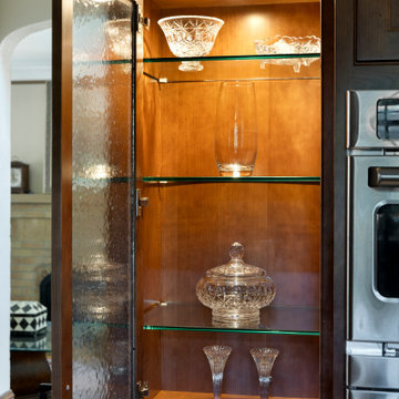
Appliance placement was carefully planned to deliver the requested performance without overwhelming the small room. Three cooking functions (double ovens & microwave) were consolidated into one location with a GE Café double oven featuring Advantium Technology, while the client’s compact 31-inch refrigerator was reused to preserve space. A sleek 30-inch induction cooktop provides efficient cooking, and a Vent-A-Hood ARS ductless vent hood supplies needed ventilation without requiring a duct run to the exterior.
The finish palette balances richness, texture, and historical sensitivity. A deeply textured navy backsplash tile adds depth and dramatic shadow play against the soapstone, while wallpaper in the back entry echoes the tile’s geometric pattern to visually connect the adjoining spaces. Oil-rubbed bronze cabinet hardware and light fixtures enhance the warmth of the cherry cabinetry and complete the antique-inspired feel.
Lighting was layered to make the compact kitchen brighter, more useful, and more inviting. Vintage-style semi-flush ceiling fixtures establish the overall tone, while dimmable puck lights highlight select areas and undercabinet task lighting keeps work surfaces well illuminated.
The completed kitchen now feels both highly functional and deeply rooted in the home’s history. Rich cherry cabinetry, velvety soapstone, natural red oak flooring, navy tile, bronze accents, and carefully preserved birch trim work together to create a warm, cohesive space that celebrates timeless craftsmanship. By increasing storage, improving workflow, integrating modern appliances, and respecting the Tudor home’s original character, the design achieves the client’s vision: a kitchen that feels personal, practical, historically appropriate, and as though it has always been there.
 Crystal Kitchen + Bath
The goal for this 1939 Tudor-style story-and-a-half home was to create a kitchen that offered the conveniences, storage, and performance of a modern workspace while preserving the warmth, craftsmanship, and vintage charm that made the home special. The client, an avid home cook, wanted the room to feel as though it had always belonged to the house, with thoughtful upgrades that respected the original architecture rather than competing with it. Just as important, she needed a more efficient layout with enough storage for small appliances, so everyday cooking would no longer require carrying items up from the lower level.
Several existing conditions shaped the design approach. The kitchen retained original, amber-stained birch woodwork that the client wished to keep, and the compact footprint was interrupted by six doorways and two windows, none of which were to be moved, altered, or replaced. A previous flooring update had left the door casings undercut too short, creating visible gaps where the casing met the floor. The existing vintage 40-inch range also lacked proper ventilation, yet the client wished to accommodate a refrigerator, dishwasher, cooktop, double ovens, built-in microwave, and effective venting above the cooktop into the new kitchen layout.
To honor the original millwork, beaded inset-style cherry cabinetry was selected in a soft, hand-rubbed finish that will deepen over time and develop a natural patina. Charcoal-gray soapstone countertops complement the cabinetry while reinforcing the historic character of the home with an organic, timeworn texture. The former breakfast nook was transformed into a butler’s pantry, adding valuable base cabinet storage and expanded work surfaces for frequently used small appliances. Also in the butler’s pantry, a single upper cabinet was paired with open shelves to give an open, airy feeling while adding character and practical storage. A classic single-bowl apron-front workstation sink contributes both period-appropriate character and practical prep and cleanup function.
Because the home’s openings were such a defining feature, the design worked within the existing architecture instead of altering it. Custom plinth blocks were created for each doorway to extend the original casing gracefully down to the new natural red oak flooring, resolving the earlier construction issue while adding a detail that feels authentic to the age of the house. Despite the number of door and window openings, the new layout provides a significantly more functional, built-in kitchen with an improved work triangle for serious cooking.
Appliance placement was carefully planned to deliver the requested performance without overwhelming the small room. Three cooking functions (double ovens & microwave) were consolidated into one location with a GE Café double oven featuring Advantium Technology, while the client’s compact 31-inch refrigerator was reused to preserve space. A sleek 30-inch induction cooktop provides efficient cooking, and a Vent-A-Hood ARS ductless vent hood supplies needed ventilation without requiring a duct run to the exterior.
The finish palette balances richness, texture, and historical sensitivity. A deeply textured navy backsplash tile adds depth and dramatic shadow play against the soapstone, while wallpaper in the back entry echoes the tile’s geometric pattern to visually connect the adjoining spaces. Oil-rubbed bronze cabinet hardware and light fixtures enhance the warmth of the cherry cabinetry and complete the antique-inspired feel.
Lighting was layered to make the compact kitchen brighter, more useful, and more inviting. Vintage-style semi-flush ceiling fixtures establish the overall tone, while dimmable puck lights highlight select areas and undercabinet task lighting keeps work surfaces well illuminated.
The completed kitchen now feels both highly functional and deeply rooted in the home’s history. Rich cherry cabinetry, velvety soapstone, natural red oak flooring, navy tile, bronze accents, and carefully preserved birch trim work together to create a warm, cohesive space that celebrates timeless craftsmanship. By increasing storage, improving workflow, integrating modern appliances, and respecting the Tudor home’s original character, the design achieves the client’s vision: a kitchen that feels personal, practical, historically appropriate, and as though it has always been there.
 Reyes Creative Concepts LLC.
Living Room:
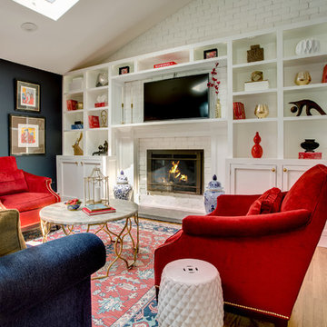
Our customer wanted to update the family room and the kitchen of this 1970's splanch. By painting the brick wall white and adding custom built-ins we brightened up the space. The decor reflects our client's love for color and a bit of asian style elements. We also made sure that the sitting was not only beautiful, but very comfortable and durable. The sofa and the accent chairs sit very comfortably and we used the performance fabrics to make sure they last through the years. We also wanted to highlight the art collection which the owner curated through the years.
Kithen:
We enlarged the kitchen by removing a partition wall that divided it from the dining room and relocated the entrance. Our goal was to create a warm and inviting kitchen, therefore we selected a mellow, neutral palette. The cabinets are soft Irish Cream as opposed to a bright white. The mosaic backsplash makes a statement, but remains subtle through its beige tones. We selected polished brass for the hardware, as well as brass and warm metals for the light fixtures which emit a warm and cozy glow.
For beauty and practicality, we used quartz for the working surface countertops and for the island we chose a sophisticated leather finish marble with strong movement and gold inflections. Because of our client’s love for Asian influences, we selected upholstery fabric with an image of a dragon, chrysanthemums to mimic Japanese textiles, and red accents scattered throughout.
Functionality, aesthetics, and expressing our clients vision was our main goal.
Photography: Jeanne Calarco, Context Media Development
 NanaWall
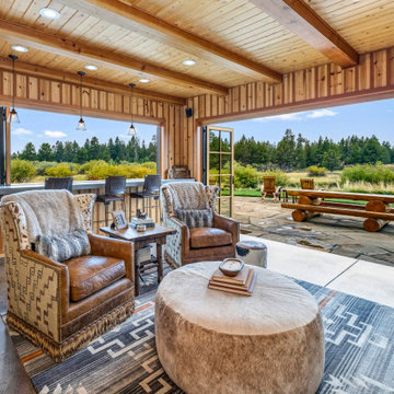
Originally built in 1892, this quaint log cabin has undergone a transformative renovation while preserving its charming character. Located near the Little Deschutes River in Central Oregon, within the historic Vandert Homestead, the home now boasts bright, open spaces for everyday living, complete with flexible aluminum clad folding doors.
Working alongside contractor Bales Inc., architect Jeff Klein from Klein Architecture led the renovation with the goal of opening the once dark interior to natural light and the surrounding landscape. Central to the design was transforming a deteriorating garage into a new functional sunroom, creating a light-filled space that reorients the cabin design toward the patio and natural environment.
Restoring a Historic Cabin with Aluminum Clad Folding Doors
outdoor living with aluminum clad folding door
A Revamped Cabin Design for Indoor-Outdoor Living
The former garage is now a transitional space between the cabin and a natural stone patio. Positioned along the south elevation, the sunroom captures daylight throughout the day while acting as a buffer between the interior and exterior environments. A revised roof assembly was developed to resolve previous drainage failures. Working with framers, the design team incorporated a sloping roof system with a waterproof membrane to direct water away from the structure.
This approach not only protected the log walls but also created access to a rooftop deck from the upper level, adding functional outdoor space without expanding the building footprint.
“It was also critical to transform the existing dark, segmented interior spaces by physically opening them up to the new sunroom,” says Klein. “NanaWall systems offered the ideal solution for what we were after.”
historical homestead interior
Improving Spatial Flow, From the Kitchen to the Sunroom
The kitchen remained largely intact during the renovation, retaining many of the elements that had defined the cabin’s character for decades. Features such as the farmhouse sink, concrete countertops, butcher-block island, and built-in seating were retained, creating a perfect blend of old and new.
What changed was how the kitchen connects to the surrounding rooms. The layout now flows naturally into an adjacent dining area before extending into the newly added sunroom, delivering a seamless transition from the interiors to the outdoors through aluminum clad folding doors.
Historic log cabin with clad folding doors and windows
A Light-Filled Sunroom Designed for Gatherings with Aluminum Clad Windows and Doors
The newly added sunroom became the centerpiece of the cabin design. Designed as a bright, welcoming space, it connects the historic cabin to the natural stone patio beyond. Interior designer Sue Olson helped create the room's atmosphere by choosing finishes and furnishings that complement the cabin's rustic materials while keeping the space open and inviting.
The sunroom captures sunlight throughout the day and serves as a flexible space for dining, relaxing, and entertaining. The addition was designed to sit comfortably alongside the existing log structure while introducing expansive glazing and aluminum clad folding doors that draw daylight deep into the home.
NanaWall aluminum clad folding doors and windows
Aluminum Clad Folding Doors Open the Sunroom to the Patio
A NanaWall aluminum clad folding glass door opens the south wall of the sunroom, creating a direct connection to the natural stone patio. Spanning more than thirteen feet wide and nearly eight feet tall, the system allows the entire façade to open when the panels are folded back. Specified with pine wood frames and simulated divided lites, the door complements the cabin’s traditional materials while introducing the flexibility of modern indoor-outdoor living.
When closed, the door frames the view while bringing daylight into the sunroom. When open, the space seamlessly flows into the patio. Plus, customized with double glazed panels, these aluminum clad systems offer an insulated barrier that keeps cold weather out and keeps comfortable interiors year-round.
“The NanaWall system was the ideal solution for the proposed design,” says Klein. “The result is a seamless connection between the sheltered interior area and the openness of the outdoor environment.”
aluminum clad folding windows
A Folding Window Creates an Indoor-Outdoor Bar
Complementing the folding door and indoor-outdoor cabin design, a NanaWall aluminum clad folding window was installed at bar height along the sunroom wall facing the patio. Stretching more than thirteen feet across and just over four feet in height, the opening transforms the wall into a casual indoor-outdoor serving counter.
Specified with matching pine wood frames and simulated divided lites, the system folds away easily, creating an indoor-outdoor bar that encourages interaction between the sunroom and patio. When open, the counter becomes a flexible gathering point for meals, drinks, and conversation, allowing those inside and outside to share the space comfortably.
“The NanaWall door and window systems played a pivotal role in achieving our design objectives,” says Klein. “The connection between the indoor and outdoor environment has become seamless.”
inoor-outdoor living with clad folding windows and doors
The Flexible Design Solution for Every Home Style
Beyond creating large openings, the NanaWall aluminum clad folding doors were chosen for how well they integrate with the cabin’s traditional architecture while delivering modern functionality. The wood clad panels, specified with simulated divided lites, reflect the style and charm of classic window detailing, while panels that fold outward maximize usable space inside the cabin.
Minimal frames maximize glass area, drawing natural light deeper into the sunroom and adjacent spaces. Paired with higher weather performance sills, the systems are built to withstand the region’s climate while allowing the sunroom to shift easily between a sheltered interior space and an open-air extension of the patio.
Additionally, NanaWall aluminum clad systems feature clip-on cladding technology that allows the wood to breathe in environments where temperatures are extremely hot, humid, or cold. This, in turn, aligns with the renovation’s goal of resolving prior drainage and moisture issues.
outdoor living with NanaWall aluminum clad systems
Final Thoughts: Historic Cabin Design Reimagined for Modern Living
Today, the Vandevert Homestead perfectly blends old-time charm with modern living. The renovation maintains the historic character of the original log structure while introducing brighter, more connected spaces that better engage with the surrounding landscape.
With the transformation of the garage into a light-filled sunroom and flexible NanaWall aluminum clad folding doors, everyday living now flows naturally between the kitchen, dining area, sunroom, and patio. The result is a cabin that feels both timeless and renewed, where historic craftsmanship remains intact while the home experience is lighter, more open, and closely tied to the natural beauty of Central Oregon.
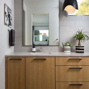 A. Michael Architecture
At A. Michael Architecture, we are a leading residential architecture firm in Dallas, TX, specializing in unforgettable Healthy, High-Performance home design. We craft exclusive living spaces as sophisticated and elegant as our clients' imaginations....#AMArchitecture #DesignCraftThrive #HighPerformanceHome #HealthyHomeDesign #ModernTexasArchitecture #LuxuryResidentialDesign #CustomHomeArchitect #BoutiqueArchitectureFirm #PassiveHouseInspired #ArchitectsOfPinterest #ElevatedLiving #HomeAsSanctuary #WellnessByDesign #SustainableLuxury #LiveInspired #DallasArchitecture #TexasModernHome #PinterestHomeInspo #DreamHomeGoals #ArchitecturalInspiration

 NILES
NILESThis 2022 project was a fully custom mix and writing suite designed for multi-Grammy and Dove Award–winning producer and songwriter Kyle Lee. The goal was to create an environment that mirrors his creative workflow—quiet, natural, highly accurate, and intentionally crafted for long sessions of collaboration and focused work.
The layout is compact but feels open thanks to high ceilings, soft daylight from the surrounding windows, and a palette of warm textures and natural materials. The room maintains a clean, grounded aesthetic without sacrificing technical performance, balancing style and acoustical precision in a way that supports both creativity and accuracy.
Acoustic isolation was a core priority. The suite is fully separated from the rest of the home using sound-reducing wall assemblies, custom bass management including a full soft-ceiling trap and a false rear wall trap, and full-lite doors designed for controlled leakage. The result is a private, self-contained environment that integrates seamlessly with the home’s flow yet transforms into a focused creative space the moment the doors close.
Monitoring was built around Kyle’s preferred ATC SCM45A loudspeakers, paired with Dynaudio subwoofers and calibrated specifically to the room’s frequency response. Every treatment, material, and speaker position was selected to ensure what Kyle hears while mixing precisely translates to the final master.
The finished suite delivers an effortless feel with professional-grade performance—an inspiring, accurate, and dependable space built to support Kyle’s work at the highest level.
 NILES
NILESThis 2022 project was a fully custom mix and writing suite designed for multi-Grammy and Dove Award–winning producer and songwriter Kyle Lee. The goal was to create an environment that mirrors his creative workflow—quiet, natural, highly accurate, and intentionally crafted for long sessions of collaboration and focused work.
The layout is compact but feels open thanks to high ceilings, soft daylight from the surrounding windows, and a palette of warm textures and natural materials. The room maintains a clean, grounded aesthetic without sacrificing technical performance, balancing style and acoustical precision in a way that supports both creativity and accuracy.
Acoustic isolation was a core priority. The suite is fully separated from the rest of the home using sound-reducing wall assemblies, custom bass management including a full soft-ceiling trap and a false rear wall trap, and full-lite doors designed for controlled leakage. The result is a private, self-contained environment that integrates seamlessly with the home’s flow yet transforms into a focused creative space the moment the doors close.
Monitoring was built around Kyle’s preferred ATC SCM45A loudspeakers, paired with Dynaudio subwoofers and calibrated specifically to the room’s frequency response. Every treatment, material, and speaker position was selected to ensure what Kyle hears while mixing precisely translates to the final master.
The finished suite delivers an effortless feel with professional-grade performance—an inspiring, accurate, and dependable space built to support Kyle’s work at the highest level.
 User
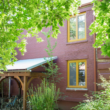
UserA unique historic renovation. Our windows maintain the historic look with modern performance. Equipped with tilt and turn, wood aluminum triple-pane, Glo European Windows.
The Glo wood aluminum triple pane windows were chosen for this historic renovation to maintain comfortable temperatures and provide clear views. Our client wanted to match the historic aesthetic and continue their goal of energy efficient updates. High performance values with multiple air seals were required to keep the building comfortable through Missoula's changing weather. Warm wood interior frames were selected and the original paint color chosen to match the original design aesthetic, while durable aluminum frames provide protection from the elements.
 NILES
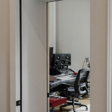
NILESThis 2022 project was a fully custom mix and writing suite designed for multi-Grammy and Dove Award–winning producer and songwriter Kyle Lee. The goal was to create an environment that mirrors his creative workflow—quiet, natural, highly accurate, and intentionally crafted for long sessions of collaboration and focused work.
The layout is compact but feels open thanks to high ceilings, soft daylight from the surrounding windows, and a palette of warm textures and natural materials. The room maintains a clean, grounded aesthetic without sacrificing technical performance, balancing style and acoustical precision in a way that supports both creativity and accuracy.
Acoustic isolation was a core priority. The suite is fully separated from the rest of the home using sound-reducing wall assemblies, custom bass management including a full soft-ceiling trap and a false rear wall trap, and full-lite doors designed for controlled leakage. The result is a private, self-contained environment that integrates seamlessly with the home’s flow yet transforms into a focused creative space the moment the doors close.
Monitoring was built around Kyle’s preferred ATC SCM45A loudspeakers, paired with Dynaudio subwoofers and calibrated specifically to the room’s frequency response. Every treatment, material, and speaker position was selected to ensure what Kyle hears while mixing precisely translates to the final master.
The finished suite delivers an effortless feel with professional-grade performance—an inspiring, accurate, and dependable space built to support Kyle’s work at the highest level.
 Architect
Why Mattress Thickness Is One of the Most Misunderstood Specs
When most people shop for a memory foam mattress, they focus on firmness, materials, and brand. Thickness tends to be an afterthought — or worse, treated as a proxy for quality. The assumption goes: thicker equals better. That assumption is wrong in a meaningful number of cases, and getting it wrong means waking up with exactly the kind of stiffness, pressure pain, or lower back ache you bought a new mattress to avoid.
The right thickness for a memory foam mattress is not a single number. It is a combination of your body weight, your sleep position, and any specific health conditions you are managing. A 14-inch mattress that provides ideal support for a 250-pound side sleeper may cause a 115-pound stomach sleeper to experience spinal misalignment all night. A 10-inch mattress that works perfectly for a back sleeper of average build offers inadequate pressure relief for a heavier side sleeper whose hips need to sink further into the comfort layer before the support base engages.
This guide maps thickness to the factors that actually determine whether a mattress works for your body. It covers the science of mattress layers, the three primary variables (weight, position, condition), and a complete decision table so you can find your ideal thickness without guesswork.
Understanding Mattress Thickness: Layers, Not Just Height
A memory foam mattress’s total thickness is the sum of its individual layers, and those layers serve entirely different functions. Two mattresses that are both 12 inches thick may feel radically different because their comfort layer depths and support core thicknesses are distributed differently.
The Two Parts That Matter
Every memory foam mattress has two functional zones: the comfort layer at the top and the support core at the bottom. The comfort layer — which in quality mattresses consists of gel-infused viscoelastic foam, transition foam, and a cooling cover — is the zone that contours to your body, relieves pressure, and cushions the joints. The support core — high-density foam or pocketed springs in a hybrid — is the zone that keeps the spine aligned and prevents the entire body from sinking into the mattress.
The key relationship is this: the comfort layer must be deep enough for your body’s heaviest pressure points to sink in fully before the firmer support core pushes back. If it is too shallow, those pressure points press against a firm surface and cause localised pain. If the support core is too thin, the whole mattress sags under body weight and the spine loses alignment regardless of how comfortable the top feels.
Here is how EGOHOME’s Black series layers map to these functions:
Layer
Material
Function
EGOHOME Technology
Cover (0.5–1")
Fabric + cooling tech
Temperature regulation, hygiene
Anti-heat™ Graphene Cooling Cover
Comfort layer (2–6")
Gel foam, AeroFusion™
Pressure relief, contouring
Copper Gel AeroFusion™ Foam
Transition layer (1–2")
Mid-density foam
Prevents sinkage past comfort zone
BraceSleeper™ Support Foam (upper)
Support core (6–12")
High-density foam or coils
Spinal alignment, edge support
BraceSleeper™ Support Foam (core)
Thickness alone does not tell you how a mattress will perform. A 14-inch mattress with a 2-inch comfort layer and a 12-inch support core will feel firm and supportive. A 14-inch mattress with a 6-inch comfort layer and an 8-inch support core will feel plush and contouring. Always check the comfort layer depth, not just the total inches.
Memory Foam Mattress Thickness Ranges: What Each Category Delivers
Here is a complete breakdown of what to expect from each thickness range and who each suits best:
Thickness
Profile
Best Use Case
Body Weight
Best Sleep Position
6–8"
Low profile
Children, bunk beds, guest rooms, adjustable bases
Under 130 lbs
Kids, lightweight, occasional use
8–10"
Standard-thin
Stomach sleepers, lightweight adults, budget setups
Under 130 lbs
Stomach, lightweight back sleepers
10–12"
Standard
Most adults, back sleepers, back pain relief
130–230 lbs
Back, stomach, combo sleepers
12–14"
High-profile
Side sleepers, plus-size, pressure relief
130–230 lbs+
Side sleepers, hip/shoulder pain
14"+
Premium
Plus-size sleepers, heavy duos, luxury setups
230 lbs+
Plus-size, side sleepers, chronic pain
6–8 Inches: Low-Profile (Specific Use Cases Only)
Low-profile mattresses in the 6 to 8 inch range are designed for specific applications rather than general adult use. They work well on bunk beds and trundle beds where height clearance is limited, for children’s beds where a lower sleep surface is safer, on adjustable bases where the mattress needs to flex significantly, and for lightweight individuals under 130 pounds who need minimal depth to reach the support core. For a standard adult of average build, a mattress under 8 inches is unlikely to provide adequate comfort layer depth for sustained pressure relief.
8–10 Inches: Standard-Thin (Stomach Sleepers and Lightweight Adults)
The 8 to 10 inch range is the practical starting point for most adult use. At this thickness, there is enough comfort layer to provide basic pressure relief without the excessive depth that allows heavier body sections to sink past the support zone. Stomach sleepers in particular benefit from this range: when sleeping face down, the goal is to keep the hips from sinking lower than the shoulders and chest, which would create a downward bow in the lumbar spine. A thinner mattress with a firmer feel prevents this hyperextension more reliably than a thicker, softer model. EGOHOME offers 8-inch memory foam options suited to this profile.
10–12 Inches: Standard (The Sweet Spot for Most Adults)
The 10 to 12 inch range is the most broadly appropriate thickness for adults of standard build. At this depth, a quality memory foam mattress contains enough comfort layer material to contour genuinely around the hips and shoulders without allowing the body to bottom out into the support core. It also contains enough support core depth to maintain spinal alignment under continuous body weight across seven or eight hours. Back sleepers of standard weight (130 to 230 pounds) typically find this range the most supportive, as the lumbar region receives adequate underlying resistance without the excessive softness that taller mattresses can develop under consistent pressure.
12–14 Inches: High-Profile (Side Sleepers and Plus-Size Sleepers)
The 12 to 14 inch range addresses two specific needs: side sleepers who require a deep enough comfort layer to allow the shoulder and hip to sink in while the waist remains supported, and heavier individuals whose body weight requires more foam depth before reaching full support core engagement. For a side sleeper of standard or higher body weight, a comfort layer of less than 4 to 6 inches is often not deep enough for the shoulder to sink fully into an aligned position. The result is an upward lateral bow in the thoracic spine that causes shoulder and upper back pain upon waking. The EGOHOME Black 14-inch Pro and Hybrid models are built specifically for this thickness range.
14 Inches and Above: Premium and Plus-Size
Mattresses at 14 inches or more are appropriate for plus-size sleepers over 230 pounds and for couples where one partner is significantly heavier. At higher body weights, a greater depth of both comfort material and support foam is required because the heavier load compresses the foam more aggressively. A support core that adequately resists a 160-pound sleeper may allow excessive sinkage under a 280-pound sleeper, causing the hips to drop past the point of lumbar support. EGOHOME’s Black 14-inch Firm model includes a 12-inch BraceSleeper™ Support Foam core specifically designed to resist this deep compression under higher body weights.
Thickness by Body Weight: The Primary Determining Factor
Body weight is the single most important variable in thickness selection because it directly determines how far the body sinks into the foam. The same mattress will feel completely different to a 120-pound sleeper versus a 240-pound sleeper, because the heavier person compresses the foam significantly more deeply.
Lightweight Sleepers (Under 130 lbs)
Lightweight sleepers do not need and often cannot benefit from thick mattresses. Because they exert less pressure on the foam, they may not compress a 14-inch mattress deeply enough to feel the support core at all, resulting in a floating sensation with insufficient underlying resistance. For lightweight sleepers, 8 to 10 inches provides adequate comfort layer depth for full pressure relief. The EGOHOME Black 10-inch Classic (medium feel) is the appropriate starting point for this weight category.
Standard-Weight Sleepers (130–230 lbs)
Standard-weight adults represent the broadest population of mattress buyers, and the 10 to 12 inch range was designed specifically for this group. At this weight range, the body compresses the comfort layer meaningfully enough for the foam to contour around pressure points, while the support core remains thick enough to prevent excessive sinkage. The EGOHOME Black 12-inch and the Black 10-inch ranges both address this category, with the 12-inch models being more appropriate for side sleepers who need the extra comfort layer depth.
Plus-Size Sleepers (Over 230 lbs)
Heavier sleepers require 12 to 14 inches at minimum to prevent bottoming out — the point at which body weight compresses through the comfort layer entirely and the sleeper feels the firm support core directly. Bottoming out eliminates pressure relief completely and can significantly worsen joint pain and lower back stiffness. EGOHOME recommends a suggested maximum of 300 pounds per person across their mattress range, and the 14-inch Hybrid and 14-inch Firm models are engineered with the deeper support cores required to handle higher body weights without performance degradation over time.
Thickness by Sleep Position: Matching Depth to Alignment Needs
Side Sleepers: 12 Inches or More
Side sleeping places the body’s heaviest pressure points — the shoulder and hip — in direct contact with the mattress. These points need to sink into the comfort layer deeply enough that the spine remains horizontal from head to toe. If the comfort layer is too thin or too firm, the shoulder cannot descend fully into the mattress, and the spine develops an upward lateral curve between the shoulder and the head. This causes the neck, shoulder, and upper back tension that many side sleepers report upon waking.
Side sleepers of standard weight need at least 12 inches, with a soft to medium-soft comfort layer. EGOHOME’s Black 12-inch Pro (soft feel, 7.5 out of 10 cooling score) is specifically recommended for side sleepers managing back, shoulder, or joint pain. The Black 14-inch Pro (medium-soft, 8 out of 10 cooling) adds additional comfort layer depth for those who need greater pressure relief.
Back Sleepers: 10–12 Inches
Back sleeping is the most spinal-alignment-friendly position because the body’s weight is distributed relatively evenly across the mattress. The primary challenge for back sleepers is lumbar support: the natural inward curve of the lower back creates a gap between the lumbar spine and the mattress surface that must be filled by the foam contouring upward into it. A mattress that is too soft allows the pelvis to sink excessively, flattening this curve and creating lower back compression. A mattress that is too firm cannot conform into the lumbar curve at all.
For back sleepers, 10 to 12 inches with a medium or medium-firm feel provides the optimal combination. EGOHOME’s Black 12-inch Hybrid (medium-firm, 6.5 out of 10 cooling) is specifically noted as ideal for back sleepers, combining pocketed spring zoned support with gel foam contouring for precise lumbar engagement.
Stomach Sleepers: 8–10 Inches
Stomach sleepers face the opposite alignment challenge from side sleepers. Rather than needing the mattress to yield deeply at the joints, they need the mattress to maintain a flat, firm surface that prevents the hips from sinking below the chest. If the hips drop lower than the upper body, the lumbar spine hyperextends into an arched position that compresses the posterior vertebral joints and causes significant lower back pain.
Stomach sleepers need a thinner mattress with a firmer feel. The EGOHOME Black 14-inch Firm is specifically recommended for stomach sleepers and heavier sleepers who need maximum surface resistance. Its 12-inch BraceSleeper™ Support Foam core provides the deep, unyielding base that prevents hip sinkage without requiring a thin mattress that compromises comfort.
Best Thickness for Back Pain: The Medium-Firm 10–12 Inch Principle
For people managing chronic lower back pain, herniated discs, sciatica, or general spinal stiffness, mattress thickness interacts with back health in a specific way that differs from general sleep comfort recommendations.
The key principle for back pain is controlled contouring. You need enough foam depth to relieve pressure at the hips and shoulders, but not so much depth that the foam develops a sag under the heavier sections of the body over time. Excessive thickness combined with a soft comfort layer is one of the most common causes of mattress-induced back pain — the sleeper sinks into a gentle hammock shape that feels comfortable initially but compresses the lumbar discs continuously throughout the night.
10–12 Inches: The Optimal Back Pain Range
A medium-firm mattress of 10 to 12 inches addresses both needs simultaneously. It provides adequate foam depth for genuine pressure relief at the hips and shoulders without the risk of comfort layer collapse that taller, softer mattresses can develop. The support core at this thickness is deep enough to maintain consistent lumbar support from the first night through years of regular use.
For side sleepers with lower back pain, the recommendation extends to 12 inches with a soft feel to ensure the hip can sink into full alignment. For back sleepers with lower back pain, 10 to 12 inches with a medium-firm feel is the target. For stomach sleepers with lower back pain, a firmer feel at any thickness is more important than depth — preventing hip sinkage is the priority.
⚠️ Mattresses over 14 inches with very soft comfort layers are a common hidden cause of lower back pain. The deep softness feels luxurious initially but allows the lumbar region to sag into misalignment through the night. If you sleep on a thick, very soft mattress and wake with lower back stiffness, the mattress — not your position — may be the cause.
Complete Thickness Decision Table: Your Position × Your Weight
Use this table to find your recommended thickness and the matching EGOHOME model:
Sleep Position
Body Weight
Ideal Thickness
EGOHOME Recommendation
Side sleeper
Under 130 lbs
12"
EGOHOME Black 12” Pro (soft, 7.5/10 cool)
Side sleeper
130–230 lbs
12–14"
EGOHOME Black 14” Pro (medium-soft, 8/10 cool)
Side sleeper
Over 230 lbs
14"
EGOHOME Black 14” Hybrid (medium-firm, 8.5/10 cool)
Back sleeper
Under 130 lbs
10"
EGOHOME Black 10” Classic (medium, 6/10 cool)
Back sleeper
130–230 lbs
10–12"
EGOHOME Black 12” Hybrid (medium-firm, 6.5/10 cool)
Back sleeper
Over 230 lbs
12–14"
EGOHOME Black 14” Hybrid (medium-firm, 8.5/10 cool)
Stomach sleeper
Under 130 lbs
8–10"
EGOHOME 8" Memory Foam (firm, standard support)
Stomach sleeper
130–230 lbs
10–12"
EGOHOME Black 10” Hybrid (medium-firm, 6.5/10 cool)
Stomach sleeper
Over 230 lbs
12–14"
EGOHOME Black 14” Firm (firm, 7/10 cool)
Combination
Any weight
10–14"
EGOHOME Black 14” Pro or 14” Hybrid
? If you are between two categories — for example, a 220-pound back sleeper with occasional side sleeping — choose the model suited to your heavier variable. A 12” hybrid model handles the heavier weight and still adapts to position changes. When in doubt, go medium-firm over soft.
EGOHOME Memory Foam Mattresses by Thickness
EGOHOME’s range spans 6 to 14 inches across memory foam and hybrid constructions, with every model carrying CertiPUR-US® and OEKO-TEX® Standard 100 certification, a 10-year warranty, a 100-night home trial, and free shipping and returns across the contiguous U.S.
For 8–10 Inch Needs
The EGOHOME 8-inch memory foam and Black 10-inch Classic and Hybrid models cover the lightweight and stomach sleeper range. The 10-inch Classic offers a medium feel suited to back and side sleepers under 130 pounds. The 10-inch Hybrid adds pocketed spring support for better lumbar engagement and airflow.
For 10–12 Inch Needs
The EGOHOME Black 12-inch range — Classic, Pro, and Hybrid — is the most widely applicable thickness tier. The 12-inch Classic (soft, cool 6/10) suits side sleepers and those with joint pain. The 12-inch Hybrid (medium-firm, cool 6.5/10) is specifically recommended for back sleepers and standard-weight adults across positions. The 12-inch Pro (soft, cool 7.5/10) is the top choice for side sleepers dealing with shoulder or hip pain.
For 12–14 Inch Needs
The EGOHOME Black 14-inch series is the flagship range. The 14-inch Pro (medium-soft, cool 8/10) is designed for side sleepers and pressure-relief-first buyers. The 14-inch Hybrid (medium-firm, cool 8.5/10) handles all sleep positions and is the strongest all-rounder in the range. The 14-inch Firm is built for stomach sleepers and heavier individuals, with a 12-inch BraceSleeper™ Support Foam core that resists sinkage under higher body weights.
Frequently Asked Questions
Is a thicker memory foam mattress always better?
No. Thickness should match your body weight and sleep position, not simply be maximised. A 14-inch mattress with a very soft comfort layer can cause back pain in lightweight sleepers or stomach sleepers by allowing excessive sinkage. A well-calibrated 10-inch mattress will consistently outperform an oversized 14-inch model for the wrong body type.
What thickness of memory foam is good for back pain?
A medium-firm mattress of 10 to 12 inches is the most widely recommended range for lower back pain. It provides enough foam depth for genuine pressure relief without the risk of comfort layer collapse that causes lumbar sagging. Side sleepers with back pain may benefit from 12 inches with a softer feel to ensure hip and shoulder alignment.
What is the minimum thickness for a memory foam mattress for adults?
For most adults, 8 inches is the practical minimum for sustained comfort. Below 8 inches, there is often insufficient comfort layer depth for pressure relief across a full night of sleep. The exception is stomach sleepers who may intentionally choose 8 inches for a firmer surface that prevents hip sinkage.
Does mattress thickness affect how long it lasts?
Yes, indirectly. A mattress that is too thin for the body weight it supports will experience faster comfort layer compression and develop sags and pressure indentations earlier than one appropriately sized for that load. Choosing the correct thickness for your weight extends the usable lifespan of the mattress. EGOHOME mattresses are expected to last 6 to 8 years with proper care, with regular rotation every 3 to 6 months recommended.
Can I use a thick mattress on an adjustable base?
Memory foam mattresses up to 14 inches are generally compatible with adjustable bases, though the mattress should be flexible enough to bend at the head and foot sections without cracking or deforming. EGOHOME mattresses are confirmed compatible with adjustable bases. For very thick or firm mattresses, check the specific flex requirements of your adjustable base before purchasing.
Final Thoughts
The best thickness for a memory foam mattress is not the thickest you can find or the most expensive number on the specification sheet. It is the thickness that aligns precisely with your body weight, your sleep position, and any specific conditions you are managing — then pairs that depth with a comfort layer and support core calibrated to work
 MATHISON | MATHISON ARCHITECTS
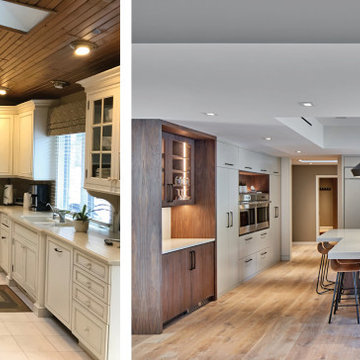
With a desire to stay close to friends and family, the owners of this 1984 home spent several years searching for property near their neighborhood to build a new, more modern, energy-conscious home tailored to their empty-nest lifestyle. They eventually concluded that their current site was the perfect location for them, but the home needed to be updated and reorganized to create fresh, open, unified spaces to comfortably welcome gatherings of family, friends, and guests.
Before renovation, the floor plan included small rooms, dedicated hallways, a step-down living room, a heavy and dark corner fireplace, and limited opportunities for natural light and visual connections from space to space. Exterior deck areas were narrow, long, and used infrequently.
Primary goals of this project included accessibility of space, more natural light, better connectivity between spaces, and a focus on sustainable performance. The updated main floor plan included the selective removal of walls to reallocate dedicated hall space to usable, open living area. The step-down living room was leveled for full accessibility, safety, furniture flexibility and overall space use. The removal of a half-height wall between the living area and the kitchen created continuity between the spaces. Reorganizing the primary entry and stair and eliminating walls between the entry and dining room created new visual connections between the kitchen and the entry. The new central concrete hearth and fireplace provides a strong, modern focal point for the living area. Large sliding glass doors on each side of the fireplace allow the TV area beyond to be separated from the living area as needed.
In several strategic locations, the footprint of the house was expanded to enhance function and flow at the kitchen, dining room, and mudroom. The new outdoor deck area is now large and singular and includes a grille area, dining space and open seating overlooking the newly landscaped pool below.
The exterior envelope of the house includes new insulation, siding, and energy-efficient windows, as well as two large roof-mounted solar arrays, to increase thermal performance and to offset energy costs. Inside, the new HVAC system maximizes energy efficiency while using a fraction of its former footprint. As a result, a portion of the former mechanical space was added back to the lower level family room area and expands into a cozy library nook.
MMA partnered with the owner’s interior designer and kitchen designer to achieve a softer, contemporary palette of finishes that complement this newly configured, light-filled home.
 Crystal Kitchen + Bath
The goal for this 1939 Tudor-style story-and-a-half home was to create a kitchen that offered the conveniences, storage, and performance of a modern workspace while preserving the warmth, craftsmanship, and vintage charm that made the home special. The client, an avid home cook, wanted the room to feel as though it had always belonged to the house, with thoughtful upgrades that respected the original architecture rather than competing with it. Just as important, she needed a more efficient layout with enough storage for small appliances, so everyday cooking would no longer require carrying items up from the lower level.
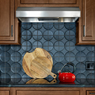
Several existing conditions shaped the design approach. The kitchen retained original, amber-stained birch woodwork that the client wished to keep, and the compact footprint was interrupted by six doorways and two windows, none of which were to be moved, altered, or replaced. A previous flooring update had left the door casings undercut too short, creating visible gaps where the casing met the floor. The existing vintage 40-inch range also lacked proper ventilation, yet the client wished to accommodate a refrigerator, dishwasher, cooktop, double ovens, built-in microwave, and effective venting above the cooktop into the new kitchen layout.
To honor the original millwork, beaded inset-style cherry cabinetry was selected in a soft, hand-rubbed finish that will deepen over time and develop a natural patina. Charcoal-gray soapstone countertops complement the cabinetry while reinforcing the historic character of the home with an organic, timeworn texture. The former breakfast nook was transformed into a butler’s pantry, adding valuable base cabinet storage and expanded work surfaces for frequently used small appliances. Also in the butler’s pantry, a single upper cabinet was paired with open shelves to give an open, airy feeling while adding character and practical storage. A classic single-bowl apron-front workstation sink contributes both period-appropriate character and practical prep and cleanup function.
Because the home’s openings were such a defining feature, the design worked within the existing architecture instead of altering it. Custom plinth blocks were created for each doorway to extend the original casing gracefully down to the new natural red oak flooring, resolving the earlier construction issue while adding a detail that feels authentic to the age of the house. Despite the number of door and window openings, the new layout provides a significantly more functional, built-in kitchen with an improved work triangle for serious cooking.
Appliance placement was carefully planned to deliver the requested performance without overwhelming the small room. Three cooking functions (double ovens & microwave) were consolidated into one location with a GE Café double oven featuring Advantium Technology, while the client’s compact 31-inch refrigerator was reused to preserve space. A sleek 30-inch induction cooktop provides efficient cooking, and a Vent-A-Hood ARS ductless vent hood supplies needed ventilation without requiring a duct run to the exterior.
The finish palette balances richness, texture, and historical sensitivity. A deeply textured navy backsplash tile adds depth and dramatic shadow play against the soapstone, while wallpaper in the back entry echoes the tile’s geometric pattern to visually connect the adjoining spaces. Oil-rubbed bronze cabinet hardware and light fixtures enhance the warmth of the cherry cabinetry and complete the antique-inspired feel.
Lighting was layered to make the compact kitchen brighter, more useful, and more inviting. Vintage-style semi-flush ceiling fixtures establish the overall tone, while dimmable puck lights highlight select areas and undercabinet task lighting keeps work surfaces well illuminated.
The completed kitchen now feels both highly functional and deeply rooted in the home’s history. Rich cherry cabinetry, velvety soapstone, natural red oak flooring, navy tile, bronze accents, and carefully preserved birch trim work together to create a warm, cohesive space that celebrates timeless craftsmanship. By increasing storage, improving workflow, integrating modern appliances, and respecting the Tudor home’s original character, the design achieves the client’s vision: a kitchen that feels personal, practical, historically appropriate, and as though it has always been there.
17