
Search results for "Personal pay" in Home Design Ideas
 Grandeur Hills Group,Inc.
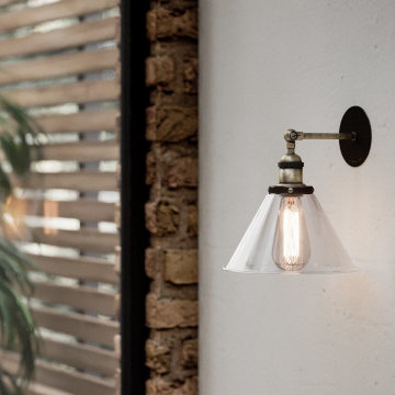
The perfect kitchen is known to be characterized by a few different kinds of lighting. In this photo, you can see very beautiful, original LED sconces that ideally blend with the entire interior design of the kitchen in general and beige walls in particular.
Pay attention to the use of natural wood in the interior. The indoor plants, which blend well with the wood, make the kitchen look live and natural. The prevailing color in the interior is beige.
The Grandeur Hills Group Company is always pleased to help you with elevating your kitchen interior design. Just call us and learn more about the services we provide
 Laure Nell Interiors
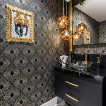
Every inch of this 4,200-square-foot condo on Las Olas—two units combined into one inside the tallest building in Fort Lauderdale—is dripping with glamour, starting right away in the entrance with Phillip Jeffries’ Cloud wallpaper and crushed velvet gold chairs by Koket. Along with tearing out some of the bathrooms and installing sleek and chic new vanities, Laure Nell Interiors outfitted the residence with all the accoutrements that make it perfect for the owners—two doctors without children—to enjoy an evening at home alone or entertaining friends and family. On one side of the condo, we turned the previous kitchen into a wet bar off the family room. Inspired by One Hotel, the aesthetic here gives off permanent vacation vibes. A large rattan light fixture sets a beachy tone above a custom-designed oversized sofa. Also on this side of the unit, a light and bright guest bedroom, affectionately named the Bali Room, features Phillip Jeffries’ silver leaf wallpaper and heirloom artifacts that pay homage to the Indian heritage of one of the owners. In another more-moody guest room, a Currey and Co. Grand Lotus light fixture gives off a golden glow against Phillip Jeffries’ dip wallcovering behind an emerald green bed, while an artist hand painted the look on each wall. The other side of the condo took on an aesthetic that reads: The more bling, the better. Think crystals and chrome and a 78-inch circular diamond chandelier. The main kitchen, living room (where we custom-surged together Surya rugs), dining room (embellished with jewelry-like chain-link Yale sconces by Arteriors), office, and master bedroom (overlooking downtown and the ocean) all reside on this side of the residence. And then there’s perhaps the jewel of the home: the powder room, illuminated by Tom Dixon pendants. The homeowners hiked Machu Picchu together and fell in love with a piece of art on their trip that we designed the entire bathroom around. It’s one of many personal objets found throughout the condo, making this project a true labor of love.
 Mercury Mosaics and Tile
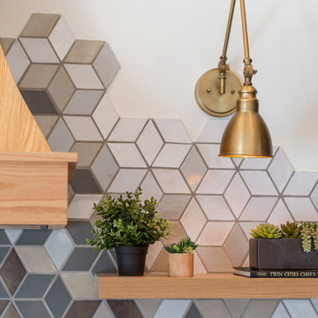
We're extra-proud of this detail. All exposed edges of the tile are finished with glaze which gives a much-more polished look.
This project was inspired by a fusion of: contemporary elements, farmhouse warmth, geometric design & overall convenience. The style is eclectic as a result. Our clients wanted something unique to them and a reflection of their style to greet them each day. With details that are custom like the hood and the ceramic tile backsplash, there are standard elements worked into the space to truly show off this couple's personal style.
Photo Credits: Construction 2 Style + Chelsea Lopez Production
Find the right local pro for your project
 SabaRehman Abdulrehman
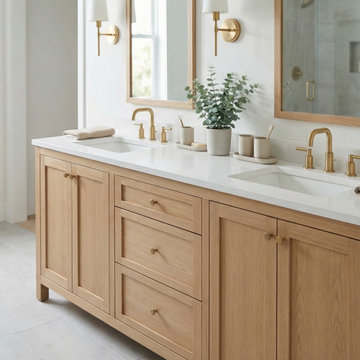
Morning routines shouldn’t involve a traffic jam at the sink. The 2025 Houzz Bathroom Trends Study found that 65 percent of U.S. renovators now choose a double-sink vanity to skip the wait. Designers agree: Titan Builders dubbed 2025 “the year of bigger, storage-packed double vanities,” forecasting dual-basin setups in family, guest, and even powder baths. As KBIS 2025 launches land, prototypes for 2026 layer in spa-grade wood, built-in outlets, and planet-friendly finishes. In this guide, we rank six standout models and show you how to size, install, and enjoy a clutter-free, two-sink future.
Methodology and selection criteria
A well-planned double-sink vanity keeps busy morning routines calm and clutter-free.
Before we crowned any winners, we mapped the entire 2024–2026 double-sink (dual-basin) market. That meant parsing KBIS exhibitor releases, scraping bestseller lists from Home Depot, Lowe’s, and Wayfair, and reviewing designer short lists in trade magazines. The sweep produced 110 candidate vanities, giving us visibility into every style, price tier, and material in play.
We then scored each model against six weighted factors that continue to matter long after installers leave:
- Build quality – 25 percent.Solid hardwood frames, dovetail drawers, and furniture-grade plywood backs, never particleboard in disguise.
- Design versatility – 20 percent.Lines and finishes that suit modern, classic, or farmhouse baths without dating quickly.
- Sustainability – 15 percent.FSC-certified wood, CARB 2 compliance, and low-VOC finishes for healthier air.
- Storage efficiency – 15 percent.Deep drawers, tilt-outs, or power cubbies that corral countertop clutter.
- Value for money – 15 percent.Fair street price for the materials, stone tops, sinks, and soft-close hardware included.
- Brand reputation and warranty – 10 percent.Manufacturers with responsive support and at least a one-year parts guarantee.
- Footprint: 72 W × 22 D × 36 H in. (183 × 56 × 91 cm)
- Crated weight: 506 lb / 230 kg
- Street price: about $2,575 with marble top and basins, Q4 2025
- Footprint: 48 W × 22 D in. (122 × 56 cm)
- Height: 34.8 in. (88 cm) with backsplash
- Sliding barn door plus 3 drawers
- Pre-drilled 8-in. faucet spacing, sinks included
- Footprint: 60 W × 21 D × 34 H in. (152 × 53 × 86 cm)
- Integrated power: 4 AC + 2 USB, UL-listed
- Crated weight: 300 lb / 136 kg
- Street price: about $2,349 at Home Depot, Q4 2025
- Footprint: 72 W × 22 D in. (183 × 56 cm)
- Height: 34 in. (86 cm) plus 4 in. backsplash
- Counter: 1 in. Carrara marble, apron-front sinks included
- Hardware: oil-rubbed bronze, soft-close doors and drawers
- Footprint: 60 W × 22 D × 34 H in. (152 × 56 × 86 cm)
- Construction: solid poplar and plywood, waterfall quartz top
- Integrated slim power bank, soft-close doors and drawers
- Target price: just under $2,300 with top and basins
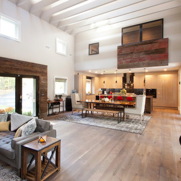
 Warmboard Radiant
Personal home of John Colaneri, TV Host and Homebuilder.
Inspiration for a contemporary medium tone wood floor and brown floor living room remodel in Other
Inspiration for a contemporary medium tone wood floor and brown floor living room remodel in Other
 Tiffany Brooks, HGTV Host & Interior Designer
Inquire About Our Design Services
When we first started talking in the spring of 2015, I was impressed. She was witty, realistic, and understood that as much as she loves my shows on HGTV, design does not does not happen in 43 minutes! She told me about her space, and how she felt that her bedroom seemed “blah” to her. She had no retreat. Molly desperately longed for a place that she could spend time in, read in, play in and above all, relax in.
What we did:
Many people are terrified of hiring a designer. Rightfully so, they are investing a pretty penny in their homes. They want to make sure that everything, down to the last floral arrangement, is to their liking, because they will have to live it (and pay for it). Unfortunately, a client can unintentionally stifle a designer’s creativity through micro-management. This can produce lackluster results and ultimately cause more time (and money) to be spent on a project than is really necessary.
With Molly, that was never an issue. Before she even showed me the room in question, she said that I could have full creative license to do what I needed to do to her bedroom. SAY WHAAH!?
With Molly giving me complete creative freedom, I planned everything out and got down to business. The result: Bite-your-bottom-lip sexy. I don’t get jealous of too many of my clients’ spaces, but this one still takes my breath away every time I look at the pics!
The craziest part was that by adding more furniture, it actually made the space feel larger.
Molly and her husband Patrick loved the finished space, and promised me I will be back to finish the rest of the house!
Here’s the highlights of the rest of the project:
I came up with a space plan with three options.
Next, we reviewed mood boards and fabric schemes that would work for both Molly and her hubby Patrick.
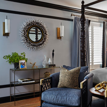
We started with the bed. My goal was to add edge to its otherwise traditional style.
We decided to spice things up by painting the trim work in the room black.
We built in layers of lighting with dimmers. In a bedroom everything should be on dimmers, right? Right.
We designed and customized bedding, chairs and window treatments.
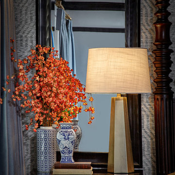
Together with Molly, we selected the most perfect wallpaper. This geometric “grasscloth” adds so much depth and dimension that was just missing before.
What I love:
That light fixture. I mean it is really, really amazing in person.
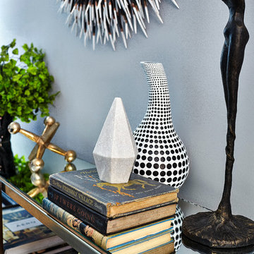
The porcupine mirror. This thing came packaged like it was the hope diamond, and everyone was terrified to handle it. But it really became a highlight of the room.
 Tiffany Brooks, HGTV Host & Interior Designer
Inquire About Our Design Services
When we first started talking in the spring of 2015, I was impressed. She was witty, realistic, and understood that as much as she loves my shows on HGTV, design does not does not happen in 43 minutes! She told me about her space, and how she felt that her bedroom seemed “blah” to her. She had no retreat. Molly desperately longed for a place that she could spend time in, read in, play in and above all, relax in.
What we did:
Many people are terrified of hiring a designer. Rightfully so, they are investing a pretty penny in their homes. They want to make sure that everything, down to the last floral arrangement, is to their liking, because they will have to live it (and pay for it). Unfortunately, a client can unintentionally stifle a designer’s creativity through micro-management. This can produce lackluster results and ultimately cause more time (and money) to be spent on a project than is really necessary.
With Molly, that was never an issue. Before she even showed me the room in question, she said that I could have full creative license to do what I needed to do to her bedroom. SAY WHAAH!?
With Molly giving me complete creative freedom, I planned everything out and got down to business. The result: Bite-your-bottom-lip sexy. I don’t get jealous of too many of my clients’ spaces, but this one still takes my breath away every time I look at the pics!
The craziest part was that by adding more furniture, it actually made the space feel larger.
Molly and her husband Patrick loved the finished space, and promised me I will be back to finish the rest of the house!
Here’s the highlights of the rest of the project:
I came up with a space plan with three options.
Next, we reviewed mood boards and fabric schemes that would work for both Molly and her hubby Patrick.
We started with the bed. My goal was to add edge to its otherwise traditional style.
We decided to spice things up by painting the trim work in the room black.
We built in layers of lighting with dimmers. In a bedroom everything should be on dimmers, right? Right.
We designed and customized bedding, chairs and window treatments.
Together with Molly, we selected the most perfect wallpaper. This geometric “grasscloth” adds so much depth and dimension that was just missing before.
What I love:
That light fixture. I mean it is really, really amazing in person.
The porcupine mirror. This thing came packaged like it was the hope diamond, and everyone was terrified to handle it. But it really became a highlight of the room.

Sponsored
Delaware, OH

Buckeye Basements, Inc.
Central Ohio's Basement Finishing ExpertsBest Of Houzz '13-'21
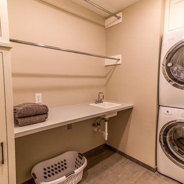
 Castle Building & Remodeling
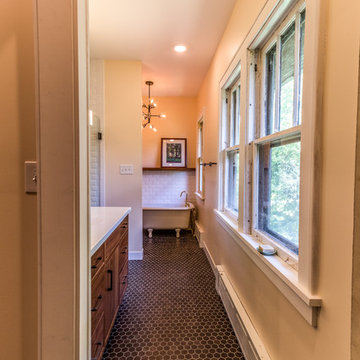
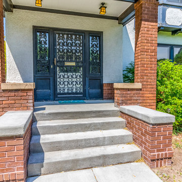
No strangers to remodeling, the new owners of this St. Paul tudor knew they could update this decrepit 1920 duplex into a single-family forever home.
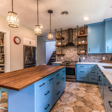
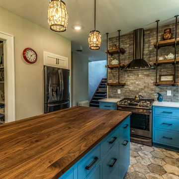
A list of desired amenities was a catalyst for turning a bedroom into a large mudroom, an open kitchen space where their large family can gather, an additional exterior door for direct access to a patio, two home offices, an additional laundry room central to bedrooms, and a large master bathroom. To best understand the complexity of the floor plan changes, see the construction documents.
As for the aesthetic, this was inspired by a deep appreciation for the durability, colors, textures and simplicity of Norwegian design. The home’s light paint colors set a positive tone. An abundance of tile creates character. New lighting reflecting the home’s original design is mixed with simplistic modern lighting. To pay homage to the original character several light fixtures were reused, wallpaper was repurposed at a ceiling, the chimney was exposed, and a new coffered ceiling was created.
Overall, this eclectic design style was carefully thought out to create a cohesive design throughout the home.
Come see this project in person, September 29 – 30th on the 2018 Castle Home Tour.
 Tiffany Brooks, HGTV Host & Interior Designer
Inquire About Our Design Services
When we first started talking in the spring of 2015, I was impressed. She was witty, realistic, and understood that as much as she loves my shows on HGTV, design does not does not happen in 43 minutes! She told me about her space, and how she felt that her bedroom seemed “blah” to her. She had no retreat. Molly desperately longed for a place that she could spend time in, read in, play in and above all, relax in.
What we did:
Many people are terrified of hiring a designer. Rightfully so, they are investing a pretty penny in their homes. They want to make sure that everything, down to the last floral arrangement, is to their liking, because they will have to live it (and pay for it). Unfortunately, a client can unintentionally stifle a designer’s creativity through micro-management. This can produce lackluster results and ultimately cause more time (and money) to be spent on a project than is really necessary.
With Molly, that was never an issue. Before she even showed me the room in question, she said that I could have full creative license to do what I needed to do to her bedroom. SAY WHAAH!?
With Molly giving me complete creative freedom, I planned everything out and got down to business. The result: Bite-your-bottom-lip sexy. I don’t get jealous of too many of my clients’ spaces, but this one still takes my breath away every time I look at the pics!
The craziest part was that by adding more furniture, it actually made the space feel larger.
Molly and her husband Patrick loved the finished space, and promised me I will be back to finish the rest of the house!
Here’s the highlights of the rest of the project:
I came up with a space plan with three options.
Next, we reviewed mood boards and fabric schemes that would work for both Molly and her hubby Patrick.
We started with the bed. My goal was to add edge to its otherwise traditional style.
We decided to spice things up by painting the trim work in the room black.
We built in layers of lighting with dimmers. In a bedroom everything should be on dimmers, right? Right.
We designed and customized bedding, chairs and window treatments.
Together with Molly, we selected the most perfect wallpaper. This geometric “grasscloth” adds so much depth and dimension that was just missing before.
What I love:
That light fixture. I mean it is really, really amazing in person.
The porcupine mirror. This thing came packaged like it was the hope diamond, and everyone was terrified to handle it. But it really became a highlight of the room.
 Castle Building & Remodeling
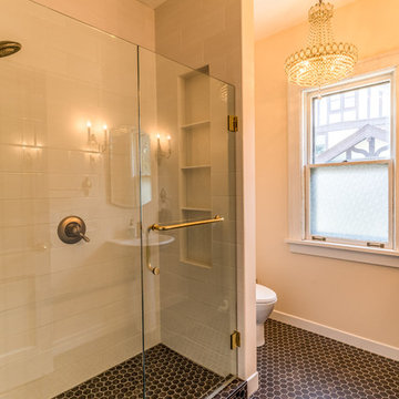
No strangers to remodeling, the new owners of this St. Paul tudor knew they could update this decrepit 1920 duplex into a single-family forever home.
A list of desired amenities was a catalyst for turning a bedroom into a large mudroom, an open kitchen space where their large family can gather, an additional exterior door for direct access to a patio, two home offices, an additional laundry room central to bedrooms, and a large master bathroom. To best understand the complexity of the floor plan changes, see the construction documents.
As for the aesthetic, this was inspired by a deep appreciation for the durability, colors, textures and simplicity of Norwegian design. The home’s light paint colors set a positive tone. An abundance of tile creates character. New lighting reflecting the home’s original design is mixed with simplistic modern lighting. To pay homage to the original character several light fixtures were reused, wallpaper was repurposed at a ceiling, the chimney was exposed, and a new coffered ceiling was created.
Overall, this eclectic design style was carefully thought out to create a cohesive design throughout the home.
Come see this project in person, September 29 – 30th on the 2018 Castle Home Tour.
 Castle Building & Remodeling
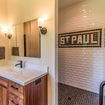
No strangers to remodeling, the new owners of this St. Paul tudor knew they could update this decrepit 1920 duplex into a single-family forever home.
A list of desired amenities was a catalyst for turning a bedroom into a large mudroom, an open kitchen space where their large family can gather, an additional exterior door for direct access to a patio, two home offices, an additional laundry room central to bedrooms, and a large master bathroom. To best understand the complexity of the floor plan changes, see the construction documents.
As for the aesthetic, this was inspired by a deep appreciation for the durability, colors, textures and simplicity of Norwegian design. The home’s light paint colors set a positive tone. An abundance of tile creates character. New lighting reflecting the home’s original design is mixed with simplistic modern lighting. To pay homage to the original character several light fixtures were reused, wallpaper was repurposed at a ceiling, the chimney was exposed, and a new coffered ceiling was created.
Overall, this eclectic design style was carefully thought out to create a cohesive design throughout the home.
Come see this project in person, September 29 – 30th on the 2018 Castle Home Tour.
 Castle Building & Remodeling
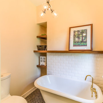
No strangers to remodeling, the new owners of this St. Paul tudor knew they could update this decrepit 1920 duplex into a single-family forever home.
A list of desired amenities was a catalyst for turning a bedroom into a large mudroom, an open kitchen space where their large family can gather, an additional exterior door for direct access to a patio, two home offices, an additional laundry room central to bedrooms, and a large master bathroom. To best understand the complexity of the floor plan changes, see the construction documents.
As for the aesthetic, this was inspired by a deep appreciation for the durability, colors, textures and simplicity of Norwegian design. The home’s light paint colors set a positive tone. An abundance of tile creates character. New lighting reflecting the home’s original design is mixed with simplistic modern lighting. To pay homage to the original character several light fixtures were reused, wallpaper was repurposed at a ceiling, the chimney was exposed, and a new coffered ceiling was created.
Overall, this eclectic design style was carefully thought out to create a cohesive design throughout the home.
Come see this project in person, September 29 – 30th on the 2018 Castle Home Tour.
 Castle Building & Remodeling
No strangers to remodeling, the new owners of this St. Paul tudor knew they could update this decrepit 1920 duplex into a single-family forever home.
A list of desired amenities was a catalyst for turning a bedroom into a large mudroom, an open kitchen space where their large family can gather, an additional exterior door for direct access to a patio, two home offices, an additional laundry room central to bedrooms, and a large master bathroom. To best understand the complexity of the floor plan changes, see the construction documents.
As for the aesthetic, this was inspired by a deep appreciation for the durability, colors, textures and simplicity of Norwegian design. The home’s light paint colors set a positive tone. An abundance of tile creates character. New lighting reflecting the home’s original design is mixed with simplistic modern lighting. To pay homage to the original character several light fixtures were reused, wallpaper was repurposed at a ceiling, the chimney was exposed, and a new coffered ceiling was created.
Overall, this eclectic design style was carefully thought out to create a cohesive design throughout the home.
Come see this project in person, September 29 – 30th on the 2018 Castle Home Tour.
 Castle Building & Remodeling
No strangers to remodeling, the new owners of this St. Paul tudor knew they could update this decrepit 1920 duplex into a single-family forever home.
A list of desired amenities was a catalyst for turning a bedroom into a large mudroom, an open kitchen space where their large family can gather, an additional exterior door for direct access to a patio, two home offices, an additional laundry room central to bedrooms, and a large master bathroom. To best understand the complexity of the floor plan changes, see the construction documents.
As for the aesthetic, this was inspired by a deep appreciation for the durability, colors, textures and simplicity of Norwegian design. The home’s light paint colors set a positive tone. An abundance of tile creates character. New lighting reflecting the home’s original design is mixed with simplistic modern lighting. To pay homage to the original character several light fixtures were reused, wallpaper was repurposed at a ceiling, the chimney was exposed, and a new coffered ceiling was created.
Overall, this eclectic design style was carefully thought out to create a cohesive design throughout the home.
Come see this project in person, September 29 – 30th on the 2018 Castle Home Tour.
 Castle Building & Remodeling
No strangers to remodeling, the new owners of this St. Paul tudor knew they could update this decrepit 1920 duplex into a single-family forever home.
A list of desired amenities was a catalyst for turning a bedroom into a large mudroom, an open kitchen space where their large family can gather, an additional exterior door for direct access to a patio, two home offices, an additional laundry room central to bedrooms, and a large master bathroom. To best understand the complexity of the floor plan changes, see the construction documents.
As for the aesthetic, this was inspired by a deep appreciation for the durability, colors, textures and simplicity of Norwegian design. The home’s light paint colors set a positive tone. An abundance of tile creates character. New lighting reflecting the home’s original design is mixed with simplistic modern lighting. To pay homage to the original character several light fixtures were reused, wallpaper was repurposed at a ceiling, the chimney was exposed, and a new coffered ceiling was created.
Overall, this eclectic design style was carefully thought out to create a cohesive design throughout the home.
Come see this project in person, September 29 – 30th on the 2018 Castle Home Tour.
 Castle Building & Remodeling
No strangers to remodeling, the new owners of this St. Paul tudor knew they could update this decrepit 1920 duplex into a single-family forever home.
A list of desired amenities was a catalyst for turning a bedroom into a large mudroom, an open kitchen space where their large family can gather, an additional exterior door for direct access to a patio, two home offices, an additional laundry room central to bedrooms, and a large master bathroom. To best understand the complexity of the floor plan changes, see the construction documents.
As for the aesthetic, this was inspired by a deep appreciation for the durability, colors, textures and simplicity of Norwegian design. The home’s light paint colors set a positive tone. An abundance of tile creates character. New lighting reflecting the home’s original design is mixed with simplistic modern lighting. To pay homage to the original character several light fixtures were reused, wallpaper was repurposed at a ceiling, the chimney was exposed, and a new coffered ceiling was created.
Overall, this eclectic design style was carefully thought out to create a cohesive design throughout the home.
Come see this project in person, September 29 – 30th on the 2018 Castle Home Tour.
 Castle Building & Remodeling
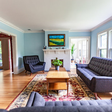
No strangers to remodeling, the new owners of this St. Paul tudor knew they could update this decrepit 1920 duplex into a single-family forever home.
A list of desired amenities was a catalyst for turning a bedroom into a large mudroom, an open kitchen space where their large family can gather, an additional exterior door for direct access to a patio, two home offices, an additional laundry room central to bedrooms, and a large master bathroom. To best understand the complexity of the floor plan changes, see the construction documents.
As for the aesthetic, this was inspired by a deep appreciation for the durability, colors, textures and simplicity of Norwegian design. The home’s light paint colors set a positive tone. An abundance of tile creates character. New lighting reflecting the home’s original design is mixed with simplistic modern lighting. To pay homage to the original character several light fixtures were reused, wallpaper was repurposed at a ceiling, the chimney was exposed, and a new coffered ceiling was created.
Overall, this eclectic design style was carefully thought out to create a cohesive design throughout the home.
Come see this project in person, September 29 – 30th on the 2018 Castle Home Tour.
 Forward Design Build Remodel
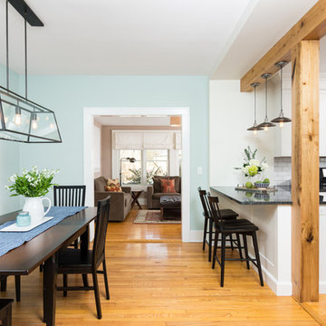
The rooms in this charming 1920’s Burns Park home were completely compartmentalized (typical for homes built in this period). The homeowners wanted a more open space with sightlines into the dining and living spaces, and a kitchen that could accommodate more than one cook!
We removed a wall and replaced it with a beautiful Butternut beam and countertop seating, a more casual eating area to supplement their dining room. Bringing this home into 2018 while paying respect to its historic neighborhood was an important part of this project. The personality, cabinetry and contemporary finishes in this kitchen better mirror this cheerful and vibrant family.
Photography by CJ South.
 Studio Vlock
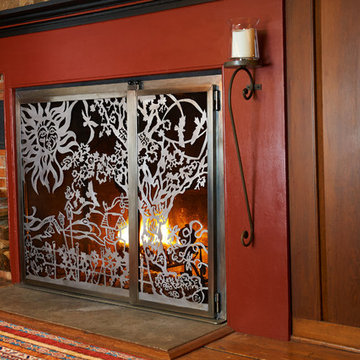
The ‘Family Tree’ fireplace screen was commissioned by the property’s owners who were devastated by the loss of a magnificent 200 year old maple tree; eager to pay tribute to the beauty and joy it had provided to them and to the generations preceding who had passed the seasons under its boughs.
Inspiration: This tree marked a homestead, sheltered a family, enlivened a neighborhood, and harbored the stories of generations. This was the inspiration for 'Family Tree'.
In the course of the design process, it became apparent that the tree was not only an object of beauty, but also a reliquary of family memories. “I feel as though that tree defined the personality of this old, historic house; if it could speak, the stories it would tell,” the client asserted.
‘Family Tree’ weaves a joyful metal tapestry of images and references. A skull and cross bones speak to the legend of Capt’n Kidd and buried treasure (somewhere still to be found on the property!). An iconic wishing well stands filled with legendary stories, real and mostly imagined. A split rail fence defines the front yard with its Great Tree. Initials carved into its massive trunk celebrate generations of grandparents, parents, three adventurous boys and the family dog. References to an active life on the water abound.
In this tableau, the blessings of family life are the real hidden treasure.
Specifications: “Family Tree” is a 4' x 5' custom fireplace screen. The client selected a bright sanded finish for the imagery, accomplished by grinding the surface revealing a natural steel luster; then hand rubbed with wax to maintain this brilliant finish. The frame stands in contrast with a blackened patina finish.
Photo Credit: Edwina Stevenson & Sandra Vlock
 RHEINZINK
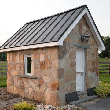
A 100-year-old farmhouse in Central Maryland was totally renovated and now sports a brand new RHEINZINK roof that gives it an authentic old-world look and feel. The property, which was originally a dairy farm, has been in the owner’s family since the 1920’s.
The renovation involved gutting virtually the entire house and keeping only the frame. The asphalt roof, which had started leaking, was replaced with approximately 4,700 sq. ft. RHEINZINK’s PrePATINA graphite-grey Double Lock Standing Seam Panels.
Fabrication and installation of the RHEINZINK panels was done by Hardin Construction, Union Bridge, MD. According to Craig Hardin, president, “The owner contacted me and said he wanted a roof on the house that would last for generations. We considered various metal material options but quickly settled on RHEINZINK because of its low to no maintenance and the color. The graphite-grey develops a nice patina that complements the house and makes the roof look like it’s always been there.”
“Another factor that steered us toward RHEINZINK was their European detailing techniques,” Hardin said. “You don’t see any other metal roofs around here that have the kind of detailing and seaming techniques like this one.”
Prior to doing the job, Hardin attended a how-to workshop at RHEINZINK America headquarters in Woburn, MA. The workshops, led by technical training manager Lou Rondeau, provide practical instruction in the installation of RHEINZINK roofing, façade and gutter systems. “These are hands-on sessions,” Rondeau said, “and they can really contribute to the craftsmanship of installers.”
Hardin explained his approach to the project. “We’re a small company and I’m personally involved in the actual installation. Unlike larger companies with large crews that have to move fast, we really take the time to pay close attention to the detailing and finish work. This project is really distinctive in that regard,” Hardin said.
In addition to the main roof, the RHEINZINK panels were used on the front porch, a screened-in back porch and a small, freestanding outbuilding. The stone outbuilding once enclosed a cold water spring where the dairy farm’s milk was stored. It now welcomes visitors to the property.
The RHEINZINK distributor on the project was Sheet Metal Supply, Mundelein, IL.
15