
Search results for "Personal reference" in Home Design Ideas
 Craig O'Connell Architecture
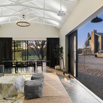
After the devastating Tubbs fire, Craig reimagined this Calistoga property into a wine country retreat for the owners' family as well as corporate/wellness guests. He approached the design by studying the natural elements of the site including trees, views and light, the vernacular design of the area and the clients’ personality. Craig designed a barn and the house – made up of a one-story and a two-story building – connected by a stunning 20-foot steel and glass breezeway. Expansive doors and windows create seamless indoor/outdoor flow and numerous patios and the pool area provide comfortable outdoor spaces. The modern and warm interior is bright, luxurious and comfortable.
 Pratt & Lambert Paints
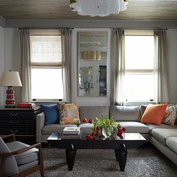
Looking for a beautiful way to express your personal style? Pratt & Lambert® Accolade® Interior Paint + Primer, our finest interior paint, is formulated to go on smoothly and provide a rich, luxurious coating for a beautiful, stunning finish. The 100% acrylic formula is durable and easy to maintain. Accolade®. Trusted performance, proven results.
Colors Featured:
Wall: Mirage Gray 28-31
Trim: Ever Classic 32-24

Find the right local pro for your project
 Fox Interiors
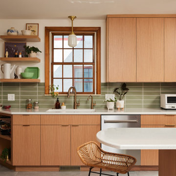
Inspired by their years in Japan and California and their Scandinavian heritage, we updated this 1938 home with a earthy palette and clean lines.
Rift-cut white oak cabinetry, white quartz counters and a soft green tile backsplash are balanced with details that reference the home's history.
Classic light fixtures soften the modern elements.
We created a new arched opening to the living room and removed the trim around other doorways to enlarge them and mimic original arched openings.
Removing an entry closet and breakfast nook opened up the overall footprint and allowed for a functional work zone that includes great counter space on either side of the range, when they had none before.
The new pantry wall incorporates storage for the microwave, coat storage, and a bench for shoe removal.
 Birchwood Construction Company
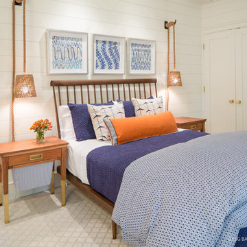
A home this vibrant is something to admire. We worked alongside Greg Baudoin Interior Design, who brought this home to life using color. Together, we saturated the cottage retreat with floor to ceiling personality and custom finishes. The rich color palette presented in the décor pairs beautifully with natural materials such as Douglas fir planks and maple end cut countertops.
Surprising features lie around every corner. In one room alone you’ll find a woven fabric ceiling and a custom wooden bench handcrafted by Birchwood carpenters. As you continue throughout the home, you’ll admire the custom made nickel slot walls and glimpses of brass hardware. As they say, the devil is in the detail.
Photo credit: Jacqueline Southby
 The Brooklyn Studio
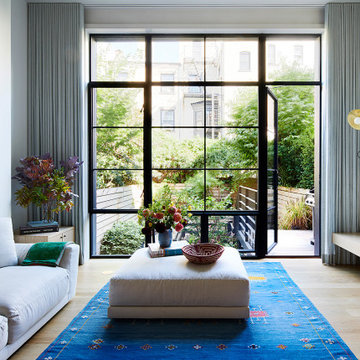
This residence was a complete gut renovation of a 4-story row house in Park Slope, and included a new rear extension and penthouse addition. The owners wished to create a warm, family home using a modern language that would act as a clean canvas to feature rich textiles and items from their world travels. As with most Brooklyn row houses, the existing house suffered from a lack of natural light and connection to exterior spaces, an issue that Principal Brendan Coburn is acutely aware of from his experience re-imagining historic structures in the New York area. The resulting architecture is designed around moments featuring natural light and views to the exterior, of both the private garden and the sky, throughout the house, and a stripped-down language of detailing and finishes allows for the concept of the modern-natural to shine.
Upon entering the home, the kitchen and dining space draw you in with views beyond through the large glazed opening at the rear of the house. An extension was built to allow for a large sunken living room that provides a family gathering space connected to the kitchen and dining room, but remains distinctly separate, with a strong visual connection to the rear garden. The open sculptural stair tower was designed to function like that of a traditional row house stair, but with a smaller footprint. By extending it up past the original roof level into the new penthouse, the stair becomes an atmospheric shaft for the spaces surrounding the core. All types of weather – sunshine, rain, lightning, can be sensed throughout the home through this unifying vertical environment. The stair space also strives to foster family communication, making open living spaces visible between floors. At the upper-most level, a free-form bench sits suspended over the stair, just by the new roof deck, which provides at-ease entertaining. Oak was used throughout the home as a unifying material element. As one travels upwards within the house, the oak finishes are bleached to further degrees as a nod to how light enters the home.
The owners worked with CWB to add their own personality to the project. The meter of a white oak and blackened steel stair screen was designed by the family to read “I love you” in Morse Code, and tile was selected throughout to reference places that hold special significance to the family. To support the owners’ comfort, the architectural design engages passive house technologies to reduce energy use, while increasing air quality within the home – a strategy which aims to respect the environment while providing a refuge from the harsh elements of urban living.
This project was published by Wendy Goodman as her Space of the Week, part of New York Magazine’s Design Hunting on The Cut.
Photography by Kevin Kunstadt
 JRP Design & Remodel
Our client had been living in her beautiful lakeside retreat for about 3 years. All around were stunning views of the lake and mountains, but the view from inside was minimal. It felt dark and closed off from the gorgeous waterfront mere feet away. She desired a bigger kitchen, natural light, and a contemporary look. Referred to JRP by a subcontractor our client walked into the showroom one day, took one look at the modern kitchen in our design center, and was inspired!
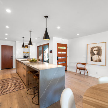
After talking about the frustrations of dark spaces and limitations when entertaining groups of friends, the homeowner and the JRP design team emerged with a new vision. Two walls between the living room and kitchen would be eliminated and structural revisions were needed for a common wall shared a wall with a neighbor. With the wall removals and the addition of multiple slider doors, the main level now has an open layout.
Everything in the home went from dark to luminous as sunlight could now bounce off white walls to illuminate both spaces. Our aim was to create a beautiful modern kitchen which fused the necessities of a functional space with the elegant form of the contemporary aesthetic. The kitchen playfully mixes frameless white upper with horizontal grain oak lower cabinets and a fun diagonal white tile backsplash. Gorgeous grey Cambria quartz with white veining meets them both in the middle. The large island with integrated barstool area makes it functional and a great entertaining space.
The master bedroom received a mini facelift as well. White never fails to give your bedroom a timeless look. The beautiful, bright marble shower shows what's possible when mixing tile shape, size, and color. The marble mosaic tiles in the shower pan are especially bold paired with black matte plumbing fixtures and gives the shower a striking visual.
Layers, light, consistent intention, and fun! - paired with beautiful, unique designs and a personal touch created this beautiful home that does not go unnoticed.
PROJECT DETAILS:
• Style: Contemporary
• Colors: Neutrals
• Countertops: Cambria Quartz, Luxury Series, Queen Anne
• Kitchen Cabinets: Slab, Overlay Frameless
Uppers: Blanco
Base: Horizontal Grain Oak
• Hardware/Plumbing Fixture Finish: Kitchen – Stainless Steel
• Lighting Fixtures:
• Flooring:
Hardwood: Siberian Oak with Fossil Stone finish
• Tile/Backsplash:
Kitchen Backsplash: White/Clear Glass
Master Bath Floor: Ann Sacks Benton Mosaics Marble
Master Bath Surround: Ann Sacks White Thassos Marble
Photographer: Andrew – Open House VC

Sponsored
Delaware, OH

Buckeye Basements, Inc.
Central Ohio's Basement Finishing ExpertsBest Of Houzz '13-'21
 Penelope Daborn Ltd.
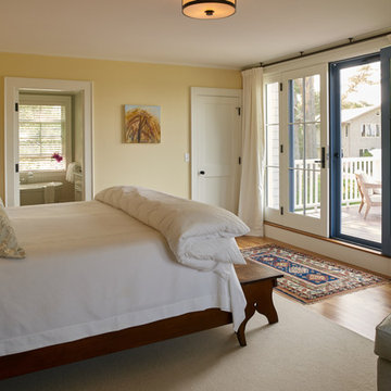
The interior details are simple, elegant, and are understated to display fine craftsmanship throughout the home. The design and finishes are not pretentious - but exactly what you would expect to find in an accomplished Maine artist’s home. Each piece of artwork carefully informed the selections that would highlight the art and contribute to the personality of each space.
© Darren Setlow Photography
 Hager Cabinets Inc.
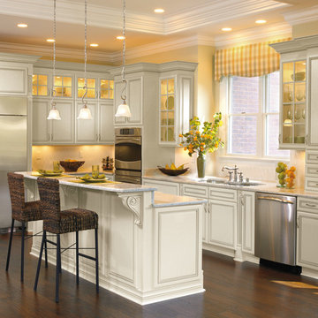
The small details of this bright kitchen give it its wonderful personality! Cambridge Style, Maple wood with Chantille paint and Coffee glaze.
Eat-in kitchen - mid-sized traditional l-shaped eat-in kitchen idea in Other with an undermount sink, raised-panel cabinets, white cabinets, granite countertops, white backsplash, stainless steel appliances and an island
Eat-in kitchen - mid-sized traditional l-shaped eat-in kitchen idea in Other with an undermount sink, raised-panel cabinets, white cabinets, granite countertops, white backsplash, stainless steel appliances and an island


 Simply Perfect
In our work, we see lots of big homes with big spaces. We also see small homes. And we’ll be the first to tell you that size isn’t what matters.
What’s important is scale.
Through design, we can make a small space look big—or make a big space look small. But more important, we can use scale to make your home interiors meet your functional needs while reflecting your personality, values and style.
The Eyes Have It.
When you step into a room, where do you look?
Directing the eye is one of the magic tricks that designers use to create a particular effect.
Bright red apples in a simple glass bowl immediately draws the eye to a kitchen counter. The hefty wood trivet and rounded concrete planter containing succulents echo the shape of the apples and the bowl, while adding new materials. A wood and metal stand holds an iPad or book for easy recipe reference, all atop an elegant light granite counter.
In a separate arrangement, ceramic artichokes create shape and shine but maintain the neutral color for continuity.
In this context, the eye is drawn immediately to the bright red color. That’s why sparse seasonal decorations can be more effective than heavy ornamentation. We can actually take in more when there are fewer items to focus on.
 The Brooklyn Studio
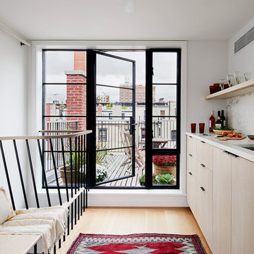
This residence was a complete gut renovation of a 4-story row house in Park Slope, and included a new rear extension and penthouse addition. The owners wished to create a warm, family home using a modern language that would act as a clean canvas to feature rich textiles and items from their world travels. As with most Brooklyn row houses, the existing house suffered from a lack of natural light and connection to exterior spaces, an issue that Principal Brendan Coburn is acutely aware of from his experience re-imagining historic structures in the New York area. The resulting architecture is designed around moments featuring natural light and views to the exterior, of both the private garden and the sky, throughout the house, and a stripped-down language of detailing and finishes allows for the concept of the modern-natural to shine.
Upon entering the home, the kitchen and dining space draw you in with views beyond through the large glazed opening at the rear of the house. An extension was built to allow for a large sunken living room that provides a family gathering space connected to the kitchen and dining room, but remains distinctly separate, with a strong visual connection to the rear garden. The open sculptural stair tower was designed to function like that of a traditional row house stair, but with a smaller footprint. By extending it up past the original roof level into the new penthouse, the stair becomes an atmospheric shaft for the spaces surrounding the core. All types of weather – sunshine, rain, lightning, can be sensed throughout the home through this unifying vertical environment. The stair space also strives to foster family communication, making open living spaces visible between floors. At the upper-most level, a free-form bench sits suspended over the stair, just by the new roof deck, which provides at-ease entertaining. Oak was used throughout the home as a unifying material element. As one travels upwards within the house, the oak finishes are bleached to further degrees as a nod to how light enters the home.
The owners worked with CWB to add their own personality to the project. The meter of a white oak and blackened steel stair screen was designed by the family to read “I love you” in Morse Code, and tile was selected throughout to reference places that hold special significance to the family. To support the owners’ comfort, the architectural design engages passive house technologies to reduce energy use, while increasing air quality within the home – a strategy which aims to respect the environment while providing a refuge from the harsh elements of urban living.
This project was published by Wendy Goodman as her Space of the Week, part of New York Magazine’s Design Hunting on The Cut.
Photography by Kevin Kunstadt

Sponsored
Columbus, OH

Hope Restoration & General Contracting
Columbus Design-Build, Kitchen & Bath Remodeling, Historic Renovations
 Signature Kitchens & Baths of Charleston, Inc.
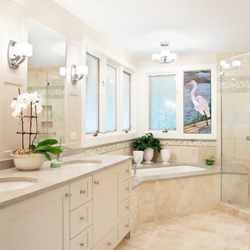
Example of a mid-sized beach style master corner shower design in Charleston with shaker cabinets, white cabinets, an undermount tub, white walls and an undermount sink
 Arizona Tile
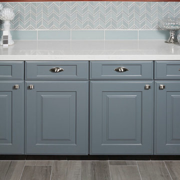
Islandia Glass Backsplash with White Marble Countertop from Arizona Tile.
Bathroom - contemporary glass tile and gray tile porcelain tile bathroom idea in Los Angeles with blue walls
Bathroom - contemporary glass tile and gray tile porcelain tile bathroom idea in Los Angeles with blue walls
 Fiorito Interior Design
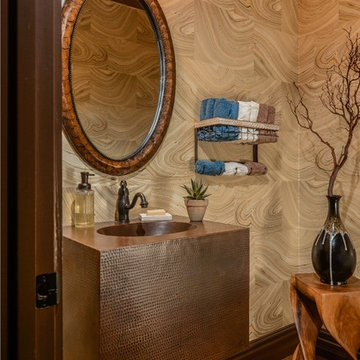
This formerly dull powder room was part of a whole house remodel. The overall concept for the home was to bring in natural, organic colors and elements and to reference stone, metals, wood, trees, and leaves. A powder room is always a great canvas on which to build a dramatic scene and the amazing sliced agate wallpaper for this powder room fits that bill perfectly. A hammered copper vanity and sink, a copper-colored pendant light, and a new ceramic wood floor give the space a clean but hearty outdoor feeling.
Photo by Bernardo Grijalva
 Trevor Fulmer Design
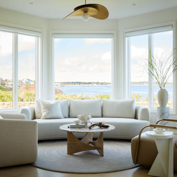
This oceanside residence in coastal Rhode Island blends relaxed Southern California ease with classic New England charm. A full renovation removed interior walls and introduced expansive sliding doors that open to the patio, creating an indoor outdoor living experience. The outdoor area features a tiered swimming pool, a spacious lounge and sweeping ocean views. The modern kitchen includes a two tiered island, woven metal inserts, slab stone backsplash, contemporary lighting and a pass-through window that connects to the outdoor kitchen. The primary bathroom offers unobstructed ocean views from the shower and bathtub, along with a dual vanity and stone wrapped walls that reinforce a sense of luxury. Throughout the home, a cream and neutral materials palette brings comfort and personality.
Sponsored
Columbus, OH
Hope Restoration & General Contracting
Columbus Design-Build, Kitchen & Bath Remodeling, Historic Renovations
 TKS Design Group
Free ebook, Creating the Ideal Kitchen. DOWNLOAD NOW
The Klimala’s and their three kids are no strangers to moving, this being their fifth house in the same town over the 20-year period they have lived there. “It must be the 7-year itch, because every seven years, we seem to find ourselves antsy for a new project or a new environment. I think part of it is being a designer, I see my own taste evolve and I want my environment to reflect that. Having easy access to wonderful tradesmen and a knowledge of the process makes it that much easier”.
This time, Klimala’s fell in love with a somewhat unlikely candidate. The 1950’s ranch turned cape cod was a bit of a mutt, but it’s location 5 minutes from their design studio and backing up to the high school where their kids can roll out of bed and walk to school, coupled with the charm of its location on a private road and lush landscaping made it an appealing choice for them.
“The bones of the house were really charming. It was typical 1,500 square foot ranch that at some point someone added a second floor to. Its sloped roofline and dormered bedrooms gave it some charm.” With the help of architect Maureen McHugh, Klimala’s gutted and reworked the layout to make the house work for them. An open concept kitchen and dining room allows for more frequent casual family dinners and dinner parties that linger. A dingy 3-season room off the back of the original house was insulated, given a vaulted ceiling with skylights and now opens up to the kitchen. This room now houses an 8’ raw edge white oak dining table and functions as an informal dining room. “One of the challenges with these mid-century homes is the 8’ ceilings. I had to have at least one room that had a higher ceiling so that’s how we did it” states Klimala.
The kitchen features a 10’ island which houses a 5’0” Galley Sink. The Galley features two faucets, and double tiered rail system to which accessories such as cutting boards and stainless steel bowls can be added for ease of cooking. Across from the large sink is an induction cooktop. “My two teen daughters and I enjoy cooking, and the Galley and induction cooktop make it so easy.” A wall of tall cabinets features a full size refrigerator, freezer, double oven and built in coffeemaker. The area on the opposite end of the kitchen features a pantry with mirrored glass doors and a beverage center below.
The rest of the first floor features an entry way, a living room with views to the front yard’s lush landscaping, a family room where the family hangs out to watch TV, a back entry from the garage with a laundry room and mudroom area, one of the home’s four bedrooms and a full bath. There is a double sided fireplace between the family room and living room. The home features pops of color from the living room’s peach grass cloth to purple painted wall in the family room. “I’m definitely a traditionalist at heart but because of the home’s Midcentury roots, I wanted to incorporate some of those elements into the furniture, lighting and accessories which also ended up being really fun. We are not formal people so I wanted a house that my kids would enjoy, have their friends over and feel comfortable.”
The second floor houses the master bedroom suite, two of the kids’ bedrooms and a back room nicknamed “the library” because it has turned into a quiet get away area where the girls can study or take a break from the rest of the family. The area was originally unfinished attic, and because the home was short on closet space, this Jack and Jill area off the girls’ bedrooms houses two large walk-in closets and a small sitting area with a makeup vanity. “The girls really wanted to keep the exposed brick of the fireplace that runs up the through the space, so that’s what we did, and I think they feel like they are in their own little loft space in the city when they are up there” says Klimala.
Designed by: Susan Klimala, CKD, CBD
Photography by: Carlos Vergara
For more information on kitchen and bath design ideas go to: www.kitchenstudio-ge.com
 LIGNUM ELITE
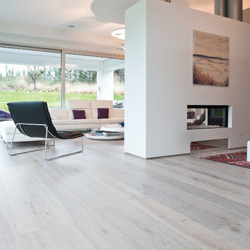
Modern lines beautifully executed by Alto Standing Construction with Lignum Elite - wide plank flooring from the Platinum Collection (random widths from 7 3/4" to 15 3/4" and up to 16 ft long). The color reference is "Valencia" in country grading.
 Chris Haltom Floors Inc.
Juan Jose for Chris Haltom Floors
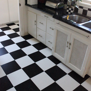
Example of a classic galley kitchen pantry design in San Francisco with a double-bowl sink, flat-panel cabinets, white cabinets, granite countertops, multicolored backsplash, ceramic backsplash and no island
Example of a classic galley kitchen pantry design in San Francisco with a double-bowl sink, flat-panel cabinets, white cabinets, granite countertops, multicolored backsplash, ceramic backsplash and no island
19