
Search results for "Photographer based" in Home Design Ideas
 Bilotta Kitchen & Home
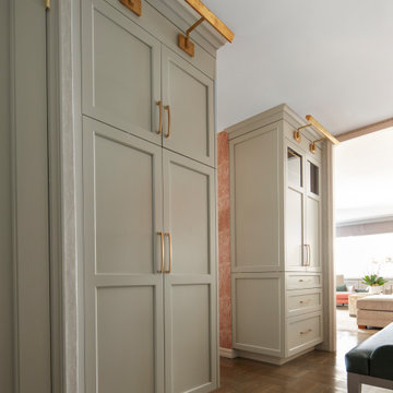
Bilotta Senior Designer, Thomas Vecchio, and Patrick J. Hamilton of Patrick James Hamilton Designs, partnered on this Manhattan upper east side kitchen renovation. This nondescript ‘60’s co-op and galley kitchen were reimagined into a pre-war era gem by adding architectural details: paneling, coffers, and moldings. Widening the opening created an open vista. Upper panes of glass on the Bilotta Collection wall cabinets echo the apartment’s transoms and unite the two sections that are interrupted by the paneled structural column. To compensate for the shorter wall, storage is optimized with plentiful pullouts, dividers, and specialized organizers. The “dead end” under the window was eliminated by continuing cabinetry and countertop materials around the room.
Countertop wall cabinets create a hutch in full view of the dining room. With dark gray paint, corner posts and furniture base molding, the peninsula reads like an island and bridges the two areas. Quartz countertops sport “lightning bolt” veins for pattern. Sophisticated on-
trend brushed brass was employed on the cabinet pulls and knobs, faucet, sconces, and pendants. A gamechanger was extending the footprint of the kitchen into the hallway with two tall cabinets. One is allocated for cleaning supplies, bulk items, recycling, and the vacuum. The other conceals a built-in wine rack; glassware and bar items; a docking drawer for charging devices; and a Penda-flex rack for files. An absolutely stunning metamorphosis.
Written by Paulette Gambacorta adapted for Houzz.
Bilotta Designer: Tom Vecchio
Interior Designer: Patrick J. Hamilton of Patrick James Hamilton Designs
Photographer: John Bessler
 Bilotta Kitchen & Home
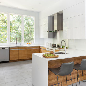
A convergence of sleek contemporary style and organic elements culminate in this elevated esthetic. High gloss white contrasts with sustainable bamboo veneers, run horizontally, and stained a warm matte caramel color. The showpiece is the 3” bamboo framing around the tall units, engineered in strips that perfectly align with the breaks in the surrounding cabinetry. So as not to clutter the clean lines of the flat panel doors, the white cabinets open with touch latches, most of which have lift-up mechanisms. Base cabinets have integrated channel hardware in stainless steel, echoing the appliances. Storage abounds, with such conveniences as tray partitions, corner swing-out lazy susans, and assorted dividers and inserts for the profusion of large drawers.
Pure white quartz countertops terminate in a waterfall end at the peninsula, where there’s room for three comfortable stools under the overhang. A unique feature is the execution of the cooktop: it’s set flush into the countertop, with a fascia of quartz below it; the cooktop’s knobs are set into that fascia. To assure a clean look throughout, the quartz is continued onto the backsplashes, punctuated by a sheet of stainless steel behind the rangetop and hood. Serenity and style in a hardworking space.
This project was designed in collaboration with Taylor Viazzo Architects.
Photography by Jason Taylor, R.A., AIA.
Written by Paulette Gambacorta, adapted for Houzz
Bilotta Designer: Danielle Florie
Architect: Taylor Viazzo Architects
Photographer: Jason Taylor, R.A., AIA

 Flavor Paper
Designed by UK born, Brooklyn based artist Jon Burgerman, Play Doodles brings to life Jon's famous doodles...where he just grabs a pen, wiggles it over a piece of paper and sees what, or who, pops out. Thinking it would be interesting to see how this could translate into 3D, he grabbed a bunch of colourful Play Doh and tried to make some fun characters without any plan, allowing the medium to dictate the results, which was a whole gaggle of funny little dudes. They are ageless, genderless, raceless and clearly embody the fun Jon had in making them. From a half-eaten cookie and a laid back corn on the cob to many abstract and curious creatures that ooze personality.
When Jon and Jon started to talk about a collaboration it seemed like using the realized doodles made the most sense since they added such a colorful 3D aspect to the design. All of the characters were photographed and then built into a repeat resulting in a lively wallpaper that will bring cheer to many spaces.
Play Doodles is one of our EZ Papes designs, meaning it's pre-pasted and water-activated for an easy DIY installation and removal!
Find the right local pro for your project

 TELFORD+BROWN STUDIO ARCHITECTURE
At exactly 400sf, this Accessory Dwelling Unit was originally an alley garage crammed with junk, and nearly falling over. Intended as a short- or long-term rental, a family guest house, summer party spot, and a potential future home for the clients, this ADU had to live larger than its actual square footage. Because of this, there needed to be a full kitchen, dining, living space, and limited long-term storage, as well as have the ability to fully open up to a landscaped patio. The clients also wanted to be sure that the space was extremely energy efficient, as well as budget-conscious.
Using the existing footprint, and a small portion of the garage to construct the new ADU enabled the homeowners keep the structure very close to the property lines, way within current setback requirements. This one move, although it ended up being a more expensive option than building completely new, saved the small back yard from being fully overtaken.
The plan of this unit is very simple, and we used a slim palette of finishes; both moves make it seem larger than it is. White walls and cabinets are punctuated by black stained wood doors and windows, and vertical grain Douglas Fir was used for window sills, shelving, and wall base. We used a mixture of the clients’ vintage door hardware and kitchen pulls with some new fixtures for the build-out to make it somewhat eclectic and personal.
Photographer: Matt Swain Photography

 Ward Jewell Architect AIA
San Marino based clients were interested in developing a property that had been in their family for generations. This was an exciting proposition as it was one of the last surviving bayside double lots on the scenic Coronado peninsula in San Diego. They desired a holiday home that would be a gathering place for their large, close- knit family.
San Marino based clients were interested in developing a property that had been in their family for generations. This was an exciting proposition as it was one of the last surviving bayside double lots on the scenic Coronado peninsula in San Diego. They desired a holiday home that would be a gathering place for their large, close-knit family. Facing the Back Bay, overlooking downtown and the Bay Bridge, this property presented us with a unique opportunity to design a vacation home with a dual personality. One side faces a bustling harbor with a constant parade of yachts, cargo vessels and military ships while the other opens onto a deep, quiet contemplative garden. The home’s shingle-style influence carries on the historical Coronado tradition of clapboard and Craftsman bungalows built in the shadow of the great Hotel Del Coronado which was erected at the turn of the last century. In order to create an informal feel to the residence, we devised a concept that eliminated the need for a “front door”. Instead, one walks through the garden and enters the “Great Hall” through either one of two French doors flanking a walk-in stone fireplace. Both two-story bedroom wings bookend this central wood beam vaulted room which serves as the “heart of the home”, and opens to both views. Three sets of stairs are discretely tucked away inside the bedroom wings.
In lieu of a formal dining room, the family convenes and dines around a beautiful table and banquette set into a circular window bay off the kitchen which overlooks the lights of the city beyond the harbor. Working with noted interior designer Betty Ann Marshall, we designed a unique kitchen that was inspired by the colors and textures of a fossil the couple found on a honeymoon trip to the quarries of Montana. We set that ancient fossil into a matte glass backsplash behind the professional cook’s stove. A warm library with walnut paneling and a bayed window seat affords a refuge for the family to read or play board games. The couple’s fine craft and folk art collection is on prominent display throughout the house and helps to set an intimate and whimsical tone.
Another architectural feature devoted to family is the play room lit by a dramatic cupola which beacons the older grandchildren and their friends. Below the play room is a four car garage that allows the patriarch space to refurbish an antique fire truck, a mahogany launch boat and several vintage cars. Their jet skis and kayaks are housed in another garage designed for that purpose. Lattice covered skylights that allow dappled sunlight to bathe the loggia affords a comfortable refuge to watch the kids swim and gaze out upon the rushing water, the Coronado Bay Bridge and the romantic downtown San Diego skyline.
Architect: Ward Jewell Architect, AIA
Interior Design: Betty Ann Marshall
Construction: Bill Lyons
Photographer: Laura Hull
Styling: Zale Design Studio
 TELFORD+BROWN STUDIO ARCHITECTURE
At exactly 400sf, this Accessory Dwelling Unit was originally an alley garage crammed with junk, and nearly falling over. Intended as a short- or long-term rental, a family guest house, summer party spot, and a potential future home for the clients, this ADU had to live larger than its actual square footage. Because of this, there needed to be a full kitchen, dining, living space, and limited long-term storage, as well as have the ability to fully open up to a landscaped patio. The clients also wanted to be sure that the space was extremely energy efficient, as well as budget-conscious.
Using the existing footprint, and a small portion of the garage to construct the new ADU enabled the homeowners keep the structure very close to the property lines, way within current setback requirements. This one move, although it ended up being a more expensive option than building completely new, saved the small back yard from being fully overtaken.
The plan of this unit is very simple, and we used a slim palette of finishes; both moves make it seem larger than it is. White walls and cabinets are punctuated by black stained wood doors and windows, and vertical grain Douglas Fir was used for window sills, shelving, and wall base. We used a mixture of the clients’ vintage door hardware and kitchen pulls with some new fixtures for the build-out to make it somewhat eclectic and personal.
Photographer: Matt Swain Photography
 TOMRUQUE
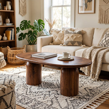
Solen explores the relationship between a long oval tabletop and two substantial cylindrical pedestals. The softly rounded shoulders of the bases echo the tabletop’s curved bullnose edge, giving the design a consistent sculptural language from top to floor. Its elongated silhouette creates a central surface for books, drinks, and everyday objects in contemporary living spaces.
Handcrafted in a choice of solid oak or solid walnut, the table brings natural wood grain into focus. Oak offers a lighter appearance for Scandinavian and Japandi-inspired interiors, while walnut introduces deeper tones alongside neutral upholstery and textured rugs. A protective matte finish complements the wood, and the approximately 1.8-inch-thick tabletop adds substance to the rounded profile.
Eight tabletop configurations range from 30"W × 18"D to 58"W × 32"D, with selectable heights of 16", 18", or 20". These options allow the proportions to be considered alongside different sofas and seating arrangements. Custom dimensions can also be discussed before ordering.
Each Solen coffee table is made to order, with photographs of the finished piece shared for approval before shipping.
Explore the materials and available dimensions: [Solen Oval Solid Wood Coffee Table by Tomruque]( https://tomruque.com/products/solen-oval-solid-wood-coffee-table-oak-walnut-sculptural-double-pedestal-design).

 TELFORD+BROWN STUDIO ARCHITECTURE
At exactly 400sf, this Accessory Dwelling Unit was originally an alley garage crammed with junk, and nearly falling over. Intended as a short- or long-term rental, a family guest house, summer party spot, and a potential future home for the clients, this ADU had to live larger than its actual square footage. Because of this, there needed to be a full kitchen, dining, living space, and limited long-term storage, as well as have the ability to fully open up to a landscaped patio. The clients also wanted to be sure that the space was extremely energy efficient, as well as budget-conscious.
Using the existing footprint, and a small portion of the garage to construct the new ADU enabled the homeowners keep the structure very close to the property lines, way within current setback requirements. This one move, although it ended up being a more expensive option than building completely new, saved the small back yard from being fully overtaken.
The plan of this unit is very simple, and we used a slim palette of finishes; both moves make it seem larger than it is. White walls and cabinets are punctuated by black stained wood doors and windows, and vertical grain Douglas Fir was used for window sills, shelving, and wall base. We used a mixture of the clients’ vintage door hardware and kitchen pulls with some new fixtures for the build-out to make it somewhat eclectic and personal.
Photographer: Matt Swain Photography
 Centoni Restoration & Development, Inc.
CLIENT GOALS
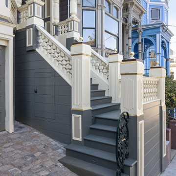
This spectacular Victorian was built in 1890 for Joseph Budde, an inventor, patent holder, and major manufacturer of the flush toilet. Through its more than 130-year life, this home evolved with the many incarnations of the Haight District. The most significant was the street modification that made way for the Haight Street railway line in the early 1920s. At that time, streets and sidewalks widened, causing the straight-line, two-story staircase to take a turn.
In the 1920s, stucco and terrazzo were considered modern and low-maintenance materials and were often used to replace the handmade residential carpentry that would have graced this spectacular staircase. Sometime during the 1990s, the entire entry door assembly was removed and replaced with another “modern” solution. Our clients challenged Centoni to recreate the original staircase and entry.
OUR DESIGN SOLUTION
Through a partnership with local artisans and support from San Francisco Historical Planners, team Centoni sourced information from the public library that included original photographs, writings on Cranston and Keenan, and the history of the Haight. Though no specific photo has yet to be sourced, we are confident the design choices are in the spirit of the original and are based on remnants of the original porch discovered under the 1920s stucco.
Through this journey, the staircase foundation was reengineered, the staircase designed and built, the original entry doors recreated, the stained glass transom created (including replication of the original hand-painted bird-theme rondels, many rotted decorated elements hand-carved, new and historic lighting installed, and a new iron handrail designed and fabricated.

 Vision Interiors
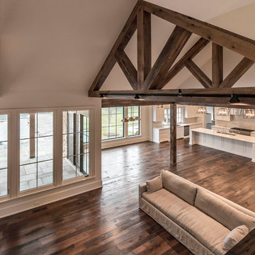
The Holloway blends the recent revival of mid-century aesthetics with the timelessness of a country farmhouse. Each façade features playfully arranged windows tucked under steeply pitched gables. Natural wood lapped siding emphasizes this homes more modern elements, while classic white board & batten covers the core of this house. A rustic stone water table wraps around the base and contours down into the rear view-out terrace.
Inside, a wide hallway connects the foyer to the den and living spaces through smooth case-less openings. Featuring a grey stone fireplace, tall windows, and vaulted wood ceiling, the living room bridges between the kitchen and den. The kitchen picks up some mid-century through the use of flat-faced upper and lower cabinets with chrome pulls. Richly toned wood chairs and table cap off the dining room, which is surrounded by windows on three sides. The grand staircase, to the left, is viewable from the outside through a set of giant casement windows on the upper landing. A spacious master suite is situated off of this upper landing. Featuring separate closets, a tiled bath with tub and shower, this suite has a perfect view out to the rear yard through the bedroom's rear windows. All the way upstairs, and to the right of the staircase, is four separate bedrooms. Downstairs, under the master suite, is a gymnasium. This gymnasium is connected to the outdoors through an overhead door and is perfect for athletic activities or storing a boat during cold months. The lower level also features a living room with a view out windows and a private guest suite.
Architect: Visbeen Architects
Photographer: Ashley Avila Photography
Builder: AVB Inc.
 Bilotta Kitchen & Home
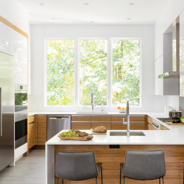
A convergence of sleek contemporary style and organic elements culminate in this elevated esthetic. High gloss white contrasts with sustainable bamboo veneers, run horizontally, and stained a warm matte caramel color. The showpiece is the 3” bamboo framing around the tall units, engineered in strips that perfectly align with the breaks in the surrounding cabinetry. So as not to clutter the clean lines of the flat panel doors, the white cabinets open with touch latches, most of which have lift-up mechanisms. Base cabinets have integrated channel hardware in stainless steel, echoing the appliances. Storage abounds, with such conveniences as tray partitions, corner swing-out lazy susans, and assorted dividers and inserts for the profusion of large drawers.
Pure white quartz countertops terminate in a waterfall end at the peninsula, where there’s room for three comfortable stools under the overhang. A unique feature is the execution of the cooktop: it’s set flush into the countertop, with a fascia of quartz below it; the cooktop’s knobs are set into that fascia. To assure a clean look throughout, the quartz is continued onto the backsplashes, punctuated by a sheet of stainless steel behind the rangetop and hood. Serenity and style in a hardworking space.
This project was designed in collaboration with Taylor Viazzo Architects.
Photography by Jason Taylor, R.A., AIA.
Written by Paulette Gambacorta, adapted for Houzz
Bilotta Designer: Danielle Florie
Architect: Taylor Viazzo Architects
Photographer: Jason Taylor, R.A., AIA
 TELFORD+BROWN STUDIO ARCHITECTURE
At exactly 400sf, this Accessory Dwelling Unit was originally an alley garage crammed with junk, and nearly falling over. Intended as a short- or long-term rental, a family guest house, summer party spot, and a potential future home for the clients, this ADU had to live larger than its actual square footage. Because of this, there needed to be a full kitchen, dining, living space, and limited long-term storage, as well as have the ability to fully open up to a landscaped patio. The clients also wanted to be sure that the space was extremely energy efficient, as well as budget-conscious.
Using the existing footprint, and a small portion of the garage to construct the new ADU enabled the homeowners keep the structure very close to the property lines, way within current setback requirements. This one move, although it ended up being a more expensive option than building completely new, saved the small back yard from being fully overtaken.
The plan of this unit is very simple, and we used a slim palette of finishes; both moves make it seem larger than it is. White walls and cabinets are punctuated by black stained wood doors and windows, and vertical grain Douglas Fir was used for window sills, shelving, and wall base. We used a mixture of the clients’ vintage door hardware and kitchen pulls with some new fixtures for the build-out to make it somewhat eclectic and personal.
Photographer: Matt Swain Photography
 TELFORD+BROWN STUDIO ARCHITECTURE
At exactly 400sf, this Accessory Dwelling Unit was originally an alley garage crammed with junk, and nearly falling over. Intended as a short- or long-term rental, a family guest house, summer party spot, and a potential future home for the clients, this ADU had to live larger than its actual square footage. Because of this, there needed to be a full kitchen, dining, living space, and limited long-term storage, as well as have the ability to fully open up to a landscaped patio. The clients also wanted to be sure that the space was extremely energy efficient, as well as budget-conscious.
Using the existing footprint, and a small portion of the garage to construct the new ADU enabled the homeowners keep the structure very close to the property lines, way within current setback requirements. This one move, although it ended up being a more expensive option than building completely new, saved the small back yard from being fully overtaken.
The plan of this unit is very simple, and we used a slim palette of finishes; both moves make it seem larger than it is. White walls and cabinets are punctuated by black stained wood doors and windows, and vertical grain Douglas Fir was used for window sills, shelving, and wall base. We used a mixture of the clients’ vintage door hardware and kitchen pulls with some new fixtures for the build-out to make it somewhat eclectic and personal.
Photographer: Matt Swain Photography
 TELFORD+BROWN STUDIO ARCHITECTURE
At exactly 400sf, this Accessory Dwelling Unit was originally an alley garage crammed with junk, and nearly falling over. Intended as a short- or long-term rental, a family guest house, summer party spot, and a potential future home for the clients, this ADU had to live larger than its actual square footage. Because of this, there needed to be a full kitchen, dining, living space, and limited long-term storage, as well as have the ability to fully open up to a landscaped patio. The clients also wanted to be sure that the space was extremely energy efficient, as well as budget-conscious.
Using the existing footprint, and a small portion of the garage to construct the new ADU enabled the homeowners keep the structure very close to the property lines, way within current setback requirements. This one move, although it ended up being a more expensive option than building completely new, saved the small back yard from being fully overtaken.
The plan of this unit is very simple, and we used a slim palette of finishes; both moves make it seem larger than it is. White walls and cabinets are punctuated by black stained wood doors and windows, and vertical grain Douglas Fir was used for window sills, shelving, and wall base. We used a mixture of the clients’ vintage door hardware and kitchen pulls with some new fixtures for the build-out to make it somewhat eclectic and personal.
Photographer: Matt Swain Photography


 Bilotta Kitchen & Home
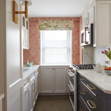
Bilotta Senior Designer, Thomas Vecchio, and Patrick J. Hamilton of Patrick James Hamilton Designs, partnered on this Manhattan upper east side kitchen renovation. This nondescript ‘60’s co-op and galley kitchen were reimagined into a pre-war era gem by adding architectural details: paneling, coffers, and moldings. Widening the opening created an open vista. Upper panes of glass on the Bilotta Collection wall cabinets echo the apartment’s transoms and unite the two sections that are interrupted by the paneled structural column. To compensate for the shorter wall, storage is optimized with plentiful pullouts, dividers, and specialized organizers. The “dead end” under the window was eliminated by continuing cabinetry and countertop materials around the room.
Countertop wall cabinets create a hutch in full view of the dining room. With dark gray paint, corner posts and furniture base molding, the peninsula reads like an island and bridges the two areas. Quartz countertops sport “lightning bolt” veins for pattern. Sophisticated on-
trend brushed brass was employed on the cabinet pulls and knobs, faucet, sconces, and pendants. A gamechanger was extending the footprint of the kitchen into the hallway with two tall cabinets. One is allocated for cleaning supplies, bulk items, recycling, and the vacuum. The other conceals a built-in wine rack; glassware and bar items; a docking drawer for charging devices; and a Penda-flex rack for files. An absolutely stunning metamorphosis.
Written by Paulette Gambacorta adapted for Houzz.
Bilotta Designer: Tom Vecchio
Interior Designer: Patrick J. Hamilton of Patrick James Hamilton Designs
Photographer: John Bessler
 Bilotta Kitchen & Home
Designed by Bilotta’s Fabrice Garson, this expansive traditional kitchen features our private Bilotta Collection Cabinetry in white paint with double stacked wall cabinets leading up to the coffered ceiling. The massive island houses multiple appliances, including a warming drawer, microwave and dishwasher next to the main sink, as well as large drawers for ample storage. Island seating allows for less formal dining or a place for the children to do their homework while mom prepares dinner. Two wall ovens flanking the 48” Wolf range top create a perfect cooking “nook” and the side-by-side fully integrated 36” Sub-Zero refrigerator and freezer allow for plenty of food storage. On either side of the refrigeration are two tall pull-out pantries concealing snacks, spices, baking supplies and more. Every drawer in the space has its individual purpose, whether it be to house cutlery or fine china. The coffered ceiling, a trademark of many of Fabrice’s designs, really open up the space and intertwine it with the adjacent rooms for an overall open feeling – very bright and inviting. The wall on the other side of the island from the cooking wall features a secondary prep sink with a second dishwasher and a under counter beverage center, again, with plenty of storage in both the base and wall cabinets. The backsplash is mostly wood paneling except for the wall behind the range top where there is a custom designed marble mosaic pattern. The countertops are Vermont Super White quartzite with a double ogee edge.
Photographer – Peter Krupenye

 Dillman & Upton, Inc.
Dura Supreme Silverton inset door. Pearl paint for pantry. Extra- tall, doorless base cabinets outfitted with custom painted deep rollouts. Kate Benjamin Photographer, Lindsey Markel Kitchen & Bath Designer, Shana Smith Interior Designer and Don Henderson Custom Installer.
 Bilotta Kitchen & Home
Written by Mary Kate Hogan for Westchester Home Magazine.
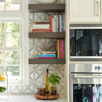
"The Goal: The family that cooks together has the most fun — especially when their kitchen is equipped with four ovens and tons of workspace. After a first-floor renovation of a home for a couple with four grown children, the new kitchen features high-tech appliances purchased through Royal Green and a custom island with a connected table to seat family, friends, and cooking spectators. An old dining room was eliminated, and the whole area was transformed into one open, L-shaped space with a bar and family room.
“They wanted to expand the kitchen and have more of an entertaining room for their family gatherings,” says designer Danielle Florie. She designed the kitchen so that two or three people can work at the same time, with a full sink in the island that’s big enough for cleaning vegetables or washing pots and pans.
Key Features:
Well-Stocked Bar: The bar area adjacent to the kitchen doubles as a coffee center. Topped with a leathered brown marble, the bar houses the coffee maker as well as a wine refrigerator, beverage fridge, and built-in ice maker. Upholstered swivel chairs encourage people to gather and stay awhile.
Finishing Touches: Counters around the kitchen and the island are covered with a Cambria quartz that has the light, airy look the homeowners wanted and resists stains and scratches. A geometric marble tile backsplash is an eye-catching decorative element.
Into the Wood: The larger table in the kitchen was handmade for the family and matches the island base. On the floor, wood planks with a warm gray tone run diagonally for added interest."
Bilotta Designer: Danielle Florie
Photographer: Phillip Ennis
 Centoni Restoration & Development, Inc.
CLIENT GOALS
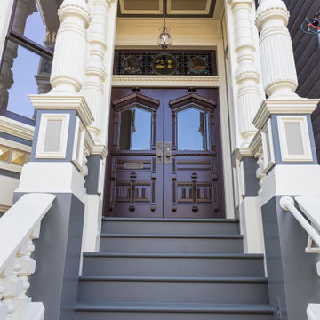
This spectacular Victorian was built in 1890 for Joseph Budde, an inventor, patent holder, and major manufacturer of the flush toilet. Through its more than 130-year life, this home evolved with the many incarnations of the Haight District. The most significant was the street modification that made way for the Haight Street railway line in the early 1920s. At that time, streets and sidewalks widened, causing the straight-line, two-story staircase to take a turn.
In the 1920s, stucco and terrazzo were considered modern and low-maintenance materials and were often used to replace the handmade residential carpentry that would have graced this spectacular staircase. Sometime during the 1990s, the entire entry door assembly was removed and replaced with another “modern” solution. Our clients challenged Centoni to recreate the original staircase and entry.
OUR DESIGN SOLUTION
Through a partnership with local artisans and support from San Francisco Historical Planners, team Centoni sourced information from the public library that included original photographs, writings on Cranston and Keenan, and the history of the Haight. Though no specific photo has yet to be sourced, we are confident the design choices are in the spirit of the original and are based on remnants of the original porch discovered under the 1920s stucco.
Through this journey, the staircase foundation was reengineered, the staircase designed and built, the original entry doors recreated, the stained glass transom created (including replication of the original hand-painted bird-theme rondels, many rotted decorated elements hand-carved, new and historic lighting installed, and a new iron handrail designed and fabricated.
146