
Search results for "Photographer based" in Home Design Ideas
 Architect
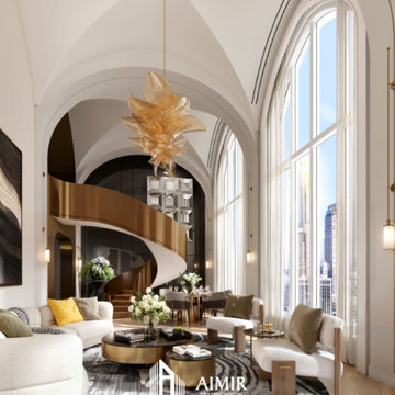
Not all architectural imagery is created equal. Some renderings look obviously computer-generated, with flat lighting and plastic-looking materials that fail to convince viewers. Others are so precise that they are indistinguishable from photographs. That second category, realistic architectural visualization rendering, has become the standard expectation for architects, developers, and marketers who need imagery capable of withstanding close scrutiny from investors, buyers, and planning authorities. As audiences grow more visually literate, the tolerance for obviously artificial, video-game-like imagery in professional presentations continues to shrink.
What Sets Realistic Visualization Apart
Realistic architectural visualization goes beyond simply modeling a building in three dimensions. It requires physically accurate lighting simulation, true-to-life material properties, and careful attention to the small imperfections that make real-world photography convincing, such as subtle reflections, ambient occlusion in corners, and natural depth of field. The goal is an image that a viewer would believe was captured by a camera on-site rather than generated by software. Achieving that level of believability typically means dozens of small adjustments layered on top of one another rather than any single dramatic setting.
Realistic Versus Stylized Rendering Approaches
Stylized or conceptual renderings still have their place, particularly in early design phases when a looser, more artistic representation helps convey mood without locking in every detail. But once a project moves toward marketing, investment, or permitting, stakeholders need to see exactly what they are getting. Realistic visualization removes ambiguity, showing true material colors, accurate proportions, and honest lighting conditions rather than idealized abstractions. Understanding which approach a project actually needs at each stage helps clients avoid paying for a level of polish that a given milestone does not yet require.
Why Realism Builds Client and Buyer Confidence
Buyers and investors are understandably skeptical of overly polished or unrealistic marketing images. When a rendering looks convincingly real, it builds trust rather than raising doubts about what the finished project will actually look like. This is especially important in real estate presales, where buyers are committing significant sums based largely on visual material rather than a finished physical space. A rendering that later turns out to have misrepresented the finished product can also create legal and reputational exposure for developers, making accuracy a genuine business risk rather than just an aesthetic preference.
The Technical Pillars Behind Every Realistic Scene
Achieving true realism depends on several technical disciplines working together: physically based rendering engines that simulate how light actually behaves, high-resolution texture libraries that replicate real materials like stone, wood, and glass, and careful camera work that mimics real photographic lenses and exposure. Post-production adds a final layer of color grading and atmospheric effects that ties everything together into a cohesive, believable image. Each of these pillars depends on the others; even flawless material work can be undermined by lighting that behaves in a physically implausible way.
Applications Across Residential, Commercial, and Institutional Projects
Realistic visualization serves a wide range of building types, from single-family homes and luxury condominiums to office towers, hotels, schools, and healthcare facilities. Each typology has its own material palette and lighting expectations, and an experienced studio adjusts its approach accordingly, whether that means warm, inviting tones for a residential lobby or crisp, professional lighting for a corporate headquarters. Institutional clients such as universities and hospitals often have additional requirements around accessibility signage and wayfinding, which need to be represented accurately alongside the architecture itself.
How AIMIR CG Delivers Photorealistic Accuracy
Our studio specializes in realistic architectural visualization rendering that holds up under close inspection. Every project moves through a disciplined pipeline of modeling, texturing, lighting, and post-production review, with artists cross-checking material references and lighting studies against real-world photography. This attention to detail is why clients consistently describe our end product as impressive and our process as easy to work with. A dedicated quality review stage before delivery catches inconsistencies that might otherwise slip through a faster, less structured pipeline.
Common Challenges in Achieving True Realism
Realistic rendering is technically demanding. Common obstacles include accurately simulating how light bounces between surfaces, matching material reflectivity to real product specifications, and avoiding the uncanny, slightly artificial look that comes from over-processed images. Overcoming these challenges requires experienced artists who understand both the science of light and the craft of photography, not just software proficiency. Rushed production schedules are often the real culprit behind unconvincing renderings, since realism typically requires several iterative passes rather than a single render.
What to Look for in a Realism-Focused Rendering Studio
When evaluating a rendering partner, review their portfolio critically. Do the images include convincing shadow detail and material variation, or do surfaces look uniformly smooth and artificial? Ask about their revision process and how closely they work with architects to source accurate material and lighting references, since realism is ultimately the product of disciplined collaboration, not a single software setting. It also helps to ask for examples of past projects in a similar building type, since a studio's strengths can vary across typologies.
Ready for Renderings That Look Real
If your project deserves imagery that can stand up to the scrutiny of investors, buyers, and planning boards, AIMIR CG is ready to help. Our team combines technical precision with artistic judgment to deliver visualization that looks and feels genuinely real. Contact us to discuss how photorealistic rendering can strengthen your next presentation or marketing campaign, and let us show you examples from projects similar to your own.
 Tile Doctor Ltd
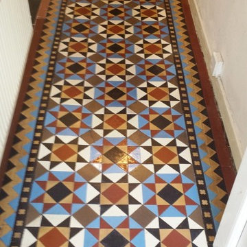
When you uncover a tiled floor after it has been covered by carpet for many years, it’s almost a given that it will be in a bad state. However, my customer, who lives in the town of Lymm, wasn’t expecting the Victorian tiled hallway they had recently uncovered to be in quite so terrible a state. As you can see from the photograph, it has been completely devastated by paint plaster and a big pool of cement floor leveller. Understandably, the formerly colourful appearance of the tiles had completely drained and it would require a through restoration to get them back into a usable condition.
To begin the restoration, I mixed a strong cleaning solution which consisted of Tile Doctor Remove & Go combined 50/50 with Tile Doctor Pro Clean. Remove & Go is a heavy duty remover that breaks down old sealers, along with adhesives, paint stains and other tough soil build up where as Pro-Clean is a versatile alkaline-based cleaner that reliably eradicates dirt on a wide variety of natural stone floors.
The solution was applied liberally across the floor, and left to dwell for a short period, allowing time for it to soften up the paint plaster. Next, I fitted a coarse scrubbing pad to my rotary cleaning machine and began to scrub the solution into the tiles, with a big difference to the appearance of the tiles being made quite quickly. The resulting cleaning slurry was promptly removed using a wet-vac machine.
I repeated the process two times to provide an extra thorough clean and then give the floor a thorough rinse. Some particularly stubborn marks remained on the floor which I was able to remove using Tile a Doctor Acid Gel, a blend of phosphoric and hydrochloric acids in gel form that’s easy to control. The floor was then left to dry fully overnight.
The next morning, I returned to the property and ran some damp tests. This is incredibly important to do before sealing any tiled floor because any excess moisture can cloud the sealer and prevent it from doing its job properly.
Once satisfied that the floor could be sealed, I applied several coats of Tile Doctor Seal and Go, our topical sealer which provides both a robust surface seal and a long-lasting low sheen finish in one and ideal for Victorian tiles.
It would be an understatement to say that this Victorian tiled floor was transformed. The customer was amazed at the results considering how bad a state the tiles had been in just a day earlier. When you have a situation like this, it’s hard to believe the tiles could ever be fully restored. Nonetheless, we could now see them in their full and original glory, and needless to say, the customer was very, very pleased with the result.
Alastair Robb
West Cheshire Tile Doctor

 MOTIV Interiors
Interior Designer: MOTIV Interiors LLC
Photographer: Sam Angel Photography
Design Challenge: This 8 year-old boy and girl were outgrowing their existing setup and needed to update their rooms with a plan that would carry them forward into middle school and beyond. In addition to gaining storage and study areas, could these twins show off their big personalities? Absolutely, we said! MOTIV Interiors tackled the rooms of these youngsters living in Nashville's 12th South Neighborhood and created an environment where the dynamic duo can learn, create, and grow together for years to come.
Design Solution:
In his room, we wanted to continue the feature wall fun, but with a different approach. Since our young explorer loves outer space, being a boy scout, and building with legos, we created a dynamic geometric wall that serves as the backdrop for our young hero’s control center. We started with a neutral mushroom color for the majority of the walls in the room, while our feature wall incorporated a deep indigo and sky blue that are as classic as your favorite pair of jeans. We focused on indoor air quality and used Sherwin Williams’ Duration paint in a satin sheen, which is a scrubbable/no-VOC coating.
We wanted to create a great reading corner, so we placed a comfortable denim lounge chair next to the window and made sure to feature a self-portrait created by our young client. For night time reading, we included a super-stellar floor lamp with white globes and a sleek satin nickel finish. Metal details are found throughout the space (such as the lounge chair base and nautical desk clock), and lend a utilitarian feel to the room. In order to balance the metal and keep the room from feeling too cold, we also snuck in woven baskets that work double-duty as decorative pieces and functional storage bins.
The large north-facing window got the royal treatment and was dressed with a relaxed roman shade in a shiitake linen blend. We added a fabulous fabric trim from F. Schumacher and echoed the look by using the same fabric for the bolster on the bed. Royal blue bedding brings a bit of color into the space, and is complimented by the rich chocolate wood tones seen in the furniture throughout. Additional storage was a must, so we brought in a glossy blue storage unit that can accommodate legos, encyclopedias, pinewood derby cars, and more!
Comfort and creativity converge in this space, and we were excited to get a big smile when we turned it over to its new commander.
Find the right local pro for your project
 MOTIV Interiors
Interior Designer: MOTIV Interiors LLC
Photographer: Sam Angel Photography
Design Challenge: This 8 year-old boy and girl were outgrowing their existing setup and needed to update their rooms with a plan that would carry them forward into middle school and beyond. In addition to gaining storage and study areas, could these twins show off their big personalities? Absolutely, we said! MOTIV Interiors tackled the rooms of these youngsters living in Nashville's 12th South Neighborhood and created an environment where the dynamic duo can learn, create, and grow together for years to come.
Design Solution:
In his room, we wanted to continue the feature wall fun, but with a different approach. Since our young explorer loves outer space, being a boy scout, and building with legos, we created a dynamic geometric wall that serves as the backdrop for our young hero’s control center. We started with a neutral mushroom color for the majority of the walls in the room, while our feature wall incorporated a deep indigo and sky blue that are as classic as your favorite pair of jeans. We focused on indoor air quality and used Sherwin Williams’ Duration paint in a satin sheen, which is a scrubbable/no-VOC coating.
We wanted to create a great reading corner, so we placed a comfortable denim lounge chair next to the window and made sure to feature a self-portrait created by our young client. For night time reading, we included a super-stellar floor lamp with white globes and a sleek satin nickel finish. Metal details are found throughout the space (such as the lounge chair base and nautical desk clock), and lend a utilitarian feel to the room. In order to balance the metal and keep the room from feeling too cold, we also snuck in woven baskets that work double-duty as decorative pieces and functional storage bins.
The large north-facing window got the royal treatment and was dressed with a relaxed roman shade in a shiitake linen blend. We added a fabulous fabric trim from F. Schumacher and echoed the look by using the same fabric for the bolster on the bed. Royal blue bedding brings a bit of color into the space, and is complimented by the rich chocolate wood tones seen in the furniture throughout. Additional storage was a must, so we brought in a glossy blue storage unit that can accommodate legos, encyclopedias, pinewood derby cars, and more!
Comfort and creativity converge in this space, and we were excited to get a big smile when we turned it over to its new commander.
 Neumann & Rudy Architecture
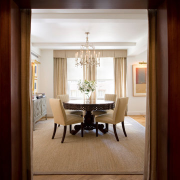
The photograph is composed as a deliberate enfilade study, framing the dining room through a deep, mahogany-cased cased opening that functions as both proscenium and threshold. This heavy portal — with its substantial reveal, plinth-like jambs and crisply mitered head casing — establishes a strong rectilinear armature that compresses the foreground and, by contrast, releases the eye into the luminous volume beyond. The plan reads as a classic pre-war apartment sequence: an axial sightline runs from the gallery floor, across the field of the dining room, and terminates at the window wall, where a curtained bay borrows daylight from the street. The ceiling is articulated by shallow beam drops or applied soffits — a coffer-adjacent treatment that registers the building's structural grid while lending the room a subtle sense of enclosure and datum. Geometry is orchestrated around opposing figures: the orthogonal rigor of casings, valance, beam lines and picture frames set against the centralized circular table, whose radial symmetry anchors the room's midpoint directly beneath the chandelier. Furnishings are held in a loose, non-touching arrangement, with generous circulation clearance at the perimeter, so that the room's volume — rather than its contents — remains the primary subject. Secondary sightlines to the left, toward a mirrored console and gilt-framed panel, and to the right, toward a picture-lit artwork, quietly widen the perceived footprint and imply adjacent rooms beyond the frame.
The material narrative is built on a controlled tonal ascent from dark to light. The foreground is dominated by richly figured, warm-red mahogany millwork and a chevron-laid oak parquet whose bleached, honeyed grain reads with a slight gray wash — a directional pattern that visually propels the viewer toward the interior. Within the dining room, the palette shifts to a low-saturation envelope of chalky off-white plaster walls and putty-toned textiles: floor-length linen or silk-blend drapery panels with a faint slubbed weave, gathered beneath a tailored, flat-front upholstered valance whose crisp horizontal band imparts an atelier precision. Underfoot, a natural sisal or seagrass rug with a linen tape border introduces a coarse, granular tactility that grounds the refined upholstery above; its woven, matte texture is deliberately calibrated against the smoother satin sheen of the dining chairs' subtly striped fabric. The room's tonal fulcrum is the antique carved pedestal table — a near-black, deeply modeled Anglo-Indian or Colonial Revival piece whose pierced apron, scrolled tripod base and paw feet supply the composition's only ornamental exuberance and its darkest value. Accents are chosen for restraint: silvered leaf on the console's fretwork facing, water-gilt on the framed panel, polished nickel or silver on the chandelier and the flower vessel, and the cool white of massed oriental lilies. Undertones remain uniformly warm — greige, ecru, taupe, oatmeal — with cool relief supplied only by the metals and the daylight itself.
Lighting is layered with quiet discipline. Natural light enters as a diffused, north-facing wash through a sheer-veiled window, its intensity softened by roller or Roman shading so that the glazing reads as a luminous plane rather than a view; this creates a gentle contre-jour that silhouettes the chandelier and the table's carved base. The multi-arm chandelier — a silvered, pagoda-crested fixture with slender candle sleeves and faceted drops — serves as sculptural punctuation more than as a working source, its warm 2700K glow registering as ambient sparkle. Accent illumination is deployed with curatorial intent: a picture light grazes the framed work at right, while the recessed downlights and the darkened foreground casings produce a chiaroscuro that heightens the sense of arrival. The cumulative atmosphere is one of hushed formality — composed, aerated, and almost monastic in its refusal of visual noise. Stylistically, the room synthesizes into what might be termed Transitional Classicism, or Warm Neutral Modern Traditional: the bones and millwork are unmistakably pre-war Beaux-Arts-derived, yet the flat-front valances, unadorned wall planes, natural-fiber flooring and simplified parson-back chairs reflect a contemporary editorial sensibility. The single antique table operates as a considered anachronism — a note of patinated gravitas within an otherwise pared-back, texturally driven interior — demonstrating a designer's confidence in restraint punctuated by one authoritative gesture.
 MOTIV Interiors
Interior Designer: MOTIV Interiors LLC
Photographer: Sam Angel Photography
Design Challenge: This 8 year-old boy and girl were outgrowing their existing setup and needed to update their rooms with a plan that would carry them forward into middle school and beyond. In addition to gaining storage and study areas, could these twins show off their big personalities? Absolutely, we said! MOTIV Interiors tackled the rooms of these youngsters living in Nashville's 12th South Neighborhood and created an environment where the dynamic duo can learn, create, and grow together for years to come.
Design Solution:
In his room, we wanted to continue the feature wall fun, but with a different approach. Since our young explorer loves outer space, being a boy scout, and building with legos, we created a dynamic geometric wall that serves as the backdrop for our young hero’s control center. We started with a neutral mushroom color for the majority of the walls in the room, while our feature wall incorporated a deep indigo and sky blue that are as classic as your favorite pair of jeans. We focused on indoor air quality and used Sherwin Williams’ Duration paint in a satin sheen, which is a scrubbable/no-VOC coating.
We wanted to create a great reading corner, so we placed a comfortable denim lounge chair next to the window and made sure to feature a self-portrait created by our young client. For night time reading, we included a super-stellar floor lamp with white globes and a sleek satin nickel finish. Metal details are found throughout the space (such as the lounge chair base and nautical desk clock), and lend a utilitarian feel to the room. In order to balance the metal and keep the room from feeling too cold, we also snuck in woven baskets that work double-duty as decorative pieces and functional storage bins.
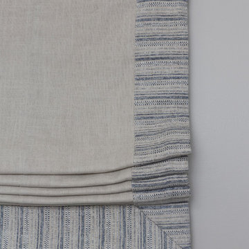
The large north-facing window got the royal treatment and was dressed with a relaxed roman shade in a shiitake linen blend. We added a fabulous fabric trim from F. Schumacher and echoed the look by using the same fabric for the bolster on the bed. Royal blue bedding brings a bit of color into the space, and is complimented by the rich chocolate wood tones seen in the furniture throughout. Additional storage was a must, so we brought in a glossy blue storage unit that can accommodate legos, encyclopedias, pinewood derby cars, and more!
Comfort and creativity converge in this space, and we were excited to get a big smile when we turned it over to its new commander.
 MOTIV Interiors
Interior Designer: MOTIV Interiors LLC
Photographer: Sam Angel Photography
Design Challenge: This 8 year-old boy and girl were outgrowing their existing setup and needed to update their rooms with a plan that would carry them forward into middle school and beyond. In addition to gaining storage and study areas, could these twins show off their big personalities? Absolutely, we said! MOTIV Interiors tackled the rooms of these youngsters living in Nashville's 12th South Neighborhood and created an environment where the dynamic duo can learn, create, and grow together for years to come.
Design Solution:
In his room, we wanted to continue the feature wall fun, but with a different approach. Since our young explorer loves outer space, being a boy scout, and building with legos, we created a dynamic geometric wall that serves as the backdrop for our young hero’s control center. We started with a neutral mushroom color for the majority of the walls in the room, while our feature wall incorporated a deep indigo and sky blue that are as classic as your favorite pair of jeans. We focused on indoor air quality and used Sherwin Williams’ Duration paint in a satin sheen, which is a scrubbable/no-VOC coating.
We wanted to create a great reading corner, so we placed a comfortable denim lounge chair next to the window and made sure to feature a self-portrait created by our young client. For night time reading, we included a super-stellar floor lamp with white globes and a sleek satin nickel finish. Metal details are found throughout the space (such as the lounge chair base and nautical desk clock), and lend a utilitarian feel to the room. In order to balance the metal and keep the room from feeling too cold, we also snuck in woven baskets that work double-duty as decorative pieces and functional storage bins.
The large north-facing window got the royal treatment and was dressed with a relaxed roman shade in a shiitake linen blend. We added a fabulous fabric trim from F. Schumacher and echoed the look by using the same fabric for the bolster on the bed. Royal blue bedding brings a bit of color into the space, and is complimented by the rich chocolate wood tones seen in the furniture throughout. Additional storage was a must, so we brought in a glossy blue storage unit that can accommodate legos, encyclopedias, pinewood derby cars, and more!
Comfort and creativity converge in this space, and we were excited to get a big smile when we turned it over to its new commander.
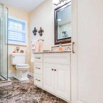


 Envision Web
Becky Hulsey, Envision Virtual Tours
The Lodge at Gold Mine Falls
A Once in a Lifetime Opportunity Awaits….
Have you dreamed of owning your own spectacular waterfall, a serene trout pond, or a one of a kind mountain lodge filled with high end touches, all near Lake Burton? If the answer is yes…..then “The Lodge at Gold Mine Falls” is for you!
Located just off HW 76 .3 miles to Anchorage Marina, this unique 2.8 acre property borders the National Forest, boasts a fully remodeled 3 bedroom, 3 bath, 2000+ square foot rock lodge that is adjacent to its own private, spectacular 60 foot waterfall all surrounded by native landscape such as rhododendron and mountain laurel. Tumbling under the 40 foot suspension bridge, the pristine, crystal clear water continues to ramble on its way to large pond ready to be stocked with trout. Picture yourself fly fishing for a trout dinner right at your front door, or delight your friends or family while entertaining on your new porch or extensive, multi-level deck that connects your new home to your own waterfall. The kids or grandkids will be entertained for hours wading in the pool at the base of the waterfall, exploring the crooks and crannies among the stream’s boulders while looking for salamanders, or panning for “fool’s gold” in the stream. Just imagine….The Lodge at Gold Mine Falls has all this and more!
As you walk up the front steps to The Lodge at Gold Mine Falls, you will notice the craftsmanship of this uniquely one of a kind home made from local stone and granite from a period gone by. If you look closely at some of the stones, you will find raw garnets, some the size of a nail head. Upon opening the front door constructed of solid oak and a tasteful piece of leaded glass, you will be amazed at the spaciousness of the lodge room. Once upon a time, the 20 x 30 foot room with 10 foot ceilings was the entire home. The focal piece of the room is the new floor to ceiling field stone fireplace, hand honed solid maple mantel, rounded hearth, accentuated by a hand-cut keystone, and flanked by raw cedar columns. The new gas logs can be remotely controlled with programmable heat. A built-in floor to ceiling cherry wood wall unit, with granite serving surface, highlights a side wall and is topped off with a large piece of stained glass from an English pub. The mood lighting behind the stained glass and the antique library ladder really highlights this unique bookcase. Distinctive lighting fixtures and fans provide dining area lighting and circulation from the cool breezes off of Lake Burton. On the bottom, the solid oak 1.5 inch flooring is a remnant of the past on the top, the height of the ceilings is enhanced by double crown moldings throughout and a touch of the outdoors is brought indoors by the three new skylights. Surrounded by rustic cedar window boxes, additional ambient light streams through the four windows facing south, and the new French doors.
As you open the French doors to the new porch, you are immediately struck by the sights and sound produced by the rushing water as it cascades over the spectacular multilevel waterfall. You will also notice that the mountain has literally been carved away as you view the layers and striations in the granite that surround the back of the porch. The peaked cathedral ceiling sports a glass apex and the bead board on the ceiling accentuated by the raw cedar plank framing and the five cedar trees used as cornerstones all bring the outdoors within your reach. The addition of “E-Z Breeze” vinyl windows along with the cast iron gas stove will allow you and your family to enjoy the beauty and continually changing scenery at The Lodge at Gold Mine Fall during all four seasons.
Opening the Adirondack style door on the other side of the lodge room allows you to step into the Lodge’s addition built at a later date. The four foot wide hallway boasts stained glass light fixtures and an architectural feature from the new stairwell that divides the living and the bedroom spaces. Knowing that the east wall in the kitchen and study were once on the home’s exterior allowed us to investigate and reveal the true character of these walls by removing the two layers of drywall and 4 inches of plaster exposing a striking addition to both rooms…… beautiful granite rock walls. The hallway flows into the granite breakfast bar which fully complements the newly exposed granite wall. From the Viking SS refrigerator to gas Jenn Air ceramic cooktop and microwave the appliances are a chef’s delight. Lighting is a critical component in a gourmet kitchen and the light from the double window is enhanced by two spotlights over the cooking area, LED task lighting under the cabinets, mood lighting over the top cabinets, and four “Murano” hand blown glass pendant lights over the sink and bar area. Scoring points in the design category, the full wood “Thomasville” two tone glazed cabinets that are country white and palomino scream style and sophistication, and are accentuated by the cool copper glass backsplash and refined stainless steel hardware. The porcelain, two bowl farmhouse sink is large enough for your biggest pots while the stainless steel sink guards will protect it from scratches. The SS faucet is professional quality and the Insinkerator will help the chef in the house save time with instant 190 degree water. An eight foot long exposed cedar tree trunk hangs over the cooking area allowing the chef to hang his/her favorite utensils and pots or pans in full lodge style. And who wouldn’t crave a large walk in pantry with commercial grade slides that will up to 120 pounds. With all these features, the cook/cooks in the family will love spending time in this room.
Across from the kitchen is a study/office area which can be closed off from the hallway by a double barn door. Except for the remarkable exposed granite rock wall mentioned earlier, the entire room has been paneled with raw cedar boards treated with Australian Tree Oil for true lodge feel. The triple crank out window provides a superb view of the pond and blazing Japanese maple trees in the fall. Outside, the hallway leads to the utility room which has been fully upgraded with all the modern amenities. The oak cabinetry with granite tops also has an extra deep sink with commercial kitchen sprayer. The sink area is surrounded by white subway tile while slate and green glass mini tile accents bring the outdoor colors inside. The doggy door, new exterior door and crank out window provide access to the back yard and additional light. From the new “Rinnai” point of use, gas hot water heater to the new “LG” full size, stackable washer and dryer, this utility room delivers.
The master bedroom has four windows which provide outstanding light and air circulation. To take the chill off of nippy evenings, this bedroom also has its own romantic fireplace with travertine marble surround, remote controlled gas logs, and a beautiful antique oak and mirror mantle. To top it off, the en-suite bath contains high end fixtures, a spacious vanity, and floor to ceiling rain shower with independent valves allowing you to turn on the shower and not get wet. Multiple safety handrails and a fold down shower seat give bathers assurance and provide an additional measure of safety. The earthy color tiles, glass tile accents and hand blown light fixtures continue the lodge theme in this end of the house. Located across the hall, the guest bedroom is light and airy with its white window boxes and double crown molding, and also has an attached bathroom. This bathroom also has an entrance door leading to the hallway and doubles as the guest bathroom for the house. Its antique oak vanity and mirror, stained glass lights and wrought iron accents remind me of a past era while the vessel sink, modern fixtures, and floor to ceiling travertine and glass tile rain shower all bring the bathroom up to modern standards.
Located at the end of the hallway, and next to the guest bathroom, is the handcrafted stairwell leading to the sleeping loft. The distinctive maple stair treads with their grain and raw edge being displayed, were milled locally in Clayton and then installed from underneath so that no screw or nail heads are visible. The staircase was completed with wrought iron spindles, raw cedar handrail and floor to ceiling end post. Upon your entry into the sleeping loft, you will notice the amount of light that enters through the two skylights and large window facing the pond. The sound of water rushing over the pond’s spillway is a delightful addition to this large sleeping loft. Finished with engineered hardwood flooring and two built in double beds with tree trunks for legs, the room can accommodate four additional twin beds. The sleeping loft is also equipped with a kitchenette and a distinctive cedar and rock walled bathroom. The bath features an antique dresser vanity with marble vessel sink, distinctive fixtures and a floor to ceiling polished travertine marble shower with rain head. This bathroom also has an exterior door leading to a secondary upstairs staircase in the back yard. Just envision the great sleepovers the kids or grandkids will have here or how your out of town friends or family will just love this special area designed with their comfort and needs in mind.
Originally constructed in 1925 by “off Broadway” star Rose Grant, this property is rich in history. In the early years, this home was one of the first in Rabun County to generate its own electric from the waterfall. Several small cabins were also built on the property and rented out to guests who came for the waterfall, swim in the pond and connect with nature. Other notable residents were Mrs. and Doctor Fowler who was a local pediatrician. According to an aged newspaper article, Mrs. Fowler was very interested in the indigenous flora and fauna and grew a variety of native plants on the property including some that were rare or endangered. Many metal name tags still remain along the various paths on the property thus reminding you of times gone by and the true beauty of property.
Lastly, this solidly built home has just been structurally solidified, become more energy efficient, and reconfigured to further usable space all while retaining the Lodge’s original charm. After removing the flooring in the kitchen, hall and both bathrooms, the home’s structure and roof were fortified with numerous concrete footers to support both bathrooms, kitchen, and stairwell walls that extend from floor to roof. To make this home more comfortable, energy efficient, and bring it up to modern standards, the electrical system was upgraded to 220 service with the wiring, outlets, electrical panels and fixtures replaced throughout the entire home. A whole house surge protector was also installed to protect against damage that may occur with lightning strikes. Speaking of electric…..the pond’s newly poured formed concrete wall contains a pipe enabling you to install your own hydro-electric system. And whether you might decide to tie into the grid or store you energy in a battery system, you could generate your own electric 24/7. The homes plumbing was also replaced with new pipes, energy/water efficient fixtures in each bathroom (including three Toto toilets), and a new cistern was installed behind the garage with a laboratory grade water filtration system. The task of water heating was completed by a gas Rinnai point of use hot water heater in the utility room and all windows were replaced with Anderson thermal pane and 6 Velux skylights were mounted to bring the outdoors inside. The home’s HVAC system was top of the line several years ago and both sets of new gas logs are controlled with remotes. Formerly a summer home, all exterior walls were studded out with insulation added, and whole house fans were installed in the attic and upstairs bathroom. Although many of these upgrades may not be visible, they allow the home to be more energy efficient and more comfortable……allowing The Lodge at Gold Mine Falls to become your four season retreat.

 Cantoni Irvine
Designed By: Sarah Buehlman
Marc and Mandy Maister were clients and fans of Cantoni before they purchased this harbor home on Balboa Island. The South African natives originally met designer Sarah Buehlman and Cantoni’s Founder and CEO Michael Wilkov at a storewide sale, and quickly established a relationship as they bought furnishings for their primary residence in Newport Beach.
So, when the couple decided to invest in this gorgeous second home, in one of the ritziest enclaves in North America, they sought Sarah’s help in transforming the outdated 1960’s residence into a modern marvel. “It’s now the ultimate beach house,” says Sarah, “and finished in Cantoni from top to bottom—including new custom cabinetry installed throughout.”
But let’s back up. This project began when Mandy contacted Sarah in the midst of the remodel process (in December 2010), asking if she could come take a look and help with the overall design.
“The plans were being drawn up with an architect, and they opted not to move anything major. Instead, they updated everything—as in the small carpeted staircase that became a gorgeous glass and metal sculpture,” Sarah explains. She took photographs and measurements, and then set to work creating the scaled renderings. “Marc and Mandy were drawn to the One and Only Collection. It features a high-gloss brown and white color scheme which served as inspiration for the project,” says Sarah.
Primary pieces in the expansive living area include the Mondrian leather sectional, the Involution sculpture, and a pair of Vladimir Kagan Corkscrew swivel chairs. The Maisters needed a place to house all their electronics but didn’t want a typical entertainment center. The One and Only buffet was actually modified by our skilled shop technicians, in our distribution center, so it could accommodate all the couple’s media equipment. “These artisans are another one of our hidden strengths—in addition to the design tools, inventory and extensive resources we have to get a job done,” adds Sarah. Marc and Mandy also fell in love with the exotic Makassar ebony wood in the Ritz Collection, which Sarah combined in the master bedroom with the Ravenna double chaise to provide an extra place to sit and enjoy the beautiful harbor views.
Beyond new furnishings, the Maisters also decided to completely redo their kitchen. And though Marc and Mandy did not have a chance to actually see our kitchen displays, having worked with Sarah over the years, they had immense trust in our commitment to craftsmanship and quality. In fact, they opted for new cabinetry in four bathrooms as well as the laundry room based on our 3D renderings and lacquer samples alone—without ever opening a drawer. “Their trust in my expertise and Cantoni’s reputation were a major deciding factor,” says Sarah.
This plush second home, complete with a private boat dock right out back, counts as one of Sarah’s proudest accomplishments. “These long-time clients are great. They love Cantoni and appreciate high quality Italian furnishings in particular. The home is so gorgeous that once you are inside and open the Nano doors, you simply don’t want to leave.” The job took almost two years to complete, but everyone seems quite happy with the results, proving that large or small—and in cases necessitating a quick turnaround or execution of a long-term vision—Cantoni has the resources to come through for all clients.
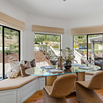
 JRP Design & Remodel
To spotlight the owners’ worldly decor, this remodel quietly complements the furniture and art textures, colors, and patterns abundant in this beautiful home.
The original master bath had a 1980s style in dire need of change. By stealing an adjacent bedroom for the new master closet, the bath transformed into an artistic and spacious space. The jet-black herringbone-patterned floor adds visual interest to highlight the freestanding soaking tub. Schoolhouse-style shell white sconces flank the matching his and her vanities. The new generous master shower features polished nickel dual shower heads and hand shower and is wrapped in Bedrosian Porcelain Manifica Series in Luxe White with satin finish.
The kitchen started as dated and isolated. To add flow and more natural light, the wall between the bar and the kitchen was removed, along with exterior windows, which allowed for a complete redesign. The result is a streamlined, open, and light-filled kitchen that flows into the adjacent family room and bar areas – perfect for quiet family nights or entertaining with friends.
Crystal Cabinets in white matte sheen with satin brass pulls, and the white matte ceramic backsplash provides a sleek and neutral palette. The newly-designed island features Calacutta Royal Leather Finish quartz and Kohler sink and fixtures. The island cabinets are finished in black sheen to anchor this seating and prep area, featuring round brass pendant fixtures. One end of the island provides the perfect prep and cut area with maple finish butcher block to match the stove hood accents. French White Oak flooring warms the entire area. The Miele 48” Dual Fuel Range with Griddle offers the perfect features for simple or gourmet meal preparation. A new dining nook makes for picture-perfect seating for night or day dining.
Welcome to artful living in Worldly Heritage style.
Photographer: Andrew - OpenHouse VC
 Tile Doctor Ltd
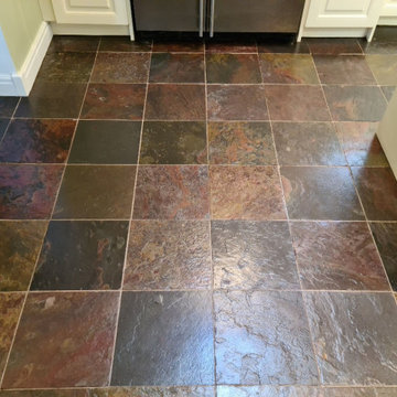
The pictures above are of a 12 metre squared Chinese slate floor in the kitchen of a property in Harrogate which had been laid ten years prior. You can see from the photographs that the grout had darkened and the slate itself had lost a lot of its character and colour.
Sealers typically last between three to five years so by now there was little protection left and so dirt had become trapped in the pores of the stone and grout making it difficult to keep clean. It was now overdue a deep clean and the application of a fresh seal.
I went over to survey the floor and provide a quote for stripping off what was left of the original sealer, cleaning the floor, and then resealing. I had been recommended by a previous customer so happy with my track record and the price I quoted, they asked me to do the work. They had received a quote from another firm which as it turned out was a lot more expensive than mine.
Given there was little sealer left to remove I decided to start by scrubbing the floor with a strong concentration of Tile Doctor Pro-Clean which was left to soak into the slate for ten minutes. Then I worked the solution in with a rotary machine fitted with a black scrubbing pad. Pro-Clean is a very versatile product that will strip the sealer off a floor when used in a strong dilution with water, it will also remove deep seated dirt too.
Due to the riven nature of the tiles however I found the black pad was struggling to reach into the crevices of the tile so to achieve the desired result I resorted to scrubbing the floor on my hands and knees with a scrubbing brush. Its important that the floor is as clean as it possibly can be before sealing otherwise you simply lock the dirt in and it will never look clean.
The floor was left to dry off overnight and I returned the next day to apply the new sealer. First, I checked to ensure that the floor was fully dry using a damp meter. The sealer would not cure properly if the floor damp and this can detract from the finished appearance.
I was happy with the readings, so I started to apply the first coat of Tile Doctor Seal and Go which I felt was the best product sealing Slate. The stone needed four coats; each one being left to dry before applying the next. Seal and Go is a stain resistant sealer which results in a low sheen silky appearance, it is good on surfaces such as the Chinese Slate which tend to be more porous and being water based it does not leave a smell as it dries.
The client was very happy with the result and mentioned to me that it had never looked that good even when new.
For aftercare cleaning I recommended the use of Tile Doctor Neutral Tile Cleaner which will keep the floor in the best condition. This is a pH neutral cleaner which can be used daily and won’t compromise the newly laid sealer like many of the stronger products you find in supermarkets.
Nigel Stoker
North West Yorkshire Tile Doctor
 JRP Design & Remodel
Our client had been living in her beautiful lakeside retreat for about 3 years. All around were stunning views of the lake and mountains, but the view from inside was minimal. It felt dark and closed off from the gorgeous waterfront mere feet away. She desired a bigger kitchen, natural light, and a contemporary look. Referred to JRP by a subcontractor our client walked into the showroom one day, took one look at the modern kitchen in our design center, and was inspired!
After talking about the frustrations of dark spaces and limitations when entertaining groups of friends, the homeowner and the JRP design team emerged with a new vision. Two walls between the living room and kitchen would be eliminated and structural revisions were needed for a common wall shared a wall with a neighbor. With the wall removals and the addition of multiple slider doors, the main level now has an open layout.
Everything in the home went from dark to luminous as sunlight could now bounce off white walls to illuminate both spaces. Our aim was to create a beautiful modern kitchen which fused the necessities of a functional space with the elegant form of the contemporary aesthetic. The kitchen playfully mixes frameless white upper with horizontal grain oak lower cabinets and a fun diagonal white tile backsplash. Gorgeous grey Cambria quartz with white veining meets them both in the middle. The large island with integrated barstool area makes it functional and a great entertaining space.
The master bedroom received a mini facelift as well. White never fails to give your bedroom a timeless look. The beautiful, bright marble shower shows what's possible when mixing tile shape, size, and color. The marble mosaic tiles in the shower pan are especially bold paired with black matte plumbing fixtures and gives the shower a striking visual.
Layers, light, consistent intention, and fun! - paired with beautiful, unique designs and a personal touch created this beautiful home that does not go unnoticed.
PROJECT DETAILS:
• Style: Contemporary
• Colors: Neutrals
• Countertops: Cambria Quartz, Luxury Series, Queen Anne
• Kitchen Cabinets: Slab, Overlay Frameless
Uppers: Blanco
Base: Horizontal Grain Oak
• Hardware/Plumbing Fixture Finish: Kitchen – Stainless Steel
• Lighting Fixtures:
• Flooring:
Hardwood: Siberian Oak with Fossil Stone finish
• Tile/Backsplash:
Kitchen Backsplash: White/Clear Glass
Master Bath Floor: Ann Sacks Benton Mosaics Marble
Master Bath Surround: Ann Sacks White Thassos Marble
Photographer: Andrew – Open House VC
 Dale Cohen Designstudio
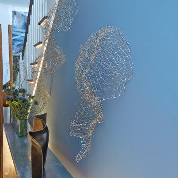
Dale was chosen to participate in the 2013 Hampton Designer Showhouse, sponsored by Traditional Home Magazine, because she has built a reputation for precise, elegant, and livable design work in Manhattan. The challenge of the showhouse, essentially a blank canvas with an imaginary client, was not beyond her. The room she was given is the Terrace Level Lounge; she chose a program to embrace a burgeoning art collection, and devise areas of repose to enjoy the work. And Ms. Cohen’s early training as a painter and photographer clearly are clearly a great asset in this particular room. Her method is to analyze the room as an architectural proposition. A Yale Architectural School graduate, she is able to cast a few intelligent moves to make the room a stage rather than a hallway. Creating a platform for her creative collaboration and designing the Monumental Lantern with artist John Houshmand.
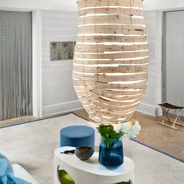
The seating areas are a series of compressed compositions with shapes and forms of chairs, a Minotti sofa, a Valerie Goodman Gallery coffee table, and the Holland and Sherry geometric throw pillows that evoke the early modernist paintings of Jean Arp. Accented by ceiling panels covered in a Maharam wallpaper. Her next big move was enrolling the work of artist and furniture maker John Houshmand. Ms. Cohen thrives on creative collaboration and designing the Monumental Lantern that with Houshmand, that she boldly placed in one entire corner of the room. Few designers would welcome a giant rough sawn luminaire but Ms. Cohen’s early apprenticeship with Richard Serra is evident in this wonderful juxtaposition of scale. Ms. Cohen’s reputation as a brave designer has been established with the inclusion of Houshmand’s piece.
Ms. Cohen’s method is to analyze the room as an architectural proposition. A Yale Architectural School graduate, she is able to cast a few intelligent moves to make the room a stage rather than a hallway. The stairway was divided into two events, one behind a scrim and the other revealed. This gave the sitting area a theatrical backdrop as well as choreographing a Hollywood-style entrance for the visitor walking down the stairs. In fact Ms. Cohen uses a series of fabric backdrops throughout the space to denote different spatial conditions.
The color palette, if said aloud, is the prototypical Hamptons beach house cheery; though Ms. Cohen’s take is altogether different. With a sea blue as her base, she treats the envelope of the space with tinted whites and grays, and just as you are comfortable with this resolve she infuses the space with drops of chartreuse. The optic shock of an electric green is a sign of strength in Ms. Cohen’s tool box. The result is a perfect balance of whimsy and sophistication.
Whimsy, bravery, and compositional sophistication will not be evident or sufficient without Ms. Cohen’s razor sharp rigor. Her attention to detail is what makes one want to sit in the Fritz Hansen chair, under the reading light, with cashmere throw at its side. Ms. Cohen’s embrace of the luxury of detail is what makes for valuable moments in the design world and what sets her work apart.

 JRP Design & Remodel
Our client had been living in her beautiful lakeside retreat for about 3 years. All around were stunning views of the lake and mountains, but the view from inside was minimal. It felt dark and closed off from the gorgeous waterfront mere feet away. She desired a bigger kitchen, natural light, and a contemporary look. Referred to JRP by a subcontractor our client walked into the showroom one day, took one look at the modern kitchen in our design center, and was inspired!
After talking about the frustrations of dark spaces and limitations when entertaining groups of friends, the homeowner and the JRP design team emerged with a new vision. Two walls between the living room and kitchen would be eliminated and structural revisions were needed for a common wall shared a wall with a neighbor. With the wall removals and the addition of multiple slider doors, the main level now has an open layout.
Everything in the home went from dark to luminous as sunlight could now bounce off white walls to illuminate both spaces. Our aim was to create a beautiful modern kitchen which fused the necessities of a functional space with the elegant form of the contemporary aesthetic. The kitchen playfully mixes frameless white upper with horizontal grain oak lower cabinets and a fun diagonal white tile backsplash. Gorgeous grey Cambria quartz with white veining meets them both in the middle. The large island with integrated barstool area makes it functional and a great entertaining space.
The master bedroom received a mini facelift as well. White never fails to give your bedroom a timeless look. The beautiful, bright marble shower shows what's possible when mixing tile shape, size, and color. The marble mosaic tiles in the shower pan are especially bold paired with black matte plumbing fixtures and gives the shower a striking visual.
Layers, light, consistent intention, and fun! - paired with beautiful, unique designs and a personal touch created this beautiful home that does not go unnoticed.
PROJECT DETAILS:
• Style: Contemporary
• Colors: Neutrals
• Countertops: Cambria Quartz, Luxury Series, Queen Anne
• Kitchen Cabinets: Slab, Overlay Frameless
Uppers: Blanco
Base: Horizontal Grain Oak
• Hardware/Plumbing Fixture Finish: Kitchen – Stainless Steel
• Lighting Fixtures:
• Flooring:
Hardwood: Siberian Oak with Fossil Stone finish
• Tile/Backsplash:
Kitchen Backsplash: White/Clear Glass
Master Bath Floor: Ann Sacks Benton Mosaics Marble
Master Bath Surround: Ann Sacks White Thassos Marble
Photographer: Andrew – Open House VC

 Amazing Spaces
We started with a blank slate on this basement project where our only obstacles were exposed steel support columns, existing plumbing risers from the concrete slab, and dropped soffits concealing ductwork on the ceiling. It had the advantage of tall ceilings, an existing egress window, and a sliding door leading to a newly constructed patio.
This family of five loves the beach and frequents summer beach resorts in the Northeast. Bringing that aesthetic home to enjoy all year long was the inspiration for the décor, as well as creating a family-friendly space for entertaining.
Wish list items included room for a billiard table, wet bar, game table, family room, guest bedroom, full bathroom, space for a treadmill and closed storage. The existing structural elements helped to define how best to organize the basement. For instance, we knew we wanted to connect the bar area and billiards table with the patio in order to create an indoor/outdoor entertaining space. It made sense to use the egress window for the guest bedroom for both safety and natural light. The bedroom also would be adjacent to the plumbing risers for easy access to the new bathroom. Since the primary focus of the family room would be for TV viewing, natural light did not need to filter into that space. We made sure to hide the columns inside of newly constructed walls and dropped additional soffits where needed to make the ceiling mechanicals feel less random.
In addition to the beach vibe, the homeowner has valuable sports memorabilia that was to be prominently displayed including two seats from the original Yankee stadium.
For a coastal feel, shiplap is used on two walls of the family room area. In the bathroom shiplap is used again in a more creative way using wood grain white porcelain tile as the horizontal shiplap “wood”. We connected the tile horizontally with vertical white grout joints and mimicked the horizontal shadow line with dark grey grout. At first glance it looks like we wrapped the shower with real wood shiplap. Materials including a blue and white patterned floor, blue penny tiles and a natural wood vanity checked the list for that seaside feel.
A large reclaimed wood door on an exposed sliding barn track separates the family room from the game room where reclaimed beams are punctuated with cable lighting. Cabinetry and a beverage refrigerator are tucked behind the rolling bar cabinet (that doubles as a Blackjack table!). A TV and upright video arcade machine round-out the entertainment in the room. Bar stools, two rotating club chairs, and large square poufs along with the Yankee Stadium seats provide fun places to sit while having a drink, watching billiards or a game on the TV.
Signed baseballs can be found behind the bar, adjacent to the billiard table, and on specially designed display shelves next to the poker table in the family room.
Thoughtful touches like the surfboards, signage, photographs and accessories make a visitor feel like they are on vacation at a well-appointed beach resort without being cliché.
 Cantoni Irvine
Designed By: Sarah Buehlman
Marc and Mandy Maister were clients and fans of Cantoni before they purchased this harbor home on Balboa Island. The South African natives originally met designer Sarah Buehlman and Cantoni’s Founder and CEO Michael Wilkov at a storewide sale, and quickly established a relationship as they bought furnishings for their primary residence in Newport Beach.
So, when the couple decided to invest in this gorgeous second home, in one of the ritziest enclaves in North America, they sought Sarah’s help in transforming the outdated 1960’s residence into a modern marvel. “It’s now the ultimate beach house,” says Sarah, “and finished in Cantoni from top to bottom—including new custom cabinetry installed throughout.”
But let’s back up. This project began when Mandy contacted Sarah in the midst of the remodel process (in December 2010), asking if she could come take a look and help with the overall design.
“The plans were being drawn up with an architect, and they opted not to move anything major. Instead, they updated everything—as in the small carpeted staircase that became a gorgeous glass and metal sculpture,” Sarah explains. She took photographs and measurements, and then set to work creating the scaled renderings. “Marc and Mandy were drawn to the One and Only Collection. It features a high-gloss brown and white color scheme which served as inspiration for the project,” says Sarah.
Primary pieces in the expansive living area include the Mondrian leather sectional, the Involution sculpture, and a pair of Vladimir Kagan Corkscrew swivel chairs. The Maisters needed a place to house all their electronics but didn’t want a typical entertainment center. The One and Only buffet was actually modified by our skilled shop technicians, in our distribution center, so it could accommodate all the couple’s media equipment. “These artisans are another one of our hidden strengths—in addition to the design tools, inventory and extensive resources we have to get a job done,” adds Sarah. Marc and Mandy also fell in love with the exotic Makassar ebony wood in the Ritz Collection, which Sarah combined in the master bedroom with the Ravenna double chaise to provide an extra place to sit and enjoy the beautiful harbor views.
Beyond new furnishings, the Maisters also decided to completely redo their kitchen. And though Marc and Mandy did not have a chance to actually see our kitchen displays, having worked with Sarah over the years, they had immense trust in our commitment to craftsmanship and quality. In fact, they opted for new cabinetry in four bathrooms as well as the laundry room based on our 3D renderings and lacquer samples alone—without ever opening a drawer. “Their trust in my expertise and Cantoni’s reputation were a major deciding factor,” says Sarah.
This plush second home, complete with a private boat dock right out back, counts as one of Sarah’s proudest accomplishments. “These long-time clients are great. They love Cantoni and appreciate high quality Italian furnishings in particular. The home is so gorgeous that once you are inside and open the Nano doors, you simply don’t want to leave.” The job took almost two years to complete, but everyone seems quite happy with the results, proving that large or small—and in cases necessitating a quick turnaround or execution of a long-term vision—Cantoni has the resources to come through for all clients.

 Advance Design Studio, Ltd.
After six years of living in their Huntley IL home, Chris and Meghan were tired of their dark, dingy, outdated kitchen and it was finally time for a long-anticipated change. “The kitchen is the place where we live, it’s where we do everything,” Meghan said. “It was important that it be a space where we wanted to be.” Meghan loves cooking and enjoys including their girls in healthy meal prepping, this led them to want a brighter, more enjoyable kitchen with increased functionality and improved storage.
For Chris especially, the laundry room was an entirely dysfunctional eyesore. “We had a washer and a dryer, but it was all kind-of cobbled together!” Chris said. “There were always laundry piles everywhere, we weren’t really sure what we wanted to do in there, but it was time for us to make a change.” The mess of the space was stressful every time they walked in the door from the garage each day. Kids’ backpacks and shoes piled up haphazardly in the makeshift boot-bench closet left the family feeling disorganized and stressed. They needed space for folding clothes and locker cubbies to help keep the family organized.
Having known Christine and Todd in the Huntley community for years, Chris and Meghan were familiar with their work. “We already trusted them personally and having seen their projects for years we knew they did top notch work. After we reviewed the initial round of designs, we knew that hiring them was definitely the right choice,” Meghan and Chris said. Although Chris had done a lot of work in their home himself, the kitchen and laundry room renovation was such a large undertaking that he didn’t want to steal time away from his family to spend what would surely be many long weekends doing the job himself. “That would not have been a wise choice for us,” Chris laughed.
“Our designer, Michelle was very, very, easy to work with; anything we wanted to see or weren’t sure about, she went above and beyond to make this easy for us. She was easy to get hold of and always quick to respond,” the couple said. Michelle pulled ideas that mirrored the couple’s taste and style and was adept at directing the couple to limited choices that didn’t overwhelm them and kept the process moving. “I have a hard time making decisions. Michelle made the decision-making process so easy. I loved how she listened to what I liked and then presented three great options for me to choose from,” Meghan said.
The main objectives for the kitchen were better storage solutions, they wanted the space to reflect their lifestyle and taste, and they wanted it to last for years with low maintenance. One of the first steps in creating a more functional kitchen was relocating the refrigerator, creating an improved workflow for the busy family.
“We didn’t know that we could even move the refrigerator to a new location where it is now, that was something that we never would have thought of,” Chris said. “The new refrigerator location makes the kitchen feel so much bigger. We didn’t add any space, but our whole kitchen with the new design just seems like it’s so much larger than before!” Meghan said.
The perimeter mist colored cabinets helped warm and brighten the entire room, while the graphite colored cabinets on the island added contrast. Using this fresh, clean color palette satisfied the couple’s desire for a bright space that was the exact opposite of what they had before. Organization accessories were also added to the cabinets such as a spice drawer tray and roll outs to create hidden convenience.
“I absolutely love the hidden spices – it makes cooking so much more enjoyable!” Chris said. “And all the pull outs, and the double trash bin, who would think you could get so excited about organization!” the couple said in unison.
One thing they hated in their original kitchen was how dark the space felt. Added lighting on the ceiling with the new light fixtures combined with the lighter cabinetry colors throughout solved this problem. “Our new kitchen has this warm, almost cozy feeling that our old kitchen never had, it’s just a space that I love spending my time in now,” Meghan said. The light airy feeling was accentuated with the use of floating white shelves on either side of the decorative range hood. “We have so much cabinetry space, the new design is amazing we actually have more storage space than we will ever need,” Meghan said.
The island was extended to create more work surface and added space for stool seating. “The new island changes how we live. Now the kids can be in the kitchen with us, doing homework, eating breakfast, and the three of us have special dinners there when Chris is working late,” Meghan said.
The Carrara Marmi Quartz countertops were chosen because they are, not only beautiful, but are made from hard-working material that doesn’t require maintenance. The white subway tile backsplash that wraps to the ceiling behind the focal point cooktop range/hood compliments the crisp white countertops perfectly, while brushed brass hardware and light fixtures keep the design fresh and new.
The couple had a few fears at the beginning of the project, as most homeowners do. Their biggest fear was being out of their kitchen and laundry room for an extended time. The crew made it very easy for the family to work in a limited space keeping the washer and dryer hooked up the majority of the time, and also getting appliances working with minimal downtime.
“They above and beyond accommodated us to get us through the process,” Meghan said. “They did a great job making sure we were as comfortable as possible throughout the process,” Chris added.
“Our project manager DJ did a great job. He was very good at updating us on schedule changes, getting guys in as quickly as possible. Everyone that stepped in the house was nice and did great work,” said Chris. They thought Advance’s carpenter was phenomenal and were impressed when he took a conceptual idea from a photograph and worked with designer Michelle to create a one of a kind range/hood that has become the topic of conversation with friends and family who visit the new kitchen. “He was in our house literally every day for several weeks. He was easy to work with and good at what he did,” Meghan and Chris said.
The focal point of the kitchen; a hand-crafted, custom-built ventilation hood was clad with handpicked reclaimed barnwood. Advance Design’s carpenter built the framework and the cladding to create a one-of-a-kind design element that the couple loves.
“I think it was especially fun for him to create something unique from scratch, showcasing his talent in this area,” Meghan said. “I love that my kitchen is not like everyone else’s. I got to pick out the wood on my hood and watch it being built and was able to choose what pieces of wood went where on it. It’s totally unique.”
Red Oak flooring was toothed-in throughout the kitchen and the rest of the first floor anywhere changes were made. Then the whole floor was refinished to tone down the orange undertones in the existing floor stain, ultimately changing the color complexion of the entire first floor. The result is a completely new feeling to the entire home.
Renovating the laundry room was extremely important to Meghan and Chris, but they had trouble visualizing what the possibilities were for the seemingly small space. Michelle produced beautiful 3D illustrations that helped them envision the space in a whole new way.
“I must have told Michelle 100 times that I am a visual person, seeing the designs in 3D made it so easy to make decisions and see what we could really do with our space,” Meghan said.
A dividing wall and doorway were removed between the existing laundry room and hallway formerly containing a coat closet, providing space to design specialized graphite colored cabinetry matching the kitchen island to house custom storage cubbies for each family member. Adding the tall utility cabinetry in the new laundry area helped solve the storage issue, tucking away cleaning supplies, household items, and even the cat got its own cubby.
“I love how everything is now hidden in its own space. I can’t tell you how much I hated coming home and seeing everything sitting around on counters,” Chris said.
Electrical outlets were planned for the inside of utility cabinets, so devices could charge in hidden locations. Stacking the washer and dryer allowed for wider countertop space to provide a folding area and a special space for clothes to hang. “The way I do laundry has been completely transformed! I can actually fold clothes and hang them now right out of the washer and dryer,” Meghan said.
“The end result in the kitchen and the laundry/mud room was an updated light and bright space, with a smarter work flow that better meets the needs of this family,” Michelle said.
“I would totally recommend Advance Design,” Meghan said. “Sometimes I sit and just look at my kitchen and laundry room and think ‘Wow, I can’t believe I get to live here!’ It’s an understatement to say we love our new space.”
 Dale Cohen Designstudio
Dale was chosen to participate in the 2013 Hampton Designer Showhouse, sponsored by Traditional Home Magazine, because she has built a reputation for precise, elegant, and livable design work in Manhattan. The challenge of the showhouse, essentially a blank canvas with an imaginary client, was not beyond her. The room she was given is the Terrace Level Lounge; she chose a program to embrace a burgeoning art collection, and devise areas of repose to enjoy the work. And Ms. Cohen’s early training as a painter and photographer clearly are clearly a great asset in this particular room. Her method is to analyze the room as an architectural proposition. A Yale Architectural School graduate, she is able to cast a few intelligent moves to make the room a stage rather than a hallway. Creating a platform for her creative collaboration and designing the Monumental Lantern with artist John Houshmand.
The seating areas are a series of compressed compositions with shapes and forms of chairs, a Minotti sofa, a Valerie Goodman Gallery coffee table, and the Holland and Sherry geometric throw pillows that evoke the early modernist paintings of Jean Arp. Accented by ceiling panels covered in a Maharam wallpaper. Her next big move was enrolling the work of artist and furniture maker John Houshmand. Ms. Cohen thrives on creative collaboration and designing the Monumental Lantern that with Houshmand, that she boldly placed in one entire corner of the room. Few designers would welcome a giant rough sawn luminaire but Ms. Cohen’s early apprenticeship with Richard Serra is evident in this wonderful juxtaposition of scale. Ms. Cohen’s reputation as a brave designer has been established with the inclusion of Houshmand’s piece.
Ms. Cohen’s method is to analyze the room as an architectural proposition. A Yale Architectural School graduate, she is able to cast a few intelligent moves to make the room a stage rather than a hallway. The stairway was divided into two events, one behind a scrim and the other revealed. This gave the sitting area a theatrical backdrop as well as choreographing a Hollywood-style entrance for the visitor walking down the stairs. In fact Ms. Cohen uses a series of fabric backdrops throughout the space to denote different spatial conditions.
The color palette, if said aloud, is the prototypical Hamptons beach house cheery; though Ms. Cohen’s take is altogether different. With a sea blue as her base, she treats the envelope of the space with tinted whites and grays, and just as you are comfortable with this resolve she infuses the space with drops of chartreuse. The optic shock of an electric green is a sign of strength in Ms. Cohen’s tool box. The result is a perfect balance of whimsy and sophistication.
Whimsy, bravery, and compositional sophistication will not be evident or sufficient without Ms. Cohen’s razor sharp rigor. Her attention to detail is what makes one want to sit in the Fritz Hansen chair, under the reading light, with cashmere throw at its side. Ms. Cohen’s embrace of the luxury of detail is what makes for valuable moments in the design world and what sets her work apart.

 Homestead Doors, Inc.
Door #10
FP3190
Flat 3 Panel Interior Door with Farmhouse Sticking
Solid Poplar stiles and rails
MDF panels
Painted White
1 x 4 door casing
1 x 6 baseboard
Bravura 336B door knob
Call us for a quote on your door project
419-684-9582
Visit https://www.door.cc

 Lori Teacher & Associates
Restored entry for a 1940s Paul Williams Home in the flats of Beverly Hills. Original floors and railing.
Example of a mid-sized classic medium tone wood floor foyer design in Los Angeles with white walls and a black front door
Example of a mid-sized classic medium tone wood floor foyer design in Los Angeles with white walls and a black front door
156