
Search results for "Photographer based" in Home Design Ideas

 Advance Design Studio, Ltd.
When Tom and Michelle Stien decided to remodel their kitchen, they chose Advance Design Studio to make it happen. They were looking for an innovative design that would open up an awkward wall, and we're hoping to remove some half walls that closed off their family room. "Of all the people we had come and give us quotes for our project, ADS/Scott, was the only one who came in with an idea right off the bat for what we could do. His knowledge of design and code was evident from the start," said the Stiens.
The new design increased the seating area with a large peninsula, and the cooking area was expanded to accommodate Tom's cooking skills. A warming drawer was incorporated beneath a nearly hidden microwave drawer, along with a clever pull out for increased pantry storage. A built in message board area was custom designed for kids art and family communication. Roll out trays grace every base cabinet for easy pull out storage and a single floating shelf ties the contemporary kitchen design together. Starlight quartz countertops create ease of clean up, and the look is finished off with sharp gray and white mosaic backsplash tiles.
The Stiens really liked a clean modern look, so the new crisp transitional kitchen design incorporated bright white shaker cabinetry from Medallion with gray and metal accents along with a modern feel. "Scott's presentation of what we could expect with ADS was clear and concise. He gave us a great deal of confidence in how the project would be handled".
Homeowners are frequently concerned about project budgets that get quickly get out of control. "Scott's quote was well thought out, organized and offered options based on our budget," said Michelle. "I was worried about the project budget changing as we went through the process, but they did a good job managing the situation and minimized change orders as much as possible."
When asked about their overall experience with their kitchen renovation he Stien's said; "Scott, Justin, Matt and Jason were great! They were all very friendly, personable, responsible and trustworthy. Advance Design definitely met and exceeded our expectations. Remodeling is a very challenging process to endure, but ADS minimized discomfort and inconvenience as much as possible and kept on schedule. The end result was well worth the investment in time and money."
Designer: Scott Christensen
Photographer: Joe Nowak

 Visbeen Architects
Builder: AVB Inc.
Interior Design: Vision Interiors by Visbeen
Photographer: Ashley Avila Photography
The Holloway blends the recent revival of mid-century aesthetics with the timelessness of a country farmhouse. Each façade features playfully arranged windows tucked under steeply pitched gables. Natural wood lapped siding emphasizes this homes more modern elements, while classic white board & batten covers the core of this house. A rustic stone water table wraps around the base and contours down into the rear view-out terrace.
Inside, a wide hallway connects the foyer to the den and living spaces through smooth case-less openings. Featuring a grey stone fireplace, tall windows, and vaulted wood ceiling, the living room bridges between the kitchen and den. The kitchen picks up some mid-century through the use of flat-faced upper and lower cabinets with chrome pulls. Richly toned wood chairs and table cap off the dining room, which is surrounded by windows on three sides. The grand staircase, to the left, is viewable from the outside through a set of giant casement windows on the upper landing. A spacious master suite is situated off of this upper landing. Featuring separate closets, a tiled bath with tub and shower, this suite has a perfect view out to the rear yard through the bedrooms rear windows. All the way upstairs, and to the right of the staircase, is four separate bedrooms. Downstairs, under the master suite, is a gymnasium. This gymnasium is connected to the outdoors through an overhead door and is perfect for athletic activities or storing a boat during cold months. The lower level also features a living room with view out windows and a private guest suite.
 Visbeen Architects
Builder: AVB Inc.
Interior Design: Vision Interiors by Visbeen
Photographer: Ashley Avila Photography
The Holloway blends the recent revival of mid-century aesthetics with the timelessness of a country farmhouse. Each façade features playfully arranged windows tucked under steeply pitched gables. Natural wood lapped siding emphasizes this homes more modern elements, while classic white board & batten covers the core of this house. A rustic stone water table wraps around the base and contours down into the rear view-out terrace.
Inside, a wide hallway connects the foyer to the den and living spaces through smooth case-less openings. Featuring a grey stone fireplace, tall windows, and vaulted wood ceiling, the living room bridges between the kitchen and den. The kitchen picks up some mid-century through the use of flat-faced upper and lower cabinets with chrome pulls. Richly toned wood chairs and table cap off the dining room, which is surrounded by windows on three sides. The grand staircase, to the left, is viewable from the outside through a set of giant casement windows on the upper landing. A spacious master suite is situated off of this upper landing. Featuring separate closets, a tiled bath with tub and shower, this suite has a perfect view out to the rear yard through the bedrooms rear windows. All the way upstairs, and to the right of the staircase, is four separate bedrooms. Downstairs, under the master suite, is a gymnasium. This gymnasium is connected to the outdoors through an overhead door and is perfect for athletic activities or storing a boat during cold months. The lower level also features a living room with view out windows and a private guest suite.
Find the right local pro for your project
 David Rance Interiors
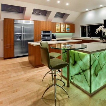
What a Kitchen! We hand picked the cherry for the cabinets, tagged the onyx. It was hard to photograph the real beauty of the onyx. It is much warmer than shown. The LED panel lighting behind it is fully dimmable. The onyx is framed by Cambria stone that is the counter top. The glass top table is supported by a bracket below the floor that provides a sleeve for the brushed stainless column. The back splash in the back corner is 3/4" Etruscan glass that we have lighted top and bottom with LED lighting to glow. In the opposite corner we took out a banquet seat and developed an office with a lot of storage. Also a bench to lounge with a lap top or book and be able to see the fantastic ocean view. Thank you to Lance Vaughn Builders and his talented team.
 Advance Design Studio, Ltd.
When Tom and Michelle Stien decided to remodel their kitchen, they chose Advance Design Studio to make it happen. They were looking for an innovative design that would open up an awkward wall, and we're hoping to remove some half walls that closed off their family room. "Of all the people we had come and give us quotes for our project, ADS/Scott, was the only one who came in with an idea right off the bat for what we could do. His knowledge of design and code was evident from the start," said the Stiens.
The new design increased the seating area with a large peninsula, and the cooking area was expanded to accommodate Tom's cooking skills. A warming drawer was incorporated beneath a nearly hidden microwave drawer, along with a clever pull out for increased pantry storage. A built in message board area was custom designed for kids art and family communication. Roll out trays grace every base cabinet for easy pull out storage and a single floating shelf ties the contemporary kitchen design together. Starlight quartz countertops create ease of clean up, and the look is finished off with sharp gray and white mosaic backsplash tiles.
The Stiens really liked a clean modern look, so the new crisp transitional kitchen design incorporated bright white shaker cabinetry from Medallion with gray and metal accents along with a modern feel. "Scott's presentation of what we could expect with ADS was clear and concise. He gave us a great deal of confidence in how the project would be handled".
Homeowners are frequently concerned about project budgets that get quickly get out of control. "Scott's quote was well thought out, organized and offered options based on our budget," said Michelle. "I was worried about the project budget changing as we went through the process, but they did a good job managing the situation and minimized change orders as much as possible."
When asked about their overall experience with their kitchen renovation he Stien's said; "Scott, Justin, Matt and Jason were great! They were all very friendly, personable, responsible and trustworthy. Advance Design definitely met and exceeded our expectations. Remodeling is a very challenging process to endure, but ADS minimized discomfort and inconvenience as much as possible and kept on schedule. The end result was well worth the investment in time and money."
Designer: Scott Christensen
Photographer: Joe Nowak

 Windfall Lumber
This new custom house, completed in late 2012, was designed with an accessory dwelling unit to take advantage of an allowance in the single family zoning code in Seattle. The primary dwelling, 1300 square feet on the upper two stories houses a mother and teenager. The accessory dwelling, 750 square feet, provides a leasable smaller space that can be for a tenant or downsizing in the future.
Seattle based RE Store began by completely deconstructing the original home so that its salvaged parts could have a new life in other design applications. The new design for the home is modern with a sustainable theme, incorporating a palette of natural materials. The Paperstone, wood and steel staircase connects the open-plan living, dining areas and kitchen to the upstairs bedrooms and open library. Exterior decks extend the main interior living spaces while sliding glass panels allow the primary bedroom to connect.
Stylishly visible from all rooms in the open interior living spaces are two complementary objects, both lit from within, a frosted lexan pantry and a slatted reclaimed fir bathroom, with wood sourced from Windfall Lumber. Throughout the home, finishes are simple and minimal: polished concrete flooring, bright-white walls, and formaldehyde-free sapele and maple cabinetry. The main kitchen is outfitted with Ecotop counters and a custom sapele wood island that has large, handle-free pullout drawers on the cooking side and a built-in wine rack on the other. Maximizing storage, a custom built-in apple plywood bench and open wooden box shelves provide extra space.
A model of efficiency, the home maximizes the performance of the envelope of the building. The reclaimed fir car decking wrapped around the exterior from Windfall Lumber, creates the rainscreen siding and is sourced locally from a deconstructed warehouse in Tacoma WA. In addition, access to daylight through high-performance glazing, solar preheat for domestic hot water needs, in-floor radiant heating and a green roof created by the owner adds to the efficiency.
Photo Credit & Design: b9 architects
URL
http://www.windfalllumber.com
Photographer: Ed Sozinho
 Advance Design Studio, Ltd.
When Tom and Michelle Stien decided to remodel their kitchen, they chose Advance Design Studio to make it happen. They were looking for an innovative design that would open up an awkward wall, and we're hoping to remove some half walls that closed off their family room. "Of all the people we had come and give us quotes for our project, ADS/Scott, was the only one who came in with an idea right off the bat for what we could do. His knowledge of design and code was evident from the start," said the Stiens.
The new design increased the seating area with a large peninsula, and the cooking area was expanded to accommodate Tom's cooking skills. A warming drawer was incorporated beneath a nearly hidden microwave drawer, along with a clever pull out for increased pantry storage. A built in message board area was custom designed for kids art and family communication. Roll out trays grace every base cabinet for easy pull out storage and a single floating shelf ties the contemporary kitchen design together. Starlight quartz countertops create ease of clean up, and the look is finished off with sharp gray and white mosaic backsplash tiles.
The Stiens really liked a clean modern look, so the new crisp transitional kitchen design incorporated bright white shaker cabinetry from Medallion with gray and metal accents along with a modern feel. "Scott's presentation of what we could expect with ADS was clear and concise. He gave us a great deal of confidence in how the project would be handled".
Homeowners are frequently concerned about project budgets that get quickly get out of control. "Scott's quote was well thought out, organized and offered options based on our budget," said Michelle. "I was worried about the project budget changing as we went through the process, but they did a good job managing the situation and minimized change orders as much as possible."
When asked about their overall experience with their kitchen renovation he Stien's said; "Scott, Justin, Matt and Jason were great! They were all very friendly, personable, responsible and trustworthy. Advance Design definitely met and exceeded our expectations. Remodeling is a very challenging process to endure, but ADS minimized discomfort and inconvenience as much as possible and kept on schedule. The end result was well worth the investment in time and money."
Designer: Scott Christensen
Photographer: Joe Nowak


 Interiors by Natasha
This house was a new purchase for my clients. I was entrusted with the task to make this 1980’s kitchen into a beautiful chef’s kitchen. The challenge with this kitchen renovation was making sure that I gave my client, a kitchen that a pastry chef would be proud to bake in. Because she is a pastry chef, the original space was not functional for her. It was dark, dated and did not have enough storage. The cabinets were an old traditional expresso finish, small electric drop-in cooktop, and double wall oven with florescent ceiling light fixtures. I wanted to make sure that I capitalized on the square footage in the kitchen and gave them a more Contemporary Style.
The first thing, I had to address was the damaged floor. One of the selling points to the house for my clients was the hardwood floors but, a portion of the floor in the kitchen was rotted by years of water decay. We replaced the hardwood floors that were damaged and refinished them. The second, was to open the entryway between the kitchen and dining room and swapping the refrigerator and the pantry. The contractor demoed the kitchen changing the position of the original pantry and the refrigerator. By doing this, provided more floor space for my clients to walk through. The third, was to address the dark cabinet finish. We went with two-tone color cabinetry. The wall and base cabinets are white and the island is a gray finish. As a pastry chef, I had to make sure my client had enough countertop/prep and storage space. The fourth, was very important to her which was replacing the drop-in electric cooktop with a freestanding professional gas range. After addressing these four concerns, my clients are very pleased with the renovation. Happy clients!
Photographer: Haigwood Studios
 Visbeen Architects
Builder: AVB Inc.
Interior Design: Vision Interiors by Visbeen
Photographer: Ashley Avila Photography
The Holloway blends the recent revival of mid-century aesthetics with the timelessness of a country farmhouse. Each façade features playfully arranged windows tucked under steeply pitched gables. Natural wood lapped siding emphasizes this homes more modern elements, while classic white board & batten covers the core of this house. A rustic stone water table wraps around the base and contours down into the rear view-out terrace.
Inside, a wide hallway connects the foyer to the den and living spaces through smooth case-less openings. Featuring a grey stone fireplace, tall windows, and vaulted wood ceiling, the living room bridges between the kitchen and den. The kitchen picks up some mid-century through the use of flat-faced upper and lower cabinets with chrome pulls. Richly toned wood chairs and table cap off the dining room, which is surrounded by windows on three sides. The grand staircase, to the left, is viewable from the outside through a set of giant casement windows on the upper landing. A spacious master suite is situated off of this upper landing. Featuring separate closets, a tiled bath with tub and shower, this suite has a perfect view out to the rear yard through the bedrooms rear windows. All the way upstairs, and to the right of the staircase, is four separate bedrooms. Downstairs, under the master suite, is a gymnasium. This gymnasium is connected to the outdoors through an overhead door and is perfect for athletic activities or storing a boat during cold months. The lower level also features a living room with view out windows and a private guest suite.
 Interiors by Natasha
This house was a new purchase for my clients. I was entrusted with the task to make this 1980’s kitchen into a beautiful chef’s kitchen. The challenge with this kitchen renovation was making sure that I gave my client, a kitchen that a pastry chef would be proud to bake in. Because she is a pastry chef, the original space was not functional for her. It was dark, dated and did not have enough storage. The cabinets were an old traditional expresso finish, small electric drop-in cooktop, and double wall oven with florescent ceiling light fixtures. I wanted to make sure that I capitalized on the square footage in the kitchen and gave them a more Contemporary Style.
The first thing, I had to address was the damaged floor. One of the selling points to the house for my clients was the hardwood floors but, a portion of the floor in the kitchen was rotted by years of water decay. We replaced the hardwood floors that were damaged and refinished them. The second, was to open the entryway between the kitchen and dining room and swapping the refrigerator and the pantry. The contractor demoed the kitchen changing the position of the original pantry and the refrigerator. By doing this, provided more floor space for my clients to walk through. The third, was to address the dark cabinet finish. We went with two-tone color cabinetry. The wall and base cabinets are white and the island is a gray finish. As a pastry chef, I had to make sure my client had enough countertop/prep and storage space. The fourth, was very important to her which was replacing the drop-in electric cooktop with a freestanding professional gas range. After addressing these four concerns, my clients are very pleased with the renovation. Happy clients!
Photographer: Haigwood Studios

 Vision Interiors
The Holloway blends the recent revival of mid-century aesthetics with the timelessness of a country farmhouse. Each façade features playfully arranged windows tucked under steeply pitched gables. Natural wood lapped siding emphasizes this homes more modern elements, while classic white board & batten covers the core of this house. A rustic stone water table wraps around the base and contours down into the rear view-out terrace.
Inside, a wide hallway connects the foyer to the den and living spaces through smooth case-less openings. Featuring a grey stone fireplace, tall windows, and vaulted wood ceiling, the living room bridges between the kitchen and den. The kitchen picks up some mid-century through the use of flat-faced upper and lower cabinets with chrome pulls. Richly toned wood chairs and table cap off the dining room, which is surrounded by windows on three sides. The grand staircase, to the left, is viewable from the outside through a set of giant casement windows on the upper landing. A spacious master suite is situated off of this upper landing. Featuring separate closets, a tiled bath with tub and shower, this suite has a perfect view out to the rear yard through the bedroom's rear windows. All the way upstairs, and to the right of the staircase, is four separate bedrooms. Downstairs, under the master suite, is a gymnasium. This gymnasium is connected to the outdoors through an overhead door and is perfect for athletic activities or storing a boat during cold months. The lower level also features a living room with a view out windows and a private guest suite.
Architect: Visbeen Architects
Photographer: Ashley Avila Photography
Builder: AVB Inc.

 JRP Design & Remodel
Our client had been living in her beautiful lakeside retreat for about 3 years. All around were stunning views of the lake and mountains, but the view from inside was minimal. It felt dark and closed off from the gorgeous waterfront mere feet away. She desired a bigger kitchen, natural light, and a contemporary look. Referred to JRP by a subcontractor our client walked into the showroom one day, took one look at the modern kitchen in our design center, and was inspired!
After talking about the frustrations of dark spaces and limitations when entertaining groups of friends, the homeowner and the JRP design team emerged with a new vision. Two walls between the living room and kitchen would be eliminated and structural revisions were needed for a common wall shared a wall with a neighbor. With the wall removals and the addition of multiple slider doors, the main level now has an open layout.
Everything in the home went from dark to luminous as sunlight could now bounce off white walls to illuminate both spaces. Our aim was to create a beautiful modern kitchen which fused the necessities of a functional space with the elegant form of the contemporary aesthetic. The kitchen playfully mixes frameless white upper with horizontal grain oak lower cabinets and a fun diagonal white tile backsplash. Gorgeous grey Cambria quartz with white veining meets them both in the middle. The large island with integrated barstool area makes it functional and a great entertaining space.
The master bedroom received a mini facelift as well. White never fails to give your bedroom a timeless look. The beautiful, bright marble shower shows what's possible when mixing tile shape, size, and color. The marble mosaic tiles in the shower pan are especially bold paired with black matte plumbing fixtures and gives the shower a striking visual.
Layers, light, consistent intention, and fun! - paired with beautiful, unique designs and a personal touch created this beautiful home that does not go unnoticed.
PROJECT DETAILS:
• Style: Contemporary
• Colors: Neutrals
• Countertops: Cambria Quartz, Luxury Series, Queen Anne
• Kitchen Cabinets: Slab, Overlay Frameless
Uppers: Blanco
Base: Horizontal Grain Oak
• Hardware/Plumbing Fixture Finish: Kitchen – Stainless Steel
• Lighting Fixtures:
• Flooring:
Hardwood: Siberian Oak with Fossil Stone finish
• Tile/Backsplash:
Kitchen Backsplash: White/Clear Glass
Master Bath Floor: Ann Sacks Benton Mosaics Marble
Master Bath Surround: Ann Sacks White Thassos Marble
Photographer: Andrew – Open House VC

 SoNo architects
Architects: SoNo Arhitekti
www.sono.si
www.facebook.com/SonoArhitekti
Location: Slovenia
Architects in Charge: Edvard Blažko, Marko Volk, Nina Tešanović, Samo Radinja
Area: 230 sqm
Year: 2015
Photographs: Aljoša Videtič
This family home is an example of a modern design filled with natural light and building blocks comprised of sustainable material – in this case wood, one of the if not the most strategic material of Slovenia . It's definitely not a typical prefabricated house out of catalogue as we tried to develop a residence that meets the needs of modern users while having functional floor plans and contemporary elegant exterior all appropriately settled into its landscape.
Main concept presents three volumes that are placed in a triangular composition partially overlayed with a rectangular form of the upper floor. While the dynamic shape of the groundfloor is covered with a flat roof, the 1st floor is completed with a gable –like roof, echoing the traditional architecture of the house's surroundings.
While we enter into an open spacious and dynamically shaped groundfloor we discover a pleasant intimate ambience. The living room and dining area offer a lot of natural light through the large glazed window surfaces. A prominent staircase leads us to the upper sleeping area that consists of the main bedroom with its own dressing room and a bathroom and children's rooms with a smaller bathroom.
Despite groundfloor's dynamic shape, its façade is monochrome - predominately a clean white surface in combination with bigger windows. On the contrary the simple form of the upper floor has a boldly designed façade - a combination of dark colour shades and natural larch wood’s textures.
Wood is the basic structural element and at the same time complements the facades, window frames, while also dominating the interiors.
 Windfall Lumber
This new custom house, completed in late 2012, was designed with an accessory dwelling unit to take advantage of an allowance in the single family zoning code in Seattle. The primary dwelling, 1300 square feet on the upper two stories houses a mother and teenager. The accessory dwelling, 750 square feet, provides a leasable smaller space that can be for a tenant or downsizing in the future.
Seattle based RE Store began by completely deconstructing the original home so that its salvaged parts could have a new life in other design applications. The new design for the home is modern with a sustainable theme, incorporating a palette of natural materials. The Paperstone, wood and steel staircase connects the open-plan living, dining areas and kitchen to the upstairs bedrooms and open library. Exterior decks extend the main interior living spaces while sliding glass panels allow the primary bedroom to connect.
Stylishly visible from all rooms in the open interior living spaces are two complementary objects, both lit from within, a frosted lexan pantry and a slatted reclaimed fir bathroom, with wood sourced from Windfall Lumber. Throughout the home, finishes are simple and minimal: polished concrete flooring, bright-white walls, and formaldehyde-free sapele and maple cabinetry. The main kitchen is outfitted with Ecotop counters and a custom sapele wood island that has large, handle-free pullout drawers on the cooking side and a built-in wine rack on the other. Maximizing storage, a custom built-in apple plywood bench and open wooden box shelves provide extra space.
A model of efficiency, the home maximizes the performance of the envelope of the building. The reclaimed fir car decking wrapped around the exterior from Windfall Lumber, creates the rainscreen siding and is sourced locally from a deconstructed warehouse in Tacoma WA. In addition, access to daylight through high-performance glazing, solar preheat for domestic hot water needs, in-floor radiant heating and a green roof created by the owner adds to the efficiency.
Photo Credit & Design: b9 architects
URL
http://www.windfalllumber.com
Photographer: Ed Sozinho
 Visbeen Architects
Builder: AVB Inc.
Interior Design: Vision Interiors by Visbeen
Photographer: Ashley Avila Photography
The Holloway blends the recent revival of mid-century aesthetics with the timelessness of a country farmhouse. Each façade features playfully arranged windows tucked under steeply pitched gables. Natural wood lapped siding emphasizes this homes more modern elements, while classic white board & batten covers the core of this house. A rustic stone water table wraps around the base and contours down into the rear view-out terrace.
Inside, a wide hallway connects the foyer to the den and living spaces through smooth case-less openings. Featuring a grey stone fireplace, tall windows, and vaulted wood ceiling, the living room bridges between the kitchen and den. The kitchen picks up some mid-century through the use of flat-faced upper and lower cabinets with chrome pulls. Richly toned wood chairs and table cap off the dining room, which is surrounded by windows on three sides. The grand staircase, to the left, is viewable from the outside through a set of giant casement windows on the upper landing. A spacious master suite is situated off of this upper landing. Featuring separate closets, a tiled bath with tub and shower, this suite has a perfect view out to the rear yard through the bedrooms rear windows. All the way upstairs, and to the right of the staircase, is four separate bedrooms. Downstairs, under the master suite, is a gymnasium. This gymnasium is connected to the outdoors through an overhead door and is perfect for athletic activities or storing a boat during cold months. The lower level also features a living room with view out windows and a private guest suite.
 Interiors by Natasha
This house was a new purchase for my clients. I was entrusted with the task to make this 1980’s kitchen into a beautiful chef’s kitchen. The challenge with this kitchen renovation was making sure that I gave my client, a kitchen that a pastry chef would be proud to bake in. Because she is a pastry chef, the original space was not functional for her. It was dark, dated and did not have enough storage. The cabinets were an old traditional expresso finish, small electric drop-in cooktop, and double wall oven with florescent ceiling light fixtures. I wanted to make sure that I capitalized on the square footage in the kitchen and gave them a more Contemporary Style. The first thing, I had to address was the damaged floor. One of the selling points to the house for my clients was the hardwood floors but, a portion of the floor in the kitchen was rotted by years of water decay. We replaced the hardwood floors that were damaged and refinished them. The second, was to open the entryway between the kitchen and dining room and swapping the refrigerator and the pantry. The contractor demoed the kitchen changing the position of the original pantry and the refrigerator. By doing this, provided more floor space for my clients to walk through. The third, was to address the dark cabinet finish. We went with two-tone color cabinetry. The wall and base cabinets are white and the island is a gray finish. As a pastry chef, I had to make sure my client had enough countertop/prep and storage space. The fourth, was very important to her which was replacing the drop-in electric cooktop with a freestanding professional gas range. After addressing these four concerns, my clients are very pleased with the renovation. Happy clients!
Photographer: Haigwood Studios
 JRP Design & Remodel
Our client had been living in her beautiful lakeside retreat for about 3 years. All around were stunning views of the lake and mountains, but the view from inside was minimal. It felt dark and closed off from the gorgeous waterfront mere feet away. She desired a bigger kitchen, natural light, and a contemporary look. Referred to JRP by a subcontractor our client walked into the showroom one day, took one look at the modern kitchen in our design center, and was inspired!
After talking about the frustrations of dark spaces and limitations when entertaining groups of friends, the homeowner and the JRP design team emerged with a new vision. Two walls between the living room and kitchen would be eliminated and structural revisions were needed for a common wall shared a wall with a neighbor. With the wall removals and the addition of multiple slider doors, the main level now has an open layout.
Everything in the home went from dark to luminous as sunlight could now bounce off white walls to illuminate both spaces. Our aim was to create a beautiful modern kitchen which fused the necessities of a functional space with the elegant form of the contemporary aesthetic. The kitchen playfully mixes frameless white upper with horizontal grain oak lower cabinets and a fun diagonal white tile backsplash. Gorgeous grey Cambria quartz with white veining meets them both in the middle. The large island with integrated barstool area makes it functional and a great entertaining space.
The master bedroom received a mini facelift as well. White never fails to give your bedroom a timeless look. The beautiful, bright marble shower shows what's possible when mixing tile shape, size, and color. The marble mosaic tiles in the shower pan are especially bold paired with black matte plumbing fixtures and gives the shower a striking visual.
Layers, light, consistent intention, and fun! - paired with beautiful, unique designs and a personal touch created this beautiful home that does not go unnoticed.
PROJECT DETAILS:
• Style: Contemporary
• Colors: Neutrals
• Countertops: Cambria Quartz, Luxury Series, Queen Anne
• Kitchen Cabinets: Slab, Overlay Frameless
Uppers: Blanco
Base: Horizontal Grain Oak
• Hardware/Plumbing Fixture Finish: Kitchen – Stainless Steel
• Lighting Fixtures:
• Flooring:
Hardwood: Siberian Oak with Fossil Stone finish
• Tile/Backsplash:
Kitchen Backsplash: White/Clear Glass
Master Bath Floor: Ann Sacks Benton Mosaics Marble
Master Bath Surround: Ann Sacks White Thassos Marble
Photographer: Andrew – Open House VC
 Tile Doctor Ltd
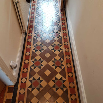
This client had just moved into a property in York and having pulled back the old carpet revealed a lovely old period Victorian tiled floor she didn’t know existed when she bought the house!
I went over at the beginning of this year to survey the floor and could see that fortunately, no glue or carpet grips had been used to secure the carpet; additionally the floor was in good physical condition considering its age with no cracks or loose tiles. The tiles were however very dusty and dirty with ingrained dirt and so had probably been covered with carpet for a very long time. The hallway was quite dark I’m afraid with little natural light so apologies for the photographs.
With old houses like this you never know what you are going to find so whilst I was there surveying the floor, I took some moisture readings with a damp meter on the floors and walls. The readings came back low so no sign of damp which was a relief to the owner.
We agreed a price for the work, and I arranged to come back the following week.
I must admit I do like York, its steeped in history and famous for its Cathedral and Viking museum. The houses in the city have loads of character and period features like this floor are quite common.
I deep cleaned the floor with a strong 1:3 dilution of Tile Doctor Pro-Clean worked in with a black scrubbing pad fitted to a rotary machine. Initially the solution was left to soak into the tile before being agitated by the machine. The soil was then rinsed off with minimal water and then extracted with a wet vacuum.
I followed this up with an Acid Wash using Tile Doctor Acid Gel to further clean up the tiles and help inhibit any potential efflorescent salt issues which are common in floors of this age due to the absence of the damp proof membrane. The floor was given a further rinse and extraction and allowed to dry out fully overnight. I needed the floor to be dry for the next day so it could be sealed.
I came back the next day and started by taking more damp readings which showed similar readings to the day before. Given the low readings I was able to move straight onto sealing which was done using four coats of Tile Doctor Seal and Go. This product works really well on old Victorian Tiles like these and being water based it doesn’t leave a smell as it dries.
Once the final coat of sealer had dried there was a significant improvement in the appearance of the floor which was much appreciated by client who was very happy with the end result.
For aftercare I recommended the use of Tile Doctor Neutral Tile Cleaner to maintain the floor, it has a nice fresh smell and can be used regularly due to its pH neutral nature which won’t prematurely erode the sealer like stronger bleach based cleaners.
Nigel Stoker
North West Yorkshire Tile Doctor
 Visbeen Architects
Builder: AVB Inc.
Interior Design: Vision Interiors by Visbeen
Photographer: Ashley Avila Photography
The Holloway blends the recent revival of mid-century aesthetics with the timelessness of a country farmhouse. Each façade features playfully arranged windows tucked under steeply pitched gables. Natural wood lapped siding emphasizes this homes more modern elements, while classic white board & batten covers the core of this house. A rustic stone water table wraps around the base and contours down into the rear view-out terrace.
Inside, a wide hallway connects the foyer to the den and living spaces through smooth case-less openings. Featuring a grey stone fireplace, tall windows, and vaulted wood ceiling, the living room bridges between the kitchen and den. The kitchen picks up some mid-century through the use of flat-faced upper and lower cabinets with chrome pulls. Richly toned wood chairs and table cap off the dining room, which is surrounded by windows on three sides. The grand staircase, to the left, is viewable from the outside through a set of giant casement windows on the upper landing. A spacious master suite is situated off of this upper landing. Featuring separate closets, a tiled bath with tub and shower, this suite has a perfect view out to the rear yard through the bedrooms rear windows. All the way upstairs, and to the right of the staircase, is four separate bedrooms. Downstairs, under the master suite, is a gymnasium. This gymnasium is connected to the outdoors through an overhead door and is perfect for athletic activities or storing a boat during cold months. The lower level also features a living room with view out windows and a private guest suite.
 VAULT®
In the Tuscany region of central Italy, a region made famous around the world for its history, landscapes, traditions, artistic legacy and fine wine, perhaps nothing is more universally recognized than the old world villa’s that are nestled into the rolling countryside. Standing at approximately 10,500 square feet, this custom residence has all of the elegance, style and craftsmanship of those old world homes, but with all of the modern amenities of a new modern luxury home. This stunning residence was recognized by the National Association of Home Builders (NAHB) as the best custom built home in the country in 2010, a testament to the skillful designers and craftsmen who brought the homeowners vision into reality.
When Chad Haas, Founder of VAULT (www.vaultgarage.com), a company that prides itself in furnishing some of the most beautiful garages in the world, was brought into the project, the home and garage had already been built. The accolades of the gorgeous villa already awarded. But the homeowner felt that the exterior and interior of the garage lacked architectural harmony with the rest of the home and so he flew Mr. Haas out to visit the space directly so that he could assist hands-on with re-designing a new look and to add furnishings to accessories the space.
“When I first approached the villa from the street, I knew that I’d have my work cut out for me. Everything looked so perfect exactly the way it was designed and built. I questioned myself ‘how was I going to improve upon perfection?’, since remarkable attention was paid to even the smallest of details in the home” asked Haas.
The client’s goal was to engage Haas to design and furnish a garage where he could relax, separate from the home, enjoy his growing car collection and entertain family and friends.
After spending a short weekend together with the home owner to gather his ideas, Haas returned back to his Beaverton, Oregon-based company with a clearer vision: create the ultimate gentlemen’s retreat through the look of a turn-of-a-century Tuscan ‘car barn’.
Absolutely nothing in the garage was overlooked – and it shows. Every design element in the garage for color, texture and material was meticulously thought out to elicit just the right feeling and emotion in everyone that enters what may be one of the most beautifully elegant garages in America, a space commonly overlooked in the construction of homes today.
A main focal point of the exterior of garage is the beautiful view from the courtyard, where all three carriage doors can be seen. While the existing wood doors looked acceptable, it was agreed that something more befitting of the quality and beauty of the home were appropriate. Haas designed luxurious castle-style doors handcrafted from solid Mahogany and bathed in a rich dark brown stain that was complemented by hand-wrought iron grills, clavos and door pull hardware. The double-wide door, in particular, is truly remarkable in both its elegance, as well as its one-of-a-kind operation. “The client was concerned in this area of having mounting hardware and a motor on the ceiling. Because the cars in this area do not get brought out on a regular (daily) basis, the doors open manually by hand and operate accordion style on a track”. The homes main overhead garage doors feature jack-shaft operation which removes the clutter of a motor on the garage ceiling, but offers the convenience of powered operation. These extraordinary, custom-made castle doors look just as beautiful on the inside as the out and their unparalleled design and craftsmanship take the exterior of the home to even greater heights than before.
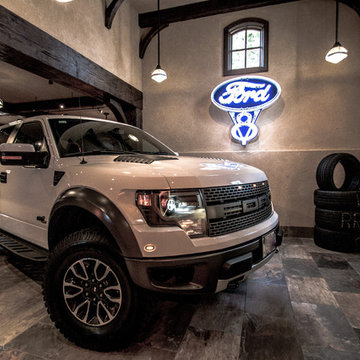
On to the interior, a black and white epoxy coating was stripped and replaced with porcelain tiles that resembled Italian travertine stone. To give the car barn a rustic feeling and a presence that it was older, not modern, Haas worked on the development and concept directly with the home owner to collaborate with a local millwork company that designed and hand-finished substantial wood beams from distressed Doug Fir. All of the walls were hand-plastered by a local artist using straw that was harvested from the immediate area surrounding the home and incorporated into the plaster to give it a rustic antique quality.
Haas conceived and designed a bar area and cabinetry for a work area that pulled inspiration from old ice boxes of the 1920’s that utilized heavy nickel-plated hardware, again to give storage spaces a rustic appearance.
The warm glow from several custom porcelain neon signs, each one meticulously built entirely by hand by VAULT, are dispersed throughout the space and transform the entire room and bring it to life. The client had never previously owned a neon sign before and along with the carriage doors felt that these items have transformed the space more than any other feature. Several antique gas pumps, restored in the client’s favorite petro bran, and a few additional porcelain signs will eventually furnish the rest of the space to complement the clients amazing car collection.
In addition to the countless details that set this showcase garage apart, its ability to seamlessly blend with the rest of the home and the natural, rustic setting of the Colorado Rockies, yet house modern automobiles in a manner in which they feel well placed and belong, is also noteworthy.
GARAGE DESIGN & FURNISHINGS
To learn more about VAULT visit them at: http://www.vaultgarage.com/
And on Facebook: http://www.facebook.com/VaultGarage
PHOTOGRAPHY
All photographs were used with the permission of photographer John Vanderpool (john.vanderpool5@gmail.com)
You can visit John Vanderpool on Facebook at: https://www.facebook.com/JVanderpoolPhotography
ARCHITECTURE
Jerry Gloss, Principal, KGA Architects: http://www.kgarch.com/
HOMEBUILDER
Thomas Sattler Home: http://thomassattlerhomes.com/
VEHICLES
Here is an overview of the cars that were photographed in this article:
1. 2014 Ferrari 458 Italia
2. 2013 Maserati GranTurismo Sport
3. 2007 Porsche 911 GT3 RS (997)
4. 2008 Porsche Cayenne GTS
5. 2008 Porsche GT3 RS
6. 2013 Porsche 911 Turbo S (997)
7. 2014 Porsche Panamera GTS
8. 2013 Ford SVT Raptor (6.2L CrewCab)’
Overview of project reprinted with permission of DuPont Registry.
152