
Search results for "Physically" in Home Design Ideas
 Vitruvius Built
Some families measure a life well-lived not in possessions, but in moments. Elevé Studios is the physical expression of that conviction.
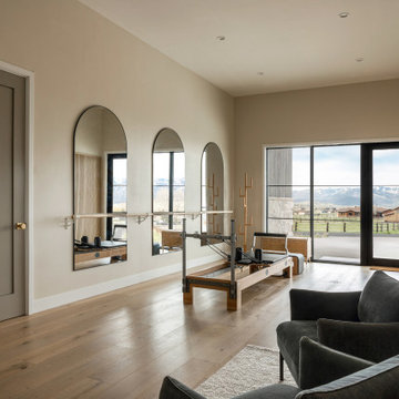
Set within a private equestrian property in Silver Creek in Park City, this 5,000 square foot accessory studio was designed to serve as the experiential heart of the estate. Vitruvius Built was engaged to deliver a structure that is equal parts athlete's retreat, entertainer's sanctuary, and private resort, built to the same precision and permanence as the main residence it supports.
The program is unapologetically experiential: a regulation heated pickleball court, a private pilates and yoga studio, a professional golf simulator, and an expansive garage occupy the main volume, while a self-contained ADU provides accommodations for guests or extended family. Each element was specified and constructed to perform at the highest level, because for this family, investing in how you spend time is the only investment that compounds without limit.
A 45-kilowatt solar installation with integrated EV charging reflects the same philosophy extended outward. The land that frames this property is part of what makes it extraordinary, and the family's commitment to preserving it is built into the structure itself.
Elevé Studios is a testament to what becomes possible when a family knows exactly what it values, and partners with a builder who understands how to make it permanent.
Architecture & Interiors: AD Architects

 Home in Harmony, Inc
The goal in this Show House Library was to create a haven that is both nurturing from an aesthetic view and from a healthy perspective. My original training that catapulted me into the world of design was Feng Shui. My goal when designing a space is to create a feeling of tranquility, serenity and peace. As you walk into your home, you want to feel a sense of calm, inner peace and contentment. You have come home to your sanctuary, your place of refuge. Home is a place that fortifies your soul and helps you go out into the world and excel. It should nurture you both in how it makes you feel emotionally and how healthy it is for your physical body. I have a passion for eco-friendly design that is both sustainable for the earth and healthy for the inhabitants. I was so excited when I found the Kravet Green Collection. The reason I chose these particular Kravet fabrics for the ottoman and pillows in the Show House was to demonstrate to people that Green fabrics have come so far in the past five years. It is wonderful that Kravet has introduced a collection of eco-friendly fabrics that are vibrant and fresh. The commitment of Home in Harmony is to connect the beauty of our client’s interiors with the beauty of the outside world that sustains us. Kravet creates beautiful fabrics that allow designers to accomplish this mission.

 AoDK Inc.
A couple wanted a weekend retreat without spending a majority of their getaway in an automobile. Therefore, a lot was purchased along the Rocky River with the vision of creating a nearby escape less than five miles away from their home. This 1,300 sf 24’ x 24’ dwelling is divided into a four square quadrant with the goal to create a variety of interior and exterior experiences while maintaining a rather small footprint.
Typically, when going on a weekend retreat one has the drive time to decompress. However, without this, the goal was to create a procession from the car to the house to signify such change of context. This concept was achieved through the use of a wood slatted screen wall which must be passed through. After winding around a collection of poured concrete steps and walls one comes to a wood plank bridge and crosses over a Japanese garden leaving all the stresses of the daily world behind.
The house is structured around a nine column steel frame grid, which reinforces the impression one gets of the four quadrants. The two rear quadrants intentionally house enclosed program space but once passed through, the floor plan completely opens to long views down to the mouth of the river into Lake Erie.
On the second floor the four square grid is stacked with one quadrant removed for the two story living area on the first floor to capture heightened views down the river. In a move to create complete separation there is a one quadrant roof top office with surrounding roof top garden space. The rooftop office is accessed through a unique approach by exiting onto a steel grated staircase which wraps up the exterior facade of the house. This experience provides an additional retreat within their weekend getaway, and serves as the apex of the house where one can completely enjoy the views of Lake Erie disappearing over the horizon.
Visually the house extends into the riverside site, but the four quadrant axis also physically extends creating a series of experiences out on the property. The Northeast kitchen quadrant extends out to become an exterior kitchen & dining space. The two-story Northwest living room quadrant extends out to a series of wrap around steps and lounge seating. A fire pit sits in this quadrant as well farther out in the lawn. A fruit and vegetable garden sits out in the Southwest quadrant in near proximity to the shed, and the entry sequence is contained within the Southeast quadrant extension. Internally and externally the whole house is organized in a simple and concise way and achieves the ultimate goal of creating many different experiences within a rationally sized footprint.
Photo: Sergiu Stoian
Find the right local pro for your project


 Adaptiv DC
THEME The main theme for this room is an active, physical and personalized experience for a growing boy. This was achieved with the use of bold colors, creative inclusion of personal favorites and the use of industrial materials. FOCUS The main focus of the room is the 12 foot long x 4 foot high elevated bed. The bed is the focal point of the room and leaves ample space for activity within the room beneath. A secondary focus of the room is the desk, positioned in a private corner of the room outfitted with custom lighting and suspended desktop designed to support growing technical needs and school assignments. STORAGE A large floor armoire was built at the far die of the room between the bed and wall.. The armoire was built with 8 separate storage units that are approximately 12”x24” by 8” deep. These enclosed storage spaces are convenient for anything a growing boy may need to put away and convenient enough to make cleaning up easy for him. The floor is built to support the chair and desk built into the far corner of the room. GROWTH The room was designed for active ages 8 to 18. There are three ways to enter the bed, climb the knotted rope, custom rock wall, or pipe monkey bars up the wall and along the ceiling. The ladder was included only for parents. While these are the intended ways to enter the bed, they are also a convenient safety system to prevent younger siblings from getting into his private things. SAFETY This room was designed for an older child but safety is still a critical element and every detail in the room was reviewed for safety. The raised bed includes extra long and higher side boards ensuring that any rolling in bed is kept safe. The decking was sanded and edges cleaned to prevent any potential splintering. Power outlets are covered using exterior industrial outlets for the switches and plugs, which also looks really cool.

 Fidelity General Contractors Inc.
What is an ADU: Accessory Dwelling Units:
An accessory dwelling unit, usually just called an ADU, is a secondary housing unit on a single-family residential lot. The term “accessory dwelling unit” is a institutional-sounding name, but it’s the most commonly-used term across the country to describe this type of housing. While the full name is a mouthful, the shorthand “ADU” is better.
ADUs vary in their physical form quite a bit, as there are detached ADU, attached ADU, second story ADU (above garage or work shop), addition ADU, internal ADU.
IMPORTANT:
There’s simply too few permitted ADUs to make a real difference in the housing stock. But, even if they aren’t going to solve all a city’s problems, they may help homeowners solve some of their problems. The most common motivation for ADU development is rental income potential, followed by the prospect of flexible living space for multigenerational households.
We at FIDELITY GENERAL CONTRACTORS, providing a single point of contact to homeowners interested in this product, from conceptual stage including plans, city legwork, project managing of the construction stage including assistance with material purchase and other coordination, all the way to completion.
(this project showcases a detached ADU, 400 SQ.)

 Raymour & Flanigan Furniture and Mattresses
photo: Amie Freling
coffee table: Tory coffee table
Inspiration for a huge craftsman walk-out carpeted and beige floor basement remodel in New York with beige walls
Inspiration for a huge craftsman walk-out carpeted and beige floor basement remodel in New York with beige walls

Sponsored
Sunbury, OH

J.Holderby - Renovations
Franklin County's Leading General Contractors - 2X Best of Houzz!

 JoJo Wong Design and Build
If you've ever taken a road trip that meandered through the countryside you've probably noticed that simple house sitting at the end of a dirt road. It looks cozy and has a rustic charm that reminds us of a more straightforward way of living. A warm, cozy fire on a chilly fall evening, or sitting on the farmers' porch enjoying a cold iced tea at the end of a long summer day.
Today, as more of us are beginning to appreciate the warmth of that rustic setting, one design style is rapidly growing in popularity. Known as “Modern Rustic” it provides homeowners with the warm, natural, and inviting style of that rural farmhouse, along with the clean, simple lines of modern design.
One of the characteristics of the Modern Rustic design aesthetic is that is evidenced by both the physical rooms, as well as in individual pieces of furniture within the space. The primary design components of this style are the warmth of natural materials and the texture those material provide.
Exposed wood and stone or brick are often used to add character and the appearance of warmth to the aesthetic. These are textures typically found in old hand-built country homes, as these were the building materials available at the time. Woolen objects like rugs and blankets are used as décor to add warm textures to the space. Modern Rustic also uses smooth textures, for example, counter and chairs surfaces and cabinetry. These are the textures that provide the clean and modern feel.
Shape and architecture play a significant role in the overall design environment. Natural elements like stones and wood are typically rough and asymmetrical in their natural state. A Modern Rustic design combines these natural shapes like tree branches, antlers and river stones with rectangles, spheres, and sharp angles. Think Cathedral ceilings, large prominent stairs, huge natural beams, and beautiful stone fireplaces.
I am extremely proud of this project and we finish right on time before the couple get married. Contact @jojowongdesign for next gigs. @ Houston, Texas

 Kitchen & Bath Concepts
This home was built in the late 60’s to early 70’s in the classic “Brady Bunch” Ranch Style Genre.
The new space was designed for a young active family, complete with big dog, that likes to entertain and finds themselves in the kitchen more than any other room in the house. “Mom” has a professional culinary background and has cooking events in her kitchen from time to time.
A prior remodel created an enclosed kitchen with angled walls protruding into the space. Our Design Objective was to open the space physically and visually in a clean contemporary style to create a more functional and inviting kitchen, Breakfast Area and drink bar that receives heavy daily use.
Walls were removed and reconfigured to create an open space. A professional style 60" dual-fuel range and stainless steel hood are the focal point of the kitchen along the back wall. To the left are a 36” all refrigerator and freezer separated by a pantry with chalk board that displays daily schedules or meals.
The drink bar sits across from the Breakfast area and features an under-counter beverage refrigerator, ice maker and under counter wine refrigerator.
Designed by Micqui McGowen, CMKBD, RID
 SM Design
York Mills Residence | Layered Contemporary Elegance
This York Mills residence was designed around the idea of quiet luxury expressed through architectural detail rather than excess. The interior combines classical residential proportions with contemporary forms, creating a sophisticated environment that feels highly curated while remaining comfortable and inviting for everyday living.
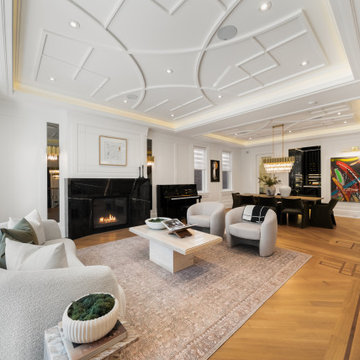
A key design strategy was to establish a continuous architectural language across the connected living, dining, and circulation spaces. Rather than designing each zone independently, the spaces are visually tied together through consistent wall paneling, warm oak flooring, carefully controlled neutral tones, and a coordinated lighting strategy. This creates a strong sense of continuity and allows the eye to move naturally through the home.
The ceiling design plays an important role in defining the character of the interior. Elaborate geometric and curved coffering introduces a sculptural element overhead, transforming the ceiling into a fifth architectural surface. The integrated perimeter illumination emphasizes these forms after dark, while recessed lighting provides functional illumination without competing with the decorative architecture.
The black stone fireplace provides a deliberate counterpoint to the predominantly light interior. Its strong visual weight anchors the living area and establishes a dramatic focal point, while the softer curved seating and neutral upholstery balance its intensity. This contrast between monumental architectural elements and tactile, rounded furnishings gives the room a contemporary character without losing its residential warmth.
Furniture planning was approached as an exercise in conversation, proportion, and movement. The seating arrangement creates an intimate conversational zone while maintaining a clear visual and physical connection to the dining area. The curved forms soften the geometry of the architecture and introduce a more relaxed human scale within the larger room.
The dining area extends the social function of the space and is visually framed by the architectural detailing and artwork. A sculptural chandelier establishes a focal point above the dining table, while the large-scale artwork introduces color, energy, and individuality into the otherwise restrained palette. This balance between a controlled architectural background and expressive art allows the homeowner's personality to become part of the design.
The flooring contributes another layer of craftsmanship. The warm wood surface establishes continuity throughout the open interior, while geometric floor detailing and directional patterns subtly define zones without relying on physical partitions. This allows the architecture to remain open while still providing a sense of hierarchy and spatial organization.
Artwork, decorative objects, greenery, and furnishings were intentionally selected to introduce moments of color, texture, softness, and visual contrast. The result is not a purely minimalist interior; instead, it is a layered composition in which restraint provides the foundation for carefully selected moments of expression.
Overall, the project reflects a contemporary approach to traditional luxury, architectural, highly detailed, and timeless, but never overly formal. The design prioritizes proportion, craftsmanship, material relationships, natural light, and the experience of moving through the home, creating an interior that functions as both an elegant entertaining environment and a comfortable everyday living space.
 Kitchen & Bath Concepts
This home was built in the late 60’s to early 70’s in the classic “Brady Bunch” Ranch Style Genre.
The new space was designed for a young active family, complete with big dog, that likes to entertain and finds themselves in the kitchen more than any other room in the house. “Mom” has a professional culinary background and has cooking events in her kitchen from time to time.
A prior remodel created an enclosed kitchen with angled walls protruding into the space. Our Design Objective was to open the space physically and visually in a clean contemporary style to create a more functional and inviting kitchen, Breakfast Area and drink bar that receives heavy daily use.
Walls were removed and reconfigured to create an open space. A professional style 60" dual-fuel range and stainless steel hood are the focal point of the kitchen along the back wall. To the left are a 36” all refrigerator and freezer separated by a pantry with chalk board that displays daily schedules or meals.
The drink bar sits across from the Breakfast area and features an under-counter beverage refrigerator, ice maker and under counter wine refrigerator.
Designed by Micqui McGowen, CMKBD, RID

 TOLO Architecture
Located above the coast of Malibu, this two-story concrete and glass home is organized into a series of bands that hug the hillside and a central circulation spine. Living spaces are compressed between the retaining walls that hold back the earth and a series of glass facades facing the ocean and Santa Monica Bay. The name of the project stems from the physical and psychological protection provided by wearing reflective sunglasses. On the house the “glasses” allow for panoramic views of the ocean while also reflecting the landscape back onto the exterior face of the building.
PROJECT TEAM: Peter Tolkin, Jeremy Schacht, Maria Iwanicki, Brian Proffitt, Tinka Rogic, Leilani Trujillo
ENGINEERS: Gilsanz Murray Steficek (Structural), Innovative Engineering Group (MEP), RJR Engineering (Geotechnical), Project Engineering Group (Civil)
LANDSCAPE: Mark Tessier Landscape Architecture
INTERIOR DESIGN: Deborah Goldstein Design Inc.
CONSULTANTS: Lighting DesignAlliance (Lighting), Audio Visual Systems Los Angeles (Audio/ Visual), Rothermel & Associates (Rothermel & Associates (Acoustic), GoldbrechtUSA (Curtain Wall)
CONTRACTOR: Winters-Schram Associates
PHOTOGRAPHER: Benny Chan
AWARDS: 2007 American Institute of Architects Merit Award, 2010 Excellence Award, Residential Concrete Building Category Southern California Concrete Producers

 Leff Construction Design/Build
Inspiration for a transitional dark wood floor dining room remodel in San Francisco
Sponsored
Sunbury, OH
J.Holderby - Renovations
Franklin County's Leading General Contractors - 2X Best of Houzz!

 Ground One Landscape Design + Build
This visually simple, modern solution is unique within its suburban context, and gives this family the custom landscape of their dreams. The homeowners’ wish list included a modern design and clearly defined spaces: a larger dining patio, firepit patio, hot tub, and a 4-season sport court (which gets flooded for ice hockey in the winter).
Circulation and screening were key in Ground One’s landscape design. A sport court could overwhelm the entire backyard, so it was raised three feet above the primary backyard to physically separate different spaces, and minimize its visual impact. Rectangular bluestone in a running bond pattern was used in all the gathering spaces (dining, firepit, hot tub). Bluestone walls reinforce a simple material palette.
A larger dining patio was installed near the house for greater entertaining flexibility. Plank paver paths connect to a private hot tub area and allow kids to don hockey gear and enter the sport court without messing up the house. The firepit patio is at the back of the property, nestled into the existing hillside under a large oak and below the sport court terrace.
Plantings reinforce the geometry of each gathering space, provide focal points, and create layers of screening and separation from any given vantage point. Hardy species were selected for their low-maintenance requirements and various seasons of interest. Landscape lighting was incorporated to provide way finding between the patios, accent various hardscape elements, and highlight the trees.

 Native Edge Landscape
Another fun Crestview project! This young couple wanted a back yard that reflected their bohemian-eclectic style and could add additional privacy from the ever climbing construction around them. A place for “hanging out and drinking coffee or beer in the backyard.” But what was most exciting, was the air stream they had just purchased and were in the process of restoring. With the end goal of using it as a guest home for family and friends, we were challenged with creating a space that was cohesive and connected this new living space with the rest of the yard.
In the front we had another quark to fix. The sidewalk from their front door to the street suddenly stopped 5 feet from the curb, making a less than inviting entry for guests. So, creating a new usable entryway with additional curb appeal was a top priority.
We managed the entertainment space by using modern poured concrete pad’s as a focal. A poured concrete wall serves as a bench as well as creates a visual anchor for the patio area. To soften the hard materials, small plantings of succulents and ground cover were planted in the spaces between the pads. For a backdrop, a custom Cedar Plank wall and trellis combined to soften the vertical space and add plenty of privacy. The trellis is anchored by a Coral Vine to add interest. Cafe style lighting was strung across the area create a sense of intimacy.
We also completed the fence transition, and eliminated the grass areas that were not being utilized to reduce the amount of water waste in the landscape, and replaced these areas with beneficial plantings for the wildlife.
Overall, this landscape was completed with a cohesive Austin-friendly design in mind for these busy young professionals!
Caleb Kerr - http://www.calebkerr.com

 Gappsi
T shaped swimming pool designed by Giuseppe Abbrancati and built by Gappsi in Smithtown NY, 11787. This swimming pool is a very special pool, not only it’s beautiful, but it is also very functional and energy efficient. The layout of the backyard incorporates raised and pool area travertine patios, hot tub spa, travertine veneered walls with 2 inches travertine copings and plenty of space for tables and chairs. The T shaped swimming pool is very functional it has a very large diving deep end area making it very safe for professional diving, it has steps in deep end for easy access and exit, it has steps along the shallow area to access the pool but also serve as sitting benches for bathers that just want to sit in water, the shallow are its perfect valley ball play area like no other pool shape would offer and all these provided with less the 800 sq ft of surface making it cost effective when running the heather and the pumps to circulate the water.
This swimming pool defies the law of physics by being smaller then a 20x40 while providing a larger deep end area and a larger shallow area. For more information’s about pool constructions please visit Gappsi.com or call us at 631-543-1177.
 TOLO Architecture
Located above the coast of Malibu, this two-story concrete and glass home is organized into a series of bands that hug the hillside and a central circulation spine. Living spaces are compressed between the retaining walls that hold back the earth and a series of glass facades facing the ocean and Santa Monica Bay. The name of the project stems from the physical and psychological protection provided by wearing reflective sunglasses. On the house the “glasses” allow for panoramic views of the ocean while also reflecting the landscape back onto the exterior face of the building.
PROJECT TEAM: Peter Tolkin, Jeremy Schacht, Maria Iwanicki, Brian Proffitt, Tinka Rogic, Leilani Trujillo
ENGINEERS: Gilsanz Murray Steficek (Structural), Innovative Engineering Group (MEP), RJR Engineering (Geotechnical), Project Engineering Group (Civil)
LANDSCAPE: Mark Tessier Landscape Architecture
INTERIOR DESIGN: Deborah Goldstein Design Inc.
CONSULTANTS: Lighting DesignAlliance (Lighting), Audio Visual Systems Los Angeles (Audio/ Visual), Rothermel & Associates (Rothermel & Associates (Acoustic), GoldbrechtUSA (Curtain Wall)
CONTRACTOR: Winters-Schram Associates
PHOTOGRAPHER: Benny Chan
AWARDS: 2007 American Institute of Architects Merit Award, 2010 Excellence Award, Residential Concrete Building Category Southern California Concrete Producers




 Living By Laura
This kitchen remodel was interesting because the owners loved their previous kitchen but wanted to update well-worn laminate and vinyl surfaces.
We installed "Whisper" Corian in the kitchen area. The surface is forgiving, doesn't break every glass that falls on it and hides seams. We spent the extra few dollars with the fabricator to set the pattern one-way across the kitchen instead of turning with the "run" of the countertops. You can't see they physical seams and you cannot see the pattern change at the seams.
Other items upgraded in the space were: The backsplash in a blue-gray porcelain with glass accent. The kitchen sink to an under-counter model. The dishwasher, cooktop and oven were upgraded, however black appliances topped stainless for this remodel.
Interesting fact: the glass in the proper cooking area is not the same color as the glass in back of the bar sink. They look the same, but the bar backsplash is more complimentary to its sink. The difference is undetectable looking across the kitchen.
The "office" area was updated to go underneath the countertop with a pull-out shelf. The shelf allows papers, and needed items to be stored below the counter surface.
This design is practical and casually elegant for the kitchen command center. The two peninsulas were done in "Cosmos" granite. By adding granite to the top-cap of the bar, these areas blend into the living area. The glass sink is new along with the glass tile but the Grohe faucet is a re-use from the original kitchen. They loved that faucet so why change something that you like that still works beautifully after nearly 25 years? The vinyl floor was upgraded to vinyl tile. This choice is softer and warm underfoot compared to other hard surfaces including porcelain tile.
100