
Search results for "Physics" in Home Design Ideas
 The Pool & Spa Place
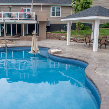
This shot is before project completion but better shows the in pool bench under the in pool umbrella table. This bench serves as a great place to hang out, but also doubles as a physical therapy space for one of our favorite customers! You can also see the elevator lift from the deck down to the pool area directly behind the umbrella.
 Thayer Design Build
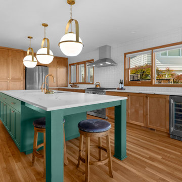
Shannon’s kitchen transformation focused on removing barriers—both physical and functional. By opening up the floor plan, upgrading storage, and modernizing finishes, our team delivered a kitchen and living area that are bright, spacious, and tailored to her style. The result is a cohesive, inviting home that combines beauty and practicality.
 Nistenhaus Design LLC
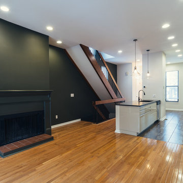
Daring black walls with white trim tie back to the black and white kitchen finishes and bring a modern, dramatic look to the fireplace.
The decision to tear down the wall that was by the refrigerator opened up the space physically as well as visually and makes the space seem much bigger.
Find the right local pro for your project
 KB Design +
A city condo needed an uplift, all finishes started to feel outdated, the kitchen's layout did not work for a dynamic couple who love to entertain and play Bridge with their friends on the regular basis.
We developed a plan how to provide a luxurious experience and necessary changes in the limited space. The condo has some physical limitations as well, such as the load bearing walls could not be changed, the duct work had to stay in place, and the floor finishes had to satisfy strict sound restrictions.
 Lanson B. Jones & Co, Inc.
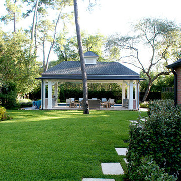
Primarily English in style with French leanings, this manor boasts two grand outdoor scaled rooms with each centered on two separate lawns allowing the entire space to be visually and physically tied together. Custom cut stone was used to create a "green pathway" by allowing ground cover (or in this case, lawn) to exist between stepping pads, making the path appear to be "floating".
 RAJ Kitchen and Bath, LLC
**Check out the video of this transformation on our website**
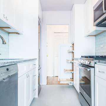
This small kitchen was way too small for this 2 bedrooms, 2 bathrooms apartment. Not only was it a very small kitchen, but the physical location of it made it very difficult to make it any bigger. There wasn't much that could have been done without incurring astronomical cost, which would get little or no return on the investment. The client wanted a kitchen that can be optimized in its current location to add a ton of value for resale.
This was difficult to do, because there was no moving of any mechanical around in the kitchen and even if we wanted to, the management of the building would not allow. For those of you who live in condos, co-ops or apartment building, you know how difficult it is to rework these foot prints. When we showed up, we saw the problems, but we also saw a huge opportunity where we can achieve those goals in the small space. This was accomplished by making some key changes and to incorporate some new things that was not possible when this kitchen was built years ago.
The crucial part of the design that would drive the entire new layout, was selecting the only appliance; that was the Refrigerator. Once we nailed down that refrigerator, we then proceeded to design the kitchen around it. We moved it to the other side of the wall where the sink was so that we can tap into the water line from the sink plumbing. It was crucial that it stays exactly 24" deep, not an inch more because we had to keep the entry as open as possible. Also, it was going to be directly in front of another big storage unit - The pantry. It is not ideal in most cases, but we needed the rest of the space to ramp up the design and open feel towards the side where all of the activities would take place, which happend to be the dining room and the view.
Once all that was figured out, we re-positioned the sink, dishwasher and the range and proceeded to wrap the cabinets around the columns to integrate them into the space. Thirty- six inches cabinets height was used so that they can be installed higher towards the ceiling height to give more room rather than the standard 18" required height between the counter tops. This was done to make the room feel a lot bigger than it really was. Not to mention, we also didn't want the faucet to be buried under the cabinets so that was also a necessary design detail for the space.
We then lowered both knee walls so that the counter top can sit on top of them, by removing that stop point that would have otherwise defined the kitchen area. This allowed us to pick up that extra footprint into the room for added prep space and enabled us to create the illusion of a kitchen that is looking longer than it really is. Every inch mattered when designing this kitchen and we made a conscious decision to use every one of that inch.
White cabinets were selected to do just what white cabinets are design to do; make a small or dark room appear bigger, brighter and more open. In this kitchen, this was amplified the more because of the kitchen location. It was perfect! We knew we did justice to the space because while we were there taking some photos, a few potential buyers walked in and went straight for the kitchen! They said its design just to fit the apartment.
Pantry roll out shelving, Double recycle bin, fancy handles, LED lighting, Quartz counter top, beautiful backslash tiles and grey linen floors finished off the kitchen which looked over a beautiful view of the George Washington Bridge from the top of this lovely 4th floor apartment.
Credit to Masterpiece Tile and Marble (Annmarie on the selection of Tiles and countertop and Val on the Construction to complete this project).
Davor Kokic Photography
 DMB Interior Design-Build
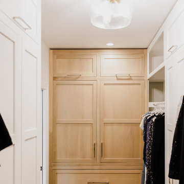
The Master Suite of the Elmwood project was formulated from scratch in the spacious addition of a branching household. Our clients wanted to keep the neighborhood they loved while creating space for a growing family. DMB Design came into the project at the blueprint phase, offering our intentional consideration to the layout of the space before its physical creation. This offered us an opportunity to present our idealized iteration of a self-contained sanctuary space. We created a spa-inspired atmosphere, starting with the floating tub that captured our hearts from the very beginning. You'll find plenty of space to hang your robe in the 15-foot walk in closet complete with floor-to-ceiling custom built-ins. The suite maintains an aura of romance, creating a sense of delicacy without an ounce of fussiness.
 RAJ Kitchen and Bath, LLC
**Check out the video of this transformation on our website**
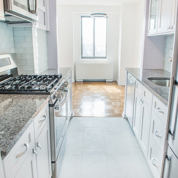
This small kitchen was way too small for this 2 bedrooms, 2 bathrooms apartment. Not only was it a very small kitchen, but the physical location of it made it very difficult to make it any bigger. There wasn't much that could have been done without incurring astronomical cost, which would get little or no return on the investment. The client wanted a kitchen that can be optimized in its current location to add a ton of value for resale.
This was difficult to do, because there was no moving of any mechanical around in the kitchen and even if we wanted to, the management of the building would not allow. For those of you who live in condos, co-ops or apartment building, you know how difficult it is to rework these foot prints. When we showed up, we saw the problems, but we also saw a huge opportunity where we can achieve those goals in the small space. This was accomplished by making some key changes and to incorporate some new things that was not possible when this kitchen was built years ago.
The crucial part of the design that would drive the entire new layout, was selecting the only appliance; that was the Refrigerator. Once we nailed down that refrigerator, we then proceeded to design the kitchen around it. We moved it to the other side of the wall where the sink was so that we can tap into the water line from the sink plumbing. It was crucial that it stays exactly 24" deep, not an inch more because we had to keep the entry as open as possible. Also, it was going to be directly in front of another big storage unit - The pantry. It is not ideal in most cases, but we needed the rest of the space to ramp up the design and open feel towards the side where all of the activities would take place, which happend to be the dining room and the view.
Once all that was figured out, we re-positioned the sink, dishwasher and the range and proceeded to wrap the cabinets around the columns to integrate them into the space. Thirty- six inches cabinets height was used so that they can be installed higher towards the ceiling height to give more room rather than the standard 18" required height between the counter tops. This was done to make the room feel a lot bigger than it really was. Not to mention, we also didn't want the faucet to be buried under the cabinets so that was also a necessary design detail for the space.
We then lowered both knee walls so that the counter top can sit on top of them, by removing that stop point that would have otherwise defined the kitchen area. This allowed us to pick up that extra footprint into the room for added prep space and enabled us to create the illusion of a kitchen that is looking longer than it really is. Every inch mattered when designing this kitchen and we made a conscious decision to use every one of that inch.
White cabinets were selected to do just what white cabinets are design to do; make a small or dark room appear bigger, brighter and more open. In this kitchen, this was amplified the more because of the kitchen location. It was perfect! We knew we did justice to the space because while we were there taking some photos, a few potential buyers walked in and went straight for the kitchen! They said its design just to fit the apartment.
Pantry roll out shelving, Double recycle bin, fancy handles, LED lighting, Quartz counter top, beautiful backslash tiles and grey linen floors finished off the kitchen which looked over a beautiful view of the George Washington Bridge from the top of this lovely 4th floor apartment.
Credit to Masterpiece Tile and Marble (Annmarie on the selection of Tiles and countertop and Val on the Construction to complete this project).
Davor Kokic Photography
 Unfold Architecture
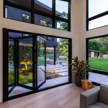
Nestled into a steep hill on an urban-sized lot, N44° 58' 34" is a creative response to a set of unique site conditions. The house is terraced up the hill, providing multiple connections to the large urban lot. This allows the main living spaces to wrap around the greenspace, providing numerous visual and physical relationships to the backyard. With a direct connection to the largest public park in Minneapolis, the backyard transforms seasonally to support the families active, outdoor lifestyle.
A grand, central staircase functions as a statement of modern design while windows simultaneously flood all three levels with light. The towering stair is framed by two distinct wings of the home, creating secluded, yet connected moments on each level.
 Juxtapose Design Build
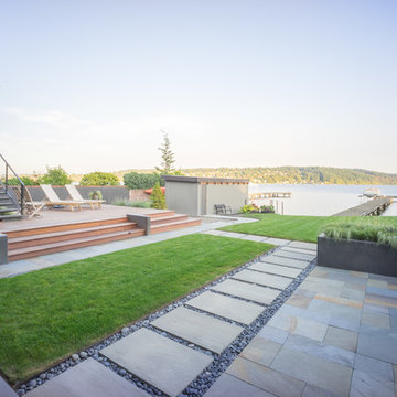
Cast in place concrete walls and custom waterjet metal with integrated lighting complement the architectural materiality, while providing physical and visual separation between this private modern home and the wooded public passage of the Burke Gilman Trail. Cantilevered steps float above a cascade of soft grasses and rushes. Looking out over Lake Washington from the hot tub, a combination of wood and concrete walls softened by plants contain the experience of outdoor relaxation at its finest. A crushed granite path gently curves along handcrafted stone walls containing a burst of lush planting to connect wood decking at the house with a fire pit area close to the water.
Photography: Louie Jeon Photography
 Tamara Marie Designs
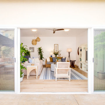
We converted this 3 car garage into an ADU. The space now has a living room and physical therapy space for its' tenants. The Assisted Living facility has a coastal feeling with blue, creams and natural soft colors to create a relaxing environment.
 Stebnitz Builders, Inc.
In every project we complete, design, form, function and safety are all important aspects to a successful space plan.
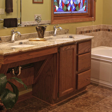
For these homeowners, it was an absolute must. The family had some unique needs that needed to be addressed. As physical abilities continued to change, the accessibility and safety in their master bathroom was a significant concern.
The layout of the bathroom was the first to change. We swapped places with the tub and vanity to give better access to both. A beautiful chrome grab bar was added along with matching towel bar and towel ring.
The vanity was changed out and now featured an angled cut-out for easy access for a wheelchair to pull completely up to the sink while protecting knees and legs from exposed plumbing and looking gorgeous doing it.
The toilet came out of the corner and we eliminated the privacy wall, giving it far easier access with a wheelchair. The original toilet was in great shape and we were able to reuse it. But now, it is equipped with much-needed chrome grab bars for added safety and convenience.
The shower was moved and reconstructed to allow for a larger walk-in tile shower with stylish chrome grab bars, an adjustable handheld showerhead and a comfortable fold-down shower bench – proving a bathroom can (and should) be functionally safe AND aesthetically beautiful at the same time.
 JoJo Wong Design and Build
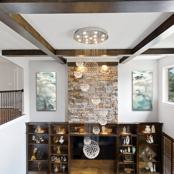
If you've ever taken a road trip that meandered through the countryside you've probably noticed that simple house sitting at the end of a dirt road. It looks cozy and has a rustic charm that reminds us of a more straightforward way of living. A warm, cozy fire on a chilly fall evening, or sitting on the farmers' porch enjoying a cold iced tea at the end of a long summer day.
Today, as more of us are beginning to appreciate the warmth of that rustic setting, one design style is rapidly growing in popularity. Known as “Modern Rustic” it provides homeowners with the warm, natural, and inviting style of that rural farmhouse, along with the clean, simple lines of modern design.
One of the characteristics of the Modern Rustic design aesthetic is that is evidenced by both the physical rooms, as well as in individual pieces of furniture within the space. The primary design components of this style are the warmth of natural materials and the texture those material provide.
Exposed wood and stone or brick are often used to add character and the appearance of warmth to the aesthetic. These are textures typically found in old hand-built country homes, as these were the building materials available at the time. Woolen objects like rugs and blankets are used as décor to add warm textures to the space. Modern Rustic also uses smooth textures, for example, counter and chairs surfaces and cabinetry. These are the textures that provide the clean and modern feel.
Shape and architecture play a significant role in the overall design environment. Natural elements like stones and wood are typically rough and asymmetrical in their natural state. A Modern Rustic design combines these natural shapes like tree branches, antlers and river stones with rectangles, spheres, and sharp angles. Think Cathedral ceilings, large prominent stairs, huge natural beams, and beautiful stone fireplaces.
I am extremely proud of this project and we finish right on time before the couple get married. Contact @jojowongdesign for next gigs. @ Houston, Texas
 Wood Anchor
“A deep purple river joins two 14 ft live edge Winnipeg Elm slabs on this one of a kind table.
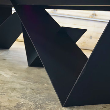
The angular design of the leg offers visual qualities much like a kite in the sky.
Shifting your perspective to the tables angles you really get a sense of visual and physical mass!
From its side profile you’ll see thin lines of angular connections.”
We were commissioned to build this one of a kind table for a customer residing in another province.
As with all of our custom pieces we worked closely with the customer (much through emails) understanding the emotion they wanted the table to invoke in their space.
Details:
14’ long x 5’ wide x 1.5” thick reclaimed Elm table with central live edge “river” coloured resin, squared outer edges, black powder coated steel leg (“w”leg design) with black powder coated steel table under structure.
First image credit: Customer supplied image.
2016 © Ray Chan Photo, All Rights Reserved

 3SI Design
Meet Don Fuego—a bold, luxurious, and unforgettable experience. ?
Bringing this vision to life was an incredible journey alongside talented vendors and artists. We began designing Don Fuego at the start of 2024, keeping four key elements at the forefront: Moody, Sophisticated, Bold, and Memorable.
Inspired by Día de los Muertos, this space pays homage to those who are no longer with us physically but remain with us spiritually. Every design choice reflects this essence—deep, rich textures, dramatic lighting, and custom elements that make Don Fuego a true work of art.
One of the focal points is the custom-designed checkout counter, featuring a striking porcelain slab that embodies everything Don Fuego stands for: fire, intensity, and individuality. The moment we saw it, we knew it was destined for this space.
Design is all about the details, and Don Fuego is no exception. From late-night idea exchanges to meticulous material selections, every element was chosen with intention. We introduced texture through limewash, mimicking the organic feel of a grave, and Roman clay, sculpted into arches reminiscent of traditional Mexican architecture.
Lighting is the jewelry of a space, and in Don Fuego, it sets the mood. We layered task, decorative, ambient, and accent lighting to create an immersive atmosphere. One of our favorite details? A light fixture inspired by the cascarón, a cracked egg symbolizing good luck and prosperity in Mexican culture. The moment we discovered it, we knew it belonged here—to bring blessings to our clients and everyone who steps inside this curated experience.
Don Fuego isn’t just a space—it’s a feeling, a story, a tribute. ✨
 Granit Architects + Interiors
We are delighted to have completed the radical transformation of a tired detached property in South Croydon.
When they appointed Granit, our clients were living in the property which had previously been divided into a number of flats.
The historic sub-division had resulted in an extremely poor use of space with redundant staircases, kitchens and bathrooms throughout.
Our clients sought to reconfigure the property back into a single dwelling for his growing family.
Our client had an eye for design and was keen to balance contemporary design whilst maintaining as much of the character of the original house.
Maximising natural light, space and establishing a visual and physical connection were also key drivers for the design. Owing to the size of the property, it became apparent that reconfiguration rather than extension provided the solution to meet the brief.
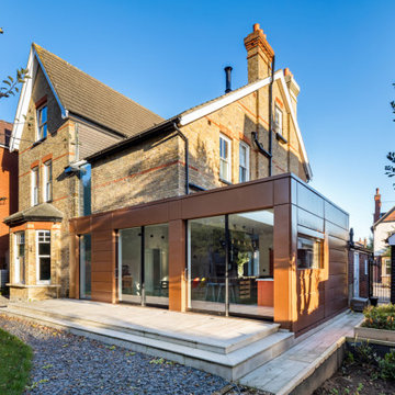
A metal clad ‘intervention’ was introduced to the rear facade. This created a strong horizontal element creating a visual balance with the vertical nature of the three storey gable.
The metal cladding specified echoed the colour of the red brick string courses tying old with new. Slender frame sliding doors provide access and views of the large garden.
The central circulation space was transformed by the introduction of a double height glazed slot wrapping up the rear facade and onto the roof. This allows daylight to permeate into the heart of the otherwise dark deep floor plan. The staircase was reconfigured into a series of landings looking down over the main void space below and out towards the tree canopies at the rear of the garden.
The introduction of double pocket doors throughout the ground floor creates a series of interconnected spaces and the whitewashed Larch flooring flows seamlessly from room to room. A bold palette of colours and materials lends character and texture throughout the property.
The end result is a spacious yet cosy environment for the family to inhabit for years to come.
 D3 Architects
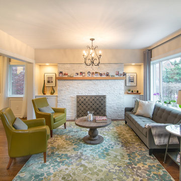
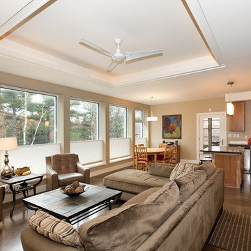
The formal living room, the front room of the house, the first space you see after you enter the home. This is traditionally a formal space used for hosting guests, and it is no different in this remodeled home. The stone fireplace provides a visual and physical anchor around which the furniture and space radiates. Natural light from the north, west, and south washes into the room.
 Passive Design Solutions
This project proved that a certified Passive House can have the same combined mortgage and energy costs as a conventional house: monitored heating costs are only $200 per year. The integration of Lifetime for Homes guidelines make this house accessible for people of varying physical abilities and will allow our clients to stay in their home as they age. A small solar panel can provide 55% of all hot water, further lowering energy bills.
Hawkins House is both LEED GOLD and PASSIVE HOUSE certified.
Photo Credit: Jarrell Whisken
 aj Interiors
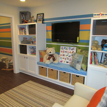
Samantha's House is a non-profit organization that redesigns homes to better suit the needs of children with physical limitations. The rooms are designed on a donation basis and extremely limited budget.
 Kashmir Fine Arts & Crafts
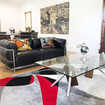
Kandinsky pillow cover – In the flow- Star fragments and enigmatic hieroglyphs artfully stitched in this decorative pillow cover in finest Kashmir wool chainstitch needlework. Various tones of light browns, complement earthier tones of coral terra cotta and other tones of ivory, to recreate a design based on the work of influential Russian artist, Wassily Kandinsky.The exciting pattern evokes the thought of a ladder to the stars, a comet’s tail, or a star map. This cover could grace the cabin of your boat or the chair in your solarium and yet be equally as comfortable in your den. Durable and easy to clean, this toss pillow will catch the eye of every passerby.
Composition: 70% Wool, 30% Cotton
Size: 13? x 21? (33cm x 53cm)
Pillow Insert not Included (Only Cover is on Sale)
Hand embroidered in Village Cottage Units
Backing: Canvas (See the Last Picture)
View additional pictures to see the intricate embroidery done in highly stylized beautiful patterns and superb craftsmanship unparalleled in the whole world.
A close-up view of this abstract pillow cover allows you to see the amazing chain-stitch embroidery work of master artisans who have practiced this art their entire lives.This abstract decorative pillow cover could grace the cabin of your boat or the chair in your solarium and yet be equally as comfortable in your den.
The eye-popping color and pattern of this modern throw pillow is just what the designer ordered to create a fiery focal point in your décor. Perfect wherever you need a splash of color, this art work pillow creation is as durable as it is beautiful. Easy to care for, this cushion cover could spark up an old throw pillow or grace a new pillow form.
Kandinsky conveyed profound spirituality and inner human emotion through a visual language of abstract forms and colors that transcended cultural and physical boundaries. He used interrelation between color and form to create an aesthetic experience that engaged the sight, sound, and emotions of the viewer.
Kandinsky viewed music as the most transcendent form of non-objective art – musicians could evoke images in listeners’ minds merely with sounds. He crafted spiritually rich paintings that alluded to sounds and emotions through sensations. Modern Artist Wassily Kandinsky used the form of concentric circles to portray the soul. Rendered here as chain stitch embroidery in wool, this cushion cover can create a new personality for any room in which you choose to use it.
98