
Search results for "Pile hand tema" in Home Design Ideas

 Tarnow Doors, Inc.
This door is out of the Clopay Modern Steel Collection. The modern grooved door is factory painted Black and has plain long windows across the top.

 threshold interiors
Location: New York, NY, United States
This Loft was tastefully renovated back in the '90s, but was due for an update and an expansion of the kitchen and dining areas to accommodate the client's cooking skills and entertaining needs. EnlargIing the island and adding cabinetry to delineate the office, bar and dining areas was a priority. The bathroom was updated to feel like a tranquil spa with beautiful new tile, plumbing fixtures and cabinets. Our biggest challenge was coordinating the entire renovation while our client was out of town for the Summer!
Photographed by: James Salomon

 Advance Design Studio, Ltd.
After six years of living in their Huntley IL home, Chris and Meghan were tired of their dark, dingy, outdated kitchen and it was finally time for a long-anticipated change. “The kitchen is the place where we live, it’s where we do everything,” Meghan said. “It was important that it be a space where we wanted to be.” Meghan loves cooking and enjoys including their girls in healthy meal prepping, this led them to want a brighter, more enjoyable kitchen with increased functionality and improved storage.
For Chris especially, the laundry room was an entirely dysfunctional eyesore. “We had a washer and a dryer, but it was all kind-of cobbled together!” Chris said. “There were always laundry piles everywhere, we weren’t really sure what we wanted to do in there, but it was time for us to make a change.” The mess of the space was stressful every time they walked in the door from the garage each day. Kids’ backpacks and shoes piled up haphazardly in the makeshift boot-bench closet left the family feeling disorganized and stressed. They needed space for folding clothes and locker cubbies to help keep the family organized.
Having known Christine and Todd in the Huntley community for years, Chris and Meghan were familiar with their work. “We already trusted them personally and having seen their projects for years we knew they did top notch work. After we reviewed the initial round of designs, we knew that hiring them was definitely the right choice,” Meghan and Chris said. Although Chris had done a lot of work in their home himself, the kitchen and laundry room renovation was such a large undertaking that he didn’t want to steal time away from his family to spend what would surely be many long weekends doing the job himself. “That would not have been a wise choice for us,” Chris laughed.
“Our designer, Michelle was very, very, easy to work with; anything we wanted to see or weren’t sure about, she went above and beyond to make this easy for us. She was easy to get hold of and always quick to respond,” the couple said. Michelle pulled ideas that mirrored the couple’s taste and style and was adept at directing the couple to limited choices that didn’t overwhelm them and kept the process moving. “I have a hard time making decisions. Michelle made the decision-making process so easy. I loved how she listened to what I liked and then presented three great options for me to choose from,” Meghan said.
The main objectives for the kitchen were better storage solutions, they wanted the space to reflect their lifestyle and taste, and they wanted it to last for years with low maintenance. One of the first steps in creating a more functional kitchen was relocating the refrigerator, creating an improved workflow for the busy family.
“We didn’t know that we could even move the refrigerator to a new location where it is now, that was something that we never would have thought of,” Chris said. “The new refrigerator location makes the kitchen feel so much bigger. We didn’t add any space, but our whole kitchen with the new design just seems like it’s so much larger than before!” Meghan said.
The perimeter mist colored cabinets helped warm and brighten the entire room, while the graphite colored cabinets on the island added contrast. Using this fresh, clean color palette satisfied the couple’s desire for a bright space that was the exact opposite of what they had before. Organization accessories were also added to the cabinets such as a spice drawer tray and roll outs to create hidden convenience.
“I absolutely love the hidden spices – it makes cooking so much more enjoyable!” Chris said. “And all the pull outs, and the double trash bin, who would think you could get so excited about organization!” the couple said in unison.
One thing they hated in their original kitchen was how dark the space felt. Added lighting on the ceiling with the new light fixtures combined with the lighter cabinetry colors throughout solved this problem. “Our new kitchen has this warm, almost cozy feeling that our old kitchen never had, it’s just a space that I love spending my time in now,” Meghan said. The light airy feeling was accentuated with the use of floating white shelves on either side of the decorative range hood. “We have so much cabinetry space, the new design is amazing we actually have more storage space than we will ever need,” Meghan said.
The island was extended to create more work surface and added space for stool seating. “The new island changes how we live. Now the kids can be in the kitchen with us, doing homework, eating breakfast, and the three of us have special dinners there when Chris is working late,” Meghan said.
The Carrara Marmi Quartz countertops were chosen because they are, not only beautiful, but are made from hard-working material that doesn’t require maintenance. The white subway tile backsplash that wraps to the ceiling behind the focal point cooktop range/hood compliments the crisp white countertops perfectly, while brushed brass hardware and light fixtures keep the design fresh and new.
The couple had a few fears at the beginning of the project, as most homeowners do. Their biggest fear was being out of their kitchen and laundry room for an extended time. The crew made it very easy for the family to work in a limited space keeping the washer and dryer hooked up the majority of the time, and also getting appliances working with minimal downtime.
“They above and beyond accommodated us to get us through the process,” Meghan said. “They did a great job making sure we were as comfortable as possible throughout the process,” Chris added.
“Our project manager DJ did a great job. He was very good at updating us on schedule changes, getting guys in as quickly as possible. Everyone that stepped in the house was nice and did great work,” said Chris. They thought Advance’s carpenter was phenomenal and were impressed when he took a conceptual idea from a photograph and worked with designer Michelle to create a one of a kind range/hood that has become the topic of conversation with friends and family who visit the new kitchen. “He was in our house literally every day for several weeks. He was easy to work with and good at what he did,” Meghan and Chris said.
The focal point of the kitchen; a hand-crafted, custom-built ventilation hood was clad with handpicked reclaimed barnwood. Advance Design’s carpenter built the framework and the cladding to create a one-of-a-kind design element that the couple loves.
“I think it was especially fun for him to create something unique from scratch, showcasing his talent in this area,” Meghan said. “I love that my kitchen is not like everyone else’s. I got to pick out the wood on my hood and watch it being built and was able to choose what pieces of wood went where on it. It’s totally unique.”
Red Oak flooring was toothed-in throughout the kitchen and the rest of the first floor anywhere changes were made. Then the whole floor was refinished to tone down the orange undertones in the existing floor stain, ultimately changing the color complexion of the entire first floor. The result is a completely new feeling to the entire home.
Renovating the laundry room was extremely important to Meghan and Chris, but they had trouble visualizing what the possibilities were for the seemingly small space. Michelle produced beautiful 3D illustrations that helped them envision the space in a whole new way.
“I must have told Michelle 100 times that I am a visual person, seeing the designs in 3D made it so easy to make decisions and see what we could really do with our space,” Meghan said.
A dividing wall and doorway were removed between the existing laundry room and hallway formerly containing a coat closet, providing space to design specialized graphite colored cabinetry matching the kitchen island to house custom storage cubbies for each family member. Adding the tall utility cabinetry in the new laundry area helped solve the storage issue, tucking away cleaning supplies, household items, and even the cat got its own cubby.
“I love how everything is now hidden in its own space. I can’t tell you how much I hated coming home and seeing everything sitting around on counters,” Chris said.
Electrical outlets were planned for the inside of utility cabinets, so devices could charge in hidden locations. Stacking the washer and dryer allowed for wider countertop space to provide a folding area and a special space for clothes to hang. “The way I do laundry has been completely transformed! I can actually fold clothes and hang them now right out of the washer and dryer,” Meghan said.
“The end result in the kitchen and the laundry/mud room was an updated light and bright space, with a smarter work flow that better meets the needs of this family,” Michelle said.
“I would totally recommend Advance Design,” Meghan said. “Sometimes I sit and just look at my kitchen and laundry room and think ‘Wow, I can’t believe I get to live here!’ It’s an understatement to say we love our new space.”
Find the right local pro for your project

 Carmit Oron Interior Design
Mid-sized minimalist master white tile and cement tile porcelain tile and multicolored floor doorless shower photo in San Francisco with shaker cabinets, blue cabinets, a one-piece toilet, white walls, an undermount sink, marble countertops, a hinged shower door and multicolored countertops

 Danny Deck Construction, Inc.
Danny Shushan
Inspiration for a mid-sized contemporary backyard rectangular lap pool remodel in Los Angeles with decking
Inspiration for a mid-sized contemporary backyard rectangular lap pool remodel in Los Angeles with decking

 Mosaic & Co.
White Carrara polish 3x12 installed in the shower of a master bathroom. Also used was White Carrara polish and honed basketweave and White Carrara polish chair rail.

 Tiles Gone Wild, Inc.
Eastern White Carrara 2 x 4 and 2 x 2
Example of an ornate kitchen design in Boston with flat-panel cabinets, white cabinets, white backsplash and mosaic tile backsplash
Example of an ornate kitchen design in Boston with flat-panel cabinets, white cabinets, white backsplash and mosaic tile backsplash
Sponsored
Columbus, OH

Structural Remodeling
Franklin County's Heavy Timber Specialists | Best of Houzz 2020!


 Cool Designs for Landscapes
Tropical foliage works well around this pool. The boring cinderblock wall completely disappears.
Inspiration for a mid-sized coastal backyard brick and custom-shaped full sun hot tub remodel in Orange County
Inspiration for a mid-sized coastal backyard brick and custom-shaped full sun hot tub remodel in Orange County

 DRIVEWAYS BY DESIGN
Shosh vant Verlaat Designer / Project Manager
Example of a mid-sized island style backyard stone and rectangular lap hot tub design in Miami
Example of a mid-sized island style backyard stone and rectangular lap hot tub design in Miami
 Mosaic & Co.
White Carrara honed 3x12 installed in a Herringbone pattern in a master bathroom floor.
Transitional white tile marble floor bathroom photo in Miami
Transitional white tile marble floor bathroom photo in Miami
 Advance Design Studio, Ltd.
After six years of living in their Huntley IL home, Chris and Meghan were tired of their dark, dingy, outdated kitchen and it was finally time for a long-anticipated change. “The kitchen is the place where we live, it’s where we do everything,” Meghan said. “It was important that it be a space where we wanted to be.” Meghan loves cooking and enjoys including their girls in healthy meal prepping, this led them to want a brighter, more enjoyable kitchen with increased functionality and improved storage.
For Chris especially, the laundry room was an entirely dysfunctional eyesore. “We had a washer and a dryer, but it was all kind-of cobbled together!” Chris said. “There were always laundry piles everywhere, we weren’t really sure what we wanted to do in there, but it was time for us to make a change.” The mess of the space was stressful every time they walked in the door from the garage each day. Kids’ backpacks and shoes piled up haphazardly in the makeshift boot-bench closet left the family feeling disorganized and stressed. They needed space for folding clothes and locker cubbies to help keep the family organized.
Having known Christine and Todd in the Huntley community for years, Chris and Meghan were familiar with their work. “We already trusted them personally and having seen their projects for years we knew they did top notch work. After we reviewed the initial round of designs, we knew that hiring them was definitely the right choice,” Meghan and Chris said. Although Chris had done a lot of work in their home himself, the kitchen and laundry room renovation was such a large undertaking that he didn’t want to steal time away from his family to spend what would surely be many long weekends doing the job himself. “That would not have been a wise choice for us,” Chris laughed.
“Our designer, Michelle was very, very, easy to work with; anything we wanted to see or weren’t sure about, she went above and beyond to make this easy for us. She was easy to get hold of and always quick to respond,” the couple said. Michelle pulled ideas that mirrored the couple’s taste and style and was adept at directing the couple to limited choices that didn’t overwhelm them and kept the process moving. “I have a hard time making decisions. Michelle made the decision-making process so easy. I loved how she listened to what I liked and then presented three great options for me to choose from,” Meghan said.
The main objectives for the kitchen were better storage solutions, they wanted the space to reflect their lifestyle and taste, and they wanted it to last for years with low maintenance. One of the first steps in creating a more functional kitchen was relocating the refrigerator, creating an improved workflow for the busy family.
“We didn’t know that we could even move the refrigerator to a new location where it is now, that was something that we never would have thought of,” Chris said. “The new refrigerator location makes the kitchen feel so much bigger. We didn’t add any space, but our whole kitchen with the new design just seems like it’s so much larger than before!” Meghan said.
The perimeter mist colored cabinets helped warm and brighten the entire room, while the graphite colored cabinets on the island added contrast. Using this fresh, clean color palette satisfied the couple’s desire for a bright space that was the exact opposite of what they had before. Organization accessories were also added to the cabinets such as a spice drawer tray and roll outs to create hidden convenience.
“I absolutely love the hidden spices – it makes cooking so much more enjoyable!” Chris said. “And all the pull outs, and the double trash bin, who would think you could get so excited about organization!” the couple said in unison.
One thing they hated in their original kitchen was how dark the space felt. Added lighting on the ceiling with the new light fixtures combined with the lighter cabinetry colors throughout solved this problem. “Our new kitchen has this warm, almost cozy feeling that our old kitchen never had, it’s just a space that I love spending my time in now,” Meghan said. The light airy feeling was accentuated with the use of floating white shelves on either side of the decorative range hood. “We have so much cabinetry space, the new design is amazing we actually have more storage space than we will ever need,” Meghan said.
The island was extended to create more work surface and added space for stool seating. “The new island changes how we live. Now the kids can be in the kitchen with us, doing homework, eating breakfast, and the three of us have special dinners there when Chris is working late,” Meghan said.
The Carrara Marmi Quartz countertops were chosen because they are, not only beautiful, but are made from hard-working material that doesn’t require maintenance. The white subway tile backsplash that wraps to the ceiling behind the focal point cooktop range/hood compliments the crisp white countertops perfectly, while brushed brass hardware and light fixtures keep the design fresh and new.
The couple had a few fears at the beginning of the project, as most homeowners do. Their biggest fear was being out of their kitchen and laundry room for an extended time. The crew made it very easy for the family to work in a limited space keeping the washer and dryer hooked up the majority of the time, and also getting appliances working with minimal downtime.
“They above and beyond accommodated us to get us through the process,” Meghan said. “They did a great job making sure we were as comfortable as possible throughout the process,” Chris added.
“Our project manager DJ did a great job. He was very good at updating us on schedule changes, getting guys in as quickly as possible. Everyone that stepped in the house was nice and did great work,” said Chris. They thought Advance’s carpenter was phenomenal and were impressed when he took a conceptual idea from a photograph and worked with designer Michelle to create a one of a kind range/hood that has become the topic of conversation with friends and family who visit the new kitchen. “He was in our house literally every day for several weeks. He was easy to work with and good at what he did,” Meghan and Chris said.
The focal point of the kitchen; a hand-crafted, custom-built ventilation hood was clad with handpicked reclaimed barnwood. Advance Design’s carpenter built the framework and the cladding to create a one-of-a-kind design element that the couple loves.
“I think it was especially fun for him to create something unique from scratch, showcasing his talent in this area,” Meghan said. “I love that my kitchen is not like everyone else’s. I got to pick out the wood on my hood and watch it being built and was able to choose what pieces of wood went where on it. It’s totally unique.”
Red Oak flooring was toothed-in throughout the kitchen and the rest of the first floor anywhere changes were made. Then the whole floor was refinished to tone down the orange undertones in the existing floor stain, ultimately changing the color complexion of the entire first floor. The result is a completely new feeling to the entire home.
Renovating the laundry room was extremely important to Meghan and Chris, but they had trouble visualizing what the possibilities were for the seemingly small space. Michelle produced beautiful 3D illustrations that helped them envision the space in a whole new way.
“I must have told Michelle 100 times that I am a visual person, seeing the designs in 3D made it so easy to make decisions and see what we could really do with our space,” Meghan said.
A dividing wall and doorway were removed between the existing laundry room and hallway formerly containing a coat closet, providing space to design specialized graphite colored cabinetry matching the kitchen island to house custom storage cubbies for each family member. Adding the tall utility cabinetry in the new laundry area helped solve the storage issue, tucking away cleaning supplies, household items, and even the cat got its own cubby.
“I love how everything is now hidden in its own space. I can’t tell you how much I hated coming home and seeing everything sitting around on counters,” Chris said.
Electrical outlets were planned for the inside of utility cabinets, so devices could charge in hidden locations. Stacking the washer and dryer allowed for wider countertop space to provide a folding area and a special space for clothes to hang. “The way I do laundry has been completely transformed! I can actually fold clothes and hang them now right out of the washer and dryer,” Meghan said.
“The end result in the kitchen and the laundry/mud room was an updated light and bright space, with a smarter work flow that better meets the needs of this family,” Michelle said.
“I would totally recommend Advance Design,” Meghan said. “Sometimes I sit and just look at my kitchen and laundry room and think ‘Wow, I can’t believe I get to live here!’ It’s an understatement to say we love our new space.”

 Michael Given Environments, LLC
Stunning Sicis Glass tile custom blend pool interior. When the light hits it right the tan tiles turn iridescent, absolutely gorgeous. Custom pool has Roman/Turkish Bath entry steps, Thermal ledge, Limestone coping and Copper Scupper water feature. Pool and surrounding landscape & LED lighting by Michael Given Environments, LLC

 NY Plantings Irrigation and Landscape Lighting
Lovely combination of Arborvitae and Boxwoods in a Custom Built Planter Box from IPE made by New York Plantings.Contact newyorkplantings at:
phone: 347-558-7051
website: http://www.newyorkplantings.com/


 EmilyPost
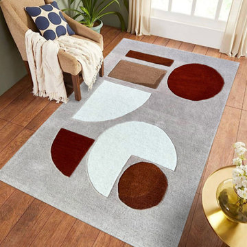
When it comes to defining a space, few elements are as transformative as a rug. Particularly in larger rooms, 9x12 rugs play a pivotal role in anchoring furniture, unifying aesthetics, and providing comfort underfoot. As home design continues to evolve, so do the styles, materials, and motifs that define contemporary rug choices. Whether you're redesigning a single room or curating an entire home, choosing the right 9x12 rug can dramatically influence the tone and function of your space. This blog explores the transition from classic to contemporary rug styles, highlighting current trends in design, texture, and sustainability. Read on to discover how 9x12 rugs are being used to redefine modern living environments in 2025.
Classic Rug Designs: Timeless Elegance and Historical Influence
Classic rugs have always been synonymous with tradition, craftsmanship, and sophistication. These pieces often draw inspiration from centuries-old techniques and cultural aesthetics, primarily seen in Persian, Oriental, and Turkish designs. A 9x12 classic rug is not merely a floor covering but a narrative woven through intricate patterns and deep, rich colors.
Traditional rug styles typically feature ornate borders, central medallions, and floral or geometric motifs. Colors like burgundy, deep navy, ivory, forest green, and gold dominate these designs, making them ideal for creating a warm, inviting atmosphere. The materials used often high-quality wool or silk add a luxurious texture and long-lasting durability. Hand-knotted techniques passed down through generations lend these rugs their intricate detail and resilience.
Today, classic rugs are being reimagined to fit modern sensibilities. Interior designers are pairing antique Persian rugs with contemporary furniture to create a unique, eclectic mix. For instance, a vintage 9x12 Rugs might lie beneath a minimalist glass coffee table and a sleek leather sectional, marrying old-world charm with modern clarity. In open-plan layouts, these rugs help delineate spaces and introduce visual interest. Their timeless beauty ensures that they remain relevant, even as design trends shift.
Moreover, the reintroduction of classic designs in modern colorways has allowed traditional rugs to appeal to a new generation. Muted tones, distressed finishes, and faded patterns give these rugs a more relaxed, lived-in feel that blends well with both rustic and urban interiors. For those seeking to infuse character and heritage into their living spaces, a classic 9x12 rug offers a versatile and enduring option.
Modern Minimalism: Embracing Simplicity and Subtlety in Large Rugs
As modern design trends continue to favor simplicity, functionality, and understated elegance, the demand for minimalist rugs has surged. The 9x12 rug format, given its expansive coverage, is particularly suited to minimalistic interiors where clean lines, neutral tones, and open spaces dominate the aesthetic.
Minimalist 9x12 rugs often utilize a restrained palette think beige, gray, ivory, taupe, and soft earth tones. These colors help maintain a calm, cohesive environment, especially in spaces where natural light plays a crucial role. Designs may be solid or include subtle patterns such as linear textures, tone-on-tone geometrics, or abstract gradients. The absence of elaborate ornamentation allows these rugs to blend seamlessly with contemporary furniture, making them a staple in Scandinavian, Japandi, and transitional interior styles.
Materials also play a crucial role in defining the minimalist look. Natural wool, bamboo silk, and viscose provide a soft, luxurious feel while maintaining a clean aesthetic. Flatweaves and low-pile constructions are popular choices, offering practicality alongside elegance.
 Neumann & Rudy Architecture
**I. Spatial Composition & Architectural Volume**
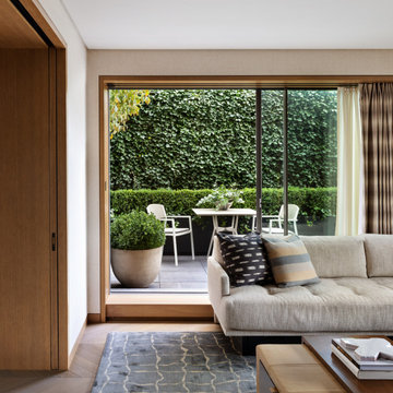
This interior operates on a strategy of framed extension, in which the room's perceived volume is borrowed from the garden beyond rather than asserted through internal grandeur. The composition is governed by a rigorous orthogonal discipline: a full-height sliding glazing system, set within a deep oak-lined reveal, functions as both aperture and proscenium, its slender mullions dividing the exterior into a triptych of vegetal planes. The generous depth of that reveal — expressed as a substantial threshold plinth and continuous jamb casing — reads less as trim than as tectonic gesture, giving weight and thickness to the enclosure and reinforcing the sense of a pavilion pressed against a green wall. To the left, a floor-to-ceiling pocketing door of book-matched, quarter-sawn oak establishes a monolithic vertical counterpoint, its recessed flush pull the only interruption of an otherwise uninflected plane; the shallow return of the wall beyond it creates a compressed entry sequence that releases into the primary volume. The flat, shadowless plaster ceiling maintains a neutral lid over the composition, while the furniture plan is deliberately low-slung and horizontal — a deep sectional set parallel to the glazing, a leather-topped ottoman, and a low occasional table — so that no element rises to compete with the sightline. Circulation is implied along the wall's edge, funnelling toward the terrace and its al fresco dining vignette, which acts as the room's terminal focal point and extends the interior axis outward.
**II. Materiality, Color & Texture**
The palette is a study in low-contrast tonal layering, calibrated within a narrow band of warm neutrals and animated almost entirely by the saturated chlorophyll green of the ivy screen. Rift-cut white oak, finished in a matte oil that reveals rather than glosses its medullary figure, provides the room's structural warmth — appearing in the joinery, the window surround, and the herringbone parquet, whose fine chevron rhythm introduces a subtle graphic pattern at foot level. Walls are treated in what appears to be a woven grasscloth or linen-effect wallcovering in a pale oatmeal tone, its faint horizontal striation catching raking light and lending textile softness to the perimeter. Against this, the seating is upholstered in a tightly woven, undyed linen-cotton blend with a biscuit-tufted seat platform, its slubbed irregularity a deliberate foil to the precision of the millwork. The cushion program provides the composition's only chromatic incident: an indigo-ground ikat or *kasuri* resist-dyed weave, with its blurred weft-broken banding, paired with a heavier blanket-stitched wool in glaucous blue-grey and buff stripes. Underfoot, a hand-knotted silk-and-wool rug in slate and mineral grey carries an attenuated ogee lattice, its lustrous pile providing cool relief beneath the warmer wood tones. The plinth-mounted travertine or reconstituted-stone planter — matte, porous, faintly chalky — and the honed grey stone paving beyond introduce lithic gravity, balancing the prevailing softness with a mineral edge.
**III. Lighting, Atmosphere & Style Profile**
Illumination here is almost entirely diurnal and indirect: north-oriented or hedge-filtered daylight arrives diffuse and green-cast, washing the space in a soft, even luminance that suppresses hard shadow and privileges texture over drama. The ivory sheer, hung on a discreet recessed track, tempers glare while retaining silhouette legibility, and the adjacent pinch-pleated overdrape in a taupe-bronze silk-blend — with its subtle vertical striation and slight sheen — offers the option of full blackout while contributing a note of drapery-weight formality. Artificial sources are conspicuously concealed; no decorative fixture interrupts the ceiling plane, implying a scheme of recessed low-glare downlights or perimeter cove washing designed to sustain the daytime ambience after dusk. The resulting atmosphere is one of composed reticence — quiet, tactile, and deeply oriented toward the garden. Stylistically, the project synthesises Japandi restraint (the pocketing timber plane, the shadow-gap detailing, the reverence for the framed view) with the material sensuality and drapery conventions of European Soft Modernism, yielding a warm minimalism in which luxury is communicated through joinery tolerance, textile hand, and the disciplined editing of the palette rather than through ornament or statement furniture. It is an interior conceived as a calm neutral ground — an armature for light, landscape, and the slow accretion of daily life.

 Absolute Stone Design
Colonial White, 3 cm natural granite
Price Level Medium
Country of origin: China
Overall white stone, with pearl sparkles and spots of cranberry

37