
Search results for "Poor decision making" in Home Design Ideas

 Interiors by Natasha
I was hired by the parents of a soon-to-be teenage girl turning 13 years-old. They wanted to remodel her bedroom from a young girls room to a teenage room. This project was a joy and a dream to work on! I got the opportunity to channel my inner child. I wanted to design a space that she would love to sleep in, entertain, hangout, do homework, and lounge in.
The first step was to interview her so that she would feel like she was a part of the process and the decision making. I asked her what was her favorite color, what was her favorite print, her favorite hobbies, if there was anything in her room she wanted to keep, and her style.
The second step was to go shopping with her and once that process started she was thrilled. One of the challenges for me was making sure I was able to give her everything she wanted. The other challenge was incorporating her favorite pattern-- zebra print. I decided to bring it into the room in small accent pieces where it was previously the dominant pattern throughout her room. The color palette went from light pink to her favorite color teal with pops of fuchsia. I wanted to make the ceiling a part of the design so I painted it a deep teal and added a beautiful teal glass and crystal chandelier to highlight it. Her room became a private oasis away from her parents where she could escape to. In the end we gave her everything she wanted.
Photography by Haigwood Studios


 Interiors by Natasha
I was hired by the parents of a soon-to-be teenage girl turning 13 years-old. They wanted to remodel her bedroom from a young girls room to a teenage room. This project was a joy and a dream to work on! I got the opportunity to channel my inner child. I wanted to design a space that she would love to sleep in, entertain, hangout, do homework, and lounge in.
The first step was to interview her so that she would feel like she was a part of the process and the decision making. I asked her what was her favorite color, what was her favorite print, her favorite hobbies, if there was anything in her room she wanted to keep, and her style.
The second step was to go shopping with her and once that process started she was thrilled. One of the challenges for me was making sure I was able to give her everything she wanted. The other challenge was incorporating her favorite pattern-- zebra print. I decided to bring it into the room in small accent pieces where it was previously the dominant pattern throughout her room. The color palette went from light pink to her favorite color teal with pops of fuchsia. I wanted to make the ceiling a part of the design so I painted it a deep teal and added a beautiful teal glass and crystal chandelier to highlight it. Her room became a private oasis away from her parents where she could escape to. In the end we gave her everything she wanted.
Photography by Haigwood Studios
Find the right local pro for your project

 Yunker Associates Architecture
Photo: Karen Melvin
Example of a cottage dressing room design in Minneapolis
Example of a cottage dressing room design in Minneapolis

 J & J Design Group, LLC.
John Woodcock Photography
Kids' bedroom - bedroom contemporary kids' bedroom idea in Phoenix with multicolored walls
Kids' bedroom - bedroom contemporary kids' bedroom idea in Phoenix with multicolored walls

 Carolyn Reyes
Photo: Carolyn Reyes Photography © 2017 Houzz
Design: franklinAve
Inspiration for a transitional living room remodel in Los Angeles
Inspiration for a transitional living room remodel in Los Angeles

 Interiors by Popov
This newly built custom residence turned out to be spectacular. With Interiors by Popov’s magic touch, it has become a real family home that is comfortable for the grownups, safe for the kids and friendly to the little dogs that now occupy this space.The start of construction was a bumpy road for the homeowners. After the house was framed, our clients found themselves paralyzed with the million and one decisions that had to be made. Decisions about plumbing, electrical, millwork, hardware and exterior left them drained and overwhelmed. The couple needed help. It was at this point that they were referred to us by a friend.We immediately went about systematizing the selection and design process, which allowed us to streamline decision making and stay ahead of construction.
We designed every detail in this house. And when I say every detail, I mean it. We designed lighting, plumbing, millwork, hard surfaces, exterior, kitchen, bathrooms, fireplace and so much more. After the construction-related items were addressed, we moved to furniture, rugs, lamps, art, accessories, bedding and so on.
The result of our systematic approach and design vision was a client head over heels in love with their new home. The positive feedback we received from this homeowner was immensely gratifying. They said the only thing that they regret was not hiring Interiors by Popov sooner!


 Boss Design Center
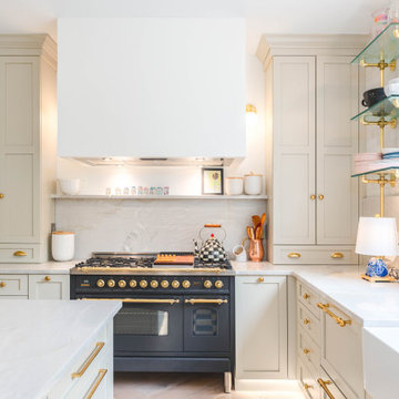
Welcome to our latest kitchen renovation project, where classic French elegance meets contemporary design in the heart of Great Falls, VA. In this transformation, we aim to create a stunning kitchen space that exudes sophistication and charm, capturing the essence of timeless French style with a modern twist.
Our design centers around a harmonious blend of light gray and off-white tones, setting a serene and inviting backdrop for this kitchen makeover. These neutral hues will work in harmony to create a calming ambiance and enhance the natural light, making the kitchen feel open and welcoming.
To infuse a sense of nature and add a striking focal point, we have carefully selected green cabinets. The rich green hue, reminiscent of lush gardens, brings a touch of the outdoors into the space, creating a unique and refreshing visual appeal. The cabinets will be thoughtfully placed to optimize both functionality and aesthetics.
Throughout the project, our focus is on creating a seamless integration of design elements to produce a cohesive and visually stunning kitchen. The cabinetry, hood, light fixture, and other details will be meticulously crafted using high-quality materials, ensuring longevity and a timeless appeal.
Countertop Material: Quartzite
Cabinet: Frameless Custom cabinet
Stove: Ilve 48"
Hood: Plaster field made
Lighting: Hudson Valley Lighting

 User
UserExample of a trendy white tile bathroom design in San Francisco with flat-panel cabinets and red cabinets


 Advance Design Studio, Ltd.
After six years of living in their Huntley IL home, Chris and Meghan were tired of their dark, dingy, outdated kitchen and it was finally time for a long-anticipated change. “The kitchen is the place where we live, it’s where we do everything,” Meghan said. “It was important that it be a space where we wanted to be.” Meghan loves cooking and enjoys including their girls in healthy meal prepping, this led them to want a brighter, more enjoyable kitchen with increased functionality and improved storage.
For Chris especially, the laundry room was an entirely dysfunctional eyesore. “We had a washer and a dryer, but it was all kind-of cobbled together!” Chris said. “There were always laundry piles everywhere, we weren’t really sure what we wanted to do in there, but it was time for us to make a change.” The mess of the space was stressful every time they walked in the door from the garage each day. Kids’ backpacks and shoes piled up haphazardly in the makeshift boot-bench closet left the family feeling disorganized and stressed. They needed space for folding clothes and locker cubbies to help keep the family organized.
Having known Christine and Todd in the Huntley community for years, Chris and Meghan were familiar with their work. “We already trusted them personally and having seen their projects for years we knew they did top notch work. After we reviewed the initial round of designs, we knew that hiring them was definitely the right choice,” Meghan and Chris said. Although Chris had done a lot of work in their home himself, the kitchen and laundry room renovation was such a large undertaking that he didn’t want to steal time away from his family to spend what would surely be many long weekends doing the job himself. “That would not have been a wise choice for us,” Chris laughed.
“Our designer, Michelle was very, very, easy to work with; anything we wanted to see or weren’t sure about, she went above and beyond to make this easy for us. She was easy to get hold of and always quick to respond,” the couple said. Michelle pulled ideas that mirrored the couple’s taste and style and was adept at directing the couple to limited choices that didn’t overwhelm them and kept the process moving. “I have a hard time making decisions. Michelle made the decision-making process so easy. I loved how she listened to what I liked and then presented three great options for me to choose from,” Meghan said.
The main objectives for the kitchen were better storage solutions, they wanted the space to reflect their lifestyle and taste, and they wanted it to last for years with low maintenance. One of the first steps in creating a more functional kitchen was relocating the refrigerator, creating an improved workflow for the busy family.
“We didn’t know that we could even move the refrigerator to a new location where it is now, that was something that we never would have thought of,” Chris said. “The new refrigerator location makes the kitchen feel so much bigger. We didn’t add any space, but our whole kitchen with the new design just seems like it’s so much larger than before!” Meghan said.
The perimeter mist colored cabinets helped warm and brighten the entire room, while the graphite colored cabinets on the island added contrast. Using this fresh, clean color palette satisfied the couple’s desire for a bright space that was the exact opposite of what they had before. Organization accessories were also added to the cabinets such as a spice drawer tray and roll outs to create hidden convenience.
“I absolutely love the hidden spices – it makes cooking so much more enjoyable!” Chris said. “And all the pull outs, and the double trash bin, who would think you could get so excited about organization!” the couple said in unison.
One thing they hated in their original kitchen was how dark the space felt. Added lighting on the ceiling with the new light fixtures combined with the lighter cabinetry colors throughout solved this problem. “Our new kitchen has this warm, almost cozy feeling that our old kitchen never had, it’s just a space that I love spending my time in now,” Meghan said. The light airy feeling was accentuated with the use of floating white shelves on either side of the decorative range hood. “We have so much cabinetry space, the new design is amazing we actually have more storage space than we will ever need,” Meghan said.
The island was extended to create more work surface and added space for stool seating. “The new island changes how we live. Now the kids can be in the kitchen with us, doing homework, eating breakfast, and the three of us have special dinners there when Chris is working late,” Meghan said.
The Carrara Marmi Quartz countertops were chosen because they are, not only beautiful, but are made from hard-working material that doesn’t require maintenance. The white subway tile backsplash that wraps to the ceiling behind the focal point cooktop range/hood compliments the crisp white countertops perfectly, while brushed brass hardware and light fixtures keep the design fresh and new.
The couple had a few fears at the beginning of the project, as most homeowners do. Their biggest fear was being out of their kitchen and laundry room for an extended time. The crew made it very easy for the family to work in a limited space keeping the washer and dryer hooked up the majority of the time, and also getting appliances working with minimal downtime.
“They above and beyond accommodated us to get us through the process,” Meghan said. “They did a great job making sure we were as comfortable as possible throughout the process,” Chris added.
“Our project manager DJ did a great job. He was very good at updating us on schedule changes, getting guys in as quickly as possible. Everyone that stepped in the house was nice and did great work,” said Chris. They thought Advance’s carpenter was phenomenal and were impressed when he took a conceptual idea from a photograph and worked with designer Michelle to create a one of a kind range/hood that has become the topic of conversation with friends and family who visit the new kitchen. “He was in our house literally every day for several weeks. He was easy to work with and good at what he did,” Meghan and Chris said.
The focal point of the kitchen; a hand-crafted, custom-built ventilation hood was clad with handpicked reclaimed barnwood. Advance Design’s carpenter built the framework and the cladding to create a one-of-a-kind design element that the couple loves.
“I think it was especially fun for him to create something unique from scratch, showcasing his talent in this area,” Meghan said. “I love that my kitchen is not like everyone else’s. I got to pick out the wood on my hood and watch it being built and was able to choose what pieces of wood went where on it. It’s totally unique.”
Red Oak flooring was toothed-in throughout the kitchen and the rest of the first floor anywhere changes were made. Then the whole floor was refinished to tone down the orange undertones in the existing floor stain, ultimately changing the color complexion of the entire first floor. The result is a completely new feeling to the entire home.
Renovating the laundry room was extremely important to Meghan and Chris, but they had trouble visualizing what the possibilities were for the seemingly small space. Michelle produced beautiful 3D illustrations that helped them envision the space in a whole new way.
“I must have told Michelle 100 times that I am a visual person, seeing the designs in 3D made it so easy to make decisions and see what we could really do with our space,” Meghan said.
A dividing wall and doorway were removed between the existing laundry room and hallway formerly containing a coat closet, providing space to design specialized graphite colored cabinetry matching the kitchen island to house custom storage cubbies for each family member. Adding the tall utility cabinetry in the new laundry area helped solve the storage issue, tucking away cleaning supplies, household items, and even the cat got its own cubby.
“I love how everything is now hidden in its own space. I can’t tell you how much I hated coming home and seeing everything sitting around on counters,” Chris said.
Electrical outlets were planned for the inside of utility cabinets, so devices could charge in hidden locations. Stacking the washer and dryer allowed for wider countertop space to provide a folding area and a special space for clothes to hang. “The way I do laundry has been completely transformed! I can actually fold clothes and hang them now right out of the washer and dryer,” Meghan said.
“The end result in the kitchen and the laundry/mud room was an updated light and bright space, with a smarter work flow that better meets the needs of this family,” Michelle said.
“I would totally recommend Advance Design,” Meghan said. “Sometimes I sit and just look at my kitchen and laundry room and think ‘Wow, I can’t believe I get to live here!’ It’s an understatement to say we love our new space.”

 Lindsey Markel
After building their first home this Bloomfield couple didn't have any immediate plans on building another until they saw this perfect property for sale. It didn't take them long to make the decision on purchasing it and moving forward with another building project. With the wife working from home it allowed them to become the general contractor for this project. It was a lot of work and a lot of decision making but they are absolutely in love with their new home. It is a dream come true for them and I am happy they chose me and Dillman & Upton to help them make it a reality.
Photo By: Kate Benjamin

 Cummings Architecture + Interiors
Looking at this home today, you would never know that the project began as a poorly maintained duplex. Luckily, the homeowners saw past the worn façade and engaged our team to uncover and update the Victorian gem that lay underneath. Taking special care to preserve the historical integrity of the 100-year-old floor plan, we returned the home back to its original glory as a grand, single family home.
The project included many renovations, both small and large, including the addition of a a wraparound porch to bring the façade closer to the street, a gable with custom scrollwork to accent the new front door, and a more substantial balustrade. Windows were added to bring in more light and some interior walls were removed to open up the public spaces to accommodate the family’s lifestyle.
You can read more about the transformation of this home in Old House Journal: http://www.cummingsarchitects.com/wp-content/uploads/2011/07/Old-House-Journal-Dec.-2009.pdf
Photo Credit: Eric Roth

Sponsored
Columbus, OH

Wannemacher Interiors
Customized Award-Winning Interior Design Solutions in Franklin Cnty OH

 Michael Nash Design, Build & Homes
This growing family of six was struggling with a dysfunctional kitchen design. The center island had been installed at an odd angle that limited accessibility and traffic flow. Additionally, storage space was limited by poor cabinet design. Finally, doorways in and out of the kitchen were narrow and poorly located, especially for children dashing in and out.
Other design challenges included how to better use a 10’ x 12’ room for children’s jackets and toys and how to add a professional-quality gas range in a neighborhood were natural gas wasn’t available. The new design would address all of these issues.
DESIGN SOLUTIONS
The new kitchen design revolves around a more proportional island. Carefully placed in the center of the new space with seating for four, it includes a prep sink, a second dishwasher and a beverage center.
The distressed ebony-stained island and hutch provides a brilliant contrast between the white color cabinetry. White Carrera marble countertops and backsplash top both island and perimeter cabinets.
Tall, double stacked cabinetry lines two walls to maximize storage space. Across the room there was an unused wall that now contains a 36” tower fridge and freezer, both covered with matching panels, and a tall cabinet that contains a microwave, steam unit and warming drawer.
A propane tank was buried in the back yard to provide gas to a new 60” professional range and cooktop. A custom-made wood mantel hood blends perfectly with the cabinet style.
The old laundry room was reconfigured to have lots of locker space for all kids and added cabinetry for storage. A double entry door separated the new mudroom from the rest of the back hall. In the back hall the back windows were replaced with a set of French door and added decking to create a direct access to deck and backyard.
The end result is an open floor plan, high-end appliances, great traffic flow and pleasing colors. The homeowner calls it the “kitchen of her dreams.”

 Liz Schupanitz Designs
A PLACE TO GATHER
Location: Eagan, MN, USA
This family of five wanted an inviting space to gather with family and friends. Mom, the primary cook, wanted a large island with more organized storage – everything in its place – and a crisp white kitchen with the character of an older home.
Challenges:
Design an island that could accommodate this family of five for casual weeknight dinners.
Create more usable storage within the existing kitchen footprint.
Design a better transition between the upper cabinets on the 8-foot sink wall and the adjoining 9-foot cooktop wall.
Make room for more counter space around the cooktop. It was poorly lit, cluttered with small appliances and confined by the tall oven cabinet.
Solutions:
A large island, that seats 5 comfortably, replaced the small island and kitchen table. This allowed for more storage including cookbook shelves, a heavy-duty roll out shelf for the mixer, a 2-bin recycling center and a bread drawer.
Tall pantries with decorative grilles were placed between the kitchen and family room. These created ample storage and helped define each room, making each one feel larger, yet more intimate.
A space intentionally separates the upper cabinets on the sink wall from those on the cooktop wall. This created symmetry on the sink wall and made room for an appliance garage, which keeps the countertops uncluttered.
Moving the double ovens to the former pantry location made way for more usable counter space around the cooktop and a dramatic focal point with the hood, cabinets and marble backsplash.
Special Features:
Custom designed corbels and island legs lend character.
Gilt open lanterns, antiqued nickel grilles on the pantries, and the soft linen shade at the kitchen sink add personality and charm.
The unique bronze hardware with a living finish creates the patina of an older home.
A walnut island countertop adds the warmth and feel of a kitchen table.
This homeowner truly understood the idea of living with the patina of marble. Her grandmother’s marble-topped antique table inspired the Carrara countertops.
The result is a highly organized kitchen with a light, open feel that invites you to stay a while.
Liz Schupanitz Designs
Photographed by: Andrea Rugg

Transitional galley eat-in kitchen photo in Orange County with an undermount sink, recessed-panel cabinets, white cabinets, white backsplash and an island

 Giffin & Crane General Contractors, Inc.
Master bathroom.
Huge trendy master porcelain tile freestanding bathtub photo in Santa Barbara with flat-panel cabinets, gray cabinets, gray walls, an integrated sink and quartz countertops
Huge trendy master porcelain tile freestanding bathtub photo in Santa Barbara with flat-panel cabinets, gray cabinets, gray walls, an integrated sink and quartz countertops

Sponsored
Columbus, OH

Hope Restoration & General Contracting
Columbus Design-Build, Kitchen & Bath Remodeling, Historic Renovations

 Francesca Owings Interior Design
Point West at Macatawa Park
J. Visser Design
Insignia Homes
Inspiration for a coastal mudroom remodel in Grand Rapids
Inspiration for a coastal mudroom remodel in Grand Rapids

 Four Brothers Design + Build
Example of a mid-sized transitional l-shaped porcelain tile utility room design in DC Metro with a white front door, shaker cabinets, medium tone wood cabinets and white walls

 indi interiors
A built-in home office features the classic Eames chairs with an open shelving unit.
Matthew Willams Photography
Victoria Kirk Interiors Co-Designer
Inspiration for a mid-sized transitional freestanding desk medium tone wood floor study room remodel in Auckland with white walls
Inspiration for a mid-sized transitional freestanding desk medium tone wood floor study room remodel in Auckland with white walls
1