
Search results for "Poor black" in Home Design Ideas
 TBS Construction Inc.
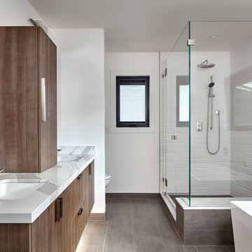
Working on this beautiful Los Altos residence has been a wonderful opportunity for our team. Located in an upscale neighborhood young owner’s of this house wanted to upgrade the whole house design which included major kitchen and master bathroom remodel.
The combination of a simple white cabinetry with the clean lined wood, contemporary countertops and glass tile create a perfect modern style which is what customers were looking for.
 Advance Design Studio, Ltd.
Laundry rooms and mudrooms can be a headache for many homeowners. They are usually cramped with poor functionality and little storage space. Joe and Kristin suffered all those aches and more, as their laundry room lacked clothing storage. Shoes were crammed in every corner. There was nowhere to fold clothes without taking them to the kitchen. They were ready for a complete laundry room remodel project.
Joe and Kristin interviewed several local remodeling companies but didn’t connect with anyone who could understand their vision. During the summer, when they were attending their son’s race venue, they noticed fellow kart racers Todd and Christine Jurs’ sponsor banner for their remodeling company, Advance Design Studio. Immediately they were thrilled that they knew someone they trusted who could handle the renovation.
“We wanted someone that we actually knew, who has a little bit more invested than an outside person that we don’t have any ties to,” Kristin said.
Project Designer Nicole Ryan came to their home in Warrenville for the initial consultation. Kristin, an avid HGTV viewer, brought her ideas to Nicole. Throughout the design process, they worked together designing the space, selecting materials, and choosing colors. Nicole made sure to incorporate Kristin’s must-haves into the finished laundry room remodel.
“It was really easy. Nicole made the transition very easy,” Kristin said of Nicole’s work in the design phase of the project. With the materials selected and the drawings finalized, it was time to begin construction. Kristin and Joe were impressed with how quickly and cleanly this phase went.
“Everyone that came in was very respectful, very neat, and that was a big part for me because I didn’t want dust going through the rest of my house,” Kristin said.
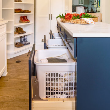
The new combination mudroom/laundry room is everything Kristin and Joe hoped. There is plenty of storage, three pull-out laundry hampers for presorting laundry, a large central island for folding clothes, a designated bar to hang dry, and even a unique rotating shoe rack to keep shoes from cluttering the space.
“My rotating shoe rack,” Kristin said when asked what her favorite part of her new laundry room was. “We have four kids. We have a lot of shoes and sporting events. So it makes sense to have all that space for shoes.”
The center island has an exceptional feature as well. It has wheels. Kristin wanted to be able to move the island out of the way for different functions in the room. An island with wheels can be placed wherever needed in the space.
The two existing closets were reconfigured with built-in closet storage systems to make them more functional than before with shelves for baskets holding gloves and hats, umbrellas, and coats.
“They love it,” Project Designer Nicole Ryan said. “They had a vision of how they wanted the space to function but didn’t know exactly how to get it there. My design took all their needs and used the most efficient products to get them the desired outcome. Tons of function, while still looking beautiful!”
The “White” Hudson Panel Dura Supreme cabinetry on the perimeter brightens the space and contrasts the popular blue “Gale Force” Dura Supreme cabinetry of the rolling island. The black and white encaustic design porcelain tile backsplash adds visual interest to the room above the white quartz countertops. Additionally, an oil-rubbed bronze bar for hanging clothes is conveniently located above the washer/dryer, and a stainless-steel under-mount sink with a matching Kohler faucet offers perfect functionality.
“I would definitely recommend Advance Design; they’ve been wonderful. They were so helpful. Any little changes we had, they were able to accommodate,” Kristin said.
 J Design Group - Interior Designers Miami - Modern
AVENTURA MAGAZINE selected our client’s luxury 5000 Sf ocean front apartment in Miami Beach, to publish it in their issue and they Said:
Story by Linda Marx, Photography by Daniel Newcomb
Light & Bright
New York snowbirds redesigned their Miami Beach apartment to take advantage of the tropical lifestyle.
WHEN INTERIOR DESIGNER JENNIFER CORREDOR was asked to recreate a four-bedroom, six-bath condominium at The Bath Club in Miami Beach, she seized the opportunity to open the rooms and better utilize the vast ocean views.
In five months last year, the designer transformed a dark and closed 5,000-square-foot unit located on a high floor into a series of sweeping waterfront spaces and updated the well located apartment into a light and airy retreat for a sports-loving family of five.
“They come down from New York every other weekend and wanted to make their waterfront home a series of grand open spaces,” says Corrredor, of the J. Design Group in Coral Gables, a firm specializing in modern and contemporary interiors. “Since many of the rooms face the ocean, it made sense to open and lighten up the home, taking advantage of the awesome views of the sea and the bay.”
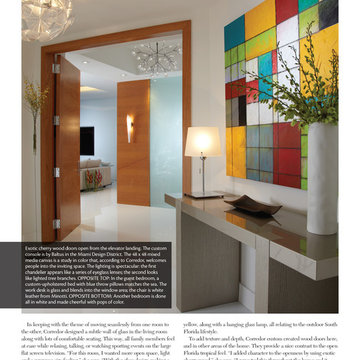
The designer used 40 x 40 all white tile throughout the apartment as a clean base. This way, her sophisticated use of color would stand out and bring the outdoors in.
The close-knit family members—two parents and three boys in college—like to do things together. But there were situations to overcome in the process of modernizing and opening the space. When Corredor was briefed on their desires, nothing seemed too daunting. The confident designer was ready to delve in. For example, she fixed an area at the front door
that was curved. “The wood was concave so I straightened it out,” she explains of a request from the clients. “It was an obstacle that I overcame as part of what I do in a redesign. I don’t consider it a difficult challenge. Improving what I see is part of the process.”
She also tackled the kitchen with gusto by demolishing a wall. The kitchen had formerly been enclosed, which was a waste of space and poor use of available waterfront ambience. To create a grand space linking the kitchen to the living room and dining room area, something had to go. Once the wall was yesterday’s news, she relocated the refrigerator and freezer (two separate appliances) to the other side of the room. This change was a natural functionality in the new open space. “By tearing out the wall, the family has a better view of the kitchen from the living and dining rooms,” says Corredor, who also made it easier to walk in and out of one area and into the other. “The views of the larger public space and the surrounding water are breathtaking.
Opening it up changed everything.”
They clients can now see the kitchen from the living and dining areas, and at the same time, dwell in an airy and open space instead of feeling stuck in a dark enclosed series of rooms. In fact, the high-top bar stools that Corredor selected for the kitchen can be twirled around to use for watching TV in the living room.
In keeping with the theme of moving seamlessly from one room to the other, Corredor designed a subtle wall of glass in the living room along with lots of comfortable seating. This way, all family members feel at ease while relaxing, talking, or watching sporting events on the large flat screen television. “For this room, I wanted more open space, light and a supreme airy feeling,” she says. “With the glass design making a statement, it quickly became the star of the show.”…….
….. To add texture and depth, Corredor custom created wood doors here, and in other areas of the home. They provide a nice contrast to the open Florida tropical feel. “I added character to the openness by using exotic cherry wood,” she says. “I repeated this throughout the home and it works well.”
Known for capturing the client’s vision while adding her own innovative twists, Corredor lightened the family room, giving it a contemporary and modern edge with colorful art and matching throw pillows on the sofas. She added a large beige leather ottoman as the center coffee table in the room. This round piece was punctuated with a bold-toned flowering plant atop. It effortlessly matches the pillows and colors of the contemporary canvas.
Miami,
Miami Interior Designers,
Miami Interior Designer,
Interior Designers Miami,
Interior Designer Miami,
Modern Interior Designers,
Modern Interior Designer,
Modern interior decorators,
Modern interior decorator,
Contemporary Interior Designers,
Contemporary Interior Designer,
Interior design decorators,
Interior design decorator,
Interior Decoration and Design,
Black Interior Designers,
Black Interior Designer,
Interior designer,
Interior designers,
Interior design decorators,
Interior design decorator,
Home interior designers,
Home interior designer,
Interior design companies,
Interior decorators,
Interior decorator,
Decorators,
Decorator,
Miami Decorators,
Miami Decorator,
Decorators Miami,
Decorator Miami,
Interior Design Firm,
Interior Design Firms,
Interior Designer Firm,
Interior Designer Firms,
Interior design,
Interior designs,
Home decorators,
Miami Beach
Interior decorating Miami,
Best Interior Designers,
Interior design decorator,
Find the right local pro for your project
 Twelve Stones Designs, LLC
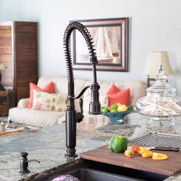
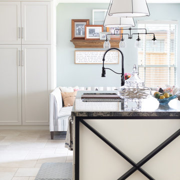
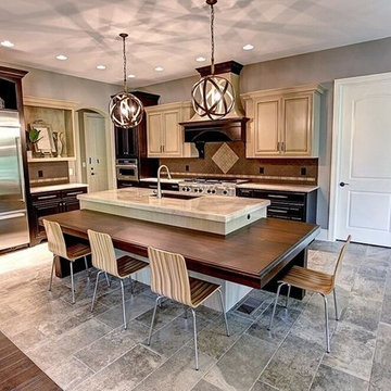
The owners of this kitchen had spent the money to upgrade the finishes in their kitchen upon building the home 12 years ago, but after living in the space for several years they realized how nonfunctional the layout really was. The (then) two preschool aged children had grown into busy, hungry teenagers with many friends who also liked to hang out at the house. So the family needed a more functional kitchen with better traffic flow, space for daily activities revolving around the kitchen at different times of day, and a kitchen that could accommodate cooking for and serving large groups. Furthermore, the dark, traditional finishes no longer reflected the homeowners’ style. They requested a brighter, more relaxed, coastal style that reflected their love of the seaside cities they like to visit.
Originally, the kitchen was U-shaped with a narrow island in the middle. The island created narrow aisles that bottle-necked at the dishwasher, refrigerator, and cooktop areas. There was a pass-through from the foyer into the kitchen, but the owners never liked that the pass-through was also located so close to the powder room. The awkward proximity was unappealing and made guests feel uncomfortable.
The kitchen’s storage was made up of lots of narrow cabinets, apothecary drawers, clipped corner units, and very few drawers. It lacked useful storage for the larger items the family used on a daily basis. And the kitchen’s only pantry was small closet that had only builder-grade, narrow shelving with no illumination to be able to see the contents inside.
Overall, the kitchen’s lighting plan was poorly executed. Only six recessed cans illuminated the entire kitchen and nook areas. The under cabinet lighting was not evenly distributed either. In fact, the builder had mis-placed the under cabinet lighting around the decorative pilasters which made for choppy, dark cubbies. Further, the builder didn’t include any lighting over the sink or the bar area, which meant whoever was doing the dishes was always in their own shadow. That, coupled with the steep overhang of the game room above made the bar area feel like a dim, cavernous space that wasn’t inviting or task oriented. The kitchen looked out into the main living space, but the raised bar and a narrow wall (which held the only large cabinet in the kitchen) created more of a barrier than a relationship to the living room or breakfast nook. In fact, one couldn’t even see the breakfast nook from the cooktop or sink areas due to its orientation. The raised bar top was too narrow to comfortably sit to either dine at or chat from due to the lack of knee space. The the homeowners confided that the kitchen felt more like a dark, dirty prison than place where the family, or their guests, wanted to gather and commune.
The clients' needs and desires were:
➢ to create a kitchen that would be a space the family loved to be in; to relate to the adjacent spaces all around, and to have better flow for entertaining large groups
➢ to remove the walls between the breakfast nook and living area and to be able to utilize the natural light from the windows in both those areas
➢ to incorporate a functional chopping block for prepping fresh food for home cooked meals, an island with a large sink and drain board, 2 pull out trash cans, and seating for at least the 2 teens to eat or do homework
➢ to design a kitchen and breakfast nook with an airy, coastal, relaxed vibe that blended with the rest of the house's coastal theme
➢ to integrate a layered lighting plan which would include ample general illumination, specific task lighting, decorative lighting, and lots of illuminated storage
➢ to design a kitchen with not only more storage for all the husband’s kitchen gadgets and collection of oils and spices, but smart storage, including a coffee/breakfast bar and a place to store and conceal the toaster oven and microwave
➢ to find a way to utilize the large open space between the kitchen, pantry area, and breakfast nook
Twelve Stones Designs achieved the owner's goals by:
➢ removing the walls between the kitchen and living room to allow the natural light to filter in from the adjacent rooms and to create a connection between the kitchen, nook, and living spaces for a sense of unity and communion
➢ removing the existing pantry and designing 3 large pantry style cabinets with LED tape lights and rollout drawers to house lots of kitchen appliances, gadgets, and tons of groceries. We also took the cabinets all the way up to the 9’ ceiling for additional storage for seasonal items and bulk storage.
➢ designing 2 islands - 1 with a gorgeous black walnut chopping block that houses a drawer for chopping and carving knives and a custom double pull out trash unit for point of use utilization - and 1 that houses the dishwasher, a large Blanco Gourmet sink with integrated drain board, woven baskets for fresh root vegetables and kitchen towels, plenty of drawer storage for kitchen items, and bar seating for up to 4 diners.
➢ closing off the space between the kitchen and the powder room to create a beautiful new private alcove for the powder room as well as adding some decorative storage. This also gave us space to include more tall storage near the new range for precision placement of the husband’s extensive oil and spice collection as well as a location for a combo-steam oven the wife wanted for baking and cooking healthy meals.
The project is enhanced functionally by:
➢ incorporated USB and standard receptacles for the kids’ laptops and phone charging in the large island
➢ designing the small island to include additional open shelving for items used on a daily basis such as a variety of bowls, plates, and colanders. This set up also works well for the husband who prefers to “plate” his dinners in restaurant-style fashion before presenting them to the table.
➢ the integration of specific storage units, such as double stacked cutlery drawers, a custom spice pull-out, a Kuerig coffee and tea pod drawer, and custom double stacked utensil drawers
➢ moving the refrigerator to the old oven location - this eliminated the bottle neck as well as created a better relationship to the eating table. It also utilizes the floor space between the pantry, nook, and kitchen
➢ creating a banquet style breakfast nook - this banquette seating not only doubles the amount of seating for large gatherings but it better utilizes the odd space between the kitchen and the previous nook area. It also helps to create a distinct pathway from the mudroom room through the pantry area, kitchen, nook, and living room.
➢ the coffee/breakfast bar area which includes the perfect location for the concealed microwave and toaster oven, convenient storage for the coffee pods and tea accoutrements. Roll-out drawers below also house the smoothie maker, hot water kettle, and a plethora of smoothie-making ingredients such as protein powders, smoothie additives, etc. Furthermore, the drawers below the Keurig house measuring utensil, cutlery, baking supplies and tupperware storage.
➢ incorporating lots of wide drawers and pullouts to accommodate large cookware.
➢ utilizing as much vertical space as possible by building storage to the ceiling which accommodates the family’s abundant amount of serving platters, baking sheets, bakeware, casserole dishes, and additional cutting boards.
The project is enhanced aesthetically by:
➢ new 5-piece Versailles pattern porcelain tile that now seamlessly joins the entire down stairs area together creating a bright, cohesiveness feeling instead of choppy separated spaces - it also adds a coastal feeling
➢ designing a cabinet to conceal the microwave and toaster oven
➢ the coastal influenced light fixtures over the nook table and island
➢ the sandy colors of the Langdon Cambria countertops. The swirling pattern and sparkling quartz pieces remind the homeowner of black-and-tan sandy beaches
➢ the striped banquet seating whose creamy white background and blue-green stripes were the inspiration for the cabinet and wall colors.
➢ All the interior doors were painted black to coordinate with the blacks and grays in the backsplash tile and countertop. This also adds a hint of tailored formality to an otherwise casual space.
➢ the use of WAC's Oculux small aperture LED units for the overhead lighting complimented with Diode LED strips for task lighting under the cabinets and inside the pantry and glass wall cabinets. All of the lighting applications are on separate dimmer switches.
Innovative uses of materials or construction methods by Realty Restoration LLC:
➢ Each 1-1/2” x 3” block of reclaimed end-grain black walnut that makes up the center island chopping block was hand milled and built in the shop. It was designed to look substantial and proportional to the surrounding elements, executed by creating the 4 inch tall top with a solid wood chamfered edge band.
➢ The metal doors on either side of the vent hood were also custom designed for this project and built in the Realty Restoration LLC shop. They are made 1x2, 11-gauge mild steel with ribbed glass. Weighing 60 lbs a piece, heavy duty cabinet hinges were added to support the weight of the door and keep them from sagging.
➢ Under-cabinet receptacles were added along the range wall in order to have a clean, uninterrupted backsplash.
Design obstacles to overcome:
➢ Because we were removing the demising walls between the kitchen and living room, we had to find a way to plumb and vent the new island. We did this by tunneling through the slab (the slab had post tension cables which prevented us from just trenching) to run a new wet vent through a nearby structural wall. We pulled the existing hot and cold lines between upper floor joists and ran them down the structural wall as well and up through a conduit in the tunnel.
➢ Since we were converting from wall overs to a gas range it allowed us to utilize the 220 feed for the wall ovens to provide a new sub panel for all the new kitchen circuits
➢ Due to framing deficiencies inherited from the original build there was a 1-1/2” differential in the floor-to-ceiling height over a 20 foot span; by utilizing the process of cutting and furring coupled with the crown moulding details on the cabinet elevations we were able to mask the problem and provide seamless transitions between the cabinet components.
Evidence of superior craftsmanship:
➢ uniquely designed, one-of-a-kind metal “X” end panels on the large island. The end panels were custom made in the Realty Restoration LLC shop and fitted to the exact dimensions of the island. The welding seams are completely indistinguishable - the posts look like they are cut from a single sheet of metal
➢ square metal posts on the small island were also custom made and designed to compliment and carry through the metal element s throughout the kitchen
➢ the beautiful, oversized end panels on the pantry cabinets which give the breakfast nook a tailored look
➢ integrating a large format 5 piece Versailles tile pattern to seamlessly flow from the existing spaces into the new kitchen space
➢ By constructing a custom cabinet that jogged around a corner we could not remodel (housing the entry way coat closet) we were able to camouflage the adjacent wall offset within the upper and lower cabinets. By designing around the existing jog in the structural walls we accomplished a few things: we were able to find the space to house, and hide, the microwave and toaster oven yet still have a clean cohesive appearance from the kitchen side. Additionally, the owners were able to keep their much needed coat closet and we didn’t have to increase the budget with unnecessary structural work.
 Twelve Stones Designs, LLC
The owners of this kitchen had spent the money to upgrade the finishes in their kitchen upon building the home 12 years ago, but after living in the space for several years they realized how nonfunctional the layout really was. The (then) two preschool aged children had grown into busy, hungry teenagers with many friends who also liked to hang out at the house. So the family needed a more functional kitchen with better traffic flow, space for daily activities revolving around the kitchen at different times of day, and a kitchen that could accommodate cooking for and serving large groups. Furthermore, the dark, traditional finishes no longer reflected the homeowners’ style. They requested a brighter, more relaxed, coastal style that reflected their love of the seaside cities they like to visit.
Originally, the kitchen was U-shaped with a narrow island in the middle. The island created narrow aisles that bottle-necked at the dishwasher, refrigerator, and cooktop areas. There was a pass-through from the foyer into the kitchen, but the owners never liked that the pass-through was also located so close to the powder room. The awkward proximity was unappealing and made guests feel uncomfortable.
The kitchen’s storage was made up of lots of narrow cabinets, apothecary drawers, clipped corner units, and very few drawers. It lacked useful storage for the larger items the family used on a daily basis. And the kitchen’s only pantry was small closet that had only builder-grade, narrow shelving with no illumination to be able to see the contents inside.
Overall, the kitchen’s lighting plan was poorly executed. Only six recessed cans illuminated the entire kitchen and nook areas. The under cabinet lighting was not evenly distributed either. In fact, the builder had mis-placed the under cabinet lighting around the decorative pilasters which made for choppy, dark cubbies. Further, the builder didn’t include any lighting over the sink or the bar area, which meant whoever was doing the dishes was always in their own shadow. That, coupled with the steep overhang of the game room above made the bar area feel like a dim, cavernous space that wasn’t inviting or task oriented. The kitchen looked out into the main living space, but the raised bar and a narrow wall (which held the only large cabinet in the kitchen) created more of a barrier than a relationship to the living room or breakfast nook. In fact, one couldn’t even see the breakfast nook from the cooktop or sink areas due to its orientation. The raised bar top was too narrow to comfortably sit to either dine at or chat from due to the lack of knee space. The the homeowners confided that the kitchen felt more like a dark, dirty prison than place where the family, or their guests, wanted to gather and commune.
The clients' needs and desires were:
➢ to create a kitchen that would be a space the family loved to be in; to relate to the adjacent spaces all around, and to have better flow for entertaining large groups
➢ to remove the walls between the breakfast nook and living area and to be able to utilize the natural light from the windows in both those areas
➢ to incorporate a functional chopping block for prepping fresh food for home cooked meals, an island with a large sink and drain board, 2 pull out trash cans, and seating for at least the 2 teens to eat or do homework
➢ to design a kitchen and breakfast nook with an airy, coastal, relaxed vibe that blended with the rest of the house's coastal theme
➢ to integrate a layered lighting plan which would include ample general illumination, specific task lighting, decorative lighting, and lots of illuminated storage
➢ to design a kitchen with not only more storage for all the husband’s kitchen gadgets and collection of oils and spices, but smart storage, including a coffee/breakfast bar and a place to store and conceal the toaster oven and microwave
➢ to find a way to utilize the large open space between the kitchen, pantry area, and breakfast nook
Twelve Stones Designs achieved the owner's goals by:
➢ removing the walls between the kitchen and living room to allow the natural light to filter in from the adjacent rooms and to create a connection between the kitchen, nook, and living spaces for a sense of unity and communion
➢ removing the existing pantry and designing 3 large pantry style cabinets with LED tape lights and rollout drawers to house lots of kitchen appliances, gadgets, and tons of groceries. We also took the cabinets all the way up to the 9’ ceiling for additional storage for seasonal items and bulk storage.
➢ designing 2 islands - 1 with a gorgeous black walnut chopping block that houses a drawer for chopping and carving knives and a custom double pull out trash unit for point of use utilization - and 1 that houses the dishwasher, a large Blanco Gourmet sink with integrated drain board, woven baskets for fresh root vegetables and kitchen towels, plenty of drawer storage for kitchen items, and bar seating for up to 4 diners.
➢ closing off the space between the kitchen and the powder room to create a beautiful new private alcove for the powder room as well as adding some decorative storage. This also gave us space to include more tall storage near the new range for precision placement of the husband’s extensive oil and spice collection as well as a location for a combo-steam oven the wife wanted for baking and cooking healthy meals.
The project is enhanced functionally by:
➢ incorporated USB and standard receptacles for the kids’ laptops and phone charging in the large island
➢ designing the small island to include additional open shelving for items used on a daily basis such as a variety of bowls, plates, and colanders. This set up also works well for the husband who prefers to “plate” his dinners in restaurant-style fashion before presenting them to the table.
➢ the integration of specific storage units, such as double stacked cutlery drawers, a custom spice pull-out, a Kuerig coffee and tea pod drawer, and custom double stacked utensil drawers
➢ moving the refrigerator to the old oven location - this eliminated the bottle neck as well as created a better relationship to the eating table. It also utilizes the floor space between the pantry, nook, and kitchen
➢ creating a banquet style breakfast nook - this banquette seating not only doubles the amount of seating for large gatherings but it better utilizes the odd space between the kitchen and the previous nook area. It also helps to create a distinct pathway from the mudroom room through the pantry area, kitchen, nook, and living room.
➢ the coffee/breakfast bar area which includes the perfect location for the concealed microwave and toaster oven, convenient storage for the coffee pods and tea accoutrements. Roll-out drawers below also house the smoothie maker, hot water kettle, and a plethora of smoothie-making ingredients such as protein powders, smoothie additives, etc. Furthermore, the drawers below the Keurig house measuring utensil, cutlery, baking supplies and tupperware storage.
➢ incorporating lots of wide drawers and pullouts to accommodate large cookware.
➢ utilizing as much vertical space as possible by building storage to the ceiling which accommodates the family’s abundant amount of serving platters, baking sheets, bakeware, casserole dishes, and additional cutting boards.
The project is enhanced aesthetically by:
➢ new 5-piece Versailles pattern porcelain tile that now seamlessly joins the entire down stairs area together creating a bright, cohesiveness feeling instead of choppy separated spaces - it also adds a coastal feeling
➢ designing a cabinet to conceal the microwave and toaster oven
➢ the coastal influenced light fixtures over the nook table and island
➢ the sandy colors of the Langdon Cambria countertops. The swirling pattern and sparkling quartz pieces remind the homeowner of black-and-tan sandy beaches
➢ the striped banquet seating whose creamy white background and blue-green stripes were the inspiration for the cabinet and wall colors.
➢ All the interior doors were painted black to coordinate with the blacks and grays in the backsplash tile and countertop. This also adds a hint of tailored formality to an otherwise casual space.
➢ the use of WAC's Oculux small aperture LED units for the overhead lighting complimented with Diode LED strips for task lighting under the cabinets and inside the pantry and glass wall cabinets. All of the lighting applications are on separate dimmer switches.
Innovative uses of materials or construction methods by Realty Restoration LLC:
➢ Each 1-1/2” x 3” block of reclaimed end-grain black walnut that makes up the center island chopping block was hand milled and built in the shop. It was designed to look substantial and proportional to the surrounding elements, executed by creating the 4 inch tall top with a solid wood chamfered edge band.
➢ The metal doors on either side of the vent hood were also custom designed for this project and built in the Realty Restoration LLC shop. They are made 1x2, 11-gauge mild steel with ribbed glass. Weighing 60 lbs a piece, heavy duty cabinet hinges were added to support the weight of the door and keep them from sagging.
➢ Under-cabinet receptacles were added along the range wall in order to have a clean, uninterrupted backsplash.
Design obstacles to overcome:
➢ Because we were removing the demising walls between the kitchen and living room, we had to find a way to plumb and vent the new island. We did this by tunneling through the slab (the slab had post tension cables which prevented us from just trenching) to run a new wet vent through a nearby structural wall. We pulled the existing hot and cold lines between upper floor joists and ran them down the structural wall as well and up through a conduit in the tunnel.
➢ Since we were converting from wall overs to a gas range it allowed us to utilize the 220 feed for the wall ovens to provide a new sub panel for all the new kitchen circuits
➢ Due to framing deficiencies inherited from the original build there was a 1-1/2” differential in the floor-to-ceiling height over a 20 foot span; by utilizing the process of cutting and furring coupled with the crown moulding details on the cabinet elevations we were able to mask the problem and provide seamless transitions between the cabinet components.
Evidence of superior craftsmanship:
➢ uniquely designed, one-of-a-kind metal “X” end panels on the large island. The end panels were custom made in the Realty Restoration LLC shop and fitted to the exact dimensions of the island. The welding seams are completely indistinguishable - the posts look like they are cut from a single sheet of metal
➢ square metal posts on the small island were also custom made and designed to compliment and carry through the metal element s throughout the kitchen
➢ the beautiful, oversized end panels on the pantry cabinets which give the breakfast nook a tailored look
➢ integrating a large format 5 piece Versailles tile pattern to seamlessly flow from the existing spaces into the new kitchen space
➢ By constructing a custom cabinet that jogged around a corner we could not remodel (housing the entry way coat closet) we were able to camouflage the adjacent wall offset within the upper and lower cabinets. By designing around the existing jog in the structural walls we accomplished a few things: we were able to find the space to house, and hide, the microwave and toaster oven yet still have a clean cohesive appearance from the kitchen side. Additionally, the owners were able to keep their much needed coat closet and we didn’t have to increase the budget with unnecessary structural work.
 Sosna Inc
The family's once-loved home had become a source of frustration. Their kitchen, a space meant for gathering and creating, felt cramped and outdated. Limited storage and poor organization made meal prep a tedious task, and entertaining guests a logistical nightmare. The laundry room, often overlooked, was equally problematic. Its cramped layout and lack of storage made laundry day a chore, and the noise of the washing machine echoed through the living room.
To compound the issue, the absence of dedicated office spaces made working from home a constant struggle. One makeshift office was squeezed into the dining room, while another was relegated to the basement.
The family was hesitant to embark on a major renovation, fearing the challenges and uncertainties that come with such a project. Finding a reliable contractor, ensuring timely completion, and worrying about potential shoddy workmanship were all valid concerns.
We understood their anxieties and were committed to providing a smooth and stress-free experience. Our team crafted a design that addressed each of their concerns, transforming their home into a functional and stylish space.
We reimagined the laundry room, creating a custom storage solution and incorporating a stackable washer and dryer. The open hallway to the living room was enclosed, creating a spacious closet with ample storage. The laundry room now seamlessly connected to the kitchen, simplifying the grocery unloading process.
A former juliette balcony was converted into a dedicated office space, providing a peaceful and productive work-from-home environment.
The dated and cluttered ensuite bathroom received a luxurious makeover. A clever pull-out storage system in the shower wall and a spacious niche provided much-needed organization.
While every renovation project has its challenges, this one was remarkably smooth. The only significant hurdle was some additional structural work required in the basement to support the new office space. Our experienced team handled this efficiently, minimizing any disruption.
The final result is a home that truly reflects the family's personality and lifestyle. The laundry room, now a cheerful and organized space with soft green cabinets, patterned floor tiles, and gold accents, showcases our attention to detail.
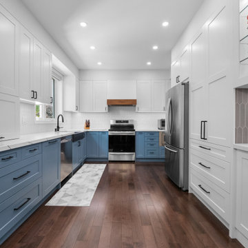
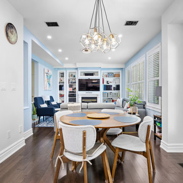
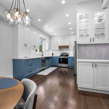
The kitchen is a stunning centerpiece, featuring a striking combination of blue and white cabinets, dark hardwood floors, and a sleek white backsplash. The adjacent beverage bar, with its glass-fronted upper cabinets, provides an elegant space for entertaining.
The ensuite bathroom is a spa-like retreat, with large-format marble tiles, a black vanity, and chrome fixtures creating an atmosphere of understated luxury.
The renovation has had a profound impact on the family's daily life. Ample storage throughout the house has banished clutter, making it easier to maintain a tidy home. The seamless flow from the laundry room to the kitchen has streamlined the grocery unloading process, and the dedicated office spaces have transformed the work-from-home experience.
Beyond the physical transformation, it was the shared moments and laughter that made this project truly special. The family's enthusiasm and good humor were contagious. One of the clients, with his big personality, even starred in a walk-through video of the finished project, showcasing his infectious joy.
From choosing tiles to navigating unexpected challenges, the entire process was filled with warmth and collaboration. Even their four-year-old son, initially shy, warmed up to our site leader, Gus, nicknaming him "Gus the Bus," a moniker that endeared him to the entire team.
 Milgard Windows & Doors
The Kiguchi family moved into their Austin, Texas home in 1994. Built in the 1980’s as part of a neighborhood development, they happily raised their family here but longed for something more contemporary. Once they became empty nesters, they decided it was time for a major remodel. After spending many years visiting Austin AIA Home Tours that highlight contemporary residential architecture, they had a lot of ideas and in 2013 were ready to interview architects and get their renovation underway.
The project turned into a major remodel due to an unstable foundation. Architects Ben Arbib and Ed Hughey, of Arbib Hughey Design were hired to solve the structural issue and look for inspiration in the bones of the house, which sat on top of a hillside and was surrounded by great views.
Unfortunately, with the old floor plan, the beautiful views were hidden by small windows that were poorly placed. In order to bring more natural light into the house the window sizes and configurations had to be addressed, all while keeping in mind the homeowners desire for a modern look and feel.
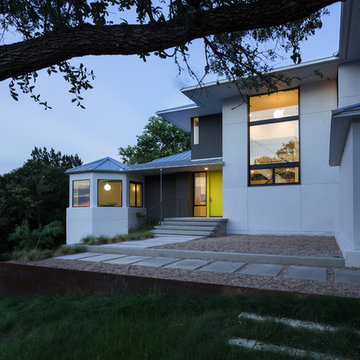
To achieve a more contemporary and sophisticated front of house, a new entry was designed that included removing a two-story bay window and porch. The entrance of the home also became more integrated with the landscape creating a template for new foliage to be planted. Older exterior materials were updated to incorporate a more muted palette of colors with a metal roof, dark grey siding in the back and white stucco in the front. Deep eaves were added over many of the new large windows for clean lines and sun protection.
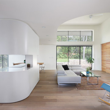
“Inside it was about opening up the floor plan, expanding the views throughout the house, and updating the material palette to get a modern look that was also warm and inviting,” said Ben from Arbib Hughey Design. “Prior to the remodel, the house had the typical separation of rooms. We removed the walls between them and changed all of the windows to Milgard Thermally Improved Aluminum to connect the inside with the outside. No matter where you are you get nice views and natural light.”
The architects wanted to create some drama, which they accomplished with the window placement and opening up the interior floor plan to an open concept approach. Cabinetry was used to help delineate intimate spaces. To add warmth to an all-white living room, white-washed oak wood floors were installed and pine planks were used around the fireplace. The large windows served as artwork bringing the color of nature into the space.
An octagon shaped, elevated dining room, (named “the turret”), had a big impact on the design of the house. They architects rounded the corners and added larger window openings overlooking a new sunken garden. The great room was also softened by rounding out the corners and that circular theme continued throughout the house, being picked up in skylight wells and kitchen cabinetry. A staircase leading to a catwalk was added and the result was a two-story window wall that flooded the home with natural light.
When asked why Milgard® Thermally Improved Aluminum windows were selected, the architectural team listed many reasons:
1) Aesthetics: “We liked the slim profiles and narrow sightlines. The window frames never get in the way of the view and that was important to us. They also have a very contemporary look that went well with our design.”
2) Options: “We liked that we could get large sliding doors that matched the windows, giving us a very cohesive look and feel throughout the project.”
3) Cost Effective: “Milgard windows are affordable. You get a good product at a good price.”
4) Custom Sizes: “Milgard windows are customizable, which allowed us to get the right window for each location.”
Ready to take on your own traditional to modern home remodeling project? Arbib Hughey Design advises, “Work with a good architect. That means picking a team that is creative, communicative, listens well and is responsive. We think it’s important for an architect to listen to their clients and give them something they want, not something the architect thinks they should have. At the same time you want an architect who is willing and able to think outside the box and offer up design options that you may not have considered. Design is about a lot of back and forth, trying out ideas, getting feedback and trying again.”
The home was completely transformed into a unique, contemporary house perfectly integrated with its site. Internally the home has a natural flow for the occupants and externally it is integrated with the surroundings taking advantage of great natural light. As a side note, it was highly praised as part of the Austin AIA homes tour.
Sponsored
Plain City, OH

Kuhns Contracting, Inc.
Central Ohio's Trusted Home Remodeler Specializing in Kitchens & Baths
 Thompson Remodeling
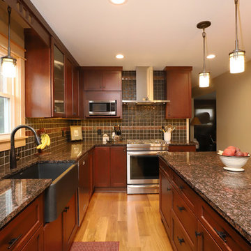
Our clients had lovingly cared for their home for 16 years. In this small home, space was at a premium and the couple wanted to update this poorly functioning kitchen to match the rest of their Arts & Crafts style home.
Key requirements of this kitchen remodel design included:
- Improved lighting
- Better traffic pattern
- More storage
- Incorporating the Pewabic tile the clients loved
IMPROVED LIGHTING
A new lighting plan for the kitchen included:
- Three pendants over the new island
- Pendant lighting over the sink
- Recessed lights throughout
- Under cabinet lighting
BETTER TRAFFIC PATTERN
The refrigerator was moved from the main walkway to a perimeter wall. Its new location creates one point in the now smaller working triangle.
Prep space was previously scarce and the new island allows two to work in the kitchen without one getting trapped in the corner.
MORE STORAGE
A new island supplies storage that was non-existent before and it creates a place for people to sit and connect.
Although we replaced a slider with a door, we added a pantry cabinet which was also new storage the kitchen did not previously have.
Bulkheads were removed allowing cabinets to extend to the ceiling.
INCORPORATING PEWABIC TILE
Pewabic tile is handcrafted stoneware clay tile that is made in Detroit with a history dating back to 1903. Our clients fell in love with this tile years ago and used it on the landing of their staircase and wanted to incorporate it into the kitchen design.
We decided to let this gorgeous tile take center stage by creating an eye-catching backsplash. The flooring also incorporates details that connect back to the Pewabic tiles used on the walls.
OVERALL RESULTS
The remodeled kitchen has improved the feel of the whole first floor. A clear pathway runs from the living room through the kitchen and from the kitchen into the dining room. A new island supplies much-needed storage and provides a place for people to eat casual meals and hang out. The new lighting plan brightened not only the kitchen, but also the adjacent rooms. Now, with the kitchen completed, the whole house has a cohesive Arts & Crafts aesthetic – Mission Accomplished!
“The kitchen design is everything we hoped it would be. It’s a reflection of our tastes – it’s us. Our designer really understood what we liked and how to make the kitchen fit with the look of the rest of the house.”
“What do we love? Lighting, lighting, lighting! The Pewabic backsplash! The storage additions. The overall look – it’s new, but it looks & feels like it could have been original to the house.”
– Homeowner
 Sosna Inc
The family's once-loved home had become a source of frustration. Their kitchen, a space meant for gathering and creating, felt cramped and outdated. Limited storage and poor organization made meal prep a tedious task, and entertaining guests a logistical nightmare. The laundry room, often overlooked, was equally problematic. Its cramped layout and lack of storage made laundry day a chore, and the noise of the washing machine echoed through the living room.
To compound the issue, the absence of dedicated office spaces made working from home a constant struggle. One makeshift office was squeezed into the dining room, while another was relegated to the basement.
The family was hesitant to embark on a major renovation, fearing the challenges and uncertainties that come with such a project. Finding a reliable contractor, ensuring timely completion, and worrying about potential shoddy workmanship were all valid concerns.
We understood their anxieties and were committed to providing a smooth and stress-free experience. Our team crafted a design that addressed each of their concerns, transforming their home into a functional and stylish space.
We reimagined the laundry room, creating a custom storage solution and incorporating a stackable washer and dryer. The open hallway to the living room was enclosed, creating a spacious closet with ample storage. The laundry room now seamlessly connected to the kitchen, simplifying the grocery unloading process.
A former juliette balcony was converted into a dedicated office space, providing a peaceful and productive work-from-home environment.
The dated and cluttered ensuite bathroom received a luxurious makeover. A clever pull-out storage system in the shower wall and a spacious niche provided much-needed organization.
While every renovation project has its challenges, this one was remarkably smooth. The only significant hurdle was some additional structural work required in the basement to support the new office space. Our experienced team handled this efficiently, minimizing any disruption.
The final result is a home that truly reflects the family's personality and lifestyle. The laundry room, now a cheerful and organized space with soft green cabinets, patterned floor tiles, and gold accents, showcases our attention to detail.
The kitchen is a stunning centerpiece, featuring a striking combination of blue and white cabinets, dark hardwood floors, and a sleek white backsplash. The adjacent beverage bar, with its glass-fronted upper cabinets, provides an elegant space for entertaining.
The ensuite bathroom is a spa-like retreat, with large-format marble tiles, a black vanity, and chrome fixtures creating an atmosphere of understated luxury.
The renovation has had a profound impact on the family's daily life. Ample storage throughout the house has banished clutter, making it easier to maintain a tidy home. The seamless flow from the laundry room to the kitchen has streamlined the grocery unloading process, and the dedicated office spaces have transformed the work-from-home experience.
Beyond the physical transformation, it was the shared moments and laughter that made this project truly special. The family's enthusiasm and good humor were contagious. One of the clients, with his big personality, even starred in a walk-through video of the finished project, showcasing his infectious joy.
From choosing tiles to navigating unexpected challenges, the entire process was filled with warmth and collaboration. Even their four-year-old son, initially shy, warmed up to our site leader, Gus, nicknaming him "Gus the Bus," a moniker that endeared him to the entire team.
 Cochrane Floors & More
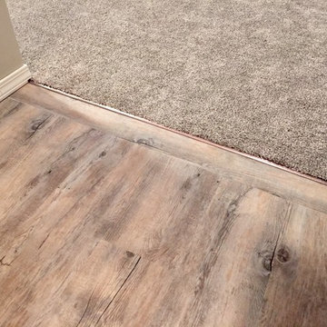
This renovation was completed with the primary goal of removed the carpet in the stairs which was not only difficult to clean but constantly looking worn in this very busy household. Ideally they wanted a durable, low maintenance flooring solution that still added character and coziness. The solution: Luxury vinyl planks! The unique and discreet metal nosings we used respect the clean lines and richness of this amazing plank in a non-commercial way. NOTE: While not all vinyl planks are created equal - the good ones are worth paying a little extra for!
 Sosna Inc
The family's once-loved home had become a source of frustration. Their kitchen, a space meant for gathering and creating, felt cramped and outdated. Limited storage and poor organization made meal prep a tedious task, and entertaining guests a logistical nightmare. The laundry room, often overlooked, was equally problematic. Its cramped layout and lack of storage made laundry day a chore, and the noise of the washing machine echoed through the living room.
To compound the issue, the absence of dedicated office spaces made working from home a constant struggle. One makeshift office was squeezed into the dining room, while another was relegated to the basement.
The family was hesitant to embark on a major renovation, fearing the challenges and uncertainties that come with such a project. Finding a reliable contractor, ensuring timely completion, and worrying about potential shoddy workmanship were all valid concerns.
We understood their anxieties and were committed to providing a smooth and stress-free experience. Our team crafted a design that addressed each of their concerns, transforming their home into a functional and stylish space.
We reimagined the laundry room, creating a custom storage solution and incorporating a stackable washer and dryer. The open hallway to the living room was enclosed, creating a spacious closet with ample storage. The laundry room now seamlessly connected to the kitchen, simplifying the grocery unloading process.
A former juliette balcony was converted into a dedicated office space, providing a peaceful and productive work-from-home environment.
The dated and cluttered ensuite bathroom received a luxurious makeover. A clever pull-out storage system in the shower wall and a spacious niche provided much-needed organization.
While every renovation project has its challenges, this one was remarkably smooth. The only significant hurdle was some additional structural work required in the basement to support the new office space. Our experienced team handled this efficiently, minimizing any disruption.
The final result is a home that truly reflects the family's personality and lifestyle. The laundry room, now a cheerful and organized space with soft green cabinets, patterned floor tiles, and gold accents, showcases our attention to detail.
The kitchen is a stunning centerpiece, featuring a striking combination of blue and white cabinets, dark hardwood floors, and a sleek white backsplash. The adjacent beverage bar, with its glass-fronted upper cabinets, provides an elegant space for entertaining.
The ensuite bathroom is a spa-like retreat, with large-format marble tiles, a black vanity, and chrome fixtures creating an atmosphere of understated luxury.
The renovation has had a profound impact on the family's daily life. Ample storage throughout the house has banished clutter, making it easier to maintain a tidy home. The seamless flow from the laundry room to the kitchen has streamlined the grocery unloading process, and the dedicated office spaces have transformed the work-from-home experience.
Beyond the physical transformation, it was the shared moments and laughter that made this project truly special. The family's enthusiasm and good humor were contagious. One of the clients, with his big personality, even starred in a walk-through video of the finished project, showcasing his infectious joy.
From choosing tiles to navigating unexpected challenges, the entire process was filled with warmth and collaboration. Even their four-year-old son, initially shy, warmed up to our site leader, Gus, nicknaming him "Gus the Bus," a moniker that endeared him to the entire team.
 Milgard Windows & Doors
The Kiguchi family moved into their Austin, Texas home in 1994. Built in the 1980’s as part of a neighborhood development, they happily raised their family here but longed for something more contemporary. Once they became empty nesters, they decided it was time for a major remodel. After spending many years visiting Austin AIA Home Tours that highlight contemporary residential architecture, they had a lot of ideas and in 2013 were ready to interview architects and get their renovation underway.
The project turned into a major remodel due to an unstable foundation. Architects Ben Arbib and Ed Hughey, of Arbib Hughey Design were hired to solve the structural issue and look for inspiration in the bones of the house, which sat on top of a hillside and was surrounded by great views.
Unfortunately, with the old floor plan, the beautiful views were hidden by small windows that were poorly placed. In order to bring more natural light into the house the window sizes and configurations had to be addressed, all while keeping in mind the homeowners desire for a modern look and feel.
To achieve a more contemporary and sophisticated front of house, a new entry was designed that included removing a two-story bay window and porch. The entrance of the home also became more integrated with the landscape creating a template for new foliage to be planted. Older exterior materials were updated to incorporate a more muted palette of colors with a metal roof, dark grey siding in the back and white stucco in the front. Deep eaves were added over many of the new large windows for clean lines and sun protection.
“Inside it was about opening up the floor plan, expanding the views throughout the house, and updating the material palette to get a modern look that was also warm and inviting,” said Ben from Arbib Hughey Design. “Prior to the remodel, the house had the typical separation of rooms. We removed the walls between them and changed all of the windows to Milgard Thermally Improved Aluminum to connect the inside with the outside. No matter where you are you get nice views and natural light.”
The architects wanted to create some drama, which they accomplished with the window placement and opening up the interior floor plan to an open concept approach. Cabinetry was used to help delineate intimate spaces. To add warmth to an all-white living room, white-washed oak wood floors were installed and pine planks were used around the fireplace. The large windows served as artwork bringing the color of nature into the space.
An octagon shaped, elevated dining room, (named “the turret”), had a big impact on the design of the house. They architects rounded the corners and added larger window openings overlooking a new sunken garden. The great room was also softened by rounding out the corners and that circular theme continued throughout the house, being picked up in skylight wells and kitchen cabinetry. A staircase leading to a catwalk was added and the result was a two-story window wall that flooded the home with natural light.
When asked why Milgard® Thermally Improved Aluminum windows were selected, the architectural team listed many reasons:
1) Aesthetics: “We liked the slim profiles and narrow sightlines. The window frames never get in the way of the view and that was important to us. They also have a very contemporary look that went well with our design.”
2) Options: “We liked that we could get large sliding doors that matched the windows, giving us a very cohesive look and feel throughout the project.”
3) Cost Effective: “Milgard windows are affordable. You get a good product at a good price.”
4) Custom Sizes: “Milgard windows are customizable, which allowed us to get the right window for each location.”
Ready to take on your own traditional to modern home remodeling project? Arbib Hughey Design advises, “Work with a good architect. That means picking a team that is creative, communicative, listens well and is responsive. We think it’s important for an architect to listen to their clients and give them something they want, not something the architect thinks they should have. At the same time you want an architect who is willing and able to think outside the box and offer up design options that you may not have considered. Design is about a lot of back and forth, trying out ideas, getting feedback and trying again.”
The home was completely transformed into a unique, contemporary house perfectly integrated with its site. Internally the home has a natural flow for the occupants and externally it is integrated with the surroundings taking advantage of great natural light. As a side note, it was highly praised as part of the Austin AIA homes tour.
 Sosna Inc
The family's once-loved home had become a source of frustration. Their kitchen, a space meant for gathering and creating, felt cramped and outdated. Limited storage and poor organization made meal prep a tedious task, and entertaining guests a logistical nightmare. The laundry room, often overlooked, was equally problematic. Its cramped layout and lack of storage made laundry day a chore, and the noise of the washing machine echoed through the living room.
To compound the issue, the absence of dedicated office spaces made working from home a constant struggle. One makeshift office was squeezed into the dining room, while another was relegated to the basement.
The family was hesitant to embark on a major renovation, fearing the challenges and uncertainties that come with such a project. Finding a reliable contractor, ensuring timely completion, and worrying about potential shoddy workmanship were all valid concerns.
We understood their anxieties and were committed to providing a smooth and stress-free experience. Our team crafted a design that addressed each of their concerns, transforming their home into a functional and stylish space.
We reimagined the laundry room, creating a custom storage solution and incorporating a stackable washer and dryer. The open hallway to the living room was enclosed, creating a spacious closet with ample storage. The laundry room now seamlessly connected to the kitchen, simplifying the grocery unloading process.
A former juliette balcony was converted into a dedicated office space, providing a peaceful and productive work-from-home environment.
The dated and cluttered ensuite bathroom received a luxurious makeover. A clever pull-out storage system in the shower wall and a spacious niche provided much-needed organization.
While every renovation project has its challenges, this one was remarkably smooth. The only significant hurdle was some additional structural work required in the basement to support the new office space. Our experienced team handled this efficiently, minimizing any disruption.
The final result is a home that truly reflects the family's personality and lifestyle. The laundry room, now a cheerful and organized space with soft green cabinets, patterned floor tiles, and gold accents, showcases our attention to detail.
The kitchen is a stunning centerpiece, featuring a striking combination of blue and white cabinets, dark hardwood floors, and a sleek white backsplash. The adjacent beverage bar, with its glass-fronted upper cabinets, provides an elegant space for entertaining.
The ensuite bathroom is a spa-like retreat, with large-format marble tiles, a black vanity, and chrome fixtures creating an atmosphere of understated luxury.
The renovation has had a profound impact on the family's daily life. Ample storage throughout the house has banished clutter, making it easier to maintain a tidy home. The seamless flow from the laundry room to the kitchen has streamlined the grocery unloading process, and the dedicated office spaces have transformed the work-from-home experience.
Beyond the physical transformation, it was the shared moments and laughter that made this project truly special. The family's enthusiasm and good humor were contagious. One of the clients, with his big personality, even starred in a walk-through video of the finished project, showcasing his infectious joy.
From choosing tiles to navigating unexpected challenges, the entire process was filled with warmth and collaboration. Even their four-year-old son, initially shy, warmed up to our site leader, Gus, nicknaming him "Gus the Bus," a moniker that endeared him to the entire team.
Sponsored
Fredericksburg, OH

High Point Cabinets
Columbus' Experienced Custom Cabinet Builder | 4x Best of Houzz Winner
 Ferriss - Architectural Renderings
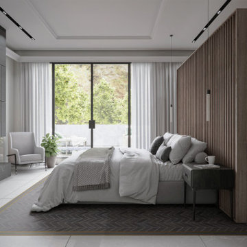
7 mistakes in bedroom design and ways to avoid them.
ERROR # 1 - Incorrect bed size.
This is a problem with any furniture in principle. When, according to the plan and ergonomic calculations, it becomes size to size, but in fact, it looks cumbersome, visually overflowing the space or, on the contrary, turns out to be too small and looks awkward.
How to avoid: Always be guided by the proportions of the size of the furniture in the room. Try to choose as big a bed as possible, but stay realistic. The main thing is that the width of the passageways in the bedroom should not be less than 70cm, and for comfortable movement, it is better to do everything 100cm.
ERROR # 2 - Poor lighting and switches.
Even in a small bedroom, you need multiple light sources. A single chandelier in the center of the ceiling is not enough, because it creates the effect of darkening the corners, and the room seems uncomfortable.
How to avoid: Hang a sconce over your headboard. Don't forget to light up the space next to the mirror and wardrobe. And be sure to place switches close to the bed so that you don't have to go to the other end of the room after an evening with a book in bed.
Do not forget about a sufficient number of outlets, this should be done even at the planning stage.
ERROR # 3 - Few storage locations
The fewer well-thought-out cabinets and shelving, the more things are visible. And the clutter spoils even the most stylish and expensive interior.
How to avoid: In addition to bedside tables, a chest of drawers (for storing small things) and a built-in wardrobe can be placed in a small bedroom: unlike a usual one, it takes up space from floor to ceiling, thereby accommodating more items. In addition, the built-in structure looks more solid and often merges with the walls, making the setting complete.
ERROR # 4 - Carpet of the wrong size.
The carpet in the bedroom is a great addition, and sometimes the final touch of the whole composition. But often people choose the wrong size or do not use it at all.
How to avoid: Choosing the right size can be guided by the unspoken rule, according to which the carpet should be 1 meter larger than the bed, both lengthwise and across. If the room is large, then it is recommended that the indentation of the carpet from the wall is 45-50 cm, if it is small, then 20-30 cm can be dispensed with.
ERROR # 5 Typical design.
If you buy a typical bed, bedside tables, and wardrobe from one manufacturer, then the interior will turn out to be formulaic and impersonal. No accessories and color schemes will help him.
How to avoid: The interior should reflect the character of its owner, and the person living in it will feel comfortable. Explore different collections of furniture and try to assemble a capsule in the same color scheme, but at the same time different in texture and shape.
ERROR # 6 Empty walls.
Even if the bedroom is a room for relaxation, it would be a mistake to make a space out of it that is intended solely for sleeping. Ascetic furnishings, unadorned walls, boring furniture, and bed linen - all this does not improve the mood at all, but, on the contrary, creates a gloomy mood.
How to avoid: The walls in the bedroom are a blank slate that you can transform into something original, beautiful, and unique to your liking. Even if you just paint one of the walls in a contrasting color, and decorate the other with several photos from the Internet, printed and inserted into frames, you can transform the atmosphere of the room as a whole.
ERROR # 7 Too dark interior.
One should not be deceived by the beauty of the thick dark tones of interior paint. It has long been known that dark blue, burgundy, blueberry, chocolate, and black for the bedroom should not be used in large quantities, since such an environment will have a tangible effect and interfere with a vigorous awakening in the morning.
How to avoid: If you like a rich range, try choosing derived shades a few tones lighter, for example, instead of black or graphite, choose gray-brown, dove-gray for the walls, and blue can be replaced with cornflower blue or azure.
Don't forget to combine dark tones with lots of whites, creams, complementing shimmery accessories, and vibrant décor.
https://www.ferriss.co/
#ferriss #We_bring_objects_to_life #3drendering #architecture #San_Francisco
 Sosna Inc
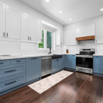
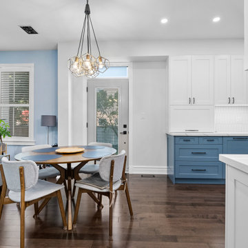
The family's once-loved home had become a source of frustration. Their kitchen, a space meant for gathering and creating, felt cramped and outdated. Limited storage and poor organization made meal prep a tedious task, and entertaining guests a logistical nightmare. The laundry room, often overlooked, was equally problematic. Its cramped layout and lack of storage made laundry day a chore, and the noise of the washing machine echoed through the living room.
To compound the issue, the absence of dedicated office spaces made working from home a constant struggle. One makeshift office was squeezed into the dining room, while another was relegated to the basement.
The family was hesitant to embark on a major renovation, fearing the challenges and uncertainties that come with such a project. Finding a reliable contractor, ensuring timely completion, and worrying about potential shoddy workmanship were all valid concerns.
We understood their anxieties and were committed to providing a smooth and stress-free experience. Our team crafted a design that addressed each of their concerns, transforming their home into a functional and stylish space.
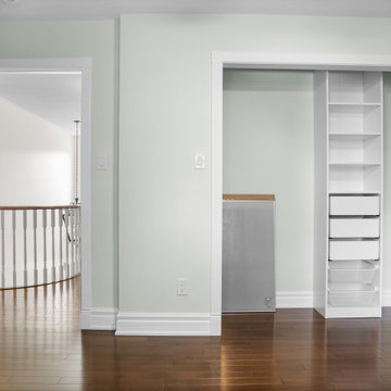
We reimagined the laundry room, creating a custom storage solution and incorporating a stackable washer and dryer. The open hallway to the living room was enclosed, creating a spacious closet with ample storage. The laundry room now seamlessly connected to the kitchen, simplifying the grocery unloading process.
A former juliette balcony was converted into a dedicated office space, providing a peaceful and productive work-from-home environment.
The dated and cluttered ensuite bathroom received a luxurious makeover. A clever pull-out storage system in the shower wall and a spacious niche provided much-needed organization.
While every renovation project has its challenges, this one was remarkably smooth. The only significant hurdle was some additional structural work required in the basement to support the new office space. Our experienced team handled this efficiently, minimizing any disruption.
The final result is a home that truly reflects the family's personality and lifestyle. The laundry room, now a cheerful and organized space with soft green cabinets, patterned floor tiles, and gold accents, showcases our attention to detail.
The kitchen is a stunning centerpiece, featuring a striking combination of blue and white cabinets, dark hardwood floors, and a sleek white backsplash. The adjacent beverage bar, with its glass-fronted upper cabinets, provides an elegant space for entertaining.
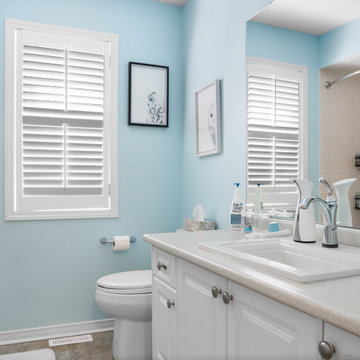
The ensuite bathroom is a spa-like retreat, with large-format marble tiles, a black vanity, and chrome fixtures creating an atmosphere of understated luxury.
The renovation has had a profound impact on the family's daily life. Ample storage throughout the house has banished clutter, making it easier to maintain a tidy home. The seamless flow from the laundry room to the kitchen has streamlined the grocery unloading process, and the dedicated office spaces have transformed the work-from-home experience.
Beyond the physical transformation, it was the shared moments and laughter that made this project truly special. The family's enthusiasm and good humor were contagious. One of the clients, with his big personality, even starred in a walk-through video of the finished project, showcasing his infectious joy.
From choosing tiles to navigating unexpected challenges, the entire process was filled with warmth and collaboration. Even their four-year-old son, initially shy, warmed up to our site leader, Gus, nicknaming him "Gus the Bus," a moniker that endeared him to the entire team.
 Sosna Inc
The family's once-loved home had become a source of frustration. Their kitchen, a space meant for gathering and creating, felt cramped and outdated. Limited storage and poor organization made meal prep a tedious task, and entertaining guests a logistical nightmare. The laundry room, often overlooked, was equally problematic. Its cramped layout and lack of storage made laundry day a chore, and the noise of the washing machine echoed through the living room.
To compound the issue, the absence of dedicated office spaces made working from home a constant struggle. One makeshift office was squeezed into the dining room, while another was relegated to the basement.
The family was hesitant to embark on a major renovation, fearing the challenges and uncertainties that come with such a project. Finding a reliable contractor, ensuring timely completion, and worrying about potential shoddy workmanship were all valid concerns.
We understood their anxieties and were committed to providing a smooth and stress-free experience. Our team crafted a design that addressed each of their concerns, transforming their home into a functional and stylish space.
We reimagined the laundry room, creating a custom storage solution and incorporating a stackable washer and dryer. The open hallway to the living room was enclosed, creating a spacious closet with ample storage. The laundry room now seamlessly connected to the kitchen, simplifying the grocery unloading process.
A former juliette balcony was converted into a dedicated office space, providing a peaceful and productive work-from-home environment.
The dated and cluttered ensuite bathroom received a luxurious makeover. A clever pull-out storage system in the shower wall and a spacious niche provided much-needed organization.
While every renovation project has its challenges, this one was remarkably smooth. The only significant hurdle was some additional structural work required in the basement to support the new office space. Our experienced team handled this efficiently, minimizing any disruption.
The final result is a home that truly reflects the family's personality and lifestyle. The laundry room, now a cheerful and organized space with soft green cabinets, patterned floor tiles, and gold accents, showcases our attention to detail.
The kitchen is a stunning centerpiece, featuring a striking combination of blue and white cabinets, dark hardwood floors, and a sleek white backsplash. The adjacent beverage bar, with its glass-fronted upper cabinets, provides an elegant space for entertaining.
The ensuite bathroom is a spa-like retreat, with large-format marble tiles, a black vanity, and chrome fixtures creating an atmosphere of understated luxury.
The renovation has had a profound impact on the family's daily life. Ample storage throughout the house has banished clutter, making it easier to maintain a tidy home. The seamless flow from the laundry room to the kitchen has streamlined the grocery unloading process, and the dedicated office spaces have transformed the work-from-home experience.
Beyond the physical transformation, it was the shared moments and laughter that made this project truly special. The family's enthusiasm and good humor were contagious. One of the clients, with his big personality, even starred in a walk-through video of the finished project, showcasing his infectious joy.
From choosing tiles to navigating unexpected challenges, the entire process was filled with warmth and collaboration. Even their four-year-old son, initially shy, warmed up to our site leader, Gus, nicknaming him "Gus the Bus," a moniker that endeared him to the entire team.
 Sosna Inc
The family's once-loved home had become a source of frustration. Their kitchen, a space meant for gathering and creating, felt cramped and outdated. Limited storage and poor organization made meal prep a tedious task, and entertaining guests a logistical nightmare. The laundry room, often overlooked, was equally problematic. Its cramped layout and lack of storage made laundry day a chore, and the noise of the washing machine echoed through the living room.
To compound the issue, the absence of dedicated office spaces made working from home a constant struggle. One makeshift office was squeezed into the dining room, while another was relegated to the basement.
The family was hesitant to embark on a major renovation, fearing the challenges and uncertainties that come with such a project. Finding a reliable contractor, ensuring timely completion, and worrying about potential shoddy workmanship were all valid concerns.
We understood their anxieties and were committed to providing a smooth and stress-free experience. Our team crafted a design that addressed each of their concerns, transforming their home into a functional and stylish space.
We reimagined the laundry room, creating a custom storage solution and incorporating a stackable washer and dryer. The open hallway to the living room was enclosed, creating a spacious closet with ample storage. The laundry room now seamlessly connected to the kitchen, simplifying the grocery unloading process.
A former juliette balcony was converted into a dedicated office space, providing a peaceful and productive work-from-home environment.
The dated and cluttered ensuite bathroom received a luxurious makeover. A clever pull-out storage system in the shower wall and a spacious niche provided much-needed organization.
While every renovation project has its challenges, this one was remarkably smooth. The only significant hurdle was some additional structural work required in the basement to support the new office space. Our experienced team handled this efficiently, minimizing any disruption.
The final result is a home that truly reflects the family's personality and lifestyle. The laundry room, now a cheerful and organized space with soft green cabinets, patterned floor tiles, and gold accents, showcases our attention to detail.
The kitchen is a stunning centerpiece, featuring a striking combination of blue and white cabinets, dark hardwood floors, and a sleek white backsplash. The adjacent beverage bar, with its glass-fronted upper cabinets, provides an elegant space for entertaining.
The ensuite bathroom is a spa-like retreat, with large-format marble tiles, a black vanity, and chrome fixtures creating an atmosphere of understated luxury.
The renovation has had a profound impact on the family's daily life. Ample storage throughout the house has banished clutter, making it easier to maintain a tidy home. The seamless flow from the laundry room to the kitchen has streamlined the grocery unloading process, and the dedicated office spaces have transformed the work-from-home experience.
Beyond the physical transformation, it was the shared moments and laughter that made this project truly special. The family's enthusiasm and good humor were contagious. One of the clients, with his big personality, even starred in a walk-through video of the finished project, showcasing his infectious joy.
From choosing tiles to navigating unexpected challenges, the entire process was filled with warmth and collaboration. Even their four-year-old son, initially shy, warmed up to our site leader, Gus, nicknaming him "Gus the Bus," a moniker that endeared him to the entire team.


 Sosna Inc
The family's once-loved home had become a source of frustration. Their kitchen, a space meant for gathering and creating, felt cramped and outdated. Limited storage and poor organization made meal prep a tedious task, and entertaining guests a logistical nightmare. The laundry room, often overlooked, was equally problematic. Its cramped layout and lack of storage made laundry day a chore, and the noise of the washing machine echoed through the living room.
To compound the issue, the absence of dedicated office spaces made working from home a constant struggle. One makeshift office was squeezed into the dining room, while another was relegated to the basement.
The family was hesitant to embark on a major renovation, fearing the challenges and uncertainties that come with such a project. Finding a reliable contractor, ensuring timely completion, and worrying about potential shoddy workmanship were all valid concerns.
We understood their anxieties and were committed to providing a smooth and stress-free experience. Our team crafted a design that addressed each of their concerns, transforming their home into a functional and stylish space.
We reimagined the laundry room, creating a custom storage solution and incorporating a stackable washer and dryer. The open hallway to the living room was enclosed, creating a spacious closet with ample storage. The laundry room now seamlessly connected to the kitchen, simplifying the grocery unloading process.
A former juliette balcony was converted into a dedicated office space, providing a peaceful and productive work-from-home environment.
The dated and cluttered ensuite bathroom received a luxurious makeover. A clever pull-out storage system in the shower wall and a spacious niche provided much-needed organization.
While every renovation project has its challenges, this one was remarkably smooth. The only significant hurdle was some additional structural work required in the basement to support the new office space. Our experienced team handled this efficiently, minimizing any disruption.
The final result is a home that truly reflects the family's personality and lifestyle. The laundry room, now a cheerful and organized space with soft green cabinets, patterned floor tiles, and gold accents, showcases our attention to detail.
The kitchen is a stunning centerpiece, featuring a striking combination of blue and white cabinets, dark hardwood floors, and a sleek white backsplash. The adjacent beverage bar, with its glass-fronted upper cabinets, provides an elegant space for entertaining.
The ensuite bathroom is a spa-like retreat, with large-format marble tiles, a black vanity, and chrome fixtures creating an atmosphere of understated luxury.
The renovation has had a profound impact on the family's daily life. Ample storage throughout the house has banished clutter, making it easier to maintain a tidy home. The seamless flow from the laundry room to the kitchen has streamlined the grocery unloading process, and the dedicated office spaces have transformed the work-from-home experience.
Beyond the physical transformation, it was the shared moments and laughter that made this project truly special. The family's enthusiasm and good humor were contagious. One of the clients, with his big personality, even starred in a walk-through video of the finished project, showcasing his infectious joy.
From choosing tiles to navigating unexpected challenges, the entire process was filled with warmth and collaboration. Even their four-year-old son, initially shy, warmed up to our site leader, Gus, nicknaming him "Gus the Bus," a moniker that endeared him to the entire team.
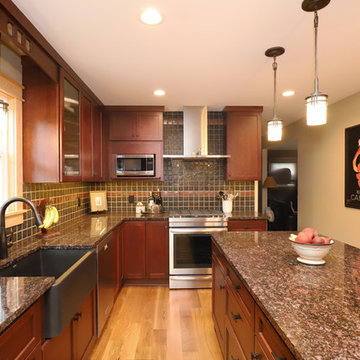 Thompson Remodeling
Our clients had lovingly cared for their home for 16 years. In this small home, space was at a premium and the couple wanted to update this poorly functioning kitchen to match the rest of their Arts & Crafts style home.
Key requirements of this kitchen remodel design included:
- Improved lighting
- Better traffic pattern
- More storage
- Incorporating the Pewabic tile the clients loved
IMPROVED LIGHTING
A new lighting plan for the kitchen included:
- Three pendants over the new island
- Pendant lighting over the sink
- Recessed lights throughout
- Under cabinet lighting
BETTER TRAFFIC PATTERN
The refrigerator was moved from the main walkway to a perimeter wall. Its new location creates one point in the now smaller working triangle.
Prep space was previously scarce and the new island allows two to work in the kitchen without one getting trapped in the corner.
MORE STORAGE
A new island supplies storage that was non-existent before and it creates a place for people to sit and connect.
Although we replaced a slider with a door, we added a pantry cabinet which was also new storage the kitchen did not previously have.
Bulkheads were removed allowing cabinets to extend to the ceiling.
INCORPORATING PEWABIC TILE
Pewabic tile is handcrafted stoneware clay tile that is made in Detroit with a history dating back to 1903. Our clients fell in love with this tile years ago and used it on the landing of their staircase and wanted to incorporate it into the kitchen design.
We decided to let this gorgeous tile take center stage by creating an eye-catching backsplash. The flooring also incorporates details that connect back to the Pewabic tiles used on the walls.
OVERALL RESULTS
The remodeled kitchen has improved the feel of the whole first floor. A clear pathway runs from the living room through the kitchen and from the kitchen into the dining room. A new island supplies much-needed storage and provides a place for people to eat casual meals and hang out. The new lighting plan brightened not only the kitchen, but also the adjacent rooms. Now, with the kitchen completed, the whole house has a cohesive Arts & Crafts aesthetic – Mission Accomplished!
“The kitchen design is everything we hoped it would be. It’s a reflection of our tastes – it’s us. Our designer really understood what we liked and how to make the kitchen fit with the look of the rest of the house.”
“What do we love? Lighting, lighting, lighting! The Pewabic backsplash! The storage additions. The overall look – it’s new, but it looks & feels like it could have been original to the house.”
– Homeowner
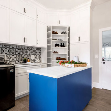 Advance Design Studio, Ltd.
Laundry rooms and mudrooms can be a headache for many homeowners. They are usually cramped with poor functionality and little storage space. Joe and Kristin suffered all those aches and more, as their laundry room lacked clothing storage. Shoes were crammed in every corner. There was nowhere to fold clothes without taking them to the kitchen. They were ready for a complete laundry room remodel project.
Joe and Kristin interviewed several local remodeling companies but didn’t connect with anyone who could understand their vision. During the summer, when they were attending their son’s race venue, they noticed fellow kart racers Todd and Christine Jurs’ sponsor banner for their remodeling company, Advance Design Studio. Immediately they were thrilled that they knew someone they trusted who could handle the renovation.
“We wanted someone that we actually knew, who has a little bit more invested than an outside person that we don’t have any ties to,” Kristin said.
Project Designer Nicole Ryan came to their home in Warrenville for the initial consultation. Kristin, an avid HGTV viewer, brought her ideas to Nicole. Throughout the design process, they worked together designing the space, selecting materials, and choosing colors. Nicole made sure to incorporate Kristin’s must-haves into the finished laundry room remodel.
“It was really easy. Nicole made the transition very easy,” Kristin said of Nicole’s work in the design phase of the project. With the materials selected and the drawings finalized, it was time to begin construction. Kristin and Joe were impressed with how quickly and cleanly this phase went.
“Everyone that came in was very respectful, very neat, and that was a big part for me because I didn’t want dust going through the rest of my house,” Kristin said.
The new combination mudroom/laundry room is everything Kristin and Joe hoped. There is plenty of storage, three pull-out laundry hampers for presorting laundry, a large central island for folding clothes, a designated bar to hang dry, and even a unique rotating shoe rack to keep shoes from cluttering the space.
“My rotating shoe rack,” Kristin said when asked what her favorite part of her new laundry room was. “We have four kids. We have a lot of shoes and sporting events. So it makes sense to have all that space for shoes.”
The center island has an exceptional feature as well. It has wheels. Kristin wanted to be able to move the island out of the way for different functions in the room. An island with wheels can be placed wherever needed in the space.
The two existing closets were reconfigured with built-in closet storage systems to make them more functional than before with shelves for baskets holding gloves and hats, umbrellas, and coats.
“They love it,” Project Designer Nicole Ryan said. “They had a vision of how they wanted the space to function but didn’t know exactly how to get it there. My design took all their needs and used the most efficient products to get them the desired outcome. Tons of function, while still looking beautiful!”
The “White” Hudson Panel Dura Supreme cabinetry on the perimeter brightens the space and contrasts the popular blue “Gale Force” Dura Supreme cabinetry of the rolling island. The black and white encaustic design porcelain tile backsplash adds visual interest to the room above the white quartz countertops. Additionally, an oil-rubbed bronze bar for hanging clothes is conveniently located above the washer/dryer, and a stainless-steel under-mount sink with a matching Kohler faucet offers perfect functionality.
“I would definitely recommend Advance Design; they’ve been wonderful. They were so helpful. Any little changes we had, they were able to accommodate,” Kristin said.
35