
Search results for "Poor colors" in Home Design Ideas
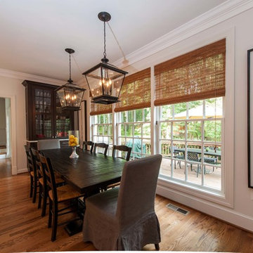
 Michael Nash Design, Build & Homes
This growing family of six was struggling with a dysfunctional kitchen design. The center island had been installed at an odd angle that limited accessibility and traffic flow. Additionally, storage space was limited by poor cabinet design. Finally, doorways in and out of the kitchen were narrow and poorly located, especially for children dashing in and out.
Other design challenges included how to better use a 10’ x 12’ room for children’s jackets and toys and how to add a professional-quality gas range in a neighborhood were natural gas wasn’t available. The new design would address all of these issues.
DESIGN SOLUTIONS
The new kitchen design revolves around a more proportional island. Carefully placed in the center of the new space with seating for four, it includes a prep sink, a second dishwasher and a beverage center.
The distressed ebony-stained island and hutch provides a brilliant contrast between the white color cabinetry. White Carrera marble countertops and backsplash top both island and perimeter cabinets.
Tall, double stacked cabinetry lines two walls to maximize storage space. Across the room there was an unused wall that now contains a 36” tower fridge and freezer, both covered with matching panels, and a tall cabinet that contains a microwave, steam unit and warming drawer.
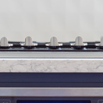
A propane tank was buried in the back yard to provide gas to a new 60” professional range and cooktop. A custom-made wood mantel hood blends perfectly with the cabinet style.
The old laundry room was reconfigured to have lots of locker space for all kids and added cabinetry for storage. A double entry door separated the new mudroom from the rest of the back hall. In the back hall the back windows were replaced with a set of French door and added decking to create a direct access to deck and backyard.
The end result is an open floor plan, high-end appliances, great traffic flow and pleasing colors. The homeowner calls it the “kitchen of her dreams.”
 QuarterLab Design Build
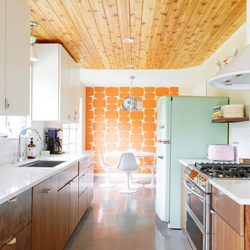
When we first happened upon this house, the original floors were 12x12 tile. The installation was poorly done years ago but lucky for us the poor installation made for a relatively easy removal. this floor you see in the photo is a concrete overlay technique. After the old tile was removed, the slab surface was cleaned and made ready for our overlay. when ready, a soupy polymer mix of concrete was overlaid on the floor, colored and then sealed with an epoxy finish.
(See callout D on the new layout page to see where the camera was set to take this photo.)
 Advance Design Studio, Ltd.
See "5-Year Kitchen in Elgin" for the kitchen featured in this description.
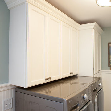
Bud Kane has remodeled nearly every room in his own home over many years. Now reaching his 70’s, he contemplated heading up a major kitchen and laundry room renovation himself, planning on doing the carpentry work with his own hands. “I was not convinced I would ever meet anyone who could do it as well as I could do it myself”, said Bud. Ruth and Bud spent 5 years visiting kitchen firms and interviewing designers. They couldn’t however bring themselves to pull the trigger on the project, until they met Advance Design Studio in 2015.
“No one understood what I wanted”, said Ruth. She was continually frustrated by experiences with designers who weren’t hearing what was important to her. “Everyone kept designing my kitchen with what they thought it should look like; I couldn’t find anyone who would listen to me”!
When they met designer Scott Christensen from Advance Design Studio, they liked him right away. He listened to Ruth and designed a kitchen that she loved, all the while interjecting years of wisdom and design expertise that Ruth appreciated. “The finished product is better than I expected”, says Ruth. “I respected Scott’s opinions and together we created the perfect place for me to bake with my grandkids and truly enjoy the kitchen and laundry room I’ve been dreaming of for many years!”
The kitchen transformation began with removing the home’s soffits, and extending new painted maple cabinetry to the ceiling with the addition of an elegant crown molding. Ruth’s new Vita Mix holds a coveted place on her counter, and adjustments were planned to size the cabinets in conjunction with the under cabinet decorative light molding to fit this appliance just right. “This one small detail was really important to me”, says Ruth smiling. An elegant new island replaced the original island, complete with room for 3 stools where her grandchildren will sit to make home-made pasta every Thanksgiving, and cookies at Christmas time. “Traditions are very important in my family, and making my kitchen work to suit cherished activities with my family was the number one reason this renovation was so desired”, replied Ruth when asked about the island.
A picture perfect new tea station replaced a cluttered unused desk area, creating a wonderful place to prepare hot drinks for sipping any season of the year while overlooking the couple’s wonderfully manicured gardens from the lovely 3 season’s room just off the kitchen. The soft sage island bead panel detail was repeated on the backsplash, replicating the feel of a fine old piece of furniture.
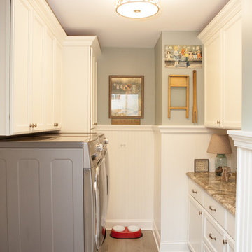
The biggest problem with the laundry room was 3 doors, one from the garage, one from the closet, and one to the hallway. “Scott designed a pocket door, and oh what a dream it is now to bring groceries in from the garage!” exclaims Bud who grew to disdain this task! Doing laundry is now a breeze in this attractive new space that doubles as a wonderful pantry for the kitchen with room to store food items that didn’t have a home in the poorly designed original space.
New Hickory distressed wood flooring was laid both in the kitchen and leading to the hall foyer. Soft gray wood-replicating porcelain was placed in the laundry area, making for an easily cleanable surface for what doubles as a mud room from the garage. Creamy tumbled marble graces an unobtrusive backsplash spilling onto shiny granite counter tops in a rich earthy pattern of fall colors that mimic colors throughout the home. Advance is known details that included custom crafted furniture toe kicks, luxurious crown moldings, and beaded under cabinet moldings. The kitchen is complete with a glass display cabinet showing Ruth’s treasured china tea collection.
Early on, it was initially only their intention of purchasing cabinets for the new design. They were so impressed however with Advance Design’s complete program for budgeting, design, installation and management that it became clear to them both that they wanted Advance to handle the entire project from start to finish. “After seeing the quality work they did, coupled with the in-house team completely dedicated to our satisfaction, it became apparent there was no other choice but to hire them to handle everything. And we’re so glad we did, we have not one regret”, says Bud.
“The attention to detail by the carpentry crew more than satisfied my perfectionist expectations of the finished carpentry,” exclaimed Bud. “Every one of Advance Design’s people we encountered from design through construction was wonderful. We’ve never met a group of people so dedicated to making sure we were happy with every single detail, and every single part of this experience”, said Ruth and Bud.
Designer: Scott Christensen
Photographer: Joe Nowak
Find the right local pro for your project
 Advance Design Studio, Ltd.
Bud Kane has remodeled nearly every room in his own home over many years. Now reaching his 70’s, he contemplated heading up a major kitchen and laundry room renovation himself, planning on doing the carpentry work with his own hands. “I was not convinced I would ever meet anyone who could do it as well as I could do it myself”, said Bud. Ruth and Bud spent 5 years visiting kitchen firms and interviewing designers. They couldn’t however bring themselves to pull the trigger on the project, until they met Advance Design Studio in 2015.
“No one understood what I wanted”, said Ruth. She was continually frustrated by experiences with designers who weren’t hearing what was important to her. “Everyone kept designing my kitchen with what they thought it should look like; I couldn’t find anyone who would listen to me”!
When they met designer Scott Christensen from Advance Design Studio, they liked him right away. He listened to Ruth and designed a kitchen that she loved, all the while interjecting years of wisdom and design expertise that Ruth appreciated. “The finished product is better than I expected”, says Ruth. “I respected Scott’s opinions and together we created the perfect place for me to bake with my grandkids and truly enjoy the kitchen and laundry room I’ve been dreaming of for many years!”
The kitchen transformation began with removing the home’s soffits, and extending new painted maple cabinetry to the ceiling with the addition of an elegant crown molding. Ruth’s new Vita Mix holds a coveted place on her counter, and adjustments were planned to size the cabinets in conjunction with the under cabinet decorative light molding to fit this appliance just right. “This one small detail was really important to me”, says Ruth smiling. An elegant new island replaced the original island, complete with room for 3 stools where her grandchildren will sit to make home-made pasta every Thanksgiving, and cookies at Christmas time. “Traditions are very important in my family, and making my kitchen work to suit cherished activities with my family was the number one reason this renovation was so desired”, replied Ruth when asked about the island.
A picture perfect new tea station replaced a cluttered unused desk area, creating a wonderful place to prepare hot drinks for sipping any season of the year while overlooking the couple’s wonderfully manicured gardens from the lovely 3 season’s room just off the kitchen. The soft sage island bead panel detail was repeated on the backsplash, replicating the feel of a fine old piece of furniture.
The biggest problem with the laundry room was 3 doors, one from the garage, one from the closet, and one to the hallway. “Scott designed a pocket door, and oh what a dream it is now to bring groceries in from the garage!” exclaims Bud who grew to disdain this task! Doing laundry is now a breeze in this attractive new space that doubles as a wonderful pantry for the kitchen with room to store food items that didn’t have a home in the poorly designed original space.
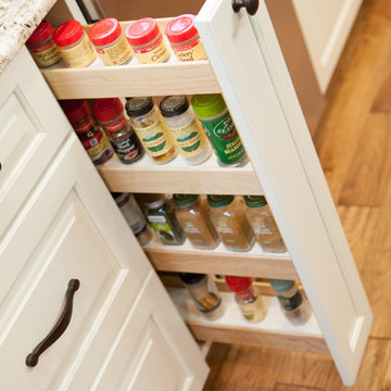
New Hickory distressed wood flooring was laid both in the kitchen and leading to the hall foyer. Soft gray wood-replicating porcelain was placed in the laundry area, making for an easily cleanable surface for what doubles as a mud room from the garage. Creamy tumbled marble graces an unobtrusive backsplash spilling onto shiny granite counter tops in a rich earthy pattern of fall colors that mimic colors throughout the home. Advance is known details that included custom crafted furniture toe kicks, luxurious crown moldings, and beaded under cabinet moldings. The kitchen is complete with a glass display cabinet showing Ruth’s treasured china tea collection.
Early on, it was initially only their intention of purchasing cabinets for the new design. They were so impressed however with Advance Design’s complete program for budgeting, design, installation and management that it became clear to them both that they wanted Advance to handle the entire project from start to finish. “After seeing the quality work they did, coupled with the in-house team completely dedicated to our satisfaction, it became apparent there was no other choice but to hire them to handle everything. And we’re so glad we did, we have not one regret”, says Bud.
“The attention to detail by the carpentry crew more than satisfied my perfectionist expectations of the finished carpentry,” exclaimed Bud. “Every one of Advance Design’s people we encountered from design through construction was wonderful. We’ve never met a group of people so dedicated to making sure we were happy with every single detail, and every single part of this experience”, said Ruth and Bud.
Designer: Scott Christensen
Photographer: Joe Nowak
 Twelve Stones Designs, LLC
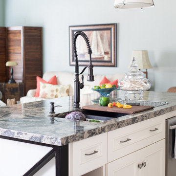
The owners of this kitchen had spent the money to upgrade the finishes in their kitchen upon building the home 12 years ago, but after living in the space for several years they realized how nonfunctional the layout really was. The (then) two preschool aged children had grown into busy, hungry teenagers with many friends who also liked to hang out at the house. So the family needed a more functional kitchen with better traffic flow, space for daily activities revolving around the kitchen at different times of day, and a kitchen that could accommodate cooking for and serving large groups. Furthermore, the dark, traditional finishes no longer reflected the homeowners’ style. They requested a brighter, more relaxed, coastal style that reflected their love of the seaside cities they like to visit.
Originally, the kitchen was U-shaped with a narrow island in the middle. The island created narrow aisles that bottle-necked at the dishwasher, refrigerator, and cooktop areas. There was a pass-through from the foyer into the kitchen, but the owners never liked that the pass-through was also located so close to the powder room. The awkward proximity was unappealing and made guests feel uncomfortable.
The kitchen’s storage was made up of lots of narrow cabinets, apothecary drawers, clipped corner units, and very few drawers. It lacked useful storage for the larger items the family used on a daily basis. And the kitchen’s only pantry was small closet that had only builder-grade, narrow shelving with no illumination to be able to see the contents inside.
Overall, the kitchen’s lighting plan was poorly executed. Only six recessed cans illuminated the entire kitchen and nook areas. The under cabinet lighting was not evenly distributed either. In fact, the builder had mis-placed the under cabinet lighting around the decorative pilasters which made for choppy, dark cubbies. Further, the builder didn’t include any lighting over the sink or the bar area, which meant whoever was doing the dishes was always in their own shadow. That, coupled with the steep overhang of the game room above made the bar area feel like a dim, cavernous space that wasn’t inviting or task oriented. The kitchen looked out into the main living space, but the raised bar and a narrow wall (which held the only large cabinet in the kitchen) created more of a barrier than a relationship to the living room or breakfast nook. In fact, one couldn’t even see the breakfast nook from the cooktop or sink areas due to its orientation. The raised bar top was too narrow to comfortably sit to either dine at or chat from due to the lack of knee space. The the homeowners confided that the kitchen felt more like a dark, dirty prison than place where the family, or their guests, wanted to gather and commune.
The clients' needs and desires were:
➢ to create a kitchen that would be a space the family loved to be in; to relate to the adjacent spaces all around, and to have better flow for entertaining large groups
➢ to remove the walls between the breakfast nook and living area and to be able to utilize the natural light from the windows in both those areas
➢ to incorporate a functional chopping block for prepping fresh food for home cooked meals, an island with a large sink and drain board, 2 pull out trash cans, and seating for at least the 2 teens to eat or do homework
➢ to design a kitchen and breakfast nook with an airy, coastal, relaxed vibe that blended with the rest of the house's coastal theme
➢ to integrate a layered lighting plan which would include ample general illumination, specific task lighting, decorative lighting, and lots of illuminated storage
➢ to design a kitchen with not only more storage for all the husband’s kitchen gadgets and collection of oils and spices, but smart storage, including a coffee/breakfast bar and a place to store and conceal the toaster oven and microwave
➢ to find a way to utilize the large open space between the kitchen, pantry area, and breakfast nook
Twelve Stones Designs achieved the owner's goals by:
➢ removing the walls between the kitchen and living room to allow the natural light to filter in from the adjacent rooms and to create a connection between the kitchen, nook, and living spaces for a sense of unity and communion
➢ removing the existing pantry and designing 3 large pantry style cabinets with LED tape lights and rollout drawers to house lots of kitchen appliances, gadgets, and tons of groceries. We also took the cabinets all the way up to the 9’ ceiling for additional storage for seasonal items and bulk storage.
➢ designing 2 islands - 1 with a gorgeous black walnut chopping block that houses a drawer for chopping and carving knives and a custom double pull out trash unit for point of use utilization - and 1 that houses the dishwasher, a large Blanco Gourmet sink with integrated drain board, woven baskets for fresh root vegetables and kitchen towels, plenty of drawer storage for kitchen items, and bar seating for up to 4 diners.
➢ closing off the space between the kitchen and the powder room to create a beautiful new private alcove for the powder room as well as adding some decorative storage. This also gave us space to include more tall storage near the new range for precision placement of the husband’s extensive oil and spice collection as well as a location for a combo-steam oven the wife wanted for baking and cooking healthy meals.
The project is enhanced functionally by:
➢ incorporated USB and standard receptacles for the kids’ laptops and phone charging in the large island
➢ designing the small island to include additional open shelving for items used on a daily basis such as a variety of bowls, plates, and colanders. This set up also works well for the husband who prefers to “plate” his dinners in restaurant-style fashion before presenting them to the table.
➢ the integration of specific storage units, such as double stacked cutlery drawers, a custom spice pull-out, a Kuerig coffee and tea pod drawer, and custom double stacked utensil drawers
➢ moving the refrigerator to the old oven location - this eliminated the bottle neck as well as created a better relationship to the eating table. It also utilizes the floor space between the pantry, nook, and kitchen
➢ creating a banquet style breakfast nook - this banquette seating not only doubles the amount of seating for large gatherings but it better utilizes the odd space between the kitchen and the previous nook area. It also helps to create a distinct pathway from the mudroom room through the pantry area, kitchen, nook, and living room.
➢ the coffee/breakfast bar area which includes the perfect location for the concealed microwave and toaster oven, convenient storage for the coffee pods and tea accoutrements. Roll-out drawers below also house the smoothie maker, hot water kettle, and a plethora of smoothie-making ingredients such as protein powders, smoothie additives, etc. Furthermore, the drawers below the Keurig house measuring utensil, cutlery, baking supplies and tupperware storage.
➢ incorporating lots of wide drawers and pullouts to accommodate large cookware.
➢ utilizing as much vertical space as possible by building storage to the ceiling which accommodates the family’s abundant amount of serving platters, baking sheets, bakeware, casserole dishes, and additional cutting boards.
The project is enhanced aesthetically by:
➢ new 5-piece Versailles pattern porcelain tile that now seamlessly joins the entire down stairs area together creating a bright, cohesiveness feeling instead of choppy separated spaces - it also adds a coastal feeling
➢ designing a cabinet to conceal the microwave and toaster oven
➢ the coastal influenced light fixtures over the nook table and island
➢ the sandy colors of the Langdon Cambria countertops. The swirling pattern and sparkling quartz pieces remind the homeowner of black-and-tan sandy beaches
➢ the striped banquet seating whose creamy white background and blue-green stripes were the inspiration for the cabinet and wall colors.
➢ All the interior doors were painted black to coordinate with the blacks and grays in the backsplash tile and countertop. This also adds a hint of tailored formality to an otherwise casual space.
➢ the use of WAC's Oculux small aperture LED units for the overhead lighting complimented with Diode LED strips for task lighting under the cabinets and inside the pantry and glass wall cabinets. All of the lighting applications are on separate dimmer switches.
Innovative uses of materials or construction methods by Realty Restoration LLC:
➢ Each 1-1/2” x 3” block of reclaimed end-grain black walnut that makes up the center island chopping block was hand milled and built in the shop. It was designed to look substantial and proportional to the surrounding elements, executed by creating the 4 inch tall top with a solid wood chamfered edge band.
➢ The metal doors on either side of the vent hood were also custom designed for this project and built in the Realty Restoration LLC shop. They are made 1x2, 11-gauge mild steel with ribbed glass. Weighing 60 lbs a piece, heavy duty cabinet hinges were added to support the weight of the door and keep them from sagging.
➢ Under-cabinet receptacles were added along the range wall in order to have a clean, uninterrupted backsplash.
Design obstacles to overcome:
➢ Because we were removing the demising walls between the kitchen and living room, we had to find a way to plumb and vent the new island. We did this by tunneling through the slab (the slab had post tension cables which prevented us from just trenching) to run a new wet vent through a nearby structural wall. We pulled the existing hot and cold lines between upper floor joists and ran them down the structural wall as well and up through a conduit in the tunnel.
➢ Since we were converting from wall overs to a gas range it allowed us to utilize the 220 feed for the wall ovens to provide a new sub panel for all the new kitchen circuits
➢ Due to framing deficiencies inherited from the original build there was a 1-1/2” differential in the floor-to-ceiling height over a 20 foot span; by utilizing the process of cutting and furring coupled with the crown moulding details on the cabinet elevations we were able to mask the problem and provide seamless transitions between the cabinet components.
Evidence of superior craftsmanship:
➢ uniquely designed, one-of-a-kind metal “X” end panels on the large island. The end panels were custom made in the Realty Restoration LLC shop and fitted to the exact dimensions of the island. The welding seams are completely indistinguishable - the posts look like they are cut from a single sheet of metal
➢ square metal posts on the small island were also custom made and designed to compliment and carry through the metal element s throughout the kitchen
➢ the beautiful, oversized end panels on the pantry cabinets which give the breakfast nook a tailored look
➢ integrating a large format 5 piece Versailles tile pattern to seamlessly flow from the existing spaces into the new kitchen space
➢ By constructing a custom cabinet that jogged around a corner we could not remodel (housing the entry way coat closet) we were able to camouflage the adjacent wall offset within the upper and lower cabinets. By designing around the existing jog in the structural walls we accomplished a few things: we were able to find the space to house, and hide, the microwave and toaster oven yet still have a clean cohesive appearance from the kitchen side. Additionally, the owners were able to keep their much needed coat closet and we didn’t have to increase the budget with unnecessary structural work.
 S.J. Janis Company, Inc.
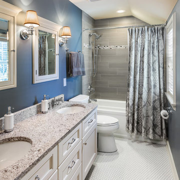
The previous master bathroom is now the kids new bath with a dual vanity and decorative recessed medicine cabinets.
They have much more room as well as natural lighting, wall sconces and recesses lighting.
Quartz countertops and under mount sinks blend in with the gray and white tones.
Hexagon field tile was used to pull the original age and character of the home.
 Milgard Windows & Doors
The Kiguchi family moved into their Austin, Texas home in 1994. Built in the 1980’s as part of a neighborhood development, they happily raised their family here but longed for something more contemporary. Once they became empty nesters, they decided it was time for a major remodel. After spending many years visiting Austin AIA Home Tours that highlight contemporary residential architecture, they had a lot of ideas and in 2013 were ready to interview architects and get their renovation underway.
The project turned into a major remodel due to an unstable foundation. Architects Ben Arbib and Ed Hughey, of Arbib Hughey Design were hired to solve the structural issue and look for inspiration in the bones of the house, which sat on top of a hillside and was surrounded by great views.
Unfortunately, with the old floor plan, the beautiful views were hidden by small windows that were poorly placed. In order to bring more natural light into the house the window sizes and configurations had to be addressed, all while keeping in mind the homeowners desire for a modern look and feel.
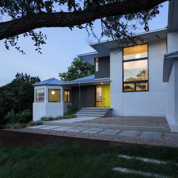
To achieve a more contemporary and sophisticated front of house, a new entry was designed that included removing a two-story bay window and porch. The entrance of the home also became more integrated with the landscape creating a template for new foliage to be planted. Older exterior materials were updated to incorporate a more muted palette of colors with a metal roof, dark grey siding in the back and white stucco in the front. Deep eaves were added over many of the new large windows for clean lines and sun protection.
“Inside it was about opening up the floor plan, expanding the views throughout the house, and updating the material palette to get a modern look that was also warm and inviting,” said Ben from Arbib Hughey Design. “Prior to the remodel, the house had the typical separation of rooms. We removed the walls between them and changed all of the windows to Milgard Thermally Improved Aluminum to connect the inside with the outside. No matter where you are you get nice views and natural light.”
The architects wanted to create some drama, which they accomplished with the window placement and opening up the interior floor plan to an open concept approach. Cabinetry was used to help delineate intimate spaces. To add warmth to an all-white living room, white-washed oak wood floors were installed and pine planks were used around the fireplace. The large windows served as artwork bringing the color of nature into the space.
An octagon shaped, elevated dining room, (named “the turret”), had a big impact on the design of the house. They architects rounded the corners and added larger window openings overlooking a new sunken garden. The great room was also softened by rounding out the corners and that circular theme continued throughout the house, being picked up in skylight wells and kitchen cabinetry. A staircase leading to a catwalk was added and the result was a two-story window wall that flooded the home with natural light.
When asked why Milgard® Thermally Improved Aluminum windows were selected, the architectural team listed many reasons:
1) Aesthetics: “We liked the slim profiles and narrow sightlines. The window frames never get in the way of the view and that was important to us. They also have a very contemporary look that went well with our design.”
2) Options: “We liked that we could get large sliding doors that matched the windows, giving us a very cohesive look and feel throughout the project.”
3) Cost Effective: “Milgard windows are affordable. You get a good product at a good price.”
4) Custom Sizes: “Milgard windows are customizable, which allowed us to get the right window for each location.”
Ready to take on your own traditional to modern home remodeling project? Arbib Hughey Design advises, “Work with a good architect. That means picking a team that is creative, communicative, listens well and is responsive. We think it’s important for an architect to listen to their clients and give them something they want, not something the architect thinks they should have. At the same time you want an architect who is willing and able to think outside the box and offer up design options that you may not have considered. Design is about a lot of back and forth, trying out ideas, getting feedback and trying again.”
The home was completely transformed into a unique, contemporary house perfectly integrated with its site. Internally the home has a natural flow for the occupants and externally it is integrated with the surroundings taking advantage of great natural light. As a side note, it was highly praised as part of the Austin AIA homes tour.
Sponsored
Westerville, OH

Custom Home Works
Franklin County's Award-Winning Design, Build and Remodeling Expert
 Advance Design Studio, Ltd.
See "5-Year Kitchen in Elgin" for the kitchen featured in this description.
Bud Kane has remodeled nearly every room in his own home over many years. Now reaching his 70’s, he contemplated heading up a major kitchen and laundry room renovation himself, planning on doing the carpentry work with his own hands. “I was not convinced I would ever meet anyone who could do it as well as I could do it myself”, said Bud. Ruth and Bud spent 5 years visiting kitchen firms and interviewing designers. They couldn’t however bring themselves to pull the trigger on the project, until they met Advance Design Studio in 2015.
“No one understood what I wanted”, said Ruth. She was continually frustrated by experiences with designers who weren’t hearing what was important to her. “Everyone kept designing my kitchen with what they thought it should look like; I couldn’t find anyone who would listen to me”!
When they met designer Scott Christensen from Advance Design Studio, they liked him right away. He listened to Ruth and designed a kitchen that she loved, all the while interjecting years of wisdom and design expertise that Ruth appreciated. “The finished product is better than I expected”, says Ruth. “I respected Scott’s opinions and together we created the perfect place for me to bake with my grandkids and truly enjoy the kitchen and laundry room I’ve been dreaming of for many years!”
The kitchen transformation began with removing the home’s soffits, and extending new painted maple cabinetry to the ceiling with the addition of an elegant crown molding. Ruth’s new Vita Mix holds a coveted place on her counter, and adjustments were planned to size the cabinets in conjunction with the under cabinet decorative light molding to fit this appliance just right. “This one small detail was really important to me”, says Ruth smiling. An elegant new island replaced the original island, complete with room for 3 stools where her grandchildren will sit to make home-made pasta every Thanksgiving, and cookies at Christmas time. “Traditions are very important in my family, and making my kitchen work to suit cherished activities with my family was the number one reason this renovation was so desired”, replied Ruth when asked about the island.
A picture perfect new tea station replaced a cluttered unused desk area, creating a wonderful place to prepare hot drinks for sipping any season of the year while overlooking the couple’s wonderfully manicured gardens from the lovely 3 season’s room just off the kitchen. The soft sage island bead panel detail was repeated on the backsplash, replicating the feel of a fine old piece of furniture.
The biggest problem with the laundry room was 3 doors, one from the garage, one from the closet, and one to the hallway. “Scott designed a pocket door, and oh what a dream it is now to bring groceries in from the garage!” exclaims Bud who grew to disdain this task! Doing laundry is now a breeze in this attractive new space that doubles as a wonderful pantry for the kitchen with room to store food items that didn’t have a home in the poorly designed original space.
New Hickory distressed wood flooring was laid both in the kitchen and leading to the hall foyer. Soft gray wood-replicating porcelain was placed in the laundry area, making for an easily cleanable surface for what doubles as a mud room from the garage. Creamy tumbled marble graces an unobtrusive backsplash spilling onto shiny granite counter tops in a rich earthy pattern of fall colors that mimic colors throughout the home. Advance is known details that included custom crafted furniture toe kicks, luxurious crown moldings, and beaded under cabinet moldings. The kitchen is complete with a glass display cabinet showing Ruth’s treasured china tea collection.
Early on, it was initially only their intention of purchasing cabinets for the new design. They were so impressed however with Advance Design’s complete program for budgeting, design, installation and management that it became clear to them both that they wanted Advance to handle the entire project from start to finish. “After seeing the quality work they did, coupled with the in-house team completely dedicated to our satisfaction, it became apparent there was no other choice but to hire them to handle everything. And we’re so glad we did, we have not one regret”, says Bud.
“The attention to detail by the carpentry crew more than satisfied my perfectionist expectations of the finished carpentry,” exclaimed Bud. “Every one of Advance Design’s people we encountered from design through construction was wonderful. We’ve never met a group of people so dedicated to making sure we were happy with every single detail, and every single part of this experience”, said Ruth and Bud.
Designer: Scott Christensen
Photographer: Joe Nowak
 Bennett Contracting, Inc.
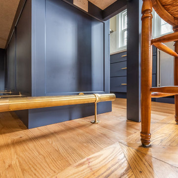
This Loudonville couple started by getting a quote to finish their attic space, but then changed gears and decided the kitchen was more important at this time. Estimator Anthony and designer Justina from Bennett Contracting went to work on a new design. The home is an older colonial with classic features, and the existing kitchen was a poorly laid out 90’s nightmare. With children in the home the island cooktop alone was a constant danger. By adding a window and removing the wall from the dining room, the new kitchen is much brighter and connected to the rest of the home. Bennett removed the old vinyl tile and continued the wood flooring into the new kitchen space. Justina admits it was so much fun working on this project because the owners were open to all sorts of design features. Roll-outs in most cabinets, hidden bread boards, hutch coffee bar, brass chicken wire, and the very cool antique foot rail. Then there are the custom cabinet colors. RD Henry Cabinets matched Glidden paint colors to get the exact color the client desired. They even sent three cabinet samples to get it right. These classic features combined with the modern design brings new life to the space.
 Designs by KS
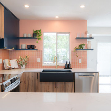
When our clients came to us with their renovation project asking for a pink kitchen, we were thrilled at the opportunity to create a unique, bright and colourful kitchen. It’s not something you see everyday, and we live for it! Being that they are a young family, who loves to cook but felt secluded and overwhelmed when in this space, we knew that this was going to be an epic transformation, not just aesthetically but also for their day-to-day life.
This renovation transformed a closed off, cramped, and poorly laid-out kitchen into a colourful, bright, open, and inviting space that combines functionality with vibrant colours and character. The redesign focused on maximizing storage, improving layout efficiency, and infusing the space with unique design elements that make it both practical and fun.
 Designs by KS
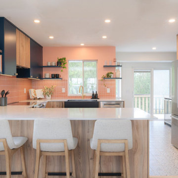
When our clients came to us with their renovation project asking for a pink kitchen, we were thrilled at the opportunity to create a unique, bright and colourful kitchen. It’s not something you see everyday, and we live for it! Being that they are a young family, who loves to cook but felt secluded and overwhelmed when in this space, we knew that this was going to be an epic transformation, not just aesthetically but also for their day-to-day life.
This renovation transformed a closed off, cramped, and poorly laid-out kitchen into a colourful, bright, open, and inviting space that combines functionality with vibrant colours and character. The redesign focused on maximizing storage, improving layout efficiency, and infusing the space with unique design elements that make it both practical and fun.
 Homework Remodels
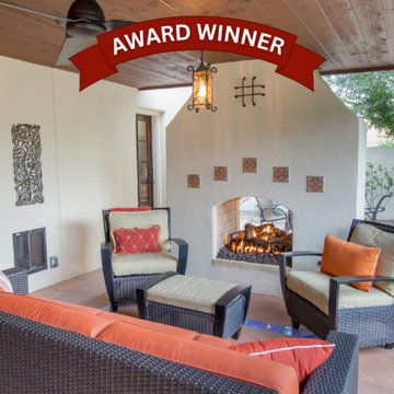
Award-Winning Exterior Home Remodel
2025 NARI of Greater Phoenix Remodeler of the Year
This project showcases a blend of historic preservation and innovative design, rejuvenating a Spanish Colonial home while addressing aesthetic and functional needs.
The exterior of this historic beauty, long in need of repair, was in poor condition. Stucco cracks, paint deterioration, holes in the garage walls, and a dilapidated patio cover created daunting challenges. We carefully and respectfully addressed these issues, breathing new life into the home while maintaining its original charm.
Modern enhancements were central to the project’s success. We thoughtfully preserved the existing structure and carefully considered the design lines to ensure rhythm and continuity. We masterfully balanced symmetry and asymmetry, particularly in the new back patio design, which extends the living space and adds a visually cohesive element to the rear of the home. The choice of materials and colors highlights the home’s Spanish Colonial character, with a mix of textures and contrasting hues emphasizing key architectural features. Durable porcelain tiles on the patio floor provide function, safety and beauty. The color palette creates clear transitions between indoor and outdoor spaces, enhancing flow and safety.
This project beautifully illustrates the rejuvenation of a historic Spanish Colonial home, addressing aesthetic and functional needs. We carefully restored the exterior, addressing stucco cracks, paint deterioration, and structural issues. The design preserves the home’s character while creating a modern, functional space. A new patio addition extends the living area, blending indoor and outdoor spaces. The choice of materials and colors enhances the home’s architectural features, and durable porcelain tiles add both beauty and function. By working closely with the Historic Preservation Office, we realized the homeowner’s vision for a beautiful, inviting home and an outdoor entertaining space.
 RMW Team
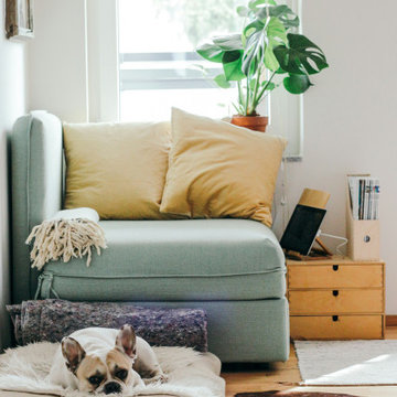
Designing a Health-Focused Home Living Space
Designing a health-focused home living space is more than just arranging furniture and choosing colors; it's about creating an environment that promotes physical well-being, mental clarity, and overall wellness. As we spend more time at home, especially in the wake of recent global shifts towards remote work and lifestyle changes, the importance of our living spaces in supporting our health has never been greater. Here are some key considerations when designing a health-oriented home.
Natural Light and Air Quality
Natural light plays a crucial role in our health, affecting everything from our sleep patterns to our mood. When designing your home, prioritize spaces that allow for ample sunlight. Large windows, skylights, and strategically placed mirrors can help maximize natural light. In rooms where natural light is limited, consider using full-spectrum lighting that mimics daylight to support your circadian rhythms.
Air quality is another critical factor in a health-focused home. Indoor air can be more polluted than outdoor air due to various factors like off-gassing from furniture, household cleaners, and poor ventilation. Incorporating plants that are known to purify air, such as spider plants, snake plants, and peace lilies, can help improve indoor air quality. Additionally, ensure your home is well-ventilated by using exhaust fans in kitchens and bathrooms, and consider investing in air purifiers, especially if you live in an area with high pollution levels.
Ergonomic Furniture and Movement Spaces
The furniture you choose and how you arrange it can significantly impact your physical health. Ergonomic furniture, especially in workspaces, can help prevent strain and injury. Adjustable desks, supportive chairs, and monitor stands can contribute to better posture and reduced risk of musculoskeletal issues.
Incorporating spaces that encourage movement is also important. For example, a small home gym or a yoga corner can serve as a dedicated area for physical activity. Even in smaller spaces, you can create movement opportunities by ensuring there’s enough room to stretch or do simple exercises. Open floor plans or multipurpose spaces that can be easily reconfigured for different activities can help integrate movement into daily life.
Mindful and Minimalist Design
A clutter-free environment is conducive to mental clarity and relaxation. Mindful and minimalist design principles focus on creating spaces that are both functional and aesthetically pleasing without being overwhelming. Start by decluttering and organizing your belongings, keeping only what you need and what brings you joy.
Choose furniture and decor that are simple, natural, and calming. Materials like wood, stone, and natural fibers not only add a touch of nature to your home but also tend to have fewer chemicals than synthetic materials. Neutral color palettes with accents of soothing colors like blues and greens can help create a tranquil atmosphere.
Sleep and Restful Areas
A significant part of health-focused design is creating spaces that promote restful sleep. Your bedroom should be a sanctuary that encourages relaxation. Invest in a good-quality mattress and pillows that support your body. Blackout curtains, soundproofing, and maintaining a cool room temperature can also contribute to better sleep quality.
In addition to the bedroom, consider creating other restful areas in your home where you can unwind, meditate, or practice mindfulness. A cozy reading nook, a meditation space, or even a comfortable chair by a window can serve as your personal retreat.
Incorporating Nature and Green Spaces
Finally, integrating elements of nature into your living space can have a profound impact on your health. Biophilic design, which connects indoor environments with nature, has been shown to reduce stress and increase feelings of well-being. This can be as simple as adding more houseplants, incorporating natural materials, or even installing a small indoor water feature.
If you have outdoor space, create a garden or a patio where you can relax and enjoy fresh air. Even a small balcony can be transformed into a green oasis with the right plants and seating.
By thoughtfully designing your living space with health in mind, you create an environment that not only looks beautiful but also supports your physical and mental well-being.

Sponsored
Sunbury, OH

J.Holderby - Renovations
Franklin County's Leading General Contractors - 2X Best of Houzz!
 J Design Group - Interior Designers Miami - Modern
AVENTURA MAGAZINE selected our client’s luxury 5000 Sf ocean front apartment in Miami Beach, to publish it in their issue and they Said:
Story by Linda Marx, Photography by Daniel Newcomb
Light & Bright
New York snowbirds redesigned their Miami Beach apartment to take advantage of the tropical lifestyle.
WHEN INTERIOR DESIGNER JENNIFER CORREDOR was asked to recreate a four-bedroom, six-bath condominium at The Bath Club in Miami Beach, she seized the opportunity to open the rooms and better utilize the vast ocean views.
In five months last year, the designer transformed a dark and closed 5,000-square-foot unit located on a high floor into a series of sweeping waterfront spaces and updated the well located apartment into a light and airy retreat for a sports-loving family of five.
“They come down from New York every other weekend and wanted to make their waterfront home a series of grand open spaces,” says Corrredor, of the J. Design Group in Coral Gables, a firm specializing in modern and contemporary interiors. “Since many of the rooms face the ocean, it made sense to open and lighten up the home, taking advantage of the awesome views of the sea and the bay.”
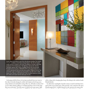
The designer used 40 x 40 all white tile throughout the apartment as a clean base. This way, her sophisticated use of color would stand out and bring the outdoors in.
The close-knit family members—two parents and three boys in college—like to do things together. But there were situations to overcome in the process of modernizing and opening the space. When Corredor was briefed on their desires, nothing seemed too daunting. The confident designer was ready to delve in. For example, she fixed an area at the front door
that was curved. “The wood was concave so I straightened it out,” she explains of a request from the clients. “It was an obstacle that I overcame as part of what I do in a redesign. I don’t consider it a difficult challenge. Improving what I see is part of the process.”
She also tackled the kitchen with gusto by demolishing a wall. The kitchen had formerly been enclosed, which was a waste of space and poor use of available waterfront ambience. To create a grand space linking the kitchen to the living room and dining room area, something had to go. Once the wall was yesterday’s news, she relocated the refrigerator and freezer (two separate appliances) to the other side of the room. This change was a natural functionality in the new open space. “By tearing out the wall, the family has a better view of the kitchen from the living and dining rooms,” says Corredor, who also made it easier to walk in and out of one area and into the other. “The views of the larger public space and the surrounding water are breathtaking.
Opening it up changed everything.”
They clients can now see the kitchen from the living and dining areas, and at the same time, dwell in an airy and open space instead of feeling stuck in a dark enclosed series of rooms. In fact, the high-top bar stools that Corredor selected for the kitchen can be twirled around to use for watching TV in the living room.
In keeping with the theme of moving seamlessly from one room to the other, Corredor designed a subtle wall of glass in the living room along with lots of comfortable seating. This way, all family members feel at ease while relaxing, talking, or watching sporting events on the large flat screen television. “For this room, I wanted more open space, light and a supreme airy feeling,” she says. “With the glass design making a statement, it quickly became the star of the show.”…….
….. To add texture and depth, Jennifer Corredor custom created wood doors here, and in other areas of the home. They provide a nice contrast to the open Florida tropical feel. “I added character to the openness by using exotic cherry wood,” she says. “I repeated this throughout the home and it works well.”
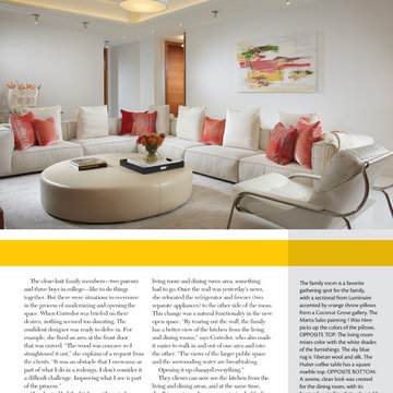
Known for capturing the client’s vision while adding her own innovative twists, Corredor lightened the family room, giving it a contemporary and modern edge with colorful art and matching throw pillows on the sofas. She added a large beige leather ottoman as the center coffee table in the room. This round piece was punctuated with a bold-toned flowering plant atop. It effortlessly matches the pillows and colors of the contemporary canvas.
Miami,
Miami Beach
Miami Interior Designers,
Miami Interior Designer,
Interior Designers Miami,
Interior Designer Miami,
Modern Interior Designers,
Modern Interior Designer,
Modern interior decorators,
Modern interior decorator,
Contemporary Interior Designers,
Contemporary Interior Designer,
Interior design decorators,
Interior design decorator,
Interior Decoration and Design,
Black Interior Designers,
Black Interior Designer,
Interior designer,
Interior designers,
Interior design decorators,
Interior design decorator,
Home interior designers,
Home interior designer,
Interior design companies,
Interior decorators,
Interior decorator,
Decorators,
Decorator,
Miami Decorators,
Miami Decorator,
Decorators Miami,
Decorator Miami,
Interior Design Firm,
Interior Design Firms,
Interior Designer Firm,
Interior Designer Firms,
Interior design,
Interior designs,
Home decorators,
Interior decorating Miami,
Best Interior Designers,
Interior design decorator,
 Elite Concrete Systems
The clients had experienced some flooding and took the oportunity to renovate the basement to create a play room, gym and wine cellar.
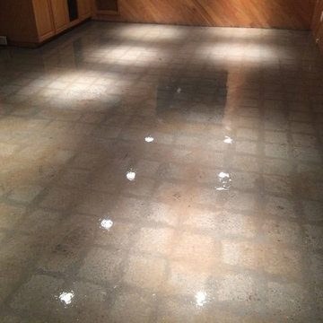
The PVC tiles were removed and the top surface of concrete was removed along with the adhesive.
The tiles had left a shadow in the concrete which is not uncommon and can look really unique.
This particular slab was very soft and was not likely to polish up well using tooling alone. We decided to polish to 200 grit and coat the floor with Elite Crete PT 1 Crystal Clear Epoxy.
Prior to applying the epoxy we colored the floor with Ameripolish Color Juice Mid Gray.
The result was a smooth and shiny floor with great contrast and color.
 Designs by KS
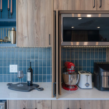
When our clients came to us with their renovation project asking for a pink kitchen, we were thrilled at the opportunity to create a unique, bright and colourful kitchen. It’s not something you see everyday, and we live for it! Being that they are a young family, who loves to cook but felt secluded and overwhelmed when in this space, we knew that this was going to be an epic transformation, not just aesthetically but also for their day-to-day life.
This renovation transformed a closed off, cramped, and poorly laid-out kitchen into a colourful, bright, open, and inviting space that combines functionality with vibrant colours and character. The redesign focused on maximizing storage, improving layout efficiency, and infusing the space with unique design elements that make it both practical and fun.
 J Design Group - Interior Designers Miami - Modern
AVENTURA MAGAZINE selected our client’s luxury 5000 Sf ocean front apartment in Miami Beach, to publish it in their issue and they Said:
Story by Linda Marx, Photography by Daniel Newcomb
Light & Bright
New York snowbirds redesigned their Miami Beach apartment to take advantage of the tropical lifestyle.
WHEN INTERIOR DESIGNER JENNIFER CORREDOR was asked to recreate a four-bedroom, six-bath condominium at The Bath Club in Miami Beach, she seized the opportunity to open the rooms and better utilize the vast ocean views.
In five months last year, the designer transformed a dark and closed 5,000-square-foot unit located on a high floor into a series of sweeping waterfront spaces and updated the well located apartment into a light and airy retreat for a sports-loving family of five.
“They come down from New York every other weekend and wanted to make their waterfront home a series of grand open spaces,” says Corrredor, of the J. Design Group in Coral Gables, a firm specializing in modern and contemporary interiors. “Since many of the rooms face the ocean, it made sense to open and lighten up the home, taking advantage of the awesome views of the sea and the bay.”
The designer used 40 x 40 all white tile throughout the apartment as a clean base. This way, her sophisticated use of color would stand out and bring the outdoors in.
The close-knit family members—two parents and three boys in college—like to do things together. But there were situations to overcome in the process of modernizing and opening the space. When Corredor was briefed on their desires, nothing seemed too daunting. The confident designer was ready to delve in. For example, she fixed an area at the front door
that was curved. “The wood was concave so I straightened it out,” she explains of a request from the clients. “It was an obstacle that I overcame as part of what I do in a redesign. I don’t consider it a difficult challenge. Improving what I see is part of the process.”
She also tackled the kitchen with gusto by demolishing a wall. The kitchen had formerly been enclosed, which was a waste of space and poor use of available waterfront ambience. To create a grand space linking the kitchen to the living room and dining room area, something had to go. Once the wall was yesterday’s news, she relocated the refrigerator and freezer (two separate appliances) to the other side of the room. This change was a natural functionality in the new open space. “By tearing out the wall, the family has a better view of the kitchen from the living and dining rooms,” says Corredor, who also made it easier to walk in and out of one area and into the other. “The views of the larger public space and the surrounding water are breathtaking.
Opening it up changed everything.”
They clients can now see the kitchen from the living and dining areas, and at the same time, dwell in an airy and open space instead of feeling stuck in a dark enclosed series of rooms. In fact, the high-top bar stools that Corredor selected for the kitchen can be twirled around to use for watching TV in the living room.
In keeping with the theme of moving seamlessly from one room to the other, Corredor designed a subtle wall of glass in the living room along with lots of comfortable seating. This way, all family members feel at ease while relaxing, talking, or watching sporting events on the large flat screen television. “For this room, I wanted more open space, light and a supreme airy feeling,” she says. “With the glass design making a statement, it quickly became the star of the show.”…….
….. To add texture and depth, Corredor custom created wood doors here, and in other areas of the home. They provide a nice contrast to the open Florida tropical feel. “I added character to the openness by using exotic cherry wood,” she says. “I repeated this throughout the home and it works well.”
Known for capturing the client’s vision while adding her own innovative twists, Corredor lightened the family room, giving it a contemporary and modern edge with colorful art and matching throw pillows on the sofas. She added a large beige leather ottoman as the center coffee table in the room. This round piece was punctuated with a bold-toned flowering plant atop. It effortlessly matches the pillows and colors of the contemporary canvas.
Miami,
Miami Interior Designers,
Miami Interior Designer,
Interior Designers Miami,
Interior Designer Miami,
Modern Interior Designers,
Modern Interior Designer,
Modern interior decorators,
Modern interior decorator,
Contemporary Interior Designers,
Contemporary Interior Designer,
Interior design decorators,
Interior design decorator,
Interior Decoration and Design,
Black Interior Designers,
Black Interior Designer,
Interior designer,
Interior designers,
Interior design decorators,
Interior design decorator,
Home interior designers,
Home interior designer,
Interior design companies,
Interior decorators,
Interior decorator,
Decorators,
Decorator,
Miami Decorators,
Miami Decorator,
Decorators Miami,
Decorator Miami,
Interior Design Firm,
Interior Design Firms,
Interior Designer Firm,
Interior Designer Firms,
Interior design,
Interior designs,
Home decorators,
Miami Beach
Interior decorating Miami,
Best Interior Designers,
Interior design decorator,

 Designs by KS
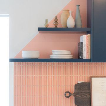
When our clients came to us with their renovation project asking for a pink kitchen, we were thrilled at the opportunity to create a unique, bright and colourful kitchen. It’s not something you see everyday, and we live for it! Being that they are a young family, who loves to cook but felt secluded and overwhelmed when in this space, we knew that this was going to be an epic transformation, not just aesthetically but also for their day-to-day life.
This renovation transformed a closed off, cramped, and poorly laid-out kitchen into a colourful, bright, open, and inviting space that combines functionality with vibrant colours and character. The redesign focused on maximizing storage, improving layout efficiency, and infusing the space with unique design elements that make it both practical and fun.
 Bennett Contracting, Inc.
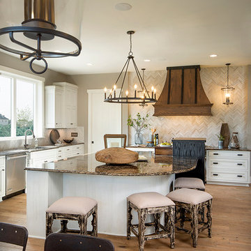
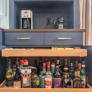
This Loudonville couple started by getting a quote to finish their attic space, but then changed gears and decided the kitchen was more important at this time. Estimator Anthony and designer Justina from Bennett Contracting went to work on a new design. The home is an older colonial with classic features, and the existing kitchen was a poorly laid out 90’s nightmare. With children in the home the island cooktop alone was a constant danger. By adding a window and removing the wall from the dining room, the new kitchen is much brighter and connected to the rest of the home. Bennett removed the old vinyl tile and continued the wood flooring into the new kitchen space. Justina admits it was so much fun working on this project because the owners were open to all sorts of design features. Roll-outs in most cabinets, hidden bread boards, hutch coffee bar, brass chicken wire, and the very cool antique foot rail. Then there are the custom cabinet colors. RD Henry Cabinets matched Glidden paint colors to get the exact color the client desired. They even sent three cabinet samples to get it right. These classic features combined with the modern design brings new life to the space.
 Bennett Contracting, Inc.
This Loudonville couple started by getting a quote to finish their attic space, but then changed gears and decided the kitchen was more important at this time. Estimator Anthony and designer Justina from Bennett Contracting went to work on a new design. The home is an older colonial with classic features, and the existing kitchen was a poorly laid out 90’s nightmare. With children in the home the island cooktop alone was a constant danger. By adding a window and removing the wall from the dining room, the new kitchen is much brighter and connected to the rest of the home. Bennett removed the old vinyl tile and continued the wood flooring into the new kitchen space. Justina admits it was so much fun working on this project because the owners were open to all sorts of design features. Roll-outs in most cabinets, hidden bread boards, hutch coffee bar, brass chicken wire, and the very cool antique foot rail. Then there are the custom cabinet colors. RD Henry Cabinets matched Glidden paint colors to get the exact color the client desired. They even sent three cabinet samples to get it right. These classic features combined with the modern design brings new life to the space.
14