
Search results for "Poor functionality" in Home Design Ideas
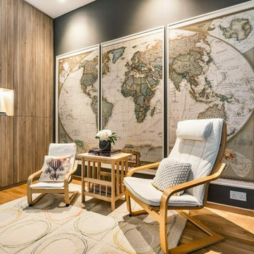
 M Atelier
If there is one big mistake that homeowners make when carrying out the decoration tasks of their interior design project, that would be over-accessorising. Indeed, experts in interior design in Singapore agree that there are styles where “more is more,” and there are also those where “less is more.”
While as a homeowner you may choose either of these two style directions, you should first think about the different aspects of interior design and make sure that your style choice fits with these elements. Not doing so may not only result to a poorly executed renovation, but a home that you will find uncomfortable to live in.
So how do you avoid the tendency of over-accessorising? You may want to follow these pieces of advice coming from professionals in interior design in Singapore:
Mistake #1: Using the same fabric on almost all surfaces.
It is common practice among most homeowners to use almost the same fabric on all table surfaces, and sometimes even on sofa covers and drapes. Indeed, this can be cost effective, but it does not contribute to the development of the home’s overall design.
This is because there are fabrics are created to meet specific purposes. For example, lace is often used as table runners, as they give more definition and style to these specific furniture pieces. However, they do not do your windows any favours when used as curtains.
Opaque and heavy fabrics are often intended for curtains and drapes for rooms that require more privacy; in contrast, sheer and fabric materials are more suited for living room windows as they allow natural light and ventilation to move around the house.
Mistake #2: Placing more accents than you actually need.
Another mistake which homeowners are prone to make when decorating their home is placing more accents than needed. There are homes you can see side tables that are overpopulated with picture frames, trinkets, and fancy souvenirs that do not have any connection to each other. Sometimes, you can find numerous throw pillows occupying almost the entire sofa, to the point that all the seats are already occupied.
These are classic examples of “fear of empty spaces,” which is prevalent in most Asian societies, and even in some Western countries. But while it is common practice to occupy empty spaces, you may also want to think about what to do with the space first.
Instead of piling up all your memorabilia in the side tables of your bedroom or living room, why not use a tiered stand so that they can be presented in an organised manner? You may also want to choose a designated area for your trinkets, such as a wall or an unoccupied corner in your room.
Mistake #3: Overdoing the lighting fixtures.
Some homeowners want to imitate the homes of the celebrities they see on TV, and apart from following the same colour schemes and choice of furniture, they also choose to add more lights in their rooms than necessary.
Well, you should understand that the purpose of lighting fixtures is to illuminate the rooms of the house, but this doesn’t mean that you have to brighten up your home all the time. You may want to use lamps that spread the light across the room, rather than several smaller bulbs. The latter only lights up specific parts of the room, and when all these bulbs are lit simultaneously, they only spike up your electric bill.
It would be better to choose lighting fixtures according to your need and the function of the room. Doing so not only illuminates your home properly, but also creates an ambiance that gives you the comfort you are looking for in a dwelling space.
 Michael Nash Design, Build & Homes
2010 REGIONAL AWARD WINNER
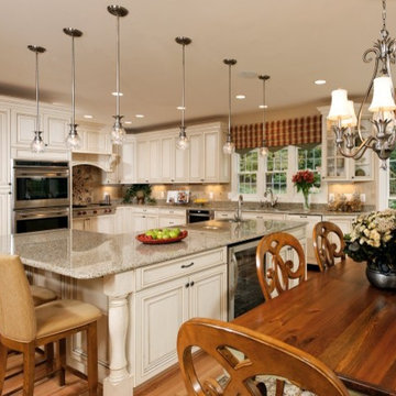
Built in 2000, this center hall colonial in Fairfax Station, Virginia had a kitchen that was neither functional nor aesthetically pleasing.
First, the floor plan was poorly rationalized. The work triangle was inefficient, a large pantry took up too much floor space, and a series of railings between the kitchen and family room obstructed traffic flow.
Aesthetically, the space was dated. Dutch cabinetry, floral wallpaper and a faux Victorian chandelier all cried for an update. Additionally, the homeowners wanted to incorporate high-end appliances and other amenities like a wine cooler and steam cooker.
Overall, the owners were seeking to replace worn out-of-style kitchen with a substantially upgraded “open” facility that combines traditional and contemporary features configured to support multiple social and culinary needs.
Working with Michael Nash Design, Build & Homes, they decided to implement a series of strategic revisions that would support their new use goals.
First, they removed an obstructive bearing wall between the existing kitchen and mudroom, creating a recessed niche for a new 48” gas range with custom hood. An unused desk taken out provided a spot for the new 48” two-drawer refrigerator/freezer.
A custom-designed L-shaped granite-surfaced island with bar sink, icemaker and mini-drawer refrigerator takes center stage in the space and offers seating for six. Now the chef can entertain guests while preparing the meal.
From an aesthetic point of view, the interior features are nothing less than stunning. Softly painted walls, decorative ceramic tile backsplashes and granite surfaces combine with custom made cabinets to create an elegant space. Antiqued soft-opaque cabinet facings, wood panel refrigerator door inserts, glass-facing display cabinets and a custom mantle range hood are true works of craftsmanship. Fine detail is expressed with flutes and corbels. Beauty is truly in the details of this award-winning kitchen.
 J.T. Design
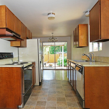
Existing small galley style kitchen, with a lot of flow, but poor size and function
Inspiration for a small contemporary galley laminate floor eat-in kitchen remodel in Seattle with a single-bowl sink, flat-panel cabinets, medium tone wood cabinets, laminate countertops, yellow backsplash and yellow countertops
Inspiration for a small contemporary galley laminate floor eat-in kitchen remodel in Seattle with a single-bowl sink, flat-panel cabinets, medium tone wood cabinets, laminate countertops, yellow backsplash and yellow countertops
Find the right local pro for your project
 Nip Tuck Remodeling
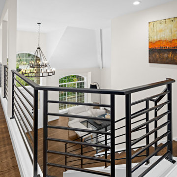
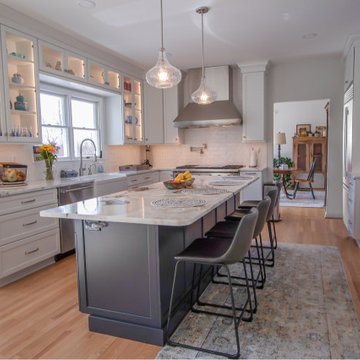
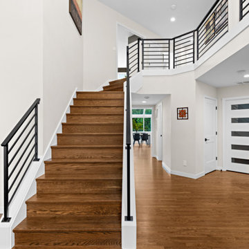
This home had dated and falling apart finishes, an insignificant fireplace in a giant living room, and a poor layout in the family room. Not to mention the primary bath covered in bamboo wallpaper.
The clients wanted a functional, updated and good-looking kitchen, a more adult family room, an updated serene primary bath. The remaining baths to be updated and modern. And, to make it feel like a holistic update, they wanted a welcoming staircase/entry.
As with most clients, stretching their dollar as far as possible was important. They didn't want to enlarge any footprint or move walls - we had to stay within existing bounds. With a whole home remodel costs can add up quickly depending on where we start & stop. For this family it made sense to do all the work at once to avoid repeat remodels. It was either buy new and still have to customize, or remodel to their exact needs and wants. The remodel was more affordable and made just for them.
Many finishes are clean, simple, and modern. A window was removed! in the family room to allow for a symmetrical entertainment center. A dramatic floor to ceiling fireplace surround was created in the Living room. The staircase was totally redone in both shape and style! The primary bath was reworked to get a two-person shower, and soaking tub. Serene /quiet finishes in the primary helped achieve a mellow /calming atmosphere. All new doors and trim throughout.

 Garrett Churchill Inc.
Garrett Churchill rebuild a waterfall which had been poorly designed by another landscaper. Finally, this waterfall functions and no longer leaks water!
 Bel Air Construction
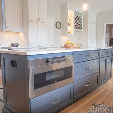
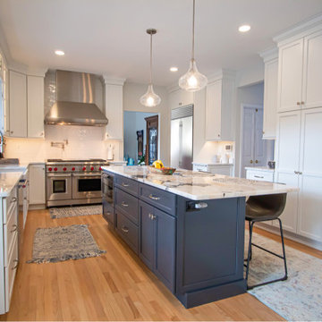
The homeowner’s goal for this kitchen remodel was to improve functionality and increase the home’s value. The existing kitchen was old and needed an update – cabinets were falling apart, the downdraft on the Jenn-Air range made it difficult to cook items correctly, there was little to no storage, lighting was insufficient. A poor layout dominated by a hook-shaped peninsula inhibited the ability to work efficiently
 Plain & Posh
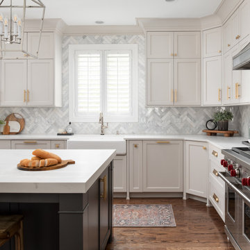
This large space did not function well for this family of 6. The cabinetry they had did not go to the ceiling and offered very poor storage options. The island that existed was tiny in comparrison to the space.
By taking the cabinets to the ceiling, enlarging the island and adding large pantry's we were able to achieve the storage needed. Then the fun began, all of the decorative details that make this space so stunning. Beautiful tile for the backsplash and a custom metal hood. Lighting and hardware to complement the hood.
Then, the vintage runner and natural wood elements to make the space feel more homey.

Sponsored
Columbus, OH

Structural Remodeling
Franklin County's Heavy Timber Specialists | Best of Houzz 2020!
 Bel Air Construction
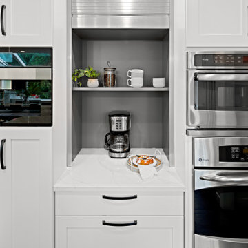
The homeowner’s goal for this kitchen remodel was to improve functionality and increase the home’s value. The existing kitchen was old and needed an update – cabinets were falling apart, the downdraft on the Jenn-Air range made it difficult to cook items correctly, there was little to no storage, lighting was insufficient. A poor layout dominated by a hook-shaped peninsula inhibited the ability to work efficiently
 Nip Tuck Remodeling
This home had dated and falling apart finishes, an insignificant fireplace in a giant living room, and a poor layout in the family room. Not to mention the primary bath covered in bamboo wallpaper.
The clients wanted a functional, updated and good-looking kitchen, a more adult family room, an updated serene primary bath. The remaining baths to be updated and modern. And, to make it feel like a holistic update, they wanted a welcoming staircase/entry.
As with most clients, stretching their dollar as far as possible was important. They didn't want to enlarge any footprint or move walls - we had to stay within existing bounds. With a whole home remodel costs can add up quickly depending on where we start & stop. For this family it made sense to do all the work at once to avoid repeat remodels. It was either buy new and still have to customize, or remodel to their exact needs and wants. The remodel was more affordable and made just for them.
Many finishes are clean, simple, and modern. A window was removed! in the family room to allow for a symmetrical entertainment center. A dramatic floor to ceiling fireplace surround was created in the Living room. The staircase was totally redone in both shape and style! The primary bath was reworked to get a two-person shower, and soaking tub. Serene /quiet finishes in the primary helped achieve a mellow /calming atmosphere. All new doors and trim throughout.
 Nip Tuck Remodeling
This home had dated and falling apart finishes, an insignificant fireplace in a giant living room, and a poor layout in the family room. Not to mention the primary bath covered in bamboo wallpaper.
The clients wanted a functional, updated and good-looking kitchen, a more adult family room, an updated serene primary bath. The remaining baths to be updated and modern. And, to make it feel like a holistic update, they wanted a welcoming staircase/entry.
As with most clients, stretching their dollar as far as possible was important. They didn't want to enlarge any footprint or move walls - we had to stay within existing bounds. With a whole home remodel costs can add up quickly depending on where we start & stop. For this family it made sense to do all the work at once to avoid repeat remodels. It was either buy new and still have to customize, or remodel to their exact needs and wants. The remodel was more affordable and made just for them.
Many finishes are clean, simple, and modern. A window was removed! in the family room to allow for a symmetrical entertainment center. A dramatic floor to ceiling fireplace surround was created in the Living room. The staircase was totally redone in both shape and style! The primary bath was reworked to get a two-person shower, and soaking tub. Serene /quiet finishes in the primary helped achieve a mellow /calming atmosphere. All new doors and trim throughout.
 Bel Air Construction
The homeowner’s goal for this kitchen remodel was to improve functionality and increase the home’s value. The existing kitchen was old and needed an update – cabinets were falling apart, the downdraft on the Jenn-Air range made it difficult to cook items correctly, there was little to no storage, lighting was insufficient. A poor layout dominated by a hook-shaped peninsula inhibited the ability to work efficiently

 J Design Group - Interior Designers Miami - Modern
AVENTURA MAGAZINE selected our client’s luxury 5000 Sf ocean front apartment in Miami Beach, to publish it in their issue and they Said:
Story by Linda Marx, Photography by Daniel Newcomb
Light & Bright
New York snowbirds redesigned their Miami Beach apartment to take advantage of the tropical lifestyle.
WHEN INTERIOR DESIGNER JENNIFER CORREDOR was asked to recreate a four-bedroom, six-bath condominium at The Bath Club in Miami Beach, she seized the opportunity to open the rooms and better utilize the vast ocean views.
In five months last year, the designer transformed a dark and closed 5,000-square-foot unit located on a high floor into a series of sweeping waterfront spaces and updated the well located apartment into a light and airy retreat for a sports-loving family of five.
“They come down from New York every other weekend and wanted to make their waterfront home a series of grand open spaces,” says Corrredor, of the J. Design Group in Coral Gables, a firm specializing in modern and contemporary interiors. “Since many of the rooms face the ocean, it made sense to open and lighten up the home, taking advantage of the awesome views of the sea and the bay.”
The designer used 40 x 40 all white tile throughout the apartment as a clean base. This way, her sophisticated use of color would stand out and bring the outdoors in.
The close-knit family members—two parents and three boys in college—like to do things together. But there were situations to overcome in the process of modernizing and opening the space. When Corredor was briefed on their desires, nothing seemed too daunting. The confident designer was ready to delve in. For example, she fixed an area at the front door
that was curved. “The wood was concave so I straightened it out,” she explains of a request from the clients. “It was an obstacle that I overcame as part of what I do in a redesign. I don’t consider it a difficult challenge. Improving what I see is part of the process.”
She also tackled the kitchen with gusto by demolishing a wall. The kitchen had formerly been enclosed, which was a waste of space and poor use of available waterfront ambience. To create a grand space linking the kitchen to the living room and dining room area, something had to go. Once the wall was yesterday’s news, she relocated the refrigerator and freezer (two separate appliances) to the other side of the room. This change was a natural functionality in the new open space. “By tearing out the wall, the family has a better view of the kitchen from the living and dining rooms,” says Corredor, who also made it easier to walk in and out of one area and into the other. “The views of the larger public space and the surrounding water are breathtaking.
Opening it up changed everything.”
They clients can now see the kitchen from the living and dining areas, and at the same time, dwell in an airy and open space instead of feeling stuck in a dark enclosed series of rooms. In fact, the high-top bar stools that Corredor selected for the kitchen can be twirled around to use for watching TV in the living room.
In keeping with the theme of moving seamlessly from one room to the other, Corredor designed a subtle wall of glass in the living room along with lots of comfortable seating. This way, all family members feel at ease while relaxing, talking, or watching sporting events on the large flat screen television. “For this room, I wanted more open space, light and a supreme airy feeling,” she says. “With the glass design making a statement, it quickly became the star of the show.”…….
….. To add texture and depth, Corredor custom created wood doors here, and in other areas of the home. They provide a nice contrast to the open Florida tropical feel. “I added character to the openness by using exotic cherry wood,” she says. “I repeated this throughout the home and it works well.”
Known for capturing the client’s vision while adding her own innovative twists, Corredor lightened the family room, giving it a contemporary and modern edge with colorful art and matching throw pillows on the sofas. She added a large beige leather ottoman as the center coffee table in the room. This round piece was punctuated with a bold-toned flowering plant atop. It effortlessly matches the pillows and colors of the contemporary canvas.
Miami,
Miami Interior Designers,
Miami Interior Designer,
Interior Designers Miami,
Interior Designer Miami,
Modern Interior Designers,
Modern Interior Designer,
Modern interior decorators,
Modern interior decorator,
Contemporary Interior Designers,
Contemporary Interior Designer,
Interior design decorators,
Interior design decorator,
Interior Decoration and Design,
Black Interior Designers,
Black Interior Designer,
Interior designer,
Interior designers,
Interior design decorators,
Interior design decorator,
Home interior designers,
Home interior designer,
Interior design companies,
Interior decorators,
Interior decorator,
Decorators,
Decorator,
Miami Decorators,
Miami Decorator,
Decorators Miami,
Decorator Miami,
Interior Design Firm,
Interior Design Firms,
Interior Designer Firm,
Interior Designer Firms,
Interior design,
Interior designs,
Home decorators,
Interior decorating Miami,
Best Interior Designers,
Interior design decorator,
 Lean Lens Architects
KITCHEN REDEFINED
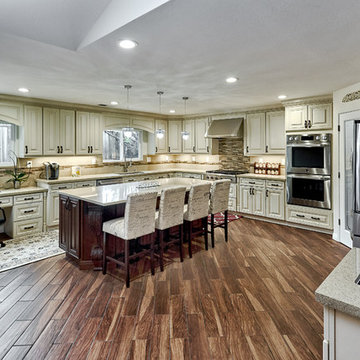
One of the biggest constraints the home owners had was the kitchen's size and layout. By demolishing the poorly designed 'bonus room', Lean Lens Architects was able to create space for a well sized and laid out kitchen.A large island now facilitates entertaining while plentiful storage along the walls creates a perfect background while being functional. The clients picked beautiful finishes to complete the design.


 Sosna Inc
The family's once-loved home had become a source of frustration. Their kitchen, a space meant for gathering and creating, felt cramped and outdated. Limited storage and poor organization made meal prep a tedious task, and entertaining guests a logistical nightmare. The laundry room, often overlooked, was equally problematic. Its cramped layout and lack of storage made laundry day a chore, and the noise of the washing machine echoed through the living room.
To compound the issue, the absence of dedicated office spaces made working from home a constant struggle. One makeshift office was squeezed into the dining room, while another was relegated to the basement.
The family was hesitant to embark on a major renovation, fearing the challenges and uncertainties that come with such a project. Finding a reliable contractor, ensuring timely completion, and worrying about potential shoddy workmanship were all valid concerns.
We understood their anxieties and were committed to providing a smooth and stress-free experience. Our team crafted a design that addressed each of their concerns, transforming their home into a functional and stylish space.
We reimagined the laundry room, creating a custom storage solution and incorporating a stackable washer and dryer. The open hallway to the living room was enclosed, creating a spacious closet with ample storage. The laundry room now seamlessly connected to the kitchen, simplifying the grocery unloading process.
A former juliette balcony was converted into a dedicated office space, providing a peaceful and productive work-from-home environment.
The dated and cluttered ensuite bathroom received a luxurious makeover. A clever pull-out storage system in the shower wall and a spacious niche provided much-needed organization.
While every renovation project has its challenges, this one was remarkably smooth. The only significant hurdle was some additional structural work required in the basement to support the new office space. Our experienced team handled this efficiently, minimizing any disruption.
The final result is a home that truly reflects the family's personality and lifestyle. The laundry room, now a cheerful and organized space with soft green cabinets, patterned floor tiles, and gold accents, showcases our attention to detail.
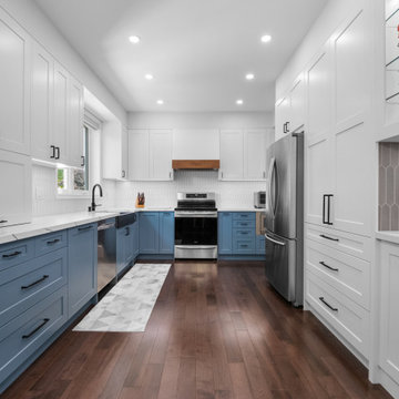
The kitchen is a stunning centerpiece, featuring a striking combination of blue and white cabinets, dark hardwood floors, and a sleek white backsplash. The adjacent beverage bar, with its glass-fronted upper cabinets, provides an elegant space for entertaining.
The ensuite bathroom is a spa-like retreat, with large-format marble tiles, a black vanity, and chrome fixtures creating an atmosphere of understated luxury.
The renovation has had a profound impact on the family's daily life. Ample storage throughout the house has banished clutter, making it easier to maintain a tidy home. The seamless flow from the laundry room to the kitchen has streamlined the grocery unloading process, and the dedicated office spaces have transformed the work-from-home experience.
Beyond the physical transformation, it was the shared moments and laughter that made this project truly special. The family's enthusiasm and good humor were contagious. One of the clients, with his big personality, even starred in a walk-through video of the finished project, showcasing his infectious joy.
From choosing tiles to navigating unexpected challenges, the entire process was filled with warmth and collaboration. Even their four-year-old son, initially shy, warmed up to our site leader, Gus, nicknaming him "Gus the Bus," a moniker that endeared him to the entire team.
 Lakeville Homes
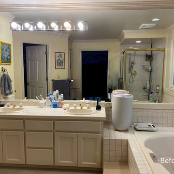
After more than 30 years in their 1990 Sammamish home, these homeowners were ready to update their primary suite. They had worked with contractors in the past and had dealt with poor workmanship, inaccurate measurements, budget overruns, and a design process that didn’t reflect what they wanted. This time, they were looking for a contractor who would listen, communicate clearly, and provide accurate pricing.
Lakeville started with a detailed preconstruction process. We reviewed the scope with the homeowners, gathered subcontractor pricing, and walked through the estimate line by line before construction began.
The primary bathroom was updated without replacing everything. The existing cabinets were in good condition, so they were refreshed. We raised the shower ceiling, replaced the original whirlpool tub, added heated tile floors, and installed a Grundfos SCALA2 booster pump to improve water pressure. Warm brushed-gold fixtures, large-format porcelain tile, Sherwin-Williams Alabaster walls, Greek Villa millwork, and Stratus Prime Acropolis quartz bring the new finishes together.
The adjoining primary closet was also remodeled with a custom storage system that includes accessory storage, a two-bag slide-out hamper, valet rod, and charging station.
Behind the walls, the project included new electrical circuits for the heated floors, smart thermostat, and booster pump. The existing bathroom presented a few challenges, including finding a specialty corner bypass shower enclosure that would fit the space.
In the primary bedroom, the existing carpet was replaced with hardwood flooring matched to the floors throughout the rest of the home.
The project was completed on time and on budget, with a finished primary suite that reflects what the homeowners wanted from the start: a comfortable, functional space and a contractor they could trust.
 Reico Kitchen & Bath
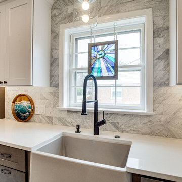
Designed by Marc Jean-Michel of Reico Kitchen & Bath in Bethesda, MD in collaboration with Liz Forgione of MMD Construction, this small transitional kitchen features Green Forest cabinets in the Park Place shaker door style in two finishes. The base cabinets feature a Summit Grey finish and the wall cabinets a White finish. The kitchen countertops are MSI Artic White Quartz.
The kitchen includes a Maravilla/Alvetian Isles Honed Marble 4x16 tile backsplash along with GE and Frigidaire appliances.
“The hardest part was envisioning a new functional space in an old kitchen with a poor layout and use of space,” said the client. “I love most the transformation in the flow of the whole first floor. The kitchen entries are wide, more inviting and create a lot of great light! There is so much great storage in a small kitchen! Marc was great to work with. I loved all of his ideas.”
Photos courtesy of BTW Images LLC.
 INSPIRED KITCHEN DESIGN
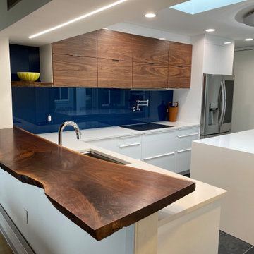
Following the IKD design plan — even when faced with unexpected challenges — ensured that Jeffery’s kitchen would function how he needed.
One such obstacle occurred when Jeffery went to replace a poorly installed kitchen window and found the inside of the wall was completely rotted away. “The sill plate was gone and the studs were literally dangling from the roof,” he says.
Since he had to reframe the wall, he decided to replace the exterior door with a sliding glass patio door as well. “However, the spot where I wanted to place the door already had a hydronic baseboard radiator there. My solution was to remove it and replace it with a European wall-mounted radiator. It gave us a better view and more floor space around the island,” he says.
He concludes: “The kitchen is, ironically, the only room in the home that wasn’t open concept. I knew I wanted to partially remove a wall to open it up into the dining room. So, I gave IKD that information and asked them to design the kitchen from the ground up making the best use of space. I was willing to move anything.”
 Lindsey Runyon Design
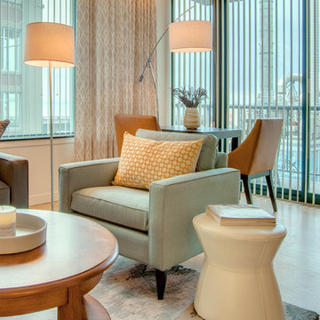
The round Hammary Ascend coffee table top lifts up to provide hidden storage and contrasts beautifully with the ikat print area rug. Lighting was a big concern: while the ample windows provided plenty of natural light during the day, the apartment was poorly lit once the sun went down. We added numerous table and floor lamps to add warmth and improve the functionality of the space.
 Mom's Design Build
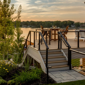
The #LakesideLeisure Project was a comprehensive redesign of a lakefront property that transformed various challenges into stunning solutions. Initially, the property featured a small, high-maintenance cedar deck with minimal lake views, poorly placed stairs, limited flat yard space due to extensive tiered landscaping and excessive plantings, obstructed lake views, and privacy concerns from a neighboring home.
The client’s vision was clear: they wanted a large, flat yard for family activities and hosting, enhanced outdoor living spaces for dining and lounging, increased privacy from neighbors, more shaded hangout areas, improved “curb appeal” from the lake, and reduced maintenance.
 MMW Architects
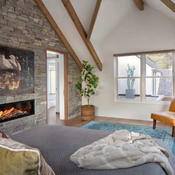
What the owners of the Madeline Ave Residence loved about the home when they bought it was the charm of the original 1920’s structure. However, a dissonance addition from the 1970’s shifted original charm to aesthetic awkwardness and poor flow. While maintaining the feel of the front façade, the rest of the home was reconfigured and choreographed to offer beauty and meet functional needs. Like many homes in historic districts, the homes grow organically to meet needs. Multiple forms and roof lines result.
Due to incorporating these same moves, this renovation fits seamlessly into the neighborhood. It is formal where it needs to be yet comfortable for the daily life. The people, the dog, the cats, the wine: all were carefully tended to throughout the design of the home. The spacious rooms and crisp white palette set the stage for vibrant tile and offers many locations for large scale art. Easy connections to the exterior spaces offer all-season gathering under the shade of the trellis or while making s’mores around the fire pit.
35