
Search results for "Poor functionality" in Home Design Ideas
 Keith Spears Kitchen & Bath Designer/Consultant
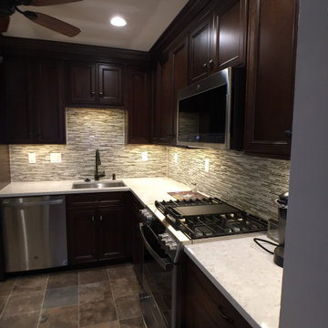
The old, outdated kitchen from the 40's had poor flow and was no longer to code. The remodeled kitchen has better flow and function just by switching the fridge and stove. The new wood cabinets fit better with the colors and style of the updated house, as is the flooring.
 MMW Architects
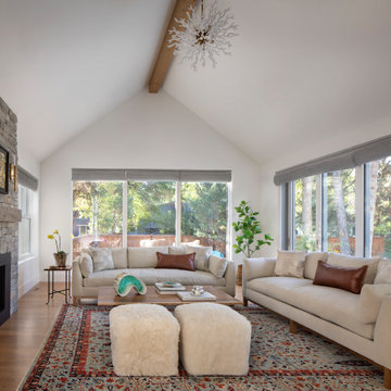
What the owners of the Madeline Ave Residence loved about the home when they bought it was the charm of the original 1920’s structure. However, a dissonance addition from the 1970’s shifted original charm to aesthetic awkwardness and poor flow. While maintaining the feel of the front façade, the rest of the home was reconfigured and choreographed to offer beauty and meet functional needs. Like many homes in historic districts, the homes grow organically to meet needs. Multiple forms and roof lines result.
Due to incorporating these same moves, this renovation fits seamlessly into the neighborhood. It is formal where it needs to be yet comfortable for the daily life. The people, the dog, the cats, the wine: all were carefully tended to throughout the design of the home. The spacious rooms and crisp white palette set the stage for vibrant tile and offers many locations for large scale art. Easy connections to the exterior spaces offer all-season gathering under the shade of the trellis or while making s’mores around the fire pit.
 New Era Builders Inc
Here’s a polished paragraph for you:
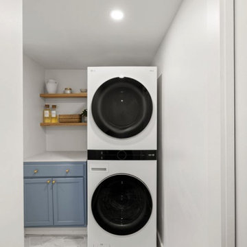
We took what was once a poorly finished flipper’s space and transformed it into a properly built, functional laundry room and bathroom designed with this growing family in mind. With a newborn on the way, every detail mattered — from creating an open, accessible layout for effortless laundry, to building a comfortable, safe area to bathe the baby. Thoughtful design, quality craftsmanship, and smart planning came together to deliver a space that not only works beautifully today, but will make life easier for this family as they continue to grow.
Find the right local pro for your project
 Advance Design Studio, Ltd.
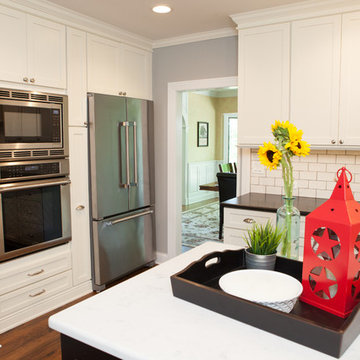
The major kitchen renovation of this old country farmhouse was a task of love, one that had been planned for many years by these Barrington seasoned homeowners. After interviewing no less than five companies, the homeowners chose the design team at Advance Design Studio to make the transformation they had long planned for.
“They had an understanding of the right design for the space almost from the instant they walked in the room”, says Sharon Scott of the design team of Nicole Ryan at Todd Jurs at Advance Design Studio. “They were the only designers who laid out ideas in the first meeting at the house that we really loved”, she says. “It was obvious that they understood the house, and understood us - and from then on the decision to hire them literally made itself”.
The original kitchen had a dividing “wall” of cabinetry…that made the rather large space seem very small, and cut off the kitchen from the eating area that has a beautiful garden view completely hidden from the main kitchen. Circulation was poor, leaving family members on top of one another when entertaining family and friends.
The new kitchen design nearly doubles the kitchen size within the original space; opening it up completely and enjoying an expansive island containing a new Kohler Whitehaven Smart Divide farm sink, a dishwasher, and pull out double trash receptacle. The great new gathering space accommodates four pull out stools beckoning grandchildren and friends alike. Removing the range from the island and relocating it to create a dramatic “feature” wall, completely out of the way of guests; it is now crowned with a beautiful completely customized wood hood designed to ventilate much more efficiently than the original island range containing a limited downdraft system.
The much more efficient use of the space after removing a pantry closet made way for a fully functional “tall wall” housing a double oven and refrigerator, out of the way of guests. Removing the restrictive cabinetry wall now allowed for an expansive floor to ceiling pantry cabinet with full extension pull out shelving, and an elegant display area complete with a beautiful furniture detailed buffet.
Fitting perfectly into the farmhouse charm of the old estate, Medallion Silver Lancaster cabinetry was chosen in a soft white Maple Divinity paint finish lining the perimeter. The stunning island hints to this old home’s past with Medallion Gold’s Maple Devonshire style graced with a Carriage Black Heirloom painted finish. The rubbed off black paint finish reveals the soft wood tones beneath, mimicking furniture you’d see in your grandmother’s home that has lovingly been polished for years to reveal a soft, subtly rubbed-off sheen.
Counter tops reverse contrast with perimeter tops of black “Raven” granite possessing a subtle honed finish, and a shift to Quartz Difinity Viareggio - resembling white Carrera marble on the island. A simple herringbone detail completes the decorative range wall, and subtle porcelain subway tiles grace the backsplash throughout.
The design is finished off with crisp Thermador and Bosch stainless steel appliances, and bright brushed cup pull and handle combination hardware. A pull down Kohler Bellaria faucet makes cleanup a breeze, and soft under-cabinet LED lighting throughout makes every work surface shine softly, and highlights the cabinetry display area with grace.
One special detail was created to make the dramatic ceiling transition to a vaulted area above the breakfast nook extra special. A tongue and groove solid wood ceiling was hung above, and a subtle greenish-grey distressed paint finish was hand developed on site by the talented crew, complementing the new kitchen with a completely unique surface that appears as if it’s been there for many, many years. It’s just one standout feature in the amazing new space that is sure to be in every conversation as newcomers enjoy the newest best hangout in this old home renewed!
After 30 years of renovating homes, this now content homeowner sips a cup of tea enjoying her new garden view, and reminisces projects of past – and lastly reports their experience with Advance Design Studio culminating with their amazing new kitchen to be the most enjoyable and satisfying home experience yet.
Designer: Nicole Ryan
Photographer: Joe Nowak
 Saikley Architects
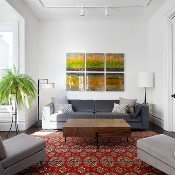
This beautiful 1881 Alameda Victorian cottage, wonderfully embodying the Transitional Gothic-Eastlake era, had most of its original features intact. Our clients, one of whom is a painter, wanted to preserve the beauty of the historic home while modernizing its flow and function.
From several small rooms, we created a bright, open artist’s studio. We dug out the basement for a large workshop, extending a new run of stair in keeping with the existing original staircase. While keeping the bones of the house intact, we combined small spaces into large rooms, closed off doorways that were in awkward places, removed unused chimneys, changed the circulation through the house for ease and good sightlines, and made new high doorways that work gracefully with the eleven foot high ceilings. We removed inconsistent picture railings to give wall space for the clients’ art collection and to enhance the height of the rooms. From a poorly laid out kitchen and adjunct utility rooms, we made a large kitchen and family room with nine-foot-high glass doors to a new large deck. A tall wood screen at one end of the deck, fire pit, and seating give the sense of an outdoor room, overlooking the owners’ intensively planted garden. A previous mismatched addition at the side of the house was removed and a cozy outdoor living space made where morning light is received. The original house was segmented into small spaces; the new open design lends itself to the clients’ lifestyle of entertaining groups of people, working from home, and enjoying indoor-outdoor living.
Photography by Kurt Manley.
https://saikleyarchitects.com/portfolio/artists-victorian/
 San Luis Kitchen Co.
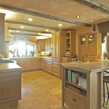
When the homeowners decided to move from San Francisco to the Central Coast, they were looking for a more relaxed lifestyle, a unique place to call their own, and an environment conducive to raising their young children. They found it all in San Luis Obispo. They had owned a house here in SLO for several years that they had used as a rental. As the homeowners own and run a contracting business and relocation was not impossible, they decided to move their business and make this SLO rental into their dream home.
As a rental, the house was in a bare-bones condition. The kitchen had old white cabinets, boring white tile counters, and a horrendous vinyl tile floor. Not only was the kitchen out-of-date and old-fashioned, it was also pretty worn out. The tiles were cracking and the grout was stained, the cabinet doors were sagging, and the appliances were conflicting (ie: you could not open the stove and dishwasher at the same time).
To top it all off, the kitchen was just too small for the custom home the homeowners wanted to create.
Thus enters San Luis Kitchen. At the beginning of their quest to remodel, the homeowners visited San Luis Kitchen’s showroom and fell in love with our Tuscan Grotto display. They sat down with our designers and together we worked out the scope of the project, the budget for cabinetry and how that fit into their overall budget, and then we worked on the new design for the home starting with the kitchen.
As the homeowners felt the kitchen was cramped, it was decided to expand by moving the window wall out onto the existing porch. Besides the extra space gained, moving the wall brought the kitchen window out from under the porch roof – increasing the natural light available in the space. (It really helps when the homeowner both understands building and can do his own contracting and construction.) A new arched window and stone clad wall now highlights the end of the kitchen. As we gained wall space, we were able to move the range and add a plaster hood, creating a focal nice focal point for the kitchen.
The other long wall now houses a Sub-Zero refrigerator and lots of counter workspace. Then we completed the kitchen by adding a wrap-around wet bar extending into the old dining space. We included a pull-out pantry unit with open shelves above it, wine cubbies, a cabinet for glassware recessed into the wall, under-counter refrigerator drawers, sink base and trash cabinet, along with a decorative bookcase cabinet and bar seating. Lots of function in this corner of the kitchen; a bar for entertaining and a snack station for the kids.
After the kitchen design was finalized and ordered, the homeowners turned their attention to the rest of the house. They asked San Luis Kitchen to help with their master suite, a guest bath, their home control center (essentially a deck tucked under the main staircase) and finally their laundry room. Here are the photos:
I wish I could show you the rest of the house. The homeowners took a poor rental house and turned it into a showpiece! They added custom concrete floors, unique fiber optic lighting, large picture windows, and much more. There is now an outdoor kitchen complete with pizza oven, an outdoor shower and exquisite garden. They added a dedicated dog run to the side yard for their pooches and a rooftop deck at the very peak. Such a fun house.
Wood-Mode Fine Custom Cabinetry, Barcelona
 Saikley Architects
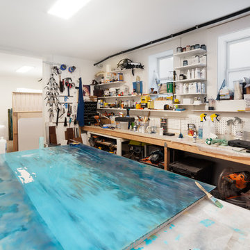
This beautiful 1881 Alameda Victorian cottage, wonderfully embodying the Transitional Gothic-Eastlake era, had most of its original features intact. Our clients, one of whom is a painter, wanted to preserve the beauty of the historic home while modernizing its flow and function.
From several small rooms, we created a bright, open artist’s studio. We dug out the basement for a large workshop, extending a new run of stair in keeping with the existing original staircase. While keeping the bones of the house intact, we combined small spaces into large rooms, closed off doorways that were in awkward places, removed unused chimneys, changed the circulation through the house for ease and good sightlines, and made new high doorways that work gracefully with the eleven foot high ceilings. We removed inconsistent picture railings to give wall space for the clients’ art collection and to enhance the height of the rooms. From a poorly laid out kitchen and adjunct utility rooms, we made a large kitchen and family room with nine-foot-high glass doors to a new large deck. A tall wood screen at one end of the deck, fire pit, and seating give the sense of an outdoor room, overlooking the owners’ intensively planted garden. A previous mismatched addition at the side of the house was removed and a cozy outdoor living space made where morning light is received. The original house was segmented into small spaces; the new open design lends itself to the clients’ lifestyle of entertaining groups of people, working from home, and enjoying indoor-outdoor living.
Photography by Kurt Manley.
https://saikleyarchitects.com/portfolio/artists-victorian/

Sponsored
Columbus, OH

Structural Remodeling
Franklin County's Heavy Timber Specialists | Best of Houzz 2020!
 Amsted Design-Build
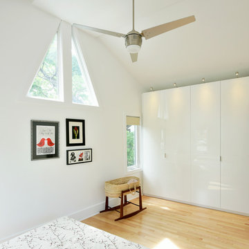
Previously renovated with a two-story addition in the 80’s, the home’s square footage had been increased, but the current homeowners struggled to integrate the old with the new.
An oversized fireplace and awkward jogged walls added to the challenges on the main floor, along with dated finishes. While on the second floor, a poorly configured layout was not functional for this expanding family.
From the front entrance, we can see the fireplace was removed between the living room and dining rooms, creating greater sight lines and allowing for more traditional archways between rooms.
At the back of the home, we created a new mudroom area, and updated the kitchen with custom two-tone millwork, countertops and finishes. These main floor changes work together to create a home more reflective of the homeowners’ tastes.
On the second floor, the master suite was relocated and now features a beautiful custom ensuite, walk-in closet and convenient adjacency to the new laundry room.
Gordon King Photography
 ForeverLawn, Inc.
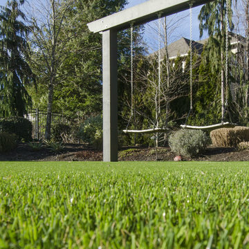
The owners of this incredible home in Lake Sammamish, Washington, had been discouraged by the work done by a previous artificial turf company at their home—a low quality product was installed poorly and therefore didn’t function as it should. Their faith in the artificial turf industry was restored when ForeverLawn Bellevue stepped in to remove and correct the issues that the previous company had created. ForeverLawn transformed a disaster into the homeowners’ dream yard. This wonderfully executed installation included over 4,000 square feet of DuPont™ ForeverLawn® Select HD and a unique backyard putting green surfaced with EZ Putt, a variation of GolfGreens™ ideal for fun, family-focused putting greens that requires little maintenance and will provide endless entertainment.
 Designs by KS
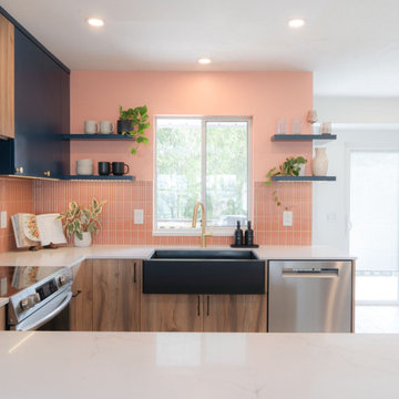
When our clients came to us with their renovation project asking for a pink kitchen, we were thrilled at the opportunity to create a unique, bright and colourful kitchen. It’s not something you see everyday, and we live for it! Being that they are a young family, who loves to cook but felt secluded and overwhelmed when in this space, we knew that this was going to be an epic transformation, not just aesthetically but also for their day-to-day life.
This renovation transformed a closed off, cramped, and poorly laid-out kitchen into a colourful, bright, open, and inviting space that combines functionality with vibrant colours and character. The redesign focused on maximizing storage, improving layout efficiency, and infusing the space with unique design elements that make it both practical and fun.
 Enchanted Kitchens, LLC
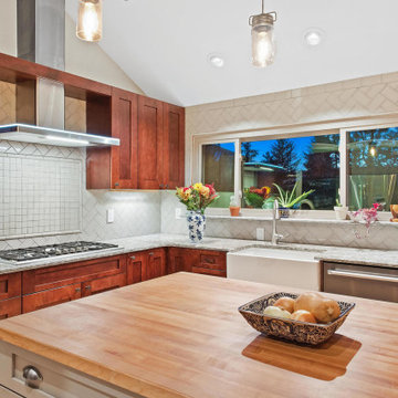
The space was unusable for family and entertaining. It was too small, with poor space planning. This complete remodel required structural wall removal, appliance relocate, floor replace and refinish. The peninsula was replaced with island for better traffic flow. The bridge at hood avoided the need for tile to the ceiling. The client was a fireman and the ladder makes him feel right at home!
 Designs by KS
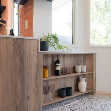
When our clients came to us with their renovation project asking for a pink kitchen, we were thrilled at the opportunity to create a unique, bright and colourful kitchen. It’s not something you see everyday, and we live for it! Being that they are a young family, who loves to cook but felt secluded and overwhelmed when in this space, we knew that this was going to be an epic transformation, not just aesthetically but also for their day-to-day life.
This renovation transformed a closed off, cramped, and poorly laid-out kitchen into a colourful, bright, open, and inviting space that combines functionality with vibrant colours and character. The redesign focused on maximizing storage, improving layout efficiency, and infusing the space with unique design elements that make it both practical and fun.
 Beckony Kitchens & Baths
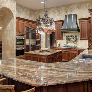
This couple are gourmet cooks with an extensive cookbook collection. This beautiful space was a long time coming, a delayed gratification of sorts for a retired couple who built their dream kitchen. The aesthetic is centered around their long vacations in Europe, bringing home the cooking techniques and the tried and true functional and gorgeous kitchens of The Old World. This design honours their love of cooking by giving them every tool needed right at their fingertips when they need it.The kitchen is in constant use as they entertain quite often. The original kitchen was poorly designed and had the cooktop on the island, severely limiting workspace for this dynamic duo. The fridge was located where the new cooktop now resides. Moving the cooktop to the wall greatly increased the space where the chefs work, as they are now able to move freely all the way around the perimeter of the island. The custom cabinets have intentionally designed shelves for each of the couple’s specific accessory needs. No expense was spared for this stunning villa-style kitchen. The one of a kind hood alone cost $5000 - $8000. The countertops are made of Quartzite Granite, and the walls are hand-frescoed.


 The Home Co.
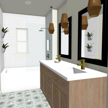
We ? bathroom renovations! This initially drab space was so poorly laid-out that it fit only a tiny vanity for a family of four!
Working in the existing footprint, and in a matter of a few weeks, we were able to design and renovate this space to accommodate a double vanity (SO important when it is the only bathroom in the house!). In addition, we snuck in a private toilet room for added functionality. Now this bath is a stunning workhorse!
 Erica Sweitzer Interior Decorator
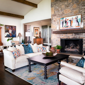
Modern art, comfortable seating, and treasured heirlooms combine to create an eclectic, inviting living room in this Country Music Hall Of Famers home. This space, with spectacular views, was seldom used due to impractical, poorly placed furniture. But an updated layout dramatically improved the flow and function, while the comfortable new seating and casual rustic tables provide the perfect conversation area. The new furniture, brimming with soft, inviting textures, coexist beautifully with the cherished antiques. The exposed beams and mantle were faux finished to coordinate with the rich wood floors, and a colorful contemporary rug and accessories were added to encourage family and guests to relax and enjoy the expansive views.
 Castle Building & Remodeling
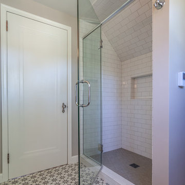
This 1932 South Minneapolis bathroom was OK to look at but did not suit the client’s aesthetics. Not to mention, it was composed of poorly-made and impractical products. Glass mosaic tiles in the shower were hard to clean and were cracking, while the vanity was falling apart.
The clients wanted something fresher that connected with the rest of the feel of their home, and products that were easier to maintain. The layout remained the same, but the space was updated with traditional style cement tiles, subway tiles and a timeless style/finish for the new vanity. Quartz was used for the vanity top, which will be easy to clean and maintain for the homeowner for years to come. A frameless glass enclosure was installed in order to eliminate the problematic stall-style shower curtain that the client despised.
The result was a bathroom that is classic in style but modern in maintenance and function.
 Wellstudio Architecture
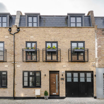
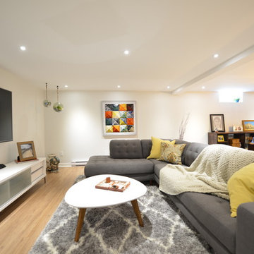
Renovation of an existing mews house, transforming it from a poorly planned out and finished property to a highly desirable residence that creates wellbeing for its occupants.
Wellstudio demolished the existing bedrooms on the first floor of the property to create a spacious new open plan kitchen living dining area which enables residents to relax together and connect.
Wellstudio inserted two new windows between the garage and the corridor on the ground floor and increased the glazed area of the garage door, opening up the space to bring in more natural light and thus allowing the garage to be used for a multitude of functions.
Wellstudio replanned the rest of the house to optimise the space, adding two new compact bathrooms and a utility room into the layout.

 DRIVEWAYS BY DESIGN
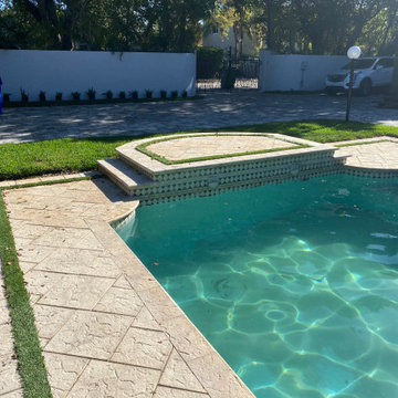
At Driveways by Design, safety and functionality are paramount to us. Peace of mind that your vehicle will enter and exit in a forward position, eliminating unwanted turns, blind spots, or backing out onto busy streets, all are priceless. When designing a driveway, it’s not just about the proper materials, the latest trends, style, colors, but it is also about the impact on the household, environment, and infrastructure. Nowadays many factors affect the daily life of south floridians, i.e. the heat island effect, some cities no longer allow circular driveways (zoning codes have become very restrictive about the amount that can be paved in order to mitigate the heat island effect,) construction happening all over our city, poor transportation systems, a turntable can truly enhance our daily experience, making it easier to exit our homes, no more agglomerations of traffic, or concrete trucks backing out, and no more worries about children or pets running unexpectedly behind the car. Designed by Shosh vant Verlaat and installed/maintained by Driveways by Design, the Car Turntable is ideal for residential and commercial applications, and will maximize the use of space, improve driver's visibility, as well as add value to your property.
 Chicagoland Home Products
Chicagoland Home Products pops up all over the Chicago area just looking for an awkward niche to transform into a place of custom storage, accessibility and function. Most homes have an area that is hard to get to, poorly designed or with no purpose. The design people and craftsmen at CHP are ready to look at your biggest and smallest problem places and help you fulfill your plans to bring grace to the awkward. Even if you don’t have a plan for transformation, Chicagoland Home Products will help you develop one.
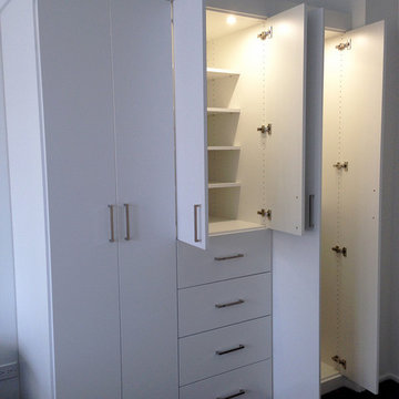
Example #1 adds some usable storage space to a room that came up short when it needed a closet. Using white with flat fronts and polished chrome square pulls, this unit has base molding and in-cabinet lighting. Where there was once awkward emptiness there are now drawers, shelves and a space for hanging storage.
Example #2 takes advantage of an unused wall. This unit is highlighted with the Carnaval color and Aspen fronts. A lighting valance enriches the area and makes it look great and brings alive a space that will be used for general storage and to display whatever you would like to show off.
These are just two examples of the many ways Chicagoland Home Products can take wasted space and provide storage solutions, beauty and usefulness. Remember that CHP has a practical purpose and a storage solution for all those places in your home, office or garage that need to become so much more that they are.
39