
Search results for "Poor functionality" in Home Design Ideas
 J & F Specialties, Inc.
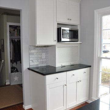
What was once a dark and dated kitchen with a poor layout was transformed into a bright open kitchen that is much more functional. We opened up some walls and removed another, relocated the door leading to the garage and relocated the sink. We added recessed and under cabinet lighting as well as updating outlets and switched. The new cabinets are Bridgewood Advantage Maple Mission door in painted white. The countertops are black quartz. The backsplash is Carrera marble.
 EPHROSS DESIGNS
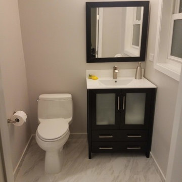
This bedroom/office had no shower in a very small bathroom with only a wall sink and small toilet. There was a poorly configured closet adjacent to the left wall which was used for the additional space in this bathroom allowing for a 36 in x 40 in shower stall. New plumbing and electric was added to the space as well..
The floors are 12 x 24 in porcelain marble tiles from The Tile Shop. We cut additional tile to use as the baseboard. The vanity which was purchased, has enough room for additional towels and toiletries and is an attractive and functional addition to the space.
 RMW Team
Designing a Health-Focused Home Living Space
Designing a health-focused home living space is more than just arranging furniture and choosing colors; it's about creating an environment that promotes physical well-being, mental clarity, and overall wellness. As we spend more time at home, especially in the wake of recent global shifts towards remote work and lifestyle changes, the importance of our living spaces in supporting our health has never been greater. Here are some key considerations when designing a health-oriented home.
Natural Light and Air Quality
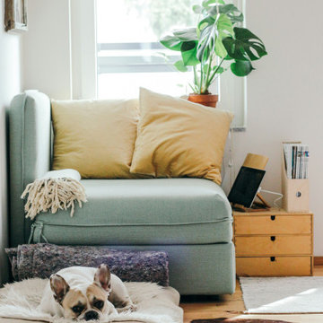
Natural light plays a crucial role in our health, affecting everything from our sleep patterns to our mood. When designing your home, prioritize spaces that allow for ample sunlight. Large windows, skylights, and strategically placed mirrors can help maximize natural light. In rooms where natural light is limited, consider using full-spectrum lighting that mimics daylight to support your circadian rhythms.
Air quality is another critical factor in a health-focused home. Indoor air can be more polluted than outdoor air due to various factors like off-gassing from furniture, household cleaners, and poor ventilation. Incorporating plants that are known to purify air, such as spider plants, snake plants, and peace lilies, can help improve indoor air quality. Additionally, ensure your home is well-ventilated by using exhaust fans in kitchens and bathrooms, and consider investing in air purifiers, especially if you live in an area with high pollution levels.
Ergonomic Furniture and Movement Spaces
The furniture you choose and how you arrange it can significantly impact your physical health. Ergonomic furniture, especially in workspaces, can help prevent strain and injury. Adjustable desks, supportive chairs, and monitor stands can contribute to better posture and reduced risk of musculoskeletal issues.
Incorporating spaces that encourage movement is also important. For example, a small home gym or a yoga corner can serve as a dedicated area for physical activity. Even in smaller spaces, you can create movement opportunities by ensuring there’s enough room to stretch or do simple exercises. Open floor plans or multipurpose spaces that can be easily reconfigured for different activities can help integrate movement into daily life.
Mindful and Minimalist Design
A clutter-free environment is conducive to mental clarity and relaxation. Mindful and minimalist design principles focus on creating spaces that are both functional and aesthetically pleasing without being overwhelming. Start by decluttering and organizing your belongings, keeping only what you need and what brings you joy.
Choose furniture and decor that are simple, natural, and calming. Materials like wood, stone, and natural fibers not only add a touch of nature to your home but also tend to have fewer chemicals than synthetic materials. Neutral color palettes with accents of soothing colors like blues and greens can help create a tranquil atmosphere.
Sleep and Restful Areas
A significant part of health-focused design is creating spaces that promote restful sleep. Your bedroom should be a sanctuary that encourages relaxation. Invest in a good-quality mattress and pillows that support your body. Blackout curtains, soundproofing, and maintaining a cool room temperature can also contribute to better sleep quality.
In addition to the bedroom, consider creating other restful areas in your home where you can unwind, meditate, or practice mindfulness. A cozy reading nook, a meditation space, or even a comfortable chair by a window can serve as your personal retreat.
Incorporating Nature and Green Spaces
Finally, integrating elements of nature into your living space can have a profound impact on your health. Biophilic design, which connects indoor environments with nature, has been shown to reduce stress and increase feelings of well-being. This can be as simple as adding more houseplants, incorporating natural materials, or even installing a small indoor water feature.
If you have outdoor space, create a garden or a patio where you can relax and enjoy fresh air. Even a small balcony can be transformed into a green oasis with the right plants and seating.
By thoughtfully designing your living space with health in mind, you create an environment that not only looks beautiful but also supports your physical and mental well-being.
Find the right local pro for your project
 Kaufman Construction Design and Build
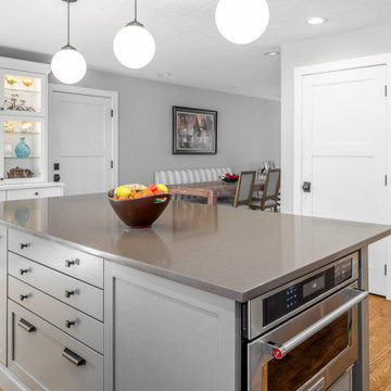
Emily and Steve have remodeled several pieces of their home and because they love Kaufman’s process so much, they keep coming back. In past years, we’ve remodeled most of their main floor including an updated living space and staircase, and a completely remodeled powder room and kitchen with a nice big island that’s perfect for entertaining. Their most recent project was this year when we remodeled their deck. The major pain points Steve and Emily dealt with before the remodel was lack of functionality due to poor design and because the previous owners had built the deck themselves, there were quite a few safety concerns. Throughout the design process, we decided to remove the existing deck completely and start fresh with a screened in porch, Emily’s Porch, and a deck off the porch with stairs going down to the beautiful backyard – one of the factors that motivated them to make this house their home to begin with.
 Enchanted Kitchens, LLC
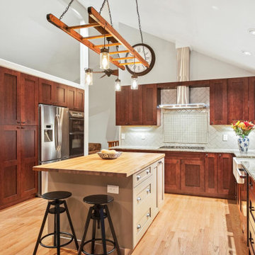
The space was unusable for family and entertaining. It was too small, with poor space planning. This complete remodel required structural wall removal, appliance relocate, floor replace and refinish. The peninsula was replaced with island for better traffic flow. The bridge at hood avoided the need for tile to the ceiling. The client was a fireman and the ladder makes him feel right at home!
 Coastal Home Design Studio
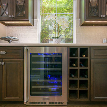
This kitchen started as a builder basic with no personality or charm. The layout didn't have the best function and the island was poorly placed. The homeowners purchased this house with remodeling and upgrading in mind. The layout was changed to accommodate two people cooking together. Zones were created for meal prepping, cooking and baking. The island was expanded to fill the space and utilize bar seating. The walk through butlers pantry was turned in to a wine bar with a fridge, storage and custom glass cabinets. A medium toned hardwood floor was layed throughout the entire lower level.
 Saikley Architects
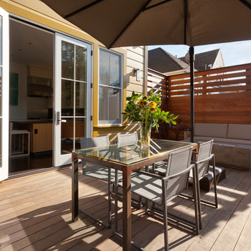
This beautiful 1881 Alameda Victorian cottage, wonderfully embodying the Transitional Gothic-Eastlake era, had most of its original features intact. Our clients, one of whom is a painter, wanted to preserve the beauty of the historic home while modernizing its flow and function.
From several small rooms, we created a bright, open artist’s studio. We dug out the basement for a large workshop, extending a new run of stair in keeping with the existing original staircase. While keeping the bones of the house intact, we combined small spaces into large rooms, closed off doorways that were in awkward places, removed unused chimneys, changed the circulation through the house for ease and good sightlines, and made new high doorways that work gracefully with the eleven foot high ceilings. We removed inconsistent picture railings to give wall space for the clients’ art collection and to enhance the height of the rooms. From a poorly laid out kitchen and adjunct utility rooms, we made a large kitchen and family room with nine-foot-high glass doors to a new large deck. A tall wood screen at one end of the deck, fire pit, and seating give the sense of an outdoor room, overlooking the owners’ intensively planted garden. A previous mismatched addition at the side of the house was removed and a cozy outdoor living space made where morning light is received. The original house was segmented into small spaces; the new open design lends itself to the clients’ lifestyle of entertaining groups of people, working from home, and enjoying indoor-outdoor living.
Photography by Kurt Manley.
https://saikleyarchitects.com/portfolio/artists-victorian/

Sponsored
Columbus, OH

Structural Remodeling
Franklin County's Heavy Timber Specialists | Best of Houzz 2020!
 LA Turf & Paver
Transformed Urban Oasis: Premium Artificial Turf Installation"
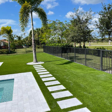
Set in the heart of Palm Beach Gardens this backyard underwent a comprehensive transformation, turning a previously underutilized space into a lush, evergreen oasis. The aim was clear: to craft an outdoor environment that requires minimal maintenance, provides aesthetic pleasure, and offers functional space for various activities.
Initially, the backyard presented challenges including uneven ground, patchy grass areas, and poor soil conditions. Our team addressed these issues with precision grading and soil stabilization techniques, preparing a perfect base for the upcoming transformation.
We opted for a premium artificial turf, chosen for its realistic texture, durability, and environmental resilience. Spread across [specific square footage/size of the area], the turf exudes a natural charm that rivals the best of lawns. With its soft pile height and UV resistance, it promises year-round greenery without the hassle of watering, mowing, or fertilizing.
Details, such as the seamless integration of the turf with existing patios or garden beds, highlight our team's meticulous attention to detail and commitment to excellence. The results are evident — a green sanctuary ready for sunbathing, children's play, or simply lounging.
Homeowners have praised the transformation, noting the newfound usability of their outdoor space, the reduction in water bills, and the numerous compliments they receive from visitors.
This project isn't just about installing artificial turf; it's about reimagining urban backyards, bringing nature closer to home, and offering sustainable and beautiful solutions for modern living.
 MMW Architects
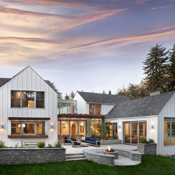
What the owners of the Madeline Ave Residence loved about the home when they bought it was the charm of the original 1920’s structure. However, a dissonance addition from the 1970’s shifted original charm to aesthetic awkwardness and poor flow. While maintaining the feel of the front façade, the rest of the home was reconfigured and choreographed to offer beauty and meet functional needs. Like many homes in historic districts, the homes grow organically to meet needs. Multiple forms and roof lines result.
Due to incorporating these same moves, this renovation fits seamlessly into the neighborhood. It is formal where it needs to be yet comfortable for the daily life. The people, the dog, the cats, the wine: all were carefully tended to throughout the design of the home. The spacious rooms and crisp white palette set the stage for vibrant tile and offers many locations for large scale art. Easy connections to the exterior spaces offer all-season gathering under the shade of the trellis or while making s’mores around the fire pit.
 Walczak Design And Build
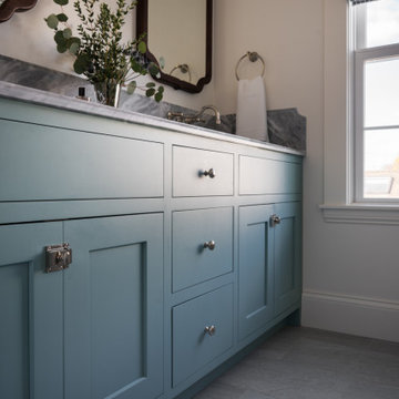
When this family came to us, they loved their home — but their bathrooms were failing them. The kids' bathroom had a non-functioning tub, a serious problem with two young children in the house. The primary bathroom was battling an active shower leak, a poor layout, and finishes well past their prime. Both spaces needed to be gutted. We got to work.
The Primary Bath: Elevated, Effortless, Unmistakably Theirs
Our clients arrived with a clear vision and a beautiful, refined sense of style. The layout was reconfigured from the ground up, and at the heart of the room sits a custom double vanity in a soft, sophisticated sage, topped with a stunning marble countertop and coordinating backsplash. Paired with elegant walnut-framed mirrors, a sculptural black and brass sconce, and wall-mounted polished nickel faucets, the vanity wall is a showpiece. Custom woven shades add warmth without sacrificing light.
The walk-in shower delivers — floor-to-ceiling white subway tile, a mosaic marble floor, transom windows, and frameless glass. Schluter DITRA radiant floor heating adds the kind of quiet luxury you feel every morning. Both marble surfaces were professionally sealed with StoneGuard to protect the investment for the long haul.
The Kids' Bath: Cheerful, Timeless, Built to Last
The girls' bathroom is designed with just as much intention as any room in the house. A warm white oak vanity with marble countertop anchors the space, paired with an antique brass-framed mirror and raspberry custom sconce shades that bring personality without being precious. A botanical-print Roman shade layers in pattern and charm.
The fully rebuilt tub-shower features wall-to-wall white subway tile, polished nickel fixtures, and a beautiful geometric floor tile in cream and warm taupe. A glass-front wall cabinet keeps things tidy, and tile wainscoting wraps the room for durability where it counts. Schluter DITRA radiant heat runs underfoot here too — because warm floors aren't just for adults.
Two bathrooms. Completely distinct. Completely intentional. Built for a family that already loved their home — and loves it even more now.
 Lakeville Homes
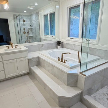
After more than 30 years in their 1990 Sammamish home, these homeowners were ready to update their primary suite. They had worked with contractors in the past and had dealt with poor workmanship, inaccurate measurements, budget overruns, and a design process that didn’t reflect what they wanted. This time, they were looking for a contractor who would listen, communicate clearly, and provide accurate pricing.
Lakeville started with a detailed preconstruction process. We reviewed the scope with the homeowners, gathered subcontractor pricing, and walked through the estimate line by line before construction began.
The primary bathroom was updated without replacing everything. The existing cabinets were in good condition, so they were refreshed. We raised the shower ceiling, replaced the original whirlpool tub, added heated tile floors, and installed a Grundfos SCALA2 booster pump to improve water pressure. Warm brushed-gold fixtures, large-format porcelain tile, Sherwin-Williams Alabaster walls, Greek Villa millwork, and Stratus Prime Acropolis quartz bring the new finishes together.
The adjoining primary closet was also remodeled with a custom storage system that includes accessory storage, a two-bag slide-out hamper, valet rod, and charging station.
Behind the walls, the project included new electrical circuits for the heated floors, smart thermostat, and booster pump. The existing bathroom presented a few challenges, including finding a specialty corner bypass shower enclosure that would fit the space.
In the primary bedroom, the existing carpet was replaced with hardwood flooring matched to the floors throughout the rest of the home.
The project was completed on time and on budget, with a finished primary suite that reflects what the homeowners wanted from the start: a comfortable, functional space and a contractor they could trust.
 River Woodcraft
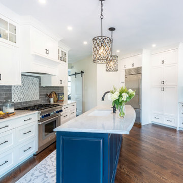
A must see before and after kitchen. What was a drab brown kitchen before with a not-so-functional layout, we have completely opened up the space, by removing a peninsula and a poorly used pantry space and added a large floating island and slide-out pantry storage instead. Now this bright and open space now feels fresh, clean and expansive.
 Enchanted Kitchens, LLC
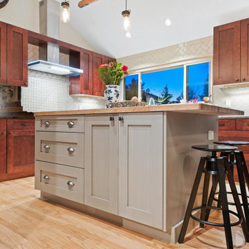
The space was unusable for family and entertaining. It was too small, with poor space planning. This complete remodel required structural wall removal, appliance relocate, floor replace and refinish. The peninsula was replaced with island for better traffic flow. The bridge at hood avoided the need for tile to the ceiling. The client was a fireman and the ladder makes him feel right at home!


 Designs By Gia Interior Design and Renovation
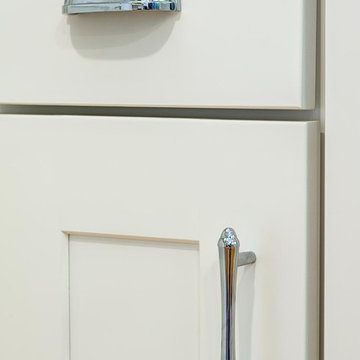
In this recent kitchen design and renovation project, these long time clients came to me originally, several years ago to start discussing the design of their kitchen. At that time, the kitchen in this 1800’s home included a kitchen that had been poorly remodeled in the 1980’s, so the kitchen had already lost most of it’s original charm. I created a design plan creating a beautiful large kitchen expanding the space into the adjacent rooms. My clients loved this design plan, but other home issues took precedence, so after a few additional years, my clients were now ready to start their kitchen project.
Their overall goals for the property did change since we first looked at this project, my clients decided that they did not want to enlarge or expand the small kitchen by opening it up to the adjacent rooms. So, I went back to the drawing board to create a kitchen in the existing kitchen space that fulfilled their new goals and created a beautiful functional space within the existing kitchen space. This new design, like my former design, honored this home’s traditional architecture, but added a light, fresh feel to the space using updated colors and material selections. This design consisted of additional storage and cabinetry, additional countertop space, and a small space to sit. We added new cabinetry, appliances, electrical, plumbing, beautiful quartz countertops, glass backsplash tile, traditional lighting fixtures, and finished everything off using beautiful classic hardware elements.
My clients are now in love with this new renovated kitchen space. It contains many of the elements of a much larger kitchen, and melds beautifully with the rest of the house which we have also designed renovated over the last few years. Finally my client’s get to enjoy their new kitchen space as much as they enjoy the rest of this beautiful home!
 Kitchen Solvers of Spring Hill
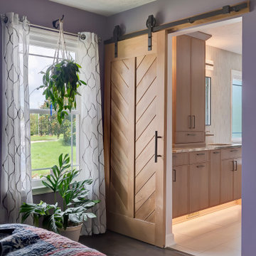
These homeowners were ready to completely transform their master bathroom. The existing space felt cramped and outdated, with an impractical linen closet, a small vanity, poor lighting, a bulky tub, and a shower that had seen better days. Their vision was clear—they wanted a warm, inviting, spa-inspired retreat with natural elements, rich textures, and a unique wood feature wall, rather than the all-white look that has become so common.
The finished design brings that vision to life through a beautiful blend of color, texture, and thoughtful details. A stunning cherry vanity and counter stack, topped with luxurious quartzite countertops, create warmth and elegance. The feature wall, finished in 1" x 3" Articulo tile, adds depth and visual interest, while large-format floor tiles provide a clean, modern foundation.
The curbless shower features coordinating hex tile flooring and niches, complemented by porcelain slab walls and glass panels that create an open, airy feel. A spacious freestanding tub offers the perfect place to relax and unwind. To maximize functionality, the doorway was relocated to accommodate a larger vanity, and custom barn and closet doors were added to enhance the room's character.
Programmable lighting tailored to the homeowners' lifestyle, along with a custom wood feature wall designed to showcase decorative plants, transformed a once-empty wall into a stunning focal point. What was once a dreaded space is now a beautiful spa-like retreat and one of the homeowners' favorite rooms in the house.
 Saikley Architects
This beautiful 1881 Alameda Victorian cottage, wonderfully embodying the Transitional Gothic-Eastlake era, had most of its original features intact. Our clients, one of whom is a painter, wanted to preserve the beauty of the historic home while modernizing its flow and function.
From several small rooms, we created a bright, open artist’s studio. We dug out the basement for a large workshop, extending a new run of stair in keeping with the existing original staircase. While keeping the bones of the house intact, we combined small spaces into large rooms, closed off doorways that were in awkward places, removed unused chimneys, changed the circulation through the house for ease and good sightlines, and made new high doorways that work gracefully with the eleven foot high ceilings. We removed inconsistent picture railings to give wall space for the clients’ art collection and to enhance the height of the rooms. From a poorly laid out kitchen and adjunct utility rooms, we made a large kitchen and family room with nine-foot-high glass doors to a new large deck. A tall wood screen at one end of the deck, fire pit, and seating give the sense of an outdoor room, overlooking the owners’ intensively planted garden. A previous mismatched addition at the side of the house was removed and a cozy outdoor living space made where morning light is received. The original house was segmented into small spaces; the new open design lends itself to the clients’ lifestyle of entertaining groups of people, working from home, and enjoying indoor-outdoor living.
Photography by Kurt Manley.
https://saikleyarchitects.com/portfolio/artists-victorian/
 Saikley Architects
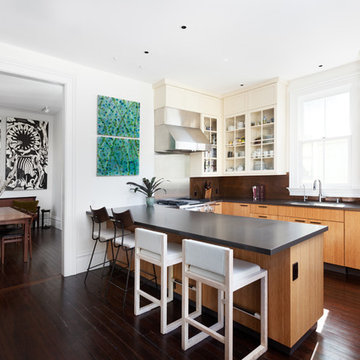
This beautiful 1881 Alameda Victorian cottage, wonderfully embodying the Transitional Gothic-Eastlake era, had most of its original features intact. Our clients, one of whom is a painter, wanted to preserve the beauty of the historic home while modernizing its flow and function.
From several small rooms, we created a bright, open artist’s studio. We dug out the basement for a large workshop, extending a new run of stair in keeping with the existing original staircase. While keeping the bones of the house intact, we combined small spaces into large rooms, closed off doorways that were in awkward places, removed unused chimneys, changed the circulation through the house for ease and good sightlines, and made new high doorways that work gracefully with the eleven foot high ceilings. We removed inconsistent picture railings to give wall space for the clients’ art collection and to enhance the height of the rooms. From a poorly laid out kitchen and adjunct utility rooms, we made a large kitchen and family room with nine-foot-high glass doors to a new large deck. A tall wood screen at one end of the deck, fire pit, and seating give the sense of an outdoor room, overlooking the owners’ intensively planted garden. A previous mismatched addition at the side of the house was removed and a cozy outdoor living space made where morning light is received. The original house was segmented into small spaces; the new open design lends itself to the clients’ lifestyle of entertaining groups of people, working from home, and enjoying indoor-outdoor living.
Photography by Kurt Manley.
https://saikleyarchitects.com/portfolio/artists-victorian/
 Designs by KS
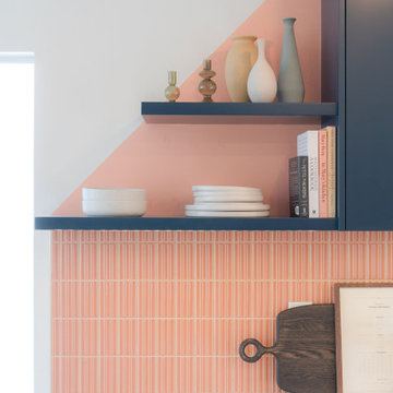
When our clients came to us with their renovation project asking for a pink kitchen, we were thrilled at the opportunity to create a unique, bright and colourful kitchen. It’s not something you see everyday, and we live for it! Being that they are a young family, who loves to cook but felt secluded and overwhelmed when in this space, we knew that this was going to be an epic transformation, not just aesthetically but also for their day-to-day life.
This renovation transformed a closed off, cramped, and poorly laid-out kitchen into a colourful, bright, open, and inviting space that combines functionality with vibrant colours and character. The redesign focused on maximizing storage, improving layout efficiency, and infusing the space with unique design elements that make it both practical and fun.
 LaMantia Design and Remodeling
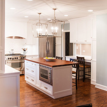
The clients found a house they loved for two reasons…location, location, location (first reason) and the exterior style was similar to a beloved childhood home. They came to LaMantia inquiring as to the possibilities for the first floor. Armed with the clients’ “wants and desires” LaMantia designers Jackie Prazak and Andy LaMantia went about redesigning most of the first floor into an open floor plan fit for the young family.
LaMantia & Prazak found the key to providing the enlarged feeling was through the poorly designed existing home addition. The additional living space was difficult to access, thus providing no useful function to the home.
Completely removing the original exterior walls of the home that blocked access into the addition was the first step in the plan. With the walls removed, the original walled-off space became a part of the home. Relocating the first floor Powder Room, revising the entry closet, removing the wall into the kitchen and resizing the Living Room all were key components to the final rebirth of the larger picture.
To finalize the new kitchen space, it was suggested to raise the Bay window unit thus allowing the relocated sink location. With all the revisions, the Kitchen now could easily accommodate a stretched out “L” layout with a large seated Island and a separate desk area.
With the final plans in place, the clients were amazed to find that within the existing walls of their newly purchased home they had gained so much extra use. And…the very last prize they gained was a dreamed of Mudroom!
 Mom's Design Build
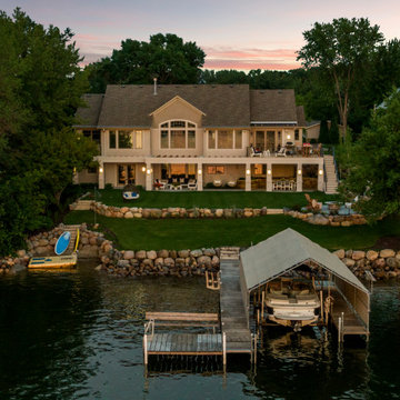
The #LakesideLeisure Project was a comprehensive redesign of a lakefront property that transformed various challenges into stunning solutions. Initially, the property featured a small, high-maintenance cedar deck with minimal lake views, poorly placed stairs, limited flat yard space due to extensive tiered landscaping and excessive plantings, obstructed lake views, and privacy concerns from a neighboring home.
The client’s vision was clear: they wanted a large, flat yard for family activities and hosting, enhanced outdoor living spaces for dining and lounging, increased privacy from neighbors, more shaded hangout areas, improved “curb appeal” from the lake, and reduced maintenance.
50