
Search results for "Post work social" in Home Design Ideas
 Norman Sanchez Architecture
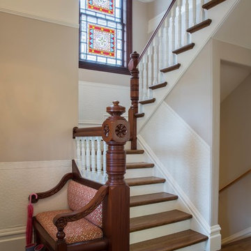
Hall staircase with original stained glass window and built in bench seat.
Example of a mid-sized classic wooden u-shaped wood railing staircase design in San Francisco with wooden risers
Example of a mid-sized classic wooden u-shaped wood railing staircase design in San Francisco with wooden risers
 Kahrs
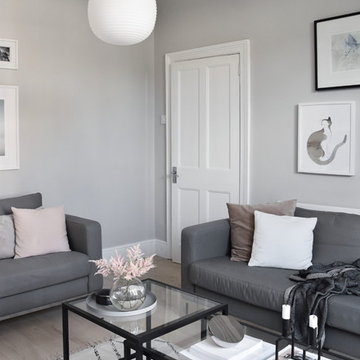
KahrsPopular Scandinavian-style interiors blog 'These Four Walls' has collaborated with Kährs for a scandi-inspired, soft and minimalist living room makeover. Kährs worked with founder Abi Dare to find the perfect hard wearing and stylish floor to work alongside minimalist decor. Kährs' ultra matt 'Oak Sky' engineered wood floor design was the perfect fit.
"I was keen on the idea of pale Nordic oak and ordered all sorts of samples, but none seemed quite right – until a package arrived from Swedish brand Kährs, that is. As soon as I took a peek at ‘Oak Sky’ ultra matt lacquered boards I knew they were the right choice – light but not overly so, with a balance of ashen and warmer tones and a beautiful grain. It creates the light, Scandinavian vibe that I love, but it doesn’t look out of place in our Victorian house; it also works brilliantly with the grey walls. I also love the matte finish, which is very hard wearing but has
none of the shininess normally associated with lacquer" says Abi.
Oak Sky is the lightest oak design from the Kährs Lux collection of one-strip ultra matt lacquer floors. The semi-transparent white stain and light and dark contrasts in the wood makes the floor ideal for a scandi-chic inspired interior. The innovative surface treatment is non-reflective; enhancing the colour of the floor while giving it a silky, yet strong shield against wear and tear. Kährs' Lux collection won 'Best Flooring' at the House Beautiful Awards 2017.
Kährs have collaborated with These Four Walls and feature in two blog posts; My soft, minimalist
living room makeover reveal and How to choose wooden flooring.
All photography by Abi Dare, Founder of These Four Walls
 Twelve Stones Designs, LLC
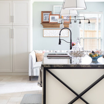
The owners of this kitchen had spent the money to upgrade the finishes in their kitchen upon building the home 12 years ago, but after living in the space for several years they realized how nonfunctional the layout really was. The (then) two preschool aged children had grown into busy, hungry teenagers with many friends who also liked to hang out at the house. So the family needed a more functional kitchen with better traffic flow, space for daily activities revolving around the kitchen at different times of day, and a kitchen that could accommodate cooking for and serving large groups. Furthermore, the dark, traditional finishes no longer reflected the homeowners’ style. They requested a brighter, more relaxed, coastal style that reflected their love of the seaside cities they like to visit.
Originally, the kitchen was U-shaped with a narrow island in the middle. The island created narrow aisles that bottle-necked at the dishwasher, refrigerator, and cooktop areas. There was a pass-through from the foyer into the kitchen, but the owners never liked that the pass-through was also located so close to the powder room. The awkward proximity was unappealing and made guests feel uncomfortable.
The kitchen’s storage was made up of lots of narrow cabinets, apothecary drawers, clipped corner units, and very few drawers. It lacked useful storage for the larger items the family used on a daily basis. And the kitchen’s only pantry was small closet that had only builder-grade, narrow shelving with no illumination to be able to see the contents inside.
Overall, the kitchen’s lighting plan was poorly executed. Only six recessed cans illuminated the entire kitchen and nook areas. The under cabinet lighting was not evenly distributed either. In fact, the builder had mis-placed the under cabinet lighting around the decorative pilasters which made for choppy, dark cubbies. Further, the builder didn’t include any lighting over the sink or the bar area, which meant whoever was doing the dishes was always in their own shadow. That, coupled with the steep overhang of the game room above made the bar area feel like a dim, cavernous space that wasn’t inviting or task oriented. The kitchen looked out into the main living space, but the raised bar and a narrow wall (which held the only large cabinet in the kitchen) created more of a barrier than a relationship to the living room or breakfast nook. In fact, one couldn’t even see the breakfast nook from the cooktop or sink areas due to its orientation. The raised bar top was too narrow to comfortably sit to either dine at or chat from due to the lack of knee space. The the homeowners confided that the kitchen felt more like a dark, dirty prison than place where the family, or their guests, wanted to gather and commune.
The clients' needs and desires were:
➢ to create a kitchen that would be a space the family loved to be in; to relate to the adjacent spaces all around, and to have better flow for entertaining large groups
➢ to remove the walls between the breakfast nook and living area and to be able to utilize the natural light from the windows in both those areas
➢ to incorporate a functional chopping block for prepping fresh food for home cooked meals, an island with a large sink and drain board, 2 pull out trash cans, and seating for at least the 2 teens to eat or do homework
➢ to design a kitchen and breakfast nook with an airy, coastal, relaxed vibe that blended with the rest of the house's coastal theme
➢ to integrate a layered lighting plan which would include ample general illumination, specific task lighting, decorative lighting, and lots of illuminated storage
➢ to design a kitchen with not only more storage for all the husband’s kitchen gadgets and collection of oils and spices, but smart storage, including a coffee/breakfast bar and a place to store and conceal the toaster oven and microwave
➢ to find a way to utilize the large open space between the kitchen, pantry area, and breakfast nook
Twelve Stones Designs achieved the owner's goals by:
➢ removing the walls between the kitchen and living room to allow the natural light to filter in from the adjacent rooms and to create a connection between the kitchen, nook, and living spaces for a sense of unity and communion
➢ removing the existing pantry and designing 3 large pantry style cabinets with LED tape lights and rollout drawers to house lots of kitchen appliances, gadgets, and tons of groceries. We also took the cabinets all the way up to the 9’ ceiling for additional storage for seasonal items and bulk storage.
➢ designing 2 islands - 1 with a gorgeous black walnut chopping block that houses a drawer for chopping and carving knives and a custom double pull out trash unit for point of use utilization - and 1 that houses the dishwasher, a large Blanco Gourmet sink with integrated drain board, woven baskets for fresh root vegetables and kitchen towels, plenty of drawer storage for kitchen items, and bar seating for up to 4 diners.
➢ closing off the space between the kitchen and the powder room to create a beautiful new private alcove for the powder room as well as adding some decorative storage. This also gave us space to include more tall storage near the new range for precision placement of the husband’s extensive oil and spice collection as well as a location for a combo-steam oven the wife wanted for baking and cooking healthy meals.
The project is enhanced functionally by:
➢ incorporated USB and standard receptacles for the kids’ laptops and phone charging in the large island
➢ designing the small island to include additional open shelving for items used on a daily basis such as a variety of bowls, plates, and colanders. This set up also works well for the husband who prefers to “plate” his dinners in restaurant-style fashion before presenting them to the table.
➢ the integration of specific storage units, such as double stacked cutlery drawers, a custom spice pull-out, a Kuerig coffee and tea pod drawer, and custom double stacked utensil drawers
➢ moving the refrigerator to the old oven location - this eliminated the bottle neck as well as created a better relationship to the eating table. It also utilizes the floor space between the pantry, nook, and kitchen
➢ creating a banquet style breakfast nook - this banquette seating not only doubles the amount of seating for large gatherings but it better utilizes the odd space between the kitchen and the previous nook area. It also helps to create a distinct pathway from the mudroom room through the pantry area, kitchen, nook, and living room.
➢ the coffee/breakfast bar area which includes the perfect location for the concealed microwave and toaster oven, convenient storage for the coffee pods and tea accoutrements. Roll-out drawers below also house the smoothie maker, hot water kettle, and a plethora of smoothie-making ingredients such as protein powders, smoothie additives, etc. Furthermore, the drawers below the Keurig house measuring utensil, cutlery, baking supplies and tupperware storage.
➢ incorporating lots of wide drawers and pullouts to accommodate large cookware.
➢ utilizing as much vertical space as possible by building storage to the ceiling which accommodates the family’s abundant amount of serving platters, baking sheets, bakeware, casserole dishes, and additional cutting boards.
The project is enhanced aesthetically by:
➢ new 5-piece Versailles pattern porcelain tile that now seamlessly joins the entire down stairs area together creating a bright, cohesiveness feeling instead of choppy separated spaces - it also adds a coastal feeling
➢ designing a cabinet to conceal the microwave and toaster oven
➢ the coastal influenced light fixtures over the nook table and island
➢ the sandy colors of the Langdon Cambria countertops. The swirling pattern and sparkling quartz pieces remind the homeowner of black-and-tan sandy beaches
➢ the striped banquet seating whose creamy white background and blue-green stripes were the inspiration for the cabinet and wall colors.
➢ All the interior doors were painted black to coordinate with the blacks and grays in the backsplash tile and countertop. This also adds a hint of tailored formality to an otherwise casual space.
➢ the use of WAC's Oculux small aperture LED units for the overhead lighting complimented with Diode LED strips for task lighting under the cabinets and inside the pantry and glass wall cabinets. All of the lighting applications are on separate dimmer switches.
Innovative uses of materials or construction methods by Realty Restoration LLC:
➢ Each 1-1/2” x 3” block of reclaimed end-grain black walnut that makes up the center island chopping block was hand milled and built in the shop. It was designed to look substantial and proportional to the surrounding elements, executed by creating the 4 inch tall top with a solid wood chamfered edge band.
➢ The metal doors on either side of the vent hood were also custom designed for this project and built in the Realty Restoration LLC shop. They are made 1x2, 11-gauge mild steel with ribbed glass. Weighing 60 lbs a piece, heavy duty cabinet hinges were added to support the weight of the door and keep them from sagging.
➢ Under-cabinet receptacles were added along the range wall in order to have a clean, uninterrupted backsplash.
Design obstacles to overcome:
➢ Because we were removing the demising walls between the kitchen and living room, we had to find a way to plumb and vent the new island. We did this by tunneling through the slab (the slab had post tension cables which prevented us from just trenching) to run a new wet vent through a nearby structural wall. We pulled the existing hot and cold lines between upper floor joists and ran them down the structural wall as well and up through a conduit in the tunnel.
➢ Since we were converting from wall overs to a gas range it allowed us to utilize the 220 feed for the wall ovens to provide a new sub panel for all the new kitchen circuits
➢ Due to framing deficiencies inherited from the original build there was a 1-1/2” differential in the floor-to-ceiling height over a 20 foot span; by utilizing the process of cutting and furring coupled with the crown moulding details on the cabinet elevations we were able to mask the problem and provide seamless transitions between the cabinet components.
Evidence of superior craftsmanship:
➢ uniquely designed, one-of-a-kind metal “X” end panels on the large island. The end panels were custom made in the Realty Restoration LLC shop and fitted to the exact dimensions of the island. The welding seams are completely indistinguishable - the posts look like they are cut from a single sheet of metal
➢ square metal posts on the small island were also custom made and designed to compliment and carry through the metal element s throughout the kitchen
➢ the beautiful, oversized end panels on the pantry cabinets which give the breakfast nook a tailored look
➢ integrating a large format 5 piece Versailles tile pattern to seamlessly flow from the existing spaces into the new kitchen space
➢ By constructing a custom cabinet that jogged around a corner we could not remodel (housing the entry way coat closet) we were able to camouflage the adjacent wall offset within the upper and lower cabinets. By designing around the existing jog in the structural walls we accomplished a few things: we were able to find the space to house, and hide, the microwave and toaster oven yet still have a clean cohesive appearance from the kitchen side. Additionally, the owners were able to keep their much needed coat closet and we didn’t have to increase the budget with unnecessary structural work.
Find the right local pro for your project
 City Homes, LLC
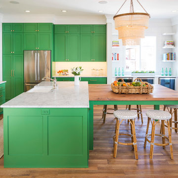
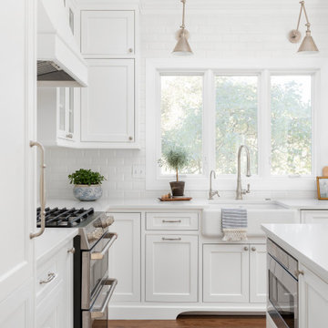
The work zone makes good use of the island, in which the sink and dishwasher are installed. It is across from the range and within easy reach of the refrigerator. The more social area of the kitchen is on the other side of the island, which has easy access to a drinks station. Placing the island extension and beverage station out of the way of the work zone was deliberate.
French cafe stools and a tiered coconut shell chandelier keep things laid-back and coastal. The shells on the chandelier bring in an earthy element. Brass hardware pops against the green cabinets.
 Plain & Posh
This home’s kitchen isn’t large and needed to somehow hold a mudroom area as the detached garage enters into the space. I carefully planned out all storage needs and we were able to add a wide, double door cabinet closet by the back door. The upper area holds coats and clutter. The lower doors have hooks and boot trays for backpacks and shoes. Paneling the Subzero fridge helps with softening the weight of the large appliance, as does the panel on the dishwasher. Little details like the skirt on the toe area and the beautiful hood and island posts make this smaller work space truly special!
 User
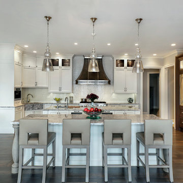
UserSpacious white kitchen with (2) islands and breakfast table. Stacked cabinets above wall cabinets and tall cabinets for additional storage / display. Interior of display cabinets coordinate with the dark finish on the tall cabinet section.
 Warmboard Radiant
Work Program Architects
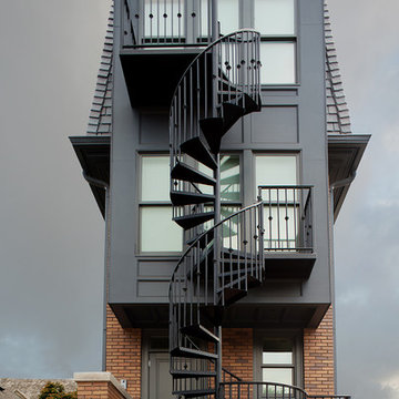
Inspiration for a mid-sized contemporary black three-story brick exterior home remodel in Other
Inspiration for a mid-sized contemporary black three-story brick exterior home remodel in Other

Sponsored
Delaware, OH

Buckeye Basements, Inc.
Central Ohio's Basement Finishing ExpertsBest Of Houzz '13-'21
 Teakwood Builders, Inc.
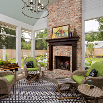
The clients were looking for an outdoor space they could retreat to and enjoy with their family. The backyard of this home features flower gardens, a gas burning lamp post, decorative pergola extending from the main house to the garage, 30' fiberglass pool with a splashpad, gas burning firepit area, patio area for outdoor dining, and a screened in porch complete with a 36" fireplace. The pergola is aesthetically pleasing while giving some protection from the elements journeying from house to garage and vice versa. Even with a 30' pool, there is plenty of yard space for family games. The placement of the firepit when lit gives just the right amount of ambiance for overlooking the property in the evening. The patio is located adjacent to the screened in porch that leads into the kitchen for ease of dining and socializing outdoors. The screened in porch allows the family to enjoy aspects of the backyard during inclement weather.
 My House Design|Build|Team
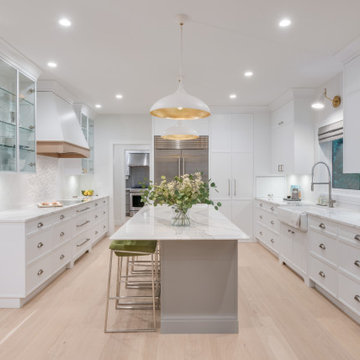
In this white kitchen renovation, we removed the old wooden shaker-style kitchen cabinetry and replaced them with all new white and grey cabinets, and white marble counter tops. Expertly hidden behind some of these cabinets is the family’s new walk-in pantry.
The original space had a small, awkward-shaped kitchen island that was so small it was barely functional or convenient for more than one person to sit at. We gave the homeowners a much larger kitchen island, with a beveled edge, that now has more than enough space for eating, socializing, or doing work. With a large overhang counter top on one side, there is now room for several backless bar stools tucked under the island. You’ll also notice glitters of gold inside the two over-sized lighting fixtures suspended over the island.
We created the homeowners a small wok kitchen just off of their new white kitchen renovation. In the main kitchen, we added a ceramic flat cook top and subtle white exhaust hood with an elegant rose-gold trim. Behind it, a white/grey mosaic back splash acts as a wall accent to provide some dimension to the otherwise solid white space. Surrounding the range hood are two large wall cabinets with clear doors to provide extra storage without adding bulk to the newly opened room.
The adjacent dining room was also updated to include a long, contemporary dining table with comfortable seating for eight (ten if you want to get cozy). We replaced the low-hanging run-of-the-mill chandelier with a higher, more modern style made of gold and glass. Behind it all is a new dark grey accent wall with a paneled design to add dimension and depth to the new brighter room.
 O’Hara Interiors
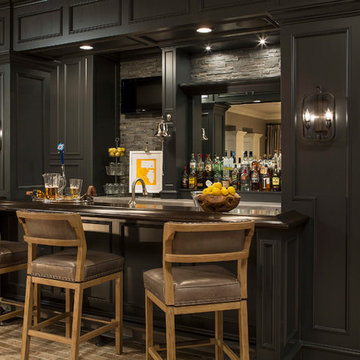
Martha O'Hara Interiors, Interior Design | L. Cramer Builders + Remodelers, Builder | Troy Thies, Photography | Shannon Gale, Photo Styling
Please Note: All “related,” “similar,” and “sponsored” products tagged or listed by Houzz are not actual products pictured. They have not been approved by Martha O’Hara Interiors nor any of the professionals credited. For information about our work, please contact design@oharainteriors.com.

 Tracy deShazo Interiors
Bryan Chavez Photography
River City Custom Homes - RounTrey - 2015 Homearama
Farmhouse with a Modern Vibe
Gold Winner - Master Suite
Aware of the financial investment clients put into their homes, I combine my business and design expertise while working with each client to understand their taste, enhance their style and create spaces they will enjoy for years to come.
It’s been said that I have a “good” eye. I won’t discount that statement and I’d add I have an affinity to people, places and things that tell a story. My clients benefit from my passion and ability to turn their homes into finely curated spaces through the use of beautiful textiles, amazing lighting and furniture pieces that are as timeless as they are wonderfully unique. I enjoy the creative process and work with people who are building their dream homes, remodeling existing homes or desire a fresh take on a well lived-in space.
I see the client–designer relationship as a partnership with a desire to deliver an end result that exceeds my client’s expectations. I approach each project with professionalism, unparalleled excitement and a commitment for designing homes that are as livable as they are beautiful.
 User
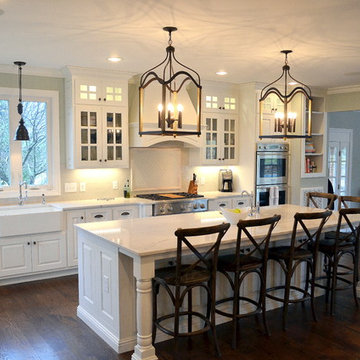
UserThis was a major kitchen remodel we worked on, that we provided the cabinetry for. They wanted a fresh airy look as well a working kitchen to accommodate a family of 6. We incorporated all white stacked cabinets with glass in the top, as well as 2 pantries with roll-outs flanking the large refrigerator. We also provided enough seating for everyone in the family by creating an over hang on 2 sides of the island supported my 3 posts. Other efficient storage accessories include a hidden spice pullout, lazy susan and hidden trash pull-out.
We also provided cabinetry for the Organization Center and Bar Area in the same room. For the Organization Center we incorporated a lift up appliance garage to hide any paperwork or electronic charging, and also a chalk board for lists or notes. In the Bar Area we incorporated a wine rack and a shallow pantry to the left for extra storage.
SELECTIONS:
Door Style- 3" frame raised panel door with rounded over outside edge (Stage 1)
Finish: Warm White
Hardware: Jeffery Alexander "Lyon" in Brushed Oil Rubbed Bronze
Countertops: Cambria "Ella"
 Drewett Works
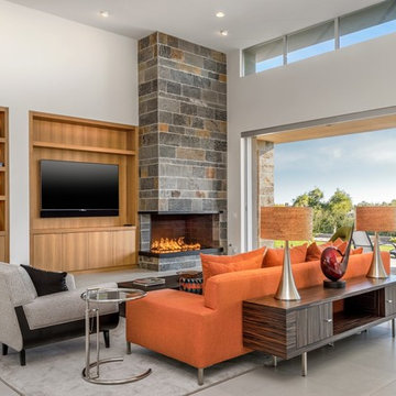
The unique opportunity and challenge for the Joshua Tree project was to enable the architecture to prioritize views. Set in the valley between Mummy and Camelback mountains, two iconic landforms located in Paradise Valley, Arizona, this lot “has it all” regarding views. The challenge was answered with what we refer to as the desert pavilion.
This highly penetrated piece of architecture carefully maintains a one-room deep composition. This allows each space to leverage the majestic mountain views. The material palette is executed in a panelized massing composition. The home, spawned from mid-century modern DNA, opens seamlessly to exterior living spaces providing for the ultimate in indoor/outdoor living.
Project Details:
Architecture: Drewett Works, Scottsdale, AZ // C.P. Drewett, AIA, NCARB // www.drewettworks.com
Builder: Bedbrock Developers, Paradise Valley, AZ // http://www.bedbrock.com
Interior Designer: Est Est, Scottsdale, AZ // http://www.estestinc.com
Photographer: Michael Duerinckx, Phoenix, AZ // www.inckx.com
Sponsored
Delaware, OH
Buckeye Basements, Inc.
Central Ohio's Basement Finishing ExpertsBest Of Houzz '13-'21
 Dynamic Garage Door
Antique Iron Gate Retrofit
Custom Gate Projects by Dynamic Garage Door
Project Consultations: (855) 343-3667
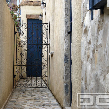
This authentic iron gate was purchased by our client at an antique bazaar without having a real direction as to how it would be incorporated on the construction of her new home in Long Beach, CA. We took the gate in for one of our in-house designer and iron-forge craftsman. Together they were able to develop a plan of action for the installation of the gate which included hand-forging authentic-looking posts and working hinges to attach to the gate leaving no trace of the modifications for a truly unique architectural appearance.
The work we did around the house was meticulously thought out to evoke authentic European design that looks like it's been there forever.
Dynamic Garage Door retrofitted a few gates surrounding the property and also designed and crafted a unique reclaimed barn wood garden gate you'll see in the other project pictures.
Our designers strive to create the most astounding garage door, gate and shutter projects you'll find on Houzz.com!

 Fishcamp Custom LLC.
There are a few ways to get to this beautiful back porch and they all lead to the same well-crafted destination. This exterior space continues the rustic cabin theme of exposed logs, reclaimed features (like the door), and detailed stone work on the walls and floor.
 Domus Constructors, LLC.
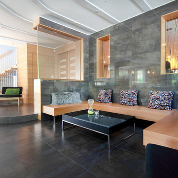
“Compelling.” That’s how one of our judges characterized this stair, which manages to embody both reassuring solidity and airy weightlessness. Architect Mahdad Saniee specified beefy maple treads—each laminated from two boards, to resist twisting and cupping—and supported them at the wall with hidden steel hangers. “We wanted to make them look like they are floating,” he says, “so they sit away from the wall by about half an inch.” The stainless steel rods that seem to pierce the treads’ opposite ends are, in fact, joined by threaded couplings hidden within the thickness of the wood. The result is an assembly whose stiffness underfoot defies expectation, Saniee says. “It feels very solid, much more solid than average stairs.” With the rods working in tension from above and compression below, “it’s very hard for those pieces of wood to move.”
The interplay of wood and steel makes abstract reference to a Steinway concert grand, Saniee notes. “It’s taking elements of a piano and playing with them.” A gently curved soffit in the ceiling reinforces the visual rhyme. The jury admired the effect but was equally impressed with the technical acumen required to achieve it. “The rhythm established by the vertical rods sets up a rigorous discipline that works with the intricacies of stair dimensions,” observed one judge. “That’s really hard to do.”
 Drewett Works
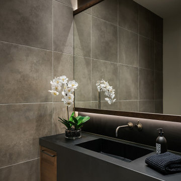
A monochromatic palette adds to the modern vibe of this powder room in our "Urban Modern" project.
https://www.drewettworks.com/urban-modern/
Project Details // Urban Modern
Location: Kachina Estates, Paradise Valley, Arizona
Architecture: Drewett Works
Builder: Bedbrock Developers
Landscape: Berghoff Design Group
Interior Designer for development: Est Est
Interior Designer + Furnishings: Ownby Design
Photography: Mark Boisclair
Sponsored
Columbus, OH
Free consultation for landscape design!

Peabody Landscape Group
Columbus' Reliable Landscape Design & Contracting
 Interiors by Steven G
Barry Grossman Photography
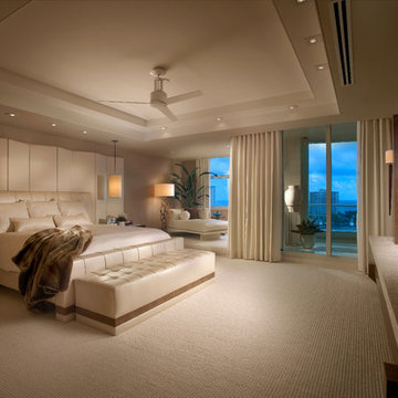
Trendy master carpeted bedroom photo in Miami with no fireplace and gray walls
Trendy master carpeted bedroom photo in Miami with no fireplace and gray walls
 Lakeville Kitchen and Bath
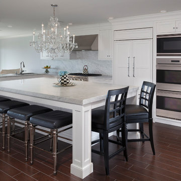
Painted White Kitchen by Rich Coulton at Lakeville Industries. Cabinetry by Crystal Cabinet Works, Inc. featuring the French Villa Doorstyle in Designer White paint.
David Reeves
 AMB2 Architects, LLC
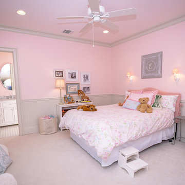
A little girls room with a pale pink ceiling and pale gray wainscoat
This fast pace second level addition in Lakeview has received a lot of attention in this quite neighborhood by neighbors and house visitors. Ana Borden designed the second level addition on this previous one story residence and drew from her experience completing complicated multi-million dollar institutional projects. The overall project, including designing the second level addition included tieing into the existing conditions in order to preserve the remaining exterior lot for a new pool. The Architect constructed a three dimensional model in Revit to convey to the Clients the design intent while adhering to all required building codes. The challenge also included providing roof slopes within the allowable existing chimney distances, stair clearances, desired room sizes and working with the structural engineer to design connections and structural member sizes to fit the constraints listed above. Also, extensive coordination was required for the second addition, including supports designed by the structural engineer in conjunction with the existing pre and post tensioned slab. The Architect’s intent was also to create a seamless addition that appears to have been part of the existing residence while not impacting the remaining lot. Overall, the final construction fulfilled the Client’s goals of adding a bedroom and bathroom as well as additional storage space within their time frame and, of course, budget.
Smart Media
16