
Search results for "Potential difference" in Home Design Ideas
 Metropolis Drafting and Construction Inc
An original 1930’s English Tudor with only 2 bedrooms and 1 bath spanning about 1730 sq.ft. was purchased by a family with 2 amazing young kids, we saw the potential of this property to become a wonderful nest for the family to grow.
The plan was to reach a 2550 sq. ft. home with 4 bedroom and 4 baths spanning over 2 stories.
With continuation of the exiting architectural style of the existing home.
A large 1000sq. ft. addition was constructed at the back portion of the house to include the expended master bedroom and a second-floor guest suite with a large observation balcony overlooking the mountains of Angeles Forest.
An L shape staircase leading to the upstairs creates a moment of modern art with an all white walls and ceilings of this vaulted space act as a picture frame for a tall window facing the northern mountains almost as a live landscape painting that changes throughout the different times of day.
Tall high sloped roof created an amazing, vaulted space in the guest suite with 4 uniquely designed windows extruding out with separate gable roof above.
The downstairs bedroom boasts 9’ ceilings, extremely tall windows to enjoy the greenery of the backyard, vertical wood paneling on the walls add a warmth that is not seen very often in today’s new build.
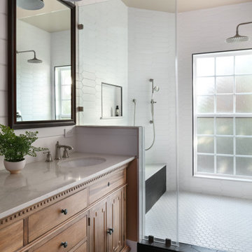
The master bathroom has a showcase 42sq. walk-in shower with its own private south facing window to illuminate the space with natural morning light. A larger format wood siding was using for the vanity backsplash wall and a private water closet for privacy.
In the interior reconfiguration and remodel portion of the project the area serving as a family room was transformed to an additional bedroom with a private bath, a laundry room and hallway.
The old bathroom was divided with a wall and a pocket door into a powder room the leads to a tub room.
The biggest change was the kitchen area, as befitting to the 1930’s the dining room, kitchen, utility room and laundry room were all compartmentalized and enclosed.
We eliminated all these partitions and walls to create a large open kitchen area that is completely open to the vaulted dining room. This way the natural light the washes the kitchen in the morning and the rays of sun that hit the dining room in the afternoon can be shared by the two areas.
The opening to the living room remained only at 8’ to keep a division of space.
 Roeser Home Remodeling
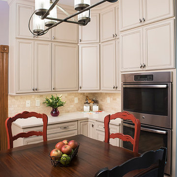
Older homes are filled with charm, but often the kitchen has been overlooked. Originally, it was a work area– not made for public view. Today it truly is the center of all that goes on in the family. Today’s active homeowners are no different. Although their children may be grown, cooking and baking are still considered top priorities. Storage and counter space were issues that needed to be addressed and being aware of the aging process of the kitchen, lighting also needed to be considered. Although the kitchen is only a 13’ X 13’ space, it had other challenges. A back staircase, three doorways, and a large window took away from the wall space, however the 9’ ceilings were an unused potential for storage. Choosing Wellborn’s Select Series Cabinets in a Maple with a sandstone slate finish brightened the space immediately. Stacking the cabinets and taking them all the way to the ceiling gave this homeowner more storage than ever imagined for items of occasional use. Under counter LED Tape lighting brightened the task areas of the kitchen without causing additional heat from too many lights. A new table light on a dimmer sets the right mood for dining and provides just enough additional lighting. Installing a Sharp, stainless steel, 24” microwave drawer freed up some counter space for prep work near the cooktop (a GE, stainless steel 30” gas cooktop with four burners) and next to the sink (a new Elkay Gourmet Double Bowl with aqua DVD). Also, adding a new Kohler Sensate kitchen faucet which is hands free, a Kohler contemporary soap/lotion dispenser and a new ISE 3/4 horsepower disposal– helps to make clean-up a breeze. A new GE dishwasher, a new Broan stainless steel 30” hood, and a new GE 30” double oven both standard oven sizes, not only allows our homeowner to cook dinner and dessert, but the stainless steel reflects light while adding a design element tying the cabinet hardware and light fixture into the overall look. The countertop is Caesarstone’s Dreamy Marfil and is always a bold statement for any size Kitchen. Mixing the backsplash tile up without appearing busy came together with the beautiful combination of Sandlewood polished Amafi 30cm from countertops to base cabinets and Jinsen Coffee Bone in a diamond pattern framed in the Sandlewood polish and a Amafi Pencil liner above the cooktop. The soft addition of a new six panel Pine door stained and finished to match the other doors within the home added to the overall beauty of this stunning kitchen.
 J. Francis Company LLC
About:
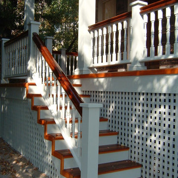
Abandoned two years ago by a previous contractor, and overwhelmed by the challenges associated with building an updated porch respectful to this Queen Anne style home, J. Francis Company, LLC was referred to the customer by Maynes & Associates, Architects. Perched at the highest point on the North Side with a panoramic view is where Deb Mortillaro and Mike Gonze make their residence. Owners of the famous Dreadnought Wines and Palate Partners in the Strip District of Pittsburgh, Deb & Mike wanted a porch to use for entertaining & wine tasting parties. Design features include reuse of original porch footers, mahogany tongue & groove flooring, a railing system that compliments the original design yet complies with the code and features a clear coated Cyprus top rail. The original porch columns were most likely stone bases with wood posts that have been replaced with columns to enhance the updated look. The curved corner has been reproduced including a custom-built curved handrail. The whole porch comes together, tying in the red mahogany floor, Cyprus handrail, and stained bead board ceiling. The finished result is a breathtakingly beautiful wrap-around porch with ample room for guests and entertaining.
Testimonial:
"Our beloved porch had been taken down to be rebuilt for two years before we met the great folks at J. Francis Company. We knew this porch had great potential and all it would take was the right people to make it happen - ones with vision and great craftsmanship. In conjunction with our architect, Greg Maynes, Dave Myers of J. Francis Company guided this project along with tremendous skill and patience. His creative suggestions and practical thought made the process painless and exciting. The head carpenter JK was a marvel and added touches that made a spectacular difference.
We use our home and especially this porch to entertain both clients and friends throughout the year. They all have been anxiously waiting to hear that it is done. A pleasant surprise will be theirs when they arrive."
Find the right local pro for your project
 TVL Creative Ltd.
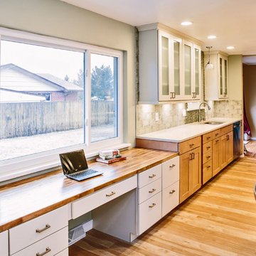
This remodel took an extremely dark & dated kitchen and transformed it into a bright and airy happy place for our client. The existing conditions created a dark, hall-like kitchen that greatly lacked in function and did little to optimize storage. Realizing the potential of this truly massive space, we created a design that utilizes every inch of the kitchen and creates functional cooking and prep space as well as pantry storage and work nooks. Our first order of business was to demo out the blocky corner that separated the kitchen from the living room. This involved removing an existing fireplace, re-structuring a wall, and having an entirely new furnace installed in the basement to eliminate a duct running right through the corner we hoped to eliminate. After opening up the space, we focused on highlighting and brightening the room. New NuCore flooring was installed to give the kitchen a fresh look while offering optimal function and cleanability. Two-toned cabinets in a honey maple and painted silk were used to create a warm and comfortable balance throughout the space. New quartz countertops in MSI's canvas were installed, and butcher block was installed on the two desk areas to offer a warm visual relief and casual work surface. The color palette for the kitchen is reminiscent of a cozy apothecary; we utilized fresh greens with Sherwin Williams paint on the walls and Treviso Gray Sage glazed subway tiles on the backsplash. Over the sink, we designed a playful highlight with counter-to-ceiling mini brick mosaic in a dark crackle green. We introduced additional lighting throughout including new recessed lights, over-sink light, and under-cabinet lights. New appliances were introduced to the space as well, and we complimented the stainless steel of these fixtures to the transitional nickel hardware on the cabinets. This space now feels open and inviting, and is visible from the second you enter the front door! We are so proud of this result and so happy that our clients can enjoy this gorgeous kitchen for years to come.
 Asher Custom Homes
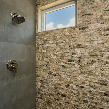
Example of a large mountain style master beige tile and stone tile medium tone wood floor and brown floor japanese bathtub design in Denver with distressed cabinets, an undermount sink, granite countertops, a hinged shower door and gray countertops
 OH LA LA !
Italian Different Concept
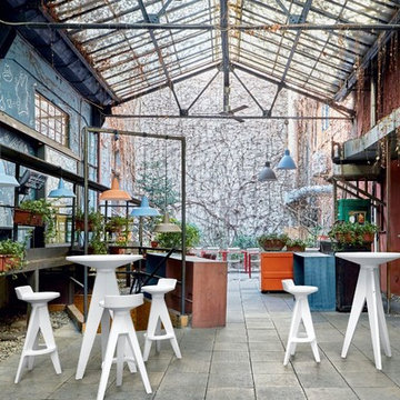
A real laboratory of ideas. Myyour is a reality where the most innovative design ideas are chosen and transformed into new and unique decorative solutions... solutions that are able to express elegance and color, functionality and aesthetics, versatility and prestige. A result that has been achieved thanks to the upshot of the series of research, assessments, studies and applications that have been carried out for each of the collections... An uninterrupted series of formal and technological trials to help us reach our final objective: a vanguard product that is best characterized as a perfect blend of craftsmanship and innovation and which is destined to become the protagonist of the most diverse spaces: a product designed to take over the scene by giving a touch of exclusivity and originality to the home, office, public setting...
The founding pillars of the Myyour philosophy are the surprising stateliness of its products and the distinction of a manufacturing process, which is meticulously followed as to ensure perfection; from the development of the project to the selection of the materials, but also from the execution of the project to the attention and care that are paid to every single minimum detail along the way. This is how the Myyour quality came to life. A must that is always more and more appreciated on an international level and by a clientele who has witnessed the potential artistic expression of these decorative creations. These solutions have managed to fill an empty space and are always in perfect harmony with their outside beauty and intrinsic functionalities. These creations always manage to trigger the creativity of individuals, architects, decorators and designers.
 Renovisions
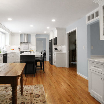
This client requested that we design her new kitchen space to look and function with her and her family’s usage in mind. She was not happy with her existing kitchen due to builder-grade ceramic flooring, lack of countertop space, poor lighting, inadequate and unorganized storage and the closed off feel of the area. Renovisions resolved all of these issues by designing and building an impressive, transitional styled kitchen; delivering a beautifully well thought-out space that provides a multi-functional approach and meets the needs of this busy and dynamic household.
Typically, we encounter challenges in every project, and this was no different. The upstairs bathroom plumbing ran across the entire length of the kitchen sink wall and it was necessary to work with it by moving the plumbing as far up as possible and then building a soffit to hide it.
Creating a space that has a more open feel was top of mind for our client. Installing a new wood floor that matched the existing dining room floor helped with this and in addition, warmed up the room. By relocating the refrigerator to the opposite wall and adding a bar area at the end toward the family room, the flow of traffic for family members and guests became more managed.
The open floor plan allowed for additional island cabinets to accommodate smart storage and better functionality when prepping meals, sitting to eat or gathering with friends and family. We believe having ample countertop surface space is a critical improvement in any renovation and this particular project now boasts a large countertop area with a stunning wide vein pattern that accentuates the design instead of overpowering it. The soft look of the Blanco Arabescato quartz enhances the space and looks lovely with the white inset styled cabinetry.
Beauty and function go hand-in-hand in this kitchen with several exceptional elements such as under-cabinet lighting with dimmers to control the mood light. Glass doors were added to the wall cabinets which flank the wine rack for displaying their decorative glassware and a beverage cooler below provided added convenience and access to cold beverages. The GE Café line of appliances in ‘Slate’ and ‘Stainless Steel’ finishes are a stunning contrast here.
The sensational looking decorative marble 6”x6” backsplash tile over the gas range and in the bar area creates nice focal points by creating a unique look for her that family and guests love.
Convenient and functional elements were added such as a blind corner pull-out for easier pot/pan storage, a sweep-o-vac under cabinet vacuum system for those constant quick clean-ups, a pull-out caddy under the sink base for storage of cleaning products and a protective mat to collect potential spills.
Our client let us know it was time for a change and we listened. She shared a few pictures she loved from a home magazine, we shared our insight and then designed/built the kitchen of her dreams! … A fabulous and functional space.
Sponsored
Columbus, OH

Hope Restoration & General Contracting
Columbus Design-Build, Kitchen & Bath Remodeling, Historic Renovations
 Art of Home Team
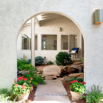
Santa Fe inspired oasis with ~17,000 sq ft still to garden, expand or develop. WOW! A wonderful home for the buyer who wants something beautiful and different. Stop by ** Friday, July 9th, 4-6 pm ** for a tour @ 10755 E Asbury Ave. Just 25 minutes to downtown Denver and DIA. Small custom home lots a few blocks over just sold for 150-200K. Parcel split the back half, with an easement for the driveway. Huge opportunity here. Buyer to verify potential.
4 br 4 ba :: 3,538 sq ft :: $825,000
#SantaFe #DreamHome #Courtyard #FindYourZen #Aurora #ArtOfHomeTeam #eXpRealty

 Chester County Kitchen & Bath
Great kitchen remodel by Ken Helm at Snap Design. Chester County Kitchen and bath provided the new design and cabinetry using Fabuwood cabinets in the Fusion Blanc door style. The granite countertops are the popular color Fantasy Brown. Clients love the coloring of this granite because it compliments a lot of different designs and color schemes. The new flooring is Luxury vinyl snap lock Fusion Max in Chambord. Fusion flooring has the look and feel of real wood along with being waterproof and way more durable. Come by our showroom to check out Fusion flooring.
 Klopf Architecture
Malibu Glass Box House by Klopf Architecture
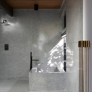
Following the devastating Woolsey Fire of 2018, the site in Malibu offered a unique opportunity to rebuild not just a home, but a new architectural composition that highlighted the property’s potential while navigating strict fire-rebuild codes in the area. Designed by Klopf Architecture, this project embraced a set of limitations and translated them into an architectural asset.
The city’s fire-rebuild process required the new structure to remain close to the original footprint, size and bulk, a constraint that ultimately clarified the architectural direction. Perched near the front of a long, narrow lot, the new home frames and overlooks a private, park-like rear expanse, an uncommon luxury especially in this part of Malibu .
Without a fixed program, the design process allowed for a different kind of creative focus allowing Klopf Architecture the opportunity to explore how a modernist home could best respond to this site. The team approached the project not with a list of requirements, but with a question: How might a modernist live here? What spatial qualities would inspire calm, connection, and a sense of wonder in this setting? The process became less about problem-solving and more about architectural storytelling—letting the site, the light, and the principles of modern design guide the form and flow of the home.
The response emerged in the form of a glass-box pavilion, an open, Mid-Century Modern inspired living, dining, and kitchen space that floats at the edge of the property’s natural descent. Connected to the more enclosed, private areas of the home by a glass-walled hallway, the living pavilion becomes a distinct centerpiece of the design. It opens on all four sides to the landscape with decks and patios on the flanks, an internal garden and water feature to the north, and a dramatic unguarded view of the expansive backyard and ocean horizon to the south.
Because of the mandated footprint, careful planning was required to ensure every space could still engage with light, landscape, or both. Strategic voids in the form of atriums and courtyards allow daylight to filter deep into the home’s core, while offering moments of surprise and retreat. These design gestures allow natural light to filter deep into the interior, creating a sense of brightness and openness throughout the day. At the same time, they expand the perceptual boundaries between inside and out, making the home feel more expansive while anchoring its connection to the surrounding landscape.
The siting of the house is what gives it its unique character. Rather than receding into the backyard like the neighboring homes, the house holds a slight prominence. From the central living pavilion, stepping down into the landscape feels more like entering a secluded park where a separate existing accessory structure, trail, and recreational areas await. The home’s modest street presence gives way to this unfolding drama of space, view, and nature.
Fire-resilient materials and assemblies are integrated seamlessly throughout including triple-pane glazing, under-slab and roof insulation, and locally sourced fire-rated cladding ensure the house not only meets Calfornia’s rigorous wildland-urban interface (WUI) standards, but feels effortlessly aligned with them. While technical decisions like fire-hardening and mechanical systems presented some construction challenges, particularly around the cantilevered glass box, the team found a functional compromise that preserved the integrity of the design.
Inside, a restrained palette and exposed post and beam design celebrate the ethos of mid-century modernism. A central circulation spine extends from the entry to the rear glass wall, offering a continuous visual link from street to ocean. Spaces such as the library and office, though more intimate in scale, are never cut off from nature as each opens to its own unique courtyard or garden view.
Though born out of a strict regulatory framework and developed without a specific client, the rebuild design unfolded with remarkable clarity. Grounded in site logic, refined by limitations and an emphasis on timeless spatial relationships – light, proportion, and a strong connection to nature, the resulting design feels both effortless and uplifting. The home lives lightly on the land, opens generously to its surroundings, and strikes a careful balance between privacy, openness, and calm. For Klopf Architecture, it stands as a compelling case study in how site, code, and circumstantial constraints can inspire enduring, modernist architecture. With years of experience reimagining mid-century modern design for how people live today, the firm took the project’s limitations as an opportunity. The result is a home shaped by open, flowing spaces, strong indoor-outdoor connections, and a calm, clear sense of structure. It’s a good reminder that even with strict constraints, there’s still room for architecture to breathe—and for modernism to keep moving forward.
Klopf Architecture project team: Geoff Campen, John Klopf, AIA, and Sherry Tan
Structural Engineer: ZFA
Contractor: Maison D’Artiste
Photography: ©2025 Mariko Reed
Year Completed: 2023

 Diane Bishop Interiors
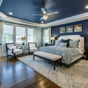
When we started this project it was our job to coax out the true character and potential hiding in this lovely home. Selecting a calming color palate and different textures throughout got us off to a great start.
Jay Greene Photography
 AMLD INTERIOR INC
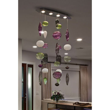
AM2220 JEWEL BOX CHANDELIER
DESCRIPTION:
A beautiful modern chandelier featuring a mix of Striped and Ribbed beads. Limitless combinations allow one-of-a-kind installations. The key to an elegant, opulent, bespoke design is to understand the aspirations of the client, the relevance of location, and maximizing the potential of the existing elements in the space.
SPECIFICATIONS:
Collection: Modern
Size: 24” Wide x 60” Height Adjustable (Custom sizes also available)
Shape: Pendant
Frame Finished: Brushed Nickel (Different finish available at no additional cost)
Materials: Stainless Steel, Glass
Weight: N/A
Extension: Adjustable cord customizable up to 12 ft.
Bulbs: 5 LED recessed puck lights
Assembly: Some assembly required.
Dimmer Switch Compatible: Optional
Shipping: Free Door-To-Door Shipping Worldwide!
Rush Order: 4-6 Weeks; 15% added to the total
Regular Lead Time: 6-10 Weeks
Warranty: 5 Years Full Coverage (includes replacement parts)
SIZE OPTIONS:
Size:
Price:
20” Wide x 40” Height Adjustable
$2,214.00
28” Wide x 40” Height Adjustable
$3,419.00
36” Wide x 50” Height Adjustable
$4,808.00
44” Wide x 60” Height Adjustable
$6,722.00
60” Wide x 60” Height Adjustable (as shown)
$7,444.00
Custom Sizes, Finishes, Colors Available Upon Request

 Klopf Architecture
Malibu Glass Box House by Klopf Architecture
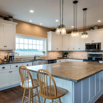
Following the devastating Woolsey Fire of 2018, the site in Malibu offered a unique opportunity to rebuild not just a home, but a new architectural composition that highlighted the property’s potential while navigating strict fire-rebuild codes in the area. Designed by Klopf Architecture, this project embraced a set of limitations and translated them into an architectural asset.
The city’s fire-rebuild process required the new structure to remain close to the original footprint, size and bulk, a constraint that ultimately clarified the architectural direction. Perched near the front of a long, narrow lot, the new home frames and overlooks a private, park-like rear expanse, an uncommon luxury especially in this part of Malibu .
Without a fixed program, the design process allowed for a different kind of creative focus allowing Klopf Architecture the opportunity to explore how a modernist home could best respond to this site. The team approached the project not with a list of requirements, but with a question: How might a modernist live here? What spatial qualities would inspire calm, connection, and a sense of wonder in this setting? The process became less about problem-solving and more about architectural storytelling—letting the site, the light, and the principles of modern design guide the form and flow of the home.
The response emerged in the form of a glass-box pavilion, an open, Mid-Century Modern inspired living, dining, and kitchen space that floats at the edge of the property’s natural descent. Connected to the more enclosed, private areas of the home by a glass-walled hallway, the living pavilion becomes a distinct centerpiece of the design. It opens on all four sides to the landscape with decks and patios on the flanks, an internal garden and water feature to the north, and a dramatic unguarded view of the expansive backyard and ocean horizon to the south.
Because of the mandated footprint, careful planning was required to ensure every space could still engage with light, landscape, or both. Strategic voids in the form of atriums and courtyards allow daylight to filter deep into the home’s core, while offering moments of surprise and retreat. These design gestures allow natural light to filter deep into the interior, creating a sense of brightness and openness throughout the day. At the same time, they expand the perceptual boundaries between inside and out, making the home feel more expansive while anchoring its connection to the surrounding landscape.
The siting of the house is what gives it its unique character. Rather than receding into the backyard like the neighboring homes, the house holds a slight prominence. From the central living pavilion, stepping down into the landscape feels more like entering a secluded park where a separate existing accessory structure, trail, and recreational areas await. The home’s modest street presence gives way to this unfolding drama of space, view, and nature.
Fire-resilient materials and assemblies are integrated seamlessly throughout including triple-pane glazing, under-slab and roof insulation, and locally sourced fire-rated cladding ensure the house not only meets Calfornia’s rigorous wildland-urban interface (WUI) standards, but feels effortlessly aligned with them. While technical decisions like fire-hardening and mechanical systems presented some construction challenges, particularly around the cantilevered glass box, the team found a functional compromise that preserved the integrity of the design.
Inside, a restrained palette and exposed post and beam design celebrate the ethos of mid-century modernism. A central circulation spine extends from the entry to the rear glass wall, offering a continuous visual link from street to ocean. Spaces such as the library and office, though more intimate in scale, are never cut off from nature as each opens to its own unique courtyard or garden view.
Though born out of a strict regulatory framework and developed without a specific client, the rebuild design unfolded with remarkable clarity. Grounded in site logic, refined by limitations and an emphasis on timeless spatial relationships – light, proportion, and a strong connection to nature, the resulting design feels both effortless and uplifting. The home lives lightly on the land, opens generously to its surroundings, and strikes a careful balance between privacy, openness, and calm. For Klopf Architecture, it stands as a compelling case study in how site, code, and circumstantial constraints can inspire enduring, modernist architecture. With years of experience reimagining mid-century modern design for how people live today, the firm took the project’s limitations as an opportunity. The result is a home shaped by open, flowing spaces, strong indoor-outdoor connections, and a calm, clear sense of structure. It’s a good reminder that even with strict constraints, there’s still room for architecture to breathe—and for modernism to keep moving forward.
Klopf Architecture project team: Geoff Campen, John Klopf, AIA, and Sherry Tan
Structural Engineer: ZFA
Contractor: Maison D’Artiste
Photography: ©2025 Mariko Reed
Year Completed: 2023
 Jon Allen Fine Metal Art
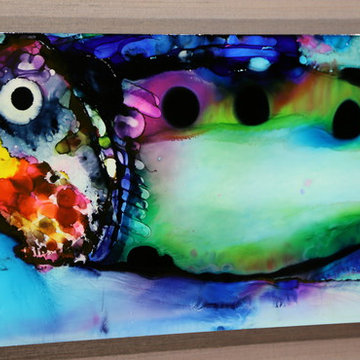
Fish in Paradise by Jon Allen - JAC 136
The Jon Allen Collection is an exclusive, hand-selected group of my most personal work to date. Each piece is hand-painted on aluminum. My art itself and my chosen medium, aluminum, are blissfully married. You may not think of the word organic when you hear the word metal, but this is some of my most organic art and that’s simply because metal allows my work to achieve true sentience. Aluminum’s naturally reflective nature enables each color, shape, and stroke to reach its full potential. A new aspect of the painting will reveal itself to you as it basks in the light that surrounds, evades, or envelops it in that moment. When you see the piece from different angles, you will appreciate how vibrant, dynamic, and environmentally influenced these pieces are. What you may see and feel by morning is not what you’ll see or feel by dusk and in many ways, and as such I feel these pieces capture the ever-ebbing and complex nature of human emotion and perception.
Some of these pieces are truly abstract while others are modern takes on traditional landscapes, marine life, and portraits. I hope you enjoy them a fraction of how much I enjoyed creating them. If you have any questions, please don’t hesitate to reach out.
Number of Pieces: 1
Dimensions: 12" x 48" x 2" off the wall
Care & Cleaning: Clean with a soft cloth and plain soap & water
Other Features: Hardware is pre-installed for simple hanging and art will “float” 2” off the wall
 Gallery KBNY
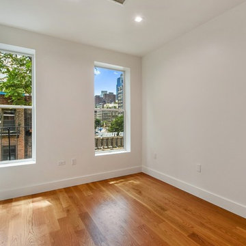
The owner of this historic and landmarked town-home renovation in Hudson Square, originally built in 1826, hired Gallery Kitchen and Bath to fully gut-renovate this 3-unit row-home. The scope of work included a full-scale renovation of the owners unit, including the renovation of the kitchen, one 4-piece master ensuite bathroom, one 3-piece bathroom with a walk-in steam shower, and a beautiful powder room. Additional work in the owners unit also included flooring, electrical upgrade, major plumbing work, new HVAC system, restoration of a fireplace, installation of a fully integrated smart home system and landmarked approved windows.
CELLAR RENOVATION IN NYC LANDMARKED TOWN-HOME
Rounding out the owners unit we renovated the cellar, which was converted into an entertainment space and featured a custom glass curtain wall, along with a custom staircase with an exposed brick wall. During the demolition phase of the cellar, our team discovered 56 wine jugs filled with wine from the prohibition era, leading us to name this project the prohibition house. For the two tenant units, Gallery Kitchen and Bath undertook the renovation of 2 kitchens, 4 bathrooms, new hardwood flooring throughout, along with detailed carpentry work in the entire home.
WHY GALLERY KITCHEN AND BATH
After interviewing multiple contractors, our client decided on Gallery Kitchen and Bath primarily because of our turnkey design, selection, and build process. In a renovation of this magnitude it is crucial to have a centralized full service contractor under one roof to handle all of the aspects and simultaneous moving parts of the project. Decentralizing the entire process by having multiple unaffiliated vendors handle various parts of the process can easily become chaotic, time consuming, and costly.
Because Gallery Kitchen and Bath undertook the entire process, from the design of the entire space to the selection and procurement of all finishes and fixtures, down to the procurement of all permits and LPC filings, it made a seemingly chaotic project a’lot more manageable.
PHASE 1: DESIGN, SELECTION, PROCUREMENT
Our client wanted the renovation to incorporate a fully modern design into his Hudson Square town-house. Being that this is a landmarked property, the exterior facade had to be restored and kept with the original aesthetic, the interior of the home however was a whole different story.
In keeping up with the modern aesthetic, our designers went to work to design a custom kitchen that included fully custom flat panel base cabinets in a white high gloss finish and an absolute matte black appliance/pantry wall. The kitchen design also included a white quartz countertop and backsplash with a waterfall edge island. To bring warmth to the modern kitchen, our designers incorporated a rifted and quartered select oak wood floor in a herringbone pattern, and custom blended stain with matte polyurethane finish. For continuity, the wood floor was also extended throughout the entire owners unit.
In the ensuite bathroom we created a “wet area” which houses a standalone soaking tub as well as a beautiful rainfall shower, completely leveled with the rest of the floor in the bathroom. Some highlights within this space include a tiled square drain, large niche cutouts with a carrera marble accents. Once again, to bring warmth to this modern bathroom, our designers incorporated a floating rustic oak vanity and carrera marble mosaic floor tile.
Last on the list on the owners unit floor was the cellar, which our client wanted to utilize as an entertainment space for his friends and family. During the design phase, we incorporated an open concept layout, wedding the indoor and outdoor space with a custom glass curtain wall. The design also included custom walnut built-ins that serve as a custom wet bar and storage piece.
With the design approved and selections made our office liaisons moved to procure all of the material selections and finishes.
PHASE 2: DEMO
Because this home is almost two centuries old, we had to take extra precaution during the interior demolition phase of the project. One specific area that we had to pay special attention to was the existing brick. Over time the mortar in old brick homes deteriorates and turns into dust – for this reason it was extremely important that a thorough and ongoing inspection of the exteriors and interior walls took place during the demolition of the space.
After 14 30-yard debris containers and 56 wine filled jugs from the prohibition era later , the demolition of this historic Hudson Square town-home came to an end. If you are wondering whether we tried the wine? After notifying the owner we agreed to open one of the jugs and try them together – nothing but vinegar.
PHASE 3: BUILD
One of the challenges in a renovation project of this scope is nailing down the logistics and delivery of fixtures and finish material. Adding to this challenge was a narrow entry door that required us to use a boom truck in order to deliver some of the larger materials on site. To ensure a succinct time schedule, we boomed all of the materials through the 3rd floor for the entire project and worked our renovation work from top floor to cellar. This technique also insured that any unexpected water issues during the renovation process would not damage a finished floor.
With all roughing and framing complete, the Gallery KBNY team proceeded to execute on the design plan.
THE REVEAL
From what was once a dilapidated town-home with nothing but potential, to a glamorous and luxurious modern interior space – the prohibition house was complete. Ready to speak with us about your renovation project? Contact us to schedule your free consultation and let Gallery KBNY show you why our all-inclusive approach to your renovation is the smartest way to renovating in NYC.
 Jon Allen Fine Metal Art
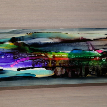
JAC 140 - Twilight in Space by Jon Allen
The Jon Allen Collection is an exclusive, hand-selected group of my most personal work to date. Each piece is hand-painted on aluminum. My art itself and my chosen medium, aluminum, are blissfully married. You may not think of the word organic when you hear the word metal, but this is some of my most organic art and that’s simply because metal allows my work to achieve true sentience. Aluminum’s naturally reflective nature enables each color, shape, and stroke to reach its full potential. A new aspect of the painting will reveal itself to you as it basks in the light that surrounds, evades, or envelops it in that moment. When you see the piece from different angles, you will appreciate how vibrant, dynamic, and environmentally influenced these pieces are. What you may see and feel by morning is not what you’ll see or feel by dusk and in many ways, and as such I feel these pieces capture the ever-ebbing and complex nature of human emotion and perception.
Some of these pieces are truly abstract while others are modern takes on traditional landscapes, marine life, and portraits. I hope you enjoy them a fraction of how much I enjoyed creating them. If you have any questions, please don’t hesitate to reach out.
Number of Pieces: 1
Dimensions: 46" x 13" x 2" off the wall
Care & Cleaning: Clean with a soft cloth and plain soap & water
Other Features: Hardware is pre-installed for simple hanging and art will “float” 2” off the wall


 User
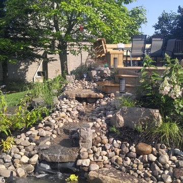
UserA spiritual sanctuary was created for this family helping them reconnect & centre. I does much more than help one relax... it assists one in blossoming to their full potential as a meditative space. It heals the body &rejuvenates...
Nightscaping makes it an entirely different space- it's quite mesmerizing everyone agrees!!
 Unique Home Solutions Inc.
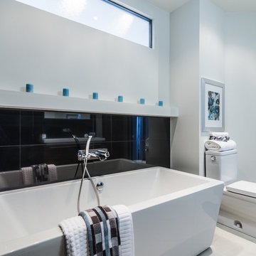
Adding furniture and accessories to a vacant property makes an incredible difference to the potential purchaser's perspective when they walk through the door for the first time. If you would like a consultation, give us a call at 514-222-5553.
We work with investors, home owners, realtors and house 'flippers'. Unique home Solutions Inc. has been in business since 2006 helping owners improve the look of their properties.
 Unique Home Solutions Inc.
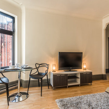
Adding furniture and accessories to a vacant property makes an incredible difference to the potential purchaser's perspective when they walk through the door for the first time. If you would like a consultation, give us a call at 514-222-5553.
We work with investors, home owners, realtors and house 'flippers'. Unique home Solutions Inc. has been in business since 2006 helping owners improve the look of their properties.
42