
Search results for "Potential impact" in Home Design Ideas

 ID Studio Interiors
Transitional open concept medium tone wood floor, brown floor, coffered ceiling and vaulted ceiling family room photo with beige walls, a standard fireplace, a wood fireplace surround and a wall-mounted tv

 SGDI - Sarah Gallop Design Inc.
The objective was to create a warm neutral space to later customize to a specific colour palate/preference of the end user for this new construction home being built to sell. A high-end contemporary feel was requested to attract buyers in the area. An impressive kitchen that exuded high class and made an impact on guests as they entered the home, without being overbearing. The space offers an appealing open floorplan conducive to entertaining with indoor-outdoor flow.
Due to the spec nature of this house, the home had to remain appealing to the builder, while keeping a broad audience of potential buyers in mind. The challenge lay in creating a unique look, with visually interesting materials and finishes, while not being so unique that potential owners couldn’t envision making it their own. The focus on key elements elevates the look, while other features blend and offer support to these striking components. As the home was built for sale, profitability was important; materials were sourced at best value, while retaining high-end appeal. Adaptations to the home’s original design plan improve flow and usability within the kitchen-greatroom. The client desired a rich dark finish. The chosen colours tie the kitchen to the rest of the home (creating unity as combination, colours and materials, is repeated throughout).
Photos- Paul Grdina
 SGDI - Sarah Gallop Design Inc.
The objective was to create a warm neutral space to later customize to a specific colour palate/preference of the end user for this new construction home being built to sell. A high-end contemporary feel was requested to attract buyers in the area. An impressive kitchen that exuded high class and made an impact on guests as they entered the home, without being overbearing. The space offers an appealing open floorplan conducive to entertaining with indoor-outdoor flow.
Due to the spec nature of this house, the home had to remain appealing to the builder, while keeping a broad audience of potential buyers in mind. The challenge lay in creating a unique look, with visually interesting materials and finishes, while not being so unique that potential owners couldn’t envision making it their own. The focus on key elements elevates the look, while other features blend and offer support to these striking components. As the home was built for sale, profitability was important; materials were sourced at best value, while retaining high-end appeal. Adaptations to the home’s original design plan improve flow and usability within the kitchen-greatroom. The client desired a rich dark finish. The chosen colours tie the kitchen to the rest of the home (creating unity as combination, colours and materials, is repeated throughout).
Photos- Paul Grdina
Find the right local pro for your project

 Hoss Building Group, Inc./ Hoss Homes
side entry garage
Mid-sized trendy attached four-car garage photo in Indianapolis
Mid-sized trendy attached four-car garage photo in Indianapolis

 Home Dot Designs
The living room was a wide open canvas for designer, Clarissa Rigby. She grouped the space into smaller intimate groupings to allow for conversation areas while entertaining. A large commissioned art piece really anchors the space and the textures and finishes of the furniture and accessories really tie in well.
A custom bar cabinet with a beverage refrigerator was designed by Clarissa Rigby to be a stand alone feature. The modern geometric design, color, and feet allow it to be not only a conversation starter but a potential family heirloom.
Custom shelving were designed and added to a builder niche that the homeowner did not know what to do with. It allows for more function of the space, and looks like it was meant to be there.
The color pallet and finishes chosen, really make an impact on guests as they enter the home.
 SGDI - Sarah Gallop Design Inc.
The objective was to create a warm neutral space to later customize to a specific colour palate/preference of the end user for this new construction home being built to sell. A high-end contemporary feel was requested to attract buyers in the area. An impressive kitchen that exuded high class and made an impact on guests as they entered the home, without being overbearing. The space offers an appealing open floorplan conducive to entertaining with indoor-outdoor flow.
Due to the spec nature of this house, the home had to remain appealing to the builder, while keeping a broad audience of potential buyers in mind. The challenge lay in creating a unique look, with visually interesting materials and finishes, while not being so unique that potential owners couldn’t envision making it their own. The focus on key elements elevates the look, while other features blend and offer support to these striking components. As the home was built for sale, profitability was important; materials were sourced at best value, while retaining high-end appeal. Adaptations to the home’s original design plan improve flow and usability within the kitchen-greatroom. The client desired a rich dark finish. The chosen colours tie the kitchen to the rest of the home (creating unity as combination, colours and materials, is repeated throughout).
Photos- Paul Grdina
 Home Dot Designs
The living room was a wide open canvas for designer, Clarissa Rigby. She grouped the space into smaller intimate groupings to allow for conversation areas while entertaining. A large commissioned art piece really anchors the space and the textures and finishes of the furniture and accessories really tie in well.
A custom bar cabinet with a beverage refrigerator was designed by Clarissa Rigby to be a stand alone feature. The modern geometric design, color, and feet allow it to be not only a conversation starter but a potential family heirloom.
Custom shelving were designed and added to a builder niche that the homeowner did not know what to do with. It allows for more function of the space, and looks like it was meant to be there.
The color pallet and finishes chosen, really make an impact on guests as they enter the home.
Sponsored
Delaware, OH

Buckeye Basements, Inc.
Central Ohio's Basement Finishing ExpertsBest Of Houzz '13-'21


 Home Dot Designs
The living room was a wide open canvas for designer, Clarissa Rigby. She grouped the space into smaller intimate groupings to allow for conversation areas while entertaining. A large commissioned art piece really anchors the space and the textures and finishes of the furniture and accessories really tie in well.
A custom bar cabinet with a beverage refrigerator was designed by Clarissa Rigby to be a stand alone feature. The modern geometric design, color, and feet allow it to be not only a conversation starter but a potential family heirloom.
Custom shelving were designed and added to a builder niche that the homeowner did not know what to do with. It allows for more function of the space, and looks like it was meant to be there.
The color pallet and finishes chosen, really make an impact on guests as they enter the home.
 Home Dot Designs
BEFORE:
The living room was a wide open canvas for designer, Clarissa Rigby. She grouped the space into smaller intimate groupings to allow for conversation areas while entertaining. A large commissioned art piece really anchors the space and the textures and finishes of the furniture and accessories really tie in well.
A custom bar cabinet with a beverage refrigerator was designed by Clarissa Rigby to be a stand alone feature. The modern geometric design, color, and feet allow it to be not only a conversation starter but a potential family heirloom.
Custom shelving were designed and added to a builder niche that the homeowner did not know what to do with. It allows for more function of the space, and looks like it was meant to be there.
The color pallet and finishes chosen, really make an impact on guests as they enter the home.

 Murphy Bros. Design | Build | Remodel
This compact mid 50's story and a half needed new life in both the kitchen and the main floor bath. While expanding the footprint wasn't really a viable option, restructuring the layout and removing two walls made all the difference. Of course with any major demo and rethink, new surfaces carried a lot of the design impact. Still, since space was a big issue, considerable effort was placed on designing maximum storage over every square inch of cabinet space. For instance, both sides of the new peninsula were designed to accommodate massive storage potential. The "mudroom" bench opens up to store all boots, hats and mittens or sandals and sporting equipment.
"Sometimes, I find myself just sitting in my kitchen, and I can't believe this is mine," says the homeowner. Take a look at the before photos and you'll agree. The transformation is pretty darn dramatic.
Design/Build Consultant — Theresa Mann
Photography — Alyssa Lee
 Inspector Roofing and Restoration
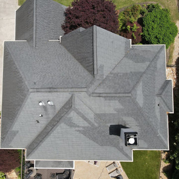
After a recent hail event in the Alpharetta area, the homeowner requested a full roof inspection to determine if damage was present and whether an insurance claim would be warranted.
Using the Inspector Roofing Protocols™, we performed a structured, inspection-first evaluation of the roofing system. This included wide-to-tight photographic documentation, slope-by-slope analysis, and targeted inspection of shingles, soft metals, and potential impact zones.
While initial concern was hail-related damage, the inspection found no claim-verifiable damage to the roofing system. Shingle condition, seal integrity, and surface granule loss were all within normal wear parameters and did not meet thresholds consistent with storm-related functional damage.
This project is a clear example of why inspection-first matters. Not every storm results in actionable damage, and proper documentation helps homeowners avoid unnecessary claims or premature roof replacement decisions.
 SGDI - Sarah Gallop Design Inc.
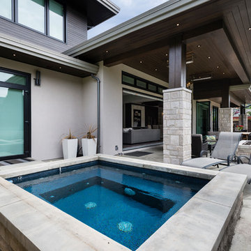
The objective was to create a warm neutral space to later customize to a specific colour palate/preference of the end user for this new construction home being built to sell. A high-end contemporary feel was requested to attract buyers in the area. An impressive kitchen that exuded high class and made an impact on guests as they entered the home, without being overbearing. The space offers an appealing open floorplan conducive to entertaining with indoor-outdoor flow.
Due to the spec nature of this house, the home had to remain appealing to the builder, while keeping a broad audience of potential buyers in mind. The challenge lay in creating a unique look, with visually interesting materials and finishes, while not being so unique that potential owners couldn’t envision making it their own. The focus on key elements elevates the look, while other features blend and offer support to these striking components. As the home was built for sale, profitability was important; materials were sourced at best value, while retaining high-end appeal. Adaptations to the home’s original design plan improve flow and usability within the kitchen-greatroom. The client desired a rich dark finish. The chosen colours tie the kitchen to the rest of the home (creating unity as combination, colours and materials, is repeated throughout).
Photos- Paul Grdina
Sponsored
Delaware, OH
Buckeye Basements, Inc.
Central Ohio's Basement Finishing ExpertsBest Of Houzz '13-'21
 Home Dot Designs
The living room was a wide open canvas for designer, Clarissa Rigby. She grouped the space into smaller intimate groupings to allow for conversation areas while entertaining. A large commissioned art piece really anchors the space and the textures and finishes of the furniture and accessories really tie in well.
A custom bar cabinet with a beverage refrigerator was designed by Clarissa Rigby to be a stand alone feature. The modern geometric design, color, and feet allow it to be not only a conversation starter but a potential family heirloom.
Custom shelving were designed and added to a builder niche that the homeowner did not know what to do with. It allows for more function of the space, and looks like it was meant to be there.
The color pallet and finishes chosen, really make an impact on guests as they enter the home.
 SGDI - Sarah Gallop Design Inc.
The objective was to create a warm neutral space to later customize to a specific colour palate/preference of the end user for this new construction home being built to sell. A high-end contemporary feel was requested to attract buyers in the area. An impressive kitchen that exuded high class and made an impact on guests as they entered the home, without being overbearing. The space offers an appealing open floorplan conducive to entertaining with indoor-outdoor flow.
Due to the spec nature of this house, the home had to remain appealing to the builder, while keeping a broad audience of potential buyers in mind. The challenge lay in creating a unique look, with visually interesting materials and finishes, while not being so unique that potential owners couldn’t envision making it their own. The focus on key elements elevates the look, while other features blend and offer support to these striking components. As the home was built for sale, profitability was important; materials were sourced at best value, while retaining high-end appeal. Adaptations to the home’s original design plan improve flow and usability within the kitchen-greatroom. The client desired a rich dark finish. The chosen colours tie the kitchen to the rest of the home (creating unity as combination, colours and materials, is repeated throughout).
Photos- Paul Grdina
 Home Dot Designs
The living room was a wide open canvas for designer, Clarissa Rigby. She grouped the space into smaller intimate groupings to allow for conversation areas while entertaining. A large commissioned art piece really anchors the space and the textures and finishes of the furniture and accessories really tie in well.
A custom bar cabinet with a beverage refrigerator was designed by Clarissa Rigby to be a stand alone feature. The modern geometric design, color, and feet allow it to be not only a conversation starter but a potential family heirloom.
Custom shelving were designed and added to a builder niche that the homeowner did not know what to do with. It allows for more function of the space, and looks like it was meant to be there.
The color pallet and finishes chosen, really make an impact on guests as they enter the home.
 Home Dot Designs
BEFORE:
The living room was a wide open canvas for designer, Clarissa Rigby. She grouped the space into smaller intimate groupings to allow for conversation areas while entertaining. A large commissioned art piece really anchors the space and the textures and finishes of the furniture and accessories really tie in well.
A custom bar cabinet with a beverage refrigerator was designed by Clarissa Rigby to be a stand alone feature. The modern geometric design, color, and feet allow it to be not only a conversation starter but a potential family heirloom.
Custom shelving were designed and added to a builder niche that the homeowner did not know what to do with. It allows for more function of the space, and looks like it was meant to be there.
The color pallet and finishes chosen, really make an impact on guests as they enter the home.

 TKS Design Group
Download our free ebook, Creating the Ideal Kitchen. DOWNLOAD NOW
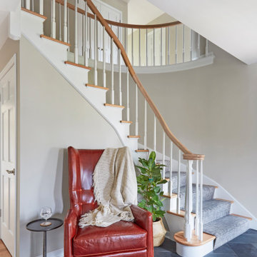
Lakefront property in the northwest suburbs of Chicago is hard to come by, so when we were hired by this young family with exactly that, we were immediately inspired by not just the unusually large footprint of this 1950’s colonial revival but also the lovely views of the manmade lake it was sited on. The large 5-bedroom home was solidly stuck in the 1980’s, but we saw tons of potential. We started out by updating the existing staircase with a fresh coat of paint and adding new herringbone slate to the entry hall.
The powder room off the entryway also got a refresh - new flooring, new cabinets and fixtures. We ran the new slate right through into this space for some consistency. A fun wallpaper and shiplap trim add a welcoming feel and set the tone for the home.
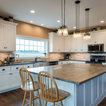
Next, we tackled the kitchen. Located away from the rest of the first floor, the kitchen felt a little isolated, so we immediately began planning for how to better connect it to the rest of the first floor. We landed on removing the wall between the kitchen and dining room and designed a modified galley style space with separate cooking and clean up zones. The cooking zone consists of the refrigerator, prep sink and cooktop, along with a nice long run of prep space at the island. The cleanup side of the kitchen consists of the main sink and dishwasher. Both areas are situated so that the user can view the lake during prep work and cleanup!
One of the home’s main puzzles was how to incorporate the mudroom and area in front of the patio doors at the back of the house. We already had a breakfast table area, so the space by the patio doors was a bit of a no man’s land. We decided to separate the kitchen proper from what became the new mudroom with a large set of barn doors. That way you can quickly hide any mudroom messes but have easy access to the light coming in through the patio doors as well as the outdoor grilling station. We also love the impact the barn doors add to the overall space.
The homeowners’ first words to us were “it’s time to ditch the brown,” so we did! We chose a lovely blue pallet that reflects the home’s location on the lake which is also vibrant yet easy on the eye. Countertops are white quartz, and the natural oak floor works well with the other honey accents. The breakfast table was given a refresh with new chairs, chandelier and window treatments that frame the gorgeous views of the lake out the back.
We coordinated the slate mudroom flooring with that used in the home’s main entrance for a consistent feel. The storage area consists of open and closed storage to allow for some clutter control as needed.
Next on our “to do” list was revamping the dated brown bar area in the neighboring dining room. We eliminated the clutter by adding some closed cabinets and did some easy updates to help the space feel more current. One snag we ran into here was the discovery of a beam above the existing open shelving that had to be modified with a smaller structural beam to allow for our new design to work. This was an unexpected surprise, but in the end we think it was well worth it!
We kept the colors here a bit more muted to blend with the homeowner’s existing furnishings. Open shelving and polished nickel hardware add some simple detail to the new entertainment zone which also looks out onto the lake!
Next we tackled the upstairs starting with the homeowner’s son’s bath. The bath originally had both a tub shower and a separate shower, so we decided to swap out the shower for a new laundry area. This freed up some space downstairs in what used to be the mudroom/laundry room and is much more convenient for daily laundry needs.
We continued the blue palette here with navy cabinetry and the navy tile in the shower. Porcelain floor tile and chrome fixtures keep maintenance to a minimum while matte black mirrors and lighting add some depth the design. A low maintenance runner adds some warmth underfoot and ties the whole space together.
We added a pocket door to the bathroom to minimize interference with the door swings. The left door of the laundry closet is on a 180 degree hinge to allow for easy full access to the machines. Next we tackled the master bath which is an en suite arrangement. The original was typical of the 1980’s with the vanity outside of the bathroom, situated near the master closet. And the brown theme continued here with multiple shades of brown.
Our first move was to segment off the bath and the closet from the master bedroom. We created a short hall from the bedroom to the bathroom with his and hers walk-in closets on the left and right as well as a separate toilet closet outside of the main bathroom for privacy and flexibility.
The original bathroom had a giant soaking tub with steps (dangerous!) as well as a small shower that did not work well for our homeowner who is 6’3”. With other bathtubs in the home, they decided to eliminate the tub and create an oversized shower which takes up the space where the old tub was located. The double vanity is on the opposite wall and a bench is located under the window for morning conversations and a place to set a couple of towels.
The pallet in here is light and airy with a mix of blond wood, creamy porcelain and marble tile, and brass accents. A simple roman shade adds some texture and it’s top-down mechanism allows for light and privacy.
This large whole house remodel gave our homeowners not only the ability to maximize the potential of their home but also created a lovely new frame from which to view their fabulous lake views.
Designed by: Susan Klimala, CKD, CBD
Photography by: Michael Kaskel
For more information on kitchen and bath design ideas go to: www.kitchenstudio-ge.com
 SGDI - Sarah Gallop Design Inc.
The objective was to create a warm neutral space to later customize to a specific colour palate/preference of the end user for this new construction home being built to sell. A high-end contemporary feel was requested to attract buyers in the area. An impressive kitchen that exuded high class and made an impact on guests as they entered the home, without being overbearing. The space offers an appealing open floorplan conducive to entertaining with indoor-outdoor flow.
Due to the spec nature of this house, the home had to remain appealing to the builder, while keeping a broad audience of potential buyers in mind. The challenge lay in creating a unique look, with visually interesting materials and finishes, while not being so unique that potential owners couldn’t envision making it their own. The focus on key elements elevates the look, while other features blend and offer support to these striking components. As the home was built for sale, profitability was important; materials were sourced at best value, while retaining high-end appeal. Adaptations to the home’s original design plan improve flow and usability within the kitchen-greatroom. The client desired a rich dark finish. The chosen colours tie the kitchen to the rest of the home (creating unity as combination, colours and materials, is repeated throughout).
Photos- Paul Grdina
 SGDI - Sarah Gallop Design Inc.
The objective was to create a warm neutral space to later customize to a specific colour palate/preference of the end user for this new construction home being built to sell. A high-end contemporary feel was requested to attract buyers in the area. An impressive kitchen that exuded high class and made an impact on guests as they entered the home, without being overbearing. The space offers an appealing open floorplan conducive to entertaining with indoor-outdoor flow.
Due to the spec nature of this house, the home had to remain appealing to the builder, while keeping a broad audience of potential buyers in mind. The challenge lay in creating a unique look, with visually interesting materials and finishes, while not being so unique that potential owners couldn’t envision making it their own. The focus on key elements elevates the look, while other features blend and offer support to these striking components. As the home was built for sale, profitability was important; materials were sourced at best value, while retaining high-end appeal. Adaptations to the home’s original design plan improve flow and usability within the kitchen-greatroom. The client desired a rich dark finish. The chosen colours tie the kitchen to the rest of the home (creating unity as combination, colours and materials, is repeated throughout).
Photos- Paul Grdina
9