
Search results for "Powerful visual" in Home Design Ideas
 Rachiele Custom Sinks
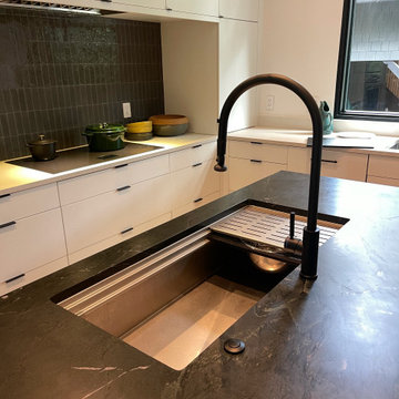
Set in a serene, light-filled modern home, this kitchen exudes both warmth and bold sophistication. At the heart of it all is a 42" hand-finished stainless steel Paragon™ workstation sink by Rachiele®—a showpiece that redefines what it means to cook in comfort and style. Designed for seamless performance and intuitive use, the sink offers a dual-tier ledge system that transforms it from a simple basin into a fully integrated prep zone. From chopping and rinsing to plating and cleaning, every task flows effortlessly thanks to custom-fit accessories that move along the interior ledge system.
The gleaming stainless steel sink makes a striking statement against the deep, dramatic veining of the black soapstone island. Paired with a matte black extended-reach faucet and a matching air switch, the entire workstation reads as both refined and powerful. Each element was selected not just for its visual impact, but for how it supports the rhythm of daily life in the kitchen—from quick weekday breakfasts to sprawling weekend dinner prep.
Every detail of this space was curated with intention: the crisp cabinetry, the understated lighting, and the seamless view out to the treetops all reinforce the idea that a kitchen should be as beautiful as it is functional. Crafted in the USA and built to last, the Paragon™ sink doesn’t just meet expectations—it elevates them.
 Crystal Kitchen + Bath
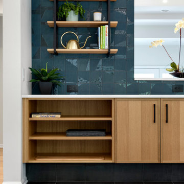
The homeowners wanted to transform their dining room into a more open, functional, and visually connected space while honoring the home’s modern, mid-century style. Their main goals included removing the massive wall of rough-textured cabinetry, adding a view of the backyard from the front door, creating a serving area with multiple outlets for small appliances, incorporating deep drawers for linens, and adding display space. They also wanted quarter sawn oak cabinetry with hardware instead of the nail breaking routed pocket pulls, black accents, and a backsplash tile in a fun color or shape.
Originally, the wall separating the dining room from the kitchen was slated for removal, but engineering requirements made this cost prohibitive. Instead, we collaborated with an architect and engineer to design a passthrough that maintained structural integrity. During construction, hidden HVAC was discovered, prompting us to build the wall out further, resulting in a deeper 16" passthrough; a happy accident that created an ideal display area with puck lighting.
The cabinetry features Crystal Cabinet Works’ Encore frameless line in Quarter Sawn White Oak with a Natural matte finish, paired with matte black ladder shelves for display. A tiled, extra-deep toekick covered in matching floor tile gives the appearance of floating cabinetry while ensuring easy, mop-friendly maintenance. The wall is finished in matte square Nemo tile with glossy accents, adding vibrant color and texture. Cambria’s Smithfield quartz countertops provide a durable serving surface, while black floor tile with a metallic finish grounds the design.
Now, the dining room serves as a hub for entertaining, with ample space for serving dishes, convenient power access, and a direct sightline from the kitchen to the backyard.
Ready for a dining space that serves looks as well as dinner? Pull up a chair and let’s talk.
 A Cloud 9 Design
Gutted this Master Bath to the studs, removed carpet flooring, oversized sunken tub, old vanities & tile countertops, brought in tile floors throughout, new floating cabinets with lights underneath, vessel sinks with wall mounted faucets, built-in mirrored medicine cabinet with power for Her hair appliances, & HIs matching built-in mirror, modern lighting, tiled walls to the ceiling, a brand new walk-in closet, a 1 pc, toilet with dual flush & recessed cabinet storage above.
Find the right local pro for your project
 Lindy Design Build
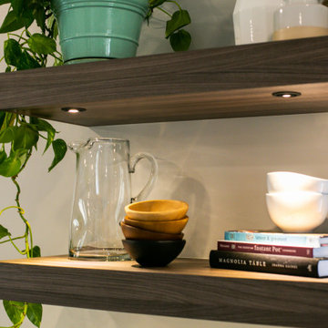
This 1950s home was sporting elements of the original kitchen and the dark space was not meeting our client’s needs. The original kitchen didn’t have much to offer in the way of functionality, so our first order of business was to create a design that would exponentially increase the usability of the kitchen. We brought in functional cabinetry, introduced uninterrupted work surfaces, and added plenty of lighting to brighten up their kitchen. They also wanted to open the new kitchen to the living room and create space for a larger dining table, so we started by removing the existing cabinetry that was visually cut the living space in two and minimized the power of the dramatic vaulted ceiling. We also extended the wood flooring into the kitchen as well to create seamless transitions between spaces.
We fell in love with the idea of a two-toned cabinetry design for this kitchen and ultimately went head over heels for clean white painted base cabinets and a textured wood-look melamine on the uppers. This gave us a crisp backdrop that allowed us to bring is fun forms like the black light fixture over the table and the gorgeous silhouettes on the hardware. We played a lot with directionality in this space. The elongated open shelves and rectangular backsplash tiles give us wonderfully clean horizontal lines, but to balance those out we brought in a vertical grain pattern on the wall cabinets and added long black cabinetry pulls that emphasize the verticality of the space. The clients have a green thumb and wanted to make sure we created a home for their growing plant collection. The open shelving gives us plenty of opportunities for foliage and to showcase fun kitchen accessories. This design feels like home and brings together the clean lines and crisp finishes our clients were looking.
 Wiles Design Group
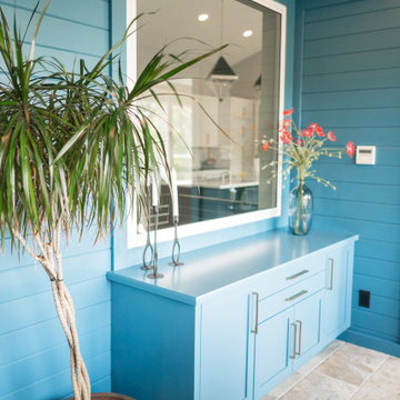
This home was redesigned to reflect the homeowners' personalities through intentional and bold design choices, resulting in a visually appealing and powerfully expressive environment.
This captivating dining room design features a striking bold blue palette that mingles with elegant furniture while statement lights dangle gracefully above. The rust-toned carpet adds a warm contrast, completing a sophisticated and inviting ambience.
 Home Staging by SPC
Jump Visual
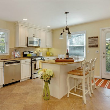
Vacant Staging - Islip, New York
Mid-sized transitional ceramic tile kitchen photo in New York with an undermount sink, raised-panel cabinets, white cabinets, granite countertops, beige backsplash, ceramic backsplash, stainless steel appliances and an island
Mid-sized transitional ceramic tile kitchen photo in New York with an undermount sink, raised-panel cabinets, white cabinets, granite countertops, beige backsplash, ceramic backsplash, stainless steel appliances and an island
 Above And Beyond Builders
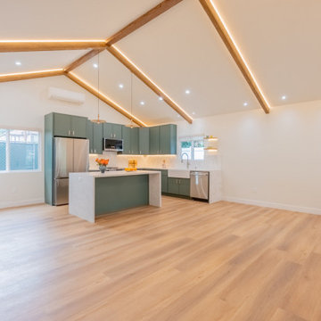
This Sherman Oaks ADU interior captures the power of intentional design, soaring vaulted ceilings with exposed wood beams and integrated LED cove lighting create a luminous architectural canopy that instantly elevates the space.
The open-concept layout flows seamlessly into a sculptural quartz island wrapped in soft sage cabinetry, delivering both visual impact and functional efficiency. Wide plank flooring expands the footprint, while strategic window placement maximizes natural light, making this ADU feel dramatically larger than its square footage.
Designed as a high-yield investment property, this build balances refined aesthetics with rental market appeal, creating a premium living experience that drives long-term value and strong return on investment.
Sponsored
Fredericksburg, OH

High Point Cabinets
Columbus' Experienced Custom Cabinet Builder | 4x Best of Houzz Winner
 Sarah Hassaan Interiors
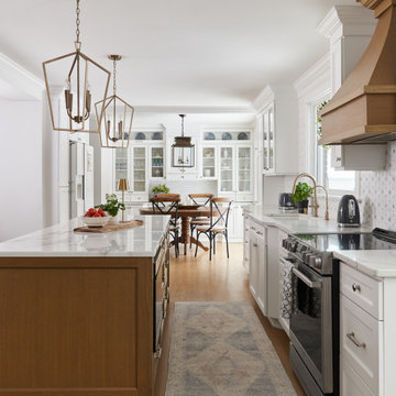
Project Summerhayes is a thoughtfully curated transformation of the heart of the home, the kitchen and family room. These spaces were designed to support daily living while feeling warm, welcoming, and deeply personal.
From the outset, our approach focused on intentional design choices that balance visual impact with comfort and functionality. Each element was carefully selected to enhance the flow of the space while creating an atmosphere that feels both refined and inviting.
Every layer, detail, and finish was chosen with purpose, resulting in interiors that feel lived-in, loved, and uniquely reflective of the family who calls this house home. The transformation highlights the power of considered design where beauty and function work together seamlessly.
We’re delighted to share Project Summerhayes with you.
 My Kitchen And Bath
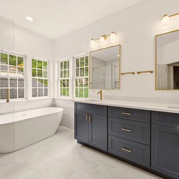
A complete primary bathroom remodel in Springfield, Virginia, designed around three priorities our clients came in with: a real walk-in shower, a freestanding tub by the windows, and a proper double vanity with storage that actually worked.
The original layout had everything in the wrong place. The tub sat against an interior wall away from the natural light. A small stall shower took up real estate across the room. The vanity was squeezed into whatever space was left over. Three windows on the back wall were doing nothing for the room because the layout was fighting them. Our solution involved knocking down the dividing wall between the old shower and vanity area, relocating plumbing for both the tub and the new vanities, and placing the freestanding tub directly under the bay of windows so morning light became part of the experience.
Design Approach
We anchored the room around contrast: deep navy cabinetry against soft white walls, warm brushed gold against cool marble tile, sharp Shaker lines against the curved silhouette of the freestanding tub. Navy was the design decision the rest of the room was built around — the clients knew they wanted color but didn't want anything that would feel dated in five years. Navy reads bold without being loud, pairs with virtually any metal finish, and has staying power that trendier choices don't.
We used Fabuwood Galaxy Indigo for the vanities — all-plywood construction with solid wood doors and drawer fronts, soft close throughout. Shaker-style flat panels keep the navy from feeling heavy. The brushed gold (Jeffrey Alexander 635-96SBZ in satin bronze) shows up across hardware, faucets, lighting, the tub filler, and the shower trim, creating a quiet continuity throughout the room.
The Shower
Removing the wall between the old shower and old vanity area created room for a proper walk-in. We tiled the entire shower floor to ceiling in Decovita Calacatta Suave 24x48" porcelain — large format installed in a 50% offset horizontal pattern, with cement board and redgard underneath. The marble-look porcelain gives the visual depth of natural marble without the maintenance.
A built-in shower bench, custom-built into the corner, is wrapped in the same wall tile on the front with a quartz top matching the vanity counter. The shower niche is detailed with MSI Arabescato Carrara 2" honed hex mosaic at the back, the same tile used on the shower floor. All tile edges are finished with Schluter in satin bronze to match the room's metal finishes. The shower door is custom frameless 3/8" tempered glass with a satin bronze pull — no metal frame interrupting the sight line.
The Vanities and Countertops
The new double vanity gives both clients their own space for morning routines. Counter tops are MSI Calacatta Miraggio Cielo quartz with pencil edging and a 4" backsplash — a soft white with subtle gray veining that reads like real Calacatta marble without the porosity issues. Two undermount square porcelain sinks finish the surface cleanly.
The Tub
A 60" freestanding soaker tub sits under the bay of three windows. The floor-mounted tub filler is satin bronze with a handheld sprayer. We relocated the drain and supply lines to make the centered placement work. The tub is the room's quietest feature and its strongest — clients tell us they use this bathroom differently than they used the old one.
Flooring
MSI Sande Ivory 12x24" matte porcelain runs throughout the bathroom floor in a 50% offset pattern parallel to the vanity wall. Cement board underneath, 4" white wood baseboard, Whisper Grey grout that handles daily use without showing wear.
Paint and Lighting
Walls are Benjamin Moore Chantilly Lace 2121-70 in satin — a true crisp white that doesn't lean cool or warm. The ceiling uses Benjamin Moore Aura Bath and Spa White, which is formulated to resist mildew in high-humidity spaces. Lighting is layered: three new 6" LED recessed lights on a dimmer, two satin bronze vanity sconces above the mirrors, and the existing three windows providing the daytime ambient light.
Project Specs
Location: Springfield, Virginia
Project type: Full primary bathroom remodel
Project duration: Approximately 5 weeks
Style: Modern, Transitional
Color palette: Navy, white, brushed gold, marble
Materials
Cabinetry: Fabuwood Galaxy Indigo, Shaker-style flat panel maple, all-plywood construction
Cabinet hardware: Jeffrey Alexander 635-96SBZ Satin Bronze pulls
Vanity counter and bench top: MSI Calacatta Miraggio Cielo Quartz, pencil edge with 4" backsplash
Sinks: Undermount white porcelain BR-202 square (x2)
Wall tile: Decovita Calacatta Suave 24x48" porcelain
Floor tile: MSI Sande Ivory 12x24" matte porcelain
Shower floor + niche back: MSI Arabescato Carrara 2" honed hex mosaic marble
Edge trim: Schluter satin bronze
Shower door: Custom frameless 3/8" tempered glass
Tub: 60" freestanding acrylic soaker (Ferguson)
Tub filler: Floor-mounted satin bronze (Ferguson)
Vanity faucets, mirrors, sconces, toilet: Satin bronze coordinated finishes (Ferguson)
Wall paint: Benjamin Moore Chantilly Lace 2121-70 Satin
Ceiling paint: Benjamin Moore Aura Bath and Spa White
Grout: Whisper Grey (floor), Standard White (walls and shower)
Designed and built by My Kitchen and Bath out of our Alexandria showroom at 5710 General Washington Drive. We've been designing and building kitchens, bathrooms, and full home renovations across Northern Virginia and the DMV since 1994.
 RL Design and Build
This backyard was completely reimagined into a modern, fully automated outdoor living space designed for relaxation, entertaining, and year-round enjoyment.
At the center of the design is a fully automated 11’ x 9’ inground spa, equipped with a dedicated pump for powerful swimming jets and a sleek sheer descent water feature. The spa is finished with pour-in-place coping, stack stone on the spa facing, and low-voltage LED lighting to enhance both functionality and nighttime ambiance.
Adjacent to the spa is a custom rectangular fire pit, featuring pour-in-place coping, stack stone veneer, and integrated low-voltage lighting, creating a warm and inviting focal point for evening gatherings.
For entertaining, we built a custom BBQ island topped with a concrete countertop, and fully equipped with an ice chest, refrigerator, trash pull-out, and ample storage space, offering both durability and a clean, modern aesthetic.
The hardscape includes 24” x 12” decking pavers installed throughout the yard and continued along the side of the house, all designed with proper drainage for long-term performance and durability.
A raised planter system adds structure and greenery to the space, finished with pour-in-place coping, smooth stucco planter faces, and low-voltage lighting both on and within the planters. An irrigation drip system was integrated into all planters to ensure efficient watering and healthy plant growth with minimal maintenance.
To soften the design, artificial grass with stepping stones was installed, creating a low-maintenance, lush look while improving flow through the yard.
For evening atmosphere, three metal posts were installed for string lighting, complemented by low-voltage lighting throughout all flat and raised planters to deliver layered, resort-style ambiance after dark.
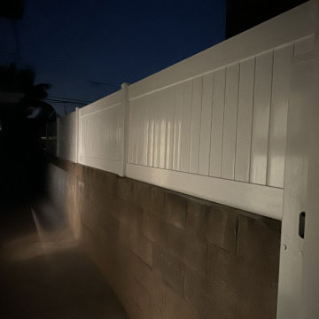
Finally, white vinyl gates and fencing were added to enclose and conceal the spa and pool equipment, topped with a privacy extension to keep the space visually clean and private.
The result is a cohesive, modern outdoor retreat that balances design, comfort, and functionality. Perfect for both entertaining and everyday enjoyment.
 TVL Creative Ltd.
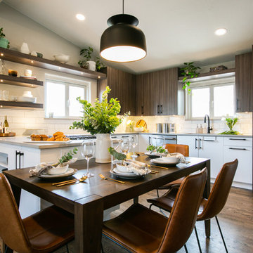
This 1950s home was sporting elements of the original kitchen and the dark space was not meeting our client’s needs. The original kitchen didn’t have much to offer in the way of functionality, so our first order of business was to create a design that would exponentially increase the usability of the kitchen. We brought in functional cabinetry, introduced uninterrupted work surfaces, and added plenty of lighting to brighten up their kitchen. They also wanted to open the new kitchen to the living room and create space for a larger dining table, so we started by removing the existing cabinetry that was visually cut the living space in two and minimized the power of the dramatic vaulted ceiling. We also extended the wood flooring into the kitchen as well to create seamless transitions between spaces. We fell in love with the idea of a two-toned cabinetry design for this kitchen and ultimately went head over heels for clean white painted base cabinets and a textured wood-look melamine on the uppers. This gave us a crisp backdrop that allowed us to bring is fun forms like the black light fixture over the table and the gorgeous silhouettes on the hardware. We played a lot with directionality in this space. The elongated open shelves and rectangular backsplash tiles give us wonderfully clean horizontal lines, but to balance those out we brought in a vertical grain pattern on the wall cabinets and added long black cabinetry pulls that emphasize the verticality of the space. The clients have a green thumb and wanted to make sure we created a home for their growing plant collection. The open shelving gives us plenty of opportunities for foliage and to showcase fun kitchen accessories. This design feels like home and brings together the clean lines and crisp finishes our clients were looking for.
 Brooks + Scarpa Architects
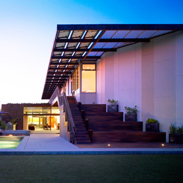
The Yin-Yang House is a net-zero energy single-family home in a quiet Venice, CA neighborhood. The design objective was to create a space for a large and growing family with several children, which would create a calm, relaxed and organized environment that emphasizes public family space. The home also serves as a place to entertain, and a welcoming space for teenagers as they seek social space with friends.
The home is organized around a series of courtyards and other outdoor spaces that integrate with the interior of the house. Facing the street the house appears to be solid. However, behind the steel entry door is a courtyard, which reveals the indoor-outdoor nature of the house behind the solid exterior. From the entry courtyard, the entire space to the rear garden wall can be seen; the first clue of the home’s spatial connection between inside and out. These spaces are designed for entertainment, and the 40 foot sliding glass door to the living room enhances the harmonic relationship of the main room, allowing the owners to host many guests without the feeling of being overburdened.
The tensions of the house’s exterior are subtly underscored by a 12-inch steel band that hews close to, but sometimes rises above or falls below the floor line of the second floor – a continuous loop moving inside and out like a pen that is never lifted from the page, but reinforces the intent to spatially weave together the indoors with the outside as a single space.
Scale manipulation also plays a formal role in the design of the structure. From the rear, the house appears to be a single-story volume. The large master bedroom window and the outdoor steps are scaled to support this illusion. It is only when the steps are animated with people that one realizes the true scale of the house is two stories.
The kitchen is the heart of the house, with an open working area that allows the owner, an accomplished chef, to converse with friends while cooking. Bedrooms are intentionally designed to be very small and simple; allowing for larger public spaces, emphasizing the family over individual domains. The breakfast room looks across an outdoor courtyard to the guest room/kids playroom, establishing a visual connection while defining the separation of uses. The children can play outdoors while under adult supervision from the dining area or the office, or do homework in the office while adults occupy the adjacent outdoor or indoor space.
Many of the materials used, including the bamboo interior, composite stone and tile countertops and bathroom finishes are recycled, and reinforce the environmental DNA of the house, which also has a green roof. Blown-in cellulose insulation, radiant heating and a host of other sustainable features aids in the performance of the building’s heating and cooling.
The active systems in the home include a 12 KW solar photovoltaic panel system, the largest such residential system available on the market. The solar panels also provide shade from the sun, preventing the house from becoming overheated. The owners have been in the home for over nine months and have yet to receive a power bill.
 Lavish Interiors
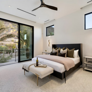
This never-occupied, move-in ready custom home in The Estates at Ascent at The Phoenician showcases the power of professional home staging. With unobstructed Camelback Mountain views, over 4,600 sq ft of designer living space, and luxury finishes throughout, this property was thoughtfully staged to highlight its architectural beauty and create emotional appeal for high-end buyers.
Staging features include layered textures, neutral tones, and curated furnishings that enhance the natural light, open flow, and high-end amenities—like the invisacook induction island, glass-enclosed wine display, and spa-style primary suite. Every space, from the dramatic entry to the multiple view patios, was styled to maximize visual impact and buyer connection.
Luxury home staging helped bring this one-of-a-kind property to life, showing its full potential and lifestyle story.


 Wiles Design Group
This home was redesigned to reflect the homeowners' personalities through intentional and bold design choices, resulting in a visually appealing and powerfully expressive environment.
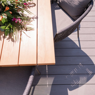
The home's outdoor space offers the perfect blend of comfort and style. Relax on plush seating while embracing nature's beauty, or gather around the charming dining area for delightful meals under open skies.
 Docking Drawer
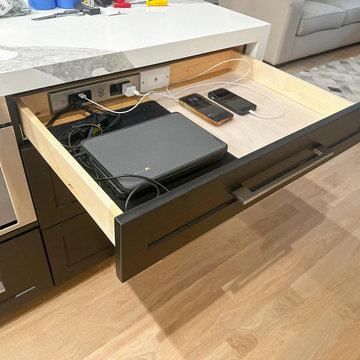
This kitchen features a Blade Duo charging drawer that keeps phones, laptops, and cords completely off the counter. A built-in internet connection delivers seamless power without sacrificing clean lines or visual simplicity.
 Vancouver Gas Fireplaces
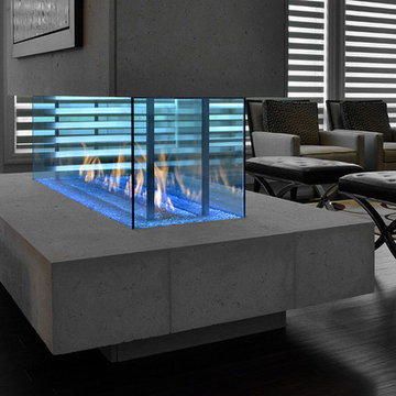
DaVinci fireplaces are a modular design that comes in segments measured by feet. They feature a hi-tech air flow system that will keep the glass cool to the touch. These units come single-sided, see-thru, corner unit, or 4-sided glass enclosure. Glass height normally comes in 12", 20", 30", or 36" but can be adjusted.
Power venting allows for easy unlimited venting configurations and installation in almost any room. Onsite assembly to eliminate space restrictions such as small stairwells or elevators.
Glass media paired with multi-coloured LED lights will make your fire feature a unique experience that you control with a user friendly remote.
 My Kitchen And Bath
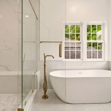
A complete primary bathroom remodel in Springfield, Virginia, designed around three priorities our clients came in with: a real walk-in shower, a freestanding tub by the windows, and a proper double vanity with storage that actually worked.
The original layout had everything in the wrong place. The tub sat against an interior wall away from the natural light. A small stall shower took up real estate across the room. The vanity was squeezed into whatever space was left over. Three windows on the back wall were doing nothing for the room because the layout was fighting them. Our solution involved knocking down the dividing wall between the old shower and vanity area, relocating plumbing for both the tub and the new vanities, and placing the freestanding tub directly under the bay of windows so morning light became part of the experience.
Design Approach
We anchored the room around contrast: deep navy cabinetry against soft white walls, warm brushed gold against cool marble tile, sharp Shaker lines against the curved silhouette of the freestanding tub. Navy was the design decision the rest of the room was built around — the clients knew they wanted color but didn't want anything that would feel dated in five years. Navy reads bold without being loud, pairs with virtually any metal finish, and has staying power that trendier choices don't.
We used Fabuwood Galaxy Indigo for the vanities — all-plywood construction with solid wood doors and drawer fronts, soft close throughout. Shaker-style flat panels keep the navy from feeling heavy. The brushed gold (Jeffrey Alexander 635-96SBZ in satin bronze) shows up across hardware, faucets, lighting, the tub filler, and the shower trim, creating a quiet continuity throughout the room.
The Shower
Removing the wall between the old shower and old vanity area created room for a proper walk-in. We tiled the entire shower floor to ceiling in Decovita Calacatta Suave 24x48" porcelain — large format installed in a 50% offset horizontal pattern, with cement board and redgard underneath. The marble-look porcelain gives the visual depth of natural marble without the maintenance.
A built-in shower bench, custom-built into the corner, is wrapped in the same wall tile on the front with a quartz top matching the vanity counter. The shower niche is detailed with MSI Arabescato Carrara 2" honed hex mosaic at the back, the same tile used on the shower floor. All tile edges are finished with Schluter in satin bronze to match the room's metal finishes. The shower door is custom frameless 3/8" tempered glass with a satin bronze pull — no metal frame interrupting the sight line.
The Vanities and Countertops
The new double vanity gives both clients their own space for morning routines. Counter tops are MSI Calacatta Miraggio Cielo quartz with pencil edging and a 4" backsplash — a soft white with subtle gray veining that reads like real Calacatta marble without the porosity issues. Two undermount square porcelain sinks finish the surface cleanly.
The Tub
A 60" freestanding soaker tub sits under the bay of three windows. The floor-mounted tub filler is satin bronze with a handheld sprayer. We relocated the drain and supply lines to make the centered placement work. The tub is the room's quietest feature and its strongest — clients tell us they use this bathroom differently than they used the old one.
Flooring
MSI Sande Ivory 12x24" matte porcelain runs throughout the bathroom floor in a 50% offset pattern parallel to the vanity wall. Cement board underneath, 4" white wood baseboard, Whisper Grey grout that handles daily use without showing wear.
Paint and Lighting
Walls are Benjamin Moore Chantilly Lace 2121-70 in satin — a true crisp white that doesn't lean cool or warm. The ceiling uses Benjamin Moore Aura Bath and Spa White, which is formulated to resist mildew in high-humidity spaces. Lighting is layered: three new 6" LED recessed lights on a dimmer, two satin bronze vanity sconces above the mirrors, and the existing three windows providing the daytime ambient light.
Project Specs
Location: Springfield, Virginia
Project type: Full primary bathroom remodel
Project duration: Approximately 5 weeks
Style: Modern, Transitional
Color palette: Navy, white, brushed gold, marble
Materials
Cabinetry: Fabuwood Galaxy Indigo, Shaker-style flat panel maple, all-plywood construction
Cabinet hardware: Jeffrey Alexander 635-96SBZ Satin Bronze pulls
Vanity counter and bench top: MSI Calacatta Miraggio Cielo Quartz, pencil edge with 4" backsplash
Sinks: Undermount white porcelain BR-202 square (x2)
Wall tile: Decovita Calacatta Suave 24x48" porcelain
Floor tile: MSI Sande Ivory 12x24" matte porcelain
Shower floor + niche back: MSI Arabescato Carrara 2" honed hex mosaic marble
Edge trim: Schluter satin bronze
Shower door: Custom frameless 3/8" tempered glass
Tub: 60" freestanding acrylic soaker (Ferguson)
Tub filler: Floor-mounted satin bronze (Ferguson)
Vanity faucets, mirrors, sconces, toilet: Satin bronze coordinated finishes (Ferguson)
Wall paint: Benjamin Moore Chantilly Lace 2121-70 Satin
Ceiling paint: Benjamin Moore Aura Bath and Spa White
Grout: Whisper Grey (floor), Standard White (walls and shower)
Designed and built by My Kitchen and Bath out of our Alexandria showroom at 5710 General Washington Drive. We've been designing and building kitchens, bathrooms, and full home renovations across Northern Virginia and the DMV since 1994.


 Lang's Kitchen & Bath
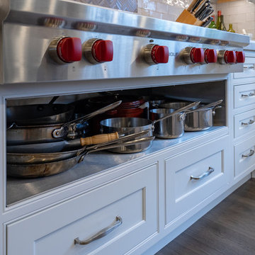
This transitional style kitchen remodel is the heart and soul of this Yardley, PA home, with the perfect marriage of form and function. The combination of white and gray finish DuraSupreme kitchen cabinets, accented by Top Knobs hardware and granite countertops, create a stunning visual effect. Each cabinet houses well-planned specialized storage, including glass front cabinetry and a beverage bar with pull outs. A walk-in pantry provides ample room to store all your cooking essentials. Custom features like the Jay Rambo hood, stainless insert under the range, and Walker Zanger decorative tile feature set this kitchen design apart. The main sink by Julien includes a drain board, colander, and drying rack with a Grohe pull-down faucet, and the secondary sink from Elkay is a hammered stainless sculpted metal sink. The kitchen features top of the line appliances including Subzero refrigerators, a Sharp microwave drawer, Wolf cooking appliances, a Bosch dishwasher, and Kitchenaid ice maker. Task Lighting angled power strips offer space to plug in appliances and charge devices. The Eco Timber engineered wood floor gives the entire space a warm, inviting appearance.
 Drury Design
THE SETUP
The original primary bathroom was characterized by a disjointed and segmented layout. The shower featured a bulky glass-block enclosure that overwhelmed the space visually. There was a considerable amount of open, unused space, and despite having a his and hers vanity, the arrangement lacked personal space for each user, as they shared the conjoined space between the sinks. The toilet was inconveniently located right by the door, with a half-wall partition meant to provide privacy but instead contributing to a cramped and unbalanced feel. Overall, the bathroom’s layout and design were fragmented, failing to make the most of the available space and lacking adequate storage solutions.
Design objectives:
- Reconfigure the layout to enhance functionality and flow.
- Create an elegant, upscale aesthetic that is light and bright.
- Incorporate specialized storage solutions for female hair care needs.
- Increase overall storage capacity.
- Develop a spa-like shower experience.
- Provide a significant wow factor to the space.
THE REMODEL
Design challenges to be solved:
- Repositioning the toilet to a more suitable location.
- Designing hair care storage solutions without cluttering the elegant space.
- Balancing an upscale, elegant design with a feminine touch in the color palette.
- Increasing the brightness of the room without adding windows.
- Completely replacing the existing shower to create a spa-like experience.
- Planning new storage solutions without adding bulkiness or clutter to the cabinetry.
THE RENEWED SPACE
Design solutions:
Toilet Relocation: Moved the toilet by the window, creating a better overall layout that also opened up two full walls for cabinetry and storage solutions.
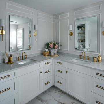
Specialized Vanity Storage: The left side of the left vanity is the wife’s. Open shelves facing across the vanity can be used for decorative or daily needs items. Pull-out docking drawers with power outlets and metal basins handle hot hair appliances.
Bright and Elegant Color Scheme: White cabinets, countertops, floors, and shower walls keep the space bright. The just-off-white wall color with a hint of pink adds a feminine touch. Thin wainscoting with white trim offers traditional-leaning elegance.
Layered Lighting Strategy: Ceiling can lights, sconces, lighted mirrors, and toe-kick lighting were installed. Natural light-rated bulbs keep the space bright and natural-feeling.
Spa-Like Shower: An extra-large shower was created using the same floor tile materials for continuity. Equipped with a Kohler Anthem system with a shower head, hand-held, and four body sprays. His and Hers niches for separate body care product storage.
Enhanced Storage Solutions: Added a linen cabinet within the vanity area for efficient storage of towels and bathroom essentials.
This elegant bathroom feels incredibly spacious now. The color palette and lights keep the room bright and cheery. Gold fixtures, the herringbone pattern on the floor, and exquisite trim work add an elegant touch. With the husband and wife having their own vanity wall sections joined at the corner, each user truly has their own space within the space. The clients are very happy with the final result.
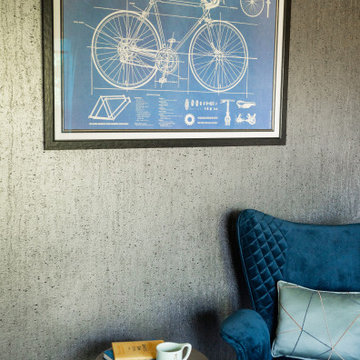 Wiles Design Group
This home was redesigned to reflect the homeowners' personalities through intentional and bold design choices, resulting in a visually appealing and powerfully expressive environment.
In the home office, a sleek table is a focal point, complemented by a plush armchair and ottoman, providing comfort and style. Elegant decor, including captivating artwork and guitars adorning the walls, transforms the space into a harmonious blend of functionality and personal expression.
56