
Search results for "Practical objective" in Home Design Ideas

 Fiorito Interior Design
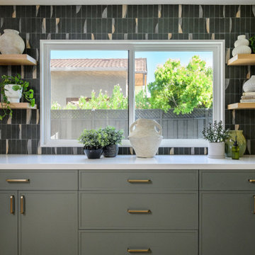
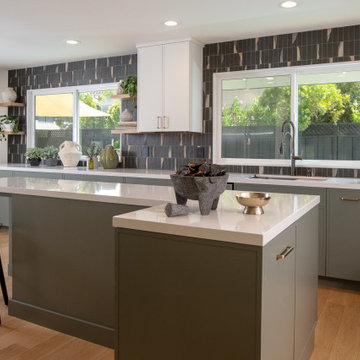
When I began this kitchen project, the space was constrained by an awkward peninsula and a dropped ceiling that compressed the room both physically and visually. Fluorescent fixtures sat behind a plastic diffuser, and the refrigerator was wedged beside the range, leaving the kitchen feeling crowded while also making poor use of the available space. The transformation began by taking things away. The dropped ceiling was removed, the fluorescent tubes went with it, and the room suddenly gained height and light. The peninsula was removed too, opening the floor plan and allowing the cabinetry to continue down an adjacent wall and incorporate a second window. What had been a small, enclosed kitchen became a generous working space with room for a slim, functional L-shaped island, additional cabinetry and, perhaps most importantly, a much more natural relationship between the different parts of the kitchen.
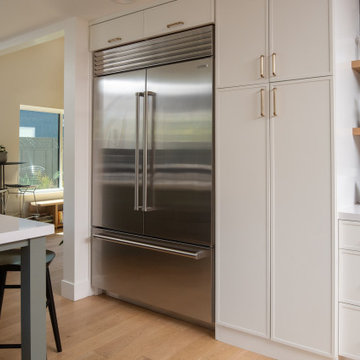
The palette is quiet, but there is a lot happening within it. Soft sage cabinetry grounds the room, while warm white upper cabinets and pantry cabinetry lift the space. A pure white quartz countertop provides a crisp surface against the cabinetry, and soft brass hardware adds just enough warmth. The new Sub Zero refrigerator was given its own wall, beside a full pantry, freeing the range wall to become a strong focal point. A Monogram range now sits centered beneath an angular stainless-steel Zephyr hood, framed by the kitchen's most distinctive element: a graphite backsplash made from WOW Design's Pottery tile. Inspired by Japanese handmade ceramics, the tiles have a wonderfully tactile, imperfect character. Most are deep graphite, but here and there the surface breaks into strokes of camel, dusty peach and deep blue-gunmetal glaze. There is an almost painterly quality to the way those colors move across the wall, giving the kitchen something that is difficult to achieve with a more uniform material—the feeling that someone actually made it.
The rest of the room was designed around that same balance of simplicity and warmth. New pale oak flooring runs throughout the ground floor, bringing a natural material and a soft golden tone beneath the cooler sage and graphite. Floating oak shelves flank the windows and provide a home for plants, ceramics and a few favorite objects, while another pair of shelves beside the refrigerator creates a small landing place for the things that inevitably arrive with you at the end of the day—keys, mail, bags and whatever else happens to be in your hands. The island occupies a surprisingly small footprint, yet its L-shaped form provides both additional work surface and seating without interrupting the flow of the room. A deep sink with an integrated cutting board and roll-up drying rack, a commercial-style faucet and under-cabinet LED lighting bring the practical details up to the same level of thoughtfulness as the larger design decisions. In the end, the renovation did more than just enlarge the kitchen; it created a space that feels calm, contemporary, warm, and a little unexpected … and, most importantly, we created a kitchen that finally makes sense for the way my clients live.
AFTER photos: Bernardo Grijalva
 Fiorito Interior Design
When I began this kitchen project, the space was constrained by an awkward peninsula and a dropped ceiling that compressed the room both physically and visually. Fluorescent fixtures sat behind a plastic diffuser, and the refrigerator was wedged beside the range, leaving the kitchen feeling crowded while also making poor use of the available space. The transformation began by taking things away. The dropped ceiling was removed, the fluorescent tubes went with it, and the room suddenly gained height and light. The peninsula was removed too, opening the floor plan and allowing the cabinetry to continue down an adjacent wall and incorporate a second window. What had been a small, enclosed kitchen became a generous working space with room for a slim, functional L-shaped island, additional cabinetry and, perhaps most importantly, a much more natural relationship between the different parts of the kitchen.
The palette is quiet, but there is a lot happening within it. Soft sage cabinetry grounds the room, while warm white upper cabinets and pantry cabinetry lift the space. A pure white quartz countertop provides a crisp surface against the cabinetry, and soft brass hardware adds just enough warmth. The new Sub Zero refrigerator was given its own wall, beside a full pantry, freeing the range wall to become a strong focal point. A Monogram range now sits centered beneath an angular stainless-steel Zephyr hood, framed by the kitchen's most distinctive element: a graphite backsplash made from WOW Design's Pottery tile. Inspired by Japanese handmade ceramics, the tiles have a wonderfully tactile, imperfect character. Most are deep graphite, but here and there the surface breaks into strokes of camel, dusty peach and deep blue-gunmetal glaze. There is an almost painterly quality to the way those colors move across the wall, giving the kitchen something that is difficult to achieve with a more uniform material—the feeling that someone actually made it.
The rest of the room was designed around that same balance of simplicity and warmth. New pale oak flooring runs throughout the ground floor, bringing a natural material and a soft golden tone beneath the cooler sage and graphite. Floating oak shelves flank the windows and provide a home for plants, ceramics and a few favorite objects, while another pair of shelves beside the refrigerator creates a small landing place for the things that inevitably arrive with you at the end of the day—keys, mail, bags and whatever else happens to be in your hands. The island occupies a surprisingly small footprint, yet its L-shaped form provides both additional work surface and seating without interrupting the flow of the room. A deep sink with an integrated cutting board and roll-up drying rack, a commercial-style faucet and under-cabinet LED lighting bring the practical details up to the same level of thoughtfulness as the larger design decisions. In the end, the renovation did more than just enlarge the kitchen; it created a space that feels calm, contemporary, warm, and a little unexpected … and, most importantly, we created a kitchen that finally makes sense for the way my clients live.
AFTER photos: Bernardo Grijalva
Find the right local pro for your project
 Fiorito Interior Design
When I began this kitchen project, the space was constrained by an awkward peninsula and a dropped ceiling that compressed the room both physically and visually. Fluorescent fixtures sat behind a plastic diffuser, and the refrigerator was wedged beside the range, leaving the kitchen feeling crowded while also making poor use of the available space. The transformation began by taking things away. The dropped ceiling was removed, the fluorescent tubes went with it, and the room suddenly gained height and light. The peninsula was removed too, opening the floor plan and allowing the cabinetry to continue down an adjacent wall and incorporate a second window. What had been a small, enclosed kitchen became a generous working space with room for a slim, functional L-shaped island, additional cabinetry and, perhaps most importantly, a much more natural relationship between the different parts of the kitchen.
The palette is quiet, but there is a lot happening within it. Soft sage cabinetry grounds the room, while warm white upper cabinets and pantry cabinetry lift the space. A pure white quartz countertop provides a crisp surface against the cabinetry, and soft brass hardware adds just enough warmth. The new Sub Zero refrigerator was given its own wall, beside a full pantry, freeing the range wall to become a strong focal point. A Monogram range now sits centered beneath an angular stainless-steel Zephyr hood, framed by the kitchen's most distinctive element: a graphite backsplash made from WOW Design's Pottery tile. Inspired by Japanese handmade ceramics, the tiles have a wonderfully tactile, imperfect character. Most are deep graphite, but here and there the surface breaks into strokes of camel, dusty peach and deep blue-gunmetal glaze. There is an almost painterly quality to the way those colors move across the wall, giving the kitchen something that is difficult to achieve with a more uniform material—the feeling that someone actually made it.
The rest of the room was designed around that same balance of simplicity and warmth. New pale oak flooring runs throughout the ground floor, bringing a natural material and a soft golden tone beneath the cooler sage and graphite. Floating oak shelves flank the windows and provide a home for plants, ceramics and a few favorite objects, while another pair of shelves beside the refrigerator creates a small landing place for the things that inevitably arrive with you at the end of the day—keys, mail, bags and whatever else happens to be in your hands. The island occupies a surprisingly small footprint, yet its L-shaped form provides both additional work surface and seating without interrupting the flow of the room. A deep sink with an integrated cutting board and roll-up drying rack, a commercial-style faucet and under-cabinet LED lighting bring the practical details up to the same level of thoughtfulness as the larger design decisions. In the end, the renovation did more than just enlarge the kitchen; it created a space that feels calm, contemporary, warm, and a little unexpected … and, most importantly, we created a kitchen that finally makes sense for the way my clients live.
AFTER photos: Bernardo Grijalva
 Fiorito Interior Design
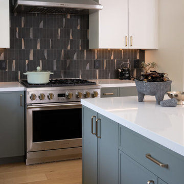
When I began this kitchen project, the space was constrained by an awkward peninsula and a dropped ceiling that compressed the room both physically and visually. Fluorescent fixtures sat behind a plastic diffuser, and the refrigerator was wedged beside the range, leaving the kitchen feeling crowded while also making poor use of the available space. The transformation began by taking things away. The dropped ceiling was removed, the fluorescent tubes went with it, and the room suddenly gained height and light. The peninsula was removed too, opening the floor plan and allowing the cabinetry to continue down an adjacent wall and incorporate a second window. What had been a small, enclosed kitchen became a generous working space with room for a slim, functional L-shaped island, additional cabinetry and, perhaps most importantly, a much more natural relationship between the different parts of the kitchen.
The palette is quiet, but there is a lot happening within it. Soft sage cabinetry grounds the room, while warm white upper cabinets and pantry cabinetry lift the space. A pure white quartz countertop provides a crisp surface against the cabinetry, and soft brass hardware adds just enough warmth. The new Sub Zero refrigerator was given its own wall, beside a full pantry, freeing the range wall to become a strong focal point. A Monogram range now sits centered beneath an angular stainless-steel Zephyr hood, framed by the kitchen's most distinctive element: a graphite backsplash made from WOW Design's Pottery tile. Inspired by Japanese handmade ceramics, the tiles have a wonderfully tactile, imperfect character. Most are deep graphite, but here and there the surface breaks into strokes of camel, dusty peach and deep blue-gunmetal glaze. There is an almost painterly quality to the way those colors move across the wall, giving the kitchen something that is difficult to achieve with a more uniform material—the feeling that someone actually made it.
The rest of the room was designed around that same balance of simplicity and warmth. New pale oak flooring runs throughout the ground floor, bringing a natural material and a soft golden tone beneath the cooler sage and graphite. Floating oak shelves flank the windows and provide a home for plants, ceramics and a few favorite objects, while another pair of shelves beside the refrigerator creates a small landing place for the things that inevitably arrive with you at the end of the day—keys, mail, bags and whatever else happens to be in your hands. The island occupies a surprisingly small footprint, yet its L-shaped form provides both additional work surface and seating without interrupting the flow of the room. A deep sink with an integrated cutting board and roll-up drying rack, a commercial-style faucet and under-cabinet LED lighting bring the practical details up to the same level of thoughtfulness as the larger design decisions. In the end, the renovation did more than just enlarge the kitchen; it created a space that feels calm, contemporary, warm, and a little unexpected … and, most importantly, we created a kitchen that finally makes sense for the way my clients live.
AFTER photos: Bernardo Grijalva
 Fiorito Interior Design
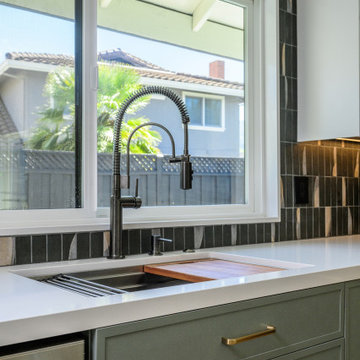
When I began this kitchen project, the space was constrained by an awkward peninsula and a dropped ceiling that compressed the room both physically and visually. Fluorescent fixtures sat behind a plastic diffuser, and the refrigerator was wedged beside the range, leaving the kitchen feeling crowded while also making poor use of the available space. The transformation began by taking things away. The dropped ceiling was removed, the fluorescent tubes went with it, and the room suddenly gained height and light. The peninsula was removed too, opening the floor plan and allowing the cabinetry to continue down an adjacent wall and incorporate a second window. What had been a small, enclosed kitchen became a generous working space with room for a slim, functional L-shaped island, additional cabinetry and, perhaps most importantly, a much more natural relationship between the different parts of the kitchen.
The palette is quiet, but there is a lot happening within it. Soft sage cabinetry grounds the room, while warm white upper cabinets and pantry cabinetry lift the space. A pure white quartz countertop provides a crisp surface against the cabinetry, and soft brass hardware adds just enough warmth. The new Sub Zero refrigerator was given its own wall, beside a full pantry, freeing the range wall to become a strong focal point. A Monogram range now sits centered beneath an angular stainless-steel Zephyr hood, framed by the kitchen's most distinctive element: a graphite backsplash made from WOW Design's Pottery tile. Inspired by Japanese handmade ceramics, the tiles have a wonderfully tactile, imperfect character. Most are deep graphite, but here and there the surface breaks into strokes of camel, dusty peach and deep blue-gunmetal glaze. There is an almost painterly quality to the way those colors move across the wall, giving the kitchen something that is difficult to achieve with a more uniform material—the feeling that someone actually made it.
The rest of the room was designed around that same balance of simplicity and warmth. New pale oak flooring runs throughout the ground floor, bringing a natural material and a soft golden tone beneath the cooler sage and graphite. Floating oak shelves flank the windows and provide a home for plants, ceramics and a few favorite objects, while another pair of shelves beside the refrigerator creates a small landing place for the things that inevitably arrive with you at the end of the day—keys, mail, bags and whatever else happens to be in your hands. The island occupies a surprisingly small footprint, yet its L-shaped form provides both additional work surface and seating without interrupting the flow of the room. A deep sink with an integrated cutting board and roll-up drying rack, a commercial-style faucet and under-cabinet LED lighting bring the practical details up to the same level of thoughtfulness as the larger design decisions. In the end, the renovation did more than just enlarge the kitchen; it created a space that feels calm, contemporary, warm, and a little unexpected … and, most importantly, we created a kitchen that finally makes sense for the way my clients live.
AFTER photos: Bernardo Grijalva
 Fiorito Interior Design
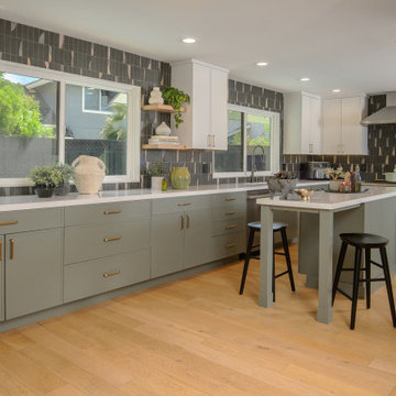
When I began this kitchen project, the space was constrained by an awkward peninsula and a dropped ceiling that compressed the room both physically and visually. Fluorescent fixtures sat behind a plastic diffuser, and the refrigerator was wedged beside the range, leaving the kitchen feeling crowded while also making poor use of the available space. The transformation began by taking things away. The dropped ceiling was removed, the fluorescent tubes went with it, and the room suddenly gained height and light. The peninsula was removed too, opening the floor plan and allowing the cabinetry to continue down an adjacent wall and incorporate a second window. What had been a small, enclosed kitchen became a generous working space with room for a slim, functional L-shaped island, additional cabinetry and, perhaps most importantly, a much more natural relationship between the different parts of the kitchen.
The palette is quiet, but there is a lot happening within it. Soft sage cabinetry grounds the room, while warm white upper cabinets and pantry cabinetry lift the space. A pure white quartz countertop provides a crisp surface against the cabinetry, and soft brass hardware adds just enough warmth. The new Sub Zero refrigerator was given its own wall, beside a full pantry, freeing the range wall to become a strong focal point. A Monogram range now sits centered beneath an angular stainless-steel Zephyr hood, framed by the kitchen's most distinctive element: a graphite backsplash made from WOW Design's Pottery tile. Inspired by Japanese handmade ceramics, the tiles have a wonderfully tactile, imperfect character. Most are deep graphite, but here and there the surface breaks into strokes of camel, dusty peach and deep blue-gunmetal glaze. There is an almost painterly quality to the way those colors move across the wall, giving the kitchen something that is difficult to achieve with a more uniform material—the feeling that someone actually made it.
The rest of the room was designed around that same balance of simplicity and warmth. New pale oak flooring runs throughout the ground floor, bringing a natural material and a soft golden tone beneath the cooler sage and graphite. Floating oak shelves flank the windows and provide a home for plants, ceramics and a few favorite objects, while another pair of shelves beside the refrigerator creates a small landing place for the things that inevitably arrive with you at the end of the day—keys, mail, bags and whatever else happens to be in your hands. The island occupies a surprisingly small footprint, yet its L-shaped form provides both additional work surface and seating without interrupting the flow of the room. A deep sink with an integrated cutting board and roll-up drying rack, a commercial-style faucet and under-cabinet LED lighting bring the practical details up to the same level of thoughtfulness as the larger design decisions. In the end, the renovation did more than just enlarge the kitchen; it created a space that feels calm, contemporary, warm, and a little unexpected … and, most importantly, we created a kitchen that finally makes sense for the way my clients live.
AFTER photos: Bernardo Grijalva
Sponsored
Columbus, OH

Hope Restoration & General Contracting
Columbus Design-Build, Kitchen & Bath Remodeling, Historic Renovations
 Fiorito Interior Design
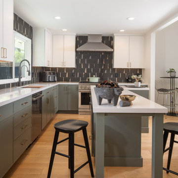
When I began this kitchen project, the space was constrained by an awkward peninsula and a dropped ceiling that compressed the room both physically and visually. Fluorescent fixtures sat behind a plastic diffuser, and the refrigerator was wedged beside the range, leaving the kitchen feeling crowded while also making poor use of the available space. The transformation began by taking things away. The dropped ceiling was removed, the fluorescent tubes went with it, and the room suddenly gained height and light. The peninsula was removed too, opening the floor plan and allowing the cabinetry to continue down an adjacent wall and incorporate a second window. What had been a small, enclosed kitchen became a generous working space with room for a slim, functional L-shaped island, additional cabinetry and, perhaps most importantly, a much more natural relationship between the different parts of the kitchen.
The palette is quiet, but there is a lot happening within it. Soft sage cabinetry grounds the room, while warm white upper cabinets and pantry cabinetry lift the space. A pure white quartz countertop provides a crisp surface against the cabinetry, and soft brass hardware adds just enough warmth. The new Sub Zero refrigerator was given its own wall, beside a full pantry, freeing the range wall to become a strong focal point. A Monogram range now sits centered beneath an angular stainless-steel Zephyr hood, framed by the kitchen's most distinctive element: a graphite backsplash made from WOW Design's Pottery tile. Inspired by Japanese handmade ceramics, the tiles have a wonderfully tactile, imperfect character. Most are deep graphite, but here and there the surface breaks into strokes of camel, dusty peach and deep blue-gunmetal glaze. There is an almost painterly quality to the way those colors move across the wall, giving the kitchen something that is difficult to achieve with a more uniform material—the feeling that someone actually made it.
The rest of the room was designed around that same balance of simplicity and warmth. New pale oak flooring runs throughout the ground floor, bringing a natural material and a soft golden tone beneath the cooler sage and graphite. Floating oak shelves flank the windows and provide a home for plants, ceramics and a few favorite objects, while another pair of shelves beside the refrigerator creates a small landing place for the things that inevitably arrive with you at the end of the day—keys, mail, bags and whatever else happens to be in your hands. The island occupies a surprisingly small footprint, yet its L-shaped form provides both additional work surface and seating without interrupting the flow of the room. A deep sink with an integrated cutting board and roll-up drying rack, a commercial-style faucet and under-cabinet LED lighting bring the practical details up to the same level of thoughtfulness as the larger design decisions. In the end, the renovation did more than just enlarge the kitchen; it created a space that feels calm, contemporary, warm, and a little unexpected … and, most importantly, we created a kitchen that finally makes sense for the way my clients live.
AFTER photos: Bernardo Grijalva
 Fiorito Interior Design
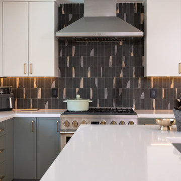
When I began this kitchen project, the space was constrained by an awkward peninsula and a dropped ceiling that compressed the room both physically and visually. Fluorescent fixtures sat behind a plastic diffuser, and the refrigerator was wedged beside the range, leaving the kitchen feeling crowded while also making poor use of the available space. The transformation began by taking things away. The dropped ceiling was removed, the fluorescent tubes went with it, and the room suddenly gained height and light. The peninsula was removed too, opening the floor plan and allowing the cabinetry to continue down an adjacent wall and incorporate a second window. What had been a small, enclosed kitchen became a generous working space with room for a slim, functional L-shaped island, additional cabinetry and, perhaps most importantly, a much more natural relationship between the different parts of the kitchen.
The palette is quiet, but there is a lot happening within it. Soft sage cabinetry grounds the room, while warm white upper cabinets and pantry cabinetry lift the space. A pure white quartz countertop provides a crisp surface against the cabinetry, and soft brass hardware adds just enough warmth. The new Sub Zero refrigerator was given its own wall, beside a full pantry, freeing the range wall to become a strong focal point. A Monogram range now sits centered beneath an angular stainless-steel Zephyr hood, framed by the kitchen's most distinctive element: a graphite backsplash made from WOW Design's Pottery tile. Inspired by Japanese handmade ceramics, the tiles have a wonderfully tactile, imperfect character. Most are deep graphite, but here and there the surface breaks into strokes of camel, dusty peach and deep blue-gunmetal glaze. There is an almost painterly quality to the way those colors move across the wall, giving the kitchen something that is difficult to achieve with a more uniform material—the feeling that someone actually made it.
The rest of the room was designed around that same balance of simplicity and warmth. New pale oak flooring runs throughout the ground floor, bringing a natural material and a soft golden tone beneath the cooler sage and graphite. Floating oak shelves flank the windows and provide a home for plants, ceramics and a few favorite objects, while another pair of shelves beside the refrigerator creates a small landing place for the things that inevitably arrive with you at the end of the day—keys, mail, bags and whatever else happens to be in your hands. The island occupies a surprisingly small footprint, yet its L-shaped form provides both additional work surface and seating without interrupting the flow of the room. A deep sink with an integrated cutting board and roll-up drying rack, a commercial-style faucet and under-cabinet LED lighting bring the practical details up to the same level of thoughtfulness as the larger design decisions. In the end, the renovation did more than just enlarge the kitchen; it created a space that feels calm, contemporary, warm, and a little unexpected … and, most importantly, we created a kitchen that finally makes sense for the way my clients live.
AFTER photos: Bernardo Grijalva

 Travis Mark Photography
Travis Mark
Inspiration for a contemporary straight staircase remodel in New York
Inspiration for a contemporary straight staircase remodel in New York
 Klopf Architecture
Nestled in the hills of Orinda, California, this 1951 residence is one of only seven extant homes, now known as “The Magnificent Seven”, designed by architect Olof Dahlstrand, a protégé of Frank Lloyd Wright. With its low-slung rooflines, natural materials, and deep integration with the sloping landscape, the home is a pristine example of mid-century modern design inspired by Wright’s organic principles. Over the years, prior homeowners have emphasized preservation, ensuring that the house remained relatively untouched. Each owner has respected the original architecture and stayed true to Dahlstrand’s intent. When a family of five—two college-aged sons and a middle school-aged daughter—acquired the property, they were captivated by its history, legacy of care, and architectural significance. While they appreciated Dahlstrand’s original vision, they also recognized the need to adapt the home for contemporary living while preserving its design integrity.
The remodel was conceived as a thoughtful response to the past—an effort to bring the house into the 21st century without compromising its soul. The primary mandate was to maintain architectural continuity while improving the functionality, comfort, and livability for a modern family. The design team—architects and contractor alike—worked with a shared reverence for the original architecture, allowing that mindset to guide even the most technical or pragmatic decisions.
A key objective was to increase natural light in the kitchen—a departure from Wrightian principles of enclosed, intimate cooking spaces—while maintaining the home’s architectural language. The kitchen was reconfigured to foster a stronger connection to adjacent living spaces while retaining the underlying concept of spatial separation. One of the most transformative architectural changes was the removal of a ridge beam that was originally planned to remain visible through the kitchen. During construction, the team collaborated on a better solution: a wide-flanged steel beam concealed within the roof envelope. This subtle move preserved the clean lines and ceiling continuity, a modern update carried out with utmost respect for the existing framework.
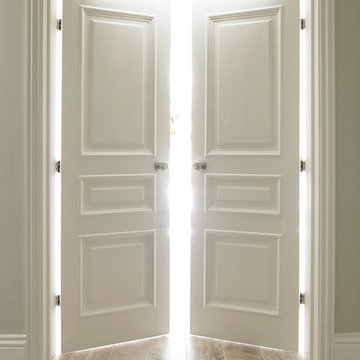
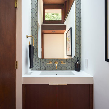
The home’s original powder room, previously accessible only through the kitchen, was relocated for better flow and privacy. A new powder room was carved out of former kitchen cabinetry—a narrow, interior space that could have felt dark and enclosed. To avoid this, the design extended the line of original transom windows into the new powder room and added a skylight above the vanity. The result is a bright and airy space that feels consistent with the rest of the home. Other updates included the installation of new solid-core interior doors with veneers carefully matched to the original mahogany, enhancing the continuity of the interiors. Even smaller decisions, such as placing the door knobs at 42 inches high, mirrored the original proportions. Every choice reflected a shared belief between the architect, contractor, and client: that new work should serve the integrity of the old.
The home’s extensive interior redwood millwork and paneling was meticulously restored. Where new materials were introduced—such as the replacement redwood soffit paneling—the contractor took pains to find finish nails that matched the original, rather than using modern equivalents. This level of craftsmanship and collaboration defined the project. It extended even to the detailing of a blind door to the new powder room, which had to disappear into the existing redwood board-and-batten wall. It was a team effort: the owner found a suitable handle, the architects devised the custom in-swing mechanism, and the contractor executed it so the door aligned precisely with the battens. Throughout, the homeowners were deeply engaged in the design process. One, a meticulous design enthusiast, focused on aesthetic integrity and historic detail. The other brought a practical and function-driven perspective, ensuring that new fixtures and materials would be durable and require minimal maintenance.
While the home’s location posed no major site challenges, sustainability was a key concern. The team upgraded the roof insulation, installed solar panels with battery storage, and added ductless mini-split cooling systems. Lighting was another area where modern technology was woven into a historic framework: new square LED fixtures echo the original custom perimeter soffit lights, maintaining the design language while offering advanced performance.
A planned expansion of a bedroom into suite with a bathroom had to be shelved due to budget constraints and the high cost of below-grade foundation work. Still, the team focused their efforts on making the most of the existing footprint, resolving constraints through design ingenuity rather than adding square footage. This renovation represents a collaborative achievement in preserving and evolving a historically significant home. Every decision was shaped by a shared ethos among clients, architects, and contractor: to maintain the home’s architectural soul while updating it for contemporary life. The result is a timeless modernist residence that continues Olof Dahlstrand’s legacy, remaining grounded in nature, craftsmanship, and human-scale design.
Klopf Architecture Team: John Klopf, AIA, Klara Kevane, Fernanda Bernardes
Interior Architectural Design: Klopf Architecture
Structural Engineer: Daniel Bastiao
Contractor: Don Larwood, Larwood Construction
Photography: Mariko Reed
Year Completed: 2022

 KINGDOM WOODWORKS
Collaboration with Canonbury Homes and Frank Neely Design Associates.
Inspiration for a timeless open concept kitchen remodel in Atlanta with beaded inset cabinets and two islands
Inspiration for a timeless open concept kitchen remodel in Atlanta with beaded inset cabinets and two islands


Sponsored
Delaware, OH

Buckeye Basements, Inc.
Central Ohio's Basement Finishing ExpertsBest Of Houzz '13-'21
 Drury Design
The Setup
For this primary bathroom project, the homeowners wanted to transform their large, T-shaped bathroom into a functional, multi-purpose sanctuary. The existing layout was inefficient, with a bulky built-in tub, a closed-off shower, and an awkward footprint that limited practical use.
This remodel also presented a unique challenge – the homeowners wanted to use the space for workouts as well. The design needed to maximize the large open area in the middle of the T, providing enough room for yoga and light free-weight exercises while maintaining the bathroom’s aesthetic and functionality.
Design objectives:
Expand and brighten the shower area without major layout changes
Replace the oversized built-in tub with a sleek freestanding alternative
Create a flexible space for workouts while maintaining the bathroom’s design integrity
Address cold flooring with added comfort solutions
Enhance lighting for both beauty and functionality
Incorporate storage for workout equipment and everyday essentials
Integrate natural elements to accommodate the homeowners’ love of plants
The Remodel
Design challenges to be solved:
Shower Expansion – The homeowners want a more open, spa-like shower but don’t want to dramatically alter the footprint.
Workout Integration – Balancing fitness functionality with a serene bathroom design will require creative layout adjustments.
Storage Solutions – With workout gear to stow away, the space needs discrete and versatile storage options.
Lighting – Enhancing both natural and artificial lighting to brighten the large space.
Cold Floors – Positioned above the garage, the bathroom tends to feel colder than the adjacent primary bedroom. A solution is needed to add warmth and comfort during use, without the need to reconfigure the home’s overall heating system.
The Renewed Space
Design solutions:
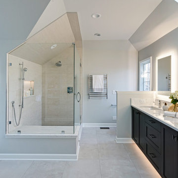
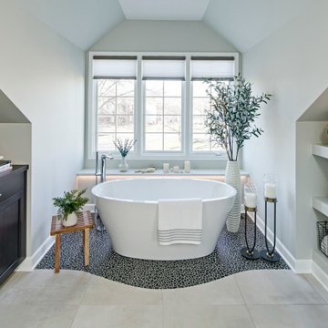
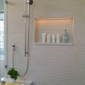
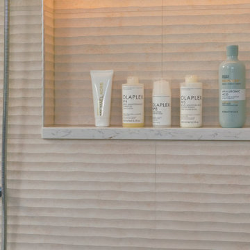
Spa-Like Shower Expansion – Removing a wall and replacing it with glass transformed the shower into an open, airy retreat, allowing natural light to flow freely through the space. A curved black river rock floor and neutral linear wall tiles add warmth and texture, while carefully placed niche lighting enhances the tranquil, luxurious atmosphere.
Workout-Friendly Layout – A custom full-length mirror was strategically placed to accommodate multiple uses, creating a fitness studio-like experience for yoga or light weight training. The mirror’s size and positioning allow for clear visibility during workouts, while also enhancing the room by adding light and a greater sense of depth.
Custom Storage Solutions – A custom cabinet with a wood top was crafted to discreetly store workout equipment, preserving the clean, open feel of the space. Its design not only enhances functionality but also creates a sense of symmetry, bringing visual balance and cohesion to the overall layout.
Enhanced Lighting – Replacing the shower wall with glass, installing a full-length mirror, and incorporating vanity mirrors with built-in lighting dramatically brighten the space. LED strip lighting under the cabinets, along the tub half wall, and in both the side and shower niches adds layered illumination, enhancing both function and ambiance.
Heated Floors – Installing heated flooring provides consistent warmth and comfort year-round, enhancing the space for both workouts and daily routines. A European-style towel warmer brings additional warmth and a touch of luxury, elevating the overall experience.
Final Thoughts:
This transformed bathroom blends luxury with intentional design. By addressing the homeowners’ needs – from workout flexibility to spa-inspired details – the space now serves multiple purposes without compromise. The warm cabinetry, black accents and thoughtful lighting tie the design together, while the curved textures and plant-friendly ledge add a personalized touch. This bathroom is now a bright, welcoming sanctuary for daily routines and mindful moments.

 Cummings Architecture + Interiors
When Cummings Architects first met with the owners of this understated country farmhouse, the building’s layout and design was an incoherent jumble. The original bones of the building were almost unrecognizable. All of the original windows, doors, flooring, and trims – even the country kitchen – had been removed. Mathew and his team began a thorough design discovery process to find the design solution that would enable them to breathe life back into the old farmhouse in a way that acknowledged the building’s venerable history while also providing for a modern living by a growing family.
The redesign included the addition of a new eat-in kitchen, bedrooms, bathrooms, wrap around porch, and stone fireplaces. To begin the transforming restoration, the team designed a generous, twenty-four square foot kitchen addition with custom, farmers-style cabinetry and timber framing. The team walked the homeowners through each detail the cabinetry layout, materials, and finishes. Salvaged materials were used and authentic craftsmanship lent a sense of place and history to the fabric of the space.
The new master suite included a cathedral ceiling showcasing beautifully worn salvaged timbers. The team continued with the farm theme, using sliding barn doors to separate the custom-designed master bath and closet. The new second-floor hallway features a bold, red floor while new transoms in each bedroom let in plenty of light. A summer stair, detailed and crafted with authentic details, was added for additional access and charm.
Finally, a welcoming farmer’s porch wraps around the side entry, connecting to the rear yard via a gracefully engineered grade. This large outdoor space provides seating for large groups of people to visit and dine next to the beautiful outdoor landscape and the new exterior stone fireplace.
Though it had temporarily lost its identity, with the help of the team at Cummings Architects, this lovely farmhouse has regained not only its former charm but also a new life through beautifully integrated modern features designed for today’s family.
Photo by Eric Roth
 Drury Design
The Setup
For this primary bathroom project, the homeowners wanted to transform their large, T-shaped bathroom into a functional, multi-purpose sanctuary. The existing layout was inefficient, with a bulky built-in tub, a closed-off shower, and an awkward footprint that limited practical use.
This remodel also presented a unique challenge – the homeowners wanted to use the space for workouts as well. The design needed to maximize the large open area in the middle of the T, providing enough room for yoga and light free-weight exercises while maintaining the bathroom’s aesthetic and functionality.
Design objectives:
Expand and brighten the shower area without major layout changes
Replace the oversized built-in tub with a sleek freestanding alternative
Create a flexible space for workouts while maintaining the bathroom’s design integrity
Address cold flooring with added comfort solutions
Enhance lighting for both beauty and functionality
Incorporate storage for workout equipment and everyday essentials
Integrate natural elements to accommodate the homeowners’ love of plants
The Remodel
Design challenges to be solved:
Shower Expansion – The homeowners want a more open, spa-like shower but don’t want to dramatically alter the footprint.
Workout Integration – Balancing fitness functionality with a serene bathroom design will require creative layout adjustments.
Storage Solutions – With workout gear to stow away, the space needs discrete and versatile storage options.
Lighting – Enhancing both natural and artificial lighting to brighten the large space.
Cold Floors – Positioned above the garage, the bathroom tends to feel colder than the adjacent primary bedroom. A solution is needed to add warmth and comfort during use, without the need to reconfigure the home’s overall heating system.
The Renewed Space
Design solutions:
Spa-Like Shower Expansion – Removing a wall and replacing it with glass transformed the shower into an open, airy retreat, allowing natural light to flow freely through the space. A curved black river rock floor and neutral linear wall tiles add warmth and texture, while carefully placed niche lighting enhances the tranquil, luxurious atmosphere.
Workout-Friendly Layout – A custom full-length mirror was strategically placed to accommodate multiple uses, creating a fitness studio-like experience for yoga or light weight training. The mirror’s size and positioning allow for clear visibility during workouts, while also enhancing the room by adding light and a greater sense of depth.
Custom Storage Solutions – A custom cabinet with a wood top was crafted to discreetly store workout equipment, preserving the clean, open feel of the space. Its design not only enhances functionality but also creates a sense of symmetry, bringing visual balance and cohesion to the overall layout.
Enhanced Lighting – Replacing the shower wall with glass, installing a full-length mirror, and incorporating vanity mirrors with built-in lighting dramatically brighten the space. LED strip lighting under the cabinets, along the tub half wall, and in both the side and shower niches adds layered illumination, enhancing both function and ambiance.
Heated Floors – Installing heated flooring provides consistent warmth and comfort year-round, enhancing the space for both workouts and daily routines. A European-style towel warmer brings additional warmth and a touch of luxury, elevating the overall experience.
Final Thoughts:
This transformed bathroom blends luxury with intentional design. By addressing the homeowners’ needs – from workout flexibility to spa-inspired details – the space now serves multiple purposes without compromise. The warm cabinetry, black accents and thoughtful lighting tie the design together, while the curved textures and plant-friendly ledge add a personalized touch. This bathroom is now a bright, welcoming sanctuary for daily routines and mindful moments.
 Drury Design
The Setup
For this primary bathroom project, the homeowners wanted to transform their large, T-shaped bathroom into a functional, multi-purpose sanctuary. The existing layout was inefficient, with a bulky built-in tub, a closed-off shower, and an awkward footprint that limited practical use.
This remodel also presented a unique challenge – the homeowners wanted to use the space for workouts as well. The design needed to maximize the large open area in the middle of the T, providing enough room for yoga and light free-weight exercises while maintaining the bathroom’s aesthetic and functionality.
Design objectives:
Expand and brighten the shower area without major layout changes
Replace the oversized built-in tub with a sleek freestanding alternative
Create a flexible space for workouts while maintaining the bathroom’s design integrity
Address cold flooring with added comfort solutions
Enhance lighting for both beauty and functionality
Incorporate storage for workout equipment and everyday essentials
Integrate natural elements to accommodate the homeowners’ love of plants
The Remodel
Design challenges to be solved:
Shower Expansion – The homeowners want a more open, spa-like shower but don’t want to dramatically alter the footprint.
Workout Integration – Balancing fitness functionality with a serene bathroom design will require creative layout adjustments.
Storage Solutions – With workout gear to stow away, the space needs discrete and versatile storage options.
Lighting – Enhancing both natural and artificial lighting to brighten the large space.
Cold Floors – Positioned above the garage, the bathroom tends to feel colder than the adjacent primary bedroom. A solution is needed to add warmth and comfort during use, without the need to reconfigure the home’s overall heating system.
The Renewed Space
Design solutions:
Spa-Like Shower Expansion – Removing a wall and replacing it with glass transformed the shower into an open, airy retreat, allowing natural light to flow freely through the space. A curved black river rock floor and neutral linear wall tiles add warmth and texture, while carefully placed niche lighting enhances the tranquil, luxurious atmosphere.
Workout-Friendly Layout – A custom full-length mirror was strategically placed to accommodate multiple uses, creating a fitness studio-like experience for yoga or light weight training. The mirror’s size and positioning allow for clear visibility during workouts, while also enhancing the room by adding light and a greater sense of depth.
Custom Storage Solutions – A custom cabinet with a wood top was crafted to discreetly store workout equipment, preserving the clean, open feel of the space. Its design not only enhances functionality but also creates a sense of symmetry, bringing visual balance and cohesion to the overall layout.
Enhanced Lighting – Replacing the shower wall with glass, installing a full-length mirror, and incorporating vanity mirrors with built-in lighting dramatically brighten the space. LED strip lighting under the cabinets, along the tub half wall, and in both the side and shower niches adds layered illumination, enhancing both function and ambiance.
Heated Floors – Installing heated flooring provides consistent warmth and comfort year-round, enhancing the space for both workouts and daily routines. A European-style towel warmer brings additional warmth and a touch of luxury, elevating the overall experience.
Final Thoughts:
This transformed bathroom blends luxury with intentional design. By addressing the homeowners’ needs – from workout flexibility to spa-inspired details – the space now serves multiple purposes without compromise. The warm cabinetry, black accents and thoughtful lighting tie the design together, while the curved textures and plant-friendly ledge add a personalized touch. This bathroom is now a bright, welcoming sanctuary for daily routines and mindful moments.
Sponsored
Westerville, OH

Custom Home Works
Franklin County's Award-Winning Design, Build and Remodeling Expert
 Drury Design
The Setup
For this primary bathroom project, the homeowners wanted to transform their large, T-shaped bathroom into a functional, multi-purpose sanctuary. The existing layout was inefficient, with a bulky built-in tub, a closed-off shower, and an awkward footprint that limited practical use.
This remodel also presented a unique challenge – the homeowners wanted to use the space for workouts as well. The design needed to maximize the large open area in the middle of the T, providing enough room for yoga and light free-weight exercises while maintaining the bathroom’s aesthetic and functionality.
Design objectives:
Expand and brighten the shower area without major layout changes
Replace the oversized built-in tub with a sleek freestanding alternative
Create a flexible space for workouts while maintaining the bathroom’s design integrity
Address cold flooring with added comfort solutions
Enhance lighting for both beauty and functionality
Incorporate storage for workout equipment and everyday essentials
Integrate natural elements to accommodate the homeowners’ love of plants
The Remodel
Design challenges to be solved:
Shower Expansion – The homeowners want a more open, spa-like shower but don’t want to dramatically alter the footprint.
Workout Integration – Balancing fitness functionality with a serene bathroom design will require creative layout adjustments.
Storage Solutions – With workout gear to stow away, the space needs discrete and versatile storage options.
Lighting – Enhancing both natural and artificial lighting to brighten the large space.
Cold Floors – Positioned above the garage, the bathroom tends to feel colder than the adjacent primary bedroom. A solution is needed to add warmth and comfort during use, without the need to reconfigure the home’s overall heating system.
The Renewed Space
Design solutions:
Spa-Like Shower Expansion – Removing a wall and replacing it with glass transformed the shower into an open, airy retreat, allowing natural light to flow freely through the space. A curved black river rock floor and neutral linear wall tiles add warmth and texture, while carefully placed niche lighting enhances the tranquil, luxurious atmosphere.
Workout-Friendly Layout – A custom full-length mirror was strategically placed to accommodate multiple uses, creating a fitness studio-like experience for yoga or light weight training. The mirror’s size and positioning allow for clear visibility during workouts, while also enhancing the room by adding light and a greater sense of depth.
Custom Storage Solutions – A custom cabinet with a wood top was crafted to discreetly store workout equipment, preserving the clean, open feel of the space. Its design not only enhances functionality but also creates a sense of symmetry, bringing visual balance and cohesion to the overall layout.
Enhanced Lighting – Replacing the shower wall with glass, installing a full-length mirror, and incorporating vanity mirrors with built-in lighting dramatically brighten the space. LED strip lighting under the cabinets, along the tub half wall, and in both the side and shower niches adds layered illumination, enhancing both function and ambiance.
Heated Floors – Installing heated flooring provides consistent warmth and comfort year-round, enhancing the space for both workouts and daily routines. A European-style towel warmer brings additional warmth and a touch of luxury, elevating the overall experience.
Final Thoughts:
This transformed bathroom blends luxury with intentional design. By addressing the homeowners’ needs – from workout flexibility to spa-inspired details – the space now serves multiple purposes without compromise. The warm cabinetry, black accents and thoughtful lighting tie the design together, while the curved textures and plant-friendly ledge add a personalized touch. This bathroom is now a bright, welcoming sanctuary for daily routines and mindful moments.
 Drury Design
The Setup:
After purchasing this home, the homeowners faced a unique opportunity to reimagine their kitchen and nearby spaces. Water damage from a burst pipe had left much of the home’s interior in need of repair, and while the existing kitchen was functional and in relatively good shape, it didn’t align with the family’s vision for their new home. The layout included a peninsula that wasn’t ideal, and there were some druthers with the nearby pantry.
Since the space needed to be rebuilt anyway, the homeowners saw this as a chance to create a kitchen that was both highly functional for their four young children and timeless in its design. The project also included a refresh of the adjacent message center and dining room — spaces that play key roles in the family’s daily life. The goal was to create a cohesive flow between these areas, balancing modern functionality with the craftsman-inspired character of the rest of the home.
Design Objectives:
- Replace the outdated peninsula with a large island to maximize counter space and create new seating options.
- Open up the space visually by removing soffits and rethinking the cabinetry layout.
Incorporate concealed refrigeration and freezer units to provide significant storage for the family while maintaining a streamlined aesthetic.
- Integrate black cabinetry into the design without making the space feel harsh or heavy.
- Ensure the lighting plan balances functional task lighting with ambient accent lighting.
- Avoid visual clutter in the cabinetry design while still giving a nod to the craftsman aesthetic.
- Incorporate a slab backsplash as a key design feature.
Design Challenges:
- The outdated peninsula left dead space in the kitchen and lacked sufficient seating for the family.
- The cooktop wall was cramped, with small cabinets flanking the hood, limited storage, and soffits that made the space feel closed-in.
- The family needed significant refrigeration space (two refrigerators and a freezer) but wanted to avoid a cluttered look with visible stainless steel appliances.
- Adding black cabinetry risked making the space feel too dark or heavy.
- The original lighting plan was insufficient, particularly over the dining table where a decorative fixture proved too dim.
- The family wanted shaker-style drawer fronts to match the home’s arts-and-crafts design but worried that too much shaker cabinetry might look overly busy.
- Prioritizing a slab backsplash in the wish list priority planning.
The Renewed Space
Design Solutions:
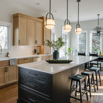
- A functional island: The peninsula was replaced with a large island that provides continuous countertop space for prepping and serving. The island also features seating for four people, creating a central hub for informal meals and activities.
- Streamlined cooktop wall: The soffits were removed, and the upper cabinets on the cooktop wall were eliminated to create a more open, streamlined design. A custom oversized hood became the focal point of the wall, with the blower unit offset inside it to align with the cooktop while maintaining exterior visual symmetry.
- Concealed refrigeration: Two column refrigerators and one freezer were integrated into the cabinetry, concealing them behind wood paneling that blends seamlessly with the overall design.
- Warm black cabinetry: The black cabinetry was crafted from hickory with a visible grain, softening its appearance and adding warmth. The grain detail gives the cabinetry a rich, textured look that avoids feeling stark or overpowering.
- Additional lighting: In the dining area, recessed can lights were added during an additional installation phase to supplement the gorgeous decorative fixture’s dim output. The new lighting plan creates a layered effect, combining functional task lighting with softer ambient lighting.
- Simplified cabinetry details: Slab drawer fronts were used on the upper drawers, while five-piece shaker fronts (with slightly less prominent rail and stile pieces) were reserved for the middle and lower drawers. This approach simplified the overall look while maintaining the craftsman-inspired aesthetic.
- Slab backsplash priority: The slab backsplash was prioritized by making thoughtful adjustments elsewhere, like opting not to extend cabinetry to the ceiling, which also helped visually prioritize the gorgeous slab backsplash. This decision also enhanced the kitchen’s furniture-like feel, aligning with the home’s craftsman character.
- This kitchen perfectly balances practicality with timeless style. By addressing the family’s functional needs — ample seating, smart storage, and effective lighting — while incorporating thoughtful design elements like warm black cabinetry and a striking slab backsplash, Alicia created a space that works beautifully for a busy household. The result is a cohesive, inviting kitchen that honors the home’s craftsman roots and will serve the family well for years to come.
 Drury Design
The Setup
For this primary bathroom project, the homeowners wanted to transform their large, T-shaped bathroom into a functional, multi-purpose sanctuary. The existing layout was inefficient, with a bulky built-in tub, a closed-off shower, and an awkward footprint that limited practical use.
This remodel also presented a unique challenge – the homeowners wanted to use the space for workouts as well. The design needed to maximize the large open area in the middle of the T, providing enough room for yoga and light free-weight exercises while maintaining the bathroom’s aesthetic and functionality.
Design objectives:
Expand and brighten the shower area without major layout changes
Replace the oversized built-in tub with a sleek freestanding alternative
Create a flexible space for workouts while maintaining the bathroom’s design integrity
Address cold flooring with added comfort solutions
Enhance lighting for both beauty and functionality
Incorporate storage for workout equipment and everyday essentials
Integrate natural elements to accommodate the homeowners’ love of plants
The Remodel
Design challenges to be solved:
Shower Expansion – The homeowners want a more open, spa-like shower but don’t want to dramatically alter the footprint.
Workout Integration – Balancing fitness functionality with a serene bathroom design will require creative layout adjustments.
Storage Solutions – With workout gear to stow away, the space needs discrete and versatile storage options.
Lighting – Enhancing both natural and artificial lighting to brighten the large space.
Cold Floors – Positioned above the garage, the bathroom tends to feel colder than the adjacent primary bedroom. A solution is needed to add warmth and comfort during use, without the need to reconfigure the home’s overall heating system.
The Renewed Space
Design solutions:
Spa-Like Shower Expansion – Removing a wall and replacing it with glass transformed the shower into an open, airy retreat, allowing natural light to flow freely through the space. A curved black river rock floor and neutral linear wall tiles add warmth and texture, while carefully placed niche lighting enhances the tranquil, luxurious atmosphere.
Workout-Friendly Layout – A custom full-length mirror was strategically placed to accommodate multiple uses, creating a fitness studio-like experience for yoga or light weight training. The mirror’s size and positioning allow for clear visibility during workouts, while also enhancing the room by adding light and a greater sense of depth.
Custom Storage Solutions – A custom cabinet with a wood top was crafted to discreetly store workout equipment, preserving the clean, open feel of the space. Its design not only enhances functionality but also creates a sense of symmetry, bringing visual balance and cohesion to the overall layout.
Enhanced Lighting – Replacing the shower wall with glass, installing a full-length mirror, and incorporating vanity mirrors with built-in lighting dramatically brighten the space. LED strip lighting under the cabinets, along the tub half wall, and in both the side and shower niches adds layered illumination, enhancing both function and ambiance.
Heated Floors – Installing heated flooring provides consistent warmth and comfort year-round, enhancing the space for both workouts and daily routines. A European-style towel warmer brings additional warmth and a touch of luxury, elevating the overall experience.
Final Thoughts:
This transformed bathroom blends luxury with intentional design. By addressing the homeowners’ needs – from workout flexibility to spa-inspired details – the space now serves multiple purposes without compromise. The warm cabinetry, black accents and thoughtful lighting tie the design together, while the curved textures and plant-friendly ledge add a personalized touch. This bathroom is now a bright, welcoming sanctuary for daily routines and mindful moments.
29