Search results for "Practical objective" in Home Design Ideas
This full first-floor renovation transformed a family home in Northwest Indiana, originally built in the early 2000s, into a personalized, highly functional space that better reflects the lifestyle and taste of its four residents. The remodel included the kitchen, living room, a reimagined dining room turned sitting room, office, mudroom, and laundry room.
The clients’ main objective was to move beyond dated, builder-grade finishes and create a home that felt curated, warm, and distinctive—infused with layered textures, custom details, and a sense of ease. The living room posed the biggest design challenge, with awkward furniture placement due to two structural columns. We used these features to anchor a revised layout, integrating custom built-ins for storage and balance, and adding mixed metals and refined textures for visual depth.
A former dining room was transformed into a moody sitting room—contrasting the neutral palette used throughout the rest of the main floor, while still complementing it. The mudroom was reworked from a tight, underutilized space into a practical, polished drop zone with custom cabinetry and stylish utility.
Throughout the renovation, our team focused on improving flow, enhancing functionality, and blending each room’s unique character into a cohesive, elevated whole—resulting in a home that’s as livable as it is beautifully tailored.

Nestled in the hills of Orinda, California, this 1951 residence is one of only seven extant homes, now known as “The Magnificent Seven”, designed by architect Olof Dahlstrand, a protégé of Frank Lloyd Wright. With its low-slung rooflines, natural materials, and deep integration with the sloping landscape, the home is a pristine example of mid-century modern design inspired by Wright’s organic principles. Over the years, prior homeowners have emphasized preservation, ensuring that the house remained relatively untouched. Each owner has respected the original architecture and stayed true to Dahlstrand’s intent. When a family of five—two college-aged sons and a middle school-aged daughter—acquired the property, they were captivated by its history, legacy of care, and architectural significance. While they appreciated Dahlstrand’s original vision, they also recognized the need to adapt the home for contemporary living while preserving its design integrity.
The remodel was conceived as a thoughtful response to the past—an effort to bring the house into the 21st century without compromising its soul. The primary mandate was to maintain architectural continuity while improving the functionality, comfort, and livability for a modern family. The design team—architects and contractor alike—worked with a shared reverence for the original architecture, allowing that mindset to guide even the most technical or pragmatic decisions.
A key objective was to increase natural light in the kitchen—a departure from Wrightian principles of enclosed, intimate cooking spaces—while maintaining the home’s architectural language. The kitchen was reconfigured to foster a stronger connection to adjacent living spaces while retaining the underlying concept of spatial separation. One of the most transformative architectural changes was the removal of a ridge beam that was originally planned to remain visible through the kitchen. During construction, the team collaborated on a better solution: a wide-flanged steel beam concealed within the roof envelope. This subtle move preserved the clean lines and ceiling continuity, a modern update carried out with utmost respect for the existing framework.
The home’s original powder room, previously accessible only through the kitchen, was relocated for better flow and privacy. A new powder room was carved out of former kitchen cabinetry—a narrow, interior space that could have felt dark and enclosed. To avoid this, the design extended the line of original transom windows into the new powder room and added a skylight above the vanity. The result is a bright and airy space that feels consistent with the rest of the home. Other updates included the installation of new solid-core interior doors with veneers carefully matched to the original mahogany, enhancing the continuity of the interiors. Even smaller decisions, such as placing the door knobs at 42 inches high, mirrored the original proportions. Every choice reflected a shared belief between the architect, contractor, and client: that new work should serve the integrity of the old.
The home’s extensive interior redwood millwork and paneling was meticulously restored. Where new materials were introduced—such as the replacement redwood soffit paneling—the contractor took pains to find finish nails that matched the original, rather than using modern equivalents. This level of craftsmanship and collaboration defined the project. It extended even to the detailing of a blind door to the new powder room, which had to disappear into the existing redwood board-and-batten wall. It was a team effort: the owner found a suitable handle, the architects devised the custom in-swing mechanism, and the contractor executed it so the door aligned precisely with the battens. Throughout, the homeowners were deeply engaged in the design process. One, a meticulous design enthusiast, focused on aesthetic integrity and historic detail. The other brought a practical and function-driven perspective, ensuring that new fixtures and materials would be durable and require minimal maintenance.
While the home’s location posed no major site challenges, sustainability was a key concern. The team upgraded the roof insulation, installed solar panels with battery storage, and added ductless mini-split cooling systems. Lighting was another area where modern technology was woven into a historic framework: new square LED fixtures echo the original custom perimeter soffit lights, maintaining the design language while offering advanced performance.
A planned expansion of a bedroom into suite with a bathroom had to be shelved due to budget constraints and the high cost of below-grade foundation work. Still, the team focused their efforts on making the most of the existing footprint, resolving constraints through design ingenuity rather than adding square footage. This renovation represents a collaborative achievement in preserving and evolving a historically significant home. Every decision was shaped by a shared ethos among clients, architects, and contractor: to maintain the home’s architectural soul while updating it for contemporary life. The result is a timeless modernist residence that continues Olof Dahlstrand’s legacy, remaining grounded in nature, craftsmanship, and human-scale design.
Klopf Architecture Team: John Klopf, AIA, Klara Kevane, Fernanda Bernardes
Interior Architectural Design: Klopf Architecture
Structural Engineer: Daniel Bastiao
Contractor: Don Larwood, Larwood Construction
Photography: Mariko Reed
Year Completed: 2022

Nestled in the hills of Orinda, California, this 1951 residence is one of only seven extant homes, now known as “The Magnificent Seven”, designed by architect Olof Dahlstrand, a protégé of Frank Lloyd Wright. With its low-slung rooflines, natural materials, and deep integration with the sloping landscape, the home is a pristine example of mid-century modern design inspired by Wright’s organic principles. Over the years, prior homeowners have emphasized preservation, ensuring that the house remained relatively untouched. Each owner has respected the original architecture and stayed true to Dahlstrand’s intent. When a family of five—two college-aged sons and a middle school-aged daughter—acquired the property, they were captivated by its history, legacy of care, and architectural significance. While they appreciated Dahlstrand’s original vision, they also recognized the need to adapt the home for contemporary living while preserving its design integrity.
The remodel was conceived as a thoughtful response to the past—an effort to bring the house into the 21st century without compromising its soul. The primary mandate was to maintain architectural continuity while improving the functionality, comfort, and livability for a modern family. The design team—architects and contractor alike—worked with a shared reverence for the original architecture, allowing that mindset to guide even the most technical or pragmatic decisions.
A key objective was to increase natural light in the kitchen—a departure from Wrightian principles of enclosed, intimate cooking spaces—while maintaining the home’s architectural language. The kitchen was reconfigured to foster a stronger connection to adjacent living spaces while retaining the underlying concept of spatial separation. One of the most transformative architectural changes was the removal of a ridge beam that was originally planned to remain visible through the kitchen. During construction, the team collaborated on a better solution: a wide-flanged steel beam concealed within the roof envelope. This subtle move preserved the clean lines and ceiling continuity, a modern update carried out with utmost respect for the existing framework.
The home’s original powder room, previously accessible only through the kitchen, was relocated for better flow and privacy. A new powder room was carved out of former kitchen cabinetry—a narrow, interior space that could have felt dark and enclosed. To avoid this, the design extended the line of original transom windows into the new powder room and added a skylight above the vanity. The result is a bright and airy space that feels consistent with the rest of the home. Other updates included the installation of new solid-core interior doors with veneers carefully matched to the original mahogany, enhancing the continuity of the interiors. Even smaller decisions, such as placing the door knobs at 42 inches high, mirrored the original proportions. Every choice reflected a shared belief between the architect, contractor, and client: that new work should serve the integrity of the old.
The home’s extensive interior redwood millwork and paneling was meticulously restored. Where new materials were introduced—such as the replacement redwood soffit paneling—the contractor took pains to find finish nails that matched the original, rather than using modern equivalents. This level of craftsmanship and collaboration defined the project. It extended even to the detailing of a blind door to the new powder room, which had to disappear into the existing redwood board-and-batten wall. It was a team effort: the owner found a suitable handle, the architects devised the custom in-swing mechanism, and the contractor executed it so the door aligned precisely with the battens. Throughout, the homeowners were deeply engaged in the design process. One, a meticulous design enthusiast, focused on aesthetic integrity and historic detail. The other brought a practical and function-driven perspective, ensuring that new fixtures and materials would be durable and require minimal maintenance.
While the home’s location posed no major site challenges, sustainability was a key concern. The team upgraded the roof insulation, installed solar panels with battery storage, and added ductless mini-split cooling systems. Lighting was another area where modern technology was woven into a historic framework: new square LED fixtures echo the original custom perimeter soffit lights, maintaining the design language while offering advanced performance.
A planned expansion of a bedroom into suite with a bathroom had to be shelved due to budget constraints and the high cost of below-grade foundation work. Still, the team focused their efforts on making the most of the existing footprint, resolving constraints through design ingenuity rather than adding square footage. This renovation represents a collaborative achievement in preserving and evolving a historically significant home. Every decision was shaped by a shared ethos among clients, architects, and contractor: to maintain the home’s architectural soul while updating it for contemporary life. The result is a timeless modernist residence that continues Olof Dahlstrand’s legacy, remaining grounded in nature, craftsmanship, and human-scale design.
Klopf Architecture Team: John Klopf, AIA, Klara Kevane, Fernanda Bernardes
Interior Architectural Design: Klopf Architecture
Structural Engineer: Daniel Bastiao
Contractor: Don Larwood, Larwood Construction
Photography: Mariko Reed
Year Completed: 2022
Find the right local pro for your project

Our Panoramic Door System truly blurs the lines between indoor-outdoor living, creating an additional outdoor room! Bring the outdoors in with this sleek, and elegant patented system. Outdoor living is hotter than ever, visit www.panoramicdoors.com for an instant quote today!

Dennis and Joe have a large, light-filled house. New construction meant lofted space and open floor plans with traditional styling. Running a busy dental practice by day and engaged in a rich social life by night, this couple needed a professional to take the lead on making their house a home.
That’s my cue!
They wanted to take risks, and stay away from “matchy-matchy”. We gussied up a plain ol’ TV room and gave it a healthy dose of luxury.
Our plan was initially inspired by an abstract painting hanging over their stone fireplace. We brought in their love of the outdoors to make things cozy and used family furniture whenever possible for nostalgia and comfort.
I took their love for one-of-a-kind objects and started making a design plan, aiming to solve their biggest frustration: the family room. They had a tortured relationship with a “forgotten family room,” a great space that was spacious and bright, but not at all cozy or joyful, and certainly not “them.”
I wanted to create a cozy space functional for everyday curling up with puppies and watching TV after dinner, yet chic enough for hosting the pre-dinner kitchen overflow and cocktails during parties.
I went looking for contrasting textures and materials. I wanted to balance patterns and scale, and use non-traditional colors as neutrals to create an overall sense of “BAM!”
Dennis and Joe loved the nod to the classics juxtaposed with new and different globally-inspired pieces. For this project our design aesthetic can be described as Middle Eastern/tribal meets mid-century modern. We played to their sensible side with proportion and balance, and stayed as far away from boring/bleh as we could.
You could say this room was pretty successful...It was featured in DC Modern Luxury. (#nobigdeal, right?)
From there we moved on to other spaces.. We added colorful pillows and sheer drapery to finish off their formal living room. We kept an inherited bedroom set from Dennis’ Mom and added color, draperies, and pillows to overhaul the guest bedroom.
Their project was not a rip-and-replace, we weren’t starting from scratch with a blank piece of paper.
Rather, our goal was to take what was already there and make it better, more like them. Using functionality first, we focused on giving the house a soothing, joyful aesthetic. We upped the chic factor by a gajillion and helped them find their ‘happy’ at home. See more Safferstone stuff at www.safferstone.com. Connect with us on Facebook, get inspired on Pinterest, and share modern musings on life & design on Instagram. Or, send us a love note at hello@safferstone.com.
Photo: Angie Seckinger

Jim Fuhrmann,
Beinfield Architecture PC
Mid-sized country light wood floor home yoga studio photo in New York with white walls

The Setup:
After purchasing this home, the homeowners faced a unique opportunity to reimagine their kitchen and nearby spaces. Water damage from a burst pipe had left much of the home’s interior in need of repair, and while the existing kitchen was functional and in relatively good shape, it didn’t align with the family’s vision for their new home. The layout included a peninsula that wasn’t ideal, and there were some druthers with the nearby pantry.
Since the space needed to be rebuilt anyway, the homeowners saw this as a chance to create a kitchen that was both highly functional for their four young children and timeless in its design. The project also included a refresh of the adjacent message center and dining room — spaces that play key roles in the family’s daily life. The goal was to create a cohesive flow between these areas, balancing modern functionality with the craftsman-inspired character of the rest of the home.
Design Objectives:
- Replace the outdated peninsula with a large island to maximize counter space and create new seating options.
- Open up the space visually by removing soffits and rethinking the cabinetry layout.
Incorporate concealed refrigeration and freezer units to provide significant storage for the family while maintaining a streamlined aesthetic.
- Integrate black cabinetry into the design without making the space feel harsh or heavy.
- Ensure the lighting plan balances functional task lighting with ambient accent lighting.
- Avoid visual clutter in the cabinetry design while still giving a nod to the craftsman aesthetic.
- Incorporate a slab backsplash as a key design feature.
Design Challenges:
- The outdated peninsula left dead space in the kitchen and lacked sufficient seating for the family.
- The cooktop wall was cramped, with small cabinets flanking the hood, limited storage, and soffits that made the space feel closed-in.
- The family needed significant refrigeration space (two refrigerators and a freezer) but wanted to avoid a cluttered look with visible stainless steel appliances.
- Adding black cabinetry risked making the space feel too dark or heavy.
- The original lighting plan was insufficient, particularly over the dining table where a decorative fixture proved too dim.
- The family wanted shaker-style drawer fronts to match the home’s arts-and-crafts design but worried that too much shaker cabinetry might look overly busy.
- Prioritizing a slab backsplash in the wish list priority planning.
The Renewed Space
Design Solutions:
- A functional island: The peninsula was replaced with a large island that provides continuous countertop space for prepping and serving. The island also features seating for four people, creating a central hub for informal meals and activities.
- Streamlined cooktop wall: The soffits were removed, and the upper cabinets on the cooktop wall were eliminated to create a more open, streamlined design. A custom oversized hood became the focal point of the wall, with the blower unit offset inside it to align with the cooktop while maintaining exterior visual symmetry.
- Concealed refrigeration: Two column refrigerators and one freezer were integrated into the cabinetry, concealing them behind wood paneling that blends seamlessly with the overall design.
- Warm black cabinetry: The black cabinetry was crafted from hickory with a visible grain, softening its appearance and adding warmth. The grain detail gives the cabinetry a rich, textured look that avoids feeling stark or overpowering.
- Additional lighting: In the dining area, recessed can lights were added during an additional installation phase to supplement the gorgeous decorative fixture’s dim output. The new lighting plan creates a layered effect, combining functional task lighting with softer ambient lighting.
- Simplified cabinetry details: Slab drawer fronts were used on the upper drawers, while five-piece shaker fronts (with slightly less prominent rail and stile pieces) were reserved for the middle and lower drawers. This approach simplified the overall look while maintaining the craftsman-inspired aesthetic.
- Slab backsplash priority: The slab backsplash was prioritized by making thoughtful adjustments elsewhere, like opting not to extend cabinetry to the ceiling, which also helped visually prioritize the gorgeous slab backsplash. This decision also enhanced the kitchen’s furniture-like feel, aligning with the home’s craftsman character.
- This kitchen perfectly balances practicality with timeless style. By addressing the family’s functional needs — ample seating, smart storage, and effective lighting — while incorporating thoughtful design elements like warm black cabinetry and a striking slab backsplash, Alicia created a space that works beautifully for a busy household. The result is a cohesive, inviting kitchen that honors the home’s craftsman roots and will serve the family well for years to come.

Sponsored
Westerville, OH
Custom Home Works
Franklin County's Award-Winning Design, Build and Remodeling Expert

Organization has to be key in a dressing room as well as looking beautiful. This was achieved by form and function, just gorgeous.
Closet - transitional closet idea in Indianapolis

Having a small child, loving to entertain and looking to declutter and kid-proof the gathering spaces of their home in the quaint village of Rockville Centre, Long Island, a stone’s throw from Manhattan, our client’s main objective was to have their living room and den transformed with a family friendly home makeover with mid-century modern tones boasting a formal, yet relaxed spirit
Stepping into the home we found their living room and den both architecturally well appointed yet in need of modern transitional furniture pieces and the pops of color our clients admired, as there was a substantial amount of cool, cold grays in the rooms.
Decor Aid designer Vivian C. approached the design and placement of the pieces sourced to be kid-friendly while remaining sophisticated and practical for entertaining.
“We played off of the clients love for blush pinks, mid-century modern and turquoise. We played with the use of gold and silver metals to mix it up.”
In the living room, we used the prominent bay window and its illuminating natural light as the main architectural focal point, while the fireplace and mantels soft white tone helped inform the minimalist color palette for which we styled the room around.
To add warmth to the living room we played off of the clients love for blush pinks and turquoise while elevating the room with flashes of gold and silver metallic pieces. For a sense of play and to tie the space together we punctuated the kid-friendly living room with an eclectic juxtaposition of colors and materials, from a beautifully patchworked geometric cowhide rug from All Modern, to a whimsical mirror placed over an unexpected, bold geometric credenza, to the blush velvet barrel chair and abstract blue watercolor pillows.
“When sourcing furniture and objects, we chose items that had rounded edges and were shatter proof as it was vital to keep each room’s decor childproof.” Vivian ads.
Their vision for the den remained chic, with comfort and practical functionality key to create an area for the young family to come together.
For the den, our main challenge was working around the pre-existing dark gray sectional sofa. To combat its chunkiness, we played off of the hues in the cubist framed prints placed above and focused on blue and orange accents which complement and play off of each other well. We selected orange storage ottomans in easy to clean, kid-friendly leather to maximize space and functionality. To personalize the appeal of the den we included black and white framed family photos. In the end, the result created a fun, relaxed space where our clients can enjoy family moments or watch a game while taking in the scenic view of their backyard.
For harmony between the rooms, the overall tone for each room is mid-century modern meets bold, yet classic contemporary through the use of mixed materials and fabrications including marble, stone, metals and plush velvet, creating a cozy yet sophisticated enough atmosphere for entertaining family and friends and raising a young children.
“The result od this family friendly room was really fantastic! Adding some greenery, more pillows and throws really made the space pop.” Vivian C. Decor Aid’s Designer

This vegetable garden is laid out on rectilinear lines with paths creating a cross-axis. The main path is flanked by raised beds and ornamented by a gateway at each end.
The gateways themselves draw the eye through and perhaps out of the garden, but mixed plantings adding colour and texture to the beds invites the viewer to stay and spend some time looking around and enjoying how rich a garden filled with edibles can be.

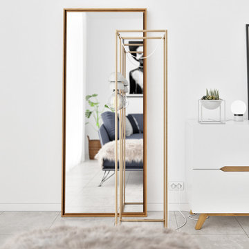
The nature of glass has the ability to transform small spaces into larger rooms, while the texture of natural wood creates a type of Scandinavian warmth. A beautiful piece designed for propping effortlessly against expansive walls, the Finn Mirror is both a practical object and decorative object of desire.

Sponsored
Delaware, OH
Buckeye Basements, Inc.
Central Ohio's Basement Finishing ExpertsBest Of Houzz '13-'21

Photo: Rikki Snyder © 2014 Houzz
Inspiration for a shabby-chic style bedroom remodel in New York

Rather than starting with an outcome in mind, this 1,400 square foot residence began from a polemic place - exploring shared conviction regarding the concentrated power of living with a smaller footprint. From the gabled silhouette to passive ventilation, the home captures the nostalgia for the past with the sustainable practices of the future.
While the exterior materials contrast a calm, minimal palette with the sleek lines of the gabled silhouette, the interior spaces embody a playful, artistic spirit. From the hand painted De Gournay wallpaper in the master bath to the rugged texture of the over-grouted limestone and Portuguese cobblestones, the home is an experience that encapsulates the unexpected and the timeless.

Laura Dante
Inspiration for an industrial bedroom remodel in Tampa with a tile fireplace and a standard fireplace

Sponsored
Columbus, OH
Hope Restoration & General Contracting
Columbus Design-Build, Kitchen & Bath Remodeling, Historic Renovations

For the 2010 Bucks County Designer House, Veneshe designed this yoga/meditation/retreat room in the attic space. It features marmorino plaster walls with trompe l'oeil fresco paintings, a feature wall in polished plaster, and a hand painted floor and floor cloth. Water features, sculpture, and natural elements provide a restful space in which to meditate and practice yoga.
Photo Credit: Swede's Photo

A Kentucky Derby-inspired sitting room, Holiday House NYC, 2014. Interior design: Patrick James Hamilton Designs; Photo: Jody Kivort.
Inspiration for a transitional open concept light wood floor living room remodel in New York with gray walls

Large minimalist multicolored two-story mixed siding house exterior photo in Seattle with a shed roof
3