
Search results for "Precisely" in Home Design Ideas
 Baru Decor
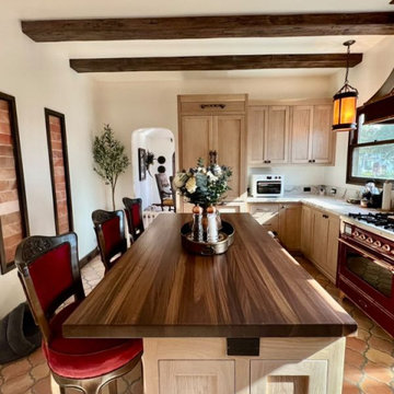
Please send us a message or contact us for custom orders - barudecor.com/custom-order/ Please include the dimensions, wood preference, and delivery location. For reference, this countertop was made of solid black walnut, butcher block style.
Made from solid premium wood, our countertops are a perfect complement to your homes and businesses. Whether you’re looking to revamp your kitchen, bars, and restaurants to give a luxurious vibe, our custom countertops are made with natural material and give a rich appearance. They add value to your space and create a more inviting space.
We only work with premium-grade woods like Teak, Walnut, White Oak, Ash, and Maple. Our pieces are completely customizable in terms of dimensions, edge designs, and finishes. We also have a CNC machine for making any cutouts precisely.
Every statement piece is handcrafted in our shop based in San Diego using only the finest quality hardwood. We place a lot of care and experience into each one of our pieces for years of memories to come. Our slabs are sustainably sourced from different regions in the US, Central & South America and we work closely with our clients to select them.
**Handmade item - Each piece is Custom Built To Order and finishes can vary, hence your piece will have a slight variation from the item shown in the photo as every piece of wood is different.
We ship to all US via truck freight and all our tables are wrapped carefully and placed inside a wooden crate with high-quality insulation to ensure safe arrival.
LEAD TIME: Our lead time varies from time to time but it is approximately 3-5 weeks plus 7-10 transit. We will let you know prior to placing the order. Rush orders are available for an additional fee depending on the project.
FINISH: We work with different options for Residential and Commercial use such as Rubio Monocoat, Osmo Polix Hardwax oil, and Commercial Grade Conversion Varnish. Our finish maintains the natural look and feel of the wood, all while offering protection and durability.
Here are some recommendations for keeping your countertop beautiful for a good time. Like every wood, maintenance depends a lot on how it is used. No matter what kind of sealant we apply liquids always win (with only one exception, an epoxy coating that looks like plastic, not very attractive).
- I recommend always using coasters, keeping hot pans away from the surface, and never letting water sits on them.
- For cleaning just a light mixture of soap and water and NEVER use harsh products like comet or Scotch Bright pads.
If you follow the recommendations the countertop will look fresh and clean for at least 2 years and then you may want to consider re-sanding and coating again which is super easy with Rubio Monocoat oil finish.
There is also a great maintenance oil developed by Rubio Monocoat - “Rubio Monocoat Renew” that refreshes, restores, and protects surfaces treated with Rubio Monocoat Oil Plus 2C (the one we use for all our furniture).
It’s recommended whenever the surface feels too dry or rough and it is super easy to apply in 3 steps:
1- Clean and dry the surface
2- Apply the oil using cloth rags, brush, or sponge
3- With kitchen tissue or cotton cloth remove all the excess oil within 10-15 min.
The surface should be dry after 6-8 hours.

 Dellfina Homes
This truly magnificent King City Project is the ultra-luxurious family home you’ve been dreaming of! This immaculate 5 bedroom residence has stunning curb appeal, with a beautifully designed white Cape Cod wood siding, professionally landscaped gardens, precisely positioned home on 3 acre lot and a private driveway leading up to the 4 car garage including workshop.
This beautiful 8200 square foot Georgian style home is every homeowners dream plus a beautiful 5800 square foot walkout basement. The English inspired exterior cladding and landscaping has an endless array of attention and detail. The handpicked materials of the interior has endless exceptional unfinished oak hardwood throughout, varying 9” to 12” plaster crown mouldings throughout and see each room accented with upscale interior light fixtures. Spend the end of your hard worked days in our beautiful Conservatory walking out of the kitchen/family room, this open concept room his met with high ceilings and 60 linear feet of glass looking out onto 3 acres of land.
Our exquisite Bloomsbury Kitchen designed kitchen is a hand painted work of art. Simple but stunning craftsmanship for this gourmet kitchen with a 10ft calacatta island and countertops. 2 apron sinks incorporated into counter and islands with 2-Georgian Bridge polished nickel faucets. Our 60” range will help every meal taste better than the last. 3 stainless steel fridges. The bright breakfast area is ideal for enjoying morning meals and conversation while overlooking the verdant backyard, or step out to the conservatory to savor your meals under the stars. All accented with Carrara backsplash.
Also, on the main level is the expansive Master Suite with stunning views of the countryside, and a magnificent ensuite washroom, featuring built-in cabinetry, a makeup counter, an oversized glass shower, and a separate free standing tub. All is sitting on a beautifully layout of carrara floor tiles. All bedrooms have abundant walk-in closet space, large windows and full ensuites with heated floor in all tiled areas.
Hardwood floors throughout have been such an important detail in this home. We take a lot of pride in the finish as well as the planning that went into designing the floors. We have a wide variety of French parque flooring, herringbone in main areas as well as chevron in our dining room and eating areas. Feel the texture on your feet as this oak hardwood comes to life with its beautiful stained finished.
75% of the home is a paneling heaven. The entire first floor leading up to the second floor has extensive recessed panels, archways and bead board from floor to ceiling to give it that country feel. Our main floor spiral staircase is nothing but luxury with its simple handrails and beautifully stained steps.
Walk out onto two Garden Walkways, one off of the kitchen and the other off of the master bedroom hallway. BBQ area or just relaxing in front of a wood burning fireplace looking off of a porch with clean cut glass railings.
Our wood burning fireplace can be seen in the basement, first floor and exterior of the garden walkway terrace. These fireplaces are cladded with Owen Sound limestone and having a herringbone designed box. To help enjoy these fireplaces, take full advantage of the two storey electronic dumbwaiter elevator for the firewood.
Get work done in our 600 square foot office, that is surrounded by oak recessed paneling, custom crafted built ins and hand carved oak desk, all looking onto 3 acres of country side.
Enjoy wine? See our beautifully designed wine cellar finished with marble border and pebble stone floor to give you that authentic feel of a real winery. This handcrafted room holds up to 3000 bottles of wine and is a beautiful feature every home should have. Wine enthusiasts will love the climatized wine room for displaying and preserving your extensive collection. This wine room has floor to ceiling glass looking onto the family room of the basement with a wood burning fireplace.
After your long meal and couple glasses of wine, see our 1500 square foot gym with all the latest equipment and rubber floor and surrounded in floor to ceiling mirrors. Once you’re done with your workout, you have the option of using our traditional sauna, infrared sauna or taking a dip in the hot tub.
Extras include a side entrance to the mudroom, two spacious cold rooms, a CVAC system throughout, 400 AMP Electrical service with generator for entire home, a security system, built-in speakers throughout and Control4 Home automation system that includes lighting, audio & video and so much more. A true pride of ownership and masterpiece built and managed by Dellfina Homes Inc.
 Neumann & Rudy Architecture
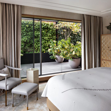
**Spatial Composition & Architectural Volume**
The room is organized around a single, decisive architectural gesture: a full-height sliding glazed wall that dissolves the boundary between the sleeping chamber and an enclosed garden court. The composition is fundamentally horizontal — a low-slung bed platform anchoring the right-hand foreground, a seating vignette calibrated to the left, and between them an uninterrupted sightline drawn through the aperture to the ivy-clad boundary wall beyond. This lateral emphasis is reinforced overhead by a recessed shadow-gap ceiling detail and a stepped perimeter cove that reads as a floating plane, subtly compressing the volume at its edges while lifting it at centre. The glazing itself is elegantly restrained: slim black-framed sliders set within a warm timber reveal, the sill deep enough to function as a threshold rather than a mere junction — an architectural pause between interior and exterior. Circulation is generous and diagonal, the ottoman and lounge chair angled to acknowledge both the bed and the view, establishing a soft triangulation of use. The tall marquetry armoire at the right terminates the composition vertically, providing the single strong axis of ascent in an otherwise recumbent plan, and its sculptural crown — a bronze group of standing figures — punctuates the ceiling zone with deliberate counterpoint.
**Materiality, Color & Texture**
The palette is an exercise in tonal modulation within a narrow chromatic band: greige, taupe, dove, mushroom, all carried on warm grey undertones with no true white and no true black save the slender window mullions. Textural variation, rather than colour contrast, performs the compositional work. The curtains — likely a slubbed silk or textured linen-viscose blend — hang in deep pinch-pleat falls whose vertical striation animates the flanking walls, while the grasscloth wallcovering behind the armoire introduces a fine, dry, horizontal weave. Against these soft-focus surfaces, the armoire delivers the room's most emphatic tactile statement: a hand-carved, faceted diamond-relief pattern in pale limed oak, bleached almost to bone, whose faceted geometry catches and fragments light. Upholstery in supple dove-grey leather on the chair and bench is offset by a crushed-velvet cushion and a finely pleated bolster at the bedhead, layering matte against lustre. Metallics are used sparingly and warmly — antiqued brass sabots on the furniture legs, a brushed bronze plinth-form side table — while the bed's pale coverlet, incised with a fine embroidered arabesque and studded buttoning, contributes a subtle graphic line. Underfoot, a hand-knotted rug in mottled silver-sage over honed stone completes a gradient from cool floor to warm wall.
**Lighting, Atmosphere & Style Profile**
Natural light is the primary luminous instrument here, admitted as a broad, diffuse northern wash through the glazed wall and rendered soft by the surrounding foliage, which filters and greens the light before it enters. The absence of visible decorative fixtures is intentional: illumination is concealed within the ceiling cove and shadow gaps, implying an evening register of low, indirect ambient light supplemented by discreet task sources. This restraint sustains an atmosphere of hushed, cloistered calm — a sanctuary sensibility in which the garden functions as a living tapestry, its verdant saturation supplying the room's only chromatic release. Stylistically, the scheme reads as Soft Minimalism inflected with Contemporary Continental luxury: a lineage traceable to mid-century French decorative tradition — Jean-Michel Frank's plinths, Royère's rounded silhouettes — reinterpreted through a modernist discipline of tonal reduction and planar clarity. The result is neither austere nor decorative but precisely balanced: a quiet, artisanal luxe in which craft (the carved oak, the cast bronze, the hand-finished textiles) supplies the ornament that colour deliberately withholds.
Find the right local pro for your project
 Rhodes Architecture + Light
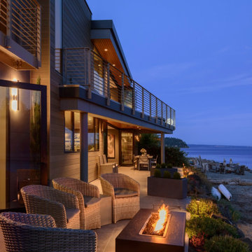
A transformation inspired by the owner’s love of modern architecture, art and color (and the adjacent sand, rock, water, and the northwest landscape), the Indianola House sought to bring the soul of a home to a colorless muted box. The original house was a drab 1990’s-era box with no personality or presence sited on a beautiful secluded bay, facing water and island views, northwest of the City of Seattle. The existing mono-colored stucco-clad exterior and pyramidal glass-block openings had led the neighborhood to dub the structure, unflatteringly, “The Miami Vice House”.
Rhodes Architecture’s Residential Architects careful use of natural light, rich, collaged finishes and ability to open the house to gardens, beach, and outdoor gathering was critical to the design. The house soon became “The Gallery”.
The original home’s grey stucco exterior made the house seem both large and featureless; the introduction of no-maintenance exterior materials that collage and complement each other was a goal of the homeowner and the Seattle Architects who teamed up for this residential design. The bloated scale of the house cried out for the establishment and definition of the parts of the structure, a breaking down of the home’s form and its apparent bland size.
Living, sleeping, and bathing areas that started as staid spaces were in need of opening to the natural environment with additions of large doors, folding glass walls and useable balconies were crucial to each space having a dialogue with the outdoors.
The owner’s extensive art collection was highlighted and became the focus of interior places, well-lit naturally and through a new lighting system. Energy use and sustainable systems were a key component of the design which used high-efficacy lighting, better cladding on a rain-screen system, high-efficiency doors and windows, new insulation and weather barriers, and which added a photovoltaic-generated electrical system. The contemporary design sought to integrate all of these systems, materials, and finishes into a seamless whole that lent interest and drama to a residence which was previously lusterless.
How radically this house was transformed is evident in the exteriors, gardens and the natural spaces the house now opens to, as well as the gallery-like interiors. This home is a stunning testament to what is possible “before-and-after” when remade by Rhodes Architecture + Light.
The clients are an older couple with long professional and political careers, a love of art and a clear desire to connect with the Northwest environment and enliven their daily lives with spaces full of color and natural light.
Rhodes Architecture + Light was hired in 2019 to add new exteriors and interiors, natural light, larger openings to beach and bay, seismic and foundation upgrades to the home, and to infuse life into the house through the re-use of existing space and varied materials, color, textures, and lighting. The only actual change to the exterior “shell” of the house was the introduction of a low “gull-wing” roof with wood soffits above the central atrium space, to add drama and bring natural light into the entry gallery space. Interior spaces, including bedrooms and bathrooms, were re-planned and opened to each other, to greater natural light, to roof decks, and to the incredible views and sea-side environment.
The Builder, Fairbank Construction Company of Bainbridge Island, Washington, met the challenge of the design, first completely deconstructing the finishes inside and out, then precisely interlocking new claddings, windows and doors, cabinetry, finishes and a new gull-wing central roof in a beautiful transformation. The construction was total, thorough, and very detailed, resulting a house that, far from seeming a “remodeling”, is far more present and fitting to the owner’s lives and the natural environment than the house we started with.
 Neumann & Rudy Architecture
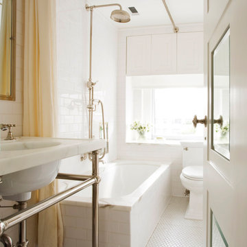
**I. Spatial Composition & Architectural Volume**
This is an exercise in the disciplined choreography of a constrained footprint — a narrow, rectilinear bathroom whose length is exploited rather than disguised. The composition unfolds along a single axis, the viewer's eye drawn from the foreground console lavatory, past the drop-in tub, to the terminal glazed aperture that anchors the far wall and releases the volume outward. The photograph's vantage, taken through a partially opened multi-paneled door with its cushioned rail-and-stile profile and beveled glazing, establishes a layered threshold condition: the room is framed, glimpsed, and entered simultaneously. Ceiling height is generous relative to plan dimension, and the architect has resisted the temptation to lower it; instead, a slender crown profile and a delicate picture-rail cornice terminate the field tile at a consistent datum, reinforcing the vertical proportion. Above the tub, a bank of recessed-panel cabinetry is set flush into the reveal of a soffit, borrowing the depth of the wall assembly to gain storage without protrusion — a deft piece of joinery logic. The window is treated as an architectural niche, its deep jambs and marble sill establishing a plinth that reads as inhabited rather than merely functional. Overhead, an exposed nickel-plated curtain rod traverses the ceiling plane in a single diagonal gesture, its cantilevered support rendering the drapery a movable spatial partition rather than a fixed enclosure.
**II. Materiality, Color & Texture**
The palette is a study in monochromatic gradation, calibrated almost entirely within the white spectrum yet richly differentiated by surface behavior. Hand-glazed subway tile in a running-bond pattern clads the wet walls, its subtle undulation and pooled glaze catching light unevenly to produce a soft, ceramic luminosity that no machine-pressed tile could replicate. Underfoot, a penny-round mosaic in matte porcelain introduces fine-grain granularity and a faintly warm grout line, its curvilinear tessellation providing tactile counterpoint to the orthogonal wall coursing. Marble — likely a Calacatta or lightly veined Carrara — appears strategically at the lavatory deck, the tub apron cap, and the window sill, its ochre-gold and cool grey veining supplying the room's only true figuration and its principal chromatic warmth. Polished nickel is the unifying metal, deployed with unusual generosity: the exposed console legs and cross-braced towel bar, the exposed riser and telephone-style handshower, the cross-handle fittings, and the rose-mounted door knob with its knurled backplate. Its cool, silvery reflectivity absorbs and redistributes ambient light, dissolving the hardware into the field. The single yielding material is the shower curtain — an unlined linen or cotton voile in pale butter-yellow — whose slubby weave, gravity-drawn folds, and warm undertone break the room's cool register and introduce the necessary note of domestic softness.
**III. Lighting, Atmosphere & Style Profile**
Illumination is overwhelmingly diurnal and unapologetically singular in source: the window at the terminus floods the space with diffuse, high-key daylight that blows toward pure white at the aperture and falls off gradually along the tile, modeling the wall's minute irregularities into a low-relief texture. The absence of visible decorative fixtures — save a discreet ceiling-recessed vent or downlight above the shower — is deliberate; artificial lighting is subordinated so that the material palette performs under natural light. The resulting atmosphere is serene, hygienic without sterility, and quietly luxurious: light behaves as a material in its own right, and the white-on-white scheme functions as a reflector rather than a void. Stylistically, the room synthesizes early-twentieth-century Anglo-American sanitary vernacular — the exposed-plumbing console lavatory, the exposed-riser shower, the metro tile and penny mosaic — with a contemporary editorial restraint that strips out ornament and pattern in favor of proportion and craft. It might be characterized as Refined Classicism, or more precisely, a Transitional Pre-War Revival: historically literate in its detailing, resolutely modern in its spatial economy and tonal discipline. The single pale-yellow textile is the design's signature move, a calibrated warm accent that prevents the achromatic scheme from tipping into clinical austerity and confirms the project's essential thesis — that restraint, correctly executed, reads as generosity.
 THE Remodel Group
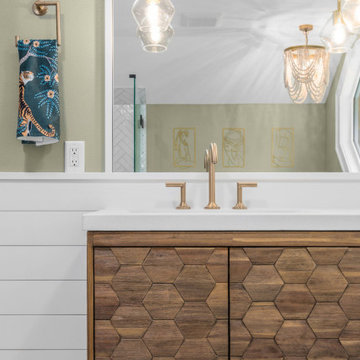
A luxurious en suite bath was created within this classic 1925 Portland bungalow by reconfiguring the second story’s original small bedrooms and tiny half bath. In this welcoming new urban boho space, eclectic finishes mingle harmoniously, integrated through subtle repetition of shapes and materials.
A furniture-style vanity sets the tone for this luxurious space, introducing materials, colors, shapes, and textures that repeat throughout. Individual walnut hexagons join to create distinctive vanity doors, offset beautifully by horizontal-grain drawers. Topping the cabinetry is a simple concrete countertop with integral sinks. An expansive framed mirror above enlarges and brightens the room. Within the mirror, sconces float, their globes a nod to the hexagons below. Champagne bronze fixtures reflect the warm walnut glow. Nestled into the back corner, a stunning shower features waterjet tiles in a double herringbone pattern, each precisely cut and laid to maintain design integrity at every surface transition. Teak floor tiles and a pebbled niche hint at the classic spa experience. Across from the shower, a large hexagonal window provides a treetop view from the free-standing tub below. The gentle oval of the tub and the beaded chandelier above provide a pleasing contrast to the strong lines surrounding it, as do the softly-shaded pebbles in the full-length niche. Shiplap wainscotting wraps the room, creating an illusion of height in the compact space. Subtle flooring and soft green walls create an understated backdrop for the bold mix of materials, unifying them into a serene oasis.
Asking a century-old home to accommodate a modern luxury bath is a tall order. Asbestos-laden plaster and flooring had to be abated. The subfloor had to be leveled and reinforced to increase strength and prevent deflection. Water lines and multiple electrical circuits had to be brought across and up without disturbing a beautifully-paneled ceiling, something we accomplished by firring out stair walls to hide the chases. Our client had visions of a leafy view from her tub, but the new layout eliminated existing windows. Placing a new window was complicated by deep eaves and flat soffits. By pushing the header into the roofline, however, we were able to accommodate a picture window. The flat soffit was replaced by an inverse hip lined with stained tongue and groove cedar, tying it to the bathroom finishes. Bringing materials up a narrow staircase became truly challenging when it was time to install the big items. However, strategic removal of drywall around the landing got the job done. Our attention to detail is showcased in the shower tile, where precise cuts were required at surface transitions to maintain the integrity of a complex double herringbone lay. The project was delivered on time.
Savvy layout choices minimized spending on structural changes. Because we were dealing with dormer space, head height was an issue. Raising the ceiling would have been complex and expensive so our design accommodated the constraints – tub on the low outside wall, shower on the full-height interior wall. The vanity spanned the spread, accommodating our petite client on the exterior side and her taller husband on the interior side. An under-eave closet was closed off to create room for both a freestanding tub and a separate shower. Rather than building replacement storage elsewhere, we simply added a new door into the closet from the primary bedroom. This was made possible by absorbing the short hallway separating the existing bed and bathroom into the primary bedroom. This new layout also created an en suite relationship between the primary bedroom and the new bath. We saved additional dollars by selecting a furniture-style vanity rather than using custom cabinetry, and the countertop with integral sinks provided a cost savings over a more traditional quartz countertop with undermount sinks. Affordable shower tiles allowed us to put more money into a dynamic tile layout. The project was delivered within budget.
 Windy City Painters
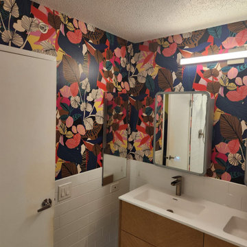
Expert wallpaper installer Lakeview services transform Chicago homes with precision and style. This stunning project showcases our commitment to quality craftsmanship in one of Chicago's most desirable neighborhoods.
Project Overview and Architecture
This beautiful Lakeview greystone required careful wallpaper installation that would complement the home's original architectural details. The vintage building's unique character demanded specialized techniques to ensure perfect results while preserving the historic charm that makes these homes so special.
Materials and Products
We utilized premium wallpaper adhesive, professional smoothing tools, and high-quality materials specifically chosen for Chicago's climate conditions. Our team selected products that work exceptionally well with the plaster walls common in vintage Lakeview homes.
Installation Process
First, we thoroughly prepared surfaces by repairing imperfections and priming walls. Next, we precisely measured and cut each strip, ensuring perfect pattern alignment. Then, we applied adhesive evenly and positioned wallpaper with expert precision. Finally, we eliminated bubbles, trimmed edges, and completed finishing touches.
Chicago Home Challenges
Lakeview's vintage homes present unique challenges including uneven plaster walls, settling issues, and temperature fluctuations. Our wallpaper installer Lakeview expertise addresses these concerns with specialized preparation techniques and climate-appropriate materials that ensure lasting results.
Results and Quality
The finished installation showcases flawless pattern matching, smooth surfaces, and crisp edges that enhance the room's architectural features. This wallpaper installer Lakeview project demonstrates our commitment to excellence and attention to detail.
Professional Tips
Homeowners should always hire experienced professionals for wallpaper installation. Proper surface preparation is crucial for longevity. Additionally, choosing quality materials appropriate for Chicago's climate ensures your investment lasts for years.
See more work and request free estimate at windypainters.com.
Q: Why choose professional wallpaper installer Lakeview services over DIY? / A: Professional installation prevents costly mistakes, ensures proper adhesion, and guarantees beautiful results that enhance your home's value and appearance.
Q: How do you handle vintage Lakeview home challenges? / A: Our wallpaper installer Lakeview team addresses plaster walls, settling issues, and architectural details with specialized techniques and appropriate materials.
Q: What preparation is required before wallpaper installation? / A: We repair wall imperfections, apply primer, ensure smooth surfaces, and address any moisture issues for optimal wallpaper installer Lakeview results.
Q: How long does professional wallpaper installation take? / A: Most rooms require 1-2 days depending on complexity, though our wallpaper installer Lakeview team works efficiently while maintaining quality standards.
Q: Can you work with designer or specialty wallpapers? / A: Absolutely, our wallpaper installer Lakeview experts handle luxury papers, grasscloth, murals, and specialty materials with appropriate techniques and care.
Q: Do you remove existing wallpaper before installation? / A: Yes, we provide complete removal services using safe methods that protect your walls and prepare surfaces for new wallpaper installer Lakeview projects.
Q: How do you ensure pattern alignment and matching? / A: Our wallpaper installer Lakeview professionals use precise measuring, professional tools, and years of experience to achieve perfect pattern continuity.
Q: What types of walls can accommodate wallpaper? / A: We install wallpaper on various surfaces including drywall, plaster, and painted walls after proper preparation for wallpaper installer Lakeview projects.
Q: How do you handle corners and trim work? / A: Our wallpaper installer Lakeview team uses specialized techniques for inside corners, outside corners, and detailed trim work ensuring professional results.
Q: What warranty do you provide on installation? / A: Windy City Painters guarantees our wallpaper installer Lakeview work with comprehensive warranty coverage protecting your investment and ensuring satisfaction.
 Rhodes Architecture + Light
A transformation inspired by the owner’s love of modern architecture, art and color (and the adjacent sand, rock, water, and the northwest landscape), the Indianola House sought to bring the soul of a home to a colorless muted box. The original house was a drab 1990’s-era box with no personality or presence sited on a beautiful secluded bay, facing water and island views, northwest of the City of Seattle. The existing mono-colored stucco-clad exterior and pyramidal glass-block openings had led the neighborhood to dub the structure, unflatteringly, “The Miami Vice House”.
Rhodes Architecture’s Residential Architects careful use of natural light, rich, collaged finishes and ability to open the house to gardens, beach, and outdoor gathering was critical to the design. The house soon became “The Gallery”.
The original home’s grey stucco exterior made the house seem both large and featureless; the introduction of no-maintenance exterior materials that collage and complement each other was a goal of the homeowner and the Seattle Architects who teamed up for this residential design. The bloated scale of the house cried out for the establishment and definition of the parts of the structure, a breaking down of the home’s form and its apparent bland size.
Living, sleeping, and bathing areas that started as staid spaces were in need of opening to the natural environment with additions of large doors, folding glass walls and useable balconies were crucial to each space having a dialogue with the outdoors.
The owner’s extensive art collection was highlighted and became the focus of interior places, well-lit naturally and through a new lighting system. Energy use and sustainable systems were a key component of the design which used high-efficacy lighting, better cladding on a rain-screen system, high-efficiency doors and windows, new insulation and weather barriers, and which added a photovoltaic-generated electrical system. The contemporary design sought to integrate all of these systems, materials, and finishes into a seamless whole that lent interest and drama to a residence which was previously lusterless.
How radically this house was transformed is evident in the exteriors, gardens and the natural spaces the house now opens to, as well as the gallery-like interiors. This home is a stunning testament to what is possible “before-and-after” when remade by Rhodes Architecture + Light.
The clients are an older couple with long professional and political careers, a love of art and a clear desire to connect with the Northwest environment and enliven their daily lives with spaces full of color and natural light.
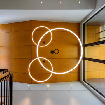
Rhodes Architecture + Light was hired in 2019 to add new exteriors and interiors, natural light, larger openings to beach and bay, seismic and foundation upgrades to the home, and to infuse life into the house through the re-use of existing space and varied materials, color, textures, and lighting. The only actual change to the exterior “shell” of the house was the introduction of a low “gull-wing” roof with wood soffits above the central atrium space, to add drama and bring natural light into the entry gallery space. Interior spaces, including bedrooms and bathrooms, were re-planned and opened to each other, to greater natural light, to roof decks, and to the incredible views and sea-side environment.
The Builder, Fairbank Construction Company of Bainbridge Island, Washington, met the challenge of the design, first completely deconstructing the finishes inside and out, then precisely interlocking new claddings, windows and doors, cabinetry, finishes and a new gull-wing central roof in a beautiful transformation. The construction was total, thorough, and very detailed, resulting a house that, far from seeming a “remodeling”, is far more present and fitting to the owner’s lives and the natural environment than the house we started with.

 Universal Appliance and Kitchen Center
Wolf 24" Coffee System EC24/S - Stainless
Available at Universal Appliance and Kitchen Center | uakc.com
Striking stainless steel design. Strikingly delicious drinks — espresso, cappuccino, latte, macchiato, long or short coffee, even hot water for tea. Simply touch a couple of buttons and in seconds you’ll be enjoying a professional-quality coffee drink, made your way. On top of that, the Wolf coffee system lets you easily customize the details of your drink, from temperature to strength to level of foam, to meet your personal definition of the “perfect cup.”
You’ll also enjoy how hassle-free the Wolf coffee system is to own. It needs no plumbing connections, and it steam-cleans the milk nozzle with one push of a button; milk never enters the system’s internal mechanisms.
The 24” coffee system in stainless can be installed with a 24" cup warming drawer to create an ultimate in-home coffee station, and coordinates beautifully with Wolf convection steam and microwave ovens of the same size. For ideal pairing with 30” Wolf ovens, the 24” coffee system in black (EC24/B) should be purchased and customized with any of five accessory trim kits.
DESIGN AND PERFORMANCE FEATURES
Make all your favorite coffee beverages:
What's your pleasure? Make long or short coffee, espresso, cappuccino, latte, or a macchiato in seconds. Even steam or froth milk for, say, a chai latte or the kids' hot chocolate.
Coffee, made to size:
Select the size you want from four pushbutton presets, everything from a one-ounce espresso shot to a 12-ounce coffee. Unique sizes (up to 7 oz.) can be programmed and saved using the customizable "My Coffee" setting.
Strength, to your taste:
When brewing from whole bean coffee, five strength settings from extra-mild to extra-strong give you precisely the flavor you prefer at any selected size.
No plumbing needed:
Unlike units that must be connected to a water line, the Wolf coffee system can be installed anywhere without additional plumbing. The easily accessible water reservoir holds 60.9 fluid oz. (1.8 liters), enough for several drinks between refills.
Easy to clean:
Unlike coffee systems that pipe milk through the internal mechanism, the Wolf system cleans with pushbutton ease. Rinse the brew head, or clean the milk spout with a jet of steam. It's all done in seconds. The milk carafe is dishwasher safe, too.
Uses whole-bean and pre-ground coffee:
The machine holds a generous supply of whole-bean coffee — about half a pound — and grinds it automatically to make your drink. It can brew single-cups from pre-ground coffee, too, so you can have your breakfast blend even when the bean reservoir is full of espresso roast.
Adjustable built-in stainless steel burr grinder:
Thirteen grind settings allow you to customize your whole-bean coffee for the taste and body you prefer.
Make it a double:
For two identical coffees, just press the Double Coffee button and position a cup under each of the two spouts. Or select Double Coffee and place your mug under the spouts to make a double-size coffee for one.
Removable milk carafe for freshness and convenience:
The dishwasher-safe carafe plugs into the machine to make milk drinks, then can go right in the refrigerator to keep milk fresh. Milk is steamed and frothed without passing through the system's internal components. That makes cleaning infinitely easier.
Hot water on demand — tea, anyone?
Tea, hot chocolate, oatmeal, you name it. The system can deliver up to 14 ounces of hot water with the push of a button. How hot? That's up to you. The temperature is adjustable.
Push-button control panel:
Brewing the drink you want at the size and with the taste you want is as easy as pressing a few buttons. The bright LCD control panel provides clear information.
Programmable start time and auto off:
Program a time for the system to turn on and warm up automatically, it will be ready to brew when you're ready to enjoy. For safety and energy efficiency, the system powers down after a set period of inactivity.
More enjoying, less cleaning:
After the system prepares a coffee drink, it ejects the compressed grounds into a container, then lets you know when the container is ready to be emptied. Meanwhile, a removable drip tray catches excess water from brewing and rinsing. Simply rinse it out just as you would your coffee cup.
Built into cabinetry, works like a drawer:
Designed to be built seamlessly into your kitchen cabinetry, the Wolf coffee system has an ingenious feature: glide rails that enable you to slide the unit out from the wall for easy access to the whole-bean and ground coffee reservoirs. It's like opening a drawer.
Supplies are in reach but out of sight:
Pull the unit out on its glide rails to access handy integrated storage trays where you can keep bottles of flavored syrup, sugars and other supplies at the ready.
Auto-descale reminders:
Minerals from water naturally build up on heating surfaces and reduce efficiency. The Wolf coffee system is engineered to monitor this and let you know when to descale the system. Result: Your drinks always come out at the temperature you expect.
TECHNICAL FEATURES:
- Electrical Requirements: 120 V AC, 60 Hz, 15-amp dedicated circuit, grounded
- Shipping Weight (lbs): 60
- Water reservoir (fl oz): 60.9 (1.8 L)
- Whole Bean Reservoir (oz): 8.8 (~1/2 lb)
- Removable milk carafe holds just over 3 cups
 Dellfina Homes
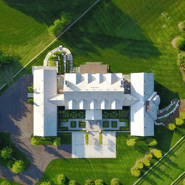
This truly magnificent King City Project is the ultra-luxurious family home you’ve been dreaming of! This immaculate 5 bedroom residence has stunning curb appeal, with a beautifully designed white Cape Cod wood siding, professionally landscaped gardens, precisely positioned home on 3 acre lot and a private driveway leading up to the 4 car garage including workshop.
This beautiful 8200 square foot Georgian style home is every homeowners dream plus a beautiful 5800 square foot walkout basement. The English inspired exterior cladding and landscaping has an endless array of attention and detail. The handpicked materials of the interior has endless exceptional unfinished oak hardwood throughout, varying 9” to 12” plaster crown mouldings throughout and see each room accented with upscale interior light fixtures. Spend the end of your hard worked days in our beautiful Conservatory walking out of the kitchen/family room, this open concept room his met with high ceilings and 60 linear feet of glass looking out onto 3 acres of land.
Our exquisite Bloomsbury Kitchen designed kitchen is a hand painted work of art. Simple but stunning craftsmanship for this gourmet kitchen with a 10ft calacatta island and countertops. 2 apron sinks incorporated into counter and islands with 2-Georgian Bridge polished nickel faucets. Our 60” range will help every meal taste better than the last. 3 stainless steel fridges. The bright breakfast area is ideal for enjoying morning meals and conversation while overlooking the verdant backyard, or step out to the conservatory to savor your meals under the stars. All accented with Carrara backsplash.
Also, on the main level is the expansive Master Suite with stunning views of the countryside, and a magnificent ensuite washroom, featuring built-in cabinetry, a makeup counter, an oversized glass shower, and a separate free standing tub. All is sitting on a beautifully layout of carrara floor tiles. All bedrooms have abundant walk-in closet space, large windows and full ensuites with heated floor in all tiled areas.
Hardwood floors throughout have been such an important detail in this home. We take a lot of pride in the finish as well as the planning that went into designing the floors. We have a wide variety of French parque flooring, herringbone in main areas as well as chevron in our dining room and eating areas. Feel the texture on your feet as this oak hardwood comes to life with its beautiful stained finished.
75% of the home is a paneling heaven. The entire first floor leading up to the second floor has extensive recessed panels, archways and bead board from floor to ceiling to give it that country feel. Our main floor spiral staircase is nothing but luxury with its simple handrails and beautifully stained steps.
Walk out onto two Garden Walkways, one off of the kitchen and the other off of the master bedroom hallway. BBQ area or just relaxing in front of a wood burning fireplace looking off of a porch with clean cut glass railings.
Our wood burning fireplace can be seen in the basement, first floor and exterior of the garden walkway terrace. These fireplaces are cladded with Owen Sound limestone and having a herringbone designed box. To help enjoy these fireplaces, take full advantage of the two storey electronic dumbwaiter elevator for the firewood.
Get work done in our 600 square foot office, that is surrounded by oak recessed paneling, custom crafted built ins and hand carved oak desk, all looking onto 3 acres of country side.
Enjoy wine? See our beautifully designed wine cellar finished with marble border and pebble stone floor to give you that authentic feel of a real winery. This handcrafted room holds up to 3000 bottles of wine and is a beautiful feature every home should have. Wine enthusiasts will love the climatized wine room for displaying and preserving your extensive collection. This wine room has floor to ceiling glass looking onto the family room of the basement with a wood burning fireplace.
After your long meal and couple glasses of wine, see our 1500 square foot gym with all the latest equipment and rubber floor and surrounded in floor to ceiling mirrors. Once you’re done with your workout, you have the option of using our traditional sauna, infrared sauna or taking a dip in the hot tub.
Extras include a side entrance to the mudroom, two spacious cold rooms, a CVAC system throughout, 400 AMP Electrical service with generator for entire home, a security system, built-in speakers throughout and Control4 Home automation system that includes lighting, audio & video and so much more. A true pride of ownership and masterpiece built and managed by Dellfina Homes Inc.
 Universal Appliance and Kitchen Center
Miele Appliances at Universal Appliance and Kitchen Center
26767 Agoura Road, Calabasas, CA 91302
Phone 818.880.0011 Fax 818.880.0411
12050 Ventura Blvd.,Studio City, CA 91604
Phone 818.755.1111 Fax 818.755.9111
www.uakc.com
Miele Generation 6000 is bringing design and innovation that exceed expectations. It includes two distinct design styles - PureLine and ContourLine - as well as several color options including Brilliant White and Truffle Brown.
Design for Miele is not simply the exterior. Like the design principle, form follows function; the true beauty of the Generation 6000 series is highlighted by its intuitive user interface, which ensures unsurpassed performance and convenience in the kitchen. With these new color options and the uniform design of the Generation 6000 series, Miele has created a series of appliances that will seamlessly integrate into any kitchen or lifestyle. Whether appliances are installed vertically, horizontally, as a square or in a T-shape configuration, the design is fully resolved.
M Touch – Top-class technology with a special touch
Whether it’s creating a double cappuccino at the touch of a single button, finding the desired MasterChef automatic program on the Combi-Steam Oven in an instant or selecting the operating mode and temperature in just a few simple steps – Miele eliminates the guesswork. All of these operations are easier than ever because of M Touch. Reminiscent of smart phones and tablets, M Touch is an intuitive user interface that allows the user to swipe or scroll through the menu with the tip of a finger. A new high resolution control panel with white TFT (Thin Film Transistor) text brings a brilliant display. And because the interface is universal across all Gen 6000 appliances, the transition from appliance to appliance is easier than ever.
Oven Innovations: Moisture Plus, Gourmet Center and MultiSteam
Developed exclusively for Miele USA, Moisture Plus is a truly unique steam injection system featured in Miele M Touch 30” Convection Ovens. Moisture Plus automatically injects a burst of steam into the oven cavity at pre-determined points during the cooking process. The addition of moisture improves results when proofing dough, gives loaves of bread a crisp crust and glossy finish and makes cuts of meat particularly crisp on the outside and succulent inside.
Also new to the 30” Convection Oven is the addition of MasterChef Plus programs. Ideal for the consummate baker at home, this exclusive new menu system houses 14 automatic bread programs and replicates results seen in artisan bakeries. Included are programs for sourdough, whole grain, rolls and baguettes.
A pioneer in steam oven technology, Generation 6000 Steam and Combi-Steam Ovens are equipped with MultiSteam technology, a revolutionary new steam cooking generation. The addition of six steam inlets in the Steam Oven and eight steam inlets in the Combi-Steam Oven, delivers fast, even steam distribution and incredibly quick heat-up times for even cooking results through a more powerful steam generator.
Long regarded for its ingredient-driven menu, Miele MasterChef programs are now located within the Gourmet Center. Choose from more than 100 easy to use programs for grains, vegetables, meats, fish and poultry. At just the touch of a button, the program will deliver menu options that guide the user step by step - from the desired oven mode to temperature - all resulting in the perfect dish.
Generation 6000 Coffee Systems impress with comfort and innovation
There are several new highlights to the Generation 6000 Whole Bean Coffee System including a new CupSensor, EasyClick Milk System and One Touch for Two features. Exclusive to Miele, the CupSensor automatically adjusts the height of the spout to the optimum position for different cup and glass sizes. Whether a tall latté macchiato or a dainty espresso is being prepared, the central spout automatically adjusts to the cup’s rim and eliminates splashing. The CupSensor even reacts precisely to beverages made with milk by raising the spout slightly to make room for the incoming espresso.
Also new is the EasyClick milk system which is a dishwasher safe glass, milk flask that effortlessly clicks into place at the front of the machine. And for easy maintenance, the new Miele Coffee Systems now automatically rinse all milk spouts and hoses with water after each use.
The One Touch for Two feature allows the user to prepare two coffee specialties such as cappuccino and latté macchiato at the same time, thus reducing prep time when two or more drinks are being served.
Miele Generation 6000 series is distinguished by its elegant design and remarkable innovations to deliver unmatched results that can be seen, touched and tasted. German engineered and tested to last 20 years, Generation 6000 reinforces the Miele Design for Life philosophy and solidifies Miele at the forefront of residential culinary appliances.
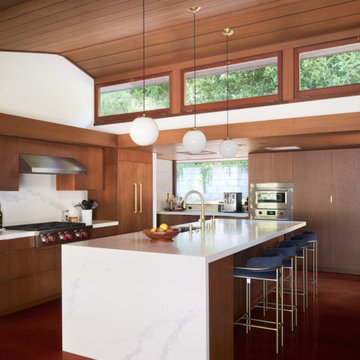
 Klopf Architecture
Nestled in the hills of Orinda, California, this 1951 residence is one of only seven extant homes, now known as “The Magnificent Seven”, designed by architect Olof Dahlstrand, a protégé of Frank Lloyd Wright. With its low-slung rooflines, natural materials, and deep integration with the sloping landscape, the home is a pristine example of mid-century modern design inspired by Wright’s organic principles. Over the years, prior homeowners have emphasized preservation, ensuring that the house remained relatively untouched. Each owner has respected the original architecture and stayed true to Dahlstrand’s intent. When a family of five—two college-aged sons and a middle school-aged daughter—acquired the property, they were captivated by its history, legacy of care, and architectural significance. While they appreciated Dahlstrand’s original vision, they also recognized the need to adapt the home for contemporary living while preserving its design integrity.
The remodel was conceived as a thoughtful response to the past—an effort to bring the house into the 21st century without compromising its soul. The primary mandate was to maintain architectural continuity while improving the functionality, comfort, and livability for a modern family. The design team—architects and contractor alike—worked with a shared reverence for the original architecture, allowing that mindset to guide even the most technical or pragmatic decisions.
A key objective was to increase natural light in the kitchen—a departure from Wrightian principles of enclosed, intimate cooking spaces—while maintaining the home’s architectural language. The kitchen was reconfigured to foster a stronger connection to adjacent living spaces while retaining the underlying concept of spatial separation. One of the most transformative architectural changes was the removal of a ridge beam that was originally planned to remain visible through the kitchen. During construction, the team collaborated on a better solution: a wide-flanged steel beam concealed within the roof envelope. This subtle move preserved the clean lines and ceiling continuity, a modern update carried out with utmost respect for the existing framework.
The home’s original powder room, previously accessible only through the kitchen, was relocated for better flow and privacy. A new powder room was carved out of former kitchen cabinetry—a narrow, interior space that could have felt dark and enclosed. To avoid this, the design extended the line of original transom windows into the new powder room and added a skylight above the vanity. The result is a bright and airy space that feels consistent with the rest of the home. Other updates included the installation of new solid-core interior doors with veneers carefully matched to the original mahogany, enhancing the continuity of the interiors. Even smaller decisions, such as placing the door knobs at 42 inches high, mirrored the original proportions. Every choice reflected a shared belief between the architect, contractor, and client: that new work should serve the integrity of the old.
The home’s extensive interior redwood millwork and paneling was meticulously restored. Where new materials were introduced—such as the replacement redwood soffit paneling—the contractor took pains to find finish nails that matched the original, rather than using modern equivalents. This level of craftsmanship and collaboration defined the project. It extended even to the detailing of a blind door to the new powder room, which had to disappear into the existing redwood board-and-batten wall. It was a team effort: the owner found a suitable handle, the architects devised the custom in-swing mechanism, and the contractor executed it so the door aligned precisely with the battens. Throughout, the homeowners were deeply engaged in the design process. One, a meticulous design enthusiast, focused on aesthetic integrity and historic detail. The other brought a practical and function-driven perspective, ensuring that new fixtures and materials would be durable and require minimal maintenance.
While the home’s location posed no major site challenges, sustainability was a key concern. The team upgraded the roof insulation, installed solar panels with battery storage, and added ductless mini-split cooling systems. Lighting was another area where modern technology was woven into a historic framework: new square LED fixtures echo the original custom perimeter soffit lights, maintaining the design language while offering advanced performance.
A planned expansion of a bedroom into suite with a bathroom had to be shelved due to budget constraints and the high cost of below-grade foundation work. Still, the team focused their efforts on making the most of the existing footprint, resolving constraints through design ingenuity rather than adding square footage. This renovation represents a collaborative achievement in preserving and evolving a historically significant home. Every decision was shaped by a shared ethos among clients, architects, and contractor: to maintain the home’s architectural soul while updating it for contemporary life. The result is a timeless modernist residence that continues Olof Dahlstrand’s legacy, remaining grounded in nature, craftsmanship, and human-scale design.
Klopf Architecture Team: John Klopf, AIA, Klara Kevane, Fernanda Bernardes
Interior Architectural Design: Klopf Architecture
Structural Engineer: Daniel Bastiao
Contractor: Don Larwood, Larwood Construction
Photography: Mariko Reed
Year Completed: 2022
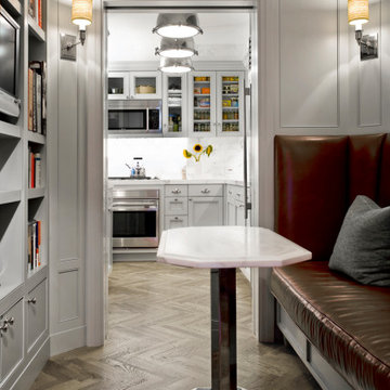 Neumann & Rudy Architecture
**I. Spatial Composition & Architectural Volume**
This vignette operates as a masterclass in the choreography of compressed urban space, deploying a classic enfilade strategy to extract depth from a modest footprint. The composition is organized around a cased opening — flanked by heavy, mitered pilaster-style jambs and a substantial crown-capped header — that frames the kitchen beyond like a proscenium, establishing a telescoping sightline from the foreground banquette nook through to the range wall and its marble backsplash. The immediate volume is a canted, faceted room; the angled corner walls and the polygonal ceiling perimeter generate a subtle rotational geometry that is echoed, with deliberate rhyme, in the octagonal tabletop and its faceted plinth base. Architectural discipline is supplied by comprehensive millwork: recessed applied-molding wall panels calibrated to the wall heights, a built-in bibliothèque with adjustable shelving and integrated media niche on the left, and a bench base detailed as cabinetry with a plinth and reveal, so the seating reads as architecture rather than furniture. The crowning gesture is a stone-clad soffit and cove above the multi-part cornice, which visually lifts the ceiling plane and dissolves the corner conditions of the canted plan into a continuous, luminous band.
**II. Materiality, Color & Texture**
The palette is a study in low-chroma tonal layering, structured on a base of dove-grey lacquered joinery whose cool, faintly greige undertone reads as both patrician and contemporary. Against this, book-matched white marble with grey and taupe veining appears in three registers — the ceiling cove, the kitchen backsplash, and the honed tabletop — creating a vertical and horizontal continuity of stone that binds the two rooms into one material narrative. Underfoot, wide-plank white oak laid in a herringbone pattern is finished in a wire-brushed, cerused grey-brown, its open grain supplying essential tactility and directional energy that counteracts the smoothness of the cabinetry. The tonal reserve is punctured by a single decisive chromatic move: the oxblood-to-cognac aniline leather banquette, its capitonné-adjacent piping and channeled seat cushion delivering saturated warmth and a supple, patinating counterpoint to the cool minerals. Metals are deliberately stratified — brushed stainless on the appliance suite, polished nickel on the cabinet hardware and pendant collars, and a high-mirror chromed column and base on the table that pulls reflected fragments of the room into itself. Textile relief arrives through a heather-grey wool bolster and the woven, honeycomb-textured sconce shades, while the sunflowers and pantry provisions behind glazed muntin doors introduce a curated, humanizing note of the quotidian.
**III. Lighting, Atmosphere & Style Profile**
The lighting scheme is layered and hierarchical. Ambient illumination is borrowed rather than direct: the kitchen functions as a light well, its own concealed under-cabinet lighting and cove-washed ceiling projecting a cool, diffuse glow forward through the cased opening, so the brighter volume beyond reads as both destination and light source. In the foreground, symmetrically paired wall sconces with textured drum shades cast a warm, amber-filtered ellipse of light onto the paneling — providing intimate, low-level modeling that emphasizes the millwork's shadow lines and flatters the leather's depth. The kitchen's aligned trio of spun-metal dome pendants, with polished collars and diffused lenses, reinforce the axial perspective and supply task-appropriate downlight, while the marble cove above serves as an indirect reflector, softening any residual harshness. The cumulative atmosphere is hushed, refined, and slightly cinematic — a quiet formality more contemplative than performative. Stylistically, the project synthesizes into a form of Transitional Classicism, or more precisely a tailored American Neoclassicism recalibrated for contemporary living: the vocabulary of paneled millwork, crown profiles, and cased openings is retained, but stripped of ornament, flattened in profile, and rendered in a monochrome envelope, then energized by faceted geometries, mirror-finish metal, and a single confident stroke of leather. It is restraint deployed as luxury.
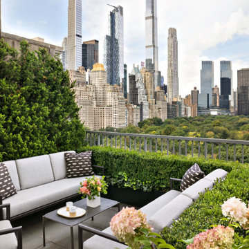 Neumann & Rudy Architecture
**Paragraph 1: Spatial Composition & Architectural Volume**
This terrace operates as an outdoor room in the fullest architectural sense — a compressed foreground plane opening onto one of the most consequential borrowed landscapes in the world. The composition is organized along a strong diagonal: an L-shaped seating arrangement anchors the lower left and right quadrants, its low-slung horizontality deliberately calibrated to sit beneath the sightline of the parapet rail so that the vista remains uninterrupted from a seated position. The spatial logic is one of layered thresholds. First, the intimate zone of the furniture group; second, the clipped boxwood hedge set within a matte-dark planter, functioning as a green datum line and soft balustrade; third, the slender vertical picket railing, whose rhythmic cadence reads as a fine-grained screen rather than a barrier; and finally the middle-ground canopy of Central Park and the distant supergraphic of the Billionaires' Row skyline. To the left, a mature juniper mass performs as a living pilaster, terminating the composition and screening the adjacent stone masonry wall — a rough-hewn ashlar remnant of the prewar building envelope that grounds the scheme in its architectural provenance. The stepped stone paving and the raked geometry of the railing as it descends to the right introduce a subtle asymmetry, preventing the picturesque from becoming static.
**Paragraph 2: Materiality, Color & Texture**
The material palette is disciplined to the point of austerity, precisely so the horticulture and the skyline may carry the chromatic load. Powder-coated aluminum in a deep graphite-bronze forms the furniture armature — slender, squared-section framing with an almost Miesian restraint — paired with performance-grade upholstery in a warm dove grey whose greige undertone reads neither cold nor sallow against the surrounding foliage. The single decorative gesture, ikat-patterned scatter cushions in charcoal and ecru, introduces a hand-loomed irregularity that humanizes the machined frames. Underfoot, large-format bluestone or cast-stone pavers in a cool grey provide a matte, granular ground plane, echoed in the honed surface of the low cocktail table. Against this monochrome scaffolding, the botanical register supplies saturation: the dense, glossy, small-leaf texture of the boxwood; the feathery, blue-green needling of the juniper; trailing ivy softening the planter edge; and, in the near foreground, the blowsy, dessicating panicles of hydrangea in blush, sage and antique rose. A ceramic vessel of coral-and-butter garden roses and a pair of banded stoneware cups on a rimmed tray introduce warm terracotta accents — small, deliberate points of chromatic heat within an otherwise tonal field.
**Paragraph 3: Lighting, Atmosphere & Style Profile**
The scheme is lit almost entirely by ambient, high-latitude daylight, diffused through a stratus-laced sky that acts as an enormous softbox. The result is shadowless modeling: the upholstery reads as luminous rather than glaring, the foliage retains full chromatic depth without specular hotspots, and the pale limestone and glass towers beyond are rendered in atmospheric perspective, receding into a silvered haze. No artificial fixtures assert themselves in the frame — a confident editorial choice that keeps the scheme legible as a daytime sanctuary and defers entirely to the natural theatre of the site. The prevailing mood is one of cultivated repose: urbane but unhurried, private without being hermetic. Stylistically, the project synthesizes into what might be termed **Refined Metropolitan Naturalism** — a hybrid of Soft Minimalism's tonal restraint and reductive geometry with the structured horticultural formality of a classical English terrace garden. The vocabulary is contemporary and materially honest, yet it observes the compositional manners of the prewar building it inhabits, treating the skyline not as backdrop but as the primary work of art around which the entire interior architecture of the terrace has been quietly framed.

 Ernest M. Ferizi
German Embassy in Pristina - Kosovo, contracted the architecture office “Ferizi + Ferizi Architects” to plan and implement an Annex Office building for their purposes. As detached part of this building is designed the waiting area, as alone standing structure.
This Office Building is constructed by assembling of Eight used office containers that were delivered on trucks and set up after only a few hours on the basis of the LEGO principle, according to the planning on strip foundations.
By removing the flexible exterior wall panels, a large room of 115 m² was created, with the counter wall as a room partition between two office spaces, each with seven workstations as well as three counters for agents on one side and a room for visitors on the other side.
With this system, room solutions can be easily implemented in all dimensions.
The container, seen as a geometric shape, is a simple, octagonal, solid box.
The standardized perfection of its dimensions is striking: 2.44 meters wide, 2.59 meters high and 6.06 meters or 12.19 meters long.
Since its introduction in 1956 by the American transport entrepreneur Malcom McLean, the container has become a standardized transport module worldwide, whether on ships, trucks or construction sites.
The shipping containers have additionally revolutionized the transport industry, pushed the globalization noticeably, and thus directly or indirectly influenced all our lives.
But after only a few years, when the first overseas containers wore out, many engineers recognized the positive properties of used shipping containers for building houses, especially since they are robust, flexible, multifunctional and second-hand relatively inexpensive to purchase. The time has long passed by to treat containers exclusively as transport objects.
As a "measure of all things", containers can hardly be ignored in construction.
Their use is no longer limited to temporary use since school containers, information containers, office containers or entire residential buildings are now part of our everyday life in the construction industry.
However, current examples of the container architecture prove that even the most demanding solutions for container building are feasible. For their specific aesthetic and spatial qualities, containers also serve as design parameters for the development of new forms of architecture and urbanity.
The office building as an extension of the visa section, characterized by modern materials and contemporary aesthetics has been designed and built mainly as a low-energy building.
Extensive insulation to achieve a comfortable and sustainable constant temperature in the interior, high window quality and low energy consumption make the building energy-efficient.
The sophisticated lighting technology, networks, heating systems and air-conditioning systems are also components of this equipment.
It creates an overall harmonic picture and guarantees the highest standard in sustainable construction, taking into consideration the fact that environmentally friendly recycling and reutilization have become an increasingly important issue in our society.
West and East side of the wooden facade is compact and has few openings, while the southern facade is completely open with lot of glass. Its spatial openness ensures a transparent, friendly work environment, which allows a lot of light into the space.
This openness allows an uninterrupted, pleasant and close-to-nature view from interior spaces into the beautiful garden. During the installation of sophisticated light sources in the garden, emphasis was not only put on functionality and security, but also on the beauty of the garden shown through the illumination in the evening.
Large, horizontal white “brisole” serve as external sun protection systems, mounted on the canopies of the entrance areas of the modular construction and the enclosure, adeptly cast shade on these areas and at the same time shape the entire architectural language.
While on one hand, the two quadratic ledges suspended in the air, are docked with steel stairs and match the wooden façade, lead the staff to their office space, the artful modern interior, on the other hand, perfectly unites the functionality, innovative technology, culture and positive effects on the employees' efficiency and wellbeing.
A lot of white, interjected by warm wooden and colored accents, determines the ambience.
In the case of the lighting solution, the mainly linear ceiling lighting is used as the overlapping design element both for the offices of the visa section as well as for the counters and the waiting area for the visitors.
They underline the puristic design in order to create a pleasant light for a desired general illumination and ensure optimal light conditions without causing disturbing reflections on the computer screens.
In addition, precisely positioned pendant luminaires are installed at the workstations, which ensure pleasant room brightness.
In the entrance area, the harmonic and uniform lighting effect from the ground highlights the integration of photography and architecture.
Photographs of landscapes, people, places, expressing unforgettable, impressive moments and memories have been lovingly engraved on 8 x 8cm square oak blocks.
The idea of an effective, impressive environment that stimulates and inspires the work was the premiss on which the whole design concept was based. Consequently, the modular construction was no longer viewed through its history of utilization and scars, but rather as a structure of work ambiance, art and elegance.
FERIZI + FERIZI Architects
Photo: Arben Llapashtica
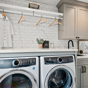
 May Construction, Inc.
The laundry room was a major transformation that was majorly needed, once a dark and gloomy dungeon is now a bright, and functional room that would make anyone be happy. The Ornate tile flooring brings in a fun funky feel to the well-organized room, while white subway backsplash tile keeps it cool and calm. To accommodate the newest furriest member of the family, a hidden litter box pull-out was included in the cabinetry and cute-custom cat door allows the new kitten to get in and out through its very own purrfect passageway.
 Ernest M. Ferizi
German Embassy in Pristina - Kosovo, contracted the architecture office “Ferizi + Ferizi Architects” to plan and implement an Annex Office building for their purposes. As detached part of this building is designed the waiting area, as alone standing structure.
This Office Building is constructed by assembling of Eight used office containers that were delivered on trucks and set up after only a few hours on the basis of the LEGO principle, according to the planning on strip foundations.
By removing the flexible exterior wall panels, a large room of 115 m² was created, with the counter wall as a room partition between two office spaces, each with seven workstations as well as three counters for agents on one side and a room for visitors on the other side.
With this system, room solutions can be easily implemented in all dimensions.
The container, seen as a geometric shape, is a simple, octagonal, solid box.
The standardized perfection of its dimensions is striking: 2.44 meters wide, 2.59 meters high and 6.06 meters or 12.19 meters long.
Since its introduction in 1956 by the American transport entrepreneur Malcom McLean, the container has become a standardized transport module worldwide, whether on ships, trucks or construction sites.
The shipping containers have additionally revolutionized the transport industry, pushed the globalization noticeably, and thus directly or indirectly influenced all our lives.
But after only a few years, when the first overseas containers wore out, many engineers recognized the positive properties of used shipping containers for building houses, especially since they are robust, flexible, multifunctional and second-hand relatively inexpensive to purchase. The time has long passed by to treat containers exclusively as transport objects.
As a "measure of all things", containers can hardly be ignored in construction.
Their use is no longer limited to temporary use since school containers, information containers, office containers or entire residential buildings are now part of our everyday life in the construction industry.
However, current examples of the container architecture prove that even the most demanding solutions for container building are feasible. For their specific aesthetic and spatial qualities, containers also serve as design parameters for the development of new forms of architecture and urbanity.
The office building as an extension of the visa section, characterized by modern materials and contemporary aesthetics has been designed and built mainly as a low-energy building.
Extensive insulation to achieve a comfortable and sustainable constant temperature in the interior, high window quality and low energy consumption make the building energy-efficient.
The sophisticated lighting technology, networks, heating systems and air-conditioning systems are also components of this equipment.
It creates an overall harmonic picture and guarantees the highest standard in sustainable construction, taking into consideration the fact that environmentally friendly recycling and reutilization have become an increasingly important issue in our society.
West and East side of the wooden facade is compact and has few openings, while the southern facade is completely open with lot of glass. Its spatial openness ensures a transparent, friendly work environment, which allows a lot of light into the space.
This openness allows an uninterrupted, pleasant and close-to-nature view from interior spaces into the beautiful garden. During the installation of sophisticated light sources in the garden, emphasis was not only put on functionality and security, but also on the beauty of the garden shown through the illumination in the evening.
Large, horizontal white “brisole” serve as external sun protection systems, mounted on the canopies of the entrance areas of the modular construction and the enclosure, adeptly cast shade on these areas and at the same time shape the entire architectural language.
While on one hand, the two quadratic ledges suspended in the air, are docked with steel stairs and match the wooden façade, lead the staff to their office space, the artful modern interior, on the other hand, perfectly unites the functionality, innovative technology, culture and positive effects on the employees' efficiency and wellbeing.
A lot of white, interjected by warm wooden and colored accents, determines the ambience.
In the case of the lighting solution, the mainly linear ceiling lighting is used as the overlapping design element both for the offices of the visa section as well as for the counters and the waiting area for the visitors.
They underline the puristic design in order to create a pleasant light for a desired general illumination and ensure optimal light conditions without causing disturbing reflections on the computer screens.
In addition, precisely positioned pendant luminaires are installed at the workstations, which ensure pleasant room brightness.
In the entrance area, the harmonic and uniform lighting effect from the ground highlights the integration of photography and architecture.
Photographs of landscapes, people, places, expressing unforgettable, impressive moments and memories have been lovingly engraved on 8 x 8cm square oak blocks.
The idea of an effective, impressive environment that stimulates and inspires the work was the premiss on which the whole design concept was based. Consequently, the modular construction was no longer viewed through its history of utilization and scars, but rather as a structure of work ambiance, art and elegance.
FERIZI + FERIZI Architects
Photo: Arben Llapashtica
 THE Remodel Group
A luxurious en suite bath was created within this classic 1925 Portland bungalow by reconfiguring the second story’s original small bedrooms and tiny half bath. In this welcoming new urban boho space, eclectic finishes mingle harmoniously, integrated through subtle repetition of shapes and materials.
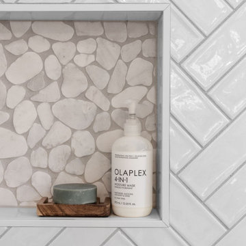
A furniture-style vanity sets the tone for this luxurious space, introducing materials, colors, shapes, and textures that repeat throughout. Individual walnut hexagons join to create distinctive vanity doors, offset beautifully by horizontal-grain drawers. Topping the cabinetry is a simple concrete countertop with integral sinks. An expansive framed mirror above enlarges and brightens the room. Within the mirror, sconces float, their globes a nod to the hexagons below. Champagne bronze fixtures reflect the warm walnut glow. Nestled into the back corner, a stunning shower features waterjet tiles in a double herringbone pattern, each precisely cut and laid to maintain design integrity at every surface transition. Teak floor tiles and a pebbled niche hint at the classic spa experience. Across from the shower, a large hexagonal window provides a treetop view from the free-standing tub below. The gentle oval of the tub and the beaded chandelier above provide a pleasing contrast to the strong lines surrounding it, as do the softly-shaded pebbles in the full-length niche. Shiplap wainscotting wraps the room, creating an illusion of height in the compact space. Subtle flooring and soft green walls create an understated backdrop for the bold mix of materials, unifying them into a serene oasis.
Asking a century-old home to accommodate a modern luxury bath is a tall order. Asbestos-laden plaster and flooring had to be abated. The subfloor had to be leveled and reinforced to increase strength and prevent deflection. Water lines and multiple electrical circuits had to be brought across and up without disturbing a beautifully-paneled ceiling, something we accomplished by firring out stair walls to hide the chases. Our client had visions of a leafy view from her tub, but the new layout eliminated existing windows. Placing a new window was complicated by deep eaves and flat soffits. By pushing the header into the roofline, however, we were able to accommodate a picture window. The flat soffit was replaced by an inverse hip lined with stained tongue and groove cedar, tying it to the bathroom finishes. Bringing materials up a narrow staircase became truly challenging when it was time to install the big items. However, strategic removal of drywall around the landing got the job done. Our attention to detail is showcased in the shower tile, where precise cuts were required at surface transitions to maintain the integrity of a complex double herringbone lay. The project was delivered on time.
Savvy layout choices minimized spending on structural changes. Because we were dealing with dormer space, head height was an issue. Raising the ceiling would have been complex and expensive so our design accommodated the constraints – tub on the low outside wall, shower on the full-height interior wall. The vanity spanned the spread, accommodating our petite client on the exterior side and her taller husband on the interior side. An under-eave closet was closed off to create room for both a freestanding tub and a separate shower. Rather than building replacement storage elsewhere, we simply added a new door into the closet from the primary bedroom. This was made possible by absorbing the short hallway separating the existing bed and bathroom into the primary bedroom. This new layout also created an en suite relationship between the primary bedroom and the new bath. We saved additional dollars by selecting a furniture-style vanity rather than using custom cabinetry, and the countertop with integral sinks provided a cost savings over a more traditional quartz countertop with undermount sinks. Affordable shower tiles allowed us to put more money into a dynamic tile layout. The project was delivered within budget.
 Dellfina Homes
This truly magnificent King City Project is the ultra-luxurious family home you’ve been dreaming of! This immaculate 5 bedroom residence has stunning curb appeal, with a beautifully designed white Cape Cod wood siding, professionally landscaped gardens, precisely positioned home on 3 acre lot and a private driveway leading up to the 4 car garage including workshop.
This beautiful 8200 square foot Georgian style home is every homeowners dream plus a beautiful 5800 square foot walkout basement. The English inspired exterior cladding and landscaping has an endless array of attention and detail. The handpicked materials of the interior has endless exceptional unfinished oak hardwood throughout, varying 9” to 12” plaster crown mouldings throughout and see each room accented with upscale interior light fixtures. Spend the end of your hard worked days in our beautiful Conservatory walking out of the kitchen/family room, this open concept room his met with high ceilings and 60 linear feet of glass looking out onto 3 acres of land.
Our exquisite Bloomsbury Kitchen designed kitchen is a hand painted work of art. Simple but stunning craftsmanship for this gourmet kitchen with a 10ft calacatta island and countertops. 2 apron sinks incorporated into counter and islands with 2-Georgian Bridge polished nickel faucets. Our 60” range will help every meal taste better than the last. 3 stainless steel fridges. The bright breakfast area is ideal for enjoying morning meals and conversation while overlooking the verdant backyard, or step out to the conservatory to savor your meals under the stars. All accented with Carrara backsplash.
Also, on the main level is the expansive Master Suite with stunning views of the countryside, and a magnificent ensuite washroom, featuring built-in cabinetry, a makeup counter, an oversized glass shower, and a separate free standing tub. All is sitting on a beautifully layout of carrara floor tiles. All bedrooms have abundant walk-in closet space, large windows and full ensuites with heated floor in all tiled areas.
Hardwood floors throughout have been such an important detail in this home. We take a lot of pride in the finish as well as the planning that went into designing the floors. We have a wide variety of French parque flooring, herringbone in main areas as well as chevron in our dining room and eating areas. Feel the texture on your feet as this oak hardwood comes to life with its beautiful stained finished.
75% of the home is a paneling heaven. The entire first floor leading up to the second floor has extensive recessed panels, archways and bead board from floor to ceiling to give it that country feel. Our main floor spiral staircase is nothing but luxury with its simple handrails and beautifully stained steps.
Walk out onto two Garden Walkways, one off of the kitchen and the other off of the master bedroom hallway. BBQ area or just relaxing in front of a wood burning fireplace looking off of a porch with clean cut glass railings.
Our wood burning fireplace can be seen in the basement, first floor and exterior of the garden walkway terrace. These fireplaces are cladded with Owen Sound limestone and having a herringbone designed box. To help enjoy these fireplaces, take full advantage of the two storey electronic dumbwaiter elevator for the firewood.
Get work done in our 600 square foot office, that is surrounded by oak recessed paneling, custom crafted built ins and hand carved oak desk, all looking onto 3 acres of country side.
Enjoy wine? See our beautifully designed wine cellar finished with marble border and pebble stone floor to give you that authentic feel of a real winery. This handcrafted room holds up to 3000 bottles of wine and is a beautiful feature every home should have. Wine enthusiasts will love the climatized wine room for displaying and preserving your extensive collection. This wine room has floor to ceiling glass looking onto the family room of the basement with a wood burning fireplace.
After your long meal and couple glasses of wine, see our 1500 square foot gym with all the latest equipment and rubber floor and surrounded in floor to ceiling mirrors. Once you’re done with your workout, you have the option of using our traditional sauna, infrared sauna or taking a dip in the hot tub.
Extras include a side entrance to the mudroom, two spacious cold rooms, a CVAC system throughout, 400 AMP Electrical service with generator for entire home, a security system, built-in speakers throughout and Control4 Home automation system that includes lighting, audio & video and so much more. A true pride of ownership and masterpiece built and managed by Dellfina Homes Inc.

 Quality Edge
TruCedar Steel Siding shown in 10" Board & Batten in Napa Vine.
Beige two-story metal exterior home idea in Grand Rapids
Beige two-story metal exterior home idea in Grand Rapids
155