
Search results for "Prefer personalities" in Home Design Ideas
 Décor Aid
“Immediately upon seeing the space, I knew that we needed to create a narrative that allowed the design to control how you moved through the space,” reports Kimberly, senior interior designer.
After surveying each room and learning a bit more about their personal style, we started with the living room remodel. It was clear that the couple wanted to infuse mid-century modern into the design plan. Sourcing the Room & Board Jasper Sofa with its narrow arms and tapered legs, it offered the mid-century look, with the modern comfort the clients are used to. Velvet accent pillows from West Elm and Crate & Barrel add pops of colors but also a subtle touch of luxury, while framed pictures from the couple’s honeymoon personalize the space.
Moving to the dining room next, Kimberly decided to add a blue accent wall to emphasize the Horchow two piece Percussion framed art that was to be the focal point of the dining area. The Seno sideboard from Article perfectly accentuated the mid-century style the clients loved while providing much-needed storage space. The palette used throughout both rooms were very New York style, grays, blues, beiges, and whites, to add depth, Kimberly sourced decorative pieces in a mixture of different metals.
“The artwork above their bureau in the bedroom is photographs that her father took,”
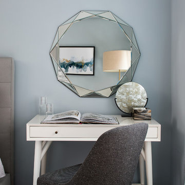
Moving into the bedroom renovation, our designer made sure to continue to stick to the client’s style preference while once again creating a personalized, warm and comforting space by including the photographs taken by the client’s father. The Avery bed added texture and complimented the other colors in the room, while a hidden drawer at the foot pulls out for attached storage, which thrilled the clients. A deco-inspired Faceted mirror from West Elm was a perfect addition to the bedroom due to the illusion of space it provides. The result was a bedroom that was full of mid-century design, personality, and area so they can freely move around.
The project resulted in the form of a layered mid-century modern design with touches of luxury but a space that can not only be lived in but serves as an extension of the people who live there. Our designer was able to take a very narrowly shaped Manhattan apartment and revamp it into a spacious home that is great for sophisticated entertaining or comfortably lazy nights in.
 Hudson Street Design
Empire Contracting Inc
707.884.9789
Photos By: Sea Ranch Images
www.searanchimages.com
707.653.6866
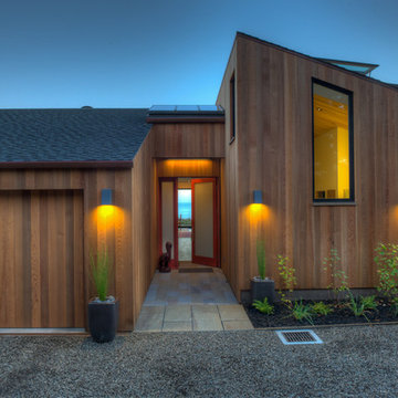
1950s exterior home photo in San Francisco
1950s exterior home photo in San Francisco

Find the right local pro for your project
 Adrienne DeRosa
Adrienne DeRosa © 2014 Houzz Inc.
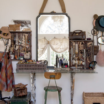
Jennifer's vanity is home to a treasure trove of vintage jewelry, highlighted by creative storage solutions. What was once a tool box now hangs on the wall to house various necklaces. Even with such rugged origins, the display has a decidedly feminine appeal.
"My girlfriend had come across these old tool boxes at an estate sale. The person that owned them painted the tools that hung on each hook, so it makes for a great story," says Jennifer.
Tool box containers: Stash Style
Photo: Adrienne DeRosa © 2014 Houzz
 The Stonehill Company
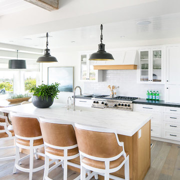
Eat-in kitchen - coastal galley dark wood floor and brown floor eat-in kitchen idea in Orange County with a farmhouse sink, shaker cabinets, white cabinets, white backsplash, subway tile backsplash, stainless steel appliances, an island and black countertops
 Buckenmeyer Architecture
Jeff Amram Photography
www.jeffamram.com
Example of a classic bedroom design in Portland with gray walls
Example of a classic bedroom design in Portland with gray walls
 Décor Aid
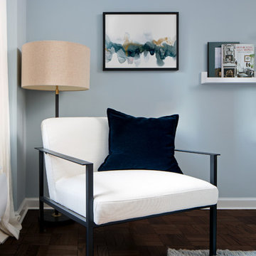
“Immediately upon seeing the space, I knew that we needed to create a narrative that allowed the design to control how you moved through the space,” reports Kimberly, senior interior designer.
After surveying each room and learning a bit more about their personal style, we started with the living room remodel. It was clear that the couple wanted to infuse mid-century modern into the design plan. Sourcing the Room & Board Jasper Sofa with its narrow arms and tapered legs, it offered the mid-century look, with the modern comfort the clients are used to. Velvet accent pillows from West Elm and Crate & Barrel add pops of colors but also a subtle touch of luxury, while framed pictures from the couple’s honeymoon personalize the space.
Moving to the dining room next, Kimberly decided to add a blue accent wall to emphasize the Horchow two piece Percussion framed art that was to be the focal point of the dining area. The Seno sideboard from Article perfectly accentuated the mid-century style the clients loved while providing much-needed storage space. The palette used throughout both rooms were very New York style, grays, blues, beiges, and whites, to add depth, Kimberly sourced decorative pieces in a mixture of different metals.
“The artwork above their bureau in the bedroom is photographs that her father took,”
Moving into the bedroom renovation, our designer made sure to continue to stick to the client’s style preference while once again creating a personalized, warm and comforting space by including the photographs taken by the client’s father. The Avery bed added texture and complimented the other colors in the room, while a hidden drawer at the foot pulls out for attached storage, which thrilled the clients. A deco-inspired Faceted mirror from West Elm was a perfect addition to the bedroom due to the illusion of space it provides. The result was a bedroom that was full of mid-century design, personality, and area so they can freely move around.
The project resulted in the form of a layered mid-century modern design with touches of luxury but a space that can not only be lived in but serves as an extension of the people who live there. Our designer was able to take a very narrowly shaped Manhattan apartment and revamp it into a spacious home that is great for sophisticated entertaining or comfortably lazy nights in.

Sponsored
Delaware, OH

Buckeye Basements, Inc.
Central Ohio's Basement Finishing ExpertsBest Of Houzz '13-'21
 Cascade West Development
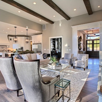
Paint by Sherwin Williams - https://goo.gl/nb9e74
Body - Anew Grey - SW7030 - https://goo.gl/rfBJBn
Trim - Dover White - SW6385 - https://goo.gl/2x84RY
Fireplace by Pro Electric Fireplace - https://goo.gl/dWX48i
Fireplace Surround by Eldorado Stone - https://goo.gl/q1ZB2z
Vantage30 in White Elm - https://goo.gl/T6i22G
Hearthstone by Stone NW Inc - Polished Pioneer Sandstone - https://goo.gl/hu0luL
Flooring by Macadam Floor + Design - https://goo.gl/r5rCto
Metropolitan Floor's Wild Thing Maple in Hearth Stone - https://goo.gl/DuC9G8
Windows by Milgard Window + Door - https://goo.gl/fYU68l
Style Line Series - https://goo.gl/ISdDZL
Supplied by TroyCo - https://goo.gl/wihgo9
Lighting by Destination Lighting - https://goo.gl/mA8XYX
Golden Lighting - Modern Chandelier - https://goo.gl/qE8RUD
Kichler Lighting - Modern Pendants - https://goo.gl/RcOqsa
Interior Design by Creative Interiors & Design - https://goo.gl/zsZtj6
Partially Furnished by Uttermost Lighting & Furniture - https://goo.gl/46Fi0h
All Root Company - https://goo.gl/4oTWJS
Built by Cascade West Development Inc
Cascade West Facebook: https://goo.gl/MCD2U1
Cascade West Website: https://goo.gl/XHm7Un
Photography by ExposioHDR - Portland, Or
Exposio Facebook: https://goo.gl/SpSvyo
Exposio Website: https://goo.gl/Cbm8Ya
Original Plans by Alan Mascord Design Associates - https://goo.gl/Fg3nFk
Plan 2476 - The Thatcher - https://goo.gl/5o0vyw
 Kitchens By Design
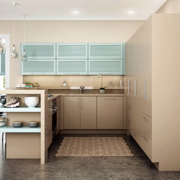
Dura Supreme’s Personal Paint Match Program offers the entire Sherwin-William’s paint palette, over 1500 paint colors, for your new cabinets.
Painted cabinetry is more popular than ever before and the color you select for your home should be a reflection of your personal taste and style. Color is a highly personal preference for most people and although there are specific colors that are considered “on trend” or fashionable, color choices should ultimately be based on what appeals to you personally.
Kitchen & Bath Designers are often asked about color trends and how to incorporate them into newly designed or renovated interiors. And although trends in fashion should be taken into consideration, that should not be the only deciding factor. For example, if you love a specific shade of green, look at selecting complementing neutrals and coordinating colors to bring the entire palette together beautifully.” It could be something as simple as being able to select the perfect shade of white that complements the countertop and tile and works well in a specific lighting situation. Our new Personal Paint Match system makes the process so much easier.
Dura Supreme's new "Personal Paint Match Program" provides the entire Sherwin Williams paint palette of over 1,500 colors to select from. The Sherwin Williams paint color simply needs to be specified and Dura Supreme will then create a color chip for the designer and homeowner to review. Once that color is approved by the homeowner, Dura Supreme then builds and finishes the cabinetry to match. The new Personal Paint Match program is available for all product lines.
Request a FREE Dura Supreme Cabinetry Brochure Packet at:
http://www.durasupreme.com/request-brochure

 User
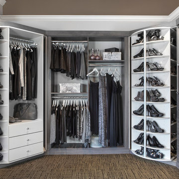
UserExample of a transitional gender-neutral walk-in closet design in Chicago with open cabinets and gray cabinets
 Soko Design
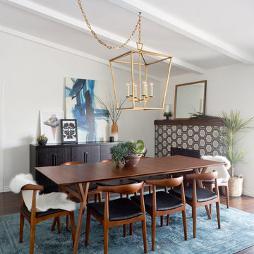
Kitchen/dining room combo - mid-sized contemporary dark wood floor kitchen/dining room combo idea in Los Angeles with white walls, a standard fireplace and a tile fireplace
 Dura Supreme Cabinetry
This fun and stylish bathroom features Sherwin-Williams “Slate Tile" SW 7624 on Dura Supreme’s Hawthorne door style. This elegant blue/gray paint color is subtle, calm, and inspiring. This color was selected for Dura Supreme’s 2017-2018 Curated Color Collection. Dura Supreme’s Curated Color Collection is a collection of cabinet paint colors that are always fresh, current and reflective of popular color trends for home interiors and cabinetry. This offering of colors is continuously updated as color trends shift.
Painted cabinetry is more popular than ever before and the color you select for your home should be a reflection of your personal taste and style. Our Personal Paint Match Program offers the entire Sherwin-William’s paint palette and Benjamin Moore’s paint palette, over 5,000 colors, for your new kitchen or bath cabinetry.
Color is a highly personal preference for most people and although there are specific colors that are considered “on trend” or fashionable, color choices should ultimately be based on what appeals to you personally. Homeowners often ask about color trends and how to incorporate them into newly designed or renovated interiors. And although trends and fashion should be taken into consideration, that should not be the only deciding factor. If you love a specific shade of green, select complementing neutrals and coordinating colors to create an entire palette that will remain an everlasting classic. It could be something as simple as being able to select the perfect shade of white that complements the countertop and tile and works well in a specific lighting situation. Our new Personal Paint Match system makes that process so much easier.
Request a FREE Dura Supreme Brochure Packet:
http://www.durasupreme.com/request-brochure
 Dura Supreme Cabinetry
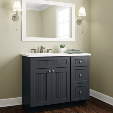
This nautical styled bathroom features Sherwin-Williams “Cyberspace” SW 7076 on Dura Supreme’s Craftsman Beaded Panel cabinet door style. This dark navy blue is subtle, neutral, and dramatic all at the same time. This color was selected for Dura Supreme’s 2017-2018 Curated Color Collection. Dura Supreme’s Curated Color Collection is a collection of cabinet paint colors that are always fresh, current and reflective of popular color trends for home interiors and cabinetry. This offering of colors is continuously updated as color trends shift.
Painted cabinetry is more popular than ever before and the color you select for your home should be a reflection of your personal taste and style. Our Personal Paint Match Program offers the entire Sherwin-William’s paint palette and Benjamin Moore’s paint palette, over 5,000 colors, for your new kitchen or bath cabinetry.
Color is a highly personal preference for most people and although there are specific colors that are considered “on trend” or fashionable, color choices should ultimately be based on what appeals to you personally. Homeowners often ask about color trends and how to incorporate them into newly designed or renovated interiors. And although trends and fashion should be taken into consideration, that should not be the only deciding factor. If you love a specific shade of green, select complementing neutrals and coordinating colors to create an entire palette that will remain an everlasting classic. It could be something as simple as being able to select the perfect shade of white that complements the countertop and tile and works well in a specific lighting situation. Our new Personal Paint Match system makes that process so much easier.
Request a FREE Dura Supreme Brochure Packet:
http://www.durasupreme.com/request-brochure
 Elstad Interiors
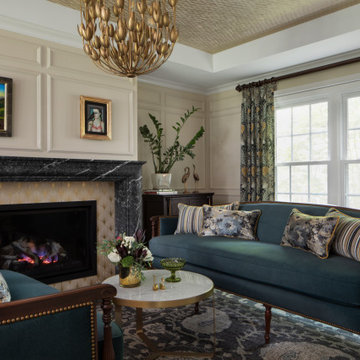
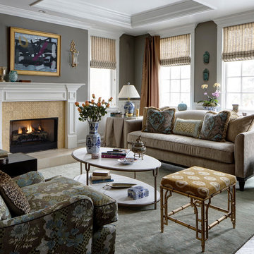
Inspiration for a mid-sized timeless formal and open concept medium tone wood floor and brown floor living room remodel in Chicago with gray walls, a standard fireplace and a tile fireplace
 K.A. Atwood, Inc
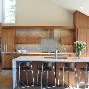
 Contemporary design in frameless walnut slab doors.
Trendy medium tone wood floor kitchen photo in Other with flat-panel cabinets, medium tone wood cabinets, gray backsplash, an island, an undermount sink and paneled appliances
Trendy medium tone wood floor kitchen photo in Other with flat-panel cabinets, medium tone wood cabinets, gray backsplash, an island, an undermount sink and paneled appliances
 Regarding Design
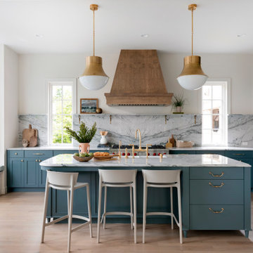
Built in the iconic neighborhood of Mount Curve, just blocks from the lakes, Walker Art Museum, and restaurants, this is city living at its best. Myrtle House is a design-build collaboration with Hage Homes and Regarding Design with expertise in Southern-inspired architecture and gracious interiors. With a charming Tudor exterior and modern interior layout, this house is perfect for all ages.
 Dura Supreme Cabinetry
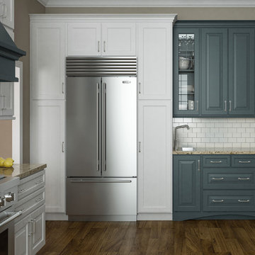
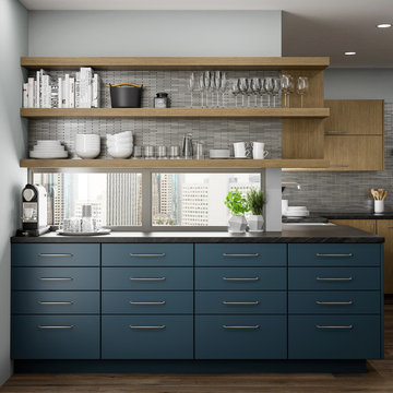
This fun and stylish kitchen remodel features a color match to “Gale Force” SW 7605 from Sherwin-Williams on Dura Supreme’s Chroma door style. This stunning deep blue paint color is sophisticated, fun, and creative. It’s a stunning statement-making color that’s sure to be a classic for years to come and represents the latest in color trends. It’s no surprise this beautiful navy blue has been selected for Dura Supreme’s Curated Color Collection for 2018-2020.
Painted cabinetry is more popular than ever before and the color you select for your home should be a reflection of your personal taste and style. Our Personal Paint Match Program offers the entire Sherwin-William’s paint palette and Benjamin Moore’s paint palette, over 5,000 colors, for your new kitchen or bath cabinetry.
Color is a highly personal preference for most people and although there are specific colors that are considered “on trend” or fashionable, color choices should ultimately be based on what appeals to you personally. Homeowners often ask about color trends and how to incorporate them into newly designed or renovated interiors. And although trends and fashion should be taken into consideration, that should not be the only deciding factor. If you love a specific shade of green, select complementing neutrals and coordinating colors to create an entire palette that will remain an everlasting classic. It could be something as simple as being able to select the perfect shade of white that complements the countertop and tile and works well in a specific lighting situation. Our new Personal Paint Match system makes that process so much easier.
Request a FREE Dura Supreme Brochure Packet: http://www.durasupreme.com/request-brochure

 Décor Aid
“Immediately upon seeing the space, I knew that we needed to create a narrative that allowed the design to control how you moved through the space,” reports Kimberly, senior interior designer.
After surveying each room and learning a bit more about their personal style, we started with the living room remodel. It was clear that the couple wanted to infuse mid-century modern into the design plan. Sourcing the Room & Board Jasper Sofa with its narrow arms and tapered legs, it offered the mid-century look, with the modern comfort the clients are used to. Velvet accent pillows from West Elm and Crate & Barrel add pops of colors but also a subtle touch of luxury, while framed pictures from the couple’s honeymoon personalize the space.
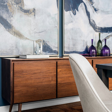
Moving to the dining room next, Kimberly decided to add a blue accent wall to emphasize the Horchow two piece Percussion framed art that was to be the focal point of the dining area. The Seno sideboard from Article perfectly accentuated the mid-century style the clients loved while providing much-needed storage space. The palette used throughout both rooms were very New York style, grays, blues, beiges, and whites, to add depth, Kimberly sourced decorative pieces in a mixture of different metals.
“The artwork above their bureau in the bedroom is photographs that her father took,”
Moving into the bedroom renovation, our designer made sure to continue to stick to the client’s style preference while once again creating a personalized, warm and comforting space by including the photographs taken by the client’s father. The Avery bed added texture and complimented the other colors in the room, while a hidden drawer at the foot pulls out for attached storage, which thrilled the clients. A deco-inspired Faceted mirror from West Elm was a perfect addition to the bedroom due to the illusion of space it provides. The result was a bedroom that was full of mid-century design, personality, and area so they can freely move around.
The project resulted in the form of a layered mid-century modern design with touches of luxury but a space that can not only be lived in but serves as an extension of the people who live there. Our designer was able to take a very narrowly shaped Manhattan apartment and revamp it into a spacious home that is great for sophisticated entertaining or comfortably lazy nights in.
4