
Search results for "Presence" in Home Design Ideas
 Cohesively Curated
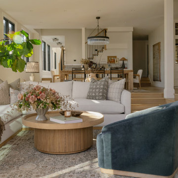
Inspiration for a transitional open concept light wood floor and beige floor living room remodel in Seattle with beige walls, a standard fireplace and a stone fireplace
 McKinney York Architects
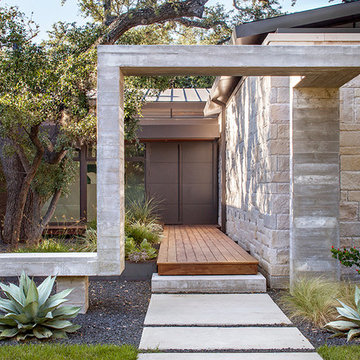
This property came with a house which proved ill-matched to our clients’ needs but which nestled neatly amid beautiful live oaks. In choosing to commission a new home, they asked that it also tuck under the limbs of the oaks and maintain a subdued presence to the street. Extraordinary efforts such as cantilevered floors and even bridging over critical root zones allow the design to be truly fitted to the site and to co-exist with the trees, the grandest of which is the focal point of the entry courtyard.
Of equal importance to the trees and view was to provide, conversely, for walls to display 35 paintings and numerous books. From form to smallest detail, the house is quiet and subtle.
 Bittoni Architects
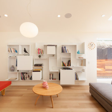
A radical remodel of a modest beach bungalow originally built in 1913 and relocated in 1920 to its current location, blocks from the ocean.
The exterior of the Bay Street Residence remains true to form, preserving its inherent street presence. The interior has been fully renovated to create a streamline connection between each interior space and the rear yard. A 2-story rear addition provides a master suite and deck above while simultaneously creating a unique space below that serves as a terraced indoor dining and living area open to the outdoors.
Photographer: Taiyo Watanabe
Find the right local pro for your project

 Last Detail Interior Design
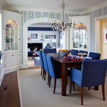
We made every effort to visually meld the dining room with the living rooms without applying the same wall covering. This bold blue and white geometric gives a modern twist to a room with traditional corner cabinets. The overall color scheme of blue and white can be accessorized with different contrasting colors as desired for completely different looks.

 ODS Architecture
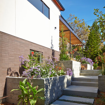
Originally a nearly three-story tall 1920’s European-styled home was turned into a modern villa for work and home. A series of low concrete retaining wall planters and steps gradually takes you up to the second level entry, grounding or anchoring the house into the site, as does a new wrap around veranda and trellis. Large eave overhangs on the upper roof were designed to give the home presence and were accented with a Mid-century orange color. The new master bedroom addition white box creates a better sense of entry and opens to the wrap around veranda at the opposite side. Inside the owners live on the lower floor and work on the upper floor with the garage basement for storage, archives and a ceramics studio. New windows and open spaces were created for the graphic designer owners; displaying their mid-century modern furnishings collection.
A lot of effort went into attempting to lower the house visually by bringing the ground plane higher with the concrete retaining wall planters, steps, wrap around veranda and trellis, and the prominent roof with exaggerated overhangs. That the eaves were painted orange is a cool reflection of the owner’s Dutch heritage. Budget was a driver for the project and it was determined that the footprint of the home should have minimal extensions and that the new windows remain in the same relative locations as the old ones. Wall removal was utilized versus moving and building new walls where possible.
Photo Credit: John Sutton Photography.
 Battle Associates, Architects
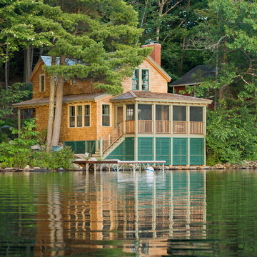
This project was a Guest House for a long time Battle Associates Client. Smaller, smaller, smaller the owners kept saying about the guest cottage right on the water's edge. The result was an intimate, almost diminutive, two bedroom cottage for extended family visitors. White beadboard interiors and natural wood structure keep the house light and airy. The fold-away door to the screen porch allows the space to flow beautifully.
Photographer: Nancy Belluscio
 McKinney York Architects
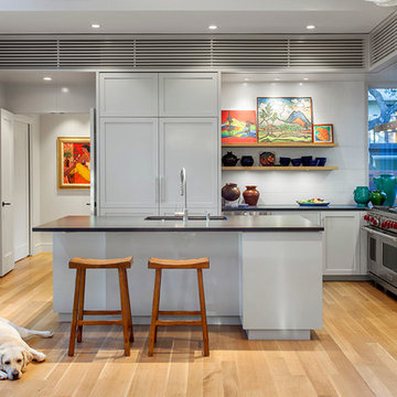
This property came with a house which proved ill-matched to our clients’ needs but which nestled neatly amid beautiful live oaks. In choosing to commission a new home, they asked that it also tuck under the limbs of the oaks and maintain a subdued presence to the street. Extraordinary efforts such as cantilevered floors and even bridging over critical root zones allow the design to be truly fitted to the site and to co-exist with the trees, the grandest of which is the focal point of the entry courtyard.
Of equal importance to the trees and view was to provide, conversely, for walls to display 35 paintings and numerous books. From form to smallest detail, the house is quiet and subtle.
 Jackson Design & Remodeling
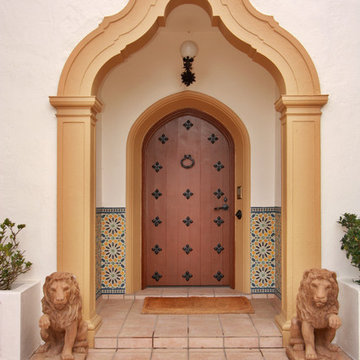
Example of a tuscan entryway design in San Diego with a medium wood front door
 reBuild Workshop
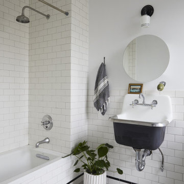
This is a black-and-white bathroom at a Brooklyn brownstone project of ours. Its centerpiece is a large, wall-mounted utility sink. The floor has mosaic marble tile, and the walls have white subway tile with accents of black tile.
 Waterman & Sun
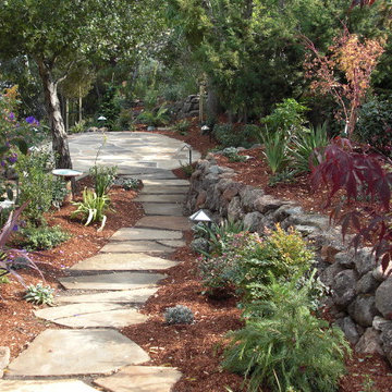
This newly planted garden is now very colorful and thriving in the presence of deer. Most all of our gardens in the hilly areas of the peninsula are designed and planted with deer in mind.
 Nar Design Group
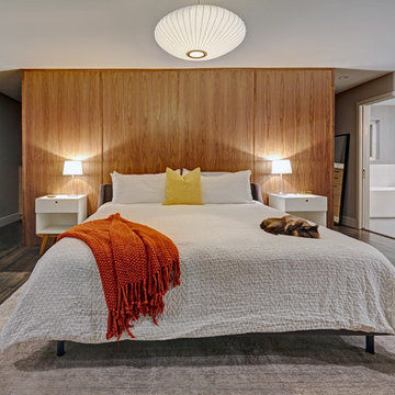
This client grew up in this 1950’s family home and has now become owner in his adult life. Designing and remodeling this childhood home that the client was very bonded and familiar with was a tall order. This modern twist of original mid-century style combined with an eclectic fusion of modern day materials and concepts fills the room with a powerful presence while maintaining its clean lined austerity and elegance. The kitchen was part of a grander complete home re-design and remodel.
A modern version of a mid-century His and Hers grand master bathroom was created to include all the amenities and nothing left behind! This bathroom has so much noticeable and hidden “POW” that commands its peaceful spa feeling with a lot of attitude. Maintaining ultra-clean lines yet delivering ample design interest at every detail, This bathroom is eclectically a one of a kind luxury statement.
The concept in the laundry room was to create a simple, easy to use and clean space with ample storage and a place removed from the central part of the home to house the necessity of the cats and their litter box needs. There was no need for glamour in the laundry room yet we were able to create a simple highly utilitarian space.
If there is one room in the home that requires frequent visitors to thoroughly enjoy with a huge element of surprise, it’s the powder room! This is a room where you know that eventually, every guest will visit. Knowing this, we created a bold statement with layers of intrigue that would leave ample room for fun conversation with your guests upon their prolonged exit. We kept the lights dim here for that intriguing experience of crafted elegance and created ambiance. The walls of peeling metallic rust are the welcoming gesture to a powder room experience of defiance and elegant mystical complexity.
It's a lucky house guest indeed who gets to stay in this newly remodeled home. This on-suite bathroom allows them their own space and privacy. Both Bedroom and Bathroom offer plenty of storage for an extended stay. Rift White Oak cabinets and sleek Silestone counters make a lovely combination in the bathroom while the bedroom showcases textured white cabinets with a dark walnut wrap.
Photo credit: Fred Donham of PhotographerLink
 Classic Custom Homes of Waunakee
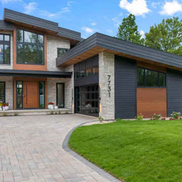
Large trendy multicolored two-story mixed siding house exterior photo in Other with a shed roof and a black roof
 Architect Heather Johnston
CASA 1O
Contemporary on a Mid-century Scaffold.
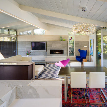
Largely unmodified since its design by Russell Forester and construction in 1957, the structure housed the original family until 2013. An intimate 1,910 square foot space, the house acquired a separate 600 square foot cottage in the 70’s designed by another architect. New owners purchased the house with the idea of keeping the original architect’s intent intact – the simple accommodation of everyday life with a focus on outdoor living only possible in Southern California. At the same time the house needed insulation, new electrical, plumbing, siding – everything but new studs and foundations.
A single roof beam travels south from the north fireplace wall all the way to the bedrooms in the back. Functions occur to either side, with private access to exterior courtyards. How do we accentuate the uncomplicated while enhancing the qualities of the chosen materials? Contemporary applied to a mid-century scaffold.
We focused on reduction, a few things performing many tasks. Each component, material or color performs more than one duty.
Lighting is paramount, enhancing the design’s procession from front to back, north to south, public to private. Strip LED’s reinforce the beam’s linear presence and spot LED’s make punctuation points of the roof purlins. Hidden up and down-lights in the cabinets and elsewhere provide the rooms with a quiet glow.
Exterior grass plantings give the only vertical dimension to the design, waving as the breeze moves them. All else is horizontal: caramelized bamboo siding, porcelain tile, roof line and ocean horizon.
Architect: Heather Johnston Architect
Landscaping: HJA
Photography: Brady Architectural Photography
 CJ South Photography
CJ South
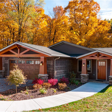
Arts and crafts brown one-story mixed siding exterior home photo in DC Metro with a hip roof
Arts and crafts brown one-story mixed siding exterior home photo in DC Metro with a hip roof
 ODS Architecture
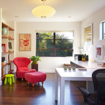
Originally a nearly three-story tall 1920’s European-styled home was turned into a modern villa for work and home. A series of low concrete retaining wall planters and steps gradually takes you up to the second level entry, grounding or anchoring the house into the site, as does a new wrap around veranda and trellis. Large eave overhangs on the upper roof were designed to give the home presence and were accented with a Mid-century orange color. The new master bedroom addition white box creates a better sense of entry and opens to the wrap around veranda at the opposite side. Inside the owners live on the lower floor and work on the upper floor with the garage basement for storage, archives and a ceramics studio. New windows and open spaces were created for the graphic designer owners; displaying their mid-century modern furnishings collection.
A lot of effort went into attempting to lower the house visually by bringing the ground plane higher with the concrete retaining wall planters, steps, wrap around veranda and trellis, and the prominent roof with exaggerated overhangs. That the eaves were painted orange is a cool reflection of the owner’s Dutch heritage. Budget was a driver for the project and it was determined that the footprint of the home should have minimal extensions and that the new windows remain in the same relative locations as the old ones. Wall removal was utilized versus moving and building new walls where possible.
Photo Credit: John Sutton Photography.
 Daniel Contelmo Architects
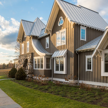
 The front elevation makes use of many traditional cottage elements, combining steep roof lines with graceful curves. Clover windows and natural stone give a timeless feeling to the front. The metal roof reflects the sky, and softens the presence of the house.
Photographer: Daniel Contelmo Jr.
 House of L
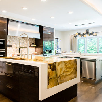
A traditional Georgian home receives an incredible transformation with an addition to expand the originally compact kitchen and create a pathway into the family room and dining area, opening the flow of the spaces that allow for fluid movement from each living space for the young family of four. Taking the lead from the client's desire to have a contemporary and edgier feel to their home's very classic facade, House of L worked with the architect's addition to the existing kitchen to design a kitchen that was incredibly functional and gorgeously dramatic, beckoning people to grab a barstool and hang out. Glossy macassar ebony wood is complimented with lacquered white cabinets for an amazing study in contrast. An oversized brushed nickel hood with polished nickel banding makes a presence on the feature wall of the kitchen. Brushed and polished nickel details are peppered in the landscape of this room, including the cabinets in the second island, a storage cabinet and automated hopper doors by Hafele on the refrigeration wall and all of the cabinet hardware, supplied and custom sized by Rajack. White quartz countertops by Hanstone in the Bianco Canvas colorway float on all the perimeter cabinets and the secondary island and creates a floating frame for the Palomino Quartzite that is a highlight in the kitchen and lends an organic feel to the clean lines of the millwork. The backsplash area behind the rangetop is a brick patterned mosaic blend of stone and glass, while surrounding walls have a layered sandstone tile that lend an incredible texture to the room. The light fixture hanging above the second island is by Wells Long and features faceted metal polygons with an amber gold interior. Woven linen drapes at window winks at the warmer tones in the room with a lustrous sheen that catches the natural light filtering in. The rift and sawn cut white oak floors are 8" planks that were fitted and finished on site to match the existing floor in the family and dining rooms. The clients were very clear on the appliances they needed the kitchen to accommodate. In addition to the vast expanses of wall space that were gained with the kitchen addition the larger footprint allowed for two sizeable islands and a host of cooking amenities, including a 48" rangetop, two double ovens, a warming drawer, and a built-in coffee maker by Miele and a 36" Refrigerator and Freezer and a beverage drawer by Subzero. A fabulous stainless steel Kallista sink by Mick De Giulio's series for the company is fitted in the first island which serves as a prep area, flanked by an Asko dishwasher to the right. A Dorenbracht faucet is a strong compliment to the scale of the sink. A smaller Kallista stainless sink is centered in the second island which has a secondary burner by Miele for overflow cooking.
Jason Miller, Pixelate
 Elizabeth Strianese Interiors LLC
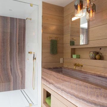
Custom white oak shiplap wall paneling to the ceiling give the vanity a natural and modern presence.. The large trough style sink in purple onyx highlights the beauty of the stone. With Niche Modern pendant lights and Vola wall mounted plumbing.
Photography by Meredith Heuer
14