
Search results for "Preventing cold" in Home Design Ideas
 Twelve Stones Designs, LLC
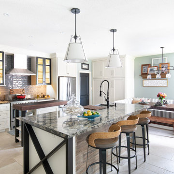
The owners of this kitchen had spent the money to upgrade the finishes in their kitchen upon building the home 12 years ago, but after living in the space for several years they realized how nonfunctional the layout really was. The (then) two preschool aged children had grown into busy, hungry teenagers with many friends who also liked to hang out at the house. So the family needed a more functional kitchen with better traffic flow, space for daily activities revolving around the kitchen at different times of day, and a kitchen that could accommodate cooking for and serving large groups. Furthermore, the dark, traditional finishes no longer reflected the homeowners’ style. They requested a brighter, more relaxed, coastal style that reflected their love of the seaside cities they like to visit.
Originally, the kitchen was U-shaped with a narrow island in the middle. The island created narrow aisles that bottle-necked at the dishwasher, refrigerator, and cooktop areas. There was a pass-through from the foyer into the kitchen, but the owners never liked that the pass-through was also located so close to the powder room. The awkward proximity was unappealing and made guests feel uncomfortable.
The kitchen’s storage was made up of lots of narrow cabinets, apothecary drawers, clipped corner units, and very few drawers. It lacked useful storage for the larger items the family used on a daily basis. And the kitchen’s only pantry was small closet that had only builder-grade, narrow shelving with no illumination to be able to see the contents inside.
Overall, the kitchen’s lighting plan was poorly executed. Only six recessed cans illuminated the entire kitchen and nook areas. The under cabinet lighting was not evenly distributed either. In fact, the builder had mis-placed the under cabinet lighting around the decorative pilasters which made for choppy, dark cubbies. Further, the builder didn’t include any lighting over the sink or the bar area, which meant whoever was doing the dishes was always in their own shadow. That, coupled with the steep overhang of the game room above made the bar area feel like a dim, cavernous space that wasn’t inviting or task oriented. The kitchen looked out into the main living space, but the raised bar and a narrow wall (which held the only large cabinet in the kitchen) created more of a barrier than a relationship to the living room or breakfast nook. In fact, one couldn’t even see the breakfast nook from the cooktop or sink areas due to its orientation. The raised bar top was too narrow to comfortably sit to either dine at or chat from due to the lack of knee space. The the homeowners confided that the kitchen felt more like a dark, dirty prison than place where the family, or their guests, wanted to gather and commune.
The clients' needs and desires were:
➢ to create a kitchen that would be a space the family loved to be in; to relate to the adjacent spaces all around, and to have better flow for entertaining large groups
➢ to remove the walls between the breakfast nook and living area and to be able to utilize the natural light from the windows in both those areas
➢ to incorporate a functional chopping block for prepping fresh food for home cooked meals, an island with a large sink and drain board, 2 pull out trash cans, and seating for at least the 2 teens to eat or do homework
➢ to design a kitchen and breakfast nook with an airy, coastal, relaxed vibe that blended with the rest of the house's coastal theme
➢ to integrate a layered lighting plan which would include ample general illumination, specific task lighting, decorative lighting, and lots of illuminated storage
➢ to design a kitchen with not only more storage for all the husband’s kitchen gadgets and collection of oils and spices, but smart storage, including a coffee/breakfast bar and a place to store and conceal the toaster oven and microwave
➢ to find a way to utilize the large open space between the kitchen, pantry area, and breakfast nook
Twelve Stones Designs achieved the owner's goals by:
➢ removing the walls between the kitchen and living room to allow the natural light to filter in from the adjacent rooms and to create a connection between the kitchen, nook, and living spaces for a sense of unity and communion
➢ removing the existing pantry and designing 3 large pantry style cabinets with LED tape lights and rollout drawers to house lots of kitchen appliances, gadgets, and tons of groceries. We also took the cabinets all the way up to the 9’ ceiling for additional storage for seasonal items and bulk storage.
➢ designing 2 islands - 1 with a gorgeous black walnut chopping block that houses a drawer for chopping and carving knives and a custom double pull out trash unit for point of use utilization - and 1 that houses the dishwasher, a large Blanco Gourmet sink with integrated drain board, woven baskets for fresh root vegetables and kitchen towels, plenty of drawer storage for kitchen items, and bar seating for up to 4 diners.
➢ closing off the space between the kitchen and the powder room to create a beautiful new private alcove for the powder room as well as adding some decorative storage. This also gave us space to include more tall storage near the new range for precision placement of the husband’s extensive oil and spice collection as well as a location for a combo-steam oven the wife wanted for baking and cooking healthy meals.
The project is enhanced functionally by:
➢ incorporated USB and standard receptacles for the kids’ laptops and phone charging in the large island
➢ designing the small island to include additional open shelving for items used on a daily basis such as a variety of bowls, plates, and colanders. This set up also works well for the husband who prefers to “plate” his dinners in restaurant-style fashion before presenting them to the table.
➢ the integration of specific storage units, such as double stacked cutlery drawers, a custom spice pull-out, a Kuerig coffee and tea pod drawer, and custom double stacked utensil drawers
➢ moving the refrigerator to the old oven location - this eliminated the bottle neck as well as created a better relationship to the eating table. It also utilizes the floor space between the pantry, nook, and kitchen
➢ creating a banquet style breakfast nook - this banquette seating not only doubles the amount of seating for large gatherings but it better utilizes the odd space between the kitchen and the previous nook area. It also helps to create a distinct pathway from the mudroom room through the pantry area, kitchen, nook, and living room.
➢ the coffee/breakfast bar area which includes the perfect location for the concealed microwave and toaster oven, convenient storage for the coffee pods and tea accoutrements. Roll-out drawers below also house the smoothie maker, hot water kettle, and a plethora of smoothie-making ingredients such as protein powders, smoothie additives, etc. Furthermore, the drawers below the Keurig house measuring utensil, cutlery, baking supplies and tupperware storage.
➢ incorporating lots of wide drawers and pullouts to accommodate large cookware.
➢ utilizing as much vertical space as possible by building storage to the ceiling which accommodates the family’s abundant amount of serving platters, baking sheets, bakeware, casserole dishes, and additional cutting boards.
The project is enhanced aesthetically by:
➢ new 5-piece Versailles pattern porcelain tile that now seamlessly joins the entire down stairs area together creating a bright, cohesiveness feeling instead of choppy separated spaces - it also adds a coastal feeling
➢ designing a cabinet to conceal the microwave and toaster oven
➢ the coastal influenced light fixtures over the nook table and island
➢ the sandy colors of the Langdon Cambria countertops. The swirling pattern and sparkling quartz pieces remind the homeowner of black-and-tan sandy beaches
➢ the striped banquet seating whose creamy white background and blue-green stripes were the inspiration for the cabinet and wall colors.
➢ All the interior doors were painted black to coordinate with the blacks and grays in the backsplash tile and countertop. This also adds a hint of tailored formality to an otherwise casual space.
➢ the use of WAC's Oculux small aperture LED units for the overhead lighting complimented with Diode LED strips for task lighting under the cabinets and inside the pantry and glass wall cabinets. All of the lighting applications are on separate dimmer switches.
Innovative uses of materials or construction methods by Realty Restoration LLC:
➢ Each 1-1/2” x 3” block of reclaimed end-grain black walnut that makes up the center island chopping block was hand milled and built in the shop. It was designed to look substantial and proportional to the surrounding elements, executed by creating the 4 inch tall top with a solid wood chamfered edge band.
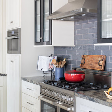
➢ The metal doors on either side of the vent hood were also custom designed for this project and built in the Realty Restoration LLC shop. They are made 1x2, 11-gauge mild steel with ribbed glass. Weighing 60 lbs a piece, heavy duty cabinet hinges were added to support the weight of the door and keep them from sagging.
➢ Under-cabinet receptacles were added along the range wall in order to have a clean, uninterrupted backsplash.
Design obstacles to overcome:
➢ Because we were removing the demising walls between the kitchen and living room, we had to find a way to plumb and vent the new island. We did this by tunneling through the slab (the slab had post tension cables which prevented us from just trenching) to run a new wet vent through a nearby structural wall. We pulled the existing hot and cold lines between upper floor joists and ran them down the structural wall as well and up through a conduit in the tunnel.
➢ Since we were converting from wall overs to a gas range it allowed us to utilize the 220 feed for the wall ovens to provide a new sub panel for all the new kitchen circuits
➢ Due to framing deficiencies inherited from the original build there was a 1-1/2” differential in the floor-to-ceiling height over a 20 foot span; by utilizing the process of cutting and furring coupled with the crown moulding details on the cabinet elevations we were able to mask the problem and provide seamless transitions between the cabinet components.
Evidence of superior craftsmanship:
➢ uniquely designed, one-of-a-kind metal “X” end panels on the large island. The end panels were custom made in the Realty Restoration LLC shop and fitted to the exact dimensions of the island. The welding seams are completely indistinguishable - the posts look like they are cut from a single sheet of metal
➢ square metal posts on the small island were also custom made and designed to compliment and carry through the metal element s throughout the kitchen
➢ the beautiful, oversized end panels on the pantry cabinets which give the breakfast nook a tailored look
➢ integrating a large format 5 piece Versailles tile pattern to seamlessly flow from the existing spaces into the new kitchen space
➢ By constructing a custom cabinet that jogged around a corner we could not remodel (housing the entry way coat closet) we were able to camouflage the adjacent wall offset within the upper and lower cabinets. By designing around the existing jog in the structural walls we accomplished a few things: we were able to find the space to house, and hide, the microwave and toaster oven yet still have a clean cohesive appearance from the kitchen side. Additionally, the owners were able to keep their much needed coat closet and we didn’t have to increase the budget with unnecessary structural work.
 Kowalske Kitchen & Bath
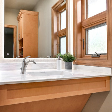
This Waukesha bathroom remodel was unique because the homeowner needed wheelchair accessibility. We designed a beautiful master bathroom and met the client’s ADA bathroom requirements.
Original Space
The old bathroom layout was not functional or safe. The client could not get in and out of the shower or maneuver around the vanity or toilet. The goal of this project was ADA accessibility.
ADA Bathroom Requirements
All elements of this bathroom and shower were discussed and planned. Every element of this Waukesha master bathroom is designed to meet the unique needs of the client. Designing an ADA bathroom requires thoughtful consideration of showering needs.
Open Floor Plan – A more open floor plan allows for the rotation of the wheelchair. A 5-foot turning radius allows the wheelchair full access to the space.
Doorways – Sliding barn doors open with minimal force. The doorways are 36” to accommodate a wheelchair.
Curbless Shower – To create an ADA shower, we raised the sub floor level in the bedroom. There is a small rise at the bedroom door and the bathroom door. There is a seamless transition to the shower from the bathroom tile floor.
Grab Bars – Decorative grab bars were installed in the shower, next to the toilet and next to the sink (towel bar).
Handheld Showerhead – The handheld Delta Palm Shower slips over the hand for easy showering.
Shower Shelves – The shower storage shelves are minimalistic and function as handhold points.
Non-Slip Surface – Small herringbone ceramic tile on the shower floor prevents slipping.
ADA Vanity – We designed and installed a wheelchair accessible bathroom vanity. It has clearance under the cabinet and insulated pipes.
Lever Faucet – The faucet is offset so the client could reach it easier. We installed a lever operated faucet that is easy to turn on/off.
Integrated Counter/Sink – The solid surface counter and sink is durable and easy to clean.
ADA Toilet – The client requested a bidet toilet with a self opening and closing lid. ADA bathroom requirements for toilets specify a taller height and more clearance.
Heated Floors – WarmlyYours heated floors add comfort to this beautiful space.
Linen Cabinet – A custom linen cabinet stores the homeowners towels and toiletries.
Style
The design of this bathroom is light and airy with neutral tile and simple patterns. The cabinetry matches the existing oak woodwork throughout the home.
 Twelve Stones Designs, LLC
The owners of this kitchen had spent the money to upgrade the finishes in their kitchen upon building the home 12 years ago, but after living in the space for several years they realized how nonfunctional the layout really was. The (then) two preschool aged children had grown into busy, hungry teenagers with many friends who also liked to hang out at the house. So the family needed a more functional kitchen with better traffic flow, space for daily activities revolving around the kitchen at different times of day, and a kitchen that could accommodate cooking for and serving large groups. Furthermore, the dark, traditional finishes no longer reflected the homeowners’ style. They requested a brighter, more relaxed, coastal style that reflected their love of the seaside cities they like to visit.
Originally, the kitchen was U-shaped with a narrow island in the middle. The island created narrow aisles that bottle-necked at the dishwasher, refrigerator, and cooktop areas. There was a pass-through from the foyer into the kitchen, but the owners never liked that the pass-through was also located so close to the powder room. The awkward proximity was unappealing and made guests feel uncomfortable.
The kitchen’s storage was made up of lots of narrow cabinets, apothecary drawers, clipped corner units, and very few drawers. It lacked useful storage for the larger items the family used on a daily basis. And the kitchen’s only pantry was small closet that had only builder-grade, narrow shelving with no illumination to be able to see the contents inside.
Overall, the kitchen’s lighting plan was poorly executed. Only six recessed cans illuminated the entire kitchen and nook areas. The under cabinet lighting was not evenly distributed either. In fact, the builder had mis-placed the under cabinet lighting around the decorative pilasters which made for choppy, dark cubbies. Further, the builder didn’t include any lighting over the sink or the bar area, which meant whoever was doing the dishes was always in their own shadow. That, coupled with the steep overhang of the game room above made the bar area feel like a dim, cavernous space that wasn’t inviting or task oriented. The kitchen looked out into the main living space, but the raised bar and a narrow wall (which held the only large cabinet in the kitchen) created more of a barrier than a relationship to the living room or breakfast nook. In fact, one couldn’t even see the breakfast nook from the cooktop or sink areas due to its orientation. The raised bar top was too narrow to comfortably sit to either dine at or chat from due to the lack of knee space. The the homeowners confided that the kitchen felt more like a dark, dirty prison than place where the family, or their guests, wanted to gather and commune.
The clients' needs and desires were:
➢ to create a kitchen that would be a space the family loved to be in; to relate to the adjacent spaces all around, and to have better flow for entertaining large groups
➢ to remove the walls between the breakfast nook and living area and to be able to utilize the natural light from the windows in both those areas
➢ to incorporate a functional chopping block for prepping fresh food for home cooked meals, an island with a large sink and drain board, 2 pull out trash cans, and seating for at least the 2 teens to eat or do homework
➢ to design a kitchen and breakfast nook with an airy, coastal, relaxed vibe that blended with the rest of the house's coastal theme
➢ to integrate a layered lighting plan which would include ample general illumination, specific task lighting, decorative lighting, and lots of illuminated storage
➢ to design a kitchen with not only more storage for all the husband’s kitchen gadgets and collection of oils and spices, but smart storage, including a coffee/breakfast bar and a place to store and conceal the toaster oven and microwave
➢ to find a way to utilize the large open space between the kitchen, pantry area, and breakfast nook
Twelve Stones Designs achieved the owner's goals by:
➢ removing the walls between the kitchen and living room to allow the natural light to filter in from the adjacent rooms and to create a connection between the kitchen, nook, and living spaces for a sense of unity and communion
➢ removing the existing pantry and designing 3 large pantry style cabinets with LED tape lights and rollout drawers to house lots of kitchen appliances, gadgets, and tons of groceries. We also took the cabinets all the way up to the 9’ ceiling for additional storage for seasonal items and bulk storage.
➢ designing 2 islands - 1 with a gorgeous black walnut chopping block that houses a drawer for chopping and carving knives and a custom double pull out trash unit for point of use utilization - and 1 that houses the dishwasher, a large Blanco Gourmet sink with integrated drain board, woven baskets for fresh root vegetables and kitchen towels, plenty of drawer storage for kitchen items, and bar seating for up to 4 diners.
➢ closing off the space between the kitchen and the powder room to create a beautiful new private alcove for the powder room as well as adding some decorative storage. This also gave us space to include more tall storage near the new range for precision placement of the husband’s extensive oil and spice collection as well as a location for a combo-steam oven the wife wanted for baking and cooking healthy meals.
The project is enhanced functionally by:
➢ incorporated USB and standard receptacles for the kids’ laptops and phone charging in the large island
➢ designing the small island to include additional open shelving for items used on a daily basis such as a variety of bowls, plates, and colanders. This set up also works well for the husband who prefers to “plate” his dinners in restaurant-style fashion before presenting them to the table.
➢ the integration of specific storage units, such as double stacked cutlery drawers, a custom spice pull-out, a Kuerig coffee and tea pod drawer, and custom double stacked utensil drawers
➢ moving the refrigerator to the old oven location - this eliminated the bottle neck as well as created a better relationship to the eating table. It also utilizes the floor space between the pantry, nook, and kitchen
➢ creating a banquet style breakfast nook - this banquette seating not only doubles the amount of seating for large gatherings but it better utilizes the odd space between the kitchen and the previous nook area. It also helps to create a distinct pathway from the mudroom room through the pantry area, kitchen, nook, and living room.
➢ the coffee/breakfast bar area which includes the perfect location for the concealed microwave and toaster oven, convenient storage for the coffee pods and tea accoutrements. Roll-out drawers below also house the smoothie maker, hot water kettle, and a plethora of smoothie-making ingredients such as protein powders, smoothie additives, etc. Furthermore, the drawers below the Keurig house measuring utensil, cutlery, baking supplies and tupperware storage.
➢ incorporating lots of wide drawers and pullouts to accommodate large cookware.
➢ utilizing as much vertical space as possible by building storage to the ceiling which accommodates the family’s abundant amount of serving platters, baking sheets, bakeware, casserole dishes, and additional cutting boards.
The project is enhanced aesthetically by:
➢ new 5-piece Versailles pattern porcelain tile that now seamlessly joins the entire down stairs area together creating a bright, cohesiveness feeling instead of choppy separated spaces - it also adds a coastal feeling
➢ designing a cabinet to conceal the microwave and toaster oven
➢ the coastal influenced light fixtures over the nook table and island
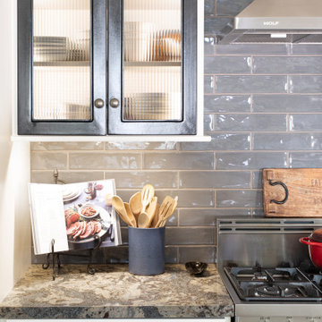
➢ the sandy colors of the Langdon Cambria countertops. The swirling pattern and sparkling quartz pieces remind the homeowner of black-and-tan sandy beaches
➢ the striped banquet seating whose creamy white background and blue-green stripes were the inspiration for the cabinet and wall colors.
➢ All the interior doors were painted black to coordinate with the blacks and grays in the backsplash tile and countertop. This also adds a hint of tailored formality to an otherwise casual space.
➢ the use of WAC's Oculux small aperture LED units for the overhead lighting complimented with Diode LED strips for task lighting under the cabinets and inside the pantry and glass wall cabinets. All of the lighting applications are on separate dimmer switches.
Innovative uses of materials or construction methods by Realty Restoration LLC:
➢ Each 1-1/2” x 3” block of reclaimed end-grain black walnut that makes up the center island chopping block was hand milled and built in the shop. It was designed to look substantial and proportional to the surrounding elements, executed by creating the 4 inch tall top with a solid wood chamfered edge band.
➢ The metal doors on either side of the vent hood were also custom designed for this project and built in the Realty Restoration LLC shop. They are made 1x2, 11-gauge mild steel with ribbed glass. Weighing 60 lbs a piece, heavy duty cabinet hinges were added to support the weight of the door and keep them from sagging.
➢ Under-cabinet receptacles were added along the range wall in order to have a clean, uninterrupted backsplash.
Design obstacles to overcome:
➢ Because we were removing the demising walls between the kitchen and living room, we had to find a way to plumb and vent the new island. We did this by tunneling through the slab (the slab had post tension cables which prevented us from just trenching) to run a new wet vent through a nearby structural wall. We pulled the existing hot and cold lines between upper floor joists and ran them down the structural wall as well and up through a conduit in the tunnel.
➢ Since we were converting from wall overs to a gas range it allowed us to utilize the 220 feed for the wall ovens to provide a new sub panel for all the new kitchen circuits
➢ Due to framing deficiencies inherited from the original build there was a 1-1/2” differential in the floor-to-ceiling height over a 20 foot span; by utilizing the process of cutting and furring coupled with the crown moulding details on the cabinet elevations we were able to mask the problem and provide seamless transitions between the cabinet components.
Evidence of superior craftsmanship:
➢ uniquely designed, one-of-a-kind metal “X” end panels on the large island. The end panels were custom made in the Realty Restoration LLC shop and fitted to the exact dimensions of the island. The welding seams are completely indistinguishable - the posts look like they are cut from a single sheet of metal
➢ square metal posts on the small island were also custom made and designed to compliment and carry through the metal element s throughout the kitchen
➢ the beautiful, oversized end panels on the pantry cabinets which give the breakfast nook a tailored look
➢ integrating a large format 5 piece Versailles tile pattern to seamlessly flow from the existing spaces into the new kitchen space
➢ By constructing a custom cabinet that jogged around a corner we could not remodel (housing the entry way coat closet) we were able to camouflage the adjacent wall offset within the upper and lower cabinets. By designing around the existing jog in the structural walls we accomplished a few things: we were able to find the space to house, and hide, the microwave and toaster oven yet still have a clean cohesive appearance from the kitchen side. Additionally, the owners were able to keep their much needed coat closet and we didn’t have to increase the budget with unnecessary structural work.
Find the right local pro for your project

 Five Star Tree Care
One frustrating thing about tree infections and diseases is that they are virtually completely unpredictable. It is essential to understand all the different types of risks and causes that can contribute to these issues in an attempt to understand how you can try and prevent and manage these things when they happen. Five Star Tree Services is going to go over the reasons as to how and why your trees can develop these certain issues.
Since there are so many different causes behind why a tree’s development might be interrupted, first think of them as two different categories you can split them into; non-living factors or abiotic, and living factors or biotic. We also want to note that it is possible for more than one factor to affect a tree’s health and development at any given time.
You can also make a distinction between primary pests and secondary pests. The primary pests exert a serious influence on the tree’s immediate survival. Whereas secondary pests have a less significant influence on the survival of the tree. The only time they will jeopardize a tree’s survival is if the tree has a previous debilitating issue from another risk factor.
For an individual tree’s circumstances, this will distinct the chances of an infestation, especially if it has any past debilitating issues. Which can be seen from any compromising management practices or pre-existing issues which affect the tree’s development as well as lower its resistance to infections.
Poor management in planting is a very common predisposed factor that compromises a tree’s infection defense. For instance, any saplings that are pot-bound will not get to develop solid root systems which doesn’t allow them to develop properly when they eventually get planted. Another example is when a tree gets stressed, along with other outer factors, will have significant effects on the overall wellbeing of the tree and its condition. Other factors to consider are bad soil quality as well as bad drainage.
Abiotic Non-Living Influences
The overall health of a tree can be linked to impacts such as bad growing conditions and bad soil quality. These things will put trees at a higher risk for catching a number of different biotic issues. Sickness, infections, and infestation can all be linked to ineffective nutrient absorption when a tree has insufficiently developed its natural resistances and defenses. One of the worst factors for this is fire damage. It is so debilitating that it makes trees hopeless at defending themselves against biotic attacks.
To uncover what circumstantial predispositions your tree might have due to poor developmental conditions, arborists can use the growth rings as a means of assessment for the long-term effects, wellbeing, and growth of a tree.
There are many outer and non-living variables that will influence the health of a tree and if it will be predisposed to biotic infestations. Such variables can include things like extensive cold winters and long dry spells.
Abiotic Common Influences Include:
-Water
-Chemicals
-Soil Conditions
-Weather
-Mechanical Agents
Biotic Living Influences
Sometimes, you are able to notice certain infestations easily, while others can be hard to tell. For instance, seeing an insect on a tree is no cause for alarm. A lot of them are harmless to the tree and do not cause harm while they regularly feed. However, some insects are actually harmful to a tree’s survival and knowing the difference between harmless and harmful ones is what you need to notice.
You might also see fungi on rotting matter or a dead tree. Fungi are not usually the immediate influence of a negative manifestation found in a tree’s development. There are other growths that can be seen living on trees. These include saprobic and pathogenic organisms. Saprobic growths are mostly found on rotting or dead tissues and pathogenic growths are less common. Some other living infestations include lichens, epiphytes, and mosses. But these don’t usually have any effect on a tree’s wellbeing. They live symbiotically together.
Biotic Common Influences Include:
-Mites
-Deer and Rodents
-Fungi
-Weeds
-Viruses
-Parasitic Plants
-Bacteria
-Phytoplasmas
-Insects
How Five Star Tree Service Can Help
It is important to know the basics to look out for when trying to prevent developmental issues or help a tree that is developing. There are a lot of factors to take into consideration when helping a tree grow, flourish, and live a healthy long life. If you have any questions or concerns about your trees, contact us at Five Star Tree Services today at (416) 990-3355. We will be able to help you with all your tree related needs. Check out our website for a full list of our Tree Services in Toronto!

 Inglenook Energy Center
The Denver area’s best fireplace store is just a short drive from downtown Denver, right in the heart of Conifer CO. We have over 40 burning displays spread throughout our expansive 3,000 sq ft showroom area. Spanning 5 full rooms, our Denver area hearth store showcases some of the best brands in the industry including a wide selection of fireplaces, fireplace inserts, wood stoves, gas stoves, pellet stoves, gas fireplaces, gas log sets, electric fireplaces, fire pits, outdoor fireplaces and more!
Beyond just fireplaces & heating stoves, we also stock a great supply of hearth accessories, including hearth pads, tool sets, fireplace doors, grates, screens, wood holders, ash buckets, and much more. Homeowners & Contractors alike turn to us for all of their hearth and heating needs, including chimney venting pipe, like Class A Chimney, Direct Vents, Pellet Vents, and other chimney systems.
At Inglenook Energy Center, you can count on full service customer care from the moment you walk in the door. Our trained & knowledgeable experts can help you select the perfect fireplace, stove, or insert for your needs then set up installation with our trusted group of licensed independent sub-contractors. We also have a fireplace & stove parts department that can help with all of your fireplace & stove repairs and maintenance needs, too.
We only carry & offer quality products from top name brands & manufacturers so our customers will get the most out of their new heating unit. Stop by our showroom and store today to view your favorite models side by side and get inspired to design & build a beautiful new hearth area, whether that is indoors or outdoors.
 SUPERIOR CHIMNEY SERVICES CORPORATION
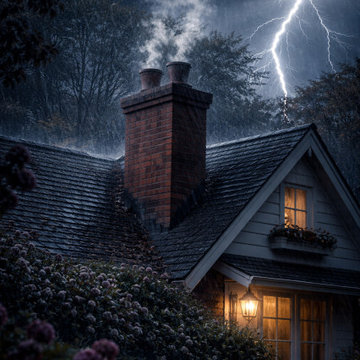
Winter is always tough on your home. This past winter was no picnic with the snow and cold. By the time spring (really) arrives, your chimney has put up with months of freezing temperatures, snow, ice, and the constant freeze-thaw cycle that quietly does damage you can't always see from the outside. That's why a spring chimney inspection isn't just a good idea, it’s essential to have your chimney checked before storm season begins. Here’s why:
Water Is Your Chimney's Worst Enemy
Here's something that most homeowners don’t know: chimney leaks cause more damage to masonry chimneys than fire does. Think about that a moment. While everyone worries about creosote and chimney fires — and rightfully so — water is silently doing just as much, if not more, damage.
Unlike the rest of your home, which is sheltered by your roof and eaves, your chimney stands fully exposed above the roofline. It takes on rain, wind, snow, and every freeze-thaw cycle winter throws at it, all while absorbing moisture into its porous masonry materials. That water expands and contracts, causing cracks, structural stress, and integrity loss that accumulates over time. The worst part? Chimney leaks are often subtle and slow-moving. By the time you notice water damage inside your home, the problem has usually become more serious, and expensive.
What a Spring Inspection Actually Catches
A professional spring chimney inspection, such as Superior Chimney’s, goes well beyond a quick visual check. A CSIA Certified Chimney Sweep technician will evaluate your entire system — inside and out — looking for the most common sources of chimney leaks and damage, including cracked chimney crowns, deteriorated brick and mortar joints, damaged or missing chimney caps, faulty chimney flashing and roof leaks, chimney slab gaps, and flue gas condensation from improperly sized chimney liners.
Any one of these issues left without a proper inspection, heads into spring storm season is an open invitation for water damage. And as Superior Chimney has discussed, masonry water damage is a progressive problem — the longer it goes unrepaired, the costlier the fix becomes.
What You Can Do Right Now
The good news is that most chimney water damage is preventable. The key steps are:
• have a professional-grade chimney cap installed if you don't already have one
• repair or replace a damaged chimney crown
• address any deteriorated brick and mortar
• fix leaky flashing and
• consider having your chimney professionally waterproofed. Waterproofing alone can save you significantly on future repair costs.
What’s Next?
Superior Chimney always includes a free 14-Point Certified Written Inspection with photo documentation via email with every chimney sweep. This helps you to know exactly what condition your chimney is in and what, if anything, needs attention.
Don't wait, have your chimney checked before storm season begins to reveal a problem that's been building all winter.
Schedule your inspection today at 877-244-6349.

 Christiano Homes, Inc.
Landscape/exterior design - Molly Wood Garden Design
Design - Mindy Gayer Design
Photo - Lane Dittoe
Patio - coastal patio idea in Orange County
Patio - coastal patio idea in Orange County
 Twelve Stones Designs, LLC
The owners of this kitchen had spent the money to upgrade the finishes in their kitchen upon building the home 12 years ago, but after living in the space for several years they realized how nonfunctional the layout really was. The (then) two preschool aged children had grown into busy, hungry teenagers with many friends who also liked to hang out at the house. So the family needed a more functional kitchen with better traffic flow, space for daily activities revolving around the kitchen at different times of day, and a kitchen that could accommodate cooking for and serving large groups. Furthermore, the dark, traditional finishes no longer reflected the homeowners’ style. They requested a brighter, more relaxed, coastal style that reflected their love of the seaside cities they like to visit.
Originally, the kitchen was U-shaped with a narrow island in the middle. The island created narrow aisles that bottle-necked at the dishwasher, refrigerator, and cooktop areas. There was a pass-through from the foyer into the kitchen, but the owners never liked that the pass-through was also located so close to the powder room. The awkward proximity was unappealing and made guests feel uncomfortable.
The kitchen’s storage was made up of lots of narrow cabinets, apothecary drawers, clipped corner units, and very few drawers. It lacked useful storage for the larger items the family used on a daily basis. And the kitchen’s only pantry was small closet that had only builder-grade, narrow shelving with no illumination to be able to see the contents inside.
Overall, the kitchen’s lighting plan was poorly executed. Only six recessed cans illuminated the entire kitchen and nook areas. The under cabinet lighting was not evenly distributed either. In fact, the builder had mis-placed the under cabinet lighting around the decorative pilasters which made for choppy, dark cubbies. Further, the builder didn’t include any lighting over the sink or the bar area, which meant whoever was doing the dishes was always in their own shadow. That, coupled with the steep overhang of the game room above made the bar area feel like a dim, cavernous space that wasn’t inviting or task oriented. The kitchen looked out into the main living space, but the raised bar and a narrow wall (which held the only large cabinet in the kitchen) created more of a barrier than a relationship to the living room or breakfast nook. In fact, one couldn’t even see the breakfast nook from the cooktop or sink areas due to its orientation. The raised bar top was too narrow to comfortably sit to either dine at or chat from due to the lack of knee space. The the homeowners confided that the kitchen felt more like a dark, dirty prison than place where the family, or their guests, wanted to gather and commune.
The clients' needs and desires were:
➢ to create a kitchen that would be a space the family loved to be in; to relate to the adjacent spaces all around, and to have better flow for entertaining large groups
➢ to remove the walls between the breakfast nook and living area and to be able to utilize the natural light from the windows in both those areas
➢ to incorporate a functional chopping block for prepping fresh food for home cooked meals, an island with a large sink and drain board, 2 pull out trash cans, and seating for at least the 2 teens to eat or do homework
➢ to design a kitchen and breakfast nook with an airy, coastal, relaxed vibe that blended with the rest of the house's coastal theme
➢ to integrate a layered lighting plan which would include ample general illumination, specific task lighting, decorative lighting, and lots of illuminated storage
➢ to design a kitchen with not only more storage for all the husband’s kitchen gadgets and collection of oils and spices, but smart storage, including a coffee/breakfast bar and a place to store and conceal the toaster oven and microwave
➢ to find a way to utilize the large open space between the kitchen, pantry area, and breakfast nook
Twelve Stones Designs achieved the owner's goals by:
➢ removing the walls between the kitchen and living room to allow the natural light to filter in from the adjacent rooms and to create a connection between the kitchen, nook, and living spaces for a sense of unity and communion
➢ removing the existing pantry and designing 3 large pantry style cabinets with LED tape lights and rollout drawers to house lots of kitchen appliances, gadgets, and tons of groceries. We also took the cabinets all the way up to the 9’ ceiling for additional storage for seasonal items and bulk storage.
➢ designing 2 islands - 1 with a gorgeous black walnut chopping block that houses a drawer for chopping and carving knives and a custom double pull out trash unit for point of use utilization - and 1 that houses the dishwasher, a large Blanco Gourmet sink with integrated drain board, woven baskets for fresh root vegetables and kitchen towels, plenty of drawer storage for kitchen items, and bar seating for up to 4 diners.
➢ closing off the space between the kitchen and the powder room to create a beautiful new private alcove for the powder room as well as adding some decorative storage. This also gave us space to include more tall storage near the new range for precision placement of the husband’s extensive oil and spice collection as well as a location for a combo-steam oven the wife wanted for baking and cooking healthy meals.
The project is enhanced functionally by:
➢ incorporated USB and standard receptacles for the kids’ laptops and phone charging in the large island
➢ designing the small island to include additional open shelving for items used on a daily basis such as a variety of bowls, plates, and colanders. This set up also works well for the husband who prefers to “plate” his dinners in restaurant-style fashion before presenting them to the table.
➢ the integration of specific storage units, such as double stacked cutlery drawers, a custom spice pull-out, a Kuerig coffee and tea pod drawer, and custom double stacked utensil drawers
➢ moving the refrigerator to the old oven location - this eliminated the bottle neck as well as created a better relationship to the eating table. It also utilizes the floor space between the pantry, nook, and kitchen
➢ creating a banquet style breakfast nook - this banquette seating not only doubles the amount of seating for large gatherings but it better utilizes the odd space between the kitchen and the previous nook area. It also helps to create a distinct pathway from the mudroom room through the pantry area, kitchen, nook, and living room.
➢ the coffee/breakfast bar area which includes the perfect location for the concealed microwave and toaster oven, convenient storage for the coffee pods and tea accoutrements. Roll-out drawers below also house the smoothie maker, hot water kettle, and a plethora of smoothie-making ingredients such as protein powders, smoothie additives, etc. Furthermore, the drawers below the Keurig house measuring utensil, cutlery, baking supplies and tupperware storage.
➢ incorporating lots of wide drawers and pullouts to accommodate large cookware.
➢ utilizing as much vertical space as possible by building storage to the ceiling which accommodates the family’s abundant amount of serving platters, baking sheets, bakeware, casserole dishes, and additional cutting boards.
The project is enhanced aesthetically by:
➢ new 5-piece Versailles pattern porcelain tile that now seamlessly joins the entire down stairs area together creating a bright, cohesiveness feeling instead of choppy separated spaces - it also adds a coastal feeling
➢ designing a cabinet to conceal the microwave and toaster oven
➢ the coastal influenced light fixtures over the nook table and island
➢ the sandy colors of the Langdon Cambria countertops. The swirling pattern and sparkling quartz pieces remind the homeowner of black-and-tan sandy beaches
➢ the striped banquet seating whose creamy white background and blue-green stripes were the inspiration for the cabinet and wall colors.
➢ All the interior doors were painted black to coordinate with the blacks and grays in the backsplash tile and countertop. This also adds a hint of tailored formality to an otherwise casual space.
➢ the use of WAC's Oculux small aperture LED units for the overhead lighting complimented with Diode LED strips for task lighting under the cabinets and inside the pantry and glass wall cabinets. All of the lighting applications are on separate dimmer switches.
Innovative uses of materials or construction methods by Realty Restoration LLC:
➢ Each 1-1/2” x 3” block of reclaimed end-grain black walnut that makes up the center island chopping block was hand milled and built in the shop. It was designed to look substantial and proportional to the surrounding elements, executed by creating the 4 inch tall top with a solid wood chamfered edge band.
➢ The metal doors on either side of the vent hood were also custom designed for this project and built in the Realty Restoration LLC shop. They are made 1x2, 11-gauge mild steel with ribbed glass. Weighing 60 lbs a piece, heavy duty cabinet hinges were added to support the weight of the door and keep them from sagging.
➢ Under-cabinet receptacles were added along the range wall in order to have a clean, uninterrupted backsplash.
Design obstacles to overcome:
➢ Because we were removing the demising walls between the kitchen and living room, we had to find a way to plumb and vent the new island. We did this by tunneling through the slab (the slab had post tension cables which prevented us from just trenching) to run a new wet vent through a nearby structural wall. We pulled the existing hot and cold lines between upper floor joists and ran them down the structural wall as well and up through a conduit in the tunnel.
➢ Since we were converting from wall overs to a gas range it allowed us to utilize the 220 feed for the wall ovens to provide a new sub panel for all the new kitchen circuits
➢ Due to framing deficiencies inherited from the original build there was a 1-1/2” differential in the floor-to-ceiling height over a 20 foot span; by utilizing the process of cutting and furring coupled with the crown moulding details on the cabinet elevations we were able to mask the problem and provide seamless transitions between the cabinet components.
Evidence of superior craftsmanship:
➢ uniquely designed, one-of-a-kind metal “X” end panels on the large island. The end panels were custom made in the Realty Restoration LLC shop and fitted to the exact dimensions of the island. The welding seams are completely indistinguishable - the posts look like they are cut from a single sheet of metal
➢ square metal posts on the small island were also custom made and designed to compliment and carry through the metal element s throughout the kitchen
➢ the beautiful, oversized end panels on the pantry cabinets which give the breakfast nook a tailored look
➢ integrating a large format 5 piece Versailles tile pattern to seamlessly flow from the existing spaces into the new kitchen space
➢ By constructing a custom cabinet that jogged around a corner we could not remodel (housing the entry way coat closet) we were able to camouflage the adjacent wall offset within the upper and lower cabinets. By designing around the existing jog in the structural walls we accomplished a few things: we were able to find the space to house, and hide, the microwave and toaster oven yet still have a clean cohesive appearance from the kitchen side. Additionally, the owners were able to keep their much needed coat closet and we didn’t have to increase the budget with unnecessary structural work.
 Neumann & Rudy Architecture
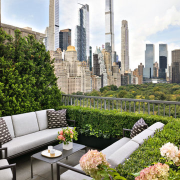
**Paragraph 1: Spatial Composition & Architectural Volume**
This terrace operates as an outdoor room in the fullest architectural sense — a compressed foreground plane opening onto one of the most consequential borrowed landscapes in the world. The composition is organized along a strong diagonal: an L-shaped seating arrangement anchors the lower left and right quadrants, its low-slung horizontality deliberately calibrated to sit beneath the sightline of the parapet rail so that the vista remains uninterrupted from a seated position. The spatial logic is one of layered thresholds. First, the intimate zone of the furniture group; second, the clipped boxwood hedge set within a matte-dark planter, functioning as a green datum line and soft balustrade; third, the slender vertical picket railing, whose rhythmic cadence reads as a fine-grained screen rather than a barrier; and finally the middle-ground canopy of Central Park and the distant supergraphic of the Billionaires' Row skyline. To the left, a mature juniper mass performs as a living pilaster, terminating the composition and screening the adjacent stone masonry wall — a rough-hewn ashlar remnant of the prewar building envelope that grounds the scheme in its architectural provenance. The stepped stone paving and the raked geometry of the railing as it descends to the right introduce a subtle asymmetry, preventing the picturesque from becoming static.
**Paragraph 2: Materiality, Color & Texture**
The material palette is disciplined to the point of austerity, precisely so the horticulture and the skyline may carry the chromatic load. Powder-coated aluminum in a deep graphite-bronze forms the furniture armature — slender, squared-section framing with an almost Miesian restraint — paired with performance-grade upholstery in a warm dove grey whose greige undertone reads neither cold nor sallow against the surrounding foliage. The single decorative gesture, ikat-patterned scatter cushions in charcoal and ecru, introduces a hand-loomed irregularity that humanizes the machined frames. Underfoot, large-format bluestone or cast-stone pavers in a cool grey provide a matte, granular ground plane, echoed in the honed surface of the low cocktail table. Against this monochrome scaffolding, the botanical register supplies saturation: the dense, glossy, small-leaf texture of the boxwood; the feathery, blue-green needling of the juniper; trailing ivy softening the planter edge; and, in the near foreground, the blowsy, dessicating panicles of hydrangea in blush, sage and antique rose. A ceramic vessel of coral-and-butter garden roses and a pair of banded stoneware cups on a rimmed tray introduce warm terracotta accents — small, deliberate points of chromatic heat within an otherwise tonal field.
**Paragraph 3: Lighting, Atmosphere & Style Profile**
The scheme is lit almost entirely by ambient, high-latitude daylight, diffused through a stratus-laced sky that acts as an enormous softbox. The result is shadowless modeling: the upholstery reads as luminous rather than glaring, the foliage retains full chromatic depth without specular hotspots, and the pale limestone and glass towers beyond are rendered in atmospheric perspective, receding into a silvered haze. No artificial fixtures assert themselves in the frame — a confident editorial choice that keeps the scheme legible as a daytime sanctuary and defers entirely to the natural theatre of the site. The prevailing mood is one of cultivated repose: urbane but unhurried, private without being hermetic. Stylistically, the project synthesizes into what might be termed **Refined Metropolitan Naturalism** — a hybrid of Soft Minimalism's tonal restraint and reductive geometry with the structured horticultural formality of a classical English terrace garden. The vocabulary is contemporary and materially honest, yet it observes the compositional manners of the prewar building it inhabits, treating the skyline not as backdrop but as the primary work of art around which the entire interior architecture of the terrace has been quietly framed.
 Tile Doctor Ltd
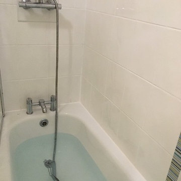
A client with a high-rise apartment in Manchester city centre contacted us in relation to the look of their bathroom tiles. The grout had become grubby and black with mould and it was clear from their message that they were considering have the grout replaced in order to freshen up the bathroom.
We discussed the problem over the telephone, and they emailed a picture of the bathroom across so I could get a better idea of what needed doing. It turns out that the apartment had been rented out previously and they needed the bathroom renovating so they could start letting it again. Clearly, they were keen to have the work completed as soon as possible. Fortunately, we are sometimes able to come out on short notice, especially for small jobs like this and so were able to do the work the following week
Re-grouting is a lot of work and very time consuming so I explained the benefits of Grout Colouring which is much quicker and results in a more practical finish as I will explain. There was a small issue with parking as one would expect from the city centre, but we were able to use one of the parking spaces of a neighbour in the basement of the building.
My first task was to get the grout as clean as possible before applying the colourant and given the amount of mould I decided to apply Tile Doctor Duo-Clean which is a Tile Cleaner/Mould Remover and ideal for use on ceramic tile and grout. The product was sprayed onto the tiles and grout and then scrubbed in by hand to get the grout as clean as possible. I also used a powerful steam cleaner to get the grout as clean as possible before rinsing the soil off with water. This process went well, and the grout looked much cleaner afterwards but was now a little patchy in places due to deep staining.
It’s worth noting that mould thrives in damp warm conditions and can easily be controlled by ensuring the bathroom has adequate ventilation. Some modern showers have a function that cool the bathroom down after use by running the shower on a cold setting. Improving cross-ventilation by leaving the bathroom door and a window open can also improve the situation and of course you can always apply Tile Doctor Duo-Clean on a regular basis.
Once the grout was dry and as clean as it could be, I applied a White Tile Doctor Grout Colourant along the grout lines with a small brush taking care to wipe off any excess from the tiles as I went. Only one bottle of colourant was needed, and I have found baby wipes work well when wiping off the excess.
The last step in the bathroom renovation was to strip out all the old mouldy silicone between the bath and the tiles and replace with new mould resistant silicone.
The cleaning and grout colour completely transformed the look of the bathroom leaving it looking fresh. The grout which was previously dark and patchy was now a consistent white colour giving the impression it had only been recently tiled. The colourant also forms an epoxy barrier over the grout that will prevent dirt from becoming ingrained in the grouts surface going forward, it’s also much easier to clean.
The customer was most impressed with the result and has informed us since that they will back in touch about renovating the grout in their own home! They left the following comment on the Tile Doctor website.
“Kamila made a wonderful job cleaning my grout and silicone. The bathroom looks like new. She was also easy to deal, very friendly and professional. Thank you!”
Alex Logozny
Greater Manchester Tile Doctor
 European Home
Everywhere we look, we’re surrounded by structures and designs that captivate and draw us in, allowing us to truly appreciate the art of modern architecture.
I was very excited to receive a couple of beautiful installation images of our H Series vent-free gas fireplace from Matt Brazeau of Stove King, which operates in Putnam, CT, and Medford, MA. The images show a stunning living room that features large sliding doors and an open layout to the kitchen. What caught my eye was the detailed woodwork and the choice of wall color – I know “dark and moody” is trending but seeing it in a Boston multi-family and done so well, I was captivated and wanted to learn more.
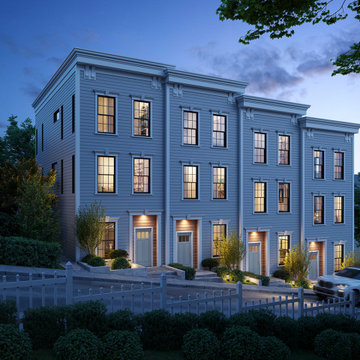
Developer Marc Savatsky, owner of Choose Boston, LLC, a multi-function development and real estate company, was behind this project. Marc’s company works throughout Boston and surrounding suburbs to redevelop and market multi-unit properties. Situated in Dorchester’s Neponset section, the property comprises four townhomes styled in a classic federalist design, paying homage to the rich history of the area. Remarkably, all units were spoken for during construction, which reflects a perfect alignment with what buyers are looking for, which is not common at all.
Collaborating with Architects and Partners
Working with architect Peter Vanko of Vanko Studio and Marc’s spouse and partner, Jessie Franco, the group designed this inviting and sought after living space. Warm and welcoming, with an open and inviting feel, unique building materials, lots of natural light and outdoor living spaces were on the list for what they felt would provide the right character for this property. Elements such as fluted wood were chosen to add visual interest, while the darker palette around the fireplace contributed to the overall aesthetic appeal.
The project faced significant challenges with the sloping terrain because Marc had not expected the need for so many retaining walls. But, once they were designed and put in, the challenge turned to charm and provided the landscaping with additional character.
Overcoming Development Challenges
Addressing the Sloping Land
Besides the sloping terrain, another major challenge was adding gas fireplaces into each unit. Due to building constraints preventing traditional venting, the fireplaces were as tricky as the retaining walls. It was important to Marc and Jessie to include fireplaces in these units. They felt that fireplaces provide a beautiful focal point and with the cold months Boston experiences, they would make the units so much more welcoming.
After consulting with Matt Brazeau, the choice became clear: the European Home H Series Vent-Free Natural Gas Fireplace. Vent free gas fireplaces are safe alternatives to direct vent fireplaces. They solve the challenge of where to run the venting and provide the living space with a real flame, heat efficiency (99%) and with the H Series, a very clean, European design. The H Series installs similarly to a gas stove – connected to gas and built with an outer body to insulate it from combustibles. It is an easy choice when gas is the preferred type of fuel and venting is difficult or the budget does not allow for the additional space, time, and cost of venting. Vent-free gas fireplaces have been allowed in Massachusetts for 20 years (since 2004) due to their safety, efficiency and practicality.
Marc Savatsky: The Developer’s Background
From New Jersey to Boston: A Passion for Building
Marc grew up in New Jersey and received a construction management degree from Purdue. As the chair of the housing committee on Mayor Walsh’s young advisory council, his love for Boston and building came together. Immersed in the dynamic environment of Boston, he discovered his passion for the city and appreciation of the architectural legacy. Suffolk Construction provided Marc with his formative, early years in the construction business. Over time he honed his skill and knowledge of the construction industry.
Having Marc as a developer who values the essence of local history and architecture adds a distinctive touch to his endeavors. It reflects not only a commitment to excellence in construction but also a dedication to harmonizing modern development with the rich tapestry of Boston’s past.
 Five Star Tree Care
A tree has many parts, all of which contribute to its overall health. Just like the human body, each part of the tree works together to ensure the tree’s survival. There are a few important elements that trees and other plants need to live; these include carbon dioxide, water, sunlight, and food. A tree that has been planted in a nourishing environment and that has quality soil for its roots will grow tall, strong, and healthy. Trees that are planted in an urban environment such as on someone’s personal property need regular maintenance to thrive.
The arborists here at Five Star Tree Services are happy to provide residential and commercial tree care services, including pruning and removal. We help trees stay healthy by getting rid of dead branches, trimming overgrown leaves to prevent them from infringing on power lines and much more. Aside from regular care, homeowners should pay particular attention to the roots of the tree, and here’s why.
Why Trees Have Roots
The roots are what hold the tree in place as well as used to absorb essential nutrients from the surrounding soil. Furthermore, water is also absorbed by the roots, which is critical for the tree’s survival. The majority of the roots of a tree are located between six inches and one foot underground. While they may be shallow going down, they extend very far horizontally, even surpassing the canopy of the tree. If a tree didn’t have roots, then it would not be able to stand or withstand harsh weather.
Allow The Roots to Breathe
The roots of your tree need to be protected, but they also need plenty of oxygen in order for your tree to thrive. Drying out the soil under your tree will allow oxygen to reach the area. Instead of watering your tree on a daily basis, choose a schedule that keeps the tree hydrated but allows the soil to rest. Packing the soil around the tree too tight will also limit the airflow which may suffocate surface roots.
Watering
Trees constantly require water regardless of their age. Trees need to be watered on a regular schedule, especially during dry seasons or drought. Ample watering will boost tree growth and maintain tree health.
Don’t Cut Them
Cutting the roots of a tree not only limits its ability to nourish itself, but it can also leave it open to attacks. Bacteria, insects, and viruses are more prone to strike a tree with a weak root system than one with a sturdy one. Cutting will also place stress on the tree which may stunt its growth for several years. Depending on the severity of the cut, severed roots may even cause the death of your tree.
Invest in Mulch
Mulch is a material placed around the bottom of a tree. It is fully organic and is intended to give the roots extra protection while also providing nutrients for your tree. Mulch should be placed around the base of a tree in the spring in order to promote new growth. An additional layer should be added in the winter to provide a buffer from the cold.
Tree Care by Five Star Tree Services
If you are worried about the health of your tree Five Star Tree Services is here to help. We offer Toronto Tree Care Services, storm damage, regular maintenance, affordable tree removal, pruning and planting services all over the metro area. If you are interested in boosting the aesthetic value of your property, or just maintaining your tree’s health, give us a call at (416) 990-3355 today.
 Xpand Inc. | Homes of Xcellence
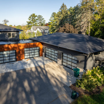
At the outset, this project began with the transformation of a 2-car attached garage. The goal was to create a mudroom, an exercise room, and a breezeway to seamlessly connect the spacious detached garage with the main part of the house. Additionally, the project involved partial roof removal and the addition of a new front entry.
But then came an unexpected twist – scope creep.
We found ourselves veering away from the initial client-supplied architectural plans. After numerous consultations with the clients and several iterations of the design, we arrived at a significantly improved plan for the remodel and addition.
Our journey commenced with the demolition of almost the entire former 2-car garage, making space for a new, oversized 3-car garage measuring 40′ x 28′. This garage was strategically placed between the existing house and the large detached garage. We introduced a custom low-sloped flat roof, designed to address historical drainage issues.
To mitigate water pooling, we created a custom concrete step at the back corner of the garage, equipped with a sturdy metal grate that sits flush with the step. We also installed a PVC drainage system, commencing at the step and running beneath a newly designed patio, ultimately draining into the yard. These measures have significantly reduced water accumulation around the house.
The new garage boasts several features, including Longboard aluminum siding, custom full glass garage doors, interior drywall finished to a level 4, an abundance of can lights, an epoxy floor coating, vinyl base trim, a new forced air garage heater, and more.
The clients also requested a designated space for their three kids and their friends to enjoy, thus giving birth to the “Kid Zone.” We partitioned a section of the existing oversized garage, resulting in a space measuring approximately 22′ x 32′, brimming with entertainment possibilities. To enhance control over the temperature in the Kid Zone, we collaborated with our licensed HVAC partner to install a cold weather mini-split system.
One of the most significant challenges was the modernization and consolidation of the home’s main electrical systems. We reconfigured and combined 6-7 different electrical panels into just two. One panel serves the main house, while the second is dedicated to backup power from a generator. These panels, along with the boiler for the in-floor heating system, are housed in a newly constructed mechanical room within the Kid Zone.
Inside the main house, we completed various tasks, such as removing the ceiling in the hallway from the new garage to address prior water damage, improve insulation, and rework electrical and HVAC systems. We also replaced the ceiling from the front door to the base of the stairs, adding new can lighting and enhancing insulation. Skilled drywall specialists then installed and finished new drywall to a level 5 standard.
The exterior of the house underwent a complete overhaul. Before installing new roofing on the entire house and garage, we modified an existing flat roof by adding custom lumber and plywood to enhance the pitch, preventing future ice dams. A new rubber roof was expertly installed on the oversized 3-car garage, and the flat roof section we re-framed.
Our meticulous exterior team removed old white aluminum soffit, fascia, and gutters, replacing them with new framing to accommodate Longboard soffit material. This task was particularly challenging due to the age of the house and the non-standard wall and roof framing. Our skilled exterior subcontractors ensured a perfect fit.
Near the pool area, we discovered severe rot and decay from years of water intrusion. After informing the homeowners, we ordered and installed five new commercial-style block framed windows and a custom 8′ high Anderson patio door. This involved careful removal and replacement of window headers from the outside to avoid disturbing the finished part of the house. We reframed the large openings to fit the new windows, and our skilled trim carpenters installed new walnut casing, base, and window sills.
In total, we replaced around 900 lineal feet of soffit and installed approximately 32 squares of aluminum siding. The entire house was meticulously prepped, repaired, and painted according to the client’s chosen color.
Throughout the project, we incorporated numerous custom touches and unique design elements, some of which you can see in the pictures. Our team also addressed various unforeseen challenges, from soil issues to rot and decay repair, roof leaks, drainage problems, electrical and HVAC complexities, and much more.
At Xpand Inc., we take pride in making it all happen, turning your remodeling and renovation dreams into reality.

 GS Construction
Example of a small classic 3/4 white tile and stone tile mosaic tile floor alcove shower design in Chicago with an undermount sink, recessed-panel cabinets, black cabinets, quartzite countertops, a two-piece toilet and gray walls

 Vanessa Olsen with Tile America
Vanessa
Example of a small asian master white tile and glass tile marble floor alcove shower design in Providence with an integrated sink, flat-panel cabinets, dark wood cabinets and gray walls
Example of a small asian master white tile and glass tile marble floor alcove shower design in Providence with an integrated sink, flat-panel cabinets, dark wood cabinets and gray walls

 Boston Premier Remodeling LLC
ER Miller Design
Mid-sized transitional master dark wood floor and brown floor bedroom photo in Boston with white walls
Mid-sized transitional master dark wood floor and brown floor bedroom photo in Boston with white walls

 Jean Stoffer Design, Ltd
Stoffer Photography
Example of a small classic porcelain tile single front door design in Grand Rapids with white walls and a black front door
Example of a small classic porcelain tile single front door design in Grand Rapids with white walls and a black front door
 Neumann & Rudy Architecture
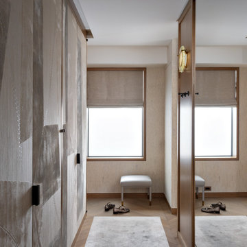
**Paragraph 1: Spatial Composition & Architectural Volume**
This dressing vestibule is an exercise in the choreography of compression and release — a narrow processional corridor that opens onto a shallow window alcove, terminating the sightline in a single, deliberately staged tableau. The plan is organized between two parallel planes of full-height joinery: at left, a monumental run of flush-faced wardrobe doors executed in bespoke decorative panelling, and at right, a mirror-clad pier whose reflective face doubles the room's apparent width and recapitulates the window, the bench, and the herringbone floor in a quiet trompe-l'oeil. The millwork is detailed with an admirable restraint — reveal-shadow gaps rather than architraves, concealed pivot hinges, and slim bronze-toned frames that read as drawn lines rather than mouldings. Overhead, a stepped soffit and recessed cornice detail lower the datum at the corridor, then release into the fuller ceiling height of the alcove; the effect is subtly perspectival, drawing the eye toward the luminous aperture. The punched window, generously reveal-deep and set within a wide oak surround, functions less as a view and more as a light well, its frosted glazing dissolving the exterior into pure illuminated field. The upholstered bench, centered beneath it and flanked casually by a pair of double-monk shoes, provides the anthropometric anchor — a note of inhabited scale that keeps the geometry from tipping into abstraction.
**Paragraph 2: Materiality, Color & Texture**
The palette operates within an exceptionally disciplined tonal register — a graduated field of oyster, greige, bone, and pale putty, all sharing a warm mineral undertone that prevents the achromatic scheme from turning cold. The hero surface is undoubtedly the wardrobe fronts: a hand-applied, gesso-like plaster or lacquered artisanal finish, its brushed and troweled passages bearing faint calligraphic incisions and pinpricked stitch-like perforations, evoking a Japanese ink study or an aged fresco fragment. Against this painterly softness, the joinery frames and window casings deliver rift-sawn oak with a fine, linear grain, while the perimeter walls are dressed in a subtly striated textile or grasscloth wallcovering punctuated by small inlaid tesserae — a low-frequency rhythm that reads as texture at distance and as craft detail at proximity. Hardware provides the scheme's only true contrast: elongated blackened-bronze pulls, rectilinear and unornamented, act as punctuation marks on the pale field. Metals are otherwise handled with restraint — satin brass sabots capping the bench legs, an unlacquered brass sconce armature — introducing warmth without glitter. Underfoot, the chevron-laid oak parquet supplies directional energy, softened by a plush viscose or silk-blend rug whose sheen shifts from pearl to shadow. The tactile logic is one of graduated softness: matte plaster against silk pile, honed timber against brushed textile, with mirror as the single hard, cool interruption.
**Paragraph 3: Lighting, Atmosphere & Style Profile**
Natural light is the primary compositional instrument here, and it has been diffused rather than admitted — the obscured glazing and half-drawn linen Roman shade convert daylight into a soft, north-facing luminous plane, evenly modelling the plaster and revealing its topography in raking gradients. This ambient wash is calibrated against a single decorative gesture: a wall-mounted sconce in alabaster or hand-formed opaline glass, its warm amber core providing the room's only chromatic accent and a welcome note of imperfection against the otherwise machined precision. Architectural lighting is entirely concealed — no downlight apertures interrupt the ceiling plane — reinforcing the sense that illumination emanates from the surfaces themselves. The resulting atmosphere is contemplative, hushed, almost sacral: a threshold space treated with the gravity of a chapel narthex. Stylistically, the project sits at the confluence of Soft Minimalism and contemporary Parisian couture interiors — the reductive planarity and monochromatic discipline of the former married to the artisanal, hand-wrought materiality and bronze detailing associated with the latter, with a distinctly Japandi sensibility in its reverence for wabi-sabi surface irregularity and asymmetric compositional balance. It is a scheme that achieves luxury not through ornament or contrast but through the sustained rigour of tonal control, the quality of the hand in its finishes, and the confidence to leave the volume largely empty.
 Twelve Stones Designs, LLC
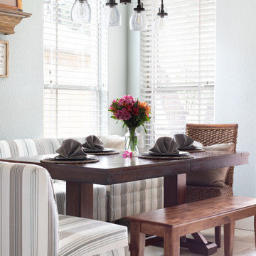
The owners of this kitchen had spent the money to upgrade the finishes in their kitchen upon building the home 12 years ago, but after living in the space for several years they realized how nonfunctional the layout really was. The (then) two preschool aged children had grown into busy, hungry teenagers with many friends who also liked to hang out at the house. So the family needed a more functional kitchen with better traffic flow, space for daily activities revolving around the kitchen at different times of day, and a kitchen that could accommodate cooking for and serving large groups. Furthermore, the dark, traditional finishes no longer reflected the homeowners’ style. They requested a brighter, more relaxed, coastal style that reflected their love of the seaside cities they like to visit.
Originally, the kitchen was U-shaped with a narrow island in the middle. The island created narrow aisles that bottle-necked at the dishwasher, refrigerator, and cooktop areas. There was a pass-through from the foyer into the kitchen, but the owners never liked that the pass-through was also located so close to the powder room. The awkward proximity was unappealing and made guests feel uncomfortable.
The kitchen’s storage was made up of lots of narrow cabinets, apothecary drawers, clipped corner units, and very few drawers. It lacked useful storage for the larger items the family used on a daily basis. And the kitchen’s only pantry was small closet that had only builder-grade, narrow shelving with no illumination to be able to see the contents inside.
Overall, the kitchen’s lighting plan was poorly executed. Only six recessed cans illuminated the entire kitchen and nook areas. The under cabinet lighting was not evenly distributed either. In fact, the builder had mis-placed the under cabinet lighting around the decorative pilasters which made for choppy, dark cubbies. Further, the builder didn’t include any lighting over the sink or the bar area, which meant whoever was doing the dishes was always in their own shadow. That, coupled with the steep overhang of the game room above made the bar area feel like a dim, cavernous space that wasn’t inviting or task oriented. The kitchen looked out into the main living space, but the raised bar and a narrow wall (which held the only large cabinet in the kitchen) created more of a barrier than a relationship to the living room or breakfast nook. In fact, one couldn’t even see the breakfast nook from the cooktop or sink areas due to its orientation. The raised bar top was too narrow to comfortably sit to either dine at or chat from due to the lack of knee space. The the homeowners confided that the kitchen felt more like a dark, dirty prison than place where the family, or their guests, wanted to gather and commune.
The clients' needs and desires were:
➢ to create a kitchen that would be a space the family loved to be in; to relate to the adjacent spaces all around, and to have better flow for entertaining large groups
➢ to remove the walls between the breakfast nook and living area and to be able to utilize the natural light from the windows in both those areas
➢ to incorporate a functional chopping block for prepping fresh food for home cooked meals, an island with a large sink and drain board, 2 pull out trash cans, and seating for at least the 2 teens to eat or do homework
➢ to design a kitchen and breakfast nook with an airy, coastal, relaxed vibe that blended with the rest of the house's coastal theme
➢ to integrate a layered lighting plan which would include ample general illumination, specific task lighting, decorative lighting, and lots of illuminated storage
➢ to design a kitchen with not only more storage for all the husband’s kitchen gadgets and collection of oils and spices, but smart storage, including a coffee/breakfast bar and a place to store and conceal the toaster oven and microwave
➢ to find a way to utilize the large open space between the kitchen, pantry area, and breakfast nook
Twelve Stones Designs achieved the owner's goals by:
➢ removing the walls between the kitchen and living room to allow the natural light to filter in from the adjacent rooms and to create a connection between the kitchen, nook, and living spaces for a sense of unity and communion
➢ removing the existing pantry and designing 3 large pantry style cabinets with LED tape lights and rollout drawers to house lots of kitchen appliances, gadgets, and tons of groceries. We also took the cabinets all the way up to the 9’ ceiling for additional storage for seasonal items and bulk storage.
➢ designing 2 islands - 1 with a gorgeous black walnut chopping block that houses a drawer for chopping and carving knives and a custom double pull out trash unit for point of use utilization - and 1 that houses the dishwasher, a large Blanco Gourmet sink with integrated drain board, woven baskets for fresh root vegetables and kitchen towels, plenty of drawer storage for kitchen items, and bar seating for up to 4 diners.
➢ closing off the space between the kitchen and the powder room to create a beautiful new private alcove for the powder room as well as adding some decorative storage. This also gave us space to include more tall storage near the new range for precision placement of the husband’s extensive oil and spice collection as well as a location for a combo-steam oven the wife wanted for baking and cooking healthy meals.
The project is enhanced functionally by:
➢ incorporated USB and standard receptacles for the kids’ laptops and phone charging in the large island
➢ designing the small island to include additional open shelving for items used on a daily basis such as a variety of bowls, plates, and colanders. This set up also works well for the husband who prefers to “plate” his dinners in restaurant-style fashion before presenting them to the table.
➢ the integration of specific storage units, such as double stacked cutlery drawers, a custom spice pull-out, a Kuerig coffee and tea pod drawer, and custom double stacked utensil drawers
➢ moving the refrigerator to the old oven location - this eliminated the bottle neck as well as created a better relationship to the eating table. It also utilizes the floor space between the pantry, nook, and kitchen
➢ creating a banquet style breakfast nook - this banquette seating not only doubles the amount of seating for large gatherings but it better utilizes the odd space between the kitchen and the previous nook area. It also helps to create a distinct pathway from the mudroom room through the pantry area, kitchen, nook, and living room.
➢ the coffee/breakfast bar area which includes the perfect location for the concealed microwave and toaster oven, convenient storage for the coffee pods and tea accoutrements. Roll-out drawers below also house the smoothie maker, hot water kettle, and a plethora of smoothie-making ingredients such as protein powders, smoothie additives, etc. Furthermore, the drawers below the Keurig house measuring utensil, cutlery, baking supplies and tupperware storage.
➢ incorporating lots of wide drawers and pullouts to accommodate large cookware.
➢ utilizing as much vertical space as possible by building storage to the ceiling which accommodates the family’s abundant amount of serving platters, baking sheets, bakeware, casserole dishes, and additional cutting boards.
The project is enhanced aesthetically by:
➢ new 5-piece Versailles pattern porcelain tile that now seamlessly joins the entire down stairs area together creating a bright, cohesiveness feeling instead of choppy separated spaces - it also adds a coastal feeling
➢ designing a cabinet to conceal the microwave and toaster oven
➢ the coastal influenced light fixtures over the nook table and island
➢ the sandy colors of the Langdon Cambria countertops. The swirling pattern and sparkling quartz pieces remind the homeowner of black-and-tan sandy beaches
➢ the striped banquet seating whose creamy white background and blue-green stripes were the inspiration for the cabinet and wall colors.
➢ All the interior doors were painted black to coordinate with the blacks and grays in the backsplash tile and countertop. This also adds a hint of tailored formality to an otherwise casual space.
➢ the use of WAC's Oculux small aperture LED units for the overhead lighting complimented with Diode LED strips for task lighting under the cabinets and inside the pantry and glass wall cabinets. All of the lighting applications are on separate dimmer switches.
Innovative uses of materials or construction methods by Realty Restoration LLC:
➢ Each 1-1/2” x 3” block of reclaimed end-grain black walnut that makes up the center island chopping block was hand milled and built in the shop. It was designed to look substantial and proportional to the surrounding elements, executed by creating the 4 inch tall top with a solid wood chamfered edge band.
➢ The metal doors on either side of the vent hood were also custom designed for this project and built in the Realty Restoration LLC shop. They are made 1x2, 11-gauge mild steel with ribbed glass. Weighing 60 lbs a piece, heavy duty cabinet hinges were added to support the weight of the door and keep them from sagging.
➢ Under-cabinet receptacles were added along the range wall in order to have a clean, uninterrupted backsplash.
Design obstacles to overcome:
➢ Because we were removing the demising walls between the kitchen and living room, we had to find a way to plumb and vent the new island. We did this by tunneling through the slab (the slab had post tension cables which prevented us from just trenching) to run a new wet vent through a nearby structural wall. We pulled the existing hot and cold lines between upper floor joists and ran them down the structural wall as well and up through a conduit in the tunnel.
➢ Since we were converting from wall overs to a gas range it allowed us to utilize the 220 feed for the wall ovens to provide a new sub panel for all the new kitchen circuits
➢ Due to framing deficiencies inherited from the original build there was a 1-1/2” differential in the floor-to-ceiling height over a 20 foot span; by utilizing the process of cutting and furring coupled with the crown moulding details on the cabinet elevations we were able to mask the problem and provide seamless transitions between the cabinet components.
Evidence of superior craftsmanship:
➢ uniquely designed, one-of-a-kind metal “X” end panels on the large island. The end panels were custom made in the Realty Restoration LLC shop and fitted to the exact dimensions of the island. The welding seams are completely indistinguishable - the posts look like they are cut from a single sheet of metal
➢ square metal posts on the small island were also custom made and designed to compliment and carry through the metal element s throughout the kitchen
➢ the beautiful, oversized end panels on the pantry cabinets which give the breakfast nook a tailored look
➢ integrating a large format 5 piece Versailles tile pattern to seamlessly flow from the existing spaces into the new kitchen space
➢ By constructing a custom cabinet that jogged around a corner we could not remodel (housing the entry way coat closet) we were able to camouflage the adjacent wall offset within the upper and lower cabinets. By designing around the existing jog in the structural walls we accomplished a few things: we were able to find the space to house, and hide, the microwave and toaster oven yet still have a clean cohesive appearance from the kitchen side. Additionally, the owners were able to keep their much needed coat closet and we didn’t have to increase the budget with unnecessary structural work.
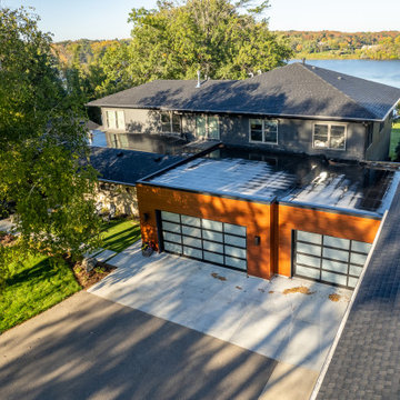 Xpand Inc. | Homes of Xcellence
At the outset, this project began with the transformation of a 2-car attached garage. The goal was to create a mudroom, an exercise room, and a breezeway to seamlessly connect the spacious detached garage with the main part of the house. Additionally, the project involved partial roof removal and the addition of a new front entry.
But then came an unexpected twist – scope creep.
We found ourselves veering away from the initial client-supplied architectural plans. After numerous consultations with the clients and several iterations of the design, we arrived at a significantly improved plan for the remodel and addition.
Our journey commenced with the demolition of almost the entire former 2-car garage, making space for a new, oversized 3-car garage measuring 40′ x 28′. This garage was strategically placed between the existing house and the large detached garage. We introduced a custom low-sloped flat roof, designed to address historical drainage issues.
To mitigate water pooling, we created a custom concrete step at the back corner of the garage, equipped with a sturdy metal grate that sits flush with the step. We also installed a PVC drainage system, commencing at the step and running beneath a newly designed patio, ultimately draining into the yard. These measures have significantly reduced water accumulation around the house.
The new garage boasts several features, including Longboard aluminum siding, custom full glass garage doors, interior drywall finished to a level 4, an abundance of can lights, an epoxy floor coating, vinyl base trim, a new forced air garage heater, and more.
The clients also requested a designated space for their three kids and their friends to enjoy, thus giving birth to the “Kid Zone.” We partitioned a section of the existing oversized garage, resulting in a space measuring approximately 22′ x 32′, brimming with entertainment possibilities. To enhance control over the temperature in the Kid Zone, we collaborated with our licensed HVAC partner to install a cold weather mini-split system.
One of the most significant challenges was the modernization and consolidation of the home’s main electrical systems. We reconfigured and combined 6-7 different electrical panels into just two. One panel serves the main house, while the second is dedicated to backup power from a generator. These panels, along with the boiler for the in-floor heating system, are housed in a newly constructed mechanical room within the Kid Zone.
Inside the main house, we completed various tasks, such as removing the ceiling in the hallway from the new garage to address prior water damage, improve insulation, and rework electrical and HVAC systems. We also replaced the ceiling from the front door to the base of the stairs, adding new can lighting and enhancing insulation. Skilled drywall specialists then installed and finished new drywall to a level 5 standard.
The exterior of the house underwent a complete overhaul. Before installing new roofing on the entire house and garage, we modified an existing flat roof by adding custom lumber and plywood to enhance the pitch, preventing future ice dams. A new rubber roof was expertly installed on the oversized 3-car garage, and the flat roof section we re-framed.
Our meticulous exterior team removed old white aluminum soffit, fascia, and gutters, replacing them with new framing to accommodate Longboard soffit material. This task was particularly challenging due to the age of the house and the non-standard wall and roof framing. Our skilled exterior subcontractors ensured a perfect fit.
Near the pool area, we discovered severe rot and decay from years of water intrusion. After informing the homeowners, we ordered and installed five new commercial-style block framed windows and a custom 8′ high Anderson patio door. This involved careful removal and replacement of window headers from the outside to avoid disturbing the finished part of the house. We reframed the large openings to fit the new windows, and our skilled trim carpenters installed new walnut casing, base, and window sills.
In total, we replaced around 900 lineal feet of soffit and installed approximately 32 squares of aluminum siding. The entire house was meticulously prepped, repaired, and painted according to the client’s chosen color.
Throughout the project, we incorporated numerous custom touches and unique design elements, some of which you can see in the pictures. Our team also addressed various unforeseen challenges, from soil issues to rot and decay repair, roof leaks, drainage problems, electrical and HVAC complexities, and much more.
At Xpand Inc., we take pride in making it all happen, turning your remodeling and renovation dreams into reality.
15