
Search results for "Primary function" in Home Design Ideas
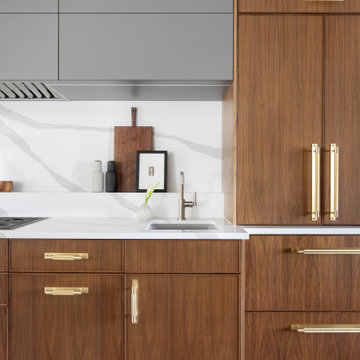
 Ashley Campbell Interior Design
Mid-sized trendy l-shaped light wood floor eat-in kitchen photo in Denver with a single-bowl sink, flat-panel cabinets, medium tone wood cabinets, quartz countertops, yellow backsplash, quartz backsplash, paneled appliances, an island and white countertops
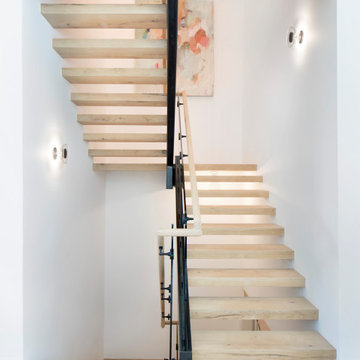
 Joe McGuire Design
In this beautiful home, our Aspen studio used a neutral palette that let natural materials shine when mixed with intentional pops of color. As long-time meditators, we love creating meditation spaces where our clients can relax and focus on renewal. In a quiet corner guest room, we paired an ultra-comfortable lounge chair in a rich aubergine with a warm earth-toned rug and a bronze Tibetan prayer bowl. We also designed a spa-like bathroom showcasing a freestanding tub and a glass-enclosed shower, made even more relaxing by a glimpse of the greenery surrounding this gorgeous home. Against a pure white background, we added a floating stair, with its open oak treads and clear glass handrails, which create a sense of spaciousness and allow light to flow between floors. The primary bedroom is designed to be super comfy but with hidden storage underneath, making it super functional, too. The room's palette is light and restful, with the contrasting black accents adding energy and the natural wood ceiling grounding the tall space.
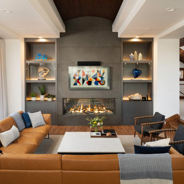
 Rodwin Architecture & Skycastle Construction
Rodwin Architecture & Skycastle Homes
Location: Boulder, Colorado, USA
Interior design, space planning and architectural details converge thoughtfully in this transformative project. A 15-year old, 9,000 sf. home with generic interior finishes and odd layout needed bold, modern, fun and highly functional transformation for a large bustling family. To redefine the soul of this home, texture and light were given primary consideration. Elegant contemporary finishes, a warm color palette and dramatic lighting defined modern style throughout. A cascading chandelier by Stone Lighting in the entry makes a strong entry statement. Walls were removed to allow the kitchen/great/dining room to become a vibrant social center. A minimalist design approach is the perfect backdrop for the diverse art collection. Yet, the home is still highly functional for the entire family. We added windows, fireplaces, water features, and extended the home out to an expansive patio and yard.
The cavernous beige basement became an entertaining mecca, with a glowing modern wine-room, full bar, media room, arcade, billiards room and professional gym.
Bathrooms were all designed with personality and craftsmanship, featuring unique tiles, floating wood vanities and striking lighting.
This project was a 50/50 collaboration between Rodwin Architecture and Kimball Modern
Find the right local pro for your project
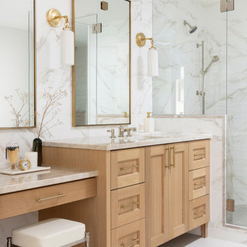
 Amy Pearson Design
APD was hired to update the kitchen, living room, primary bathroom and bedroom, and laundry room in this suburban townhome. The design brought an aesthetic that incorporated a fresh updated and current take on traditional while remaining timeless and classic. The kitchen layout moved cooking to the exterior wall providing a beautiful range and hood moment. Removing an existing peninsula and re-orienting the island orientation provided a functional floorplan while adding extra storage in the same square footage. A specific design request from the client was bar cabinetry integrated into the stair railing, and we could not be more thrilled with how it came together!
The primary bathroom experienced a major overhaul by relocating both the shower and double vanities and removing an un-used soaker tub. The design added linen storage and seated beauty vanity while expanding the shower to a luxurious size. Dimensional tile at the shower accent wall relates to the dimensional tile at the kitchen backsplash without matching the two spaces to each other while tones of cream, taupe, and warm woods with touches of gray are a cohesive thread throughout.
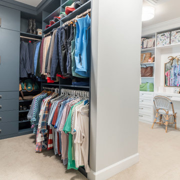
 The Tailored Closet & PremierGarage of Greater DC
This twin set of primary closets are the perfect spot for our Leesburg clients to store their personal belongings. Not only are they practical and functional in design, they also feature jewelry drawers and tilt-out laundry hampers for example, both of which provide a ease of use on a regular basis.
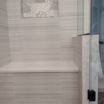
 Gabriela Matuchova, CKBD / HAUS 2690 DSGN
Complete update on this 'builder-grade' 1990's primary bathroom - not only to improve the look but also the functionality of this room. Such an inspiring and relaxing space now ...
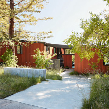
 Klopf Architecture
The Roger Lee designed house from 1962 was purchased by the current homeowners in almost original condition, as the previous owners elected to defer most maintenance projects over the years. The clients were able to see beyond the dated materials and finishes, single-paned glass and uninsulated walls and they approached Klopf Architecture to help them expand and update the entire home, one the family could settle into and enjoy for years to come. It was important that the new designs were aligned with Lee's original intent not only because of the client's appreciation for mid-century modern architecture, but also because the house was deemed historical. The Stanford Real Estate Office requires a stringent design review which safeguards the integrity of the community, which Klopf Architecture was happy to oblige going into their updated designs.
As with many original mid-century modern homes, the house was scaled to the 1960s lifestyle where rooms were smaller and openings to views were limited and tightly framed. The original conditions defined the direction the family of four would take in updating the house and making it comfortable for their modern lifestyle. Klopf designed a full gut remodel and major addition to bring the house into the 21st century and provide the living area needed for the client's family. The newly expanded house added just about 1,100 sf to create an airy, comfortable and family friendly house, taking full advantage of the beautiful southwestern views that extend out to the hills beyond. The enclosed garage created an additional 240 sf of covered space for long-term storage.
A cracked swimming pool created an eyesore taking up a majority of the backyard landscape, so it was one of the first elements to go during the transformation. Working with Outer Space Landscape Architects, the family asked for a mix of relaxing outdoor patio spaces that eventually blend into the native landscaping, extending their views outward toward the natural greenery of the trees beyond their property. Filling in the old pool was a smart way to expand the living spaces outward. The orientation of the house was designed to enjoy the views, but the original architecture provided the first homeowners with mere glimpses of the landscape outside.
Klopf was able to broaden those views, continuing and extending on the original architecture to take full advantage of the unobstructed natural views across the rear facade of the house. Small horizontal openings in the primary bedroom and office were replaced with much taller windows that now follow the angled roof line upward, extending across almost all of the facade. We worked with Western Windows, whose designs included an oblique-shaped, operable casement that allowed our design to rise with the slope. A new corner office added to the primary suite, offers a bright and functional work-from-home solution that looks out at the distant views and added natural light from the expanded window configuration that now wraps around the corner.
The existing lower level was designed by Lee as a utilitarian space, serving as a wet pool room with a drain in the center of the floor, bathroom, laundry and storage areas. Without the need for a pool room, Klopf was able to convert the area into a much more comfortable and functional living space with a new family room and guest suite. The new spaces enjoy easy access to a new outdoor patio through floor to ceiling, full-width glass sliders.
Continuing along the rear facade, a previously exposed deck extending from the living room and hallway provided access to the backyard through a single set of stairs leading toward the side of the house which made sense when the pool was in place. The new deck was re-envisioned as an extension of the main living room and now serves as a second outdoor living room. A new slatted pergola above provides the homeowners welcome relief from the hot afternoon sun. A second set of stairs now creates a better connection to the redesigned lower level. Klopf was able to reconfigure the spaces, extending the living room outward toward the views, where the family now claims it as the heart of the home, spending a large majority of their time outdoors.
Back inside, the original wood-burning Malm fireplace was beautifully restored and a gas burner installed to comply with California's strict air standards. It now rests in front of a wall of Heath accent tiles where a dated red brick wall used to stand. A new taller window brings more light and views into the refreshed interior living room. The original glass doors opposite the fireplace were replaced by larger sliders that when fully opened, create a seamless transition to the new outdoor living area so the two spaces feel like one connected space. The original utilitarian kitchen was needlessly tucked into the far back corner and closed-off, out of sight from the living room, so the clients asked Klopf to open it up and expand the kitchen forward so it felt more connected. Today the much larger kitchen is connected to the living area where a short wall with a cutout offers a visual glimpse into the kitchen and a handy pass-through counter for serving guests. A new breakfast nook was also added to create another spot where the family can gather for casual meals. Just outside, a new built-in outdoor grill and prep area extends the kitchen outside and connects to a new outdoor dining spot nestled amongst the trees, taking advantage of the views out back.
Klopf was able to expand the other two bedrooms, add a new laundry room and half-bath and convert the carport to an enclosed garage to add more storage areas which was lost when the pool house was converted to the family and guest room.
To maintain a historical connection to the original designs, the exterior siding was repeated on all exterior walls, a full-height stained glass window at the front entryway restored, and an interior slatted screen element repeated outside at the exterior entry courtyard and over the new outdoor living room to create a shade trellis. The new house stands proudly and shines against it's new landscaping features, while respecting and expanding on the original intent of Roger Lee's designs epitomizing the comforts of indoor-outdoor living in Northern California.
Completion year: 2020
Klopf Architecture project team: John Klopf, Klara Kevane, Noel Andrade
Contractor: ORB Construction, Brendan O'Reilly
Structural engineer: Sezen and Moon
Landscape architect: Outer space
Furnishings and decoration: Urbanism Designs
Photographer: Mariko Reed


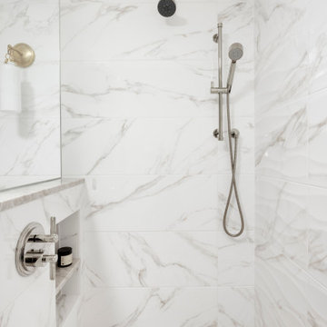 Amy Pearson Design
APD was hired to update the kitchen, living room, primary bathroom and bedroom, and laundry room in this suburban townhome. The design brought an aesthetic that incorporated a fresh updated and current take on traditional while remaining timeless and classic. The kitchen layout moved cooking to the exterior wall providing a beautiful range and hood moment. Removing an existing peninsula and re-orienting the island orientation provided a functional floorplan while adding extra storage in the same square footage. A specific design request from the client was bar cabinetry integrated into the stair railing, and we could not be more thrilled with how it came together!
The primary bathroom experienced a major overhaul by relocating both the shower and double vanities and removing an un-used soaker tub. The design added linen storage and seated beauty vanity while expanding the shower to a luxurious size. Dimensional tile at the shower accent wall relates to the dimensional tile at the kitchen backsplash without matching the two spaces to each other while tones of cream, taupe, and warm woods with touches of gray are a cohesive thread throughout.
 Edmond Kitchen & Bath LLC
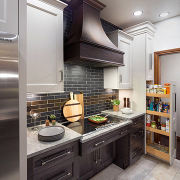
This project began with the goal of updating both style and function to allow for improved ease of use for a wheelchair. The previous space was overstuffed with an island that didn't really fit, an over-sized fridge in a location that complicated a primary doorway, and a 42" tall high bar that was inaccessible from a wheelchair. Our clients desired a space that would improve wheelchair use for both cooking or just being in the room, yet did not look like an ADA space. It became a story of less is more, and subtle, thoughtful changes from a standard design.
After working through options, we designed an open floorplan that provided a galley kitchen function with a full 5 ft walkway by use of a peninsula open to the family den. This peninsula is highlighted by a drop down, table-height countertop wrapping the end and long backside that is now accessible to all members of the family by providing a perfect height for a flexible workstation in a wheelchair or comfortable entertaining on the backside. We then dropped the height for cooking at the new induction cooktop and created knee space below. Further, we specified an apron front sink that brings the sink closer in reach than a traditional undermount sink that would have countertop rimming in front. An articulating faucet with no limitations on reach provides full range of access in the sink. The ovens and microwave were also situated at a height comfortable for use from a wheelchair. Where a refrigerator used to block the doorway, a pull out is now located giving easy access to dry goods for cooks at all heights. Every element within the space was considered for the impact to our homes occupants - wheelchair or not, even the doorswing on the microwave.
Now our client has a kitchen that every member of the family can use and be a part of. Simple design, with a well-thought out plan, makes a difference in the lives of another family.
Photos by David Cobb Photography
 Amy Pearson Design
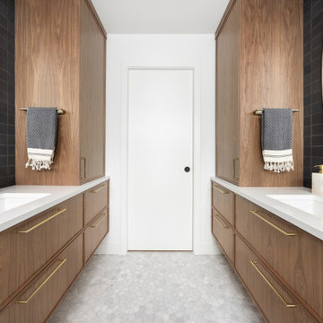
The primary bedroom and bathroom are the showstoppers of this phase! Unused and awkwardly located closets in both the bedroom and bathroom were removed to make way for additional square-footage in the bath and replaced with a sizable and functional reach-in closet in the bedroom. A dated and cramped shower stall was removed in favor for an expansive step in shower spanning the width of the bathroom and a new transom window washes the room in natural light. While the previous bathroom was only able to accommodate a single vanity, the new layout allowed us to create double matching vanities mirrored across from each other - a much appreciated addition for a primary bath. Floating walnut vanities boast impressive storage and are capped with tower cabinets with hidden outlets for charging and storing electronic bathroom tools. While the color palette is restrained - black, white, gray, and brown - the result is a timelessly modern and masculine space that is at once striking and warm. Modern geometric patterns play with each other throughout the material selections.

 Signature Designs Kitchen | Bath | Interiors
We just completed this complicated bathroom remodel. Now you can step into serene luxury primary bathroom with oversized Royal Peacock porcelain slabs that create a bold, sophisticated statement in this meticulously designed bathroom. The deep, calming hues of the tiles contrast elegantly with sleek, modern fixtures, inviting a spa-like experience. Every detail in this space exudes elegance and relaxation, perfect for unwinding in style.
Designed by @signaturedesigns.kbi and multiple collaborators
@lusso_porcelain_and_design
View the entire project on our website. https://www.signaturedesignskitchenbath.com/.../littleton...
#masterbathroom #masterbathroomdesign #bathroomideas #bathroom #bathroomstyling #bathroominspo #homedesign #interiordesign #interiordesigner #bathroomlights
 Amy Pearson Design
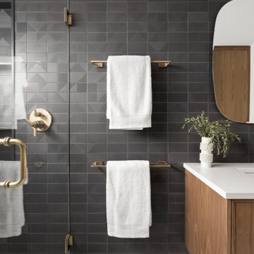
The primary bedroom and bathroom are the showstoppers of this phase! Unused and awkwardly located closets in both the bedroom and bathroom were removed to make way for additional square-footage in the bath and replaced with a sizable and functional reach-in closet in the bedroom. A dated and cramped shower stall was removed in favor for an expansive step in shower spanning the width of the bathroom and a new transom window washes the room in natural light. While the previous bathroom was only able to accommodate a single vanity, the new layout allowed us to create double matching vanities mirrored across from each other - a much appreciated addition for a primary bath. Floating walnut vanities boast impressive storage and are capped with tower cabinets with hidden outlets for charging and storing electronic bathroom tools. While the color palette is restrained - black, white, gray, and brown - the result is a timelessly modern and masculine space that is at once striking and warm. Modern geometric patterns play with each other throughout the material selections.
 Jamie House Design
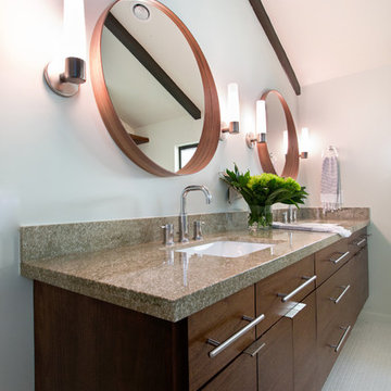
This stunning mid-century modern remodel embraces the timeless charm of the era while incorporating modern functionality. Featuring clean lines, organic textures, and warm wood tones, the design highlights the home’s original character with contemporary updates. Thoughtfully curated furnishings, iconic mid-century silhouettes, and an open-concept layout create a seamless flow between spaces. This project exemplifies high-end Littleton interior design, showcasing how mid-century modern style can be reimagined for today’s lifestyle while staying true to its classic roots.

Sponsored
Columbus, OH

Structural Remodeling
Franklin County's Heavy Timber Specialists | Best of Houzz 2020!
 Copper Sky Design + Remodel
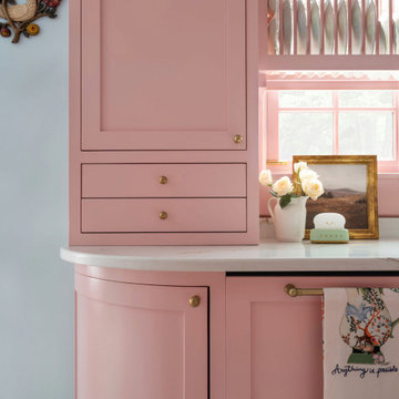
The homeowners of a 1930s Tudor in East Atlanta Village envisioned a colorful renovation that blended original charm with modern updates. The creative couple, who cherish antiques and quirky collectibles, aimed to preserve the home's historic layout and architectural elements. The overall color palette and aesthetic was inspired by their grandmother's fine China collection.
The renovation encompassed the kitchen, mudroom, breakfast nook, living room, bar, powder room, and primary bathroom. Copper Sky Design + Remodel placed emphasis on integrating color, patterns, and specialty details to honor the home's history while reflecting the homeowners' unique style.
Key design choices included retaining the functional galley kitchen, featuring a dishrack over the sink to display the clients' depression-era glass and antique China. Floral cutouts on cabinet doors and refrigerator panels, reminiscent of the 1930s, were incorporated. A scalloped built-in cabinet in the butler’s pantry, designed to fit a niche previously housing an original piece, ties into the brass scalloped hood in the kitchen. The mudroom and butler’s pantry cabinets also feature a scallop motif.
Custom mosaic floor tiles, typical of the 1930s, required meticulous planning and execution. The 2” hexagon mosaic tile pattern in the kitchen, mudroom, and butler’s pantry was digitally designed and hand-laid on site. The primary bathroom's wall tile pattern demanded precision, resulting in a symmetrical and stunning design.
The primary bathroom was expanded to include a Japanese-style soaking tub and a bidet within its modest 10’ x 9’ size. The powder room, though small, is vibrant with “Dinosauria” wallpaper, Tiffany-style lighting, and a square mosaic tile floor.
This thoughtful renovation preserved the Tudor's historical integrity while infusing it with the homeowners' vibrant aesthetic, creating a harmonious blend of past and present.

 JS Interiors LLC
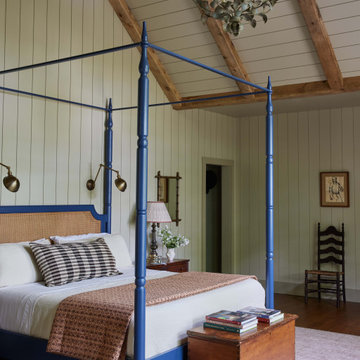
Example of a farmhouse dark wood floor, brown floor, exposed beam, shiplap ceiling and vaulted ceiling bedroom design in Nashville with beige walls
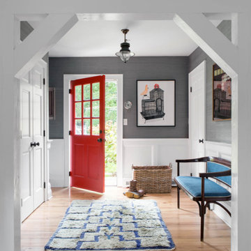
Example of a beach style medium tone wood floor, brown floor, wainscoting and wallpaper entryway design in New York with gray walls and a red front door
 Forward Design Build Remodel
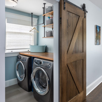
Our clients loved their neighborhood and being able to walk to work. While they knew it was their forever home, they needed more space. Their goals were to completely update the interior while keeping the original charm. They also wanted to add an addition for more space for their growing family.
On the first floor we relocated the kitchen, dining, and laundry room. With the rear addition we were able to enlarge the kitchen and dining and add in a powder room, secondary playroom, mudroom and back entry.
On the second floor, the back half was entirely reconfigured. We added a primary suite and a hallway bathroom.
With this being a historic home, we left the existing windows in place as well as the trim and baseboards. We kept and refinished the existing stairway railing. The primary bathroom was moved to be more user friendly.
We made cosmetic upgrades throughout the home for a cohesive look that matches the homeowner’s style which was transitional with industrial elements.
 Ashley Campbell Interior Design
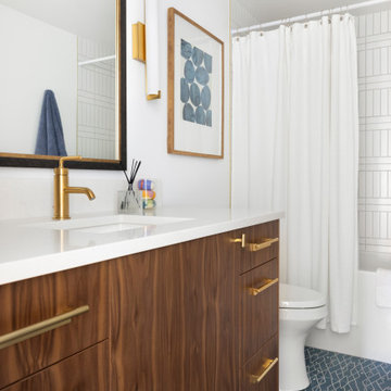
Bathroom - mid-sized contemporary 3/4 white tile and cement tile single-sink bathroom idea in Denver with flat-panel cabinets, medium tone wood cabinets, quartz countertops and white countertops
 Joe McGuire Design
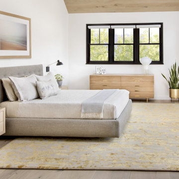
In this beautiful home, our Aspen studio used a neutral palette that let natural materials shine when mixed with intentional pops of color. As long-time meditators, we love creating meditation spaces where our clients can relax and focus on renewal. In a quiet corner guest room, we paired an ultra-comfortable lounge chair in a rich aubergine with a warm earth-toned rug and a bronze Tibetan prayer bowl. We also designed a spa-like bathroom showcasing a freestanding tub and a glass-enclosed shower, made even more relaxing by a glimpse of the greenery surrounding this gorgeous home. Against a pure white background, we added a floating stair, with its open oak treads and clear glass handrails, which create a sense of spaciousness and allow light to flow between floors. The primary bedroom is designed to be super comfy but with hidden storage underneath, making it super functional, too. The room's palette is light and restful, with the contrasting black accents adding energy and the natural wood ceiling grounding the tall space.
120