
Search results for "Primary purpose" in Home Design Ideas
 Amy Troute Inspired Interior Design
Our clients fell in love with this expansive modern home and collaborated with us to inject their personalities and add function to meet their lifestyle. Original artwork collected during their travels inspired much of the interior palette, and we looked to vibrant patterned fabrics, bold accents and gorgeous floral wallpapers to boost the personality of the spaces. In the great room, we added color with a bold wool area rug and accent pillows, and the pair of swivel chairs in the window invites leisurely time taking in the sweeping views. The richly textured dining room has its own personality with brick-clad walls and an unapologetically stylish sputnik chandelier.
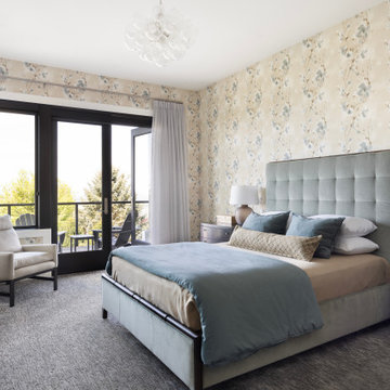
The primary bedroom is wrapped in soft, modern floral wallpaper that inspired the palette of the bespoke furnishings and luxurious bedding. Rich upholstery and supple leather adorn pieces customized for the space.
The home’s key entertaining space is the ground level bar and lounge which boasts a custom handcrafted wine wall by Sommi Wine Cellars. Furnishings with colorful patterns and unique shapes are everywhere, inviting lively gatherings and conversation.
The hobby room invites the couple to get creative together and serves as a multi-purpose getaway. The guest room repurposed the couple’s existing bedroom furniture and area rug, and we pulled it all together with new artwork, lamps and bedding to create an inviting space for guests.
Photography by Meagan Larsen Photography
 Amy Troute Inspired Interior Design
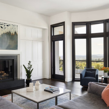
Our clients fell in love with this expansive modern home and collaborated with us to inject their personalities and add function to meet their lifestyle. Original artwork collected during their travels inspired much of the interior palette, and we looked to vibrant patterned fabrics, bold accents and gorgeous floral wallpapers to boost the personality of the spaces. In the great room, we added color with a bold wool area rug and accent pillows, and the pair of swivel chairs in the window invites leisurely time taking in the sweeping views. The richly textured dining room has its own personality with brick-clad walls and an unapologetically stylish sputnik chandelier.
The primary bedroom is wrapped in soft, modern floral wallpaper that inspired the palette of the bespoke furnishings and luxurious bedding. Rich upholstery and supple leather adorn pieces customized for the space.
The home’s key entertaining space is the ground level bar and lounge which boasts a custom handcrafted wine wall by Sommi Wine Cellars. Furnishings with colorful patterns and unique shapes are everywhere, inviting lively gatherings and conversation.
The hobby room invites the couple to get creative together and serves as a multi-purpose getaway. The guest room repurposed the couple’s existing bedroom furniture and area rug, and we pulled it all together with new artwork, lamps and bedding to create an inviting space for guests.
Photography by Meagan Larsen Photography
 O'Brien Harris LLC
In this new construction home in Hinsdale, IL the design team at O’Brien Harris was brought in at the earliest stages of planning—allowing for seamless integration of cabinetry and architectural details. Early collaboration with the builder meant every functional need could be fully addressed, including custom framing for hidden lighting and other details that would have been difficult to retrofit.
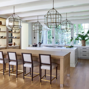
The kitchen features a unique layout that places the cook at the center of the space, facing the yard and natural light. This intentional orientation shaped the design from the start to create a layout that felt open, balanced, and multi-functional. Because the project was built from the ground up, O’Brien Harris was able to integrate downdraft ventilation systems that maintain sightlines allowing the range to face outward—achieving both form and function without compromise.
Two kitchen islands define the space, though each serves a distinct purpose. The first island is centered around the cooktop and prep area, while the second acts more like a piece of freestanding furniture—with seating, storage, and a softer presence in the room. Four oversized pendant lanterns anchor the entire space, offering both visual weight and warm illumination.
To support entertaining, a full back kitchen was added behind the main space, offering the same level of functionality with additional appliances and prep areas. A fully retractable pass-through window opens directly to the outdoor entertaining area, making the kitchen feel as expansive as the outdoors. O’Brien Harris also designed and fabricated the cabinetry in the primary bath.
Location: Hinsdale | Custom Cabinetry: O’Brien Harris | Interior Designer: Brynn Olson Design | Builder: J. Jordan Homes | Architect: Moment Design Architecture | Photography: Werner Straube Photography | Kitchen Cabinetry: Painted Finish in Gossamar Veil | Kitchen Island and Back Kitchen Cabinetry: Stained Chatham Oak
Featured Article: Luxe Interiors + Design
Find the right local pro for your project
 Amy Troute Inspired Interior Design
Our clients fell in love with this expansive modern home and collaborated with us to inject their personalities and add function to meet their lifestyle. Original artwork collected during their travels inspired much of the interior palette, and we looked to vibrant patterned fabrics, bold accents and gorgeous floral wallpapers to boost the personality of the spaces. In the great room, we added color with a bold wool area rug and accent pillows, and the pair of swivel chairs in the window invites leisurely time taking in the sweeping views. The richly textured dining room has its own personality with brick-clad walls and an unapologetically stylish sputnik chandelier.
The primary bedroom is wrapped in soft, modern floral wallpaper that inspired the palette of the bespoke furnishings and luxurious bedding. Rich upholstery and supple leather adorn pieces customized for the space.
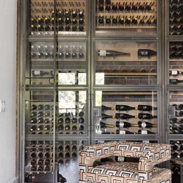
The home’s key entertaining space is the ground level bar and lounge which boasts a custom handcrafted wine wall by Sommi Wine Cellars. Furnishings with colorful patterns and unique shapes are everywhere, inviting lively gatherings and conversation.
The hobby room invites the couple to get creative together and serves as a multi-purpose getaway. The guest room repurposed the couple’s existing bedroom furniture and area rug, and we pulled it all together with new artwork, lamps and bedding to create an inviting space for guests.
Photography by Meagan Larsen Photography
 O'Brien Harris LLC
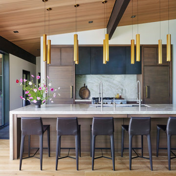
In this new construction home in Hinsdale, IL the design team at O’Brien Harris was brought in at the earliest stages of planning—allowing for seamless integration of cabinetry and architectural details. Early collaboration with the builder meant every functional need could be fully addressed, including custom framing for hidden lighting and other details that would have been difficult to retrofit.
The kitchen features a unique layout that places the cook at the center of the space, facing the yard and natural light. This intentional orientation shaped the design from the start to create a layout that felt open, balanced, and multi-functional. Because the project was built from the ground up, O’Brien Harris was able to integrate downdraft ventilation systems that maintain sightlines allowing the range to face outward—achieving both form and function without compromise.
Two kitchen islands define the space, though each serves a distinct purpose. The first island is centered around the cooktop and prep area, while the second acts more like a piece of freestanding furniture—with seating, storage, and a softer presence in the room. Four oversized pendant lanterns anchor the entire space, offering both visual weight and warm illumination.
To support entertaining, a full back kitchen was added behind the main space, offering the same level of functionality with additional appliances and prep areas. A fully retractable pass-through window opens directly to the outdoor entertaining area, making the kitchen feel as expansive as the outdoors. O’Brien Harris also designed and fabricated the cabinetry in the primary bath.
 Liz Schupanitz Designs
A PLACE TO GATHER
Location: Eagan, MN, USA
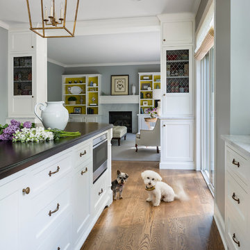
This family of five wanted an inviting space to gather with family and friends. Mom, the primary cook, wanted a large island with more organized storage – everything in its place – and a crisp white kitchen with the character of an older home.
Challenges:
Design an island that could accommodate this family of five for casual weeknight dinners.
Create more usable storage within the existing kitchen footprint.
Design a better transition between the upper cabinets on the 8-foot sink wall and the adjoining 9-foot cooktop wall.
Make room for more counter space around the cooktop. It was poorly lit, cluttered with small appliances and confined by the tall oven cabinet.
Solutions:
A large island, that seats 5 comfortably, replaced the small island and kitchen table. This allowed for more storage including cookbook shelves, a heavy-duty roll out shelf for the mixer, a 2-bin recycling center and a bread drawer.
Tall pantries with decorative grilles were placed between the kitchen and family room. These created ample storage and helped define each room, making each one feel larger, yet more intimate.
A space intentionally separates the upper cabinets on the sink wall from those on the cooktop wall. This created symmetry on the sink wall and made room for an appliance garage, which keeps the countertops uncluttered.
Moving the double ovens to the former pantry location made way for more usable counter space around the cooktop and a dramatic focal point with the hood, cabinets and marble backsplash.
Special Features:
Custom designed corbels and island legs lend character.
Gilt open lanterns, antiqued nickel grilles on the pantries, and the soft linen shade at the kitchen sink add personality and charm.
The unique bronze hardware with a living finish creates the patina of an older home.
A walnut island countertop adds the warmth and feel of a kitchen table.
This homeowner truly understood the idea of living with the patina of marble. Her grandmother’s marble-topped antique table inspired the Carrara countertops.
The result is a highly organized kitchen with a light, open feel that invites you to stay a while.
Liz Schupanitz Designs
Photographed by: Andrea Rugg
 Schuler Cabinetry
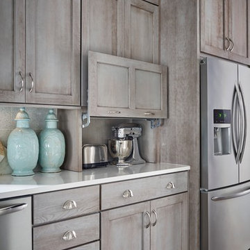
Grays add a softness to the design, whether as a primary color, shown in the kitchen here, or as a secondary color, often on an island.
Gray is the perfect fit for the growing trend of Transitional design. The washed look and character of Peppercorn cherry paired with our Boardwalk door style creates a naturally calm and simple space. Designing with consistent horizontal sight lines, linear crown and a blended color palette are a few of the key elements to create a Transitional haven.
Pairing gray toned finishes, such as stain and paint, allows you to showcase multiple textures and values for creating depth through a layered approach
 TVL Creative Ltd.
This 1910 West Highlands home was so compartmentalized that you couldn't help to notice you were constantly entering a new room every 8-10 feet. There was also a 500 SF addition put on the back of the home to accommodate a living room, 3/4 bath, laundry room and back foyer - 350 SF of that was for the living room. Needless to say, the house needed to be gutted and replanned.
Kitchen+Dining+Laundry-Like most of these early 1900's homes, the kitchen was not the heartbeat of the home like they are today. This kitchen was tucked away in the back and smaller than any other social rooms in the house. We knocked out the walls of the dining room to expand and created an open floor plan suitable for any type of gathering. As a nod to the history of the home, we used butcherblock for all the countertops and shelving which was accented by tones of brass, dusty blues and light-warm greys. This room had no storage before so creating ample storage and a variety of storage types was a critical ask for the client. One of my favorite details is the blue crown that draws from one end of the space to the other, accenting a ceiling that was otherwise forgotten.
Primary Bath-This did not exist prior to the remodel and the client wanted a more neutral space with strong visual details. We split the walls in half with a datum line that transitions from penny gap molding to the tile in the shower. To provide some more visual drama, we did a chevron tile arrangement on the floor, gridded the shower enclosure for some deep contrast an array of brass and quartz to elevate the finishes.
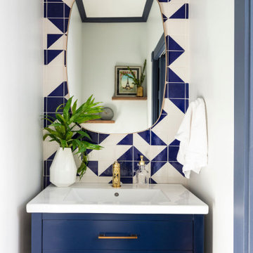
Powder Bath-This is always a fun place to let your vision get out of the box a bit. All the elements were familiar to the space but modernized and more playful. The floor has a wood look tile in a herringbone arrangement, a navy vanity, gold fixtures that are all servants to the star of the room - the blue and white deco wall tile behind the vanity.
Full Bath-This was a quirky little bathroom that you'd always keep the door closed when guests are over. Now we have brought the blue tones into the space and accented it with bronze fixtures and a playful southwestern floor tile.
Living Room & Office-This room was too big for its own good and now serves multiple purposes. We condensed the space to provide a living area for the whole family plus other guests and left enough room to explain the space with floor cushions. The office was a bonus to the project as it provided privacy to a room that otherwise had none before.
 May Construction, Inc.
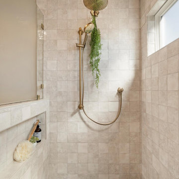
The now updated primary bathroom feels much more open, purposeful, and the shower footprint has tripled. Modern whites and creamy neutrals give this attractive bathroom a calming Zen yet chic aesthetic. Custom Walnut cabinetry adds depth and richness, providing generous storage while complementing the leathered Taj Mahal stone surface and polished nickel fixtures. A double niche was incorporated in the design for convenient space- saving storage and a smart toilet bidet was necessary for comfort. Every material was chosen for its beauty and function, resulting in a serene, spa-like environment that invites daily relaxation and doesn’t fall into a single style category.
 ZeroEnergy Design
This modern green home offers both a vacation destination on Cape Cod near local family members and an opportunity for rental income.
FAMILY ROOTS. A West Coast couple living in the San Francisco Bay Area sought a permanent East Coast vacation home near family members living on Cape Cod. As academic professionals focused on sustainability, they sought a green, energy efficient home that was well-aligned with their values. With no green homes available for sale on Cape Cod, they decided to purchase land near their family and build their own.
SLOPED SITE. Comprised of a 3/4 acre lot nestled in the pines, the steeply sloping terrain called for a plan that embraced and took advantage of the slope. Of equal priority was optimizing solar exposure, preserving privacy from abutters, and creating outdoor living space. The design accomplished these goals with a simple, rectilinear form, offering living space on the both entry and lower/basement levels. The stepped foundation allows for a walk-out basement level with light-filled living space on the down-hill side of the home. The traditional basement on the eastern, up-hill side houses mechanical equipment and a home gym. The house welcomes natural light throughout, captures views of the forest, and delivers entertainment space that connects indoor living space to outdoor deck and dining patio.
MODERN VISION. The clean building form and uncomplicated finishes pay homage to the modern architectural legacy on the outer Cape. Durable and economical fiber cement panels, fixed with aluminum channels, clad the primary form. Cedar clapboards provide a visual accent at the south-facing living room, which extends a single roof plane to cover the entry porch.
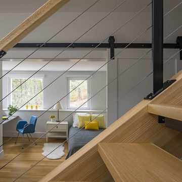
SMART USE OF SPACE. On the entry level, the “L”-shaped living, dining, and kitchen space connects to the exterior living, dining, and grilling spaces to effectively double the home’s summertime entertainment area. Placed at the western end of the entry level (where it can retain privacy but still claim expansive downhill views) is the master suite with a built-in study. The lower level has two guest bedrooms, a second full bathroom, and laundry. The flexibility of the space—crucial in a house with a modest footprint—emerges in one of the guest bedrooms, which doubles as home office by opening the barn-style double doors to connect it to the bright, airy open stair leading up to the entry level. Thoughtful design, generous ceiling heights and large windows transform the modest 1,100 sf* footprint into a well-lit, spacious home. *(total finished space is 1800 sf)
RENTAL INCOME. The property works for its owners by netting rental income when the owners are home in San Francisco. The house especially caters to vacationers bound for nearby Mayo Beach and includes an outdoor shower adjacent to the lower level entry door. In contrast to the bare bones cottages that are typically available on the Cape, this home offers prospective tenants a modern aesthetic, paired with luxurious and green features. Durable finishes inside and out will ensure longevity with the heavier use that comes with a rental property.
COMFORT YEAR-ROUND. The home is super-insulated and air-tight, with mechanical ventilation to provide continuous fresh air from the outside. High performance triple-paned windows complement the building enclosure and maximize passive solar gain while ensuring a warm, draft-free winter, even when sitting close to the glass. A properly sized air source heat pump offers efficient heating & cooling, and includes a carefully designed the duct distribution system to provide even comfort throughout the house. The super-insulated envelope allows us to significantly reduce the equipment capacity, duct size, and airflow quantities, while maintaining unparalleled thermal comfort.
ENERGY EFFICIENT. The building’s shell and mechanical systems play instrumental roles in the home’s exceptional performance. The building enclosure reduces the most significant energy glutton: heating. Continuous super-insulation, thorough air sealing, triple-pane windows, and passive solar gain work together to yield a miniscule heating load. All active energy consumers are extremely efficient: an air source heat pump for heating and cooling, a heat pump hot water heater, LED lighting, energy recovery ventilation (ERV), and high efficiency appliances. The result is a home that uses 70% less energy than a similar new home built to code requirements.
OVERALL. The home embodies the owners’ goals and values while comprehensively enabling thermal comfort, energy efficiency, a vacation respite, and supplementary income.
PROJECT TEAM
ZeroEnergy Design - Architect & Mechanical Designer
A.F. Hultin & Co. - Contractor
Pamet Valley Landscape Design - Landscape & Masonry
Lisa Finch - Original Artwork
European Architectural Supply - Windows
Eric Roth Photography - Photography
 Schuler Cabinetry
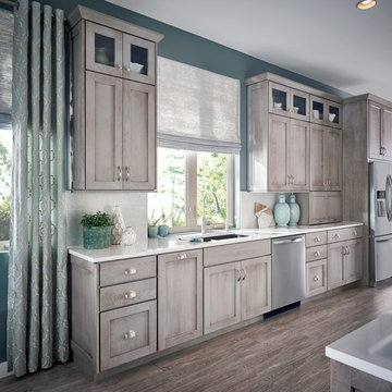
Grays add a softness to the design, whether as a primary color, shown in the kitchen here, or as a secondary color, often on an island.
Gray is the perfect fit for the growing trend of Transitional design. The washed look and character of Peppercorn cherry paired with our Boardwalk door style creates a naturally calm and simple space. Designing with consistent horizontal sight lines, linear crown and a blended color palette are a few of the key elements to create a Transitional haven.
Pairing gray toned finishes, such as stain and paint, allows you to showcase multiple textures and values for creating depth through a layered approach
 TVL Creative Ltd.
This 1910 West Highlands home was so compartmentalized that you couldn't help to notice you were constantly entering a new room every 8-10 feet. There was also a 500 SF addition put on the back of the home to accommodate a living room, 3/4 bath, laundry room and back foyer - 350 SF of that was for the living room. Needless to say, the house needed to be gutted and replanned.
Kitchen+Dining+Laundry-Like most of these early 1900's homes, the kitchen was not the heartbeat of the home like they are today. This kitchen was tucked away in the back and smaller than any other social rooms in the house. We knocked out the walls of the dining room to expand and created an open floor plan suitable for any type of gathering. As a nod to the history of the home, we used butcherblock for all the countertops and shelving which was accented by tones of brass, dusty blues and light-warm greys. This room had no storage before so creating ample storage and a variety of storage types was a critical ask for the client. One of my favorite details is the blue crown that draws from one end of the space to the other, accenting a ceiling that was otherwise forgotten.
Primary Bath-This did not exist prior to the remodel and the client wanted a more neutral space with strong visual details. We split the walls in half with a datum line that transitions from penny gap molding to the tile in the shower. To provide some more visual drama, we did a chevron tile arrangement on the floor, gridded the shower enclosure for some deep contrast an array of brass and quartz to elevate the finishes.
Powder Bath-This is always a fun place to let your vision get out of the box a bit. All the elements were familiar to the space but modernized and more playful. The floor has a wood look tile in a herringbone arrangement, a navy vanity, gold fixtures that are all servants to the star of the room - the blue and white deco wall tile behind the vanity.
Full Bath-This was a quirky little bathroom that you'd always keep the door closed when guests are over. Now we have brought the blue tones into the space and accented it with bronze fixtures and a playful southwestern floor tile.
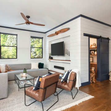
Living Room & Office-This room was too big for its own good and now serves multiple purposes. We condensed the space to provide a living area for the whole family plus other guests and left enough room to explain the space with floor cushions. The office was a bonus to the project as it provided privacy to a room that otherwise had none before.
 Pamela Dailey Design
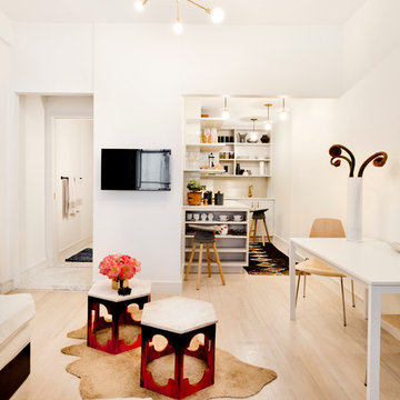
This 400 s.f. studio apartment in NYC’s Greenwich Village serves as a pied-a-terre
for clients whose primary residence is on the West Coast.
Although the clients do not reside here full-time, this tiny space accommodates
all the creature comforts of home.
Bleached hardwood floors, crisp white walls, and high ceilings are the backdrop to
a custom blackened steel and glass partition, layered with raw silk sheer draperies,
to create a private sleeping area, replete with custom built-in closets.
Simple headboard and crisp linens are balanced with a lightly-metallic glazed
duvet and a vintage textile pillow.
The living space boasts a custom Belgian linen sectional sofa that pulls out into a
full-size bed for the couple’s young children who sometimes accompany them.
Efficient and inexpensive dining furniture sits comfortably in the main living space
and lends clean, Scandinavian functionality for sharing meals. The sculptural
handrafted metal ceiling mobile offsets the architecture’s clean lines, defining the
space while accentuating the tall ceilings.
The kitchenette combines custom cool grey lacquered cabinets with brass fittings,
white beveled subway tile, and a warm brushed brass backsplash; an antique
Boucherouite runner and textural woven stools that pull up to the kitchen’s
coffee counter puntuate the clean palette with warmth and the human scale.
The under-counter freezer and refrigerator, along with the 18” dishwasher, are all
panelled to match the cabinets, and open shelving to the ceiling maximizes the
feeling of the space’s volume.
The entry closet doubles as home for a combination washer/dryer unit.
The custom bathroom vanity, with open brass legs sitting against floor-to-ceiling
marble subway tile, boasts a honed gray marble countertop, with an undermount
sink offset to maximize precious counter space and highlight a pendant light. A
tall narrow cabinet combines closed and open storage, and a recessed mirrored
medicine cabinet conceals additional necessaries.
The stand-up shower is kept minimal, with simple white beveled subway tile and
frameless glass doors, and is large enough to host a teak and stainless bench for
comfort; black sink and bath fittings ground the otherwise light palette.
What had been a generic studio apartment became a rich landscape for living.
 TKS Design Group
Free ebook, Creating the Ideal Kitchen. DOWNLOAD NOW
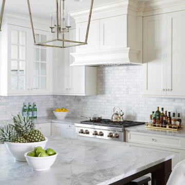
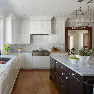
This project started out as a kitchen remodel but ended up as so much more. As the original plan started to take shape, some water damage provided the impetus to remodel a small upstairs hall bath. Once this bath was complete, the homeowners enjoyed the result so much that they decided to set aside the kitchen and complete a large master bath remodel. Once that was completed, we started planning for the kitchen!
The original kitchen was just large enough to accommodate an island and a separate pantry but felt a little cramped, especially during the weekends when the couple likes to entertain. The primary goal was to maintain the functionality of the current space, but to add some breathing room as well as to provide a view to the homeowner’s side yard and substantial Hosta garden.
The solution was to bump out the space about 10 feet which provided ample room for large pro appliances, a large island for gathering and an upgraded pantry space. It was important to the homeowners to create a space that felt like it belonged in their historic 1866 home. Details such as matching new trim to the existing large custom profiles in the original home and re-purposing an existing door to be used for the new pantry, provided these touches. A large window at the main sink provides that view into the yard and a beautiful focal point for the room.
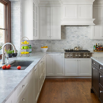
A mix of painted wood and stained cabinetry gives the new kitchen a sense of belonging in the older home, as do the Super White quartzite that has the look of marble, subway tile backsplash, polished nickel lanterns and glass and mirrored doors. The large pantry, filled with custom shelving built to the homeowner’s specifications, stainless steel appliances and the two Galley Workstations – sinks that do double duty as prep space – ensure that not only does the kitchen look great, but also functions in a personalized manner that works perfectly for the occupants.
Doing the bump out also allowed the opportunity for a small mudroom and powder room right off the kitchen as well as re-arranging some openings to allow for better traffic flow throughout the entire first floor. The result is a comfortable up-to-date home that feels both steeped in history yet allows for today’s style of living.
Designed by: Susan Klimala, CKD, CBD
Photography by: Michael Alan Kaskel
For more information on kitchen and bath design ideas go to: www.kitchenstudio-ge.com
 TKS Design Group
Free ebook, Creating the Ideal Kitchen. DOWNLOAD NOW
This project started out as a kitchen remodel but ended up as so much more. As the original plan started to take shape, some water damage provided the impetus to remodel a small upstairs hall bath. Once this bath was complete, the homeowners enjoyed the result so much that they decided to set aside the kitchen and complete a large master bath remodel. Once that was completed, we started planning for the kitchen!
The original kitchen was just large enough to accommodate an island and a separate pantry but felt a little cramped, especially during the weekends when the couple likes to entertain. The primary goal was to maintain the functionality of the current space, but to add some breathing room as well as to provide a view to the homeowner’s side yard and substantial Hosta garden.
The solution was to bump out the space about 10 feet which provided ample room for large pro appliances, a large island for gathering and an upgraded pantry space. It was important to the homeowners to create a space that felt like it belonged in their historic 1866 home. Details such as matching new trim to the existing large custom profiles in the original home and re-purposing an existing door to be used for the new pantry, provided these touches. A large window at the main sink provides that view into the yard and a beautiful focal point for the room.
A mix of painted wood and stained cabinetry gives the new kitchen a sense of belonging in the older home, as do the Super White quartzite that has the look of marble, subway tile backsplash, polished nickel lanterns and glass and mirrored doors. The large pantry, filled with custom shelving built to the homeowner’s specifications, stainless steel appliances and the two Galley Workstations – sinks that do double duty as prep space – ensure that not only does the kitchen look great, but also functions in a personalized manner that works perfectly for the occupants.
Doing the bump out also allowed the opportunity for a small mudroom and powder room right off the kitchen as well as re-arranging some openings to allow for better traffic flow throughout the entire first floor. The result is a comfortable up-to-date home that feels both steeped in history yet allows for today’s style of living.
Designed by: Susan Klimala, CKD, CBD
Photography by: Michael Alan Kaskel
For more information on kitchen and bath design ideas go to: www.kitchenstudio-ge.com
 TVL Creative Ltd.
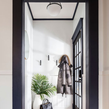
This 1910 West Highlands home was so compartmentalized that you couldn't help to notice you were constantly entering a new room every 8-10 feet. There was also a 500 SF addition put on the back of the home to accommodate a living room, 3/4 bath, laundry room and back foyer - 350 SF of that was for the living room. Needless to say, the house needed to be gutted and replanned.
Kitchen+Dining+Laundry-Like most of these early 1900's homes, the kitchen was not the heartbeat of the home like they are today. This kitchen was tucked away in the back and smaller than any other social rooms in the house. We knocked out the walls of the dining room to expand and created an open floor plan suitable for any type of gathering. As a nod to the history of the home, we used butcherblock for all the countertops and shelving which was accented by tones of brass, dusty blues and light-warm greys. This room had no storage before so creating ample storage and a variety of storage types was a critical ask for the client. One of my favorite details is the blue crown that draws from one end of the space to the other, accenting a ceiling that was otherwise forgotten.
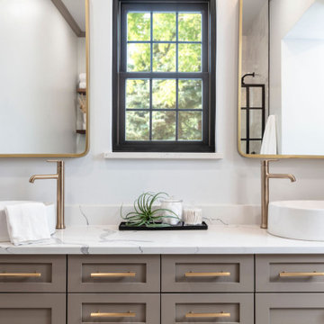
Primary Bath-This did not exist prior to the remodel and the client wanted a more neutral space with strong visual details. We split the walls in half with a datum line that transitions from penny gap molding to the tile in the shower. To provide some more visual drama, we did a chevron tile arrangement on the floor, gridded the shower enclosure for some deep contrast an array of brass and quartz to elevate the finishes.
Powder Bath-This is always a fun place to let your vision get out of the box a bit. All the elements were familiar to the space but modernized and more playful. The floor has a wood look tile in a herringbone arrangement, a navy vanity, gold fixtures that are all servants to the star of the room - the blue and white deco wall tile behind the vanity.
Full Bath-This was a quirky little bathroom that you'd always keep the door closed when guests are over. Now we have brought the blue tones into the space and accented it with bronze fixtures and a playful southwestern floor tile.
Living Room & Office-This room was too big for its own good and now serves multiple purposes. We condensed the space to provide a living area for the whole family plus other guests and left enough room to explain the space with floor cushions. The office was a bonus to the project as it provided privacy to a room that otherwise had none before.
 TVL Creative Ltd.
This 1910 West Highlands home was so compartmentalized that you couldn't help to notice you were constantly entering a new room every 8-10 feet. There was also a 500 SF addition put on the back of the home to accommodate a living room, 3/4 bath, laundry room and back foyer - 350 SF of that was for the living room. Needless to say, the house needed to be gutted and replanned.
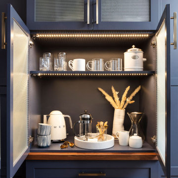
Kitchen+Dining+Laundry-Like most of these early 1900's homes, the kitchen was not the heartbeat of the home like they are today. This kitchen was tucked away in the back and smaller than any other social rooms in the house. We knocked out the walls of the dining room to expand and created an open floor plan suitable for any type of gathering. As a nod to the history of the home, we used butcherblock for all the countertops and shelving which was accented by tones of brass, dusty blues and light-warm greys. This room had no storage before so creating ample storage and a variety of storage types was a critical ask for the client. One of my favorite details is the blue crown that draws from one end of the space to the other, accenting a ceiling that was otherwise forgotten.
Primary Bath-This did not exist prior to the remodel and the client wanted a more neutral space with strong visual details. We split the walls in half with a datum line that transitions from penny gap molding to the tile in the shower. To provide some more visual drama, we did a chevron tile arrangement on the floor, gridded the shower enclosure for some deep contrast an array of brass and quartz to elevate the finishes.
Powder Bath-This is always a fun place to let your vision get out of the box a bit. All the elements were familiar to the space but modernized and more playful. The floor has a wood look tile in a herringbone arrangement, a navy vanity, gold fixtures that are all servants to the star of the room - the blue and white deco wall tile behind the vanity.
Full Bath-This was a quirky little bathroom that you'd always keep the door closed when guests are over. Now we have brought the blue tones into the space and accented it with bronze fixtures and a playful southwestern floor tile.
Living Room & Office-This room was too big for its own good and now serves multiple purposes. We condensed the space to provide a living area for the whole family plus other guests and left enough room to explain the space with floor cushions. The office was a bonus to the project as it provided privacy to a room that otherwise had none before.
 TKS Design Group
Free ebook, Creating the Ideal Kitchen. DOWNLOAD NOW
This project started out as a kitchen remodel but ended up as so much more. As the original plan started to take shape, some water damage provided the impetus to remodel a small upstairs hall bath. Once this bath was complete, the homeowners enjoyed the result so much that they decided to set aside the kitchen and complete a large master bath remodel. Once that was completed, we started planning for the kitchen!
The original kitchen was just large enough to accommodate an island and a separate pantry but felt a little cramped, especially during the weekends when the couple likes to entertain. The primary goal was to maintain the functionality of the current space, but to add some breathing room as well as to provide a view to the homeowner’s side yard and substantial Hosta garden.
The solution was to bump out the space about 10 feet which provided ample room for large pro appliances, a large island for gathering and an upgraded pantry space. It was important to the homeowners to create a space that felt like it belonged in their historic 1866 home. Details such as matching new trim to the existing large custom profiles in the original home and re-purposing an existing door to be used for the new pantry, provided these touches. A large window at the main sink provides that view into the yard and a beautiful focal point for the room.
A mix of painted wood and stained cabinetry gives the new kitchen a sense of belonging in the older home, as do the Super White quartzite that has the look of marble, subway tile backsplash, polished nickel lanterns and glass and mirrored doors. The large pantry, filled with custom shelving built to the homeowner’s specifications, stainless steel appliances and the two Galley Workstations – sinks that do double duty as prep space – ensure that not only does the kitchen look great, but also functions in a personalized manner that works perfectly for the occupants.
Doing the bump out also allowed the opportunity for a small mudroom and powder room right off the kitchen as well as re-arranging some openings to allow for better traffic flow throughout the entire first floor. The result is a comfortable up-to-date home that feels both steeped in history yet allows for today’s style of living.
Designed by: Susan Klimala, CKD, CBD
Photography by: Michael Alan Kaskel
For more information on kitchen and bath design ideas go to: www.kitchenstudio-ge.com
 TVL Creative Ltd.
This 1910 West Highlands home was so compartmentalized that you couldn't help to notice you were constantly entering a new room every 8-10 feet. There was also a 500 SF addition put on the back of the home to accommodate a living room, 3/4 bath, laundry room and back foyer - 350 SF of that was for the living room. Needless to say, the house needed to be gutted and replanned.
Kitchen+Dining+Laundry-Like most of these early 1900's homes, the kitchen was not the heartbeat of the home like they are today. This kitchen was tucked away in the back and smaller than any other social rooms in the house. We knocked out the walls of the dining room to expand and created an open floor plan suitable for any type of gathering. As a nod to the history of the home, we used butcherblock for all the countertops and shelving which was accented by tones of brass, dusty blues and light-warm greys. This room had no storage before so creating ample storage and a variety of storage types was a critical ask for the client. One of my favorite details is the blue crown that draws from one end of the space to the other, accenting a ceiling that was otherwise forgotten.
Primary Bath-This did not exist prior to the remodel and the client wanted a more neutral space with strong visual details. We split the walls in half with a datum line that transitions from penny gap molding to the tile in the shower. To provide some more visual drama, we did a chevron tile arrangement on the floor, gridded the shower enclosure for some deep contrast an array of brass and quartz to elevate the finishes.
Powder Bath-This is always a fun place to let your vision get out of the box a bit. All the elements were familiar to the space but modernized and more playful. The floor has a wood look tile in a herringbone arrangement, a navy vanity, gold fixtures that are all servants to the star of the room - the blue and white deco wall tile behind the vanity.
Full Bath-This was a quirky little bathroom that you'd always keep the door closed when guests are over. Now we have brought the blue tones into the space and accented it with bronze fixtures and a playful southwestern floor tile.
Living Room & Office-This room was too big for its own good and now serves multiple purposes. We condensed the space to provide a living area for the whole family plus other guests and left enough room to explain the space with floor cushions. The office was a bonus to the project as it provided privacy to a room that otherwise had none before.
 Schumacher Homes
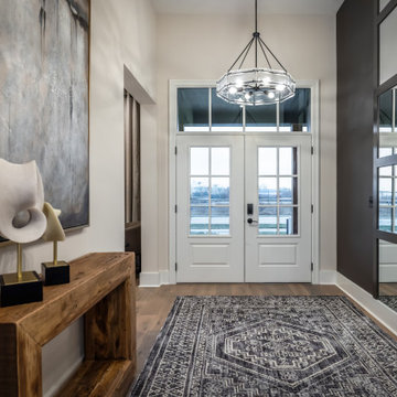
Built by Schumacher Homes, America's Largest Custom Home Builder, this stunning Charleston II Modern Farmhouse in Whitestown, Indiana, effortlessly balances classic architectural details with modern charm. Based on one of our most popular plans, the Charleston II maximizes spatial volume by increasing ceiling heights throughout both levels. The main living space boasts an expansive, open-concept floor plan featuring 10-foot ceilings throughout, which soar to a dramatic 12 feet across the central great room, kitchen, and bright morning room. Designed for seamless entertaining and effortless organization, the chef-ready kitchen is equipped with abundant counter space, a large central island to gather around, and a giant walk-in pantry. This dual-purpose pantry features a highly functional "messy kitchen" secondary prep zone, brilliantly engineered to keep cooking clutter, meal prep, and mess completely out of sight from the main living area.
The thoughtful layout continues with a perfectly placed pocket office, offering a quiet, dedicated space to organize daily tasks or work from home. This pocket office flows gracefully into the luxurious owner’s retreat, a private sanctuary showcasing an expansive primary bath and two large walk-in closets. To elevate the primary suite's design aesthetic, the bedroom features a show-stopping ceiling accented with custom stained wood beams—meticulously finished to match the flooring—with integrated hidden lighting to cast a warm, indirect glow. A smart split-bedroom floor plan ensures ultimate privacy for the entire family, keeping the additional secondary bedrooms situated on the opposite side of the residence so everyone can enjoy their own independent space.
13