
Search results for "Primary socials" in Home Design Ideas
 TVL Creative Ltd.
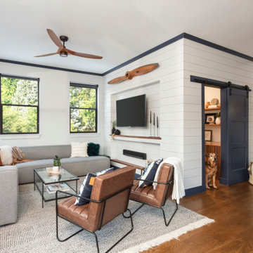
This 1910 West Highlands home was so compartmentalized that you couldn't help to notice you were constantly entering a new room every 8-10 feet. There was also a 500 SF addition put on the back of the home to accommodate a living room, 3/4 bath, laundry room and back foyer - 350 SF of that was for the living room. Needless to say, the house needed to be gutted and replanned.
Kitchen+Dining+Laundry-Like most of these early 1900's homes, the kitchen was not the heartbeat of the home like they are today. This kitchen was tucked away in the back and smaller than any other social rooms in the house. We knocked out the walls of the dining room to expand and created an open floor plan suitable for any type of gathering. As a nod to the history of the home, we used butcherblock for all the countertops and shelving which was accented by tones of brass, dusty blues and light-warm greys. This room had no storage before so creating ample storage and a variety of storage types was a critical ask for the client. One of my favorite details is the blue crown that draws from one end of the space to the other, accenting a ceiling that was otherwise forgotten.
Primary Bath-This did not exist prior to the remodel and the client wanted a more neutral space with strong visual details. We split the walls in half with a datum line that transitions from penny gap molding to the tile in the shower. To provide some more visual drama, we did a chevron tile arrangement on the floor, gridded the shower enclosure for some deep contrast an array of brass and quartz to elevate the finishes.
Powder Bath-This is always a fun place to let your vision get out of the box a bit. All the elements were familiar to the space but modernized and more playful. The floor has a wood look tile in a herringbone arrangement, a navy vanity, gold fixtures that are all servants to the star of the room - the blue and white deco wall tile behind the vanity.
Full Bath-This was a quirky little bathroom that you'd always keep the door closed when guests are over. Now we have brought the blue tones into the space and accented it with bronze fixtures and a playful southwestern floor tile.
Living Room & Office-This room was too big for its own good and now serves multiple purposes. We condensed the space to provide a living area for the whole family plus other guests and left enough room to explain the space with floor cushions. The office was a bonus to the project as it provided privacy to a room that otherwise had none before.
 TVL Creative Ltd.
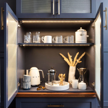
This 1910 West Highlands home was so compartmentalized that you couldn't help to notice you were constantly entering a new room every 8-10 feet. There was also a 500 SF addition put on the back of the home to accommodate a living room, 3/4 bath, laundry room and back foyer - 350 SF of that was for the living room. Needless to say, the house needed to be gutted and replanned.
Kitchen+Dining+Laundry-Like most of these early 1900's homes, the kitchen was not the heartbeat of the home like they are today. This kitchen was tucked away in the back and smaller than any other social rooms in the house. We knocked out the walls of the dining room to expand and created an open floor plan suitable for any type of gathering. As a nod to the history of the home, we used butcherblock for all the countertops and shelving which was accented by tones of brass, dusty blues and light-warm greys. This room had no storage before so creating ample storage and a variety of storage types was a critical ask for the client. One of my favorite details is the blue crown that draws from one end of the space to the other, accenting a ceiling that was otherwise forgotten.
Primary Bath-This did not exist prior to the remodel and the client wanted a more neutral space with strong visual details. We split the walls in half with a datum line that transitions from penny gap molding to the tile in the shower. To provide some more visual drama, we did a chevron tile arrangement on the floor, gridded the shower enclosure for some deep contrast an array of brass and quartz to elevate the finishes.
Powder Bath-This is always a fun place to let your vision get out of the box a bit. All the elements were familiar to the space but modernized and more playful. The floor has a wood look tile in a herringbone arrangement, a navy vanity, gold fixtures that are all servants to the star of the room - the blue and white deco wall tile behind the vanity.
Full Bath-This was a quirky little bathroom that you'd always keep the door closed when guests are over. Now we have brought the blue tones into the space and accented it with bronze fixtures and a playful southwestern floor tile.
Living Room & Office-This room was too big for its own good and now serves multiple purposes. We condensed the space to provide a living area for the whole family plus other guests and left enough room to explain the space with floor cushions. The office was a bonus to the project as it provided privacy to a room that otherwise had none before.
 Michael Nash Design, Build & Homes
2010 NATIONAL NARI REGIONAL AWARD WINNER
Project Scope
The owners of this 7,000 square foot colonial in Oakton, Virginia, were seeking a multi-level Mediterranean-style indoor/outdoor living space off the back of their home. They turned to Michael Nash Design, Build & Homes for a design solution that would include a stone patio, a second-story deck, a screened-in porch and linking staircases.
While the structure was designed primarily for family dining and entertaining, it also had to accommodate periodic social gatherings of one hundred guests or more. To meet these needs, the project would include a fully-equipped outdoor kitchen, several serving counters with permanent refrigeration, and well-delineated socializing and dining zones.
The existing home’s setting offered several impressive assets the new outdoor living area was designed to exploit. The sprawling acreage features old stand trees, wooded paths and a private lake. Beautifully landscaped, it unfolds as an idyllic panorama that naturally draws people to the outdoors.
Challenges
Since the rear elevation was situated on a slope that drops away from the house, the Michael Nash team had to raise the grade two feet within in a 2,000 square foot area extending out from the back of the house. Infrastructure plans also called for a sophisticated drainage system that had to accommodate a whole series of water “runoff” considerations to be integrated into the decking itself. Excavation included constructing retaining walls to bolster the elevated grade—which also had to support a concrete slab, the primary foundation for the entire complex.
Solutions
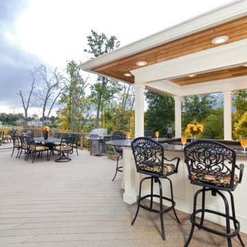
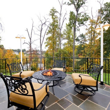
The ground level decking consists of a 2,000 square foot flagstone patio level with the home’s lower level doors. There is a decorative water fountain mid-patio—an ornate collectible acquired in Florida. Food preparation is concentrated within a specially designed semi-circular wall that creates an “outdoor kitchen” equipped with a 60” Viking barbecue grill, a prep sink, a warming drawer, refrigerator and appropriate storage. There is a granite surfaced dining counter with seating for eight.
Wrought iron railing and approximately 20 decorative columns (some encasing steel vertical supports) are incorporated into the design scheme. Many of the columns house accent lights.
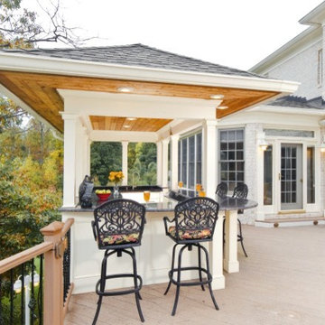
The top level—supported by horizontal steel beams– is a 2,500 square foot deck constructed entirely of Trex decking. The open air decking is, again, directly accessible from rooms on the second level of the house including the kitchen, sunroom and family room.
The platform’s most prominent feature is a U-shaped “kitchenette” with cedar shake shingle roofing. Like its counterpart one level below, the facility is equipped with grill, refrigerator and stainless steel cabinetry.
One portion of the deck has been allocated for a 16’ x 16’ octagonal screened-in porch crowned by a pair of 2’ x 4’ skylights. The porch can be accessed from the home’s conservatory via a set of French doors. With its mosaic tile flooring, stained cedar panel ceiling and honed granite counters, the interior is elegant and calming. Hand-painted stenciling and a wall-mounted water feature provide distinctive detailing.
Finally, the design introduced elements to highlight and reinforce an awareness of the lovely bucolic setting. Fountains and water features combined with textured surfaces and mosaic tiling and backsplashes to present a villa-like ambiance well-suited to the Virginia countryside.
Find the right local pro for your project
 Michael Nash Design, Build & Homes
2010 NATIONAL NARI REGIONAL AWARD WINNER
Project Scope
The owners of this 7,000 square foot colonial in Oakton, Virginia, were seeking a multi-level Mediterranean-style indoor/outdoor living space off the back of their home. They turned to Michael Nash Design, Build & Homes for a design solution that would include a stone patio, a second-story deck, a screened-in porch and linking staircases.
While the structure was designed primarily for family dining and entertaining, it also had to accommodate periodic social gatherings of one hundred guests or more. To meet these needs, the project would include a fully-equipped outdoor kitchen, several serving counters with permanent refrigeration, and well-delineated socializing and dining zones.
The existing home’s setting offered several impressive assets the new outdoor living area was designed to exploit. The sprawling acreage features old stand trees, wooded paths and a private lake. Beautifully landscaped, it unfolds as an idyllic panorama that naturally draws people to the outdoors.
Challenges
Since the rear elevation was situated on a slope that drops away from the house, the Michael Nash team had to raise the grade two feet within in a 2,000 square foot area extending out from the back of the house. Infrastructure plans also called for a sophisticated drainage system that had to accommodate a whole series of water “runoff” considerations to be integrated into the decking itself. Excavation included constructing retaining walls to bolster the elevated grade—which also had to support a concrete slab, the primary foundation for the entire complex.
Solutions
The ground level decking consists of a 2,000 square foot flagstone patio level with the home’s lower level doors. There is a decorative water fountain mid-patio—an ornate collectible acquired in Florida. Food preparation is concentrated within a specially designed semi-circular wall that creates an “outdoor kitchen” equipped with a 60” Viking barbecue grill, a prep sink, a warming drawer, refrigerator and appropriate storage. There is a granite surfaced dining counter with seating for eight.
Wrought iron railing and approximately 20 decorative columns (some encasing steel vertical supports) are incorporated into the design scheme. Many of the columns house accent lights.
The top level—supported by horizontal steel beams– is a 2,500 square foot deck constructed entirely of Trex decking. The open air decking is, again, directly accessible from rooms on the second level of the house including the kitchen, sunroom and family room.
The platform’s most prominent feature is a U-shaped “kitchenette” with cedar shake shingle roofing. Like its counterpart one level below, the facility is equipped with grill, refrigerator and stainless steel cabinetry.
One portion of the deck has been allocated for a 16’ x 16’ octagonal screened-in porch crowned by a pair of 2’ x 4’ skylights. The porch can be accessed from the home’s conservatory via a set of French doors. With its mosaic tile flooring, stained cedar panel ceiling and honed granite counters, the interior is elegant and calming. Hand-painted stenciling and a wall-mounted water feature provide distinctive detailing.
Finally, the design introduced elements to highlight and reinforce an awareness of the lovely bucolic setting. Fountains and water features combined with textured surfaces and mosaic tiling and backsplashes to present a villa-like ambiance well-suited to the Virginia countryside.
 Michael Nash Design, Build & Homes
2010 NATIONAL NARI REGIONAL AWARD WINNER
Project Scope
The owners of this 7,000 square foot colonial in Oakton, Virginia, were seeking a multi-level Mediterranean-style indoor/outdoor living space off the back of their home. They turned to Michael Nash Design, Build & Homes for a design solution that would include a stone patio, a second-story deck, a screened-in porch and linking staircases.
While the structure was designed primarily for family dining and entertaining, it also had to accommodate periodic social gatherings of one hundred guests or more. To meet these needs, the project would include a fully-equipped outdoor kitchen, several serving counters with permanent refrigeration, and well-delineated socializing and dining zones.
The existing home’s setting offered several impressive assets the new outdoor living area was designed to exploit. The sprawling acreage features old stand trees, wooded paths and a private lake. Beautifully landscaped, it unfolds as an idyllic panorama that naturally draws people to the outdoors.
Challenges
Since the rear elevation was situated on a slope that drops away from the house, the Michael Nash team had to raise the grade two feet within in a 2,000 square foot area extending out from the back of the house. Infrastructure plans also called for a sophisticated drainage system that had to accommodate a whole series of water “runoff” considerations to be integrated into the decking itself. Excavation included constructing retaining walls to bolster the elevated grade—which also had to support a concrete slab, the primary foundation for the entire complex.
Solutions
The ground level decking consists of a 2,000 square foot flagstone patio level with the home’s lower level doors. There is a decorative water fountain mid-patio—an ornate collectible acquired in Florida. Food preparation is concentrated within a specially designed semi-circular wall that creates an “outdoor kitchen” equipped with a 60” Viking barbecue grill, a prep sink, a warming drawer, refrigerator and appropriate storage. There is a granite surfaced dining counter with seating for eight.
Wrought iron railing and approximately 20 decorative columns (some encasing steel vertical supports) are incorporated into the design scheme. Many of the columns house accent lights.
The top level—supported by horizontal steel beams– is a 2,500 square foot deck constructed entirely of Trex decking. The open air decking is, again, directly accessible from rooms on the second level of the house including the kitchen, sunroom and family room.
The platform’s most prominent feature is a U-shaped “kitchenette” with cedar shake shingle roofing. Like its counterpart one level below, the facility is equipped with grill, refrigerator and stainless steel cabinetry.
One portion of the deck has been allocated for a 16’ x 16’ octagonal screened-in porch crowned by a pair of 2’ x 4’ skylights. The porch can be accessed from the home’s conservatory via a set of French doors. With its mosaic tile flooring, stained cedar panel ceiling and honed granite counters, the interior is elegant and calming. Hand-painted stenciling and a wall-mounted water feature provide distinctive detailing.
Finally, the design introduced elements to highlight and reinforce an awareness of the lovely bucolic setting. Fountains and water features combined with textured surfaces and mosaic tiling and backsplashes to present a villa-like ambiance well-suited to the Virginia countryside.
 TVL Creative Ltd.
This 1910 West Highlands home was so compartmentalized that you couldn't help to notice you were constantly entering a new room every 8-10 feet. There was also a 500 SF addition put on the back of the home to accommodate a living room, 3/4 bath, laundry room and back foyer - 350 SF of that was for the living room. Needless to say, the house needed to be gutted and replanned.
Kitchen+Dining+Laundry-Like most of these early 1900's homes, the kitchen was not the heartbeat of the home like they are today. This kitchen was tucked away in the back and smaller than any other social rooms in the house. We knocked out the walls of the dining room to expand and created an open floor plan suitable for any type of gathering. As a nod to the history of the home, we used butcherblock for all the countertops and shelving which was accented by tones of brass, dusty blues and light-warm greys. This room had no storage before so creating ample storage and a variety of storage types was a critical ask for the client. One of my favorite details is the blue crown that draws from one end of the space to the other, accenting a ceiling that was otherwise forgotten.
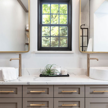
Primary Bath-This did not exist prior to the remodel and the client wanted a more neutral space with strong visual details. We split the walls in half with a datum line that transitions from penny gap molding to the tile in the shower. To provide some more visual drama, we did a chevron tile arrangement on the floor, gridded the shower enclosure for some deep contrast an array of brass and quartz to elevate the finishes.
Powder Bath-This is always a fun place to let your vision get out of the box a bit. All the elements were familiar to the space but modernized and more playful. The floor has a wood look tile in a herringbone arrangement, a navy vanity, gold fixtures that are all servants to the star of the room - the blue and white deco wall tile behind the vanity.
Full Bath-This was a quirky little bathroom that you'd always keep the door closed when guests are over. Now we have brought the blue tones into the space and accented it with bronze fixtures and a playful southwestern floor tile.
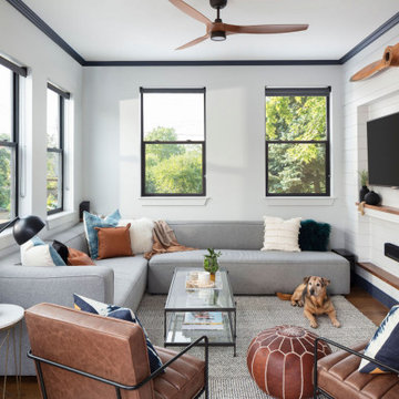
Living Room & Office-This room was too big for its own good and now serves multiple purposes. We condensed the space to provide a living area for the whole family plus other guests and left enough room to explain the space with floor cushions. The office was a bonus to the project as it provided privacy to a room that otherwise had none before.
 TVL Creative Ltd.
This 1910 West Highlands home was so compartmentalized that you couldn't help to notice you were constantly entering a new room every 8-10 feet. There was also a 500 SF addition put on the back of the home to accommodate a living room, 3/4 bath, laundry room and back foyer - 350 SF of that was for the living room. Needless to say, the house needed to be gutted and replanned.
Kitchen+Dining+Laundry-Like most of these early 1900's homes, the kitchen was not the heartbeat of the home like they are today. This kitchen was tucked away in the back and smaller than any other social rooms in the house. We knocked out the walls of the dining room to expand and created an open floor plan suitable for any type of gathering. As a nod to the history of the home, we used butcherblock for all the countertops and shelving which was accented by tones of brass, dusty blues and light-warm greys. This room had no storage before so creating ample storage and a variety of storage types was a critical ask for the client. One of my favorite details is the blue crown that draws from one end of the space to the other, accenting a ceiling that was otherwise forgotten.
Primary Bath-This did not exist prior to the remodel and the client wanted a more neutral space with strong visual details. We split the walls in half with a datum line that transitions from penny gap molding to the tile in the shower. To provide some more visual drama, we did a chevron tile arrangement on the floor, gridded the shower enclosure for some deep contrast an array of brass and quartz to elevate the finishes.
Powder Bath-This is always a fun place to let your vision get out of the box a bit. All the elements were familiar to the space but modernized and more playful. The floor has a wood look tile in a herringbone arrangement, a navy vanity, gold fixtures that are all servants to the star of the room - the blue and white deco wall tile behind the vanity.
Full Bath-This was a quirky little bathroom that you'd always keep the door closed when guests are over. Now we have brought the blue tones into the space and accented it with bronze fixtures and a playful southwestern floor tile.
Living Room & Office-This room was too big for its own good and now serves multiple purposes. We condensed the space to provide a living area for the whole family plus other guests and left enough room to explain the space with floor cushions. The office was a bonus to the project as it provided privacy to a room that otherwise had none before.
 Michael Nash Design, Build & Homes
2010 NATIONAL NARI REGIONAL AWARD WINNER
Project Scope
The owners of this 7,000 square foot colonial in Oakton, Virginia, were seeking a multi-level Mediterranean-style indoor/outdoor living space off the back of their home. They turned to Michael Nash Design, Build & Homes for a design solution that would include a stone patio, a second-story deck, a screened-in porch and linking staircases.
While the structure was designed primarily for family dining and entertaining, it also had to accommodate periodic social gatherings of one hundred guests or more. To meet these needs, the project would include a fully-equipped outdoor kitchen, several serving counters with permanent refrigeration, and well-delineated socializing and dining zones.
The existing home’s setting offered several impressive assets the new outdoor living area was designed to exploit. The sprawling acreage features old stand trees, wooded paths and a private lake. Beautifully landscaped, it unfolds as an idyllic panorama that naturally draws people to the outdoors.
Challenges
Since the rear elevation was situated on a slope that drops away from the house, the Michael Nash team had to raise the grade two feet within in a 2,000 square foot area extending out from the back of the house. Infrastructure plans also called for a sophisticated drainage system that had to accommodate a whole series of water “runoff” considerations to be integrated into the decking itself. Excavation included constructing retaining walls to bolster the elevated grade—which also had to support a concrete slab, the primary foundation for the entire complex.
Solutions
The ground level decking consists of a 2,000 square foot flagstone patio level with the home’s lower level doors. There is a decorative water fountain mid-patio—an ornate collectible acquired in Florida. Food preparation is concentrated within a specially designed semi-circular wall that creates an “outdoor kitchen” equipped with a 60” Viking barbecue grill, a prep sink, a warming drawer, refrigerator and appropriate storage. There is a granite surfaced dining counter with seating for eight.
Wrought iron railing and approximately 20 decorative columns (some encasing steel vertical supports) are incorporated into the design scheme. Many of the columns house accent lights.
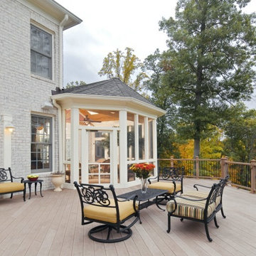
The top level—supported by horizontal steel beams– is a 2,500 square foot deck constructed entirely of Trex decking. The open air decking is, again, directly accessible from rooms on the second level of the house including the kitchen, sunroom and family room.
The platform’s most prominent feature is a U-shaped “kitchenette” with cedar shake shingle roofing. Like its counterpart one level below, the facility is equipped with grill, refrigerator and stainless steel cabinetry.
One portion of the deck has been allocated for a 16’ x 16’ octagonal screened-in porch crowned by a pair of 2’ x 4’ skylights. The porch can be accessed from the home’s conservatory via a set of French doors. With its mosaic tile flooring, stained cedar panel ceiling and honed granite counters, the interior is elegant and calming. Hand-painted stenciling and a wall-mounted water feature provide distinctive detailing.
Finally, the design introduced elements to highlight and reinforce an awareness of the lovely bucolic setting. Fountains and water features combined with textured surfaces and mosaic tiling and backsplashes to present a villa-like ambiance well-suited to the Virginia countryside.
 Design West
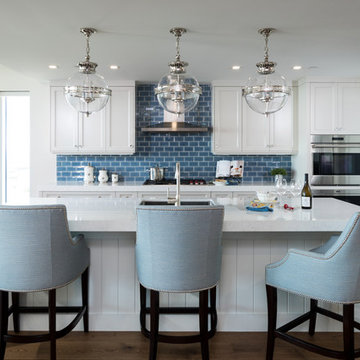
The primary color scheme of this room uses various shades of blue, to help pop-in coastal undertones. We mixed patterns and straight lines with organic elements to create soft edges.
 EAG Studio
On a quiet street just steps from San Francisco’s beloved Dolores Park, a formerly modest urban structure has been transformed into a luminous vertical residence that quietly redefines contemporary city living. Through a comprehensive remodel and both vertical and horizontal expansion, the project turns a constrained urban footprint into a sequence of serene, art-forward living spaces that unfold upward toward expansive city views.
The architecture balances restraint and warmth: crisp contemporary geometry softened by natural materials, artful lighting, and carefully curated interiors. The result is a home that feels simultaneously grounded and elevated—deeply connected to its neighborhood yet remarkably private.
Reimagining the Urban Envelope
The original building has been almost entirely reconceived. The facade now reads as a disciplined composition of plaster volumes and precisely detailed window openings framed by subtle projecting bands. The geometry references San Francisco’s classic rhythm of bayed facades while stripping the language down to a refined modern expression.
Behind this quiet exterior lies a dramatically expanded interior volume. The redesign adds both additional floor area and new vertical circulation, transforming what was once a conventional city house into a multi-level architectural sequence organized around light, art, and views.
At the roofline, planted terraces soften the building’s silhouette and create a green crown visible from surrounding hillsides.
Interiors as a Sequence of Galleries
Inside, the home unfolds as a series of spatial moments connected by a sculptural stair and gallery-like corridors.
Wide plank oak floors run throughout, providing continuity and warmth against a palette of plaster walls, dark steel detailing, and natural stone. The hallways function almost as curated galleries, with layered artworks suspended in front of mesh panels that create depth and subtle shadow.
Light filters through carefully placed windows and stair openings, transforming circulation spaces into contemplative transitions rather than mere passageways.
A Living Room Anchored by Stone and Light
The primary living room occupies one of the home’s central floors, where a quiet interplay of texture and geometry defines the space.
A monumental fireplace wrapped in dark stone forms the room’s anchor, its mass contrasting with a recessed ceiling plane that seems to float above the seating area. Integrated perimeter lighting creates a soft architectural glow that washes the ceiling and walls.
Furniture is sculptural yet understated—rounded lounge chairs in warm ochre velvet, tailored sofas, and a striking marble cocktail table whose expressive veining becomes a focal artwork in itself. Deep blue carpeting grounds the seating arrangement and subtly absorbs light, enhancing the calm atmosphere.
Above the fireplace, a delicate projection artwork introduces a moment of visual poetry—an unexpected cinematic gesture that transforms the wall into a quietly animated canvas.
Kitchen as Architectural Furniture
The kitchen expresses a different register: crisp, tactile, and materially rich.
Custom walnut cabinetry spans the wall in a continuous plane, punctuated only by the sculpted hood and integrated appliances. The wood’s depth and warmth are balanced by expanses of pale marble that flow seamlessly from countertop to backsplash.
Three dome pendants hover above the island like industrial sculptures, casting pools of warm light onto the stone surface.
A row of vivid red stools introduces a controlled burst of color, a small but confident departure from the otherwise restrained palette.
Dining With a Living Backdrop
Adjacent to the kitchen, the dining room opens toward a glass wall overlooking a vertical garden of climbing ivy. The greenery becomes a constantly changing backdrop—lush and shadowy during the day, atmospheric and cinematic after sunset.
A dark wood table anchors the room, surrounded by pale oak chairs whose understated forms echo Scandinavian design traditions. The simplicity of the furniture allows the view and natural light to become the dominant experience.
Intimate Spaces and Material Contrast
Throughout the home, smaller rooms offer moments of intimacy and material experimentation.
The powder room pairs textured wall coverings with a dramatic black marble vanity whose bold veining feels almost geological. A suspended mirror and slender pendant create a sculptural composition against the tactile backdrop.
The primary bedroom, by contrast, feels serene and expansive. Floor-to-ceiling glazing frames sweeping views of the city, while soft textiles and warm wood paneling create a cocooning effect. Slender black columns subtly define a sitting area without interrupting the openness of the space.
Bathing Above the City
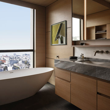
In the primary bathroom, a sculptural freestanding tub sits beside a panoramic window overlooking San Francisco’s hills and rooftops.
The room’s palette—light oak, grey stone, and matte metals—reinforces the spa-like atmosphere. Floating cabinetry and integrated lighting maintain a sense of visual lightness despite the richness of the materials.
Entertaining Above the Park
Higher in the house, a lounge and bar area becomes the social heart of the home. Here, dark stone slabs with dramatic veining wrap the bar wall like a piece of monumental art.
Open shelving displays glassware and spirits, while integrated wine storage hints at the home’s entertaining ambitions. A soft leather sectional and low glass table create a relaxed setting for conversation, framed by expansive views of the city skyline.
Cinema and Retreat
The lower level introduces yet another atmosphere: a dedicated media room designed for immersive viewing.
Dark walls, plush seating, and soft lighting create a cinematic environment that contrasts intentionally with the airy upper floors. It’s a retreat within the home—intimate, quiet, and removed from the brightness above.
Architecture That Balances Discipline and Warmth
What makes the project particularly compelling is its balance between architectural discipline and lived warmth.
Every element—from the carefully framed views to the restrained material palette—contributes to a cohesive spatial narrative. Yet the home never feels austere. Natural materials, curated art, and layered lighting create a sense of comfort and depth.
The result is a house that feels both architecturally rigorous and deeply human.
A Contemporary Interpretation of San Francisco Living
In a neighborhood defined by historic homes and iconic park views, this transformation offers a contemporary interpretation of San Francisco living.
It respects the city’s urban density while embracing openness, light, and vertical living. The home rises quietly above its surroundings, culminating in panoramic vistas that stretch across rooftops, hills, and sky.
What began as a conventional structure has become something far more nuanced: a modern urban sanctuary—part gallery, part retreat, and wholly connected to the vibrant city just beyond its walls.
 Klopf Architecture
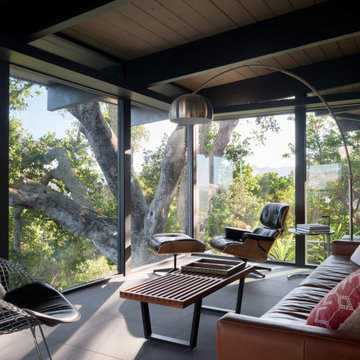
Set in a quiet neighborhood and framed by mature trees, this residence presented a unique opportunity: to thoughtfully evolve a custom mid-century modern home into a space that supports the everyday rhythms of a growing family. With a deep respect for the home’s original architecture, Klopf Architecture reimagined the house to better meet the needs of its owners—introducing functional improvements while preserving the spirit and character of its mid-century roots.
The clients approached Klopf Architecture with a clear vision: refresh their home while seamlessly integrating new programmatic elements. Key goals included clarifying and enhancing the entry sequence; connecting the detached garage to the main house with a practical yet architecturally intentional intervention; adding functional spaces such as a mudroom and laundry room; expanding and remodeling the primary suite’s bathroom and closet; and creating a more engaging outdoor space that capitalized on the site’s impressive views, featuring a fire pit and outdoor kitchen.
As a couple with distinct yet complementary perspectives—one focused on modern functionality and technology, and the other dedicated to preserving the home’s architectural integrity—their collaboration with Klopf Architecture resulted in a solution that harmonized both ideals. Their shared commitment to improving the livability of their home led to a design dialogue rooted in balance. This dynamic partnership shaped the direction of the renovation, ensuring that every decision honored the spirit of the original home while aligning with the practical needs of their growing family.
Designing within the constraints of the sloped site posed one of the project’s central challenges. The detached garage sat at a higher elevation than the main house, requiring a solution that ensured architectural and geometric compatibility between the two structures. Rather than create a purely utilitarian link, Klopf Architecture introduced an intentional connection that contributes to the overall architectural language. A notable pinch point in the plan—where differing geometries converged—was treated as a hinge point, turning a potentially awkward juncture into an architectural feature. This area now functions as both a transition and a moment of design interest that unifies the overall plan.
The design also addressed the underutilized outdoor area, which was located in a shadowed portion of the site with geometrical limitations. A new connection to the rear deck was created in this same area, making the outdoor space more useful and inviting. Klopf Architecture introduced carefully positioned openings and spatial improvements that forged a strong visual and functional connection between indoor and outdoor spaces. The outdoor area now reads as a deliberate extension of the home, embracing natural light and emphasizing the dramatic views.
Working through multiple design iterations, Klopf Architecture crafted a solution that preserved the architectural language of the original home while supporting the functional needs of modern life. The garage-to-house connection became more than a passage—it evolved into an architectural moment of transition. A new mudroom and laundry space enhanced convenience without compromising the clean lines of the design. The primary suite was expanded to create a private, serene retreat. The reimagined backyard, complete with fire pit and kitchen, now plays a vital role in the family’s daily routine and social life.
Outcomes and Lasting Impact
The result is a home that balances heritage with contemporary design, technical precision with design sensibility. The redesign not only met the clients’ initial goals but also exceeded expectations in its ability to seamlessly blend past and present, function and beauty, making the outdoor kitchen a favorite gathering place.
Beyond aesthetics, the renovation has significantly improved daily life for the family. The newly integrated garage connection has streamlined routines, providing a seamless transition between arriving home, storing belongings, and entering the main living spaces. The expanded primary suite offers a retreat-like atmosphere, creating a private space to unwind at the end of the day. The redesigned outdoor areas have also become an extension of their lifestyle—whether it's casual family dinners around the fire pit, entertaining friends in the outdoor kitchen, or simply enjoying the view from the reimagined backyard.
Through a thoughtful and strategic approach, the house has been successfully evolved into a home that remains true to its mid-century modern roots while enhancing livability, functionality, and the overall quality of life for the modern-day owners.
Klopf Architecture Team: Geoffrey Campen, Fernanda Bernardes
Architectural Interior Design: Klopf Architecture
Structural Engineer: Base Design Inc.
Contractor: Golden Snail Builders
Photography: Mariko Reed
Year Completed:2022
 TVL Creative Ltd.
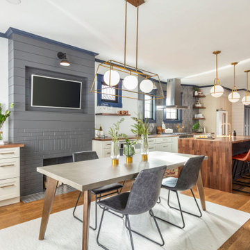
This 1910 West Highlands home was so compartmentalized that you couldn't help to notice you were constantly entering a new room every 8-10 feet. There was also a 500 SF addition put on the back of the home to accommodate a living room, 3/4 bath, laundry room and back foyer - 350 SF of that was for the living room. Needless to say, the house needed to be gutted and replanned.
Kitchen+Dining+Laundry-Like most of these early 1900's homes, the kitchen was not the heartbeat of the home like they are today. This kitchen was tucked away in the back and smaller than any other social rooms in the house. We knocked out the walls of the dining room to expand and created an open floor plan suitable for any type of gathering. As a nod to the history of the home, we used butcherblock for all the countertops and shelving which was accented by tones of brass, dusty blues and light-warm greys. This room had no storage before so creating ample storage and a variety of storage types was a critical ask for the client. One of my favorite details is the blue crown that draws from one end of the space to the other, accenting a ceiling that was otherwise forgotten.
Primary Bath-This did not exist prior to the remodel and the client wanted a more neutral space with strong visual details. We split the walls in half with a datum line that transitions from penny gap molding to the tile in the shower. To provide some more visual drama, we did a chevron tile arrangement on the floor, gridded the shower enclosure for some deep contrast an array of brass and quartz to elevate the finishes.
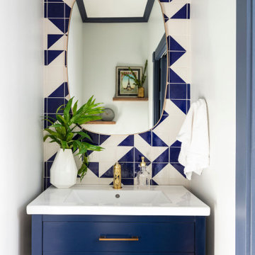
Powder Bath-This is always a fun place to let your vision get out of the box a bit. All the elements were familiar to the space but modernized and more playful. The floor has a wood look tile in a herringbone arrangement, a navy vanity, gold fixtures that are all servants to the star of the room - the blue and white deco wall tile behind the vanity.
Full Bath-This was a quirky little bathroom that you'd always keep the door closed when guests are over. Now we have brought the blue tones into the space and accented it with bronze fixtures and a playful southwestern floor tile.
Living Room & Office-This room was too big for its own good and now serves multiple purposes. We condensed the space to provide a living area for the whole family plus other guests and left enough room to explain the space with floor cushions. The office was a bonus to the project as it provided privacy to a room that otherwise had none before.
 TVL Creative Ltd.
This 1910 West Highlands home was so compartmentalized that you couldn't help to notice you were constantly entering a new room every 8-10 feet. There was also a 500 SF addition put on the back of the home to accommodate a living room, 3/4 bath, laundry room and back foyer - 350 SF of that was for the living room. Needless to say, the house needed to be gutted and replanned.
Kitchen+Dining+Laundry-Like most of these early 1900's homes, the kitchen was not the heartbeat of the home like they are today. This kitchen was tucked away in the back and smaller than any other social rooms in the house. We knocked out the walls of the dining room to expand and created an open floor plan suitable for any type of gathering. As a nod to the history of the home, we used butcherblock for all the countertops and shelving which was accented by tones of brass, dusty blues and light-warm greys. This room had no storage before so creating ample storage and a variety of storage types was a critical ask for the client. One of my favorite details is the blue crown that draws from one end of the space to the other, accenting a ceiling that was otherwise forgotten.
Primary Bath-This did not exist prior to the remodel and the client wanted a more neutral space with strong visual details. We split the walls in half with a datum line that transitions from penny gap molding to the tile in the shower. To provide some more visual drama, we did a chevron tile arrangement on the floor, gridded the shower enclosure for some deep contrast an array of brass and quartz to elevate the finishes.
Powder Bath-This is always a fun place to let your vision get out of the box a bit. All the elements were familiar to the space but modernized and more playful. The floor has a wood look tile in a herringbone arrangement, a navy vanity, gold fixtures that are all servants to the star of the room - the blue and white deco wall tile behind the vanity.
Full Bath-This was a quirky little bathroom that you'd always keep the door closed when guests are over. Now we have brought the blue tones into the space and accented it with bronze fixtures and a playful southwestern floor tile.
Living Room & Office-This room was too big for its own good and now serves multiple purposes. We condensed the space to provide a living area for the whole family plus other guests and left enough room to explain the space with floor cushions. The office was a bonus to the project as it provided privacy to a room that otherwise had none before.
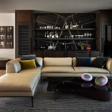 EAG Studio
On a quiet street just steps from San Francisco’s beloved Dolores Park, a formerly modest urban structure has been transformed into a luminous vertical residence that quietly redefines contemporary city living. Through a comprehensive remodel and both vertical and horizontal expansion, the project turns a constrained urban footprint into a sequence of serene, art-forward living spaces that unfold upward toward expansive city views.
The architecture balances restraint and warmth: crisp contemporary geometry softened by natural materials, artful lighting, and carefully curated interiors. The result is a home that feels simultaneously grounded and elevated—deeply connected to its neighborhood yet remarkably private.
Reimagining the Urban Envelope
The original building has been almost entirely reconceived. The facade now reads as a disciplined composition of plaster volumes and precisely detailed window openings framed by subtle projecting bands. The geometry references San Francisco’s classic rhythm of bayed facades while stripping the language down to a refined modern expression.
Behind this quiet exterior lies a dramatically expanded interior volume. The redesign adds both additional floor area and new vertical circulation, transforming what was once a conventional city house into a multi-level architectural sequence organized around light, art, and views.
At the roofline, planted terraces soften the building’s silhouette and create a green crown visible from surrounding hillsides.
Interiors as a Sequence of Galleries
Inside, the home unfolds as a series of spatial moments connected by a sculptural stair and gallery-like corridors.
Wide plank oak floors run throughout, providing continuity and warmth against a palette of plaster walls, dark steel detailing, and natural stone. The hallways function almost as curated galleries, with layered artworks suspended in front of mesh panels that create depth and subtle shadow.
Light filters through carefully placed windows and stair openings, transforming circulation spaces into contemplative transitions rather than mere passageways.
A Living Room Anchored by Stone and Light
The primary living room occupies one of the home’s central floors, where a quiet interplay of texture and geometry defines the space.
A monumental fireplace wrapped in dark stone forms the room’s anchor, its mass contrasting with a recessed ceiling plane that seems to float above the seating area. Integrated perimeter lighting creates a soft architectural glow that washes the ceiling and walls.
Furniture is sculptural yet understated—rounded lounge chairs in warm ochre velvet, tailored sofas, and a striking marble cocktail table whose expressive veining becomes a focal artwork in itself. Deep blue carpeting grounds the seating arrangement and subtly absorbs light, enhancing the calm atmosphere.
Above the fireplace, a delicate projection artwork introduces a moment of visual poetry—an unexpected cinematic gesture that transforms the wall into a quietly animated canvas.
Kitchen as Architectural Furniture
The kitchen expresses a different register: crisp, tactile, and materially rich.
Custom walnut cabinetry spans the wall in a continuous plane, punctuated only by the sculpted hood and integrated appliances. The wood’s depth and warmth are balanced by expanses of pale marble that flow seamlessly from countertop to backsplash.
Three dome pendants hover above the island like industrial sculptures, casting pools of warm light onto the stone surface.
A row of vivid red stools introduces a controlled burst of color, a small but confident departure from the otherwise restrained palette.
Dining With a Living Backdrop
Adjacent to the kitchen, the dining room opens toward a glass wall overlooking a vertical garden of climbing ivy. The greenery becomes a constantly changing backdrop—lush and shadowy during the day, atmospheric and cinematic after sunset.
A dark wood table anchors the room, surrounded by pale oak chairs whose understated forms echo Scandinavian design traditions. The simplicity of the furniture allows the view and natural light to become the dominant experience.
Intimate Spaces and Material Contrast
Throughout the home, smaller rooms offer moments of intimacy and material experimentation.
The powder room pairs textured wall coverings with a dramatic black marble vanity whose bold veining feels almost geological. A suspended mirror and slender pendant create a sculptural composition against the tactile backdrop.
The primary bedroom, by contrast, feels serene and expansive. Floor-to-ceiling glazing frames sweeping views of the city, while soft textiles and warm wood paneling create a cocooning effect. Slender black columns subtly define a sitting area without interrupting the openness of the space.
Bathing Above the City
In the primary bathroom, a sculptural freestanding tub sits beside a panoramic window overlooking San Francisco’s hills and rooftops.
The room’s palette—light oak, grey stone, and matte metals—reinforces the spa-like atmosphere. Floating cabinetry and integrated lighting maintain a sense of visual lightness despite the richness of the materials.
Entertaining Above the Park
Higher in the house, a lounge and bar area becomes the social heart of the home. Here, dark stone slabs with dramatic veining wrap the bar wall like a piece of monumental art.
Open shelving displays glassware and spirits, while integrated wine storage hints at the home’s entertaining ambitions. A soft leather sectional and low glass table create a relaxed setting for conversation, framed by expansive views of the city skyline.
Cinema and Retreat
The lower level introduces yet another atmosphere: a dedicated media room designed for immersive viewing.
Dark walls, plush seating, and soft lighting create a cinematic environment that contrasts intentionally with the airy upper floors. It’s a retreat within the home—intimate, quiet, and removed from the brightness above.
Architecture That Balances Discipline and Warmth
What makes the project particularly compelling is its balance between architectural discipline and lived warmth.
Every element—from the carefully framed views to the restrained material palette—contributes to a cohesive spatial narrative. Yet the home never feels austere. Natural materials, curated art, and layered lighting create a sense of comfort and depth.
The result is a house that feels both architecturally rigorous and deeply human.
A Contemporary Interpretation of San Francisco Living
In a neighborhood defined by historic homes and iconic park views, this transformation offers a contemporary interpretation of San Francisco living.
It respects the city’s urban density while embracing openness, light, and vertical living. The home rises quietly above its surroundings, culminating in panoramic vistas that stretch across rooftops, hills, and sky.
What began as a conventional structure has become something far more nuanced: a modern urban sanctuary—part gallery, part retreat, and wholly connected to the vibrant city just beyond its walls.
 Sudderth Design
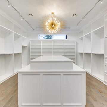
EUROPEAN MODERN MASTERPIECE! Exceptionally crafted by Sudderth Design. RARE private, OVERSIZED LOT steps from Exclusive OKC Golf and Country Club on PREMIER Wishire Blvd in Nichols Hills. Experience majestic courtyard upon entering the residence.
Aesthetic Purity at its finest! Over-sized island in Chef's kitchen. EXPANSIVE living areas that serve as magnets for social gatherings. HIGH STYLE EVERYTHING..From fixtures, to wall paint/paper, hardware, hardwoods, and stones. PRIVATE Master Retreat with sitting area, fireplace and sliding glass doors leading to spacious covered patio. Master bath is STUNNING! Floor to Ceiling marble with ENORMOUS closet. Moving glass wall system in living area leads to BACKYARD OASIS with 40 foot covered patio, outdoor kitchen, fireplace, outdoor bath, and premier pool w/sun pad and hot tub! Well thought out OPEN floor plan has EVERYTHING! 3 car garage with 6 car motor court. THE PLACE TO BE...PICTURESQUE, private retreat.
 Robert M. Cain, Architect
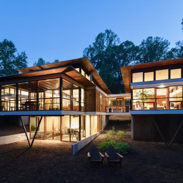
Holly Hill, a retirement home, whose owner's hobbies are gardening and restoration of classic cars, is nestled into the site contours to maximize views of the lake and minimize impact on the site.
Holly Hill is comprised of three wings joined by bridges: A wing facing a master garden to the east, another wing with workshop and a central activity, living, dining wing. Similar to a radiator the design increases the amount of exterior wall maximizing opportunities for natural ventilation during temperate months.
Other passive solar design features will include extensive eaves, sheltering porches and high-albedo roofs, as strategies for considerably reducing solar heat gain.
Daylighting with clerestories and solar tubes reduce daytime lighting requirements. Ground source geothermal heat pumps and superior to code insulation ensure minimal space conditioning costs. Corten steel siding and concrete foundation walls satisfy client requirements for low maintenance and durability. All light fixtures are LEDs.
Open and screened porches are strategically located to allow pleasant outdoor use at any time of day, particular season or, if necessary, insect challenge. Dramatic cantilevers allow the porches to project into the site’s beautiful mixed hardwood tree canopy without damaging root systems.
Guest arrive by vehicle with glimpses of the house and grounds through penetrations in the concrete wall enclosing the garden. One parked they are led through a garden composed of pavers, a fountain, benches, sculpture and plants. Views of the lake can be seen through and below the bridges.
Primary client goals were a sustainable low-maintenance house, primarily single floor living, orientation to views, natural light to interiors, maximization of individual privacy, creation of a formal outdoor space for gardening, incorporation of a full workshop for cars, generous indoor and outdoor social space for guests and parties.
 ZeroEnergy Design
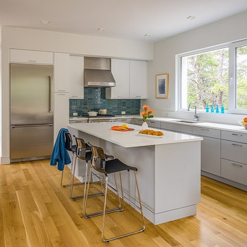
This modern green home offers both a vacation destination on Cape Cod near local family members and an opportunity for rental income.
FAMILY ROOTS. A West Coast couple living in the San Francisco Bay Area sought a permanent East Coast vacation home near family members living on Cape Cod. As academic professionals focused on sustainability, they sought a green, energy efficient home that was well-aligned with their values. With no green homes available for sale on Cape Cod, they decided to purchase land near their family and build their own.
SLOPED SITE. Comprised of a 3/4 acre lot nestled in the pines, the steeply sloping terrain called for a plan that embraced and took advantage of the slope. Of equal priority was optimizing solar exposure, preserving privacy from abutters, and creating outdoor living space. The design accomplished these goals with a simple, rectilinear form, offering living space on the both entry and lower/basement levels. The stepped foundation allows for a walk-out basement level with light-filled living space on the down-hill side of the home. The traditional basement on the eastern, up-hill side houses mechanical equipment and a home gym. The house welcomes natural light throughout, captures views of the forest, and delivers entertainment space that connects indoor living space to outdoor deck and dining patio.
MODERN VISION. The clean building form and uncomplicated finishes pay homage to the modern architectural legacy on the outer Cape. Durable and economical fiber cement panels, fixed with aluminum channels, clad the primary form. Cedar clapboards provide a visual accent at the south-facing living room, which extends a single roof plane to cover the entry porch.
SMART USE OF SPACE. On the entry level, the “L”-shaped living, dining, and kitchen space connects to the exterior living, dining, and grilling spaces to effectively double the home’s summertime entertainment area. Placed at the western end of the entry level (where it can retain privacy but still claim expansive downhill views) is the master suite with a built-in study. The lower level has two guest bedrooms, a second full bathroom, and laundry. The flexibility of the space—crucial in a house with a modest footprint—emerges in one of the guest bedrooms, which doubles as home office by opening the barn-style double doors to connect it to the bright, airy open stair leading up to the entry level. Thoughtful design, generous ceiling heights and large windows transform the modest 1,100 sf* footprint into a well-lit, spacious home. *(total finished space is 1800 sf)
RENTAL INCOME. The property works for its owners by netting rental income when the owners are home in San Francisco. The house especially caters to vacationers bound for nearby Mayo Beach and includes an outdoor shower adjacent to the lower level entry door. In contrast to the bare bones cottages that are typically available on the Cape, this home offers prospective tenants a modern aesthetic, paired with luxurious and green features. Durable finishes inside and out will ensure longevity with the heavier use that comes with a rental property.
COMFORT YEAR-ROUND. The home is super-insulated and air-tight, with mechanical ventilation to provide continuous fresh air from the outside. High performance triple-paned windows complement the building enclosure and maximize passive solar gain while ensuring a warm, draft-free winter, even when sitting close to the glass. A properly sized air source heat pump offers efficient heating & cooling, and includes a carefully designed the duct distribution system to provide even comfort throughout the house. The super-insulated envelope allows us to significantly reduce the equipment capacity, duct size, and airflow quantities, while maintaining unparalleled thermal comfort.
ENERGY EFFICIENT. The building’s shell and mechanical systems play instrumental roles in the home’s exceptional performance. The building enclosure reduces the most significant energy glutton: heating. Continuous super-insulation, thorough air sealing, triple-pane windows, and passive solar gain work together to yield a miniscule heating load. All active energy consumers are extremely efficient: an air source heat pump for heating and cooling, a heat pump hot water heater, LED lighting, energy recovery ventilation (ERV), and high efficiency appliances. The result is a home that uses 70% less energy than a similar new home built to code requirements.
OVERALL. The home embodies the owners’ goals and values while comprehensively enabling thermal comfort, energy efficiency, a vacation respite, and supplementary income.
PROJECT TEAM
ZeroEnergy Design - Architect & Mechanical Designer
A.F. Hultin & Co. - Contractor
Pamet Valley Landscape Design - Landscape & Masonry
Lisa Finch - Original Artwork
European Architectural Supply - Windows
Eric Roth Photography - Photography
 Rodwin Architecture & Skycastle Construction
Rodwin Architecture & Skycastle Homes
Location: Boulder, Colorado, USA
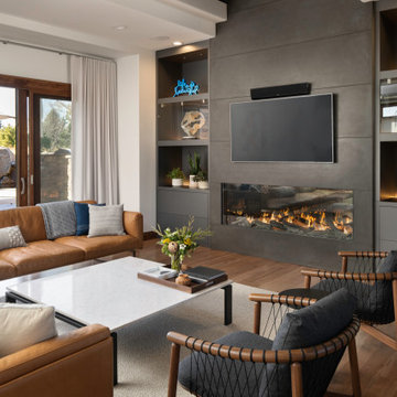
Interior design, space planning and architectural details converge thoughtfully in this transformative project. A 15-year old, 9,000 sf. home with generic interior finishes and odd layout needed bold, modern, fun and highly functional transformation for a large bustling family. To redefine the soul of this home, texture and light were given primary consideration. Elegant contemporary finishes, a warm color palette and dramatic lighting defined modern style throughout. A cascading chandelier by Stone Lighting in the entry makes a strong entry statement. Walls were removed to allow the kitchen/great/dining room to become a vibrant social center. A minimalist design approach is the perfect backdrop for the diverse art collection. Yet, the home is still highly functional for the entire family. We added windows, fireplaces, water features, and extended the home out to an expansive patio and yard.
The cavernous beige basement became an entertaining mecca, with a glowing modern wine-room, full bar, media room, arcade, billiards room and professional gym.
Bathrooms were all designed with personality and craftsmanship, featuring unique tiles, floating wood vanities and striking lighting.
This project was a 50/50 collaboration between Rodwin Architecture and Kimball Modern
 Klopf Architecture
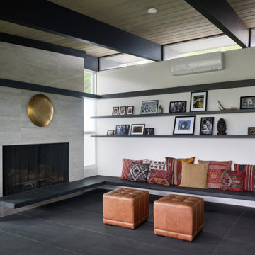
Set in a quiet neighborhood and framed by mature trees, this residence presented a unique opportunity: to thoughtfully evolve a custom mid-century modern home into a space that supports the everyday rhythms of a growing family. With a deep respect for the home’s original architecture, Klopf Architecture reimagined the house to better meet the needs of its owners—introducing functional improvements while preserving the spirit and character of its mid-century roots.
The clients approached Klopf Architecture with a clear vision: refresh their home while seamlessly integrating new programmatic elements. Key goals included clarifying and enhancing the entry sequence; connecting the detached garage to the main house with a practical yet architecturally intentional intervention; adding functional spaces such as a mudroom and laundry room; expanding and remodeling the primary suite’s bathroom and closet; and creating a more engaging outdoor space that capitalized on the site’s impressive views, featuring a fire pit and outdoor kitchen.
As a couple with distinct yet complementary perspectives—one focused on modern functionality and technology, and the other dedicated to preserving the home’s architectural integrity—their collaboration with Klopf Architecture resulted in a solution that harmonized both ideals. Their shared commitment to improving the livability of their home led to a design dialogue rooted in balance. This dynamic partnership shaped the direction of the renovation, ensuring that every decision honored the spirit of the original home while aligning with the practical needs of their growing family.
Designing within the constraints of the sloped site posed one of the project’s central challenges. The detached garage sat at a higher elevation than the main house, requiring a solution that ensured architectural and geometric compatibility between the two structures. Rather than create a purely utilitarian link, Klopf Architecture introduced an intentional connection that contributes to the overall architectural language. A notable pinch point in the plan—where differing geometries converged—was treated as a hinge point, turning a potentially awkward juncture into an architectural feature. This area now functions as both a transition and a moment of design interest that unifies the overall plan.
The design also addressed the underutilized outdoor area, which was located in a shadowed portion of the site with geometrical limitations. A new connection to the rear deck was created in this same area, making the outdoor space more useful and inviting. Klopf Architecture introduced carefully positioned openings and spatial improvements that forged a strong visual and functional connection between indoor and outdoor spaces. The outdoor area now reads as a deliberate extension of the home, embracing natural light and emphasizing the dramatic views.
Working through multiple design iterations, Klopf Architecture crafted a solution that preserved the architectural language of the original home while supporting the functional needs of modern life. The garage-to-house connection became more than a passage—it evolved into an architectural moment of transition. A new mudroom and laundry space enhanced convenience without compromising the clean lines of the design. The primary suite was expanded to create a private, serene retreat. The reimagined backyard, complete with fire pit and kitchen, now plays a vital role in the family’s daily routine and social life.
Outcomes and Lasting Impact
The result is a home that balances heritage with contemporary design, technical precision with design sensibility. The redesign not only met the clients’ initial goals but also exceeded expectations in its ability to seamlessly blend past and present, function and beauty, making the outdoor kitchen a favorite gathering place.
Beyond aesthetics, the renovation has significantly improved daily life for the family. The newly integrated garage connection has streamlined routines, providing a seamless transition between arriving home, storing belongings, and entering the main living spaces. The expanded primary suite offers a retreat-like atmosphere, creating a private space to unwind at the end of the day. The redesigned outdoor areas have also become an extension of their lifestyle—whether it's casual family dinners around the fire pit, entertaining friends in the outdoor kitchen, or simply enjoying the view from the reimagined backyard.
Through a thoughtful and strategic approach, the house has been successfully evolved into a home that remains true to its mid-century modern roots while enhancing livability, functionality, and the overall quality of life for the modern-day owners.
Klopf Architecture Team: Geoffrey Campen, Fernanda Bernardes
Architectural Interior Design: Klopf Architecture
Structural Engineer: Base Design Inc.
Contractor: Golden Snail Builders
Photography: Mariko Reed
Year Completed:2022
 EAG Studio
On a quiet street just steps from San Francisco’s beloved Dolores Park, a formerly modest urban structure has been transformed into a luminous vertical residence that quietly redefines contemporary city living. Through a comprehensive remodel and both vertical and horizontal expansion, the project turns a constrained urban footprint into a sequence of serene, art-forward living spaces that unfold upward toward expansive city views.
The architecture balances restraint and warmth: crisp contemporary geometry softened by natural materials, artful lighting, and carefully curated interiors. The result is a home that feels simultaneously grounded and elevated—deeply connected to its neighborhood yet remarkably private.
Reimagining the Urban Envelope
The original building has been almost entirely reconceived. The facade now reads as a disciplined composition of plaster volumes and precisely detailed window openings framed by subtle projecting bands. The geometry references San Francisco’s classic rhythm of bayed facades while stripping the language down to a refined modern expression.
Behind this quiet exterior lies a dramatically expanded interior volume. The redesign adds both additional floor area and new vertical circulation, transforming what was once a conventional city house into a multi-level architectural sequence organized around light, art, and views.
At the roofline, planted terraces soften the building’s silhouette and create a green crown visible from surrounding hillsides.
Interiors as a Sequence of Galleries
Inside, the home unfolds as a series of spatial moments connected by a sculptural stair and gallery-like corridors.
Wide plank oak floors run throughout, providing continuity and warmth against a palette of plaster walls, dark steel detailing, and natural stone. The hallways function almost as curated galleries, with layered artworks suspended in front of mesh panels that create depth and subtle shadow.
Light filters through carefully placed windows and stair openings, transforming circulation spaces into contemplative transitions rather than mere passageways.
A Living Room Anchored by Stone and Light
The primary living room occupies one of the home’s central floors, where a quiet interplay of texture and geometry defines the space.
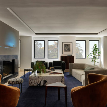
A monumental fireplace wrapped in dark stone forms the room’s anchor, its mass contrasting with a recessed ceiling plane that seems to float above the seating area. Integrated perimeter lighting creates a soft architectural glow that washes the ceiling and walls.
Furniture is sculptural yet understated—rounded lounge chairs in warm ochre velvet, tailored sofas, and a striking marble cocktail table whose expressive veining becomes a focal artwork in itself. Deep blue carpeting grounds the seating arrangement and subtly absorbs light, enhancing the calm atmosphere.
Above the fireplace, a delicate projection artwork introduces a moment of visual poetry—an unexpected cinematic gesture that transforms the wall into a quietly animated canvas.
Kitchen as Architectural Furniture
The kitchen expresses a different register: crisp, tactile, and materially rich.
Custom walnut cabinetry spans the wall in a continuous plane, punctuated only by the sculpted hood and integrated appliances. The wood’s depth and warmth are balanced by expanses of pale marble that flow seamlessly from countertop to backsplash.
Three dome pendants hover above the island like industrial sculptures, casting pools of warm light onto the stone surface.
A row of vivid red stools introduces a controlled burst of color, a small but confident departure from the otherwise restrained palette.
Dining With a Living Backdrop
Adjacent to the kitchen, the dining room opens toward a glass wall overlooking a vertical garden of climbing ivy. The greenery becomes a constantly changing backdrop—lush and shadowy during the day, atmospheric and cinematic after sunset.
A dark wood table anchors the room, surrounded by pale oak chairs whose understated forms echo Scandinavian design traditions. The simplicity of the furniture allows the view and natural light to become the dominant experience.
Intimate Spaces and Material Contrast
Throughout the home, smaller rooms offer moments of intimacy and material experimentation.
The powder room pairs textured wall coverings with a dramatic black marble vanity whose bold veining feels almost geological. A suspended mirror and slender pendant create a sculptural composition against the tactile backdrop.
The primary bedroom, by contrast, feels serene and expansive. Floor-to-ceiling glazing frames sweeping views of the city, while soft textiles and warm wood paneling create a cocooning effect. Slender black columns subtly define a sitting area without interrupting the openness of the space.
Bathing Above the City
In the primary bathroom, a sculptural freestanding tub sits beside a panoramic window overlooking San Francisco’s hills and rooftops.
The room’s palette—light oak, grey stone, and matte metals—reinforces the spa-like atmosphere. Floating cabinetry and integrated lighting maintain a sense of visual lightness despite the richness of the materials.
Entertaining Above the Park
Higher in the house, a lounge and bar area becomes the social heart of the home. Here, dark stone slabs with dramatic veining wrap the bar wall like a piece of monumental art.
Open shelving displays glassware and spirits, while integrated wine storage hints at the home’s entertaining ambitions. A soft leather sectional and low glass table create a relaxed setting for conversation, framed by expansive views of the city skyline.
Cinema and Retreat
The lower level introduces yet another atmosphere: a dedicated media room designed for immersive viewing.
Dark walls, plush seating, and soft lighting create a cinematic environment that contrasts intentionally with the airy upper floors. It’s a retreat within the home—intimate, quiet, and removed from the brightness above.
Architecture That Balances Discipline and Warmth
What makes the project particularly compelling is its balance between architectural discipline and lived warmth.
Every element—from the carefully framed views to the restrained material palette—contributes to a cohesive spatial narrative. Yet the home never feels austere. Natural materials, curated art, and layered lighting create a sense of comfort and depth.
The result is a house that feels both architecturally rigorous and deeply human.
A Contemporary Interpretation of San Francisco Living
In a neighborhood defined by historic homes and iconic park views, this transformation offers a contemporary interpretation of San Francisco living.
It respects the city’s urban density while embracing openness, light, and vertical living. The home rises quietly above its surroundings, culminating in panoramic vistas that stretch across rooftops, hills, and sky.
What began as a conventional structure has become something far more nuanced: a modern urban sanctuary—part gallery, part retreat, and wholly connected to the vibrant city just beyond its walls.
3