
Search results for "Prioritise" in Home Design Ideas

 Kitcheneering
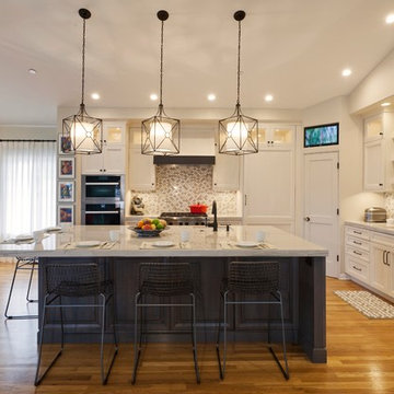
The aesthetics of the kitchen were critical because it is centrally located in the great room of which it is a part. The challenge was to integrate the kitchen into the larger space while making sure it didn't dominate it. We accomplished this by using a restrained color palette of cream, gold, gray-green and gray-blue with touches of deeper chocolate brown. The same colors repeat in the quartzite counters, arabesque stone mosaic back splash and stacked slate accent wall (also used in the fireplace in the living area). The uppermost cabinets feature glass doors and lighting to showcase a collection of crystal inherited from the client's grandmother. This feature is beautiful but also makes good use of cabinets too tall to reach conveniently. The glass doors add sparkle and the cabinet height enhances vertical lines of the space and draws the eye toward the vaulted ceiling.
Photo by Lane Barden
 TM GRADY BUILDERS
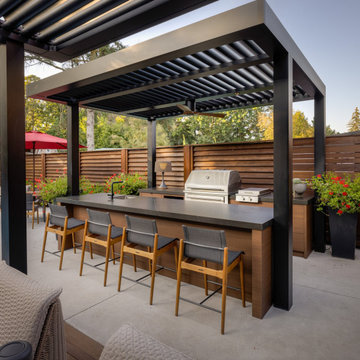
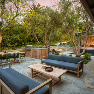
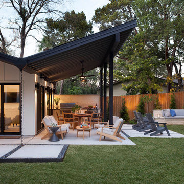
Trendy backyard stone patio photo in Orange County with a roof extension and a bbq area
Find the right local pro for your project
 Drury Design
The Setup:
After purchasing this home, the homeowners faced a unique opportunity to reimagine their kitchen and nearby spaces. Water damage from a burst pipe had left much of the home’s interior in need of repair, and while the existing kitchen was functional and in relatively good shape, it didn’t align with the family’s vision for their new home. The layout included a peninsula that wasn’t ideal, and there were some druthers with the nearby pantry.
Since the space needed to be rebuilt anyway, the homeowners saw this as a chance to create a kitchen that was both highly functional for their four young children and timeless in its design. The project also included a refresh of the adjacent message center and dining room — spaces that play key roles in the family’s daily life. The goal was to create a cohesive flow between these areas, balancing modern functionality with the craftsman-inspired character of the rest of the home.
Design Objectives:
- Replace the outdated peninsula with a large island to maximize counter space and create new seating options.
- Open up the space visually by removing soffits and rethinking the cabinetry layout.
Incorporate concealed refrigeration and freezer units to provide significant storage for the family while maintaining a streamlined aesthetic.
- Integrate black cabinetry into the design without making the space feel harsh or heavy.
- Ensure the lighting plan balances functional task lighting with ambient accent lighting.
- Avoid visual clutter in the cabinetry design while still giving a nod to the craftsman aesthetic.
- Incorporate a slab backsplash as a key design feature.
Design Challenges:
- The outdated peninsula left dead space in the kitchen and lacked sufficient seating for the family.
- The cooktop wall was cramped, with small cabinets flanking the hood, limited storage, and soffits that made the space feel closed-in.
- The family needed significant refrigeration space (two refrigerators and a freezer) but wanted to avoid a cluttered look with visible stainless steel appliances.
- Adding black cabinetry risked making the space feel too dark or heavy.
- The original lighting plan was insufficient, particularly over the dining table where a decorative fixture proved too dim.
- The family wanted shaker-style drawer fronts to match the home’s arts-and-crafts design but worried that too much shaker cabinetry might look overly busy.
- Prioritizing a slab backsplash in the wish list priority planning.
The Renewed Space
Design Solutions:
- A functional island: The peninsula was replaced with a large island that provides continuous countertop space for prepping and serving. The island also features seating for four people, creating a central hub for informal meals and activities.
- Streamlined cooktop wall: The soffits were removed, and the upper cabinets on the cooktop wall were eliminated to create a more open, streamlined design. A custom oversized hood became the focal point of the wall, with the blower unit offset inside it to align with the cooktop while maintaining exterior visual symmetry.
- Concealed refrigeration: Two column refrigerators and one freezer were integrated into the cabinetry, concealing them behind wood paneling that blends seamlessly with the overall design.
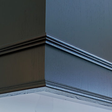
- Warm black cabinetry: The black cabinetry was crafted from hickory with a visible grain, softening its appearance and adding warmth. The grain detail gives the cabinetry a rich, textured look that avoids feeling stark or overpowering.
- Additional lighting: In the dining area, recessed can lights were added during an additional installation phase to supplement the gorgeous decorative fixture’s dim output. The new lighting plan creates a layered effect, combining functional task lighting with softer ambient lighting.
- Simplified cabinetry details: Slab drawer fronts were used on the upper drawers, while five-piece shaker fronts (with slightly less prominent rail and stile pieces) were reserved for the middle and lower drawers. This approach simplified the overall look while maintaining the craftsman-inspired aesthetic.
- Slab backsplash priority: The slab backsplash was prioritized by making thoughtful adjustments elsewhere, like opting not to extend cabinetry to the ceiling, which also helped visually prioritize the gorgeous slab backsplash. This decision also enhanced the kitchen’s furniture-like feel, aligning with the home’s craftsman character.
- This kitchen perfectly balances practicality with timeless style. By addressing the family’s functional needs — ample seating, smart storage, and effective lighting — while incorporating thoughtful design elements like warm black cabinetry and a striking slab backsplash, Alicia created a space that works beautifully for a busy household. The result is a cohesive, inviting kitchen that honors the home’s craftsman roots and will serve the family well for years to come.


 Phi Builders + Architects
Design Build Phi Builders + Architects
Custom Cabinetry Phi Builders + Architects
Sarah Szwajkos Photography
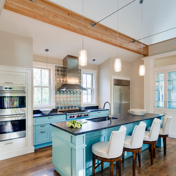
Cabinet Paint - Benjamin Moore Spectra Blue
Trim Paint - Benjamin Moore Cotton Balls
Wall Paint - Benjamin Moore Winds Breath
Wall Paint DR - Benjamin Moore Jamaican Aqua. The floor was a 4" yellow Birch which received a walnut stain.

 Wheeler Kearns Architects
White Kitchen, Modern
Interiors: Britt Taner Design
Photography: Tony Soluri Photography
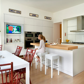
Example of a trendy light wood floor eat-in kitchen design in Chicago with flat-panel cabinets, white cabinets, white backsplash, glass sheet backsplash, stainless steel appliances and an island
Example of a trendy light wood floor eat-in kitchen design in Chicago with flat-panel cabinets, white cabinets, white backsplash, glass sheet backsplash, stainless steel appliances and an island
 Drewett Works
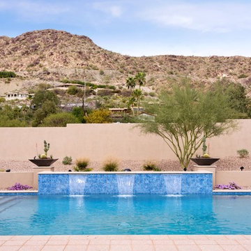
The unique opportunity and challenge for the Joshua Tree project was to enable the architecture to prioritize views. Set in the valley between Mummy and Camelback mountains, two iconic landforms located in Paradise Valley, Arizona, this lot “has it all” regarding views. The challenge was answered with what we refer to as the desert pavilion.
This highly penetrated piece of architecture carefully maintains a one-room deep composition. This allows each space to leverage the majestic mountain views. The material palette is executed in a panelized massing composition. The home, spawned from mid-century modern DNA, opens seamlessly to exterior living spaces providing for the ultimate in indoor/outdoor living.
Project Details:
Architecture: Drewett Works, Scottsdale, AZ // C.P. Drewett, AIA, NCARB // www.drewettworks.com
Builder: Bedbrock Developers, Paradise Valley, AZ // http://www.bedbrock.com
Interior Designer: Est Est, Scottsdale, AZ // http://www.estestinc.com
Photographer: Michael Duerinckx, Phoenix, AZ // www.inckx.com
 Quality Craftsman, Inc
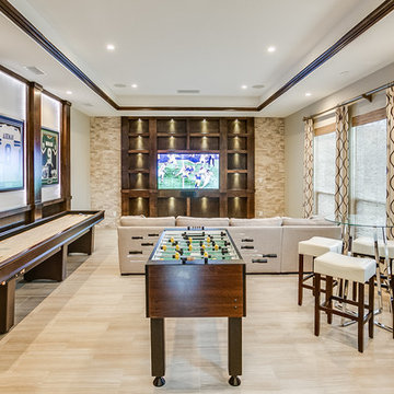
Quality Craftsman Inc is an award-winning Dallas remodeling contractor specializing in custom design work, new home construction, kitchen remodeling, bathroom remodeling, room additions and complete home renovations integrating contemporary stylings and features into existing homes in neighborhoods throughout North Dallas.
How can we help improve your living space?
 Drewett Works
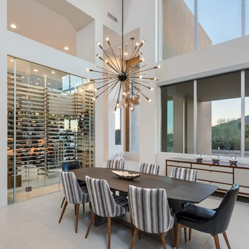
The unique opportunity and challenge for the Joshua Tree project was to enable the architecture to prioritize views. Set in the valley between Mummy and Camelback mountains, two iconic landforms located in Paradise Valley, Arizona, this lot “has it all” regarding views. The challenge was answered with what we refer to as the desert pavilion.
This highly penetrated piece of architecture carefully maintains a one-room deep composition. This allows each space to leverage the majestic mountain views. The material palette is executed in a panelized massing composition. The home, spawned from mid-century modern DNA, opens seamlessly to exterior living spaces providing for the ultimate in indoor/outdoor living.
Project Details:
Architecture: Drewett Works, Scottsdale, AZ // C.P. Drewett, AIA, NCARB // www.drewettworks.com
Builder: Bedbrock Developers, Paradise Valley, AZ // http://www.bedbrock.com
Interior Designer: Est Est, Scottsdale, AZ // http://www.estestinc.com
Photographer: Michael Duerinckx, Phoenix, AZ // www.inckx.com
 Susan Yeley Homes
This gem of a house was built in the 1950s, when its neighborhood undoubtedly felt remote. The university footprint has expanded in the 70 years since, however, and today this home sits on prime real estate—easy biking and reasonable walking distance to campus.
When it went up for sale in 2017, it was largely unaltered. Our clients purchased it to renovate and resell, and while we all knew we'd need to add square footage to make it profitable, we also wanted to respect the neighborhood and the house’s own history. Swedes have a word that means “just the right amount”: lagom. It is a guiding philosophy for us at SYH, and especially applied in this renovation. Part of the soul of this house was about living in just the right amount of space. Super sizing wasn’t a thing in 1950s America. So, the solution emerged: keep the original rectangle, but add an L off the back.
With no owner to design with and for, SYH created a layout to appeal to the masses. All public spaces are the back of the home--the new addition that extends into the property’s expansive backyard. A den and four smallish bedrooms are atypically located in the front of the house, in the original 1500 square feet. Lagom is behind that choice: conserve space in the rooms where you spend most of your time with your eyes shut. Put money and square footage toward the spaces in which you mostly have your eyes open.
In the studio, we started calling this project the Mullet Ranch—business up front, party in the back. The front has a sleek but quiet effect, mimicking its original low-profile architecture street-side. It’s very Hoosier of us to keep appearances modest, we think. But get around to the back, and surprise! lofted ceilings and walls of windows. Gorgeous.
 Jordan Design Build Group
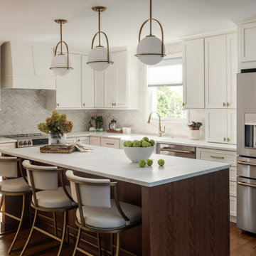
With Craftsman details throughout the rest of the home, our clients wanted their new kitchen to have transitional elements such as Shaker style doors, a farmhouse sink, warm wood tones, and other timeless features such as a custom hood and natural stone counters. The beautiful Glorious White marble counters have a soft honed finish and the stunning marble backsplash ties everything together to complete the look. The two-toned cabinets pair a rich stained cherry island with soft white perimeter cabinets. Brushed brass accents on the appliances pulls, cabinet hardware, lights and plumbing fixtures add another layer of sophistication. An induction range, dishwasher drawers, undercounter microwave, and four-door smart refrigerator amp up the functionality of this cook’s kitchen.
 Karndean Designflooring
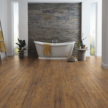
The neutral mid-browns of this Pacific Northwest wood make for a timeless design, while the rustic knot detailing and manmade markings add aged character and charm, creating the ideal backdrop for traditional and vintage interiors. Get this vintage look without the maintenance hassle that comes with rustic hardwood floors.
 Mission Accomplished Interior Design & Staging
Anthony Ford Photography & Tourmax Real Estate Media
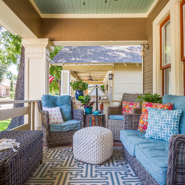
This is an example of a small craftsman front porch design in Dallas with a roof extension and decking.
This is an example of a small craftsman front porch design in Dallas with a roof extension and decking.
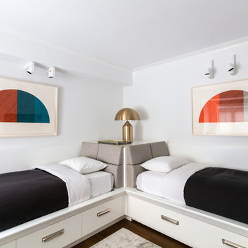
 A. Bollman & Sons.
Custom 2 sided single bed with built in storage and trundle bed.
Recessed and surface mounted Kreon lighting fixtures throughout.
Photo by Lauren Coleman
Furniture by Holly Hunt

 Rooted By Design
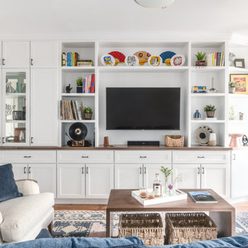
Philadelphia Row Home Renovation focusing on maximizing storage for a young family of 5. We created a "mudroom" in the front of the row home with a large living room space for family time + hosting. We used kid-friendly furnishings with performance fabrics that are durable and easy to clean. Prioritized eco-friendly selections, utilizing locally sourced + American made pieces.

4