
Search results for "Problem solving" in Home Design Ideas
 Gates & Croft Horticultural Design
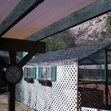
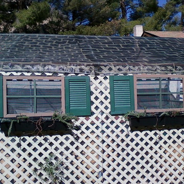
The front entry into the converted greenhouse (now 'screenhouse') shows the cottage facade of recycled materials, hand painted 'shingle' shade cloth roof, and the raised beds brimming with safe and happy vegetables inside. Photo by Jane Gates
 CARNEMARK design + build
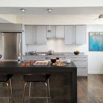
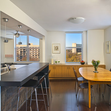
SPACE CASE. Opening up the cramped kitchen in this 1980s condominium created the elbowroom the client needed with direct sight lines to the panoramic view beyond. A chunky granite bar-height table added to the working island now a connects the kitchen and dining area.
 Klopf Architecture
Malibu Glass Box House by Klopf Architecture
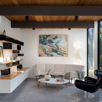
Following the devastating Woolsey Fire of 2018, the site in Malibu offered a unique opportunity to rebuild not just a home, but a new architectural composition that highlighted the property’s potential while navigating strict fire-rebuild codes in the area. Designed by Klopf Architecture, this project embraced a set of limitations and translated them into an architectural asset.
The city’s fire-rebuild process required the new structure to remain close to the original footprint, size and bulk, a constraint that ultimately clarified the architectural direction. Perched near the front of a long, narrow lot, the new home frames and overlooks a private, park-like rear expanse, an uncommon luxury especially in this part of Malibu .
Without a fixed program, the design process allowed for a different kind of creative focus allowing Klopf Architecture the opportunity to explore how a modernist home could best respond to this site. The team approached the project not with a list of requirements, but with a question: How might a modernist live here? What spatial qualities would inspire calm, connection, and a sense of wonder in this setting? The process became less about problem-solving and more about architectural storytelling—letting the site, the light, and the principles of modern design guide the form and flow of the home.
The response emerged in the form of a glass-box pavilion, an open, Mid-Century Modern inspired living, dining, and kitchen space that floats at the edge of the property’s natural descent. Connected to the more enclosed, private areas of the home by a glass-walled hallway, the living pavilion becomes a distinct centerpiece of the design. It opens on all four sides to the landscape with decks and patios on the flanks, an internal garden and water feature to the north, and a dramatic unguarded view of the expansive backyard and ocean horizon to the south.
Because of the mandated footprint, careful planning was required to ensure every space could still engage with light, landscape, or both. Strategic voids in the form of atriums and courtyards allow daylight to filter deep into the home’s core, while offering moments of surprise and retreat. These design gestures allow natural light to filter deep into the interior, creating a sense of brightness and openness throughout the day. At the same time, they expand the perceptual boundaries between inside and out, making the home feel more expansive while anchoring its connection to the surrounding landscape.
The siting of the house is what gives it its unique character. Rather than receding into the backyard like the neighboring homes, the house holds a slight prominence. From the central living pavilion, stepping down into the landscape feels more like entering a secluded park where a separate existing accessory structure, trail, and recreational areas await. The home’s modest street presence gives way to this unfolding drama of space, view, and nature.
Fire-resilient materials and assemblies are integrated seamlessly throughout including triple-pane glazing, under-slab and roof insulation, and locally sourced fire-rated cladding ensure the house not only meets Calfornia’s rigorous wildland-urban interface (WUI) standards, but feels effortlessly aligned with them. While technical decisions like fire-hardening and mechanical systems presented some construction challenges, particularly around the cantilevered glass box, the team found a functional compromise that preserved the integrity of the design.
Inside, a restrained palette and exposed post and beam design celebrate the ethos of mid-century modernism. A central circulation spine extends from the entry to the rear glass wall, offering a continuous visual link from street to ocean. Spaces such as the library and office, though more intimate in scale, are never cut off from nature as each opens to its own unique courtyard or garden view.
Though born out of a strict regulatory framework and developed without a specific client, the rebuild design unfolded with remarkable clarity. Grounded in site logic, refined by limitations and an emphasis on timeless spatial relationships – light, proportion, and a strong connection to nature, the resulting design feels both effortless and uplifting. The home lives lightly on the land, opens generously to its surroundings, and strikes a careful balance between privacy, openness, and calm. For Klopf Architecture, it stands as a compelling case study in how site, code, and circumstantial constraints can inspire enduring, modernist architecture. With years of experience reimagining mid-century modern design for how people live today, the firm took the project’s limitations as an opportunity. The result is a home shaped by open, flowing spaces, strong indoor-outdoor connections, and a calm, clear sense of structure. It’s a good reminder that even with strict constraints, there’s still room for architecture to breathe—and for modernism to keep moving forward.
Klopf Architecture project team: Geoff Campen, John Klopf, AIA, and Sherry Tan
Structural Engineer: ZFA
Contractor: Maison D’Artiste
Photography: ©2025 Mariko Reed
Year Completed: 2023
Find the right local pro for your project
 Boxwood Avenue
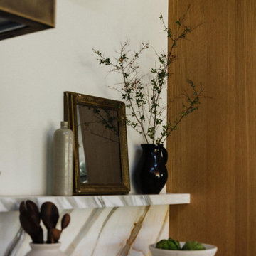
Discover the heart of this stunning mid-century modern home – a meticulously designed kitchen that seamlessly blends style and functionality. This mid-century modern kitchen features two expansive islands, zellige-tiled support beams, brass accents, and luxurious marble countertops. The exquisite marble veining extends up the wall, creating a floating shelf for practical storage and décor. Warm wood tones in architectural details and a sleek metal hood beautifully complement the design. The second island offers casual dining with elegant black metal stools, uniting the kitchen and living areas. This kitchen is a testament to creative problem-solving and the seamless fusion of style and function.
 CARNEMARK design + build
ROOM WITH A VIEW. Warm woods define the adjacent dining and living areas with coordinating teak cabinetry and dark hardwood flooring. The kitchen’s porcelain floor tile doubles as cladding for the half-wall beneath the island bar. Simple window treatments and coordinated lighting brighten the space in day and night.
 Gates & Croft Horticultural Design
Recycled materials create a facade on the front of a greenhouse converted into a screenhouse -- where vegetables can be grown unmolested. Photo by Jane Gates
 The Ferraro Group
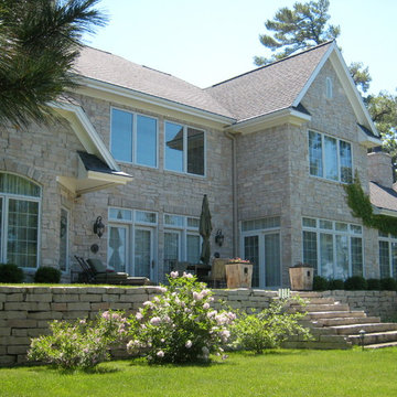
Inspiration for a huge timeless beige two-story stone exterior home remodel in Other with a clipped gable roof
 Regina Karpan Designs
Regina Karpan - designer
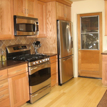
Elegant u-shaped eat-in kitchen photo in San Francisco with an undermount sink, shaker cabinets, medium tone wood cabinets, quartz countertops, multicolored backsplash, porcelain backsplash and stainless steel appliances
Elegant u-shaped eat-in kitchen photo in San Francisco with an undermount sink, shaker cabinets, medium tone wood cabinets, quartz countertops, multicolored backsplash, porcelain backsplash and stainless steel appliances
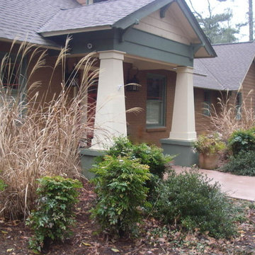
 Home & Garden Design, Atlanta - Danna Cain, ASLA
The ornamental grasses at the front door accent the Mission style architecture of this home. The owner enjoys how they dance with the slightest breeze so we don't prune them back until early spring when they are ready to resprout again. All plants here are drought tolerant and very low maintenance. Why plant drought tolerant plants in a landscape that has drainage problems? Well, Atlanta always seems to be too rainy or too dry. We've solved both problems on this site.
Photographer: Danna Cain, Home & Garden Design, Inc.
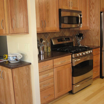 Regina Karpan Designs
Regina Karpan - designer
Inspiration for a timeless u-shaped eat-in kitchen remodel in San Francisco with an undermount sink, shaker cabinets, medium tone wood cabinets, quartz countertops, multicolored backsplash, porcelain backsplash and stainless steel appliances
Inspiration for a timeless u-shaped eat-in kitchen remodel in San Francisco with an undermount sink, shaker cabinets, medium tone wood cabinets, quartz countertops, multicolored backsplash, porcelain backsplash and stainless steel appliances
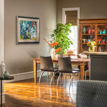
 Adcock-Smith Design
Aaron Dougherty Photography
Mid-sized transitional medium tone wood floor and brown floor great room photo in Dallas with gray walls and no fireplace
Mid-sized transitional medium tone wood floor and brown floor great room photo in Dallas with gray walls and no fireplace
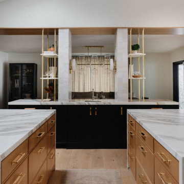 Boxwood Avenue
Discover the heart of this stunning mid-century modern home – a meticulously designed kitchen that seamlessly blends style and functionality. This mid-century modern kitchen features two expansive islands, zellige-tiled support beams, brass accents, and luxurious marble countertops. The exquisite marble veining extends up the wall, creating a floating shelf for practical storage and décor. Warm wood tones in architectural details and a sleek metal hood beautifully complement the design. The second island offers casual dining with elegant black metal stools, uniting the kitchen and living areas. This kitchen is a testament to creative problem-solving and the seamless fusion of style and function.
 Drury Design
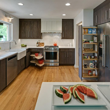
The owners of this true mid-century ranch in Wheaton were ready for a kitchen update. The home’s main living room area is decorated in a very cool, sparse way with plenty of nods to mid-century design. A new kitchen would need to bridge classic and modern notions of Mid-Century expression through the style’s characteristic clean lines and artistic notions of simplicity and straightforward functionality.
The idea was to keep a hint of mid-century influence in a modern design that could somehow be more open while accommodating more storage
The objectives were:
• Stay within the existing space while creating an open feel and winning more storage room
• Make the space brighter while using a darker cabinet finish
• Create proper ventilation for the range
Design challenges we solved for:
• Open the kitchen to the adjacent dining room without sacrificing storage
• Remove multiple layers of flooring to make the kitchen floor level with the rest of the house
• Match the new kitchen flooring to the flooring in nearby dining and living spaces
Problems solved. Here’s what we did:
• Took out soffits around the kitchen to allow for taller cabinets with more storage
• Added cabinet pull-outs that maximize under-cabinet storage space
• Used large cabinets in standard sizes
• Skipped cabinets on the window wall, opting for space- and light-friendly floating shelves
• Enhanced overall brightness with bright, white counters and textured white tile that offered a connecting contrast to the darker woodgrain cabinets
• Took out a post between the kitchen and dining room to make the space feel more open
• Added under-cabinet lights – unobtrusive and handy for task lighting
The owners love the look, feel and functionality of their new kitchen. Its sleek, modern character and notions of mid-century spirit add new excitement to the home’s original 1958 personality.
 Dream Kitchens
CONTACT
These home owners initially contacted their Designer to identify the reason that the floor in their upstairs bedroom suffered from a noticeable slant. The floor problem actually impacted a small bathroom and adjoining study also.
Early on, the decision was made to re-design the footprint for the 3 rooms in conjunction with repairing the uneven floor. The approach was to gut all three spaces of walls and floors and start from scratch. The new spaces were designed with the clients needs for accessibility in mind.
DESIGN
The design effort included identifying the products to be used throughout the spaces. This included everything from the flooring to the wall paint. Kohler plumbing fixtures and Adelphi cabinetry were decided on first. A radiant heat grid was included for the bathroom floor. Lighting, paint and tile soon followed. Wood flooring was installed throughout the adjoining spaces.
The master bedroom was redesigned to allow for entry from the study or the master bath via pocket doors. The study was given an access to the master bath also. The hardwood flooring ties the bedroom and study together and gives each room a very spacious feel. The original master bedroom was changed to incorporate a large walk-in closet that features custom storage throughout. The study that also doubles as the IT center for the home was updated with custom book cases and cabinetry from Adelphi Cabinets.
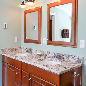
When discussing the reapportioning of the entire space for the individual rooms the bathroom was given priority. The previous small bathroom did not include a window for natural light. The new design corrected that in a big way by incorporating an existing bedroom window into the new space. The decision was made early on to allow for the inclusion of a large shower with full granite walls and custom plate glass surround. The shower system includes both fixed and hand held shower heads. A thermostatic control system was included to eliminate scalding. A large bench seat of matching granite allows for relaxing while getting squeaky clean. A separate air massage tub from Kohler centered under the new windows allows for a relaxed moment while being caressed by all those tiny bubbles. His and her side by side vanity sinks allows for efficient use of the space. The Caxton sinks and coordinated toilet were selected to match the color of the tub and do so beautifully!
CONSTRUCTION
We started the project not knowing what we were going to find. The slanting floor upstairs was not evident in the ceiling of the first floor
Once the demolition had been completed it was evident that the floor joists were at the heart of the problem. The home had been framed with floor joists that had been strung together to increase their length. Over time and with the house settling, the strung together joists started to droop from their connection point. This was concealed on the first floor by a large HVAC duct running through the garage. This was corrected by the addition of two laminated beams in the ceiling of the first floor (luckily in the garage) that re-supported the offending joists.
THE END
The project was a huge success in terms of problem solving and designing with budget and time frame in mind. The overall impact of the new space is impressive both visually and from a practicality point of view. The new master suite with upscale bathroom and study adds significant value to the home and the home owners quality of life!
 Ogle Construction & Maintenance Service, Inc.
Problem: Homeowners had a leak in their smelly, damp basement
Solution: Problem solved... and fresh, beautiful living spaces were created!
"The homeowners called us to fix a leak in their basement... which turned out to be a backed up drain, caused by a crack in an obsolete drain tile, and two leaks in their foundation... it sort of snowballed," says Bryan Ogle, owner of Ogle Construction and Maintenance Services.
With small children in the home, the couple decided to invest in solving the problem with a long-
term solution. They wanted to make the basement safe and comfortable for their young family.
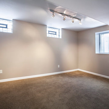
After the drain tile was fixed, the entire area was reinsulated, and finished with new sheetrock, trim, carpet and lighting. The electrical system was updated and a new laundry room (with loads of storage), bedroom and family room were created in the space. What was once a damp, smelly basement (with a dehumidifier running constantly) is now a fresh, clean living space for the family to enjoy.
 Drury Design
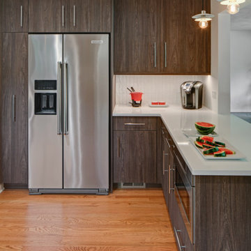
The owners of this true mid-century ranch in Wheaton were ready for a kitchen update. The home’s main living room area is decorated in a very cool, sparse way with plenty of nods to mid-century design. A new kitchen would need to bridge classic and modern notions of Mid-Century expression through the style’s characteristic clean lines and artistic notions of simplicity and straightforward functionality.
The idea was to keep a hint of mid-century influence in a modern design that could somehow be more open while accommodating more storage
The objectives were:
• Stay within the existing space while creating an open feel and winning more storage room
• Make the space brighter while using a darker cabinet finish
• Create proper ventilation for the range
Design challenges we solved for:
• Open the kitchen to the adjacent dining room without sacrificing storage
• Remove multiple layers of flooring to make the kitchen floor level with the rest of the house
• Match the new kitchen flooring to the flooring in nearby dining and living spaces
Problems solved. Here’s what we did:
• Took out soffits around the kitchen to allow for taller cabinets with more storage
• Added cabinet pull-outs that maximize under-cabinet storage space
• Used large cabinets in standard sizes
• Skipped cabinets on the window wall, opting for space- and light-friendly floating shelves
• Enhanced overall brightness with bright, white counters and textured white tile that offered a connecting contrast to the darker woodgrain cabinets
• Took out a post between the kitchen and dining room to make the space feel more open
• Added under-cabinet lights – unobtrusive and handy for task lighting
The owners love the look, feel and functionality of their new kitchen. Its sleek, modern character and notions of mid-century spirit add new excitement to the home’s original 1958 personality.
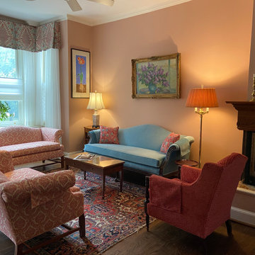
 Design for Change
The client's favorite colors of light blue, red and pink were used to created a lovely fresh and traditional living room. The colors were carefully selected to complement her existing oriental rugs and quilts.
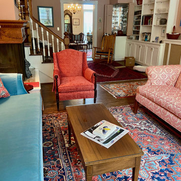 Design for Change
The furniture was timeless and of high quality so we chose to reupholster everything in fresh yet traditional fabrics to complement her collection of oriental carpets and Americana quilts.
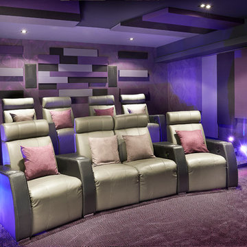
 Maria Deschamps Design
Custom Home theater, accoustic panels with indirect LED lighting on walls. Photo by :Francois Desaulniers
Trendy enclosed carpeted home theater photo in Los Angeles with a projector screen
Trendy enclosed carpeted home theater photo in Los Angeles with a projector screen
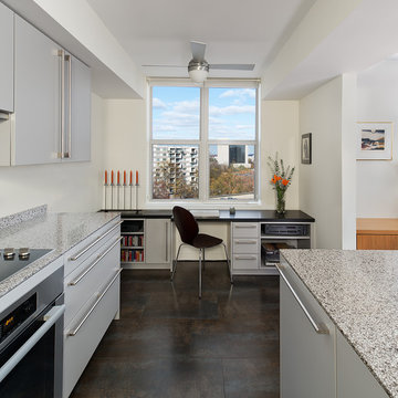 CARNEMARK design + build
WORK IT. The reconfigured kitchen even made room for an efficient workspace with storage below. Neutral finishes—matte flannel gray cabinets with terrazzo tops and oversized porcelain floor tiles—help make the space appear larger. The striking mottled shades of gray and brown tile also flow into the foyer and laundry room which add to the sense of style and space.
7