
Search results for "Problem solving" in Home Design Ideas
 Pro-Tection Seattle
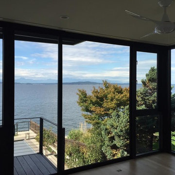
West Seattle offers great views to Puget Sound and this house is no exception. It almost felt like we were in the water from the second and third floor. The bamboo floors were getting a tremendous amount of fading and the air conditioning was having a difficult time keeping up with the heat. We installed 3M Prestige 50 to keep the view and solve the problems from the sun.
 KURV Architecture DPC (Alex Hughes Architects)
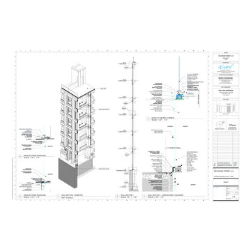
Located in the heart of Manhattan’s Lower East Side, the building was erected on a shallow commercial lot between two 120 year old masonry buildings and a new residential rental building. 330 Grand Street is a mix of 725 SF 1BRs and 1050 SF 2BR apartments. It also contains a 1100 SF two story duplex as well as private and public rooftop space, large private balconies for most units and two large private terraces for the ground floor units.
330 Grand Street was originally designed and approved at the NYC DOB as a prefabricated modular building. During the pandemic, as shipping costs skyrocketed putting the project at risk, we suggested redesigning the building as a reinforced cast-in-place concrete structure. Concrete was readily available and prices had not been affected by the demand increase that many other materials suffered in the pandemic. We took this opportunity to raise floor to ceiling heights, enlarge high performance windows and redistribute the buildings MEPFS and Structural Systems to create very open floor plans.
The challenge was to create a luxurious sensorial living experience with very limited means. In a city with very high construction costs, low cost residential buildings in the area are usually devoid of good quality, design and character. Our approach was to aim high for the end user, prioritizing natural light, open space with long visual perspectives, high ceilings and as always, rejecting the use of predefined building templates.
Our biggest challenge was to ensure that the small spaces feel as clean cut, large and bright as possible. Several unique design decisions were made to ensure low cost and high quality;
Floor plans were laid out so that spaces were wide open and free of clutter from mechanical or structural interruptions. Therefore all infrastructure was placed in lateral demising walls, which in turn act as the unit’s storage and kitchen. The apartments feel wide open, are super quiet and have more storage space than any other comparable apartment in the city.
To solve the problem of the site’s shallow commercial lot which is typically prone to dark interior spaces we focused our attention on the building’s envelope. Instead of the usual small punched window openings, oversized high performance windows were designed to ensure that light penetrated as far as possible into the units. In the smaller 1BR units, the full 50’ depth of the lot is perceived by partitioning spaces with sliding pocket doors that can be retracted to allow deep visual perspectives, making the sight lines in the space feel longer, larger, more ample than normal. In addition to the full height glazing, each unit above the 2nd floor receives a 7 foot covered balcony, adding 120 to 240 sf to each apartment, something unusual in New York City buildings. The space is large enough for a full size dining table, when the weather permits being outside.
We also worked hard to ensure modularity. For example, all kitchen units are all identical throughout the building. The idea of modularity and the economy of the repetitive unit is exercised to the maximum through the building.
Hardware, appliances, flooring, wall coverings and material finishes are all carefully selected to feel bespoke, high quality and unique.
It was important to KURV that the result of this work manifest into something that would deeply connect with the end user and sustain relationships with the consumers of this space.
All images by KURV Architecture ©
 Remodeling Contractors
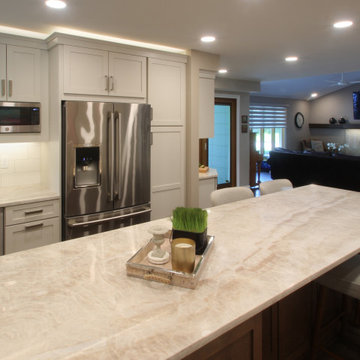
West Des Moines two story homes create challenges for homeowners with layouts including small rooms that don’t seem to flow together. The family that lives in this home found that entertaining and gathering in the kitchen was almost impossible with the current layout and asked for an addition to solve the problem. After listening to the challenges of that they faced and working with the homeowners, a new solution emerged without an addition, reducing the overall budget and allowing the whole main floor to be updated.
By removing the wall between the kitchen and dinning room, the team was able to design an island for family and friends to congregate around. Then by flanking the island with a large commercial range surrounded by a custom backsplash and custom hood a picture perfect kitchen was born. Lastly by repeating elements within the range hood, island and fireplace, the team was able to create unity throughout the space. This visually makes the space feel larger and feels like the addition was built
Find the right local pro for your project
 Red Pepper Design & Cabinetry
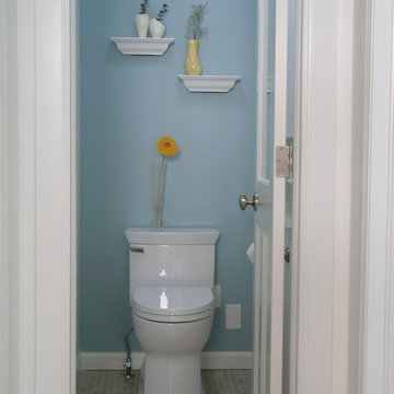
The Happy Throne room! The frosted glass on the top of the door makes this room less claustrophobic. Tile continues in from the main bath area.
Inspiration for a mid-sized timeless bathroom remodel in Denver
Inspiration for a mid-sized timeless bathroom remodel in Denver

 Bellwether Windows, Siding & Doors
This Colorado mountain home had rotting cedar siding that was creating water intrusion issues. We solved these problems by removing all the siding and trim, as well as soffits and fascia, wrapping the house with HardieWrap, and installing James Hardie HardiePlank 7" lap siding and James Hardie HardieTrim trim. The homeowner selected Timber Bark for the both the siding and trim from the James Hardie ColorPlus Statement Collection, which has a 15-year finish warranty. How do you like the look?
 Galaxy Homes
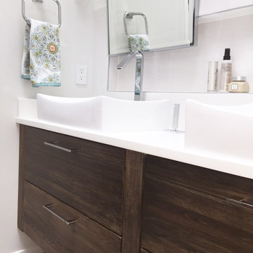
This is a 2-room luxury master bath designed and built by Galaxy Homes. The open and airy shower flows seamlessly from the vanity room with the help of a curb-less shower floor. The vanity is Ikea Godmorgon with custom reclaimed wood drawer fronts. A niche above the vanity solves the problem of needing extra counter space with vessel sinks.
 Alan D. Holt, A.S.L.A., Landscape Architect
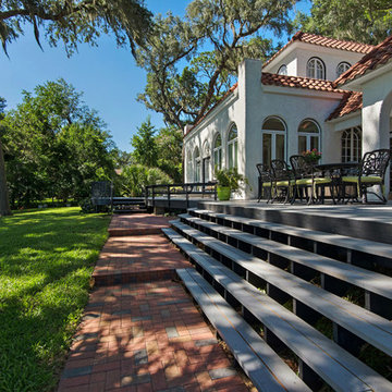
This is a simple addition to the back deck to create an outdoor kitchen and outdoor dining area. A fire pit by the water creates another seating area out in the lawn and gives a perfect place to watch the sun set. The steps and walls improve the access to the boat dock and solve an erosion problem.
Photographed by: Emerald Coast Real Estate Photography
 Kustom Home Design
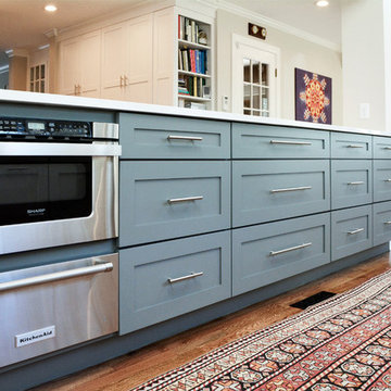
This amazing renovation focused on solving a series of problems that a previous kitchen expansion had created. By rearranging the appliance placement, updating the cabinetry, designing all new storage solutions and maximizing the amazing outdoor views; we cured the spit personality disorder plaguing the existing kitchen. The home now has a beautifully redesigned kitchen and living space perfect for entertaining, relaxing and enjoying the outside views. Vaulted ceilings with bright skylights, reflective glass wall tiles, sleek sophisticated Cambria quartz counter tops, fingerprint-free faucet, multi-functional Prolific kitchen sink by Kohler, stainless steel appliances, creative storage solutions, all new lighting and timeless shaker cabinets by Wellborn lend to the now bright, open, vivacious and flawless function of this newly renovated galley style kitchen. White base cabinets along the outside walls contrast perfectly with the dark grey island cabinets. Linear satin nickel door and drawer pulls coordinate with the stainless steel appliances and sink. An eclectic blend of vintage and modern furnishings, artwork and rugs create a comfortable balance that feels and looks timeless. Breathtaking backyard views are artfully framed by new Pella windows and doors with integral blinds between the glass. Calm, inviting neutral tones provide the perfect backdrop for this refined design.
Photos by: Kimberly Kerl
 JUMA architects
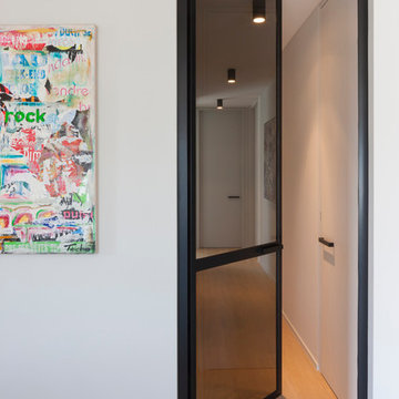
JUMA architects were contacted for the interior design of a shell-state apartment on the coast. The structural construction, the plastering, the floor screed and the technical fittings (heating ducts, plumbing, electricity and ventilation) of the apartment had already been realised.
It soon became apparent, however, that the assignment could not be limited to the interior decoration only, as the placement of kitchen, bathroom and dressing room in the existing plan turned out to be entirely impractical. More extensive renovation work was needed to meet the needs of the customer. The structure of the unit was therefore slightly adjusted to make the bathroom and dressing larger and more functional.
Also, the living room was dominated by a huge radiator that drew all the attention. To solve this problem, new pipes were laid to accommodate an integrated heating element in the sideboard. Gas pipes were fitted in the kitchen for the gas cooker which JUMA included in the design as a real eye-catcher. The sinks, in contrast, were given a more discreet placement.
Light oak parquet was selected for the floors throughout the apartment. The natural appearance of the wood gives all the rooms a warm feel. The built-in furniture was custom made and is finished in black satin lacquer to contrast the light-coloured wood. The dominant colour palette is deliberately kept very simple and neutral and is complemented with light grey tones and colour accents. The colour choice was in fact inspired by a beautiful picture of the coast.
The freestanding furniture and overall decorations were also selected or designed by JUMA architects. The arrangement of the seating area is very playful and atypical. JUMA did not want to put in a couch that would divide the space in two. The composition is meant to create a very open ambiance. A round table was chosen for the same reason. The round shape does not divide the space but allows fluid circulation.
Pictures © Liesbet Goetschalckx
 Pool & Hot Tub Alliance
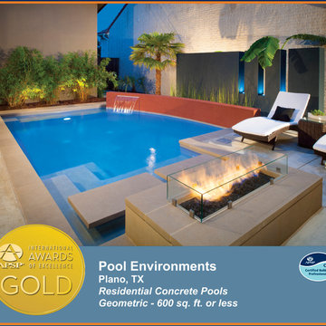
The transitional modern home was designed with large amount of glass opening into the courtyard, creating an indoor-outdoor feel, and a visual connection among the spaces that could not be ignored. The neighboring wall, however, was not only rather imposing, but also of a style completely disconnected from our clients home. Our goal was to create a layering effect, with features of varying heights, both to add depth and dimension to the space, and to take the focus of the viewer off of the neighbors wall. Many designers would have squared off the pool, with the thought of maximizing the size of the pool in this small space. Our designer felt it more important to incorporate a graceful curve on the back of the pool. The small amount of square footage lost in the water area was more than regained in the visual interest added to the space. By creating a raised stucco wall on this curve, anchored by a simple sheer descent waterfall, the eye is drawn down the length of this petite pool. Separated by a simple bed of Horsetail Reed, the main feature wall, clad in deep plum stucco, includes three vertical windows, with LED up-lighting. Leaving these windows open on the top, increases the feel of height in the space. The final step in the layering effect is the planting space behind the plum wall. Banana trees were selected here, for their deep green color, and for the large, simple texture of their leaves. The main outdoor seating area is situated just outside the master suite, and is separated from the pool by a Leuder limestone fire pit. The floating stepper pads adjacent the fire pit serve the multiple functions of a walkway, a poolside table for beverages, and as seating near the fire. The tempered glass fire surround was added after the fact, when the client discovered the courtyard was a bit of a wind tunnel, and found the fire a bit uncontrollable. This simple addition, solved the problem, and pleased the client visually, as well.
 Edmond Kitchen & Bath LLC
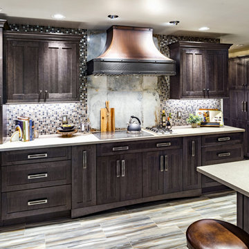
This 1970s ranch style home was in need of a whole revival in the kitchen including a complete new orientation in the space. In order to solve the problem of inadequate passage at the garage door, laundry machines were relocated to another area of the home, and a new "drop zone" for mail and phones was created. A dated soffit was removed and the cooking area was relocated to a longer - focal point wall that allows the cook to be more included while entertaining. An updated rustic and simplified craftsman style was chosen to compliment the other elements of stone and beams in the rest of the home. Of specific note is the installation of both induction and gas cooktops under the same real copper venthood for optional cooking methods. Another great kitchen for a wonderful family. Photos by David Cobb Photography.
 Elizabeth Minish Design
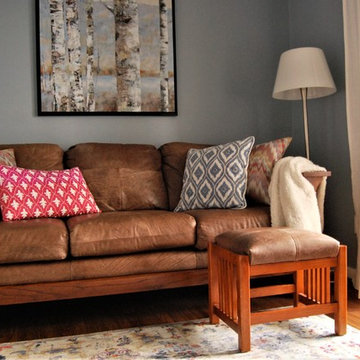
The TV room/Den in this multi-level townhouse suffered from an identity crisis. It opened onto a covered patio but the carpeted floor made it seem more like a bedroom than a room with outdoor access. It sometimes served as an extra bedroom for guests, but was primarily a TV room. An adjacent laundry room was oddly configured and opened into a busy hallway/landing area. The fix included closing off the existing door to the laundry room and opening it up to the den. This made both rooms more user-friendly. The carpet was replaced with luxury vinyl plank flooring in both rooms, making a much more practical surface for a room with an exterior door. A pocket door was not feasible in the location so barn-door hardware solved the problem of a door opening onto the sofa.
 Alan D. Holt, A.S.L.A., Landscape Architect
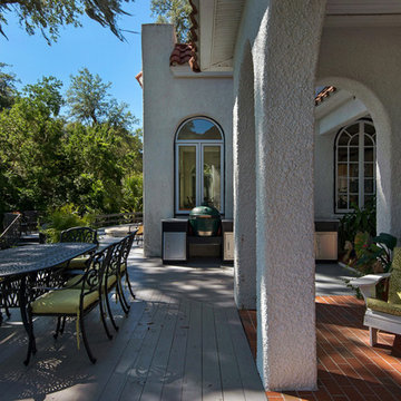
This is a simple addition to the back deck to create an outdoor kitchen and outdoor dining area. A fire pit by the water creates another seating area out in the lawn and gives a perfect place to watch the sun set. The steps and walls improve the access to the boat dock and solve an erosion problem.
Photographed by: Emerald Coast Real Estate Photography
 Shuler Architecture
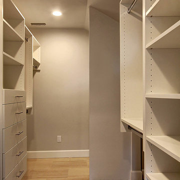
This urban infill project is a make-over of a decrepit structure that had been used as a student rental for close to 50 years. Situated on an elevated, 3300 sf lot, nothing in the original house was salvageable and the entire house was stripped down to the studs. Our challenge with this project was to then open up the original interiors, flood them with natural light while creating a design that appealed to the broadest buyer pool possible.
We solved this problem by organizing a compact floor plan that resulted in a 4 bedroom, 4 bath residence organized around a great room on the main level, a family room on the basement level and an additional 2 bedrooms with city views on the upper. By minimizing circulation space, we were able to re-purpose every square foot of floor area while creating a dramatic, light-filled staircase that tied all 3 levels of the house together into a unified living scheme. Clean lines and clean details, this is another of our attempts at a 'Not So Big House.'
Marketing of the final product lasted less than 10 days and resulted in 3 full priced offers that netted the developer a tidy profit.
 Jarrett Design
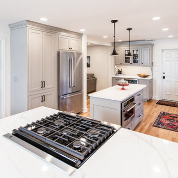
Entertaining friends and family doesn't work well when rooms are small and closed off. So when our clients decided to remodel, they knew they wanted to open up the space to accommodate large gatherings. Also important were ample storage and quality appliances that would hold up to the demands of cooking creative meals several nights a week.
As is sometimes the case with remodeling, solving one problem can create another. Opening up the space involved removing a wall, which sacrificed critical square footage for cabinetry and appliances. We knew the wall needed to come down so we were challenged with making sure every available cabinet space in the kitchen was being utilized as thoughtfully and creatively as possible. A tall pantry was added next to the refrigerator to allow for storage of pots and pans, as well as food, while another pantry in the adjacent dining room housed all dishes and silverware. A small bar area was created in an unused section in the back of the home to store coffee and tea accessories and drinkware. Finally, a small island in the center of the kitchen offered the ideal location for the microwave and most-used pots and pans.
With the expanded space, smart use of storage options and top-notch appliances, our clients are enjoying working in their new kitchen and have already hosted a ravioli-making class!
Matt Villano Photography
 Alan D. Holt, A.S.L.A., Landscape Architect
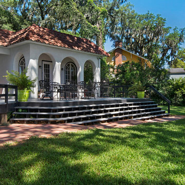
This is a simple addition to the back deck to create an outdoor kitchen and outdoor dining area. A fire pit by the water creates another seating area out in the lawn and gives a perfect place to watch the sun set. The steps and walls improve the access to the boat dock and solve an erosion problem.
Photographed by: Emerald Coast Real Estate Photography
 Morpurgo Architects
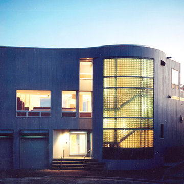
Built on a wedge-shaped site, this seaside vacation home takes advantage of its vertical composition on a constrained footprint. Unstable soil, buffeting winds, and relentless tides on the exposed Point created substantial engineering and bracing problems, which Morpurgo Architects solved by stabilizing existing bulkheads and introducing more than 150 piles capped with concrete grade beams.
A shimmering, 3-story, glass block wall is the focal point of the bleached cedar, sculpted façade. The multilevel entrance hall frames the ocean view while connecting the three levels with a dramatic staircase. From the moment of entry the eye is carried out to the horizon and vertically through the house.
On the second level, the primary living space offers a panoramic vista. Morpurgo Architects designed the built-in furniture, integral to the design concept.
The third level is dedicated to the master bedroom suite, which features an undulating, balcony wall that presents a layering of sea and sky views through a two-story window facing the ocean.
This modern residence was featured on the cover of “Architecture,” the journal of the American Institute of Architects (AIA), distributed at their annual convention.
 KURV Architecture DPC (Alex Hughes Architects)
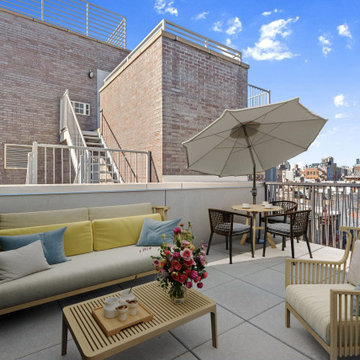
Located in the heart of Manhattan’s Lower East Side, the building was erected on a shallow commercial lot between two 120 year old masonry buildings and a new residential rental building. 330 Grand Street is a mix of 725 SF 1BRs and 1050 SF 2BR apartments. It also contains a 1100 SF two story duplex as well as private and public rooftop space, large private balconies for most units and two large private terraces for the ground floor units.
330 Grand Street was originally designed and approved at the NYC DOB as a prefabricated modular building. During the pandemic, as shipping costs skyrocketed putting the project at risk, we suggested redesigning the building as a reinforced cast-in-place concrete structure. Concrete was readily available and prices had not been affected by the demand increase that many other materials suffered in the pandemic. We took this opportunity to raise floor to ceiling heights, enlarge high performance windows and redistribute the buildings MEPFS and Structural Systems to create very open floor plans.
The challenge was to create a luxurious sensorial living experience with very limited means. In a city with very high construction costs, low cost residential buildings in the area are usually devoid of good quality, design and character. Our approach was to aim high for the end user, prioritizing natural light, open space with long visual perspectives, high ceilings and as always, rejecting the use of predefined building templates.
Our biggest challenge was to ensure that the small spaces feel as clean cut, large and bright as possible. Several unique design decisions were made to ensure low cost and high quality;
Floor plans were laid out so that spaces were wide open and free of clutter from mechanical or structural interruptions. Therefore all infrastructure was placed in lateral demising walls, which in turn act as the unit’s storage and kitchen. The apartments feel wide open, are super quiet and have more storage space than any other comparable apartment in the city.
To solve the problem of the site’s shallow commercial lot which is typically prone to dark interior spaces we focused our attention on the building’s envelope. Instead of the usual small punched window openings, oversized high performance windows were designed to ensure that light penetrated as far as possible into the units. In the smaller 1BR units, the full 50’ depth of the lot is perceived by partitioning spaces with sliding pocket doors that can be retracted to allow deep visual perspectives, making the sight lines in the space feel longer, larger, more ample than normal. In addition to the full height glazing, each unit above the 2nd floor receives a 7 foot covered balcony, adding 120 to 240 sf to each apartment, something unusual in New York City buildings. The space is large enough for a full size dining table, when the weather permits being outside.
We also worked hard to ensure modularity. For example, all kitchen units are all identical throughout the building. The idea of modularity and the economy of the repetitive unit is exercised to the maximum through the building.
Hardware, appliances, flooring, wall coverings and material finishes are all carefully selected to feel bespoke, high quality and unique.
It was important to KURV that the result of this work manifest into something that would deeply connect with the end user and sustain relationships with the consumers of this space.
All images by KURV Architecture ©
 User
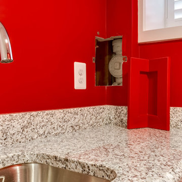
UserThe main waste stack in the corner was unattractive, but had to remain accessible. The access panel with a magnetic latch solves this problem.
Example of a classic laundry room design in DC Metro
Example of a classic laundry room design in DC Metro
 INSPIRED KITCHEN DESIGN
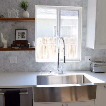
IKD also customized their sink and cooktop cabinets. The SEKTION cabinets that fit the IKEA farmhouse sink can’t accommodate non-IKEA apron sinks. And IKEA offers neither a rangetop (front-controlled cooktop) nor the base cabinet to accommodate this kind of cooktop. Luckily, we designed a kitchen hack for IKEA cabinets that solves both of these problems. (Yes, it’s a two-in-one IKEA kitchen hack that works for both appliances!)
69