
Search results for "Problem solving" in Home Design Ideas
 Mood Interieur
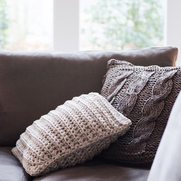
This house needed a total make-over. My clients wanted a solution between living room and serre which added more light and storing space. Mood Interieur was hired to suggest a new floor plan and to act as a sparring partner.
The wall with ceiling high sliding doors and a cupboard over the whole lenght of the wall in the serre solved the light and storing problem.
Mood Interieur also designed the tv cupboard and wardrobe closet.
All the dark colours were replaced by fresh, white colours combined with greige. A colour which beautifully interacts with the shabby-chic Flexform sofa en the greige blue Bomat carpet. The white and wood Arco tablet tables go perfectly with the white tv-cupboard and new doors.
Furniture and curtains are suggested and delivered by Mood Interieur.
 Art & Smart Inc
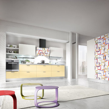
MELA is available in the WHITE, LIGHT OAK, LIGHT WALNUT, BROWN, EGGPLANT, GREY OAK, RED, LARIX, BUTTER, COFFEE and CREAM versions. A young kitchen in performing, suitable even for the most demanding clientele for it was created to solve any problems in use and composition. There are various functional wall hung Accessories and internal equipment. A wide range of tables and chairs is also available to personalised your own kitchen.
 User
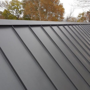
UserIs your roof leaking? Do you require a roofing inspection? Whatever your needs may be, Firestone Roofing’s roofing repair in San Diego is here to deliver and solves all your roofing problems! Contact us to learn more about our services, designed to remedy your situation.
Roofing Repair in San Diego, CA - https://firestoneroofingca.com/
Find the right local pro for your project
 JUMA architects
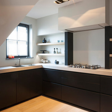
JUMA architects were contacted for the interior design of a shell-state apartment on the coast. The structural construction, the plastering, the floor screed and the technical fittings (heating ducts, plumbing, electricity and ventilation) of the apartment had already been realised.
It soon became apparent, however, that the assignment could not be limited to the interior decoration only, as the placement of kitchen, bathroom and dressing room in the existing plan turned out to be entirely impractical. More extensive renovation work was needed to meet the needs of the customer. The structure of the unit was therefore slightly adjusted to make the bathroom and dressing larger and more functional.
Also, the living room was dominated by a huge radiator that drew all the attention. To solve this problem, new pipes were laid to accommodate an integrated heating element in the sideboard. Gas pipes were fitted in the kitchen for the gas cooker which JUMA included in the design as a real eye-catcher. The sinks, in contrast, were given a more discreet placement.
Light oak parquet was selected for the floors throughout the apartment. The natural appearance of the wood gives all the rooms a warm feel. The built-in furniture was custom made and is finished in black satin lacquer to contrast the light-coloured wood. The dominant colour palette is deliberately kept very simple and neutral and is complemented with light grey tones and colour accents. The colour choice was in fact inspired by a beautiful picture of the coast.
The freestanding furniture and overall decorations were also selected or designed by JUMA architects. The arrangement of the seating area is very playful and atypical. JUMA did not want to put in a couch that would divide the space in two. The composition is meant to create a very open ambiance. A round table was chosen for the same reason. The round shape does not divide the space but allows fluid circulation.
Pictures © Liesbet Goetschalckx
 Art & Smart Inc
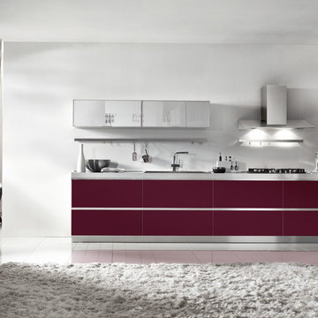
MELA is available in the WHITE, LIGHT OAK, LIGHT WALNUT, BROWN, EGGPLANT, GREY OAK, RED, LARIX, BUTTER, COFFEE and CREAM versions. A young kitchen in performing, suitable even for the most demanding clientele for it was created to solve any problems in use and composition. There are various functional wall hung Accessories and internal equipment. A wide range of tables and chairs is also available to personalised your own kitchen.
 Drury Design
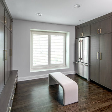
Some rooms never quite find their purpose. That was the case with this space, which had gradually become a combination home office, pantry overflow area, pet zone, and general catch-all for daily life. While it offered plenty of square footage, it wasn’t helping the homeowners stay organized, and valuable storage was scattered between an overcrowded pantry closet and various pieces of furniture throughout the room.
Having previously partnered with Drury Design on a kitchen remodel, these homeowners once again turned to Senior Designer Samantha Schoell to help them rethink how their home could better support the way they actually live. What began as a conversation about adding some cabinetry quickly evolved into a comprehensive storage solution — one designed to accommodate everything from groceries and sports equipment to pet supplies and everyday household essentials.
Design Objectives:
Create Organization: Consolidate pantry overflow, household supplies, and everyday essentials into a single, highly functional space.
Support Family Life: Provide dedicated storage for coats, bags, sports equipment, and the routines of an active household.
Accommodate Pets: Incorporate thoughtful features for the family’s dogs while maintaining a clean, organized appearance.
Maximize Existing Space: Transform an underutilized room without expanding the home’s footprint.
Maintain Flexibility: Preserve the room’s long-term versatility and appeal for future homeowners.
Design Challenges:
Multiple Functions: The room was being used simultaneously as a home office, pantry, storage area, and pet space without a cohesive organizational strategy.
Insufficient Pantry Storage: The nearby pantry closet had become overcrowded and difficult to navigate.
Visual Clutter: Everyday items, pet supplies, and household necessities lacked dedicated storage locations.
Unused Potential: Despite its generous size, the room was not contributing meaningfully to the home’s overall functionality.
Balancing Practicality and Style: The homeowners wanted substantial storage without creating a space that felt overly utilitarian.
Design Solutions:
Purpose-Built Storage Plan: Custom cabinetry was designed to support multiple functions within a unified storage system, allowing the room to serve as a mudroom, pantry extension, household hub, and pet station.
Expanded Pantry Capacity: Floor-to-ceiling cabinetry, a secondary refrigerator, and extensive drawer storage dramatically increased food storage and organization capabilities.
Hidden Organization: Closed cabinetry conceals household items, sports gear, pet supplies, and everyday clutter, creating a calm and orderly appearance.
Full-Room Transformation: Rather than simply adding cabinets to one wall, the design reimagined the entire room, utilizing its footprint to create a true family command center.
Furniture-Inspired Cabinetry: Warm wood finishes, decorative hardware, open display shelving, and thoughtful detailing elevate the room beyond pure utility, helping it feel like a natural extension of the home’s design.
The most successful remodeling projects often solve problems homeowners have simply learned to live with. In this case, a room that once served several purposes — but excelled at none — was transformed into one of the hardest-working spaces in the home.
Today, groceries, pet supplies, seasonal gear, household essentials, and daily routines all have a designated place. Even the family’s dogs were thoughtfully considered, with a built-in resting area integrated into the cabinetry. The result is a room that feels remarkably organized despite supporting countless everyday activities — a reflection of how thoughtful design can bring clarity, efficiency, and calm to the busiest parts of family life.
 Galaxy Homes
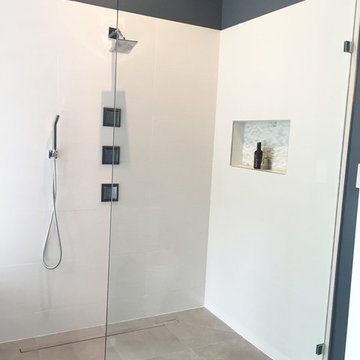
This is a 2-room luxury master bath designed and built by Galaxy Homes. The open and airy shower flows seamlessly from the vanity room with the help of a curb-less shower floor. The vanity is Ikea Godmorgon with custom reclaimed wood drawer fronts. A niche above the vanity solves the problem of needing extra counter space with vessel sinks.
 Mark E Goodman
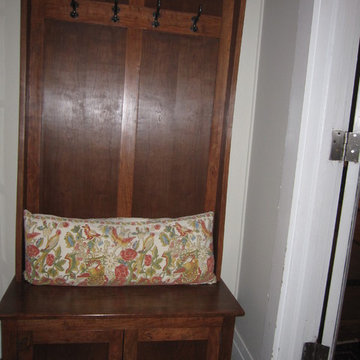
The customer's older home had no place to hang coats. We designed this hall tree to fit in her vestibule to solve the problem.
 Kustom Home Design
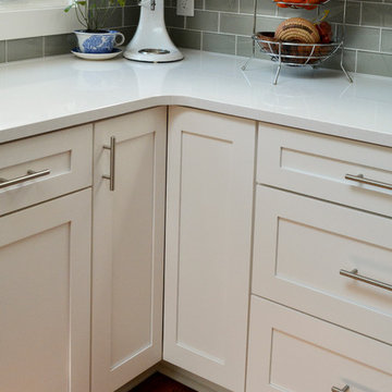
This amazing renovation focused on solving a series of problems that a previous kitchen expansion had created. By rearranging the appliance placement, updating the cabinetry, designing all new storage solutions and maximizing the amazing outdoor views; we cured the spit personality disorder plaguing the existing kitchen. The home now has a beautifully redesigned kitchen and living space perfect for entertaining, relaxing and enjoying the outside views. Vaulted ceilings with bright skylights, reflective glass wall tiles, sleek sophisticated Cambria quartz counter tops, fingerprint-free faucet, multi-functional Prolific kitchen sink by Kohler, stainless steel appliances, creative storage solutions, all new lighting and timeless shaker cabinets by Wellborn lend to the now bright, open, vivacious and flawless function of this newly renovated galley style kitchen. White base cabinets along the outside walls contrast perfectly with the dark grey island cabinets. Linear satin nickel door and drawer pulls coordinate with the stainless steel appliances and sink. An eclectic blend of vintage and modern furnishings, artwork and rugs create a comfortable balance that feels and looks timeless. Breathtaking backyard views are artfully framed by new Pella windows and doors with integral blinds between the glass. Calm, inviting neutral tones provide the perfect backdrop for this refined design.
Photos by: Kimberly Kerl
 E. Wyse Nurseries, Inc.
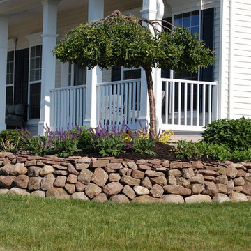
This simple wall is not only decorative but also functional. It solves the problem of a grade change while providing a nice bed area for a specimen tree and plantings. The stone is NY Fieldstone.
 Art & Smart Inc
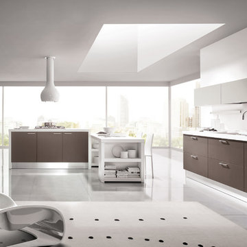
MELA is available in the WHITE, LIGHT OAK, LIGHT WALNUT, BROWN, EGGPLANT, GREY OAK, RED, LARIX, BUTTER, COFFEE and CREAM versions. A young kitchen in performing, suitable even for the most demanding clientele for it was created to solve any problems in use and composition. There are various functional wall hung Accessories and internal equipment. A wide range of tables and chairs is also available to personalised your own kitchen.
 KURV Architecture DPC (Alex Hughes Architects)
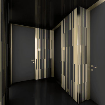
Located in the heart of Manhattan’s Lower East Side, the building was erected on a shallow commercial lot between two 120 year old masonry buildings and a new residential rental building. 330 Grand Street is a mix of 725 SF 1BRs and 1050 SF 2BR apartments. It also contains a 1100 SF two story duplex as well as private and public rooftop space, large private balconies for most units and two large private terraces for the ground floor units.
330 Grand Street was originally designed and approved at the NYC DOB as a prefabricated modular building. During the pandemic, as shipping costs skyrocketed putting the project at risk, we suggested redesigning the building as a reinforced cast-in-place concrete structure. Concrete was readily available and prices had not been affected by the demand increase that many other materials suffered in the pandemic. We took this opportunity to raise floor to ceiling heights, enlarge high performance windows and redistribute the buildings MEPFS and Structural Systems to create very open floor plans.
The challenge was to create a luxurious sensorial living experience with very limited means. In a city with very high construction costs, low cost residential buildings in the area are usually devoid of good quality, design and character. Our approach was to aim high for the end user, prioritizing natural light, open space with long visual perspectives, high ceilings and as always, rejecting the use of predefined building templates.
Our biggest challenge was to ensure that the small spaces feel as clean cut, large and bright as possible. Several unique design decisions were made to ensure low cost and high quality;
Floor plans were laid out so that spaces were wide open and free of clutter from mechanical or structural interruptions. Therefore all infrastructure was placed in lateral demising walls, which in turn act as the unit’s storage and kitchen. The apartments feel wide open, are super quiet and have more storage space than any other comparable apartment in the city.
To solve the problem of the site’s shallow commercial lot which is typically prone to dark interior spaces we focused our attention on the building’s envelope. Instead of the usual small punched window openings, oversized high performance windows were designed to ensure that light penetrated as far as possible into the units. In the smaller 1BR units, the full 50’ depth of the lot is perceived by partitioning spaces with sliding pocket doors that can be retracted to allow deep visual perspectives, making the sight lines in the space feel longer, larger, more ample than normal. In addition to the full height glazing, each unit above the 2nd floor receives a 7 foot covered balcony, adding 120 to 240 sf to each apartment, something unusual in New York City buildings. The space is large enough for a full size dining table, when the weather permits being outside.
We also worked hard to ensure modularity. For example, all kitchen units are all identical throughout the building. The idea of modularity and the economy of the repetitive unit is exercised to the maximum through the building.
Hardware, appliances, flooring, wall coverings and material finishes are all carefully selected to feel bespoke, high quality and unique.
It was important to KURV that the result of this work manifest into something that would deeply connect with the end user and sustain relationships with the consumers of this space.
All images by KURV Architecture ©
 Black Rock Design | Build
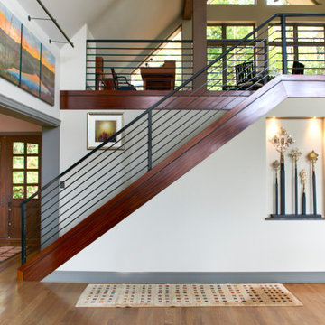
Purchased in a very dated style, these homeowners came to us to solve their remodeling problems! We redesigned the flow of the home to reflect their family's needs and desires. Now they have a masterpiece!
 Alka Pool Construction Ltd
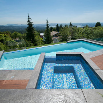
The unique shape of the pool whirlpool combination was created to solve the problem of the backyard’s natural layout. The owner wanted to view the Bay from the pool but the restrictions of the lot required the pool to face the mountain terrain instead with the Bay on the right. A simple solution was to angle the whirlpool to face the stunning view of the Bay while still keeping the pool perpendicular to the trees.
Bob Young Photography
 Red House Design Build
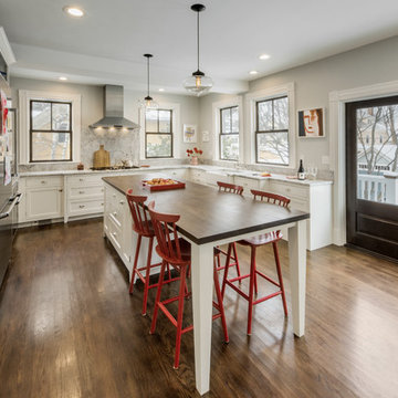
The owners of this home in Newton, MA, were happy with the house, the neighborhood, and the commute to Boston, but the kitchen and powder room area was a big problem both aesthetically and functionally. It had gotten so bad, in fact, that the wife was removing the doors to all the upper cabinets to eliminate as much of her dislike as possible. When Red House finally started construction, almost all of the doors had been removed and stored in the shed out back.
This client wanted an open, airy feel to the kitchen; she wanted to avoid any upper cabinets with solid doors, and she had to have inset cabinets. These were were the priorities in the design of the kitchen.
What she ended up with was an open and bright kitchen with an eat at island, beautiful glass display cabinet, open shelves, and an incredibly functional working kitchen by Red House.
Photography exclusively for Red House Custom Building by Aaron Usher Photography
Instagram: @redhousedesignbuild

 Brandner Design
The Bridger Fence is an artistic approach to solving the problem of a fencing screen. Made from a mix of Shou Sugi Ban wood, hot rolled steel and reclaimed gravel screen all designed in a Mondrian style layout this fence will turn heads. The C-Channel below the fence serves as a steel wall to hold the driveway grade above.
Please call 406-582-0711 for pricing and ordering information, or email us at sales@brandnerdesign.com.
 Manchester Design Group
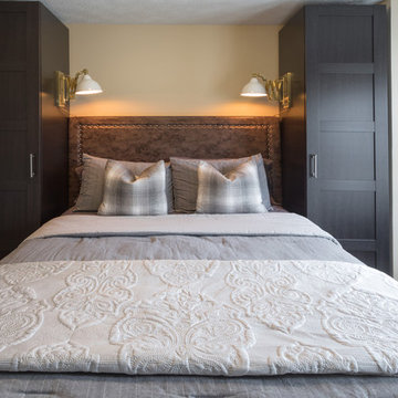
And then there was storage. A friendly trip to IKEA solved the problem. Of course I had to embellish the storage cabinet with lighting and strong sleek handles. We went from a tossed space to a sleek stay-cation.
 JM Kitchen & Bath Design
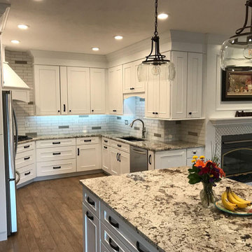
This remodel project started to solve the problem of a kitchen that was too small for the homeowner to have her weekly family dinners in. The kitchen designer Jennifer worked with the owner to balance her vision, her needs, and her budget. Together they made her dream come true. Featuring white shaker doors with bead detail, Tangier Granite, stacking molding, and a Wood Cove Hood, this kitchen has everything it needs to create memories.
The cabinets are Sterling White Shaker Boardwalk Maple, Tangier Granite Countertops, and hand cut Italian white subway tiles with pops of grey.
The hardware and lighting is matte black to contrast with the white and grey tones throughout.
Every detail of this kitchen remodel was thoroughly thought through. From the high stacking crown molding to the interior of the cabinets using rev-a-shelf accessories.
 Galaxy Homes
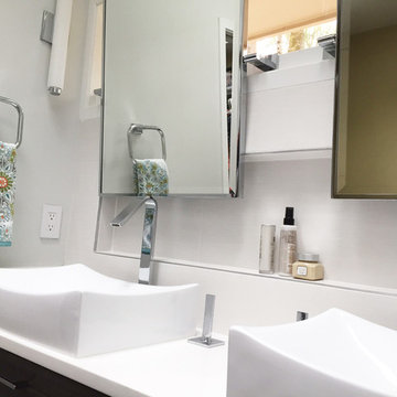
This is a 2-room luxury master bath designed and built by Galaxy Homes. The open and airy shower flows seamlessly from the vanity room with the help of a curb-less shower floor. The vanity is Ikea Godmorgon with custom reclaimed wood drawer fronts. A niche above the vanity solves the problem of needing extra counter space with vessel sinks.
 KURV Architecture DPC (Alex Hughes Architects)
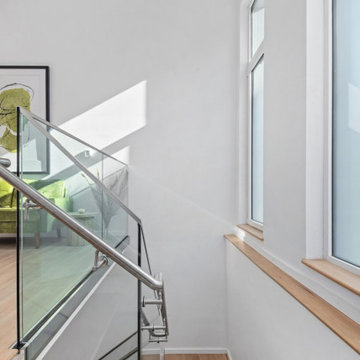
Located in the heart of Manhattan’s Lower East Side, the building was erected on a shallow commercial lot between two 120 year old masonry buildings and a new residential rental building. 330 Grand Street is a mix of 725 SF 1BRs and 1050 SF 2BR apartments. It also contains a 1100 SF two story duplex as well as private and public rooftop space, large private balconies for most units and two large private terraces for the ground floor units.
330 Grand Street was originally designed and approved at the NYC DOB as a prefabricated modular building. During the pandemic, as shipping costs skyrocketed putting the project at risk, we suggested redesigning the building as a reinforced cast-in-place concrete structure. Concrete was readily available and prices had not been affected by the demand increase that many other materials suffered in the pandemic. We took this opportunity to raise floor to ceiling heights, enlarge high performance windows and redistribute the buildings MEPFS and Structural Systems to create very open floor plans.
The challenge was to create a luxurious sensorial living experience with very limited means. In a city with very high construction costs, low cost residential buildings in the area are usually devoid of good quality, design and character. Our approach was to aim high for the end user, prioritizing natural light, open space with long visual perspectives, high ceilings and as always, rejecting the use of predefined building templates.
Our biggest challenge was to ensure that the small spaces feel as clean cut, large and bright as possible. Several unique design decisions were made to ensure low cost and high quality;
Floor plans were laid out so that spaces were wide open and free of clutter from mechanical or structural interruptions. Therefore all infrastructure was placed in lateral demising walls, which in turn act as the unit’s storage and kitchen. The apartments feel wide open, are super quiet and have more storage space than any other comparable apartment in the city.
To solve the problem of the site’s shallow commercial lot which is typically prone to dark interior spaces we focused our attention on the building’s envelope. Instead of the usual small punched window openings, oversized high performance windows were designed to ensure that light penetrated as far as possible into the units. In the smaller 1BR units, the full 50’ depth of the lot is perceived by partitioning spaces with sliding pocket doors that can be retracted to allow deep visual perspectives, making the sight lines in the space feel longer, larger, more ample than normal. In addition to the full height glazing, each unit above the 2nd floor receives a 7 foot covered balcony, adding 120 to 240 sf to each apartment, something unusual in New York City buildings. The space is large enough for a full size dining table, when the weather permits being outside.
We also worked hard to ensure modularity. For example, all kitchen units are all identical throughout the building. The idea of modularity and the economy of the repetitive unit is exercised to the maximum through the building.
Hardware, appliances, flooring, wall coverings and material finishes are all carefully selected to feel bespoke, high quality and unique.
It was important to KURV that the result of this work manifest into something that would deeply connect with the end user and sustain relationships with the consumers of this space.
All images by KURV Architecture ©
71