
Search results for "Problem solving" in Home Design Ideas
 Truitt and White Window and Door Showroom
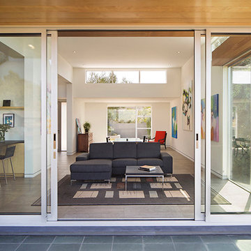
This hillside home in Piedmont, CA was remodeled to change the style from a 1940's rancher with eight foot ceilings and dark interiors, into a modern geometric composition with vast white interiors for casual living and generous daylighting for displaying the artist-owner's works.
In a city known for rigorous and difficult design review, an addition, two variances, and a full stylistic change were unanimously approved on the first round. All sloped roofs and attics were eliminated and replaced by a series of stacked and overlapping flat roofs. This made the house taller on the inside and shorter on the outside, which helped earn design review cooperation in the community. Windows were concentrated toward the rear yard views or moved up high on the side walls for daylight and privacy, benefitting the owners as well as the neighbors.
At the start, the owner husband was so enthusiastic and engaged in transforming his house into something modern that he presented the architect with a scaled foamcore model, rather than the usual magazine clippings and wish list. He participated in the design decisions throughout the process. The owner wife is the artist who did all the artwork in the house. She had been craving a display space with large walls and good natural light. Both of them loved the location and great views.
The project was an opportunity to transform the style of an older traditional home into a modern one, while solving numerous problems. By rebuilding the 1800 ft2 top of the 3-story home it was possible to change the style of the whole building, since the lower floors were a neutral base, and also to change the lifestyle of the owners, who wanted to move their master suite upstairs and live primarily on the top floor as empty nesters.
Going into the project, the architect knew there were multiple encroachments into the setbacks and potential privacy issues with close by neighbors. He approached this as a complex puzzle made up of architectural and political pieces which all had to fit together elegantly. It took many careful moves, small and large, to arrive at a serene and cohesive result that tied old and new together seamlessly.
The design-build contractor worked closely with the owners and handled all of the construction phase documents and design adjustments, adding ideas of their own to make the project really sing.
The project was a collaboration in three acts. The owner had a strong design concept from the start. The architect developed it into a realistic project and garnered the design approvals. Then the contractor executed brilliantly

 JM Kitchen & Bath Design
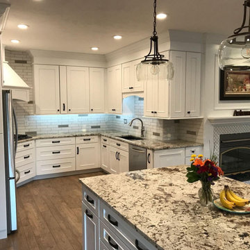
This remodel project started to solve the problem of a kitchen that was too small for the homeowner to have her weekly family dinners in. The kitchen designer Jennifer worked with the owner to balance her vision, her needs, and her budget. Together they made her dream come true. Featuring white shaker doors with bead detail, Tangier Granite, stacking molding, and a Wood Cove Hood, this kitchen has everything it needs to create memories.
The cabinets are Sterling White Shaker Boardwalk Maple, Tangier Granite Countertops, and hand cut Italian white subway tiles with pops of grey.
The hardware and lighting is matte black to contrast with the white and grey tones throughout.
Every detail of this kitchen remodel was thoroughly thought through. From the high stacking crown molding to the interior of the cabinets using rev-a-shelf accessories.
Find the right local pro for your project
 Kustom Home Design
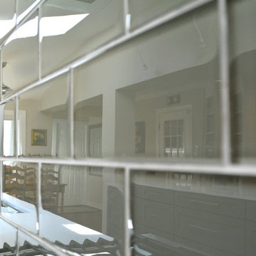
This amazing renovation focused on solving a series of problems that a previous kitchen expansion had created. By rearranging the appliance placement, updating the cabinetry, designing all new storage solutions and maximizing the amazing outdoor views; we cured the spit personality disorder plaguing the existing kitchen. The home now has a beautifully redesigned kitchen and living space perfect for entertaining, relaxing and enjoying the outside views. Vaulted ceilings with bright skylights, reflective glass wall tiles, sleek sophisticated Cambria quartz counter tops, fingerprint-free faucet, multi-functional Prolific kitchen sink by Kohler, stainless steel appliances, creative storage solutions, all new lighting and timeless shaker cabinets by Wellborn lend to the now bright, open, vivacious and flawless function of this newly renovated galley style kitchen. White base cabinets along the outside walls contrast perfectly with the dark grey island cabinets. Linear satin nickel door and drawer pulls coordinate with the stainless steel appliances and sink. An eclectic blend of vintage and modern furnishings, artwork and rugs create a comfortable balance that feels and looks timeless. Breathtaking backyard views are artfully framed by new Pella windows and doors with integral blinds between the glass. Calm, inviting neutral tones provide the perfect backdrop for this refined design.
Photos by: Kimberly Kerl
 KURV Architecture DPC (Alex Hughes Architects)
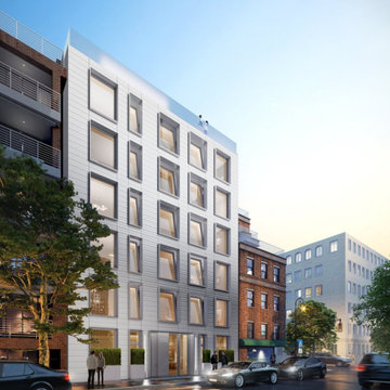
Located in the heart of Manhattan’s Lower East Side, the building was erected on a shallow commercial lot between two 120 year old masonry buildings and a new residential rental building. 330 Grand Street is a mix of 725 SF 1BRs and 1050 SF 2BR apartments. It also contains a 1100 SF two story duplex as well as private and public rooftop space, large private balconies for most units and two large private terraces for the ground floor units.
330 Grand Street was originally designed and approved at the NYC DOB as a prefabricated modular building. During the pandemic, as shipping costs skyrocketed putting the project at risk, we suggested redesigning the building as a reinforced cast-in-place concrete structure. Concrete was readily available and prices had not been affected by the demand increase that many other materials suffered in the pandemic. We took this opportunity to raise floor to ceiling heights, enlarge high performance windows and redistribute the buildings MEPFS and Structural Systems to create very open floor plans.
The challenge was to create a luxurious sensorial living experience with very limited means. In a city with very high construction costs, low cost residential buildings in the area are usually devoid of good quality, design and character. Our approach was to aim high for the end user, prioritizing natural light, open space with long visual perspectives, high ceilings and as always, rejecting the use of predefined building templates.
Our biggest challenge was to ensure that the small spaces feel as clean cut, large and bright as possible. Several unique design decisions were made to ensure low cost and high quality;
Floor plans were laid out so that spaces were wide open and free of clutter from mechanical or structural interruptions. Therefore all infrastructure was placed in lateral demising walls, which in turn act as the unit’s storage and kitchen. The apartments feel wide open, are super quiet and have more storage space than any other comparable apartment in the city.
To solve the problem of the site’s shallow commercial lot which is typically prone to dark interior spaces we focused our attention on the building’s envelope. Instead of the usual small punched window openings, oversized high performance windows were designed to ensure that light penetrated as far as possible into the units. In the smaller 1BR units, the full 50’ depth of the lot is perceived by partitioning spaces with sliding pocket doors that can be retracted to allow deep visual perspectives, making the sight lines in the space feel longer, larger, more ample than normal. In addition to the full height glazing, each unit above the 2nd floor receives a 7 foot covered balcony, adding 120 to 240 sf to each apartment, something unusual in New York City buildings. The space is large enough for a full size dining table, when the weather permits being outside.
We also worked hard to ensure modularity. For example, all kitchen units are all identical throughout the building. The idea of modularity and the economy of the repetitive unit is exercised to the maximum through the building.
Hardware, appliances, flooring, wall coverings and material finishes are all carefully selected to feel bespoke, high quality and unique.
It was important to KURV that the result of this work manifest into something that would deeply connect with the end user and sustain relationships with the consumers of this space.
All images by KURV Architecture ©
 Bellwether Windows, Siding & Doors
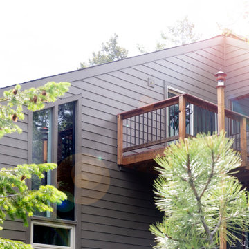
This Colorado mountain home had rotting cedar siding that was creating water intrusion issues. We solved these problems by removing all the siding and trim, as well as soffits and fascia, wrapping the house with HardieWrap, and installing James Hardie HardiePlank 7" lap siding and James Hardie HardieTrim trim. The homeowner selected Timber Bark for the both the siding and trim from the James Hardie ColorPlus Statement Collection, which has a 15-year finish warranty. How do you like the look?
 TOUCH Architect Co., Ltd.
PROJECT | Duplicate-Duplex
TYPE | private residence / home-studio
LOCATION | Phayathai Rd., Bangkok, Thailand
OWNER | Ms. Najaree Ratanajiajaroen / Chanon Treenet
ARCHITECT | TOUCH Architect Co.,Ltd.
FLOOR AREA | 64 sq.m.
FLOOR AREA (by proposing) | 75 sq.m.
COMPLETION | 2018
PHOTOGRAPHER | Chalermwat Wongchompoo
CONTRACTOR | Legend Construction Group
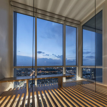
A major pain point of staying in 64 sq.m. of duplex condominium unit, which is used for a home-studio for an animator and an artist, is that there is not enough space for dwelling. Moreover, a double-volume space of living area with a huge glass curtain wall, faces West. High temperature occurs all day long, since it allows direct sunlight to come inside.
In order to solve both mentioned problems, three addition items are proposed which are, GRID PARTITION, EXTENSION DECK, and STEPPING SPACE.
A glass partition not only dividing space between kitchen and living, but also helps reduce electricity charge from air-condition. Grid-like of double glass frame is for stuff and stationery hanging, as to serve the owners’ activities.
Extension deck would help filtrating heat from direct sunlight, since an existing high glass facade facing West.
An existing staircase for going up to the second-floor bedroom, is added by a proposed space above, since this condominium unit has no enough space for dwelling or storage. In order to utilize the space in a small condominium, creating another staircase above the existing one helps increase the space.
The grid partition and the extension deck help ‘decrease’ the electricity charge, while the extension deck and the stepping space help ‘increase’ the space for 11 sq.m.
 Srote & Co Architects | Planners | Interiors
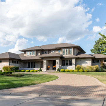
Our Sackston Prarie Cabana solved the problem of client privacy with its native stone screen walls and stucco accents while providing all of the luxuries of poolside outdoor living. Three 11-feet wide accordion style doors open the cabana entirely to the outdoors to circulate westerly summer winds. Deep overhangs provide shade for summer sun while allowing the sun to permeate the space to utilize the saloon and hot tub during the winter months. Terraced poolside planters with native vegetation complement the design. Although this cabana was constructed after completion of the main residence the material choices seamlessly blend this addition to create one unified outdoor space.
 Petrick Architecture
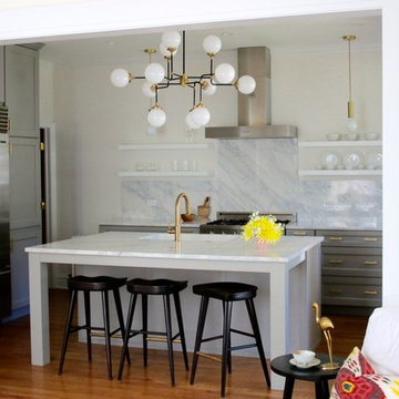
With help from my design-savvy client, I was able to create a stylish yet practical solution to her functional problems in the existing kitchen. The space was dark, cramped, and disorganized. While making dinner, she ran back and forth through a two-way door to communicate with her children in the family room. Backpacks and homework spilled into the kitchen and lights were on regardless of the time of day.
To solve these issues, we opened up the wall between the family room to improve communication and bring in more natural light. A mud room was defined by adding walls near the back door. We raised the ceiling to the original height and the new opening was trimmed to match all existing openings for a seamless design. Making dinner has a whole new outlook with a custom island that faces the family room and the warm southern sunlight. We finished it off embracing current trends with grey cabinets, marble counters with backsplash, brushed brass hardware and open shelving.
 Lagois Design Build Renovate
New windows, floors, powder room and basement:
We gave the home new windows, new hardwood floors, and paint throughout. We created a new main floor powder room and a new finished basement containing a living area, three-piece bathroom and new bedroom with egress (tilt and turn) windows.
Flipped around and redesigned kitchen:
We created a new kitchen. The footprint of the kitchen stayed the same, but we flipped it around and redesigned it. Now it has a walk-in pantry area and more floorspace going in and out, which optimized the flow of traffic. We replaced the old non-functioning mudroom with a new one.
Disappearing balcony and drafty door:
To create a new space using a balcony in a bedroom, we extended the second storey out to line up with the first floor, and this increased the square footage. In that room we turned a drafty door into a window.
We reinstated the rear deck, using as many of the original pieces as we could:
There was a leaking roof problem because the original roof pitches were causing ice damming. We designed a new roof to prevent that in the future.
New windows, stucco, and the challenge of asbestos:
Another challenge was installing new windows in the original stucco finish, which contained asbestos. We waterproofed those properly, future proofing them from leaks.
We solved the situation by installing a 5-inch trim around the perimeter of the window. Specialists cut the asbestos back (we had to set up a containment perimeter around each window), and then we placed windows that are five inches wider than the window frames. We used special flashing tapes and sealed them all up behind the stucco.
 Remodeling Contractors
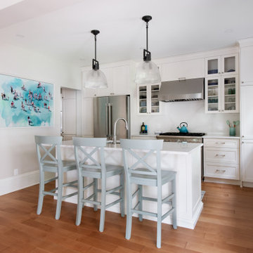
West Des Moines two story homes create challenges for homeowners with layouts including small rooms that don’t seem to flow together. The family that lives in this home found that entertaining and gathering in the kitchen was almost impossible with the current layout and asked for an addition to solve the problem. After listening to the challenges of that they faced and working with the homeowners, a new solution emerged without an addition, reducing the overall budget and allowing the whole main floor to be updated.
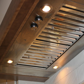
By removing the wall between the kitchen and dinning room, the team was able to design an island for family and friends to congregate around. Then by flanking the island with a large commercial range surrounded by a custom backsplash and custom hood a picture perfect kitchen was born. Lastly by repeating elements within the range hood, island and fireplace, the team was able to create unity throughout the space. This visually makes the space feel larger and feels like the addition was built
 Stoett Screens
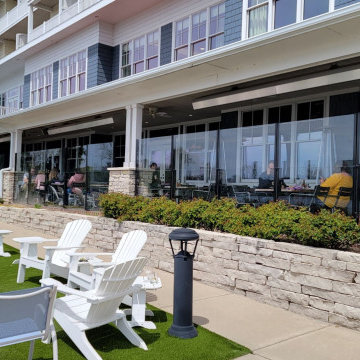
Having a restaurant on the shores of the St. Joe River ensures sunny summer days and unforgettable sunsets. Outdoor dining has been critical to a restaurant’s success over the last few years. Having that success depends on the weather in Michigan meant that the Inn at Harbor Shores needed to find a solution that meant continued use of their outdoor space when the weather wasn’t cooperating. Finding an aesthetically pleasing solution didn’t hinder the views and that fit the upscale feel of the Inn became a priority. Stoett’s PanoraKinetic glass wind barrier solved that problem.
 Mood Interieur
This house needed a total make-over. My clients wanted a solution between living room and serre which added more light and storing space. Mood Interieur was hired to suggest a new floor plan and to act as a sparring partner.
The wall with ceiling high sliding doors and a cupboard over the whole lenght of the wall in the serre solved the light and storing problem.
Mood Interieur also designed the tv cupboard and wardrobe closet.
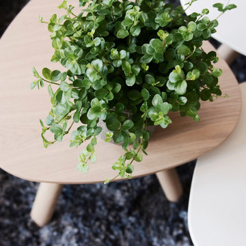
All the dark colours were replaced by fresh, white colours combined with greige. A colour which beautifully interacts with the shabby-chic Flexform sofa en the greige blue Bomat carpet. The white and wood Arco tablet tables go perfectly with the white tv-cupboard and new doors.
Furniture and curtains are suggested and delivered by Mood Interieur.
 Black Rock Design | Build
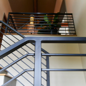
Purchased in a very dated style, these homeowners came to us to solve their remodeling problems! We redesigned the flow of the home to reflect their family's needs and desires. Now they have a masterpiece!
 Srote & Co Architects | Planners | Interiors
Interior Design by others.
Our Sackston Prarie Cabana solved the problem of client privacy with its native stone screen walls and stucco accents while providing all of the luxuries of poolside outdoor living. Three 11-feet wide accordion style doors open the cabana entirely to the outdoors to circulate westerly summer winds. Deep overhangs provide shade for summer sun while allowing the sun to permeate the space to utilize the saloon and hot tub during the winter months. Terraced poolside planters with native vegetation complement the design. Although this cabana was constructed after completion of the main residence the material choices seamlessly blend this addition to create one unified outdoor space.

 Emilia Decor
Photo Credit: Heather V. Keeling
When this client contacted me to work on his office, we needed to solve one big problem first: What part of the house would the said home office be located?
As his family has grown over the past years, all of the bedrooms were now occupied by beautiful children! As a self-employed cartographer, his current office space was in the basement. We decided to turn a nook at the top of the stairs into his private office. The two big challenges were creating a private space, (adding doors to an open nook) and tearing out the existing built-in daybed. Once the demo was finished we were able to make this small little nook come to life with reclaimed wood shelving and desk top, a topographic wallpaper and easy organization.
 User
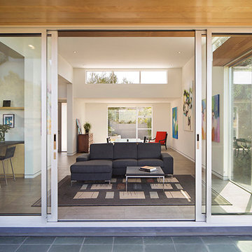
UserThis hillside home in Piedmont, CA was remodeled to change the style from a 1940's rancher with eight foot ceilings and dark interiors, into a modern geometric composition with vast white interiors for casual living and generous daylighting for displaying the artist-owner's works.
In a city known for rigorous and difficult design review, an addition, two variances, and a full stylistic change were unanimously approved on the first round. All sloped roofs and attics were eliminated and replaced by a series of stacked and overlapping flat roofs. This made the house taller on the inside and shorter on the outside, which helped earn design review cooperation in the community. Windows were concentrated toward the rear yard views or moved up high on the side walls for daylight and privacy, benefitting the owners as well as the neighbors.
At the start, the owner husband was so enthusiastic and engaged in transforming his house into something modern that he presented the architect with a scaled foamcore model, rather than the usual magazine clippings and wish list. He participated in the design decisions throughout the process. The owner wife is the artist who did all the artwork in the house. She had been craving a display space with large walls and good natural light. Both of them loved the location and great views.
The project was an opportunity to transform the style of an older traditional home into a modern one, while solving numerous problems. By rebuilding the 1800 ft2 top of the 3-story home it was possible to change the style of the whole building, since the lower floors were a neutral base, and also to change the lifestyle of the owners, who wanted to move their master suite upstairs and live primarily on the top floor as empty nesters.
Going into the project, the architect knew there were multiple encroachments into the setbacks and potential privacy issues with close by neighbors. He approached this as a complex puzzle made up of architectural and political pieces which all had to fit together elegantly. It took many careful moves, small and large, to arrive at a serene and cohesive result that tied old and new together seamlessly.
The design-build contractor worked closely with the owners and handled all of the construction phase documents and design adjustments, adding ideas of their own to make the project really sing.
The project was a collaboration in three acts. The owner had a strong design concept from the start. The architect developed it into a realistic project and garnered the design approvals. Then the contractor executed brilliantly.
 NextGen Home Builders
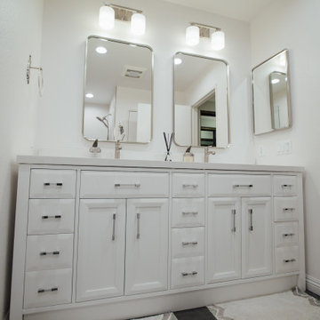
A custom double vanity built for two, with twelve drawers and two cabinets to solve the storage problem the homeowners had in their old bathroom. Quartz counters and brushed nickel fixtures keep the look bright and modern.
This is remodel done by Nextgen Home Builders
 Deskins Group LLC
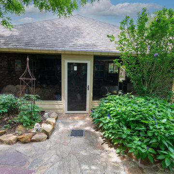
This project began with a beautiful Koi pond under a large patio cover, but the homeowner struggled with two major issues:
• Lack of privacy between the driveway and patio
• A breezeway roofline that didn’t align with the exterior brick, causing rainwater to pour into the gap and flood the patio during storms
As part of our exterior remodeling and water‑management correction, we redesigned the entire connection between the breezeway, patio, and driveway.
? Phase 1: Structural Fixes & Weather Protection
• Converted the original 4' brick wall and gate into a full‑height privacy wall with an exterior door, creating a secure, enclosed patio space.
• Extended and realigned the breezeway roofline to properly tie into the home’s brick, eliminating water intrusion and preventing patio flooding.
• Installed a solar tube to bring natural daylight into the pond area without adding heat — a perfect upgrade for shaded patios.
? Phase 2: Creating a Backyard Oasis
After seeing the transformation, the homeowner invited us back to complete the space with a custom screen wall across the backside of the patio. This addition created a private, breezy, bug‑free outdoor retreat, ideal for relaxing around the Koi pond.
? Serving Cypress, Tomball, Champions & Northwest Houston
This project is a great example of how we solve privacy issues, roofline and drainage problems, and patio enclosure upgrades to help homeowners get more out of their outdoor spaces.
 McNally Interiors
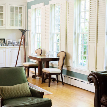
Solving the world's problems over dinner? Take a seat in a comfy dining chair that cushions your shoulder blades as well as your bottom. Round dining tables really do facilitate conversation. This one expands radially to seat 10.
72