
Search results for "Proceeds" in Home Design Ideas

 RAJ Kitchen and Bath, LLC
**Check out the video of this transformation on our website**
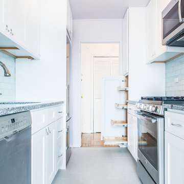
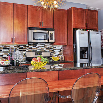
This small kitchen was way too small for this 2 bedrooms, 2 bathrooms apartment. Not only was it a very small kitchen, but the physical location of it made it very difficult to make it any bigger. There wasn't much that could have been done without incurring astronomical cost, which would get little or no return on the investment. The client wanted a kitchen that can be optimized in its current location to add a ton of value for resale.
This was difficult to do, because there was no moving of any mechanical around in the kitchen and even if we wanted to, the management of the building would not allow. For those of you who live in condos, co-ops or apartment building, you know how difficult it is to rework these foot prints. When we showed up, we saw the problems, but we also saw a huge opportunity where we can achieve those goals in the small space. This was accomplished by making some key changes and to incorporate some new things that was not possible when this kitchen was built years ago.
The crucial part of the design that would drive the entire new layout, was selecting the only appliance; that was the Refrigerator. Once we nailed down that refrigerator, we then proceeded to design the kitchen around it. We moved it to the other side of the wall where the sink was so that we can tap into the water line from the sink plumbing. It was crucial that it stays exactly 24" deep, not an inch more because we had to keep the entry as open as possible. Also, it was going to be directly in front of another big storage unit - The pantry. It is not ideal in most cases, but we needed the rest of the space to ramp up the design and open feel towards the side where all of the activities would take place, which happend to be the dining room and the view.
Once all that was figured out, we re-positioned the sink, dishwasher and the range and proceeded to wrap the cabinets around the columns to integrate them into the space. Thirty- six inches cabinets height was used so that they can be installed higher towards the ceiling height to give more room rather than the standard 18" required height between the counter tops. This was done to make the room feel a lot bigger than it really was. Not to mention, we also didn't want the faucet to be buried under the cabinets so that was also a necessary design detail for the space.
We then lowered both knee walls so that the counter top can sit on top of them, by removing that stop point that would have otherwise defined the kitchen area. This allowed us to pick up that extra footprint into the room for added prep space and enabled us to create the illusion of a kitchen that is looking longer than it really is. Every inch mattered when designing this kitchen and we made a conscious decision to use every one of that inch.
White cabinets were selected to do just what white cabinets are design to do; make a small or dark room appear bigger, brighter and more open. In this kitchen, this was amplified the more because of the kitchen location. It was perfect! We knew we did justice to the space because while we were there taking some photos, a few potential buyers walked in and went straight for the kitchen! They said its design just to fit the apartment.
Pantry roll out shelving, Double recycle bin, fancy handles, LED lighting, Quartz counter top, beautiful backslash tiles and grey linen floors finished off the kitchen which looked over a beautiful view of the George Washington Bridge from the top of this lovely 4th floor apartment.
Credit to Masterpiece Tile and Marble (Annmarie on the selection of Tiles and countertop and Val on the Construction to complete this project).
Davor Kokic Photography
 Tiffany Brooks, HGTV Host & Interior Designer
Inquire About Our Design Services
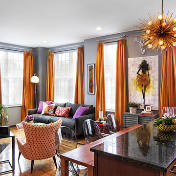
This homeowner loved color. In order to bring in more color, I ditched her yellow and orange walls by painting the room gray, with charcoal trim. I often tell folks in order to pump up the color, we have to bring down the backdrop, and Lori’s condo was my case in point.
And then we proceeded with construction. Yep, construction. I had to figure out a way around the awkward floor plan, and where to put that TV. We decided to rebuild her fireplace to house her TV - it was great way to utilize the unused space.
Marcel Page
Find the right local pro for your project
 Danes Custom Homes
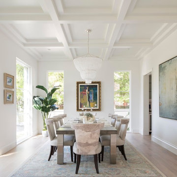
Inspiration for a mediterranean light wood floor enclosed dining room remodel in Dallas with white walls and no fireplace
 J Design Group - Interior Designers Miami - Modern
Home and Living Examiner said:
Modern renovation by J Design Group is stunning
J Design Group, an expert in luxury design, completed a new project in Tamarac, Florida, which involved the total interior remodeling of this home. We were so intrigued by the photos and design ideas, we decided to talk to J Design Group CEO, Jennifer Corredor. The concept behind the redesign was inspired by the client’s relocation.
Andrea Campbell: How did you get a feel for the client's aesthetic?
Jennifer Corredor: After a one-on-one with the Client, I could get a real sense of her aesthetics for this home and the type of furnishings she gravitated towards.
The redesign included a total interior remodeling of the client's home. All of this was done with the client's personal style in mind. Certain walls were removed to maximize the openness of the area and bathrooms were also demolished and reconstructed for a new layout. This included removing the old tiles and replacing with white 40” x 40” glass tiles for the main open living area which optimized the space immediately. Bedroom floors were dressed with exotic African Teak to introduce warmth to the space.
We also removed and replaced the outdated kitchen with a modern look and streamlined, state-of-the-art kitchen appliances. To introduce some color for the backsplash and match the client's taste, we introduced a splash of plum-colored glass behind the stove and kept the remaining backsplash with frosted glass. We then removed all the doors throughout the home and replaced with custom-made doors which were a combination of cherry with insert of frosted glass and stainless steel handles.
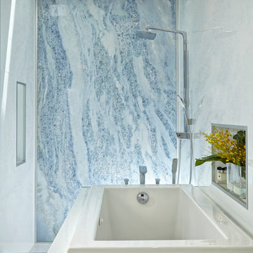
All interior lights were replaced with LED bulbs and stainless steel trims, including unique pendant and wall sconces that were also added. All bathrooms were totally gutted and remodeled with unique wall finishes, including an entire marble slab utilized in the master bath shower stall.
Once renovation of the home was completed, we proceeded to install beautiful high-end modern furniture for interior and exterior, from lines such as B&B Italia to complete a masterful design. One-of-a-kind and limited edition accessories and vases complimented the look with original art, most of which was custom-made for the home.
To complete the home, state of the art A/V system was introduced. The idea is always to enhance and amplify spaces in a way that is unique to the client and exceeds his/her expectations.
To see complete J Design Group featured article, go to: http://www.examiner.com/article/modern-renovation-by-j-design-group-is-stunning
Living Room,
Dining room,
Master Bedroom,
Master Bathroom,
Powder Bathroom,
Miami Interior Designers,
Miami Interior Designer,
Interior Designers Miami,
Interior Designer Miami,
Modern Interior Designers,
Modern Interior Designer,
Modern interior decorators,
Modern interior decorator,
Miami,
Contemporary Interior Designers,
Contemporary Interior Designer,
Interior design decorators,
Interior design decorator,
Interior Decoration and Design,
Black Interior Designers,
Black Interior Designer,
Interior designer,
Interior designers,
Home interior designers,
Home interior designer,
Daniel Newcomb

 RAJ Kitchen and Bath, LLC
**Check out the video of this transformation on our website**
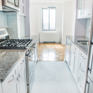
This small kitchen was way too small for this 2 bedrooms, 2 bathrooms apartment. Not only was it a very small kitchen, but the physical location of it made it very difficult to make it any bigger. There wasn't much that could have been done without incurring astronomical cost, which would get little or no return on the investment. The client wanted a kitchen that can be optimized in its current location to add a ton of value for resale.
This was difficult to do, because there was no moving of any mechanical around in the kitchen and even if we wanted to, the management of the building would not allow. For those of you who live in condos, co-ops or apartment building, you know how difficult it is to rework these foot prints. When we showed up, we saw the problems, but we also saw a huge opportunity where we can achieve those goals in the small space. This was accomplished by making some key changes and to incorporate some new things that was not possible when this kitchen was built years ago.
The crucial part of the design that would drive the entire new layout, was selecting the only appliance; that was the Refrigerator. Once we nailed down that refrigerator, we then proceeded to design the kitchen around it. We moved it to the other side of the wall where the sink was so that we can tap into the water line from the sink plumbing. It was crucial that it stays exactly 24" deep, not an inch more because we had to keep the entry as open as possible. Also, it was going to be directly in front of another big storage unit - The pantry. It is not ideal in most cases, but we needed the rest of the space to ramp up the design and open feel towards the side where all of the activities would take place, which happend to be the dining room and the view.
Once all that was figured out, we re-positioned the sink, dishwasher and the range and proceeded to wrap the cabinets around the columns to integrate them into the space. Thirty- six inches cabinets height was used so that they can be installed higher towards the ceiling height to give more room rather than the standard 18" required height between the counter tops. This was done to make the room feel a lot bigger than it really was. Not to mention, we also didn't want the faucet to be buried under the cabinets so that was also a necessary design detail for the space.
We then lowered both knee walls so that the counter top can sit on top of them, by removing that stop point that would have otherwise defined the kitchen area. This allowed us to pick up that extra footprint into the room for added prep space and enabled us to create the illusion of a kitchen that is looking longer than it really is. Every inch mattered when designing this kitchen and we made a conscious decision to use every one of that inch.
White cabinets were selected to do just what white cabinets are design to do; make a small or dark room appear bigger, brighter and more open. In this kitchen, this was amplified the more because of the kitchen location. It was perfect! We knew we did justice to the space because while we were there taking some photos, a few potential buyers walked in and went straight for the kitchen! They said its design just to fit the apartment.
Pantry roll out shelving, Double recycle bin, fancy handles, LED lighting, Quartz counter top, beautiful backslash tiles and grey linen floors finished off the kitchen which looked over a beautiful view of the George Washington Bridge from the top of this lovely 4th floor apartment.
Credit to Masterpiece Tile and Marble (Annmarie on the selection of Tiles and countertop and Val on the Construction to complete this project).
Davor Kokic Photography
 Elaine Musiwa
Photo: Elaine Musiwa © 2015 Houzz
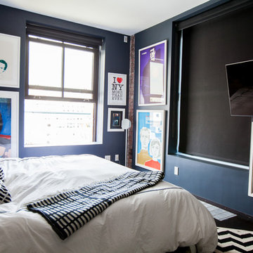
Inspiration for an eclectic bedroom remodel in New York
Inspiration for an eclectic bedroom remodel in New York
 Rossoto Art LLC
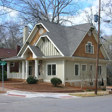
After Remodel.
Design and Photos by William Rossoto of Rossoto Art LLC
Inspiration for a mid-sized craftsman green one-story mixed siding exterior home remodel in Other with a clipped gable roof
Inspiration for a mid-sized craftsman green one-story mixed siding exterior home remodel in Other with a clipped gable roof
 Dalia Canora Design, LLC
Jane Beiles
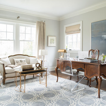
Inspiration for a mid-sized transitional freestanding desk dark wood floor study room remodel in DC Metro with gray walls
Inspiration for a mid-sized transitional freestanding desk dark wood floor study room remodel in DC Metro with gray walls
 RAJ Kitchen and Bath, LLC
**Check out the video of this transformation on our website**
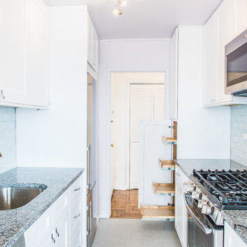
This small kitchen was way too small for this 2 bedrooms, 2 bathrooms apartment. Not only was it a very small kitchen, but the physical location of it made it very difficult to make it any bigger. There wasn't much that could have been done without incurring astronomical cost, which would get little or no return on the investment. The client wanted a kitchen that can be optimized in its current location to add a ton of value for resale.
This was difficult to do, because there was no moving of any mechanical around in the kitchen and even if we wanted to, the management of the building would not allow. For those of you who live in condos, co-ops or apartment building, you know how difficult it is to rework these foot prints. When we showed up, we saw the problems, but we also saw a huge opportunity where we can achieve those goals in the small space. This was accomplished by making some key changes and to incorporate some new things that was not possible when this kitchen was built years ago.
The crucial part of the design that would drive the entire new layout, was selecting the only appliance; that was the Refrigerator. Once we nailed down that refrigerator, we then proceeded to design the kitchen around it. We moved it to the other side of the wall where the sink was so that we can tap into the water line from the sink plumbing. It was crucial that it stays exactly 24" deep, not an inch more because we had to keep the entry as open as possible. Also, it was going to be directly in front of another big storage unit - The pantry. It is not ideal in most cases, but we needed the rest of the space to ramp up the design and open feel towards the side where all of the activities would take place, which happend to be the dining room and the view.
Once all that was figured out, we re-positioned the sink, dishwasher and the range and proceeded to wrap the cabinets around the columns to integrate them into the space. Thirty- six inches cabinets height was used so that they can be installed higher towards the ceiling height to give more room rather than the standard 18" required height between the counter tops. This was done to make the room feel a lot bigger than it really was. Not to mention, we also didn't want the faucet to be buried under the cabinets so that was also a necessary design detail for the space.
We then lowered both knee walls so that the counter top can sit on top of them, by removing that stop point that would have otherwise defined the kitchen area. This allowed us to pick up that extra footprint into the room for added prep space and enabled us to create the illusion of a kitchen that is looking longer than it really is. Every inch mattered when designing this kitchen and we made a conscious decision to use every one of that inch.
White cabinets were selected to do just what white cabinets are design to do; make a small or dark room appear bigger, brighter and more open. In this kitchen, this was amplified the more because of the kitchen location. It was perfect! We knew we did justice to the space because while we were there taking some photos, a few potential buyers walked in and went straight for the kitchen! They said its design just to fit the apartment.
Pantry roll out shelving, Double recycle bin, fancy handles, LED lighting, Quartz counter top, beautiful backslash tiles and grey linen floors finished off the kitchen which looked over a beautiful view of the George Washington Bridge from the top of this lovely 4th floor apartment.
Credit to Masterpiece Tile and Marble (Annmarie on the selection of Tiles and countertop and Val on the Construction to complete this project).
Davor Kokic Photography
 Interior Affairs -- Vickie Daeley
Artistically Tuscan
Francesca called me, nearly 13 years ago, as she had seen one of our ads in the Orange County Living Magazine. In that particular ad, she fell in love with the mural work our artists had done for another home we designed in Huntington Beach, California. Although this was a newly built home in Portofira Estates neighborhood, in the city of Orange, both she and her husband knew they would eventually add to the existing square footage, making the family room and kitchen much bigger.
We proceeded with designing the house as her time frame and budget proceeded until we completed the entire home.
Then, about 5 years ago, Francesca and her husband decided to move forward with getting their expansion project underway. They moved the walls out in the family room and the kitchen area, creating more space. They also added a game room to the upstairs portion of their home. The results are spectacular!
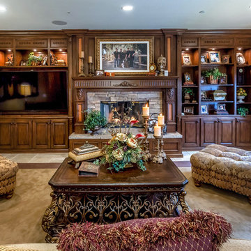
This family room has a large angular sofa with a shaped wood frame. Two oversized chairs and ottomans on either side of the sofa to create a circular conversation and almost theatre like setting. A warm, wonderful color palette of deep plums, caramels, rich reds, burgundy, calming greens and accents of black make the entire home come together perfectly.
The entertainment center wraps the fireplace and nook shelving as it takes up the entire wall opposite the sofa. The window treatments consist of working balloon shades in a deep plum silk with valances in a rich gold silk featuring wrought iron rods running vertically through the fabric. The treatment frames the stunning panoramic view of all of Orange County.
 TKS Design Group
Free ebook, Creating the Ideal Kitchen. DOWNLOAD NOW
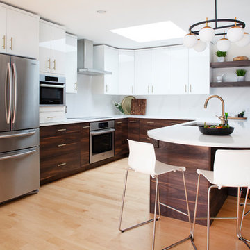
One of my very favorite parts of the design process is space planning and considering all the possible floor plan solutions at the beginning stages of the project. What works for one person as a solution may not be the best solution for the next. What you think you want going into the process, may change once all the space planning options are considered. This was exactly the case for this family. They thought they really wanted an island configuration.
Once we figured out the flow of the work triangle and saw how great a large peninsula would work for the family, we proceeded along those lines. The peninsula not only works great for food prep, it also allows more of a traditional table seating versus an island with everyone lined up in a row — not so great for daily dinner conversation.
To the right of that is a counter depth fridge and a speed oven which gives some flexibility with cooking and reheating smaller meals instead of having to heat the entire oven. An induction cooktop with its easy to clean surface keeps the space looking clean and tidy. Induction heats very quickly to high temperatures so is also wonderful to cook on. To the right of cooktop is a long stretch of countertop perfect for prep space.
Storage was very important to the homeowners. We took our time discussing where spice pull outs and tray dividers would be located, how the corner storage would be addressed and the location of the other items such as trash and recycling cans. We worked as many drawers as possible into the space, as I always recommend drawers over doors and/or roll outs as they offer the most flexibility and ease of use. Customizing these details is time well spent as having a place for everything and everything in its place, just like Mom said, really is the key to a functional and professionally designed kitchen.
The talls and wall cabinets are white acrylic which combined with the white marble look quartz countertops and full height backsplash keep the room feeling light, bright and airy. The wood toned base cabinets are made of a textured laminate that has the look of wood but is a very easy to maintain product. Brushed gold metal on the hardware, faucet and chandelier add a warm touch and ties into the blond maple flooring. The neighboring breakfast room was also remodeled as part of the project and houses a small coffee station.
Designed by: Susan Klimala, CKBD
Photography by: Kari Firak
For more information on kitchen and bath design ideas go to: www.kitchenstudio-ge.com
 Pearl Remodeling
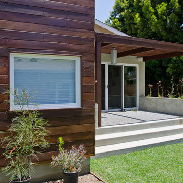
Korbin - Santa Monica room addition
Mid-sized trendy backyard concrete patio photo in Los Angeles with a pergola
Mid-sized trendy backyard concrete patio photo in Los Angeles with a pergola
 Appliances Connection
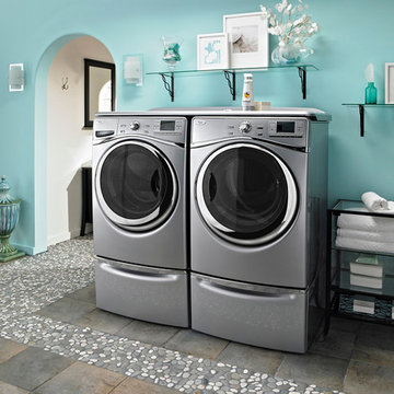
Whirlpool does more than help you run your house more easily, cleanly, and efficiently; Whirlpool is dedicated to developing more environmentally friendly appliances for your home. As we proceed into the twenty first century, and Whirlpool proceeds into its second, they've only expanded their initiatives toward cleaner technology, embracing the Energy Star efficiency banner and exceeding government requirements to ensure eco-friendly operation for all your home appliances. Whirlpool is dedicated to helping the home whether it's your home, or the home we all share: Planet Earth
 Bespoke Fine Interiors
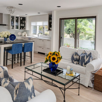
This fantastic kitchen is in a renovation that encompassed about 1/2 of this house built in the 1980's. Metal framed cabinets were used on the upper cabinets. Blue accents throughout.
Olin Redmon Photography http://olinredmon.com
 Tiffany Brooks, HGTV Host & Interior Designer
Inquire About Our Design Services
This homeowner loved color. In order to bring in more color, I ditched her yellow and orange walls by painting the room gray, with charcoal trim. I often tell folks in order to pump up the color, we have to bring down the backdrop, and Lori’s condo was my case in point.
And then we proceeded with construction. Yep, construction. I had to figure out a way around the awkward floor plan, and where to put that TV. We decided to rebuild her fireplace to house her TV - it was great way to utilize the unused space.
Marcel Page
 Southern Living
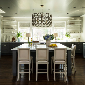
Inspiration for a timeless u-shaped dark wood floor kitchen remodel in Birmingham with shaker cabinets, gray cabinets, white backsplash, stainless steel appliances and an island


6