
Search results for "Proceeds" in Home Design Ideas
 Lauren Nicole Designs
D Randolph Foulds Photography
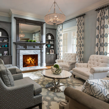
Example of a classic formal living room design in Charlotte with blue walls and a standard fireplace
Example of a classic formal living room design in Charlotte with blue walls and a standard fireplace

 Interior Affairs -- Vickie Daeley
Artistically Tuscan
Francesca called me, nearly 13 years ago, as she had seen one of our ads in the Orange County Living Magazine. In that particular ad, she fell in love with the mural work our artists had done for another home we designed in Huntington Beach, California. Although this was a newly built home in Portofira Estates neighborhood, in the city of Orange, both she and her husband knew they would eventually add to the existing square footage, making the family room and kitchen much bigger.
We proceeded with designing the house as her time frame and budget proceeded until we completed the entire home.
Then, about 5 years ago, Francesca and her husband decided to move forward with getting their expansion project underway. They moved the walls out in the family room and the kitchen area, creating more space. They also added a game room to the upstairs portion of their home. The results are spectacular!
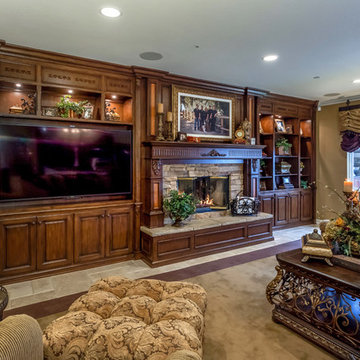
This family room has a large angular sofa with a shaped wood frame. Two oversized chairs and ottomans on either side of the sofa to create a circular conversation and almost theatre like setting. A warm, wonderful color palette of deep plums, caramels, rich reds, burgundy, calming greens and accents of black make the entire home come together perfectly.
The entertainment center wraps the fireplace and nook shelving as it takes up the entire wall opposite the sofa. The window treatments consist of working balloon shades in a deep plum silk with valances in a rich gold silk featuring wrought iron rods running vertically through the fabric. The treatment frames the stunning panoramic view of all of Orange County.
Find the right local pro for your project
 Ruth Richards, Allied ASID
Robert Granoff
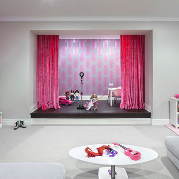
Inspiration for a huge contemporary carpeted kids' room remodel in New York with gray walls
Inspiration for a huge contemporary carpeted kids' room remodel in New York with gray walls
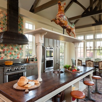
Example of a cottage brick floor eat-in kitchen design in Houston with shaker cabinets, gray cabinets, multicolored backsplash, stainless steel appliances and an island
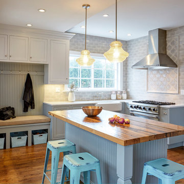
 ED Enterprises, Inc.
We understood the customer's dream to remove an existing closet and several walls.
We began with the removal of several structural walls and closet. We found that the previous contractor had incorrectly removed structural wood posts. We secured the structural integrity of the building with wood and steel.
We proceeded to expand the opening between
the Kitchen and Butler Pantry, which included relocating waste and water lines from the second floor.
We upgraded the existing electrical and installed a 440-volt electrical system for the entire home.
You can enjoy the illumination of the cabinetry and kitchen, by the pendant lights, recessed lights, under cabinet lights, and curio lights in the glass door cabinets,
Note the brick pattern Subway tile from the counter top to the ceiling, in the kitchen and the Butler Pantry. Take special notice of the decorative tile area above the range.
The chimney style hood was vented to the exterior.
The unique sitting area, near the rear entry, was finished with beadboard paneling and wall cabinets up to the ceiling., trimmed with crown molding.
General Contractor / Remodel: E D Enterprises, Inc.
Michael Alan Kaskel Photography
 RAJ Kitchen and Bath, LLC
**Check out the video of this transformation on our website**
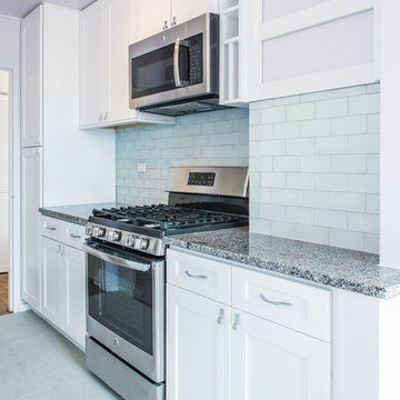
This small kitchen was way too small for this 2 bedrooms, 2 bathrooms apartment. Not only was it a very small kitchen, but the physical location of it made it very difficult to make it any bigger. There wasn't much that could have been done without incurring astronomical cost, which would get little or no return on the investment. The client wanted a kitchen that can be optimized in its current location to add a ton of value for resale.
This was difficult to do, because there was no moving of any mechanical around in the kitchen and even if we wanted to, the management of the building would not allow. For those of you who live in condos, co-ops or apartment building, you know how difficult it is to rework these foot prints. When we showed up, we saw the problems, but we also saw a huge opportunity where we can achieve those goals in the small space. This was accomplished by making some key changes and to incorporate some new things that was not possible when this kitchen was built years ago.
The crucial part of the design that would drive the entire new layout, was selecting the only appliance; that was the Refrigerator. Once we nailed down that refrigerator, we then proceeded to design the kitchen around it. We moved it to the other side of the wall where the sink was so that we can tap into the water line from the sink plumbing. It was crucial that it stays exactly 24" deep, not an inch more because we had to keep the entry as open as possible. Also, it was going to be directly in front of another big storage unit - The pantry. It is not ideal in most cases, but we needed the rest of the space to ramp up the design and open feel towards the side where all of the activities would take place, which happend to be the dining room and the view.
Once all that was figured out, we re-positioned the sink, dishwasher and the range and proceeded to wrap the cabinets around the columns to integrate them into the space. Thirty- six inches cabinets height was used so that they can be installed higher towards the ceiling height to give more room rather than the standard 18" required height between the counter tops. This was done to make the room feel a lot bigger than it really was. Not to mention, we also didn't want the faucet to be buried under the cabinets so that was also a necessary design detail for the space.
We then lowered both knee walls so that the counter top can sit on top of them, by removing that stop point that would have otherwise defined the kitchen area. This allowed us to pick up that extra footprint into the room for added prep space and enabled us to create the illusion of a kitchen that is looking longer than it really is. Every inch mattered when designing this kitchen and we made a conscious decision to use every one of that inch.
White cabinets were selected to do just what white cabinets are design to do; make a small or dark room appear bigger, brighter and more open. In this kitchen, this was amplified the more because of the kitchen location. It was perfect! We knew we did justice to the space because while we were there taking some photos, a few potential buyers walked in and went straight for the kitchen! They said its design just to fit the apartment.
Pantry roll out shelving, Double recycle bin, fancy handles, LED lighting, Quartz counter top, beautiful backslash tiles and grey linen floors finished off the kitchen which looked over a beautiful view of the George Washington Bridge from the top of this lovely 4th floor apartment.
Credit to Masterpiece Tile and Marble (Annmarie on the selection of Tiles and countertop and Val on the Construction to complete this project).
Davor Kokic Photography
 Locale Design Build
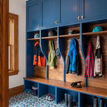
Mudroom - mid-sized transitional ceramic tile and blue floor mudroom idea in Minneapolis with beige walls
 Coastal Decor & Interior Design
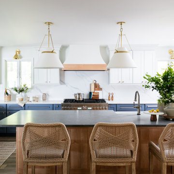
Eat-in kitchen - large coastal u-shaped eat-in kitchen idea in New York with shaker cabinets and an island
 Archetype Architecture
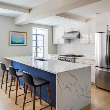
Example of a trendy light wood floor and beige floor kitchen design in New York with an undermount sink, flat-panel cabinets, white cabinets, stainless steel appliances, a peninsula and white countertops
 Alderwood Landscape Architecture and Construction
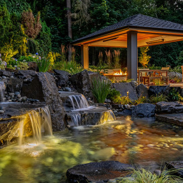
The final design includes several "courtyard" and transitional spaces to accommodate the unique grading and provide several lounge spaces. Each of the home's many windows provides a different, picturesque view of the water feature focal point. The hot tub is purposefully close to the house for easy access, yet carefully positioned out of sight from the rest of the lounge areas so as to not draw attention away from the focal point.
Quaint seating spaces, a fire pit lounge area, and a covered dining space are accented by ornamental grasses, hydrangeas, and night lighting. Our clients are thrilled with how the final project made their oddly shaped yard now perfectly fit their landscape needs and desires!
 Gina Sims Designs
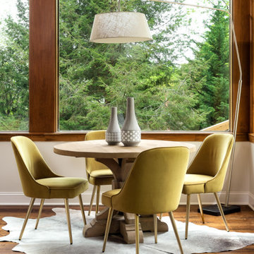
Dining room - contemporary dark wood floor and brown floor dining room idea in Atlanta with beige walls
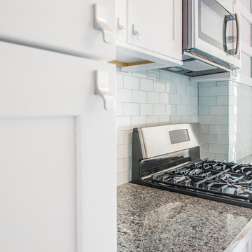 RAJ Kitchen and Bath, LLC
**Check out the video of this transformation on our website**
This small kitchen was way too small for this 2 bedrooms, 2 bathrooms apartment. Not only was it a very small kitchen, but the physical location of it made it very difficult to make it any bigger. There wasn't much that could have been done without incurring astronomical cost, which would get little or no return on the investment. The client wanted a kitchen that can be optimized in its current location to add a ton of value for resale.
This was difficult to do, because there was no moving of any mechanical around in the kitchen and even if we wanted to, the management of the building would not allow. For those of you who live in condos, co-ops or apartment building, you know how difficult it is to rework these foot prints. When we showed up, we saw the problems, but we also saw a huge opportunity where we can achieve those goals in the small space. This was accomplished by making some key changes and to incorporate some new things that was not possible when this kitchen was built years ago.
The crucial part of the design that would drive the entire new layout, was selecting the only appliance; that was the Refrigerator. Once we nailed down that refrigerator, we then proceeded to design the kitchen around it. We moved it to the other side of the wall where the sink was so that we can tap into the water line from the sink plumbing. It was crucial that it stays exactly 24" deep, not an inch more because we had to keep the entry as open as possible. Also, it was going to be directly in front of another big storage unit - The pantry. It is not ideal in most cases, but we needed the rest of the space to ramp up the design and open feel towards the side where all of the activities would take place, which happend to be the dining room and the view.
Once all that was figured out, we re-positioned the sink, dishwasher and the range and proceeded to wrap the cabinets around the columns to integrate them into the space. Thirty- six inches cabinets height was used so that they can be installed higher towards the ceiling height to give more room rather than the standard 18" required height between the counter tops. This was done to make the room feel a lot bigger than it really was. Not to mention, we also didn't want the faucet to be buried under the cabinets so that was also a necessary design detail for the space.
We then lowered both knee walls so that the counter top can sit on top of them, by removing that stop point that would have otherwise defined the kitchen area. This allowed us to pick up that extra footprint into the room for added prep space and enabled us to create the illusion of a kitchen that is looking longer than it really is. Every inch mattered when designing this kitchen and we made a conscious decision to use every one of that inch.
White cabinets were selected to do just what white cabinets are design to do; make a small or dark room appear bigger, brighter and more open. In this kitchen, this was amplified the more because of the kitchen location. It was perfect! We knew we did justice to the space because while we were there taking some photos, a few potential buyers walked in and went straight for the kitchen! They said its design just to fit the apartment.
Pantry roll out shelving, Double recycle bin, fancy handles, LED lighting, Quartz counter top, beautiful backslash tiles and grey linen floors finished off the kitchen which looked over a beautiful view of the George Washington Bridge from the top of this lovely 4th floor apartment.
Credit to Masterpiece Tile and Marble (Annmarie on the selection of Tiles and countertop and Val on the Construction to complete this project).
Davor Kokic Photography

 Style Infused Living
With family and fun in-mind, this basement was remodeled into new space for all to enjoy.
Photography by Cinda Pfeil
Transitional family room photo in Minneapolis
Transitional family room photo in Minneapolis
 TKS Design Group
Free ebook, Creating the Ideal Kitchen. DOWNLOAD NOW
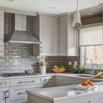
Our clients had been in their home since the early 1980’s and decided it was time for some updates. We took on the kitchen, two bathrooms and a powder room.
The layout in the kitchen was functional for them, so we kept that pretty much as is. Our client wanted a contemporary-leaning transitional look — nice clean lines with a gray and white palette. Light gray cabinets with a slightly darker gray subway tile keep the northern exposure light and airy. They also purchased some new furniture for their breakfast room and adjoining family room, so the whole space looks completely styled and new. The light fixtures are staggered and give a nice rhythm to the otherwise serene feel.
The homeowners were not 100% sold on the flooring choice for little powder room off the kitchen when I first showed it, but now they think it is one of the most interesting features of the design. I always try to “push” my clients a little bit because that’s when things can get really fun and this is what you are paying for after all, ideas that you may not come up with on your own.
We also worked on the two upstairs bathrooms. We started first on the hall bath which was basically just in need of a face lift. The floor is porcelain tile made to look like carrera marble. The vanity is white Shaker doors fitted with a white quartz top. We re-glazed the cast iron tub.
The master bath was a tub to shower conversion. We used a wood look porcelain plank on the main floor along with a Kohler Tailored vanity. The custom shower has a barn door shower door, and vinyl wallpaper in the sink area gives a rich textured look to the space. Overall, it’s a pretty sophisticated look for its smaller fooprint.
Designed by: Susan Klimala, CKD, CBD
Photography by: Michael Alan Kaskel
For more information on kitchen and bath design ideas go to: www.kitchenstudio-ge.com
 Hammer Architects
Peter Vanderwarker
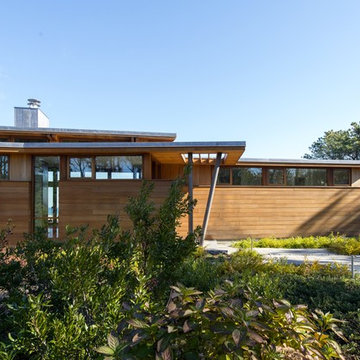
Mid-sized minimalist brown one-story wood exterior home photo in Boston
Mid-sized minimalist brown one-story wood exterior home photo in Boston
 User
UserDarko Mihalić
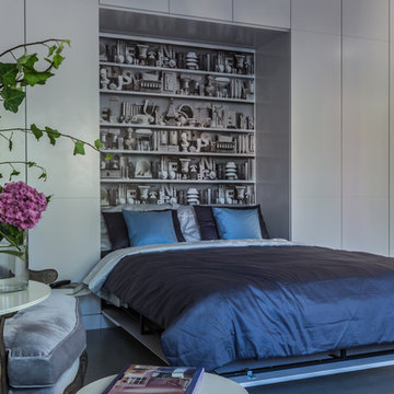
Inspiration for a small eclectic guest concrete floor bedroom remodel in Other with gray walls and no fireplace
Inspiration for a small eclectic guest concrete floor bedroom remodel in Other with gray walls and no fireplace
 RAJ Kitchen and Bath, LLC
**Check out the video of this transformation on our website**
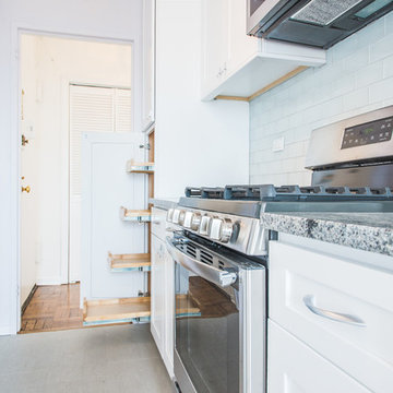
This small kitchen was way too small for this 2 bedrooms, 2 bathrooms apartment. Not only was it a very small kitchen, but the physical location of it made it very difficult to make it any bigger. There wasn't much that could have been done without incurring astronomical cost, which would get little or no return on the investment. The client wanted a kitchen that can be optimized in its current location to add a ton of value for resale.
This was difficult to do, because there was no moving of any mechanical around in the kitchen and even if we wanted to, the management of the building would not allow. For those of you who live in condos, co-ops or apartment building, you know how difficult it is to rework these foot prints. When we showed up, we saw the problems, but we also saw a huge opportunity where we can achieve those goals in the small space. This was accomplished by making some key changes and to incorporate some new things that was not possible when this kitchen was built years ago.
The crucial part of the design that would drive the entire new layout, was selecting the only appliance; that was the Refrigerator. Once we nailed down that refrigerator, we then proceeded to design the kitchen around it. We moved it to the other side of the wall where the sink was so that we can tap into the water line from the sink plumbing. It was crucial that it stays exactly 24" deep, not an inch more because we had to keep the entry as open as possible. Also, it was going to be directly in front of another big storage unit - The pantry. It is not ideal in most cases, but we needed the rest of the space to ramp up the design and open feel towards the side where all of the activities would take place, which happend to be the dining room and the view.
Once all that was figured out, we re-positioned the sink, dishwasher and the range and proceeded to wrap the cabinets around the columns to integrate them into the space. Thirty- six inches cabinets height was used so that they can be installed higher towards the ceiling height to give more room rather than the standard 18" required height between the counter tops. This was done to make the room feel a lot bigger than it really was. Not to mention, we also didn't want the faucet to be buried under the cabinets so that was also a necessary design detail for the space.
We then lowered both knee walls so that the counter top can sit on top of them, by removing that stop point that would have otherwise defined the kitchen area. This allowed us to pick up that extra footprint into the room for added prep space and enabled us to create the illusion of a kitchen that is looking longer than it really is. Every inch mattered when designing this kitchen and we made a conscious decision to use every one of that inch.
White cabinets were selected to do just what white cabinets are design to do; make a small or dark room appear bigger, brighter and more open. In this kitchen, this was amplified the more because of the kitchen location. It was perfect! We knew we did justice to the space because while we were there taking some photos, a few potential buyers walked in and went straight for the kitchen! They said its design just to fit the apartment.
Pantry roll out shelving, Double recycle bin, fancy handles, LED lighting, Quartz counter top, beautiful backslash tiles and grey linen floors finished off the kitchen which looked over a beautiful view of the George Washington Bridge from the top of this lovely 4th floor apartment.
Credit to Masterpiece Tile and Marble (Annmarie on the selection of Tiles and countertop and Val on the Construction to complete this project).
Davor Kokic Photography
 Appliances Connection
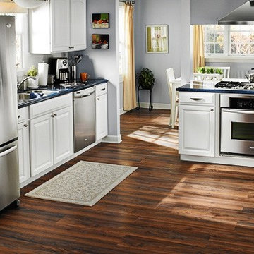
Whirlpool does more than help you run your house more easily, cleanly, and efficiently; Whirlpool is dedicated to developing more environmentally friendly appliances for your home. As we proceed into the twenty first century, and Whirlpool proceeds into its second, they've only expanded their initiatives toward cleaner technology, embracing the Energy Star efficiency banner and exceeding government requirements to ensure eco-friendly operation for all your home appliances.
8