
Search results for "Professing" in Home Design Ideas
 Allen E Neyman Associates Architecture
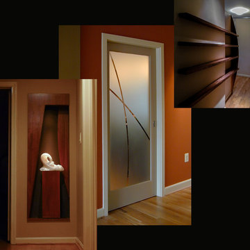
Interior Details were important to owner. Saturated color and natural wood were thematic. The owners are artists, more as an avocation than as a profession, so the house had to provide options for displaying art. The surfaces, materials, and architectural components were studied carefully for complimentary relationships.
 TVL Creative Ltd.
Cramped kitchen be gone! That was the project motto and top priority. The goal was to transform the current layout from multiple smaller spaces into a connected whole that would activate the main level for our clients, a young family of four.
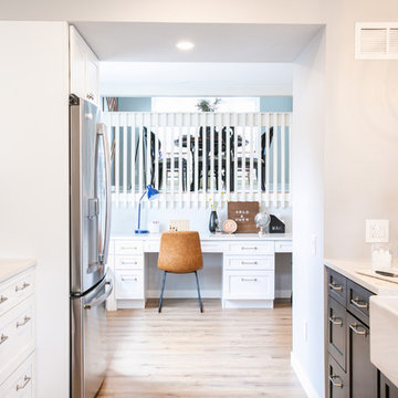
The biggest obstacle was the wall dividing the kitchen and the dining room. Removing this wall was central to opening up and integrating the main living spaces, but the existing ductwork that ran right through the center of the wall posed a design challenge, er design opportunity. The resulting design solution features a central pantry that captures the ductwork and provides valuable storage- especially when compared to the original kitchen's 18" wide pantry cabinet. The pantry also anchors the kitchen island and serves as a visual separation of space between the kitchen and homework area.
Through our design development process, we learned the formal living room was of no service to their lifestyle and therefore space they rarely spent time in. With that in mind, we proposed to eliminate the unused living room and make it the new dining room. Relocating the dining room to this space inherently felt right given the soaring ceiling and ample room for holiday dinners and celebrations. The new dining room was spacious enough for us to incorporate a conversational seating area in the warm, south-facing window alcove.
Now what to do with the old dining room?! To answer that question we took inspiration from our clients' shared profession in education and developed a craft area/homework station for both of their boys. The semi-custom cabinetry of the desk area carries over to the adjacent wall and forms window bench base with storage that we topped with butcher block for a touch of warmth. While the boys are young, the bench drawers are the perfect place for a stash of toys close to the kitchen.
The kitchen begins just beyond the window seat with their refrigerator enclosure. Opposite the refrigerator is the new pantry with twenty linear feet of shelving and space for brooms and a stick vacuum. Extending from the backside of the pantry the kitchen island design incorporates counter seating on the family room side and a cabinetry configuration on the kitchen side with drawer storage, a trashcan center, farmhouse sink, and dishwasher.
We took careful time in design and execution to align the range and sink because while it might seem like a small detail, it plays an important role in supporting the symmetrical configuration of the back wall of the kitchen. The rear wall design utilizes an appliance garage mirrors the visual impact of the refrigerator enclosure and helps keep the now open kitchen tidy. Between the appliance garage and refrigerator enclosure is the cooking zone with 30" of cabinetry and work surface on either side of the range, a chimney style vent hood, and a bold graphic tile backsplash.
The backsplash is just one of many personal touches we added to the space to reflect our client's modern eclectic style and love of color. Swooping lines of the mid-mod style barstools compliment the pendants and backsplash pattern. A pop of vibrant green on the frame of the pantry door adds a fresh wash of color to an otherwise neutral space. The big show stopper is the custom charcoal gray and copper chevron wall installation in the dining room. This was an idea our clients softly suggested, and we excitedly embraced the opportunity. It is also a kickass solution to the head-scratching design dilemma of how to fill a large and lofty wall.
We are so grateful to bring this design to life for our clients and now dear friends.
 Battle Associates, Architects
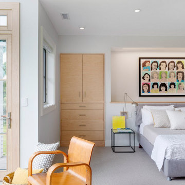
This project created a singular modern home for clients with two distinct professions; she is an artist; he is a musician. Their directive to Battle Associates was to “design the home of their dreams,” and “make it cool.” As the design evolved, three volumes emerged each with its own individual character. Shapes, materials, and colors reinforced the concept. The “Red Barn” houses a music studio, garage, guest, and children’s bedrooms. The “Industrial” volume is the Art Studio. The “Middle” volume is where the clients live. Each structure has its own set of exterior details, materials, and colors. The three buildings are oriented to maximize views around a man-made pond and a conserved hefty locus tree. Clean, contemporary lines set the tone for the details throughout the project, creating an appropriate environment for displaying artwork. Maple, bamboo, and painted finishes were the predominant palette, complemented with steel and glass for the stairs. Kitchen details favored cut-away pulls instead of hardware. The shell of the entire home was detailed and constructed with a high degree of energy efficiency in mind. Ultra-insulation was the standard with foam panels, triple glazing, and near passive house standards for construction.
Find the right local pro for your project
 TVL Creative Ltd.
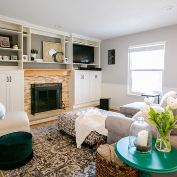
Cramped kitchen be gone! That was the project motto and top priority. The goal was to transform the current layout from multiple smaller spaces into a connected whole that would activate the main level for our clients, a young family of four.
The biggest obstacle was the wall dividing the kitchen and the dining room. Removing this wall was central to opening up and integrating the main living spaces, but the existing ductwork that ran right through the center of the wall posed a design challenge, er design opportunity. The resulting design solution features a central pantry that captures the ductwork and provides valuable storage- especially when compared to the original kitchen's 18" wide pantry cabinet. The pantry also anchors the kitchen island and serves as a visual separation of space between the kitchen and homework area.
Through our design development process, we learned the formal living room was of no service to their lifestyle and therefore space they rarely spent time in. With that in mind, we proposed to eliminate the unused living room and make it the new dining room. Relocating the dining room to this space inherently felt right given the soaring ceiling and ample room for holiday dinners and celebrations. The new dining room was spacious enough for us to incorporate a conversational seating area in the warm, south-facing window alcove.
Now what to do with the old dining room?! To answer that question we took inspiration from our clients' shared profession in education and developed a craft area/homework station for both of their boys. The semi-custom cabinetry of the desk area carries over to the adjacent wall and forms window bench base with storage that we topped with butcher block for a touch of warmth. While the boys are young, the bench drawers are the perfect place for a stash of toys close to the kitchen.
The kitchen begins just beyond the window seat with their refrigerator enclosure. Opposite the refrigerator is the new pantry with twenty linear feet of shelving and space for brooms and a stick vacuum. Extending from the backside of the pantry the kitchen island design incorporates counter seating on the family room side and a cabinetry configuration on the kitchen side with drawer storage, a trashcan center, farmhouse sink, and dishwasher.
We took careful time in design and execution to align the range and sink because while it might seem like a small detail, it plays an important role in supporting the symmetrical configuration of the back wall of the kitchen. The rear wall design utilizes an appliance garage mirrors the visual impact of the refrigerator enclosure and helps keep the now open kitchen tidy. Between the appliance garage and refrigerator enclosure is the cooking zone with 30" of cabinetry and work surface on either side of the range, a chimney style vent hood, and a bold graphic tile backsplash.
The backsplash is just one of many personal touches we added to the space to reflect our client's modern eclectic style and love of color. Swooping lines of the mid-mod style barstools compliment the pendants and backsplash pattern. A pop of vibrant green on the frame of the pantry door adds a fresh wash of color to an otherwise neutral space. The big show stopper is the custom charcoal gray and copper chevron wall installation in the dining room. This was an idea our clients softly suggested, and we excitedly embraced the opportunity. It is also a kickass solution to the head-scratching design dilemma of how to fill a large and lofty wall.
We are so grateful to bring this design to life for our clients and now dear friends.
 Treefrog Design
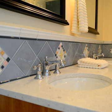
I have been working as a kitchen and bath designer in the Pacific Northwest for 13 years. I love engaging with new clients, ascertaining their needs through various interviews and meetings and then collaborating as we build their finished concept together. The variety of design styles, room layouts and function changes so much between one person and the next that no two finished products are remotely the same. This fluidity allows for endless possibilities for exploration in my field. It keeps the job interesting and has always given me a particular sense of reward and accomplishment as we near completion. The greatest personal recompense in this chosen profession is being able to walk with a client through this process and come out the other side with that client feeling elated with the end result.
 TVL Creative Ltd.
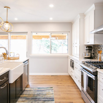
Cramped kitchen be gone! That was the project motto and top priority. The goal was to transform the current layout from multiple smaller spaces into a connected whole that would activate the main level for our clients, a young family of four.
The biggest obstacle was the wall dividing the kitchen and the dining room. Removing this wall was central to opening up and integrating the main living spaces, but the existing ductwork that ran right through the center of the wall posed a design challenge, er design opportunity. The resulting design solution features a central pantry that captures the ductwork and provides valuable storage- especially when compared to the original kitchen's 18" wide pantry cabinet. The pantry also anchors the kitchen island and serves as a visual separation of space between the kitchen and homework area.
Through our design development process, we learned the formal living room was of no service to their lifestyle and therefore space they rarely spent time in. With that in mind, we proposed to eliminate the unused living room and make it the new dining room. Relocating the dining room to this space inherently felt right given the soaring ceiling and ample room for holiday dinners and celebrations. The new dining room was spacious enough for us to incorporate a conversational seating area in the warm, south-facing window alcove.
Now what to do with the old dining room?! To answer that question we took inspiration from our clients' shared profession in education and developed a craft area/homework station for both of their boys. The semi-custom cabinetry of the desk area carries over to the adjacent wall and forms window bench base with storage that we topped with butcher block for a touch of warmth. While the boys are young, the bench drawers are the perfect place for a stash of toys close to the kitchen.
The kitchen begins just beyond the window seat with their refrigerator enclosure. Opposite the refrigerator is the new pantry with twenty linear feet of shelving and space for brooms and a stick vacuum. Extending from the backside of the pantry the kitchen island design incorporates counter seating on the family room side and a cabinetry configuration on the kitchen side with drawer storage, a trashcan center, farmhouse sink, and dishwasher.
We took careful time in design and execution to align the range and sink because while it might seem like a small detail, it plays an important role in supporting the symmetrical configuration of the back wall of the kitchen. The rear wall design utilizes an appliance garage mirrors the visual impact of the refrigerator enclosure and helps keep the now open kitchen tidy. Between the appliance garage and refrigerator enclosure is the cooking zone with 30" of cabinetry and work surface on either side of the range, a chimney style vent hood, and a bold graphic tile backsplash.
The backsplash is just one of many personal touches we added to the space to reflect our client's modern eclectic style and love of color. Swooping lines of the mid-mod style barstools compliment the pendants and backsplash pattern. A pop of vibrant green on the frame of the pantry door adds a fresh wash of color to an otherwise neutral space. The big show stopper is the custom charcoal gray and copper chevron wall installation in the dining room. This was an idea our clients softly suggested, and we excitedly embraced the opportunity. It is also a kickass solution to the head-scratching design dilemma of how to fill a large and lofty wall.
We are so grateful to bring this design to life for our clients and now dear friends.

 Full Bloom Cottage
Lovely pair of grain feed sack pillows from Europe. We custom-made these out of the original antique feed sacks, with zipper closure and overlocked edges. The fronts are a soft pale oatmeal color with pale Swedish blue stripes and original monograming. The backs are of antique French linen, a heavy weight, very soft and also an oatmeal color. All items have been pre washed, clean and ready to use. These printed sacks were individually marked over a century ago, using a tar based stenciling with last and first names of the owner, sometimes his title or profession, the village or hamlet he lived or worked in and usually the year. Not only is the fabric antique or vintage, but the stencil, the calligraphy is original to the product, making it a more rare and valuable textile. Dimensions: 20 x 20 Includes down feather insert.
 Strouse Davis Architecture
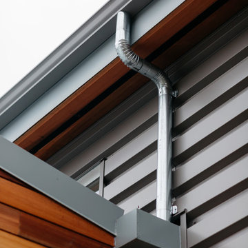
The Owner, a skilled metal fabricator and avid custom car owner and creator, needed more space to spread out given his profession and interests. Strouse Davis was tasked with creating this space on the site of his current home. The 2,500 sf building is clad in metal panel and clear cedar siding. The roof form is a unique semi-butterfly semi-shed roof. The roof water drains into an above ground concrete bio-retention planter. To honor his passion in life, large steel beams are exposed and intersect within the space.
 Strouse Davis Architecture
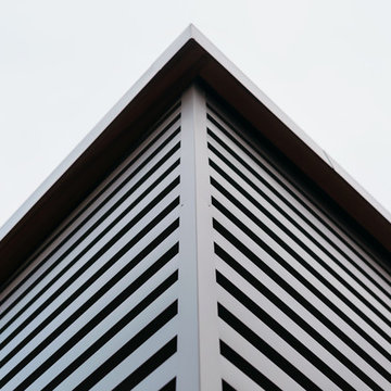
The Owner, a skilled metal fabricator and avid custom car owner and creator, needed more space to spread out given his profession and interests. Strouse Davis was tasked with creating this space on the site of his current home. The 2,500 sf building is clad in metal panel and clear cedar siding. The roof form is a unique semi-butterfly semi-shed roof. The roof water drains into an above ground concrete bio-retention planter. To honor his passion in life, large steel beams are exposed and intersect within the space.
 TVL Creative Ltd.
Cramped kitchen be gone! That was the project motto and top priority. The goal was to transform the current layout from multiple smaller spaces into a connected whole that would activate the main level for our clients, a young family of four.
The biggest obstacle was the wall dividing the kitchen and the dining room. Removing this wall was central to opening up and integrating the main living spaces, but the existing ductwork that ran right through the center of the wall posed a design challenge, er design opportunity. The resulting design solution features a central pantry that captures the ductwork and provides valuable storage- especially when compared to the original kitchen's 18" wide pantry cabinet. The pantry also anchors the kitchen island and serves as a visual separation of space between the kitchen and homework area.
Through our design development process, we learned the formal living room was of no service to their lifestyle and therefore space they rarely spent time in. With that in mind, we proposed to eliminate the unused living room and make it the new dining room. Relocating the dining room to this space inherently felt right given the soaring ceiling and ample room for holiday dinners and celebrations. The new dining room was spacious enough for us to incorporate a conversational seating area in the warm, south-facing window alcove.
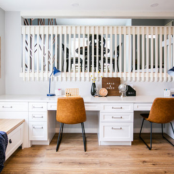
Now what to do with the old dining room?! To answer that question we took inspiration from our clients' shared profession in education and developed a craft area/homework station for both of their boys. The semi-custom cabinetry of the desk area carries over to the adjacent wall and forms window bench base with storage that we topped with butcher block for a touch of warmth. While the boys are young, the bench drawers are the perfect place for a stash of toys close to the kitchen.
The kitchen begins just beyond the window seat with their refrigerator enclosure. Opposite the refrigerator is the new pantry with twenty linear feet of shelving and space for brooms and a stick vacuum. Extending from the backside of the pantry the kitchen island design incorporates counter seating on the family room side and a cabinetry configuration on the kitchen side with drawer storage, a trashcan center, farmhouse sink, and dishwasher.
We took careful time in design and execution to align the range and sink because while it might seem like a small detail, it plays an important role in supporting the symmetrical configuration of the back wall of the kitchen. The rear wall design utilizes an appliance garage mirrors the visual impact of the refrigerator enclosure and helps keep the now open kitchen tidy. Between the appliance garage and refrigerator enclosure is the cooking zone with 30" of cabinetry and work surface on either side of the range, a chimney style vent hood, and a bold graphic tile backsplash.
The backsplash is just one of many personal touches we added to the space to reflect our client's modern eclectic style and love of color. Swooping lines of the mid-mod style barstools compliment the pendants and backsplash pattern. A pop of vibrant green on the frame of the pantry door adds a fresh wash of color to an otherwise neutral space. The big show stopper is the custom charcoal gray and copper chevron wall installation in the dining room. This was an idea our clients softly suggested, and we excitedly embraced the opportunity. It is also a kickass solution to the head-scratching design dilemma of how to fill a large and lofty wall.
We are so grateful to bring this design to life for our clients and now dear friends.

 TVL Creative Ltd.
Cramped kitchen be gone! That was the project motto and top priority. The goal was to transform the current layout from multiple smaller spaces into a connected whole that would activate the main level for our clients, a young family of four.
The biggest obstacle was the wall dividing the kitchen and the dining room. Removing this wall was central to opening up and integrating the main living spaces, but the existing ductwork that ran right through the center of the wall posed a design challenge, er design opportunity. The resulting design solution features a central pantry that captures the ductwork and provides valuable storage- especially when compared to the original kitchen's 18" wide pantry cabinet. The pantry also anchors the kitchen island and serves as a visual separation of space between the kitchen and homework area.
Through our design development process, we learned the formal living room was of no service to their lifestyle and therefore space they rarely spent time in. With that in mind, we proposed to eliminate the unused living room and make it the new dining room. Relocating the dining room to this space inherently felt right given the soaring ceiling and ample room for holiday dinners and celebrations. The new dining room was spacious enough for us to incorporate a conversational seating area in the warm, south-facing window alcove.
Now what to do with the old dining room?! To answer that question we took inspiration from our clients' shared profession in education and developed a craft area/homework station for both of their boys. The semi-custom cabinetry of the desk area carries over to the adjacent wall and forms window bench base with storage that we topped with butcher block for a touch of warmth. While the boys are young, the bench drawers are the perfect place for a stash of toys close to the kitchen.
The kitchen begins just beyond the window seat with their refrigerator enclosure. Opposite the refrigerator is the new pantry with twenty linear feet of shelving and space for brooms and a stick vacuum. Extending from the backside of the pantry the kitchen island design incorporates counter seating on the family room side and a cabinetry configuration on the kitchen side with drawer storage, a trashcan center, farmhouse sink, and dishwasher.
We took careful time in design and execution to align the range and sink because while it might seem like a small detail, it plays an important role in supporting the symmetrical configuration of the back wall of the kitchen. The rear wall design utilizes an appliance garage mirrors the visual impact of the refrigerator enclosure and helps keep the now open kitchen tidy. Between the appliance garage and refrigerator enclosure is the cooking zone with 30" of cabinetry and work surface on either side of the range, a chimney style vent hood, and a bold graphic tile backsplash.
The backsplash is just one of many personal touches we added to the space to reflect our client's modern eclectic style and love of color. Swooping lines of the mid-mod style barstools compliment the pendants and backsplash pattern. A pop of vibrant green on the frame of the pantry door adds a fresh wash of color to an otherwise neutral space. The big show stopper is the custom charcoal gray and copper chevron wall installation in the dining room. This was an idea our clients softly suggested, and we excitedly embraced the opportunity. It is also a kickass solution to the head-scratching design dilemma of how to fill a large and lofty wall.
We are so grateful to bring this design to life for our clients and now dear friends.
 All Square Contracting
Here's what our client had to say about this project which is taken from our review page:
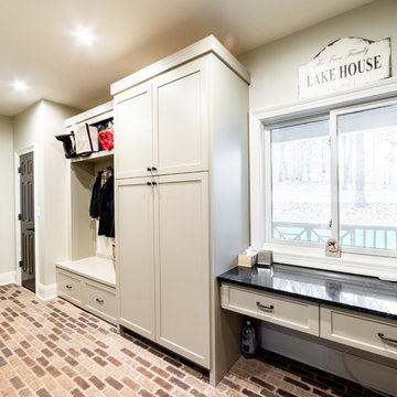
All Square has completed Phase 1 of an expected 3 phase whole house renovation of our lake home, and we are beyond thrilled with the results. We were demanding clients – my husband is an engineer by education and a program manager by profession, so he is very detailed, exacting and demanding. We solicited bids from 3 other general contractors before engaging All Square, but Micah Purvis won our confidence that he and his team could make our dream a reality. Micah is a master communicator, clear, detailed and pro-active in his approach to problems.
We were very happy with all the All Square employees who worked on our job – Daniel and Austin were great and a pleasure to have around – but most especially Justin Solomon, truly a jack of all trades. If there is something Justin can’t do or a skill he doesn’t possess, we aren’t aware of it. Justin was as reliable as the sun, here first thing every morning, troubleshooting problems, dealing with all the sub-contractors and making invaluable structural and design suggestions that made the finished product all the better. I honestly miss having Justin around and our dogs miss him too!
It is obvious that All Square has worked hard to identify and nurture relationships with quality tradesmen and a few of them really stand out for their superior work – Mike (stonemason), Jeremiah Cook (painter) and Michael Stewart (electrician).
When we are ready to begin Phase 2 of the renovation, there is no doubt that we will call Micah and All Square to do the work. We are so happy with our renovation and grateful that we made the right decision to entrust our forever home to All Square.
 Marvista Design + Build
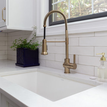
This faucet transforms the kitchen into a sleek, profession work space. The coils give off an industrial feel.
Example of a transitional kitchen design in Other
Example of a transitional kitchen design in Other
 Full Bloom Cottage
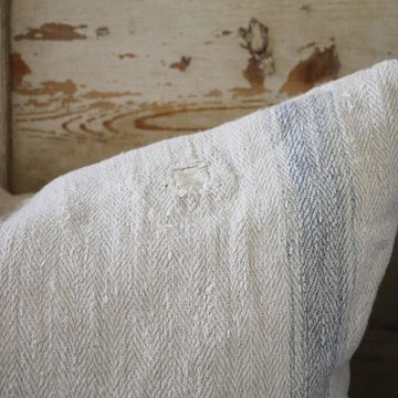
Lovely pair of grain feed sack pillows from Europe. We custom-made these out of the original antique feed sacks, with zipper closure and overlocked edges. The fronts are a soft pale oatmeal color with pale Swedish blue stripes and original monograming. The backs are of antique French linen, a heavy weight, very soft and also an oatmeal color. All items have been pre washed, clean and ready to use. These printed sacks were individually marked over a century ago, using a tar based stenciling with last and first names of the owner, sometimes his title or profession, the village or hamlet he lived or worked in and usually the year. Not only is the fabric antique or vintage, but the stencil, the calligraphy is original to the product, making it a more rare and valuable textile. Dimensions: 20 x 20 Includes down feather insert.
 McCurley's Floor Center, Inc.
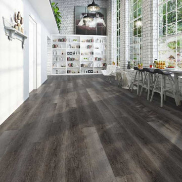
- Gaia SPC Vinyl Flooring.
McCurley's Shaw Floor Center Inc. has been supplying Gaia SPC Vinyl Flooring material nationwide to homeowners, contractors, builders, property managers, and trade professions for many years.
Now you can pick up your material from one of our distribution centers near you. Call Us: 925-866-22000 | Email Us: info@MacFloor.com
https://www.macfloors.com/gaia-spc-vinyl-flooring/
#SPC #LVT #spcflooring #lvtflooring #waterproofflooring #vinylflooring
 Cabinet Gallery
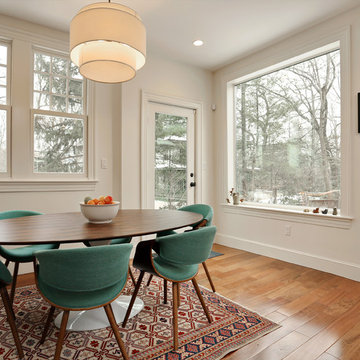
Transitional Style white painted cabinetry with Mod-style accents. Professional and built-In appliances.
Eat-in kitchen - mid-sized transitional u-shaped laminate floor and brown floor eat-in kitchen idea in Boston with an undermount sink, flat-panel cabinets, white cabinets, quartz countertops, blue backsplash, mosaic tile backsplash, stainless steel appliances and a peninsula
Eat-in kitchen - mid-sized transitional u-shaped laminate floor and brown floor eat-in kitchen idea in Boston with an undermount sink, flat-panel cabinets, white cabinets, quartz countertops, blue backsplash, mosaic tile backsplash, stainless steel appliances and a peninsula

 Jamie Banfield Interior Designs
A contemporary west coast home inspired by its surrounding coastlines & greenbelt. With this busy family of all different professions, it was important to create optimal storage throughout the home to hide away odds & ends. A love of entertain made for a large kitchen, sophisticated wine storage & a pool table room for a hide away for the young adults. This space was curated for all ages of the home.
 Battle Associates, Architects
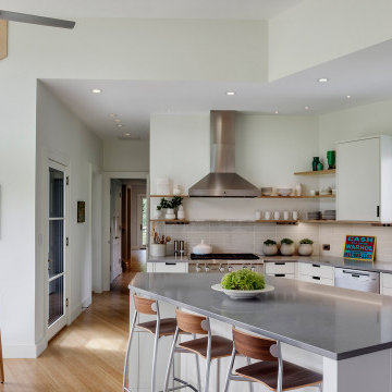
This project created a singular modern home for clients with two distinct professions; she is an artist; he is a musician. Their directive to Battle Associates was to “design the home of their dreams,” and “make it cool.” As the design evolved, three volumes emerged each with its own individual character. Shapes, materials, and colors reinforced the concept. The “Red Barn” houses a music studio, garage, guest, and children’s bedrooms. The “Industrial” volume is the Art Studio. The “Middle” volume is where the clients live. Each structure has its own set of exterior details, materials, and colors. The three buildings are oriented to maximize views around a man-made pond and a conserved hefty locus tree. Clean, contemporary lines set the tone for the details throughout the project, creating an appropriate environment for displaying artwork. Maple, bamboo, and painted finishes were the predominant palette, complemented with steel and glass for the stairs. Kitchen details favored cut-away pulls instead of hardware. The shell of the entire home was detailed and constructed with a high degree of energy efficiency in mind. Ultra-insulation was the standard with foam panels, triple glazing, and near passive house standards for construction.
 Battle Associates, Architects
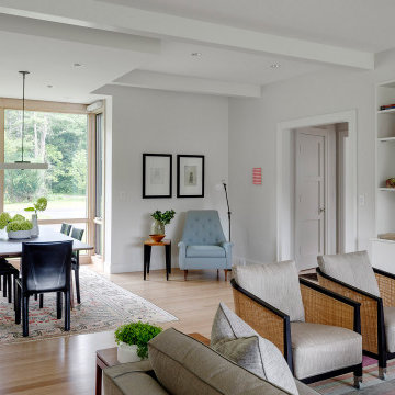
This project created a singular modern home for clients with two distinct professions; she is an artist; he is a musician. Their directive to Battle Associates was to “design the home of their dreams,” and “make it cool.” As the design evolved, three volumes emerged each with its own individual character. Shapes, materials, and colors reinforced the concept. The “Red Barn” houses a music studio, garage, guest, and children’s bedrooms. The “Industrial” volume is the Art Studio. The “Middle” volume is where the clients live. Each structure has its own set of exterior details, materials, and colors. The three buildings are oriented to maximize views around a man-made pond and a conserved hefty locus tree. Clean, contemporary lines set the tone for the details throughout the project, creating an appropriate environment for displaying artwork. Maple, bamboo, and painted finishes were the predominant palette, complemented with steel and glass for the stairs. Kitchen details favored cut-away pulls instead of hardware. The shell of the entire home was detailed and constructed with a high degree of energy efficiency in mind. Ultra-insulation was the standard with foam panels, triple glazing, and near passive house standards for construction.
14