
Search results for "Professing" in Home Design Ideas
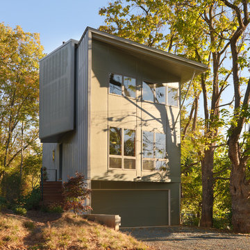
 Hays + Ewing Design Studio
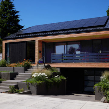
The house is sited orthogonal to the street grid but the front wall of the house is canted toward the south to better optimize for passive solar.
Photo by Philip Beaurline
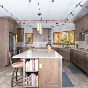
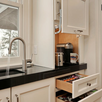
 McCabe By Design LLC
The original kitchen was designed and built by the original homeowner, needless to say neither design nor building was his profession. Further, the entire house has hydronic tubing in gypcrete for heat which means to utilities (water, ventilation or power) could be brought up through the floor or down from the ceiling except on the the exterior walls.
The current homeowners love to cook and have a seasonal garden that generates a lot of lovely fruits and vegetables for both immediate consumption and preserving, hence, kitchen counter space, two sinks, the induction cooktop and the steam oven were all 'must haves' for both the husband and the wife. The beautiful wood plank porcelain tile floors ensures a slip resistant floor that is sturdy enough to stand up to their three four-legged children.
Utilizing the three existing j-boxes in the ceiling, the cable and rail system combined with the under cabinet light illuminates every corner of this formerly dark kitchen.
The rustic knotty alder cabinetry, wood plank tile floor and the bronze finish hardware/lighting all help to achieve the rustic casual look the homeowners craved.
Photo by A Kitchen That Works LLC

Find the right local pro for your project

 Star Furniture
Meet Marta Herbert
Marta comes to Star Furniture from the mountains and valleys of the West where she specialized in turning apartments into lofts, cabins into lodges and houses into estates. From cozy, to chic, to expansive, Marta's fluency with color, texture, and lighting in perfect balance is a gift first noted by professors at The American River College in Sacramento, and has evolved over the past three decades into the ability to translate the desires of her clients into classic statements of style.
As an avid student of design and proponent of continuing education, Marta has remained at the forefront of her profession gathering broad knowledge about exotic woods, fabrics, fine carpets, and the vast assortment of leathers. She understands the elements needed to create personal spaces that welcome use.
"Let me bring your vision of your room to life...it's not just a room, it's the place you want to live."
Contact Marta and let her know that you found her on Houzz.com.
Webpage: https://www.starfurniture.com/marta-herbert
Address: Star Furniture, 18107 North Freeway, Houston, TX 77090
Phone: 281-440-3330
Email: mherbert@starfurniture.com
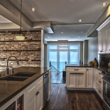
 Lounsbury Group
The owners of this property approached LB LounsBury Group to request information on an addition to their corner lot property and re-finishing of their existing home, which would accommodate their growing family. Upon conversations that determined budgets and schedules and the necessary permit approvals, LB LounsBury Group began construction. This involved the tearing down of the small existing rear addition to the original house. Finishes throughout the house were aged and outdated. Electrical and mechanical systems were in need of upgrades, basement apartment had low ceilings and limited light distribution.
LB LounsBury Group lowered, underpinned and added radiant heat to the basement floor, created a legal basement apartment with 7ft. + ceilings, built the new 1000 sq. ft. addition around the tree root, protecting the natural element existing in the property. By the use of a helical pile, we cantilevered the addition to allow for the desired size. We installed new electrical and mechanical systems, built new staircases and installed a 14 ft. x10 ft. feature window in the new addition to allow natural light to penetrate the home. A new roof was built and siding was added to the addition for a profession finish look. Upon completion of the project, we assisted our clients with their move back into the home. The property was then estimated to have 2700 sq. ft. not including a basement apartment, and was evaluated to have increased in value by 40%.
 Valley View Landworks
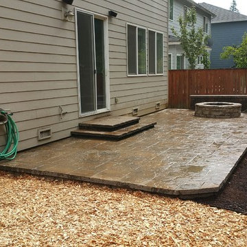
This young family, with busy lives including sports, professions and travel... needed an easy to upkeep front, back and side yards. Weeds and forgotten yard toys piled high, we cleaned everything up and installed this simple solution to easy outdoor family time. The kids love the fire pit, while Mom and Dad enjoy only 10 minutes of focused, front yard mowing. SIde yards are for storage and only need a light weed spraying once in a while. Bamboo is growing to buffer their investment from a busy residential through-street bordering the backyard.
 Jamie Banfield Interior Designs
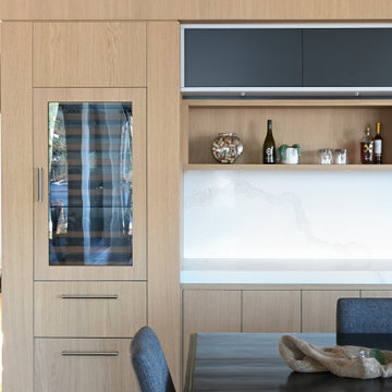
A contemporary west coast home inspired by its surrounding coastlines & greenbelt. With this busy family of all different professions, it was important to create optimal storage throughout the home to hide away odds & ends. A love of entertain made for a large kitchen, sophisticated wine storage & a pool table room for a hide away for the young adults. This space was curated for all ages of the home.
 Battle Associates, Architects
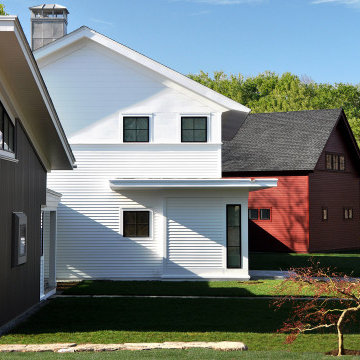
This project created a singular modern home for clients with two distinct professions; she is an artist; he is a musician. Their directive to Battle Associates was to “design the home of their dreams,” and “make it cool.” As the design evolved, three volumes emerged each with its own individual character. Shapes, materials, and colors reinforced the concept. The “Red Barn” houses a music studio, garage, guest, and children’s bedrooms. The “Industrial” volume is the Art Studio. The “Middle” volume is where the clients live. Each structure has its own set of exterior details, materials, and colors. The three buildings are oriented to maximize views around a man-made pond and a conserved hefty locus tree. Clean, contemporary lines set the tone for the details throughout the project, creating an appropriate environment for displaying artwork. Maple, bamboo, and painted finishes were the predominant palette, complemented with steel and glass for the stairs. Kitchen details favored cut-away pulls instead of hardware. The shell of the entire home was detailed and constructed with a high degree of energy efficiency in mind. Ultra-insulation was the standard with foam panels, triple glazing, and near passive house standards for construction.
 TVL Creative Ltd.
Cramped kitchen be gone! That was the project motto and top priority. The goal was to transform the current layout from multiple smaller spaces into a connected whole that would activate the main level for our clients, a young family of four.
The biggest obstacle was the wall dividing the kitchen and the dining room. Removing this wall was central to opening up and integrating the main living spaces, but the existing ductwork that ran right through the center of the wall posed a design challenge, er design opportunity. The resulting design solution features a central pantry that captures the ductwork and provides valuable storage- especially when compared to the original kitchen's 18" wide pantry cabinet. The pantry also anchors the kitchen island and serves as a visual separation of space between the kitchen and homework area.
Through our design development process, we learned the formal living room was of no service to their lifestyle and therefore space they rarely spent time in. With that in mind, we proposed to eliminate the unused living room and make it the new dining room. Relocating the dining room to this space inherently felt right given the soaring ceiling and ample room for holiday dinners and celebrations. The new dining room was spacious enough for us to incorporate a conversational seating area in the warm, south-facing window alcove.
Now what to do with the old dining room?! To answer that question we took inspiration from our clients' shared profession in education and developed a craft area/homework station for both of their boys. The semi-custom cabinetry of the desk area carries over to the adjacent wall and forms window bench base with storage that we topped with butcher block for a touch of warmth. While the boys are young, the bench drawers are the perfect place for a stash of toys close to the kitchen.
The kitchen begins just beyond the window seat with their refrigerator enclosure. Opposite the refrigerator is the new pantry with twenty linear feet of shelving and space for brooms and a stick vacuum. Extending from the backside of the pantry the kitchen island design incorporates counter seating on the family room side and a cabinetry configuration on the kitchen side with drawer storage, a trashcan center, farmhouse sink, and dishwasher.
We took careful time in design and execution to align the range and sink because while it might seem like a small detail, it plays an important role in supporting the symmetrical configuration of the back wall of the kitchen. The rear wall design utilizes an appliance garage mirrors the visual impact of the refrigerator enclosure and helps keep the now open kitchen tidy. Between the appliance garage and refrigerator enclosure is the cooking zone with 30" of cabinetry and work surface on either side of the range, a chimney style vent hood, and a bold graphic tile backsplash.
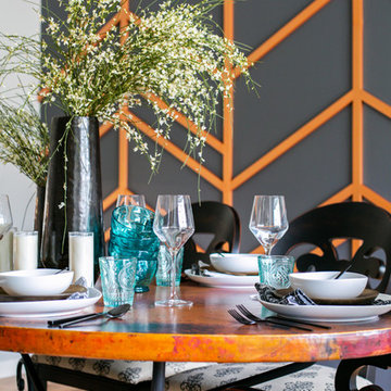
The backsplash is just one of many personal touches we added to the space to reflect our client's modern eclectic style and love of color. Swooping lines of the mid-mod style barstools compliment the pendants and backsplash pattern. A pop of vibrant green on the frame of the pantry door adds a fresh wash of color to an otherwise neutral space. The big show stopper is the custom charcoal gray and copper chevron wall installation in the dining room. This was an idea our clients softly suggested, and we excitedly embraced the opportunity. It is also a kickass solution to the head-scratching design dilemma of how to fill a large and lofty wall.
We are so grateful to bring this design to life for our clients and now dear friends.
 SHELTER Custom-Built Living
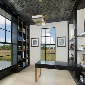
A handsome office is dressed in masculine features, many of which display the owner’s profession and interests. The room boasts a desk wrapped in Nero Marquina stone with custom wrapped
brass legs, a built-in bookcase with shelving that
features brass inlays, and a handcrafted brass ladder built to enhance the floating shelving and design of the bookcase. Ivory leather wallpaper graces the walls while a woven wood wallpaper
in a geometric pattern canvases the ceiling for contrast and
visual interest. Butler also placed a major focus on lighting, with
backlit shelves that spotlight the doctor’s numerous books.
 Battle Associates, Architects
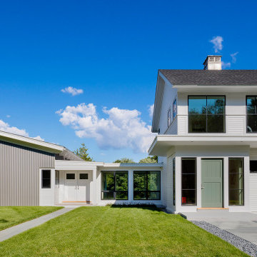
This project created a singular modern home for clients with two distinct professions; she is an artist; he is a musician. Their directive to Battle Associates was to “design the home of their dreams,” and “make it cool.” As the design evolved, three volumes emerged each with its own individual character. Shapes, materials, and colors reinforced the concept. The “Red Barn” houses a music studio, garage, guest, and children’s bedrooms. The “Industrial” volume is the Art Studio. The “Middle” volume is where the clients live. Each structure has its own set of exterior details, materials, and colors. The three buildings are oriented to maximize views around a man-made pond and a conserved hefty locus tree. Clean, contemporary lines set the tone for the details throughout the project, creating an appropriate environment for displaying artwork. Maple, bamboo, and painted finishes were the predominant palette, complemented with steel and glass for the stairs. Kitchen details favored cut-away pulls instead of hardware. The shell of the entire home was detailed and constructed with a high degree of energy efficiency in mind. Ultra-insulation was the standard with foam panels, triple glazing, and near passive house standards for construction.
 Valley View Landworks
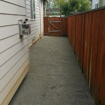
This young family, with busy lives including sports, professions and travel... needed an easy to upkeep front, back and side yards. Weeds and forgotten yard toys piled high, we cleaned everything up and installed this simple solution to easy outdoor family time. The kids love the fire pit, while Mom and Dad enjoy only 10 minutes of focused, front yard mowing. SIde yards are for storage and only need a light weed spraying once in a while. Bamboo is growing to buffer their investment from a busy residential through-street bordering the backyard.
 TVL Creative Ltd.
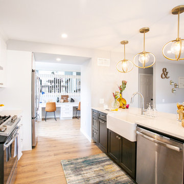
Cramped kitchen be gone! That was the project motto and top priority. The goal was to transform the current layout from multiple smaller spaces into a connected whole that would activate the main level for our clients, a young family of four.
The biggest obstacle was the wall dividing the kitchen and the dining room. Removing this wall was central to opening up and integrating the main living spaces, but the existing ductwork that ran right through the center of the wall posed a design challenge, er design opportunity. The resulting design solution features a central pantry that captures the ductwork and provides valuable storage- especially when compared to the original kitchen's 18" wide pantry cabinet. The pantry also anchors the kitchen island and serves as a visual separation of space between the kitchen and homework area.
Through our design development process, we learned the formal living room was of no service to their lifestyle and therefore space they rarely spent time in. With that in mind, we proposed to eliminate the unused living room and make it the new dining room. Relocating the dining room to this space inherently felt right given the soaring ceiling and ample room for holiday dinners and celebrations. The new dining room was spacious enough for us to incorporate a conversational seating area in the warm, south-facing window alcove.
Now what to do with the old dining room?! To answer that question we took inspiration from our clients' shared profession in education and developed a craft area/homework station for both of their boys. The semi-custom cabinetry of the desk area carries over to the adjacent wall and forms window bench base with storage that we topped with butcher block for a touch of warmth. While the boys are young, the bench drawers are the perfect place for a stash of toys close to the kitchen.
The kitchen begins just beyond the window seat with their refrigerator enclosure. Opposite the refrigerator is the new pantry with twenty linear feet of shelving and space for brooms and a stick vacuum. Extending from the backside of the pantry the kitchen island design incorporates counter seating on the family room side and a cabinetry configuration on the kitchen side with drawer storage, a trashcan center, farmhouse sink, and dishwasher.
We took careful time in design and execution to align the range and sink because while it might seem like a small detail, it plays an important role in supporting the symmetrical configuration of the back wall of the kitchen. The rear wall design utilizes an appliance garage mirrors the visual impact of the refrigerator enclosure and helps keep the now open kitchen tidy. Between the appliance garage and refrigerator enclosure is the cooking zone with 30" of cabinetry and work surface on either side of the range, a chimney style vent hood, and a bold graphic tile backsplash.
The backsplash is just one of many personal touches we added to the space to reflect our client's modern eclectic style and love of color. Swooping lines of the mid-mod style barstools compliment the pendants and backsplash pattern. A pop of vibrant green on the frame of the pantry door adds a fresh wash of color to an otherwise neutral space. The big show stopper is the custom charcoal gray and copper chevron wall installation in the dining room. This was an idea our clients softly suggested, and we excitedly embraced the opportunity. It is also a kickass solution to the head-scratching design dilemma of how to fill a large and lofty wall.
We are so grateful to bring this design to life for our clients and now dear friends.
 Cabinet Gallery
Transitional Style white painted cabinetry with Mod-style accents. Professional and built-In appliances.
Inspiration for a mid-sized transitional u-shaped laminate floor and brown floor eat-in kitchen remodel in Boston with an undermount sink, flat-panel cabinets, white cabinets, quartz countertops, blue backsplash, mosaic tile backsplash, stainless steel appliances and a peninsula
Inspiration for a mid-sized transitional u-shaped laminate floor and brown floor eat-in kitchen remodel in Boston with an undermount sink, flat-panel cabinets, white cabinets, quartz countertops, blue backsplash, mosaic tile backsplash, stainless steel appliances and a peninsula
 All Square Contracting
Here's what our client had to say about this project which is taken from our review page:
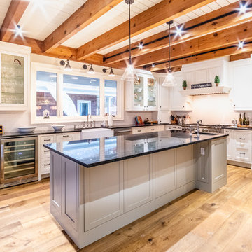
All Square has completed Phase 1 of an expected 3 phase whole house renovation of our lake home, and we are beyond thrilled with the results. We were demanding clients – my husband is an engineer by education and a program manager by profession, so he is very detailed, exacting and demanding. We solicited bids from 3 other general contractors before engaging All Square, but Micah Purvis won our confidence that he and his team could make our dream a reality. Micah is a master communicator, clear, detailed and pro-active in his approach to problems.
We were very happy with all the All Square employees who worked on our job – Daniel and Austin were great and a pleasure to have around – but most especially Justin Solomon, truly a jack of all trades. If there is something Justin can’t do or a skill he doesn’t possess, we aren’t aware of it. Justin was as reliable as the sun, here first thing every morning, troubleshooting problems, dealing with all the sub-contractors and making invaluable structural and design suggestions that made the finished product all the better. I honestly miss having Justin around and our dogs miss him too!
It is obvious that All Square has worked hard to identify and nurture relationships with quality tradesmen and a few of them really stand out for their superior work – Mike (stonemason), Jeremiah Cook (painter) and Michael Stewart (electrician).
When we are ready to begin Phase 2 of the renovation, there is no doubt that we will call Micah and All Square to do the work. We are so happy with our renovation and grateful that we made the right decision to entrust our forever home to All Square.
 TVL Creative Ltd.
Cramped kitchen be gone! That was the project motto and top priority. The goal was to transform the current layout from multiple smaller spaces into a connected whole that would activate the main level for our clients, a young family of four.
The biggest obstacle was the wall dividing the kitchen and the dining room. Removing this wall was central to opening up and integrating the main living spaces, but the existing ductwork that ran right through the center of the wall posed a design challenge, er design opportunity. The resulting design solution features a central pantry that captures the ductwork and provides valuable storage- especially when compared to the original kitchen's 18" wide pantry cabinet. The pantry also anchors the kitchen island and serves as a visual separation of space between the kitchen and homework area.
Through our design development process, we learned the formal living room was of no service to their lifestyle and therefore space they rarely spent time in. With that in mind, we proposed to eliminate the unused living room and make it the new dining room. Relocating the dining room to this space inherently felt right given the soaring ceiling and ample room for holiday dinners and celebrations. The new dining room was spacious enough for us to incorporate a conversational seating area in the warm, south-facing window alcove.
Now what to do with the old dining room?! To answer that question we took inspiration from our clients' shared profession in education and developed a craft area/homework station for both of their boys. The semi-custom cabinetry of the desk area carries over to the adjacent wall and forms window bench base with storage that we topped with butcher block for a touch of warmth. While the boys are young, the bench drawers are the perfect place for a stash of toys close to the kitchen.
The kitchen begins just beyond the window seat with their refrigerator enclosure. Opposite the refrigerator is the new pantry with twenty linear feet of shelving and space for brooms and a stick vacuum. Extending from the backside of the pantry the kitchen island design incorporates counter seating on the family room side and a cabinetry configuration on the kitchen side with drawer storage, a trashcan center, farmhouse sink, and dishwasher.
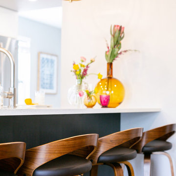
We took careful time in design and execution to align the range and sink because while it might seem like a small detail, it plays an important role in supporting the symmetrical configuration of the back wall of the kitchen. The rear wall design utilizes an appliance garage mirrors the visual impact of the refrigerator enclosure and helps keep the now open kitchen tidy. Between the appliance garage and refrigerator enclosure is the cooking zone with 30" of cabinetry and work surface on either side of the range, a chimney style vent hood, and a bold graphic tile backsplash.
The backsplash is just one of many personal touches we added to the space to reflect our client's modern eclectic style and love of color. Swooping lines of the mid-mod style barstools compliment the pendants and backsplash pattern. A pop of vibrant green on the frame of the pantry door adds a fresh wash of color to an otherwise neutral space. The big show stopper is the custom charcoal gray and copper chevron wall installation in the dining room. This was an idea our clients softly suggested, and we excitedly embraced the opportunity. It is also a kickass solution to the head-scratching design dilemma of how to fill a large and lofty wall.
We are so grateful to bring this design to life for our clients and now dear friends.

![Design Fixation [Faith Provencher]](https://st.hzcdn.com/fimgs/07a3fbf7003fc8b3_6655-w32-h32-b0-p0--.jpg) Design Fixation [Faith Provencher]
Design Fixation [Faith Provencher]Photo: Faith Towers © 2016 Houzz
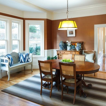
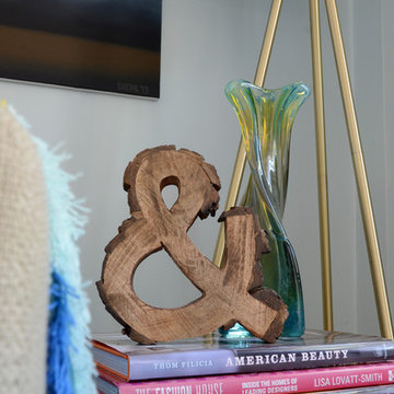
Eclectic living room photo in Boston
Eclectic living room photo in Boston

 Jamie Banfield Interior Designs
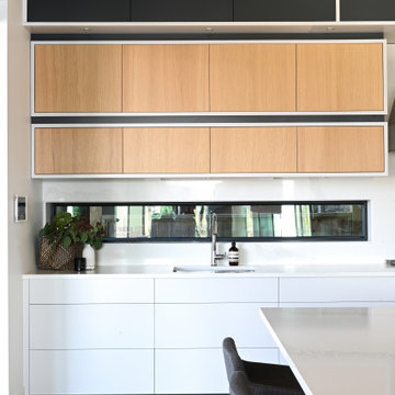
A contemporary west coast home inspired by its surrounding coastlines & greenbelt. With this busy family of all different professions, it was important to create optimal storage throughout the home to hide away odds & ends. A love of entertain made for a large kitchen, sophisticated wine storage & a pool table room for a hide away for the young adults. This space was curated for all ages of the home.
16