
Search results for "Proper tables" in Home Design Ideas
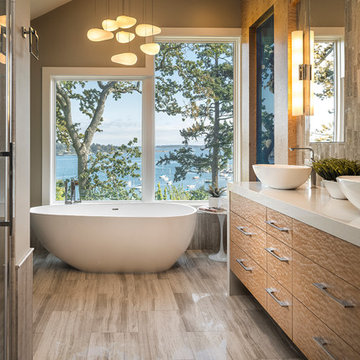

 Drewett Works
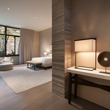
The primary goal for this project was to craft a modernist derivation of pueblo architecture. Set into a heavily laden boulder hillside, the design also reflects the nature of the stacked boulder formations. The site, located near local landmark Pinnacle Peak, offered breathtaking views which were largely upward, making proximity an issue. Maintaining southwest fenestration protection and maximizing views created the primary design constraint. The views are maximized with careful orientation, exacting overhangs, and wing wall locations. The overhangs intertwine and undulate with alternating materials stacking to reinforce the boulder strewn backdrop. The elegant material palette and siting allow for great harmony with the native desert.
The Elegant Modern at Estancia was the collaboration of many of the Valley's finest luxury home specialists. Interiors guru David Michael Miller contributed elegance and refinement in every detail. Landscape architect Russ Greey of Greey | Pickett contributed a landscape design that not only complimented the architecture, but nestled into the surrounding desert as if always a part of it. And contractor Manship Builders -- Jim Manship and project manager Mark Laidlaw -- brought precision and skill to the construction of what architect C.P. Drewett described as "a watch."
Project Details | Elegant Modern at Estancia
Architecture: CP Drewett, AIA, NCARB
Builder: Manship Builders, Carefree, AZ
Interiors: David Michael Miller, Scottsdale, AZ
Landscape: Greey | Pickett, Scottsdale, AZ
Photography: Dino Tonn, Scottsdale, AZ
Publications:
"On the Edge: The Rugged Desert Landscape Forms the Ideal Backdrop for an Estancia Home Distinguished by its Modernist Lines" Luxe Interiors + Design, Nov/Dec 2015.
Awards:
2015 PCBC Grand Award: Best Custom Home over 8,000 sq. ft.
2015 PCBC Award of Merit: Best Custom Home over 8,000 sq. ft.
The Nationals 2016 Silver Award: Best Architectural Design of a One of a Kind Home - Custom or Spec
2015 Excellence in Masonry Architectural Award - Merit Award
Photography: Dino Tonn
 Shaw Floors
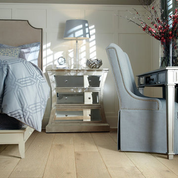
Castlewood Oak in Tower by Shaw Floors. The Castlewood collection has an abundance of the natural charm that makes hardwood floors so desirable. Creating its stunning character are stylish 7 1/2" widths, extremely handsome linear graining, and sawn face veneers that closely resemble solid hardwood. Castlewood's colors are visually rich - with the beautiful knots, mineral streaks, and natural splits seen in heirloom woods. Heightening its appeal is a very low-gloss finish, which calls to mind vintage European oil-rubbed floors.
Find the right local pro for your project
 Coronado Stone Products
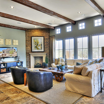
This beautiful project features Coronado Stone Products Adobe Brick thin veneer. Adobe Brick thin veneer is not a structural brick, so it can be directly adhered to a properly prepared drywall or plywood substrate. This allows projects to be enhanced with the alluring look and feel of full bed-depth Adobe Brick, without the need for additional wall tie support that standard full sized Adobe Brick installations require. This Adobe Brick product is featured in the color Sienna. Images were supplied by Standard Pacific Homes, Phoenix. See more Architectural Thin Brick Veneer projects from Coronado Stone Products
 Form Collective
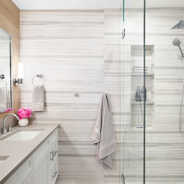
Walk-in shower - small transitional master gray tile and porcelain tile porcelain tile and gray floor walk-in shower idea in Vancouver with raised-panel cabinets, white cabinets, a one-piece toilet, gray walls, an undermount sink, quartz countertops and a hinged shower door
 Ancient Surfaces
Image provided by 'Ancient Surfaces'
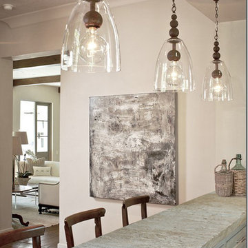
Product name: Specialty Lighting Complimenting our Antique Limestone.
Contacts: (212) 461-0245
Email: Sales@ancientsurfaces.com
Website: www.AncientSurfaces.com
Lighting or illumination is the deliberate use of light to achieve a practical or aesthetic effect. Lighting includes the use of both artificial light sources like lamps and light fixtures, as well as natural illumination by capturing daylight. Day-lighting (using windows, skylights, or light shelves) is sometimes used as the main source of light during daytime in buildings. Proper lighting can enhance task performance, improve the appearance of an area, or have positive psychological effects on occupants.
Indoor lighting is usually accomplished using light fixtures, and is a key part of interior design. Lighting can also be an intrinsic component of landscape projects.
 InnovationLand
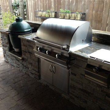
This covered patio and outdoor kitchen by Outdoor Homescapes of Houston features a Big Green Egg kamado style grill and its "nest" built into a natural stone island along with an RCS grill and double burner. The countertops are granite and the floor is concrete pavers. www.outdoorhomescapes.com
Sponsored
Sunbury, OH

J.Holderby - Renovations
Franklin County's Leading General Contractors - 2X Best of Houzz!

 Norton Homes
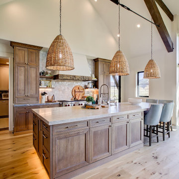
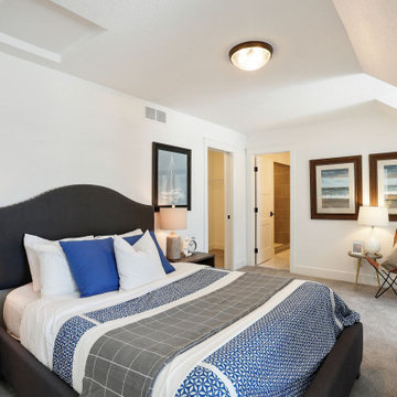
Exceptional custom-built 1 ½ story walkout home on a premier cul-de-sac site in the Lakeview neighborhood. Tastefully designed with exquisite craftsmanship and high attention to detail throughout.
Offering main level living with a stunning master suite, incredible kitchen with an open concept and a beautiful screen porch showcasing south facing wooded views. This home is an entertainer’s delight with many spaces for hosting gatherings. 2 private acres and surrounded by nature.
 lavish
Timeless, Tailored & Completely Livable — Primary Suite, Foyer & Whole-Home Interior Design | Raleigh, NC
This project is a study in how to make a home feel both elevated and deeply personal. Warm tones, natural wood, thoughtful layering of pattern and texture, and fixture choices that feel curated rather than catalog — every room earns its place.
The foyer makes an immediate impression. Herringbone hardwood floors set a classic tone underfoot, while gray grasscloth wallpaper adds warmth and texture to the walls. A brass cage lantern flush mount and wainscoting complete the entry, making it feel finished without being fussy. It's the kind of space that makes guests pause.
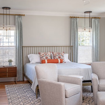
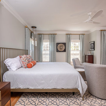
The primary bedroom is the project's centerpiece. A brass spindle bed frame anchors the room with quiet drama, flanked by walnut nightstands with brass legs and topped with a pair of extraordinarily custom lighting moments — multi-rod pendant chandeliers in brass and glass that hang from ceiling canopies, functioning as both bedside task lighting and sculptural focal points. Soft blue-gray custom drapery in a tonal dash-dot pattern hangs floor to ceiling on brass rods, layered over woven shades for light control and warmth. A pair of oatmeal linen swivel chairs with a marble-topped brass side table creates a proper sitting area at the foot of the bed. Floral accent pillows in terracotta and rust, an orange bolster, and a geometric cream and blue area rug give the neutral palette its energy. A modern minimalist white ceiling fan balances the traditional bones of the room beautifully.
The primary bathroom is a full gut renovation executed at the highest level. Warm walnut cabinetry with raised panel detailing runs the full length of a double vanity, topped with white quartz and finished with polished nickel hardware and fixtures throughout. A heated towel warmer, large format Calacatta-look marble tile floors, individual rounded-rectangle nickel-framed mirrors, and nickel sconces round out the vanity wall. The shower is nothing short of a spa experience — floor-to-ceiling Calacatta marble tile in large format, a ceiling-mounted rain head, wall-mounted traditional shower head, hand shower on a slide bar, linear drain, floating bench seat, and grab bars integrated so seamlessly they feel designed rather than added. A second bathroom receives the same care: dark walnut cabinetry, white quartz, polished nickel fixtures, a custom patterned Roman shade, and a cylindrical glass sconce with brass accent.
The walk-in pantry was designed with the same intentionality as every other room — white cabinetry, open upper shelving, a dedicated wine rack with both vertical and horizontal bottle storage, a second refrigerator, and dramatic swirling granite countertops that make even the utility spaces feel considered.
 ODS Architecture
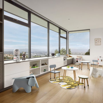
A 6,000 square foot 2-story new home complex in Milpitas was designed to facilitate the owners’ large business parties and gatherings, to have rooms for the kids to come back to upstairs, and a ground floor master suite with a huge walk-in closet. Several separate structures make up the dwelling: The main house, 3-car garage with carport for overflow parking, and a separate entertainment and recreation building separated by a courtyard from the main house.
The business activities include gatherings in the hundreds of people, so parking was maximized and guests can flow in through a separate gate to party in the courtyard and recreation building. Inside this structure is a wet bar, billiard room, workout gym and home theater. The main house ground floor has formal and informal living rooms, open kitchen and master suite with views and expansive windows in every direction. The house is sited on the crestline of a hill with views of the San Francisco Bay and private golf course below. The indoor-outdoor aspect of the house is further accentuated with outside living and dining areas.
High ceilings and expansive glass walls dissolve the sense of enclosure taking advantage of the site’s openness and privacy. The owner’s suite is downstairs in anticipation of aging-in-place, and upstairs there are three bedrooms and four bathrooms plus a sitting area lounge and casual TV loft area.
The house sits on one acre at the top of a low hill range overlooking Milpitas. The city was very cognizant of the importance of keeping a low profile at this crestline and required extensive story poles and photo evidence of the proper height and siting so as not to be seen from certain selected vantage points.
GENERAL CONTRACTOR: JCD Builders Inc.
LANDSCAPE DESIGN: Morf Chang Landscape Architecture / ODS Architecture
PHOTOGRAPHS: Paul Dyer Photography
 lavish
Timeless, Tailored & Completely Livable — Primary Suite, Foyer & Whole-Home Interior Design | Raleigh, NC
This project is a study in how to make a home feel both elevated and deeply personal. Warm tones, natural wood, thoughtful layering of pattern and texture, and fixture choices that feel curated rather than catalog — every room earns its place.
The foyer makes an immediate impression. Herringbone hardwood floors set a classic tone underfoot, while gray grasscloth wallpaper adds warmth and texture to the walls. A brass cage lantern flush mount and wainscoting complete the entry, making it feel finished without being fussy. It's the kind of space that makes guests pause.
The primary bedroom is the project's centerpiece. A brass spindle bed frame anchors the room with quiet drama, flanked by walnut nightstands with brass legs and topped with a pair of extraordinarily custom lighting moments — multi-rod pendant chandeliers in brass and glass that hang from ceiling canopies, functioning as both bedside task lighting and sculptural focal points. Soft blue-gray custom drapery in a tonal dash-dot pattern hangs floor to ceiling on brass rods, layered over woven shades for light control and warmth. A pair of oatmeal linen swivel chairs with a marble-topped brass side table creates a proper sitting area at the foot of the bed. Floral accent pillows in terracotta and rust, an orange bolster, and a geometric cream and blue area rug give the neutral palette its energy. A modern minimalist white ceiling fan balances the traditional bones of the room beautifully.
The primary bathroom is a full gut renovation executed at the highest level. Warm walnut cabinetry with raised panel detailing runs the full length of a double vanity, topped with white quartz and finished with polished nickel hardware and fixtures throughout. A heated towel warmer, large format Calacatta-look marble tile floors, individual rounded-rectangle nickel-framed mirrors, and nickel sconces round out the vanity wall. The shower is nothing short of a spa experience — floor-to-ceiling Calacatta marble tile in large format, a ceiling-mounted rain head, wall-mounted traditional shower head, hand shower on a slide bar, linear drain, floating bench seat, and grab bars integrated so seamlessly they feel designed rather than added. A second bathroom receives the same care: dark walnut cabinetry, white quartz, polished nickel fixtures, a custom patterned Roman shade, and a cylindrical glass sconce with brass accent.
The walk-in pantry was designed with the same intentionality as every other room — white cabinetry, open upper shelving, a dedicated wine rack with both vertical and horizontal bottle storage, a second refrigerator, and dramatic swirling granite countertops that make even the utility spaces feel considered.
 Become Interiors Ltd
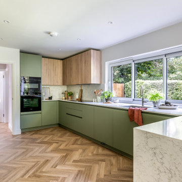
Here, I reworked the kitchen layout to improve flow, plus I moved the peninsula to create better sightlines and a distinct division between the kitchen and dining area. Every measurement, junction and finish was considered to ensure the layout worked or my clients and that using it felt effortless.
The result? A beautiful, nature inspired kitchen, with a home for everything - from the daily coffee station to integrated storage that hides the clutter. When a kitchen is designed properly, you don’t notice the planning – you just notice how easy life feels within it!

Sponsored
Columbus, OH

Wannemacher Interiors
Customized Award-Winning Interior Design Solutions in Franklin Cnty OH
 Surface Architecture & Design
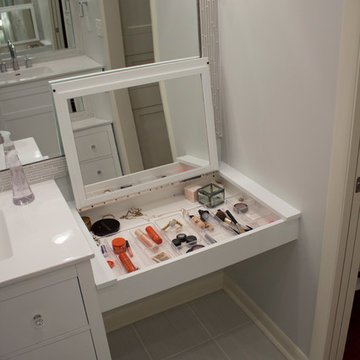
Make-up counter, in open position. Provides area to store make-up and accessories. Mirror on back side of hinged counter gives a proper view when seated. Easy way to hide the mess.
 ZeroEnergy Design
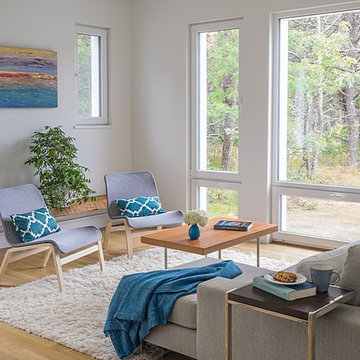
This modern green home offers both a vacation destination on Cape Cod near local family members and an opportunity for rental income.
FAMILY ROOTS. A West Coast couple living in the San Francisco Bay Area sought a permanent East Coast vacation home near family members living on Cape Cod. As academic professionals focused on sustainability, they sought a green, energy efficient home that was well-aligned with their values. With no green homes available for sale on Cape Cod, they decided to purchase land near their family and build their own.
SLOPED SITE. Comprised of a 3/4 acre lot nestled in the pines, the steeply sloping terrain called for a plan that embraced and took advantage of the slope. Of equal priority was optimizing solar exposure, preserving privacy from abutters, and creating outdoor living space. The design accomplished these goals with a simple, rectilinear form, offering living space on the both entry and lower/basement levels. The stepped foundation allows for a walk-out basement level with light-filled living space on the down-hill side of the home. The traditional basement on the eastern, up-hill side houses mechanical equipment and a home gym. The house welcomes natural light throughout, captures views of the forest, and delivers entertainment space that connects indoor living space to outdoor deck and dining patio.
MODERN VISION. The clean building form and uncomplicated finishes pay homage to the modern architectural legacy on the outer Cape. Durable and economical fiber cement panels, fixed with aluminum channels, clad the primary form. Cedar clapboards provide a visual accent at the south-facing living room, which extends a single roof plane to cover the entry porch.
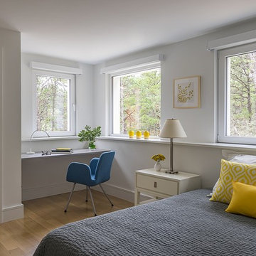
SMART USE OF SPACE. On the entry level, the “L”-shaped living, dining, and kitchen space connects to the exterior living, dining, and grilling spaces to effectively double the home’s summertime entertainment area. Placed at the western end of the entry level (where it can retain privacy but still claim expansive downhill views) is the master suite with a built-in study. The lower level has two guest bedrooms, a second full bathroom, and laundry. The flexibility of the space—crucial in a house with a modest footprint—emerges in one of the guest bedrooms, which doubles as home office by opening the barn-style double doors to connect it to the bright, airy open stair leading up to the entry level. Thoughtful design, generous ceiling heights and large windows transform the modest 1,100 sf* footprint into a well-lit, spacious home. *(total finished space is 1800 sf)
RENTAL INCOME. The property works for its owners by netting rental income when the owners are home in San Francisco. The house especially caters to vacationers bound for nearby Mayo Beach and includes an outdoor shower adjacent to the lower level entry door. In contrast to the bare bones cottages that are typically available on the Cape, this home offers prospective tenants a modern aesthetic, paired with luxurious and green features. Durable finishes inside and out will ensure longevity with the heavier use that comes with a rental property.
COMFORT YEAR-ROUND. The home is super-insulated and air-tight, with mechanical ventilation to provide continuous fresh air from the outside. High performance triple-paned windows complement the building enclosure and maximize passive solar gain while ensuring a warm, draft-free winter, even when sitting close to the glass. A properly sized air source heat pump offers efficient heating & cooling, and includes a carefully designed the duct distribution system to provide even comfort throughout the house. The super-insulated envelope allows us to significantly reduce the equipment capacity, duct size, and airflow quantities, while maintaining unparalleled thermal comfort.
ENERGY EFFICIENT. The building’s shell and mechanical systems play instrumental roles in the home’s exceptional performance. The building enclosure reduces the most significant energy glutton: heating. Continuous super-insulation, thorough air sealing, triple-pane windows, and passive solar gain work together to yield a miniscule heating load. All active energy consumers are extremely efficient: an air source heat pump for heating and cooling, a heat pump hot water heater, LED lighting, energy recovery ventilation (ERV), and high efficiency appliances. The result is a home that uses 70% less energy than a similar new home built to code requirements.
OVERALL. The home embodies the owners’ goals and values while comprehensively enabling thermal comfort, energy efficiency, a vacation respite, and supplementary income.
PROJECT TEAM
ZeroEnergy Design - Architect & Mechanical Designer
A.F. Hultin & Co. - Contractor
Pamet Valley Landscape Design - Landscape & Masonry
Lisa Finch - Original Artwork
European Architectural Supply - Windows
Eric Roth Photography - Photography
 ZeroEnergy Design
This modern green home offers both a vacation destination on Cape Cod near local family members and an opportunity for rental income.
FAMILY ROOTS. A West Coast couple living in the San Francisco Bay Area sought a permanent East Coast vacation home near family members living on Cape Cod. As academic professionals focused on sustainability, they sought a green, energy efficient home that was well-aligned with their values. With no green homes available for sale on Cape Cod, they decided to purchase land near their family and build their own.
SLOPED SITE. Comprised of a 3/4 acre lot nestled in the pines, the steeply sloping terrain called for a plan that embraced and took advantage of the slope. Of equal priority was optimizing solar exposure, preserving privacy from abutters, and creating outdoor living space. The design accomplished these goals with a simple, rectilinear form, offering living space on the both entry and lower/basement levels. The stepped foundation allows for a walk-out basement level with light-filled living space on the down-hill side of the home. The traditional basement on the eastern, up-hill side houses mechanical equipment and a home gym. The house welcomes natural light throughout, captures views of the forest, and delivers entertainment space that connects indoor living space to outdoor deck and dining patio.
MODERN VISION. The clean building form and uncomplicated finishes pay homage to the modern architectural legacy on the outer Cape. Durable and economical fiber cement panels, fixed with aluminum channels, clad the primary form. Cedar clapboards provide a visual accent at the south-facing living room, which extends a single roof plane to cover the entry porch.
SMART USE OF SPACE. On the entry level, the “L”-shaped living, dining, and kitchen space connects to the exterior living, dining, and grilling spaces to effectively double the home’s summertime entertainment area. Placed at the western end of the entry level (where it can retain privacy but still claim expansive downhill views) is the master suite with a built-in study. The lower level has two guest bedrooms, a second full bathroom, and laundry. The flexibility of the space—crucial in a house with a modest footprint—emerges in one of the guest bedrooms, which doubles as home office by opening the barn-style double doors to connect it to the bright, airy open stair leading up to the entry level. Thoughtful design, generous ceiling heights and large windows transform the modest 1,100 sf* footprint into a well-lit, spacious home. *(total finished space is 1800 sf)
RENTAL INCOME. The property works for its owners by netting rental income when the owners are home in San Francisco. The house especially caters to vacationers bound for nearby Mayo Beach and includes an outdoor shower adjacent to the lower level entry door. In contrast to the bare bones cottages that are typically available on the Cape, this home offers prospective tenants a modern aesthetic, paired with luxurious and green features. Durable finishes inside and out will ensure longevity with the heavier use that comes with a rental property.
COMFORT YEAR-ROUND. The home is super-insulated and air-tight, with mechanical ventilation to provide continuous fresh air from the outside. High performance triple-paned windows complement the building enclosure and maximize passive solar gain while ensuring a warm, draft-free winter, even when sitting close to the glass. A properly sized air source heat pump offers efficient heating & cooling, and includes a carefully designed the duct distribution system to provide even comfort throughout the house. The super-insulated envelope allows us to significantly reduce the equipment capacity, duct size, and airflow quantities, while maintaining unparalleled thermal comfort.
ENERGY EFFICIENT. The building’s shell and mechanical systems play instrumental roles in the home’s exceptional performance. The building enclosure reduces the most significant energy glutton: heating. Continuous super-insulation, thorough air sealing, triple-pane windows, and passive solar gain work together to yield a miniscule heating load. All active energy consumers are extremely efficient: an air source heat pump for heating and cooling, a heat pump hot water heater, LED lighting, energy recovery ventilation (ERV), and high efficiency appliances. The result is a home that uses 70% less energy than a similar new home built to code requirements.
OVERALL. The home embodies the owners’ goals and values while comprehensively enabling thermal comfort, energy efficiency, a vacation respite, and supplementary income.
PROJECT TEAM
ZeroEnergy Design - Architect & Mechanical Designer
A.F. Hultin & Co. - Contractor
Pamet Valley Landscape Design - Landscape & Masonry
Lisa Finch - Original Artwork
European Architectural Supply - Windows
Eric Roth Photography - Photography
 Sone Design, Inc.
Sone Design, Inc.
Traditional Home with a Modern Vibe
Photo: Joe Gutt
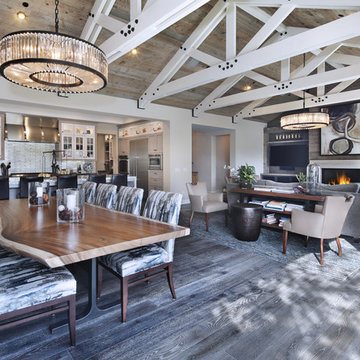
Family room - large traditional open concept dark wood floor family room idea in Other with white walls, a standard fireplace, a stone fireplace and a wall-mounted tv
Family room - large traditional open concept dark wood floor family room idea in Other with white walls, a standard fireplace, a stone fireplace and a wall-mounted tv



 TKS Design Group
Download our free ebook, Creating the Ideal Kitchen. DOWNLOAD NOW
Lakefront property in the northwest suburbs of Chicago is hard to come by, so when we were hired by this young family with exactly that, we were immediately inspired by not just the unusually large footprint of this 1950’s colonial revival but also the lovely views of the manmade lake it was sited on. The large 5-bedroom home was solidly stuck in the 1980’s, but we saw tons of potential. We started out by updating the existing staircase with a fresh coat of paint and adding new herringbone slate to the entry hall.
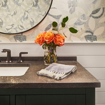
The powder room off the entryway also got a refresh - new flooring, new cabinets and fixtures. We ran the new slate right through into this space for some consistency. A fun wallpaper and shiplap trim add a welcoming feel and set the tone for the home.
Next, we tackled the kitchen. Located away from the rest of the first floor, the kitchen felt a little isolated, so we immediately began planning for how to better connect it to the rest of the first floor. We landed on removing the wall between the kitchen and dining room and designed a modified galley style space with separate cooking and clean up zones. The cooking zone consists of the refrigerator, prep sink and cooktop, along with a nice long run of prep space at the island. The cleanup side of the kitchen consists of the main sink and dishwasher. Both areas are situated so that the user can view the lake during prep work and cleanup!
One of the home’s main puzzles was how to incorporate the mudroom and area in front of the patio doors at the back of the house. We already had a breakfast table area, so the space by the patio doors was a bit of a no man’s land. We decided to separate the kitchen proper from what became the new mudroom with a large set of barn doors. That way you can quickly hide any mudroom messes but have easy access to the light coming in through the patio doors as well as the outdoor grilling station. We also love the impact the barn doors add to the overall space.
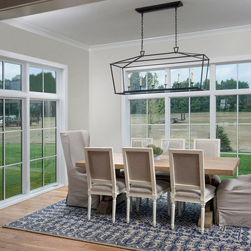
The homeowners’ first words to us were “it’s time to ditch the brown,” so we did! We chose a lovely blue pallet that reflects the home’s location on the lake which is also vibrant yet easy on the eye. Countertops are white quartz, and the natural oak floor works well with the other honey accents. The breakfast table was given a refresh with new chairs, chandelier and window treatments that frame the gorgeous views of the lake out the back.
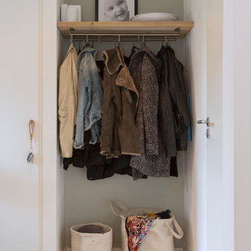
We coordinated the slate mudroom flooring with that used in the home’s main entrance for a consistent feel. The storage area consists of open and closed storage to allow for some clutter control as needed.
Next on our “to do” list was revamping the dated brown bar area in the neighboring dining room. We eliminated the clutter by adding some closed cabinets and did some easy updates to help the space feel more current. One snag we ran into here was the discovery of a beam above the existing open shelving that had to be modified with a smaller structural beam to allow for our new design to work. This was an unexpected surprise, but in the end we think it was well worth it!
We kept the colors here a bit more muted to blend with the homeowner’s existing furnishings. Open shelving and polished nickel hardware add some simple detail to the new entertainment zone which also looks out onto the lake!
Next we tackled the upstairs starting with the homeowner’s son’s bath. The bath originally had both a tub shower and a separate shower, so we decided to swap out the shower for a new laundry area. This freed up some space downstairs in what used to be the mudroom/laundry room and is much more convenient for daily laundry needs.
We continued the blue palette here with navy cabinetry and the navy tile in the shower. Porcelain floor tile and chrome fixtures keep maintenance to a minimum while matte black mirrors and lighting add some depth the design. A low maintenance runner adds some warmth underfoot and ties the whole space together.
We added a pocket door to the bathroom to minimize interference with the door swings. The left door of the laundry closet is on a 180 degree hinge to allow for easy full access to the machines. Next we tackled the master bath which is an en suite arrangement. The original was typical of the 1980’s with the vanity outside of the bathroom, situated near the master closet. And the brown theme continued here with multiple shades of brown.
Our first move was to segment off the bath and the closet from the master bedroom. We created a short hall from the bedroom to the bathroom with his and hers walk-in closets on the left and right as well as a separate toilet closet outside of the main bathroom for privacy and flexibility.
The original bathroom had a giant soaking tub with steps (dangerous!) as well as a small shower that did not work well for our homeowner who is 6’3”. With other bathtubs in the home, they decided to eliminate the tub and create an oversized shower which takes up the space where the old tub was located. The double vanity is on the opposite wall and a bench is located under the window for morning conversations and a place to set a couple of towels.
The pallet in here is light and airy with a mix of blond wood, creamy porcelain and marble tile, and brass accents. A simple roman shade adds some texture and it’s top-down mechanism allows for light and privacy.
This large whole house remodel gave our homeowners not only the ability to maximize the potential of their home but also created a lovely new frame from which to view their fabulous lake views.
Designed by: Susan Klimala, CKD, CBD
Photography by: Michael Kaskel
For more information on kitchen and bath design ideas go to: www.kitchenstudio-ge.com
31