
Search results for "Pursued" in Home Design Ideas
 Da Costa Interiors
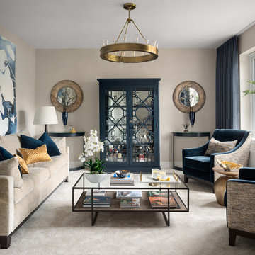
Inspiration for a mid-sized transitional formal and enclosed carpeted living room remodel in Edinburgh
 Karv One Design
The Mid-Levels of Hong Kong Island is one of the most prominent luxury residential areas. This project - Estoril Court in Mid-Levels Central is one of the rare heritage mansions in Hong Kong with a "thousand-year lease," comprising a total of 240 units.
The young couple, with their two daughters, have settled here. For the wide experience husband, the most important aspect of a home is that it carries the "depth of love." His wife's preferences and the children's interests were frequently mentioned during this project. "I hope the design can break through conventions and avoid falling into the trap of popular but clichéd styles. Kyle and I resonate deeply on this point; we both pursue a 'more personal expression.' Family life should be relaxing, natural, and bringing joy to my family members."
This residence features a square layout and excellent natural lighting, with a practicality rate of nearly 90%. However, its over 40-year-old structure poses numerous constraints on renovations. Adhering to the existing structure and the wisdom of geomancy, Karv One Design has re-examined the relationship among the landscape, windows, and functional flow within the home. They have integrated practicality, beauty, and self-expression into every corner, enhancing the happiness of living.
Once stepping into the living room, you are greeted by Hong Kong's most spectacular vistas. The ever-changing scenery of Victoria Harbour, both day and night, the immense skyscrapers of different banks and commercial buildings and the panoramic views of the Peak are all within sight. The expansive dimensions of the living room are a response to the surrounding environment, providing ample space for family bonding and companionship, while also allowing the breathtaking skyline views to seamlessly integrate into daily life.
Unlike traditional whole-house decoration, the design of Hong Kong homes emphasizes collage and customization. The minimalist aesthetic of the space corresponds to the luxurious craftsmanship and time costs involved. Elements such as natural stone, artistic paint, parquet flooring, wood veneer, and leather have all been meticulously coordinated in terms of color and proportion, while a significant amount of storage space has been cleverly concealed within the walls.
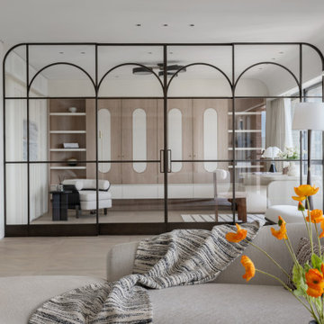
The study room is deliberately positioned to one side of the living room, embracing the gentle stretch of sunlight. The arched iron partition, exuding a vintage flavor and traces of time, not only serves as a natural divider of space but also becomes a highlight of the interior decoration with its unique artistic form, creating a serene yet stylish atmosphere. It ensures privacy without compromising on openness, allowing the home owner to work in the study room while still keeping an eye on the children playing in the living room.
Custom-made artisanal furniture offers a whole new expression of comfort and practicality to the space. The Giorgetti HUG armchair combines a sculptural sense of form with a flowing sense of shape. When natural light filters in, a rich artistic atmosphere permeates and grows within, making the home a place of tranquility and peace of mind.
The fireplace plays a significant role in the dining room. In the warm climate of Hong Kong, the fireplace rarely serves a practical purpose; it is designed to create a cozy atmosphere for family gatherings. During the winter Christmas season, it will be adorned with gifts wrapped in beautiful paper, serving as a nostalgic reminder of memories and expressions of love.
The original open-plan layout of the master bedroom has been reconfigured and divided. The ultimate goal of the enclosed space is to provide comfort and ease of sleep. The pale green color is also carefully coordinated, focusing on creating a serene and pleasant atmosphere. The combination of "green," "wood," and "metal elements" is based on Feng Shui considerations, serving to stabilize and concentrate the energy flow.
The children's room is simple yet cozy, where sunlight awakens the space and transparent glass windows bring in the ocean view. The palette of pale blue and white adds warmth and vitality to the space, inspiring children's boundless imagination about the unknown world and giving them the courage to see mountains, seas, and the world beyond.
The unique, customized storage design is cleverly hidden within the space, blending handicraft and industrial design. Adorned with delicate textures such as rounded corners and layered elements, the craftsmanship is meticulous and exquisite, demonstrating exceptional ingenuity. It adds a sense of depth and artistry to the visual experience.
The lighting system in the space brings more enjoyable experiences to "living as you desire." The smart system caters to various states of living scenarios at different times, as well as to the subtle needs of ambient temperature, brightness, and tactile atmosphere. Whether it's solo time or family moments, day or night, everyone has a comfortable place to be.
The "Estoril Court" project is a full-service case that last for 12 months. We had hundreds of communications and exchanges with the home owner, and continuously coordinated and collaborated with the property management, on-site construction and installation workers, manufacturers, and various suppliers, striving for perfection in craftsmanship and meticulous attention to detail in execution. Finally, seeing the satisfied expressions of the home owner and their family, we felt that it was an ideal conveyance.
 InnovationLand
Houston Interior Designer Lisha Maxey took this Museum District condo from the dated, mirrored walls of the 1980s to Mid Century Modern with a gallery look featuring the client's art collection.
"The place was covered with glued-down, floor-to-ceiling mirrors," says Lisha Maxey, senior designer for Homescapes of Houston and principal at LGH Design Services in Houston. "When we took them off the walls, the walls came apart. We ended up taking them down to the studs."
The makeover took six months to complete, primarily because of strict condo association rules that only gave the Houston interior designers very limited access to the elevator - through which all materials and team members had to go.
"Monday through Friday, we could only be noisy from 10 a.m. to 2 p.m., and if we had to do something extra loud, like sawing or drilling, we had to schedule it with the management and they had to communicate that to the condo owners. So it was just a lot of coordination. But a lot of Inner City Loopers live in these kinds of buildings, so we're used to handling that kind of thing."
The client, a child psychiatrist in her 60s, recently moved to Houston from northeast Texas to be with friends. After being widowed three years ago, she decided it was time to let go of the traditionally styled estate that wasn't really her style anyway. An avid diver who has traveled around the world to pursue her passion, she has amassed a large collection of art from her travels. Downsizing to 1,600 feet and wanting to go more contemporary, she wanted the display - and the look - more streamlined.
"She wanted clean lines and muted colors, with the main focus being her artwork," says Maxey. "So we made the space a palette for that."
Enter the white, gallery-grade paint she chose for the walls: "It's halfway between satin and flat," explains Maxey. "It's not glossy and it's not chalky - just very smooth and clean."
Adding to the gallery theme is the satin nickel track lighting with lamps aimed to highlight pieces of art. "This lighting has no wires," notes Maxey. "It's powered by a positive and negative conduit."
The new flooring throughout is a blended-grey porcelain tile that looks like wood planks. "It's gorgeous, natural-looking and combines all the beauty of wood with the durability of tile," says Maxey. "We used it throughout the condo to unify the space."
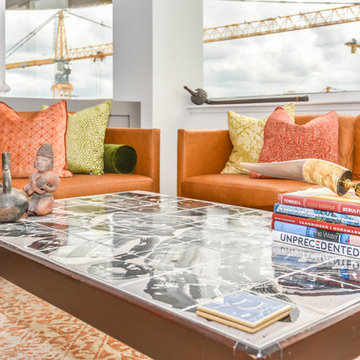
After Maxey started looking at the client's bright, vibrant, colorful artwork, she felt the palette couldn't stay as muted anymore. Hence the Mid Century Modern orange leather sofas from West Elm and chartruese chairs from Joybird, plus the throw pillows in different textures, patterns and shades of gold, orange and green.
The concave lines of the Danish-inspired chairs, she notes, help them look beautiful from all the way around - a key to designing spaces for loft living.
"The table in the living room is very interesting," notes Maxey. "It was handmade for the client in 1974 and has a signature on it from the artist. She was adamant about including the piece, which has all these hand-painted black-and-white art tiles on the top. I took one look at it and said 'It's not really going to go.'"
However, after cutting 6 inches off the bottom and making it look a little distressed, the table ended up being the perfect complement to the sofas.
The dining room table - from Design Within Reach - is a solid piece of mahogany, the chair upholstery a mix of grey velvet and leather and the legs a shiny brass. "The side chairs are leather and the end ones are velvet," says Maxey. "It's a nice textural mix that lends depth and texture."
The galley kitchen, meanwhile, has been lightened and brightened, with white quartz countertops and backsplashes mimicking the look of Carrara marble, stainless steel appliances and a velvet green bench seat for a punch of color. The cabinets are painted a cool grey color called "Silverplate."
The two bathrooms have been updated with contemporary white vanities and vessel sinks and the master bath now features a walk-in shower tiled in Dolomite white marble (the floor is Bianco Carrara marble mosaic, done in a herringbone pattern.
In the master bedroom, Homescapes of Houston knocked down a wall between two smaller closets with swing doors to make one large walk-in closet with pocket doors. The closet in the guest bedroom also came out 13 more inches.
The client's artwork throughout personalizes the space and tells the story of a life. There's a huge bowl of shells from the client's diving adventures, framed art from her child psychiatry patients and a 16th century wood carving from a monastery that's been in her family forever.
"Her collection is quite impressive," says Maxey. "There's even a framed piece of autographed songs written by John Lennon." (You can see this black-framed piece of art on the wall in the photo above of two green chairs).
"We're extremely happy with how the project turned out, and so is the client," says Maxey. "No expense was spared for her. It was a labor of love and we were excited to do it."
Find the right local pro for your project
 Designs Daly
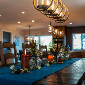
he objective of the project was to deliver a comprehensive remodel and redesign for two vacant Nestors. The clients expressed an interest in entertaining guests in their new common areas, residing in a more spacious and utilitarian master suite, pursuing their hobbies in the multipurpose room, having a functional home office, and offering comfortable accommodations for their visitors. Our team was driven to create a fresh look, style, and functionality that would cater to the clients’ needs.
 design styles architecture
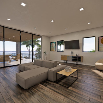
This spec home investor came to DSA with a unique challenge: to create a residence that could be sold for 8-10 million dollars on a 2-3 million dollar construction budget. The investor gave the design team complete creative control on the project, giving way to an opportunity for the team to pursue anything and everything as long as it fit in the construction budget. Out of this challenge was born a stunning modern/contemporary home that carries an atmosphere that is both luxurious and comfortable. The residence features a first floor owners’ suite, study, glass lined wine cellar, entertainment retreat, spacious great room, pool deck & lanai, bonus room, terrace, and five upstairs bedrooms. The lot chosen for the home sits on the beautiful St. Petersburg waterfront, and Designers made sure to take advantage of this at every angle of the home, creating sweeping views that flow between the exterior and interior spaces. The home boasts wide open spaces created by long-span trusses, and floor to ceiling glass and windows that promote natural light throughout the home. The living spaces in the home flow together as part of one contiguous interior space, reflecting a more casual and relaxed way of life.
 CSW Studio Interior Design
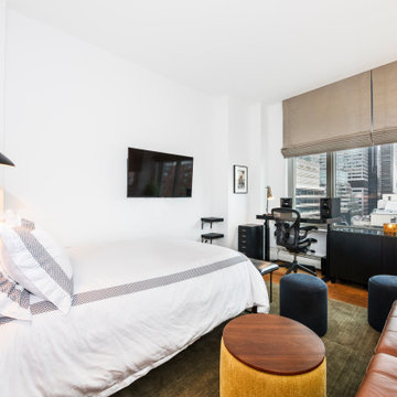
This bedroom was designed to accommodate a teenager boy who will be pursuing in the music industry. We took in consideration the need to have a additional queen size bed for guests. This space can be used for gatherings to listen him playing tracks or just to have friends over to play video game.
The use of this space is endless! The rare picture of Basquiat in the desk area and a very interesting table lamp, vintage, and made of clay welcomes everyone who walks in, without forget to mentioned, we incorporated the hall entrance with the rest of the room, adding the ceiling pendant that reflects an abstract interesting pattern in the ceiling, making even more artsy and fun!
 Bentham Plank
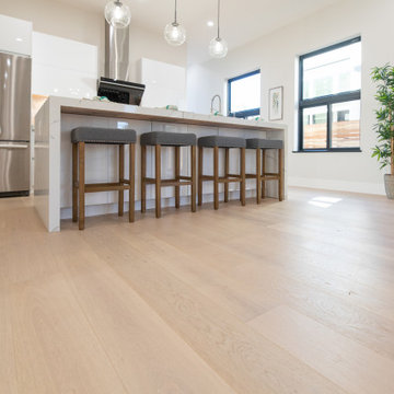
For those who prefer light-colored floors but do not wish for the consequent atmospheric coolness, Margot is the perfect solution: a light-colored floor that radiates an aura of warmth. In contrast to Sanzio and Burano, smooth and sophisticated Margot pursues a sense of unity, blurring the lines between floor planksboards. With its mellow texture and pleasantly bright ambience, Margot emanates an intoxicating impression of serene bliss.
 STUDIO TASHIMA
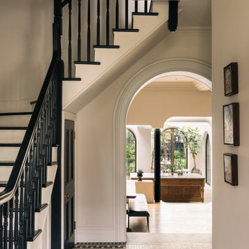
Keyes Road is a two-storey, semi-detached red brick house dating to around 1890-1910. The focus of our work was on the ground floor where we were asked to improve the layout and use of the main living areas of the house, for an active family of four. Important to the design was to maximise the quality and amount of light as well as connection to the garden and flow to the rest of the house.
Our proposal introduces three single storey extensions, comprising a central, large space that extends the main outrigger of the house. To each side are smaller volumes, affording a full width kitchen. While defining a series of discrete volumes, it was important for us to ensure that the kitchen, living, family and dining rooms that are interconnecting and continuous. The result is a big space punctuated by a series of differently sized arches, defining spaces to ensure their intimacy.
It was important for our client to have a sense of warmth and comfort - perhaps not dissimilar to the qualities of a hotel lobby. The colour scheme of the rooms are warm white painted plaster, natural wood flooring with black, bronze and brass accents. Indirect and carefully placed light fittings pulls together the atmosphere of the rooms - particularly in the evenings.
Externally, we felt it important to differentiate the extensions from the main house by using a dark, charcoal grey brick. This sets up a contrasting yet complimentary relationship to the rich red coloured brick house. The facets of the brick play with light and depth as do the graduated brick arches.
During the design process, we grappled with floor levels, the direction of sunlight, and care to not encroach on the neighbouring properties. As the house is in a conservation area, we worked closely with our trusted planning advisor. Throughout, we pursued a sensitive design strategy, using pitched roofs, matching materials and careful detailing. Internally, many of the original details are intact. This has enabled us to create an eclectic ensemble of elements, colours and materials varying in age and period.
 Marcus Gleysteen Architects
Cove House is a contemporary shoreline sanctuary in the lake region of New Hampshire. The wooded property, which includes several accessory outbuildings and an existing guest cottage, makes up a private micro-cove. The new modern house and existing traditional cottage turn both toward the lake and to each other. Thoughtful siting and landscape architecture establish a connective flow between the two residences, with a notched stone courtyard in the house inviting visitors to go back and forth.
Inspired by the craftsmanship of an antique mahogany powerboat, Cove House pursues architectural quality and beauty at the highest level. The design uses materiality, texture, and daylight to balance livability and artistry. The main entrance leads through a slot-canyon-like hall where a sequence of monumental granite walls reveals a glorious, light-filled living room. A steel moment frame spanning two levels imparts unobstructed panoramic views of the lake.
The magnetism of the New Hampshire waterfront is equalized by a coordinated series of openings, which attune daylight throughout the interior. Large sliding glass doors and windows draw light through the courtyard and into the home’s core – a bright and lofty kitchen. Below the kitchen, a walkout patio illuminates a refined wine-tasting room.
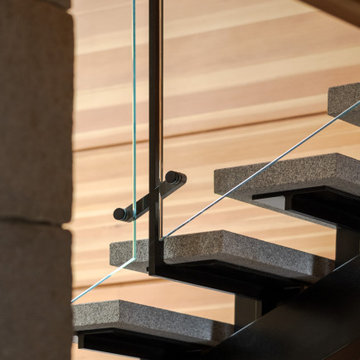
Near the front entry, a gracious granite and steel stair delivers daylight to each level though open risers and glass balustrades. Skylights draw light from above and cast grazing shadows against the textured tile walls of the upper bathrooms.
“We aimed to create a “beautiful reward” and an environment that our clients will enjoy for the rest of their lives.”
– Marcus Gleysteen
 Go Nautical Collections
 https://www.gonautical.com/nautical-coastal-furniture/1063-captain-s-writing-desk-white-trim.html
Captain's Writing Desk, White Trim
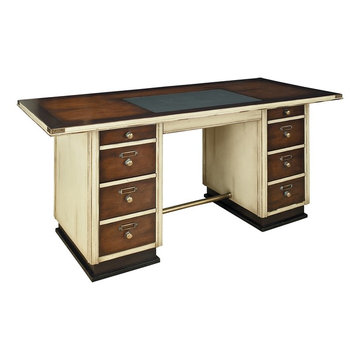
Direct your home with the confidence and authority of a ship's captain from the Authentic Models Captain's Writing Laptop Desk in White. With a space-saving design inspired by the needs raised by the captain's cramped quarters, this desk offers maximum comfort and work space without monopolizing floor area. Brass reinforced corners protect the desk from damage during movement and add an authentic look. Both desk pedestals contain ample drawer space for your supplies, and the drawer fronts feature brass hardware and label holders. A black leather inset top provides a luxurious writing surface and completes the regal feel of this well-made desk. Lustrous hand-rubbed wood finishes combine with weathered white accents for a cheerful, realistic appearance. Sturdy cherry and maple hardwood construction with dovetailed joints create a stable, durable desk that will provide nautical-themed inspiration for years to come. Arrives fully assembled.
Storage drawers in both pedestals
Dimensions: 66.9L x 29.5W x 30.7H inches
The captain’s desk is designed to offer maximum comfort and space in a minimal floor area. This desk would make a great addition to your nautical decor.
Overall Size: 29.5" height x 30.75" width x 67" length
Material: Solid cherry & maple wood
Hardware: Solid brass
Finish: Ivory and honey finish
Shipped via UPS freight (truck)
Free shipping within the continental 48 U.S.
About Authentic Models
Authentic Models strives to create and distribute a comprehensive collection of historic and fine art reproductions worldwide. Haring Piebenga founded the company in 1968, and today AM is a European wholesale manufacturer with warehouses and corporate offices in Oregon and Amsterdam. AM pursues original items at auction and uses these models for their design ideas. Each hand-made item appeals to the human need for nostalgia, intrigue, and beauty by evoking a story from the past. High-quality construction using only the finest materials ensures that these charming pieces will become treasured heirlooms in their own right.
 Eureka Ergonomic
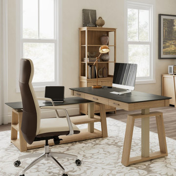
The new premium Ark desk will provide you with a revolutionary modern home office experience. Ark EX combines the charm of fine furniture with the latest cutting-edge technology, embodying modern minimalist elegance and advanced ergonomics. A standing desk specially tailored for those who prefer modern smart home style and pursue a home office environment.
 Steven Allen Designs, LLC
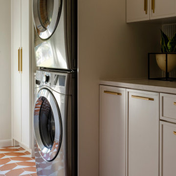
Originally built in 1958, the home became an opportunity to explore what midcentury modernism looks like when filtered through place and blending the optimism and color language of the late ’50s with influences from Santa Fe, the Texas Gulf Coast, and the relaxed, sun-washed rhythms of vacation architecture.
Rather than pursuing a strict restoration, the project embraces evolution over replication. Soft pinks, deep greens, terrazzo flooring, breeze-block screening, and warm wood tones nod to the home’s original era while allowing contemporary interventions to feel both intentional and playful. The new addition was designed to read as a natural continuation of the original structure, respecting scale, rooflines, and materiality, while opening the home to light, texture, and a stronger indoor-outdoor connection.
Throughout the interior, color and form work together to create rooms that feel collected rather than styled. A green-draped sitting area grounded in texture, a kitchen anchored by warm cabinetry and terrazzo, and a powder bath that leans fully into pattern and mood. The home reflects how we live today, but with an unmistakable sense of time and place.
 InnovationLand
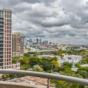
Houston Interior Designer Lisha Maxey took this Museum District condo from the dated, mirrored walls of the 1980s to Mid Century Modern with a gallery look featuring the client's art collection.
"The place was covered with glued-down, floor-to-ceiling mirrors," says Lisha Maxey, senior designer for Homescapes of Houston and principal at LGH Design Services in Houston. "When we took them off the walls, the walls came apart. We ended up taking them down to the studs."
The makeover took six months to complete, primarily because of strict condo association rules that only gave the Houston interior designers very limited access to the elevator - through which all materials and team members had to go.
"Monday through Friday, we could only be noisy from 10 a.m. to 2 p.m., and if we had to do something extra loud, like sawing or drilling, we had to schedule it with the management and they had to communicate that to the condo owners. So it was just a lot of coordination. But a lot of Inner City Loopers live in these kinds of buildings, so we're used to handling that kind of thing."
The client, a child psychiatrist in her 60s, recently moved to Houston from northeast Texas to be with friends. After being widowed three years ago, she decided it was time to let go of the traditionally styled estate that wasn't really her style anyway. An avid diver who has traveled around the world to pursue her passion, she has amassed a large collection of art from her travels. Downsizing to 1,600 feet and wanting to go more contemporary, she wanted the display - and the look - more streamlined.
"She wanted clean lines and muted colors, with the main focus being her artwork," says Maxey. "So we made the space a palette for that."
Enter the white, gallery-grade paint she chose for the walls: "It's halfway between satin and flat," explains Maxey. "It's not glossy and it's not chalky - just very smooth and clean."
Adding to the gallery theme is the satin nickel track lighting with lamps aimed to highlight pieces of art. "This lighting has no wires," notes Maxey. "It's powered by a positive and negative conduit."
The new flooring throughout is a blended-grey porcelain tile that looks like wood planks. "It's gorgeous, natural-looking and combines all the beauty of wood with the durability of tile," says Maxey. "We used it throughout the condo to unify the space."
After Maxey started looking at the client's bright, vibrant, colorful artwork, she felt the palette couldn't stay as muted anymore. Hence the Mid Century Modern orange leather sofas from West Elm and chartruese chairs from Joybird, plus the throw pillows in different textures, patterns and shades of gold, orange and green.
The concave lines of the Danish-inspired chairs, she notes, help them look beautiful from all the way around - a key to designing spaces for loft living.
"The table in the living room is very interesting," notes Maxey. "It was handmade for the client in 1974 and has a signature on it from the artist. She was adamant about including the piece, which has all these hand-painted black-and-white art tiles on the top. I took one look at it and said 'It's not really going to go.'"
However, after cutting 6 inches off the bottom and making it look a little distressed, the table ended up being the perfect complement to the sofas.
The dining room table - from Design Within Reach - is a solid piece of mahogany, the chair upholstery a mix of grey velvet and leather and the legs a shiny brass. "The side chairs are leather and the end ones are velvet," says Maxey. "It's a nice textural mix that lends depth and texture."
The galley kitchen, meanwhile, has been lightened and brightened, with white quartz countertops and backsplashes mimicking the look of Carrara marble, stainless steel appliances and a velvet green bench seat for a punch of color. The cabinets are painted a cool grey color called "Silverplate."
The two bathrooms have been updated with contemporary white vanities and vessel sinks and the master bath now features a walk-in shower tiled in Dolomite white marble (the floor is Bianco Carrara marble mosaic, done in a herringbone pattern.
In the master bedroom, Homescapes of Houston knocked down a wall between two smaller closets with swing doors to make one large walk-in closet with pocket doors. The closet in the guest bedroom also came out 13 more inches.
The client's artwork throughout personalizes the space and tells the story of a life. There's a huge bowl of shells from the client's diving adventures, framed art from her child psychiatry patients and a 16th century wood carving from a monastery that's been in her family forever.
"Her collection is quite impressive," says Maxey. "There's even a framed piece of autographed songs written by John Lennon." (You can see this black-framed piece of art on the wall in the photo above of two green chairs).
"We're extremely happy with how the project turned out, and so is the client," says Maxey. "No expense was spared for her. It was a labor of love and we were excited to do it."
 Better Builders
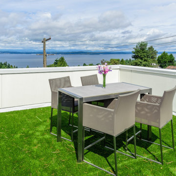
Completed in 2015, the Othello House was designed by PRDG Architecture + Design and built by Better Builders as a striking example of modern living in West Seattle. Though the homeowners chose not to pursue formal certification, the project was built to meet the rigorous standards of a Five-Star Built Green™ home.
From the ground up, sustainability and style were equally prioritized. The build preserved native vegetation, retained mature trees on-site, exceeded Washington State Energy Code requirements, and recycled over 70% of construction waste by weight. Recycled-content materials were thoughtfully incorporated throughout, reinforcing the home’s eco-conscious foundation.
Large windows on all sides flood the interiors with natural light, while the surrounding landscaping is designed to highlight lush greenery and native plantings. The result is a home that combines premium modern design with environmental responsibility—proving that sustainable construction can also deliver the ultimate in comfort and function.
 Design First Builders
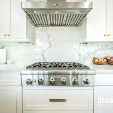
A desire to have a large open kitchen looking out into their existing greatroom allowed us to pursue removing existing walls and relocating a few components of the existing Kitchen.
The White Shaker style cabinets with gold hardware is a timeless look mixed with a subtle pop of color in the gray toned island and extended countertop backsplash behind the range.
Removing the walls and opening up the spaced allowed us to achieve a grand and impressive space for everyday use and exciting gatherings.
 Marcus Gleysteen Architects
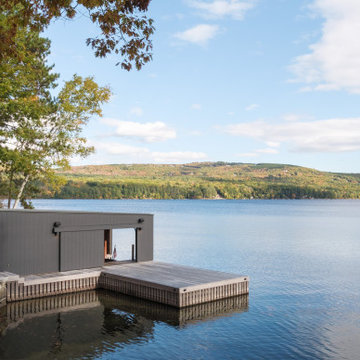
Cove House is a contemporary shoreline sanctuary in the lake region of New Hampshire. The wooded property, which includes several accessory outbuildings and an existing guest cottage, makes up a private micro-cove. The new modern house and existing traditional cottage turn both toward the lake and to each other. Thoughtful siting and landscape architecture establish a connective flow between the two residences, with a notched stone courtyard in the house inviting visitors to go back and forth.
Inspired by the craftsmanship of an antique mahogany powerboat, Cove House pursues architectural quality and beauty at the highest level. The design uses materiality, texture, and daylight to balance livability and artistry. The main entrance leads through a slot-canyon-like hall where a sequence of monumental granite walls reveals a glorious, light-filled living room. A steel moment frame spanning two levels imparts unobstructed panoramic views of the lake.
The magnetism of the New Hampshire waterfront is equalized by a coordinated series of openings, which attune daylight throughout the interior. Large sliding glass doors and windows draw light through the courtyard and into the home’s core – a bright and lofty kitchen. Below the kitchen, a walkout patio illuminates a refined wine-tasting room.
Near the front entry, a gracious granite and steel stair delivers daylight to each level though open risers and glass balustrades. Skylights draw light from above and cast grazing shadows against the textured tile walls of the upper bathrooms.
“We aimed to create a “beautiful reward” and an environment that our clients will enjoy for the rest of their lives.”
– Marcus Gleysteen
 Bentham Plank
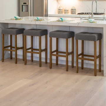
For those who prefer light-colored floors but do not wish for the consequent atmospheric coolness, Margot is the perfect solution: a light-colored floor that radiates an aura of warmth. In contrast to Sanzio and Burano, smooth and sophisticated Margot pursues a sense of unity, blurring the lines between floor planksboards. With its mellow texture and pleasantly bright ambience, Margot emanates an intoxicating impression of serene bliss.
 Sophia M. Amiano
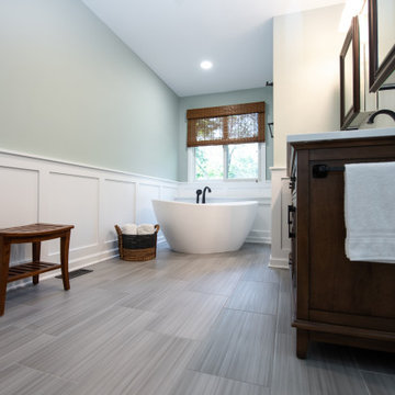
This remodel began as a powder bathroom and hall bathroom project, giving the powder bath a beautiful shaker style wainscoting and completely remodeling the second-floor hall bath. The second-floor hall bathroom features a mosaic tile accent, subway tile used for the entire shower, brushed nickel finishes, and a beautiful dark grey stained vanity with a quartz countertop. Once the powder bath and hall bathroom was complete, the homeowner decided to immediately pursue the master bathroom, creating a stunning, relaxing space. The master bathroom received the same styled wainscotting as the powder bath, as well as a free-standing tub, oil-rubbed bronze finishes, and porcelain tile flooring.
 Restoration Coston
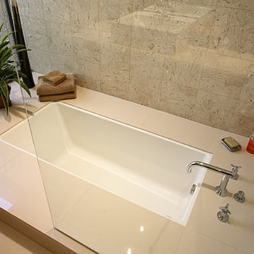
Stan Sachley design circa "1980" The architect clearly understood the proper use of space and light, while still respecting earlier mid-century desert architecture. The floors were kept clean and polished, as not to compete with the existing split travertine which ran through glass walls. This effect, blurred the indoor/outdoor living spaces. Finishes selected, were chosen to highlight a more refined and modern environment.
 Designs Daly
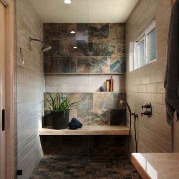
he objective of the project was to deliver a comprehensive remodel and redesign for two vacant Nestors. The clients expressed an interest in entertaining guests in their new common areas, residing in a more spacious and utilitarian master suite, pursuing their hobbies in the multipurpose room, having a functional home office, and offering comfortable accommodations for their visitors. Our team was driven to create a fresh look, style, and functionality that would cater to the clients’ needs.
34