
Search results for "Quality extends" in Home Design Ideas
 THE Remodel Group
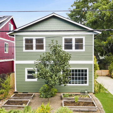
Sometimes the best solution isn't finding a bigger home, it's reimagining the one you already love. This Portland second-story addition demonstrates how strategic design-build planning can help a growing family gain the space they need while remaining in the neighborhood they never wanted to leave.
Originally, this home was a modest single-level residence with three bedrooms and two bathrooms. As the family's needs evolved, the layout no longer offered the functionality they required. Visiting relatives from California frequently stayed with them, yet the existing floor plan lacked a dedicated guest bathroom. The primary suite was undersized, storage was limited, and the main living room felt cramped for everyday family life. Complicating matters further, the narrow lot provided virtually no opportunity for expansion to the front, sides, or rear of the property. To create meaningful additional square footage, the only option was to build upward.
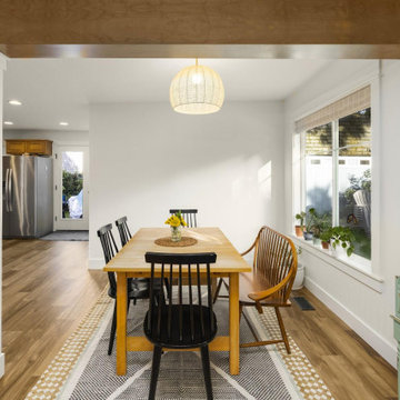
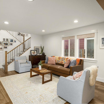
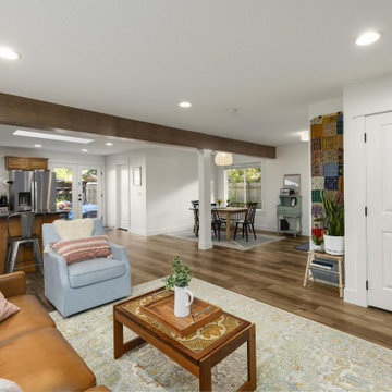
The transformation began with a complete rethinking of the home's interior organization. An existing bedroom, which had already transitioned into a home office, was removed to make way for a new staircase connecting the first and second floors. Rather than treating the staircase as simply a circulation element, the redesign used it to create a new living area while adding valuable storage beneath. The formerly enclosed dining room was opened to the kitchen and living spaces, resulting in a bright, cohesive great room that dramatically improved both sightlines and daily functionality.
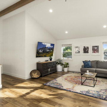
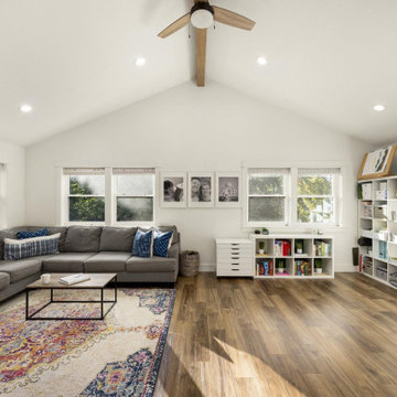
The newly added second floor became the centerpiece of the project. On one side of the addition, a spacious bonus room with vaulted ceilings provides a flexible space for family gatherings, movie nights, homework sessions, and creative projects. Dedicated workstation areas ensure the room can evolve alongside the family's needs while taking advantage of abundant natural light from multiple windows.
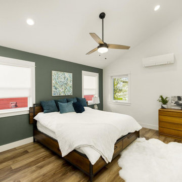
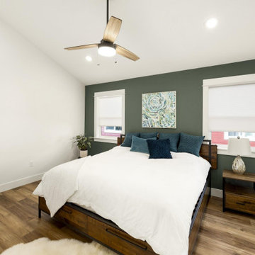
On the opposite side, the homeowners finally gained the private retreat they had been missing. The new primary suite features soaring vaulted ceilings, expansive windows, and a walk-in closet approximately six times larger than the home's original primary closet. The adjoining bathroom was designed to balance comfort, practicality, and timeless style, with a double vanity, dedicated linen storage, a separate tiled shower, and a soaking tub that creates a true spa-like experience within the home.
Throughout the renovation, a contemporary transitional aesthetic guided the design selections. New luxury vinyl plank flooring was installed across both the existing first floor and the newly constructed second level, creating visual continuity throughout the home. Matching custom stair treads provide a seamless transition between floors, while updated baseboards and door casings help unify the original structure with the addition so the entire home feels intentionally designed rather than pieced together over time.
The staircase became an architectural focal point, featuring warm wood handrails stained to complement the flooring and black metal balusters that introduce a subtle modern influence. This combination successfully bridges the homeowners' appreciation for contemporary design while respecting the overall character of the home.
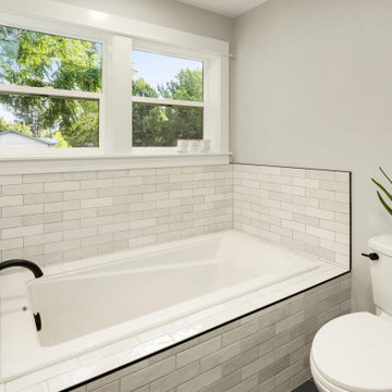
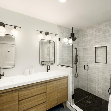
Material selections in the primary bathroom create depth through texture rather than bold color contrasts. Softly varied white wall tile ranges from crisp bright whites to subtle cloudy tones, while a gentle watercolor-like surface texture captures and reflects natural light throughout the day. Extending the same tile across both the shower walls and tub surround establishes clean architectural lines and emphasizes the room's spaciousness. Black marble pebble flooring in the shower, paired with matte black plumbing fixtures, mirrors, lighting, and trim details, adds contrast and sophistication without overwhelming the palette.
What makes this project especially meaningful is its ability to solve multiple challenges through a single integrated design-build solution. Through close collaboration with the homeowners and our architectural partner, Candid Design, every square foot was carefully considered to maximize functionality, comfort, and long-term livability. By building upward rather than outward, the homeowners gained a spacious primary suite, an additional living area, improved storage, a dedicated guest bath, and flexible family spaces while preserving the location, character, and community they already loved. The result is a home that feels larger, brighter, and better suited for the next chapter of family life without sacrificing the qualities that made it special in the first place.
 THE Remodel Group
Sometimes the best solution isn't finding a bigger home, it's reimagining the one you already love. This Portland second-story addition demonstrates how strategic design-build planning can help a growing family gain the space they need while remaining in the neighborhood they never wanted to leave.
Originally, this home was a modest single-level residence with three bedrooms and two bathrooms. As the family's needs evolved, the layout no longer offered the functionality they required. Visiting relatives from California frequently stayed with them, yet the existing floor plan lacked a dedicated guest bathroom. The primary suite was undersized, storage was limited, and the main living room felt cramped for everyday family life. Complicating matters further, the narrow lot provided virtually no opportunity for expansion to the front, sides, or rear of the property. To create meaningful additional square footage, the only option was to build upward.
The transformation began with a complete rethinking of the home's interior organization. An existing bedroom, which had already transitioned into a home office, was removed to make way for a new staircase connecting the first and second floors. Rather than treating the staircase as simply a circulation element, the redesign used it to create a new living area while adding valuable storage beneath. The formerly enclosed dining room was opened to the kitchen and living spaces, resulting in a bright, cohesive great room that dramatically improved both sightlines and daily functionality.
The newly added second floor became the centerpiece of the project. On one side of the addition, a spacious bonus room with vaulted ceilings provides a flexible space for family gatherings, movie nights, homework sessions, and creative projects. Dedicated workstation areas ensure the room can evolve alongside the family's needs while taking advantage of abundant natural light from multiple windows.
On the opposite side, the homeowners finally gained the private retreat they had been missing. The new primary suite features soaring vaulted ceilings, expansive windows, and a walk-in closet approximately six times larger than the home's original primary closet. The adjoining bathroom was designed to balance comfort, practicality, and timeless style, with a double vanity, dedicated linen storage, a separate tiled shower, and a soaking tub that creates a true spa-like experience within the home.
Throughout the renovation, a contemporary transitional aesthetic guided the design selections. New luxury vinyl plank flooring was installed across both the existing first floor and the newly constructed second level, creating visual continuity throughout the home. Matching custom stair treads provide a seamless transition between floors, while updated baseboards and door casings help unify the original structure with the addition so the entire home feels intentionally designed rather than pieced together over time.
The staircase became an architectural focal point, featuring warm wood handrails stained to complement the flooring and black metal balusters that introduce a subtle modern influence. This combination successfully bridges the homeowners' appreciation for contemporary design while respecting the overall character of the home.
Material selections in the primary bathroom create depth through texture rather than bold color contrasts. Softly varied white wall tile ranges from crisp bright whites to subtle cloudy tones, while a gentle watercolor-like surface texture captures and reflects natural light throughout the day. Extending the same tile across both the shower walls and tub surround establishes clean architectural lines and emphasizes the room's spaciousness. Black marble pebble flooring in the shower, paired with matte black plumbing fixtures, mirrors, lighting, and trim details, adds contrast and sophistication without overwhelming the palette.
What makes this project especially meaningful is its ability to solve multiple challenges through a single integrated design-build solution. Through close collaboration with the homeowners and our architectural partner, Candid Design, every square foot was carefully considered to maximize functionality, comfort, and long-term livability. By building upward rather than outward, the homeowners gained a spacious primary suite, an additional living area, improved storage, a dedicated guest bath, and flexible family spaces while preserving the location, character, and community they already loved. The result is a home that feels larger, brighter, and better suited for the next chapter of family life without sacrificing the qualities that made it special in the first place.
 THE Remodel Group
Sometimes the best solution isn't finding a bigger home, it's reimagining the one you already love. This Portland second-story addition demonstrates how strategic design-build planning can help a growing family gain the space they need while remaining in the neighborhood they never wanted to leave.
Originally, this home was a modest single-level residence with three bedrooms and two bathrooms. As the family's needs evolved, the layout no longer offered the functionality they required. Visiting relatives from California frequently stayed with them, yet the existing floor plan lacked a dedicated guest bathroom. The primary suite was undersized, storage was limited, and the main living room felt cramped for everyday family life. Complicating matters further, the narrow lot provided virtually no opportunity for expansion to the front, sides, or rear of the property. To create meaningful additional square footage, the only option was to build upward.
The transformation began with a complete rethinking of the home's interior organization. An existing bedroom, which had already transitioned into a home office, was removed to make way for a new staircase connecting the first and second floors. Rather than treating the staircase as simply a circulation element, the redesign used it to create a new living area while adding valuable storage beneath. The formerly enclosed dining room was opened to the kitchen and living spaces, resulting in a bright, cohesive great room that dramatically improved both sightlines and daily functionality.
The newly added second floor became the centerpiece of the project. On one side of the addition, a spacious bonus room with vaulted ceilings provides a flexible space for family gatherings, movie nights, homework sessions, and creative projects. Dedicated workstation areas ensure the room can evolve alongside the family's needs while taking advantage of abundant natural light from multiple windows.
On the opposite side, the homeowners finally gained the private retreat they had been missing. The new primary suite features soaring vaulted ceilings, expansive windows, and a walk-in closet approximately six times larger than the home's original primary closet. The adjoining bathroom was designed to balance comfort, practicality, and timeless style, with a double vanity, dedicated linen storage, a separate tiled shower, and a soaking tub that creates a true spa-like experience within the home.
Throughout the renovation, a contemporary transitional aesthetic guided the design selections. New luxury vinyl plank flooring was installed across both the existing first floor and the newly constructed second level, creating visual continuity throughout the home. Matching custom stair treads provide a seamless transition between floors, while updated baseboards and door casings help unify the original structure with the addition so the entire home feels intentionally designed rather than pieced together over time.
The staircase became an architectural focal point, featuring warm wood handrails stained to complement the flooring and black metal balusters that introduce a subtle modern influence. This combination successfully bridges the homeowners' appreciation for contemporary design while respecting the overall character of the home.
Material selections in the primary bathroom create depth through texture rather than bold color contrasts. Softly varied white wall tile ranges from crisp bright whites to subtle cloudy tones, while a gentle watercolor-like surface texture captures and reflects natural light throughout the day. Extending the same tile across both the shower walls and tub surround establishes clean architectural lines and emphasizes the room's spaciousness. Black marble pebble flooring in the shower, paired with matte black plumbing fixtures, mirrors, lighting, and trim details, adds contrast and sophistication without overwhelming the palette.
What makes this project especially meaningful is its ability to solve multiple challenges through a single integrated design-build solution. Through close collaboration with the homeowners and our architectural partner, Candid Design, every square foot was carefully considered to maximize functionality, comfort, and long-term livability. By building upward rather than outward, the homeowners gained a spacious primary suite, an additional living area, improved storage, a dedicated guest bath, and flexible family spaces while preserving the location, character, and community they already loved. The result is a home that feels larger, brighter, and better suited for the next chapter of family life without sacrificing the qualities that made it special in the first place.
Find the right local pro for your project
 THE Remodel Group
Sometimes the best solution isn't finding a bigger home, it's reimagining the one you already love. This Portland second-story addition demonstrates how strategic design-build planning can help a growing family gain the space they need while remaining in the neighborhood they never wanted to leave.
Originally, this home was a modest single-level residence with three bedrooms and two bathrooms. As the family's needs evolved, the layout no longer offered the functionality they required. Visiting relatives from California frequently stayed with them, yet the existing floor plan lacked a dedicated guest bathroom. The primary suite was undersized, storage was limited, and the main living room felt cramped for everyday family life. Complicating matters further, the narrow lot provided virtually no opportunity for expansion to the front, sides, or rear of the property. To create meaningful additional square footage, the only option was to build upward.
The transformation began with a complete rethinking of the home's interior organization. An existing bedroom, which had already transitioned into a home office, was removed to make way for a new staircase connecting the first and second floors. Rather than treating the staircase as simply a circulation element, the redesign used it to create a new living area while adding valuable storage beneath. The formerly enclosed dining room was opened to the kitchen and living spaces, resulting in a bright, cohesive great room that dramatically improved both sightlines and daily functionality.
The newly added second floor became the centerpiece of the project. On one side of the addition, a spacious bonus room with vaulted ceilings provides a flexible space for family gatherings, movie nights, homework sessions, and creative projects. Dedicated workstation areas ensure the room can evolve alongside the family's needs while taking advantage of abundant natural light from multiple windows.
On the opposite side, the homeowners finally gained the private retreat they had been missing. The new primary suite features soaring vaulted ceilings, expansive windows, and a walk-in closet approximately six times larger than the home's original primary closet. The adjoining bathroom was designed to balance comfort, practicality, and timeless style, with a double vanity, dedicated linen storage, a separate tiled shower, and a soaking tub that creates a true spa-like experience within the home.
Throughout the renovation, a contemporary transitional aesthetic guided the design selections. New luxury vinyl plank flooring was installed across both the existing first floor and the newly constructed second level, creating visual continuity throughout the home. Matching custom stair treads provide a seamless transition between floors, while updated baseboards and door casings help unify the original structure with the addition so the entire home feels intentionally designed rather than pieced together over time.
The staircase became an architectural focal point, featuring warm wood handrails stained to complement the flooring and black metal balusters that introduce a subtle modern influence. This combination successfully bridges the homeowners' appreciation for contemporary design while respecting the overall character of the home.
Material selections in the primary bathroom create depth through texture rather than bold color contrasts. Softly varied white wall tile ranges from crisp bright whites to subtle cloudy tones, while a gentle watercolor-like surface texture captures and reflects natural light throughout the day. Extending the same tile across both the shower walls and tub surround establishes clean architectural lines and emphasizes the room's spaciousness. Black marble pebble flooring in the shower, paired with matte black plumbing fixtures, mirrors, lighting, and trim details, adds contrast and sophistication without overwhelming the palette.
What makes this project especially meaningful is its ability to solve multiple challenges through a single integrated design-build solution. Through close collaboration with the homeowners and our architectural partner, Candid Design, every square foot was carefully considered to maximize functionality, comfort, and long-term livability. By building upward rather than outward, the homeowners gained a spacious primary suite, an additional living area, improved storage, a dedicated guest bath, and flexible family spaces while preserving the location, character, and community they already loved. The result is a home that feels larger, brighter, and better suited for the next chapter of family life without sacrificing the qualities that made it special in the first place.
 THE Remodel Group
Sometimes the best solution isn't finding a bigger home, it's reimagining the one you already love. This Portland second-story addition demonstrates how strategic design-build planning can help a growing family gain the space they need while remaining in the neighborhood they never wanted to leave.
Originally, this home was a modest single-level residence with three bedrooms and two bathrooms. As the family's needs evolved, the layout no longer offered the functionality they required. Visiting relatives from California frequently stayed with them, yet the existing floor plan lacked a dedicated guest bathroom. The primary suite was undersized, storage was limited, and the main living room felt cramped for everyday family life. Complicating matters further, the narrow lot provided virtually no opportunity for expansion to the front, sides, or rear of the property. To create meaningful additional square footage, the only option was to build upward.
The transformation began with a complete rethinking of the home's interior organization. An existing bedroom, which had already transitioned into a home office, was removed to make way for a new staircase connecting the first and second floors. Rather than treating the staircase as simply a circulation element, the redesign used it to create a new living area while adding valuable storage beneath. The formerly enclosed dining room was opened to the kitchen and living spaces, resulting in a bright, cohesive great room that dramatically improved both sightlines and daily functionality.
The newly added second floor became the centerpiece of the project. On one side of the addition, a spacious bonus room with vaulted ceilings provides a flexible space for family gatherings, movie nights, homework sessions, and creative projects. Dedicated workstation areas ensure the room can evolve alongside the family's needs while taking advantage of abundant natural light from multiple windows.
On the opposite side, the homeowners finally gained the private retreat they had been missing. The new primary suite features soaring vaulted ceilings, expansive windows, and a walk-in closet approximately six times larger than the home's original primary closet. The adjoining bathroom was designed to balance comfort, practicality, and timeless style, with a double vanity, dedicated linen storage, a separate tiled shower, and a soaking tub that creates a true spa-like experience within the home.
Throughout the renovation, a contemporary transitional aesthetic guided the design selections. New luxury vinyl plank flooring was installed across both the existing first floor and the newly constructed second level, creating visual continuity throughout the home. Matching custom stair treads provide a seamless transition between floors, while updated baseboards and door casings help unify the original structure with the addition so the entire home feels intentionally designed rather than pieced together over time.
The staircase became an architectural focal point, featuring warm wood handrails stained to complement the flooring and black metal balusters that introduce a subtle modern influence. This combination successfully bridges the homeowners' appreciation for contemporary design while respecting the overall character of the home.
Material selections in the primary bathroom create depth through texture rather than bold color contrasts. Softly varied white wall tile ranges from crisp bright whites to subtle cloudy tones, while a gentle watercolor-like surface texture captures and reflects natural light throughout the day. Extending the same tile across both the shower walls and tub surround establishes clean architectural lines and emphasizes the room's spaciousness. Black marble pebble flooring in the shower, paired with matte black plumbing fixtures, mirrors, lighting, and trim details, adds contrast and sophistication without overwhelming the palette.
What makes this project especially meaningful is its ability to solve multiple challenges through a single integrated design-build solution. Through close collaboration with the homeowners and our architectural partner, Candid Design, every square foot was carefully considered to maximize functionality, comfort, and long-term livability. By building upward rather than outward, the homeowners gained a spacious primary suite, an additional living area, improved storage, a dedicated guest bath, and flexible family spaces while preserving the location, character, and community they already loved. The result is a home that feels larger, brighter, and better suited for the next chapter of family life without sacrificing the qualities that made it special in the first place.
 Klopf Architecture
Malibu Glass Box House by Klopf Architecture
Following the devastating Woolsey Fire of 2018, the site in Malibu offered a unique opportunity to rebuild not just a home, but a new architectural composition that highlighted the property’s potential while navigating strict fire-rebuild codes in the area. Designed by Klopf Architecture, this project embraced a set of limitations and translated them into an architectural asset.
The city’s fire-rebuild process required the new structure to remain close to the original footprint, size and bulk, a constraint that ultimately clarified the architectural direction. Perched near the front of a long, narrow lot, the new home frames and overlooks a private, park-like rear expanse, an uncommon luxury especially in this part of Malibu .
Without a fixed program, the design process allowed for a different kind of creative focus allowing Klopf Architecture the opportunity to explore how a modernist home could best respond to this site. The team approached the project not with a list of requirements, but with a question: How might a modernist live here? What spatial qualities would inspire calm, connection, and a sense of wonder in this setting? The process became less about problem-solving and more about architectural storytelling—letting the site, the light, and the principles of modern design guide the form and flow of the home.
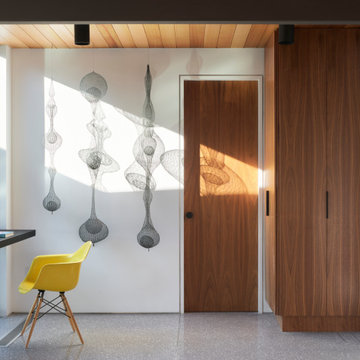
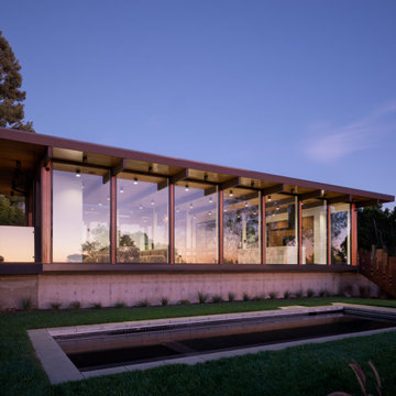
The response emerged in the form of a glass-box pavilion, an open, Mid-Century Modern inspired living, dining, and kitchen space that floats at the edge of the property’s natural descent. Connected to the more enclosed, private areas of the home by a glass-walled hallway, the living pavilion becomes a distinct centerpiece of the design. It opens on all four sides to the landscape with decks and patios on the flanks, an internal garden and water feature to the north, and a dramatic unguarded view of the expansive backyard and ocean horizon to the south.
Because of the mandated footprint, careful planning was required to ensure every space could still engage with light, landscape, or both. Strategic voids in the form of atriums and courtyards allow daylight to filter deep into the home’s core, while offering moments of surprise and retreat. These design gestures allow natural light to filter deep into the interior, creating a sense of brightness and openness throughout the day. At the same time, they expand the perceptual boundaries between inside and out, making the home feel more expansive while anchoring its connection to the surrounding landscape.
The siting of the house is what gives it its unique character. Rather than receding into the backyard like the neighboring homes, the house holds a slight prominence. From the central living pavilion, stepping down into the landscape feels more like entering a secluded park where a separate existing accessory structure, trail, and recreational areas await. The home’s modest street presence gives way to this unfolding drama of space, view, and nature.
Fire-resilient materials and assemblies are integrated seamlessly throughout including triple-pane glazing, under-slab and roof insulation, and locally sourced fire-rated cladding ensure the house not only meets Calfornia’s rigorous wildland-urban interface (WUI) standards, but feels effortlessly aligned with them. While technical decisions like fire-hardening and mechanical systems presented some construction challenges, particularly around the cantilevered glass box, the team found a functional compromise that preserved the integrity of the design.
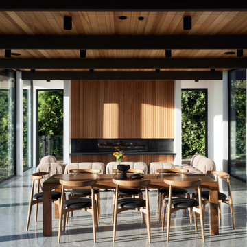
Inside, a restrained palette and exposed post and beam design celebrate the ethos of mid-century modernism. A central circulation spine extends from the entry to the rear glass wall, offering a continuous visual link from street to ocean. Spaces such as the library and office, though more intimate in scale, are never cut off from nature as each opens to its own unique courtyard or garden view.
Though born out of a strict regulatory framework and developed without a specific client, the rebuild design unfolded with remarkable clarity. Grounded in site logic, refined by limitations and an emphasis on timeless spatial relationships – light, proportion, and a strong connection to nature, the resulting design feels both effortless and uplifting. The home lives lightly on the land, opens generously to its surroundings, and strikes a careful balance between privacy, openness, and calm. For Klopf Architecture, it stands as a compelling case study in how site, code, and circumstantial constraints can inspire enduring, modernist architecture. With years of experience reimagining mid-century modern design for how people live today, the firm took the project’s limitations as an opportunity. The result is a home shaped by open, flowing spaces, strong indoor-outdoor connections, and a calm, clear sense of structure. It’s a good reminder that even with strict constraints, there’s still room for architecture to breathe—and for modernism to keep moving forward.
Klopf Architecture project team: Geoff Campen, John Klopf, AIA, and Sherry Tan
Structural Engineer: ZFA
Contractor: Maison D’Artiste
Photography: ©2025 Mariko Reed
Year Completed: 2023
 THE Remodel Group
Sometimes the best solution isn't finding a bigger home, it's reimagining the one you already love. This Portland second-story addition demonstrates how strategic design-build planning can help a growing family gain the space they need while remaining in the neighborhood they never wanted to leave.
Originally, this home was a modest single-level residence with three bedrooms and two bathrooms. As the family's needs evolved, the layout no longer offered the functionality they required. Visiting relatives from California frequently stayed with them, yet the existing floor plan lacked a dedicated guest bathroom. The primary suite was undersized, storage was limited, and the main living room felt cramped for everyday family life. Complicating matters further, the narrow lot provided virtually no opportunity for expansion to the front, sides, or rear of the property. To create meaningful additional square footage, the only option was to build upward.
The transformation began with a complete rethinking of the home's interior organization. An existing bedroom, which had already transitioned into a home office, was removed to make way for a new staircase connecting the first and second floors. Rather than treating the staircase as simply a circulation element, the redesign used it to create a new living area while adding valuable storage beneath. The formerly enclosed dining room was opened to the kitchen and living spaces, resulting in a bright, cohesive great room that dramatically improved both sightlines and daily functionality.
The newly added second floor became the centerpiece of the project. On one side of the addition, a spacious bonus room with vaulted ceilings provides a flexible space for family gatherings, movie nights, homework sessions, and creative projects. Dedicated workstation areas ensure the room can evolve alongside the family's needs while taking advantage of abundant natural light from multiple windows.
On the opposite side, the homeowners finally gained the private retreat they had been missing. The new primary suite features soaring vaulted ceilings, expansive windows, and a walk-in closet approximately six times larger than the home's original primary closet. The adjoining bathroom was designed to balance comfort, practicality, and timeless style, with a double vanity, dedicated linen storage, a separate tiled shower, and a soaking tub that creates a true spa-like experience within the home.
Throughout the renovation, a contemporary transitional aesthetic guided the design selections. New luxury vinyl plank flooring was installed across both the existing first floor and the newly constructed second level, creating visual continuity throughout the home. Matching custom stair treads provide a seamless transition between floors, while updated baseboards and door casings help unify the original structure with the addition so the entire home feels intentionally designed rather than pieced together over time.
The staircase became an architectural focal point, featuring warm wood handrails stained to complement the flooring and black metal balusters that introduce a subtle modern influence. This combination successfully bridges the homeowners' appreciation for contemporary design while respecting the overall character of the home.
Material selections in the primary bathroom create depth through texture rather than bold color contrasts. Softly varied white wall tile ranges from crisp bright whites to subtle cloudy tones, while a gentle watercolor-like surface texture captures and reflects natural light throughout the day. Extending the same tile across both the shower walls and tub surround establishes clean architectural lines and emphasizes the room's spaciousness. Black marble pebble flooring in the shower, paired with matte black plumbing fixtures, mirrors, lighting, and trim details, adds contrast and sophistication without overwhelming the palette.
What makes this project especially meaningful is its ability to solve multiple challenges through a single integrated design-build solution. Through close collaboration with the homeowners and our architectural partner, Candid Design, every square foot was carefully considered to maximize functionality, comfort, and long-term livability. By building upward rather than outward, the homeowners gained a spacious primary suite, an additional living area, improved storage, a dedicated guest bath, and flexible family spaces while preserving the location, character, and community they already loved. The result is a home that feels larger, brighter, and better suited for the next chapter of family life without sacrificing the qualities that made it special in the first place.

 THE Remodel Group
Sometimes the best solution isn't finding a bigger home, it's reimagining the one you already love. This Portland second-story addition demonstrates how strategic design-build planning can help a growing family gain the space they need while remaining in the neighborhood they never wanted to leave.
Originally, this home was a modest single-level residence with three bedrooms and two bathrooms. As the family's needs evolved, the layout no longer offered the functionality they required. Visiting relatives from California frequently stayed with them, yet the existing floor plan lacked a dedicated guest bathroom. The primary suite was undersized, storage was limited, and the main living room felt cramped for everyday family life. Complicating matters further, the narrow lot provided virtually no opportunity for expansion to the front, sides, or rear of the property. To create meaningful additional square footage, the only option was to build upward.
The transformation began with a complete rethinking of the home's interior organization. An existing bedroom, which had already transitioned into a home office, was removed to make way for a new staircase connecting the first and second floors. Rather than treating the staircase as simply a circulation element, the redesign used it to create a new living area while adding valuable storage beneath. The formerly enclosed dining room was opened to the kitchen and living spaces, resulting in a bright, cohesive great room that dramatically improved both sightlines and daily functionality.
The newly added second floor became the centerpiece of the project. On one side of the addition, a spacious bonus room with vaulted ceilings provides a flexible space for family gatherings, movie nights, homework sessions, and creative projects. Dedicated workstation areas ensure the room can evolve alongside the family's needs while taking advantage of abundant natural light from multiple windows.
On the opposite side, the homeowners finally gained the private retreat they had been missing. The new primary suite features soaring vaulted ceilings, expansive windows, and a walk-in closet approximately six times larger than the home's original primary closet. The adjoining bathroom was designed to balance comfort, practicality, and timeless style, with a double vanity, dedicated linen storage, a separate tiled shower, and a soaking tub that creates a true spa-like experience within the home.
Throughout the renovation, a contemporary transitional aesthetic guided the design selections. New luxury vinyl plank flooring was installed across both the existing first floor and the newly constructed second level, creating visual continuity throughout the home. Matching custom stair treads provide a seamless transition between floors, while updated baseboards and door casings help unify the original structure with the addition so the entire home feels intentionally designed rather than pieced together over time.
The staircase became an architectural focal point, featuring warm wood handrails stained to complement the flooring and black metal balusters that introduce a subtle modern influence. This combination successfully bridges the homeowners' appreciation for contemporary design while respecting the overall character of the home.
Material selections in the primary bathroom create depth through texture rather than bold color contrasts. Softly varied white wall tile ranges from crisp bright whites to subtle cloudy tones, while a gentle watercolor-like surface texture captures and reflects natural light throughout the day. Extending the same tile across both the shower walls and tub surround establishes clean architectural lines and emphasizes the room's spaciousness. Black marble pebble flooring in the shower, paired with matte black plumbing fixtures, mirrors, lighting, and trim details, adds contrast and sophistication without overwhelming the palette.
What makes this project especially meaningful is its ability to solve multiple challenges through a single integrated design-build solution. Through close collaboration with the homeowners and our architectural partner, Candid Design, every square foot was carefully considered to maximize functionality, comfort, and long-term livability. By building upward rather than outward, the homeowners gained a spacious primary suite, an additional living area, improved storage, a dedicated guest bath, and flexible family spaces while preserving the location, character, and community they already loved. The result is a home that feels larger, brighter, and better suited for the next chapter of family life without sacrificing the qualities that made it special in the first place.
 THE Remodel Group
Sometimes the best solution isn't finding a bigger home, it's reimagining the one you already love. This Portland second-story addition demonstrates how strategic design-build planning can help a growing family gain the space they need while remaining in the neighborhood they never wanted to leave.
Originally, this home was a modest single-level residence with three bedrooms and two bathrooms. As the family's needs evolved, the layout no longer offered the functionality they required. Visiting relatives from California frequently stayed with them, yet the existing floor plan lacked a dedicated guest bathroom. The primary suite was undersized, storage was limited, and the main living room felt cramped for everyday family life. Complicating matters further, the narrow lot provided virtually no opportunity for expansion to the front, sides, or rear of the property. To create meaningful additional square footage, the only option was to build upward.
The transformation began with a complete rethinking of the home's interior organization. An existing bedroom, which had already transitioned into a home office, was removed to make way for a new staircase connecting the first and second floors. Rather than treating the staircase as simply a circulation element, the redesign used it to create a new living area while adding valuable storage beneath. The formerly enclosed dining room was opened to the kitchen and living spaces, resulting in a bright, cohesive great room that dramatically improved both sightlines and daily functionality.
The newly added second floor became the centerpiece of the project. On one side of the addition, a spacious bonus room with vaulted ceilings provides a flexible space for family gatherings, movie nights, homework sessions, and creative projects. Dedicated workstation areas ensure the room can evolve alongside the family's needs while taking advantage of abundant natural light from multiple windows.
On the opposite side, the homeowners finally gained the private retreat they had been missing. The new primary suite features soaring vaulted ceilings, expansive windows, and a walk-in closet approximately six times larger than the home's original primary closet. The adjoining bathroom was designed to balance comfort, practicality, and timeless style, with a double vanity, dedicated linen storage, a separate tiled shower, and a soaking tub that creates a true spa-like experience within the home.
Throughout the renovation, a contemporary transitional aesthetic guided the design selections. New luxury vinyl plank flooring was installed across both the existing first floor and the newly constructed second level, creating visual continuity throughout the home. Matching custom stair treads provide a seamless transition between floors, while updated baseboards and door casings help unify the original structure with the addition so the entire home feels intentionally designed rather than pieced together over time.
The staircase became an architectural focal point, featuring warm wood handrails stained to complement the flooring and black metal balusters that introduce a subtle modern influence. This combination successfully bridges the homeowners' appreciation for contemporary design while respecting the overall character of the home.
Material selections in the primary bathroom create depth through texture rather than bold color contrasts. Softly varied white wall tile ranges from crisp bright whites to subtle cloudy tones, while a gentle watercolor-like surface texture captures and reflects natural light throughout the day. Extending the same tile across both the shower walls and tub surround establishes clean architectural lines and emphasizes the room's spaciousness. Black marble pebble flooring in the shower, paired with matte black plumbing fixtures, mirrors, lighting, and trim details, adds contrast and sophistication without overwhelming the palette.
What makes this project especially meaningful is its ability to solve multiple challenges through a single integrated design-build solution. Through close collaboration with the homeowners and our architectural partner, Candid Design, every square foot was carefully considered to maximize functionality, comfort, and long-term livability. By building upward rather than outward, the homeowners gained a spacious primary suite, an additional living area, improved storage, a dedicated guest bath, and flexible family spaces while preserving the location, character, and community they already loved. The result is a home that feels larger, brighter, and better suited for the next chapter of family life without sacrificing the qualities that made it special in the first place.
 Klopf Architecture
Malibu Glass Box House by Klopf Architecture
Following the devastating Woolsey Fire of 2018, the site in Malibu offered a unique opportunity to rebuild not just a home, but a new architectural composition that highlighted the property’s potential while navigating strict fire-rebuild codes in the area. Designed by Klopf Architecture, this project embraced a set of limitations and translated them into an architectural asset.
The city’s fire-rebuild process required the new structure to remain close to the original footprint, size and bulk, a constraint that ultimately clarified the architectural direction. Perched near the front of a long, narrow lot, the new home frames and overlooks a private, park-like rear expanse, an uncommon luxury especially in this part of Malibu .
Without a fixed program, the design process allowed for a different kind of creative focus allowing Klopf Architecture the opportunity to explore how a modernist home could best respond to this site. The team approached the project not with a list of requirements, but with a question: How might a modernist live here? What spatial qualities would inspire calm, connection, and a sense of wonder in this setting? The process became less about problem-solving and more about architectural storytelling—letting the site, the light, and the principles of modern design guide the form and flow of the home.
The response emerged in the form of a glass-box pavilion, an open, Mid-Century Modern inspired living, dining, and kitchen space that floats at the edge of the property’s natural descent. Connected to the more enclosed, private areas of the home by a glass-walled hallway, the living pavilion becomes a distinct centerpiece of the design. It opens on all four sides to the landscape with decks and patios on the flanks, an internal garden and water feature to the north, and a dramatic unguarded view of the expansive backyard and ocean horizon to the south.
Because of the mandated footprint, careful planning was required to ensure every space could still engage with light, landscape, or both. Strategic voids in the form of atriums and courtyards allow daylight to filter deep into the home’s core, while offering moments of surprise and retreat. These design gestures allow natural light to filter deep into the interior, creating a sense of brightness and openness throughout the day. At the same time, they expand the perceptual boundaries between inside and out, making the home feel more expansive while anchoring its connection to the surrounding landscape.
The siting of the house is what gives it its unique character. Rather than receding into the backyard like the neighboring homes, the house holds a slight prominence. From the central living pavilion, stepping down into the landscape feels more like entering a secluded park where a separate existing accessory structure, trail, and recreational areas await. The home’s modest street presence gives way to this unfolding drama of space, view, and nature.
Fire-resilient materials and assemblies are integrated seamlessly throughout including triple-pane glazing, under-slab and roof insulation, and locally sourced fire-rated cladding ensure the house not only meets Calfornia’s rigorous wildland-urban interface (WUI) standards, but feels effortlessly aligned with them. While technical decisions like fire-hardening and mechanical systems presented some construction challenges, particularly around the cantilevered glass box, the team found a functional compromise that preserved the integrity of the design.
Inside, a restrained palette and exposed post and beam design celebrate the ethos of mid-century modernism. A central circulation spine extends from the entry to the rear glass wall, offering a continuous visual link from street to ocean. Spaces such as the library and office, though more intimate in scale, are never cut off from nature as each opens to its own unique courtyard or garden view.
Though born out of a strict regulatory framework and developed without a specific client, the rebuild design unfolded with remarkable clarity. Grounded in site logic, refined by limitations and an emphasis on timeless spatial relationships – light, proportion, and a strong connection to nature, the resulting design feels both effortless and uplifting. The home lives lightly on the land, opens generously to its surroundings, and strikes a careful balance between privacy, openness, and calm. For Klopf Architecture, it stands as a compelling case study in how site, code, and circumstantial constraints can inspire enduring, modernist architecture. With years of experience reimagining mid-century modern design for how people live today, the firm took the project’s limitations as an opportunity. The result is a home shaped by open, flowing spaces, strong indoor-outdoor connections, and a calm, clear sense of structure. It’s a good reminder that even with strict constraints, there’s still room for architecture to breathe—and for modernism to keep moving forward.
Klopf Architecture project team: Geoff Campen, John Klopf, AIA, and Sherry Tan
Structural Engineer: ZFA
Contractor: Maison D’Artiste
Photography: ©2025 Mariko Reed
Year Completed: 2023
 Klopf Architecture
Malibu Glass Box House by Klopf Architecture
Following the devastating Woolsey Fire of 2018, the site in Malibu offered a unique opportunity to rebuild not just a home, but a new architectural composition that highlighted the property’s potential while navigating strict fire-rebuild codes in the area. Designed by Klopf Architecture, this project embraced a set of limitations and translated them into an architectural asset.
The city’s fire-rebuild process required the new structure to remain close to the original footprint, size and bulk, a constraint that ultimately clarified the architectural direction. Perched near the front of a long, narrow lot, the new home frames and overlooks a private, park-like rear expanse, an uncommon luxury especially in this part of Malibu .
Without a fixed program, the design process allowed for a different kind of creative focus allowing Klopf Architecture the opportunity to explore how a modernist home could best respond to this site. The team approached the project not with a list of requirements, but with a question: How might a modernist live here? What spatial qualities would inspire calm, connection, and a sense of wonder in this setting? The process became less about problem-solving and more about architectural storytelling—letting the site, the light, and the principles of modern design guide the form and flow of the home.
The response emerged in the form of a glass-box pavilion, an open, Mid-Century Modern inspired living, dining, and kitchen space that floats at the edge of the property’s natural descent. Connected to the more enclosed, private areas of the home by a glass-walled hallway, the living pavilion becomes a distinct centerpiece of the design. It opens on all four sides to the landscape with decks and patios on the flanks, an internal garden and water feature to the north, and a dramatic unguarded view of the expansive backyard and ocean horizon to the south.
Because of the mandated footprint, careful planning was required to ensure every space could still engage with light, landscape, or both. Strategic voids in the form of atriums and courtyards allow daylight to filter deep into the home’s core, while offering moments of surprise and retreat. These design gestures allow natural light to filter deep into the interior, creating a sense of brightness and openness throughout the day. At the same time, they expand the perceptual boundaries between inside and out, making the home feel more expansive while anchoring its connection to the surrounding landscape.
The siting of the house is what gives it its unique character. Rather than receding into the backyard like the neighboring homes, the house holds a slight prominence. From the central living pavilion, stepping down into the landscape feels more like entering a secluded park where a separate existing accessory structure, trail, and recreational areas await. The home’s modest street presence gives way to this unfolding drama of space, view, and nature.
Fire-resilient materials and assemblies are integrated seamlessly throughout including triple-pane glazing, under-slab and roof insulation, and locally sourced fire-rated cladding ensure the house not only meets Calfornia’s rigorous wildland-urban interface (WUI) standards, but feels effortlessly aligned with them. While technical decisions like fire-hardening and mechanical systems presented some construction challenges, particularly around the cantilevered glass box, the team found a functional compromise that preserved the integrity of the design.
Inside, a restrained palette and exposed post and beam design celebrate the ethos of mid-century modernism. A central circulation spine extends from the entry to the rear glass wall, offering a continuous visual link from street to ocean. Spaces such as the library and office, though more intimate in scale, are never cut off from nature as each opens to its own unique courtyard or garden view.
Though born out of a strict regulatory framework and developed without a specific client, the rebuild design unfolded with remarkable clarity. Grounded in site logic, refined by limitations and an emphasis on timeless spatial relationships – light, proportion, and a strong connection to nature, the resulting design feels both effortless and uplifting. The home lives lightly on the land, opens generously to its surroundings, and strikes a careful balance between privacy, openness, and calm. For Klopf Architecture, it stands as a compelling case study in how site, code, and circumstantial constraints can inspire enduring, modernist architecture. With years of experience reimagining mid-century modern design for how people live today, the firm took the project’s limitations as an opportunity. The result is a home shaped by open, flowing spaces, strong indoor-outdoor connections, and a calm, clear sense of structure. It’s a good reminder that even with strict constraints, there’s still room for architecture to breathe—and for modernism to keep moving forward.
Klopf Architecture project team: Geoff Campen, John Klopf, AIA, and Sherry Tan
Structural Engineer: ZFA
Contractor: Maison D’Artiste
Photography: ©2025 Mariko Reed
Year Completed: 2023
 THE Remodel Group
Sometimes the best solution isn't finding a bigger home, it's reimagining the one you already love. This Portland second-story addition demonstrates how strategic design-build planning can help a growing family gain the space they need while remaining in the neighborhood they never wanted to leave.
Originally, this home was a modest single-level residence with three bedrooms and two bathrooms. As the family's needs evolved, the layout no longer offered the functionality they required. Visiting relatives from California frequently stayed with them, yet the existing floor plan lacked a dedicated guest bathroom. The primary suite was undersized, storage was limited, and the main living room felt cramped for everyday family life. Complicating matters further, the narrow lot provided virtually no opportunity for expansion to the front, sides, or rear of the property. To create meaningful additional square footage, the only option was to build upward.
The transformation began with a complete rethinking of the home's interior organization. An existing bedroom, which had already transitioned into a home office, was removed to make way for a new staircase connecting the first and second floors. Rather than treating the staircase as simply a circulation element, the redesign used it to create a new living area while adding valuable storage beneath. The formerly enclosed dining room was opened to the kitchen and living spaces, resulting in a bright, cohesive great room that dramatically improved both sightlines and daily functionality.
The newly added second floor became the centerpiece of the project. On one side of the addition, a spacious bonus room with vaulted ceilings provides a flexible space for family gatherings, movie nights, homework sessions, and creative projects. Dedicated workstation areas ensure the room can evolve alongside the family's needs while taking advantage of abundant natural light from multiple windows.
On the opposite side, the homeowners finally gained the private retreat they had been missing. The new primary suite features soaring vaulted ceilings, expansive windows, and a walk-in closet approximately six times larger than the home's original primary closet. The adjoining bathroom was designed to balance comfort, practicality, and timeless style, with a double vanity, dedicated linen storage, a separate tiled shower, and a soaking tub that creates a true spa-like experience within the home.
Throughout the renovation, a contemporary transitional aesthetic guided the design selections. New luxury vinyl plank flooring was installed across both the existing first floor and the newly constructed second level, creating visual continuity throughout the home. Matching custom stair treads provide a seamless transition between floors, while updated baseboards and door casings help unify the original structure with the addition so the entire home feels intentionally designed rather than pieced together over time.
The staircase became an architectural focal point, featuring warm wood handrails stained to complement the flooring and black metal balusters that introduce a subtle modern influence. This combination successfully bridges the homeowners' appreciation for contemporary design while respecting the overall character of the home.
Material selections in the primary bathroom create depth through texture rather than bold color contrasts. Softly varied white wall tile ranges from crisp bright whites to subtle cloudy tones, while a gentle watercolor-like surface texture captures and reflects natural light throughout the day. Extending the same tile across both the shower walls and tub surround establishes clean architectural lines and emphasizes the room's spaciousness. Black marble pebble flooring in the shower, paired with matte black plumbing fixtures, mirrors, lighting, and trim details, adds contrast and sophistication without overwhelming the palette.
What makes this project especially meaningful is its ability to solve multiple challenges through a single integrated design-build solution. Through close collaboration with the homeowners and our architectural partner, Candid Design, every square foot was carefully considered to maximize functionality, comfort, and long-term livability. By building upward rather than outward, the homeowners gained a spacious primary suite, an additional living area, improved storage, a dedicated guest bath, and flexible family spaces while preserving the location, character, and community they already loved. The result is a home that feels larger, brighter, and better suited for the next chapter of family life without sacrificing the qualities that made it special in the first place.
 THE Remodel Group
Sometimes the best solution isn't finding a bigger home, it's reimagining the one you already love. This Portland second-story addition demonstrates how strategic design-build planning can help a growing family gain the space they need while remaining in the neighborhood they never wanted to leave.
Originally, this home was a modest single-level residence with three bedrooms and two bathrooms. As the family's needs evolved, the layout no longer offered the functionality they required. Visiting relatives from California frequently stayed with them, yet the existing floor plan lacked a dedicated guest bathroom. The primary suite was undersized, storage was limited, and the main living room felt cramped for everyday family life. Complicating matters further, the narrow lot provided virtually no opportunity for expansion to the front, sides, or rear of the property. To create meaningful additional square footage, the only option was to build upward.
The transformation began with a complete rethinking of the home's interior organization. An existing bedroom, which had already transitioned into a home office, was removed to make way for a new staircase connecting the first and second floors. Rather than treating the staircase as simply a circulation element, the redesign used it to create a new living area while adding valuable storage beneath. The formerly enclosed dining room was opened to the kitchen and living spaces, resulting in a bright, cohesive great room that dramatically improved both sightlines and daily functionality.
The newly added second floor became the centerpiece of the project. On one side of the addition, a spacious bonus room with vaulted ceilings provides a flexible space for family gatherings, movie nights, homework sessions, and creative projects. Dedicated workstation areas ensure the room can evolve alongside the family's needs while taking advantage of abundant natural light from multiple windows.
On the opposite side, the homeowners finally gained the private retreat they had been missing. The new primary suite features soaring vaulted ceilings, expansive windows, and a walk-in closet approximately six times larger than the home's original primary closet. The adjoining bathroom was designed to balance comfort, practicality, and timeless style, with a double vanity, dedicated linen storage, a separate tiled shower, and a soaking tub that creates a true spa-like experience within the home.
Throughout the renovation, a contemporary transitional aesthetic guided the design selections. New luxury vinyl plank flooring was installed across both the existing first floor and the newly constructed second level, creating visual continuity throughout the home. Matching custom stair treads provide a seamless transition between floors, while updated baseboards and door casings help unify the original structure with the addition so the entire home feels intentionally designed rather than pieced together over time.
The staircase became an architectural focal point, featuring warm wood handrails stained to complement the flooring and black metal balusters that introduce a subtle modern influence. This combination successfully bridges the homeowners' appreciation for contemporary design while respecting the overall character of the home.
Material selections in the primary bathroom create depth through texture rather than bold color contrasts. Softly varied white wall tile ranges from crisp bright whites to subtle cloudy tones, while a gentle watercolor-like surface texture captures and reflects natural light throughout the day. Extending the same tile across both the shower walls and tub surround establishes clean architectural lines and emphasizes the room's spaciousness. Black marble pebble flooring in the shower, paired with matte black plumbing fixtures, mirrors, lighting, and trim details, adds contrast and sophistication without overwhelming the palette.
What makes this project especially meaningful is its ability to solve multiple challenges through a single integrated design-build solution. Through close collaboration with the homeowners and our architectural partner, Candid Design, every square foot was carefully considered to maximize functionality, comfort, and long-term livability. By building upward rather than outward, the homeowners gained a spacious primary suite, an additional living area, improved storage, a dedicated guest bath, and flexible family spaces while preserving the location, character, and community they already loved. The result is a home that feels larger, brighter, and better suited for the next chapter of family life without sacrificing the qualities that made it special in the first place.
Sponsored
Fredericksburg, OH

High Point Cabinets
Columbus' Experienced Custom Cabinet Builder | 4x Best of Houzz Winner


 First State Building & Design
We expanded an existing deck with new stairs, railing, decking, deck board design, lighting, complete with all post and beam wraps. All decking you see is Zuri decking with Timbertech Rail Systems. We installed riser lights up the stairs with post caps on top of all posts.

 User
Vicenza Grigio Limestone
Inspiration for a large coastal backyard concrete paver patio remodel with no cover
Inspiration for a large coastal backyard concrete paver patio remodel with no cover
Sponsored
Fredericksburg, OH
High Point Cabinets
Columbus' Experienced Custom Cabinet Builder | 4x Best of Houzz Winner
 Simply Home Decorating
This beautiful North Vancouver home belongs to a nature-loving and health-conscious couple, Emma and Vince (names changed), their two young children, and their dog, Jasper. When they contacted us about renovating and furnishing their kitchen and family room, we walked in and saw a world of potential waiting to be uncovered.
Before: Larkhall Crescent Home:
Like many original North Vancouver homes, the interior was definitely dated. We encountered late ‘80s finishes in powder pink and teal green, old carpet, and a kitchen that wasn’t maximized to suit this family’s modern-day lifestyle. However, the size of the rooms offered us a ton of space with which to get creative.
Knowing our clients’ love of cooking, need for work spaces (Emma and Vince both work remotely), and growing family, we developed a design concept that would increase usable space, optimize storage, and create intimacy in this large area. As for the style, we were inspired by their European roots, inventing a new and modern take on “Belgian Farmhouse” style. Now, the home is truly one-of-a-kind.
After: Warm & Cozy Family Room:
Fresh, bright, and comfortable, this living area has been transformed! We started with the fireplace as a focal point, selecting aged brick tiles for added texture and a crisp wood mantle. The taupe-coloured sectional infuses the room with visual warmth and serves the added purpose of separating the family room from the kitchen.
Emma and Vince were also keen on using non-toxic materials in their home, and we were happy to oblige. To meet their needs, we sourced natural wood elements and sought out Canadian-made products - that adhere to high health standards - whenever possible.
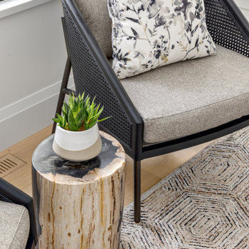
Look closer at the elements of this space, and you will find this stunning, honeycomb-patterned rug in earthy gold, beige, and charcoal tones. It’s plush to the touch and full of visual texture that brings this room’s colour palette together. We sourced these two-tone chairs with caning, petrified wood side table, black sconces, and botanical prints in greyscale from local artist, Heather Johnston.
We topped off the space with this dark wood and rattan console that offers storage facing the kitchen and presents an opportunity to display cherished items. The result is a cozy lounging space brimming with comfort and functionality. It’s perfect for enjoying quality family time, or Emma can simply slide the coffee table away to make room for her morning yoga practice.
Now, let’s turn around and give some attention to the kitchen. Do you remember what the original kitchen looked like? If not, scroll back up, because the transformation is shocking…
Moody & Welcoming Kitchen for Healthy Living:
This kitchen looks very different from how it started, right? Though we didn’t touch any walls, the kitchen has almost doubled in usable space! We created a long, extended island with storage, an outlet for small appliances, and seating for comfortable prep, after-school snacking, or mingling among friends.
On the other side of the island, the family has even more storage and an integrated dishwasher within easy reach of the sink, perfect for quick clean-up. From this angle, you can also see the expansive custom Shaker cabinetry in white and the integrated double ovens. These facilitate their cooking experience and gave us the opportunity to add an additional surprise…
A coffee garage station and more hidden storage! Keeping these items located along the perimeter allows them to be accessed by the family or their guests without someone getting under the cook’s feet. These are the little details that make everyday life easier and more enjoyable.
Moving deeper into the kitchen, the seamless induction cooktop topped with a freestanding concealed hood fan commands attention in a soft yet prominent way. The natural wood accent mirrors the fireplace mantle, and the choice of off-black wood-grain cabinets not only continues our black-and-white colour palette but adds a sense of depth and contrast. The corner sink is located to the right and perfectly positioned with a view of their thriving backyard.
To invite more of this family’s character into the space, we mixed metals for interest — matte black, dark pewter, and warm brass — and created open shelves in white oak for their plants and decor. You can also glimpse the tumbled edge of the backsplash tile, which echoes the rustic brick of the fireplace. It adds that farmhouse charm while still feeling timeless and sophisticated.
Last but not least, we designed this dining banquette in the bay window (with integrated bench storage, of course), where the family can share a meal together, the kids can do homework, or Emma and Vince can work and enjoy a change of scenery from their offices. Like the other spaces in the home, it was designed to be beautiful, multi-functional, and long-lasting.
Praise from Our Clients:
It is clear that we love this home, but what did our clients have to say?
“Lori is a visionary and masters execution to the finest detail all at the same time. When she first met us to know more about who we are and how we live, she could right away envision how we could use the space in our kitchen and living room…The results exceeded our expectations.
Lori and her team were also a delight to work with — coordination with all the trades, fast problem-solving, regular updates, professional and friendly attitude of her entire team — made it the dream team. Thank you SHD for making our space so beautiful!”
In turn, we are so grateful for this family’s trust, their open communication, and for being wonderful people with whom to work. (So, thank you!)
 Arin Carlyle
"Maximize Your Space:
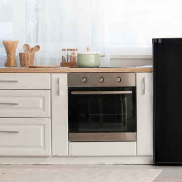
The Upstreman Black BR321 Mini Fridge
I'm a college student living in a tiny dorm room, struggling to keep my snacks, beverages, and leftovers fresh. My regular trips to the communal kitchen fridge are time-consuming and frustrating. I often discover my snacks mysteriously disappearing.
This was the exact situation I found myself in before investing in the Upstreman BR321 Mini Fridge. It was a game-changer for me in more ways than one.
One scorching summer, my friends and I hosted a movie night in my dorm room. We brought our snacks and even ice cream. Given the limited space, I doubted one appliance could handle it all. Still, with a capacity of 3.2 cubic feet, the Upstreman BR321 Mini Fridge exceeded my expectations.
As we stocked the fridge with beverages, the efficient single-door and adjustable thermostat stood out, cooling our drinks to varying preferences seamlessly. It ran quietly during our movie night, its soft 38 dB hum lost amid our enjoyment, unlike the disruptive communal fridge. It operates smoothly on 115 volts.
The freezer impressed us further by keeping the ice cream firm, complementing the ready ice cubes from the included tray. The Upstreman BR321 Mini Fridge proved excellent for storing frozen delights.
Discovering the Upstreman BR321 Mini Fridge's full capabilities was enlightening. Its crisper drawer extended the freshness of my produce, and the removable shelves made for intelligent storage. This fridge became an indispensable time and money saver in my dorm.
The included accessories, like the defrost tool, and responsive customer service added convenience. Outshining other models, it integrated into my college life effortlessly, keeping my food and drinks ideally chilled.
Pros:
1. At 17.4" deep, 33.1" wide, and 18.7" high, this space-saving, single-door design is ideal for snug spaces.
2. Customizable thermostat for personalized cooling.
3. Silent operation that doesn't disrupt your peace.
4. A crisper drawer and removable shelves for organized storage.
5. Comprehensive package with valuable accessories and reliable customer service.
6. Weighing just 39.7 pounds, this item is easily portable.
Cons:
1. None to mention, it exceeded all my expectations.
Conclusion:
The Upstreman BR321 Mini Fridge is a stellar choice for anyone needing a compact, reliable appliance. As a student, it exceeded my expectations, proving itself daily. At around $137.9, it is budget-friendly.
—----------------------------
"Chill in Style:
The Upstreman Black FR-17 Fridge with Freezer
One evening, Dad came home looking troubled. Over dinner, he shared how his office fridge was failing, struggling to keep things cold. He was fed up with its poor performance, which only added to the stresses of his workday. It was clear that a replacement was overdue.
I fondly recall how my trusty Upstreman BR321 became my dorm's cooling hero. I suggested to Dad, "It's time tlack FR-17 model. Confident in the brand's quality, it would be an excellent choice for his office needs.
old replace the old fridge in the office."
Based on my positive experience with the Upstreman BR321, I suggested to my father that he consider the Upstreman B
Sleek and space-efficient, the Upstreman 1.7 Cu.ft Mini Fridge shines in compactness and practicality. At 18.9" x 17.7" x 19.3", it tucks into small spaces easily, an excellent addition to dorms, offices, or bedrooms. The design includes a reversible door, maximizing convenience in snug layouts.
Its cooling prowess is adjustable between 33.8°F and 46.4°F, and it comes with a nifty freezer compartment for keeping edibles ice-cold. Operating at a whisper-quiet 38dB, it ensures a tranquil atmosphere.
Energy consumption is impressively low, about 0.5 kWh per day, using an eco-conscious R600a refrigerant. Upstreman backs this model with a one-year warranty, making the FR17 an intelligent, stress-free choice.
Pros:
1. Compact (18.9" x 17.7" x 19.3") - Fits well in tight spaces.
2. Adjustable thermostat (33.8°F to 46.4°F) - Suits varied storage needs.
3. Quiet (38dB) - Ensures a peaceful environment.
4. Energy-efficient - Only 0.5 kWh daily usage.
5. Eco-friendly - Uses R600a refrigerant, better for the planet.
Cons:
1. Requires manual defrosting, adding to maintenance tasks.
2. It offers minimal freezer space, which is unsuitable for more extensive storage needs.
Conclusion:
Dad's office space is complete with the Upstreman Black FR-17, offering a silent, energy-efficient cooling solution that's both space-saving and perfect for his daily needs, ensuring fresh snacks and drinks are always within reach.
—-----------------------------------------
"Chill in Compact Luxury:
Upstreman's Sleek 3.2 Cu.Ft Double Door Mini Fridge- BD-321"
Nestled amidst our salon's vibrant bustle and the rhythmic snip of scissors, the Upstreman BD321 Mini Double Door Fridge stands as a beacon of excellent efficiency. This sleek, space-conscious appliance, chosen by my mother for its style and functionality, ensures drinks and beauty products are refreshingly cold.
Its well-designed compartments, a 2.2 Cu.Ft cooler alongside a 1 Cu.Ft freezer, maintain our essentials at prime temperatures, from crisp face masks to frosty beverages. The adjustable thermostat and soft LED interior lighting cater to our after-hours operations. At the same time, the versatile shelving accommodates various product sizes.
Costing mere cents to run daily and operating in hushed tones, it's the salon's silent workhorse. With its energy-smart design and customizable options, the Upstreman Mini Double Door Fridge isn't just an appliance—it's a vital part of our daily routine, earning my recommendation for anyone searching for a stylish, reliable mini fridge for personal or professional spaces.
Pros:
1. Compact yet spacious with a 3.2 cubic feet capacity, perfect for small living spaces.
2. Offers five temperature settings and a constant -0.4 F freezer for precise cooling.
3. Features a crisper drawer and removable shelves to keep produce fresh.
4. Quiet (38 dB) operation and energy-efficient, costing roughly $0.1 daily.
5. Customizable with accessories like an ice tray and reversible doors for user convenience.
Cons:
1. Requires manual defrosting, a potential hassle for the time-strapped.
2. The 1 Cu.Ft freezer compartment may be too small for bulk freezing needs.
Conclusion:
My salon's service quality has soared with the Upstreman Mini Double Door Fridge —beverages stay chilled, products remain fresh, and the silent operation keeps the ambiance serene.

 Advance Design Studio, Ltd.
Bud Kane has remodeled nearly every room in his own home over many years. Now reaching his 70’s, he contemplated heading up a major kitchen and laundry room renovation himself, planning on doing the carpentry work with his own hands. “I was not convinced I would ever meet anyone who could do it as well as I could do it myself”, said Bud. Ruth and Bud spent 5 years visiting kitchen firms and interviewing designers. They couldn’t however bring themselves to pull the trigger on the project, until they met Advance Design Studio in 2015.
“No one understood what I wanted”, said Ruth. She was continually frustrated by experiences with designers who weren’t hearing what was important to her. “Everyone kept designing my kitchen with what they thought it should look like; I couldn’t find anyone who would listen to me”!
When they met designer Scott Christensen from Advance Design Studio, they liked him right away. He listened to Ruth and designed a kitchen that she loved, all the while interjecting years of wisdom and design expertise that Ruth appreciated. “The finished product is better than I expected”, says Ruth. “I respected Scott’s opinions and together we created the perfect place for me to bake with my grandkids and truly enjoy the kitchen and laundry room I’ve been dreaming of for many years!”
The kitchen transformation began with removing the home’s soffits, and extending new painted maple cabinetry to the ceiling with the addition of an elegant crown molding. Ruth’s new Vita Mix holds a coveted place on her counter, and adjustments were planned to size the cabinets in conjunction with the under cabinet decorative light molding to fit this appliance just right. “This one small detail was really important to me”, says Ruth smiling. An elegant new island replaced the original island, complete with room for 3 stools where her grandchildren will sit to make home-made pasta every Thanksgiving, and cookies at Christmas time. “Traditions are very important in my family, and making my kitchen work to suit cherished activities with my family was the number one reason this renovation was so desired”, replied Ruth when asked about the island.
A picture perfect new tea station replaced a cluttered unused desk area, creating a wonderful place to prepare hot drinks for sipping any season of the year while overlooking the couple’s wonderfully manicured gardens from the lovely 3 season’s room just off the kitchen. The soft sage island bead panel detail was repeated on the backsplash, replicating the feel of a fine old piece of furniture.
The biggest problem with the laundry room was 3 doors, one from the garage, one from the closet, and one to the hallway. “Scott designed a pocket door, and oh what a dream it is now to bring groceries in from the garage!” exclaims Bud who grew to disdain this task! Doing laundry is now a breeze in this attractive new space that doubles as a wonderful pantry for the kitchen with room to store food items that didn’t have a home in the poorly designed original space.
New Hickory distressed wood flooring was laid both in the kitchen and leading to the hall foyer. Soft gray wood-replicating porcelain was placed in the laundry area, making for an easily cleanable surface for what doubles as a mud room from the garage. Creamy tumbled marble graces an unobtrusive backsplash spilling onto shiny granite counter tops in a rich earthy pattern of fall colors that mimic colors throughout the home. Advance is known details that included custom crafted furniture toe kicks, luxurious crown moldings, and beaded under cabinet moldings. The kitchen is complete with a glass display cabinet showing Ruth’s treasured china tea collection.
Early on, it was initially only their intention of purchasing cabinets for the new design. They were so impressed however with Advance Design’s complete program for budgeting, design, installation and management that it became clear to them both that they wanted Advance to handle the entire project from start to finish. “After seeing the quality work they did, coupled with the in-house team completely dedicated to our satisfaction, it became apparent there was no other choice but to hire them to handle everything. And we’re so glad we did, we have not one regret”, says Bud.
“The attention to detail by the carpentry crew more than satisfied my perfectionist expectations of the finished carpentry,” exclaimed Bud. “Every one of Advance Design’s people we encountered from design through construction was wonderful. We’ve never met a group of people so dedicated to making sure we were happy with every single detail, and every single part of this experience”, said Ruth and Bud.
Designer: Scott Christensen
Photographer: Joe Nowak
137