
Search results for "Radical" in Home Design Ideas
 Everything Home
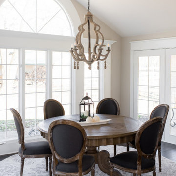
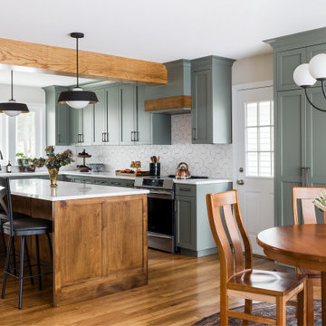
Our design studio designed a gut renovation of this home which opened up the floorplan and radically changed the functioning of the footprint. It features an array of patterned wallpaper, tiles, and floors complemented with a fresh palette, and statement lights.
Photographer - Sarah Shields
---
Project completed by Wendy Langston's Everything Home interior design firm, which serves Carmel, Zionsville, Fishers, Westfield, Noblesville, and Indianapolis.
For more about Everything Home, click here: https://everythinghomedesigns.com/
 Laney LA, Inc.
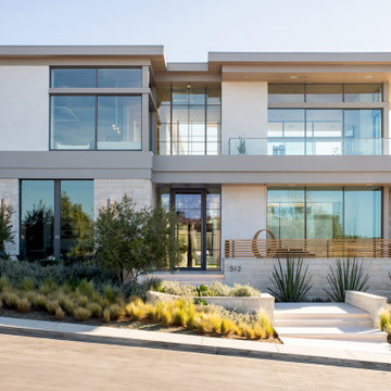
This residence represents the dynamic collaboration between artist and architect. The architectural experience seeks to unite the tactile warmth of earth and clay with the compositional elegance of craft. Against a textured canvas of linen and limestone, light is leveraged to bring dimension and life to the architecture on every level.
Through the radical embrace of nature, guests are greeted by a 16’ tall Australian Brachychiton tree as they enter the double-height entry. The home is organized around a large, outdoor courtyard which creates fluid continuity and access between the indoor and outdoors. From a chandelier of ceramic bells to a locally sourced, custom dining table, every major element has been calibrated to add to timeless composition of the home.
 Laney LA, Inc.
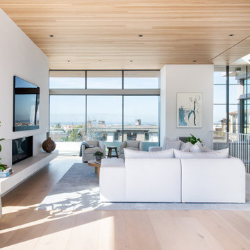
This residence represents the dynamic collaboration between artist and architect. The architectural experience seeks to unite the tactile warmth of earth and clay with the compositional elegance of craft. Against a textured canvas of linen and limestone, light is leveraged to bring dimension and life to the architecture on every level.
Through the radical embrace of nature, guests are greeted by a 16’ tall Australian Brachychiton tree as they enter the double-height entry. The home is organized around a large, outdoor courtyard which creates fluid continuity and access between the indoor and outdoors. From a chandelier of ceramic bells to a locally sourced, custom dining table, every major element has been calibrated to add to timeless composition of the home.
Find the right local pro for your project
 Fabco Sanctuary
The architect and designer Guy Derwent was approached by his client with a clear and compelling brief: to completely transform a grand Victorian terrace house they were planning to renovate. The client envisioned something far beyond a standard renovation – this was to be a bold and dramatic reimagining of a family home that could grow with them over time.
With the property having remained largely untouched for more than fifty years, the architects saw an opportunity to unlock its potential and deliver a contemporary design that would contrast beautifully with its Victorian heritage.
The existing layout consisted of a series of small, disconnected rooms to the rear of the house. To respond to the client’s need for openness and flexibility, the architect proposed a radical restructuring of the ground floor:
The rear rooms were completely removed
Suspended timber floors were lowered by up to two metres to align with the garden
Two bold extensions were added
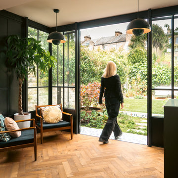
The first extension filled in the side return with a London stock brick facade and a glazed roof, while the second – a striking black steel and glass pavilion was glazed on three sides and placed along the garden elevation.
This new pavilion redefined the building’s relationship with the garden. Its steel-framed glazing created a seamless dialogue between interior and exterior, offering a sense of immersion in the surrounding landscape.
At the heart of the plan sits a dramatic, five-metre-tall dining space that acts as a transition from the original entrance hall into the new addition. A large, circular cast-glass window, framed in steel, provides a visual and spatial link between old and new, allowing light and movement to travel through the depth of the home.
Throughout the project, a series of black metal elements were introduced as sculptural interventions – each marking moments of transformation within the house. These included the bespoke steel framed circular window, a custom metal staircase, a cylindrical support column, and the striking steel and glass garden pavilion. Together, they formed a coherent architectural language that underscored the project’s bold intent.
Our steel windows and doors played a vital role in delivering the project’s vision. The architects chose steel for its refined sight lines and distinctive material character, which helped bridge the gap between the historical context of the building and the bold new additions.
The black steel frames provided a crisp contrast to the pale London stock brick and added definition to the glazed pavilion, reinforcing the sense of architectural precision. In particular, the fine steel profiles of the garden room allowed the extension to feel both lightweight and immersive, blurring the boundary between the house and its garden.
The architect drew inspiration from the Bauhaus Movement, particularly the work of Walter Gropius, whose approach to functional beauty and industrial materials informed the design of the garden pavilion.
Here, our glazing system was used not just for transparency, but as an expressive architectural element. The carefully proportioned panels help to conceal the roof thickness and reinforce the pavilion’s industrial yet abstract character – a deliberate nod to product design and modernist detailing.
Sustainability was an important factor in the selection of materials. Our steel systems, made from 99% recycled content and 100% recyclable, aligned with the project’s broader environmental goals.
The architects noted that this commitment to material longevity and circularity was central to their decision to use steel. The durability and recyclability of the windows and doors ensured the project met both aesthetic and ethical criteria.
This London terrace house now stands as a celebration of contrast – between heritage and innovation, solidity and transparency, tradition and transformation. Our steel windows and doors were not simply components; they were essential tools in crafting a home that is as bold and expressive as it is functional.
The result is a home designed for modern family life, where light, space, and materiality come together in perfect harmony.
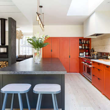
 Granit Architects + Interiors
We are delighted to have completed the radical transformation of a tired detached property in South Croydon.
When they appointed Granit, our clients were living in the property which had previously been divided into a number of flats.
The historic sub-division had resulted in an extremely poor use of space with redundant staircases, kitchens and bathrooms throughout.
Our clients sought to reconfigure the property back into a single dwelling for his growing family.
Our client had an eye for design and was keen to balance contemporary design whilst maintaining as much of the character of the original house.
Maximising natural light, space and establishing a visual and physical connection were also key drivers for the design. Owing to the size of the property, it became apparent that reconfiguration rather than extension provided the solution to meet the brief.
A metal clad ‘intervention’ was introduced to the rear facade. This created a strong horizontal element creating a visual balance with the vertical nature of the three storey gable.
The metal cladding specified echoed the colour of the red brick string courses tying old with new. Slender frame sliding doors provide access and views of the large garden.
The central circulation space was transformed by the introduction of a double height glazed slot wrapping up the rear facade and onto the roof. This allows daylight to permeate into the heart of the otherwise dark deep floor plan. The staircase was reconfigured into a series of landings looking down over the main void space below and out towards the tree canopies at the rear of the garden.
The introduction of double pocket doors throughout the ground floor creates a series of interconnected spaces and the whitewashed Larch flooring flows seamlessly from room to room. A bold palette of colours and materials lends character and texture throughout the property.
The end result is a spacious yet cosy environment for the family to inhabit for years to come.

 Epic Development
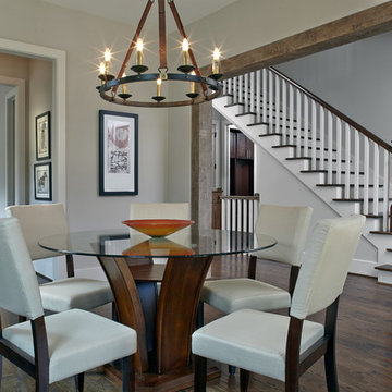
The formal dining room of a new Mediterranean/Transitional style home in Atlanta, Georgia features Jacobean hardwood floors, a beamed doorway to the grand entrance way and a Cavalier 9-Light Chandelier. There is recessed lighting along the left wall to highlight a piece of artwork or furniture. The dining room opens to the butler's pantry making it perfect for entertaining. There are also french doors that open to a flagstone patio on the front of the home. Designed by Price Residential Design; Built by Epic Development; Interior Design by Mike Horton; Photo by Brian Gassel
 Alina Druga Interiors
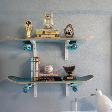
Inspiration for a small contemporary boy teen room remodel in San Francisco with blue walls
 Catherine Truman Architects
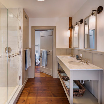
Before the renovation, this 17th century farmhouse was a rabbit warren of small dark rooms with low ceilings. A new owner wanted to keep the character but modernize the house, so CTA obliged, transforming the house completely. The family room, a large but very low ceiling room, was radically transformed by removing the ceiling to expose the roof structure above and rebuilding a more open new stair; the exposed beams were salvaged from an historic barn elsewhere on the property. The kitchen was moved to the former Dining Room, and also opened up to show the vaulted roof. The mud room and laundry were rebuilt to connect the farmhouse to a Barn (See “Net Zero Barn” project), also using salvaged timbers. Original wide plank pine floors were carefully numbered, replaced, and matched where needed. Historic rooms in the front of the house were carefully restored and upgraded, and new bathrooms and other amenities inserted where possible. The project is also a net zero energy project, with solar panels, super insulated walls, and triple glazed windows. CTA also assisted the owner with selecting all interior finishes, furniture, and fixtures. This project won “Best in Massachusetts” at the 2019 International Interior Design Association and was the 2020 Recipient of a Design Citation by the Boston Society of Architects.
Photography by Nat Rea


 Delphinium Design
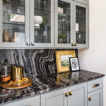
At the bar we used a one-of-a-kind leathered marble countertop and backsplash for the perfect wow factor!
Photography: Tiffany Ringwald
Builder: Ekren Construction
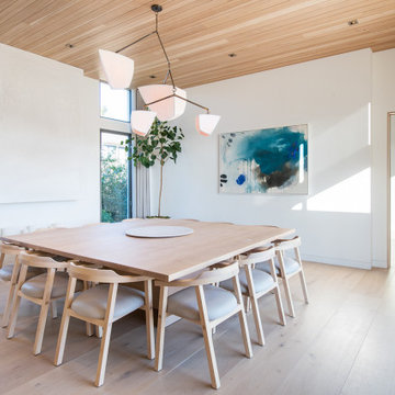 Laney LA, Inc.
This residence represents the dynamic collaboration between artist and architect. The architectural experience seeks to unite the tactile warmth of earth and clay with the compositional elegance of craft. Against a textured canvas of linen and limestone, light is leveraged to bring dimension and life to the architecture on every level.
Through the radical embrace of nature, guests are greeted by a 16’ tall Australian Brachychiton tree as they enter the double-height entry. The home is organized around a large, outdoor courtyard which creates fluid continuity and access between the indoor and outdoors. From a chandelier of ceramic bells to a locally sourced, custom dining table, every major element has been calibrated to add to timeless composition of the home.
 Cantoni Irvine
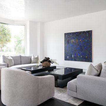
Brad Haines knows a thing or two about building things. The intensely creative and innovative founder of Oklahoma City-based Haines Capital is the driving force behind numerous successful companies including Bank 7 (NASDAQ BSVN), which proudly reported record year-end earnings since going public in September of last year. He has beautifully built, renovated, and personally thumb printed all of his commercial spaces and residences. “Our theory is to keep things sophisticated but comfortable,” Brad says.
That’s the exact approach he took in his personal haven in Nichols Hills, Oklahoma. Painstakingly renovated over the span of two years by Candeleria Foster Design-Build of Oklahoma City, his home boasts museum-white, authentic Venetian plaster walls and ceilings; charcoal tiled flooring; imported marble in the master bath; and a pretty kitchen you’ll want to emulate.
Reminiscent of an edgy luxury hotel, it is a vibe conjured by Cantoni designer Nicole George. “The new remodel plan was all about opening up the space and layering monochromatic color with lots of texture,” says Nicole, who collaborated with Brad on two previous projects. “The color palette is minimal, with charcoal, bone, amber, stone, linen and leather.”
“Sophisticated“Sophisticated“Sophisticated“Sophisticated“Sophisticated
Nicole helped oversee space planning and selection of interior finishes, lighting, furnishings and fine art for the entire 7,000-square-foot home. It is now decked top-to-bottom in pieces sourced from Cantoni, beginning with the custom-ordered console at entry and a pair of Glacier Suspension fixtures over the stairwell. “Every angle in the house is the result of a critical thought process,” Nicole says. “We wanted to make sure each room would be purposeful.”
To that end, “we reintroduced the ‘parlor,’ and also redefined the formal dining area as a bar and drink lounge with enough space for 10 guests to comfortably dine,” Nicole says. Brad’s parlor holds the Swing sectional customized in a silky, soft-hand charcoal leather crafted by prominent Italian leather furnishings company Gamma. Nicole paired it with the Kate swivel chair customized in a light grey leather, the sleek DK writing desk, and the Black & More bar cabinet by Malerba. “Nicole has a special design talent and adapts quickly to what we expect and like,” Brad says.
To create the restaurant-worthy dining space, Nicole brought in a black-satin glass and marble-topped dining table and mohair-velvet chairs, all by Italian maker Gallotti & Radice. Guests can take a post-dinner respite on the adjoining room’s Aston sectional by Gamma.
In the formal living room, Nicole paired Cantoni’s Fashion Affair club chairs with the Black & More cocktail table, and sofas sourced from Désirée, an Italian furniture upholstery company that creates cutting-edge yet comfortable pieces. The color-coordinating kitchen and breakfast area, meanwhile, hold a set of Guapa counter stools in ash grey leather, and the Ray dining table with light-grey leather Cattelan Italia chairs. The expansive loggia also is ideal for entertaining and lounging with the Versa grand sectional, the Ido cocktail table in grey aged walnut and Dolly chairs customized in black nubuck leather. Nicole made most of the design decisions, but, “she took my suggestions seriously and then put me in my place,” Brad says.
She had the master bedroom’s Marlon bed by Gamma customized in a remarkably soft black leather with a matching stitch and paired it with onyx gloss Black & More nightstands. “The furnishings absolutely complement the style,” Brad says. “They are high-quality and have a modern flair, but at the end of the day, are still comfortable and user-friendly.”
The end result is a home Brad not only enjoys, but one that Nicole also finds exceptional. “I honestly love every part of this house,” Nicole says. “Working with Brad is always an adventure but a privilege that I take very seriously, from the beginning of the design process to installation.”
 Laney LA, Inc.
This residence represents the dynamic collaboration between artist and architect. The architectural experience seeks to unite the tactile warmth of earth and clay with the compositional elegance of craft. Against a textured canvas of linen and limestone, light is leveraged to bring dimension and life to the architecture on every level.
Through the radical embrace of nature, guests are greeted by a 16’ tall Australian Brachychiton tree as they enter the double-height entry. The home is organized around a large, outdoor courtyard which creates fluid continuity and access between the indoor and outdoors. From a chandelier of ceramic bells to a locally sourced, custom dining table, every major element has been calibrated to add to timeless composition of the home.
 Haifa Architects
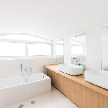
Duplex Y is located in a multi apartment building, typical to the Carmel mountain neighborhoods. The building has several entrances due to the slope it sits on.
Duplex Y has its own separate entrance and a beautiful view towards Haifa bay and the Golan Heights that can be seen on a clear weather day.
The client - a computer high-tech couple, with their two small daughters asked us for a simple and functional design that could remind them of their frequent visits to central and northern Europe. Their request has been accepted.
Our planning approach was simple indeed, maybe even simple in a radical way:
We followed the principle of clean and ultra minimal spaces, that serve their direct mission only.
Complicated geometry of the rooms has been simplified by implementing built-in wood furniture into numerous niches.
The most 'complicated' room (due to its broken geometry, narrow proportions and sloped ceiling) has been turned into a kid's room shaped as a clean 'wood box' for fun, games and 'edutainment'.
The storage room has been refurbished to maximize it's purpose by creating enough space to store 90% of the entire family's demand.
We've tried to avoid unnecessary decoration. 97% of the design has its functional use in addition to its atmospheric qualities.
Several elements like the structural cylindrical column were exposed to show their original material - concrete.
Photos: Julia Berezina
 Isla Homes
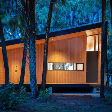
I built this on my property for my aging father who has some health issues. Handicap accessibility was a factor in design. His dream has always been to try retire to a cabin in the woods. This is what he got.
It is a 1 bedroom, 1 bath with a great room. It is 600 sqft of AC space. The footprint is 40' x 26' overall.
The site was the former home of our pig pen. I only had to take 1 tree to make this work and I planted 3 in its place. The axis is set from root ball to root ball. The rear center is aligned with mean sunset and is visible across a wetland.
The goal was to make the home feel like it was floating in the palms. The geometry had to simple and I didn't want it feeling heavy on the land so I cantilevered the structure beyond exposed foundation walls. My barn is nearby and it features old 1950's "S" corrugated metal panel walls. I used the same panel profile for my siding. I ran it vertical to math the barn, but also to balance the length of the structure and stretch the high point into the canopy, visually. The wood is all Southern Yellow Pine. This material came from clearing at the Babcock Ranch Development site. I ran it through the structure, end to end and horizontally, to create a seamless feel and to stretch the space. It worked. It feels MUCH bigger than it is.
I milled the material to specific sizes in specific areas to create precise alignments. Floor starters align with base. Wall tops adjoin ceiling starters to create the illusion of a seamless board. All light fixtures, HVAC supports, cabinets, switches, outlets, are set specifically to wood joints. The front and rear porch wood has three different milling profiles so the hypotenuse on the ceilings, align with the walls, and yield an aligned deck board below. Yes, I over did it. It is spectacular in its detailing. That's the benefit of small spaces.
Concrete counters and IKEA cabinets round out the conversation.
For those who could not live in a tiny house, I offer the Tiny-ish House.
Photos by Ryan Gamma
Staging by iStage Homes
Design assistance by Jimmy Thornton
 CITYDESKSTUDIO, Inc.
Project Team:
Ben Awes, AIA, Principal-In-Charge, Bob Ganser AIA, Nate Dodge
Photographer: Alyssa Lee
www.alyssaleephotography.com
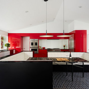
Trendy kitchen photo in Minneapolis
Trendy kitchen photo in Minneapolis
 David Clinkston
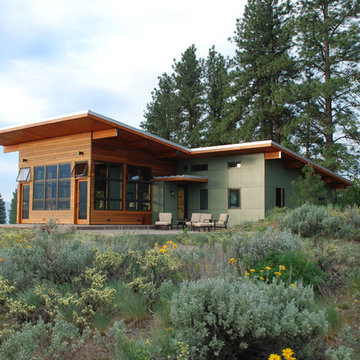
Exterior looking southwest at Hardie panels, cedar rain screen siding, and wood glulam beams. Generous windows in the greatroom provide passive solar heating in the winter months, while deep roof overhangs provide protection from solar gain in the summer months. Photo: William Sarjeant

15