
Search results for "Radical" in Home Design Ideas
 Michael Nash Design, Build & Homes
2011 NARI CAPITAL COTY FINALIST AWARD WINNER
Project Scope--
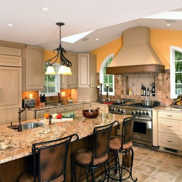
The owners of this 1990’s colonial home were seeking to convert the existing space-constricted builder-grade kitchen into a generously-apportioned Tuscan-style country kitchen with lots of natural light, high-end appointments and a warmly textured interior design concept. Among other features they sought a mid-room island that would house critical appliances, complete the work triangle and provide dining counter space for three. They also wanted to include a professional-grade gas range.
Challenges--
Situated between dining room and family room, the existing kitchen was small and poorly planned. The sink faced a blank wall and the appliances were inadequate for the owner’s gourmet cooking ambitions.
To create the desired footprint, the contractor, Michael Nash Design, Build & Homes, created a plan that called for consolidating square footage in several rooms adjacent to the kitchen. This entailed removing two load bearing walls– one between the kitchen and dining room, a second separating the kitchen and family room– and shifting loads to newly installed structural supports carefully concealed within the resultant “open” floor plan.
To accommodate new appliances (and work efficiencies) called for by this radically altered space plan, the design located the new professional gas range and other key features in the footprint formerly occupied by the breakfast room, a change that takes advantage of opportunities for a higher cathedral ceiling, better natural lighting and greater space.
Solutions--
With this space plan resolved, the design team could now eliminate a picture window on the west elevation, designing a new elevation to accommodate a stucco cooktop flanked by a pair of custom Palladium windows. A side elevation slider was replaced with a French door.
Infrastructure considerations included introducing gas lines needed for the 48” Viking cooktop range and re-routing plumbing. The 5’ x 9’ granite-surfaced custom designed island includes the primary kitchen sink, a dishwasher, microwave and dining overhang that provided seating for up to four.
On another wall, the design called for installing ceiling flush “beaded” display pantries with open bookcases, and routed-in plumbing for a water fountain, a faucet and an ice-making machine.
Glazed maple and cherry cabinetry increased available storage by over 50%. A recessed space was also created for a built-in vertical wine rack. Style-appropriate terra cotta tiling with mosaic bordering detailing extends into the home’s foyer. Other finishing work elements include crown molding with rounded turn posts and corbels.
 Alice Welborn
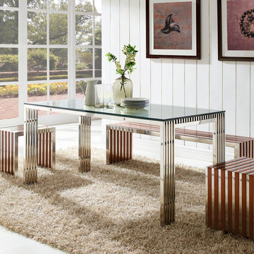
The conduit design of this Gridiron series installment artfully blends stainless steel tubing with a tempered glass table top. Modernism used to be about extremes. Wild shapes and patterns that don’t dare resemble its predecessors. We’ve reached an age of maturity of sorts. We appreciate style, but all the more, we respect those designs that represent a blending of cultures. The Gridiron stainless steel dining table is famous not for its radical shape, but for the strategic transcendence that it provides.
Buy Now
59"w x 31.5"d x 28.5"h
 Rhonda Knoche
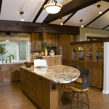
With the walls removed, the display & pantry cabinets act as working walls for the kitchen & create an entry on the opposite side. The beam parallel with the island is original, the beam perpendicular with the island is skinned to replicate it. The motion granite island tapers back for flow & interest.
Find the right local pro for your project
 Grandeur Hills Group,Inc.
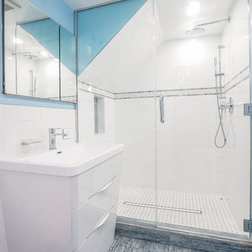
It's easy to see that the entire bathroom interior literally sparkles. White prevails in the bathroom. This color is harmoniously complemented by blue, traditionally associated with water.
With a small amount of household appliances and furniture pieces, the bathroom looks spacious. In addition, a few elegant lamps build in the ceiling also heighten a sense of space, freedom, cleanliness, warmth, and comfort.
Try to radically change the interior design of your bathroom with our top designers and appreciate the quality of their work!
 Lifescape Colorado.
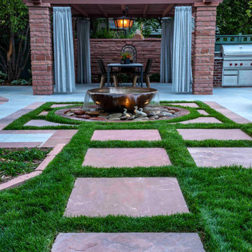
The homeowners of an iconic 1920s Denver home Denver wanted to upgrade their backyard into a tour de force for entertaining. Lifescape had completed the original landscape a decade ago and were called back for the radical transformation.
Designer Josh Ruppert, used a mix of modern tile and classic brick to create a contemporary oasis that ties with the early, 20th-century style of the home.
Additional Design Details:
- An expansive outdoor entertaining space is complete with a fully equipped outdoor kitchen, bar and dining area
- The fireplace design ties to the 1920s architecture with traditional masonry and a chimney cap that matches the home
- A custom copper bowl fountain is the crown jewel, providing a tranquil, contemporary water feature in the center of the space
- The light fixture in the outdoor dining area was custom designed by the Lifescape team to match the fixtures inside the home
 Laney LA, Inc.
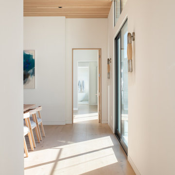
This residence represents the dynamic collaboration between artist and architect. The architectural experience seeks to unite the tactile warmth of earth and clay with the compositional elegance of craft. Against a textured canvas of linen and limestone, light is leveraged to bring dimension and life to the architecture on every level.
Through the radical embrace of nature, guests are greeted by a 16’ tall Australian Brachychiton tree as they enter the double-height entry. The home is organized around a large, outdoor courtyard which creates fluid continuity and access between the indoor and outdoors. From a chandelier of ceramic bells to a locally sourced, custom dining table, every major element has been calibrated to add to timeless composition of the home.
 G. M. Roth Design Remodeling, Inc.
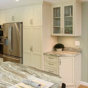
Our Nashua client needed a radical kitchen, dining room and living room re-design. The dining room was closed off from the kitchen, the living room was very dark and was dominated by lots of dark brick, and the kitchen itself had the original oak cabinets and an ineffective layout. They wanted a very sleek look, and good flow between the rooms. We started by opening up the wall between the dining room and kitchen and getting the refrigerator out of the way of the opening. In the kitchen area, we used Ultracraft frameless cabinetry with clean lines and minimalistic details to maximize storage and provide the look they were going for using maple with a melted brie with brown linen glaze finish. Framing floor to ceiling pantry cabinets with hutches on either side on the wall across from the windows provided storage and made the space flow from the living room to the dining room. New windows that climbed from the Fantasy Brown Leathered Quartzite countertop all the way to the ceiling provided tons of natural light to the space. To further simplify the design, we ran the sheetrock right to the windows without a casing, creating a nice, clean look above the countertop material we used as a windowsill. Full height Estrella Silver backsplash over the cooktop added just the right pop. By resurfacing the old brick fireplace with Golden Sand tile, replacing the hearth with a solid slab of slate, adding windows and built in cabinets on either side of the fireplace, and installing a large French door leading out to the three season room, we brightened up the living room and tied it into the kitchen itself. Creating a recess in the new fireplace for a wide screen TV created a logical furniture placement that made the space as useful as it is attractive. Wide plank, rustic oak flooring throughout the space offset the cabinets beautifully and added to the continuity of the space overall. The clients are thrilled with the look and flow of their new space.
 Catherine Truman Architects
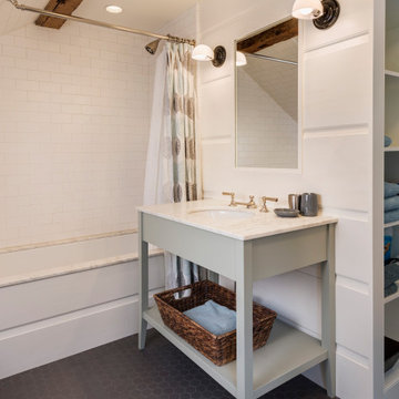
Before the renovation, this 17th century farmhouse was a rabbit warren of small dark rooms with low ceilings. A new owner wanted to keep the character but modernize the house, so CTA obliged, transforming the house completely. The family room, a large but very low ceiling room, was radically transformed by removing the ceiling to expose the roof structure above and rebuilding a more open new stair; the exposed beams were salvaged from an historic barn elsewhere on the property. The kitchen was moved to the former Dining Room, and also opened up to show the vaulted roof. The mud room and laundry were rebuilt to connect the farmhouse to a Barn (See “Net Zero Barn” project), also using salvaged timbers. Original wide plank pine floors were carefully numbered, replaced, and matched where needed. Historic rooms in the front of the house were carefully restored and upgraded, and new bathrooms and other amenities inserted where possible. The project is also a net zero energy project, with solar panels, super insulated walls, and triple glazed windows. CTA also assisted the owner with selecting all interior finishes, furniture, and fixtures. This project won “Best in Massachusetts” at the 2019 International Interior Design Association and was the 2020 Recipient of a Design Citation by the Boston Society of Architects.
Photography by Nat Rea
 IntegraStone
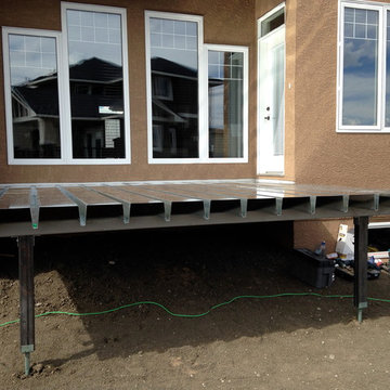
Metal Comp. A galvanized structural steel decking system that fully integrates with our IntegraStone tile system.
Metal Comp radically changes the way decks are built because we can now build deck structures that last for generations, while still being cost effective. Metal Comp is: structural, waterproof and a non-combustible decking system that is made from 25 % recycled materials. The integrity of the whole system will remain for generations without shifting, warping or rotting. We create new possibilities for luxury outdoor living.
Metal Comp Deck System is manufactured in components that can be assembled and built by certified builders. The Metal Comp Deck System is ordered to size and is delivered with all the components required to build the structure and tile the deck. We remove the “running around” that builders typically face in construction. Our goal is to provide the builder with all the materials that they will need to for the entire job


 Fabco Sanctuary
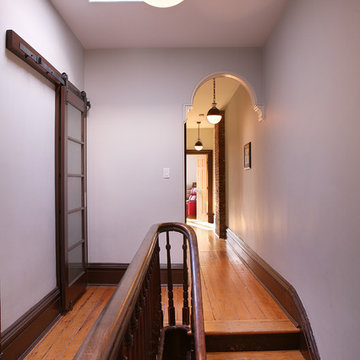
The architect and designer Guy Derwent was approached by his client with a clear and compelling brief: to completely transform a grand Victorian terrace house they were planning to renovate. The client envisioned something far beyond a standard renovation – this was to be a bold and dramatic reimagining of a family home that could grow with them over time.
With the property having remained largely untouched for more than fifty years, the architects saw an opportunity to unlock its potential and deliver a contemporary design that would contrast beautifully with its Victorian heritage.
The existing layout consisted of a series of small, disconnected rooms to the rear of the house. To respond to the client’s need for openness and flexibility, the architect proposed a radical restructuring of the ground floor:
The rear rooms were completely removed
Suspended timber floors were lowered by up to two metres to align with the garden
Two bold extensions were added
The first extension filled in the side return with a London stock brick facade and a glazed roof, while the second – a striking black steel and glass pavilion was glazed on three sides and placed along the garden elevation.
This new pavilion redefined the building’s relationship with the garden. Its steel-framed glazing created a seamless dialogue between interior and exterior, offering a sense of immersion in the surrounding landscape.
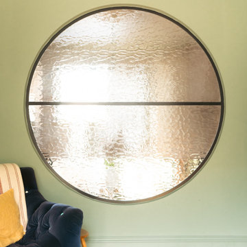
At the heart of the plan sits a dramatic, five-metre-tall dining space that acts as a transition from the original entrance hall into the new addition. A large, circular cast-glass window, framed in steel, provides a visual and spatial link between old and new, allowing light and movement to travel through the depth of the home.
Throughout the project, a series of black metal elements were introduced as sculptural interventions – each marking moments of transformation within the house. These included the bespoke steel framed circular window, a custom metal staircase, a cylindrical support column, and the striking steel and glass garden pavilion. Together, they formed a coherent architectural language that underscored the project’s bold intent.
Our steel windows and doors played a vital role in delivering the project’s vision. The architects chose steel for its refined sight lines and distinctive material character, which helped bridge the gap between the historical context of the building and the bold new additions.
The black steel frames provided a crisp contrast to the pale London stock brick and added definition to the glazed pavilion, reinforcing the sense of architectural precision. In particular, the fine steel profiles of the garden room allowed the extension to feel both lightweight and immersive, blurring the boundary between the house and its garden.
The architect drew inspiration from the Bauhaus Movement, particularly the work of Walter Gropius, whose approach to functional beauty and industrial materials informed the design of the garden pavilion.
Here, our glazing system was used not just for transparency, but as an expressive architectural element. The carefully proportioned panels help to conceal the roof thickness and reinforce the pavilion’s industrial yet abstract character – a deliberate nod to product design and modernist detailing.
Sustainability was an important factor in the selection of materials. Our steel systems, made from 99% recycled content and 100% recyclable, aligned with the project’s broader environmental goals.
The architects noted that this commitment to material longevity and circularity was central to their decision to use steel. The durability and recyclability of the windows and doors ensured the project met both aesthetic and ethical criteria.
This London terrace house now stands as a celebration of contrast – between heritage and innovation, solidity and transparency, tradition and transformation. Our steel windows and doors were not simply components; they were essential tools in crafting a home that is as bold and expressive as it is functional.
The result is a home designed for modern family life, where light, space, and materiality come together in perfect harmony.
 Classic Kitchens Designs & Renovations Ltd.
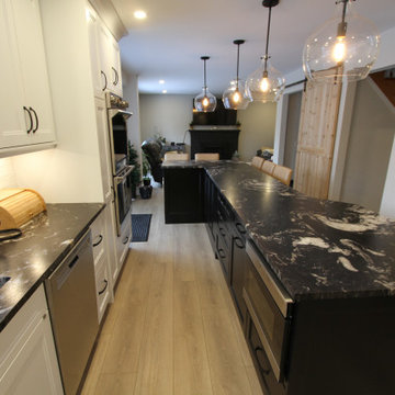
Our homeowner started with a deep red wood kitchen and a divided space which really needed brightening and opening up to make the use of space much more efficient. We started by removing a loadbearing wall separating the kitchen from the dining room and installing a new beam. We also opened the wall to the family room to create a unified space. New Wide Plank Luxury vinyl flooring and custom Benjamin Moore painted cabinetry were installed, followed by real "Platinum" granite countertops....stunning! Custom lighting was added to work with the new space and tile backsplash was installed to complete the look. What a radical difference from where we started and a beautiful new look that will thrill the owners for many years! Have a look at the before photos too.
 Haifa Architects
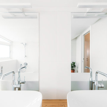
Duplex Y is located in a multi apartment building, typical to the Carmel mountain neighborhoods. The building has several entrances due to the slope it sits on.
Duplex Y has its own separate entrance and a beautiful view towards Haifa bay and the Golan Heights that can be seen on a clear weather day.
The client - a computer high-tech couple, with their two small daughters asked us for a simple and functional design that could remind them of their frequent visits to central and northern Europe. Their request has been accepted.
Our planning approach was simple indeed, maybe even simple in a radical way:
We followed the principle of clean and ultra minimal spaces, that serve their direct mission only.
Complicated geometry of the rooms has been simplified by implementing built-in wood furniture into numerous niches.
The most 'complicated' room (due to its broken geometry, narrow proportions and sloped ceiling) has been turned into a kid's room shaped as a clean 'wood box' for fun, games and 'edutainment'.
The storage room has been refurbished to maximize it's purpose by creating enough space to store 90% of the entire family's demand.
We've tried to avoid unnecessary decoration. 97% of the design has its functional use in addition to its atmospheric qualities.
Several elements like the structural cylindrical column were exposed to show their original material - concrete.
Photos: Julia Berezina
 Granit Architects + Interiors
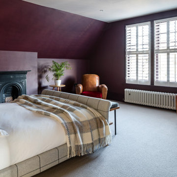
We are delighted to have completed the radical transformation of a tired detached property in South Croydon.
When they appointed Granit, our clients were living in the property which had previously been divided into a number of flats.
The historic sub-division had resulted in an extremely poor use of space with redundant staircases, kitchens and bathrooms throughout.
Our clients sought to reconfigure the property back into a single dwelling for his growing family.
Our client had an eye for design and was keen to balance contemporary design whilst maintaining as much of the character of the original house.
Maximising natural light, space and establishing a visual and physical connection were also key drivers for the design. Owing to the size of the property, it became apparent that reconfiguration rather than extension provided the solution to meet the brief.
A metal clad ‘intervention’ was introduced to the rear facade. This created a strong horizontal element creating a visual balance with the vertical nature of the three storey gable.
The metal cladding specified echoed the colour of the red brick string courses tying old with new. Slender frame sliding doors provide access and views of the large garden.
The central circulation space was transformed by the introduction of a double height glazed slot wrapping up the rear facade and onto the roof. This allows daylight to permeate into the heart of the otherwise dark deep floor plan. The staircase was reconfigured into a series of landings looking down over the main void space below and out towards the tree canopies at the rear of the garden.
The introduction of double pocket doors throughout the ground floor creates a series of interconnected spaces and the whitewashed Larch flooring flows seamlessly from room to room. A bold palette of colours and materials lends character and texture throughout the property.
The end result is a spacious yet cosy environment for the family to inhabit for years to come.
 Grandeur Hills Group,Inc.
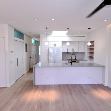
Despite the fact that most of this kitchen interior surfaces are decorated in white, the kitchen space looks partly purple thanks to the special lighting, consisting of large ball-shaped pendant lights that emphasize the main functional areas in the kitchen, and stylish miniature lamps built into the ceiling that act as background lighting. The play of light and shadow and subtle color transitions create a warm, cozy and welcoming atmosphere inside the kitchen.
Change radically interior design of your own kitchen together with professional interior designers from the Grandeur Hills Group design studio.
 EcoCraft Homes
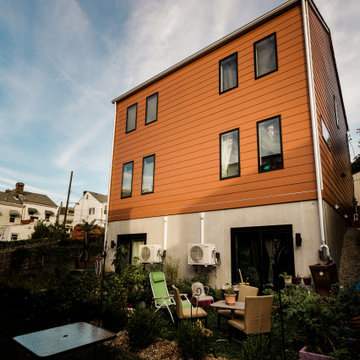
In collaboration with the Lawrenceville Corporation, Rothschild Doyno, and The Urban Redevelopment Authority, EcoCraft Homes is helping to redefine the image of affordable urban housing. Working through a newly defined mechanism called the “Community Land Trust” program Lawrenceville Corporation is pioneering a new standard for community development and affordable home ownership.
Phase one of the CLT development consists of 6 new and one renovation unit that are built with materials that are equal to, or often times of a higher quality than the market rate homes that Lawrenceville has become known for. In addition, every CLT home has been designed to seamlessly integrate into existing historical fabric of Upper Lawrenceville by respecting and implementing design elements from contextual neighborhood patterns.
The CLT design team’s radically different approach to sustainability, resiliency, and energy efficiency will ensure the affordability of these homes remain intact for generations, challenging the idea that affordability should equate to compromises in the quality of living.
 Studio41 Home Design Showroom
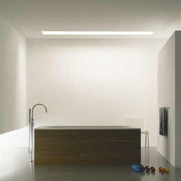
LET'S GET PHYSICAL. | TARA LOGIC takes up the form of the Tara Classic single-lever mixer and radically modernizes it, although it is still instantly recognizable. It is narrower, extends upwards – but still has the same reduced design based on a cylindrical structure. Whether as a shower stem or a free-standing single-lever mixer on the tub, TARA LOGIC reaches elegantly upwards. It looks well-toned and encourages us to emulate it. Because there is no rosette, it looks even more streamlined and aspiring.
This results in a progressive, minimalistic verticality that can be transferred to the architecture and design of the bathroom. | Available at www.shopstudio41.com
 Jeremy J. Quinn Architecture & Design
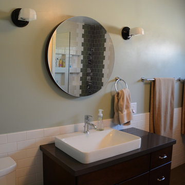
Radical transformation of 1940s blue and pink tile bath to a more contemporary style, with open shower and vintage soaking tub
Example of a transitional bathroom design in Los Angeles
Example of a transitional bathroom design in Los Angeles
 Sherwin-Williams
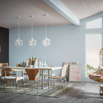
Sustainable design and radical transparency are the new standards. As our daily transactions move further into the cloud, acquiring experiences is becoming preferable to buying more things. "Doing good" is the new looking good, and it’s taking the form of "voluntourism," healing retreats and eco-travel. We’re in pursuit of an elusive ideal: a fair luxury. The roads of this journey are lined with arctic neutrals, blush rose and wild browns.
Mountain Air SW 6224
Stardew SW 9138
Coral Island SW 6332
Acier SW 9170
Casa Blanca SW 7571
Gale Force SW 7605
Brandywine SW 7710
Sheraton Sage SW 0014
Roycroft RoseSW 0034
Deep Forest Brown SW 9175
42