
Search results for "Radical" in Home Design Ideas

 Søren Vincents Svendsen
The Poul Henningsen designed PH Bow Piano is a radical departure from the expectation of how a wooden-cased piano should be presented. It was Poul Henningsen’s innate belief that when designing a piece of furniture form should always follow function and that the practical performance of his creation was of paramount importance. PH also believed that it was possible to redesign many everyday objects and pieces of furniture in such away that not only would they function better but they would also be more aesthetically pleasing. The PH Bow Piano is no exception to this philosophy.
 Haifa Architects
Duplex Y is located in a multi apartment building, typical to the Carmel mountain neighborhoods. The building has several entrances due to the slope it sits on.
Duplex Y has its own separate entrance and a beautiful view towards Haifa bay and the Golan Heights that can be seen on a clear weather day.
The client - a computer high-tech couple, with their two small daughters asked us for a simple and functional design that could remind them of their frequent visits to central and northern Europe. Their request has been accepted.
Our planning approach was simple indeed, maybe even simple in a radical way:
We followed the principle of clean and ultra minimal spaces, that serve their direct mission only.
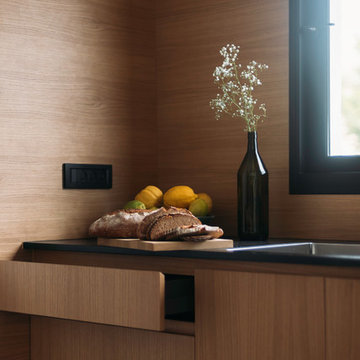
Complicated geometry of the rooms has been simplified by implementing built-in wood furniture into numerous niches.
The most 'complicated' room (due to its broken geometry, narrow proportions and sloped ceiling) has been turned into a kid's room shaped as a clean 'wood box' for fun, games and 'edutainment'.
The storage room has been refurbished to maximize it's purpose by creating enough space to store 90% of the entire family's demand.
We've tried to avoid unnecessary decoration. 97% of the design has its functional use in addition to its atmospheric qualities.
Several elements like the structural cylindrical column were exposed to show their original material - concrete.
Photos: Julia Berezina
 IntegraStone
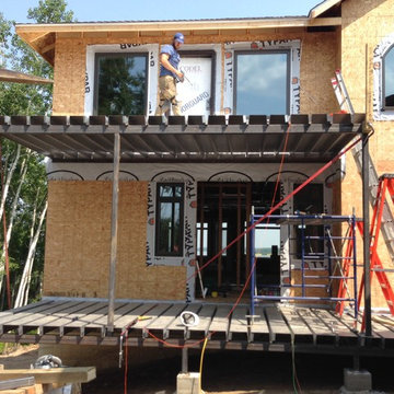
Metal Comp. A galvanized structural steel decking system that fully integrates with our IntegraStone tile system.
Metal Comp radically changes the way decks are built because we can now build deck structures that last for generations, while still being cost effective. Metal Comp is: structural, waterproof and a non-combustible decking system that is made from 25 % recycled materials. The integrity of the whole system will remain for generations without shifting, warping or rotting. We create new possibilities for luxury outdoor living.
Metal Comp Deck System is manufactured in components that can be assembled and built by certified builders. The Metal Comp Deck System is ordered to size and is delivered with all the components required to build the structure and tile the deck. We remove the “running around” that builders typically face in construction. Our goal is to provide the builder with all the materials that they will need to for the entire job
Find the right local pro for your project
 Turner Design Firm
The exquisite transformation of the kitchen in Silo Point Luxury Condominiums is a masterpiece of refinement—a testament to elegant design and optimized spatial planning.
Jeanine Turner, the creative force behind Turner Design Firm, skillfully orchestrated this renovation with a clear vision—to harness and amplify the breathtaking views that the condominium's generous glass expanses offer from the open floor plan.
Central to the renovation's success was the decisive removal of the walls that previously enclosed the refrigerator. This bold move radically enhanced the flow of the space, allowing for an uninterrupted visual connection from the kitchen through to the plush lounge and elegant dining area, and culminating in an awe-inspiring, unobstructed view of the harbor through the stately full-height windows.
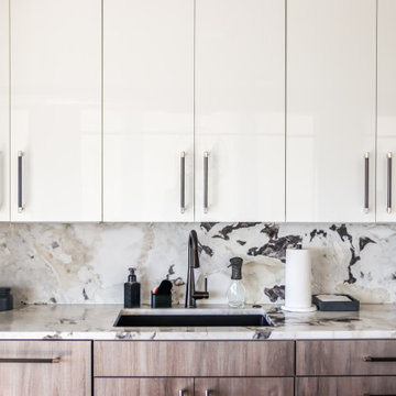
A testament to the renovation's meticulous attention to detail, the selection of the quartzite countertops resulted from an extensive and discerning search. Creating the centerpiece of the renovation, these breathtaking countertops stand out as a dazzling focal point amidst the kitchen's chic interiors, their natural beauty and resilience matching the aesthetic and functional needs of this sophisticated culinary setting.
This redefined kitchen now boasts a seamless balance of form and function. The new design elegantly delineates the area into four distinct yet harmonious zones. The high-performance kitchen area is a chef's dream, with top-of-the-line appliances and ample workspace. Adjacent to it lies the inviting lounge, furnished with plush seating that encourages relaxation and conversation. The elegant dining space beckons with its sophisticated ambiance, while the charming coffee nook provides a serene escape for savoring a morning espresso or a peaceful afternoon read.
Turner Design Firm's team member, Tessea McCrary, collaborated closely with the clients, ensuring the furniture selections echoed the homeowners' tastes and preferences, resulting in a living space that feels both luxurious and inviting.
 Catherine Truman Architects
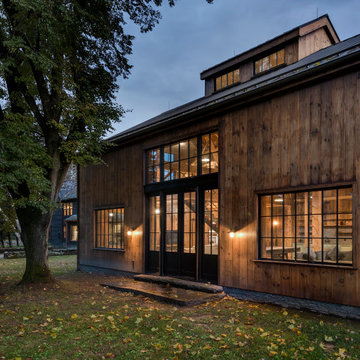
Before the renovation, this 17th century farmhouse was a rabbit warren of small dark rooms with low ceilings. A new owner wanted to keep the character but modernize the house, so CTA obliged, transforming the house completely. The family room, a large but very low ceiling room, was radically transformed by removing the ceiling to expose the roof structure above and rebuilding a more open new stair; the exposed beams were salvaged from an historic barn elsewhere on the property. The kitchen was moved to the former Dining Room, and also opened up to show the vaulted roof. The mud room and laundry were rebuilt to connect the farmhouse to a Barn (See “Net Zero Barn” project), also using salvaged timbers. Original wide plank pine floors were carefully numbered, replaced, and matched where needed. Historic rooms in the front of the house were carefully restored and upgraded, and new bathrooms and other amenities inserted where possible. The project is also a net zero energy project, with solar panels, super insulated walls, and triple glazed windows. CTA also assisted the owner with selecting all interior finishes, furniture, and fixtures. This project won “Best in Massachusetts” at the 2019 International Interior Design Association and was the 2020 Recipient of a Design Citation by the Boston Society of Architects.
Photography by Nat Rea
 Grandeur Hills Group,Inc.
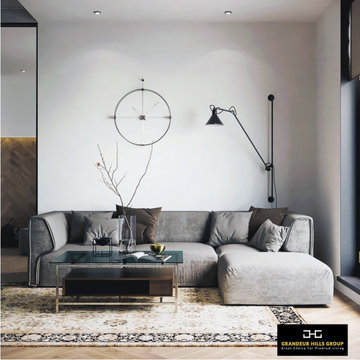
The main advantage of this amazing living room is light, which not only makes the living room bright and visually spacious, but also creates a cozy, warm, and welcoming atmosphere inside this room.
Thanks to the large windows, the living room is always filled with fresh clean air and light during the day. At night and in the evening, the living room is illuminated by lamps built into the ceiling, pendant lamps, and stylish sconces.
If your living room interior needs radical changes, don’t hesitate to contact the best Grandeur Hills Group interior designers who are certain to make your living room look great!
 European Marble & Granite
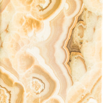
This blooming stone is Radice Polished Onyx & Bronzo Honed Quartzite.
Living room - modern living room idea in Salt Lake City with multicolored walls and a stone fireplace
Living room - modern living room idea in Salt Lake City with multicolored walls and a stone fireplace
 G. M. Roth Design Remodeling, Inc.
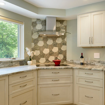
Our Nashua client needed a radical kitchen, dining room and living room re-design. The dining room was closed off from the kitchen, the living room was very dark and was dominated by lots of dark brick, and the kitchen itself had the original oak cabinets and an ineffective layout. They wanted a very sleek look, and good flow between the rooms. We started by opening up the wall between the dining room and kitchen and getting the refrigerator out of the way of the opening. In the kitchen area, we used Ultracraft frameless cabinetry with clean lines and minimalistic details to maximize storage and provide the look they were going for using maple with a melted brie with brown linen glaze finish. Framing floor to ceiling pantry cabinets with hutches on either side on the wall across from the windows provided storage and made the space flow from the living room to the dining room. New windows that climbed from the Fantasy Brown Leathered Quartzite countertop all the way to the ceiling provided tons of natural light to the space. To further simplify the design, we ran the sheetrock right to the windows without a casing, creating a nice, clean look above the countertop material we used as a windowsill. Full height Estrella Silver backsplash over the cooktop added just the right pop. By resurfacing the old brick fireplace with Golden Sand tile, replacing the hearth with a solid slab of slate, adding windows and built in cabinets on either side of the fireplace, and installing a large French door leading out to the three season room, we brightened up the living room and tied it into the kitchen itself. Creating a recess in the new fireplace for a wide screen TV created a logical furniture placement that made the space as useful as it is attractive. Wide plank, rustic oak flooring throughout the space offset the cabinets beautifully and added to the continuity of the space overall. The clients are thrilled with the look and flow of their new space.
 Spring Creek Design
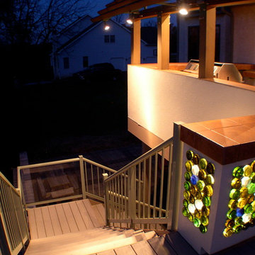
This home was a typical Toll Brothers contemporary from the early ‘90’s. The exterior had reached the end of its life, with decayed cedar siding and a deteriorated roof. Greg & Tamara decided to use this opportunity to radically remake their home - to update its modern appeal and set it apart from any other suburban tract house. Spring Creek Design created a new deck, new siding design, entryways and sculptural landscaping for the home.
Design Criteria:
- Replace siding and give the home a bold, modern look.
- Update the home’s landscaping with a spare modernism.
- Add a new deck with an outdoor kitchen.
Special Features:
- Bold new exterior features fiber-cement panels and siding.
-Three different colors are used to clearly define the shapes of the home.
- Cantilevered concrete entryways features “floating” concrete slab landings.
- Azek deck with tempered glass railings.
- Custom wine-bottle light fixtures adorn the outdoor kitchen.
- Massive planting boxes of Cor-Ten steel form the basis of a low-maintenance, dramatic landscape.
- Custom-fabricated square gutters and downspouts compliment the linearity of the home’s design.
 Building Designers Association of Australia
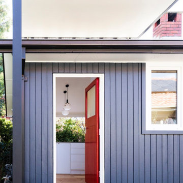
Major alterations to the structure completely changed the way the existing spaces felt and functioned. A pitched ceiling replaced the flat livingroom ceiling. Large sliding doors opened the living room directly onto the deck. This functionally doubled the size of the living areas, despite not increasing the footprint. The master bedroom received large stacking slider opening onto the deck, designed for privacy from the living area. Laundry and kitchen are combined with ample storage behind minimalist cabinetry. Storage and bench space are maximised while keeping everything open and airy. The white cabinetry reduces the bulk of so much storage in a smaller space. New insulation, uPVC windows and energy efficient blinds improved thermal performance. A cold house became warm, inviting,cheaper to heat and cool. The outside of the building received new window frames, colour palette, deck, facade lightling, downpipes and gutters. Retaining cladding + floors made this a cost-effective, + radical transformation.
 Granit Architects + Interiors
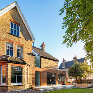
We are delighted to have completed the radical transformation of a tired detached property in South Croydon.
When they appointed Granit, our clients were living in the property which had previously been divided into a number of flats.
The historic sub-division had resulted in an extremely poor use of space with redundant staircases, kitchens and bathrooms throughout.
Our clients sought to reconfigure the property back into a single dwelling for his growing family.
Our client had an eye for design and was keen to balance contemporary design whilst maintaining as much of the character of the original house.
Maximising natural light, space and establishing a visual and physical connection were also key drivers for the design. Owing to the size of the property, it became apparent that reconfiguration rather than extension provided the solution to meet the brief.
A metal clad ‘intervention’ was introduced to the rear facade. This created a strong horizontal element creating a visual balance with the vertical nature of the three storey gable.
The metal cladding specified echoed the colour of the red brick string courses tying old with new. Slender frame sliding doors provide access and views of the large garden.
The central circulation space was transformed by the introduction of a double height glazed slot wrapping up the rear facade and onto the roof. This allows daylight to permeate into the heart of the otherwise dark deep floor plan. The staircase was reconfigured into a series of landings looking down over the main void space below and out towards the tree canopies at the rear of the garden.
The introduction of double pocket doors throughout the ground floor creates a series of interconnected spaces and the whitewashed Larch flooring flows seamlessly from room to room. A bold palette of colours and materials lends character and texture throughout the property.
The end result is a spacious yet cosy environment for the family to inhabit for years to come.
 Nip Tuck Remodeling
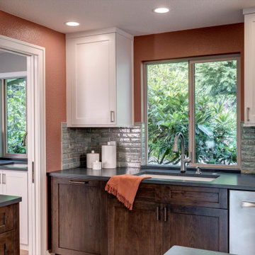
It's not everyday that we get to radically transform the heart of a home. There are often restrictions that keep the kitchen in the kitchen. These clients wanted a vaulted kitchen ceiling, which would have required major roof reconstruction. That is until it was decided to use an adjacent part of the home that already had a vaulted ceiling. The kitchen is now more connected to the living and dining areas, they have a walk-in pantry that better uses the low-ceilings, and with added storage space. Like the clients said we "blew their minds!"
 Schwartz and Architecture
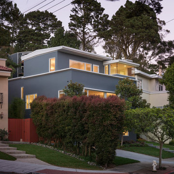
This full remodel of a 3,200 sq ft home in San Francisco’s Forest Hills neighborhood worked within the home’s existing split level organization, but radically expanded the sense of openness and movement through the space. The jewel of the new top floor master suite is a minimalist bathroom surrounded by glass and filled with light. The most private space becomes the most prominent element from the street below.
Photo by Aaron Leitz
 Atelier Renata Santos Machado
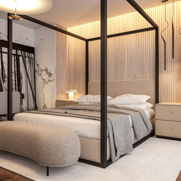
Bedroom render with a canopy bed, marble wall cladding, wood wall covering, dressing table and upholstered bench. The room combines black metal lines with pale stone and warm wood.
 Classic Kitchens Designs & Renovations Ltd.
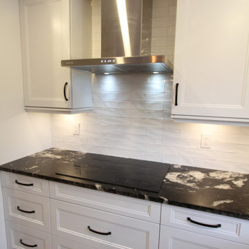
Our homeowner started with a deep red wood kitchen and a divided space which really needed brightening and opening up to make the use of space much more efficient. We started by removing a loadbearing wall separating the kitchen from the dining room and installing a new beam. We also opened the wall to the family room to create a unified space. New Wide Plank Luxury vinyl flooring and custom Benjamin Moore painted cabinetry were installed, followed by real "Platinum" granite countertops....stunning! Custom lighting was added to work with the new space and tile backsplash was installed to complete the look. What a radical difference from where we started and a beautiful new look that will thrill the owners for many years! Have a look at the before photos too.
 Haifa Architects
Duplex Y is located in a multi apartment building, typical to the Carmel mountain neighborhoods. The building has several entrances due to the slope it sits on.
Duplex Y has its own separate entrance and a beautiful view towards Haifa bay and the Golan Heights that can be seen on a clear weather day.
The client - a computer high-tech couple, with their two small daughters asked us for a simple and functional design that could remind them of their frequent visits to central and northern Europe. Their request has been accepted.
Our planning approach was simple indeed, maybe even simple in a radical way:
We followed the principle of clean and ultra minimal spaces, that serve their direct mission only.
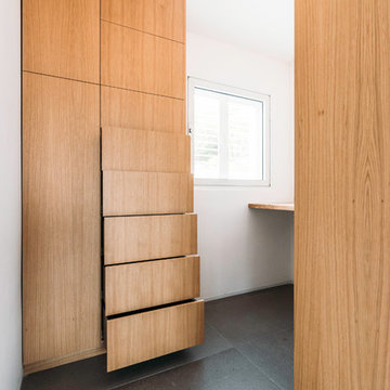
Complicated geometry of the rooms has been simplified by implementing built-in wood furniture into numerous niches.
The most 'complicated' room (due to its broken geometry, narrow proportions and sloped ceiling) has been turned into a kid's room shaped as a clean 'wood box' for fun, games and 'edutainment'.
The storage room has been refurbished to maximize it's purpose by creating enough space to store 90% of the entire family's demand.
We've tried to avoid unnecessary decoration. 97% of the design has its functional use in addition to its atmospheric qualities.
Several elements like the structural cylindrical column were exposed to show their original material - concrete.
Photos: Julia Berezina
 Lifescape Colorado.
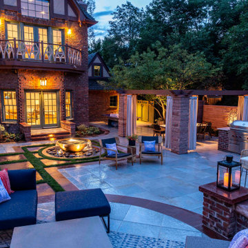
The homeowners of an iconic 1920s Denver home Denver wanted to upgrade their backyard into a tour de force for entertaining. Lifescape had completed the original landscape a decade ago and were called back for the radical transformation.
Designer Josh Ruppert, used a mix of modern tile and classic brick to create a contemporary oasis that ties with the early, 20th-century style of the home.
Additional Design Details:
- An expansive outdoor entertaining space is complete with a fully equipped outdoor kitchen, bar and dining area
- The fireplace design ties to the 1920s architecture with traditional masonry and a chimney cap that matches the home
- A custom copper bowl fountain is the crown jewel, providing a tranquil, contemporary water feature in the center of the space
- The light fixture in the outdoor dining area was custom designed by the Lifescape team to match the fixtures inside the home
44