
Search results for "Real time access" in Home Design Ideas
 TOC design & construction inc.
DESIGNED BY TOC design
CONSTRUCTION BY TOC design & Construction inc.
PHOTOS BY : Tania Scardellato
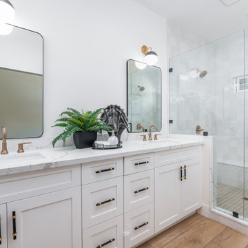
I was fortunate to have a young family approach me in desperate need to renovate there only 3 piece bathroom. This space was In dire need of a remodel, with old brown wall to wall tiles and a dated bulky yellow brown single sink vanity.
Storage was a must, lighting a necessity, and proper accessibility to the shower bath area.
We had a tight budget to respect, but a full gut of this bathroom was required. And a good thing too, once we started doing the demolition we noticed that mildew and rotting floors and walls had accumulated throughout the years. Doing it right the first time is no joke when dealing with water and electrical issues.
We discarded all reminisce of old and built from scratch, new walls, new plumbing, new electrical ,new insulation and a new window, a new fan that actually exhausted outside ( I say this laughing as you would be amazed at how many fans are installed but don’t exhaust outside, and you the client would never know unless you go inside the attic space.
Once all the hard stuff was done, the rest is just a matter of smart design. If you have a small bathroom here are some tips to guide you.
10 tips for making a small bathroom feel larger
Is your tiny bathroom cramping your functionality and style, leaving you longing for the enormous bathrooms gracing the pages of design magazines? Even if your bathroom is a fraction of the size, all it takes is some design savvy to make the most of the space you have. Consider these 10 smart tips that will help your bathroom look, feel and function like those larger contenders.
1-Get creative with corners
Space is at a premium in small bathrooms, so it's important to maximize every inch. Corners, for example, provide extra space for shelving, storage units and even hooks. Get creative and install unique design solutions that are not only functional, but also eye-catching. If you love the airiness of floating cabinets, add baskets or decorative boxes under for extra storage. If you are installing floating cabinets insure that they are installed securely to studs or plywood at wall.
2- Let solid colors shine
Busy patterns have a shrinking effect and make small bathrooms seem even smaller. Conversely, light natural hues make a space feel more open. If you're itching to get creative with design, experiment with textures but keep overpowering patterns to a minimum. Tone on tone is the best to achieve this.
3 - Maximize your bathtub
A bathtub takes up a significant portion of the room, but modern, compact options with curved basins, can make the tub feel larger when in use, all while conserving space.
4 - Select a smaller faucet
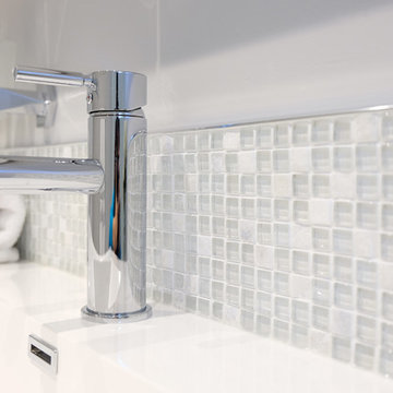
A faucet is jewelry for the bathroom. And just as accessories can overpower an outfit, a big bulky faucet isn't flattering in a small bath. Single-handle designs conserve counter space, while a wall-mount installation frees it up all together and can create quite the wow-factor, if the budget can accommodate the required changes to plumbing behind the wall.
5 - Make vanity storage simple
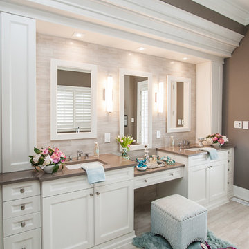
If you're in a storage war with your small bathroom, you're not alone in the battle. Toiletries and personal supplies without a place to call home only add clutter and chaos. Store smart with a space-saving vanity, the dual sink vanity shown here, looks quite simple, but in reality it has 4 sets of full extension drawers, and the vanity tower adds extra storage without overpowering the use of space.
6 - Show off the shower
Shower curtains may be pretty, but they interrupt the visual flow of a bathing space and make it feel significantly smaller. In bathrooms with small footprints, opt for a clear glass sliding shower door that doesn't require the clearance of one with a hinged design. Or as shown in this design and for fraction less expensive a half hinged panel installed on a fixed tempered glass panel. If you're embarking on a big remodel, create the illusion of more space by using same tile in the shower that's used throughout; instead of seeing them as two separate zones, the eye will read them as one.
7 - Discover the treasure of hidden storage
Work with a contractor, and you just might find some serious storage potential hidden behind your walls. Whether it's utilizing space between the studs for shallow shelving or a creating a small linen closet by annexing space from an adjacent room, even small additions can make a big difference.
8 - Focal Point
Tile is a beautiful, durable addition to any bathroom. For dainty spaces, consider installing tile at a diagonal to accentuate the focal point or as in this bathroom I used an oversized textured pattern to bring depth to the space at the window wall.
9 - Choose the right lights
Strategically install light to reflect and brighten a small bathroom to make it appear larger. Recessed lighting is an affordable solution for tiny rooms, offering ample light while taking up little space. Wall sconces alongside a mirror also reflect off the walls and make a room feel bright and airy. I always recommend going with LED lighting at 2800 to 3000K.
10 – Accessorize
This is your time to shine in your decorating skills, have fun with your towels, you can change the color scheme daily just by adding pops of color in your accessories, make sure to get items that serve a dual purpose, like baskets, boxes they can always be used as hampers, storing of towels and even a nice display for your guest.
 Flooret
Part of the Modin Vinyl Plank Collection, Available Exclusively From www.Flooret.com
$3.49 / sq ft, 22.08 sq ft per box
50% WIDER. 25% LONGER. TWICE AS DURABLE
Luxury Vinyl Plank, 5 mm x 9" x 60" (1.0 mm / 40 mil wear-layer)
Lifetime Residential Warranty, 20 year Commercial Warranty
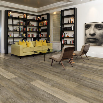
Dramatic, weathered, distinct. For those not afraid to make a statement, Idyllwild is a natural choice. The weathered pattern makes this a floor in motion, with darker and lighter planks intermingled. For those that want a floor that will never feel old or boring, look no further.
REDEFINING DURABILITY
The most important specification for determining the durability of vinyl flooring is the thickness of the wear-layer. The best wear-layers are made of thick, clear virgin PVC, which covers the paper print-film that gives the floor its unique appearance. Once the wear-layer wears through, the paper is damaged and the floor will need replacement.
Most vinyl floors come with a 8-12 mil wear-layer (0.2-3 mm). The top commercial specs in the industry are higher, at 20-22 mil (0.5 mm). A select few manufacturers offer a "super" commercial spec of 28 mil (0.7 mm).
For Modin, we decided to set a new standard: 40 mil (1.0 mm) of premium virgin PVC. This allows us to offer an industry-leading 20 year Commercial Warranty (Lifetime Residential), compared to nearly all other commercial vinyl floors' 10 year Commercial Warranty.
Beyond our superior wear-layer, we also use a patented click mechanism for superior hold, and a ceramic-bead coating.
SIZE MATTERS
Wider and longer planks create a sense of space and luxury. Most vinyl floors come in 6" or 7" widths, and 36" or 48" lengths.
For Modin, we designed our planks to be 9" wide, and 60" long. This extra large size allows our gorgeous designs to be fully expressed.
DETAILS THAT COUNT
We made sure to get all the details right. Real texture, to create the feel of wire-brushed wood. Low sheen level, to ensure a natural look that wears well over time. 4-sided bevels, to more accurately emulate the look of real planks. When added together they help create the unique look that is Modin.
DESIGNS THAT INSPIRE
We spent nearly a year just focusing on our designs, to ensure they provide the right mix of color and depth. Focusing on timeless wire-brush and European Oak styles, as well as more contemporary modern washes, our collection offers truly beautiful design that is both functional and inspiring.
Find the right local pro for your project

 Lori Dennis, ASID, LEED AP
Construction by SoCalContractor.com
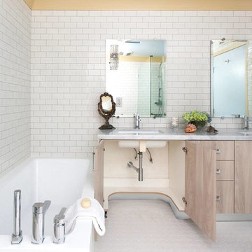
Note how cabinets open for wheelchair accessibility.
Walk-in shower - transitional white tile and ceramic tile walk-in shower idea in Los Angeles with an undermount sink, flat-panel cabinets, light wood cabinets, marble countertops, a one-piece toilet and an undermount tub
Walk-in shower - transitional white tile and ceramic tile walk-in shower idea in Los Angeles with an undermount sink, flat-panel cabinets, light wood cabinets, marble countertops, a one-piece toilet and an undermount tub
 Kowalske Kitchen & Bath
This 1933 Wauwatosa basement was dark, dingy and lacked functionality. The basement was unfinished with concrete walls and floors. A small office was enclosed but the rest of the space was open and cluttered.
The homeowners wanted a warm, organized space for their family. A recent job change meant they needed a dedicated home office. They also wanted a place where their kids could hang out with friends.
Their wish list for this basement remodel included: a home office where the couple could both work, a full bathroom, a cozy living room and a dedicated storage room.
This basement renovation resulted in a warm and bright space that is used by the whole family.
Highlights of this basement:
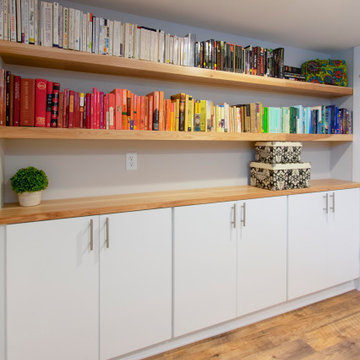
- Home Office: A new office gives the couple a dedicated space for work. There’s plenty of desk space, storage cabinets, under-shelf lighting and storage for their home library.
- Living Room: An old office area was expanded into a cozy living room. It’s the perfect place for their kids to hang out when they host friends and family.
- Laundry Room: The new laundry room is a total upgrade. It now includes fun laminate flooring, storage cabinets and counter space for folding laundry.
- Full Bathroom: A new bathroom gives the family an additional shower in the home. Highlights of the bathroom include a navy vanity, quartz counters, brass finishes, a Dreamline shower door and Kohler Choreograph wall panels.
- Staircase: We spruced up the staircase leading down to the lower level with patterned vinyl flooring and a matching trim color.
- Storage: We gave them a separate storage space, with custom shelving for organizing their camping gear, sports equipment and holiday decorations.
CUSTOMER REVIEW
“We had been talking about remodeling our basement for a long time, but decided to make it happen when my husband was offered a job working remotely. It felt like the right time for us to have a real home office where we could separate our work lives from our home lives.
We wanted the area to feel open, light-filled, and modern – not an easy task for a previously dark and cold basement! One of our favorite parts was when our designer took us on a 3D computer design tour of our basement. I remember thinking, ‘Oh my gosh, this could be our basement!?!’ It was so fun to see how our designer was able to take our wish list and ideas from my Pinterest board, and turn it into a practical design.
We were sold after seeing the design, and were pleasantly surprised to see that Kowalske was less costly than another estimate.” – Stephanie, homeowner
 TKS Design Group
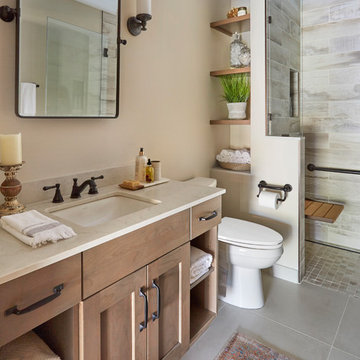
This project was completed for clients who wanted a comfortable, accessible 1ST floor bathroom for their grown daughter to use during visits to their home as well as a nicely-appointed space for any guest. Their daughter has some accessibility challenges so the bathroom was also designed with that in mind.
The original space worked fairly well in some ways, but we were able to tweak a few features to make the space even easier to maneuver through. We started by making the entry to the shower flush so that there is no curb to step over. In addition, although there was an existing oversized seat in the shower, it was way too deep and not comfortable to sit on and just wasted space. We made the shower a little smaller and then provided a fold down teak seat that is slip resistant, warm and comfortable to sit on and can flip down only when needed. Thus we were able to create some additional storage by way of open shelving to the left of the shower area. The open shelving matches the wood vanity and allows a spot for the homeowners to display heirlooms as well as practical storage for things like towels and other bath necessities.
We carefully measured all the existing heights and locations of countertops, toilet seat, and grab bars to make sure that we did not undo the things that were already working well. We added some additional hidden grab bars or “grabcessories” at the toilet paper holder and shower shelf for an extra layer of assurance. Large format, slip-resistant floor tile was added eliminating as many grout lines as possible making the surface less prone to tripping. We used a wood look tile as an accent on the walls, and open storage in the vanity allowing for easy access for clean towels. Bronze fixtures and frameless glass shower doors add an elegant yet homey feel that was important for the homeowner. A pivot mirror allows adjustability for different users.
If you are interested in designing a bathroom featuring “Living In Place” or accessibility features, give us a call to find out more. Susan Klimala, CKBD, is a Certified Aging In Place Specialist (CAPS) and particularly enjoys helping her clients with unique needs in the context of beautifully designed spaces.
Designed by: Susan Klimala, CKD, CBD
Photography by: Michael Alan Kaskel

Sponsored
Columbus, OH
Free consultation for landscape design!

Peabody Landscape Group
Columbus' Reliable Landscape Design & Contracting

 Besch Architecture
Master bath with a free standing tub, wall mounted faucet and controls. Cedar planked wall divider with glass doors each side to access the shower and toilet room
Peter Nilson
 Flooret
Part of the Modin Vinyl Plank Collection, Available Exclusively From www.Flooret.com
$3.49 / sq ft, 22.08 sq ft per box
50% WIDER. 25% LONGER. TWICE AS DURABLE
Luxury Vinyl Plank, 5 mm x 9" x 60" (1.0 mm / 40 mil wear-layer)
Lifetime Residential Warranty, 20 year Commercial Warranty
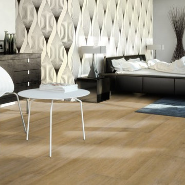
Discerning, intelligent, European. A staff favorite, Noret captures the depth of color and texture that is expected with premium European Oak. A slight tan with a whitewash brush, Noret provides a luxurious template for any refined space.
REDEFINING DURABILITY
The most important specification for determining the durability of vinyl flooring is the thickness of the wear-layer. The best wear-layers are made of thick, clear virgin PVC, which covers the paper print-film that gives the floor its unique appearance. Once the wear-layer wears through, the paper is damaged and the floor will need replacement.
Most vinyl floors come with a 8-12 mil wear-layer (0.2-3 mm). The top commercial specs in the industry are higher, at 20-22 mil (0.5 mm). A select few manufacturers offer a ?super? commercial spec of 28 mil (0.7 mm).
For Modin, we decided to set a new standard: 40 mil (1.0 mm) of premium virgin PVC. This allows us to offer an industry-leading 20 year Commercial Warranty (Lifetime Residential), compared to nearly all other commercial vinyl floors? 10 year Commercial Warranty.
Beyond our superior wear-layer, we also use a patented click mechanism for superior hold, and a ceramic-bead coating.
SIZE MATTERS
Wider and longer planks create a sense of space and luxury. Most vinyl floors come in 6? or 7? widths, and 36? or 48? lengths.
For Modin, we designed our planks to be 9? wide, and 60? long. This extra large size allows our gorgeous designs to be fully expressed.
DETAILS THAT COUNT
We made sure to get all the details right. Real texture, to create the feel of wire-brushed wood. Low sheen level, to ensure a natural look that wears well over time. 4-sided bevels, to more accurately emulate the look of real planks. When added together they help create the unique look that is Modin.
DESIGNS THAT INSPIRE
We spent nearly a year just focusing on our designs, to ensure they provide the right mix of color and depth. Focusing on timeless wire-brush and European Oak styles, as well as more contemporary modern washes, our collection offers truly beautiful design that is both functional and inspiring.
 MILLER + MILLER Architectural Photography
Miller + Miller Real Estate
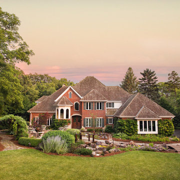
A must see luxury house less than 3 miles from Downtown Naperville. Private and secluded home on a spectacular wooded lot that borders a 14-acre forest preserve. The front patio features perennials, a mahogany stream bridge, 2 mahogany pond decks overlooking koi ponds, waterfalls and 40′ English Arbor. 40′ English Arbor with Wisteria, Clematis, & Akebia. More than 75 trees on the property, along driveway & several ornamentals. Woodland garden with abundant daffodils, scylla, redbuds, columbine, bleeding hearts & lily of the valley. Kitchen garden.
 Wright Jenkins Home Design
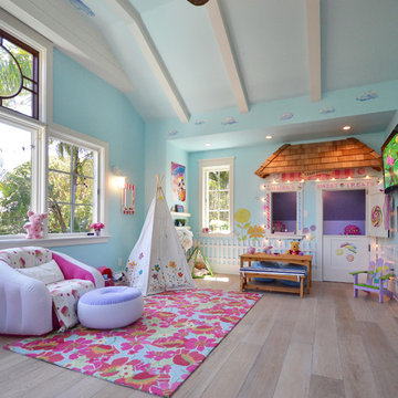
This second-story addition to an already 'picture perfect' Naples home presented many challenges. The main tension between adding the many 'must haves' the client wanted on their second floor, but at the same time not overwhelming the first floor. Working with David Benner of Safety Harbor Builders was key in the design and construction process – keeping the critical aesthetic elements in check. The owners were very 'detail oriented' and actively involved throughout the process. The result was adding 924 sq ft to the 1,600 sq ft home, with the addition of a large Bonus/Game Room, Guest Suite, 1-1/2 Baths and Laundry. But most importantly — the second floor is in complete harmony with the first, it looks as it was always meant to be that way.
©Energy Smart Home Plans, Safety Harbor Builders, Glenn Hettinger Photography

 Simply Home Decorating
This beautiful North Vancouver home belongs to a nature-loving and health-conscious couple, Emma and Vince (names changed), their two young children, and their dog, Jasper. When they contacted us about renovating and furnishing their kitchen and family room, we walked in and saw a world of potential waiting to be uncovered.
Before: Larkhall Crescent Home:
Like many original North Vancouver homes, the interior was definitely dated. We encountered late ‘80s finishes in powder pink and teal green, old carpet, and a kitchen that wasn’t maximized to suit this family’s modern-day lifestyle. However, the size of the rooms offered us a ton of space with which to get creative.
Knowing our clients’ love of cooking, need for work spaces (Emma and Vince both work remotely), and growing family, we developed a design concept that would increase usable space, optimize storage, and create intimacy in this large area. As for the style, we were inspired by their European roots, inventing a new and modern take on “Belgian Farmhouse” style. Now, the home is truly one-of-a-kind.
After: Warm & Cozy Family Room:
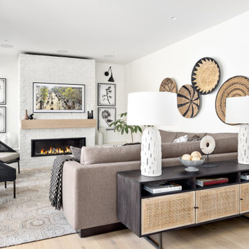
Fresh, bright, and comfortable, this living area has been transformed! We started with the fireplace as a focal point, selecting aged brick tiles for added texture and a crisp wood mantle. The taupe-coloured sectional infuses the room with visual warmth and serves the added purpose of separating the family room from the kitchen.
Emma and Vince were also keen on using non-toxic materials in their home, and we were happy to oblige. To meet their needs, we sourced natural wood elements and sought out Canadian-made products - that adhere to high health standards - whenever possible.
Look closer at the elements of this space, and you will find this stunning, honeycomb-patterned rug in earthy gold, beige, and charcoal tones. It’s plush to the touch and full of visual texture that brings this room’s colour palette together. We sourced these two-tone chairs with caning, petrified wood side table, black sconces, and botanical prints in greyscale from local artist, Heather Johnston.
We topped off the space with this dark wood and rattan console that offers storage facing the kitchen and presents an opportunity to display cherished items. The result is a cozy lounging space brimming with comfort and functionality. It’s perfect for enjoying quality family time, or Emma can simply slide the coffee table away to make room for her morning yoga practice.
Now, let’s turn around and give some attention to the kitchen. Do you remember what the original kitchen looked like? If not, scroll back up, because the transformation is shocking…
Moody & Welcoming Kitchen for Healthy Living:
This kitchen looks very different from how it started, right? Though we didn’t touch any walls, the kitchen has almost doubled in usable space! We created a long, extended island with storage, an outlet for small appliances, and seating for comfortable prep, after-school snacking, or mingling among friends.
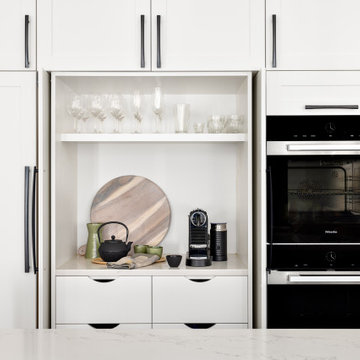
On the other side of the island, the family has even more storage and an integrated dishwasher within easy reach of the sink, perfect for quick clean-up. From this angle, you can also see the expansive custom Shaker cabinetry in white and the integrated double ovens. These facilitate their cooking experience and gave us the opportunity to add an additional surprise…
A coffee garage station and more hidden storage! Keeping these items located along the perimeter allows them to be accessed by the family or their guests without someone getting under the cook’s feet. These are the little details that make everyday life easier and more enjoyable.
Moving deeper into the kitchen, the seamless induction cooktop topped with a freestanding concealed hood fan commands attention in a soft yet prominent way. The natural wood accent mirrors the fireplace mantle, and the choice of off-black wood-grain cabinets not only continues our black-and-white colour palette but adds a sense of depth and contrast. The corner sink is located to the right and perfectly positioned with a view of their thriving backyard.
To invite more of this family’s character into the space, we mixed metals for interest — matte black, dark pewter, and warm brass — and created open shelves in white oak for their plants and decor. You can also glimpse the tumbled edge of the backsplash tile, which echoes the rustic brick of the fireplace. It adds that farmhouse charm while still feeling timeless and sophisticated.
Last but not least, we designed this dining banquette in the bay window (with integrated bench storage, of course), where the family can share a meal together, the kids can do homework, or Emma and Vince can work and enjoy a change of scenery from their offices. Like the other spaces in the home, it was designed to be beautiful, multi-functional, and long-lasting.
Praise from Our Clients:
It is clear that we love this home, but what did our clients have to say?
“Lori is a visionary and masters execution to the finest detail all at the same time. When she first met us to know more about who we are and how we live, she could right away envision how we could use the space in our kitchen and living room…The results exceeded our expectations.
Lori and her team were also a delight to work with — coordination with all the trades, fast problem-solving, regular updates, professional and friendly attitude of her entire team — made it the dream team. Thank you SHD for making our space so beautiful!”
In turn, we are so grateful for this family’s trust, their open communication, and for being wonderful people with whom to work. (So, thank you!)

Sponsored
Sunbury, OH

J.Holderby - Renovations
Franklin County's Leading General Contractors - 2X Best of Houzz!
 Advance Design Studio, Ltd.
Karen and Chad of Tower Lakes, IL were tired of their unfinished basement functioning as nothing more than a storage area and depressing gym. They wanted to increase the livable square footage of their home with a cohesive finished basement design, while incorporating space for the kids and adults to hang out.
“We wanted to make sure that upon renovating the basement, that we can have a place where we can spend time and watch movies, but also entertain and showcase the wine collection that we have,” Karen said.
After a long search comparing many different remodeling companies, Karen and Chad found Advance Design Studio. They were drawn towards the unique “Common Sense Remodeling” process that simplifies the renovation experience into predictable steps focused on customer satisfaction.
“There are so many other design/build companies, who may not have transparency, or a focused process in mind and I think that is what separated Advance Design Studio from the rest,” Karen said.
Karen loved how designer Claudia Pop was able to take very high-level concepts, “non-negotiable items” and implement them in the initial 3D drawings. Claudia and Project Manager DJ Yurik kept the couple in constant communication through the project. “Claudia was very receptive to the ideas we had, but she was also very good at infusing her own points and thoughts, she was very responsive, and we had an open line of communication,” Karen said.
A very important part of the basement renovation for the couple was the home gym and sauna. The “high-end hotel” look and feel of the openly blended work out area is both highly functional and beautiful to look at. The home sauna gives them a place to relax after a long day of work or a tough workout. “The gym was a very important feature for us,” Karen said. “And I think (Advance Design) did a very great job in not only making the gym a functional area, but also an aesthetic point in our basement”.
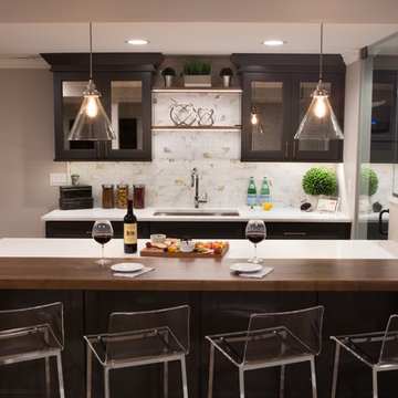
An extremely unique wow-factor in this basement is the walk in glass wine cellar that elegantly displays Karen and Chad’s extensive wine collection. Immediate access to the stunning wet bar accompanies the wine cellar to make this basement a popular spot for friends and family.
The custom-built wine bar brings together two natural elements; Calacatta Vicenza Quartz and thick distressed Black Walnut. Sophisticated yet warm Graphite Dura Supreme cabinetry provides contrast to the soft beige walls and the Calacatta Gold backsplash. An undermount sink across from the bar in a matching Calacatta Vicenza Quartz countertop adds functionality and convenience to the bar, while identical distressed walnut floating shelves add an interesting design element and increased storage. Rich true brown Rustic Oak hardwood floors soften and warm the space drawing all the areas together.
Across from the bar is a comfortable living area perfect for the family to sit down at a watch a movie. A full bath completes this finished basement with a spacious walk-in shower, Cocoa Brown Dura Supreme vanity with Calacatta Vicenza Quartz countertop, a crisp white sink and a stainless-steel Voss faucet.
Advance Design’s Common Sense process gives clients the opportunity to walk through the basement renovation process one step at a time, in a completely predictable and controlled environment. “Everything was designed and built exactly how we envisioned it, and we are really enjoying it to it’s full potential,” Karen said.
Constantly striving for customer satisfaction, Advance Design’s success is heavily reliant upon happy clients referring their friends and family. “We definitely will and have recommended Advance Design Studio to friends who are looking to embark on a remodeling project small or large,” Karen exclaimed at the completion of her project.
 Simply Home Decorating
This beautiful North Vancouver home belongs to a nature-loving and health-conscious couple, Emma and Vince (names changed), their two young children, and their dog, Jasper. When they contacted us about renovating and furnishing their kitchen and family room, we walked in and saw a world of potential waiting to be uncovered.
Before: Larkhall Crescent Home:
Like many original North Vancouver homes, the interior was definitely dated. We encountered late ‘80s finishes in powder pink and teal green, old carpet, and a kitchen that wasn’t maximized to suit this family’s modern-day lifestyle. However, the size of the rooms offered us a ton of space with which to get creative.
Knowing our clients’ love of cooking, need for work spaces (Emma and Vince both work remotely), and growing family, we developed a design concept that would increase usable space, optimize storage, and create intimacy in this large area. As for the style, we were inspired by their European roots, inventing a new and modern take on “Belgian Farmhouse” style. Now, the home is truly one-of-a-kind.
After: Warm & Cozy Family Room:
Fresh, bright, and comfortable, this living area has been transformed! We started with the fireplace as a focal point, selecting aged brick tiles for added texture and a crisp wood mantle. The taupe-coloured sectional infuses the room with visual warmth and serves the added purpose of separating the family room from the kitchen.
Emma and Vince were also keen on using non-toxic materials in their home, and we were happy to oblige. To meet their needs, we sourced natural wood elements and sought out Canadian-made products - that adhere to high health standards - whenever possible.
Look closer at the elements of this space, and you will find this stunning, honeycomb-patterned rug in earthy gold, beige, and charcoal tones. It’s plush to the touch and full of visual texture that brings this room’s colour palette together. We sourced these two-tone chairs with caning, petrified wood side table, black sconces, and botanical prints in greyscale from local artist, Heather Johnston.
We topped off the space with this dark wood and rattan console that offers storage facing the kitchen and presents an opportunity to display cherished items. The result is a cozy lounging space brimming with comfort and functionality. It’s perfect for enjoying quality family time, or Emma can simply slide the coffee table away to make room for her morning yoga practice.
Now, let’s turn around and give some attention to the kitchen. Do you remember what the original kitchen looked like? If not, scroll back up, because the transformation is shocking…
Moody & Welcoming Kitchen for Healthy Living:
This kitchen looks very different from how it started, right? Though we didn’t touch any walls, the kitchen has almost doubled in usable space! We created a long, extended island with storage, an outlet for small appliances, and seating for comfortable prep, after-school snacking, or mingling among friends.
On the other side of the island, the family has even more storage and an integrated dishwasher within easy reach of the sink, perfect for quick clean-up. From this angle, you can also see the expansive custom Shaker cabinetry in white and the integrated double ovens. These facilitate their cooking experience and gave us the opportunity to add an additional surprise…
A coffee garage station and more hidden storage! Keeping these items located along the perimeter allows them to be accessed by the family or their guests without someone getting under the cook’s feet. These are the little details that make everyday life easier and more enjoyable.
Moving deeper into the kitchen, the seamless induction cooktop topped with a freestanding concealed hood fan commands attention in a soft yet prominent way. The natural wood accent mirrors the fireplace mantle, and the choice of off-black wood-grain cabinets not only continues our black-and-white colour palette but adds a sense of depth and contrast. The corner sink is located to the right and perfectly positioned with a view of their thriving backyard.
To invite more of this family’s character into the space, we mixed metals for interest — matte black, dark pewter, and warm brass — and created open shelves in white oak for their plants and decor. You can also glimpse the tumbled edge of the backsplash tile, which echoes the rustic brick of the fireplace. It adds that farmhouse charm while still feeling timeless and sophisticated.
Last but not least, we designed this dining banquette in the bay window (with integrated bench storage, of course), where the family can share a meal together, the kids can do homework, or Emma and Vince can work and enjoy a change of scenery from their offices. Like the other spaces in the home, it was designed to be beautiful, multi-functional, and long-lasting.
Praise from Our Clients:
It is clear that we love this home, but what did our clients have to say?
“Lori is a visionary and masters execution to the finest detail all at the same time. When she first met us to know more about who we are and how we live, she could right away envision how we could use the space in our kitchen and living room…The results exceeded our expectations.
Lori and her team were also a delight to work with — coordination with all the trades, fast problem-solving, regular updates, professional and friendly attitude of her entire team — made it the dream team. Thank you SHD for making our space so beautiful!”
In turn, we are so grateful for this family’s trust, their open communication, and for being wonderful people with whom to work. (So, thank you!)
 Glickman Design Build
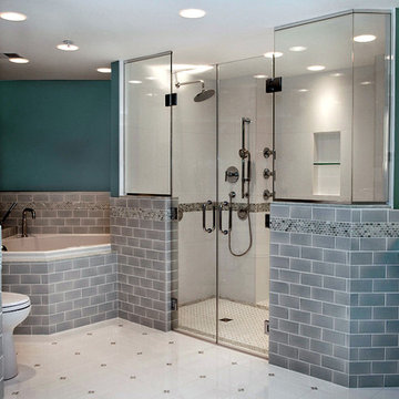
94 year old mother's birthday surprise! Wheelchair bound, her family spruced up her bathroom to accommodate her.
Fully wheelchair accessible shower
Handicap accessible bathroom and shower, Bethesda, MD
Wheelchair accessible renovation
Wheelchair accessible bathroom
Wheelchair lift
Accessible shower
Barrier free whole house remodel
ADA bathroom
Accessible design bathroom
Non-slip bathroom flooring
Accessible bathroom ideas
ADA ideas
 VladiCucina
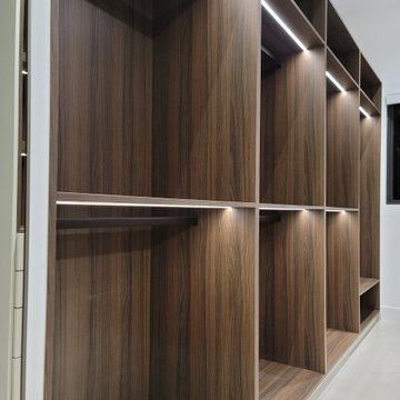
? “Crafting Closets: Custom Wardrobe in Dark Hues, Limitless Functionality” ?
In our recent video, witness the unveiling of a custom wardrobe in rich, dark tones—a masterpiece with numerous compartments and niches. The craftsman behind this marvel showcases its functionality, presenting it to clients post-installation.
The Essence of Collaboration:
This presentation isn’t just about the wardrobe; it’s a testament to collaboration. The interaction between creator and client isn’t a mere transaction—it’s a partnership.
Understanding Needs: Collaborating with clients allows for a deep understanding of their needs. The designer comprehends preferences, ensuring every compartment resonates with the client’s lifestyle.
Tailored Solutions: This interaction enables tailored solutions. It’s not just about selling a product; it’s about crafting a solution that perfectly fits the client’s requirements.
Real-time Feedback: Direct interaction post-installation fosters real-time feedback. It’s a chance for clients to voice their thoughts, allowing any tweaks for absolute satisfaction.
Building Trust: Such interactions build trust. Clients feel heard and valued, enhancing trust in the brand and fostering long-term relationships.
The beauty of collaboration isn’t just in the creation of exceptional furniture; it lies in the relationship between creator and client. This synergy births not just furniture but functional art crafted precisely for you. ✨
Sponsored
Sunbury, OH
J.Holderby - Renovations
Franklin County's Leading General Contractors - 2X Best of Houzz!

 harry schott
Running a small restaurant is a high-wire act - delicious plates on one end, razor-thin margins on the other. With food costs averaging 28-35 percent of revenue and labor at 30 percent, every dollar counts. The good news? Targeted tweaks can shave 10-20 percent off your bottom line without sacrificing quality. From smarter sourcing to streamlined waste handling, these strategies empower independents to thrive. One underrated gem: Efficient waste management via roll-off dumpster rentals, which can slash disposal fees by up to 40 percent. Let's break it down.
Optimize Inventory: Waste Less, Save More
Overstocked pantries are profit killers - U.S. restaurants toss $25 billion in food yearly. Audit weekly. Track sales data to forecast demand, using apps like Toast or MarketMan for real-time insights. Trim your menu to 12-15 core items, focusing on seasonal, high-margin stars like farm-fresh salads over imported proteins. Portion control is key - pre-weighed scoops cut overuse by 15 percent.
Repurpose scraps creatively. Veggie peels into stocks, bread ends for croutons. Donate extras to food banks via apps like Too Good To Go, earning tax deductions up to $5,000 annually. These habits reclaim 5-10 percent of food budgets, freeing cash for upgrades. Additionally, consider using citrus rinds for infused oils or desserts, and coffee grounds for compost to support local gardens. Engaging staff in sustainability efforts also builds morale and can be highlighted in marketing materials to attract eco-conscious diners.
Trim Energy and Utilities: Go Green for Greenbacks
Utilities gobble 4-10 percent of expenses. Swap to LED bulbs and energy-star appliances - upfront costs pay back in 6-12 months via 20-30 percent bill drops. Install low-flow faucets and programmable thermostats; during off-hours, dial down to 55°F to save $200/month on HVAC.
Use induction cooktops for precise heat, reducing gas by 15 percent. Train staff on "last out" protocols - unplugging idle equipment. Solar panels? For rooftops under 1,000 sq ft, incentives cover 30 percent installation, yielding ROI in 5 years.
Master Waste Management: Dumpsters as Cost Commanders
Trash isn't just garbage - it's a budget black hole, with disposal eating 2-5 percent of revenues. Small spots generate 1-2 tons monthly from food scraps, packaging, and grease. Ditch overflowing bins and irregular hauls for roll-off dumpster rentals. A 10-15 yard unit centralizes waste, handling bulk like fryer oil drums or produce crates without daily pickups.
Efficiency Over Headcount
Labor's your biggest line item - cross-train staff for multi-roles, like servers prepping during lulls, trimming overtime 10-15 percent. Shift scheduling software optimizes based on reservations, avoiding idle payroll.
Negotiate bulk buys with local suppliers for 5-10 percent discounts; loyalty programs from Sysco yield free deliveries. Go digital - QR menus cut printing costs, speed table turnover, and allow menu updates in real time without waste. Loyalty apps boost repeat visits without increasing your advertising budget, making it easier to track customer preferences and send targeted promotions. Consider bundling purchases with other area restaurants to unlock deeper discounts and leverage supplier relationships for exclusive seasonal specials. These strategies can reduce overhead, improve customer retention, and keep operations flexible as trends shift.
 Blackband Design
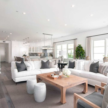
This Coastal Inspired Farmhouse with bay views puts a casual and sophisticated twist on beach living.
Interior Design by Blackband Design and Home Build by Arbor Real Estate.
 Robin's Nest Interiors
Homearama 2016: An Introduction
Welcome to Homearama 2016: An Introduction where we will take you into the process for creating a showcase home – a phenomenal 12 month long project filled with plenty of blood, sweat and tears. Mostly sweat with the actual even held in middle of a regular Kentucky July – consistently high 90s and a humidity that can steam any pair of glasses.
Our Team
Nevertheless, we are so proud of all those who helped contribute to creating a beautiful home for our ever-patient homeowners. This gorgeous “Southern Belle” took home 3 of the 6 awards given by the Building Industry Association at the River Crest Development: Best Kitchen Cabinetry (M&H Cabinetry), Best Closet Design (Closets by Design), and Best Lighting (Ferguson).
Also cheers to our builder, Chad Stoyell of Stoyell Built Homes for winning 3rd place in the popular vote for Best Builder! He, of course, is at the top of our list as Stoyell Built Homes pride themselves in custom homes built with impeccable craftsmanship. Our Southern Belle did not detour from his reputation! Beautifully executed detail can be found everywhere from the hot/cold exterior hose hookup to the wooden dormer over the front porch.
In addition, the house is a looker – a home you can’t find in just any neighborhood. Notice the bold symmetry with the stone walls flanking the large front porch. Windows placed high on either side of the front facade provide plenty of light while maintaining privacy.
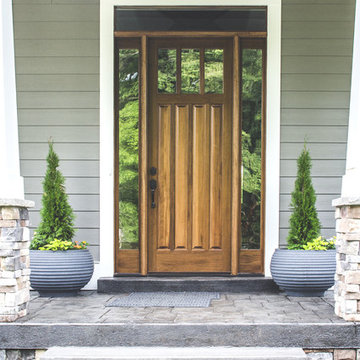
Our landscaper, Chad Rodgers, complemented the symmetry with matching Japanese Maples that in due time will grow up to be perfectly positioned. Concrete planters anchor the front door, while bold blue rocking chairs brighten up the facade two by two.
Natural Wood Elements
Chad Stoyell, the builder, used real material throughout the house and the front door is no exception. This beauty is made of solid wood.
The natural beauty of wood is continued in this wooden open dormer. The lighting fixture keeps that southern charm going with lantern accents – also seen in the fixtures flanking the garage door.
Hydrangeas line the driveway along the side of the house. Great craftsmanship on the shake siding and stone application.
View of the back porch, including two seating areas-a cozy fireplace and a patio for those lazy, hazy, crazy days of summer!
And on a final note, we just love the accessibility of the patio from the garage! The door to the right of the table and chairs leads directly into the garage! Stay tuned for what door #2 leads to….
Stay Tuned for More
Hope you liked our introduction on this great project – Homearama 2016! Please stay tuned for more insight on the design process of each space. I can’t wait to show you the inside of this Southern Belle. Enjoy!
27