
Search results for "Real time interacting" in Home Design Ideas
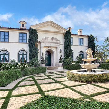
 Ancient Surfaces
Product: Authentic Limestone for Exterior Living Spaces.
Ancient Surfaces
Contacts: (212) 461-0245
Email: Sales@ancientsurfaces.com
Website: www.AncientSurfaces.com
The design of external living spaces is known as the 'Al Fresco' design style as it is called in Italian. 'Al Fresco' translates into 'the open' or 'the cool/fresh exterior'. Customizing a fully functional outdoor kitchen, pizza oven, BBQ, fireplace or Jacuzzi pool spa all out of old reclaimed Mediterranean stone pieces is no easy task and shouldn’t be created out of the lowest common denominator of building materials such as concrete, Indian slates or Turkish travertine.
The one thing you can bet the farmhouse on is that when the entire process unravels and when your outdoor living space materializes from the architects rendering to real life, you will be guaranteed a true Mediterranean living experience if your choice of construction material was as authentic and possible to the Southern Mediterranean regions.
We believe that the coziness of your surroundings brought about by the creative usage of our antique stone elements will only amplify that authenticity.
whether you are enjoying a relaxing time soaking the sun inside one of our Jacuzzi spa stone fountains or sharing unforgettable memories with family and friends while baking your own pizzas in one of our outdoor BBQ pizza ovens, our stone designs will always evoke in most a feeling of euphoria and exultation that one only gets while being on vacation is some exotic European island surrounded with the pristine beauty of indigenous nature and ancient architecture...
 Balboa Design Group
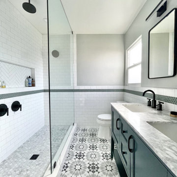
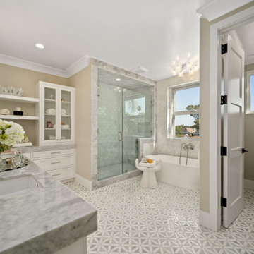
Our clients wanted a REAL master bathroom with enough space for both of them to be in there at the same time. Their house, built in the 1940’s, still had plenty of the original charm, but also had plenty of its original tiny spaces that just aren’t very functional for modern life.
The original bathroom had a tiny stall shower, and just a single vanity with very limited storage and counter space. Not to mention kitschy pink subway tile on every wall. With some creative reconfiguring, we were able to reclaim about 25 square feet of space from the bedroom. Which gave us the space we needed to introduce a double vanity with plenty of storage, and a HUGE walk-in shower that spans the entire length of the new bathroom!
While we knew we needed to stay true to the original character of the house, we also wanted to bring in some modern flair! Pairing strong graphic floor tile with some subtle (and not so subtle) green tones gave us the perfect blend of classic sophistication with a modern glow up.
Our clients were thrilled with the look of their new space, and were even happier about how large and open it now feels!
 Flooret
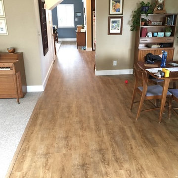
Part of the Modin Vinyl Plank Collection, Available Exclusively From www.Flooret.com
$3.49 / sq ft, 22.08 sq ft per box
50% WIDER. 25% LONGER. TWICE AS DURABLE
Luxury Vinyl Plank, 5 mm x 9" x 60" (1.0 mm / 40 mil wear-layer)
Lifetime Residential Warranty, 20 year Commercial Warranty
Classic Oak Elegance. Arden provides a timeless template with which to define your space. We designed the grain pattern to have just a hint of rustic, but it is still clean enough that you can convincingly use it in a modern setting.
REDEFINING DURABILITY
The most important specification for determining the durability of vinyl flooring is the thickness of the wear-layer. The best wear-layers are made of thick, clear virgin PVC, which covers the paper print-film that gives the floor its unique appearance. Once the wear-layer wears through, the paper is damaged and the floor will need replacement.
Most vinyl floors come with a 8-12 mil wear-layer (0.2-3 mm). The top commercial specs in the industry are higher, at 20-22 mil (0.5 mm). A select few manufacturers offer a "super" commercial spec of 28 mil (0.7 mm).
For Modin, we decided to set a new standard: 40 mil (1.0 mm) of premium virgin PVC. This allows us to offer an industry-leading 20 year Commercial Warranty (Lifetime Residential), compared to nearly all other commercial vinyl floors' 10 year Commercial Warranty.
Beyond our superior wear-layer, we also use a patented click mechanism for superior hold, and a ceramic-bead coating.
SIZE MATTERS
Wider and longer planks create a sense of space and luxury. Most vinyl floors come in 6" or 7" widths, and 36" or 48" lengths.
For Modin, we designed our planks to be 9" wide, and 60" long. This extra large size allows our gorgeous designs to be fully expressed.
DETAILS THAT COUNT
We made sure to get all the details right. Real texture, to create the feel of wire-brushed wood. Low sheen level, to ensure a natural look that wears well over time. 4-sided bevels, to more accurately emulate the look of real planks. When added together they help create the unique look that is Modin.
DESIGNS THAT INSPIRE
We spent nearly a year just focusing on our designs, to ensure they provide the right mix of color and depth. Focusing on timeless wire-brush and European Oak styles, as well as more contemporary modern washes, our collection offers truly beautiful design that is both functional and inspiring.
Find the right local pro for your project
 TKS Design Group
Download our free ebook, Creating the Ideal Kitchen. DOWNLOAD NOW
For many, extra time at home during COVID left them wanting more from their homes. Whether you realized the shortcomings of your space or simply wanted to combat boredom, a well-designed and functional home was no longer a want, it became a need. Tina found herself wanting more from her Old Irving Park home and reached out to The Kitchen Studio about adding function to her kitchen to make the most of the available real estate.
At the end of the day, there is nothing better than returning home to a bright and happy space you love. And this kitchen wasn’t that for Tina. Dark and dated, with a palette from the past and features that didn’t make the most of the available square footage, this remodel required vision and a fresh approach to the space. Lead designer, Stephanie Cole’s main design goal was better flow, while adding greater functionality with organized storage, accessible open shelving, and an overall sense of cohesion with the adjoining family room.
The original kitchen featured a large pizza oven, which was rarely used, yet its footprint limited storage space. The nearby pantry had become a catch-all, lacking the organization needed in the home. The initial plan was to keep the pizza oven, but eventually Tina realized she preferred the design possibilities that came from removing this cumbersome feature, with the goal of adding function throughout the upgraded and elevated space. Eliminating the pantry added square footage and length to the kitchen for greater function and more storage. This redesigned space reflects how she lives and uses her home, as well as her love for entertaining.
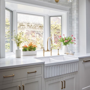
The kitchen features a classic, clean, and timeless palette. White cabinetry, with brass and bronze finishes, contrasts with rich wood flooring, and lets the large, deep blue island in Woodland’s custom color Harbor – a neutral, yet statement color – draw your eye.
The kitchen was the main priority. In addition to updating and elevating this space, Tina wanted to maximize what her home had to offer. From moving the location of the patio door and eliminating a window to removing an existing closet in the mudroom and the cluttered pantry, the kitchen footprint grew. Once the floorplan was set, it was time to bring cohesion to her home, creating connection between the kitchen and surrounding spaces.
The color palette carries into the mudroom, where we added beautiful new cabinetry, practical bench seating, and accessible hooks, perfect for guests and everyday living. The nearby bar continues the aesthetic, with stunning Carrara marble subway tile, hints of brass and bronze, and a design that further captures the vibe of the kitchen.
Every home has its unique design challenges. But with a fresh perspective and a bit of creativity, there is always a way to give the client exactly what they want [and need]. In this particular kitchen, the existing soffits and high slanted ceilings added a layer of complexity to the lighting layout and upper perimeter cabinets.
While a space needs to look good, it also needs to function well. This meant making the most of the height of the room and accounting for the varied ceiling features, while also giving Tina everything she wanted and more. Pendants and task lighting paired with an abundance of natural light amplify the bright aesthetic. The cabinetry layout and design compliments the soffits with subtle profile details that bring everything together. The tile selections add visual interest, drawing the eye to the focal area above the range. Glass-doored cabinets further customize the space and give the illusion of even more height within the room.
While her family may be grown and out of the house, Tina was focused on adding function without sacrificing a stunning aesthetic and dreamy finishes that make the kitchen the gathering place of any home. It was time to love her kitchen again, and if you’re wondering what she loves most, it’s the niche with glass door cabinetry and open shelving for display paired with the marble mosaic backsplash over the range and complimenting hood. Each of these features is a stunning point of interest within the kitchen – both brag-worthy additions to a perimeter layout that previously felt limited and lacking.
Whether your remodel is the result of special needs in your home or simply the excitement of focusing your energy on creating a fun new aesthetic, we are here for it. We love a good challenge because there is always a way to make a space better – adding function and beauty simultaneously.
 Grills'n Ovens LLC
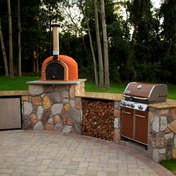
An outdoor kitchen with a handmade wood fired pizza oven from Portugal.
This outdoor kitchen is located in upstate New York, owned by a restaurant chef. You can see how it became a reality here: https://www.youtube.com/watch?v=ab9SCrhfpnw
A wood fired pizza oven of this kind adds tremendous versatility to any outdoor kitchen. Use the grill for cooking and the oven for baking. See real pizza baking in this oven here:
https://www.youtube.com/watch?v=kfIp1lLY1a8 (he makes it look easy, it actually takes a little time to find your way around a wood fired oven). More here: https://www.youtube.com/watch?v=TpX2ndxx6UI&list=UUvZH8gC23wVrO3rpyu_5ULw
 Artistic Design And Remodeling
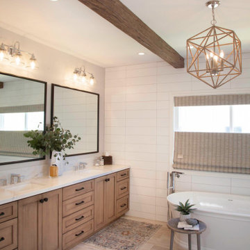
Light and Airy shiplap bathroom was the dream for this hard working couple. The goal was to totally re-create a space that was both beautiful, that made sense functionally and a place to remind the clients of their vacation time. A peaceful oasis. We knew we wanted to use tile that looks like shiplap. A cost effective way to create a timeless look. By cladding the entire tub shower wall it really looks more like real shiplap planked walls.
The center point of the room is the new window and two new rustic beams. Centered in the beams is the rustic chandelier.
Design by Signature Designs Kitchen Bath
Contractor ADR Design & Remodel
Photos by Gail Owens
 Balboa Design Group
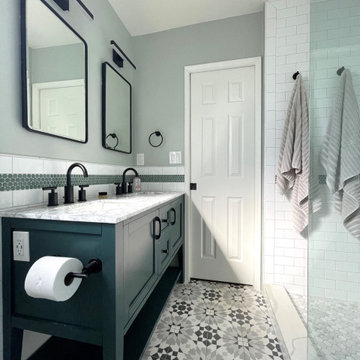
Our clients wanted a REAL master bathroom with enough space for both of them to be in there at the same time. Their house, built in the 1940’s, still had plenty of the original charm, but also had plenty of its original tiny spaces that just aren’t very functional for modern life.
The original bathroom had a tiny stall shower, and just a single vanity with very limited storage and counter space. Not to mention kitschy pink subway tile on every wall. With some creative reconfiguring, we were able to reclaim about 25 square feet of space from the bedroom. Which gave us the space we needed to introduce a double vanity with plenty of storage, and a HUGE walk-in shower that spans the entire length of the new bathroom!
While we knew we needed to stay true to the original character of the house, we also wanted to bring in some modern flair! Pairing strong graphic floor tile with some subtle (and not so subtle) green tones gave us the perfect blend of classic sophistication with a modern glow up.
Our clients were thrilled with the look of their new space, and were even happier about how large and open it now feels!

Sponsored
Sunbury, OH

J.Holderby - Renovations
Franklin County's Leading General Contractors - 2X Best of Houzz!
 Amazing Spaces
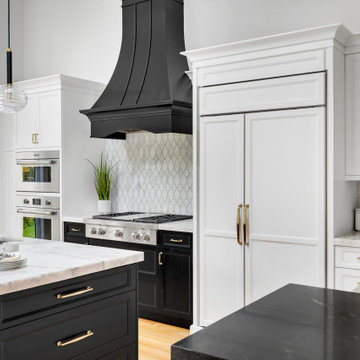
The existing U-shaped kitchen was tucked away in a small corner while the dining table was swimming in a room much too large for its size. The client’s needs and the architecture of the home made it apparent that the perfect design solution for the home was to swap the spaces.
The homeowners entertain frequently and wanted the new layout to accommodate a lot of counter seating, a bar/buffet for serving hors d’oeuvres, an island with prep sink, and all new appliances. They had a strong preference that the hood be a focal point and wanted to go beyond a typical white color scheme even though they wanted white cabinets.
While moving the kitchen to the dining space gave us a generous amount of real estate to work with, two of the exterior walls are occupied with full-height glass creating a challenge how best to fulfill their wish list. We used one available wall for the needed tall appliances, taking advantage of its height to create the hood as a focal point. We opted for both a peninsula and island instead of one large island in order to maximize the seating requirements and create a barrier when entertaining so guests do not flow directly into the work area of the kitchen. This also made it possible to add a second sink as requested. Lastly, the peninsula sets up a well-defined path to the new dining room without feeling like you are walking through the kitchen. We used the remaining fourth wall for the bar/buffet.
Black cabinetry adds strong contrast in several areas of the new kitchen. Wire mesh wall cabinet doors at the bar and gold accents on the hardware, light fixtures, faucets and furniture add further drama to the concept. The focal point is definitely the black hood, looking both dramatic and cohesive at the same time.

 Klopf Architecture
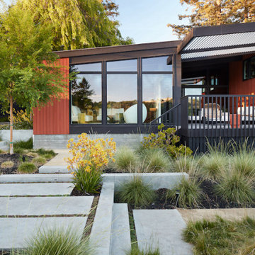
The Roger Lee designed house from 1962 was purchased by the current homeowners in almost original condition, as the previous owners elected to defer most maintenance projects over the years. The clients were able to see beyond the dated materials and finishes, single-paned glass and uninsulated walls and they approached Klopf Architecture to help them expand and update the entire home, one the family could settle into and enjoy for years to come. It was important that the new designs were aligned with Lee's original intent not only because of the client's appreciation for mid-century modern architecture, but also because the house was deemed historical. The Stanford Real Estate Office requires a stringent design review which safeguards the integrity of the community, which Klopf Architecture was happy to oblige going into their updated designs.
As with many original mid-century modern homes, the house was scaled to the 1960s lifestyle where rooms were smaller and openings to views were limited and tightly framed. The original conditions defined the direction the family of four would take in updating the house and making it comfortable for their modern lifestyle. Klopf designed a full gut remodel and major addition to bring the house into the 21st century and provide the living area needed for the client's family. The newly expanded house added just about 1,100 sf to create an airy, comfortable and family friendly house, taking full advantage of the beautiful southwestern views that extend out to the hills beyond. The enclosed garage created an additional 240 sf of covered space for long-term storage.
A cracked swimming pool created an eyesore taking up a majority of the backyard landscape, so it was one of the first elements to go during the transformation. Working with Outer Space Landscape Architects, the family asked for a mix of relaxing outdoor patio spaces that eventually blend into the native landscaping, extending their views outward toward the natural greenery of the trees beyond their property. Filling in the old pool was a smart way to expand the living spaces outward. The orientation of the house was designed to enjoy the views, but the original architecture provided the first homeowners with mere glimpses of the landscape outside.
Klopf was able to broaden those views, continuing and extending on the original architecture to take full advantage of the unobstructed natural views across the rear facade of the house. Small horizontal openings in the primary bedroom and office were replaced with much taller windows that now follow the angled roof line upward, extending across almost all of the facade. We worked with Western Windows, whose designs included an oblique-shaped, operable casement that allowed our design to rise with the slope. A new corner office added to the primary suite, offers a bright and functional work-from-home solution that looks out at the distant views and added natural light from the expanded window configuration that now wraps around the corner.
The existing lower level was designed by Lee as a utilitarian space, serving as a wet pool room with a drain in the center of the floor, bathroom, laundry and storage areas. Without the need for a pool room, Klopf was able to convert the area into a much more comfortable and functional living space with a new family room and guest suite. The new spaces enjoy easy access to a new outdoor patio through floor to ceiling, full-width glass sliders.
Continuing along the rear facade, a previously exposed deck extending from the living room and hallway provided access to the backyard through a single set of stairs leading toward the side of the house which made sense when the pool was in place. The new deck was re-envisioned as an extension of the main living room and now serves as a second outdoor living room. A new slatted pergola above provides the homeowners welcome relief from the hot afternoon sun. A second set of stairs now creates a better connection to the redesigned lower level. Klopf was able to reconfigure the spaces, extending the living room outward toward the views, where the family now claims it as the heart of the home, spending a large majority of their time outdoors.
Back inside, the original wood-burning Malm fireplace was beautifully restored and a gas burner installed to comply with California's strict air standards. It now rests in front of a wall of Heath accent tiles where a dated red brick wall used to stand. A new taller window brings more light and views into the refreshed interior living room. The original glass doors opposite the fireplace were replaced by larger sliders that when fully opened, create a seamless transition to the new outdoor living area so the two spaces feel like one connected space. The original utilitarian kitchen was needlessly tucked into the far back corner and closed-off, out of sight from the living room, so the clients asked Klopf to open it up and expand the kitchen forward so it felt more connected. Today the much larger kitchen is connected to the living area where a short wall with a cutout offers a visual glimpse into the kitchen and a handy pass-through counter for serving guests. A new breakfast nook was also added to create another spot where the family can gather for casual meals. Just outside, a new built-in outdoor grill and prep area extends the kitchen outside and connects to a new outdoor dining spot nestled amongst the trees, taking advantage of the views out back.
Klopf was able to expand the other two bedrooms, add a new laundry room and half-bath and convert the carport to an enclosed garage to add more storage areas which was lost when the pool house was converted to the family and guest room.
To maintain a historical connection to the original designs, the exterior siding was repeated on all exterior walls, a full-height stained glass window at the front entryway restored, and an interior slatted screen element repeated outside at the exterior entry courtyard and over the new outdoor living room to create a shade trellis. The new house stands proudly and shines against it's new landscaping features, while respecting and expanding on the original intent of Roger Lee's designs epitomizing the comforts of indoor-outdoor living in Northern California.
Completion year: 2020
Klopf Architecture project team: John Klopf, Klara Kevane, Noel Andrade
Contractor: ORB Construction, Brendan O'Reilly
Structural engineer: Sezen and Moon
Landscape architect: Outer space
Furnishings and decoration: Urbanism Designs
Photographer: Mariko Reed
 Tommy Daspit Photographer
Tommy Daspit Photographer
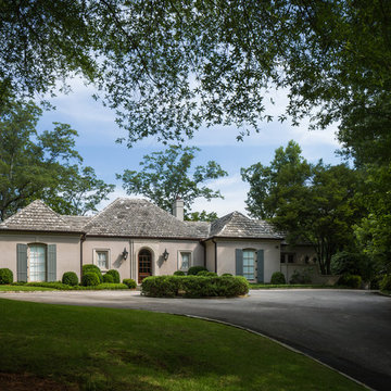
Tommy Daspit offers the very best in architectural, commercial and real estate photography for the Birmingham, Alabama metro area.
If you are looking for high quality real estate photography, with a high level of professionalism, and fast turn around, contact Tommy Daspit Photographer (205) 516-6993 tommy@tommydaspit.com
You can view more of his work on this website: http://tommydaspit.com
 Carswell Real Estate
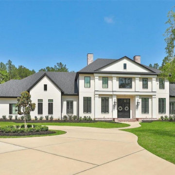
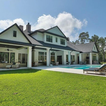
Magnolia, Texas, has quickly become one of the most attractive areas in North Houston for buyers seeking space, privacy, and a quieter lifestyle. Once considered a long-distance commute from major employment centers, the area is now far more accessible thanks to major transportation improvements.
With the expansion of State Highway 249 (Aggie Expressway) and continued development of the Grand Parkway (SH-99), commuting from Magnolia and nearby acreage communities has become significantly more convenient.
While residents enjoy the benefits of a rural setting with large homesites, commuting to nearby job centers such as The Woodlands, Spring, and Houston requires some planning, especially during peak travel times.
 Carswell Real Estate
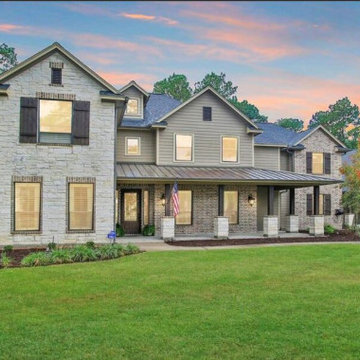
Magnolia, Texas has quickly become one of the most attractive areas in North Houston for buyers seeking space, privacy, and a quieter lifestyle. Once considered a long-distance commute from major employment centers, the area is now far more accessible thanks to major transportation improvements.
With the expansion of State Highway 249 (Aggie Expressway) and continued development of the Grand Parkway (SH-99), commuting from Magnolia and nearby acreage communities has become significantly more convenient.
While residents enjoy the benefits of a rural setting with large homesites, commuting to nearby job centers such as The Woodlands, Spring, and Houston requires some planning, especially during peak travel times.
Sponsored
Sunbury, OH
J.Holderby - Renovations
Franklin County's Leading General Contractors - 2X Best of Houzz!
 Carswell Real Estate
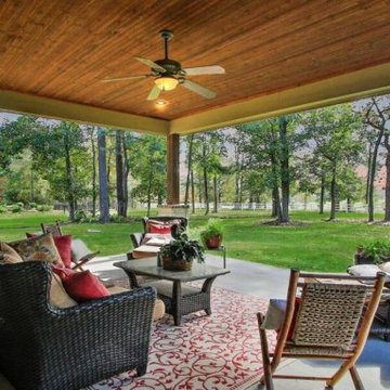
Magnolia, Texas has quickly become one of the most attractive areas in North Houston for buyers seeking space, privacy, and a quieter lifestyle. Once considered a long-distance commute from major employment centers, the area is now far more accessible thanks to major transportation improvements.
With the expansion of State Highway 249 (Aggie Expressway) and continued development of the Grand Parkway (SH-99), commuting from Magnolia and nearby acreage communities has become significantly more convenient.
While residents enjoy the benefits of a rural setting with large homesites, commuting to nearby job centers such as The Woodlands, Spring, and Houston requires some planning, especially during peak travel times.
 Carswell Real Estate
Magnolia, Texas has quickly become one of the most attractive areas in North Houston for buyers seeking space, privacy, and a quieter lifestyle. Once considered a long-distance commute from major employment centers, the area is now far more accessible thanks to major transportation improvements.
With the expansion of State Highway 249 (Aggie Expressway) and continued development of the Grand Parkway (SH-99), commuting from Magnolia and nearby acreage communities has become significantly more convenient.
While residents enjoy the benefits of a rural setting with large homesites, commuting to nearby job centers such as The Woodlands, Spring, and Houston requires some planning, especially during peak travel times.
 Lucy Harris Studio
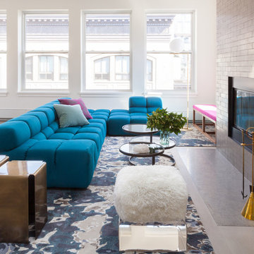
Notable decor elements include: Flos IC floor lamp in brass, B&B Italia Tufty time sofa in teal, vintage swivel coffee table from House of Honey, FTF Design custom bench upholstered in Clerici Tessuto Brochier Bosforo fabric in fuschia, Rug Art custom rug in an abstract pattern in blue, black, cream and taupe, modernist brass fireplace tools from Patrick Parrish, Gentner design Baltic side tables in patinated brass, Jean De Merry Diva Stool and pillows in Casamance Capucine in fuschia and Casamance Soprano squares velvet in sky.
Photos: Francesco Bertocci
 Westlake Royal Building Products
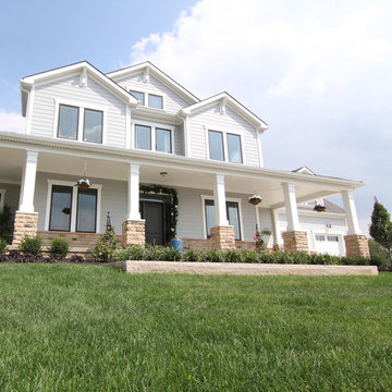
Premium siding from Celect® Cellular Composite Siding by Royal® is made from recyclable, state-of-the-art cellular materials. Which means it faithfully reproduces the deep grain texture and solid heft of real wood. And every style is equally unaffected by mold, mildew, weather and the effects of time.
 Melanie Rekola Landscape Design
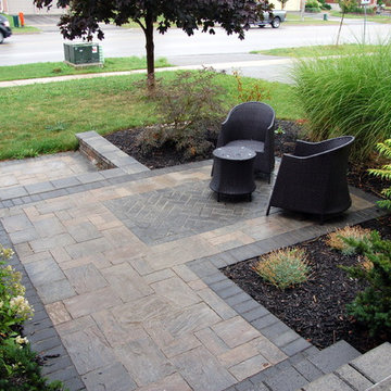
Front entrances with curb appeal in various styles, sizes and budgets A patio space in the front yard makes for an amazingly function piece of real estate. A welcoming landscape design for front yard gardens, pathways, stairs, retaining walls, landscape lighting and even water features sets the tone for your home and also brings a good ROI when time to sell. Landscape Design & Photography by Melanie Rekola
 InnovationLand
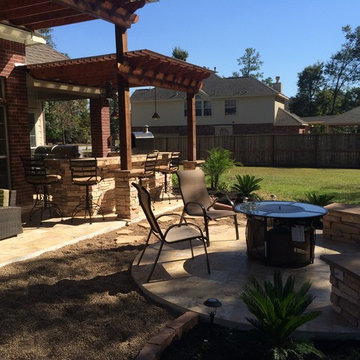
A two-level pergola, circular firepit area and outdoor kitchen with a charcoal-gas combo grill star in this Houston patio addition designed for entertaining large crowds in style.
"The client was an attorney with a passion for cooking and entertaining," says the project's principal designer, Lisha Maxey of LGH Designs. "Her main objective with this space was to create a large area for 10 to 20 guests, including seating and the prep and cooking of meals."
Located in the backyard of the client's home in Spring, TX, this beautiful outdoor living and entertaining space includes a 28-by-12-foot patio with Fantastico silver travertine tile flooring, arranged in a Versailles pattern. The walkway is Oklahoma wister flagstone.
Providing filtered shade for the patio is a two-level pergola of treated pine stained honey gold. The larger, higher tier is about 18 by 10 feet; the smaller, lower tier is about 10 feet square.
"We covered the entire pergola with Lexan - a high-quality, clear acrylic sheet that provides protection from the sun, heat and rain," says Outdoor Homescapes of Houston owner Wayne Franks.
Beneath the lower tier of the pergola sits an L-shaped, 12-by-9-foot outdoor kitchen island faced with Carmel Country ledgestone. The island houses a Fire Magic® combination charcoal-gas grill and lowered power burner, a Pacific Living countertop pizza oven and a stainless steel RCS trash drawer and sink. The countertops and raised bar are Fantastico silver travertine (18-square-inch tiles) and the backsplash is real quartz.
"The most unique design item of this kitchen area is the hexagon/circular table we added to the end of the long bar," says Lisha. This enabled the client to add seating for her dining guests."
Under the higher, larger tier of the pergola is a seating area, made up of a coffee table and espresso-colored rattan sofa and club chairs with spring-green-and-white cushions.
"Lighting also plays an important role in this space, since the client often entertains in the evening," says Wayne. Enter the chandelier over the patio seating arrangement and - over the outdoor kitchen - pendant lamps and an industrial-modern ceiling fan with a light fixture in the center. "It's important to layer your lighting for ambiance, security and safety - from an all-over ambient light that fills the space to under-the-counter task lighting for food prep and cooking to path and retaining wall lighting."
Off the patio is a transition area of crushed granite and floating flagstone pavers, leading to a circular firepit area of stamped concrete.
At the center of this circle is the standalone firepit, framed at the back by a curved stone bench. The walls of the bench and column bases for the pergola, by the way, are the same ledgestone as the kitchen island. The top slab on the bench is a hearth piece of manmade stone.
"I think the finish materials blend with the home really well," says Wayne. "We met her objectives of being able to entertain with 10 to 12 to 20 people at one time and being able to cook with charcoal and gas separately in one unit. And of course, the project was on time, on budget."
"It is truly a paradise," says the client in her Houzz review of the project. "They listened to my vision and incorporated their expertise to create an outdoor living space just perfect for me and my family!"
 Jasper + Phoenix
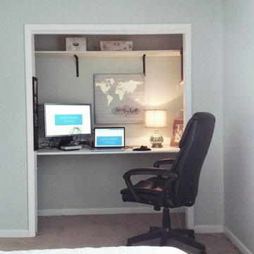
Amber works from home and was sacrificing a dining room for her home office. By utilizing the double wide closet space in her guest bedroom, she now walks into her home without the reminder of work, and can have guests over for a meal in her dining room (dining room reveal coming soon). The walls were freshly painted Sea Salt by Sherwin Williams. This gives the room a fresh, clean look and also adds contrast to the beige carpet.
Amber had her homework assignments cut out for her as she had to do some major purging in her throw all guest room. Once she started letting go, she was on a roll and continually surprised me as she cleaned out closets throughout the house. One dresser was filled with cds, dvds, books, albums, scrap-booking materials; items taking up precious real estate in her life that she didn't even know were there. There really wasn't a storage problem after-all, she was just holding on to a collection of things that no longer served her. Each time I would visit, and her space would become more open, I could see the weight lifting off her and her self love building. Amber had a recent breakup with her boyfriend and this makeover helped her not only focus on making a home sanctuary for herself, but helped her let go of the pains of the past and focus on the exciting future ahead. At one point when we were moving sofas in the living room (which we will also reveal soon), we found an ex's flip-flop. We were figuratively and literally sweeping away the past. Editing your home and your life makes room for your future; for new people and things. We are so happy to finally reveal the room to you! We can't wait to unveil the rest of Amber's home, once we complete the finishing touches.
Challenges:
Amber's home was filled with mix-matched furniture from family and college. She had no idea what her decorating style was. After shopping together and exchanging somepinterest boards, I was finally able to get a sense of what she loves.
I had to work on a tight budget, which meant really digging out the creativity and utilizing other items in the home. See how I transformed a table from the discard pile into a faux marble bedside table by clicking web link.
Amber's dad was able to help with the desk materials and building to cut costs.
We wanted to save the closet doors in the event she sold her home or no longer needed an office someday. There wasn't any extra space to store these closet doors, so I used them as a headboard.
The only items purchased were: Curtains, Curtain Rod, Bedspread Set, Throw Pillows, 2 Lamps and Paint.
22