
Search results for "Real time" in Home Design Ideas
 7 Day Kitchens
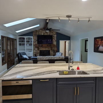
This charming family home in Belmont was in dire need of some tender loving care. The original builder-grade cabinetry and countertops were outdated and in need of an upgrade.
The kitchen was once isolated from the dining room and living room, making entertaining guests a real chore. Cooking in the kitchen meant being cut off from the rest of the household, leading to a disconnect during family time. So, we decided to make some sweeping changes.
The most transformative change was the removal of the load bearing wall separating the kitchen and living room. This created a spacious open-concept kitchen with a massive island, perfect for hosting and socializing. We upgraded the cabinets to reflect a contemporary aesthetic and added a stunning hood vent. The built-in hutch was replaced by a refrigerator and beverage center, providing ample storage space and more practical usage. The kitchen was also equipped with modern features such as roll-out trays, a trash can pull-out, spice racks, and utensil organizers. We replaced the older-style double door base cabinets with modern drawer bases for easy access, and increased the height of the cabinets from 30 inches to 36 inches, giving the kitchen a fresh, airy look and additional storage space.
The laundry room also received a makeover, with new cabinets above the washer and dryer and a tall linen/storage closet, making it more functional and storage-friendly. The small pantry closet was transformed into a sprawling 12 foot deep walk-in pantry with new shelves, cabinetry and lighting, providing ample space for all your pantry essentials. We also upgraded the flooring on the first floor with durable LVP flooring, elevating the overall aesthetic and feel of the home. All of these changes were completed in a mere 21 days, from start to finish.
 Rocky Tops Granite & Marble LLC
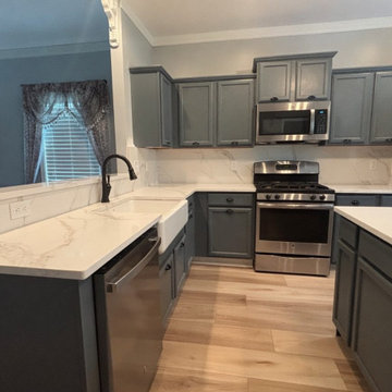
This kitchen with full height backsplash in Gaston came together in Calacatta Lilly, an engineered quartz from AG Stones that gives you that bright white background with soft gray and gold veining moving through it.
We used the same stone into the bathroom vanities too, so the whole house reads consistent without repeating the same room twice. Quartz like this is manufactured under controlled conditions, so the veining pattern is engineered to look natural while staying more predictable slab to slab than a lot of natural stone.
That consistency matters most in a kitchen, where the counters are doing the real work every day. Calacatta Lilly holds up to knives, hot pans, and the general chaos of cooking without needing much babying. It's non-porous, so there's no sealing schedule to keep track of, no worrying about a glass of wine sitting too long or lemon juice etching a ring into the surface. You wipe it down and move on with your life.
Getting the look right across a kitchen this size takes some care at the template stage. We're matching veining direction across the island, the perimeter, and working out where the seams fall so they land somewhere quiet, not right in your line of sight. With a manufactured stone like this, the pattern repeats in a way that actually helps us keep that continuity, but it still takes a careful eye to lay it out so the kitchen looks like one continuous piece rather than a handful of slabs pieced together.
In the bathroom, that same white and gray palette does something different. Vanities don't take the abuse a kitchen counter does, so the quartz there is more about keeping a clean, bright look day after day with almost zero maintenance. We finished both spaces with an eased edge, simple and clean, letting the stone itself carry the room instead of the edge detail.
Gaston sits right in that stretch of the Midlands where we do a lot of our work, and it's always good to get out there and put a stone like this into a house. Calacatta Lilly gives this kitchen and bath a bright, cohesive look that's going to hold up fine to daily life for a long time to come.
 7 Day Kitchens
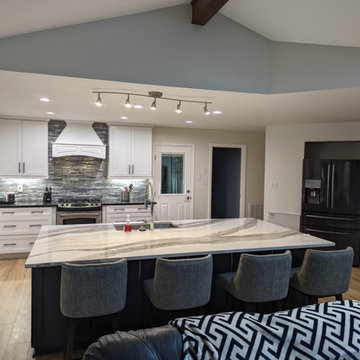
This charming family home in Belmont was in dire need of some tender loving care. The original builder-grade cabinetry and countertops were outdated and in need of an upgrade.
The kitchen was once isolated from the dining room and living room, making entertaining guests a real chore. Cooking in the kitchen meant being cut off from the rest of the household, leading to a disconnect during family time. So, we decided to make some sweeping changes.
The most transformative change was the removal of the load bearing wall separating the kitchen and living room. This created a spacious open-concept kitchen with a massive island, perfect for hosting and socializing. We upgraded the cabinets to reflect a contemporary aesthetic and added a stunning hood vent. The built-in hutch was replaced by a refrigerator and beverage center, providing ample storage space and more practical usage. The kitchen was also equipped with modern features such as roll-out trays, a trash can pull-out, spice racks, and utensil organizers. We replaced the older-style double door base cabinets with modern drawer bases for easy access, and increased the height of the cabinets from 30 inches to 36 inches, giving the kitchen a fresh, airy look and additional storage space.
The laundry room also received a makeover, with new cabinets above the washer and dryer and a tall linen/storage closet, making it more functional and storage-friendly. The small pantry closet was transformed into a sprawling 12 foot deep walk-in pantry with new shelves, cabinetry and lighting, providing ample space for all your pantry essentials. We also upgraded the flooring on the first floor with durable LVP flooring, elevating the overall aesthetic and feel of the home. All of these changes were completed in a mere 21 days, from start to finish.
Find the right local pro for your project
 7 Day Kitchens
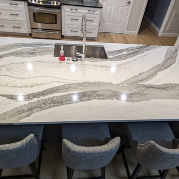
This charming family home in Belmont was in dire need of some tender loving care. The original builder-grade cabinetry and countertops were outdated and in need of an upgrade.
The kitchen was once isolated from the dining room and living room, making entertaining guests a real chore. Cooking in the kitchen meant being cut off from the rest of the household, leading to a disconnect during family time. So, we decided to make some sweeping changes.
The most transformative change was the removal of the load bearing wall separating the kitchen and living room. This created a spacious open-concept kitchen with a massive island, perfect for hosting and socializing. We upgraded the cabinets to reflect a contemporary aesthetic and added a stunning hood vent. The built-in hutch was replaced by a refrigerator and beverage center, providing ample storage space and more practical usage. The kitchen was also equipped with modern features such as roll-out trays, a trash can pull-out, spice racks, and utensil organizers. We replaced the older-style double door base cabinets with modern drawer bases for easy access, and increased the height of the cabinets from 30 inches to 36 inches, giving the kitchen a fresh, airy look and additional storage space.
The laundry room also received a makeover, with new cabinets above the washer and dryer and a tall linen/storage closet, making it more functional and storage-friendly. The small pantry closet was transformed into a sprawling 12 foot deep walk-in pantry with new shelves, cabinetry and lighting, providing ample space for all your pantry essentials. We also upgraded the flooring on the first floor with durable LVP flooring, elevating the overall aesthetic and feel of the home. All of these changes were completed in a mere 21 days, from start to finish.
 7 Day Kitchens
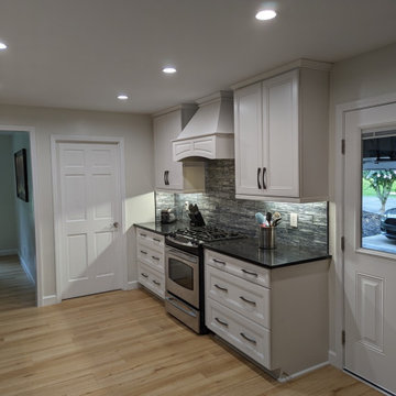
This charming family home in Belmont was in dire need of some tender loving care. The original builder-grade cabinetry and countertops were outdated and in need of an upgrade.
The kitchen was once isolated from the dining room and living room, making entertaining guests a real chore. Cooking in the kitchen meant being cut off from the rest of the household, leading to a disconnect during family time. So, we decided to make some sweeping changes.
The most transformative change was the removal of the load bearing wall separating the kitchen and living room. This created a spacious open-concept kitchen with a massive island, perfect for hosting and socializing. We upgraded the cabinets to reflect a contemporary aesthetic and added a stunning hood vent. The built-in hutch was replaced by a refrigerator and beverage center, providing ample storage space and more practical usage. The kitchen was also equipped with modern features such as roll-out trays, a trash can pull-out, spice racks, and utensil organizers. We replaced the older-style double door base cabinets with modern drawer bases for easy access, and increased the height of the cabinets from 30 inches to 36 inches, giving the kitchen a fresh, airy look and additional storage space.
The laundry room also received a makeover, with new cabinets above the washer and dryer and a tall linen/storage closet, making it more functional and storage-friendly. The small pantry closet was transformed into a sprawling 12 foot deep walk-in pantry with new shelves, cabinetry and lighting, providing ample space for all your pantry essentials. We also upgraded the flooring on the first floor with durable LVP flooring, elevating the overall aesthetic and feel of the home. All of these changes were completed in a mere 21 days, from start to finish.
 Rocky Tops Granite & Marble LLC
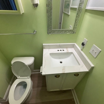
This kitchen with full height backsplash in Gaston came together in Calacatta Lilly, an engineered quartz from AG Stones that gives you that bright white background with soft gray and gold veining moving through it.
We used the same stone into the bathroom vanities too, so the whole house reads consistent without repeating the same room twice. Quartz like this is manufactured under controlled conditions, so the veining pattern is engineered to look natural while staying more predictable slab to slab than a lot of natural stone.
That consistency matters most in a kitchen, where the counters are doing the real work every day. Calacatta Lilly holds up to knives, hot pans, and the general chaos of cooking without needing much babying. It's non-porous, so there's no sealing schedule to keep track of, no worrying about a glass of wine sitting too long or lemon juice etching a ring into the surface. You wipe it down and move on with your life.
Getting the look right across a kitchen this size takes some care at the template stage. We're matching veining direction across the island, the perimeter, and working out where the seams fall so they land somewhere quiet, not right in your line of sight. With a manufactured stone like this, the pattern repeats in a way that actually helps us keep that continuity, but it still takes a careful eye to lay it out so the kitchen looks like one continuous piece rather than a handful of slabs pieced together.
In the bathroom, that same white and gray palette does something different. Vanities don't take the abuse a kitchen counter does, so the quartz there is more about keeping a clean, bright look day after day with almost zero maintenance. We finished both spaces with an eased edge, simple and clean, letting the stone itself carry the room instead of the edge detail.
Gaston sits right in that stretch of the Midlands where we do a lot of our work, and it's always good to get out there and put a stone like this into a house. Calacatta Lilly gives this kitchen and bath a bright, cohesive look that's going to hold up fine to daily life for a long time to come.
 Rocky Tops Granite & Marble LLC
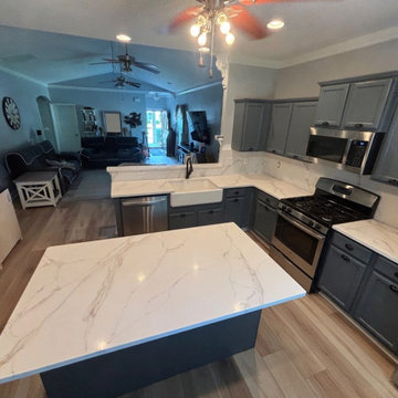
This kitchen with full height backsplash in Gaston came together in Calacatta Lilly, an engineered quartz from AG Stones that gives you that bright white background with soft gray and gold veining moving through it.
We used the same stone into the bathroom vanities too, so the whole house reads consistent without repeating the same room twice. Quartz like this is manufactured under controlled conditions, so the veining pattern is engineered to look natural while staying more predictable slab to slab than a lot of natural stone.
That consistency matters most in a kitchen, where the counters are doing the real work every day. Calacatta Lilly holds up to knives, hot pans, and the general chaos of cooking without needing much babying. It's non-porous, so there's no sealing schedule to keep track of, no worrying about a glass of wine sitting too long or lemon juice etching a ring into the surface. You wipe it down and move on with your life.
Getting the look right across a kitchen this size takes some care at the template stage. We're matching veining direction across the island, the perimeter, and working out where the seams fall so they land somewhere quiet, not right in your line of sight. With a manufactured stone like this, the pattern repeats in a way that actually helps us keep that continuity, but it still takes a careful eye to lay it out so the kitchen looks like one continuous piece rather than a handful of slabs pieced together.
In the bathroom, that same white and gray palette does something different. Vanities don't take the abuse a kitchen counter does, so the quartz there is more about keeping a clean, bright look day after day with almost zero maintenance. We finished both spaces with an eased edge, simple and clean, letting the stone itself carry the room instead of the edge detail.
Gaston sits right in that stretch of the Midlands where we do a lot of our work, and it's always good to get out there and put a stone like this into a house. Calacatta Lilly gives this kitchen and bath a bright, cohesive look that's going to hold up fine to daily life for a long time to come.

Sponsored
Sunbury, OH

J.Holderby - Renovations
Franklin County's Leading General Contractors - 2X Best of Houzz!
 Brandon Oriental Rugs
Sunday, September 14, 2014
Is Your Interior Design Depressing You?
By Joseph Pubillones
(DailyHerald.com http://www.dailyherald.com/article/20140913/entlife/140919600)
From time to time, someone will corner me and confess to me that they are depressed; they whisper that they believe their decorating is making them sick. They tell me that their interiors are not to their liking because of choices made by their spouse, their designer, or because of their own misguided attempts at decorating.
Is it possible for their environment to make them feel sick? Yes (as I think about it), it is possible for design to alter moods.
In the mid-1950s, Norbett Mintz, a researcher at Brandeis University, and his mentor, the renowned psychologist Abraham Maslow, decided to conduct research about the effects of "beauty" on behavior. Mintz had already conducted experiments about the effects of color on human behavior and concluded that color selection has a palpable effect on personal behavior.
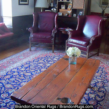
A room's design can have an impact on your mood. Mismatched colors or an
overstuffed room can affect your ability to relax and feel comfortable.
In their experiment about beauty, they designed three rooms. The first was "the ugly room", replete with clashing colors and patterns, disorganization and too much furniture for the size of the space. The second was "the average room", arranged with a monochromatic scheme, basic furniture pieces and subtly colored nondescript art. The third was "the beautiful room", decorated with quality case-goods, and fashionable fabrics and colors. Overwhelmingly, the test group rejected "the ugly room". "The average room" and "the beautiful room" were tied as the preferred room. When asked to describe the rooms, the test group was best able to describe "the beautiful room".
As a designer, this is not news to me. There are rooms, especially those that I like, that I can describe with remarkable detail. Although our notion of what is beautiful varies from person to person, it can be said that beautiful design is more memorable. We can deduce that each person prefers the beautiful.
From the time we are born, there are foods that are preferred -- some love sweets; others prefer more savory flavors. Over time, our taste buds evolve, and what was once a favorite food can become insipid or nauseating. The same is true for interior design. Over time, everyone develops preferences about what makes us feel comfortable and at home.
When I hear that someone's home is depressing, I am concerned. I suggest immediate action to change what is most bothersome. If it is wall color: a painting party is overdue. If it is furniture: I ask them to consider new upholstery; a new furniture arrangement; or substituting new pieces for those that offend. And for those too timid or dismayed to tackle their problems head-on and alone, I suggest hiring a professional interior designer.
( Joseph Pubillones is the owner of Joseph Pubillones Interiors, an award-winning interior design firm based in Palm Beach, Fla. © 2014 Creators.com)
[Comment by Brandon Oriental Rugs: Good quality is evident in the words we use when we appreciate its presence: beauty, harmony, integrity, excellence. These are appealing impressions it makes upon our minds and spirits. It can't be faked. Attempts to put a stamp of "quality" -- as in "good quality" -- upon things which possess or convey "bad quality" doesn't fool anyone who appreciates quality and the benefits it inherently brings.]
Related articles
Is your interior design depressing you?
Why Our Brains Love Colorful Interiors
A Little Spent on a Well Chosen Oriental Rug Can Save You a Lot on the Remaining Furnishings for Your Home
How Can Interior Design Inspire Fashion Design? | L' Essenziale Home Designs
Interior Design Pet Peeves
Hand-Knotted Oriental Rugs Are Best Friends With Leather Furniture And Arts & Crafts (especially Stickley (tm)) Furnishings of Every Kind
Homeowners Select Persian Kashan Rug from Bucks County Oriental Rug Store Brandon Oriental Rugs (www.BrandonRugs.com) for Family Room of Their Upper Montgomery County Farmhouse
There Is Nothing New Under The Sun - Opposites Attract - The Truth Does Not Change - Quality IS Forever Manifesting Itself - REAL Is Now
ShareThisFacebookTweetLinkedInPinterestEmail
Posted by brandon rugs at 6:06 PM No comments: Links to this post
Email This
BlogThis!
Share to Twitter
Share to Facebook
Share to Pinterest
Labels: Brandon, Brandonrugs.com, Bucks County oriental rugs, colorful rugs, designing for mood, environment, interior design, personal expression, rug store Bucks County, rugs and design
Saturday, September 13, 2014
Bucks County Rug Store Helps Bethlehem, PA Homeowners Select Rugs to Complete Newly Furnished Living Room and Dining Room
Our customers purchased new living room and dining room furniture from Hendrixson's Fine Furnishings in Shimersville, PA.
With most of both rooms finished, they asked Brandon Oriental Rugs to help them find two fine quality oriental rugs that would coordinate with each other, and serve as the last puzzle pieces to complete their decorating.
Both rugs are finely detailed, hand-knotted, antique reproduction Persian Tabriz design oriental rugs made in India. The living room rug has a golden-maize color background with an antique gold border that subtly complements the fabrics and floor color in the room. The small scale motifs add color and interest while not defeating the supporting role the rug plays in the room to the customer's collection of fine original artworks.
The dining room rug is an unusual "Hasht-guli" design with berry-red background and golden-maize border that complements the living room rug, the rich mahogany wood-tones of the dining room suite, and the fabrics used in the custom window treatments designed and installed by Hendrixson's.
The wonderful result wrought by our customers expressing their good taste in an unswerving commitment to quality is proof that a modestly sized home can look and feel as elegant and luxurious as any palace.
Related articles
Lehigh Valley: Bucks County Oriental Rug Store, Brandon Oriental Rugs - www.BrandonRugs.com - Finds and Delivers Rugs for Lehigh Valley Home in Bethlehem, PA
New Homeowners in Doylestown, PA (Bucks County) Find Handmade Oriental Rug That Complements Everything in the Entry Hall to Their Home with Help from Brandon Oriental Rugs (www.BrandonRugs.com)
Brandon Oriental Rugs in Bucks County, PA helps Lehigh Valley Homeowner ( Bethlehem, PA ) Find a Fine Quality Oriental Rug to Complete Family Room
Aesthetic pieces
RUG SALE REALITY -- What Kind of Rug Sale Are You Looking For: "Biggest Discount" or "Best Quality at the Best Price"? Bucks County Oriental Rug Store - Brandon Oriental Rugs (BrandonRugs.com) - Helps You Understand the Difference
Brandon Oriental Rugs Helps Newtown, PA Homeowner Prepare for Holiday Entertaining with new Hand-knotted Oriental Rugs for the Living Room and Dining Room
Is That Really an Antique Rug? Antique Rugs Might Not Always Be As Old As You Think.
ShareThisFacebookTweetLinkedInPinterestEmail
Posted by brandon rugs at 2:47 PM No comments: Links to this post
Email This
BlogThis!
Share to Twitter
Share to Facebook
Share to Pinterest
Labels: Bethlehem, Brandon, choosing an area rug, Doylestown, interior design, Lehigh Valley home furnishings, oriental rugs bucks county
Tuesday, September 9, 2014
Oriental Rugs: What More Can You Say?
(BrandonRugs.com) Sometimes when there's a lot to be said, saying it quietly commands more attention.
You almost want to invite the oriental rugs to speak up, but they are always content playing a supporting role.
Related articles
New Homeowners in Doylestown, PA (Bucks County) Find Handmade Oriental Rug That Complements Everything in the Entry Hall to Their Home with Help from Brandon Oriental Rugs (www.BrandonRugs.com)
Bucks County Rug Store and Rug Search Service (Brandon Oriental Rugs - www.BrandonRugs.com) Helps Upper Bucks County Homeowner to Select Living Room Rugs for Old Farmhouse Renovation
A Little Spent on a Well Chosen Oriental Rug Can Save You a Lot on the Remaining Furnishings for Your Home
5 Things That Take a Room from Good to Great
RUG SALE REALITY -- What Kind of Rug Sale Are You Looking For: "Biggest Discount" or "Best Quality at the Best Price"? Bucks County Oriental Rug Store - Brandon Oriental Rugs (BrandonRugs.com) - Helps You Understand the Difference
Rug Shopping in Princeton - Hopewell - Skillman New Jersey Region Made Easier with Help From Bucks County Oriental Rug Store Brandon Oriental Rugs - www.BrandonRugs.com - as Proven by Customer's Experience
Video: All About Persian Rugs from Their Source ( with commentary from Bucks County Oriental Rug Store Brandon Oriental Rugs - www.BrandonRugs.com )
Advice For Maintaining Oriental Rugs
ShareThisFacebookTweetLinkedInPinterestEmail
Posted by brandon rugs at 4:07 PM No comments: Links to this post
Email This
BlogThis!
Share to Twitter
Share to Facebook
Share to Pinterest
Labels: Brandon, Bucks County oriental rugs, choose an oriental rug, Doylestown, Huntingdon Valley, layered rugs, New Hope, Newtown, oriental rug store Bucks County, Pinterest, rug sale, rug size, rugs and decor
Rug Placement Helps Determine Room Function and Where Rooms Begin and End
(BrandonRugs.com) If feel that your decorating is neither here nor there; the appropriate use of handmade oriental rugs will definitely help you to figure out where here is.
http://www.pinterest.com/pin/133348838942090547/
Related articles
New Homeowners in Doylestown, PA (Bucks County) Find Handmade Oriental Rug That Complements Everything in the Entry Hall to Their Home with Help from Brandon Oriental Rugs (www.BrandonRugs.com)
Bucks County Rug Store and Rug Search Service (Brandon Oriental Rugs - www.BrandonRugs.com) Helps Upper Bucks County Homeowner to Select Living Room Rugs for Old Farmhouse Renovation
Homeowners Select Persian Kashan Rug from Bucks County Oriental Rug Store Brandon Oriental Rugs (www.BrandonRugs.com) for Family Room of Their Upper Montgomery County Farmhouse
Oriental Rugs and Rugged Individualism: The World at Your Feet Is An Expression of You
Rug Shopping in Princeton - Hopewell - Skillman New Jersey Region Made Easier with Help From Bucks County Oriental Rug Store Brandon Oriental Rugs - www.BrandonRugs.com - as Proven by Customer's Experience
One-of-a-Kind Oriental Rugs Are Something Special for Those Blazing a Trail of Exquisite Taste That Can Be Admired But Not Duplicated
ShareThisFacebookTweetLinkedInPinterestEmail
Posted by brandon rugs at 3:22 PM No comments: Links to this post
Email This
BlogThis!
Share to Twitter
Share to Facebook
Share to Pinterest
Labels: Brandon, Bucks County oriental rugs, choose an oriental rug, Doylestown, Huntingdon Valley, layered rugs, New Hope, Newtown, oriental rug store Bucks County, Pinterest, rug sale, rug size, rugs and decor
Saturday, September 6, 2014
Why You Should Hire a Professional Interior Designer
by Cindy Beyer — August 27, 2014 at 1:00 pm
( http://www.restonnow.com/2014/08/27/why-you-should-hire-a-professional-interior-designer)
The interior of your home says a lot about you. Your home is your castle. Many of my clients have said they couldn’t imagine the results after their project was completed. They say it was the WOW factor. I say, that is why you hired a professional designer.
There are many situations that warrant the hiring a professional interior designer. This includes something as simple as choosing paint and window covering to full scale renovation work such as a new kitchen, bath or lower level. In addition to achieving that WOW factor, a professional interior designer will save their clients’ money in many ways, most importantly the avoidance of costly mistakes.
Not only will a professional designer understand the context of the project, they will have access to many resources and their trained eye can make a world of difference in the final result. And those final results also will improve the value of your home.
Professional interior designers are able to work closely with architects and contractors and are comfortable with drawing floor plans, as well as understanding the implications of how interiors will be used as it relates to structural and available floor space.
Beyond floor plans, program management, installation and understanding how structural design will be used in a practical setting, a professional interior designer will also be knowledgeable in color and fabric design, space planning, window coverings, furniture design, architecture and much more. So when you see the initials ASID and NCIDQ next to an interior designer’s name, know they have been through significant amount of formal certification.
When hiring a professional interior designer, it is important to have an understanding of the scope of the work to be done. Before my initial meeting with a new client, I ask them to spend some time making a list of their needs as well as any pictures they saved of items or rooms they like. Upon our first meeting, I take photos and measurements. Together,we then develop a detailed itemized list covering all areas of concern. The next step is to draw up and present a floor plan. Depending on the type of project this could include floor plans and furniture placement as well as construction and lighting if needed.
Once the plan is approved appropriate furnishings and finishes are selected. This can be fun - and exhausting as well. I often present my clients with many samples from which to choose. After the furniture choices, I develop a comprehensive budget itemizing all purchases.
I also may call on several of the contractors I work with such as electricians, plumbers, cabinet wholesalers and cabinet makers, painters, as well as drapery workrooms and installers. It has taken many years to compile trusted associates, which is an important part of being a good designer.
Lead times for good furniture and furnishings can take from 6-12 weeks depending on availability. This extra time gives sufficient time to finish the required preparatory work, and allows clients time to dispose of old furniture.
Related articles
Interior Design Pet Peeves
A Little Spent on a Well Chosen Oriental Rug Can Save You a Lot on the Remaining Furnishings for Your Home
Analysis of Initial Reaction to the New Furniture Exhibition 1901 - an 'exceedingly vulgar show' - (Curated by The Victoria and Albert Museum) with Lessons for Today (extending to the use of handmade area rugs) Regarding Evolution of Tastes and Styles
Hand-Knotted Oriental Rugs Are Best Friends With Leather Furniture And Arts & Crafts (especially Stickley (tm)) Furnishings of Every Kind
How Can Interior Design Inspire Fashion Design? | L' Essenziale Home Designs
Brandon Oriental Rugs Helps Homeowner in Doylestown, PA (Bucks County) Find Rug to Complete Newly Furnished Study
Fine Quality Area Rugs - Naturally Including Oriental Rugs - Are A Step In the Right Direction As Designers and Homeowners Plan Improvements: What's Under Foot for 2014? | ASID Icon
Bucks County Interior Designer Able to Find Oriental Rug for Her Project Through Brandon Oriental Rugs (www.BrandonRugs.com)
ShareThisFacebookTweetLinkedInPinterestEmail
Posted by brandon rugs at 11:28 PM No comments: Links to this post
Email This
BlogThis!
Share to Twitter
Share to Facebook
Share to Pinterest
Labels: Brandon, Bucks County oriental rugs, floorplan, home fashion, interior design, lifestyle, oriental rugs, rug store Bucks County
Thursday, September 4, 2014
Homeowners Select Persian Kashan Rug from Bucks County Oriental Rug Store Brandon Oriental Rugs (www.BrandonRugs.com) for Family Room of Their Upper Montgomery County Farmhouse
- See more at: http://brandonrugs.blogspot.com/#sthash.QMFruxxC.dpuf (Pamela Ward/ Brandon Oriental Rugs)

 Advance Design Studio, Ltd.
Jackie and Sean loved the Algonquin neighborhood they lived in with the peaceful neighborhood and the close proximity to work and school. What they didn’t love was how outdated their home had become. With a cramped kitchen and an unused dining room, they decided a remodel was the perfect solution to their problem. They would be able to continue to live in the area they loved, while at the same time they could have the dream home they envisioned.
After a thorough search, Jackie came across Advance Design Studio. She was impressed by all of the positive reviews she saw on the internet and saw herself identifying with all of the project stories she saw on the website. Once they met with designer Scott Christensen and owner Todd Jurs, they knew Advance Design was the right company to make their dreams a reality.
The project consisted of four main areas: the kitchen/dining/powder room, the laundry room, the master bathroom, and the kid’s bathroom. They wanted to expand the kitchen into the seldom used dining room and add a large island for hosting parties and family gatherings. They also wanted new hardwood flooring throughout the first level. The laundry room needed to be more functional, and all three bathrooms were in dire need of updating.
The closed off kitchen was opened up to create a sweeping space between the new eating area and the much larger kitchen. A handsome dry bar complete with a beverage refrigerator and lighted glass door cabinetry makes an elegant transition across from a peninsula area filled with storage. An additional decorative cabinet lighting up elegant dishware through the mullioned glass sits directly across from the drybar.
An expansive island was critical to the kitchen plans. Jackie, Sean and Scott worked closely together to create just the right details for their design. They wanted the island to be functional in addition to being the centerpiece of the room. Added storage for the kid’s school supplies was hidden behind cabinet doors so the children could do their schoolwork right at the island, and a microwave drawer glides open with the touch of a finger hidden inconspicuously within the island space. The easy to care for Cambria Britannica Quartz island top with its sweeping grey and white marble look perched atop hand-carved Craftsman corbels was absolutely what they were hoping for, blending both beauty and function perfectly.
Adding a nice contrast to the brightness of the quartz and the white cabinetry, Kodiak - Leather granite countertops were used to balance the light and dark tones of the space. Dura Supreme Classic White painted cabinets grace the perimeter, while Maple Poppy Seed stained cabinets with a beautiful soft grey woodgrain were used in the beverage center and island. The two tones compliment the large space balancing it out nicely creating interest and elegance with the simple Craftsman style full overlay doors.
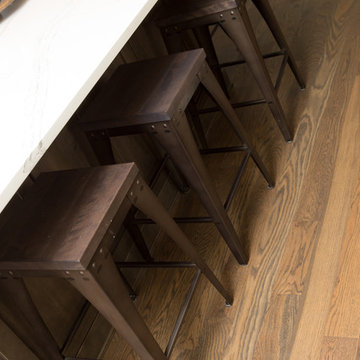
A deep warm Barnwood White Oak flooring was added throughout the lower level. The new floor brings additional contrast to the bright kitchen and provides unity with the now open floorplan as it rolls in to the foyer and family room. Final details like the show-stopping lunar like duo light fixtures complete the space and intermix expertly with crisscross details of the glass door mullions, the island bar seating and even accessories in the space.
The small cluttered laundry room needed more space and more storage. With a busy family it seemed to overflow daily and did not have anywhere to hide the families “in and out stuff.” Scott designed the new space with a stackable washer and dryer and much more efficiently organized cabinetry. Doing laundry is now (almost!) a pleasure and keeping everyone’s “stuff” hidden, but readily accessible is now a snap.
The master bath was not a place where the couple enjoyed spending time getting ready for their day. The tub almost never was used, so removing it made it possible to build an extra-large shower, replacing the small cramped cube of the previous shower they hated. Clean, horizontal lines softly draw your eye around the space with porcelain tile called Driftwood Sea spray. Full overlay cabinetry in a soft white vanity with double sinks makes getting ready for the day much more convenient for the busy couple.
Long floor planks made of porcelain tile mimic real hardwood floors in a soft grey to compliment the shower, but with the ease and care of a tile surface. Cambrian Black Granite counters with a matte finish and under mount porcelain sinks with handsome brushed chrome hardware complete the handsome space. A real bonus in any master bath; a custom built in storage nook was tucked in the corner of the space for linens and heavenly storage.
The kid’s bath was in sad shape because it was original to the house. To keep the budget in control, the tub which was in great condition was retained, but focus was on the new large brick style porcelain charcoal tile on the floor, crisp white new Craftsman style cabinetry with pretty furniture details on the corner base, a striking granite top with white under mount porcelain sinks and fresh hardware and faucets. Some beautiful soft grey wood mirrors to match mom and dads were custom sized and placed under new lighting, and 4 hooks were smartly arranged down the wall for kids’ towels.
This couple was determined not to move, and made their house their dream home. Not only does their home function greatly now, but Jackie says, “When the neighbors come to visit, they’re asking if they can “steal” the design”! The added functionality, elegance, and open floor plan were exactly what this family needed in order to stay.
Advance Design Studio, Joe Nowak

 Safferstone Interiors
Meet Kim: a partner in a downtown law firm. To say that she is short on time is a giant understatement. In the rare event she has a free moment, she wants to spend it with her kids, not fussing over home decor.
That’s my cue!
Kim is my favorite type of client. She didn’t know where to go or what to do. She leaned on me to explain and articulate design and style.
She looked to me to make her home a mirror of her best self. Easy peasy lemon squeezy. Fantastic human giving me a blank slate? Yes please!
While Kim’s traditional home had a great layout and good bones, it needed updating to make it contemporary and fresh. It needed fixtures and knobs from this century. It needed a Lulu DK roman shade in the powder room. It needed a durable, snuggle-ready sofa with tufting and little patterns of texture. It needed drapery with small-scale drama. Throw in a Thomas O’ Brian cocktail table, and now there’s no shortage of conversation pieces.
Little spaces make me happy – they are the most intimate snapshot of your entire home’s aesthetic – and this house has some good ones.
I couldn’t wait to work with the nooks and crannies of this house. Kim’s sitting room, a small den off of the master bedroom, morphed into a craveable cozy space, a quiet adult respite from the occasional chaos of raising a family. The kitchen evolved into something quite unique: playful yet modest, dressed-up but centered. We used a favorite Lucy Rose fabric and Galbraith & Paul pillows to work perfectly with a fresh color palette selected during a prior-to-me renovation. A locally made kitchen farm table fit right in with the high-fashioned quirky blend of color, texture, and pattern.
High-End + Color = Fun + Functional
This is how we articulated Kim’s style and personality. She trusted me with her inner self, allowing me to get to know her and her real, everyday life. I built her a special space to reflect the beautiful life she made for herself. Nothing too fancy or off-limits to little hands, nothing too stuffy (snore!). Everything 100% HER. #nailedit See more Safferstone stuff at www.safferstone.com. Connect with us on Facebook, get inspired on Pinterest, and share modern musings on life & design on Instagram. Or, send us a love note at hello@safferstone.com.
Photo: Angie Seckinger

 InnovationLand
3D Design Preview Drawing
Top View - Outdoor Kitchen Layout
A two-level pergola, circular firepit area and outdoor kitchen with a charcoal-gas combo grill star in this Houston patio addition designed for entertaining large crowds in style.
"The client was an attorney with a passion for cooking and entertaining," says the project's principal designer, Lisha Maxey of LGH Designs. "Her main objective with this space was to create a large area for 10 to 20 guests, including seating and the prep and cooking of meals."
Located in the backyard of the client's home in Spring, TX, this beautiful outdoor living and entertaining space includes a 28-by-12-foot patio with Fantastico silver travertine tile flooring, arranged in a Versailles pattern. The walkway is Oklahoma wister flagstone.
Providing filtered shade for the patio is a two-level pergola of treated pine stained honey gold. The larger, higher tier is about 18 by 10 feet; the smaller, lower tier is about 10 feet square.
"We covered the entire pergola with Lexan - a high-quality, clear acrylic sheet that provides protection from the sun, heat and rain," says Outdoor Homescapes of Houston owner Wayne Franks.
Beneath the lower tier of the pergola sits an L-shaped, 12-by-9-foot outdoor kitchen island faced with Carmel Country ledgestone. The island houses a Fire Magic® combination charcoal-gas grill and lowered power burner, a Pacific Living countertop pizza oven and a stainless steel RCS trash drawer and sink. The countertops and raised bar are Fantastico silver travertine (18-square-inch tiles) and the backsplash is real quartz.
"The most unique design item of this kitchen area is the hexagon/circular table we added to the end of the long bar," says Lisha. This enabled the client to add seating for her dining guests."
Under the higher, larger tier of the pergola is a seating area, made up of a coffee table and espresso-colored rattan sofa and club chairs with spring-green-and-white cushions.
"Lighting also plays an important role in this space, since the client often entertains in the evening," says Wayne. Enter the chandelier over the patio seating arrangement and - over the outdoor kitchen - pendant lamps and an industrial-modern ceiling fan with a light fixture in the center. "It's important to layer your lighting for ambiance, security and safety - from an all-over ambient light that fills the space to under-the-counter task lighting for food prep and cooking to path and retaining wall lighting."
Off the patio is a transition area of crushed granite and floating flagstone pavers, leading to a circular firepit area of stamped concrete.
At the center of this circle is the standalone firepit, framed at the back by a curved stone bench. The walls of the bench and column bases for the pergola, by the way, are the same ledgestone as the kitchen island. The top slab on the bench is a hearth piece of manmade stone.
"I think the finish materials blend with the home really well," says Wayne. "We met her objectives of being able to entertain with 10 to 12 to 20 people at one time and being able to cook with charcoal and gas separately in one unit. And of course, the project was on time, on budget."
"It is truly a paradise," says the client in her Houzz review of the project. "They listened to my vision and incorporated their expertise to create an outdoor living space just perfect for me and my family!"

 SDM Design, Inc.
This house was designed for a couple and their son. One of the design program requirements was to have two master suites on the main level. They enjoy cooking and entertaining so the public and food prep. areas are functional, attractive and conducive to people gathering around. Consequently, the square footage of the main level is large.
The house is also on a very steep slope which didn't help with the required footprint. In order to minimize the related costs of building with this site condition, the footprint of the house is long and not deep as it reaches down the slope.
The scale of the existing homes in the neighborhood are unimposing. In order to play down the size as viewed from the street, the facade is broken up into several different masses with low sloping roofs.
Once you're inside, the house opens up with 14 foot ceilings in the entry and living areas. The ceiling height of other spaces on the main level are 10 feet. Universal design was implemented on the main level to provide inherent accessibility for everyone.
The lower level accommodates several guest rooms and baths, an exercise room, a guest den with wet bar and a man cave.
Another design program requirement was to make the house as maintenance-free as possible. Exterior materials include stucco, Pennsylvania Blue Stone and a new aluminum siding product called Longboard. The siding comes in many wood grain finishes and to everyone that has seen it, they think it's real wood. It's also made from heavy gauge aluminum so it doesn't ding like traditional aluminum siding. The roofs are metal standing seam.
The house is energy efficient. It's fully insulated with spray foam insulation-lots of it. The exterior walls were designed with 2x6 studs and roof rafters are 2x12 to provide plenty of space for the insulation, exceeding the required R-values. Windows and doors of course are energy efficient as well. All lighting is LED.
The decking around the exterior is locust, a very hard native wood which is naturally insect and rot resistant.
The best part of the whole project are the owners who love their new home. They initially had plans to live in this house during the summer months and Florida during the winter. They are now seriously considering living here full-time.
 Advance Design Studio, Ltd.
Jackie and Sean loved the Algonquin neighborhood they lived in with the peaceful neighborhood and the close proximity to work and school. What they didn’t love was how outdated their home had become. With a cramped kitchen and an unused dining room, they decided a remodel was the perfect solution to their problem. They would be able to continue to live in the area they loved, while at the same time they could have the dream home they envisioned.
After a thorough search, Jackie came across Advance Design Studio. She was impressed by all of the positive reviews she saw on the internet and saw herself identifying with all of the project stories she saw on the website. Once they met with designer Scott Christensen and owner Todd Jurs, they knew Advance Design was the right company to make their dreams a reality.
The project consisted of four main areas: the kitchen/dining/powder room, the laundry room, the master bathroom, and the kid’s bathroom. They wanted to expand the kitchen into the seldom used dining room and add a large island for hosting parties and family gatherings. They also wanted new hardwood flooring throughout the first level. The laundry room needed to be more functional, and all three bathrooms were in dire need of updating.
The closed off kitchen was opened up to create a sweeping space between the new eating area and the much larger kitchen. A handsome dry bar complete with a beverage refrigerator and lighted glass door cabinetry makes an elegant transition across from a peninsula area filled with storage. An additional decorative cabinet lighting up elegant dishware through the mullioned glass sits directly across from the drybar.
An expansive island was critical to the kitchen plans. Jackie, Sean and Scott worked closely together to create just the right details for their design. They wanted the island to be functional in addition to being the centerpiece of the room. Added storage for the kid’s school supplies was hidden behind cabinet doors so the children could do their schoolwork right at the island, and a microwave drawer glides open with the touch of a finger hidden inconspicuously within the island space. The easy to care for Cambria Britannica Quartz island top with its sweeping grey and white marble look perched atop hand-carved Craftsman corbels was absolutely what they were hoping for, blending both beauty and function perfectly.
Adding a nice contrast to the brightness of the quartz and the white cabinetry, Kodiak - Leather granite countertops were used to balance the light and dark tones of the space. Dura Supreme Classic White painted cabinets grace the perimeter, while Maple Poppy Seed stained cabinets with a beautiful soft grey woodgrain were used in the beverage center and island. The two tones compliment the large space balancing it out nicely creating interest and elegance with the simple Craftsman style full overlay doors.
A deep warm Barnwood White Oak flooring was added throughout the lower level. The new floor brings additional contrast to the bright kitchen and provides unity with the now open floorplan as it rolls in to the foyer and family room. Final details like the show-stopping lunar like duo light fixtures complete the space and intermix expertly with crisscross details of the glass door mullions, the island bar seating and even accessories in the space.
The small cluttered laundry room needed more space and more storage. With a busy family it seemed to overflow daily and did not have anywhere to hide the families “in and out stuff.” Scott designed the new space with a stackable washer and dryer and much more efficiently organized cabinetry. Doing laundry is now (almost!) a pleasure and keeping everyone’s “stuff” hidden, but readily accessible is now a snap.
The master bath was not a place where the couple enjoyed spending time getting ready for their day. The tub almost never was used, so removing it made it possible to build an extra-large shower, replacing the small cramped cube of the previous shower they hated. Clean, horizontal lines softly draw your eye around the space with porcelain tile called Driftwood Sea spray. Full overlay cabinetry in a soft white vanity with double sinks makes getting ready for the day much more convenient for the busy couple.
Long floor planks made of porcelain tile mimic real hardwood floors in a soft grey to compliment the shower, but with the ease and care of a tile surface. Cambrian Black Granite counters with a matte finish and under mount porcelain sinks with handsome brushed chrome hardware complete the handsome space. A real bonus in any master bath; a custom built in storage nook was tucked in the corner of the space for linens and heavenly storage.
The kid’s bath was in sad shape because it was original to the house. To keep the budget in control, the tub which was in great condition was retained, but focus was on the new large brick style porcelain charcoal tile on the floor, crisp white new Craftsman style cabinetry with pretty furniture details on the corner base, a striking granite top with white under mount porcelain sinks and fresh hardware and faucets. Some beautiful soft grey wood mirrors to match mom and dads were custom sized and placed under new lighting, and 4 hooks were smartly arranged down the wall for kids’ towels.
This couple was determined not to move, and made their house their dream home. Not only does their home function greatly now, but Jackie says, “When the neighbors come to visit, they’re asking if they can “steal” the design”! The added functionality, elegance, and open floor plan were exactly what this family needed in order to stay.
Advance Design Studio, Joe Nowak
Sponsored
Sunbury, OH
J.Holderby - Renovations
Franklin County's Leading General Contractors - 2X Best of Houzz!
 Safferstone Interiors
Meet Kim: a partner in a downtown law firm. To say that she is short on time is a giant understatement. In the rare event she has a free moment, she wants to spend it with her kids, not fussing over home decor.
That’s my cue!
Kim is my favorite type of client. She didn’t know where to go or what to do. She leaned on me to explain and articulate design and style.
She looked to me to make her home a mirror of her best self. Easy peasy lemon squeezy. Fantastic human giving me a blank slate? Yes please!
While Kim’s traditional home had a great layout and good bones, it needed updating to make it contemporary and fresh. It needed fixtures and knobs from this century. It needed a Lulu DK roman shade in the powder room. It needed a durable, snuggle-ready sofa with tufting and little patterns of texture. It needed drapery with small-scale drama. Throw in a Thomas O’ Brian cocktail table, and now there’s no shortage of conversation pieces.
Little spaces make me happy – they are the most intimate snapshot of your entire home’s aesthetic – and this house has some good ones.
I couldn’t wait to work with the nooks and crannies of this house. Kim’s sitting room, a small den off of the master bedroom, morphed into a craveable cozy space, a quiet adult respite from the occasional chaos of raising a family. The kitchen evolved into something quite unique: playful yet modest, dressed-up but centered. We used a favorite Lucy Rose fabric and Galbraith & Paul pillows to work perfectly with a fresh color palette selected during a prior-to-me renovation. A locally made kitchen farm table fit right in with the high-fashioned quirky blend of color, texture, and pattern.
High-End + Color = Fun + Functional
This is how we articulated Kim’s style and personality. She trusted me with her inner self, allowing me to get to know her and her real, everyday life. I built her a special space to reflect the beautiful life she made for herself. Nothing too fancy or off-limits to little hands, nothing too stuffy (snore!). Everything 100% HER. #nailedit See more Safferstone stuff at www.safferstone.com. Connect with us on Facebook, get inspired on Pinterest, and share modern musings on life & design on Instagram. Or, send us a love note at hello@safferstone.com.
Photo: Angie Seckinger
 Advance Design Studio, Ltd.
Jackie and Sean loved the Algonquin neighborhood they lived in with the peaceful neighborhood and the close proximity to work and school. What they didn’t love was how outdated their home had become. With a cramped kitchen and an unused dining room, they decided a remodel was the perfect solution to their problem. They would be able to continue to live in the area they loved, while at the same time they could have the dream home they envisioned.
After a thorough search, Jackie came across Advance Design Studio. She was impressed by all of the positive reviews she saw on the internet and saw herself identifying with all of the project stories she saw on the website. Once they met with designer Scott Christensen and owner Todd Jurs, they knew Advance Design was the right company to make their dreams a reality.
The project consisted of four main areas: the kitchen/dining/powder room, the laundry room, the master bathroom, and the kid’s bathroom. They wanted to expand the kitchen into the seldom used dining room and add a large island for hosting parties and family gatherings. They also wanted new hardwood flooring throughout the first level. The laundry room needed to be more functional, and all three bathrooms were in dire need of updating.
The closed off kitchen was opened up to create a sweeping space between the new eating area and the much larger kitchen. A handsome dry bar complete with a beverage refrigerator and lighted glass door cabinetry makes an elegant transition across from a peninsula area filled with storage. An additional decorative cabinet lighting up elegant dishware through the mullioned glass sits directly across from the drybar.
An expansive island was critical to the kitchen plans. Jackie, Sean and Scott worked closely together to create just the right details for their design. They wanted the island to be functional in addition to being the centerpiece of the room. Added storage for the kid’s school supplies was hidden behind cabinet doors so the children could do their schoolwork right at the island, and a microwave drawer glides open with the touch of a finger hidden inconspicuously within the island space. The easy to care for Cambria Britannica Quartz island top with its sweeping grey and white marble look perched atop hand-carved Craftsman corbels was absolutely what they were hoping for, blending both beauty and function perfectly.
Adding a nice contrast to the brightness of the quartz and the white cabinetry, Kodiak - Leather granite countertops were used to balance the light and dark tones of the space. Dura Supreme Classic White painted cabinets grace the perimeter, while Maple Poppy Seed stained cabinets with a beautiful soft grey woodgrain were used in the beverage center and island. The two tones compliment the large space balancing it out nicely creating interest and elegance with the simple Craftsman style full overlay doors.
A deep warm Barnwood White Oak flooring was added throughout the lower level. The new floor brings additional contrast to the bright kitchen and provides unity with the now open floorplan as it rolls in to the foyer and family room. Final details like the show-stopping lunar like duo light fixtures complete the space and intermix expertly with crisscross details of the glass door mullions, the island bar seating and even accessories in the space.
The small cluttered laundry room needed more space and more storage. With a busy family it seemed to overflow daily and did not have anywhere to hide the families “in and out stuff.” Scott designed the new space with a stackable washer and dryer and much more efficiently organized cabinetry. Doing laundry is now (almost!) a pleasure and keeping everyone’s “stuff” hidden, but readily accessible is now a snap.
The master bath was not a place where the couple enjoyed spending time getting ready for their day. The tub almost never was used, so removing it made it possible to build an extra-large shower, replacing the small cramped cube of the previous shower they hated. Clean, horizontal lines softly draw your eye around the space with porcelain tile called Driftwood Sea spray. Full overlay cabinetry in a soft white vanity with double sinks makes getting ready for the day much more convenient for the busy couple.
Long floor planks made of porcelain tile mimic real hardwood floors in a soft grey to compliment the shower, but with the ease and care of a tile surface. Cambrian Black Granite counters with a matte finish and under mount porcelain sinks with handsome brushed chrome hardware complete the handsome space. A real bonus in any master bath; a custom built in storage nook was tucked in the corner of the space for linens and heavenly storage.
The kid’s bath was in sad shape because it was original to the house. To keep the budget in control, the tub which was in great condition was retained, but focus was on the new large brick style porcelain charcoal tile on the floor, crisp white new Craftsman style cabinetry with pretty furniture details on the corner base, a striking granite top with white under mount porcelain sinks and fresh hardware and faucets. Some beautiful soft grey wood mirrors to match mom and dads were custom sized and placed under new lighting, and 4 hooks were smartly arranged down the wall for kids’ towels.
This couple was determined not to move, and made their house their dream home. Not only does their home function greatly now, but Jackie says, “When the neighbors come to visit, they’re asking if they can “steal” the design”! The added functionality, elegance, and open floor plan were exactly what this family needed in order to stay.
Advance Design Studio, Joe Nowak

 Mottram Architecture
Timber frame homes offer unique challenges during a remodel. What often makes them beautiful and attractive to most homeowners, also makes them challenging for space requirements.
Context: The lovely couple that owned this home were struggling with some interesting floor plan challenges that just didn't work for their family. The loved the beautiful timbers and woodwork of their home, but the dramatically sloping ceilings on the second floor, particularly in the bathroom, just didn't work for this 1 1/2 bath home. Needing to use the skylight to approach the toilet was a less then ideal scenario. Although the bathroom footprint was more then adequate, the sloped ceiling only made half of the space useable. Check out the Before/After post on our blog to see the photos of the house pre-renovation. As much as they loved all the wood features in their home, another challenge they had was light. The wood ceiling made everything inside the house darker, even with a fantastic array of south facing windows, there were spaces in the home that felt dark and small. When they contacted us they wanted to know how could they make their brighter and more inviting, were there solutions to the 2nd floor sloped ceiling issues, and if they were going to do all of this work, how could they make their home more comfortable and efficient. A nagging water leak in the upstairs bathroom spurred them into action and here is how we solved their dilemma.
Conclusion: First, we added a little dormer to the rear of the house so we could get full headroom in nearly all of the upstairs bathroom! Then we decided to extend that dormer one more timber bay over to create a walk in closet with natural light and plenty of space. Since we were contemplating energy efficiency, we resolved a nagging issue that is present in a lot of timber frame construction, air tightness. Commonly found in timber frame construction, fiberglass insulation is installed in the rafter bays and board ceilings are installed over top. Unfortunately, board ceilings are anything but air tight, and fiberglass insulation needs to be in an airtight cavity for maximum effectiveness. So we were able to solve two issues at the same time for this homeowner. We removed the board ceiling and fiberglass insulation, we dense packed the rafter bays with cellulose insulation, and installed sheetrock in place of the boards. The boards were salvaged for re-use by the homeowner, and the space and light quality was dramatically improved. Some may think that losing the board ceiling took something away from the space, but what you'll see in the pictures is that it highly accentuates the heavy timbers and really makes them stand out in a beautiful way. Now with this added airtightness, better insulation, and brighter space, the homeowner hardly runs their wood stove, and it's so quiet in the space, an added bonus from changing the insulation. It became necessary to also add a sheetrock ceiling to the living room to hide the plumbing from the new bathroom layout above. Changing this ceiling gave the homeowner some real quality lighting that was lacking in the living room before. The brighter ceiling and new lighting layout completely transforms the living room into a space you want to hang out, even though the layout didn't change at all. When the homeowner saw the finished spaces she said "I can't believe this is my house, I want to live in this house"
Energy Efficiency: I touched a little on the efficiency above, but like all projects done with Mottram Architecture, we always want to leave you with a little extra. Timber frame construction with board ceilings and fiberglass insulation are notoriously leaky! If you want to know what we think about fiberglass insulation, check our our blog post on Why Fiberglass Insulation Sucks. By installing cellulose insulation and covering it with sheetrock we were able to greatly reduce the heat flowing out of this home. It not only improves cashflow it improves the comfort level in the space. Who wants to sit in their living room and feel a draft? Let us remind you, we are not saying cellulose insulation is an air barrier, we use the sheetrock to help with that, but it does significantly reduce the air flow over fiberglass insulation. And when we reduce the airflow, we reduce the heat flow. And when we reduce the heat flow, we reduce the need to re-heat that drafty air from outside. When it comes to energy efficiency the first and best place to start is air infiltration. We greatly reduced the air infiltration with the new insulation, but we also added a hat and warm boots. What I mean by that is, we improved the insulation in the roof, and we installed insulation in the basement. Maybe it's a silly analogy, but when you think about keeping warm, we always start with the hat and boots! With sustainability in mind, the next project will be to add a deck to the front of this house with rain catchment barrels from the metal roof. They are planning to plant a garden in the spring and the rain catchment system will help to irrigate the new garden.
Builder: East Shore Builders
Photographer: Michael Eric Berube
 SDM Design, Inc.
This house was designed for a couple and their son. One of the design program requirements was to have two master suites on the main level. They enjoy cooking and entertaining so the public and food prep. areas are functional, attractive and conducive to people gathering around. Consequently, the square footage of the main level is large.
The house is also on a very steep slope which didn't help with the required footprint. In order to minimize the related costs of building with this site condition, the footprint of the house is long and not deep as it reaches down the slope.
The scale of the existing homes in the neighborhood are unimposing. In order to play down the size as viewed from the street, the facade is broken up into several different masses with low sloping roofs.
Once you're inside, the house opens up with 14 foot ceilings in the entry and living areas. The ceiling height of other spaces on the main level are 10 feet. Universal design was implemented on the main level to provide inherent accessibility for everyone.
The lower level accommodates several guest rooms and baths, an exercise room, a guest den with wet bar and a man cave.
Another design program requirement was to make the house as maintenance-free as possible. Exterior materials include stucco, Pennsylvania Blue Stone and a new aluminum siding product called Longboard. The siding comes in many wood grain finishes and to everyone that has seen it, they think it's real wood. It's also made from heavy gauge aluminum so it doesn't ding like traditional aluminum siding. The roofs are metal standing seam.
The house is energy efficient. It's fully insulated with spray foam insulation-lots of it. The exterior walls were designed with 2x6 studs and roof rafters are 2x12 to provide plenty of space for the insulation, exceeding the required R-values. Windows and doors of course are energy efficient as well. All lighting is LED.
The decking around the exterior is locust, a very hard native wood which is naturally insect and rot resistant.
The best part of the whole project are the owners who love their new home. They initially had plans to live in this house during the summer months and Florida during the winter. They are now seriously considering living here full-time.
 RHEINZINK
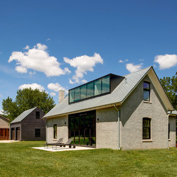
Prior to its near-total reconstruction, the Jett Residence was an overgrown structure hidden in a grove of trees in Iowa City, IA. The strikingly-renovated cottage now serves as a retreat house for its owners. Originally built in 1853, the residence retains a significant portion of the original, locally-made red brick. An original, vaulted stone root cellar—rumored to have been part of the Underground Railroad—also remains on the property.
The owners were deeply involved in working with Neumann Monson Architects, Iowa City, in planning the renovation, according to co-owner Bobby Jett. The interior design of the 1,870 sq. ft. cottage offers a highly contemporary flair within the historic setting.
The most prominent feature of the exterior is the RHEINZINK roof. “Everyone loves the roof,” Jett said. “They’ve never seen anything like it.” Approximately 2,500 sq. ft. of RHEINZINK Square Tiles were utilized. The 0.8mm prePATINA blue-grey Square Tiles were installed in a diamond pattern.
Selection of the RHEINZINK Square Tiles was inspired by an old black and white photo of the house taken more half a century ago. “At that time, the roof of the house had diamond shaped shingles. We wanted to replicate that look,” according to Jett. “The architect suggested that RHEINZINK could provide the look and durability we wanted.”
“We definitely wanted to replicate the roof’s visual pattern that we saw in the old photo but obviously wanted it to have more permanence and durability,” said Tim Schroeder, vice president at Neumann Monson Architects. “We’ve worked with zinc before and thought it would be a good complement to the dormers that would provide a nice crisp appearance. The RHEINZINK was definitely a nod to the historic element but provided a progressive look as well.”
Fabrication of the Square Tiles was done by RHEINZINK systems partner Sheet Metal Supply (SMS), Mundelein, IL.
Installation of the RHEINZINK Square Tiles was performed by Natural Metal Associates, Mont Vernon, NH. The owner of Natural Metal Associates, Lou Rondeau, has extensive hands-on experience with zinc fabrication methods and techniques. “I knew this was a unique project and I really wanted to be a part of it,” Rondeau said. Rondeau was accompanied by an apprentice and personally did the hand-cutting and folding associated with detailing the valleys and edges. The work also included installation of the RHEINZINK half-round 5½” gutter system.
The installation was completed in nine days, according to Rondeau. “Zinc is a premium material that’s a real pleasure to work with,” he said.

 Robin's Nest Interiors
Homearama 2016: An Introduction
Welcome to Homearama 2016: An Introduction where we will take you into the process for creating a showcase home – a phenomenal 12 month long project filled with plenty of blood, sweat and tears. Mostly sweat with the actual even held in middle of a regular Kentucky July – consistently high 90s and a humidity that can steam any pair of glasses.
Our Team
Nevertheless, we are so proud of all those who helped contribute to creating a beautiful home for our ever-patient homeowners. This gorgeous “Southern Belle” took home 3 of the 6 awards given by the Building Industry Association at the River Crest Development: Best Kitchen Cabinetry (M&H Cabinetry), Best Closet Design (Closets by Design), and Best Lighting (Ferguson).
Also cheers to our builder, Chad Stoyell of Stoyell Built Homes for winning 3rd place in the popular vote for Best Builder! He, of course, is at the top of our list as Stoyell Built Homes pride themselves in custom homes built with impeccable craftsmanship. Our Southern Belle did not detour from his reputation! Beautifully executed detail can be found everywhere from the hot/cold exterior hose hookup to the wooden dormer over the front porch.
In addition, the house is a looker – a home you can’t find in just any neighborhood. Notice the bold symmetry with the stone walls flanking the large front porch. Windows placed high on either side of the front facade provide plenty of light while maintaining privacy.
Our landscaper, Chad Rodgers, complemented the symmetry with matching Japanese Maples that in due time will grow up to be perfectly positioned. Concrete planters anchor the front door, while bold blue rocking chairs brighten up the facade two by two.
Natural Wood Elements
Chad Stoyell, the builder, used real material throughout the house and the front door is no exception. This beauty is made of solid wood.
The natural beauty of wood is continued in this wooden open dormer. The lighting fixture keeps that southern charm going with lantern accents – also seen in the fixtures flanking the garage door.
Hydrangeas line the driveway along the side of the house. Great craftsmanship on the shake siding and stone application.
View of the back porch, including two seating areas-a cozy fireplace and a patio for those lazy, hazy, crazy days of summer!
And on a final note, we just love the accessibility of the patio from the garage! The door to the right of the table and chairs leads directly into the garage! Stay tuned for what door #2 leads to….
Stay Tuned for More
Hope you liked our introduction on this great project – Homearama 2016! Please stay tuned for more insight on the design process of each space. I can’t wait to show you the inside of this Southern Belle. Enjoy!
 InnovationLand
3D Drawing Preview
Outdoor Kitchen Island
A two-level pergola, circular firepit area and outdoor kitchen with a charcoal-gas combo grill star in this Houston patio addition designed for entertaining large crowds in style.
"The client was an attorney with a passion for cooking and entertaining," says the project's principal designer, Lisha Maxey of LGH Designs. "Her main objective with this space was to create a large area for 10 to 20 guests, including seating and the prep and cooking of meals."
Located in the backyard of the client's home in Spring, TX, this beautiful outdoor living and entertaining space includes a 28-by-12-foot patio with Fantastico silver travertine tile flooring, arranged in a Versailles pattern. The walkway is Oklahoma wister flagstone.
Providing filtered shade for the patio is a two-level pergola of treated pine stained honey gold. The larger, higher tier is about 18 by 10 feet; the smaller, lower tier is about 10 feet square.
"We covered the entire pergola with Lexan - a high-quality, clear acrylic sheet that provides protection from the sun, heat and rain," says Outdoor Homescapes of Houston owner Wayne Franks.
Beneath the lower tier of the pergola sits an L-shaped, 12-by-9-foot outdoor kitchen island faced with Carmel Country ledgestone. The island houses a Fire Magic® combination charcoal-gas grill and lowered power burner, a Pacific Living countertop pizza oven and a stainless steel RCS trash drawer and sink. The countertops and raised bar are Fantastico silver travertine (18-square-inch tiles) and the backsplash is real quartz.
"The most unique design item of this kitchen area is the hexagon/circular table we added to the end of the long bar," says Lisha. This enabled the client to add seating for her dining guests."
Under the higher, larger tier of the pergola is a seating area, made up of a coffee table and espresso-colored rattan sofa and club chairs with spring-green-and-white cushions.
"Lighting also plays an important role in this space, since the client often entertains in the evening," says Wayne. Enter the chandelier over the patio seating arrangement and - over the outdoor kitchen - pendant lamps and an industrial-modern ceiling fan with a light fixture in the center. "It's important to layer your lighting for ambiance, security and safety - from an all-over ambient light that fills the space to under-the-counter task lighting for food prep and cooking to path and retaining wall lighting."
Off the patio is a transition area of crushed granite and floating flagstone pavers, leading to a circular firepit area of stamped concrete.
At the center of this circle is the standalone firepit, framed at the back by a curved stone bench. The walls of the bench and column bases for the pergola, by the way, are the same ledgestone as the kitchen island. The top slab on the bench is a hearth piece of manmade stone.
"I think the finish materials blend with the home really well," says Wayne. "We met her objectives of being able to entertain with 10 to 12 to 20 people at one time and being able to cook with charcoal and gas separately in one unit. And of course, the project was on time, on budget."
"It is truly a paradise," says the client in her Houzz review of the project. "They listened to my vision and incorporated their expertise to create an outdoor living space just perfect for me and my family!"
204