
Search results for "Realized" in Home Design Ideas
 TKS Design Group
Download our free ebook, Creating the Ideal Kitchen. DOWNLOAD NOW
For many, extra time at home during COVID left them wanting more from their homes. Whether you realized the shortcomings of your space or simply wanted to combat boredom, a well-designed and functional home was no longer a want, it became a need. Tina found herself wanting more from her Old Irving Park home and reached out to The Kitchen Studio about adding function to her kitchen to make the most of the available real estate.
At the end of the day, there is nothing better than returning home to a bright and happy space you love. And this kitchen wasn’t that for Tina. Dark and dated, with a palette from the past and features that didn’t make the most of the available square footage, this remodel required vision and a fresh approach to the space. Lead designer, Stephanie Cole’s main design goal was better flow, while adding greater functionality with organized storage, accessible open shelving, and an overall sense of cohesion with the adjoining family room.
The original kitchen featured a large pizza oven, which was rarely used, yet its footprint limited storage space. The nearby pantry had become a catch-all, lacking the organization needed in the home. The initial plan was to keep the pizza oven, but eventually Tina realized she preferred the design possibilities that came from removing this cumbersome feature, with the goal of adding function throughout the upgraded and elevated space. Eliminating the pantry added square footage and length to the kitchen for greater function and more storage. This redesigned space reflects how she lives and uses her home, as well as her love for entertaining.
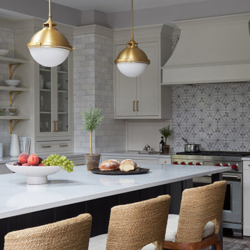
The kitchen features a classic, clean, and timeless palette. White cabinetry, with brass and bronze finishes, contrasts with rich wood flooring, and lets the large, deep blue island in Woodland’s custom color Harbor – a neutral, yet statement color – draw your eye.
The kitchen was the main priority. In addition to updating and elevating this space, Tina wanted to maximize what her home had to offer. From moving the location of the patio door and eliminating a window to removing an existing closet in the mudroom and the cluttered pantry, the kitchen footprint grew. Once the floorplan was set, it was time to bring cohesion to her home, creating connection between the kitchen and surrounding spaces.
The color palette carries into the mudroom, where we added beautiful new cabinetry, practical bench seating, and accessible hooks, perfect for guests and everyday living. The nearby bar continues the aesthetic, with stunning Carrara marble subway tile, hints of brass and bronze, and a design that further captures the vibe of the kitchen.
Every home has its unique design challenges. But with a fresh perspective and a bit of creativity, there is always a way to give the client exactly what they want [and need]. In this particular kitchen, the existing soffits and high slanted ceilings added a layer of complexity to the lighting layout and upper perimeter cabinets.
While a space needs to look good, it also needs to function well. This meant making the most of the height of the room and accounting for the varied ceiling features, while also giving Tina everything she wanted and more. Pendants and task lighting paired with an abundance of natural light amplify the bright aesthetic. The cabinetry layout and design compliments the soffits with subtle profile details that bring everything together. The tile selections add visual interest, drawing the eye to the focal area above the range. Glass-doored cabinets further customize the space and give the illusion of even more height within the room.
While her family may be grown and out of the house, Tina was focused on adding function without sacrificing a stunning aesthetic and dreamy finishes that make the kitchen the gathering place of any home. It was time to love her kitchen again, and if you’re wondering what she loves most, it’s the niche with glass door cabinetry and open shelving for display paired with the marble mosaic backsplash over the range and complimenting hood. Each of these features is a stunning point of interest within the kitchen – both brag-worthy additions to a perimeter layout that previously felt limited and lacking.
Whether your remodel is the result of special needs in your home or simply the excitement of focusing your energy on creating a fun new aesthetic, we are here for it. We love a good challenge because there is always a way to make a space better – adding function and beauty simultaneously.
 Boss Design Center
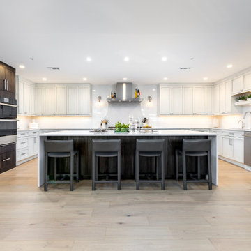
Here at Boss Design Center, we are as committed to getting your kitchen remodel, basement finishing, bathroom remodel, and room addition started and finished as you are, so call our expert team of remodelers who are standing by to deliver quality results from Northern Virginia to the District of Columbia to Maryland. More than just a business in these areas, we consider ourselves neighbors and community members. Fully licensed, bonded, and insured, you can rely on our professionalism to deliver the results that you were looking for when you first began looking for contractors to help realize your remodeling ambitions. While we are more than happy to replace those aging kitchen cabinets, the scope of our vision exceeds those small ambitions, and as our name implies at Boss Design Center, we take a keen interest in the entire design process from drawing board to completion. We have great ideas to help you realize your remodeling dreams from that room addition to the ultimate kitchen remodeling; we bring ten years of experience to the design table and construction site. Contact us today and let’s start planning that bathroom remodeling dream project.
 ALL Renovation & Design LLC
This home addition didn't go according to plan... and that's a good thing. Here's why.
Family is really important to the Nelson's. But the small kitchen and living room in their 30 plus-year-old house meant crowded holidays for all the children and grandchildren. It was easy to see that a major home remodel was needed. The problem was the Nelson's didn't know anyone who had a great experience with a builder.
The Nelson's connected with ALL Renovation & Design at a home show in York, PA, but it wasn't until after sitting down with several builders and going over preliminary designs that it became clear that Amos listened and cared enough to guide them through the project in a way that would achieve their goals perfectly. So work began on a new addition with a “great room” and a master bedroom with a master bathroom.
That's how it started. But the project didn't go according to plan. Why? Because Amos was constantly asking, “What would make you 100% satisfied.” And he meant it. For example, when Mrs. Nelson realized how much she liked the character of the existing brick chimney, she didn't want to see it get covered up. So plans changed mid-stride. But we also realized that the brick wouldn't fit with the plan for a stone fireplace in the new family room. So plans changed there as well, and brick was ordered to match the chimney.
It was truly a team effort that produced a beautiful addition that is exactly what the Nelson's wanted... or as Mrs. Nelson said, “...even better, more beautiful than we envisioned.”
For Christmas, the Nelson's were able to have the entire family over with plenty of room for everyone. Just what they wanted.
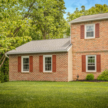
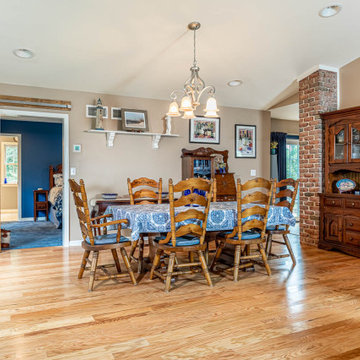
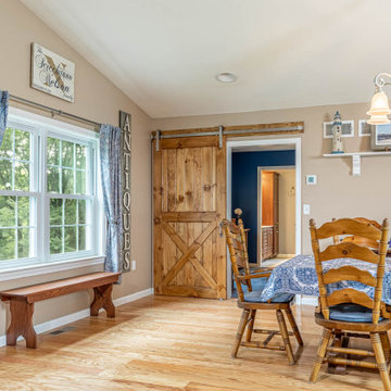
The outside of the addition features GAF architectural shingles in Pewter, Certainteed Mainstreet D4 Shiplap in light maple, and color-matching bricks. Inside the great room features the Armstrong Prime Harvest Oak engineered hardwood in a natural finish, Masonite 6-panel pocket doors, a custom sliding pine barn door, and Simonton 5500 series windows. The master bathroom cabinetry was made to match the bedroom furniture set, with a cultured marble countertop from Countertec, and tile flooring.
Find the right local pro for your project
 Covermax Resine
ATMOSFERA GIOCOSA IN UNA PRECISIONE PURA
Abbiamo avuto piacere di partecipare nella realizzazione di questo bellissimo progetto in centro della nostra citta #firenze.
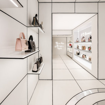
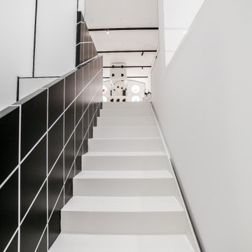
Uno store di duecento metri quadrati sviluppato su due piani dove verranno esposte le nuove collezioni di borse e bijoux. Il concetto dello spazio espositivo ideato dall’architetto @Emanuele Svetti che, da tempo, cura il concept dei progetti di Graziella Braccialini in tutto il mondo.
Questo progetto conferma che la nostra resina ci permette di realizzare qualsiasi idea per rendere ogni spazio unico e senza limiti.
Covermax Resine
covermaxresine.com
Via Giovanni Lorenzoni 16r – Firenze
info@covermaxresine.com
PlAYFUL ATMOSPHERE IN A PURE PRECISION
We had a pleasure to participate in the realization of this beautiful project in the center of our city #firenze.
A two-hundred-square-meters store spread over two floors where the new collection of bags and bijoux will be exhibited. The concept of the store space conceived by the architect @Emanuele Svetti who, for a long time, has been taking care of the concept of Graziella Braccialini's projects all over the world.
This project confirms that our resin allows us to realize any idea to make every space unique and without limits.
Covermax Resine
covermaxresine.com
Via Giovanni Lorenzoni 16r – Firenze
info@covermaxresine.com
 Cantoni Atlanta
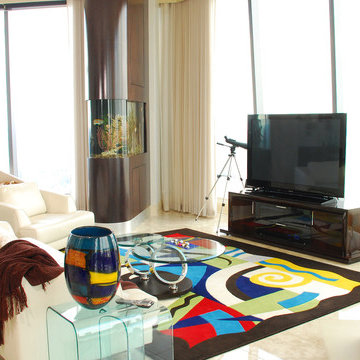
With children raised and the work of establishing a career behind them, Dennis and Helene Liotta decided it was time to simplify life and downsize—by moving up. They sold their 5,000 sq. ft. family home (complete with the requisite pool and expansive yard), in favor of a 3,600 sq. ft. residence on the 47th floor of The Sovereign, a sleek mixed-use tower located in Atlanta’s Buckhead district. Realizing they wanted to enlist a talented decorative collaborator for all phases of the project, the couple sought the assistance of Mercedes Williams, design consultant at Cantoni Atlanta. Having helped the couple’s sons with purchases in the past, he came highly recommended.
“I know the Liotta’s were thrilled to have the opportunity to personally conceptualize their new home,” recalls Mercedes. “They wanted my input to customize the space—confirming paint, tile, flooring, and finish choices—and
they wanted help choosing furniture that would create an elegant yet warm and comfortable living environment.” “Dennis and Helene also had a vision for how they wanted the space to flow,” he explains. “The large, open floor plan for the main living room included the kitchen and dining areas, so we had to delineate the spaces while creating visual interest…without using a lot of furniture.” Choosing pieces with impact, and looks that simultaneously celebrated texture, scale, finish, and color, was the key to success.
The dining table and large wool rug were custom-made by Cantoni and colored to coordinate with some of the couple’s key glass collectibles. “We also made the salt water aquarium a focal point in the living area because Dennis and Helene love the beach and ocean,” explains Mercedes.
Along with additional new furnishings from Cantoni the couple wanted to incorporate other existing pieces from their extensive art and glass collection. Given the size of their former residence, an editing session was in order, so the Liotta’s took a novel approach to the task at hand. “We had a huge ‘Sovereign’ moving party and let friends and family take some of the things we knew we could part with,” says Helene.
Dennis and Helene have been settled into their new digs since November. He continues
to work as a professor at Emory University, and she
enjoys searching for premium wines sold at Wine Gallery + Market, a family-owned gourmet emporium in Atlanta. With two bedrooms and a study, there remains room enough for the grandkids to sleep over—and a large dining table was selected so the couple could continue to accommodate multi-generational gatherings.
“This project was a dream job for me,” reflects Mercedes, with enthusiasm. “The Liotta’s have excellent taste and wanted to create a fun and inviting environment that evokes luxury without stuffiness. They knew what they wanted, but needed a little help getting there. I’m flattered they chose me and Cantoni to help them realize the life they dreamed of living at The Sovereign.”
 Covermax Resine
ATMOSFERA GIOCOSA IN UNA PRECISIONE PURA
Abbiamo avuto piacere di partecipare nella realizzazione di questo bellissimo progetto in centro della nostra citta #firenze.
Uno store di duecento metri quadrati sviluppato su due piani dove verranno esposte le nuove collezioni di borse e bijoux. Il concetto dello spazio espositivo ideato dall’architetto @Emanuele Svetti che, da tempo, cura il concept dei progetti di Graziella Braccialini in tutto il mondo.
Questo progetto conferma che la nostra resina ci permette di realizzare qualsiasi idea per rendere ogni spazio unico e senza limiti.
Covermax Resine
covermaxresine.com
Via Giovanni Lorenzoni 16r – Firenze
info@covermaxresine.com
PlAYFUL ATMOSPHERE IN A PURE PRECISION
We had a pleasure to participate in the realization of this beautiful project in the center of our city #firenze.
A two-hundred-square-meters store spread over two floors where the new collection of bags and bijoux will be exhibited. The concept of the store space conceived by the architect @Emanuele Svetti who, for a long time, has been taking care of the concept of Graziella Braccialini's projects all over the world.
This project confirms that our resin allows us to realize any idea to make every space unique and without limits.
Covermax Resine
covermaxresine.com
Via Giovanni Lorenzoni 16r – Firenze
info@covermaxresine.com
 ALL Renovation & Design LLC
This home addition didn't go according to plan... and that's a good thing. Here's why.
Family is really important to the Nelson's. But the small kitchen and living room in their 30 plus-year-old house meant crowded holidays for all the children and grandchildren. It was easy to see that a major home remodel was needed. The problem was the Nelson's didn't know anyone who had a great experience with a builder.
The Nelson's connected with ALL Renovation & Design at a home show in York, PA, but it wasn't until after sitting down with several builders and going over preliminary designs that it became clear that Amos listened and cared enough to guide them through the project in a way that would achieve their goals perfectly. So work began on a new addition with a “great room” and a master bedroom with a master bathroom.
That's how it started. But the project didn't go according to plan. Why? Because Amos was constantly asking, “What would make you 100% satisfied.” And he meant it. For example, when Mrs. Nelson realized how much she liked the character of the existing brick chimney, she didn't want to see it get covered up. So plans changed mid-stride. But we also realized that the brick wouldn't fit with the plan for a stone fireplace in the new family room. So plans changed there as well, and brick was ordered to match the chimney.
It was truly a team effort that produced a beautiful addition that is exactly what the Nelson's wanted... or as Mrs. Nelson said, “...even better, more beautiful than we envisioned.”
For Christmas, the Nelson's were able to have the entire family over with plenty of room for everyone. Just what they wanted.
The outside of the addition features GAF architectural shingles in Pewter, Certainteed Mainstreet D4 Shiplap in light maple, and color-matching bricks. Inside the great room features the Armstrong Prime Harvest Oak engineered hardwood in a natural finish, Masonite 6-panel pocket doors, a custom sliding pine barn door, and Simonton 5500 series windows. The master bathroom cabinetry was made to match the bedroom furniture set, with a cultured marble countertop from Countertec, and tile flooring.
 ALL Renovation & Design LLC
This home addition didn't go according to plan... and that's a good thing. Here's why.
Family is really important to the Nelson's. But the small kitchen and living room in their 30 plus-year-old house meant crowded holidays for all the children and grandchildren. It was easy to see that a major home remodel was needed. The problem was the Nelson's didn't know anyone who had a great experience with a builder.
The Nelson's connected with ALL Renovation & Design at a home show in York, PA, but it wasn't until after sitting down with several builders and going over preliminary designs that it became clear that Amos listened and cared enough to guide them through the project in a way that would achieve their goals perfectly. So work began on a new addition with a “great room” and a master bedroom with a master bathroom.
That's how it started. But the project didn't go according to plan. Why? Because Amos was constantly asking, “What would make you 100% satisfied.” And he meant it. For example, when Mrs. Nelson realized how much she liked the character of the existing brick chimney, she didn't want to see it get covered up. So plans changed mid-stride. But we also realized that the brick wouldn't fit with the plan for a stone fireplace in the new family room. So plans changed there as well, and brick was ordered to match the chimney.
It was truly a team effort that produced a beautiful addition that is exactly what the Nelson's wanted... or as Mrs. Nelson said, “...even better, more beautiful than we envisioned.”
For Christmas, the Nelson's were able to have the entire family over with plenty of room for everyone. Just what they wanted.
The outside of the addition features GAF architectural shingles in Pewter, Certainteed Mainstreet D4 Shiplap in light maple, and color-matching bricks. Inside the great room features the Armstrong Prime Harvest Oak engineered hardwood in a natural finish, Masonite 6-panel pocket doors, a custom sliding pine barn door, and Simonton 5500 series windows. The master bathroom cabinetry was made to match the bedroom furniture set, with a cultured marble countertop from Countertec, and tile flooring.

 Jessica Cain
Photo: Jessica Cain © 2017 Houzz
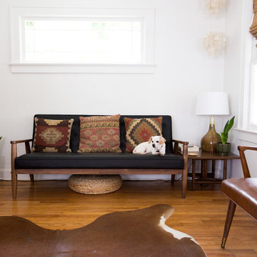
Mid-century modern open concept family room photo in Kansas City with white walls and no tv
Mid-century modern open concept family room photo in Kansas City with white walls and no tv
 Kohn Shnier architects
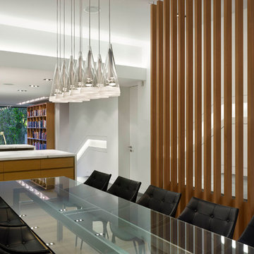
This single family home sits on a tight, sloped site. Within a modest budget, the goal was to provide direct access to grade at both the front and back of the house.
The solution is a multi-split-level home with unconventional relationships between floor levels. Between the entrance level and the lower level of the family room, the kitchen and dining room are located on an interstitial level. Within the stair space “floats” a small bathroom.
The generous stair is celebrated with a back-painted red glass wall which treats users to changing refractive ambient light throughout the house.
Black brick, grey-tinted glass and mirrors contribute to the reasonably compact massing of the home. A cantilevered upper volume shades south facing windows and the home’s limited material palette meant a more efficient construction process. Cautious landscaping retains water run-off on the sloping site and home offices reduce the client’s use of their vehicle.
The house achieves its vision within a modest footprint and with a design restraint that will ensure it becomes a long-lasting asset in the community.
Photo by Tom Arban
 Sicora Design/Build
Farm Kid Studios
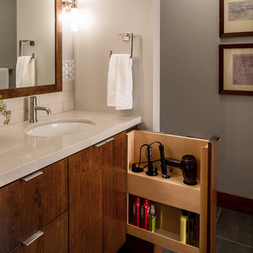
Bathroom - mid-sized contemporary master porcelain tile and beige tile porcelain tile bathroom idea in Minneapolis with flat-panel cabinets, medium tone wood cabinets, quartz countertops, an undermount sink and gray walls
Bathroom - mid-sized contemporary master porcelain tile and beige tile porcelain tile bathroom idea in Minneapolis with flat-panel cabinets, medium tone wood cabinets, quartz countertops, an undermount sink and gray walls
 Hart's Design
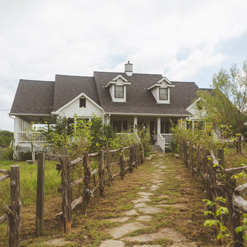
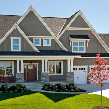
This beautiful little Craftsman in Credit River
Basic concept design is available on the website
https://www.hartsdesign.com/fullscreen-store-page/comp-jql1rjw5/6cdc53f4-ce3e-46f7-a96e-ea93be499bbb/1/%3Fi%3D1%26p%3Dkbm3w%26s%3Dstyle-jql30y7i

 FineLine Kitchens, Inc.
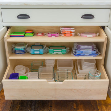
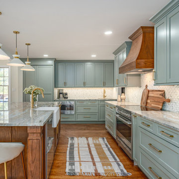
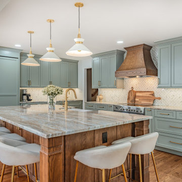
Hi everyone, I'm Sarah and Ogun we are here with fine line kitchens. So we are a couple working together. I do the interior design and remodeling of the space material selection meeting with the clients. And I handled operations outside, you know meaning all the construction work that is taking place the inside. The houses that we work in. I handle all the aspects of the construction, so today's project is very special. We're in Vienna and the client had a very big family. It's a family of seven that lives here. So we had a few aspects that we needed to keep in mind while designing this one. Having everybody be able to sit on the island. So we wanted plenty of seating all the way around. We didn't want anybody standing or anything like that. So what we did is we maximize the space. The center island is the biggest part of the kitchen. We use a natural stone to kind of give it a beautiful texture versus quartz. It's kind of standard white or kind of fabricated, so I wanted something very natural. We did this because I took my inspiration from the outside, so the inspiration if you look at the view right in front of me is there are so many greens there's a lot of brass accents and I wanted to bring this. Into this kitchen while designing it for my clients. She is very warm very. She wanted a very homey, comfy kind of look for the kitchen. So that's what we did today. As you can see, the cabinets are sage green, very light, so I still think it's a neutral, but it's a lighter color that again brings the outside in and we combine that with the oak right behind me so it's a slightly warm oak. It's not very dark. It's not very light. It's a medium brown and the same color went on the island. To kind of tie these two in and the backsplash, my favorite part is where you can see a little bit of design. It is, in my opinion still classic, but includes a pattern so the outside part is as we said in the beginning, is handled by my husband. I'd like him to speak a little bit about that. Thanks, Sarah, I want to talk to you guys a little bit about the construction part of this project. Originally this kitchen was located mostly in this area. They had their stove there sing. It was more of a peninsula layout in Sarah's and the customer vision they wanted. They wanted to get rid of the peninsula and they want to be able to have a huge island that can at least sit seven people because they're familiar with seven. So we wanted to make sure that we can achieve this design and bring it to life so that they can be happy with this layout. Some of the challenges we had, the house, the home being, you know, old home. There were a lot of you know the older electrical and plumbing that had to be replaced. We had to relocate the stove from here to this area. Over here we had put a nice foot fan that we had to relocate all the ductwork and the plumbing. Was being on the peninsula area. We had to relocate it to the center islands. So we achieved all this and kind of like bring it to bring in this kitchen up to date it looks beautiful. That's true, so yes, the old layout did not function for my clients because everything was kind of gathered on one side of the kitchen. So there was like a peninsula right there. So the end of this island kind of continued straight. And that was just the L shape. Kind of where everything was and there used to be another big table here, so they were using only kind of half of the space. So like I said at the beginning, our vision was to kind of feed everybody at the island, create some symmetry. 'cause I love that. So as you can see behind me, this is kind of the focal point symmetrical. Everything is kind of even we wanted to also panel the fridge here so it mimics the pantry and another size. So when you're looking at it, it is bringing again that symmetry back again. I hope you enjoyed this kitchen and this video and I'll see you soon. So how do you think this project turned out? It's nice. I like the color. I think it turned out nice. It's kind of like a little bit different color than what we always do. So I realize. Are you giving me a little bit of credit here that I did something different? Are you proud? I'm so proud of you. Other than that I like it. That they have kind of like a two sink. So if this was our kitchen, if we ever like you can have your own. I can have mine if we ever get into a fight then this can be like my own kitchen. Why are we gonna bring in a fight right now? So I'm cooking anyway. You're grilling most of the time, So what are you even talking about? My kitchen? That's my kitchen. You can just take the small sink. That's fine. It's always good to have your own space right there, so anyways. Thank you guys for watching. We hope to see you soon and if you have any questions please click the link below. It'll lead you to our website, house, YouTube and all of the social media is so nice to have you guys. We'll see you soon. Thanks bye bye-bye.
 FineLine Kitchens, Inc.
Hi everyone, I'm Sarah and Ogun we are here with fine line kitchens. So we are a couple working together. I do the interior design and remodeling of the space material selection meeting with the clients. And I handled operations outside, you know meaning all the construction work that is taking place the inside. The houses that we work in. I handle all the aspects of the construction, so today's project is very special. We're in Vienna and the client had a very big family. It's a family of seven that lives here. So we had a few aspects that we needed to keep in mind while designing this one. Having everybody be able to sit on the island. So we wanted plenty of seating all the way around. We didn't want anybody standing or anything like that. So what we did is we maximize the space. The center island is the biggest part of the kitchen. We use a natural stone to kind of give it a beautiful texture versus quartz. It's kind of standard white or kind of fabricated, so I wanted something very natural. We did this because I took my inspiration from the outside, so the inspiration if you look at the view right in front of me is there are so many greens there's a lot of brass accents and I wanted to bring this. Into this kitchen while designing it for my clients. She is very warm very. She wanted a very homey, comfy kind of look for the kitchen. So that's what we did today. As you can see, the cabinets are sage green, very light, so I still think it's a neutral, but it's a lighter color that again brings the outside in and we combine that with the oak right behind me so it's a slightly warm oak. It's not very dark. It's not very light. It's a medium brown and the same color went on the island. To kind of tie these two in and the backsplash, my favorite part is where you can see a little bit of design. It is, in my opinion still classic, but includes a pattern so the outside part is as we said in the beginning, is handled by my husband. I'd like him to speak a little bit about that. Thanks, Sarah, I want to talk to you guys a little bit about the construction part of this project. Originally this kitchen was located mostly in this area. They had their stove there sing. It was more of a peninsula layout in Sarah's and the customer vision they wanted. They wanted to get rid of the peninsula and they want to be able to have a huge island that can at least sit seven people because they're familiar with seven. So we wanted to make sure that we can achieve this design and bring it to life so that they can be happy with this layout. Some of the challenges we had, the house, the home being, you know, old home. There were a lot of you know the older electrical and plumbing that had to be replaced. We had to relocate the stove from here to this area. Over here we had put a nice foot fan that we had to relocate all the ductwork and the plumbing. Was being on the peninsula area. We had to relocate it to the center islands. So we achieved all this and kind of like bring it to bring in this kitchen up to date it looks beautiful. That's true, so yes, the old layout did not function for my clients because everything was kind of gathered on one side of the kitchen. So there was like a peninsula right there. So the end of this island kind of continued straight. And that was just the L shape. Kind of where everything was and there used to be another big table here, so they were using only kind of half of the space. So like I said at the beginning, our vision was to kind of feed everybody at the island, create some symmetry. 'cause I love that. So as you can see behind me, this is kind of the focal point symmetrical. Everything is kind of even we wanted to also panel the fridge here so it mimics the pantry and another size. So when you're looking at it, it is bringing again that symmetry back again. I hope you enjoyed this kitchen and this video and I'll see you soon. So how do you think this project turned out? It's nice. I like the color. I think it turned out nice. It's kind of like a little bit different color than what we always do. So I realize. Are you giving me a little bit of credit here that I did something different? Are you proud? I'm so proud of you. Other than that I like it. That they have kind of like a two sink. So if this was our kitchen, if we ever like you can have your own. I can have mine if we ever get into a fight then this can be like my own kitchen. Why are we gonna bring in a fight right now? So I'm cooking anyway. You're grilling most of the time, So what are you even talking about? My kitchen? That's my kitchen. You can just take the small sink. That's fine. It's always good to have your own space right there, so anyways. Thank you guys for watching. We hope to see you soon and if you have any questions please click the link below. It'll lead you to our website, house, YouTube and all of the social media is so nice to have you guys. We'll see you soon. Thanks bye bye-bye.
 FineLine Kitchens, Inc.
Hi everyone, I'm Sarah and Ogun we are here with fine line kitchens. So we are a couple working together. I do the interior design and remodeling of the space material selection meeting with the clients. And I handled operations outside, you know meaning all the construction work that is taking place the inside. The houses that we work in. I handle all the aspects of the construction, so today's project is very special. We're in Vienna and the client had a very big family. It's a family of seven that lives here. So we had a few aspects that we needed to keep in mind while designing this one. Having everybody be able to sit on the island. So we wanted plenty of seating all the way around. We didn't want anybody standing or anything like that. So what we did is we maximize the space. The center island is the biggest part of the kitchen. We use a natural stone to kind of give it a beautiful texture versus quartz. It's kind of standard white or kind of fabricated, so I wanted something very natural. We did this because I took my inspiration from the outside, so the inspiration if you look at the view right in front of me is there are so many greens there's a lot of brass accents and I wanted to bring this. Into this kitchen while designing it for my clients. She is very warm very. She wanted a very homey, comfy kind of look for the kitchen. So that's what we did today. As you can see, the cabinets are sage green, very light, so I still think it's a neutral, but it's a lighter color that again brings the outside in and we combine that with the oak right behind me so it's a slightly warm oak. It's not very dark. It's not very light. It's a medium brown and the same color went on the island. To kind of tie these two in and the backsplash, my favorite part is where you can see a little bit of design. It is, in my opinion still classic, but includes a pattern so the outside part is as we said in the beginning, is handled by my husband. I'd like him to speak a little bit about that. Thanks, Sarah, I want to talk to you guys a little bit about the construction part of this project. Originally this kitchen was located mostly in this area. They had their stove there sing. It was more of a peninsula layout in Sarah's and the customer vision they wanted. They wanted to get rid of the peninsula and they want to be able to have a huge island that can at least sit seven people because they're familiar with seven. So we wanted to make sure that we can achieve this design and bring it to life so that they can be happy with this layout. Some of the challenges we had, the house, the home being, you know, old home. There were a lot of you know the older electrical and plumbing that had to be replaced. We had to relocate the stove from here to this area. Over here we had put a nice foot fan that we had to relocate all the ductwork and the plumbing. Was being on the peninsula area. We had to relocate it to the center islands. So we achieved all this and kind of like bring it to bring in this kitchen up to date it looks beautiful. That's true, so yes, the old layout did not function for my clients because everything was kind of gathered on one side of the kitchen. So there was like a peninsula right there. So the end of this island kind of continued straight. And that was just the L shape. Kind of where everything was and there used to be another big table here, so they were using only kind of half of the space. So like I said at the beginning, our vision was to kind of feed everybody at the island, create some symmetry. 'cause I love that. So as you can see behind me, this is kind of the focal point symmetrical. Everything is kind of even we wanted to also panel the fridge here so it mimics the pantry and another size. So when you're looking at it, it is bringing again that symmetry back again. I hope you enjoyed this kitchen and this video and I'll see you soon. So how do you think this project turned out? It's nice. I like the color. I think it turned out nice. It's kind of like a little bit different color than what we always do. So I realize. Are you giving me a little bit of credit here that I did something different? Are you proud? I'm so proud of you. Other than that I like it. That they have kind of like a two sink. So if this was our kitchen, if we ever like you can have your own. I can have mine if we ever get into a fight then this can be like my own kitchen. Why are we gonna bring in a fight right now? So I'm cooking anyway. You're grilling most of the time, So what are you even talking about? My kitchen? That's my kitchen. You can just take the small sink. That's fine. It's always good to have your own space right there, so anyways. Thank you guys for watching. We hope to see you soon and if you have any questions please click the link below. It'll lead you to our website, house, YouTube and all of the social media is so nice to have you guys. We'll see you soon. Thanks bye bye-bye.
 FineLine Kitchens, Inc.
Hi everyone, I'm Sarah and Ogun we are here with fine line kitchens. So we are a couple working together. I do the interior design and remodeling of the space material selection meeting with the clients. And I handled operations outside, you know meaning all the construction work that is taking place the inside. The houses that we work in. I handle all the aspects of the construction, so today's project is very special. We're in Vienna and the client had a very big family. It's a family of seven that lives here. So we had a few aspects that we needed to keep in mind while designing this one. Having everybody be able to sit on the island. So we wanted plenty of seating all the way around. We didn't want anybody standing or anything like that. So what we did is we maximize the space. The center island is the biggest part of the kitchen. We use a natural stone to kind of give it a beautiful texture versus quartz. It's kind of standard white or kind of fabricated, so I wanted something very natural. We did this because I took my inspiration from the outside, so the inspiration if you look at the view right in front of me is there are so many greens there's a lot of brass accents and I wanted to bring this. Into this kitchen while designing it for my clients. She is very warm very. She wanted a very homey, comfy kind of look for the kitchen. So that's what we did today. As you can see, the cabinets are sage green, very light, so I still think it's a neutral, but it's a lighter color that again brings the outside in and we combine that with the oak right behind me so it's a slightly warm oak. It's not very dark. It's not very light. It's a medium brown and the same color went on the island. To kind of tie these two in and the backsplash, my favorite part is where you can see a little bit of design. It is, in my opinion still classic, but includes a pattern so the outside part is as we said in the beginning, is handled by my husband. I'd like him to speak a little bit about that. Thanks, Sarah, I want to talk to you guys a little bit about the construction part of this project. Originally this kitchen was located mostly in this area. They had their stove there sing. It was more of a peninsula layout in Sarah's and the customer vision they wanted. They wanted to get rid of the peninsula and they want to be able to have a huge island that can at least sit seven people because they're familiar with seven. So we wanted to make sure that we can achieve this design and bring it to life so that they can be happy with this layout. Some of the challenges we had, the house, the home being, you know, old home. There were a lot of you know the older electrical and plumbing that had to be replaced. We had to relocate the stove from here to this area. Over here we had put a nice foot fan that we had to relocate all the ductwork and the plumbing. Was being on the peninsula area. We had to relocate it to the center islands. So we achieved all this and kind of like bring it to bring in this kitchen up to date it looks beautiful. That's true, so yes, the old layout did not function for my clients because everything was kind of gathered on one side of the kitchen. So there was like a peninsula right there. So the end of this island kind of continued straight. And that was just the L shape. Kind of where everything was and there used to be another big table here, so they were using only kind of half of the space. So like I said at the beginning, our vision was to kind of feed everybody at the island, create some symmetry. 'cause I love that. So as you can see behind me, this is kind of the focal point symmetrical. Everything is kind of even we wanted to also panel the fridge here so it mimics the pantry and another size. So when you're looking at it, it is bringing again that symmetry back again. I hope you enjoyed this kitchen and this video and I'll see you soon. So how do you think this project turned out? It's nice. I like the color. I think it turned out nice. It's kind of like a little bit different color than what we always do. So I realize. Are you giving me a little bit of credit here that I did something different? Are you proud? I'm so proud of you. Other than that I like it. That they have kind of like a two sink. So if this was our kitchen, if we ever like you can have your own. I can have mine if we ever get into a fight then this can be like my own kitchen. Why are we gonna bring in a fight right now? So I'm cooking anyway. You're grilling most of the time, So what are you even talking about? My kitchen? That's my kitchen. You can just take the small sink. That's fine. It's always good to have your own space right there, so anyways. Thank you guys for watching. We hope to see you soon and if you have any questions please click the link below. It'll lead you to our website, house, YouTube and all of the social media is so nice to have you guys. We'll see you soon. Thanks bye bye-bye.
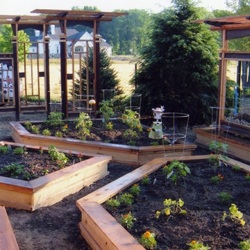
 Pro Care Horticultural Services
Inspiration for a craftsman full sun backyard vegetable garden landscape in Indianapolis for summer.
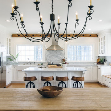
 The Working Kitchen, Ltd.
Photo: Vicki Bodine
Eat-in kitchen - large cottage u-shaped medium tone wood floor eat-in kitchen idea in New York with a farmhouse sink, beaded inset cabinets, white cabinets, marble countertops, white backsplash, stone slab backsplash, stainless steel appliances and an island
Eat-in kitchen - large cottage u-shaped medium tone wood floor eat-in kitchen idea in New York with a farmhouse sink, beaded inset cabinets, white cabinets, marble countertops, white backsplash, stone slab backsplash, stainless steel appliances and an island
59